
Caught up in the Mindful Gray vs. Agreeable Gray debate for your next home makeover? I hear you. These two Sherwin-Williams shades are both beautiful grays, but choosing between them can feel like splitting hairs.
Here’s a quick primer: Mindful Gray tends to be a bit bolder and warmer, lending an elegant depth to rooms. Agreeable Gray, though, is a softer, more neutral choice that brings a light and breezy feel to a space. So, which one’s right for you? It’s all about the atmosphere you want to create.
Stay tuned as we dig deeper into the subtleties of these colors, how they work in different spaces, and what makes each one unique. By the end, you’ll be clear on which one wins for your home, Mindful Gray or Agreeable Gray? Let’s get started.
Table of Contents
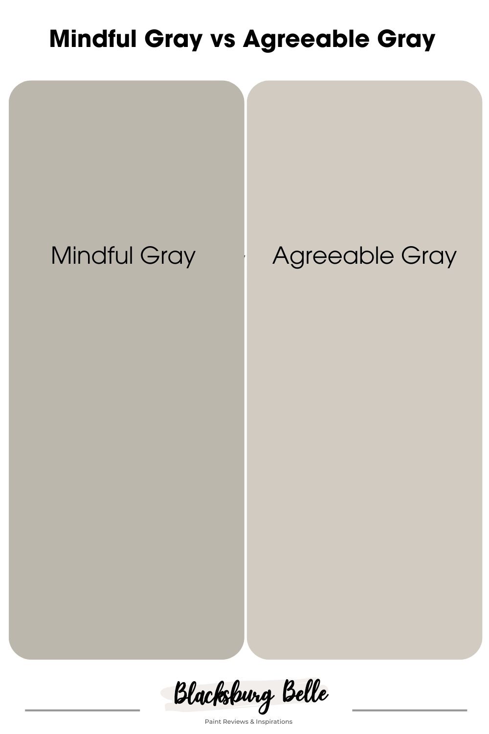
A Visual Comparison of Mindful Gray and Agreeable Gray
Before we dive in, let’s have a look at our contenders side by side:
Right off the bat, you’ll notice Mindful Gray is a touch darker and warmer than Agreeable Gray. It has a bold character that adds some real depth to a room. Agreeable Gray, on the other hand, is a softer, lighter gray that’s all about creating a bright, airy feel.
Emotional Effects: Mindful Gray Vs Agreeable Gray
Colors sway our feelings. With Mindful Gray, you invite calm and tranquility into your space. It’s like a soothing retreat, perfect for escaping a busy world.
Agreeable Gray, though, wraps you in warmth and comfort. It makes a space feel homely and inviting, just like a cozy hug at the end of a long day.
Remember, your personal reaction to color is what truly matters.
Quick Comparison:Mindful Gray Vs Agreeable Gray
Alright, let’s dive deeper into Mindful Gray and Agreeable Gray. I’ve whipped up a quick comparison chart for you below that breaks down their key features. Check it out!
| Mindful Gray | Agreeable Gray | |
| RBG | 188 / 183/ 173 | 209 / 203 / 193 |
| LRV | 48 | 60 |
| Undertones | blue-purple | green-beige |
| Hex Value | #bcb7ad | #D1CBC1 |
LRV of Mindful Gray Vs Agreeable Gray – Which Reflects More Light?
LRV, or Light Reflectance Value, essentially tells us how bright a paint color will look – the higher the LRV, the brighter the color.
Mindful Gray sits at an LRV of 48 – a bit darker, absorbing more light, making rooms feel intimate and cozy.
Agreeable Gray, on the other hand, has an LRV of 60. It’s the brighter sibling, bouncing more light around your room, giving that spacious, airy feeling.
So, if you’re after a snug, comfy room, Mindful Gray’s your guy. Need a bright, open space? Go for Agreeable Gray. But hey, there’s more to consider, like paint’s undertones. Stick around, we’re about to get into that next!
Undertones of Mindful Gray Vs Agreeable Gray: Do They Share Similar Tones?
Let’s talk undertones – those subtle colors that peek out from beneath your main color and can seriously influence the overall look of your room.
Starting with Mindful Gray, its undertones lean more towards the blue-purple side. This gives it a somewhat cooler feel, but don’t be fooled – these undertones can still add warmth and depth to your space.
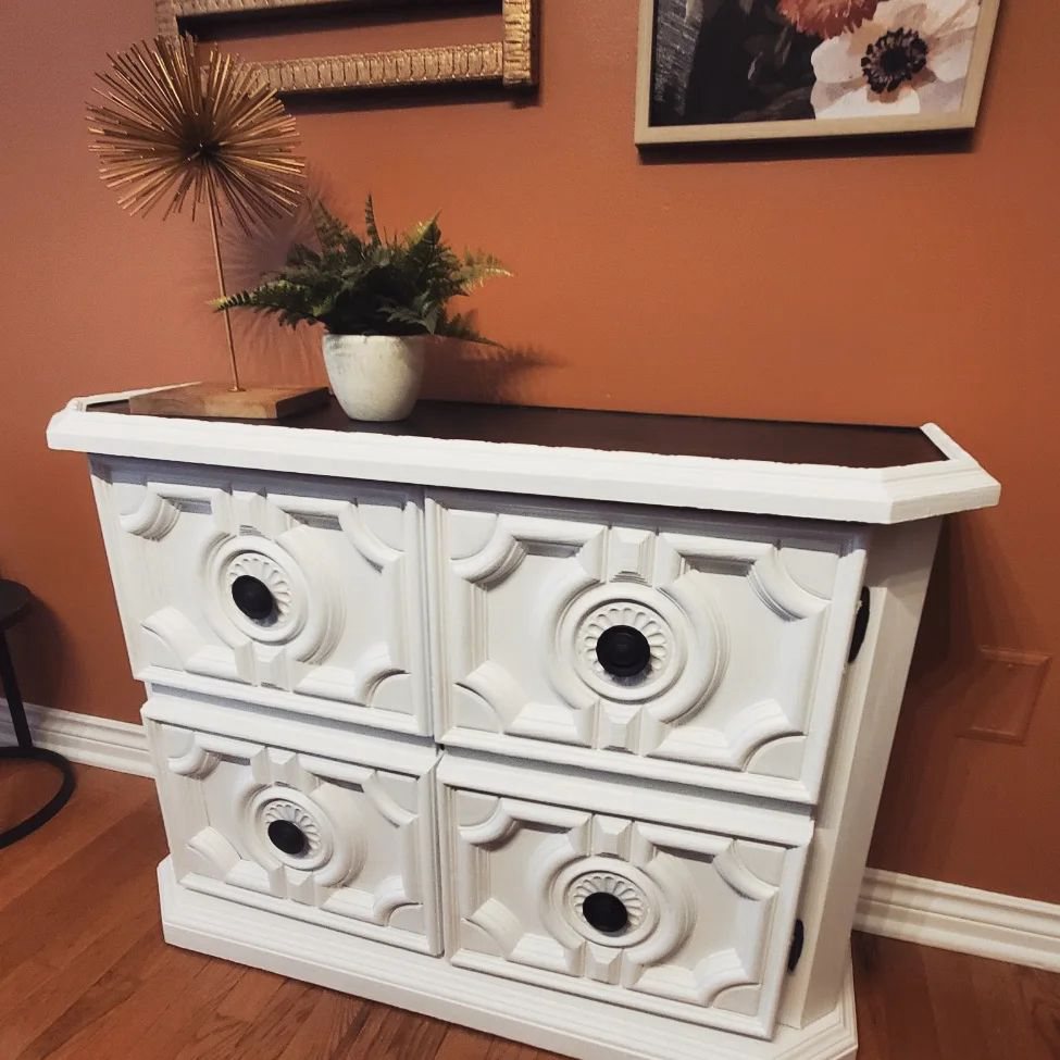
Take a look at this gorgeous pair of dressers painted in Mindful Gray from Sherwin Williams.
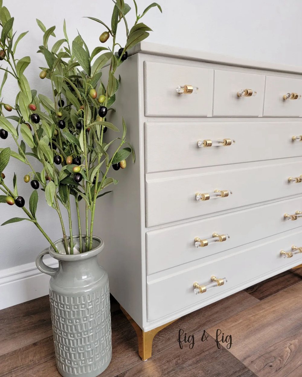
Notice how Mindful Gray’s blue-purple undertones add an extra layer of sophistication?
As for Agreeable Gray, it sports more green-beige undertones. This makes it an adaptable neutral color, which can sway warm or cool depending on the lighting and surrounding decor.
Despite their gray labels, you can see these two paints have unique undertones that make them versatile for various styles and moods.
Mindful Gray Vs Agreeable Gray – Are They Warm or Cool?
Now, let’s tackle another key question: Are our grays warm or cool?
Mindful Gray, with its blue-purple undertones, often leans towards the cooler side. However, depending on the lighting and other room elements, it can also appear warmer at times.
On the flip side, Agreeable Gray with its green-beige undertones is like a chameleon. It can lean towards being warm in some settings, but in others, it might pull cool.
So, Mindful Gray and Agreeable Gray are versatile players that can adapt to both warm and cool environments.
Mindful Gray Vs Agreeable Gray Complementary Colors
When it comes to home decor, the right complementary colors are like the perfect side dish – they can elevate the main course to new heights. So, let’s see what colors really bring out the best in Mindful Gray and Agreeable Gray.
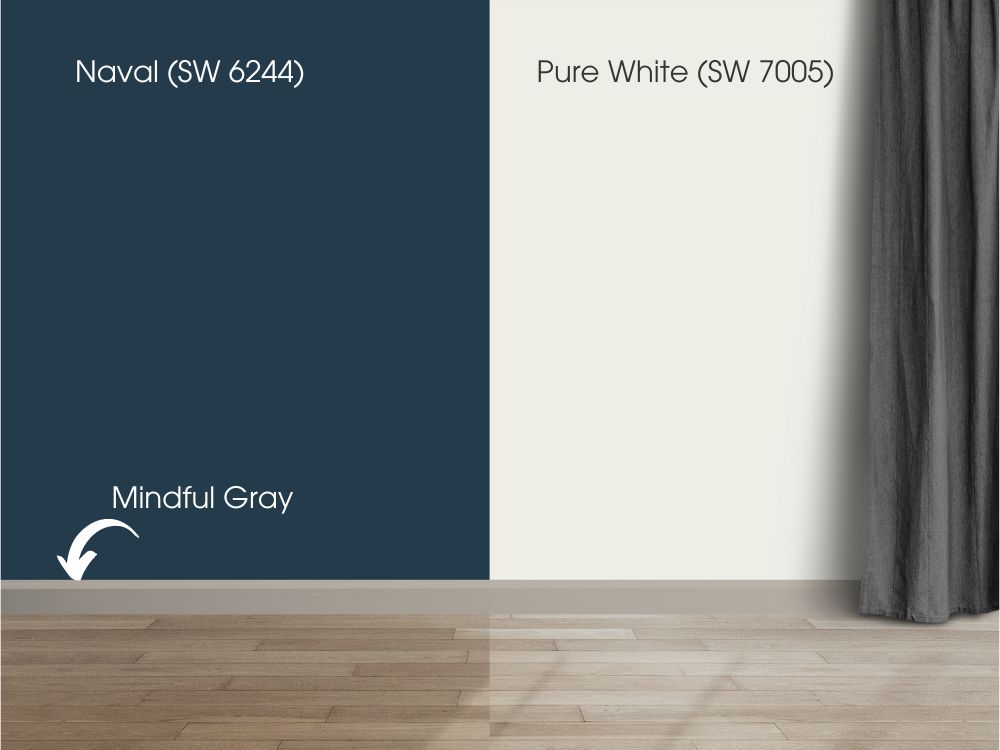
Mindful Gray (SW 7016) Complementary Colors
Mindful Gray (SW 7016) is cooler in its undertones, beautifully meshing with:
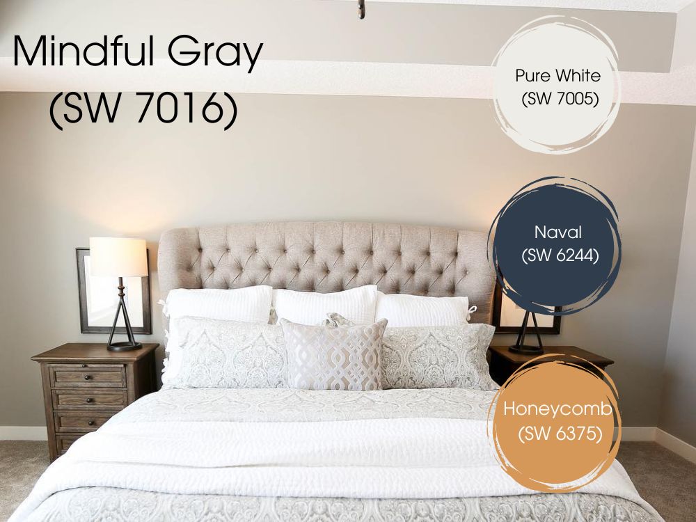
- Sherwin Williams Pure White (SW 7005): This crisp, clean white enhances the coolness of Mindful Gray, offering a modern, chic look.
- Sherwin Williams Naval (SW 6244): A deep navy blue that, contrasted against Mindful Gray, creates a space with depth and boldness.
- Sherwin Williams Honeycomb (SW 6375): A bright, cheery yellow that brings a warm contrast to Mindful Gray, providing a dynamic and inviting atmosphere.
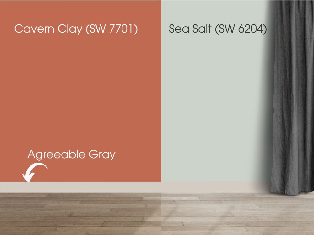
Agreeable Gray (SW 7029) Complementary Colors
On the flip side, Agreeable Gray (SW 7029), being more neutral, gets along splendidly with a range of hues:
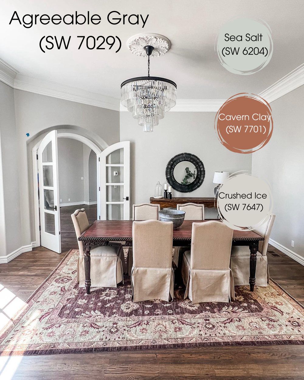
- Sherwin Williams Sea Salt (SW 6204): This subtle, muted green-blue brings a serene, calming energy to a room styled with Agreeable Gray.
- Sherwin Williams Cavern Clay (SW 7701): An earthy, warm color that stands in stark contrast to Agreeable Gray, adding a touch of rustic charm.
- Sherwin Williams Crushed Ice (SW 7647): A lighter shade of gray that offers a layered, sophisticated look when paired with Agreeable Gray.
These suggestions are a great starting point, but the beauty of Mindful Gray and Agreeable Gray is their flexibility to mesh well with a wide array of colors. Now, ready to dive a bit deeper and take a closer look at these colors on a paint palette? Let’s jump into it!
Mindful Gray Vs Agreeable Gray Color Palette
Stepping into the world of color palettes is like opening a new box of crayons – the possibilities are endless! To help you navigate, I’ve put together some color palettes that I think complement Mindful Gray and Agreeable Gray pretty well.
Here’s my suggestion for a Mindful Gray palette:
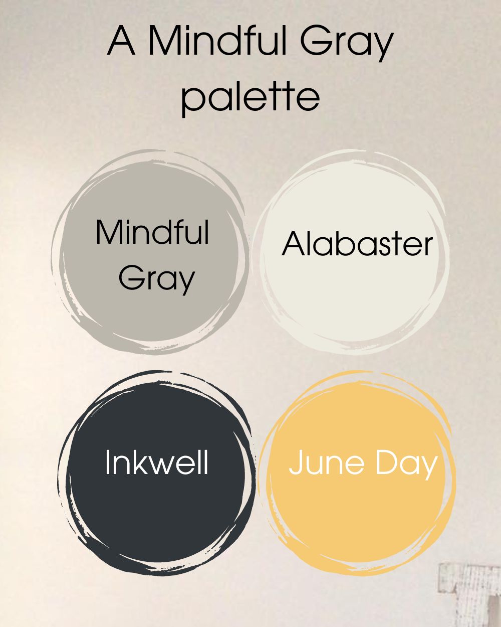
- Central hue: Mindful Gray (SW 7016)
- Pairing shade: Alabaster (SW 7008)
- Daring contrast: Inkwell (SW 6992)
- Bright accent: June Day (SW 6682)
The aim here is to balance cool and warm hues. Mindful Gray and Inkwell provide a cool, refined backdrop, while Alabaster offers a light touch, and June Day brings a warm, inviting pop of color.
Moving on to my Agreeable Gray palette:
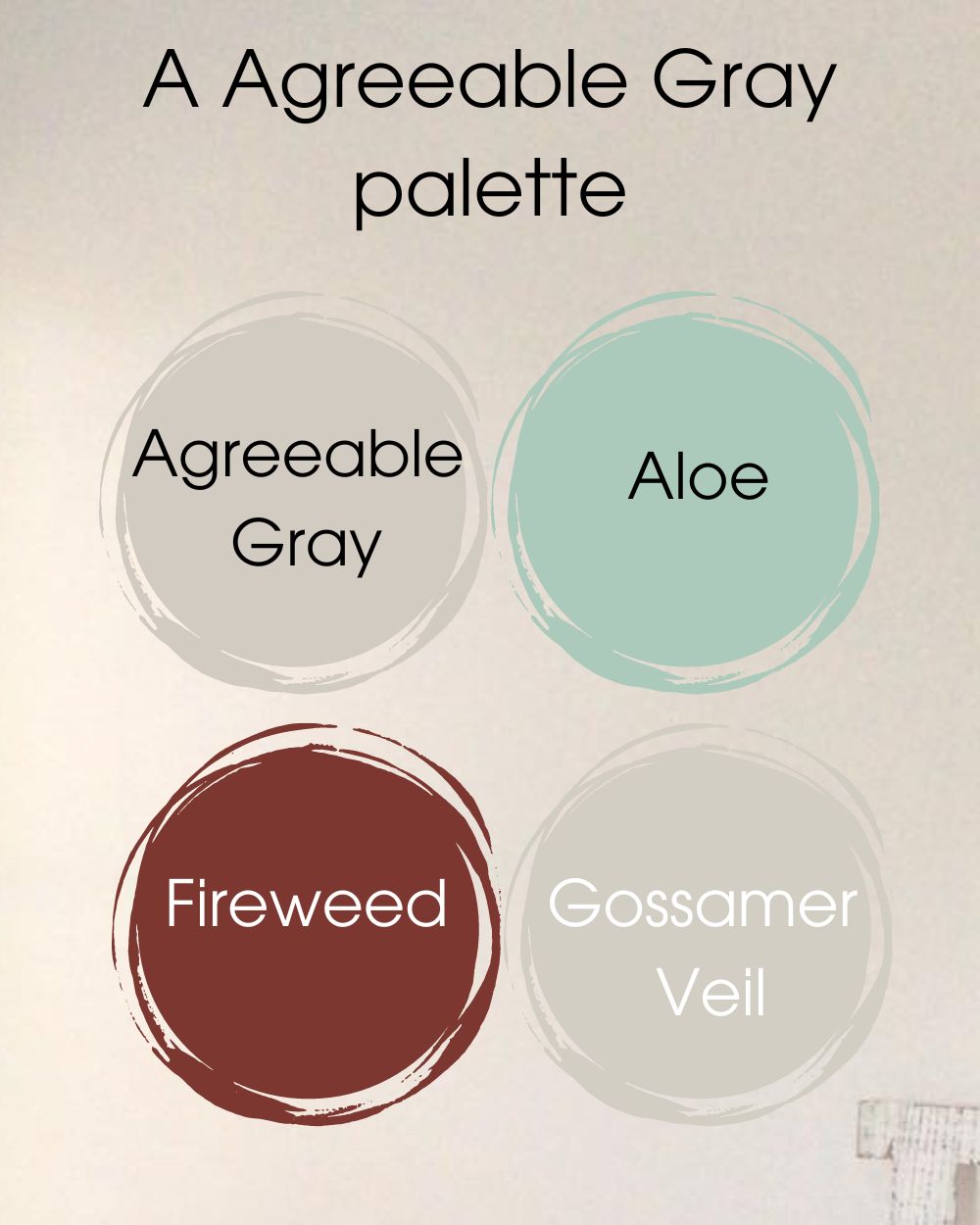
- Primary tone: Agreeable Gray (SW 7029) #D1CBC1
- Complementary color: Aloe (SW 6464) #ACCABC
- Bold contrast: Fireweed (SW 6328) #7B3730
- Subtle accent: Gossamer Veil (SW 9165) #D3CEC4
In this palette, Agreeable Gray and Gossamer Veil establish a flexible, neutral base. Aloe introduces a serene vibe, and Fireweed provides a warm, energetic contrast.
Remember, these are just the color palettes I came up with based on my experiences with these two grays. They’re here to spark your creativity – so feel free to play around, mix, and match until you find your perfect color combination. Now, let’s bring these palettes to life and see how they work in real spaces. Excited? Me too! Let’s dive in!
Mindful Gray Vs Agreeable Gray on Cabinets
Got cabinets to paint? Both Mindful Gray and Agreeable Gray have got your back. Let me show you what I mean.
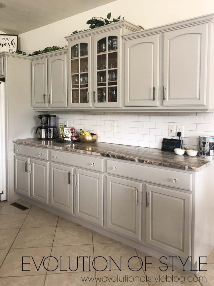
Mindful Gray on Cabinets
Mindful Gray? More like ‘classy gray’. Its sophistication can give any cabinet that much-needed modern edge. It pops brilliantly against lighter countertops or backsplashes, and stainless steel appliances? They’re best buds.
Agreeable Gray on Cabinets
Agreeable Gray is your friendly neighborhood color, welcoming, warm, and versatile. It gets along with pretty much any countertop or backsplash color. For a cozy, family-friendly vibe, you can’t go wrong here.
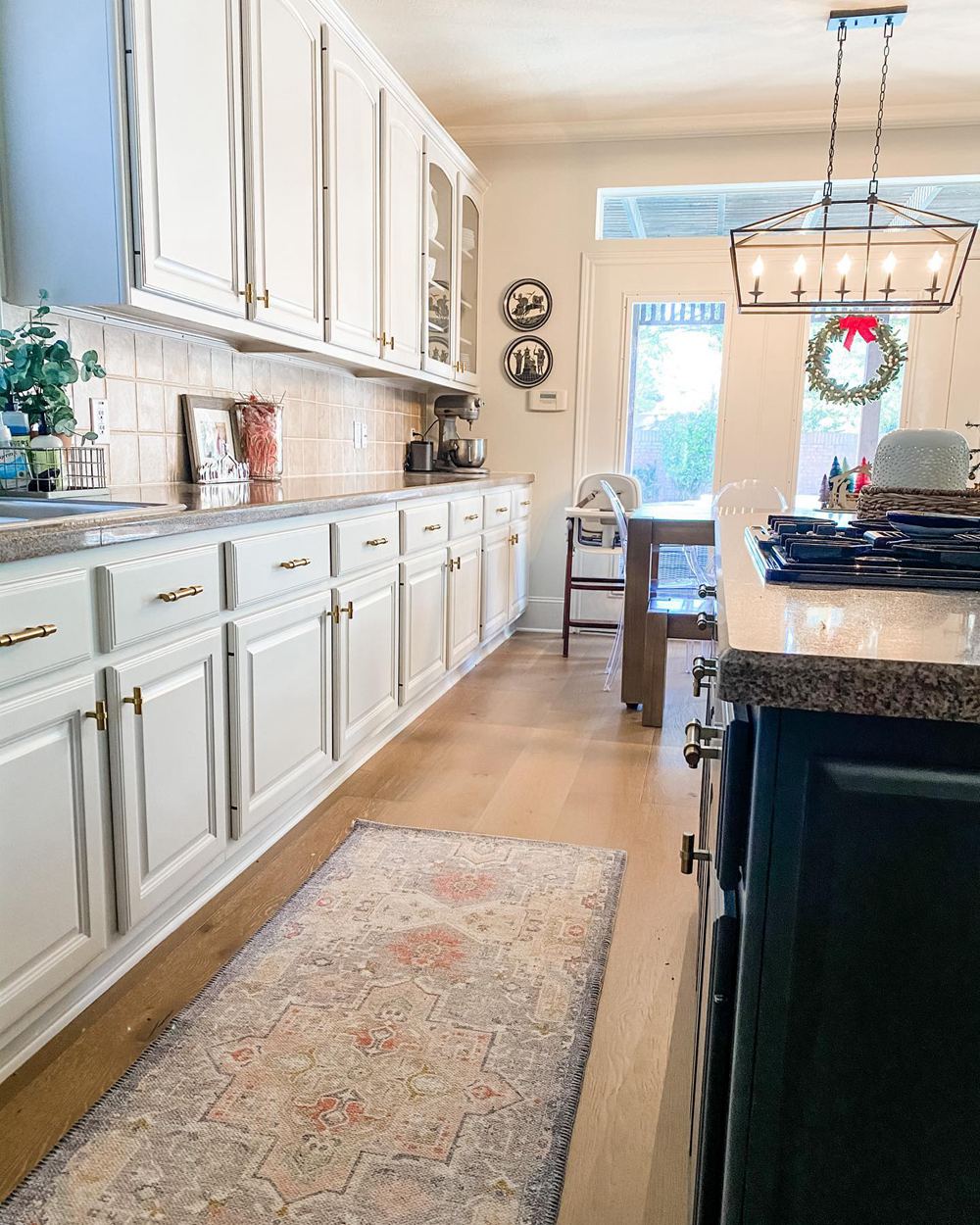
So, for a sleek, modern look, Mindful Gray’s your guy. If cozy and warm is more your jam, Agreeable Gray won’t disappoint. Bottom line: go with what feels right to you and matches your space’s vibe. Ready to see how these colors play out on walls? Let’s jump right in!
Mindful Gray Vs Agreeable Gray on Interior Walls
Now, onto the real deal – how do these colors translate on interior walls?
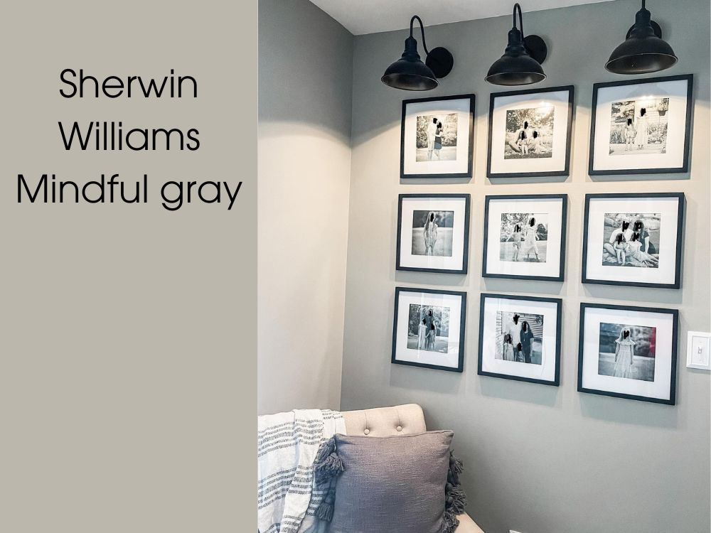
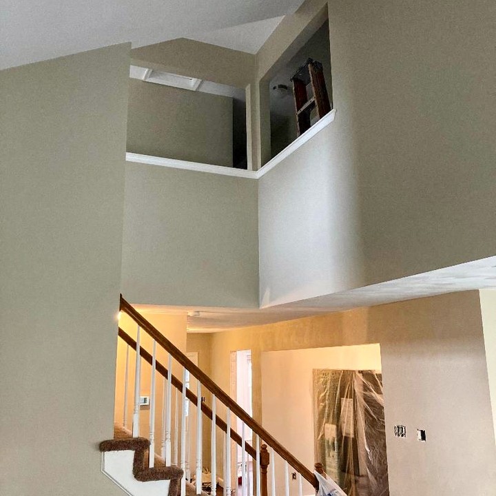
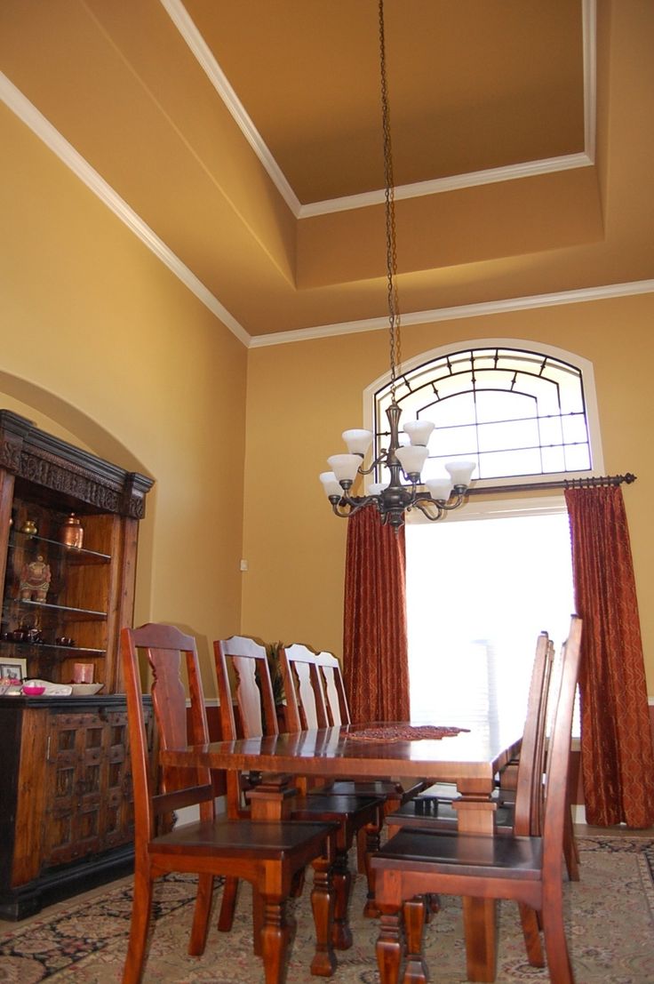
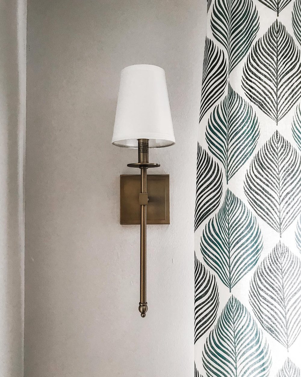
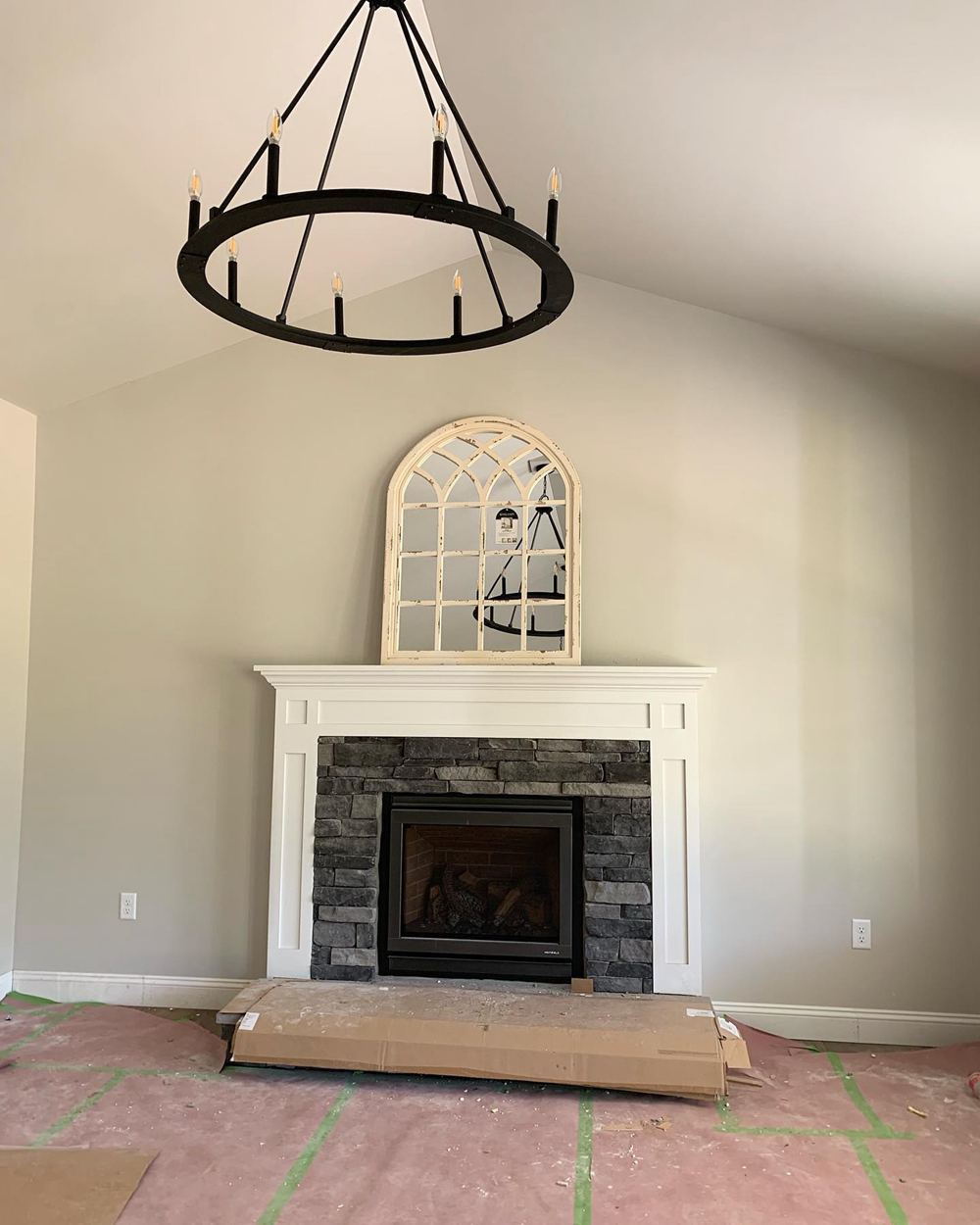
Mindful Gray on Interior Walls
The modern, chic vibe of Mindful Gray can truly shine on walls. It brings depth and an element of sophistication to any room. Here’s a snapshot of how it can transform a space.
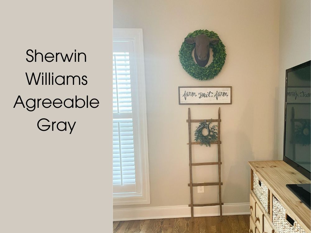
Agreeable Gray on Interior Walls
Agreeable Gray has a knack for making spaces feel instantly welcoming. It’s a versatile hue that can elevate your room to a whole new level of coziness. Take a peek below at an Agreeable Gray-adorned room.
Whether you’re going for Mindful Gray’s modern elegance or Agreeable Gray’s cozy warmth, these two colors have got you covered. Remember, lighting and other elements in your room can affect how these colors look, so always test them out in your space first.
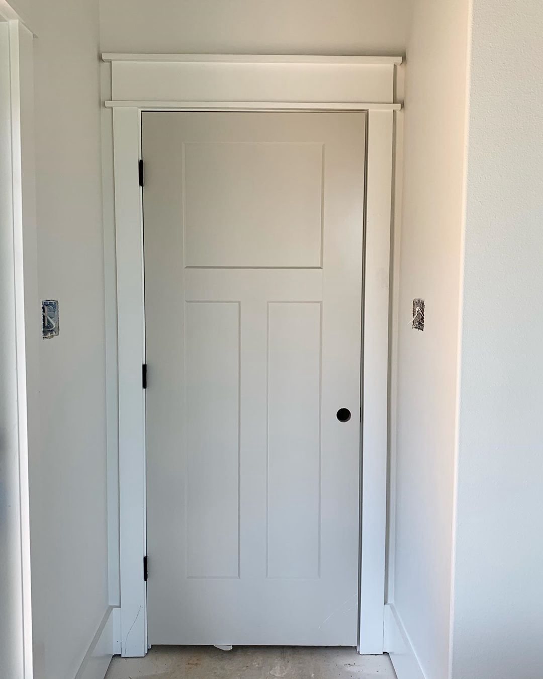
Mindful Gray Vs Agreeable Gray on Doors
Ever considered adding a dash of color to your doors? Here’s how our two grays stack up.
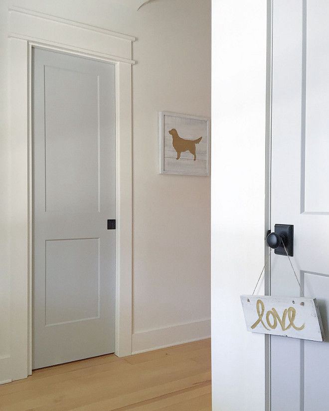
Mindful Gray on Doors
Don’t let your doors be an afterthought. Mindful Gray can bring a contemporary, stylish touch to your doors, making them a focal point rather than a necessity. Have a look at this door painted in Mindful Gray.
Agreeable Gray on Doors
Agreeable Gray on doors can lend an inviting, warm touch to your entryways. This adaptable color suits doors of any style, making your space feel more cohesive. Check out this Agreeable Gray door below.
Whether you want your door to make a statement or seamlessly blend with your interior, both Mindful Gray and Agreeable Gray can do the job perfectly.
Mindful Gray Vs Agreeable Gray for Trim
It’s trim time! Mindful Gray and Agreeable Gray can do wonders when used for trim.
Mindful Gray Trim
Mindful Gray trim shines when paired with lighter tones like Pure White (SW 7005) or cooler hues like Naval (SW 6244). The resulting contrast lends an edgy, modern look to your rooms.
Agreeable Gray Trim
Agreeable Gray trim, on the other hand, works seamlessly with warmer shades like Sea Salt (SW 6204) or a rustic color like Cavern Clay (SW 7701). This combo provides a soft, refined touch that can make your space feel cozy yet stylish.
Mindful Gray Vs Agreeable Gray on Exterior
Taking the paint party outdoors, it’s time to see how Mindful Gray and Agreeable Gray translate on exteriors.
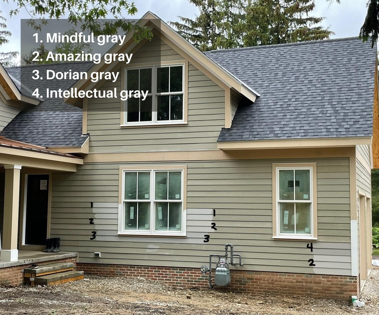
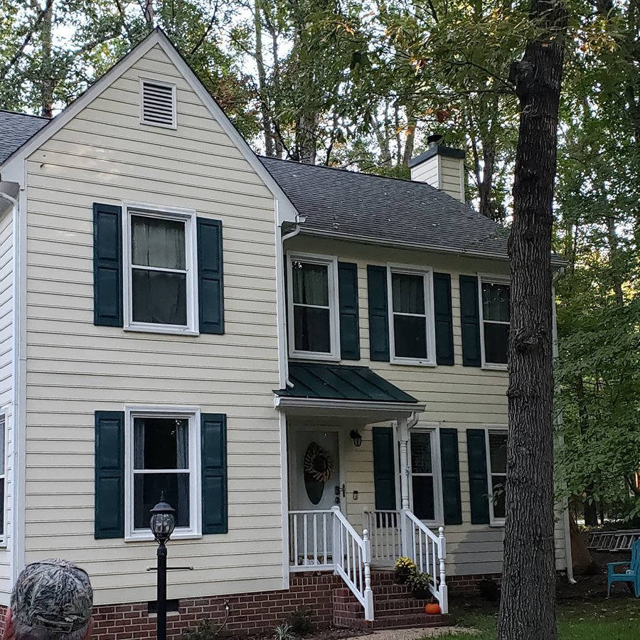
See that picture? That’s a home where the owners are considering four different grays, including Mindful and Agreeable. It’s fascinating to see them side by side, isn’t it? Don’t mind the green cast of the unpainted siding, though. It can throw you off a bit!
Mindful Gray Exterior
Mindful Gray has this cool depth to it, lending a stately, sophisticated feel to a home’s exterior. If you’re going for a somewhat serious, rooted look, Mindful Gray should be on your shortlist.
Agreeable Gray Exterior
Agreeable Gray, on the other hand, has a warm, inviting vibe. It’s this classic, timeless color that can adapt to various home styles pretty nicely.
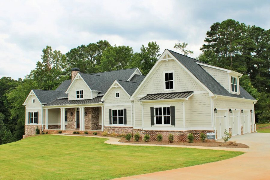
In conclusion, whether you’re drawn towards the grounded sophistication of Mindful Gray or the welcoming warmth of Agreeable Gray, both can certainly beautify your home’s exterior.
Alright, so we’ve seen how these two versatile grays perform in different settings. They both have their charm, don’t they? But now comes the all-important question – when should you choose Mindful Gray, and when is Agreeable Gray the better option? Well, that’s exactly what we’re going to dive into next. Ready? Let’s go!
When to Choose Mindful Gray Vs Agreeable Gray?
Time for a recap to determine when Mindful Gray should be your top pick and when to favor Agreeable Gray.
Opt for Mindful Gray when:
- You’re seeking a deeper, more atmospheric look. With its lower LRV of 48, it creates a cozy ambience.
- Cool undertones are your preference, as it pairs nicely with cooler neutrals and blues.
- You need a robust yet adaptable color for cabinets or doors.
- Your design strategy involves complementary colors such as Pure White or Naval.
Select Agreeable Gray when:
- You’re targeting a brighter, more open appearance. Its higher LRV of 60 amplifies light reflection.
- Warm or neutral undertones appeal to you as it harmonizes with a broad color spectrum.
- You’re intending to paint trims or smaller spaces, as it can enhance their perceived size.
- Your color palette leans towards shades like Sea Salt or Cavern Clay.
Keep in mind, these are just general suggestions drawn from my personal experience. It’s your space, and your preferences should guide your decisions! Examine your room, ponder the lighting, and let your personal taste lead the way.
Conclusion
I’d say Mindful Gray and Agreeable Gray are two unique grays from Sherwin Williams with their distinct personalities. Mindful Gray brings a cool, moody elegance, while Agreeable Gray has a warm, inviting flexibility. No right or wrong choice exists, just the one that aligns with your personal aesthetic.
In this guide, we’ve unpacked their undertones, examined complementary colors, studied their effects in different spaces, and considered the best use cases. The goal was to provide you with a solid foundation for your decision.
But remember, your home is your canvas. There’s no harm in trying different hues until you find the one that feels ‘just right’. After all, the joy lies in the journey as much as in the destination.
Stay bold, stay creative. Here’s to creating spaces that inspire and comfort you. Cheers and happy painting!
 Taupe Vs Beige: What are the Differences?
 Accessible Beige Vs Agreeable Gray: Which is Good?
 Sherwin Williams Shoji White Vs Alabaster: How to Choose
 Sherwin Williams Tricorn Black vs Iron Ore: How to Choose?
 Modern Gray vs Agreeable Gray: How to Choose?
 Benjamin Moore Ballet White vs Swiss Coffee: How to Choose
