
Whenever there is a debate about which of Benjamin Moore’s gray colors is the most versatile, Pale Oak and Edgecomb Gray are two colors you cannot but mention. Their innate ability to match whatever decor you have going is almost unmatched and it can get a bit tasking to settle for one between both.
While both colors share warm similarities as they belong to the greige family, they differ vastly in intensity and other properties.
For one, Pale Oak leans more towards beige than gray, while Edgecomb Gray connects to its gray side rather than beige. Spotting these unique differences is quite easy when you pair them on the same strip.
I understand your plight and that is why this article is focused on helping you understand these colors in detail. Here, I’ll establish the differences and similarities between the many characteristics of these paint colors, and point you in the right direction.
Table of Contents
When to Use Benjamin Moore Pale Oak Vs Edgecomb Gray
Before delving deep, it is only right that I start with the shallow end of things and give you a run down of the right scenarios that call for the use of these individual colors.
Use Pale Oak if:
- Your room gets little to no natural light. It’ll help open up your space because of its great light-reflecting ability that works wonders with limited supply
- You prefer beige to gray
- You desire a color that works in different spaces and matches a wide range of flooring colors and materials
- You crave strong yellow undertones in your space
Use Edgecomb Gray if:
- Your room gets an overwhelming amount of natural light. This color will add much-needed depth.
- You lean towards gray rather than beige.
- Your room faces north or south.
- You desire a mid-toned color that effortlessly combines elements of warmth and coolness.
Soft neutral paints like these two colors are super popular and perform best in any setting, especially when used alongside pure whites and some pastel colors. However, the trick to really making the most of these colors is to pair them with highly pigmented colors.
It’s simple; the darker colors instantly make the neutrals pop, and the neutrals, in turn, add a soft touch to whatever the deep colors got going on.
Benjamin Moore Pale Oak Vs. Edgecomb Gray: A Visual Perspective
The first step to understanding these two colors is to check out how they perform individually and the effect they would give off when paired side by side. With the images below, I’ll assist you in visualizing this concept.
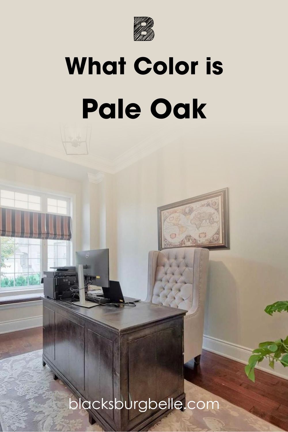
Pale Oak exudes brilliance in this modern living room
Here, Edgecomb Gray features in the chic sitting room
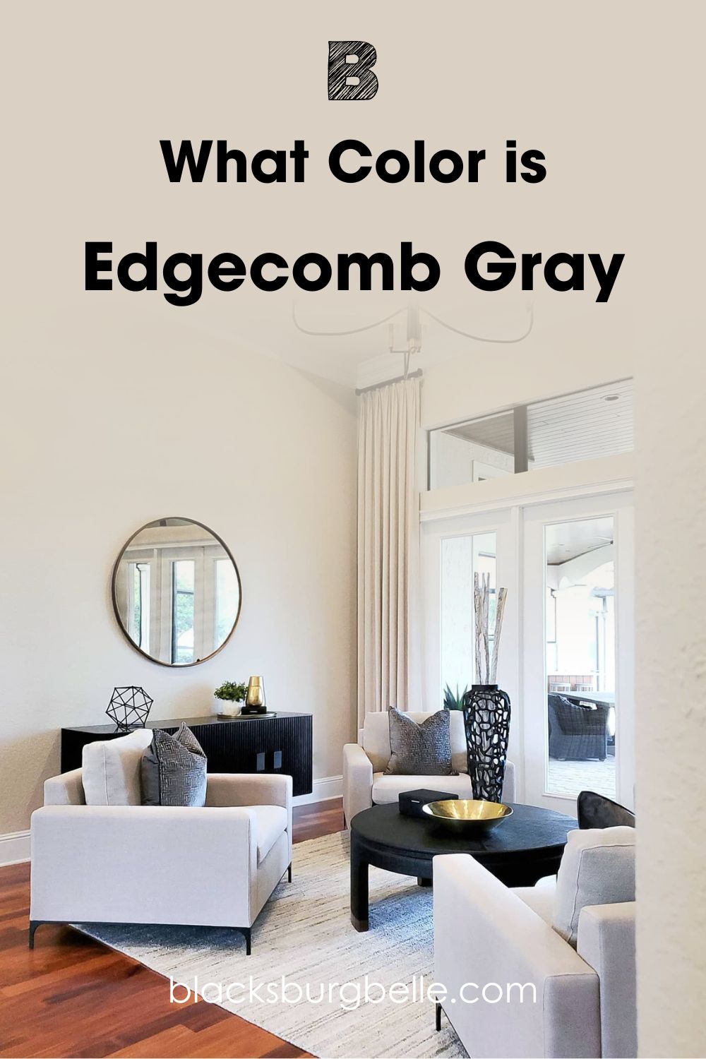
The two images above are the ultimate pointers that I need to intimate you regarding how these colors perform under different lighting conditions. It’s not difficult to notice that Pale Oak looks darker, grayer, and more purple than Edgecomb Gray, which sticks to its beige side.
Hence, it’s no secret that Pale Oak will offer your space a slightly cooler and cozier experience, thanks to the presence of undertones that add more depth. Edgecomb Gray is well suited for an all-neutral setting that will also allow you to add loads of other colors to it.
If any color is more generous between the two, it is surely Edgecomb Gray.
N.B: This may change if EG is paired with an entirely different color.
This astounding difference is more pronounced in rooms with enough natural light. However, Benjamin Moore Pale Oak will appear too light in a room that’s already bright, which positions Edgecomb Gray as better suited for bright spaces. Its deep dark tones will balance the influx of light coming from outside.
Head-to-Head: Pale Oak and Edgecomb Gray- A Quick Comparison
If you’re in a bind and need information on the light-absorbing qualities of these two paint colors, this section is for you.
| Pale Oak | Edgecomb Gray | |
| LRV | 69.89 | 63.88 |
| RGB | 222, 216, 205 | 218, 209, 196 |
| Undertones | Yellow, pink, and purple | Gray, Green undertones |
| Hex Value | #DED8CD | #DAD1C4 |
Emotional Effects: Benjamin Moore Pale Oak Vs Edgecomb Gray
Pale Oak and Edgecomb Gray are greige colors, but we cannot say the same for their effects upon your usage. At the end of the day, how your space makes you feel supersedes whatever aesthetics is on the table, hence the importance of this section.
Generally, neutral tones help balance your mood and evoke more emotional reactions than you’ll ever know. Therefore, you will likely get a similar response to any of these two colors in your space, but one is always more defined than the other.
Pale Oak has a solid reputation, and most of the feedback we’ve gotten is that they make the space feel soft and cozy, think bubblegum (not trying to sound cliché, but hello purple and pink undertones?). It’s fantastic for any weather condition, be it warm or cool.
Edgecomb Gray is all cool, calm, and collected with its pretty green undertones that bring nature closer to your home. The relaxing trait of this color slowly creeps up on you, but who’s complaining? Definitely not us.
If you desire a cozy space and are almost feminine, Pale Oak is your fighter, but if you crave less personality in your home, opt for Edgecomb Gray.
LRV of Benjamin Moore Pale Oak and Edgecomb Gray
Don’t know what LRV means? Well, here you go.
LRV is short for light reflective value, and it’s illustrated through a simple scale that runs from 0-100 (technically, it begins from 3 and runs through 97), with 0 being the darkest and 100 being the lightest.
The idea behind the LRV scale is to help you ultimately determine how much light your color can absorb or reflect, and this also affects the space you decide to use this color.
Pale oak stands tall with an LRV of 69.89. Which is miles ahead of 50; that’s a perfect intensity. What this means is that Pale Oak has an impressive light reflectance capacity and will throw back a good number of light into a space. This LRV becomes more obvious if you pair Pale Oak with darker colors.
Edgecomb Gray trails behind with an LRV of 63.88. It trails behind Pale Oak with almost 7 points. It also reflects light, but not as much as Pale Oak; in fact, should you decide to use them side by side, the high LRV of Pale Oak becomes very obvious.
Pale oak’s LRV is slightly higher than Edgecomb Gray, which means the former is lighter. However, they both tilt towards medium to light-toned neutrals.
Undertones of Benjamin Moore Pale Oak and Edgecomb Gray: How Similar?
Undertones are an integral part of any color. They emerge because of the long process of mixing varieties of colors to arrive at one main hue. Without further ado, let’s get into it.
Benjamin Moore Pale Oak is a greige paint and interestingly contains hints of pink and purple.
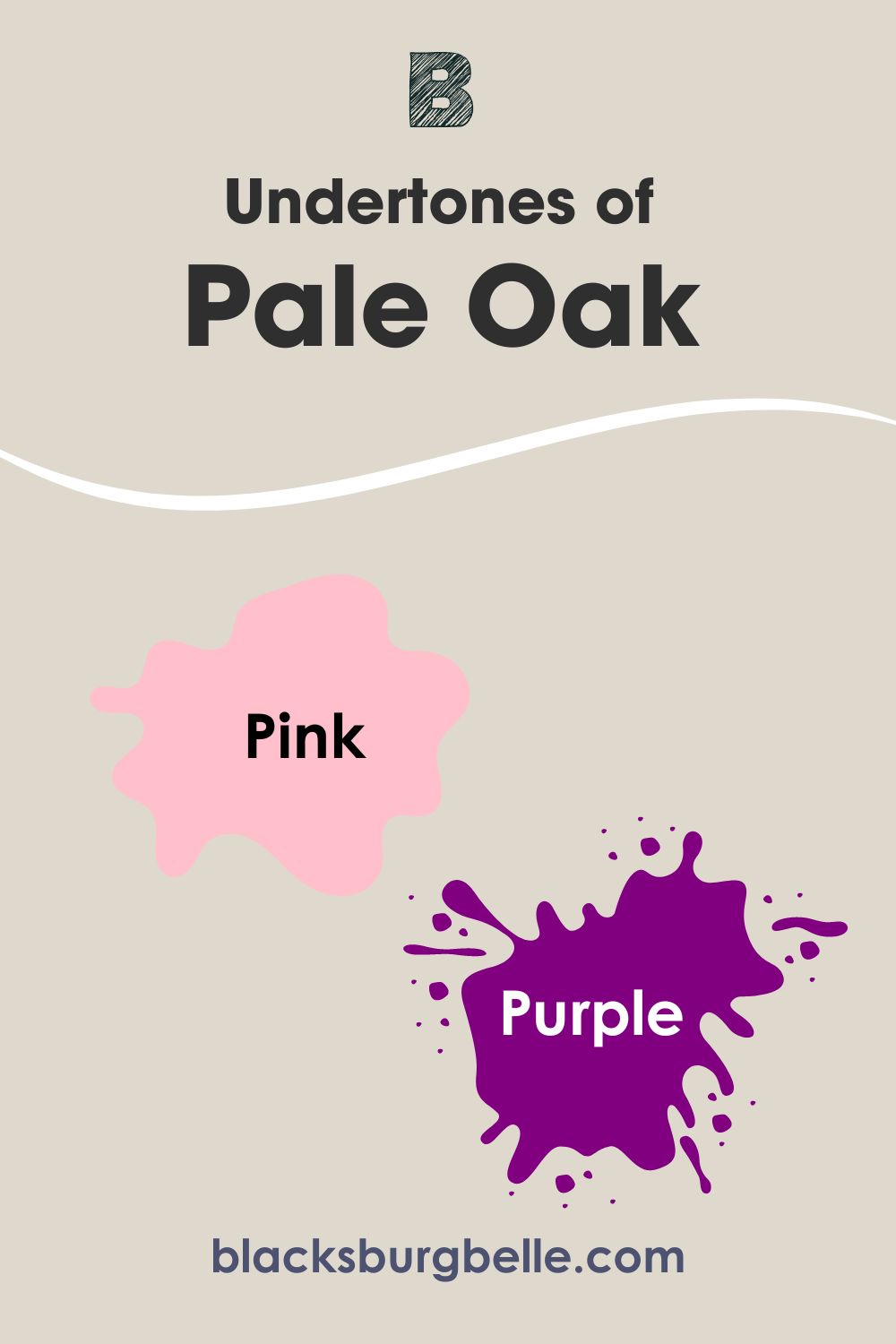
But there’s a twist, and sometimes this color may appear white. However, you must understand that pink and purple are very similar and can contrast sharply with surrounding colors, so you must always remember this to prevent a messy outcome.
In some cases, you’ll also find some yellow undertones when used in a south-facing room with lots of natural light, further adding to the incredible warmth of this color and giving it a creamy off-white appearance. Feel free to describe pale oak as neutral with balanced undertones.
While Edgecomb Gray is a sweet neutral, you can’t ignore the lush green undertones in this color, earning it the “tawny” moniker.
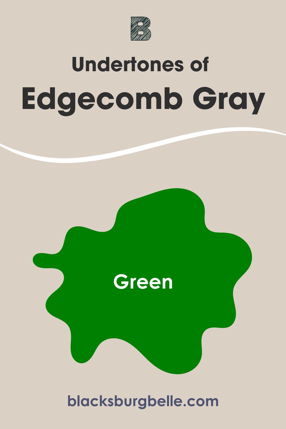
However, the lighting in the room determines just how much of the green you may see. It’ll lean towards a medium-tone gray when used in a dark room. The good part about this one is that the green permits it to work with a wide range of colors, so you don’t need to stress accessorizing.
A Closer Look at Pale Oak Undertone
Here’s a better insight into the world of Pale Oak’s undertones. These images are glaring proof that the hues mentioned above exist, and even better, they’re fully used in these spaces so you can see them.
The image below is a perfect culmination of all the pink and purple properties in Pale Oak. It’s even more fun as you gradually realize that the wall color works with the teal green throw pillow and that pastel colored couch.
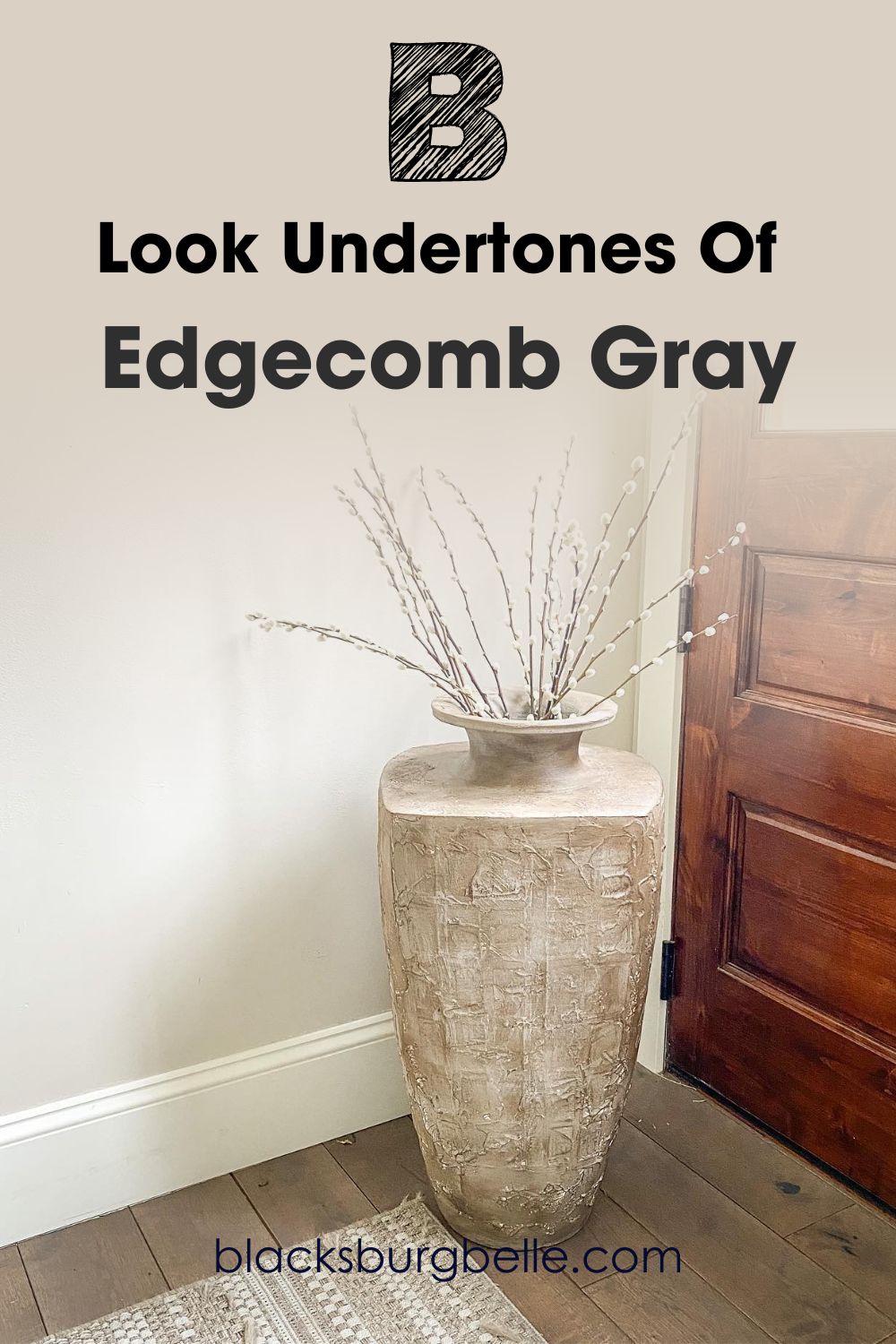
A Closer Look at Edgecomb Gray’s Undertone
Edgecomb Gray shows all its cards in these frames; there’s beige and green! The tone of that vase does something to the beige side of this paint and all eyes can see it. You can almost confuse this for a light shade of lemon. How intriguing!
Whether natural or artificial lighting, you can rest assured that these colors will bring their best foot forward. In our focus images, you can see the effect of lighting on their outcome and overall beauty, which in turn helps with the appearance of their undertones.
However, it’s noteworthy to state the volatility of the green color, especially how it’s selective with other hues; given that it’s an undertone in the situation, I advise you to thread carefully to avoid a clash in your space.
You may use them with white colors or as trims if it gets dicey picking the right complementary colors or color palettes. The combination of white colors provides a stunning outcome that keeps your space fresh and airy all year round.
Pale Oak Vs. Edgecomb Gray: Warm Or Cool Colors?
Edgecomb Gray is a warm paint color, thanks to its gray-green hue that contains a bit of yellow, whose main job is to keep it warm. Pale Oak on its end is a soft, warm gray that has a mix of cool and warm undertones (purple, pink, and yellow).
Between both of these colors, Pale Oak is surely the warmer color. However, these colors are prone to change in temperature as the day goes by, but be rest assured they won’t stray away from their original temperature too much.
Another point to note is that whatever colors you choose to pair with Pale Oak and Edgecomb Gray will alter its final appearance to a considerable extent.
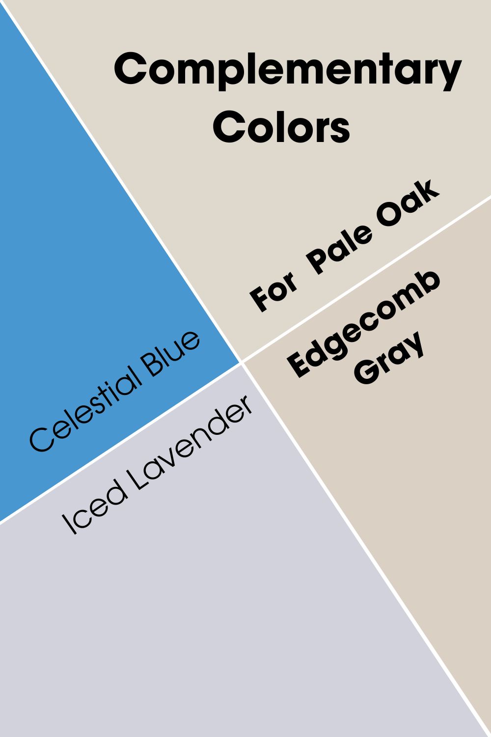
Complementary Colors for Benjamin Moore Pale Oak and Edgecomb Gray
While it’s impossible to deny the flexibility of both colors, I must also remind our dear readers that some paint colors work better with Pale Oak and Edgecomb Gray than others, getting you acquainted with them is a must.
Complementary colors stand directly opposite the central color on the color wheel. You’ll find red opposite green, blue right across from yellow, and blue facing orange. These colors create a beautiful union in real life when used together.
Due to the similarity in shades of Pale Oak and Edgecomb Gray, they have the same complementary colors of soft blue/purple tones. Celestial Blue and Iced Lavender.
Benjamin Moore Pale Oak Vs Edgecomb Gray Color Palette
What would the world be without a burst of fresh and vibrant colors? You guessed it, gloomy. This is the same for paint colors and their effect on our home decor, which brings us to this article’s crucial point.
We’ve examined the myriads of differences between these two colors. Let’s find common ground for both, where they work together to produce a balanced and aesthetically pleasing result.
A monochromatic color palette means you’ll experience almost the same effect from all the colors you opt for in your space, but that’s where the Dejavu ends. What follows is a realization that these colors actually have different intensities and shadows, delivering that balanced space you see.
The contrasting palette is less complicated. It’s basically a result of using opposite colors in one space to invite the twin touch of warmth and coolness. Whatever vibe you choose to work with for the day, your space is there to adhere to.
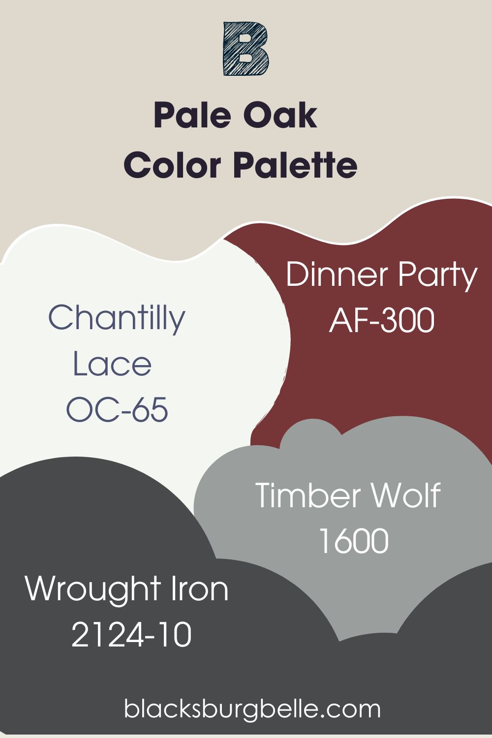
Pale Oak Color Palette
Let’s talk briefly about the colors on Benjamin Moore’s Pale Oak color palette. Whether you aim to create a contrasting or monochromatic vibe, you’re in good hands. Since Pale Oak is a warm color, you may decide to stick to the warm side of the color palette.
But nothing stops you from experimenting with some cool tones for more range and versatility. Here’re some colors to begin that interesting journey.
- Chantilly Lace: Benjamin Moore Chantilly Lace is one of the most popular and classic white hues with soft undertones or none sometimes, also making it a neutral and a versatile color. It has an LRV of 92.2 that’ll shine brightly alongside Pale Oak on any palette.
- Dinner Party: Dinner Party has impressive depth with an LRV of 8.43. So, you can only imagine how ravishing Pale Oak will look beside this deep red color in a space.
- Wrought Iron: Wrought Iron has deep navy blue undertones and can work with Pale Oak as trims on pillars, windows or even doors.
- Timber Wolf: This one has an LRV of 34.74 and hints of blue. It is a cool mid toned gray that mimics the silvery fur of a wolf and would contrast sharply with Pale Oak in the mix.
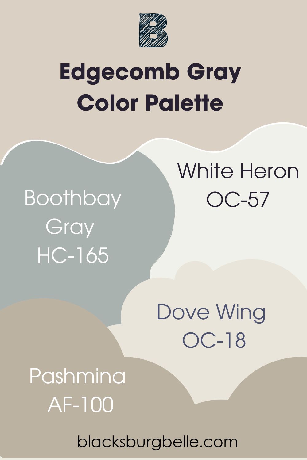
Edgecomb Gray Color Palette
Keep it trendy and timeless with the following colors on your Edgecomb Gray color palette. Whether you decide to go all warm with your color choice or take the bold step with cool colors, be rest assured you’re in safe hands and the world is your oyster
- Boothbay Gray: Boothbay Gray is a fresh gray with blue undertones. When paired with Edgecomb Gray, you get a decent play between the coolness of the former and the warmth of the latter.
- White Heron: White Heron is a crisp white with warm undertones and an LRV of 89. Therefore, you can expect it to work with the gray undertones in Edgecomb Gray.
- Pashmina: This here is a warm neutral that tries its best not to clash with the undertones in any color it’s paired with, as it comes with very subtle ones itself. It has an LRV of 43.62 and would look deeper beside Edgecomb Gray with its LRV of over 60.
- Dove Wing: Dove Wing shines bright with an LRV of 77.52 and silvery undertones. It’s a warm off white with subtle hints of gray and yellow in it.
Pale Oak vs. Edgecomb Gray on Cabinets
It may get a bit confusing to settle for the perfect cabinet color between Pale Oak and Edgecomb Gray, but not to worry, I’ve made things easy for you with the help of images containing the respective hues.
Pale Oak and Edgecomb Gray are pretty colors that fit into traditional, country, modern, and transitional settings, and their undertones are out in full glare.
BM Pale Oak on Cabinets
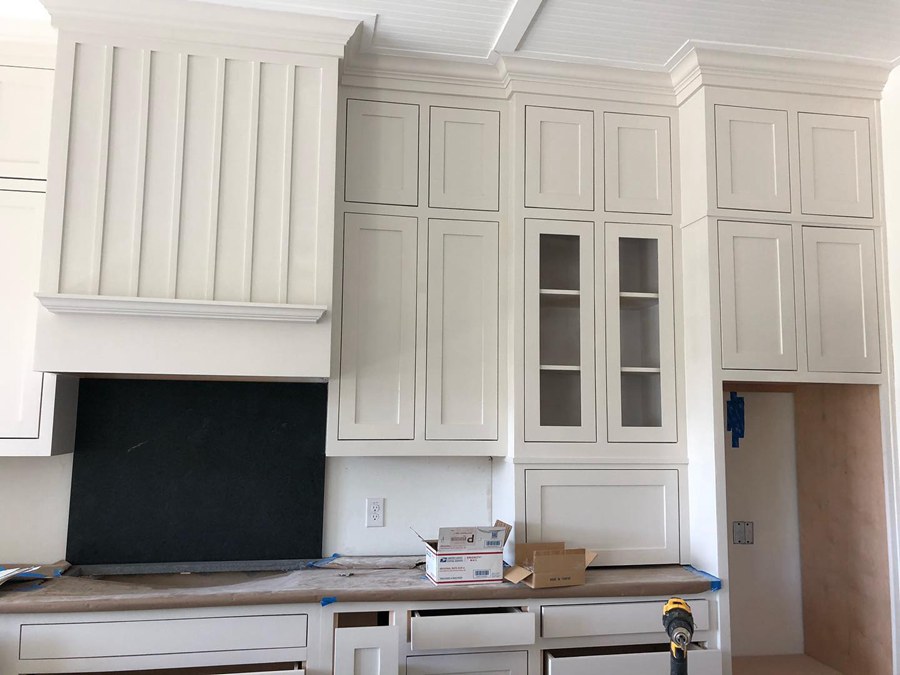
Pale Oak holds the fort with astounding hints of pink and purple undertones that are not exactly hard to notice.
BM Edgecomb Gray on Cabinets
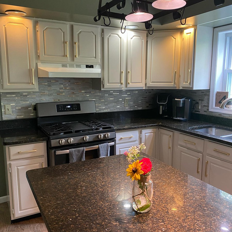
Blame the green peeks on this Edgecomb Gray cabinet on the lighting situation in the kitchen, and you’re not far from the truth; the important thing, however, is that you will absolutely adore the performance of this hue.
If you have white walls and crave extra drama with a bright cabinet and depth, opt for Benjamin Moore Edgecomb Gray.
Pale Oak vs. Edgecomb Gray on Walls
Pale Oak and Edgecomb Gray are great choices for your walls. Not only will they work with other colors as they’re neutrals, they’ll also do the work of opening up a small space or closing up a large space. Get inspired for your next wall paint job with these lovely images.
BM Pale Oak on Walls
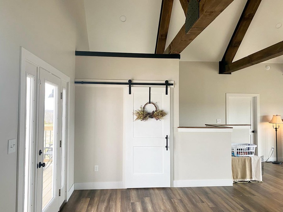
Our lovely Pale Oak flashes hints of violet-pink undertones in this space. The play between the bright white trims and ceiling paints sets this space on the path of monochromatic goodness.
BM Edgecomb Gray on Walls
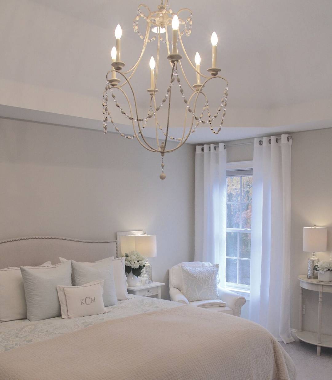
The second image reads grayer than usual, thanks to the cool blue northern light that leaves an icy cast on the walls of this bedroom.
Pale Oak Vs. Edgecomb Gray on Exterior
Pale Oak and Edgecomb Gray are excellent outdoor choices- thanks to their neutral hues that can work as trims or entire wall colors with whites as trims, you’ll still get a remarkable outcome. Get familiar with working on both colors on home exteriors.
BM Pale Oak on Exterior Walls
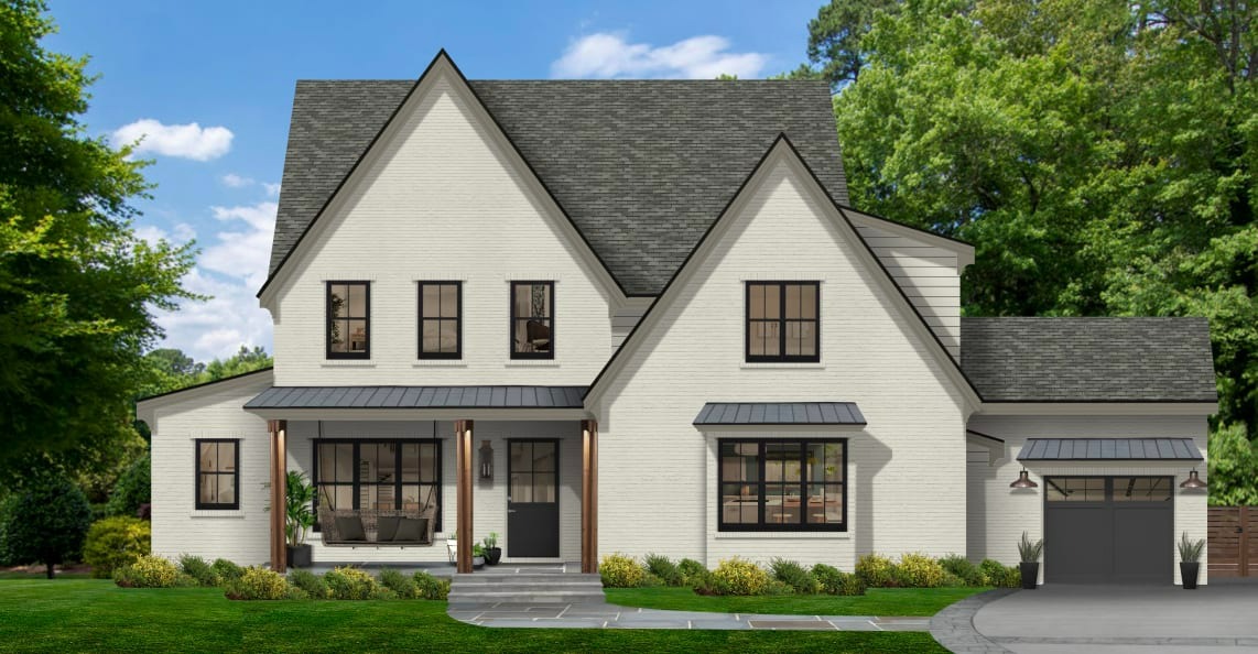
Pale Oak is a gem on the exterior of this house, as you can see the purple and pink undertones, both making a grand appearance according to the sun’s intensity. The gray roof further appeals to the cool side of this color to create a perfect marriage with the black trims.
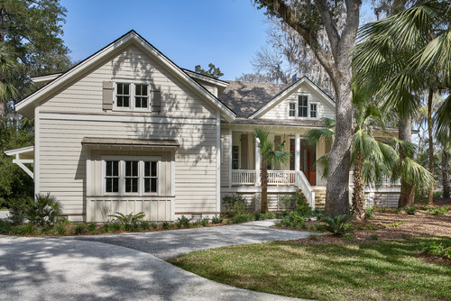
BM Edgecomb Gray on Exterior Walls
Edgecomb Gray looks adorable on exterior walls with the correct dose of natural light and surrounding trims. Colors used outdoors appear lighter and washed out, hence the reason why you see enough beige in the second image.
Lighting Conditions
Both Pale Oak and Edgecomb Gray are subject to alteration by elements of lighting surrounding them. Therefore in some situations, there may be jarring differences in how the colors you think you know so well will turn out.
For warm colors like Pale Oak and Edgecomb Gray, you’ll see their best performance in a room with warm lighting, making it less icy. When used in a room with cool lighting, the cool undertones from both colors will make a grand entrance and may defeat the entire purpose of your decor.
It’s important to round up by stating the influence of artificial and natural lighting, accessories, plantations, and many other elements. You must consider all of these to really make the most out of all your colors.
Conclusion
I hope that this article has eased the process of making the tough decision between Pale Oak and Edgecomb Gray. Both colors are incredible and would honestly look good anywhere you use them in your home.
Here’re more tips to guide you:
- Choose a finish (sheen, gloss, satin, or matte)
- Consider existing decor when settling for a color
- How large or small is your space?
- What is the current lighting condition?
- Is this decision short or long-term?
However, don’t forget to sample before fully committing with SAMPLIZE paint strips, and do well to leave your comments or suggestions about these colors in the box below.
 Sherwin Williams Alabaster Vs Pure White: How to Choose!
 Mindful Gray Vs Repose Gray: How to Choose?
 Agreeable Gray Vs Repose Gray: What’s The Difference?
 Revere Pewter vs Agreeable Gray: What’s The Difference?
 Benjamin Moore Chantilly Lace vs Simply White: Which Is Better?
 Sherwin Williams Iron Ore vs Peppercorn: Is There a Difference?
