
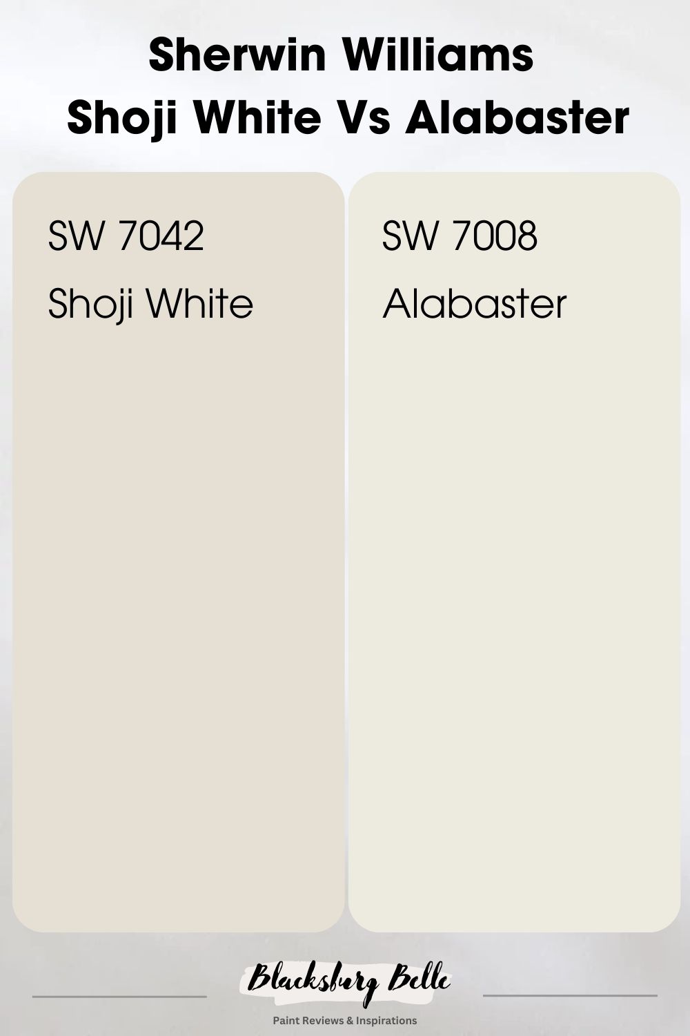
Over the years the Shoji White and Alabaster paint colors from Sherwin Williams have not only been mistaken for one another, they have also constantly been compared, prompting us to lay the unending argument to rest once and for all.
What are the differences between these two statement colors? Shoji White is a warm white with a beige feel to it, while Alabaster is a creamy warm off-white paint color.
These two colors have appeared in Sherwin Williams’s top 50 paint colors countless times. So, join us as we examine properties of these two dynamic colors that make them worth gracing your space.
You’ll get to find out how they work in a space, and, most importantly, we’ll guide you on how to use them to achieve that mood you desire.
Table of Contents
When to Choose Shoji White Vs Alabaster?
It is one thing to know that shoji white and alabaster paint colors are warm whites and have different undertones. But it is a completely different thing to know when to use each one. So, when is the best place or time to use each? Let’s give you a brief breakdown.
Choose Shoji White (SW 7042) if:
- You prefer a neutral white with subtle gray undertones.
- Your space has a significant amount of natural light, which will bring out the light, bright qualities of Shoji White.
- You desire a modern, minimalist aesthetic.
- You’re pairing with cool or warm hues, given Shoji White’s versatility.
Choose Alabaster (SW 7008) if:
- You’re looking for a warmer, creamy white that’s more inviting.
- Your room has less natural light, and you want a warm and welcoming hue that won’t come off as stark.
- You’re after a traditional, cozy, or rustic aesthetic.
- You want to pair with warm neutrals or earth tones.
Now, you may be wondering how we know when it is best to use these paint colors. You are not alone if you have difficulty differentiating between them, but our analysis will go a long way to show you the unique aspects of these colors. Without further ado, let’s get to it.
A Visual Comparison of Shoji White Vs. Alabaster
Here’s a quick visual representation of these two colors to stimulate your artistic appetite.
Before we delve any deeper, we must reiterate that the main difference between Shoji White and Alabaster is that while the latter is a true white paint color, Shoji White is an off-white color. The tricky part, however, is that both colors are creamy and neutral. Let’s explain.
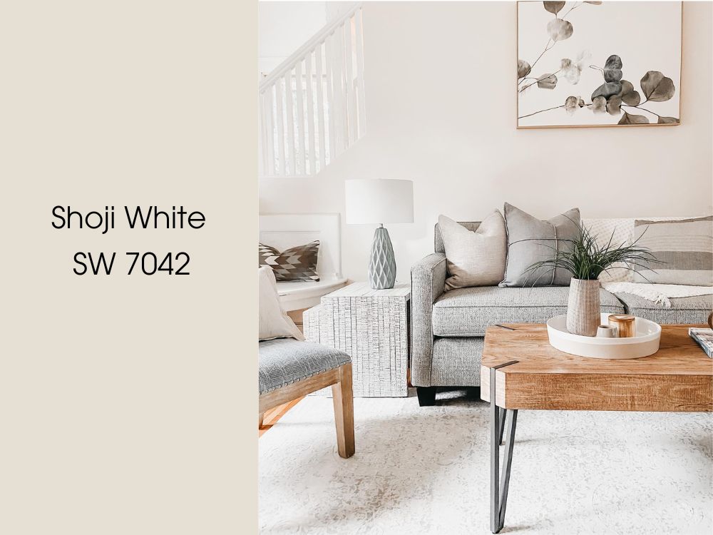
Shoji White is a great option for people who desire white paint colors with the ability to deliver warmth. A feature made possible because this color can withstand touches from the sun without looking too washed out.
So, if you are into that classic farmhouse look, pair this color with black accents and wooden textures.
Moving further, Shoji White is also right in the center of being categorized as an off white or a clean white with a lot of depth to it.
The greige characteristics of this paint color makes everything so technical. Not to mention that Shoji White is also technically darker than Alabaster.
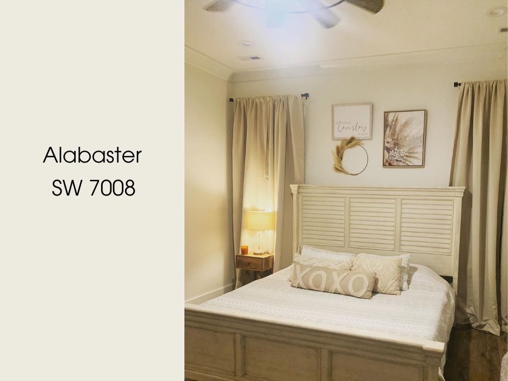
Alabaster was Sherwin Williams Color of the Year in 2016 and till this day, it remains relevant. Alabaster is a pure, simple color that’s kind enough to fall back in a space and let the décor be the belle of the ball.
Quick Comparison Guide: Shoji White Vs. Alabaster
Alright, let’s dive deeper into Shoji White Vs Alabaster. I’ve whipped up a quick comparison chart for you below that breaks down their key features. Check it out!
| Shoji White | Alabaster | |
| LRV | 74 | 82 |
| RGB | 230/223/211 | 237/234/224 |
| Undertones | Greige, Pink, Peach, Green | Gray, Beige, Yellow. |
| Hex Value | #E6DFD3 | #EDEAE0 |
Emotional Effects: Shoji White vs. Alabaster
Let’s shift gears and dive into the emotional world of Shoji White and Alabaster. Remember, paint colors do more than just compliment your décor; they can influence the vibe and mood of your room.
Shoji White, with its subtle warmth and soft undertones, brings a gentle, comforting aura into any space. It’s the kind of color that feels like a soft whisper, creating a calm and relaxing atmosphere where you’ll feel instantly at ease.
On the other hand, Alabaster, known for its slightly warmer and richer tones, cultivates a cozy and inviting ambiance. It’s the kind of color that wraps you in a warm hug, making spaces feel snug and serene, encouraging relaxation and tranquility.
So, whether you’re in the mood for a whisper of calm with Shoji White or a cozy embrace with Alabaster, you’re sure to find a color that suits your emotional landscape.
LRV of Shoji White vs. Alabaster: Which Reflects More Light?
The LRV scale goes from 0-100, but, in the paint world we stick to 3-97 because no paint is truly black or white. Basically, this scale lets you know just how light/dark your paint of choice is, as 0 represents the darkest and 100 is the lightest.
Shoji White has an LRV of 74 while Alabaster comes strong with an LRV of 82.
This implies that Shoji White will automatically reflect less light than Alabaster when used in space. In the real sense, Alabaster is a white and bright color with creamy hints, while Shoji White is simply an off-white color.
TIP: Use colors with high LRV for small spaces to open up your space to lighter and create an airy illusion. Avoid using it in a small space if your paint color has a low LRV. It’ll only make matters worse by making the walls cave in. Instead, use it for a bigger room for balance.
Shoji White vs. Alabaster Undertones: Are They the Same?
Those background colors you see, AKA undertones, help depict the major difference between Shoji White and Alabaster.
Unlike the heavy pink/peach and greige tones in Shoji White, you’ll find that Alabaster possesses creamy and beige undertones.
A Closer Look at Shoji White Undertones
Sherwin Williams Shoji White is quite the character with interesting undertones of gray and beige (AKA Greige). But like every color out there, lighting and other accessories in a space influence the outcome, and it can show hints of peach and pink like in the images below.
It’s likely you also find shades of yellow in this color, thanks to the beige side, but not to worry, this shouldn’t exactly get in the way of anything; if anything, the yellow just keeps it on the warm end of the scale.
Alabaster Undertones
Alabaster has popular soft beige and gray undertones that are not too cool or warm; instead, they’ve mastered the art of balance, making them a top choice among homeowners.
Don’t forget that the display of your paint’s undertone rests solely on your space’s lighting situation. Luckily, our focus images have individually depicted the intensity of these undertones (beige in the first and gray in the second).
Alabaster vs. Shoji White: Warm or Cool Color
Before proceeding any further, we’d like to establish that both paint colors are warm as they come from the yellow family, thanks to their undertones. This is quite straightforward, considering how complex it gets.
The warmth of Shoji White stems from the beige in it, which won’t allow it to look too cold or gray in a north and east-facing room. Alabaster is perfect for those looking for a paint color that won’t look too sharp under bright light and works with warm accessories.
Shoji White Vs. Alabaster Complementary Colors
Understanding the complementary colors of your chosen paint can help create a balanced and harmonious color scheme in your space. Let’s explore the complementary colors for Shoji White and Alabaster.
Unfortunately, neither Shoji White nor Alabaster has a corresponding paint for their complementary colors on the color wheel, but the good news is that I have found a similar paint color.
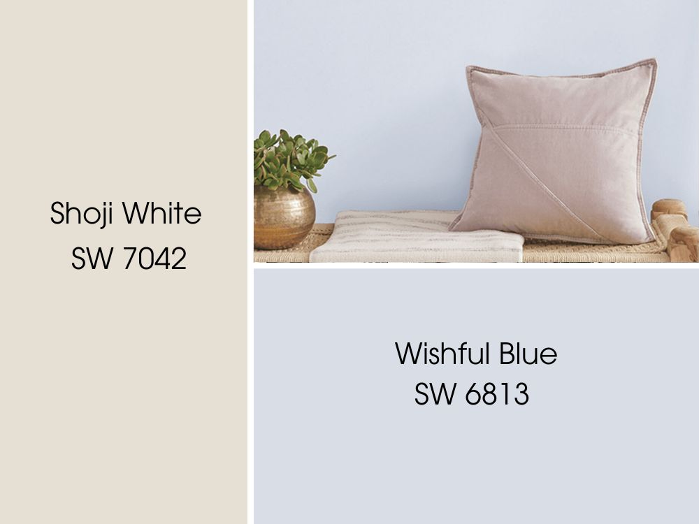
Shoji White Complementary Colors: Wishful Blue SW 6813
This shade from Sherwin Williams is like a breath of fresh air. It’s a medium-light hue of cyan-blue that evokes the clear sky on a sunny day. With an LRV of 62, it’s bright enough to open up a space, yet carries enough depth to make a statement. It can be a fantastic choice for bedrooms, bathrooms, or any area where you’d like to introduce a calming, uplifting vibe.
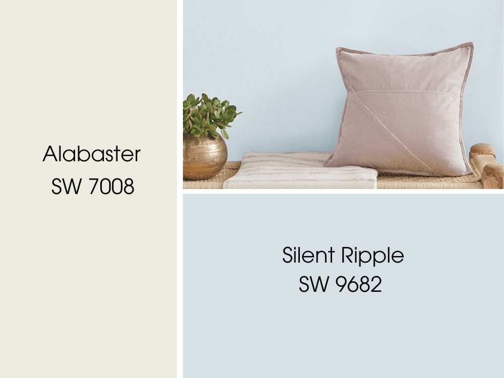
Alabaster Complementary Colors: Silent Ripple SW 9682
Silent Ripple SW 9682. This color is a sophisticated, medium dark green with a stunning depth. Its LRV stands at 18, indicating a moodier tone that can add richness and drama to a space.
Shoji White Vs Alabaster Color Palette
Painting with whites can be tricky as they often carry subtle undertones that can dramatically influence the ambiance of a space. Today, I’ll share with you my personal color palette picks for two popular Sherwin-Williams whites: Shoji White and Alabaster.
Shoji White Color Palette
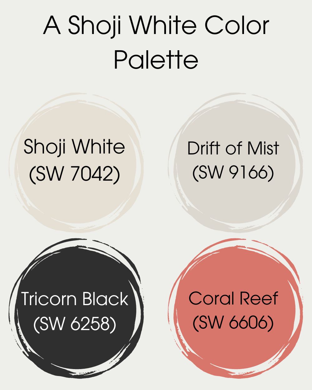
Let’s start with the Shoji White palette:
- Main attraction: Shoji White (SW 7042)
- Complementary backdrop: Drift of Mist (SW 9166)
- Striking contrast: Tricorn Black (SW 6258)
- Splash of color: Coral Reef (SW 6606)
Shoji White, with its warm greige undertones, pairs beautifully with the softer, cool Drift of Mist. To create depth and drama, I’ve added Tricorn Black, and Coral Reef serves as a vibrant accent that brings a touch of lively color.
Alabaster Color Palette
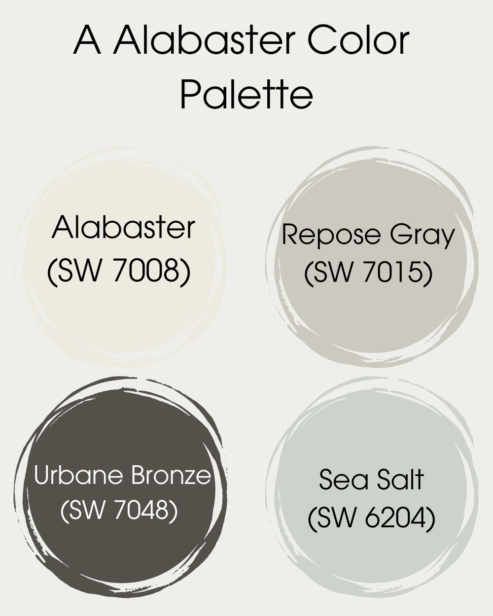
- Star of the show: Alabaster (SW 7008)
- Complementary shade: Repose Gray (SW 7015)
- Bold contrast: Urbane Bronze (SW 7048)
- Soft accent: Sea Salt (SW 6204)
Alabaster, a warmer, creamy white, beautifully matches the gray undertones of Repose Gray. For a striking contrast, I’ve introduced Urbane Bronze, while Sea Salt adds a tranquil, cool accent to the palette.
Now, let’s bring these palettes to life and see how they work in real spaces. Excited? Me too! Let’s dive in!
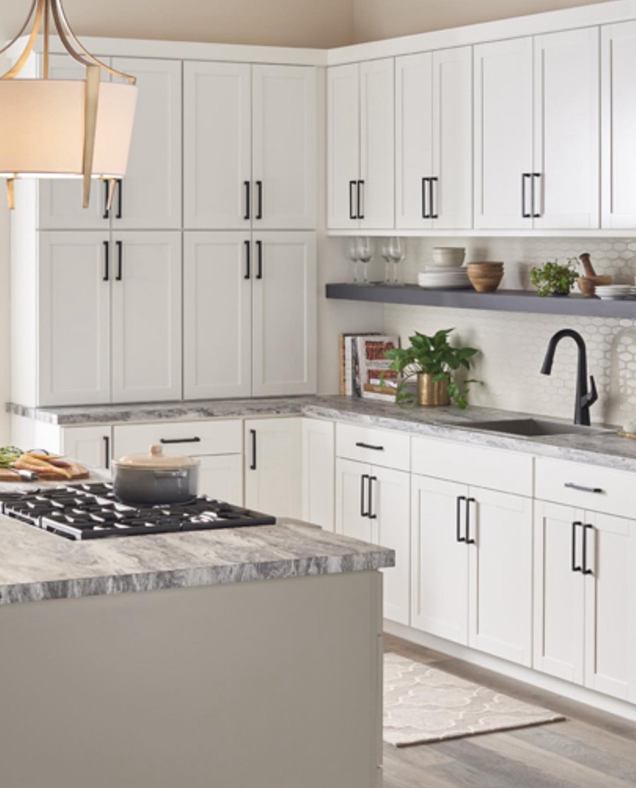
Shoji White Vs. Alabaster on Cabinets
Shoji White and Alabaster are great colors for your kitchen cabinet, and we’ll show you just how with these pictures.
Shoji White on Cabinets
The first image is a shoji white cabinetry, as seen on Instagram, and the warmth is undeniable. Notice how the touch of yellow creates a fresh ambiance in that kitchen.
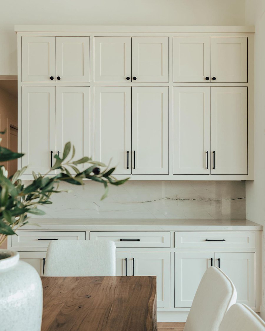
Alabaster on Cabinets
The bright white hue on the second set of cabinets is entirely different from Shoji White’s performance in the first image, giving more validity to the difference we alighted earlier.
Throw black and wooden details into your cabinetry, like the handles and countertops, and watch how your space experiences an upgrade.
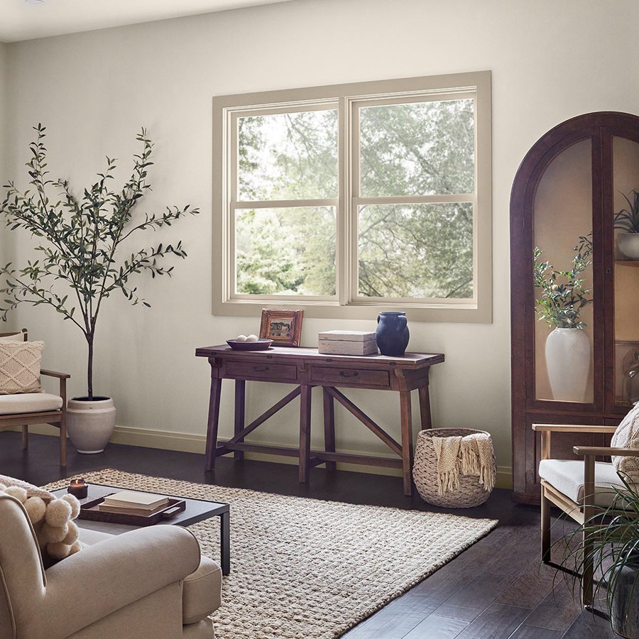
Shoji White vs. Alabaster on Wall
It’s almost difficult to tell Shoji White and Alabaster apart on walls- we mean this in a good and bad way, but let’s proceed. Your inability to immediately spot the difference is because they both appear neutral on the wall and are largely affected by surrounding factors.
The more you look, the less you see with these two colors, but we’ll get there. One of the ways to help you out of the misery of spotting them in any space is that Alabaster looks brighter than Shoji White, that’s just all yellowly and warm.
Shoji White on Wall
Alabaster on Wall
Personally, I see green undertones in the second Alabaster image, or maybe it’s due to the faux plant appealing to that side. But that’s the beauty of colors and whites in particular! They mirror every little detail.
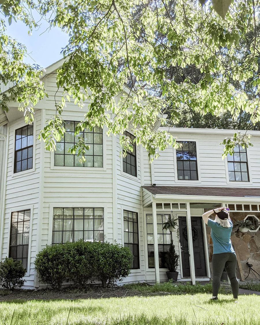
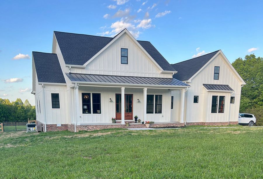
Shoji White vs. Alabaster For Exteriors
Outdoors are where the fun’s at and unarguably the area that gets the most light, hence where we get to experience the most difference in these colors. Remember that light situations may vary in the images we’ve opted to use, but it’s all part of the learning process.
Shoji White pulled a shocking move in this image as it leans towards peach in the first image, making Alabaster appear very bright and creamier. It’s very intriguing because most colors usually appear washed out when used outside, but these colors have a mind of their own.
Shoji White for Exteriors
Alabaster for Exteriors
Both of these colors are excellent options for homeowners who love a traditional or softer white look for their exterior. They don’t do too much.
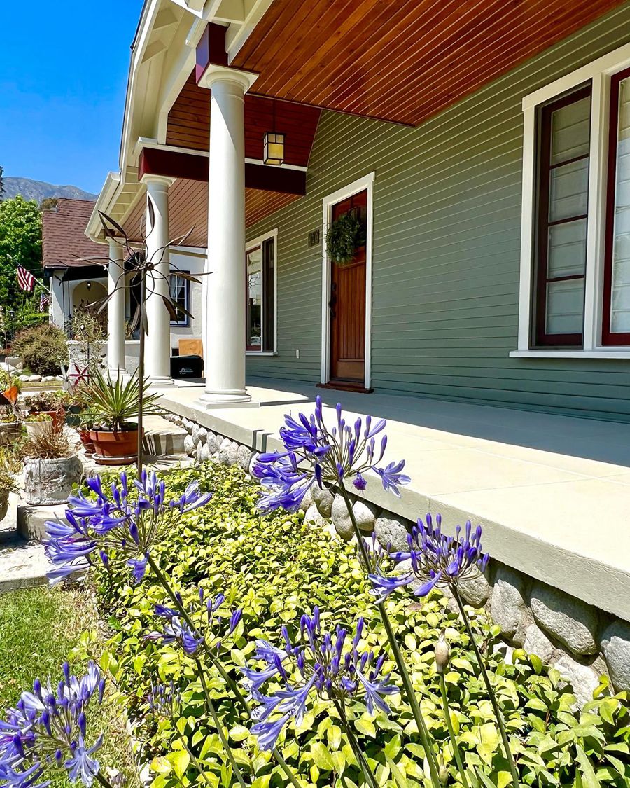
Shoji White vs. Alabaster For Trims
We’ll analyze the pictures below for a better understanding on how both colors work on trims.
There’s another interesting side to these two colors: they work as trims for much brighter, darker, and stronger colors. Both colors will always appear to the occasion Whether indoors or outdoors. Trims don’t always have to be pure white, after all!
Shoji White for Trims
Alabaster for Trims
Use Shoji White and Alabaster on your windows, pillars, and railings as done in the images above. The creaminess in Shoji White makes it a perfect fit for the dark brown exterior in the first image.
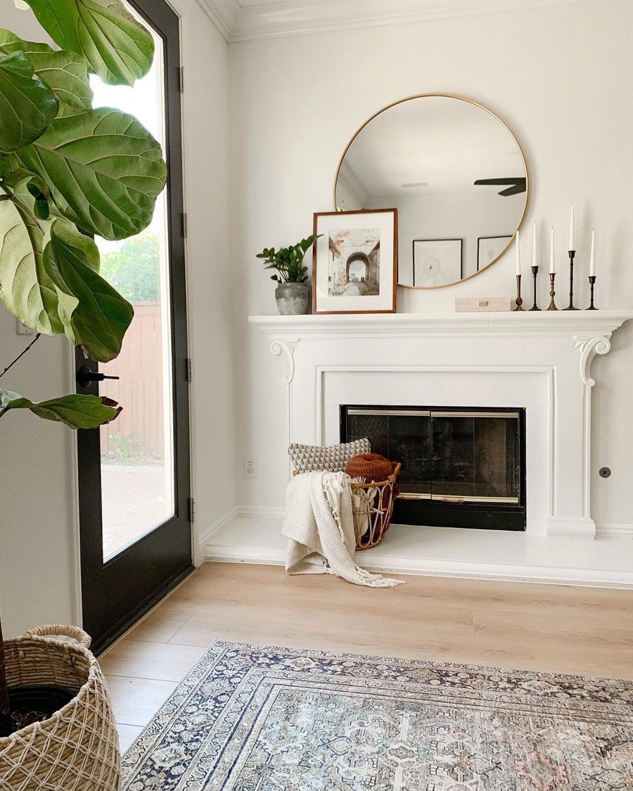
Shoji White vs. Alabaster on Woodwork
Let’s see how well Shoji White and Alabaster perform on woodwork
Shoji White on Woodwork
Alabaster on Woodwork
Another outstanding feature of Shoji White and Alabaster is how well they look on wood and their ability to introduce sophistication into any material, be it wood or metal. In the first image, Shoji White cooks up a storm as it gets exposed to a lot of sunlight.
Alabaster proves it can hold its own even in the darkest spaces, connecting it to its cool gray roots.
Conclusion
Now that you understand the intricacies and details of Shoji White and Alabaster, you must also take another necessary measure to sample them through the ever efficient and reliable SAMPLIZE strips.
Simply place them on a clean white wall with no surrounding undertones to get a true reaction and feedback in real time. Leave them on for a few days to fully get the result of this simple hypothesis. We can’t wait to receive feedback and suggestions from you!
 Sherwin Williams Worldly Gray Vs Agreeable Gray
 Sherwin Williams Alabaster Vs Pure White: How to Choose!
 Forest Green Vs Hunter Green: What are the Differences?
 Benjamin Moore Alabaster vs Sherwin Williams Alabaster: What’s the Difference?
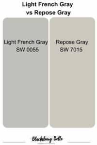 Light French Gray vs Repose Gray: How to Choose?
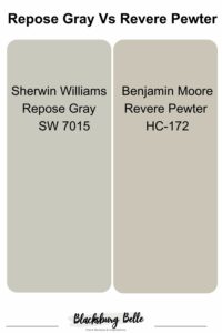 Repose Gray Vs Revere Pewter: How to Choose?
