
Having difficulty figuring out the difference between Sherwin Williams’ Tricorn Black vs. Iron Ore? We have all been there since not many of us can tell the difference between black and deep charcoal paint colors.
Used in different places, you may find it difficult to differentiate between the two dark and saturated colors. However, they could not be more different. Tricorn Black is a black paint color, as the name suggests. But Iron Ore is a deep charcoal color that only mimics black.
In simple terms, Tricorn Black is deeper, more saturated, and closer to the black end of the light spectrum. On the other hand, Iron Ore is lighter and softer, a little further away from the dark end, although the difference is not much. Let’s dive deeper to learn more about these colors to help you decide which is the better option for your specific needs.
Table of Contents
When to Choose Tricorn Black or Iron Ore
There are many aspects of each paint color to digest, but it should not be a difficult task. However, if you are still unsure of which black paint color to use, check the following guidelines:
Use Tricorn Black if:
- You want a true black
- You are not a fan of blacks with various hues
- You do not mind depth and saturation in your decor
Use Iron Ore if:
- You do not mind seeing different hues from your black paint color
- You want a soft black
- You want to play with colors in your decor
The results you get with each color will differ, especially when there are various elements to consider. In other words, Tricron Black looks and performs differently from Iron Ore. Keep this in mind when deciding between Tricorn Black and Iron Ore.
Now, you may be wondering how we know when it is best to use these paint colors. You are not alone if you have difficulty differentiating between them, but our analysis will go a long way to show you the unique aspects of these colors. Without further ado, let’s get to it.
The Visual Distinctions Between Tricorn Black vs Iron Ore
Having a clear picture of Tricorn Black and Iron Ore goes a long way in helping us see their differences. And we know the same is true for you, so let’s see what each color looks like when in use.
This is what Tricorn Black looks like:
And this is what Iron Ore looks like:
There is no doubt that Tricorn Black has more depth and color than Iron Ore. Some experts call it a true black, and you will see why in a bit.
Iron Ore is more malleable and softer when you look at it. While it is saturated, especially when placed beside a light color, it softens beside a deep color like Tricorn Black. This applies whether you are looking at the two colors in natural or artificial lights.
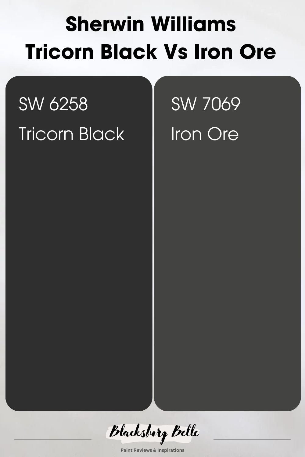
Quick Comparison: Tricorn Black vs Iron Ore
Merely looking at Tricorn Black and Iron Ore may not be enough to help you tell the difference. So, let us show you detailed differences between the colors using a chart.
| Tricorn Black | Iron Ore | |
| RGB | 47, 47, 48 | 67. 67, 65 |
| LRV | 3 | 6 |
| Undertones | No visible undertones | Gray and green-blue |
| HEX Value | #2C2B2C | #464645 |
Emotional Effects: Tricorn Black vs Iron Ore
You may not realize it, but the paint colors in your home are vital to your feelings. You may unconsciously associate some colors with rest and serenity and others with coziness and warmth. And that is what we mean by the emotional effects of Tricorn Black and Iron Ore.
Tricorn Black is saturated and deep, a true black paint color due to its lack of undertones. As a result of this, the paint color brings true elegance and sophistication to your home. It makes you feel powerful and stylish, especially when paired with vibrant colors and light neutrals. Its richness also makes the room smaller and more compact.
Iron Ore also has a somewhat similar effect on you as Tricorn Black because of its closeness in color. However, there is a slight difference, although significant. Because Iron Ore is a softer black or charcoal, it does not feel as moody or overwhelming as Tricorn Black. You can see a hint of color, which helps you relax better, as opposed to the solid black that is Tricorn Black.
If you do not mind intense saturation and depth in your decor, use Tricorn Black but add a bit of color. However, Iron Ore is better if you want that elegance and sophistication that comes with a true black without its overwhelming feeling.
LRV of Tricorn Black vs Iron Ore: Which Reflects More Light?
Before we explain the difference between the two saturated paint colors, it is important to tell you what LRV means. It is the light reflectance value of a color, which is its ability to absorb or reflect light in a room.
The value scale goes from 0 to 100, 0 being pure black and 100 being pure white. The truth is that there is hardly ever any pure black or white. The best you can get for black is 2.5 and white is 94.
Tricorn Black has an LRV of 3. This is very close to the darkest end of the light spectrum, and it may be one of the blackest black paint colors on the market. As a result, it absorbs a lot of light, making the room darker than usual.
Iron Ore, on the other hand, has an LRV of 6. It is slightly higher than that of Tricorn Black, although it is still pretty dark. However, it can throw a little more light into the room than its counterpart, especially when placed side by side to it.
Tricorn Black vs Iron Ore: Do They Have Similar Undertones?
From our chart above, you can see that Tricorn Black has no undertones, at least, no visible ones. We must point out that every paint color has a bit of red, green, and blue. This is because they are the primary colors from which we derive every color, including white and black.
Consequently, Tricorn Black may show a bit of green in bright light, although it is very minimal and barely there. Most people will not see it, so this hue is quite negligible. This is not the same as Iron Ore which has obvious green, blue, and, sometimes gray undertones.
Iron Ore may not readily present as a soft black with obvious undertones until you compare it with Tricorn Black. Next to this true black, Iron Ore will look like charcoal, and Tricorn Black will look dark and saturated on its own part.
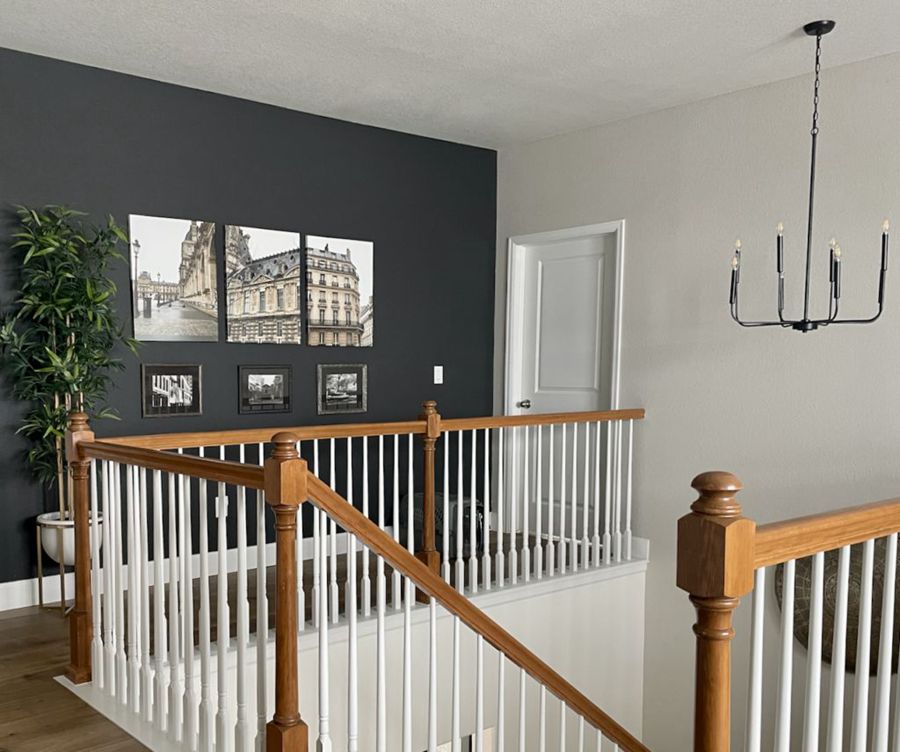
A Closer Look at the Undertones of Tricorn Black
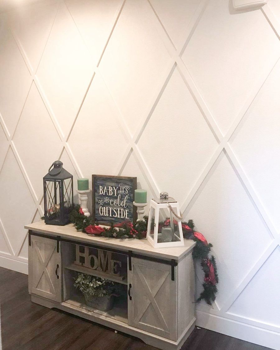
If you are still undecided whether or not Tricorn Black has any undertones, a clearer picture of how it holds up next to different elements may help. In the picture below, you will notice how black the paint color remains even beside a warm white fireplace and different wood tones.
A Closer Look at the Undertones of Iron Ore
On the other hand, when you pair Iron Ore with other colors, its undertones become readily visible. The same is true if there is enough light, whether natural or artificial. You can see a perfect example in this cozy room below:

Iron Ore is clearly a soft black paint color, tending more to charcoal than black. In the picture above, the gray undertones in the paint color are obvious; it looks more like a dark gray than any other color. If you want a solid black paint color, Iron Ore may not be the best option.
Go for Tricorn Black if you want a true black, but pick Iron Ore if you want some softness in your black paint color. Since Tricorn Black has no visible undertones and Iron Ore has gray and green-blue ones, it is easier to decide what you want for your decor.
Tricorn Black vs Iron Ore: Are They Warm or Cool?
Tricorn Black is neither warm nor cool because of the lack of undertones. You do not perceive any colors from it as it remains solid even in the brightest light. Therefore, it is ideal for different color schemes and decor styles, regardless of the existing colors or future color palettes.
Iron Ore has clear undertones, looking more gray than black. This makes it a cool color, so it does not fit into a warm color scheme. However, it is bold enough to deepen the decor’s look and produce elegance, not warmth.
Tricorn Black vs Iron Ore: Complementary Colors
When we discuss color theory, one of the most important aspects is the concept of complementary colors. These are pairs of colors which, when combined, cancel each other out, resulting in a gray-scale color. In simpler terms, these colors are located on the opposite sides of the color wheel, which is a visual representation of the colors in the light spectrum.
The most common examples of complementary colors include red and green, blue and orange, or yellow and purple. But where do the shades of black, like Tricorn Black and Iron Ore, fit in this concept?
Indeed, Tricorn Black and Iron Ore are very dark shades that verge on pure black. They sit on the extreme end of the light spectrum, closest to the ‘south pole’ if we were to visualize the color wheel as a 3D color solid, with white as the ‘north pole’ and black as the ‘south pole’, and medium gray as the center.
Due to their position in this spectrum, these dark colors technically don’t have direct complementary colors in the way that we think of for primary and secondary colors. So if you enter their hex values into the color wheel to find their complementary colors you will still get black.
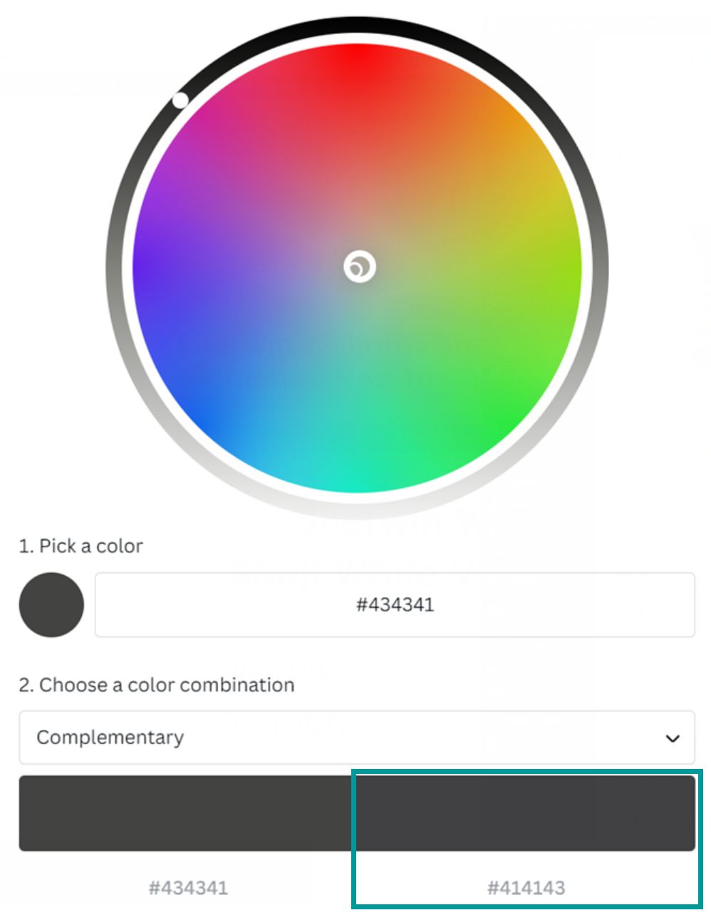
However, this doesn’t mean that these dark hues can’t be used in harmony with other colors. In fact, there are many coordinating colors that can create beautiful contrasts or harmonies with these black shades.
Understanding this can open up a world of possibilities for color schemes and designs. Whether in fashion, interior design, or art, Tricorn Black and Iron Ore can serve as the base or accent that balances and enhances the other colors used alongside them. This is the power of the color spectrum, even at its darkest end.
Without further ado, let’s look at the colors that complement the individual colors.
Tricorn Black vs Iron Ore: Coordinating Colors
When it comes to coordinating colors, the best choice will depend on your overall design goal and the style you want to achieve.
Coordinating Colors for Tricorn Black
Sherwin Williams pairs this deep black color with lighter colors, and it is no surprise to us. Some of its best coordinating colors include Blithe Blue, Classic Light Buff, and Ice Cube.
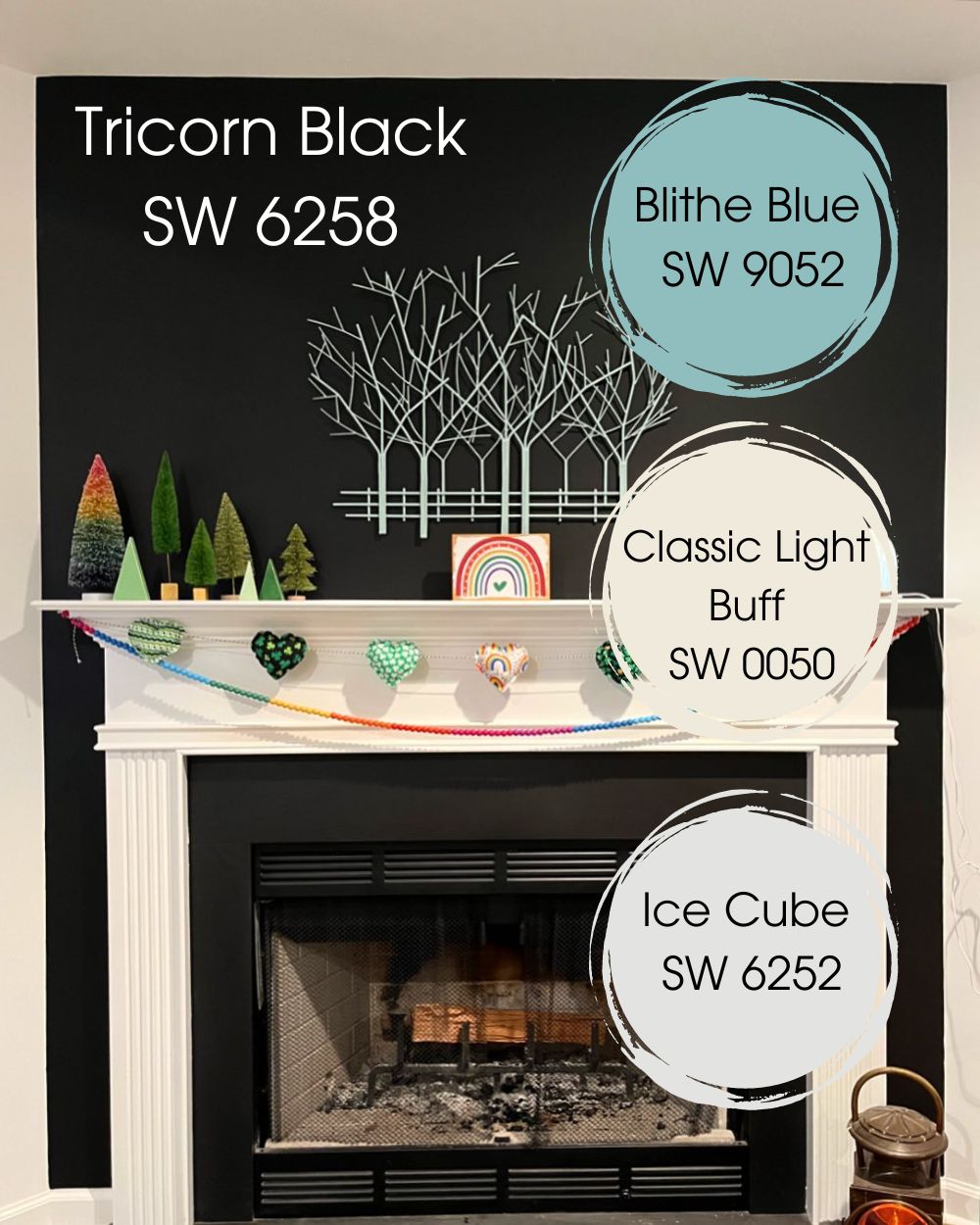
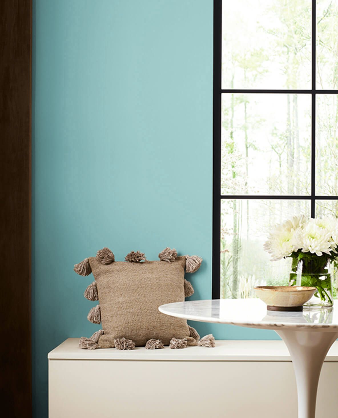
Blithe Blue SW 9052 is a mild blue paint color with teal undertones that combines well with Tricorn Black to create sophistication.
Classic Light Buff SW 0050 is a warm white paint color with ivory undertones, so it pairs well with Tricorn Black because of the black’s neutrality.
Ice Cube SW 6252 is another white paint color but cool this time, showing a hint of blue that complements the dark shade of Tricorn Black.
Coordinating Colors for Iron Ore
Nebulous White, Cityscape, and Extra White are just a few of the coordinating colors for Iron Ore. You can also use your creativity to find others, but let’s look at these key ones.
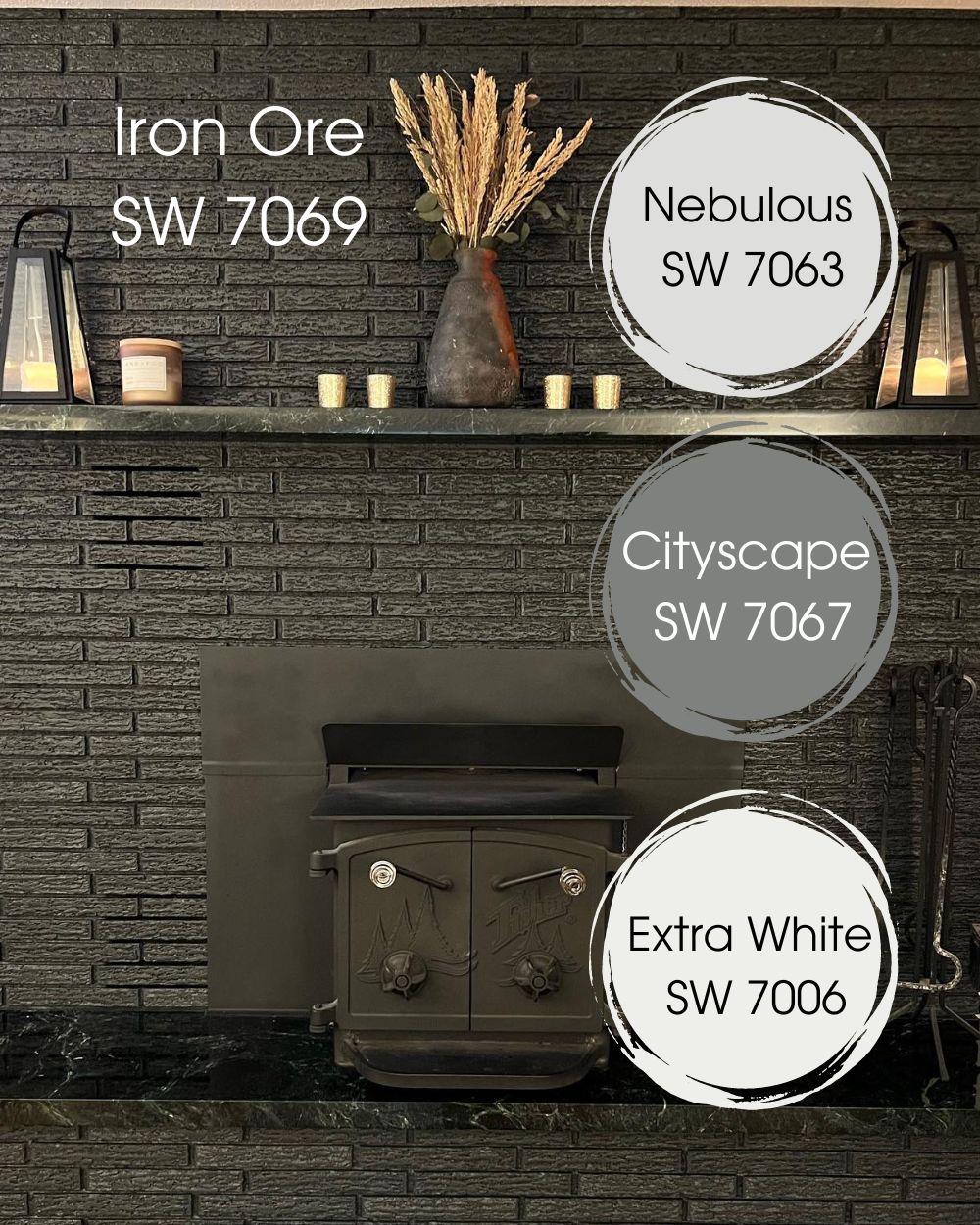
Nebulous SW 7063 is a bright white paint color with cool blue undertones that blends well with Iron Ore because of its gray hues.
Cityscape SW 7067 is a dark gray paint color with neutral tones, making it ideal for a slightly complex color like Iron Ore with several undertones.
Extra White SW 7006 is a bright white with cool blue undertones, again pairing well with Iron Ore due to its brightness and blue hints.
We must note that these colors are only to guide you in finding other coordinating colors. In other words, you are not restricted to these colors alone. Create a unique palette or follow our guide in the next section for an excellent palette if unsure about what to do.
Tricorn Black and Iron Ore Color Palette
Your choice between Tricorn Black and Iron Ore is incomplete without a suitable color palette. A color palette allows you to incorporate different hues to match the central color, including complementary and contrasting hues.
With the right palette, you open up the horizon of endless possibilities of paint color combinations. So, let’s forge ahead and see some of the colors to include in the color palettes for Tricorn Black and Iron Ore.
Color Palette for Tricorn Black
Waterloo, Mudslide, and Morning Fog are different shades and tones, making an almost perfect palette for Tricorn Black.
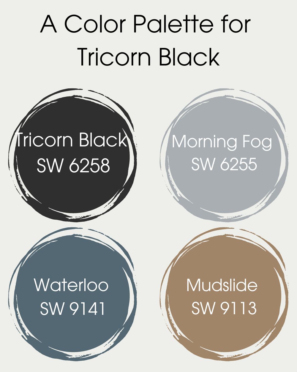
- Morning Fog SW 6255. It is close enough to the central hue, which is Tricorn Black, to form a perfect monochromatic pair with it. Use this option instead of white for steely decor.
- Waterloo SW 9141. It is a cool blue color that contrasts with Tricorn Black for a sharp and striking decor. Use it as a perfect grounding color for the rich black paint.
- Mudslide SW 9113. This is another contrasting color but on the warm side. It is a sharp turn from the usual blend for Tricorn Black because of its earthy tones.
Color Palette for Iron Ore
Nebulous White, Coral Clay, and Navajo White are some of the best colors to add to Iron Ore color palettes. This is because they include complementary colors, contrasting colors, and matching colors.
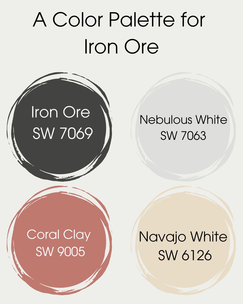
- Nebulous White SW 7063. It is a white paint color that displays some blue hints and deepens the appearance of Iron Ore.
- Coral Clay SW 9005. It is a bright earthy-toned coral shade that is a sharp contrast with the cool and dark shade of Iron Ore.
- Navajo White SW 6126. This is a warm off-white paint color that creates an outstanding and striking balance with Iron Ore.
Keep your style and decor versatile with these amazing colors paired with Tricorn Black or Iron Ore. The best part is that you do not have to use only these colors. Find other colors that do not clash with these dark and saturated shades and add them to your color palettes for the best results.
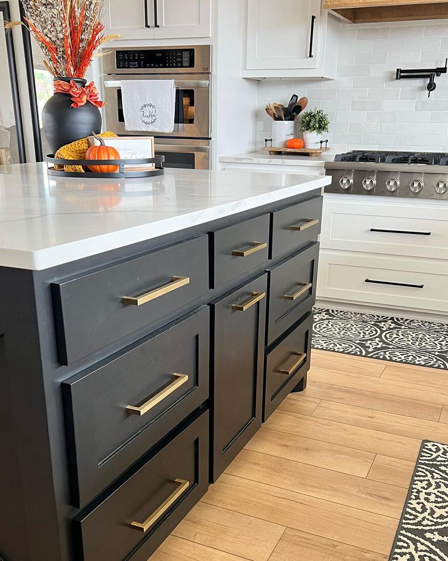
Tricorn Black vs Iron Ore on Cabinets
While we are used to seeing light paint colors on cabinets, dark-colored cabinets are also becoming trendy. And one of the best colors to use on cabinets is black. Tricorn Black and Iron Ore from Sherwin Williams are some of the best black paint colors for cabinets, as we will see below.
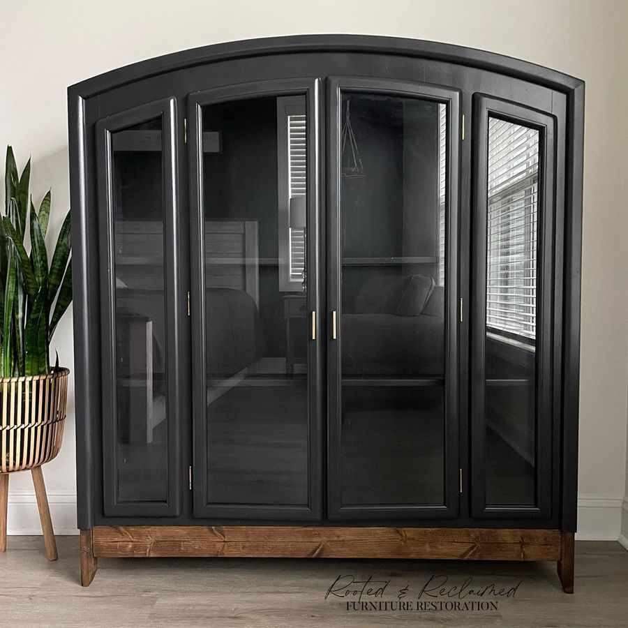
Tricorn Black on Cabinets
Whether you want that monochromatic kitchen decor or a bit of uniqueness, Tricorn Black has you covered. See what it looks like on cabinets in the kitchen.
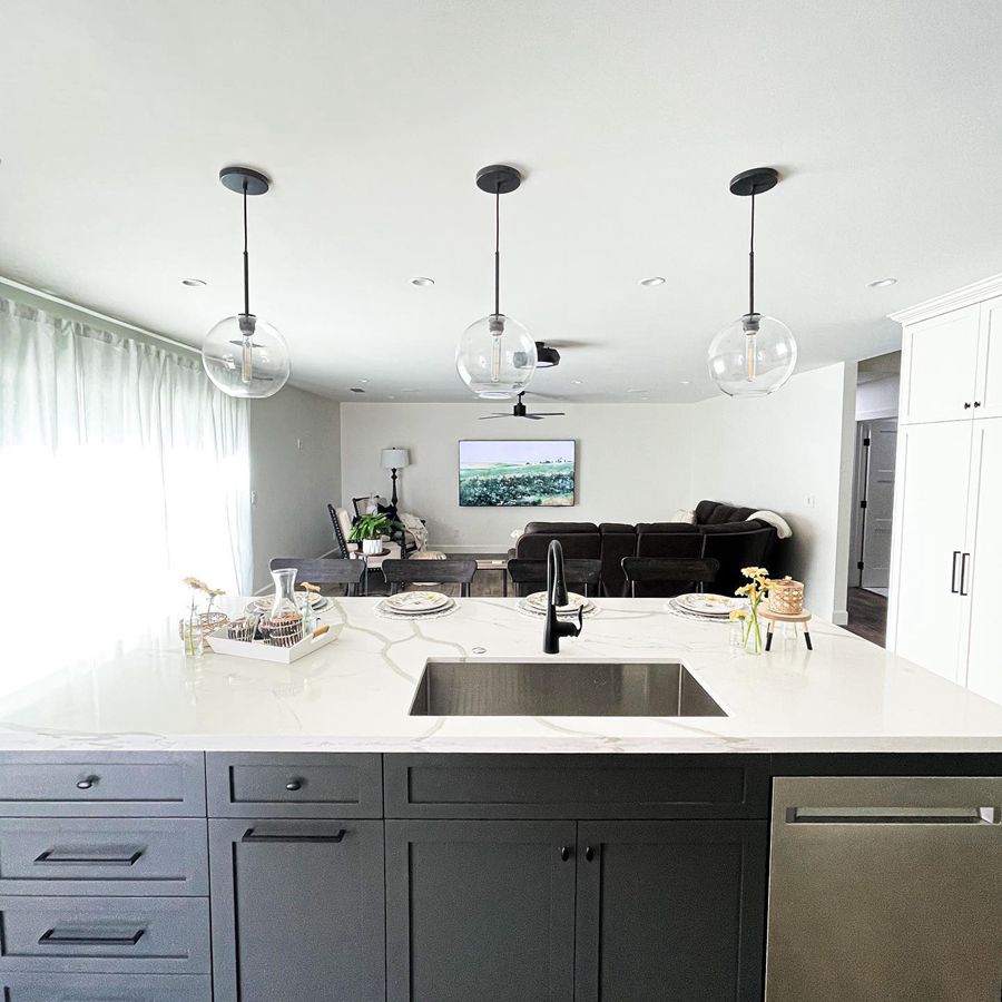
Iron Ore on Cabinets
Iron Ore is also a striking color on cabinets, whether you are pairing it with stainless steel or white appliances in your kitchen. Check it out in this kitchen decor.
Tricorn Black vs Iron Ore on Doors
One of the best places to use black paint colors is the door. Black works well on every door, whether it is a front door or a room door. So, here are examples of Tricorn Black and Iron Ore on doors.
Tricorn Black on Doors
As a true black, Tricorn looks stunning on any door. You do not have to worry about its deep color overwhelming the decor.
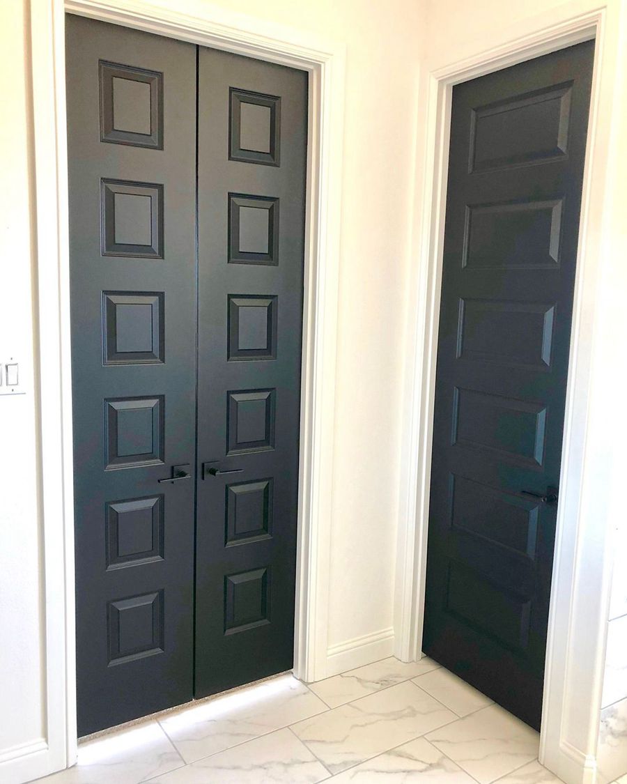
Iron Ore on Doors
In the same vein, Iron Ore is excellent on doors, although it is not as thick and heavy as Tricorn Black. It is still perfect for any door, whether inside the house or as an exit door.
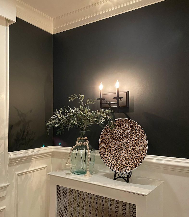
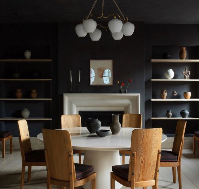
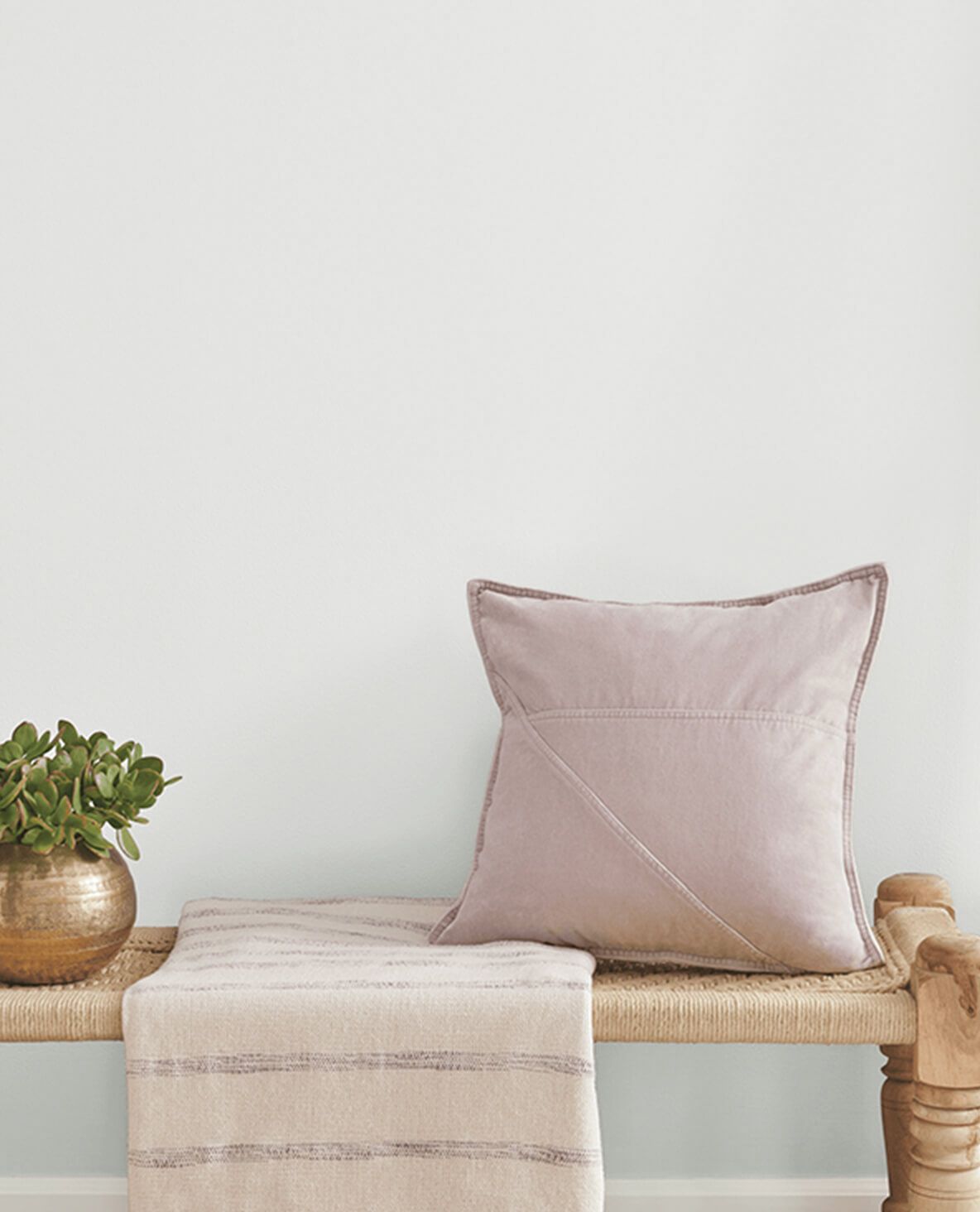
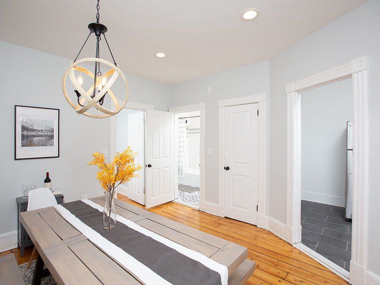
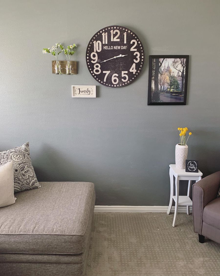
Tricorn Black vs Iron Ore on Interiors
Most of our paint choices are for interior decors, and these two black paint colors are no different. However, they perform differently because of undertones and light reflectivity. Let’s take a look.
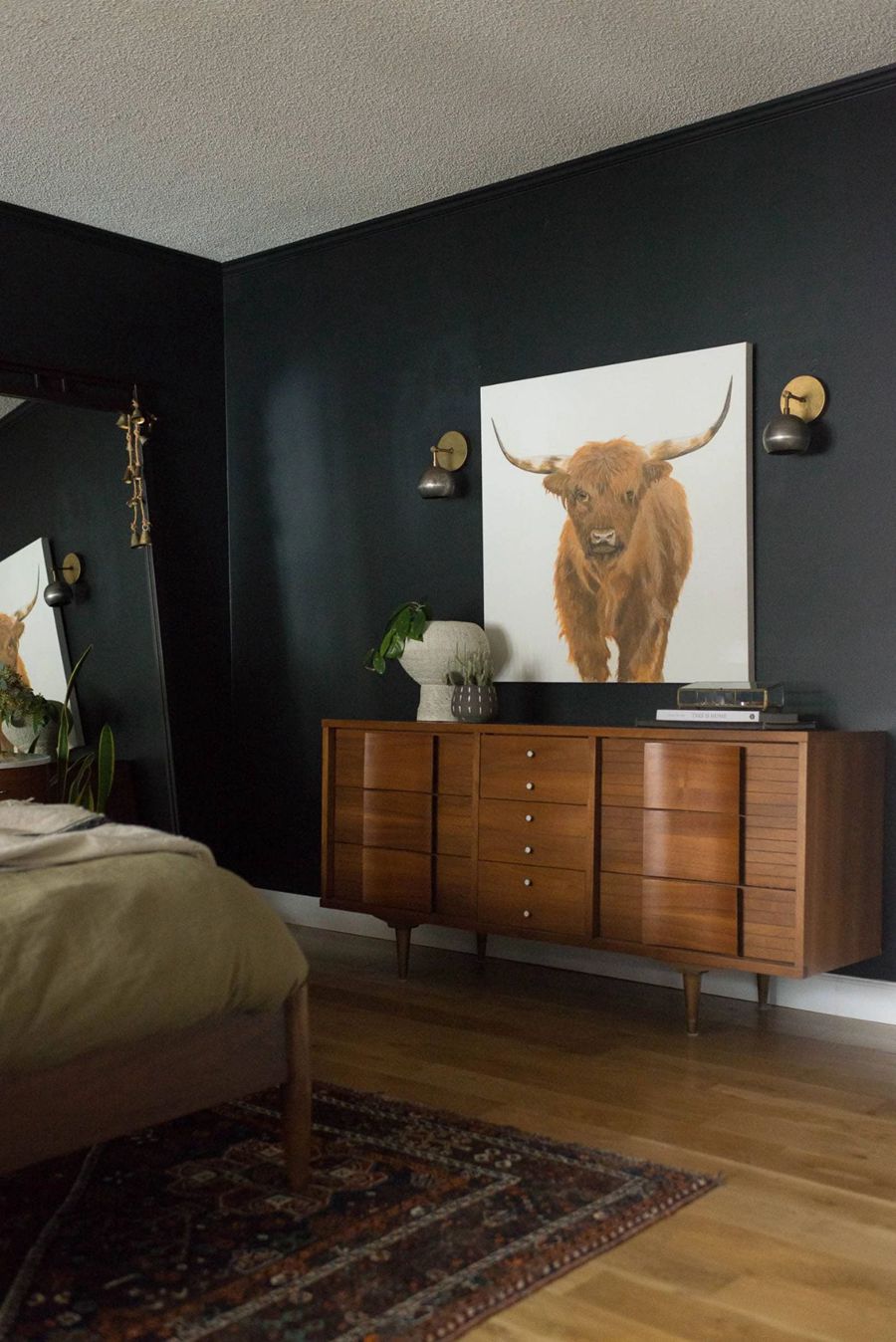
Tricorn Black on Interiors
This option looks richer and fuller on walls, as you can see in the bedroom decor below. It is best to use it on accent walls and pair it with complementary light neutrals.
Iron Ore on Interiors
It is not so easy to work with Iron Ore because of how it reveals hues in different lighting. However, it performs well as a soft black when there is no darker hue to challenge it. Here is Iron Ore in a well-lit room.
Tricorn Black vs Iron Ore on Exteriors
Black may not be the first choice for exterior paint color, but it is gaining popularity among decorators. You will find many homes with this color and light trims for a striking appearance. So, let’s see how they look on house exteriors.
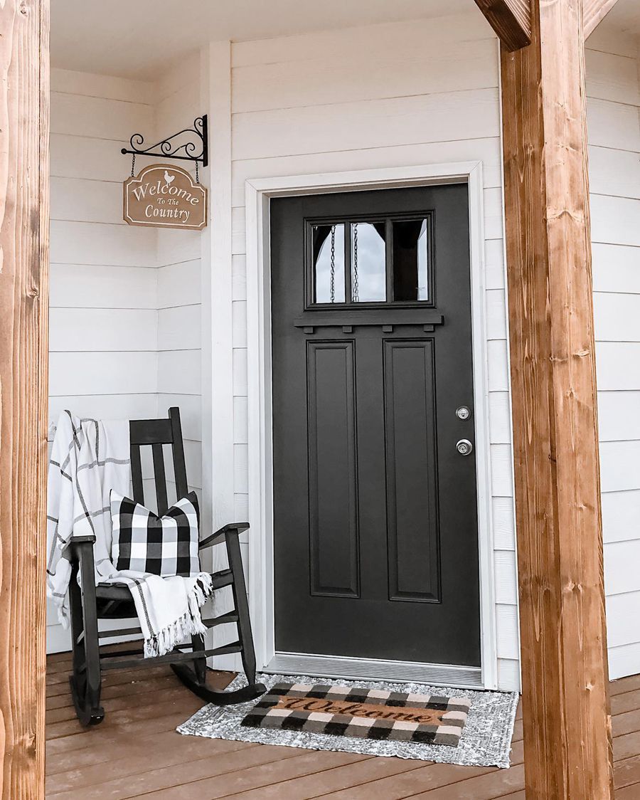
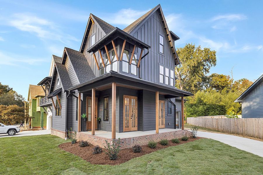
Tricorn Black on the Exterior
Use Tricorn Black if you want a black paint color that shows no other hues and does not shine. It is one of the most outstanding colors for the job.

Iron Ore on the Exterior
If you are not a fan of a deep black or fancy a soft black for the job, try Iron Ore. It can give the same vibe as a true black if there is no other dark color around it.
Tricorn Black vs Iron Ore on Window Frames
Black window frames look amazing, especially if the rest of the house is a light color like white. You would be amazed at the number of people using black for their window frames, and you will the final results in some pictures.
Tricorn Black on Window Frames
Here is Tricorn Black on some window frames in a house with white decor. You can choose to use blinds, although it is not necessary with such a striking contrast.
Iron Ore on Window Frames
As with Tricorn Black, Iron Ore is also a strikingly dark color for window frames, especially when contrasted with white. Create a stylish and sophisticated interior for your home with black window frames.
Lighting Conditions
We will not fail to point out that different back paint colors behave differently when exposed to different lighting conditions. Artificial light may cause them to appear warm when they are cool and natural lighting may cause them to appear cool.
Since Tricorn Black has no detectable undertones, it tends to remain the same and solid in all types of lighting. Therefore, it holds up better than Iron Ore, which reveals different undertones in light. It is not as bold or dark as Tricorn Black, so the result you get in different rooms may vary.
Final Thoughts
When picking between Tricorn Black and Iron Ore, it is vital to check undertones and how much of them will be revealed in different lighting conditions. While both colors look alike at first glance, a closer inspection will show that Tricorn Black is deeper and darker than Iron Ore.
The latter color looks more like a dark charcoal paint color than an actual black. We have explained their LRVs, RGBs, and HEX values to differentiate them further and make selection easier.
But you can get real samples and see how they look on your wall before deciding. Just remember that we are here for you if you have any questions. Reach us and share your thoughts in the comments section.
 Taupe Vs Beige: What are the Differences?
 Mindful Gray vs Agreeable Gray: What’s the Difference?
 Sherwin Williams Pure White vs Extra White: How to Choose?
 Sherwin Williams Shoji White Vs Alabaster: How to Choose
 Modern Gray vs Agreeable Gray: How to Choose?
 Benjamin Moore Ballet White vs Swiss Coffee: How to Choose
