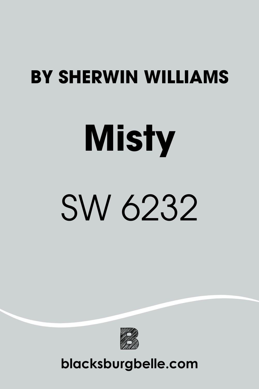
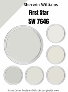
The perfect blue-gray for your space is in town. Sherwin Williams Misty is a sophisticated hue that will elevate the status of your home and rid you of the misery attached to picking the right color for your interior decor.
This detailed review will show you why this color should be top on your list of options and guide you on how to use it; most importantly, it’ll show you why we love it.
Table of Contents
What Color is Sherwin Williams Misty
The Sherwin Williams Misty paint is a light blue color widely considered by paint experts as neutral due to the presence of gray which goes so well with other collections. The presence of gray aids the Misty paint from appearing too baby blue, hence increasing its appeal to the older audience.
This blue-gray paint is perfect for combining colors responsible for amplifying and adding a sophisticated touch to a space. You can throw in oranges, mauves, pinks and black. Dark browns aren’t even left out.
| LRV | 64 |
| RGB | 205/210/210 |
| Hex Value | #CDD2D2 |
| Location Number | 222-C1 |
| Color Collections | Colormix Forecast 201 (Naturalist), West Elm(Spring/Summer), Colormix Forecast 2020 (Mantra), Pottery Barn Kids (Fall/Winter) |
RGB of Sherwin Williams Misty Paint
RGB refers to the amount of the three primary colors (red, green, and blue) present in your anchor color. The equal mix of these colors gives a pure white result, and color specialists use a scale of 0-255 for the individual hues.
The ratio of the RGB can also help you draw conclusions about its possible undertones and confirm whether the color is a cool or warm type. The RGB of Sherwin Williams Misty is 205, 210, and 210, respectively. While #CCD1D0 represents the Hex Code.
LRV Of Sherwin Williams Misty
A review is never complete if we don’t discover the light reflective value of the anchor color. You may be wondering why we always place so much emphasis on this color. This is because each color you see was formulated to reflect or absorb it.
For Sherwin Williams Misty, the LRV is 64, which means it belongs to the light side of the scale, and it gives enough room for light to bounce off it.
Light Reflective Value measures how much light a color can reflect or absorb. For a clearer perspective, we place this on a scale of 0-100, with 0 being pure black and 100 being pure white- however, we use 3-97 because, in this world of paints, there’s no true black or true white.
Is It A Warm Or Cool Color
Sherwin Williams Misty is a cool color in every sense, like every blue that we know. When you analyze its core properties like blue, gray, and green, you’d see that these tones belong to the cool category on the color wheel, further bolstering our claim.
If you’re looking for the perfect tranquil color, Misty is the color for you, and the good thing about this color is that it maintains its coolness to a tee- what this means is that you shouldn’t expect to see a mint or violet tone after you apply it on your wall.
Because of its coolness, we recommend you blend this color with brass, wooden textures, and warm tones to create a balance.
Does Sherwin Williams Misty Have Any Undertone?
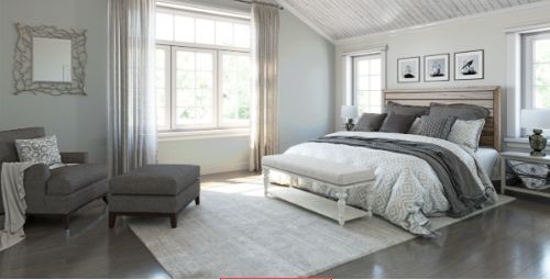
Before we proceed, it’s imperative to know that ALL COLORS have undertones, which are crucial in their formation and application. The undertones of your anchor color help you determine the accessories to create a friendly palette and a home that works.
The undertones of Sherwin Williams Misty are very cool. You’ll indeed find winks of grays and green in this color. The gray is more dominant, and the greens are visible under artificial lights or when Misty is paired with yellow tones.
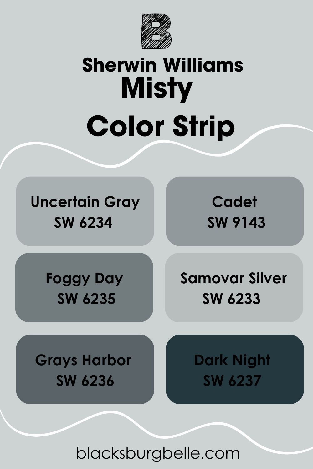
Sherwin Williams Misty Color Strip
When you hear a color strip, the first thing that should come to mind is a family of colors that share the same formula but varying intensities. They may also share the same undertones, but it’s nothing to worry about if they don’t. Rest assured; you can still use them together and get mindblowing results.
We can’t come up with a light color strip for Sherwin Williams Misty. This is because Misty is the lightest color on the scale, represented by location number 222. However, there are enough dark colors to go around for this one. Let’s get into it.
| Color | Location Number | Tone |
| Sherwin Williams Samovar Silver | 222-C2 |  |
| Sherwin Williams Uncertain Gray | 222-C3 |  |
| Sherwin Williams Cadet | 222-C4 |  |
| Sherwin Williams Foggy Day | 222-C5 |  |
| Sherwin Williams Grays Harbor | 222-C6 |  |
| Sherwin Williams Dark Night | 222-C7 |  |
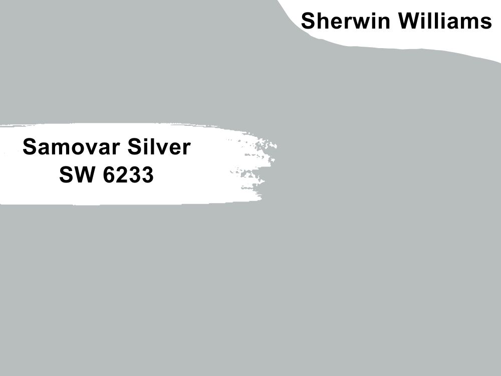
Sherwin Williams Samovar Silver
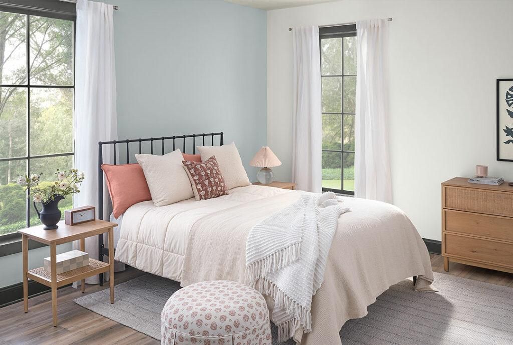
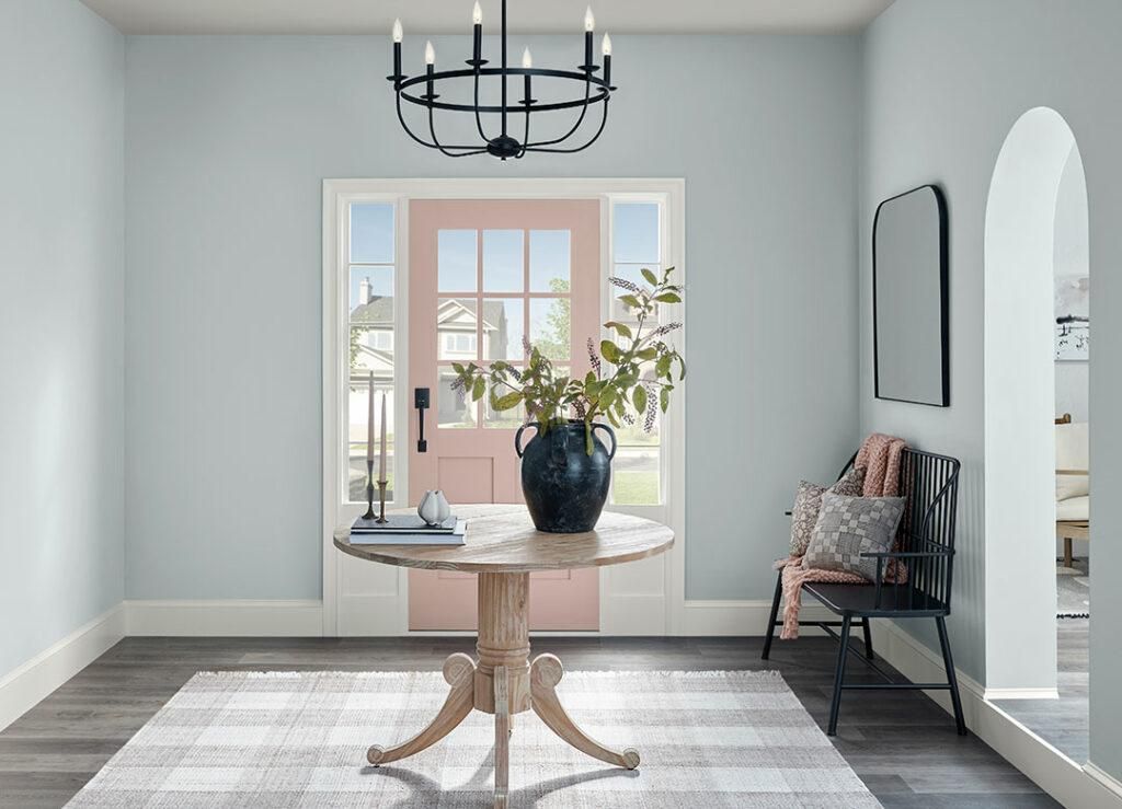
Samovar Silver is a cool blue with silvery details and a slate undertone that adds class to any space. We usually recommend this color for the hallways and bathrooms because of its medium LRV of 51, which means it’s not too light or dark. Its coordinating colors include Sherwin Williams Iron Ore and Pink Shadow (notice the bed frame and throw pillows in the picture above).
When used in the hallway, it reminds you of walking in a foggy forest in the early morning hours, especially when you pair it with cool whites to make it more dramatic. It works in both traditional and minimalistic settings.
Its RGB is 184, 190, 190, with HEX code #B8BEBE. You can also see winks of greens in it under specific light conditions. You can adopt this color for outdoor purposes, instantly mirroring the rich greenery at night. Use a black roof and white trims for added enhancement.
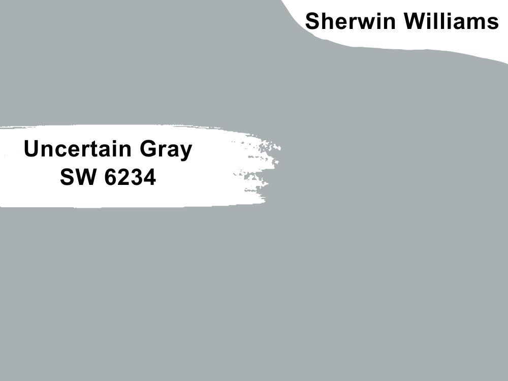
Sherwin Williams Uncertain Gray
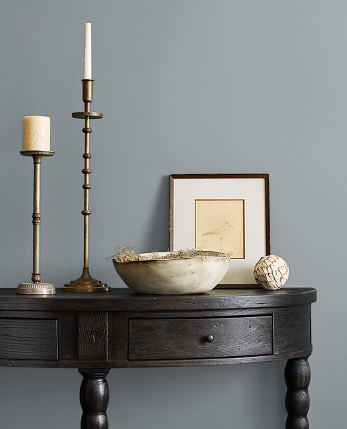
Not so popular, but you should watch out for this one. The foggy blue-gray belongs to the medium category with an LRV of 43. It’s a great choice if you want to introduce a neutral shade into your home. It has an RGB of 168/176/177.
When applied, you can expect this shade to lean towards the gray side, but its blue undertones are too sophisticated to ignore, especially if you can’t stand baby blue paint. Pair this one with cool bright whites like Sherwin Williams Rock candy for a beautiful contrast. You can also use it as an accent or primary wall; whichever way, it’ll get the job done.
Sherwin Williams Cadet
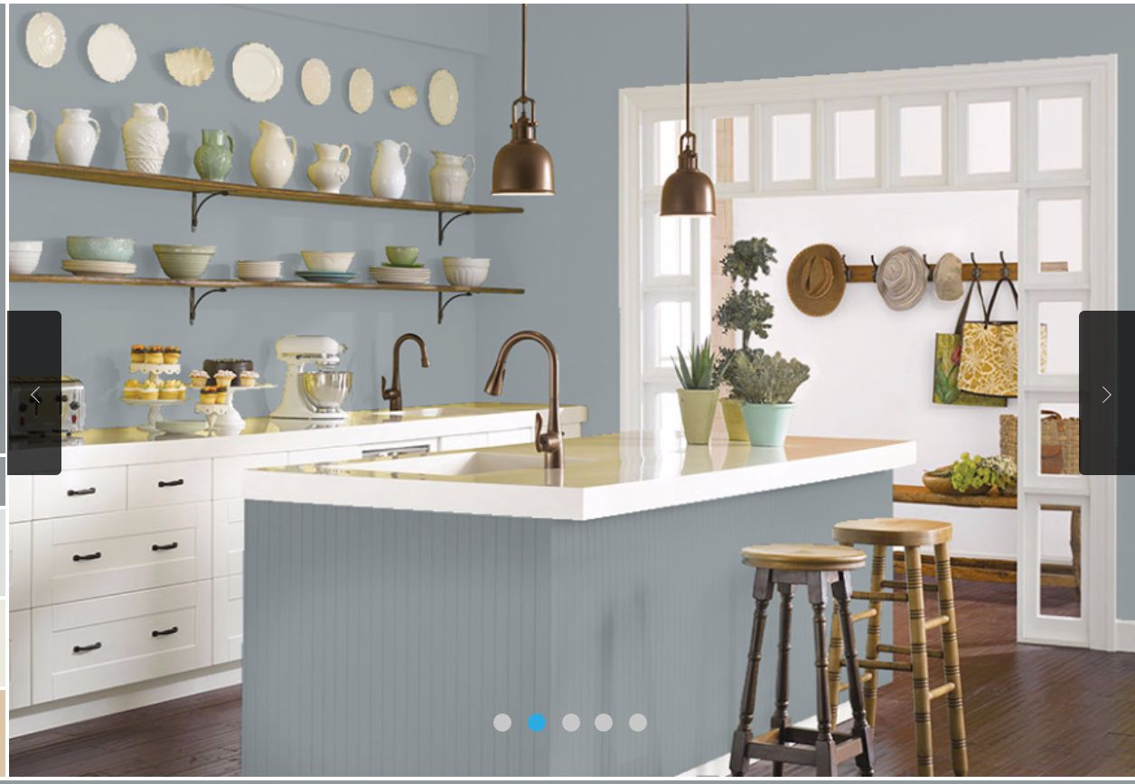
Cadet is another cool gray-blue, bringing us closer to the dark side of things with its LRV of 31, which means this color is excellent for large spaces as it draws the walls in. It can also do great in small areas, but as an accent wall with a white backdrop.
Pair with Sherwin Williams Rock Candy for a minimalist home. Alabaster would do great on a contrasting palette, and Sherwin Williams Believable Bluff is a top pick for a complementary color scheme.
Sherwin Williams Foggy Day
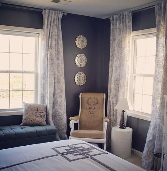
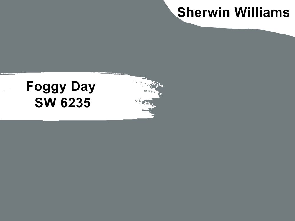
Call it a grayish blue or a blueish gray, and you’re right; this one is one of those colors perfect enough to work as the perfect alibi with a neutral color in any situation. Its deep slate gray undertone takes you one step closer to Nirvana because it’s so gentle and soft on the house.
We absolutely recommend this one as a winner in your bedrooms and even exteriors. The LRV of 20 gives it a unique depth and range simultaneously. Pair it with soft bright whites like Rock Candy for the living room and exterior. Shell white will work very well with Foggy day in your bathroom and bedrooms; go wild in your kitchen, art room, or fireplace by pairing Sherwin Williams Foggy Day with Foxy.
Sherwin Williams Grays Harbor
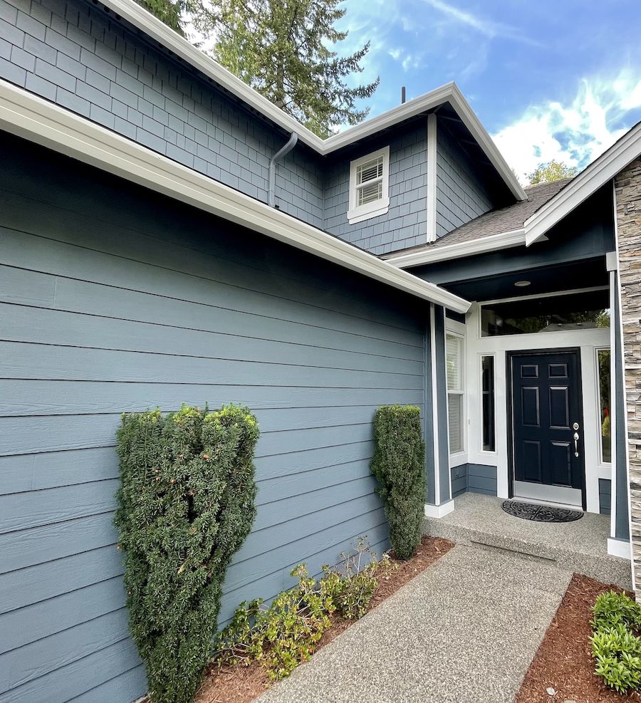
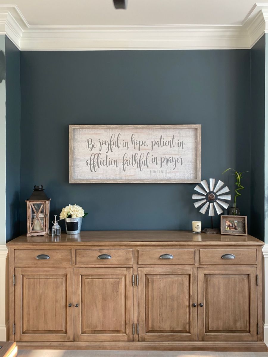
Sherwin Williams Grays Harbor is one of the best blue grays you can trust for your home. Whether you decide to use it for interior or exterior décor, this color is a lifesaver and pure artistic genius.
This color is bold and dark blue with rich gray undertones, giving a unique beauty and zest. The LRV of this color is 12, dark enough to make your home feel like home, but this one is not for small spaces (not to worry, you still get to do an accent wall with it).
Pair Grays Harbor with Sherwin Williams Accessible Beige, Pure White, and Baked Clay for a rich contrasting palette, or stick with its siblings on the color strip to achieve a monochromatic effect.
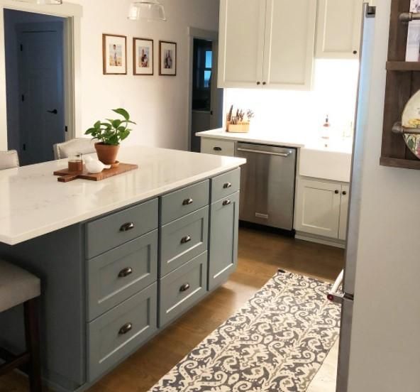
Grays Harbor is for everybody; it’s cozy, calm, soothing and versatile. It works well on wood, too, so you can cover your kitchen cabinet in this fantastic color and enjoy the view.
Sherwin Williams Dark Night
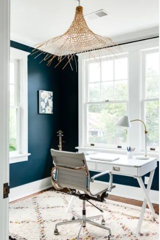
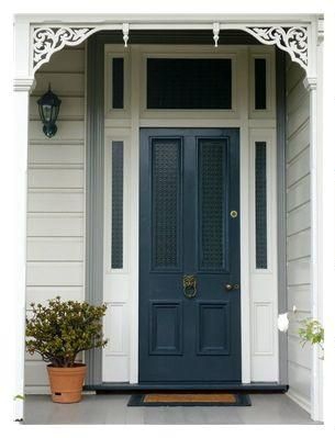
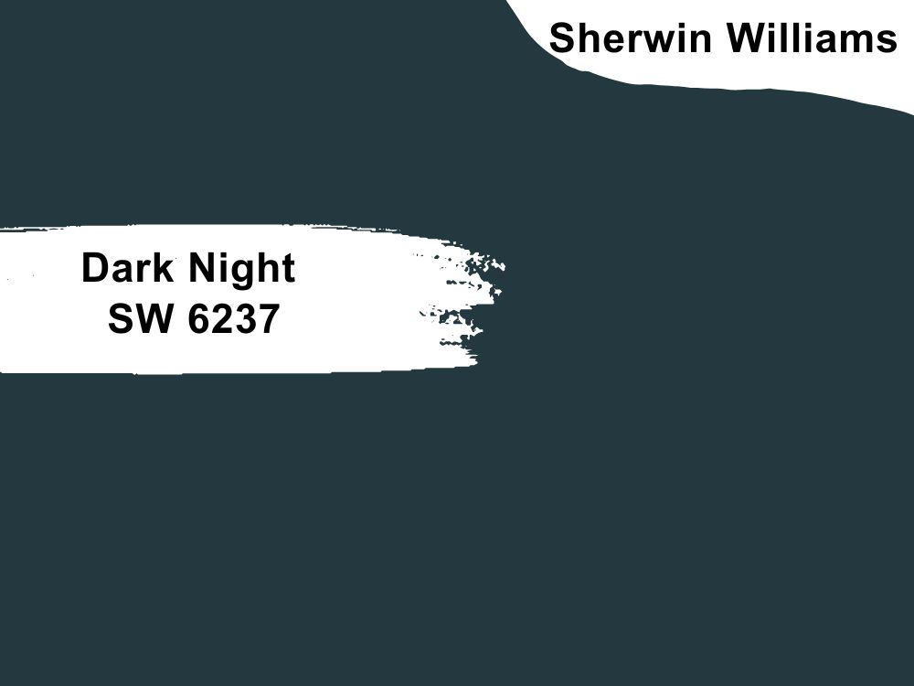
We have come to the end of the 222 color strip for Sherwin Williams Misty. This is the darkest in the arrangement, and its LRV of 4 proves that even its name is a testament to how dark you can expect this to be.
Sherwin Williams’ Dark night is one of our favorites. It’s deep, bold, and dark and is nothing like your average blue that spends all day paying homage to the ocean. This one has rich green undertones screaming at you from every direction you decide to use it.
We’re totally obsessed with Dark Night as it just gives you space with a luxury finish, especially when you combine it with rich dark furniture or dark brown if you’re trying to play it safe. For a minimalist angle, go with grays harbor, foggy day, and cadet, but the fun is in the contrasting palette- experiment with Gossamer Veil, Dovetail, and Interface Tan for a creative and rich outcome.
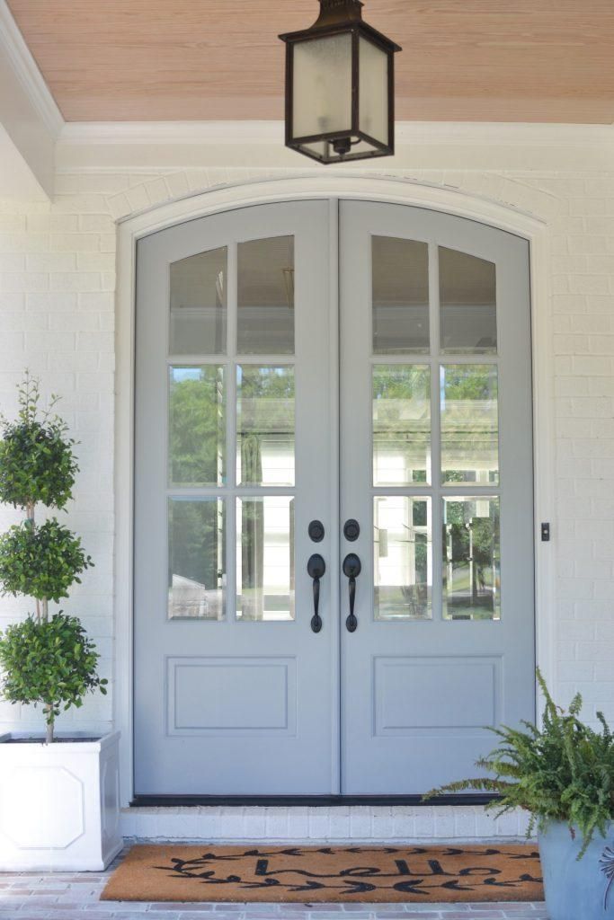
Notice the bold green-blue door that just makes the doorway pop, thanks to Sherwin Williams Dark Night. The flower pot in Sherwin Williams Copper Pot is also the right accessory to the door as it perfectly contrasts with the rich green undertone.
Sherwin Williams Misty Comparison
Some colors from Sherwin Williams resemble Misty, and you need proper clarification to ensure you understand them. This section aims to highlight the features of those colors so you can see things clearly for yourself and better understand their properties.
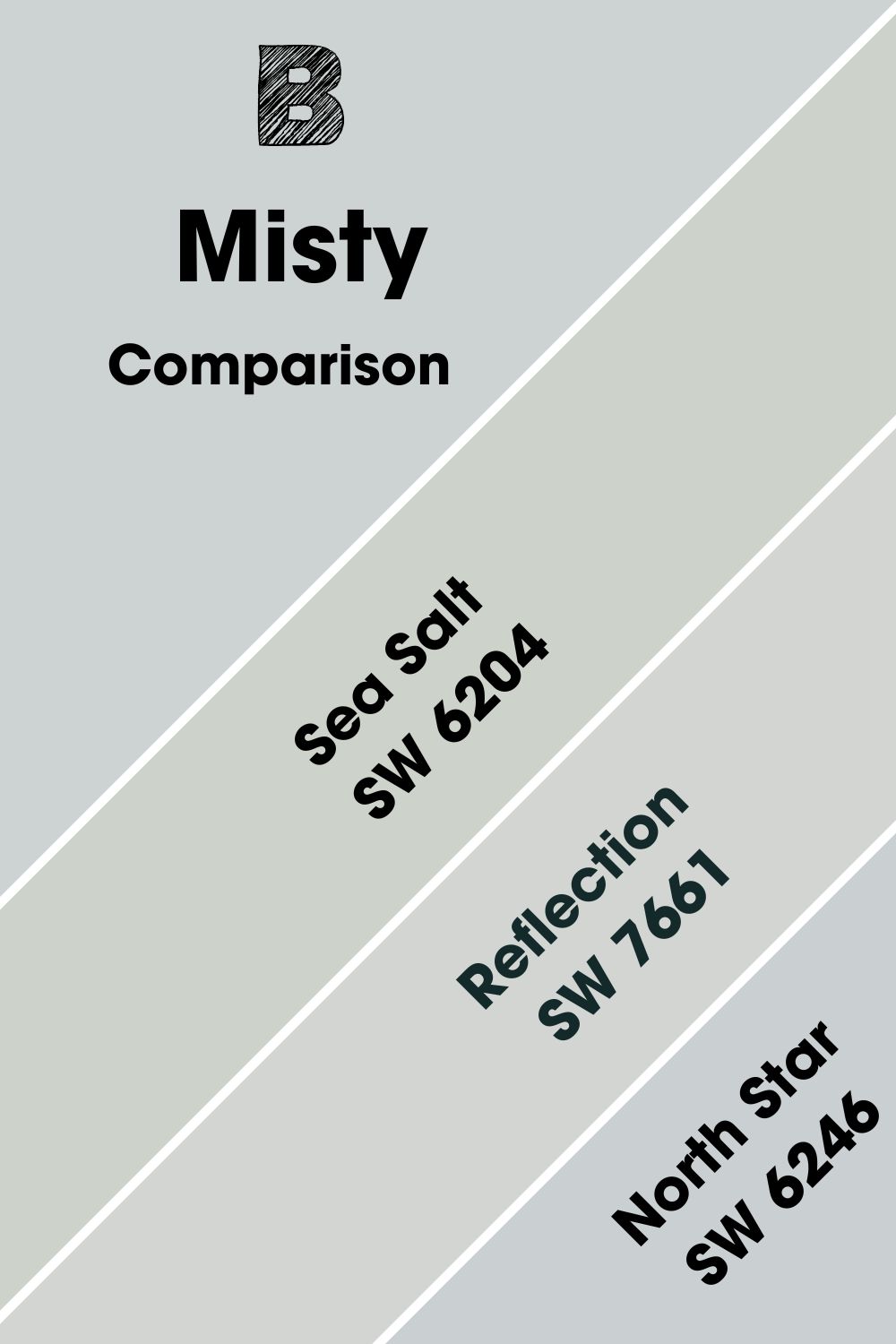
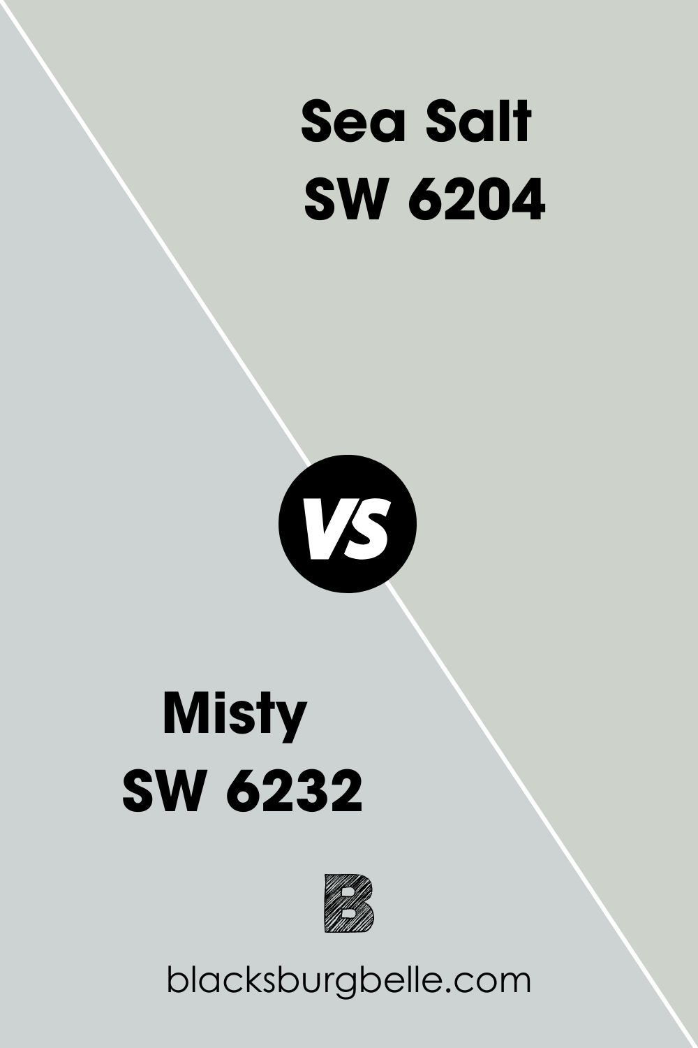
Sherwin Williams Misty Vs. Sea Salt
While sea salt is green with blue undertones, Misty is blue with a hint of green. When you place them side by side in any space, the resemblance instantly comes, this may also be because they have very close LRV with Misty at 62 and Sea Salt at 63.
They have the same amount of greens in their RGB formula: Misty is 205, 210, 210, and Sea Salt is 205, 210, and 202. When you place sea salt next to Misty, it draws out the green; when Misty stands next to Sea Salt, it draws out the gray undertones.
To douse your confusion, both colors are excellent as neutrals and can be used interchangeably or together as coordinating colors if you intend if you love a minimalist décor.
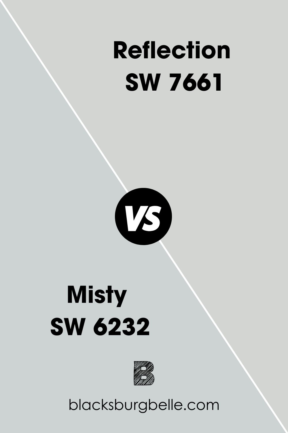
Sherwin Williams Misty Vs. Reflection
Sherwin Williams Reflection is a cool-toned gray with blue undertones. While you may not see this at first glance, it’s always adding depth to the color. It has an LRV of 66 compared to Misty, which comes with an LRV of 62, which means it’s much lighter and grayer, causing it to lean more towards the neutral category and also a great partner of so many colors.
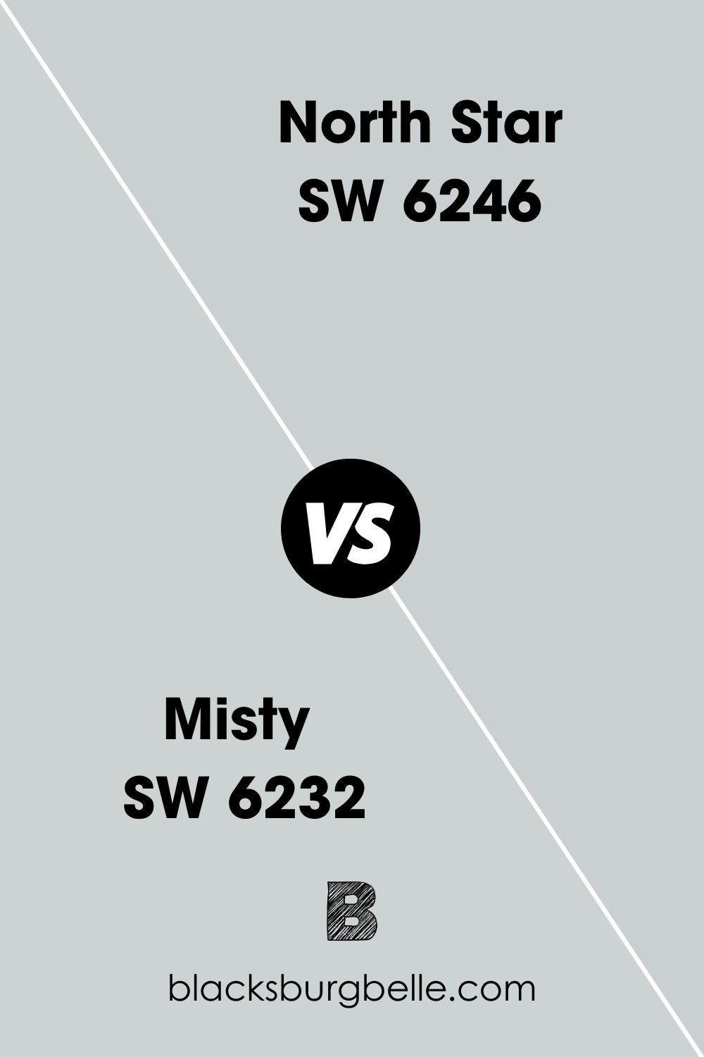
Sherwin Williams Misty Vs. North Star
North Star is one of Sherwin Williams gray-blue paint colors, but it is much lighter than Misty, with an LRV of 62. This color is exceptionally light and will soothe your eyes, body, and mind from the moment you walk into the house. Like Misty, you can pair it with whites and beiges to get a more balanced look.
Sherwin Williams Misty Color Palette
Misty has many friends across different color palettes, and it’s a relatively easy color to work with, bringing us to this section. A color palette is essential in your painting decision to help you build a workable and realistic pattern for your home to follow.
If you don’t have a color palette, you may end up with an unattractive space and that’s not what you want.
Coordinating Colors For Sherwin Williams Misty
In order to make it more practical, we’ve grouped the most compatible colors with Sherwin Williams Misty into two major categories: the Monochromatic and Contrasting Palettes.
Monochromatic Color Palette For Sherwin Williams Misty
This one is music to the ears of minimalism lovers and enthusiasts. We’ve built the most suitable monochromatic palette for your minimalist interior design and lifestyle. Basically, a monochrome palette contains colors of the same hues, undertones, or categories. When you use three together, they don’t crowd your space or get too artsy- you notice the subtle graduation of colors at intervals.
Our ultimate picks are Sherwin Williams Samovar Silver, Uncertain Gray, and Cadet. These three colors are co-incidentally on the same color strip as Misty, which means you’re on the right path. Refer to the color strip section for pictures and inspiration.
Contrasting Color Palette For Sherwin Williams Misty
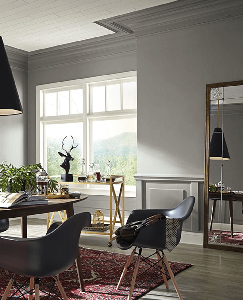
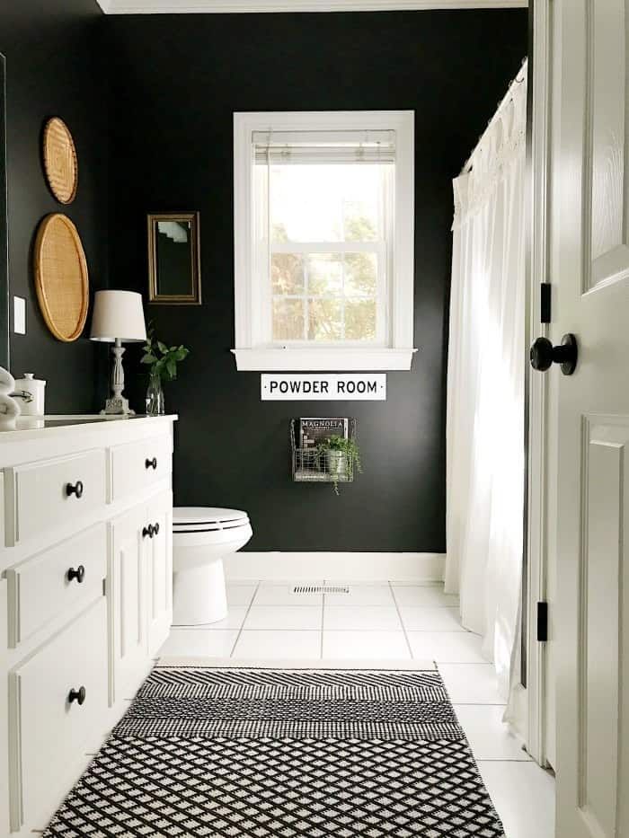

This one is for the larger-than-life and those who desire a traditional touch to their homes. Try out Sherwin Williams Dovetail, Black Magic, and Extra White to really see the difference in your home. These colors are so strikingly different, but you’ll be amazed at how smoothly they work with each other.
Sherwin Williams Misty Complementary Colors
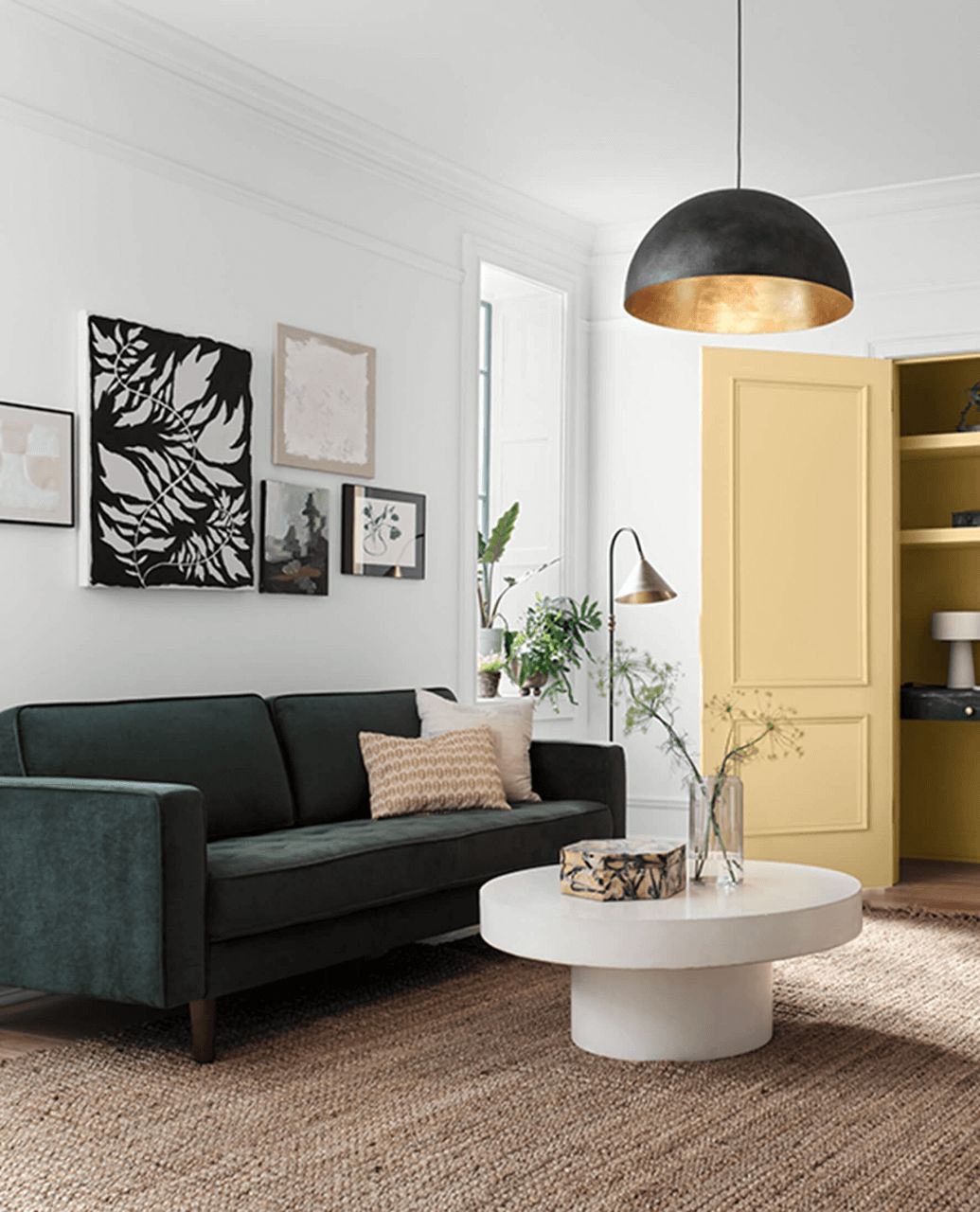


Complementary are those ones opposite each other on the color wheel. They work so well with your anchor color because they share the same undertones or work well with the undertones. These colors include Sherwin Williams Rock Candy, Dover White, and Convivial yellow.
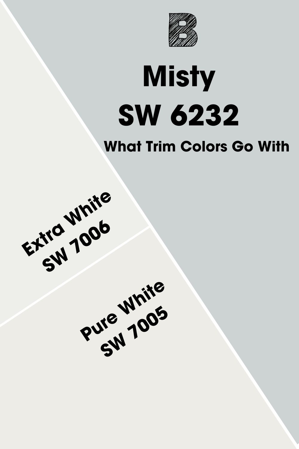
What Trim Colors Go With Sherwin Williams Misty
Crispy and cool whites are our go-tos for trims when it comes to Misty. Sherwin Williams Extra White and Pure White are two no-failing and smart choices to pair with Misty. Whether on the window, railings, accents, or even ceilings, they work well without clashing with your anchor color.
Misty Benjamin Moore Version
Benjamin Moore is also a giant in the paint-making industry, so we must include some of their colors that may suffice for Sherwin-Williams Misty should you not find them in stores or simply due to preference.
Benjamin Moore Beacon Gray
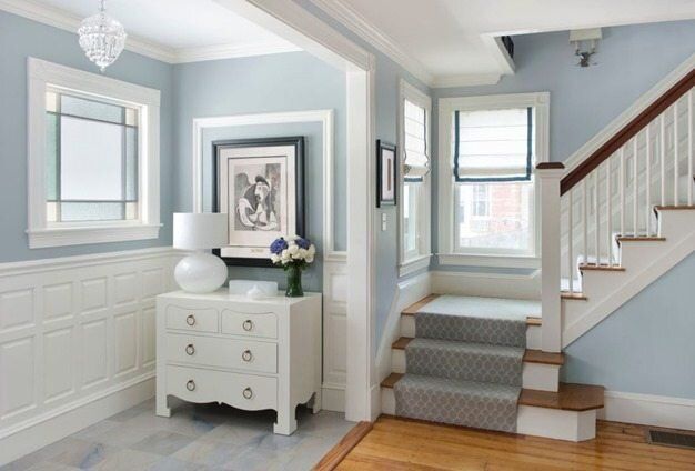
Benjamin Moore Beacon Gray is a cool-toned blue-gray paint that gives off chilly vibes in a space. People in colder regions should be careful with this one, as it can make your room extra cool.
It has an LRV of 65.92 which makes it excellent for small spaces. It’s light, airy, and very uplifting in any room.
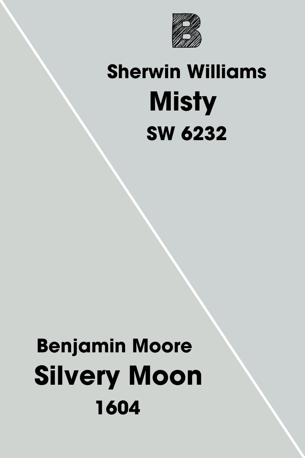
Benjamin Moore Silvery Moon
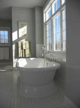
This classic one serves you a silvery slice of light blue. It reminds you of an evening stroll with light strokes of moonlight clashing into the fogs of night. Silvery moon has an LRV of 64.15 and does well in large and small spaces.
This neutral color combines dark browns, wood textures, light grays, terracotta, and soft orange tones.
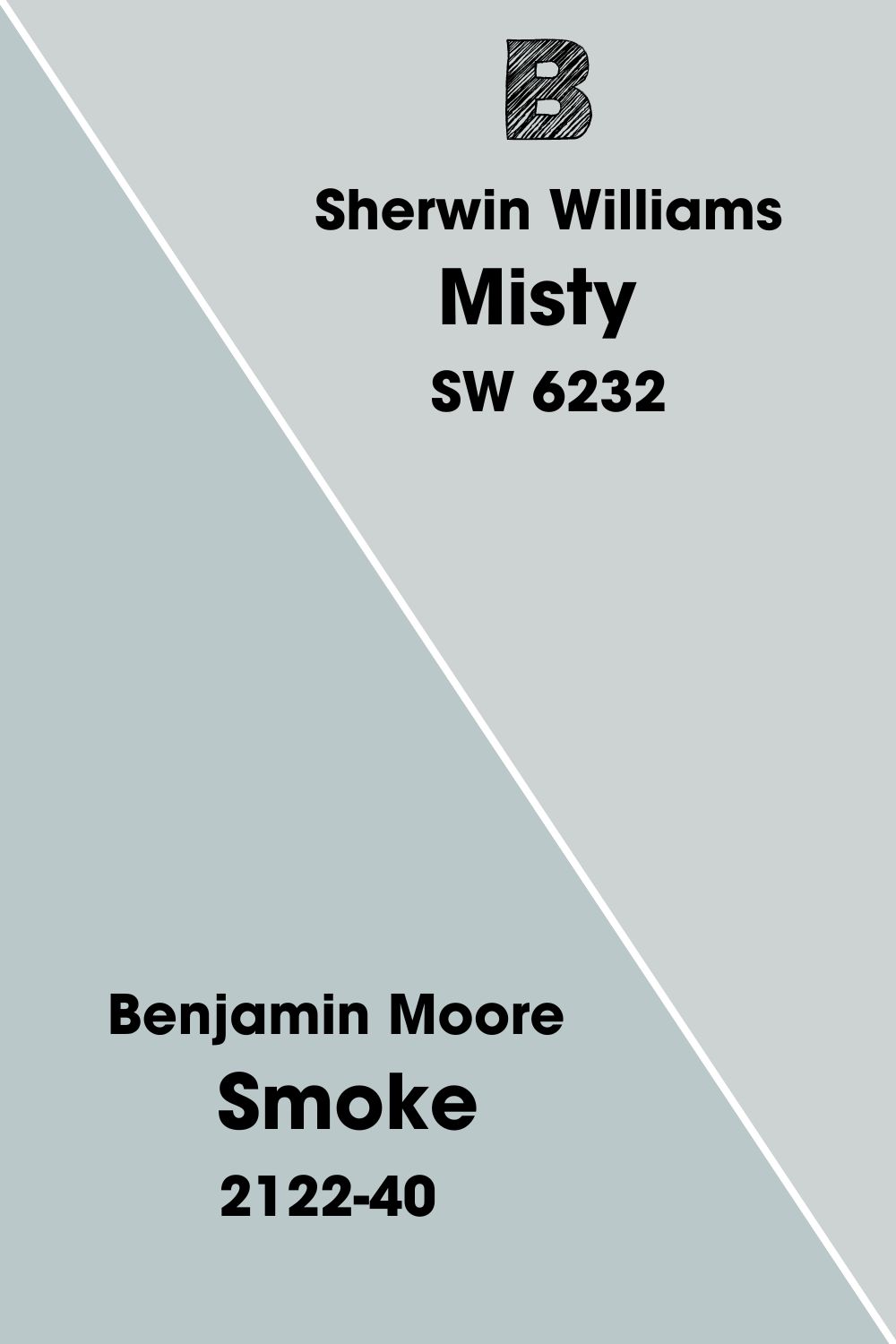
Benjamin Moore Smoke
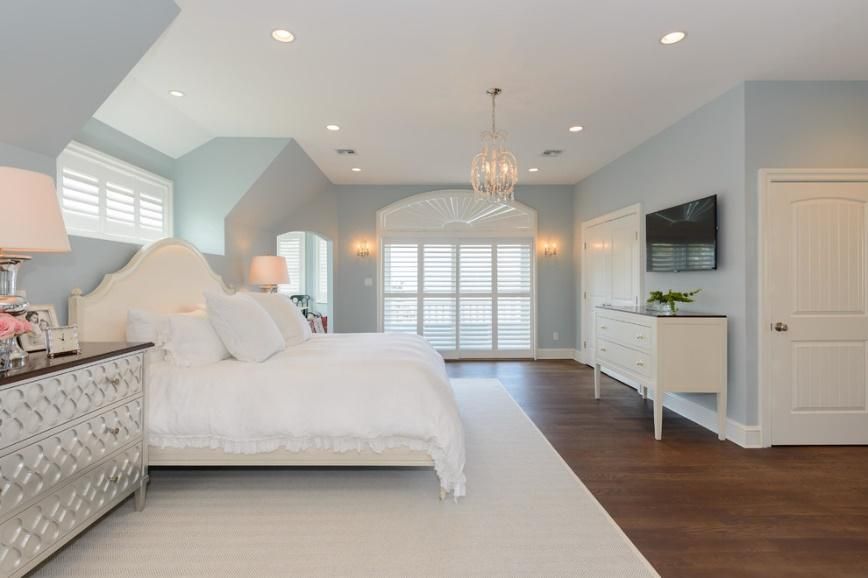
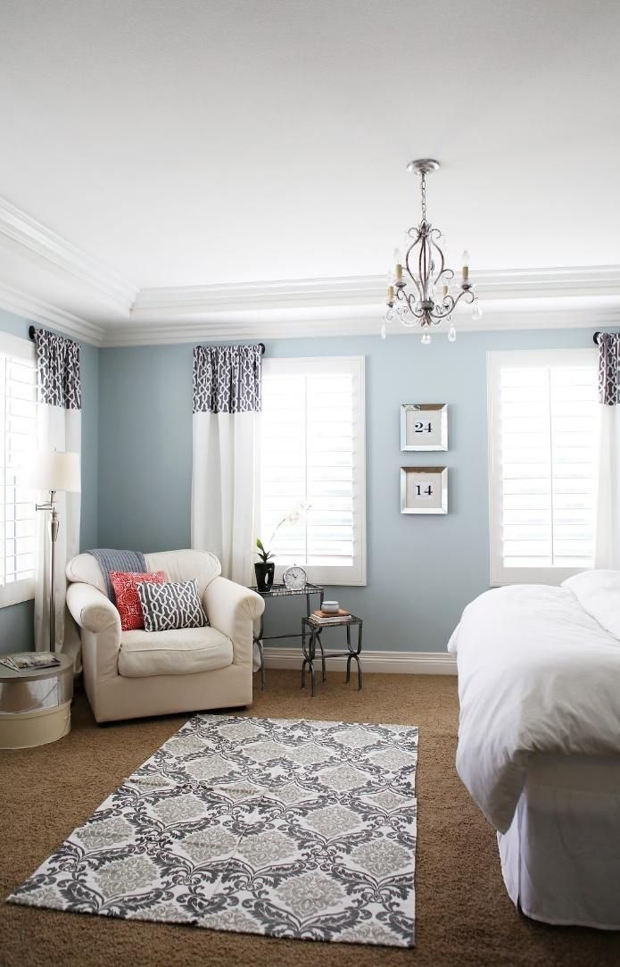
Smoke is a calm and gentle blue-gray that makes your space feel very relaxed and crisp. This color is excellent in coastal, modern, and contemporary interior design styles due to its LRV of 56.69, which places it at the lighter end of the scale.
When used in a room with enough natural light, it’ll appear lighter; in other rooms with a less light reception, the true blue emerges. The Benjamin Moore Smoke color palette should include beiges, light grays, and taupes for sweet contrast.
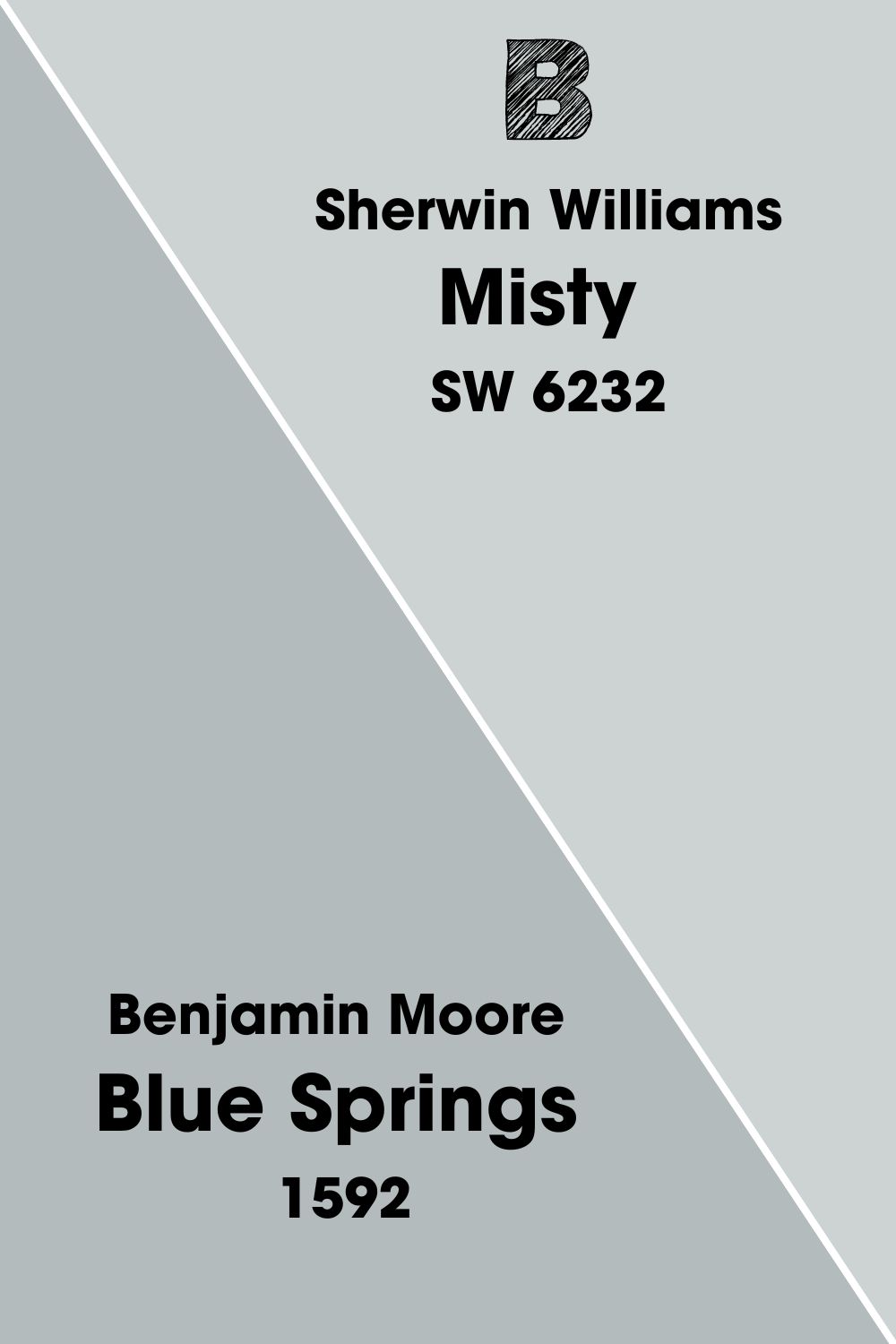
Benjamin Moore Blue Springs
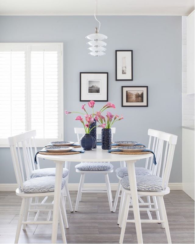
With an LRV of 48.59, this color is darker than the rest mentioned here, but we can’t ignore its richness. The near-frosty blue-gray is a performer in any lighting and will bring a refreshing cool vibe into your home in any season.
It’s neutral, so pair it with earthy tones, oranges, grays, and creamy whites for a great color palette.
How Does Light Affect The Color
Light will always affect your paint, whether you like it or not, except if your home has no windows, which is nearly impossible.
If you use Sherwin Williams Misty in North facing rooms, you’ll get a cool, chilly, and very gray side of Misty, all thanks to the strong effect of the Northern light, which is popularly tagged a “cold witch.” Rest assured; this room will look gray with a touch of blue.
East-facing rooms enjoy good and soft light, meaning paints like Misty will flourish in this place, especially in the mornings, but bid farewell to that sight as soon as the afternoon breaks. Nevertheless, this lovely sight is what you’ll see as soon as you wake up, and that’s good enough.
Sherwin Williams Misty will look warm and lighter in South facing rooms because the light coming in leaves a yellow cast on your hue- it may appear washed out if the sunlight is too bright, but this color and warm lighting are excellent partners.
At sunset, Misty will be at its lightest. Think of the Western light as drawing out this color’s fun and flirty side. If your room faces the west, get ready to enjoy a breathtaking view as soon as that 5. p.m sun hits.
Best Rooms To Paint Misty
Sherwin Williams Misty is a versatile color, which is why we’ve picked it among our top favorites, don’t be discouraged by the high Light Reflective Value; you can still make this color work in ample space, even on the exterior of your house.
The beauty of going bold with colors like these is the choice it affords you, either you choose to use it on the entire wall or just a section of the house, the result will still blow your mind absolutely.
Sherwin Williams Misty Livingroom
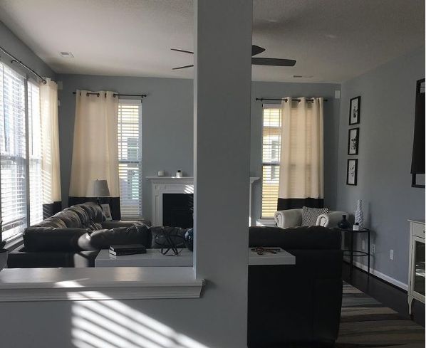
If you stick to the minimalist side of life, add metals and glass furnishings to achieve that. For lovers of traditional décor, keep the textures and color as close to wooden as possible, try creamier whites for a sharper contrast, and don’t shy away from warm lights in the living room.
Sherwin Williams Misty Kitchen
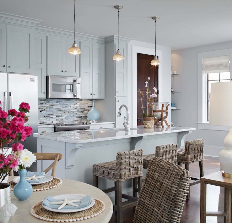
This color is perfect for your kitchen; if it gets many natural lights, that’s a big bonus. You can also use them in the smaller kitchen to maximize space and make them feel brighter and lighter. Cool-toned colors improve the cooking experience because you can feel the ease around you.
Pair your Misty with chrome-like textures and pull handles to create a seamless effect. Another fantastic way to lighten up your kitchen is to use dark blue-gray paint on the lower section of your kitchen cabinets. Try Sherwin Williams Storm Cloud to achieve the sharp contrast.
Sherwin Williams Misty Bedroom
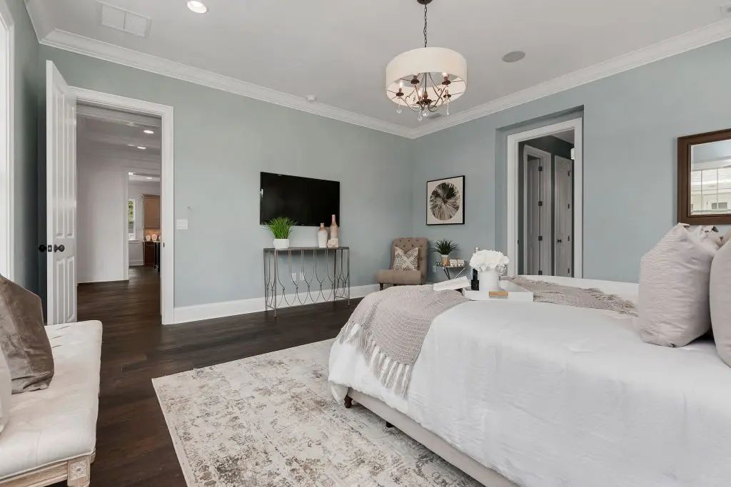
Your personal space should be your sanctuary and should always want to make you come back to a cool embrace. Sherwin Williams Misty is a soft color, perfecting your bedroom use. Pair it with a bold accent wall for a drastic effect.
Keep your bedding and floor mats in creamy whites, furniture in light beiges, and other wooden textures you can lay your hands on for that traditional vibe.
Sherwin Williams Misty Bathroom
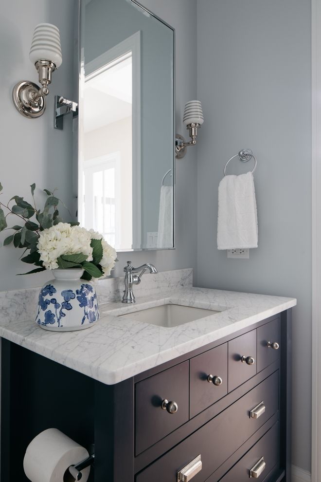
When Sherwin Williams Misty is used in a bathroom, it’s a true light blue color that works with the natural elements in there. So when you step into your bathroom, you’re in the most soothing space ever. Pair this color with wooden textures, rattan, and jute for a balanced environment.
Sherwin Williams Misty Exterior

Sherwin Williams Misty understands that job to a tee, whether it’s a nice beach house or you want to introduce the beach vibe into your home. The warm sunlight gives this color a tropical appearance that reminds you of a fun summer by the beach.
Always remember that every paint color has a different shade when met with varying intensities of light and may appear lighter and less pronounced. Pair your Sherwin Williams Misty exterior with crispy white trims for the pillars, deeper blues for the door, and a white roof to complete the transition. Beige foot mats and wooden railings are great ideas for your exterior too.
Understand that every color looks extremely washed out in the sun, so you will likely get a near-white appearance with this one, but your deep-colored accents will make up for it. Use gray, beige natural stone wainscotting for the patio columns and surroundings.
Sampling Sherwin Williams Misty
Sampling your paint before using it is a huge deal in interior work. The reason is simple: it helps you know and understand your color’s structure, how to use it, and where to apply it.
This is where Samplize comes in. This peel-and-stick strip allows you to test out patches of paint in different sections of your house for as long as you want. However, you can only get an accurate result using the strips on a pure white surface. Using it on a surface with existing paint will give you an inconsistent result.
We also advise that you use it in different rooms in the house and leave it on for a few days, this will help you see how they fare under different lighting conditions and at different times of the day. Samplize is effective, environmentally friendly, and cost-saving because you can use it repeatedly.
Parting Words
Now that you know everything you need about Sherwin Williams Misty, you can begin using this paint in your bedroom, bathroom, and exterior. Mix it with other colors on the color strip for a monochromatic effect or a neutral backdrop.
Remember to always sample your color before committing to it. This is important to help prevent mishaps and inconsistencies with the final outcome. Leave the bland décor behind and start a new, artistic journey with Sherwin Williams Misty.

