
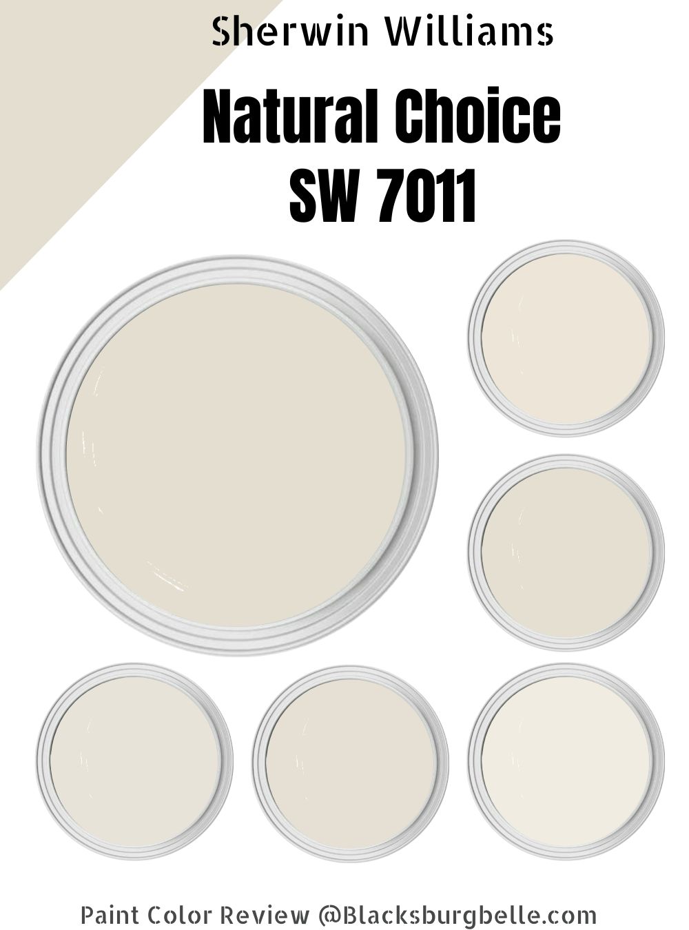
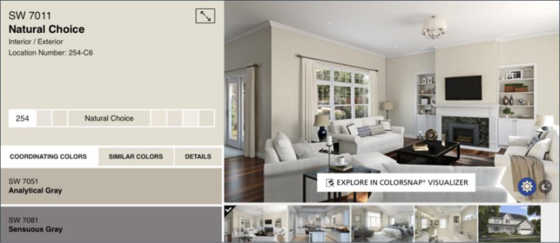
Natural Choice by Sherwin-Williams is a nuanced white paint with a rich cream base. Oftentimes, people shy from using white as an overall wall paint for fear of creating a clinical space. However, with a creamy paint like Natural Choice, that fear disappears.
The color has an ivory overlay that makes for great wall paints in contemporary and vintage-themed houses. You should see how it transforms in the morning and night – it’s magical.
Learn more about the undertones, how best to pair the paint, and everything in between with this guide.
Let’s start with a summary of what to expect with Sherwin-Williams Natural Choice.
Table of Contents
What Color is Sherwin-Williams Natural Choice?

You’ve got neutral, elegant, and two-toned beauty with Natural Choice. Its chameleon features make the paint a suitable choice for modern and vintage themes depending on how well you pair it.
Natural Choice has a high LRV of 73, so it can brighten your space without adequate lighting and present a cool aura. It’s one of Sherwin-Williams’ Top 50 colors due to its popularity, and most people buy it for its cool white feature.
| Manufacturer | Sherwin Williams |
| LRV | 73 |
| RGB | Red 227 | Green 222 | Blue 208 |
| Hex Value | #E3DED0 |
| Color Collections | Top 50 Colors, Finest Whites & Neutrals (Finest Whites) |
RGB of Sherwin-Williams Natural Choice
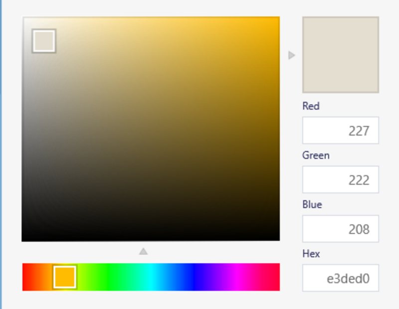
All you need to recreate Natural Choice is a perfect blend of three paints, red (227), green (222), and blue (208), into a true black paint. Due to its high red content, you can surmise that the paint carries a warm DNA even though the result is cool.
Light Reflective Value (LRV) Of Sherwin-Williams Natural Choice
This white paint is a medium-bright shade, as it’s well above the median but not quite on end. It sits comfortably in the middle of the bright end of the LRV spectrum at 73. That means without lighting Sherwin-Williams Natural Choice illuminates its surroundings.
Is Natural Choice a Warm or Cool Color?
Sherwin-Williams Natural Choice is often categorized as a cool color because it’s white in its natural state. However, during this review, I observed its ability to transform into a warm cream hue under darkness and dim lighting.
So, I’ll call it cool-warm paint. The part you get depends on the coordination (which other colors surround the paint) and lighting (how much light is ready to bounce off its surface?)
Learn more about its undertones and lighting effects below.
What are the Undertones of Natural Choice?
Natural Choice has a strong yellow, orange, and beige undertone, giving it a creamy look under dim lights and at night. You’ll get the best of these secondary tones when you pair the paint with warm colors like yellow, orange, and red.
The undertones add an air of mystery and Je ne sais quoi to the white paint. You’ll get different shades based on lighting position, which I’ll explain in a minute. Before that, check out the different expressions from Natural Choice below.

Sherwin-Williams Natural Choice Color Strip
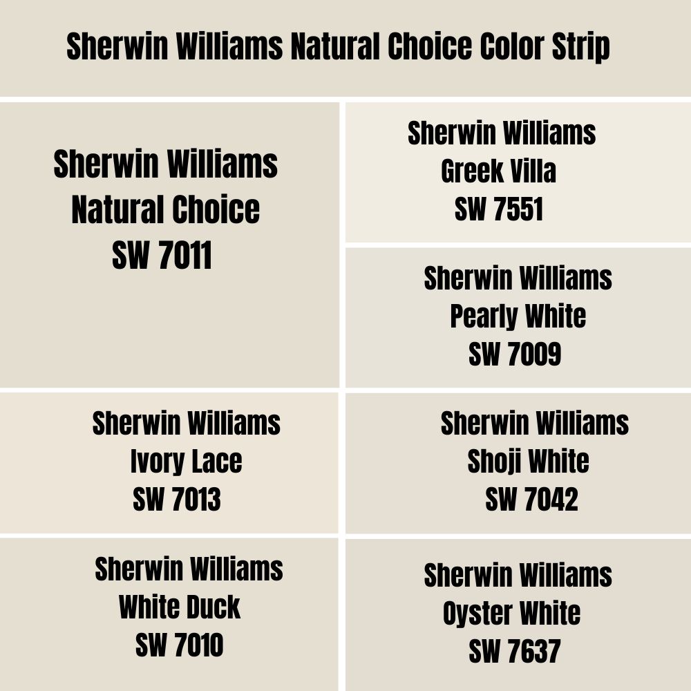
Three to Seven colors related to each other but different shades make a strip. It becomes relevant when you’re looking for alternative paints or if you want a monochrome-themed space.
In case you can’t access Sherwin-Williams Natural Choice, these are your options.
| Color Code | Color Name | Location Number | LRV | Color Tone |
| SW 7551 | Greek Villa | 254-C1 | 84 |  |
| SW 7009 | Pearly White | 254-C2 | 77 |  |
| SW 7013 | Ivory Lace | 254-C3 | 79 |  |
| SW 7010 | White Duck | 254-C5 | 75 |  |
| SW 7042 | Shoji White | 254-C4 | 74 |  |
| SW 7011 | Natural Choice | 254-C6 | 73 |  |
| SW 7637 | Oyster White | 254-C7 | 72 |  |
Sherwin-Williams Natural Choice vs. Sherwin-Williams Greek Villa
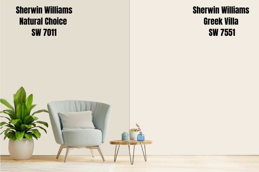
Off-white is very much in now for contemporary designing, and Greek Villa delivers that to perfection. The paint is warm-toned with a hint of deep beige leaning towards tan in his undertone.
Those undertones give Greek Villa a cozy feel despite being famous for open-space designs. Try this color for interiors with large glass windows and wide spaces to give the space a forever vacation feel.
It’s a very bright paint, so you’ll never feel like the walls are closing in on you. Use it in your bedroom if you’re dealing with anxiety and stress. It’ll transform your sleep in ways you can’t imagine.
Greek Villa walls do well with indoor plants of all colors because of their neutral tone, so get creative.
Sherwin-Williams Natural Choice vs. Sherwin-Williams Ivory Lace
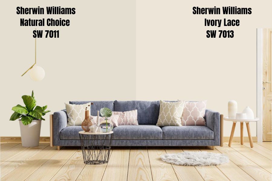
No one will ever accuse Ivory Lace of being cool because of its sharp yellow undertone. Whether it’s in the morning with bright natural light or a cool dark evening cloud, the paint stays true to its creamy hue, unlike Natural Choice.
Embrace the warmth in ivory white by pairing the paint with tan hues rich in yellow bases. You can also get vibrant with golden yellow decorations from throw pillows to the floorings and tapestry.
Sherwin-Williams Natural Choice vs. Sherwin-Williams Pearly White
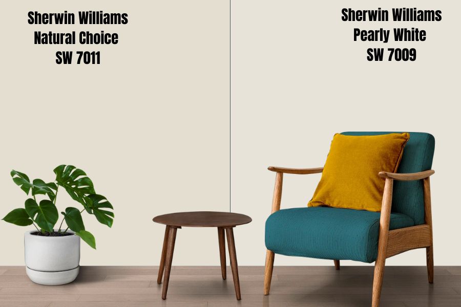
One thing about pearls is their nuanced appearance, and that’s why the name Pearly White fits this paint. It’s a pastel white paint with light sage green, yellow and cream undertones.
I love a color that gives you multiple sides of itself as it’s the best backdrop for an artistic design like complementary or triadic themes. Think of the possibilities Pearly White provides with its triple undertone.
You won’t get that with Natural Choice, although that’s a two-toned hue. Pair Pearly White with neutral trims like gray and black for a simple, neat style.
Sherwin-Williams Natural Choice vs. Sherwin-Williams Shoji White
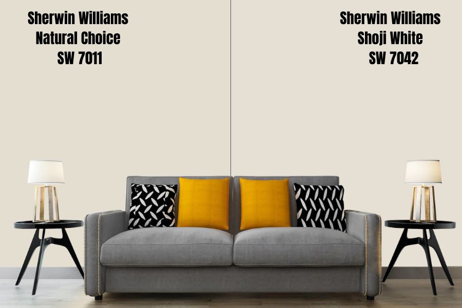
Sherwin-Williams’ Shoji White is about two percent brighter than Natural Choice, yet you can distinguish them without hassle. The trick is to pay attention to the undertones, as Shoji White has a greige tinge far from Natural Choice’s yellowish beige.
Hence, Shoji White is a purely cool color without any warmth hidden in its base. It’s a good paint for interiors, especially kitchens, bedrooms, and bathrooms. I love minimalist themes for Shoji White, as other gray paints highlight its beauty.
Sherwin-Williams Natural Choice vs. Sherwin-Williams White Duck
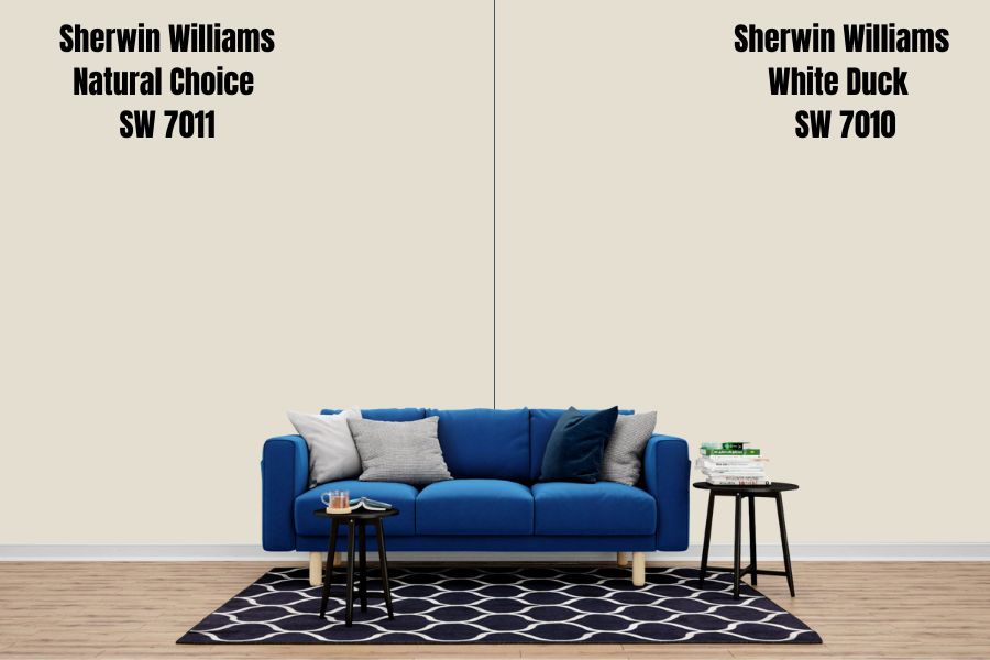
White Duck is the best alternative or substitute for Natural Choice if the need arises. They’re close in LRV, with the former being 75 and the latter 73, but they aren’t carbon copies of each other.
Sherwin-Williams White Duck is creamy like Natural Choice and transforms based on lighting, but the gray presence in its beige undertone separates it from its counterpart.
Anyone getting White Duck instead of Natural Choice doesn’t want the risk of the vibrant yellow undertone shining through. That’s a valid reason, so go ahead.
Sherwin-Williams Natural Choice vs. Sherwin-Williams Oyster White
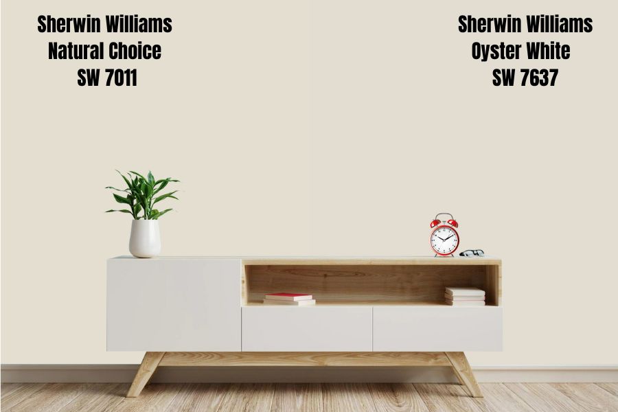
Homes surrounded by greenery (indoor and outdoor) would do well with Oyster White. The warm pastel paint has a strong sage green and greige undertone, unlike Natural Choice, which is free of green.
Choose Sherwin-Williams Oyster White as an alternative to Natural Choice to get a muted, warm tone into your space. The paint pairs well with bold sage green paints like Sherwin-Williams Rosemary for an airy presence or charcoal tones for a cozy vibe.
Sherwin-Williams Natural Choice Color Palette
Every organized space designed by a professional or interior decoration-savvy person develops from a coordinated color palette. Now that you’ve seen the color strip let’s discuss incorporating it into a theme.
Coordinating Colors for Natural Choice
There are several palettes you can use depending on the result you want. For this guide, we’ll stick to three popular palettes – Monochrome, Triadic, and Complementary Contrast.
Monochrome Decoration with Natural Choice
A monochrome palette uses a single color (Natural Choice) as the anchor for all the other hues in its surroundings. The colors differ based on shade – saturation and brightness – like the color strip.
You can use Natural Choice on the walls and accessorize with alternate tones from the furniture (settee, center table, side table) to the tapestry (curtains and blinds) and floorings (rugs, carpets, tiles.)
Alternatively, Natural Choice doesn’t have to be on the walls. It can be the focal point of the furniture, from cabinetry to doors and trims.
Triadic Decoration for Natural Choice
Artistic people would love Triadic Decorations due to its theme’s three evenly spaced and widely different colors. Natural Choice doesn’t have a straightforward triad as neutral paint, but you can use its undertones.
The primary undertone in Sherwin-Williams Natural Choice is yellow, then a slight orange and beige/cream.
Using yellow as the focus, the other two primary colors, red and blue, form the triad. If you want to highlight the orange, use the other secondary colors – purple and green.
Next, you have to decide which part of the triad you want to highlight – the main colors of other neutrals with them as undertones. Apart from the obvious first Choice, the second options are;
- Yellow Undertone– Reddish Tan and Blue White or Blue Gray.
- Orange Undertone– Gray and White with Purple bases and Tan with Green undertones.
Check out the color wheel below.
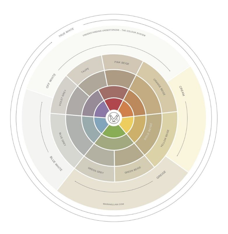
Contrasting Natural Choice with Complementary Colors
If the Triadic theme has too many colors for you, you can try a complementary design with contrasting colors. Once more, use the base notes in Natural Choice, which are yellow and orange (the blend forms beige.)
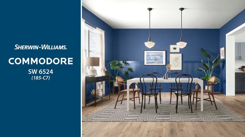
Check your color wheel containing primary and secondary hues for the opposite of your chosen paint. The opposite of yellow is purple, orange is teal, and cream is blue-white.
Some Sherwin-Williams teals are, Really Teal, Tantalizing Teal, Riverway, and Tame Teal. Try the following purple paints, Sensuous Gray, Imagine, Individual White, and Commodore (a bluish-purple shade.)
What Trim Colors Go With Sherwin-Williams Natural Choice?
Elevate your Sherwin-Williams Natural Choice wall with a bright white paint tinged with a yellow or orange base. The beautiful mix would bounce off the nuances in Natural Choice and radiate a warm shade in your space.
Add texture with warm woods like natural wood, honey oak, and cream for a bright vibe, or get into a vibrant contrast with dark wood like chestnut or mahogany. Alternatively, Natural Choice can serve as the trim on the right color – refer to the color palette above.
Sherwin-Williams Natural Choice Color Comparisons
Apart from the colors in the strip, some other paints have similar shades and saturations as Sherwin-Williams Natural Choice. Some come from the same brand, while others are similar parallels from different brands like Benjamin Moore.
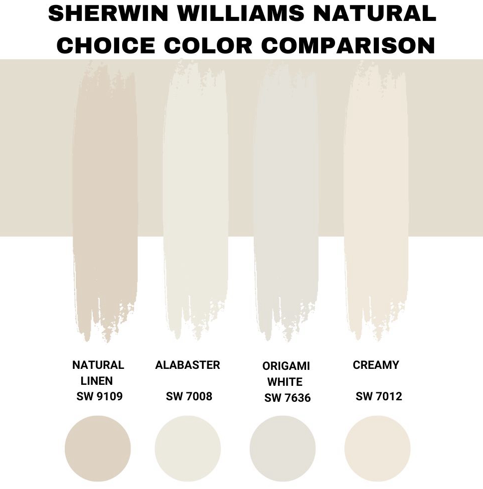
Sherwin-Williams Natural Choice vs. Sherwin-Williams Natural Linen (SW 9109)
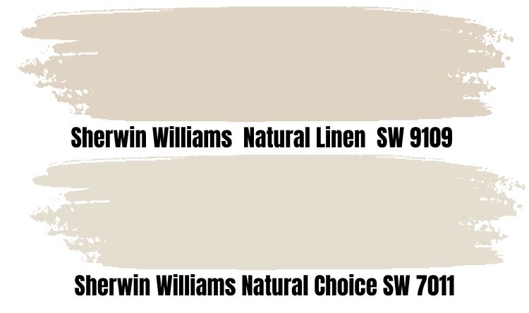
Natural Linen is as close to Natural Choice as you can get from Sherwin-Williams. They both have strong yellow and beige undertones, but the former also has gray hints cooling its overlay hue.
Hence, Natural Linen appears airier, dimmer, and a mellower yellow, unlike Natural Choice. This color thrives well with bold shades like rich tans, browns, and white for complementary and neutral themes.
It has an LRV of 66, making it darker than Natural Choice.
Sherwin-Williams Natural Choice vs. Sherwin-Williams Alabaster (SW 7008)
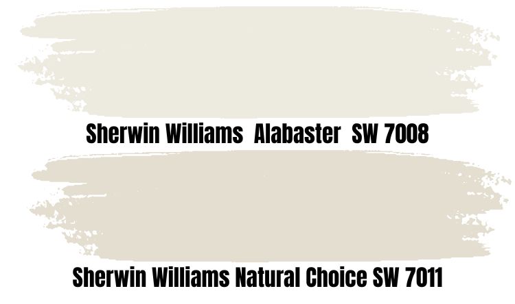
White paints are the most sought-after colors worldwide but getting the perfect shade requires thought and knowledge. Sherwin-Williams Alabaster is one of the most popular white paints from the brand, and it made the color of the month for April 2022.
The paint has a high LRV of 82 with a shocking creamy base making it off-white.
If you want white paint as the trim for Natural Choice, Alabaster is the way to go due to its creamy bases. Under the brightest light, the color’s white shine while its warm greige develops underneath a dim light.
Sherwin-Williams Natural Choice vs. Sherwin-Williams Origami White (SW 7636)
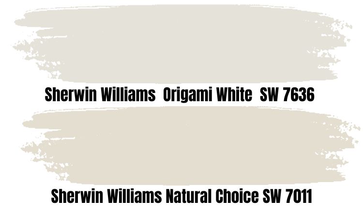
Origami White is the brighter color with only three percent higher LRV than Natural Choice. However, it has different undertones of violet and blue, separating it from its counterpart.
Hence, Origami White is a cool paint and not the best choice of trim for Natural Choice.
Sherwin-Williams Natural Choice vs. Sherwin-Williams Creamy (SW 7012)
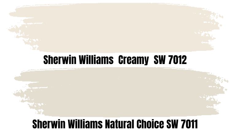
If you don’t get Alabaster, Creamy is the next best white coordinator for your Sherwin-Williams Natural Choice paint. It has a high LRV of 81 with a subtle yellow undertone that can create a warm environment when paired with the beige hint in Natural Choice.
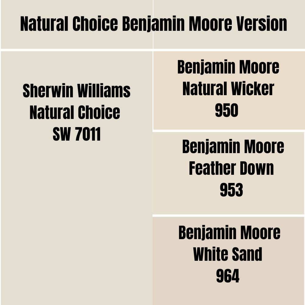
Natural Choice Benjamin Moore Color Comparison
Here are some of the top similar paints to Sherwin-Williams Natural Choice from Benjamin Moore.
Natural Cream (OC-14)
Benjamin Moore Natural Cream is a darker paint than Sherwin-Williams Natural Choice. This Benjamin Moore paint is more nuanced than its counterpart as it has contrasting undertones that bring warmth and coolness into the surroundings.
Natural cream sits at 64.78 LRV with blue, gray, and beige hints in the undertone.
Navajo White (OC-95)
Bring warmth into your space with Navajo White, a bright off-white paint with a cream and tan base leaning towards yellow. It’s brighter than Natural Choice by Sherwin-Williams at 78.26 LRV but isn’t bright enough to be a stunning trim.
Navajo White works as an alternate option, though.
Pompeii (OC-82)
Thanks to its vibrant orange undertone, you’ll get a tropical and sunny vibe from Benjamin Moore Pompeii, which makes it a peachy off-white paint. Pairing Pompeii with Natural Choice works in a triadic coordinated theme highlighting the orange in its undertone.
Acadia White (AC-41/OC-38)
Acadia White is a crisp off-white paint with a rich cream undertone presenting 83.32 LRV. It doesn’t look like Natural Choice underneath a bright light, but you’d see the similarities in dim light.
However, Acadia White is a warmer, brighter, ivory white than Natural Choice, the most common similarity.
Mayonnaise (2152-70/OC-85)
Benjamin Moore’s Mayonnaise is more yellow than white due to its high LRV of 88.07. It’s a warm pastel yellow paint with a cream overlay making it a suitable trim for dark tan paints like brown.
Natural Choice Benjamin Moore Version
Benjamin Moore doesn’t have any Natural Choice paint, but some similar paints exist. Try Navajo White, Natural Wicker, Feather Down, Creamy White, and White Sand.
How Does Light Affect the Color?
You’ll get two impressions from Natural Choice – the cool white that shows up under the brightest light and the creamy nude that comes out in the dark. It’s the reason people get confused that their paints aren’t the same as they saw on the sample.
Firstly, decide which side of the paint you’d love to highlight. If it’s the cool white, use Natural Choice under a South-facing window or room, as it gets the brightest light daily.
However, for the warm cream tone, North-facing windows are the best. They’ll give you a steady, dim light strong enough to tease out the cream and hold it in position.
As you’ve learned above, your coordinating colors also play a large part. So, don’t use warm tones where you want to highlight Natural Choice’s white, as it’ll only intensify its latent yellow, orange, and cream undertones regardless of the window position.
Best Rooms To Paint Natural Choice
It’s time to put everything you’ve learned into practice starting with deciding where you want your Sherwin-Williams Natural Choice paint. Since it’s both an interior and exterior-appropriate lacquer, it can go anywhere.
Natural Choice for Interior
When you use Sherwin-Williams Natural Choice inside, consider the medium-bright tone. It’s not a blinding shade with an 80+ LRV nor a perfect neutral at 50 – 60, so prepare for a lively space.
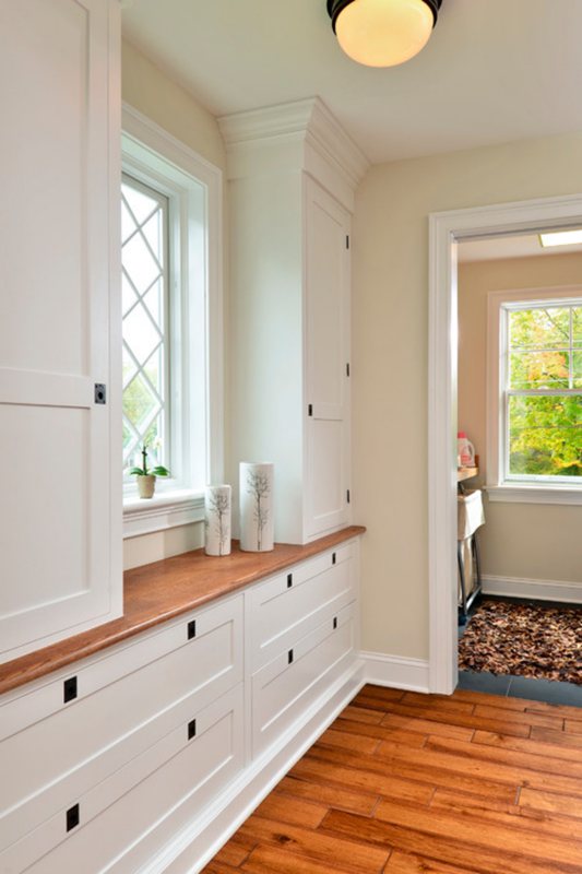
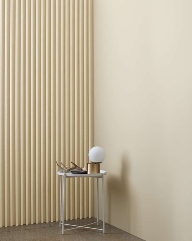
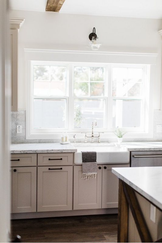
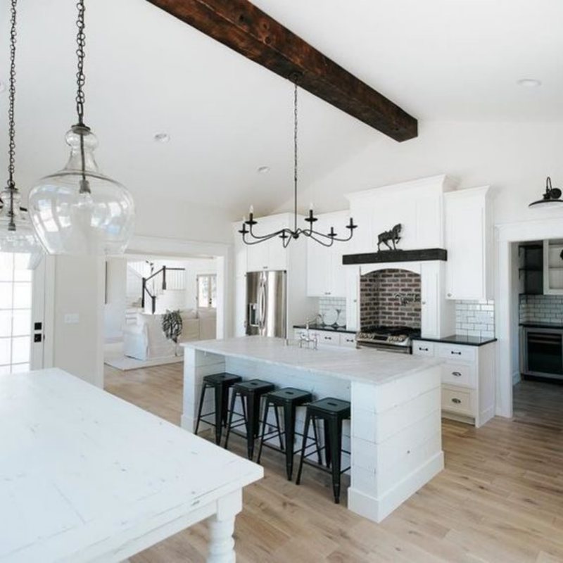
Natural Choice for Cabinets
Natural Choice is great for your cabinetry, whether you want a minimalist monochrome style or a contrasting theme. Warm white, orange, or yellow painted walls in the bathroom or kitchen can come alive with Natural Choice cabinetry.
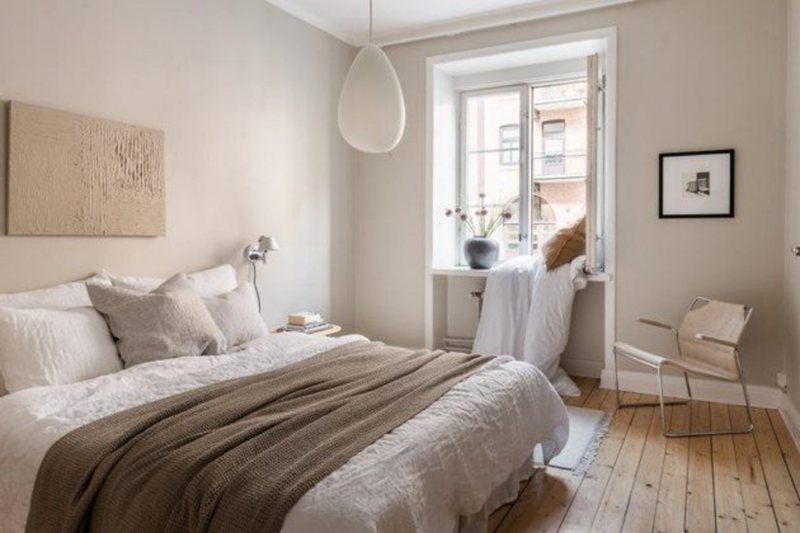
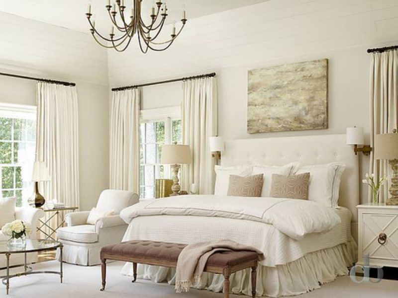
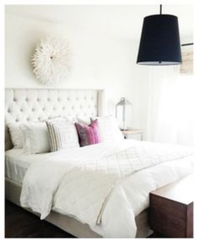
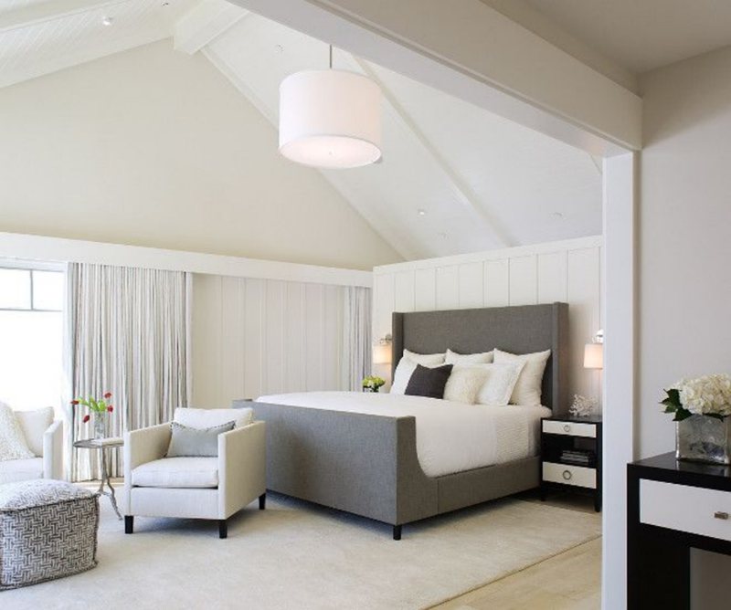
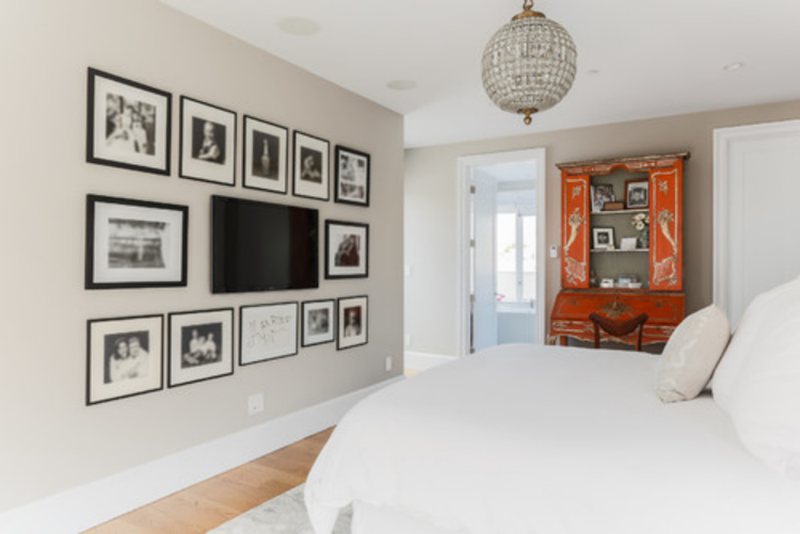
Natural Choice Bedroom
Most people go for cool vibes in their bedrooms because they often want to present calm auras, but warmth is also a great vibe for the sleeping area. If you dread mornings, incorporating brightness into your space is a great way to lift your mood.
Thanks to the undertones in Natural Choice, you can brighten the space with warm yellow beddings and tapestry. Throw in some oranges there for extra pizazz. You can also contrast the tone with rich tans and browns for a mature, elegant, and retro look.
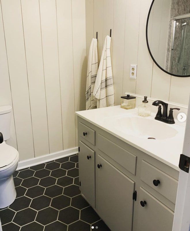
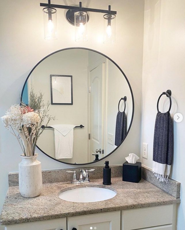
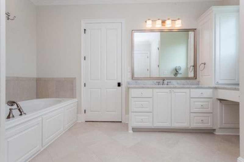
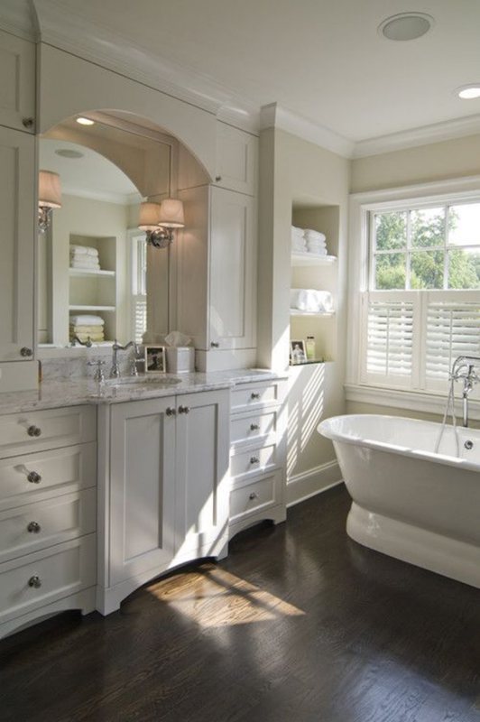
Natural Choice Bathrooms
Like bedrooms, creating a cool and spa-like vibe in the bathroom is the norm but let’s deviate from that and embrace the possibility of a Natural Choice-painted wall.
You can use the paint on your cabinetry and make the walls a vibrant shade or do it vice versa. This trick works best for children’s rooms as they’re often more creative and at the stage of self-expression.
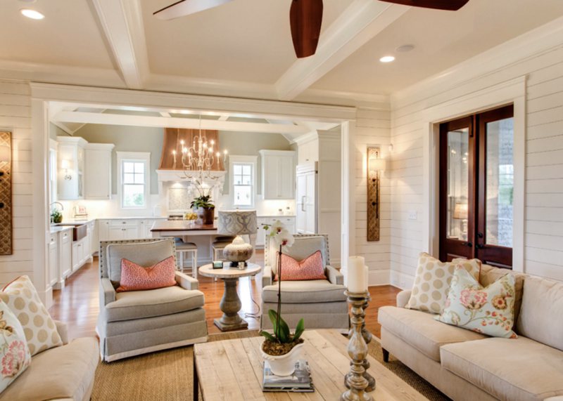
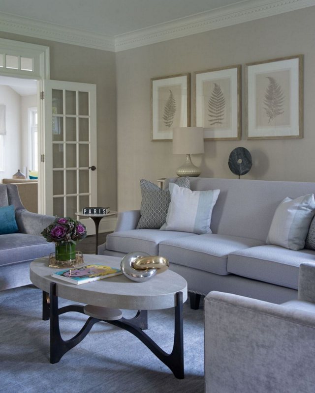
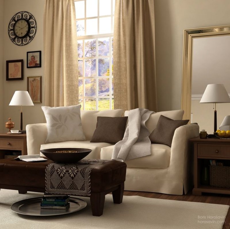
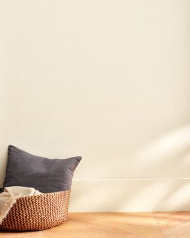
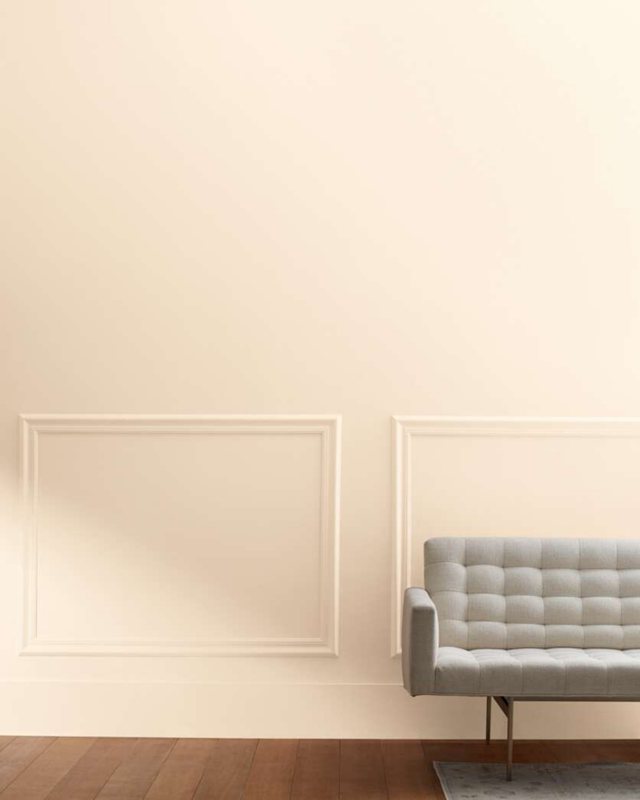
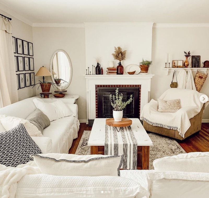
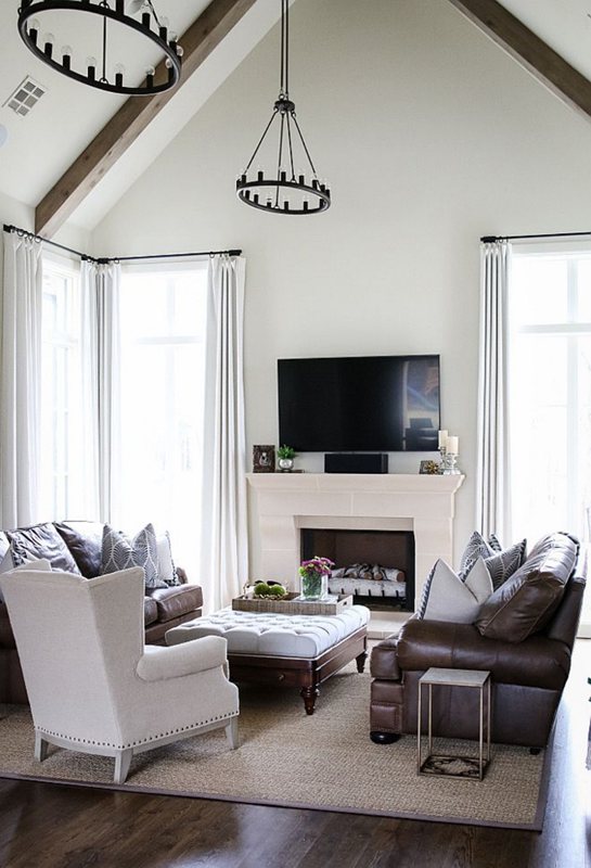
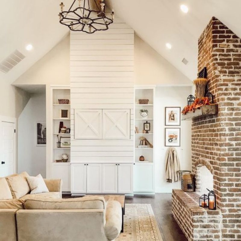
Natural Choice Living Room
It’s a no-brainer to paint your living room walls Natural Choice, especially if you hate clinical and crispy white shades.
The living area is where you welcome guests and spend most of the day (when you’re not working and staying home), so why not keep the vibe energetic? The morning light hitting through the drapes will surely add spunk to your mornings.
Also, its undertones are rich enough to help you curate the most creative space with floorings, tapestries, draperies, and furniture.
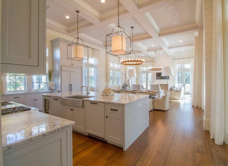
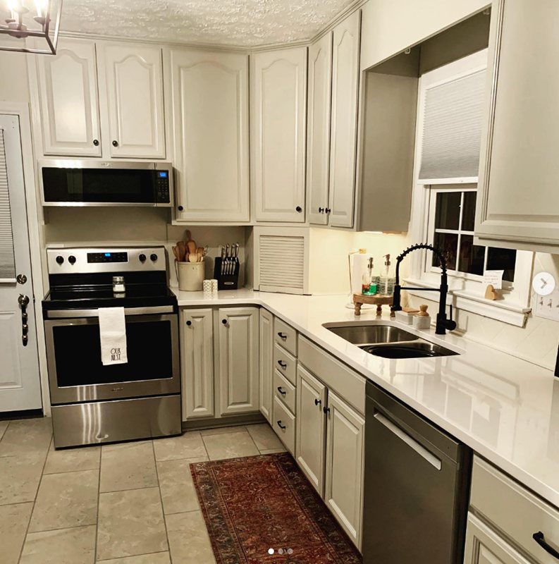
Natural Choice in the Kitchen
Using Sherwin-Williams Natural Choice in the kitchen can work in two ways – the furniture or the wall.
Make the paint your focus by putting it on your pantry door, backyard door, cabinetry, and trims, or keep it in the background by painting it on your walls.
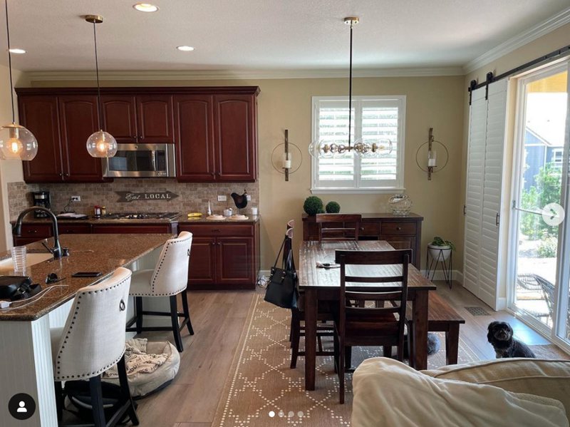
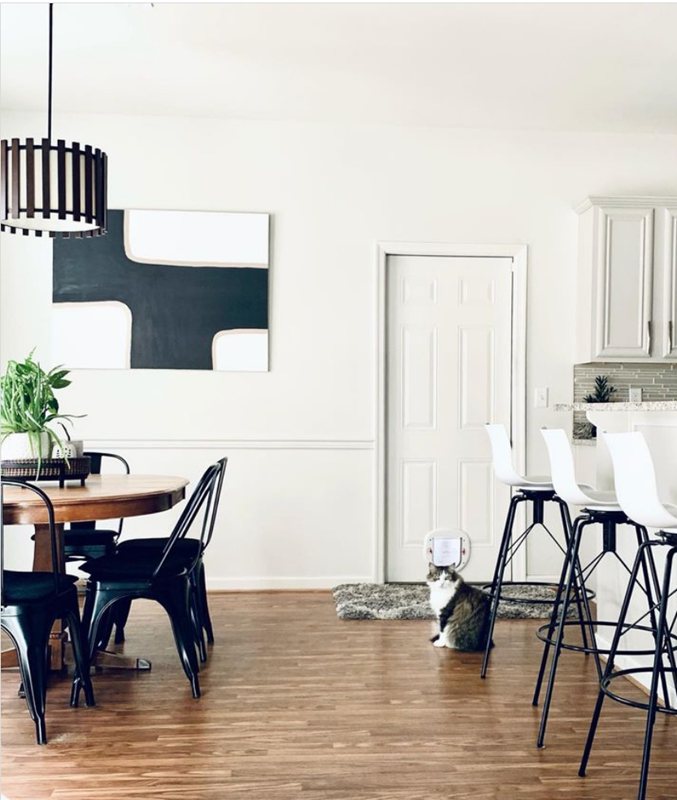
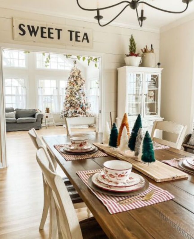
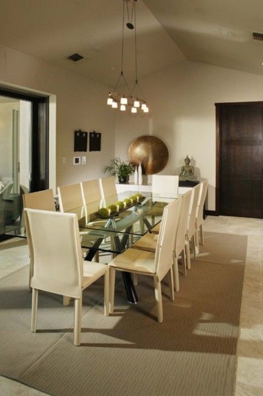
Natural Choice Dining Room
Know that whatever decision you make in your kitchen will influence the décor in your dining room, as they work best when they complement each other. Don’t use Natural Choice on all the walls, as it’ll present a bland style; instead, alternate your style.
A Natural Choice wall in the kitchen should mean that color for your dining room accessories – table, chairs, art, flooring, and drapery. On the flip side, the Natural Choice wall in the dining room works best when the kitchen has it on the cabinetry.
Typically, I’d say coordinate the rest with the choices in the kitchen (e.g., white walls for white dining furniture), but I’m feeling creative, so don’t be afraid to explore as many colors as possible.
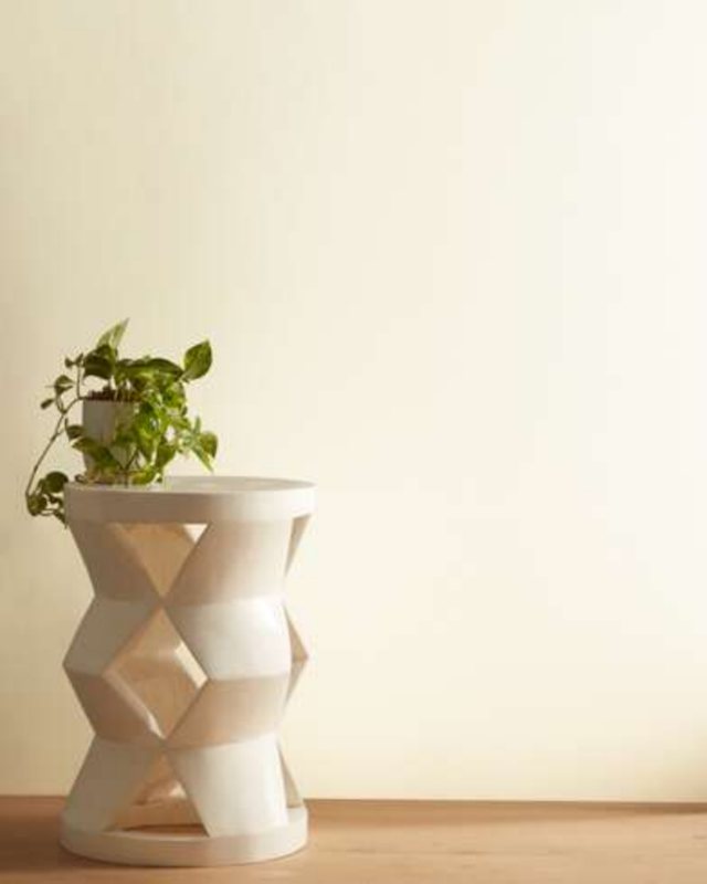
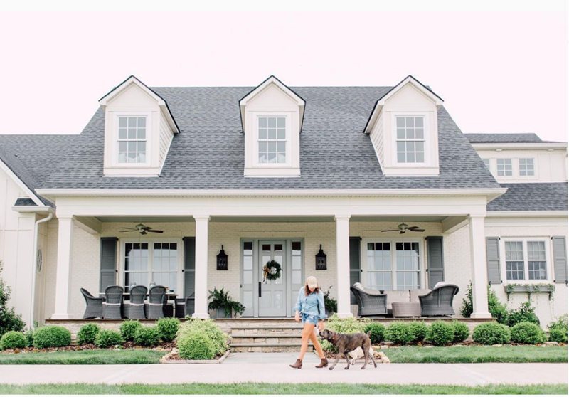
Natural Choice as an Accent Wall or Full Wall?
Whatever choice you make, Natural Choice is a goldfish that’ll always shine. It’s beautiful as a full wall to present a consistent vibe and a great option to add razzle as an accent. See the pictures above for inspiration.
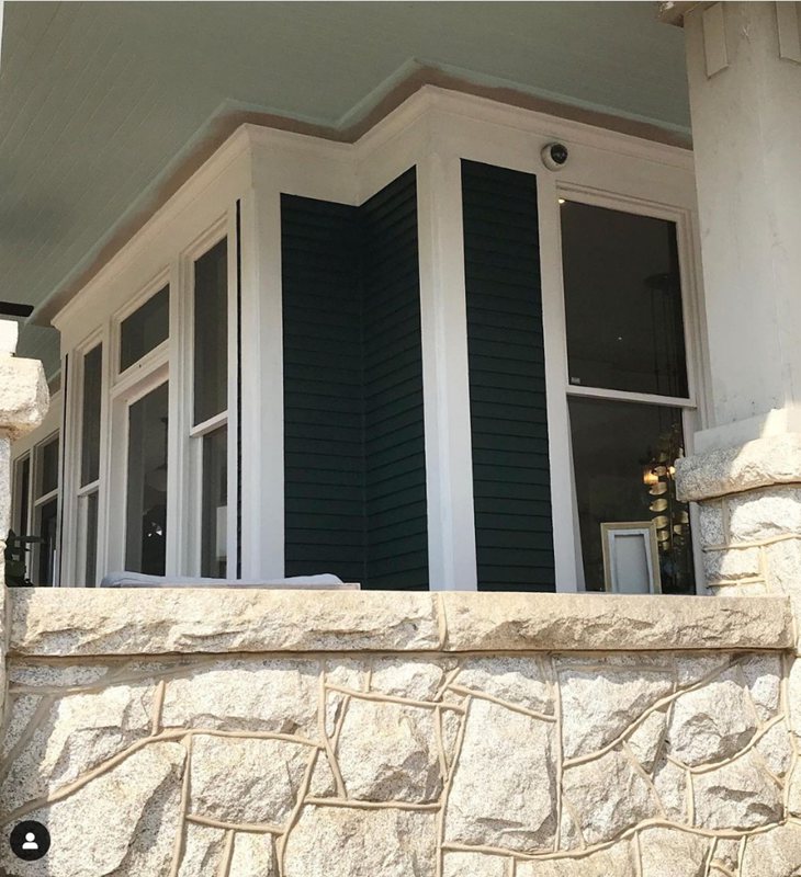
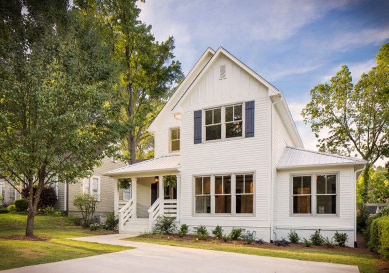
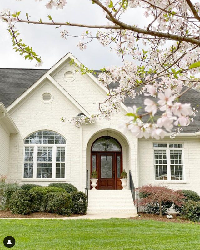
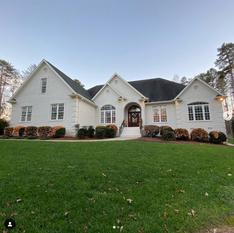
Natural Choice Exteriors
Paint Natural Choice outside on the full wall or as an accent door and trims. See some ideas below.

Sampling Natural Choice
Colors on the screen don’t always appear the same in real life, so it’s best to get samples. These pieces help you simulate your chosen paint, Natural Choice, in the desired space and practice the different lighting effects before purchase.
You can get Color-to-Go light paint, color chips, or peel & stick strips from Sherwin-Williams or Samplize (the Peel and Stick Strips only).
Final Thoughts
Natural Choice is a beautiful off-white paint you won’t regret choosing, especially in retro-themed Victorian houses. We could all use warmth in our lives, so check it out today.
 Sherwin Williams Eider White (Palette, Coordinating & Inspirations)
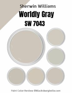 Sherwin Williams Worldly Gray (Palette, Coordinating & Inspirations)
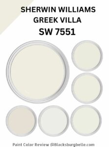 Sherwin Williams Greek Villa (Palette, Coordinating & Inspirations)
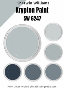 Sherwin-Williams Krypton (Palette, Coordinating & Inspirations)
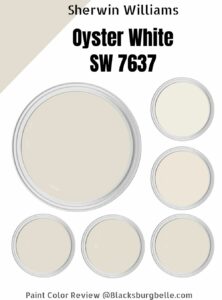 Sherwin-Williams Oyster White (Palette, Coordinating & Inspirations)
 Sherwin Williams Coastal Plain (Palette, Coordinating & Inspirations)
