
When blue paints are mentioned, what comes to mind many times is a paint color that is light and airy – but there’s a growing trend of using darker blues in paint, especially for those looking to make a bold statement.
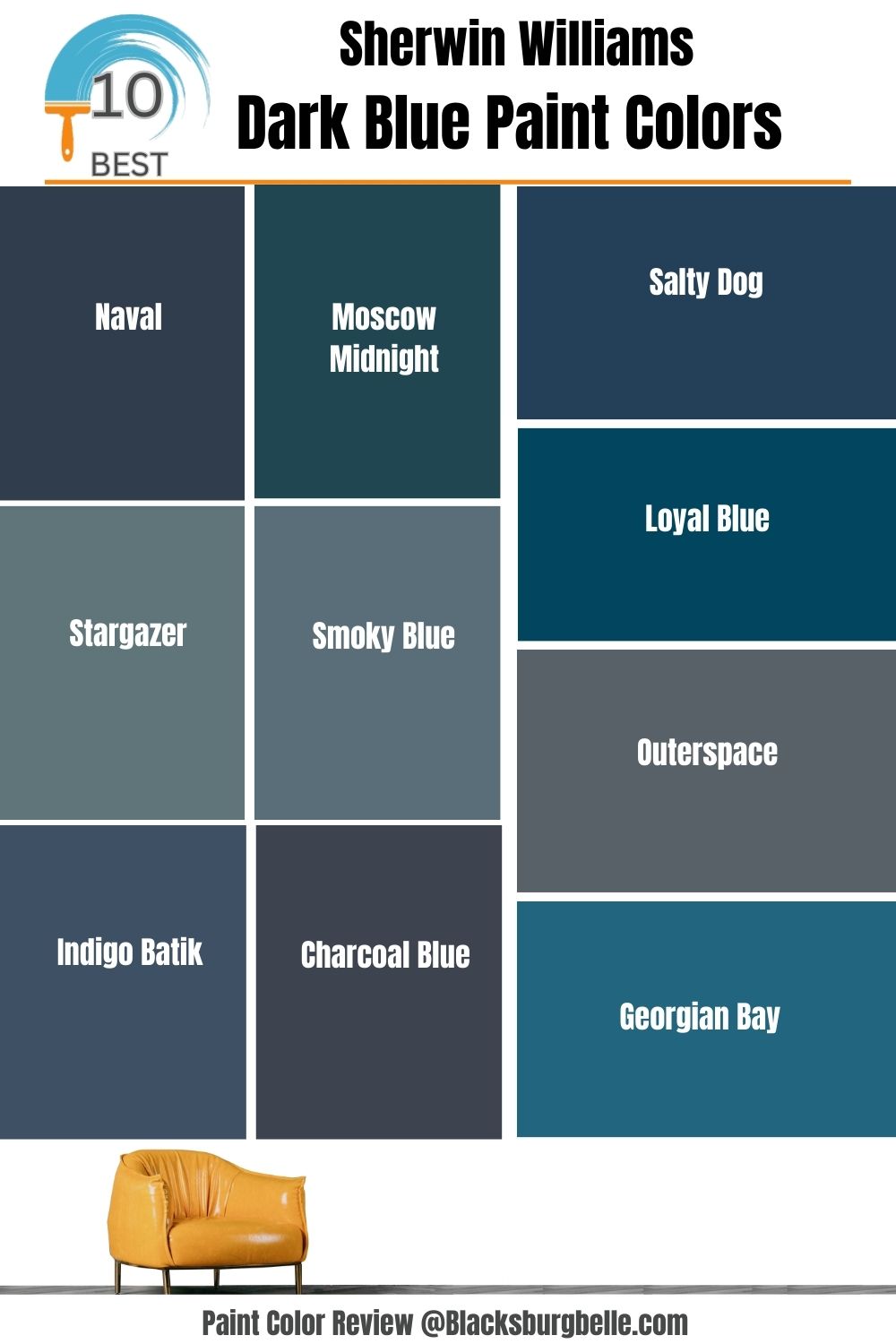
If you’re in the market for the perfect dark blue paint color, you may be overwhelmed by the countless shades and hues available. Sherwin Williams offers a variety of dark blue hues, including Naval, Stargazer, Smoky Blue, Outerspace, and Georgian Bay, among others, that can complement any home decor.
This article will highlight the top 10 Sherwin-Williams blue colors from our expert picks that will inspire you. Whether you’re looking for a soothing and relaxing blue for your bedroom or a bold and dynamic blue for your living room, you’ll find something that fits your style and sparks your interest.
Table of Contents
Choosing The Best Sherwin Williams Dark Blue Paint Colors
Before we get into the top 10 Sherwin-Williams dark blues, let’s look at some important factors to consider when selecting the perfect paint color for your space to help you make a more informed decision.
The following outline details the steps in selecting the best Sherwin Willaims blue paints for your interior and exterior design concepts.
Consider the Purpose of the Room
When considering the best Sherwin Williams dark blue for a room, it is essential first to consider the function of the room and how you will use it. It is a good idea to consider whether you want a bright and energizing hue, or a more subtle, calming tone.
Since dark blue hues are often associated with sophistication and elegance, they may be best suited for formal rooms such as living rooms, dining rooms, and bedrooms. Otherwise, a lighter blue or green may be a better choice for your space if you want a more vibrant, lively color.
Look at the Existing Decor of the Room
This is another critical step when deciding the best color for your space. Examine any existing decor and furniture in the room to ensure that the color you choose is appropriate for the space. You will notice that specific colors can be combined to form a palette that is both aesthetically pleasing and complementary.
If your space already has vibrant colors like oranges, yellows, and pinks, a light blue may be too muted for the space. Similarly, if your space contains neutral tones such as gray, beige, or white, a bright, vibrant shade of blue may be a better choice.
This is incredibly beneficial when using dark blue hues as a balancing element in a room with more vibrant colors.
Examine the Lighting Conditions of the Room
Lighting has a significant impact on the appearance of paint color. The same dark blue shade can appear dramatically different in natural and artificial light. Hence, before opting for a dark blue paint color, consider the lighting in the room and how it will affect the color’s appearance.
If your room is north-facing with limited sunlight, dark blue paint with warm undertones might be a good choice to add warmth to the space. On the other hand, a south-facing room with plenty of natural light could benefit from a cooler, more vibrant dark blue paint.
Determine the Undertones
Undertones are subtle hues that can affect how a paint color looks in different lighting conditions. They can be particularly important when it comes to dark blue paint colors because they can impact the overall mood of a room or house.
Typically, a dark blue paint color with green undertones can create a calming and serene atmosphere, while a dark blue with purple undertones can add a touch of drama and sophistication. When selecting one for a specific project, paying attention to the undertones of the dark blue paint color is vital.
Test Out Color Samples
Once you’ve decided on a dark blue paint color based on the above factors, the best way to see if it’s the right one is to test out color samples.
This can be accomplished by purchasing a small sample of the color and applying small swatches to the wall or by utilizing technology such as augmented reality, which can provide an accurate digital representation of the color’s appearance in its intended setting.
Decide on the Finish
A paint’s finish can also influence the overall appearance and feel of a room or house. Dark blue paint colors can look stunning in various finishes, but choosing the right one for the space is essential.
A matte finish, for example, can be excellent for hiding imperfections on walls, whereas a high-gloss finish can create a dramatic and modern look. Different types of finishes can also be used to achieve other looks, such as a glossy satin finish for a more subtle shine or a flat finish for an understated look.
Pro tip: For interior spaces, Sherwin Williams recommends eggshell or satin finishes for dark blue paint colors, while for exterior applications, semi-gloss finishes are recommended.
Make a Final Decision
Finally, after you’ve narrowed down your options and tested the color samples, it’s time to choose the paint color and finish that works best for you. Once you’ve made that decision, you can buy enough paint to cover the entire area and work on creating a beautiful space that will last for years.
Consult with a Professional
Choosing a paint color can be difficult, especially when dealing with dark shades, so it’s normal to have questions, and this guide will surely help with all your curiosities.
If you are still unsure about whether a dark blue paint color will suit its intended purpose, you can consult a professional designer or Sherwin-Williams expert who has extensive knowledge of color theory, lighting, and finishes and can help you select the perfect dark blue paint color for your space.
Sherwin Williams 10 Best Dark Blue Paint Colors
Now that we have identified the essential elements of selecting a paint color, let’s look at some of the most popular dark blue paint options that will pique your interest. So, sit back, relax, and enjoy this journey into the world of Sherwin-Williams blue paint colors.
The following are the top 10 Sherwin-Williams dark blue paints on the market that are sure to meet your unique taste.
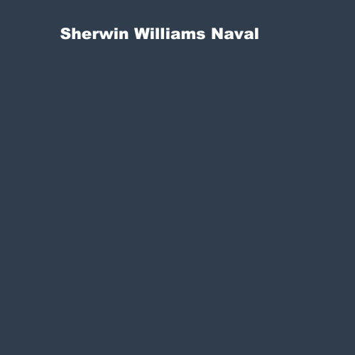
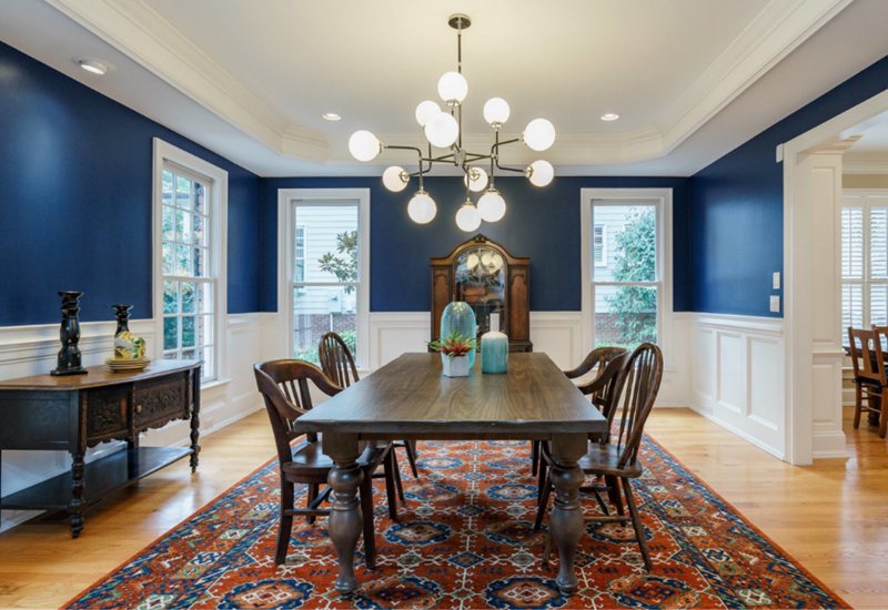
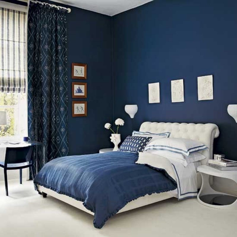
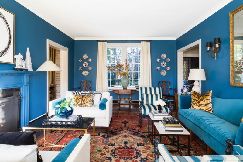
Sherwin Williams Naval (SW 6244)
The Sherwin Williams 2020 color of the Year, Naval, is still among the most popular and dazzling colors of the year 2023. It is a timeless dark blue shade that can create a sophisticated look in any room that will never go out of style. One lovely feature of this color is its warm feel creating a cozy and inviting atmosphere.
Naval has a blue base color and is considered a true navy blue. With an RGB value of 47/61/76, it has subtle green undertones that give it a rich, moody quality, making it an excellent choice for creating a stunning and classy look in any space. Given its low LRV of 4, this color absorbs more light than it reflects, but this does not detract from its timeless appeal.
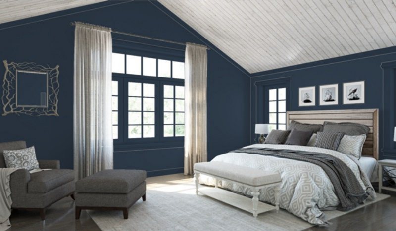
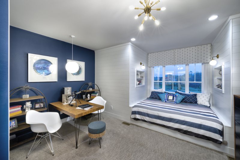
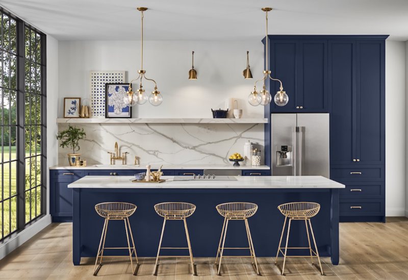
The images above demonstrate Naval’s versatility in creating bold and subtle looks. It creates a moody and intimate atmosphere in bedrooms and living rooms, adding sophistication and elegance to dining halls.
Naval pairs well with warm neutrals like beige and cream, as well as metallic accents like brass and gold, and is sure to create a luxurious and inviting space. Its versatility in any design concept is one of the reasons why it is one of the most sought-after dark blue colors, earning the 2020 color of the year.
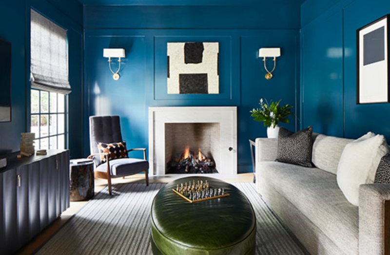
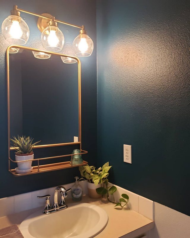
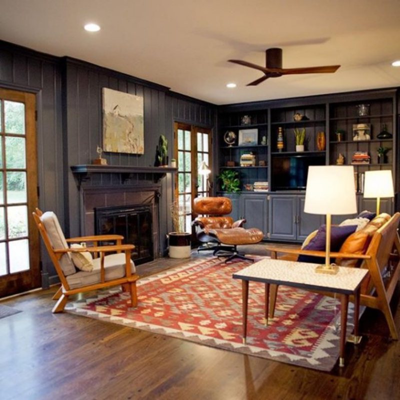
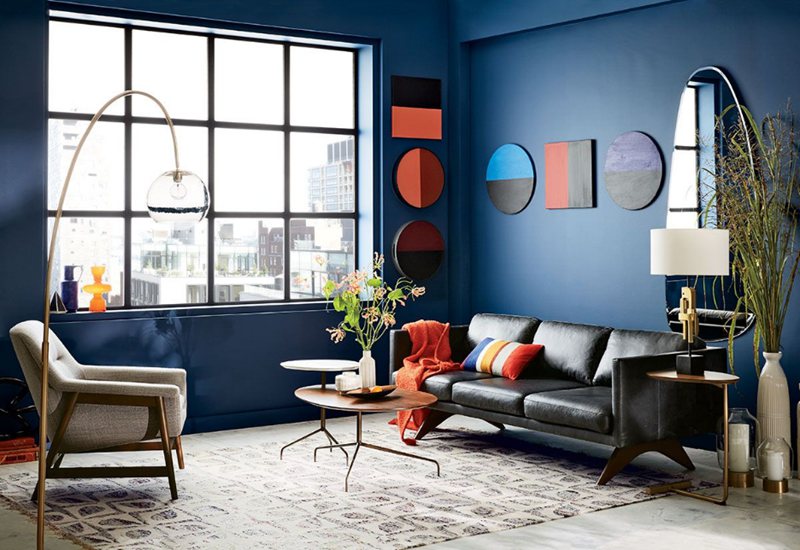
Sherwin Williams Moscow Midnight (SW 9142)
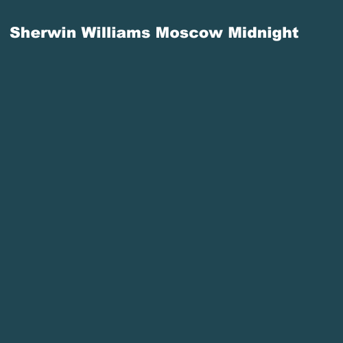
The Moscow Midnight is another stunning dark blue paint color that’s capable of adding elegance and a soothing feeling to any home decor setting. This deep blue hue is strong and bold, making it perfect for creating a dramatic look in any room.
Moscow Midnight has a low LRV of 5 and absorbs more light than it reflects, making it ideal for creating a cozy and intimate atmosphere in a room. With an RGB value of 32, 70, 82, it has a blue hue with subtle purple undertones that give it a rich, regal quality, making it an excellent choice for creating a luxurious and sophisticated atmosphere in a space.
What we love the most about the Moscow Midnight paint color is its natural monochromatic theme that contrasts the overall look. It looks great in modern minimalist spaces because it goes well with both neutral and vibrant colors, allowing you to create a one-of-a-kind look for any space.
You can use it in bedrooms, living rooms, dining rooms, and even hallways and entryways to make a bold and elegant statement, as shown in the pictures below.
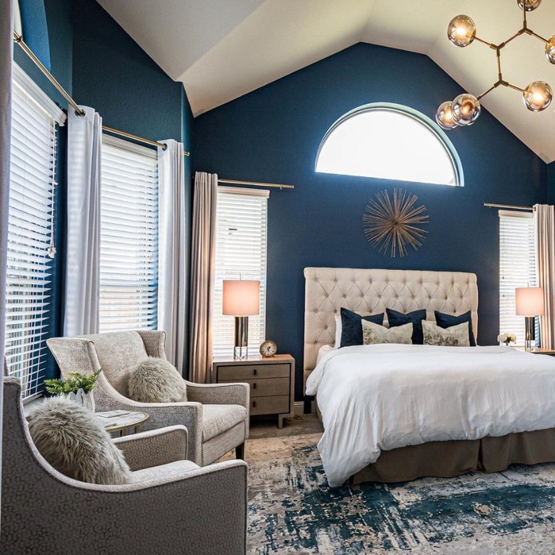
Sherwin Williams Stargazer (SW 9635)
The Stargazer is one of the top dark-blue colors from Sherwin Williams, quickly gaining popularity and dominating the market in 2023. With its stunning atmosphere and deep blue hue, which perfectly complement each other, it can add a luxurious touch to any space.
It is an excellent choice for creating a tranquil atmosphere in a space due to its subtle green undertones. The green undertones are not overpowering but provide a refreshing contrast to the blue hue, making it a distinct and sophisticated color.
Stargazer is a very dark color with RGB values of 96/117/122 and an LRV of 17. While Stargazer and Moscow Midnight have slightly similar shades.
Also, there is a slightly muted green undertone with the Stargazer, whereas Moscow Midnight leans more towards a deep navy blue undertone. Nonetheless, both colors are adaptable and can be used in various design schemes.
This color has numerous applications; some of which include cabinetry and kitchen upholstery because it adds a “pop of color” to the room. The charm of the shade can also make a bold and elegant statement in bedrooms, living rooms, dining rooms, and even hallways and entryways.
A truly remarkable hue, as you can see from the images above.
Sherwin Williams Smoky Blue (SW 7604)
Saying the Smoky Blue remains one of our favorite Sherwin-Williams blue colors is no lie. Not only does this paint color evoke a sense of calm and serenity, but it also adds a touch of sophistication and elegance to any space, plus, it pairs well with a variety of other colors and design styles, making it a versatile choice.
Smoky Blue’s base color is blue, but it features deep gray and black undertones that adds a touch of depth and complexity to the color. The gray undertone makes it an excellent choice for creating a calm atmosphere while maintaining a rich and luxurious feel. Like other dark blue colors, Smoky Blue has an RGB value of 89, 110, 121, and an LRV of 15.
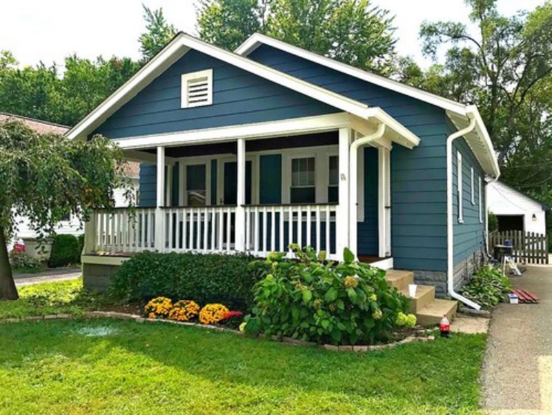
From indoor to outdoor decor, Smoky Blue does it all. It pairs well with neutrals like white and gray and warm-toned fixtures like gold and copper. It is a popular choice for various decor styles, such as modern, rustic, or coastal. It can also be used as an exterior color, creating a dramatic statement for the front door or shutters.
Plenty of natural light is important when using this color, as it can appear darker and moodier in low-light settings.
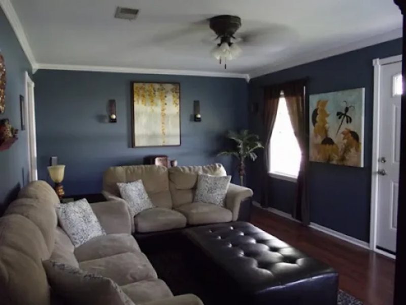
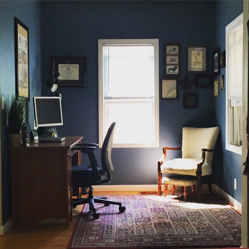
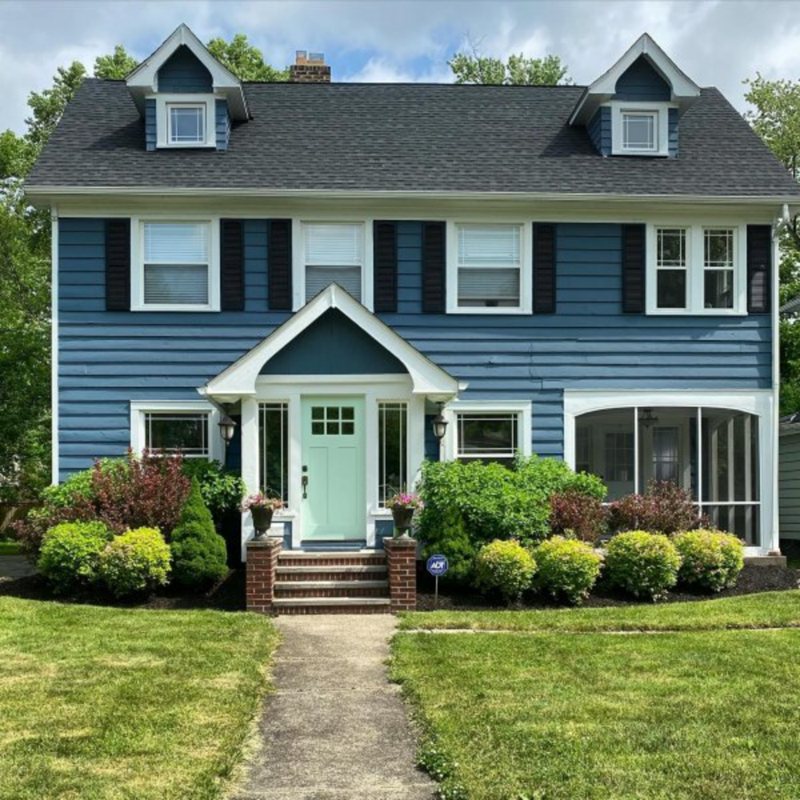
These looks do not do enough justice to this color; you must experience it in all of its splendor. From simple office spaces to home decor, this color brings depth and richness to any space. Its versatility makes it the perfect choice for various projects, from professional settings to outdoor accents.
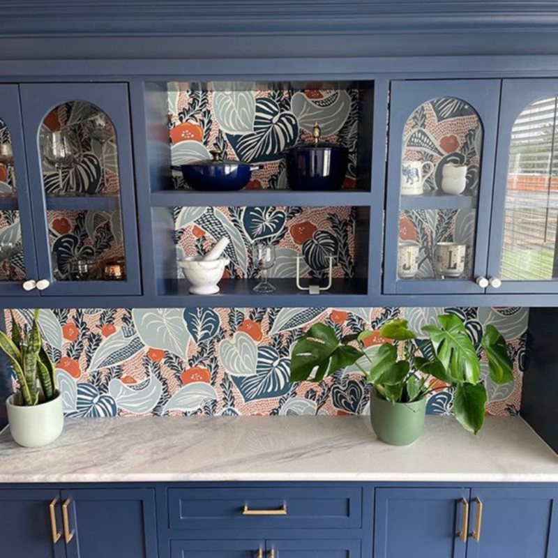
Sherwin-William Indigo Batik (SW 7602)
Sherwin Williams Indigo Batik is an excellent choice for a more subdued, classic look. Its deep blue hue adds a touch of sophistication to any space. Paired with crisp whites and natural wood accents, Indigo Batik creates a timeless and elegant aesthetic that is both polished and refined.
Its RGB values are 62, 80, 99, and it has a relatively low LRV of 8, making it a very dark color with green and gray undertones. The green undertone enhances the color’s warmth and richness, while the gray undertone adds depth and intensity. Combining these undertones makes Indigo Batik popular for creating a bold and dramatic statement in a space.
Furthermore, this 2023 trendy paint is perfect for interior and exterior applications. You will appreciate the dimension it brings to any space, whether on walls, furniture, or decor. Its versatility makes it easy to pair with other colors, creating a cohesive and stylish look.
The images below are just a few examples of how this color can be incorporated into various styles and aesthetics, whether through clothing, accessories, or home decor. From bold and vibrant to soft and subtle, the possibilities are endless with Indigo Batik.
Sherwin-Williams Charcoal Blue (SW 2739)
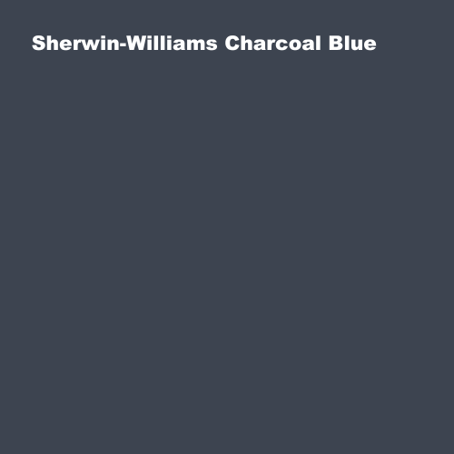
If texture and depth are essential to you, then Charcoal Blue is the color for you. Its enigmatic, deep blue hue adds depth and sophistication to any space, creating a captivating and dynamic atmosphere. With RGB values of 61/68/80, and an LRV of 6, this deep moody blue is an excellent choice for creating a dramatic mood in any space.
Charcoal Blue evokes a sense of tranquility with its gray, black, and green undertones, making it ideal for relaxation spaces such as bedrooms and home offices. Those looking for a striking accent wall or a bold contrast to light furnishings will appreciate this color.
With its deep and detailed blue paint color, Charcoal Blue is perfect for creating a dramatic and chic interior or exterior look. Pair it with metallic accents and rich textures of gold and beige for a luxurious feel.
In essence, Charcoal Blue is famous for accent walls, kitchen cabinets, and bathroom vanities. It can also be used for exterior decors, making a bold and dramatic statement for the front door or shutters, as seen in the images below.
Sherwin Williams Salty Dog (SW 9177)
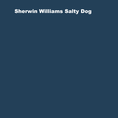
When we think of Salty Dog, the first thing that comes to mind is its natural beauty. This truly remarkable color is one of the most unique and captivating blue shades out there; it’s a lovely mix of deep blue and white that emits a calming energy identical to that of a dog.
So, how much do we know about this hue? The base color of Salty Dog is blue with a muted green undertone; this distinguishes it from other dark blue paint colors. Salty Dog has a distinct personality thanks to its green undertone, making it a refreshing choice for coastal-inspired or beach-themed interiors.
Its RGB values of 35/64/88 and LRV of 5 are similar to other dark blue colors, but it has a warmer texture. This adds depth and richness to the color and allows it to mix and match with a wide range of other colors for endless styling options.
For all its aesthetics, Salty Dog pairs well with navy blue and beige for a classic nautical look, or with bright pink for a fun and playful color combination. Whether you’re going for subtle sophistication or bold and daring, Salty Dog can complement any style.
Check out these styles to see how Salty Dog can elevate your home designs.
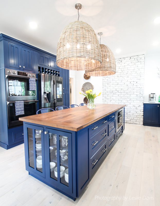
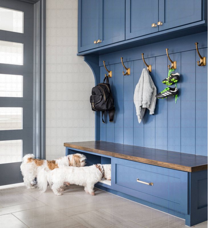
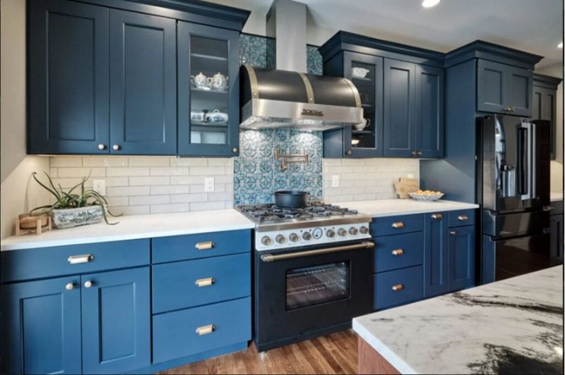
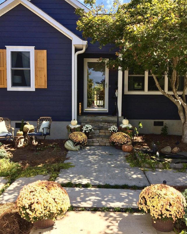
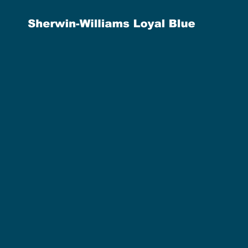
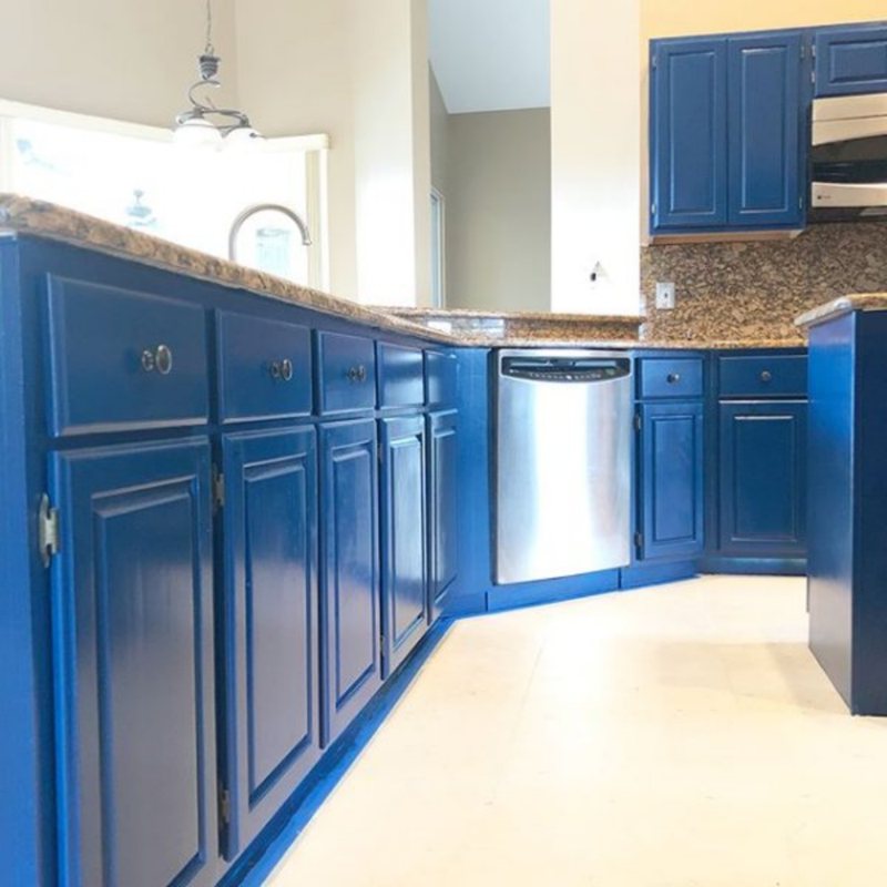
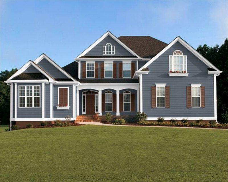
Sherwin-Williams Loyal Blue (SW 6510)
This is the deep blue color choice for cabinetry and kitchen counters.. This blue has a smooth and glossy finish and is ideal for creating a bold and modern look in your home. Additionally, the durable and scratch-resistant properties of Loyal Blue make it a practical choice for busy households that want a stylish yet functional look.
Other details about this shade include its base color, which is blue with muted undertones of gray, purple, and green. The undertones do not overpower the color but rather add depth and complexity. The undertones may become more prominent depending on the lighting, creating a distinct and dynamic shade.
Loyal Blue has an RGB value of 1/69/94, resulting in a deep, rich blue color. It has a relatively low LRV (Light Reflectance Value) of 5, making it an excellent choice for creating a moody and intimate atmosphere in a room. It works great as an accent wall, cabinet, or furniture piece, as well as in a bedroom or living room.
The images below detail how Loyal Blue can transform your kitchen fixtures from a dimly lit room into a lively and inviting space.
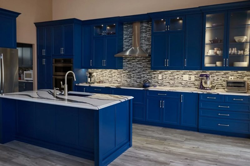
Tip: Loyal Blue looks best in rooms with plenty of natural light, as it can appear darker and moodier in low-light settings. If your room lacks natural light, consider additional lighting fixtures to boost the color’s vibrancy and personality.
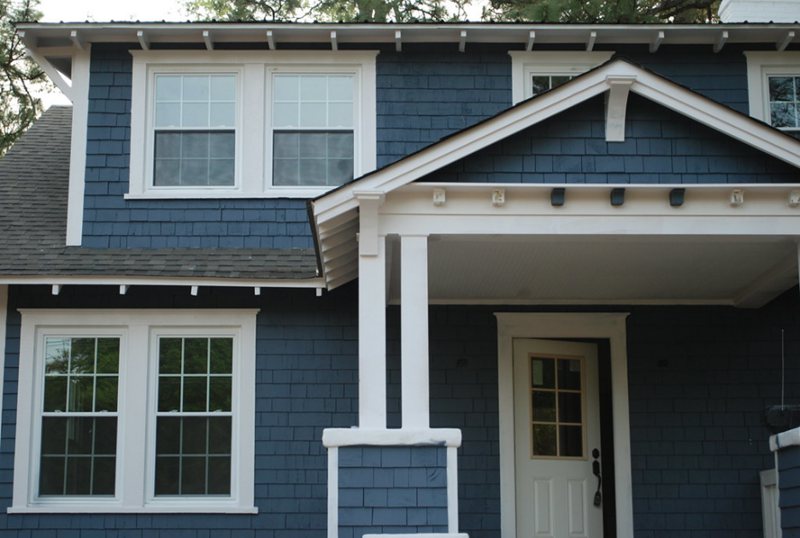
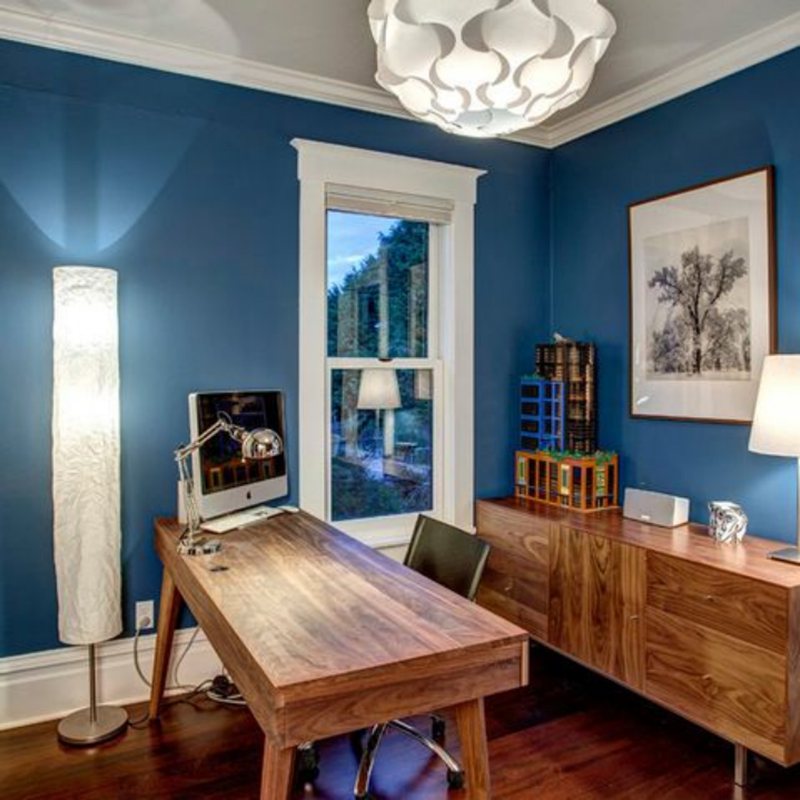
Sherwin-Williams Outerspace (SW 6251)
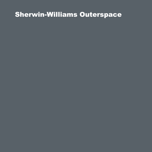
As the name implies, Outerspace is a deep, dark, and mysterious shade of blue that resembles the vastness of the universe. It can lend a sense of calmness and sophistication to any space and is often a fantastic choice for neutral regions and exteriors in your home.
Outerspace is a versatile pick for a variety of design applications. It has neutral gray and green undertones that coalesce, giving it a balanced, cool feel. Since it lacks a dominant undertone that clashes with other colors, it is a great choice for pairing with a wide range of warm and cool colors.
Outerspace has an RGB value of 88/97/104, which gives it a rich and saturated blue color. Its LRV is on the lower scale of 12, which balances the vibrancy of its deep blue hue, preventing it from feeling too flat or one-dimensional. It pairs well with neutral colors like white and gray, as well as with warm wood tones and metallic finishes.
To get the most out of this color, consider using it for exteriors or regions with a lot of natural light, such as a sunny patio or a bright living room. Outerspace also works well in coastal-themed decor, as it evokes the rich, deep blues of the ocean.
See the images below to see how Outerspace enhances the nautical theme of an outdoor and neutral setting.
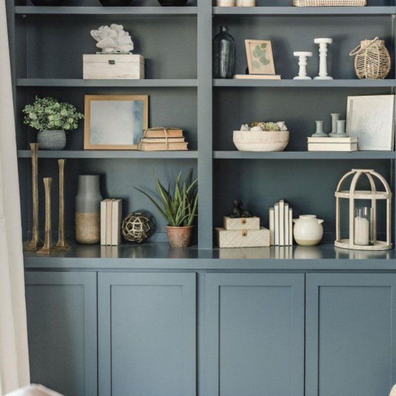
Sherwin Williams Georgian Bay (SW 6509)
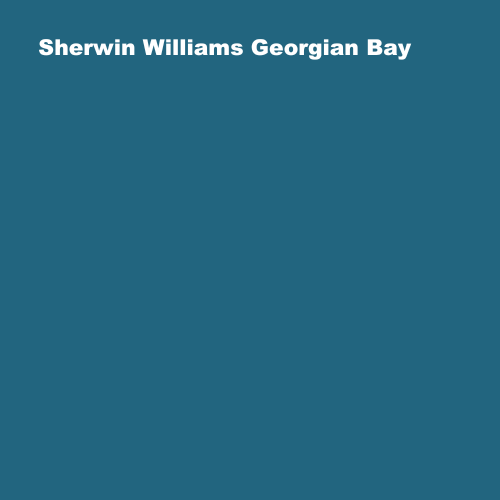
There are classic dark blue colors, and there is the Sherwin-Williams Georgian Bay! Our list would be incomplete without mentioning the unique and refreshing splash of blue that Georgian Bay provides to any space. It is a bold and beautiful deep blue-green color that evokes the natural beauty of the Canadian lakes, after which it is named.
Its unmistakably rich and deep color is popular with both homeowners and designers. If you’re looking for a color that has a timeless elegance while also adding depth and sophistication to your space, this classic dark blue shade will not disappoint.
It has an LRV of 11 and RGB values of 34/101/127, resulting in a deep and rich color. Georgian Bay has a blue-green base color with a subtle gray undertone that adds depth and complexity. The gray undertone adds sophistication and a touch of modernity to the color, making it suitable for various design styles, from traditional to contemporary.
Although Georgian Bay is commonly used for living room and bedroom walls, it can also work its magic as an accent color for furniture, accessories, and exterior decor. Its adaptability makes it a popular choice among interior designers and homeowners alike, and it is unquestionably a top choice to consider.
To get a sneak peak of its magic, check out the images below to see how this deep bluish shade can transform a room from drab to fab without distracting the theme.
NB: If you look closely at the listed colors, you’ll notice that they all have an LRV value of 20 or less. This indicates that these colors are very dark and have a low reflection value.
This is advantageous if you want to create a moody or dramatic atmosphere in your design because these colors evoke a sense of depth and intensity. However, using too many of these colors may make your design appear heavy or somber, so balance them with lighter shades or pops of color.
Final Thoughts
Dark blue is a versatile color that works well with a wide range of color schemes and styles. We’ve compiled a list of its most trendy colors, ranging from deep navy to muted slate, along with miscellaneous design ideas to consider.
Whether you prefer a simple and classic look or something bolder and daring, these 10 distinct colors are bound to add a timeless and stylish touch to your living space.
 17 Best Sherwin Williams Green Paints (Trend 2023)
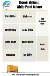 10 Best Sherwin Williams White Paint Colors (Trend 2023)
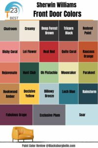 23 Perfect Sherwin-Williams Front Door Colors (2023 Trends)
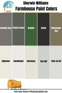 10 Best Sherwin Williams Farmhouse Paint Colors (Trend 2023)
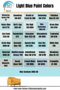 31 Best Light Blue Paint Colors: Review and Inspiration
 15 Best Pewter Paint Colors: Comparisons and Suggestions
