
Trying to play it safe with your paint colors? In such a case, pale gray is always a perfect choice. However, which option do you choose, considering the numerous gray hues on the market?
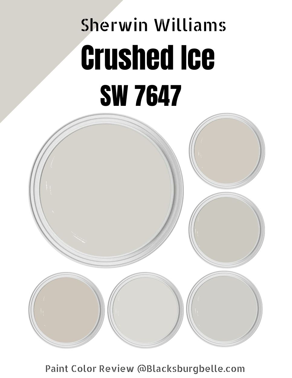
Sherwin Williams Crushed Ice could be a perfect choice. It has always been my go-to color whenever I need a safe color choice that leans both traditional and modern.
Interestingly, this soft neutral gray has always worked for my home, giving a hint of color while still allowing my décor to shine. Moreover, since Crushed Ice is neutral, I can pair it with accent colors featuring warm and cool undertones, giving me a lot of flexibility when decorating my home.
In this detailed Sherwin Williams Crushed Ice SW 7647 review, we will answer all your questions about this paint color. Read on to learn its RGB, LRV, the colors to pair it with, and colors to use on your trims.
Are you ready? Let’s dive in!
Table of Contents
What Color is Sherwin Williams Crushed Ice (SW 7647)?
| Manufacturer | Sherwin Williams |
| LRV | 66 |
| RGB | R: 214 G: 211 B: 204 |
| Hex Value | #d6d3cc |
| Color Collections | 2021 Continuum, Top 50 Colors, Living Well, Minimalist, Reasoned |
Sherwin Williams Crushed Ice is a pale gray color. It is a pastel, off-white paint that gives delight to any space. The color boasts a magical character, an inviting touch, and a maximum sleekness that makes it work for almost any space.
RGB of Sherwin Williams Crushed Ice
The RGB scale informs us of the amount of red, green, and blue that goes into making a specific paint color. It is a scale running from 0 to 255. Crushed Ice SW 7647 combines red: 214, green: 211, and blue: 204.
LRV of Sherwin Williams Crushed Ice
The LRV scale measures the reflective ability of a specific paint. It stands for Light Reflective Value—the scale starts at zero and ends at 100.
You will find pure black on the lower end (at zero), reflecting zero percent light. On the higher end, you will find pure white, which reflects 100% of light. Sherwin Williams Crushed Ice sits near the middle with an LRV of 66.
Is Sherwin Williams Crushed Ice a Warm or Cool Color?
Crushed Ice 7647 is a warm paint color. However, this color is more balanced and could fit more in the neutral category. However, it has some warm undertones that make it lean toward the warm end of the scale.
The paint color boasts deep, warm undertones that make it feel enlightened, comfortable, and cozy. The color also creates the illusion of a brighter, airier, and lighter space.
What Are the Sherwin Williams Crushed Ice Undertones?
While Crushed Ice is less committed to undertones than other gray colors, it is not a TRUE gray. The paint color favors the green undertone. However, the paint color can flash violet or blue undertones in the proper lighting.
Sherwin Williams Crushed Ice Color Strip: Sherwin Williams Crushed Ice Color Comparisons
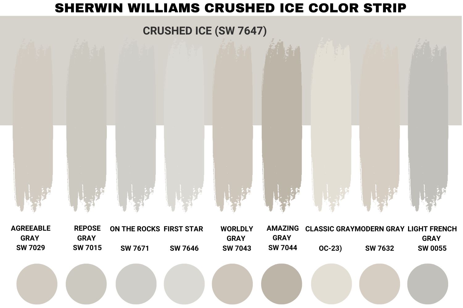
Sherwin Williams Crushed Ice vs. Agreeable Gray (SW 7029)
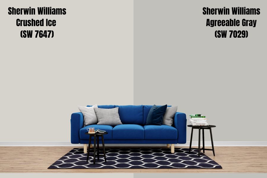
While Sherwin Williams Crushed Ice reflects 66% light, Agreeable Gray comes in with an LRV of 60, reflecting 6% less light. While there is no doubt Agreeable Gray is light, it is not the “Washed-out off-white” kind of light—it will make a statement even in an overly bright room.
While Crushed Ice features green, blue, and violet undertones, Agreeable Gray is more of a greige paint color, with almost similar undertones. While the most prominent undertone in Crushed Ice is green, the Agreeable Gray may also show some blue and violet undertones in the right lighting conditions.
Like Crushed Ice SW 7647, Agreeable Gray is also a warm color. The warmth in the two colors can play a good role in a north-facing room, helping balance out its coolness.
Sherwin Williams Crushed Ice vs. Repose Gray (SW 7015)
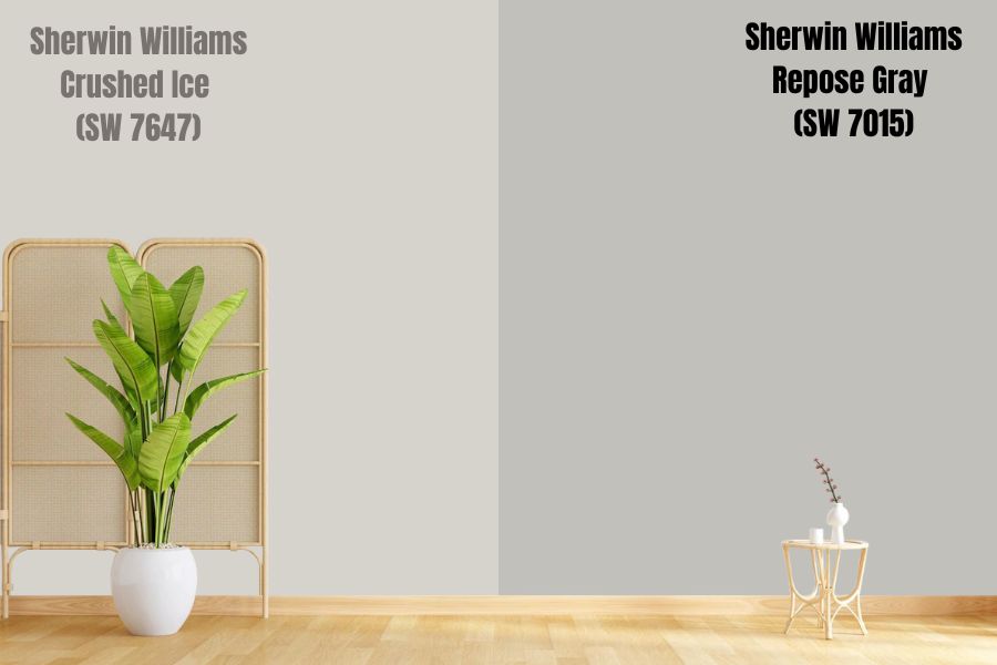
Like Crushed Ice, Repose Gray is another neutral paint color. Repose Gray features an LRV of 58—it sits just above the middle on the LRV scale, reflecting about 8% less light than Crushed Ice.
While Crushed Ice boasts green, violet, and blue undertones, Repose Gray features a taupe-ish base. It combines greige, brown, gray, and purple—however, in one go, this paint color displays a few of these undertones depending on the lighting conditions in a room.
Like Crushed Ice, Sherwin Williams Repose Gray SW 7015 is also a warm color. However, compared to other gray colors, Repose Gray pulls cooler because of the hint of blue and purple undertones, both of which lean on the cooler side.
Sherwin Williams Crushed Ice vs. On The Rocks (SW 7671)
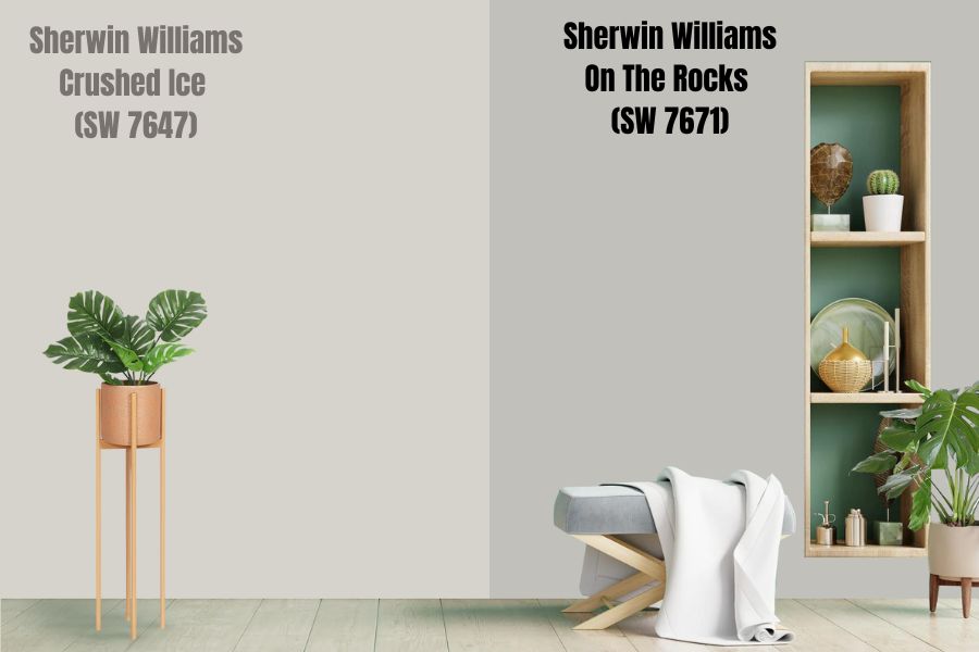
Like Crushed Ice SW 7647, On The Rocks is a gray color featuring muted undertones. On The Rocks is one of the closest colors to TRUE Gray.
While On The Rocks features some warmth, it only has a fraction of it. On The Rocks, therefore, sits in the middle of the warm-cool scale—not too warm nor too cool. If you put On The Rocks in your north-facing room, the paint color tends to look cool without appearing icy. On The Rocks, much like Crushed Ice in a south-facing room, will always look warmer.
On The Rocks reflects 4% less light than Crushed Ice, with an LRV of 62. On The Rocks will not seem too washed out in a room with too much light. Neither will the paint color look too dull in a dim-lit room.
Sherwin Williams Crushed Ice vs. First Star (SW 7646)
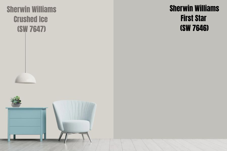
While Crushed Ice boasts blue, green, and violet undertones, First Star is a cool, light gray boasting deep blue undertones. The fact that First Star has a cool undertone (deep blue) means it will lean on the cooler side of the scale, unlike Crushed Ice, which leans more on the warmer side.
Interestingly, First Star reflects more light than Crushed Ice, boasting an LRV of 69. While it reflects 3% more light than Crushed Ice, First Star is not so light that it will end up looking too washed out in a room with more light.
Because of its deep blue undertones and cool gray tone, First Star adds a feeling of calmness and tranquility to a room. Just like Crushed Ice, First Star can give your space the impression that it is large than it is, adding the feeling of airiness and spaciousness to the room.
Sherwin Williams Crushed Ice vs. Worldly Gray (SW 7043)
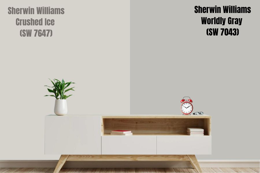
Like Crushed Ice, Worldly Gray is a neutral paint color. Experienced interior designers will tell you Worldly Gray is a greige color—this, however, depends on the exposure in the room where you put the paint color.
The paint color has an LRV of 57, reflecting 9% less light than Crushed Ice. The LRV means that it will not get washed out in bright light. Also, in a dim room, it may not look too dull.
While most people will consider Worldly Gray a neutral color, it has undertones that make it lean on the warmer side of the scale. The color’s undertones include green and a small sprinkling of violet. These, however, show up depending on the light in the space. In most cases, Sherwin Williams Worldly Gray will look neutral.
Sherwin Williams Crushed Ice vs. Amazing Gray (SW 7044)
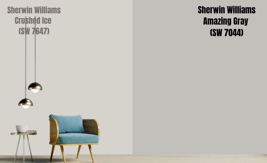
A neutral, warm paint color, Amazing Gray is more saturated than Crushed Ice. With an LRV of 47, Amazing Gray reflects 19% less light than Crushed Ice. While this low ability to reflect light is not bad, you will need to put this color in a room that receives a lot of natural light to keep it from being too dingy.
Amazing Gray features a perfect balance between gray and beige. For this reason, it is not uncommon for the paint color to be considered greige.
Amazing Gray is a warm color. However, since it is in the greige paint color family, it is not as warm as beige. The paint color boasts strong beige undertones—however, we cannot ignore its unique green undertones.
Sherwin Williams Crushed Ice vs. Classic Gray (OC-23)
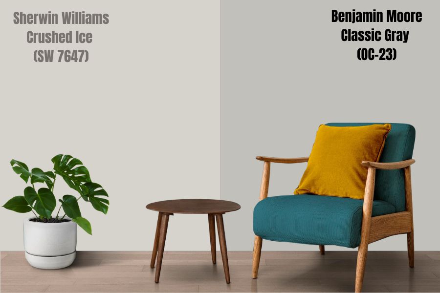
Classic Gray, produced by Benjamin Moore, is an off-white gray carrying muted and slightly feminine undertones. The color boasts a passive violet undertone in the right lighting conditions. Classic Gray is a perfect gray paint color for homeowners who want to avoid the green and blue undertones common in Crushed Ice.
Classic Gray boasts an LRV of 75—reflecting 9% more light than Crushed Ice; it sits in the off-white range. Classic Gray will lighten up your room; however, if you put this paint color in a room with excess light, it can wash out.
Classic Gray holds well in the northern light and makes a statement—just like Crushed Ice, it will display a soft, simple warm gray as the northern light encourages the gray in the paint color, not its subtle warmth. Classic Gray will also show a soothing warmth in a south-facing room like Crushed Ice.
Sherwin Williams Crushed Ice vs. Modern Gray (SW 7632)
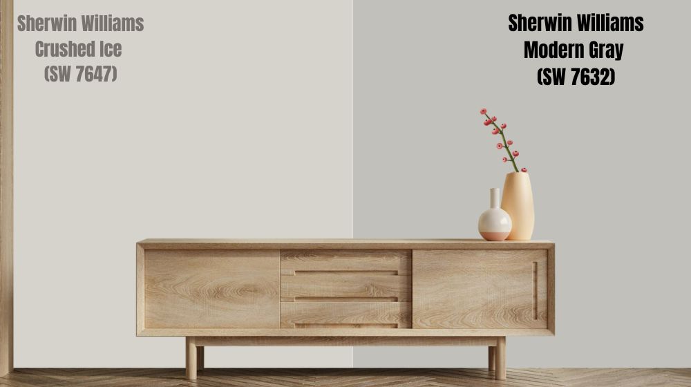
Modern Gray is a color that leans on the warmer side of gray, just like Crushed Ice. When you put Modern Gray in a south-facing room, the paint color tends to lean on its warm base, giving off a beige-tan look. In north-facing light, like Crushed Ice, Modern Gray falls back without looking too cold.
Modern Gray reflects 4% less light than Crushed Ice, with an LRV of 62. Modern Gray will hold its depth even in a bright room. However, if you put the Modern Gray in a dark room, it can look slightly drab—you can fix this with artificial lighting.
Just like Crushed Ice, Modern Gray is not committed to one undertone. However, while Crushed Ice boasts blue, green, and violet undertones, Modern Gray features pink, violet, and green undertones.
Sherwin Williams Crushed Ice vs. Light French Gray (SW 0055)
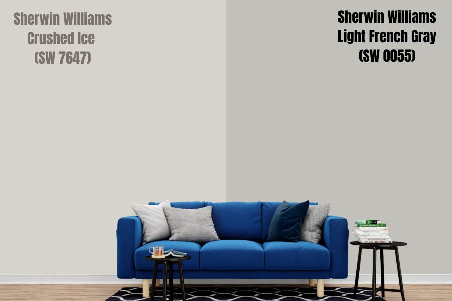
With an LRV of 53, the word “light” in Light French Gray is slightly misrepresented. Reflecting only 53% of the light—13% less than Crushed Ice—SW 0055 is not a light color. However, this means that Light French Gray will hold its ground in a bright room but may look bland in a room with minimal light.
While Crushed Ice leans on the warm gray side, Light French Gray leans on the cooler side of the scale. Also, while Crushed Ice SW 7647 boasts three undertones—violet, green, and blue—Light French Gray only has purple undertones.
Sherwin Williams Crushed Ice Palette
Coordinating Colors for Crushed Ice SW 7647
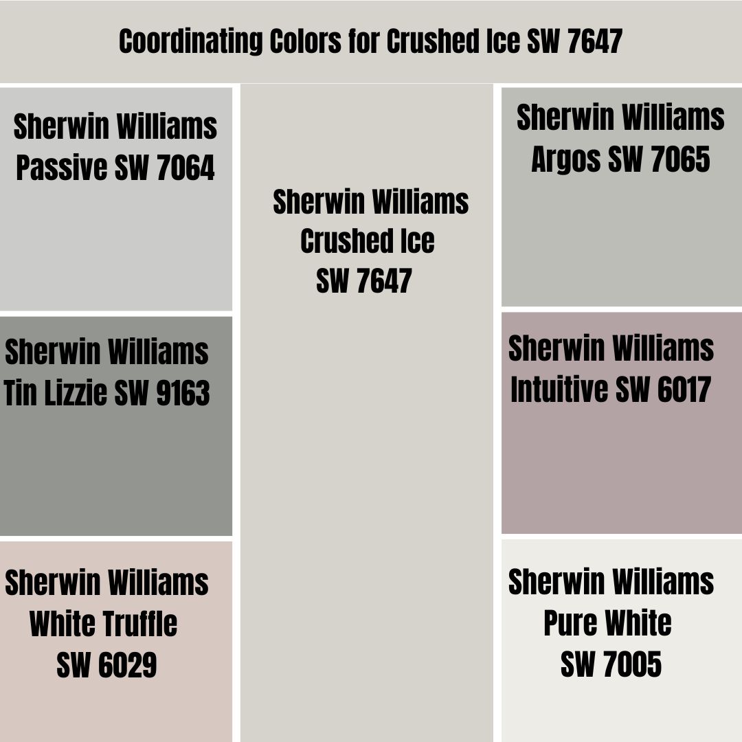
Sherwin Williams Crushed Ice is a versatile paint color that works well with numerous paints. Below, I will show you some of my popular pairing colors when I am working with Crushed Ice:
Sherwin Williams Passive SW 7064
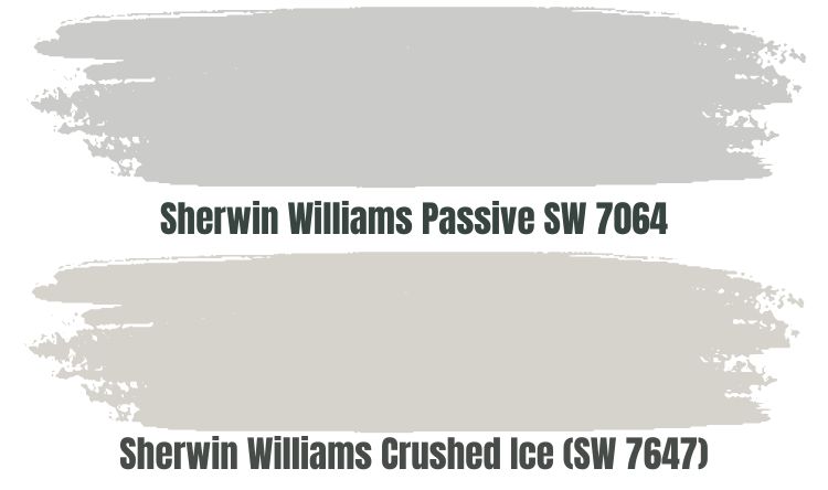
Passive is the first color I use to implement a monochromatic appearance. Passive is a gray color featuring stormy cool undertones, meaning that it is not an icy and crispy gray paint, nor a fresh paint—when you combine it with Crushed Ice, it brings that moody appearance into the room.
Sherwin Williams Passive SW 7064 leans on the cooler side. This makes it a perfect pairing color when you want to balance out the bit of warmth hidden in Crushed Ice.
Passive comes with an LRV of 60. When you combine it with Sherwin Williams Crushed Ice in a room with tons of natural light, you will find that both paint colors hold their depth. However, be careful when using these paint colors in a dim room as they may look flat and dull—but you can always breathe life into them using good artificial lighting.
Sherwin Williams Argos SW 7065
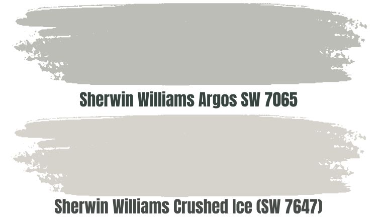
You can’t go wrong by combining Crushed Ice and Argos if you aim to implement a monochromatic look with a gray paint color that adds interest to your room. Argos is a gray paint color that boasts depth and a solid blend of green and blue undertones.
Argos SW 7065 is a cool paint color, making it ideal for pairing with Crushed Ice as it will help balance the warmth in Crushed Ice. A combination of Crushed Ice and Argos creates a balance between the warmth of western and southern light, ensuring that Crushed Ice does not become too warm.
Argos has an LRV of 51, meaning it sits in the light-medium range. It will not wash out when you combine Argos with Crushed Ice in a room with bright light. However, Argos is still not too dark that it will weigh your room down.
However, because it absorbs close to half of the light, Argos may look dull in a dim room. Therefore, if you intend to use Argos, you may want to make the space more attractive with artificial light.
Sherwin Williams Tin Lizzie SW 9163
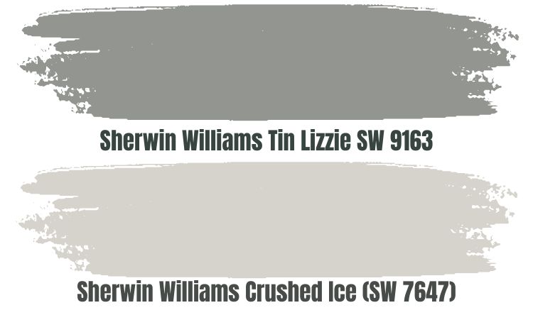
Tin Lizzie is a gray paint color that leans on the darker side. With an LRV of 30, it absorbs more light than it reflects.
For this reason, you will want to pair it with Crushed Ice in a room with a lot of natural light to keep the room from looking too dull. Alternatively, if you do not have natural light in the room, you can always use artificial light to keep the room from getting boring.
Tin Lizzie will work well in a south-facing room, helping balance out the warmth in the room. Also, since south-facing rooms tend to feature more natural light, it will be an excellent fit as it requires light to avoid looking too dull. In a north-facing room, however, you may want to invest in artificial lighting to make the paint color stand out.
Sherwin Williams Intuitive SW 6017
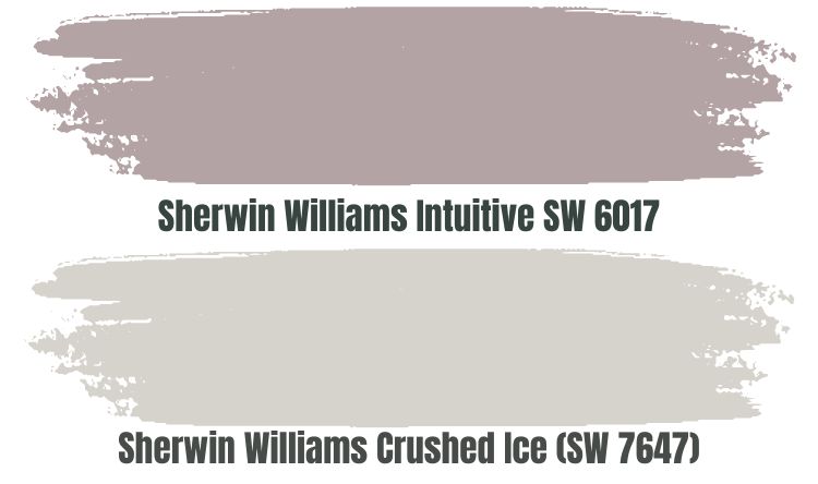
If a monochromatic theme does not work, you can always change things and use a paint color featuring a different shade. In this case, I would recommend one of my go-to colors—Sherwin Williams Intuitive.
What makes Intuitive SW 6017 stand out is the fact that it is an excellent color that has violet as its primary tone. To back the violet tone, it has purple and gray undertones. For this reason, Intuitive leans on the cool side of the scale.
Crushed Ice leans on the warmer side of the scale. Pairing crushed ice with the cool Intuitive SW 6017 will create a balance in your room, implementing a neutral look.
The LRV of Sherwin Williams Intuitive is 38. Therefore, you may not want to pair it with Crushed Ice in a dark room. If you put Crushed Ice and Intuitive in a bright room, the two paint colors will balance out the light, blending in perfectly due to their similar gray and violet tones and making a statement that makes the room stand out positively.
Sherwin Williams White Truffle SW 6029
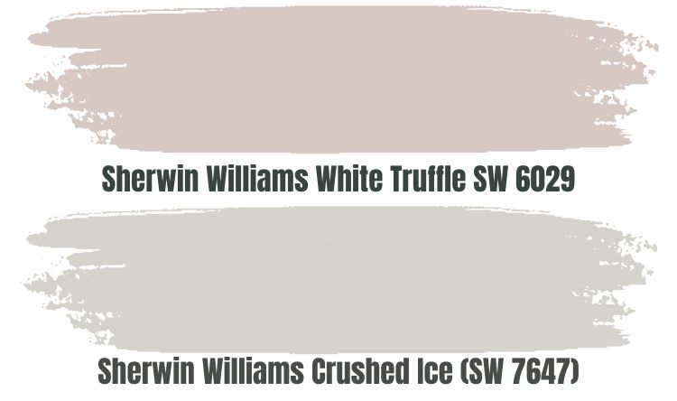
White Truffle SW 6029 sits in the red color family. It is more of a warm color, although it tends to sit in a medium position between the warm and cool sides of the scale.
For this reason, when pairing White Truffle with Sherwin Williams Crushed Ice, you may want to do that in a room that needs a boost of warmth—for example, a north-facing room. Since both Crushed Ice and White Truffle are warm colors, they could create too much warmth in a south-facing room.
Sherwin Williams White Truffle is a brownish color with a gray undertone. White Truffle will, therefore, blend well when used in a room with Crushed Ice which also has gray tones.
Sherwin Williams Pure White SW 7005
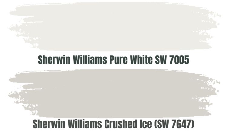
Pure White is a versatile color, boasting flexibility and the ability to work with numerous colors. While the name “Pure White” could suggest that this is the True White paint color, this is not the case.
Pure White sits in the off-white range with an LRV of 84, making it a perfect pairing color in a dimly lit room. While Crushed Ice may take a dull appearance, the high reflective ability in Pure White will give the room the character it deserves.
Pure White features some warmth that results from its black and yellow undertones. The color also tends to pick up the colors in its surroundings, giving Sherwin Williams 7647 the space it needs to shine.
Complementary colors sit on opposite sides of the color wheel, making them perfect for a design requiring contrasting colors. If you mix two complementary colors, they cancel each other, losing their hue and producing a grayscale color like black or White. Complementary colors are opposite colors.
The color that best contrasts Crushed Ice has a hex value of #D6D3CC—this color is yet to have an official name. The paint color that comes close to #D6D3CC is Squid Ink. Squid Ink has a hex value of #292C33. On the RGB scale, Squid Ink combines red: 41, green: 44, and blue: 51.
What Trim Colors Go with Sherwin Williams Crushed Ice SW 7647?
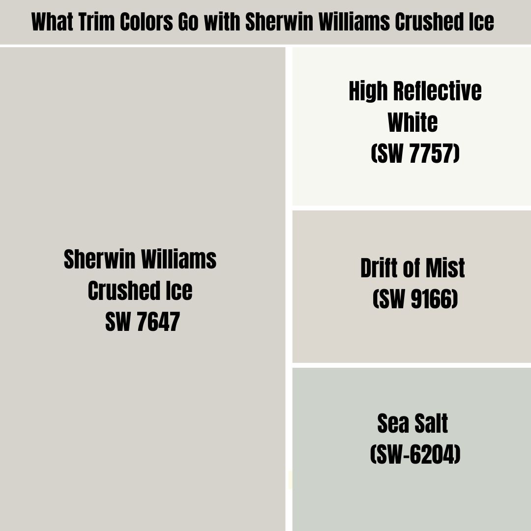
Regarding trim colors, Crushed Ice works well with numerous muted off-whites with complimentary undertones. You can also use blue-green-gray blends and white paint colors to trim Crushed Ice.
Below, I will show you my favorite colors for trimming Crushed Ice:
Sherwin Williams High Reflective White (SW 7757)
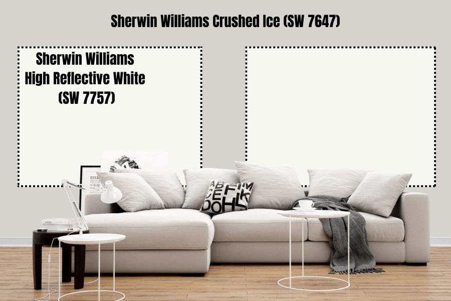
High Reflective White is the most accurate white color produced by Sherwin Williams. As its name suggests, this paint color is highly reflective, boasting an LRV of 93%.
High Reflective White is a neutral color that does not carry any visible undertones. Although Sherwin Williams Crushed Ice is a light gray color, the high whiteness level in Sherwin Williams High Reflective White makes the paint color stand out, making your trims visible.
Sherwin Williams Drift of Mist (SW 9166)
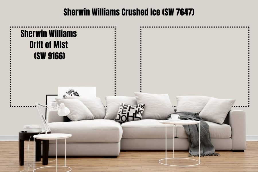
If you want to trim your Crushed Ice with a soft paint color with gentle whispers of undertone, Drift of Mist could be an ideal solution. The Drift of Mist works if you are trying to create a monochromatic look on your trims—the paint color is a soft, warm gray that can also switch to the cooler side depending on the light in the room.
The Drift of Mist has an LRV of 69. Therefore, when trimming Sherwin Williams Crushed Ice with an LRV of 66, use the two colors in a room with enough light to avoid creating a bland look.
Sherwin Williams Sea Salt (SW-6204)
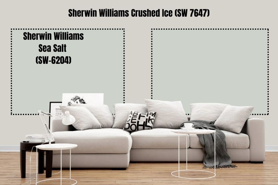
We have shown you the white and off-white you can use for trimming your Crushed Ice. But what blue-green-gray blend paint color can you use for trimming? Well, have you met Sherwin Williams Sea Salt?
Sea Salt SW 6204 is a green-gray blend. However, in some types of lighting, it leans blue. The LRV on Sea Salt is 64, reflecting 2% less light than Sherwin Williams Crushed Ice. Therefore, you may want to use this paint color to trim Crushed Ice in a room with a lot of light—this will help you avoid creating a bland look.
Sherwin Williams Crushed Ice Benjamin Moore Version
Do you want to try out Benjamin Moore products but still maintain the look offered by Sherwin Williams Crushed Ice? In that case, the color you are looking for is Benjamin Moore Lilac Hush.
BM Lilac Hush CSP-490 combines red: 214, green: 210, and blue: 205, which is pretty close to the combination for Sherwin Williams Crushed Ice. Like Crushed Ice, Benjamin Moore Lilac Hush is also a warm paint color.
On the LRV scale, Crushed Ice and Lilac Hush have a 0.95% difference in the amount of light they reflect. While Crushed Ice reflects 66% light, Lilac Hush reflects 65.05% light.
How Does Light Affect Sherwin Williams Crushed Ice?
Crushed Ice looks lighter if your space gets a lot of natural light. However, in a dimly lit room, the color will add some character; however, as the room dims beyond a certain level, it can make the paint color look bland.
The room’s orientation does affect the type of light. Therefore, when you paint Crushed Ice in a room with northern light, you can expect the paint color to lean into its cool base, with its cool undertones shining. However, put this paint color in a room with southern-facing light, and you will make it lean into its warmer tones.
Best Rooms to Paint Sherwin Williams Crushed Ice SW 6246
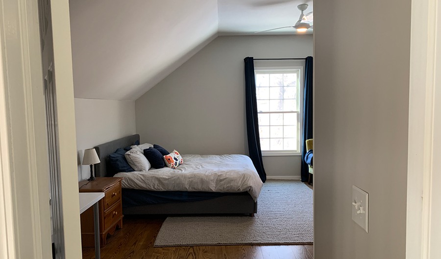
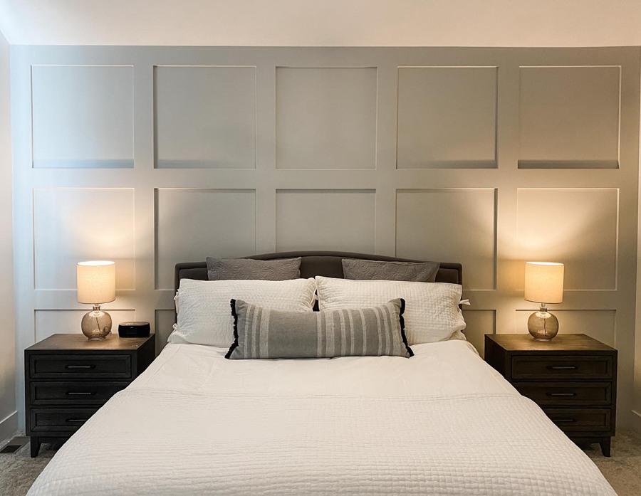
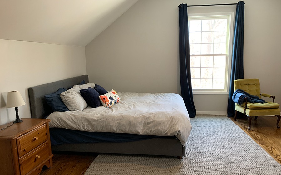
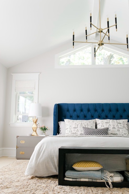
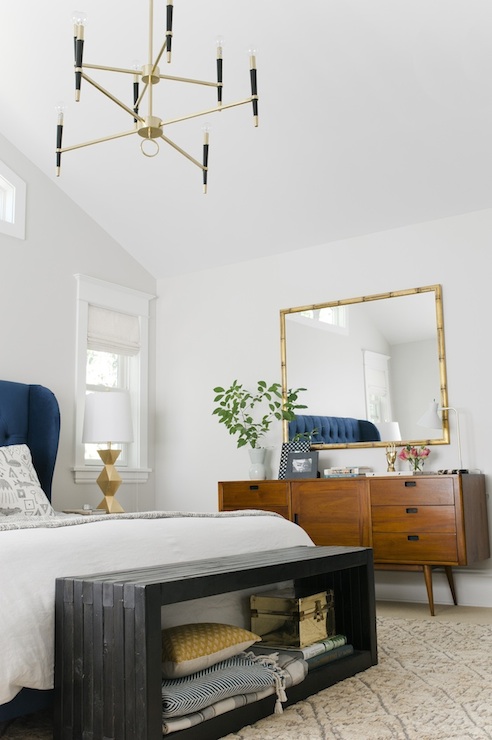
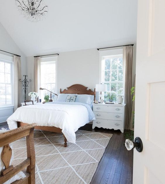
Sherwin Williams Crushed Ice in Bedroom
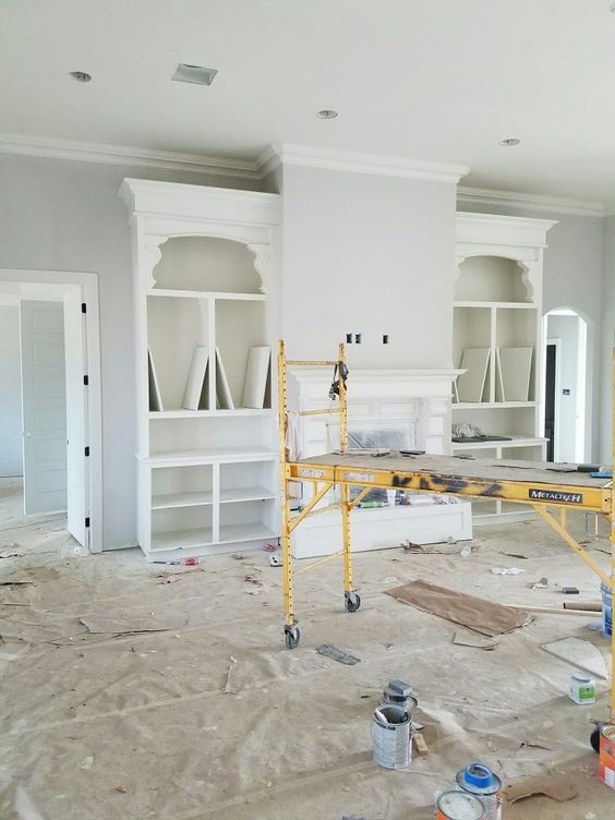
Sherwin Williams Crushed Ice in Living Room
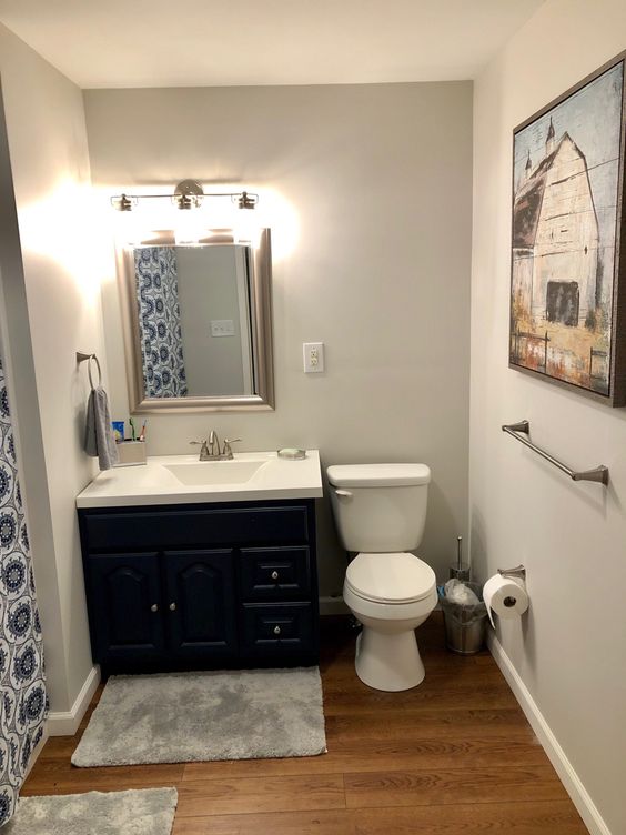
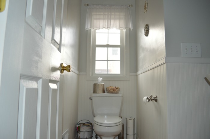
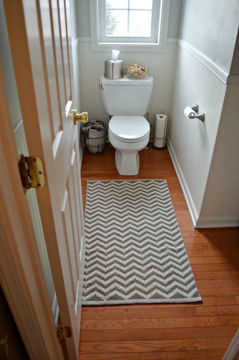
Sherwin Williams Crushed Ice in Bathroom
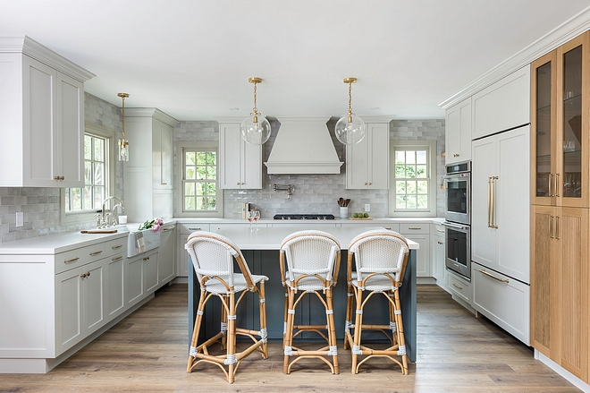
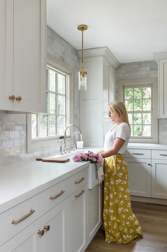
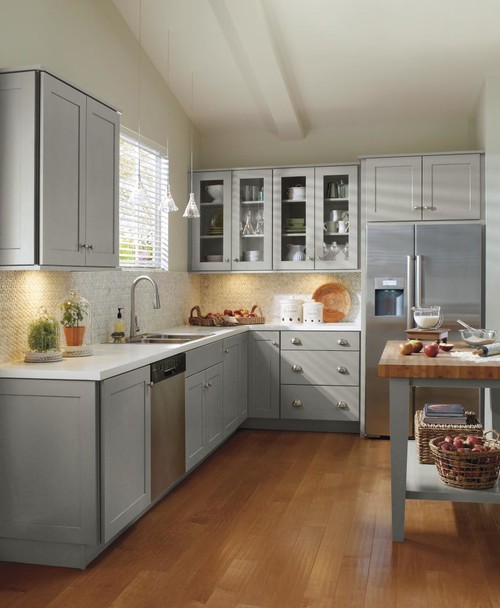
Sherwin Williams Crushed Ice Kitchen
Overview
Sherwin Williams Crushed Ice has a name many consider contradictory to its appearance. Crushed Ice is a pastel, warm off-white that adds that nice and delightful feel to any room.
Although the paint color features deep warm undertones, you do not have to worry about the color making your room too hot. Instead, the paint color creates a perfect balance.
The paint color does work with many paint colors. However, it prefers muted off-whites, colors blending green, gray, blue undertones, and pure whites.
This article examines Crushed Ice, showing you the finest details about the paint color. However, we want to ensure we have answered all questions about this paint color. Therefore, if we have left out some paint colors, please let us know in the comments.
 Sherwin Williams Tradewind (Palette, Coordinating & Inspirations)
 Sherwin Williams City Loft (Palette, Coordinating & Inspirations)
 Sherwin Williams Acacia Haze (Palette, Coordinating & Inspirations)
 Sherwin Williams Dorian Gray (Palette, Coordinating & Inspirations)
 Sherwin Williams Illusive Green (Palette, Coordinating & Inspirations)
 Sherwin Williams White Heron (Palette, Coordinating & Inspirations)
