
Does the perfect neutral color exist? Are your sights set on Benjamin Moore Manchester Tan as a worthy option? Then, I’m here to help you confirm or dispel that idea.
Welcome back to my home of Color’s where we review the trending and hidden gems from leading paint manufacturers in the US. 2023 is the year of bright colors, but not everybody has the economical capacity to follow trends.
Manchester Tan is a durable color to suit every season. Because of this reliability, it’s one of the brand’s bestsellers and part of its Historical and Colors for Vinyl collections.
Table of Contents
When to Choose Benjamin Moore Manchester Tan?
Before we get in too deep in the details of Benjamin Moore Manchester Tan, here are a few tips to help you know if it’s the right fit for you.
Looking for a Long-Term Color?
It’s a neutral beige tone that suits every fashion trend and would last for a long time.
Looking for Neutrality?
Although not a perfect medium tone, Manchester Tan still does a good enough job.
Playing with Beige?
Beige is everlasting but it can also be interesting when it has interesting undertones like Manchester Tan.
Redoing your Family Room?
Adds a warm and inviting vibe to every room.
Repainting your Family House?
It’s a homely color for a full exterior wall painting.
Are you still interested in Manchester Tan? Here’s everything you need to know about this color.
What Color is Benjamin Moore Manchester Tan?
You won’t understand why Benjamin Moore named this sandy beige “Manchester Tan” because it’s abstract. But when you consider its second name, Berber White, it puts the naming into perspective. Its beige tone reminds you of Arabian desert sand in sunlight.
Here’s a picture before we get into details.
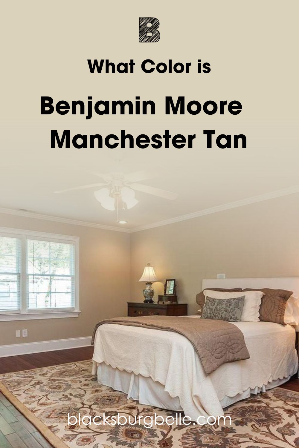
Now that you’ve seen Manchester Tan in a picture, let’s talk about it. This color is beige with a slight hint of golden yellow and the faintest green. The yellow-green undertone makes this color warmer and more intense under dim lighting.
Being a neutral yet friendly tone, it makes sense that Manchester Tan is a Benjamin Moore bestseller. As a historical color, this beige paint suits vintage-style homes and decor, and as one of the Colors for Vinyl, Manchester Tan works excellently outdoors.
It’s interesting that Benjamin Moore Manchester Tan is also Berber White but has different specifications and color palettes. Check them out.
Snapshot of Benjamin Moore Manchester Tan’s Specification
Here’s an x-ray of Manchester Tan’s specifications to help you separate it from Berber White. The differences are only slight so they’re easy to miss.
| Name | Manchester Tan HC-81 | Berber White 955 |
| RGB | Red 219 | Green 210 | Blue 188 |
| Hex Value | #DBD2BC |
| LRV | 63.24 |
| Undertones | Golden-Yellow, Green |
What is the LRV of Benjamin Moore Manchester Tan?
The Light Reflectance Value of a color is the degree between 0 – 100 at which it absorbs or reflects light.
Pure black is fully absorbent at 0 and bright white is purely reflective at 100. With manufactured paints however, the scale is between 3 – 97 because they all have undertones.
Benjamin Moore’s Manchester Tan is a medium-light color with an LRV of 63.24.
It earns the medium-light color spot because 3 – 30 is dark, 31 – 45 is medium-dark, 46 – 55 is mid-toned, 50 is neutral, 56 – 79 is medium-light and 80 + is light. However, sometimes colors with 75 – 79 LRV appear very bright depending on the RGB.
With Manchester Tan, though, there’s no confusion about its LRV because it’s the lower medium-light tone. So, Manchester Tan wouldn’t dramatically brighten your space, but it’ll transform it into a warm and homely room.
Lighting Effect on Benjamin Moore Manchester Tan
You can get the lighthearted creamy beige with subtle hints of golden yellow in Manchester Tan or the intense sandy beige with yellow-green tints. It all depends on your lighting conditions, whether natural or artificial.
Lighting is natural when it comes from sunlight or moonlight and artificial when you use fixtures like bulbs and fluorescents.
If you’re using fixtures, note that white lights make Manchester Tan and any other color appear brighter because it becomes the faintest version of itself. But with a yellow glow, the color becomes dimmer, and the deep undertones overshadow the softer exterior.
With sunlight, South-facing rooms get the brightest glow in the morning, and then East-facing rooms take over at early noon. That’s because the sun rises from the East and sets in the West. So, West-facing rooms get lower sunlight in the late afternoon until sunset.
Meanwhile, North-facing rooms receive steady and minimal sunlight throughout the day.
How is this info relevant to your interior design?
Are there Undertones in Benjamin Moore Manchester Tan?
Yes, there are two undertones in Benjamin Moore Manchester Tan if you’ve not noticed them by now. The color flashes a golden-yellow and sometimes green tint, especially when direct sunlight bounces off its walls. See an example here:
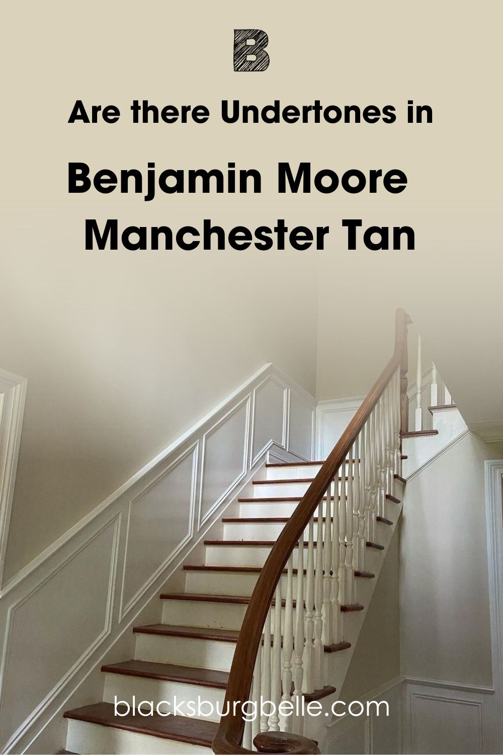
You can’t avoid undertones in manufactured paints because every RGB mixture gives you a main color and one or more secondary colors. Those alternate colors are the undertones that appear when you change the lighting conditions around your paint.
The good news is that undertones aren’t always strong. Sometimes, they can be subtle to the point of invisibility, as you’ll learn with Manchester Tan’s green tint.
Does it look Yellow or Green?
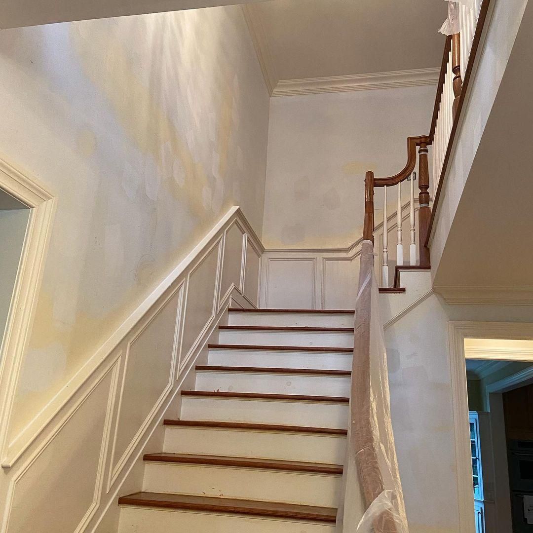
If you first saw Manchester Tan under dim lighting, especially at night, you’d lean towards accepting its golden-yellow undertone. But if your first encounter with the color is in the morning, you’ll see its softer green tint.
That means a North-facing room is your best bet to appreciate Manchester Tan’s duality, and West-facing spaces will give the color a muted reflection. Here’s an example:
But if you want a light beige color with a sandy vibe, use Manchester Tan in a South-facing or East-facing room.
If you’re stuck with a North-facing or West-facing room, don’t worry. You can still highlight Manchester Tan’s brightness with a white fluorescent bulb. Also, the coordinating colors in the palette can add to the intensity or lightness of your Manchester Tan paint.
Is Benjamin Moore Manchester Tan a Warm or Cool Color?
Benjamin Moore Manchester Tan is a warm color with no hint of coolness because of its golden-yellow solid undertone. That’s why the color is comforting, like a grandparent’s hug after a long day. I call this beige tone a feel-safe shade because it gives an aura of dependability.
When you check through the inspirations, you’ll notice that most designers used Manchester Tan in their family homes. Even in the exteriors, the color promises guests that there’s a warm home cooked meal and a cup of coffee waiting inside.
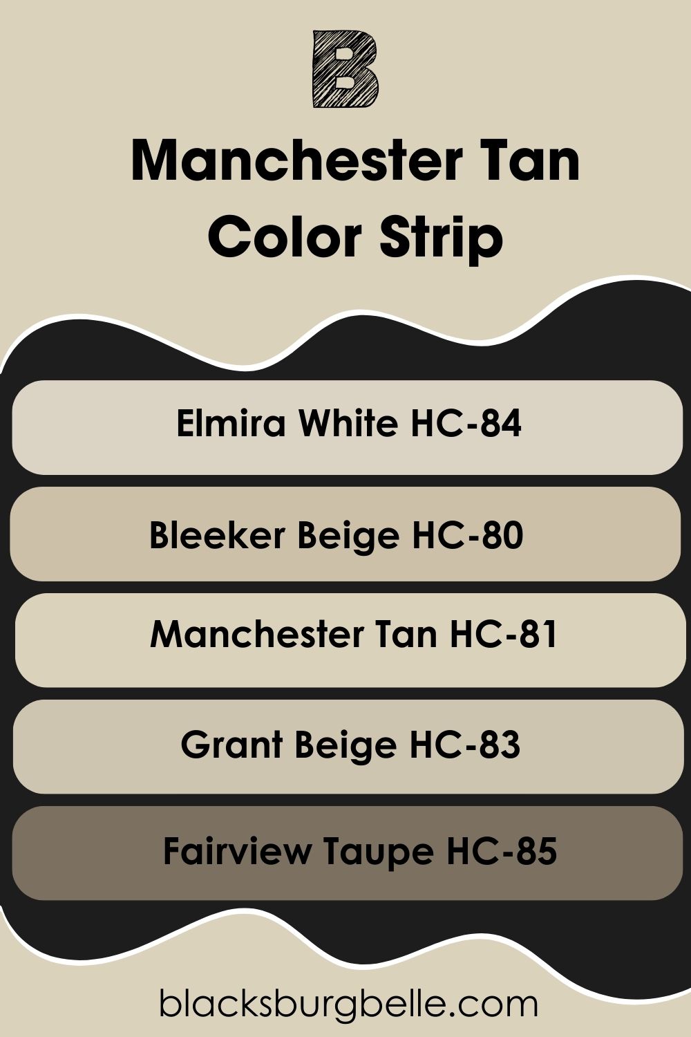
Benjamin Moore Manchester Tan Color Strip: Lighter or Darker Exploration
Are you still hanging in the balance because you think Manchester Tan isn’t the perfect fit? Don’t stress. You can try its lighter and darker versions while still retaining its core elements of yellow and green tints in beige.
- Benjamin Moore Elmira White (HC-84)
- Benjamin Moore Bleeker Beige (HC-80)
- Benjamin Moore Manchester Tan (HC-81)
- Benjamin Moore Grant Beige (HC-83)
- Benjamin Moore Fairview Taupe (HC-85)
Elmira White is brighter and more nuanced than Manchester Tan because of its pinkish-gray undertone making it softer. Meanwhile with Bleeker Beige, you’ll get a pure greige tone that leans towards a neutral taupe.
Grant Beige is another almost neutral greige but is lighter than Bleeker Beige and for a darker and more intense tone, use Fairview Taupe. It’s a warm charcoal gray with an earthy green undertone.
Benjamin Moore Manchester Tan Coordinating Colors
Besides choosing Manchester Tan for its beauty and reliability, you must pair it with the right colors to express yourself best. Simple and traditional doesn’t have to be tacky or boring when you arm yourself with the right color theory tips. That’s why I’m here.
Get a color wheel picture, then look through these palettes and choose the one that speaks to your personality.
- Analogous Theme: Combines three side-by-side colors for harmony. It often looks like a gradient of sunset or sunrise. You’ll have similar hues like red-yellow-orange, yellow-green-blue, and red-purple-pink.
- Complementary Theme: Pairs two contrasting colors for a bold look. It’s perfect for branding.
- Triadic Theme: Triangulates three equidistant colors on the wheel for a bold look. Each color group fits in one palette here. So, red-yellow-blue and purple-green-orange.
- Split Complementary Theme: Firstly highlight the complementary color. Then split it into a compound color. For a yellow paint, you’ll have purple-red (magenta) and purple-blue (violet).
- MonochromaticTheme: Use one color as the focus then add white and black to create tints and shades of the same hue in one space. It’s the most harmonious and peaceful palette.
Creative and expressive people will love bold palettes like Split-Complementary, Analogous and Triadic while simple themes like Monochromatic and Complementary are reserved for conservative designers.
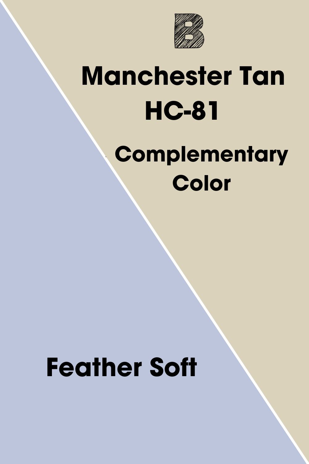
Complementary Colors for Benjamin Moore Manchester Tan
Have you ever wondered why two particular colors are always paired, especially on brand logos and international designs? That’s because they’re perfect for each other. Complementary colors perfectly blend hot and cold because of their contrasting auras.
You’ll recognize them as opposites on the color wheel from Yellow/Purple to Red/Green and Blue/Orange. Today, we’ll focus on the yellow/purple combo because of Manchester Tan’s undertone. Using a color palette generator, I can tell you that Benjamin Moore Feather Soft complements Manchester Tan.
It’s a medium-light violet with a solid blue undertone to highlight the golden base in Manchester Tan. Because Manchester Tan isn’t a purely yellow color, it makes sense that its complementary hue also leans towards a double tone. Use this palette if you want a decent color pop for your Manchester Tan without going overboard.
But if you don’t fancy this simple combo, explore other options.
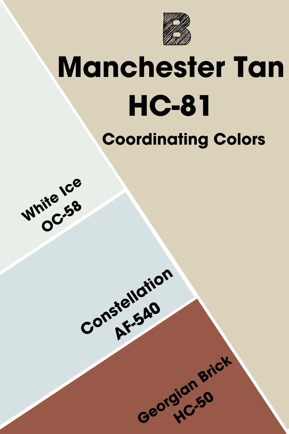
Coordinating Colors for Benjamin Moore Manchester Tan
As the manufacturers of Manchester Tan, you can’t overlook Benjamin Moore’s recommended coordinating colors. This palette spreads across themes and is ideal for the designer who wants to step outside the box a little.
- Benjamin Moore White Ice (OC-58):This bright white color has a cool blue undertone that makes it look icy.
- Benjamin Moore Constellation (AF-540):A lighthearted blue that makes any room appear airy and charming.
- Benjamin Moore Georgian Brick (HC-50):A reddish-brown clay color with a faint blush feel to add rustic charm to your space.
The coolness from Constellation balances out the warmth in Manchester Tan and Georgian Brick when you use them together. You can then add another cool color to harmonize all three shades hence the White Ice recommendation for trims.
Color Palette for Benjamin Moore Manchester Tan
I’ve selected three diverse color palettes for Manchester Tan to appeal to different personalities. At least one of these three combos will catch your fancy if you’ve come this far.
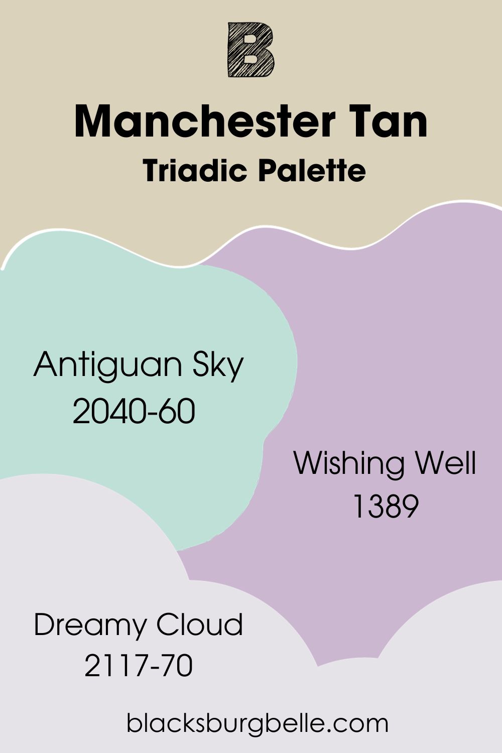
Triadic Palette
- Benjamin Moore Antiguan Sky (2040-60): This mesmerizing blue has a faint green undertone like the beaches and skies in Antigua, hence the name.
- Benjamin Moore Wishing Well (1389): This mid-toned reddish-purple appears as a lilac tone with a silky finish.
- Benjamin Moore Dreamy Cloud (2117-70): A crisp and bright white with a pinkish-violet undertone.
Because Wishing Well is almost neutral, it helps to tone down the brightness of Manchester Tan. You can then add some coolness with Antiguan Sky accents and furniture and trim the colors with Dreamy Cloud.
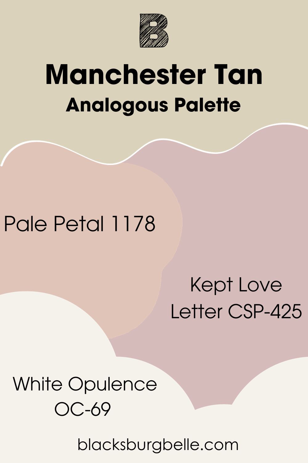
Analogous Palette
- Benjamin Moore Pale Petal (1178): A medium-light red paint that looks pink because of its sandy tan undertone.
- Benjamin Moore Kept Love Letter (CSP-425): This romantic violet with subtle hints of pink adds a loving warmth to your space.
- Benjamin Moore White Opulence (OC-69): A bright white with a soft look because of its blush pink undertone.
This palette is for the romantics who love warmth, affection, and everything that makes them feel appreciated. You can interchange Kept Love Letter with Pale Petal for your accents against a Manchester Tan wall. Then trim the wall with White Opulence.
An analogous palette can lean to the left or right and sometimes both ways if your anchor hue is in the middle. I selected a warmer analog for this review, but you can explore the cooler side.
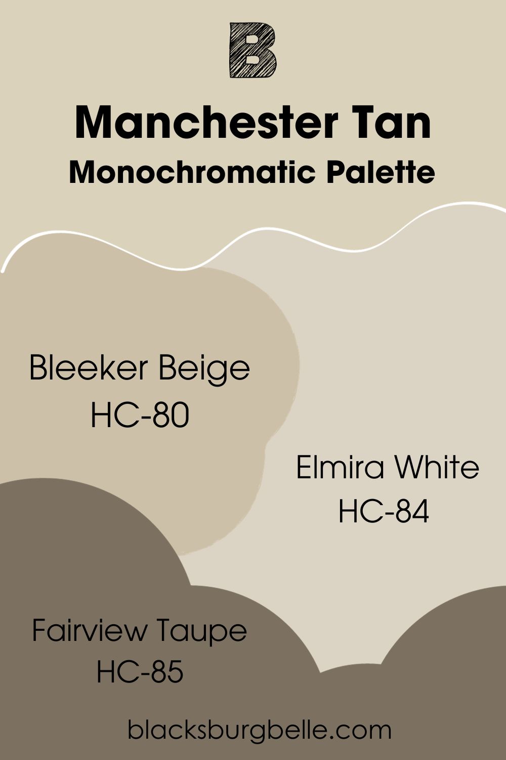
Monochromatic Palette
- Benjamin Moore Bleeker Beige (HC-80):A neutral greige with a subtle sandy overtone.
- Benjamin Moore Elmira White (HC-84):A medium-light greige with a blush pink tint to make it unassuming.
- Benjamin Moore Fairview Taupe (HC-85):A dark charcoal gray with an earthy brownish-green undertone to keep it warm.
Your combination of these earthy colors would depend on the dominant vibe you want. Note that Fairview Taupe is the darkest and best for accents while Elmira White can work as a trim or upper half-wall.
You can then interchange Bleeker Beige and Manchester Tan on walls or even use one to highlight the other.
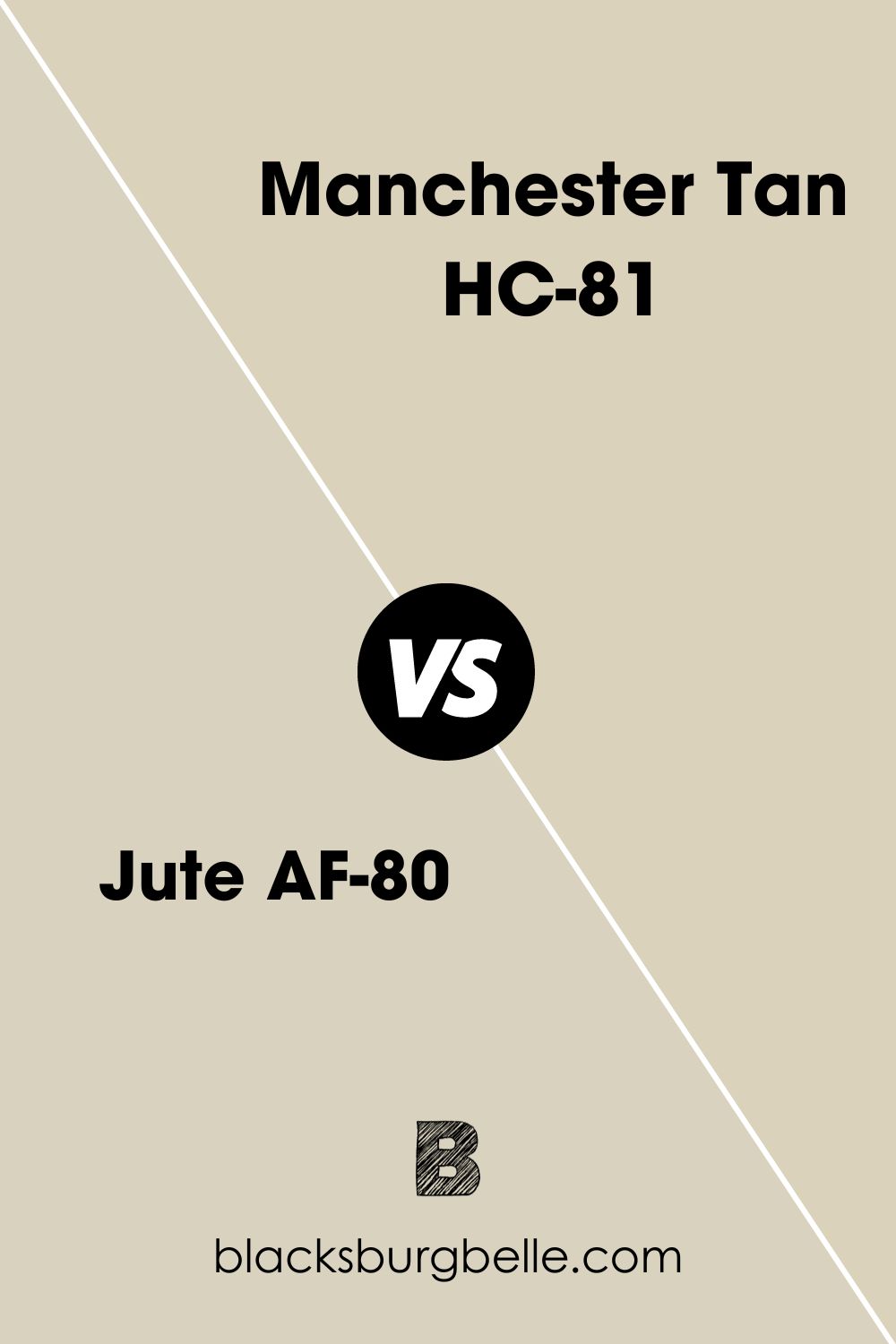
Benjamin Moore Manchester Tan vs. Benjamin Moore Jute (AF-80)
Unlike Manchester Tan, Jute is a grayish-brown color with a faint violet undertone that makes it lighter.
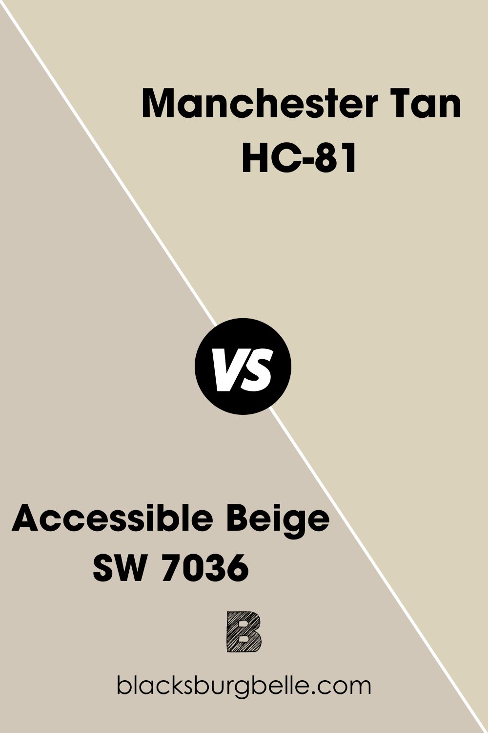
Benjamin Moore Manchester Tan vs. Sherwin-Williams Accessible Beige (SW 7036)
Sherwin-Williams Accessible Beige is a greige tone that looks earthier and more muted than Manchester Tan because it lacks a yellow-green undertone.
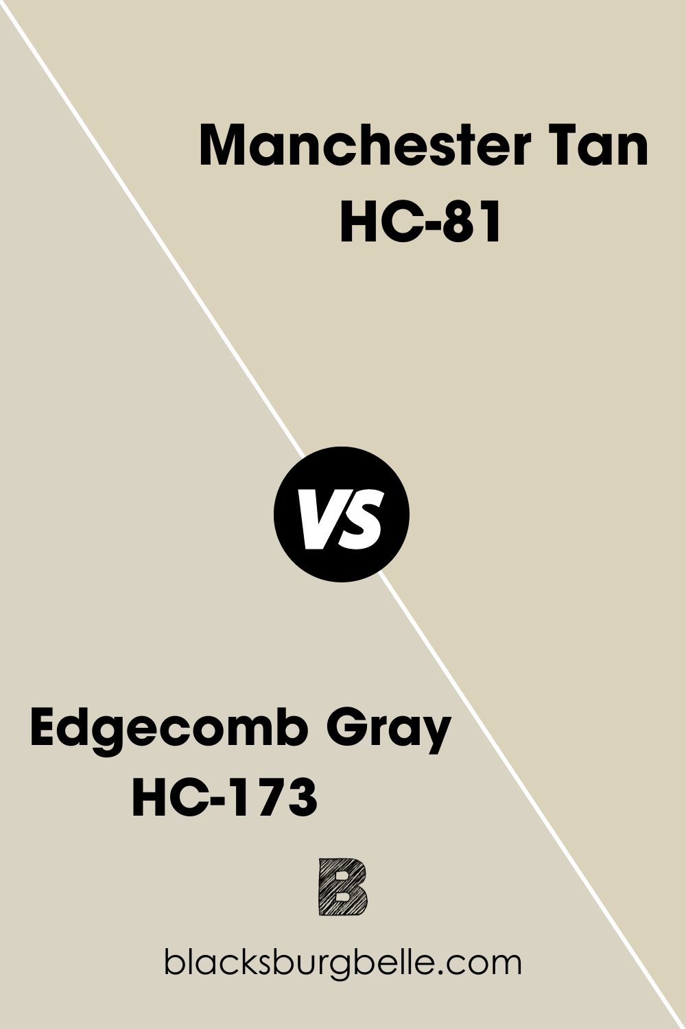
Benjamin Moore Manchester Tan vs. Benjamin Moore Edgecomb Gray (HC-173)
Edgecomb Gray is brighter than Manchester Tan even though it’s more muted because of its gray overtone.
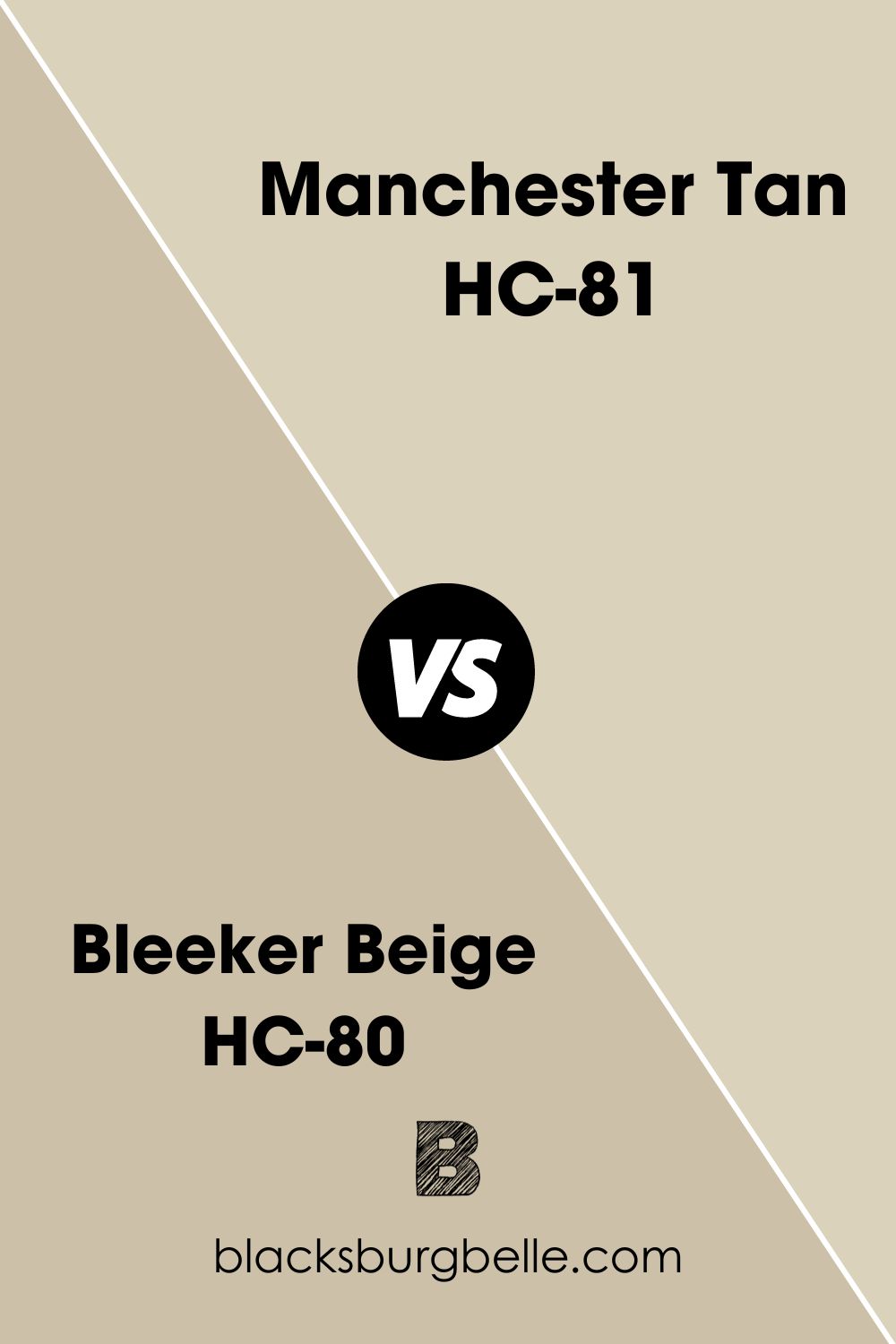
Benjamin Moore Manchester Tan vs. Benjamin Moore Bleeker Beige (HC-80)
Bleeker Beige is more neutral than Manchester Tan because it has less undertones and sticks to its greige look no matter the lighting condition.
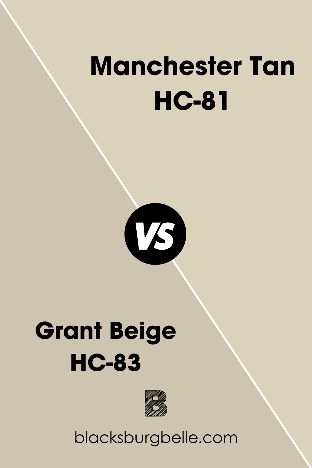
Benjamin Moore Manchester Tan vs. Benjamin Moore Grant Beige (HC-83)
Unlike Manchester Tan, Grant Beige is a muted and versatile neutral because there’s no yellow undertone to make it warm.
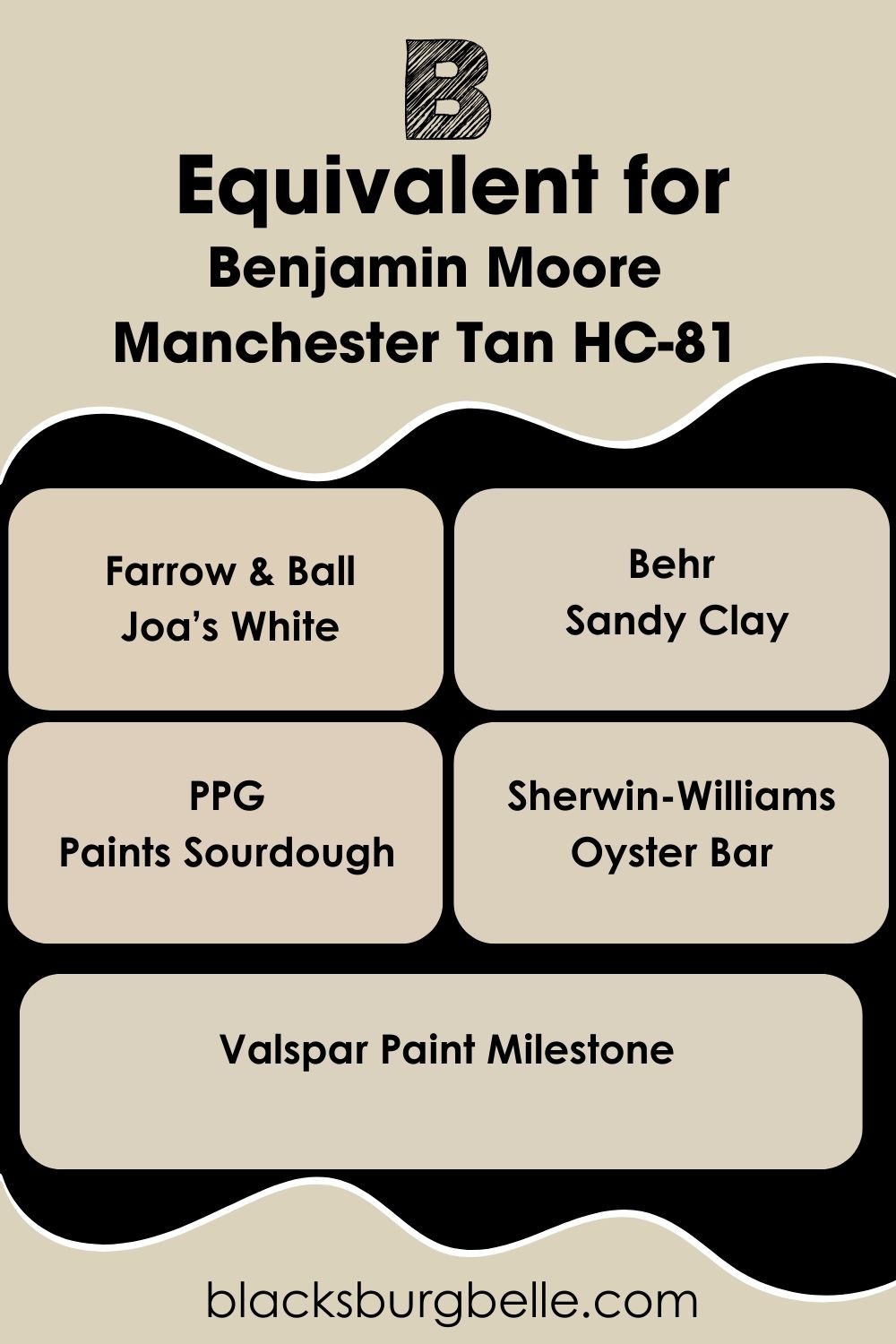
Benjamin Moore Manchester Tan Equivalent with other brands
When you ask for Manchester Tan at any qualified retailer or search online, you’ll only get product options from Benjamin Moore. That’s because the name is exclusive to the company.
But if you want this exact shade from other brands, you’ll need to make a custom order with the hex value #DBD2BC. If you can’t afford a custom order, here are some close alternatives you can try from other reputable brands:
Farrow & Ball Joa’s White, Behr’s Sandy Clay, Sourdough by PPG, Sherwin-Williams’ Oyster Bar, and Milestone by Valspar.
Where can you use Benjamin Moore Manchester Tan?
Because of its nature, Benjamin Moore Manchester Tan is best used in familial spaces like living rooms, family home exteriors, entryways, hallways, kitchen cabinets, and accenting furniture. Here are some inspirations for you.
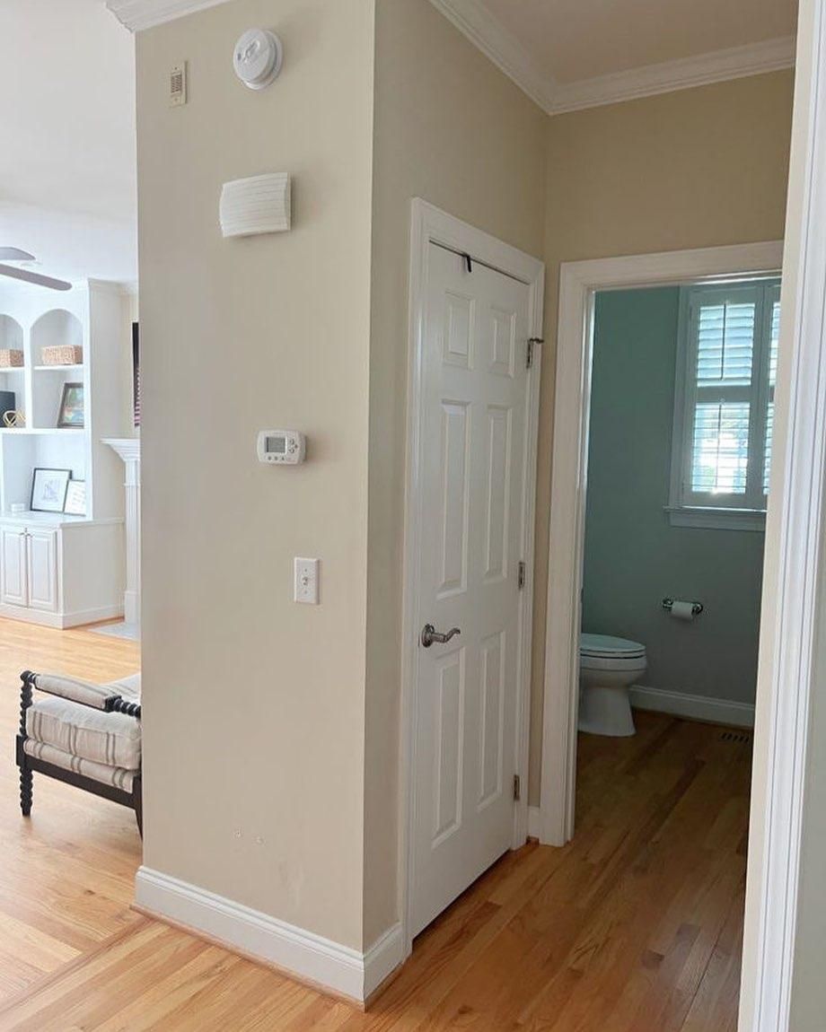
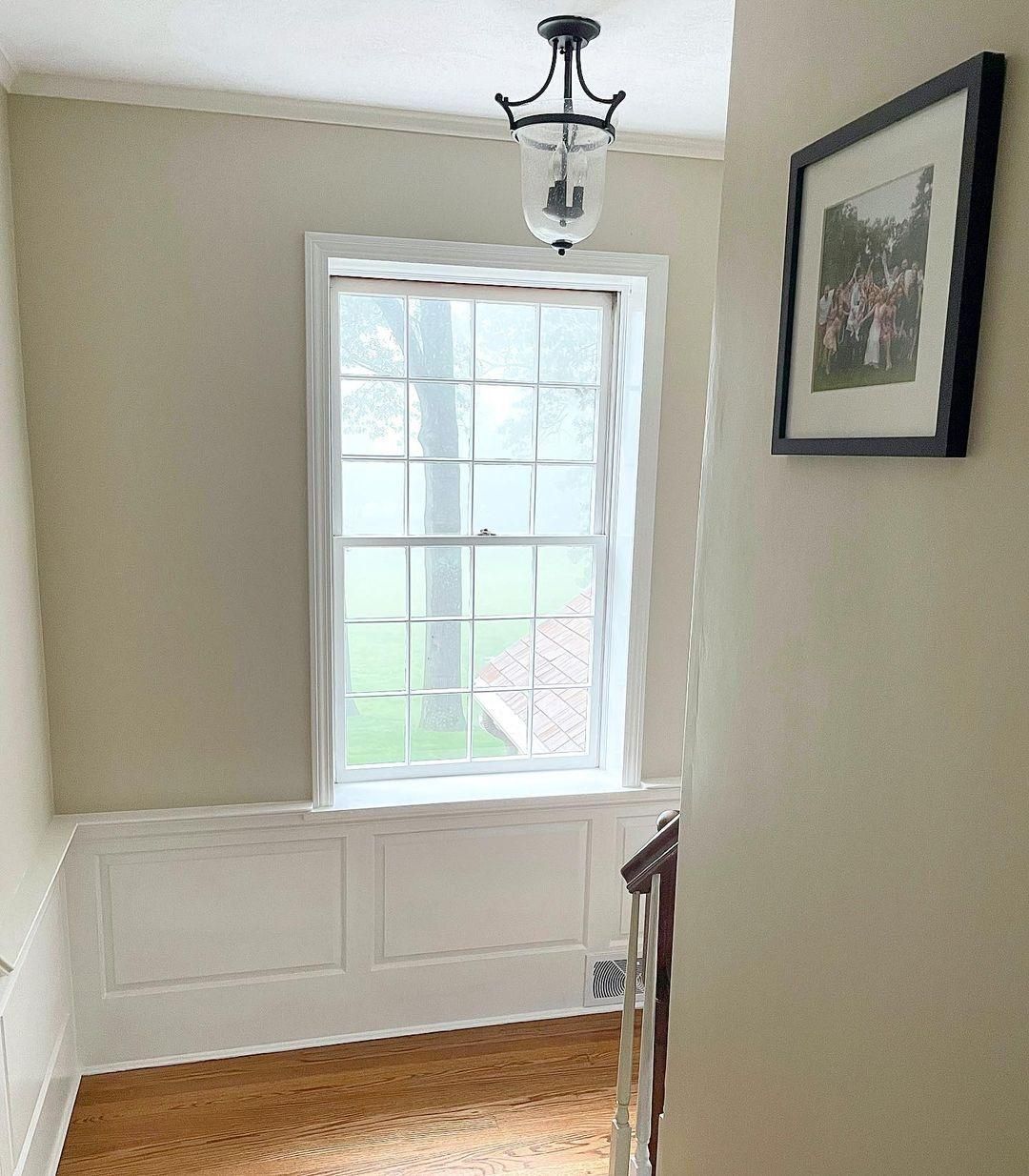
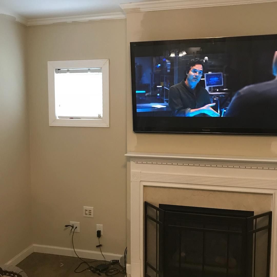
Benjamin Moore Manchester Tan on Walls
Manchester Tan walls open up a space and exude warmth. So, using the color on adjoining walls, in hallways, living rooms, and more is ideal. Here, you can see the color complements the blue-gray toilet walls while keeping the living area homely and lively.
Again, the open-plan glass window receiving natural sunlight in this stairwell gives the space a brighter look. Imagine the intense golden glow when night falls and the ceiling light turns amber.
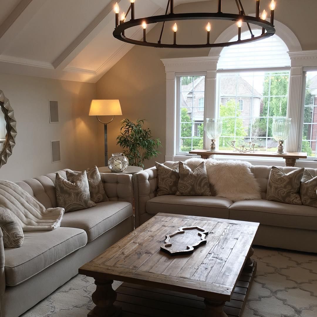
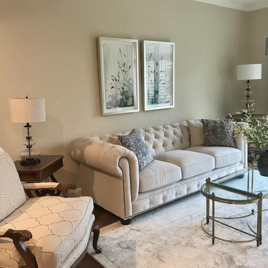
Finally, this living room wall is a testament to Manchester Tan’s suitability in living rooms. But let me show you more living room ideas.
Benjamin Moore Manchester Tan in the Living Room
Even though this interior designer embraced the monochrome palette in this living room, Manchester Tan on the walls doesn’t feel overwhelming. Instead it’s very muted and comforting.
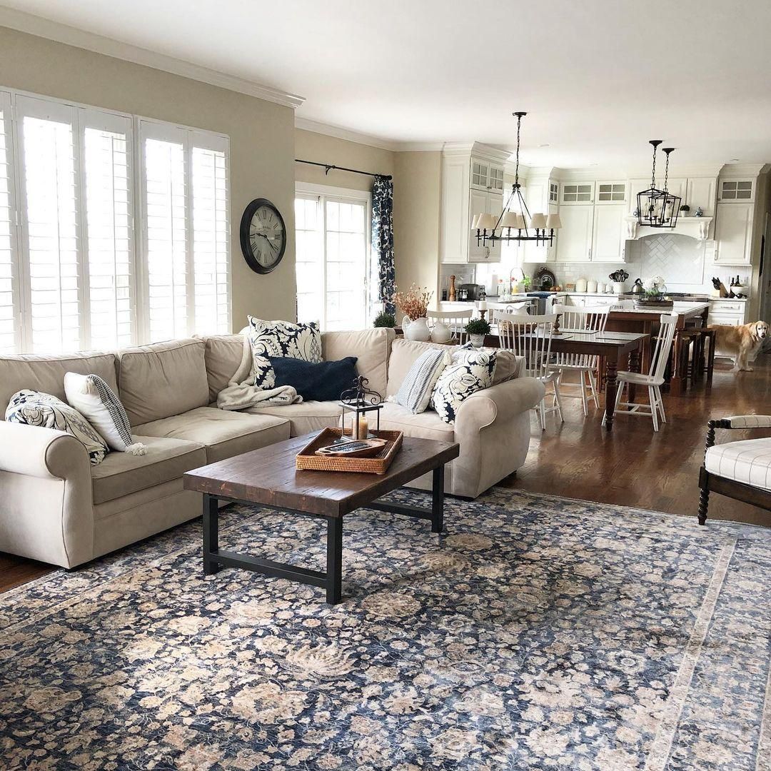
Here’s a wider view of a living room and dining room with Manchester Tan walls and basic furniture.
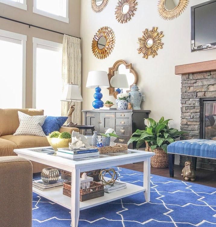
Manchester Tan being a traditional color doesn’t mean you can’t incorporate it in a modern interior design. When you pair it in a bold palette like this complementary theme, you’ll see how the muted walls come alive.
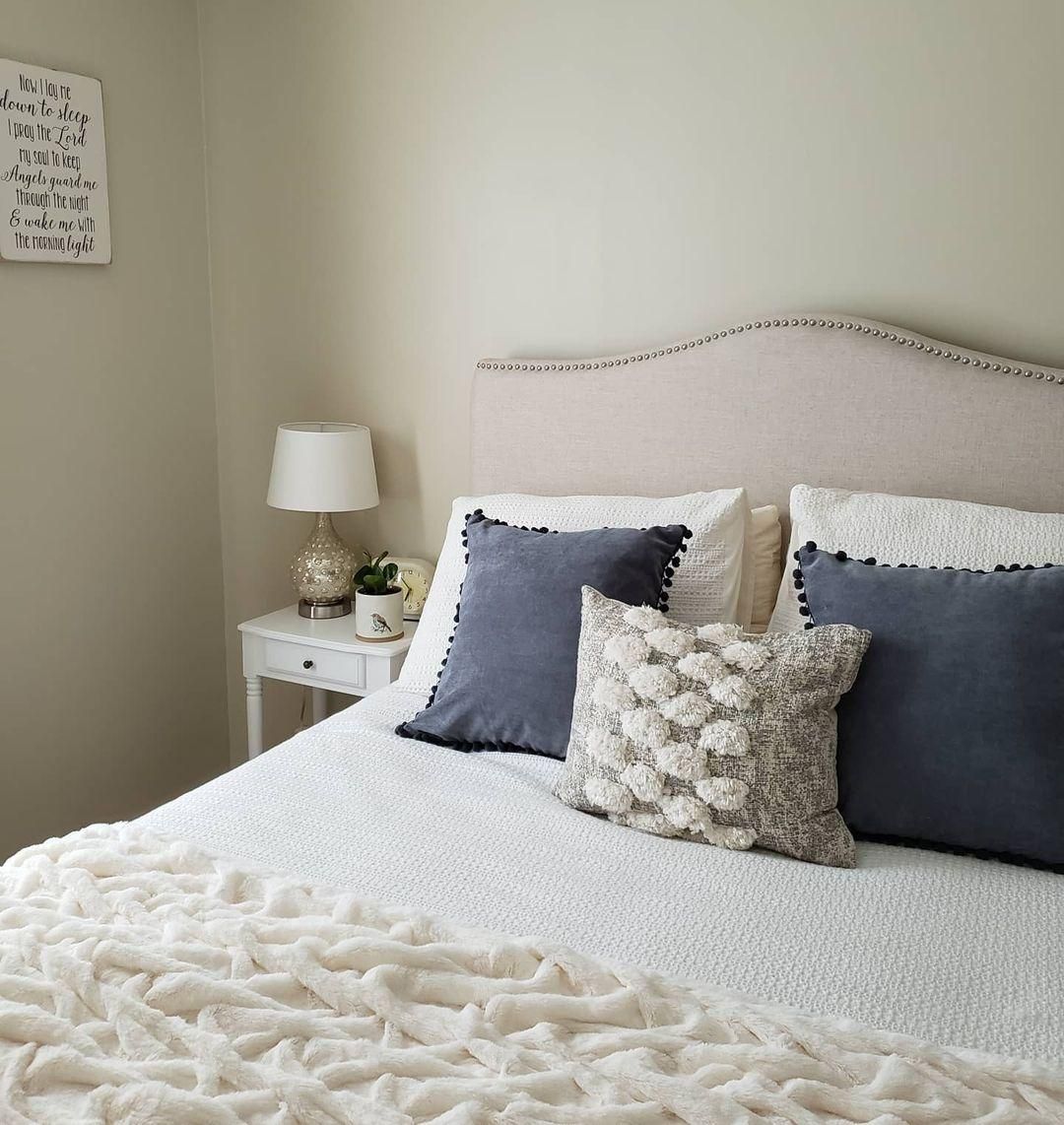
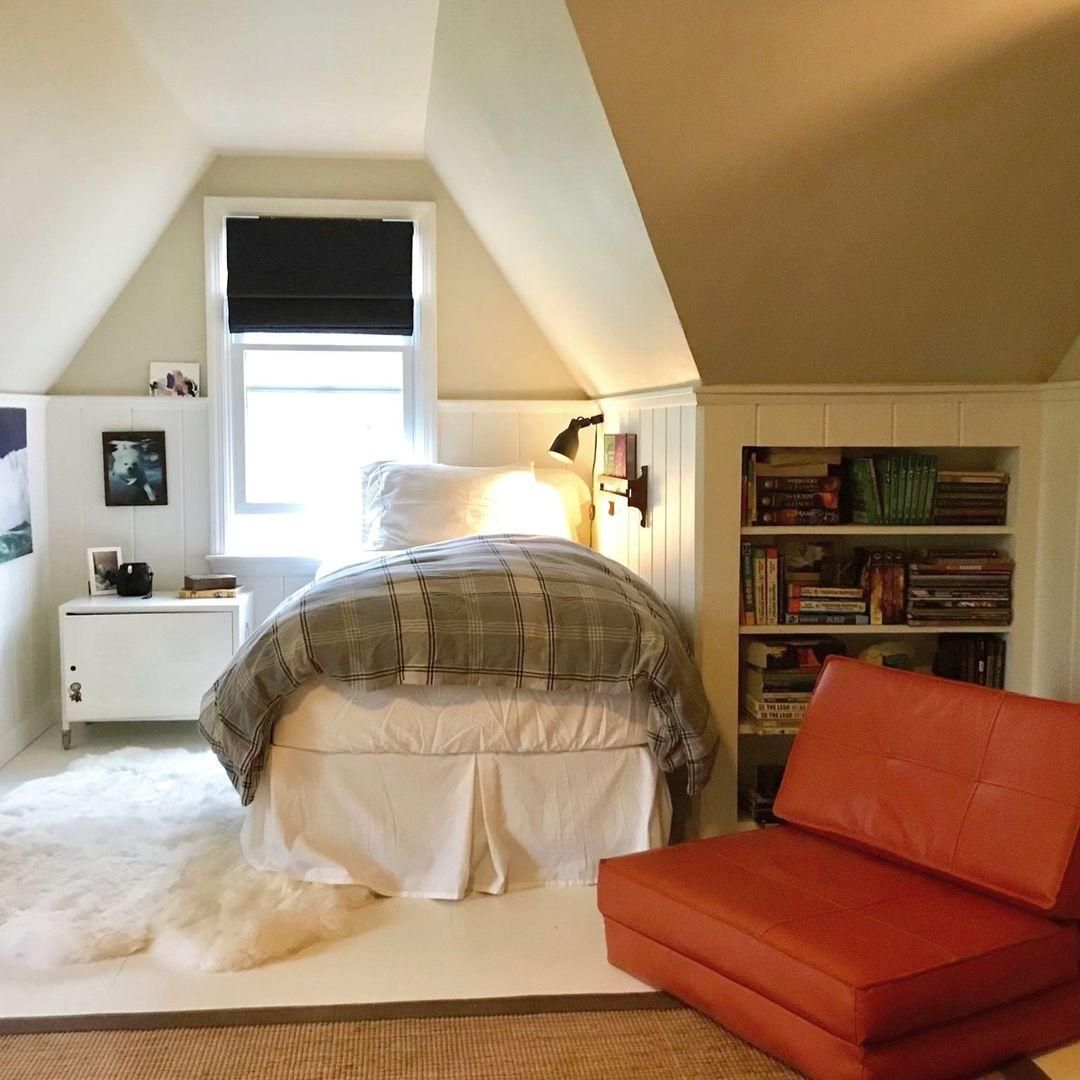
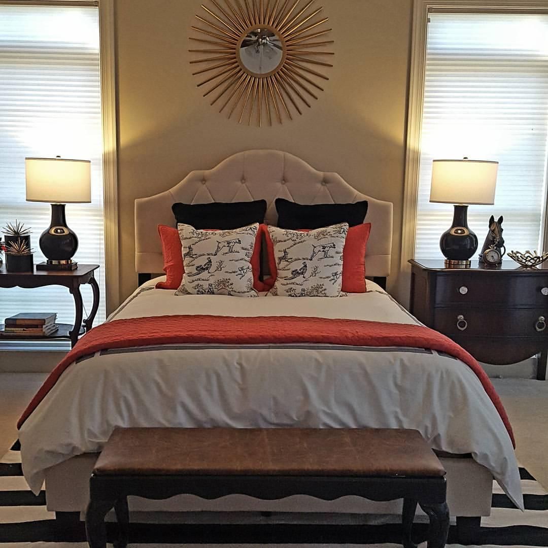
Benjamin Moore Manchester Tan in the Bedroom
You’ll always need a peaceful vibe in your bedroom, but sometimes a little warmth can brighten the bleakest days. Try Manchester Tan walls in a monochromatic or complementary palette.
You can intensify Manchester Tan’s warmth by using the color in a coordinating palette. Add reddish-brown leather furniture and amber light to make its yellow undertone shine though.
Manchester Tan walls in bedrooms also work well with modern themes. Again, notice how the bright orange interiors and warm light give live to the space.
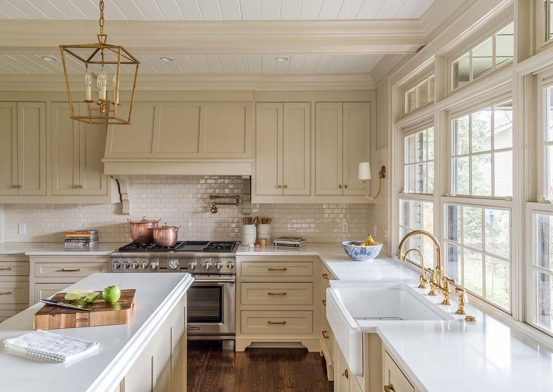
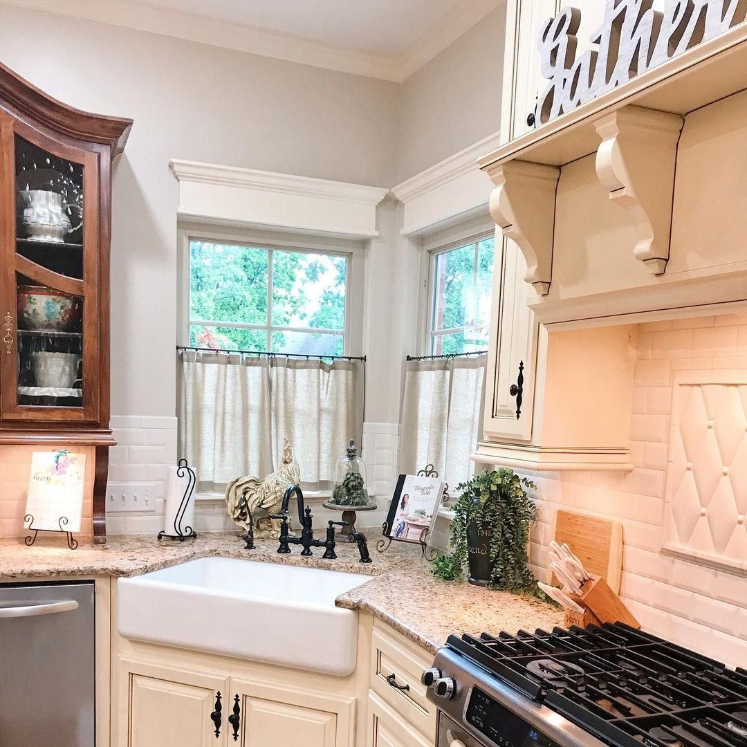
Benjamin Moore Manchester Tan on Cabinets
Most homeowners stick to traditional white paints for their cabinets, but a durable color like Manchester Tan guarantees you won’t need refurbishing for at least five to ten years. Cabinets can be up or down, and this beige color will blend in either way.
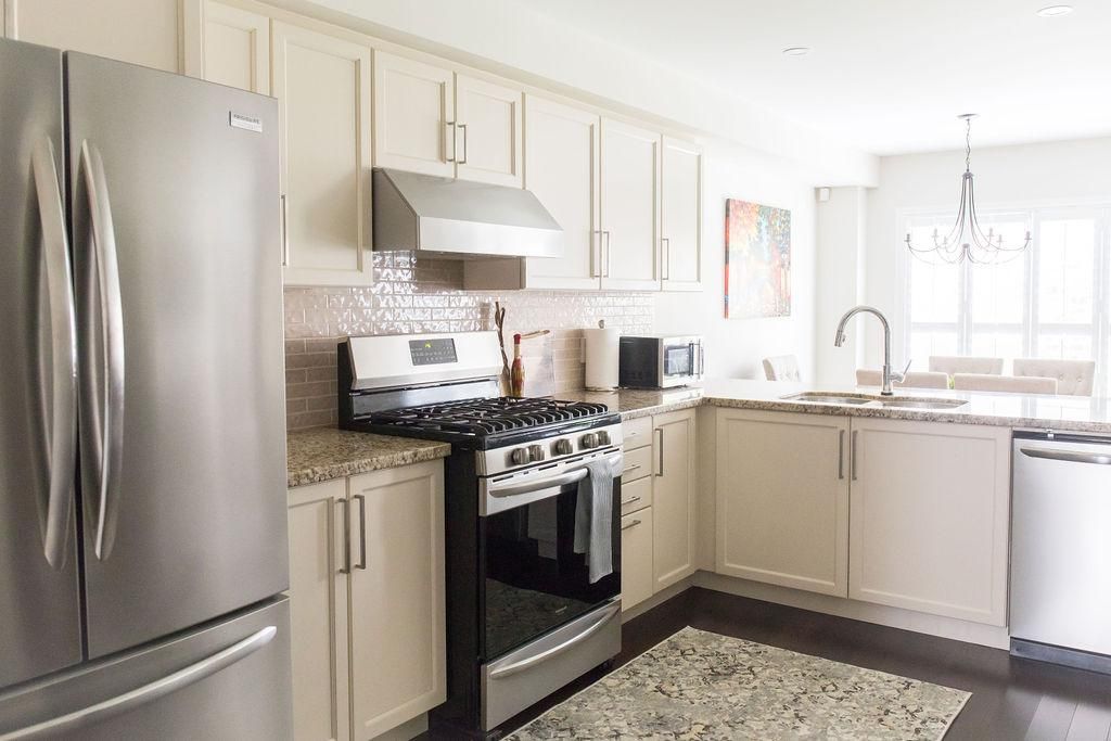
Depending on your cabinet and kitchen style, Manchester Tan can make the space look dull, like the first picture, or elevate the overall look, like this second picture. The difference is in the flooring and countertops.
Benjamin Moore Manchester Tan as an Accent
Apart from painting your cabinets Manchester Tan, you can also use it on accenting fixtures like this wall shelf. It’s an extension of the kitchen cabinets but different from the crisp white trims and gray walls. It’s a nice way to add warmth to the space.
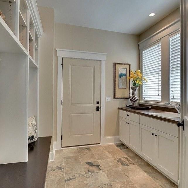
Benjamin Moore Manchester Tan on Doors
Not many neutral colors that aren’t gray and white work well on doors, but Manchester Tan fits excellently. Instead of matching your door to your trim color, you can highlight the Manchester Tan walls and even the white trim by painting the door in this beige paint.
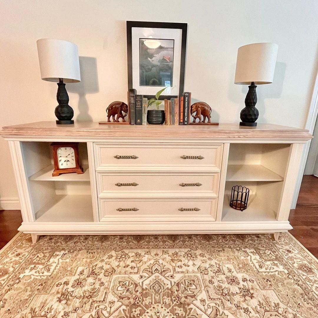
Benjamin Moore Manchester Tan on Furniture
Other furniture you can use as accents include dressers, cupboards, dining tables, and chairs. Here, you can see how warm lighting reflecting on a Manchester Tan desk gives the room a golden glow.
Benjamin Moore Manchester Tan on Exteriors
This is one of the rare times Manchester Tan reflects its green undertone because it’s receiving direct sunlight with little to no external factors. Here, the color is on the garage door and trims, while a deeper beige tone is used on the main sidings.
You can also see the designer used a coordinating palette to incorporate cool and warm vibes in one space.
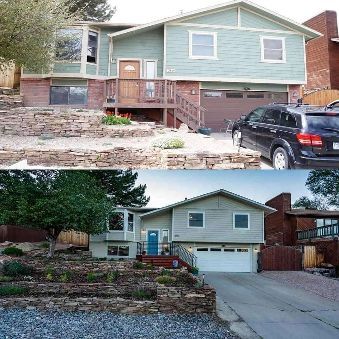
You don’t have to follow this palette exactly, but use it as an inspiration for your own exterior painting.
Conclusion
Benjamin Moore Manchester Tan is the color to choose when choosing durability over style. But the best part is that you’ll also get stylish designs from this beige color, especially if you pair it in the correct palette.
Remember that different palettes appeal to separate characters. Sample Manchester Tan before choosing it.
If you decide to buy this color, you won’t regret it. Just don’t expect a burst of energy or a serene aura. Instead, it’ll give you a neutral feeling upon which you can build other emotions.
Please share your finished work to inspire others too.
Happy Styling!
 Sherwin Williams Cavern Clay (Palette, Coordinating & Inspirations)
 Sherwin Williams Natural Linen (Palette, Coordinating & Inspirations)
 Sherwin-Williams Oyster White (Palette, Coordinating & Inspirations)
 Sherwin Williams Ripe Olive SW 6209: Review & Inspiration
 Benjamin Moore Ballet White OC-9: Review & Inspiration
 Benjamin Moore Pashmina AF-100: Review & Inspiration
