
Did you stumble on Benjamin Moore Ballet White OC-9 while searching for the perfect white paint? You’re one of many like me, and lucky for you, I’ve done a lot of the heavy lifting. So, I’ll share my discoveries in this review.
Benjamin Moore Ballet White is an off-white paint with a greige undertone that makes it appear warm and sunny. The company describes this color as a crowd-pleaser because of its neutrality and versatility.
I testify that there’s no lie told and would prove that in this review. Here are some details and inspirations to help you in choosing Benjamin Moore Ballet White.
Table of Contents
When Should I Choose Benjamin Moore Ballet White?
Ballet White may be neutral, but it’s not a universal tone for all rooms and fixtures. After reviewing the color, I realized it works best in some spaces better than others because of its unique greige undertone.
Here’s my recommendation for choosing Benjamin Moore Ballet White:
Want Some Cozy Vibes?
This is definitely a Yes! You’ll feel comforted and snuggled inside Ballet White walls.
Looking for Light?
It’s not the brightest tone but it does reflect a decent amount of light.
Playing with White Color?
A muted greige undertone is a nice switch up from popular cold whites.
Thinking of a Dining Re-Do?
Ballet White walls make a cozy background for family meals.
Need A Warm Exterior?
Encourage guests to approach your building with Ballet White walls.
What Color is Benjamin Moore Ballet White?
I believe the classic and sophisticated ballet dance inspired the name of this white paint. Like the dance, Ballet White is a soft but moving color because of its greige undertone that slowly creeps to the surface and captivates you.
See an example for a visual understanding.
Ballet White is a medium-light off-white color with a balanced greige base. Mostly, it’ll stay neutral and brighten up any space, but it turns into a warm creamy white under the proper lighting.
You’ll understand this better when I break down the specifications.
Snapshot of Benjamin Moore Ballet White Specification
You can know everything there is about a color from its specification. It includes its RGB makeup, hex code, Light Reflectance Value, and Undertones.
| Name | Ballet White OC-9 | 974 |
| RGB | Red 229 | Green 224 | Blue 208 |
| Hex Value | #E5DED0 |
| LRV | 71.97 |
| Undertones | Greige |
Dissecting the LRV of Benjamin Moore Ballet White
You measure LRV from 0 – 100, with 0 being pure black and 100 being the purest white. But every color has an undertone, so the scale is 3 – 97 for paints. 50 is neutral, 3 – 29 is dark, 30 – 45 is medium-light, 46 – 55 is medium, 56 – 75 is medium-light & 76 – 97 is light.
Benjamin Moore Ballet White has an LRV of 71.97, making it a medium-light tone. The greige base note taints its white tone and prevents it from being a fully bright color.
Ballet White will still brighten a room without additional lighting, but it won’t be a blinding brightness.
Choose this color if you want a muted light tone. Now let’s talk about the greige undertone that alters its whiteness.
What are the Undertones of Benjamin Moore Ballet White?
Undertones are alternate colors in every paint that appear when you change the surrounding lighting.
If you’ve ever wondered why there are so many shades of white from your favorite paint supplier, there’s your answer.
With Ballet White, the undertones are beige and gray, which, professionally, we call greige. Before I explain the undertones and lighting effects, take a few moments to examine the color up close.
Lighting Effect on Benjamin Moore Ballet White
Warm lighting gives Benjamin Moore Ballet White a golden reflection, while cool lighting makes it show as a chilled grayish-white color. Lighting theory is key to highlighting your preferred undertone in any color, including Ballet White.
Besides using artificial light to highlight the greige undertone, you can also manipulate natural lighting. If the sun shines on your room from the South, you’ll get the brightest glow, especially mid-late morning.
By noon, the sun moves towards the West but reflects brightly from the East. From late noon until sunset, rooms in the West get the most reflection, even though it’ll be weak.
Your best bet to keep your Ballet White paint neutral is to use it in North-facing rooms. That position reflects a steady low light throughout the day.
Pro Tip: Use a Compass to determine your room’s position.
Does it look Beige or Gray?
Ballet White is an off-white paint because of its greige undertone. Let’s start with the beige tint, the more interesting alternate color. Now, beige can be yellow-based or orange-based, but with Ballet White, there’s no clarity.
Digital color generators say Ballet White’s beige is orange-tinted, but I see more of a yellow glow. So it’s safe to say it’s a yellow-orange mixed base. Either way, the beige tone is warm and summery, which counters the haziness of its gray undertone.
Together, the greige undertone and white overtone give Ballet White a snuggly and cozy look. See what I mean in the picture below.
This bedroom wall looks beige because of the low lighting and close-up shot.
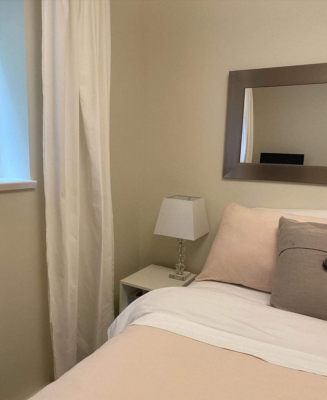
This same room looks grayish-white underneath the white light and direct sunlight
Benjamin Moore Ballet White: A Warm or Cool Color?
Benjamin Moore Ballet White is filled with warmth and coziness. You’ve seen how the undertones transform this white paint into a happy and familial off-white tone. So, let’s discuss the emotions Ballet White evokes in its surroundings.
Ballet White is best for hospitable and family spaces because of its warmth. It’ll make you feel comfortable with little bursts of energy. Use it in your living rooms, family kitchens, receptions, and guest bathrooms for interior design.
Ballet White on your exteriors is inviting and comforting. It tells your visitors they’re welcome to your space and promises them a friendly face at the door. I recommend using it in a suburban neighborhood or if you want a home touch in the city.
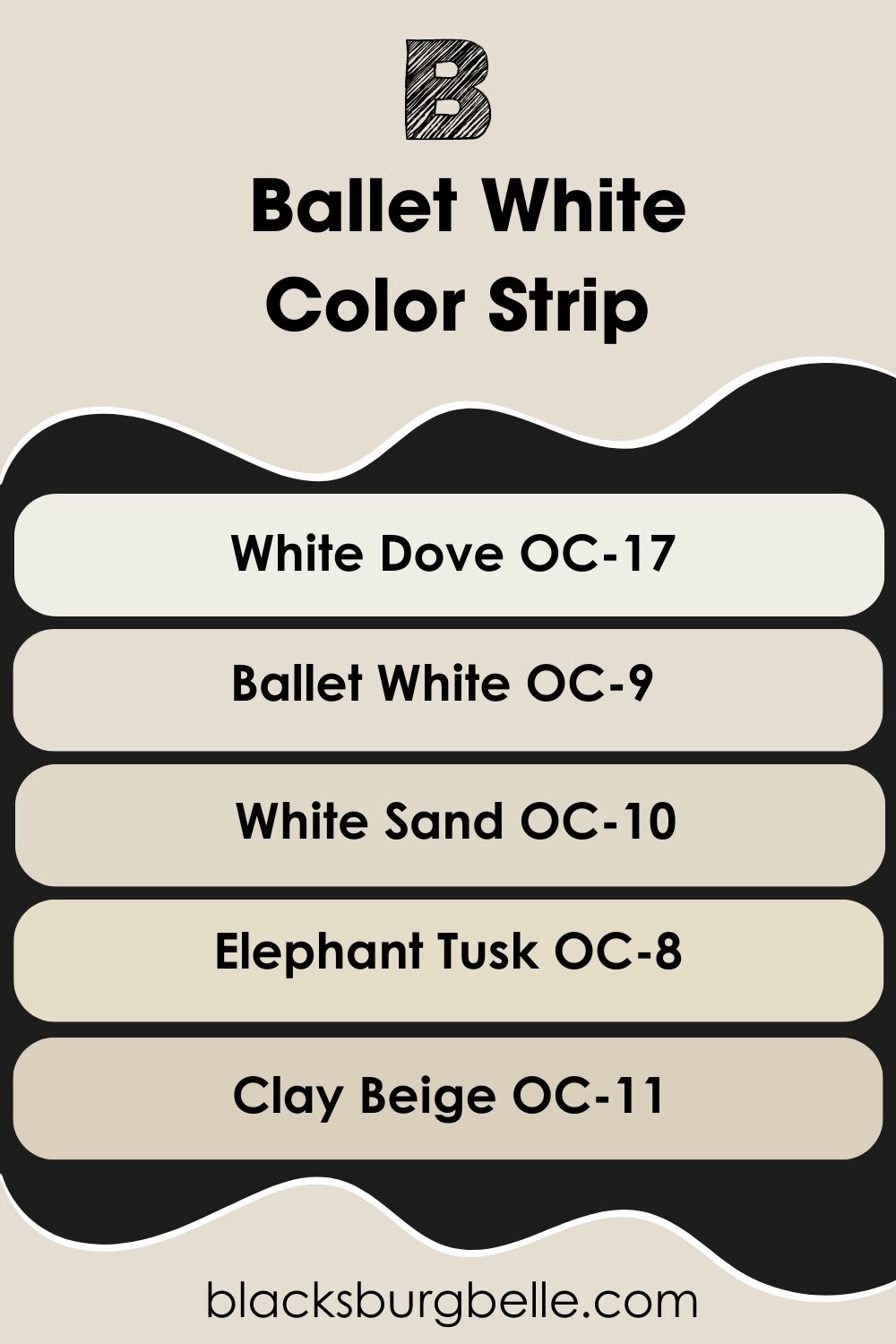
Color Strip for Benjamin Moore Ballet White: Lighter or Darker Variations
What if Benjamin Moore Ballet White isn’t bright enough for your taste? Or do you prefer a darker greige tone? There are several variations you can explore. I’ve selected four more colors, including a bright white and some deep tan. Check them out:
- Benjamin Moore White Dove OC-17
- Benjamin Moore Ballet White OC-9
- Benjamin Moore White Sand OC-10
- Benjamin Moore Elephant Tusk OC-8
- Benjamin Moore Clay Beige OC-11
These colors are formed by adding more white or black to Ballet White. White Dove is a brighter off-white, Elephant Tusk leans into its creamy undertone, White Sand gives a traditional beige look, and Clay Beige is sandy and warm.
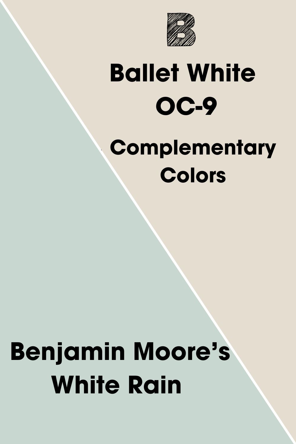
Complementary Colors for Benjamin Moore Ballet White
Complementary colors are two contrasting hues on the color wheel opposite each other. They’re made for each other because of their different auras. Where one is hot, bold, and fiery, the other is cool, relaxing, and chilly. See popular combos below:
- Red – Green
- Blue – Orange
- Yellow – Purple
Getting the complementary tone for neutrals like Ballet White is complex because they’re not primary or secondary colors. But once you study the undertones, you’ll know how to contrast the color.
Benjamin Moore’s White Rain complements Ballet White almost perfectly. I couldn’t find an exact match to #d0d7e5, the contrasting hex code for Ballet White per Canva, but this grayish-blue hue does the job.
Like Ballet White, White Rain is part of BM’s Classic collection, and for good reason. The gray undertone in the color makes it pass as neutral in specific palettes.
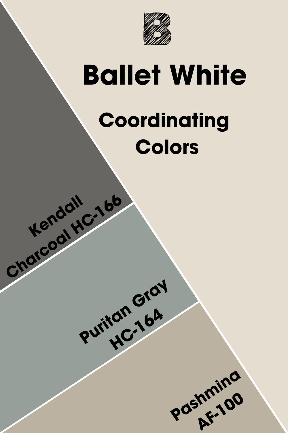
Coordinating Colors for Benjamin Moore Ballet White
Some popular color palettes you can explore:
- Analogous Theme:A combination of three colors placed beside each other on the color wheel.
- Complementary Theme:Pairing two opposite colors from the color wheel for their contrasting tones and auras.
- Triadic Theme:Form a triangle with three equally spaced colors to create a bold combo of multiple tones.
- Split Complementary Theme:Pick a complementary color then split it into two by combining it with the two colors on its sides. For Yellow, you’ll have purple as the complement then purple-blue and purple-red. So, indigo and magenta.
- Monochromatic Theme:Using multiple shades and tints of one color to create a unified look.
The Split Complementary palette is the least popular color combo, but I find it the most exciting.
Most people prefer monochromatic and complementary palettes for neutral colors because it fits the simplistic vibe, but you can also explore louder combos like analogous and triadic themes. See how some of these palettes work with Benjamin Moore Ballet White.
Coordinating Colors for Benjamin Moore Ballet White
- Benjamin Moore Kendall Charcoal HC-166:A deep and rich gray paint with a warm brown undertone.
- Benjamin Moore Puritan Gray HC-164:This medium-dark blue-gray tone has a cool and gentle aura.
- Benjamin Moore Pashmina AF-100:Create a balanced reflection with the warm-cool tone of this taupe shade.
This palette blends warm and cool colors in one space, a minimalist’s dream. Use the warmer Ballet White and Pashmina in your living room and kitchen. Then add Kendall Charcoal and Puritan Gray in your bedrooms and bathrooms.
Benjamin Moore Ballet White Color Palette
Let’s explore more colorful palettes using the neutral Ballet White as the anchor tone. You’ll notice themes with warm colors, cool or moody hues, and combinations. I added some usage tips and notes at the end to help you decide which palette best suits your room.
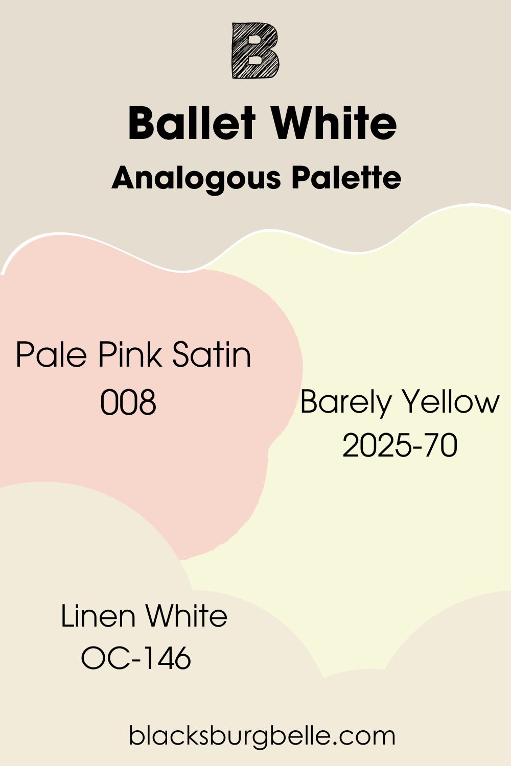
Analogous Palette
- Benjamin Moore Pale Pink Satin 008:This soft and light pink color has a vibrant yellow undertone to add more warmth to the space.
- Benjamin Moore Barely Yellow 2025-70:A very bright blend of yellow and green layered underneath a cream surface.
- Benjamin Moore Linen White OC-146:This bright white adds a delicate touch to your bold palette.
For this palette, Barely Yellow is already a bright color, almost rivaling Linen White, so you can use them as substitutes for each other. I prefer Barely Yellow for a bolder look. Use it on your accent or full walls, then highlight the color with Pale Pink Satin and Ballet White.
This palette is easily my favorite for Ballet White. It’s cheerful and unforgettable.
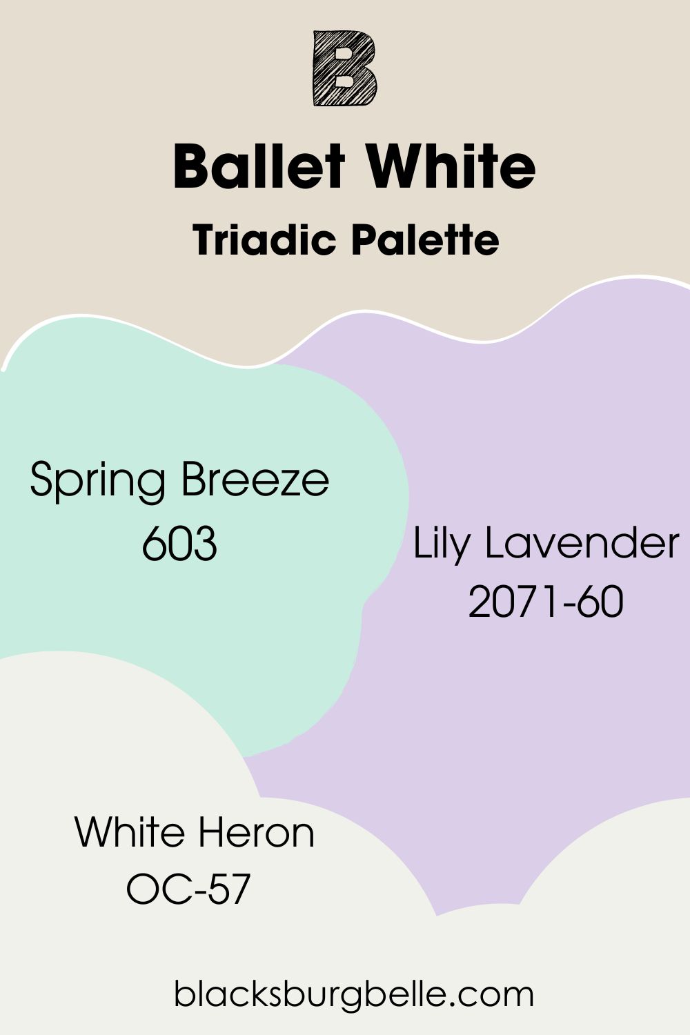
Triadic Palette
- Benjamin Moore Spring Breeze 603:Use this hypnotizing light blue-green color to create an airy aura in your room.
- Benjamin Moore Lily Lavender 2071-60:This light floral lilac has a blush undertone that gives any interior a charming look.
- Benjamin Moore White Heron OC-57:A bright off-white paint to highlight the muted tone of Ballet White.
Lily Lavender is strictly an interior coloring and this palette is ideal for children’s bedrooms and living rooms.
Make Spring Breeze and Lily Lavender your accents in the living room with Ballet White main walls and White Heron trim.
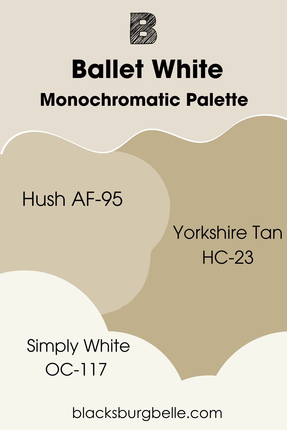
Monochromatic Palette
- Benjamin Moore Hush AF-95:A medium-light brown color with a golden-yellow undertone.
- Benjamin Moore Yorkshire Tan HC-23:Use this medium-dark khaki tone with a subtle gray undertone to cast a warm shadow on Ballet White.
- Benjamin Moore Simply White OC-117:This bright, creamy white paint blends the shades.
Because Yorkshire Tan and Hush are close in tone, you can use them alternatively as accents. Use Hush in small rooms because it’s lighter and warmer and Yorkshire Tan on your exteriors or living areas. Make Ballet White your main wall and Simply White your trim.
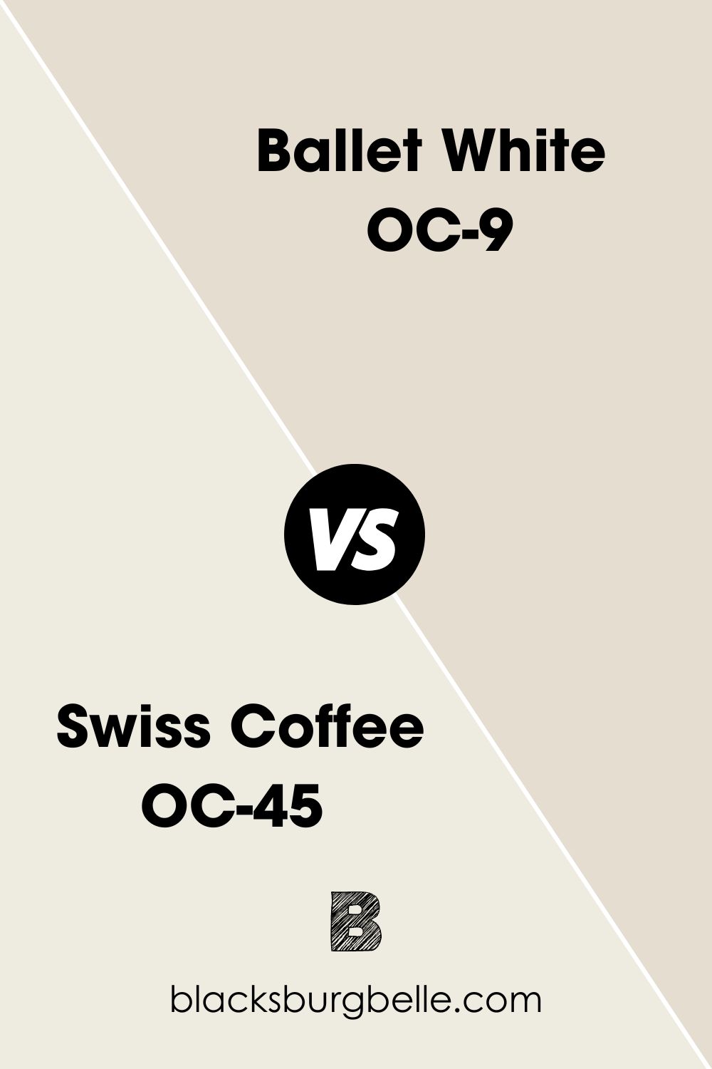
Benjamin Moore Ballet White vs. Benjamin Moore Swiss Coffee OC-45
Swiss Coffee is a very light and warm off-white paint with a bright orange and cream tint.
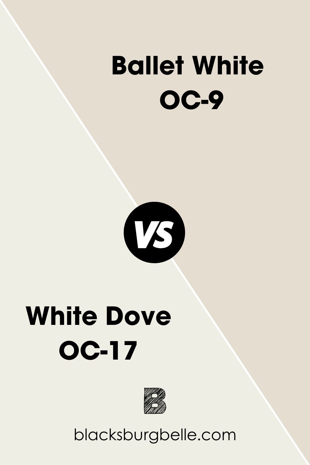
Benjamin Moore Ballet White vs. Benjamin Moore White Dove OC-17
White Dove is a very bright off-white that can almost pass as pure white unlike Ballet White which is more greige than white.
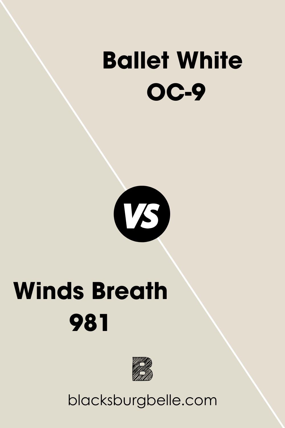
Benjamin Moore Ballet White vs. Benjamin Moore Winds Breath 981
For a cooler and grayer off-white tone choose Winds Breath over Ballet White.
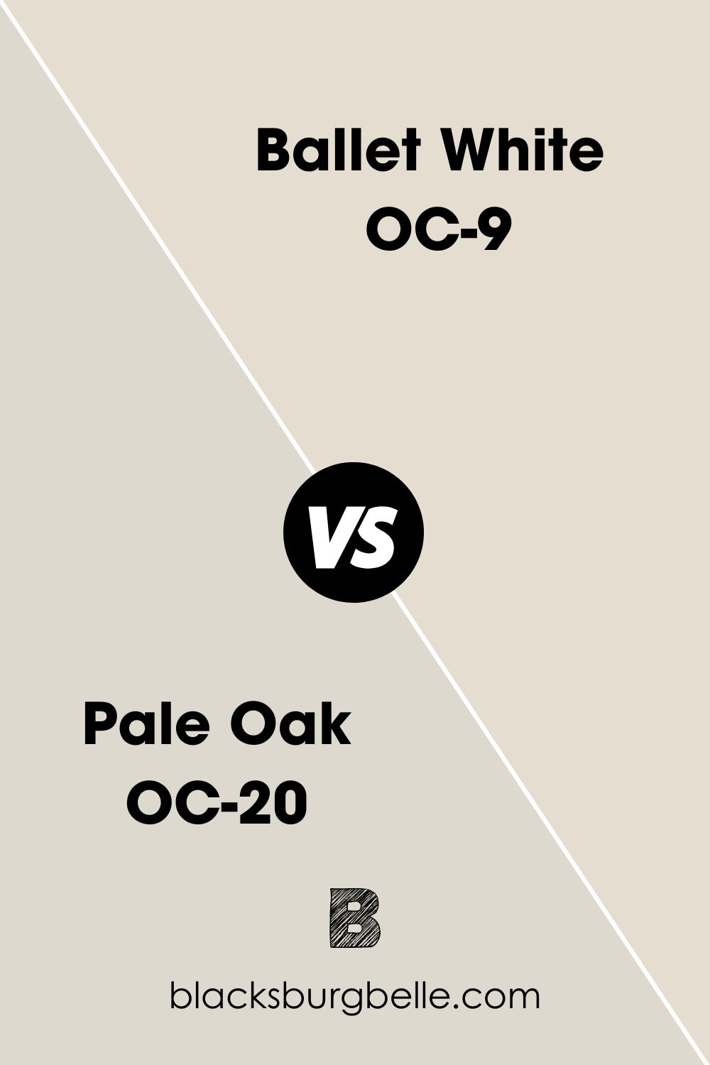
Benjamin Moore Ballet White vs. Benjamin Moore Pale Oak OC-20
The grayer tint of Pale Oak’s off-white makes it dimmer and darker than Ballet White.
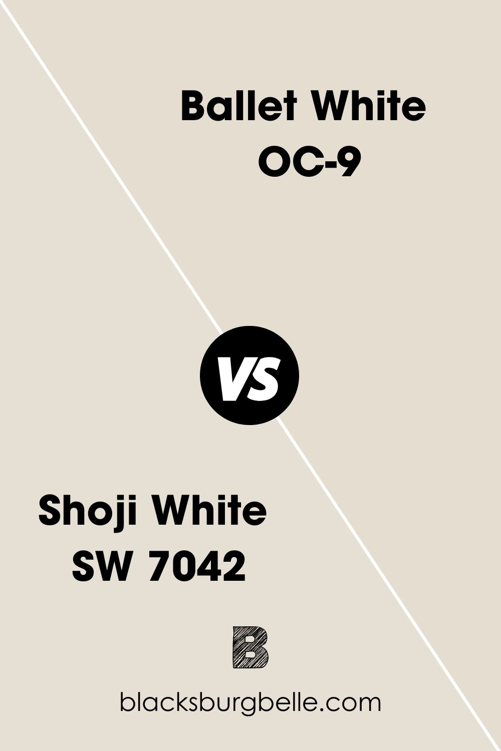
Benjamin Moore Ballet White vs. Sherwin-Williams Shoji White (SW 7042)
Sherwin-Williams Shoji White also has a greige undertone with a similar LRV. You can use it as an alternative for Ballet White.
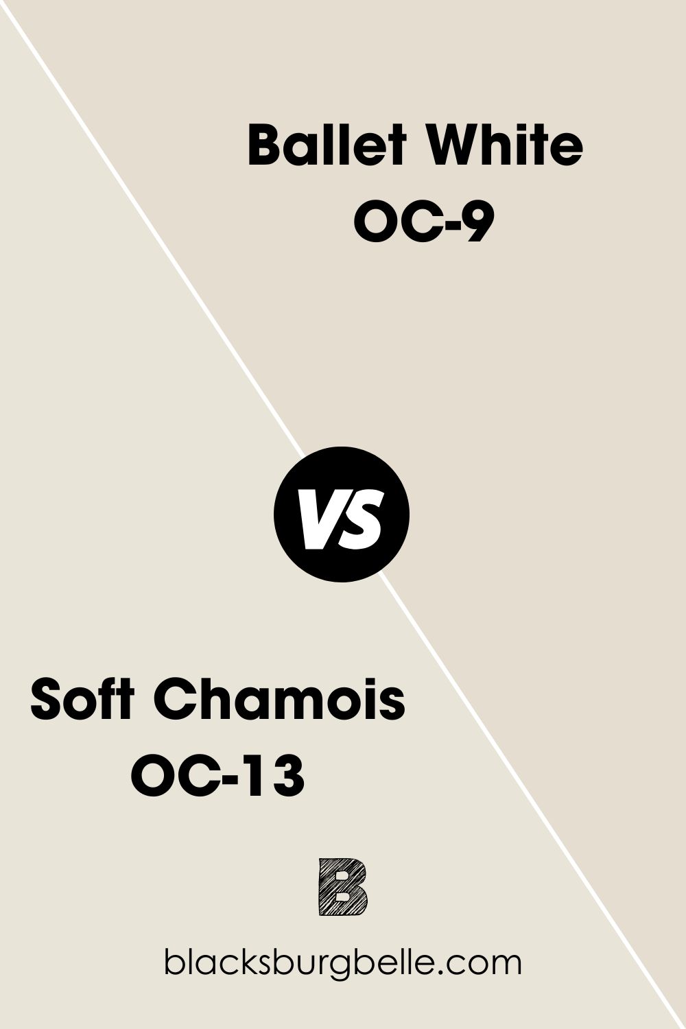
Benjamin Moore Ballet White vs. Benjamin Moore Soft Chamois OC-13
Benjamin Moore Soft Chamois is a creamy off-white paint with a warm yellow undertone.
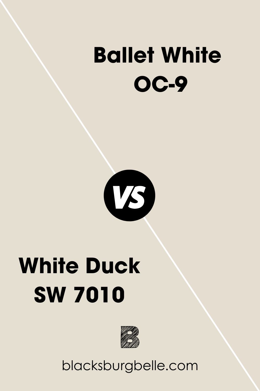
Benjamin Moore Ballet White vs. Sherwin-Williams White Duck (SW 7010)
Sherwin-Williams White Duck has a bolder gray undertone than Ballet White which is only noticeable under bright white light.
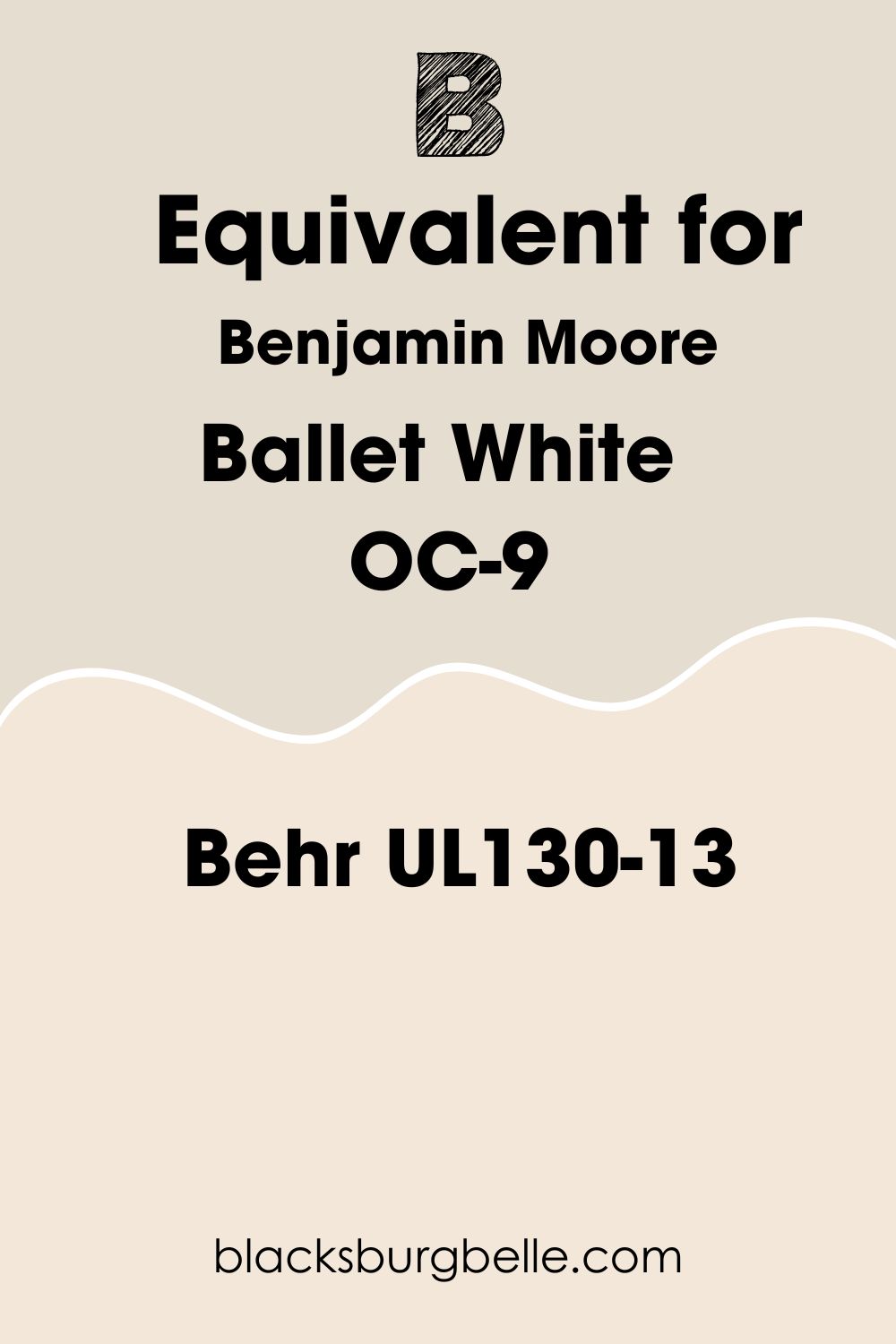
Benjamin Moore Ballet White Equivalent in Behr UL130-13
Behr’s Ballet White doesn’t have the muted gray of Benjamin Moore’s version, so it’s brighter and sunnier. It has an hex code of #F2E7D8, an RGB value of Red 242, Green 231, and Blue 216 with an LRV of 81. Also its warm undertone is purely yellow with no orange tint.
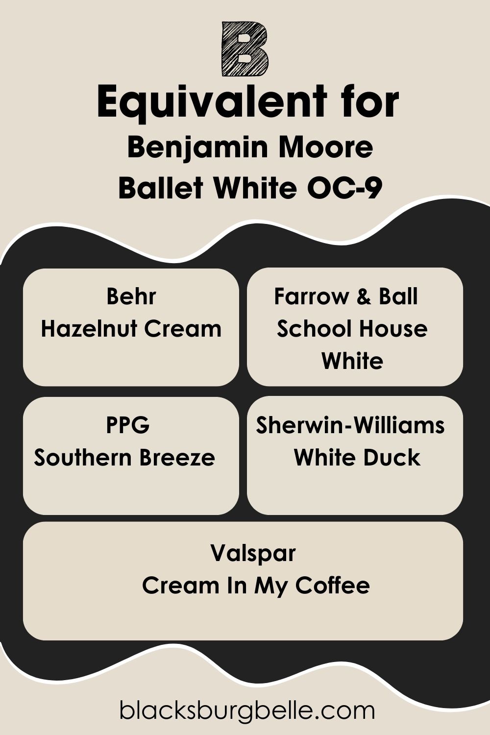
Benjamin Moore Ballet White Equivalents
Because of the muted nature of Benjamin Moore’s Ballet White, I can see its appeal but can’t guarantee you’ll get the exact same shade elsewhere. The closest muted whites from other brands include:
Behr – Hazelnut Cream
Farrow & Ball – School House White
PPG – Southern Breeze
Sherwin-Williams – White Duck
Valspar – Cream In My Coffee
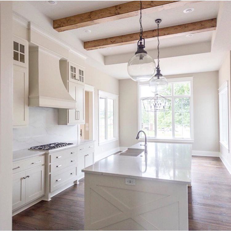
Where Can You Use Benjamin Moore Ballet White?
Because Ballet White is a medium-light neutral color, it works excellently in every room. But the greige undertone makes it a selective hue based on color palettes and spaces.
I scouted some pictures showing the different places you can use Ballet White and how it fits.
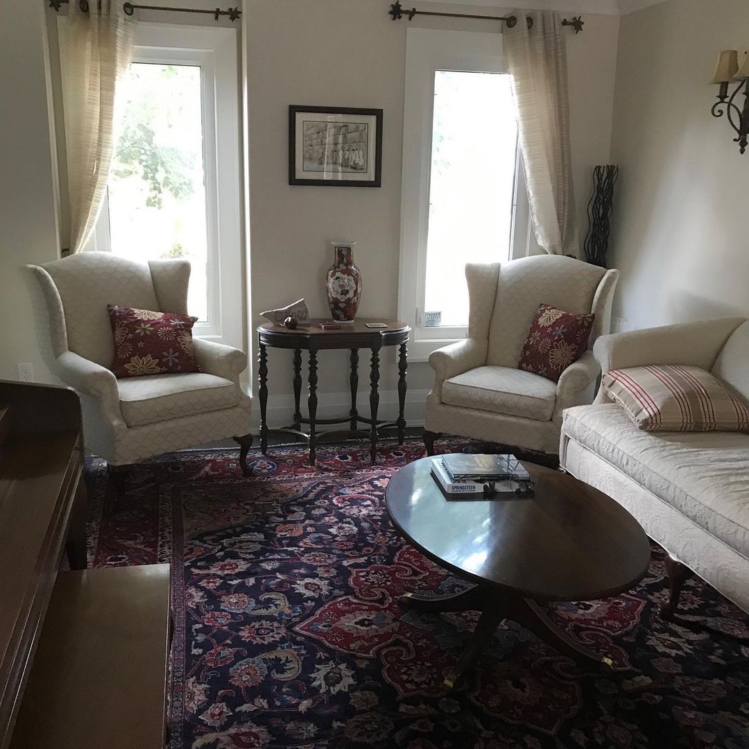
Benjamin Moore Ballet White on Walls
When you use Ballet White on walls, ensure a large window receives natural sunlight. That’ll highlight the two-toned greige undertone in this living room. If there’s no window, ensure you use adequate artificial lighting.
Use warm yellow lighting for a beige-white reflection and cool white or blue light for the grayish-white tone.
This living room wall appears beige even though there are big windows. But you’ll notice the dark red carpet and throw pillows add warmth into the room.
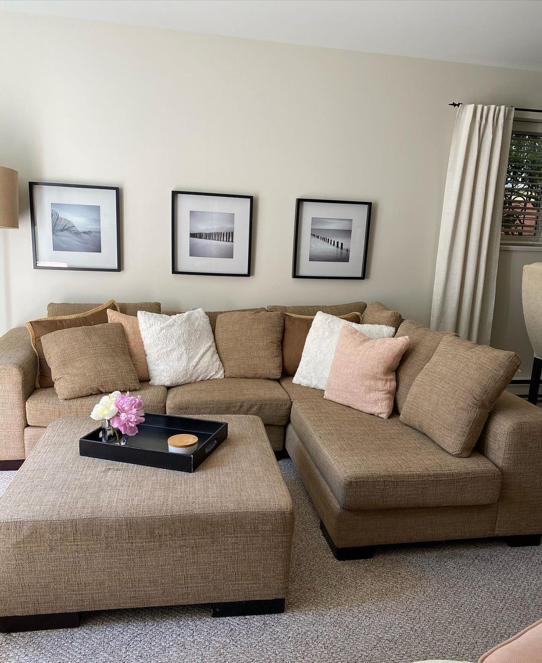
Benjamin Moore Ballet White in the Living Room
If you want the color to appear as the neutral white it is, give it enough natural lighting. It creates a backdrop for a minimalist theme when you do that like this living room.
When you use warm lighting like this it gives the room a sunny and rich glow. The interior decor also adds to the aesthetic and creates warmth.
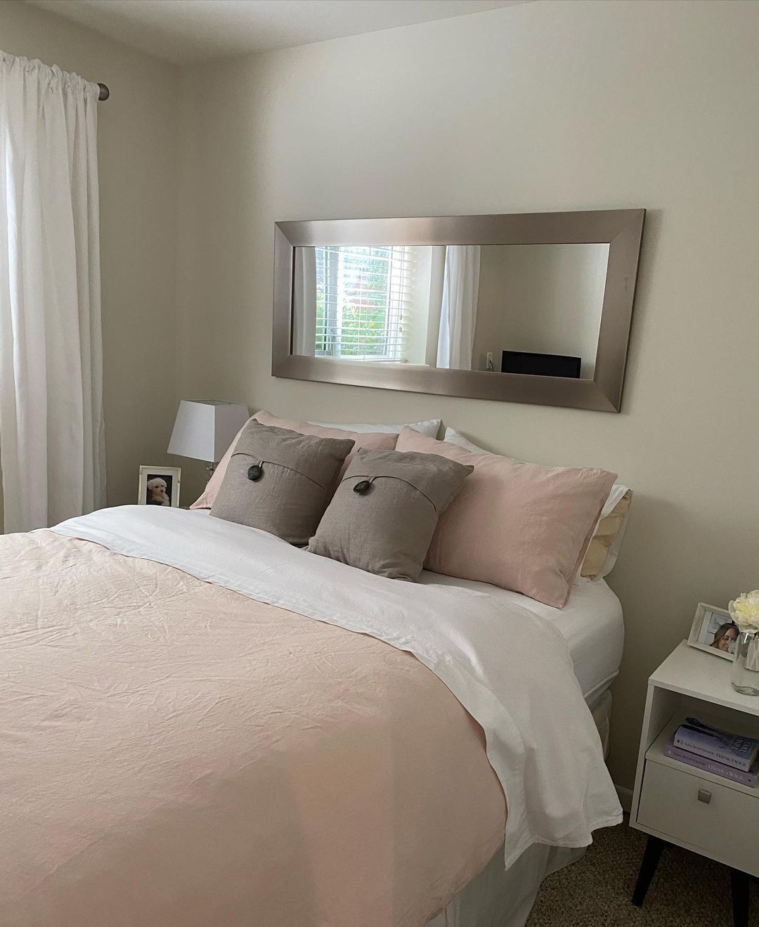
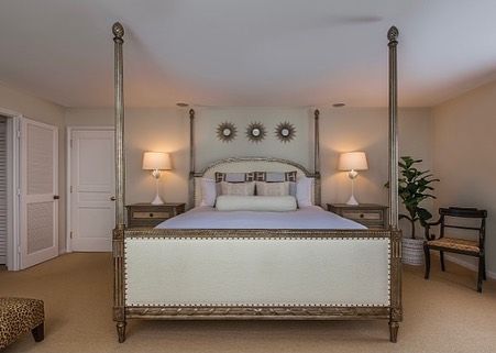
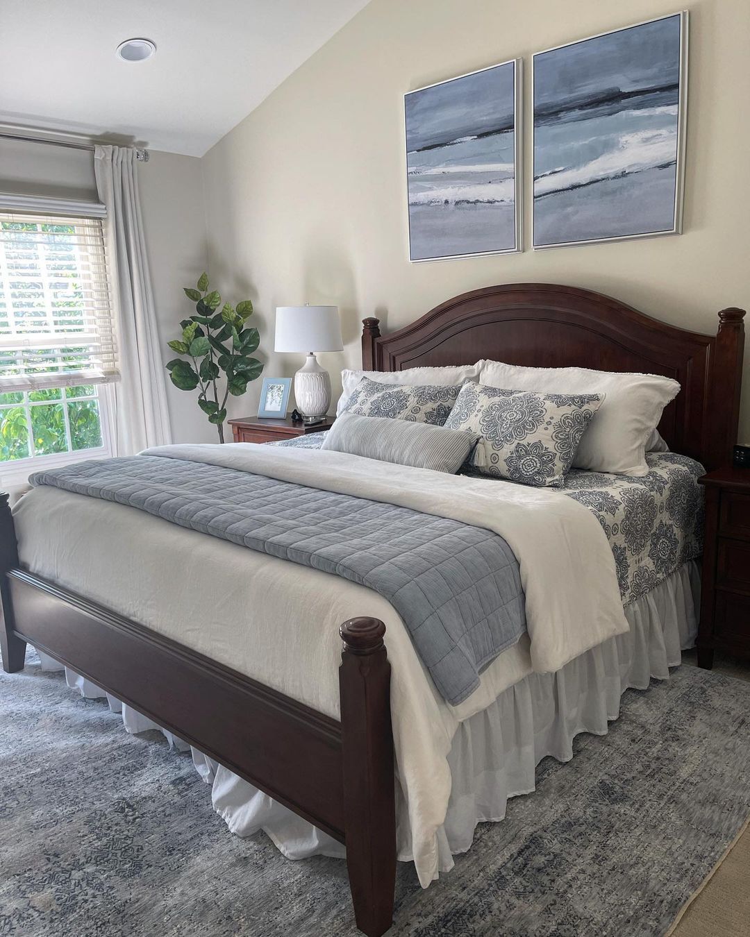
Benjamin Moore Ballet White in the Bedroom
If you can’t decide between a traditional or modern bedroom, using Ballet White comes in handy. You can paint it on your walls for a warm backdrop and intensify the tone with a yellow light.
Now look at this other bedroom with cool gray bedding. There’s direct lighting entering the room, so it mostly reflects its gray undertone. But you can still see the beige notes on the wall with the bed’s headboard.
Although I didn’t find any bedroom with Ballet White dressers or wardrobes, it’s a potential way to add color to your space.
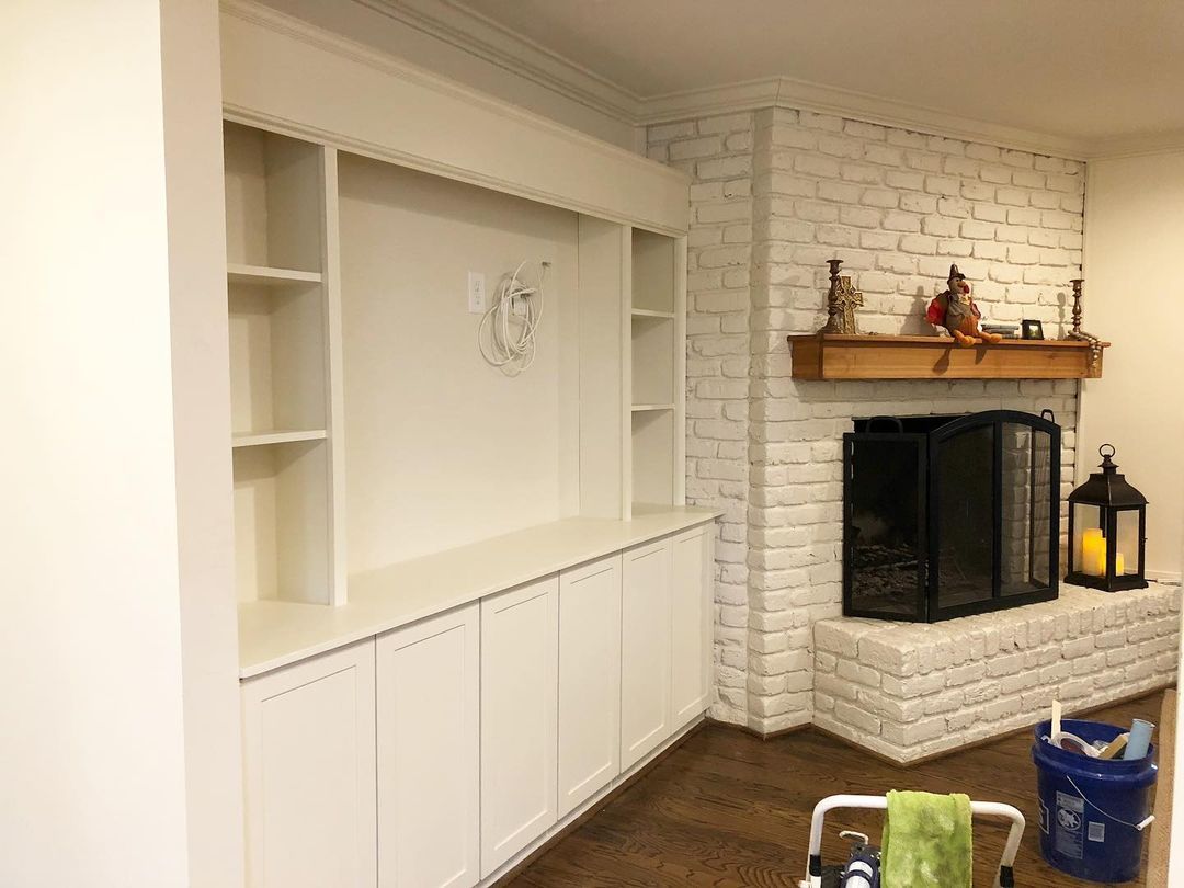
Benjamin Moore Ballet White on Furniture
It’s common to use paints on furniture to revamp them. But it’s rarer to see colored brick walls and fireplaces like this one.
I like that Ballet White isn’t a pristine tone that’ll make the room look too serious. Instead, its warm undertone gives this living room a homely vibe.
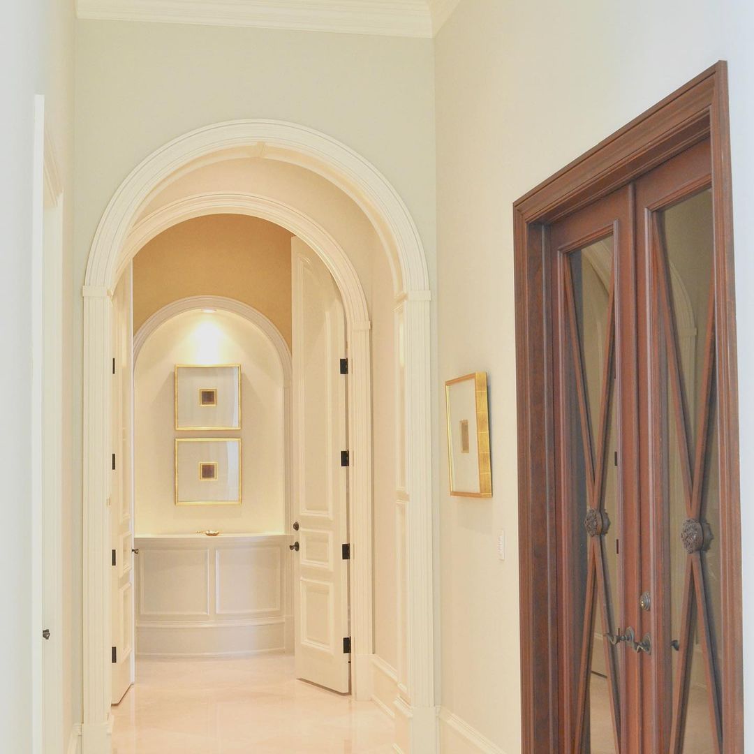
Benjamin Moore Ballet White on Hallways
When you have bold colors inside your house, you need a hallway with neutral walls like Ballet White. It adds brightness and warmth to the rooms without messing with their essential tones.
See what a Ballet White adjoining hallway looks like in a modern space with a monochrome palette.
Now see the same color paired with warm orange lighting. The additional warmth makes the space look rich and cozy with a promise of affluence to any guest walking down the halls.
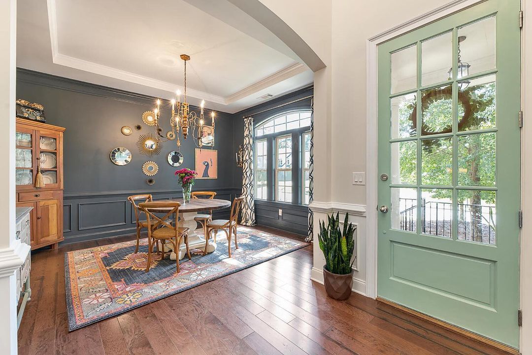
Benjamin Moore Ballet White Entryway
Entryways preview your hallways, so say yes to Ballet White here. Because of its soft and quiet warmth, it makes a lovely backdrop for other muted colors on your front door and adjoining room.
In this entryway, the Ballet White walls lighten the dining room’s dark gray tone. Also, peep the Triadic Color Palette and how it replaced a light lavender with a deep gray.
Benjamin Moore Ballet White on Cabinets
Adding neutral paints like Ballet White to cabinets gives the furniture a modernized facelift. You don’t have to break the bank by buying new woodwork when you can simply preserve and revamp your historic pieces.
Also, a tinted white paint like Ballet White on cabinets is great for all-white color palettes. You can use a pristine shade for the walls and highlight them with the painted cabinets.
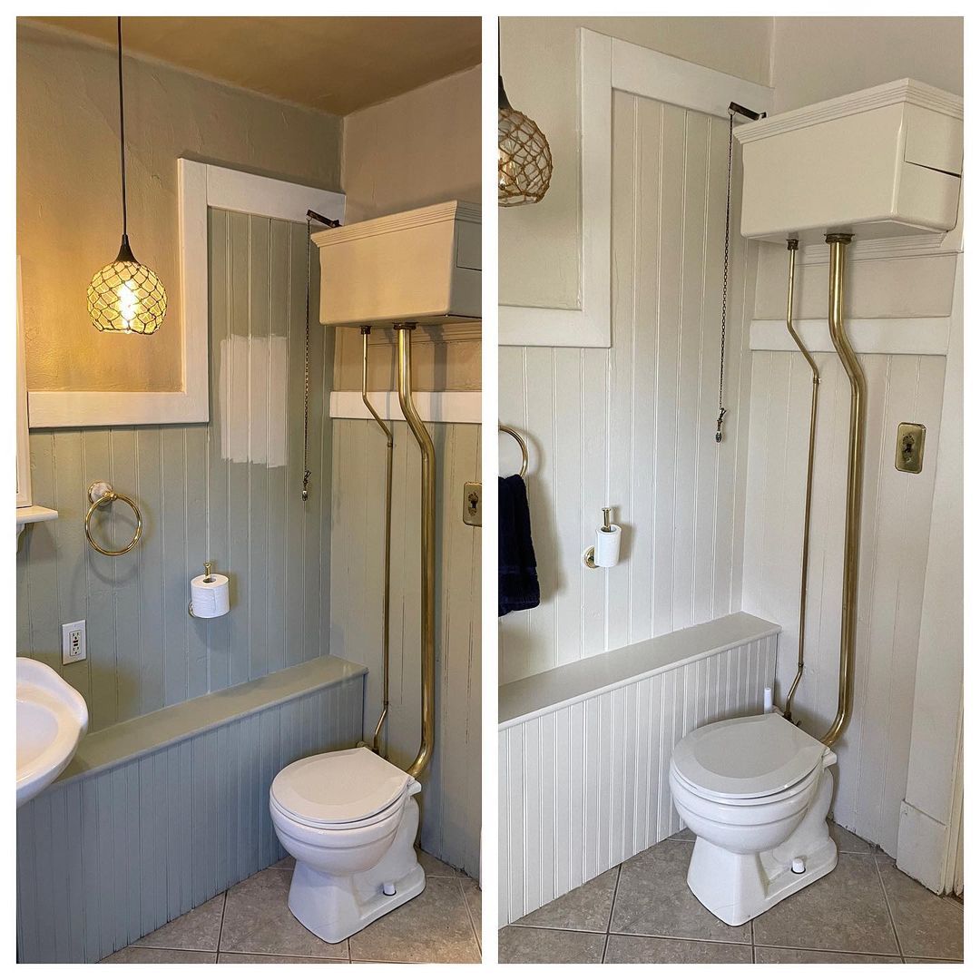
Benjamin Moore Ballet White in the Bathroom
This transformation picture is the perfect way to visualize the effect of Ballet White in bathrooms. The before-picture with the gray walls and off-white trims gave the small space a dull and old look. I believe bathroom breaks in there felt claustrophobic and stifling.
But with the Ballet White makeover, the space looks newer and cleaner even though it’s the same.
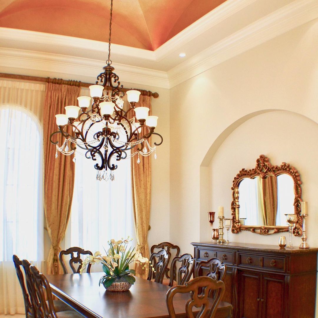
Benjamin Moore Ballet White in Dining Rooms
I like the idea of a cozy white wall in a family dining room. So, yes, I’m a big fan of Ballet White in dining areas. It suits modern nooks like this one.
Gives you the traditional family dining room look like this space.
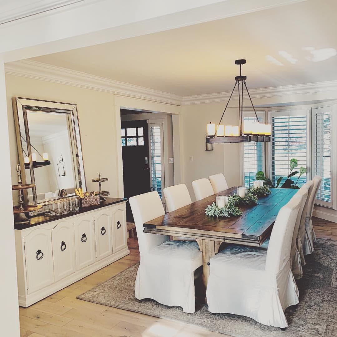
And if you want a rich vintage dining room with dark brown wooden furniture, Ballet White is still an ideal option. Remember I told you it’s a versatile color. Well, here’s the proof.
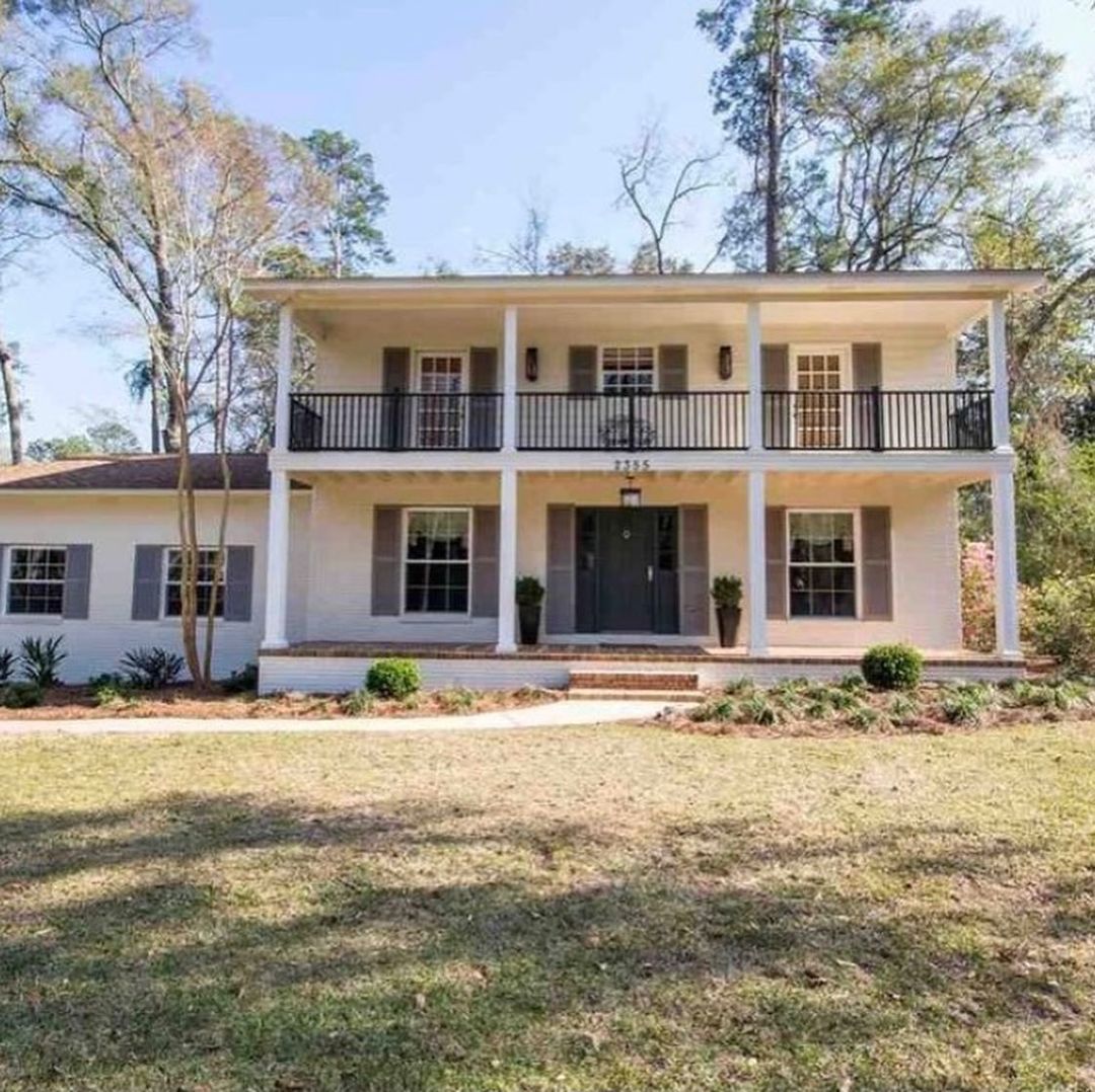
Benjamin Moore Ballet White on Exteriors
With Ballet White, you can take the warmth outside without making your home a sunny beacon. The subtle white walls will catch the natural light at sunrise or sunset, depending on the building’s position.
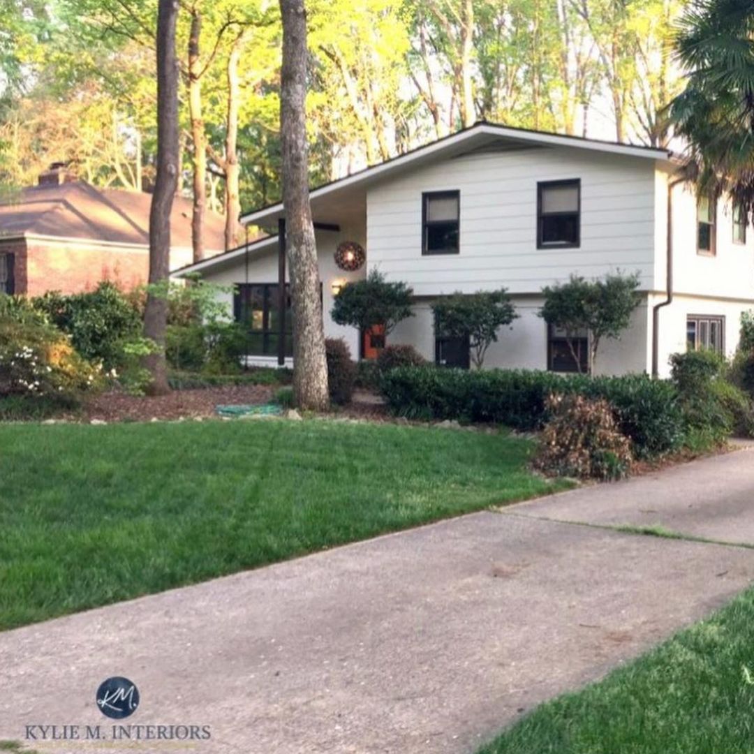
This second building is a typical example of a Ballet White building positioned away from direct sunlight. Instead of appearing with its warm beige undertone like the first picture, it takes on a calmer gray-toned reflection.
Conclusion
I recommend Benjamin Moore Ballet White for a balanced and muted neutral color in your home. You can use it inside or outside but it’s best on your interior walls. Ballet White may be a white paint but it’s not ideal as a trim because of its greige undertone.
If you’ve decided to use Ballet White, my top rooms for using it include:
- Living Rooms
- Dining Rooms
- Hallways &
- Entryways
I’d love to see your interpretation of Ballet White based on my review. So, please share your pictures and palettes with me.
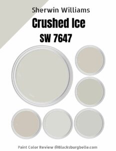 Sherwin Williams Crushed Ice (Palette, Coordinating & Inspirations)
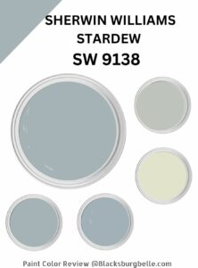 Sherwin Williams Stardew (Palette, Coordinating & Inspirations)
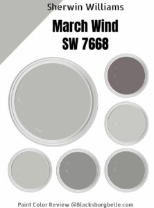 Sherwin Williams March Wind (Palette, Coordinating & Inspirations)
 Sherwin Williams Accessible Beige SW 7036: Review & Inspiration
 Sherwin Williams Simple White SW 7021: Review & Inspiration
 Sherwin Williams Sea Serpent SW 7615: Paint Color Review
