
Beige is and will always be one of the best neutral colors for decor. Because of this, there is an amazing number available from different manufacturers. One of the best is Sherwin Williams Accessible Beige SW 7036, but what makes it so great?
That’s what we are here to find out. This beige paint color has a lot of things to offer, and I want you to see if it fits your decor or style. I’ll show you when to choose it, its undertones, LRV, and colors that work well with it. Pretty extensive, right? Let’s get going on this exciting ride!
Table of Contents
When to Choose Sherwin Williams Accessible Beige
As mentioned, there are many beautiful beige paint colors, so when is it best to choose Accessible Beige over others? Let’s look at some scenarios where Accessible Beige works better than others.
Is warmth a priority?
Accessible Beige is a warm beige paint color that changes the look and feel of any room. It doesn’t lack color, although it has gray undertones. You can incorporate it into any color scheme as long as all the colors have the same tone to avoid clashing undertones.
Have good natural lighting?
This paint color is a muted beige because its LRV is just above the middle point. Although it looks bright, Accessible Beige doesn’t reflect enough light to work well in a room with low light. So, choose Accessible Beige if you have relatively good lighting in a room.
Want a good neutral backdrop?
Its neutrality makes it popular with designers and homeowners as a central color or backdrop. Although it has warm undertones, you can still make it work with different color tones. Not every time white, right?
Thinking of redoing your bathroom?
Bathrooms enjoy less natural light than other rooms. In other words, bathrooms usually don’t have enough lighting. So, they need paint colors with enough brightness to reflect light. However, Accessible beige has enough pigmentation and warmth to work in a bathroom, despite the lack of natural light.
You now have an idea of the places and situations where Accessible Beige works best. But that’s not all; there are other aspects of this paint color to know. Stick around as we discover them together.
What Color Is Accessible Beige?
Beige colors are a favorite with many people because they are like gray without the crispness or blandness. Although there are warm grays and many have undertones, they can’t be compared with beige. And when given the option of gray and a beige like Accessible Beige, many choose the latter.
Beige can take many forms, looking like warm sand, light gray with yellow and brown, or a grayish tan. So, you have many options to select from if you are keen on using beige. But Accessible Beige looks like soft gray in many settings, although it can read beige in others.
Accessible Beige SW 7036 is a medium beige paint color with warm gray undertones. It is a soft color that looks so great with other light neutrals, especially white.
A Snapshot of Sherwin Williams Accessible Beige Specifications
The following are the basic specifications for Accessible Beige that make it unique. I must point out that all colors have these basic characteristics, but the difference is the specific detail.
| Sherwin Williams Accessible Beige | |
| RGB | 209, 199, 184 |
| LRV | 58 |
| Undertone | Gray |
| HEX Code | #D1C7B8 |
Sherwin Williams Accessible Beige: Understanding the LRV
The LRV of color is its light reflectance value, referring to how much light that color reflects in a room. LRVs are measured on a scale of 0 to 100, and every color falls between these numbers. 0 is for pure black and 100 is for pure white.
Paint colors don’t have pure blacks or pure whites. So, the scale for them goes from 2.5 to 94. The higher the value, the brighter or more reflective the color is.
Accessible Beige has an LRV of 58. This is not exactly very high but enough to throw a decent amount of light into a room. I would like to point out again that this paint color works best when there are relatively good natural lighting conditions.
Sherwin Williams Accessible Beige: Examining the Undertones
Every paint color has undertones, which are hues that set it apart from other colors. Even the most seemingly neutral color has undertones, albeit minimal. So, what are the undertones of the paint color under review?
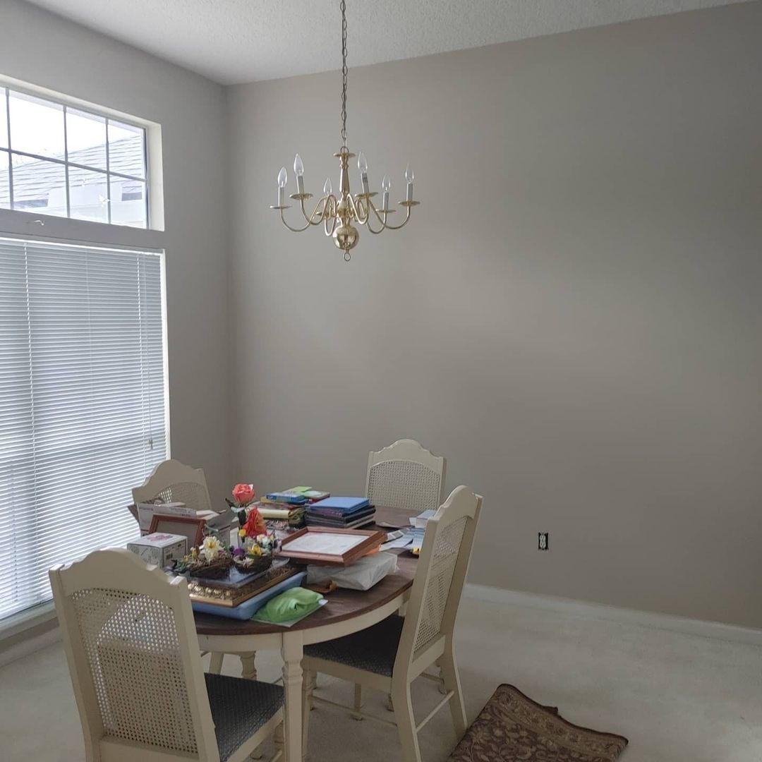
Accessible Beige has warm gray undertones. These undertones can turn a little green in certain lighting, so bear this in mind when using this paint color in any room. Typically, bright natural lighting should reveal Accessible Beige in its true shade. This is what it should look like under normal circumstances:
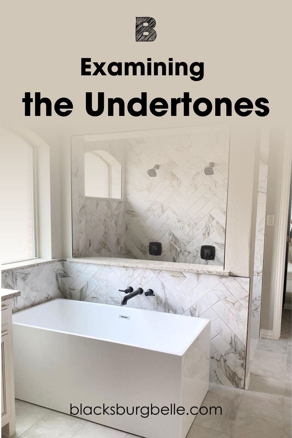
But when you see it under certain lighting, it can show a lot of green. This next picture is a perfect example and it has nothing to do with the green elements in the room:
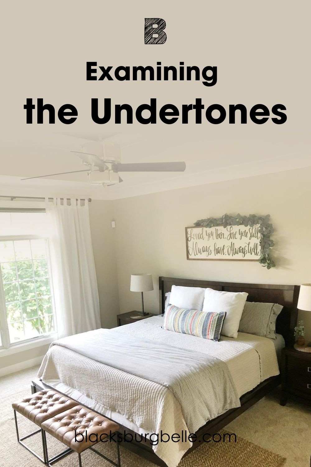
Does Accessible Beige Ever Read Yellow in a Room?
It is easy to assume that Accessible Beige will show some yellow hues in a room, especially with cool tones around it. But because it does not have any yellow in its base, Accessible Beige doesn’t usually read yellow in any room.
However, this paint color can show promises of leaning toward that angle. This is because of the green undertones that look a little like olive. And because olive typically has a bit of yellow in it, you may perceive a slightly yellow hue in Accessible Beige.
The next picture of a bedroom is a perfect representation of this scenario:
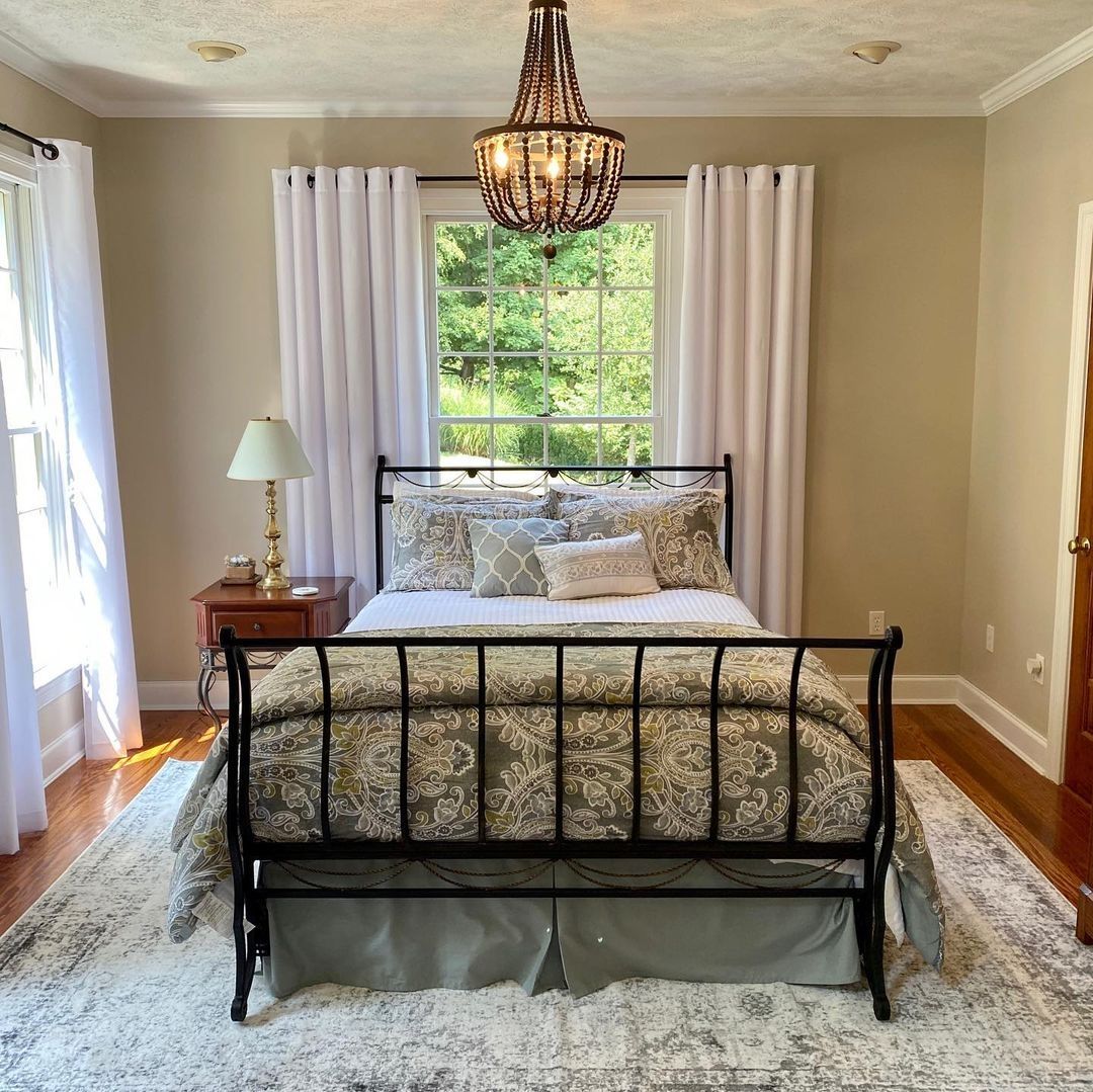
Does Lighting Affect It?
The changes in the paint color are primarily because of lighting. Different lighting conditions can make any color look different. Even bright natural lighting can transform color as solid as Accessible Beige.
Here is Accessible Beige in a living room with a combination of natural and artificial lighting:
Now, here is the same paint color in a room with low light:
In the first picture, you can see that the paint color shows some warmth. Although it is neutral, you can easily tell it is beige. But in the second picture, it looks gray instead of beige. Its undertones make it look crisp and cool instead of warm.
How Much Does Artificial Lighting Change It?
The type of artificial lighting and the wattage will determine how much Accessible Beige changes. Bright white artificial lighting can give the same impression as natural light, making it look its usual color.
But yellow artificial light can significantly affect it. This is Accessible Beige, looking like warm gray instead of beige in this bedroom because of the yellow artificial light.
And here it is in this kitchen with bright white artificial light, looking like an off-white paint color than beige or gray:
Having all these perspectives when it comes to lighting is crucial. That way, you can decide how and where Accessible Beige works best in your home.
Sherwin Williams Accessible Beige: Warm or Cool?
Accessible Beige is a warm beige paint color. It is a combination of gray and white as the base, with a little yellow for color and warmth. However, the amount of yellow in the color doesn’t affect its resultant undertones or final result.
If you want a neutral that acts like gray or greige but doesn’t sacrifice color or warmth, beige is your best bet. And Accessible Beige is one of the best because of its soft color and excellent performance in any space.
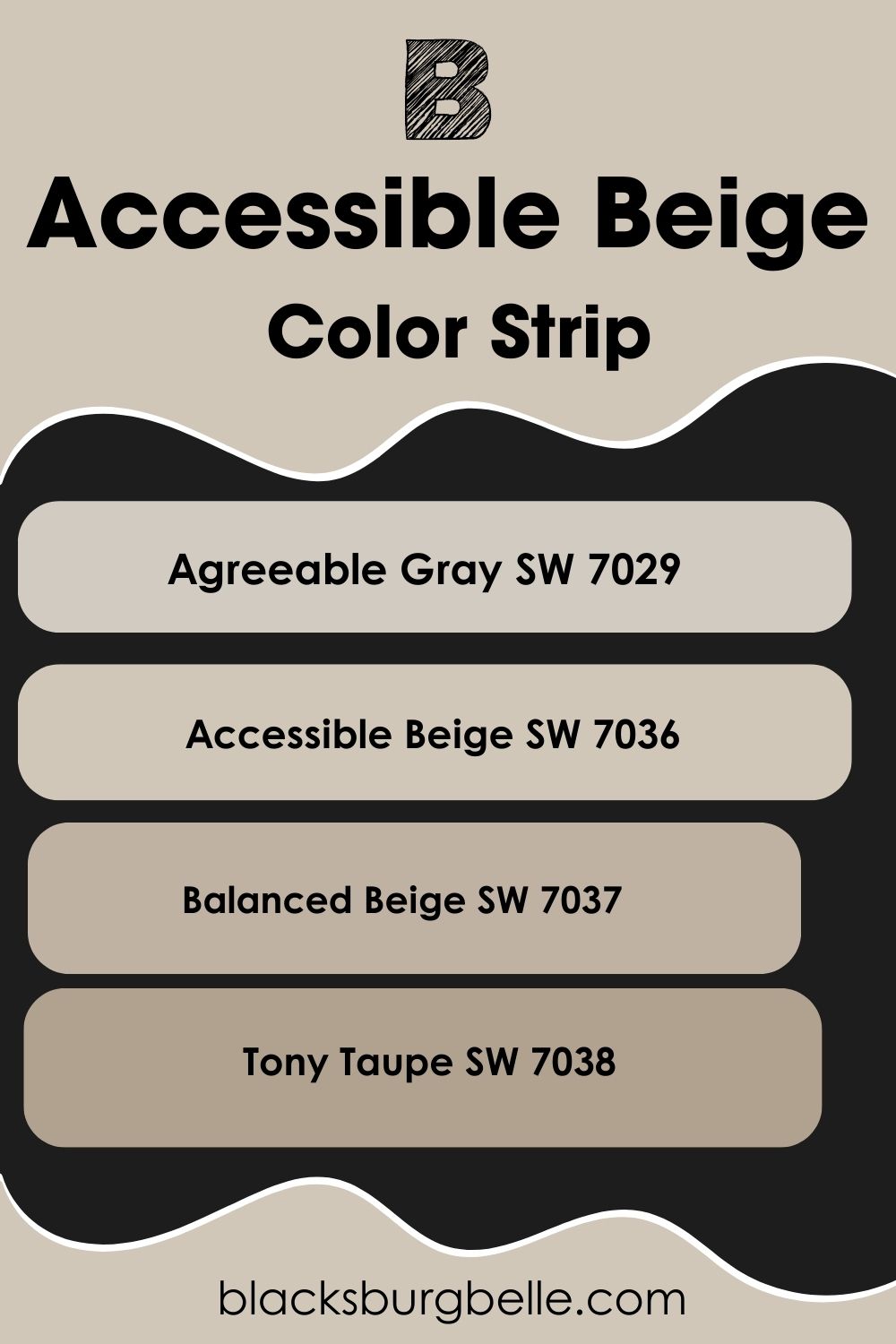
SW Accessible Beige Color Strip: Lighter to Darker Exploration
It may happen that Accessible Beige is not the exact shade you want. Your style or decor may favor a slightly lighter or darker beige, and you have no idea how to find what you need. Not to worry; I’ve picked shades, from light to dark, for easy reference.
- Sherwin Williams Agreeable Gray SW 7029
- Sherwin Williams Accessible Beige SW 7036
- Sherwin Williams Balanced Beige SW 7037
- Sherwin Williams Tony Taupe SW 7038
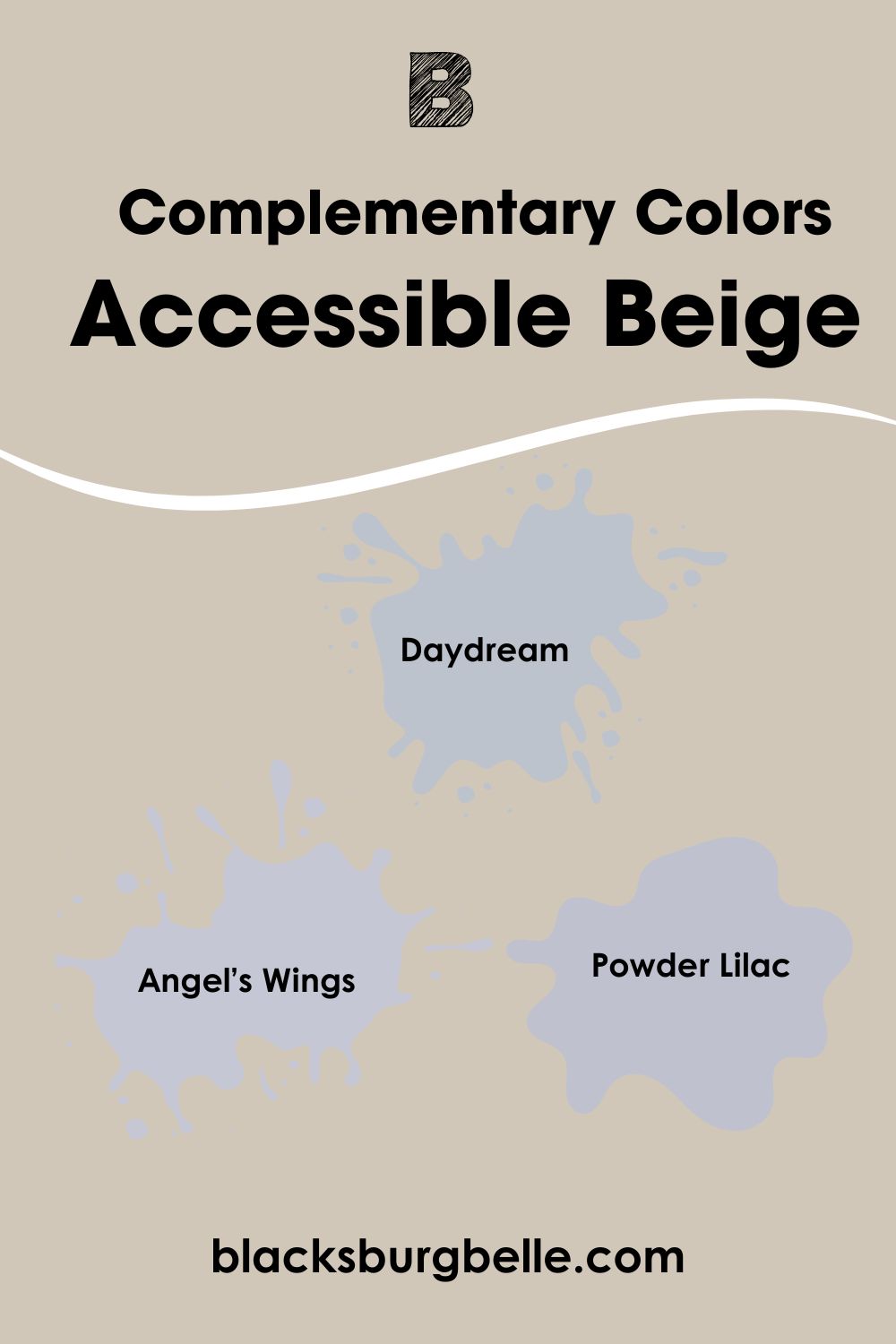
Sherwin Williams Accessible Beige Complementary Colors
If you are on the hunt for complementary colors for Accessible Beige, you must understand how they work. Complementary colors are those opposite each other on the color wheel. Don’t expect them to match at first glance; many times, they don’t.
But they cancel each other when mixed to produce a grayscale color like white or black. Examples include blue and orange or red and green. Also, each color has only one complementary color.
The best complementary color for Accessible Beige is a light to medium shade of cyan-blue or purple. And Sherwin Williams’ Daydream SW 6541 is the closest shade to this color. You can also try Benjamin Moore’s Angel’s Wings 1423 or Behr’s Powder Lilac S550-2.
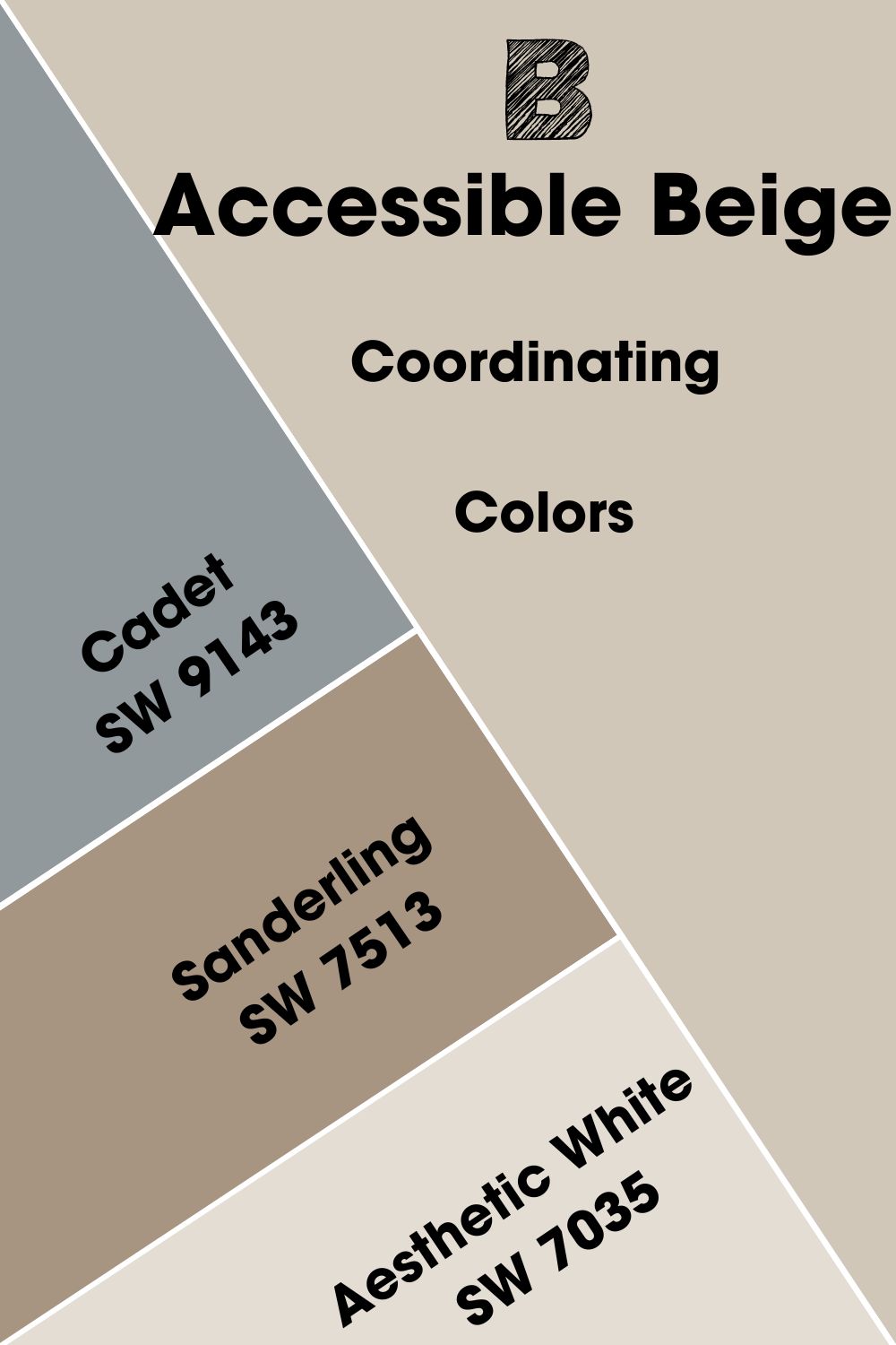
Sherwin Williams Accessible Beige Coordinating Colors
If you want to use Accessible Beige and see the best of it, you must know its coordinating colors. These colors work harmoniously and perfectly complement each other, although they may appear different at face value. Cadet, Sanderling, and Aesthetic White are some of the best-coordinating colors for Accessible Beige.
- Sherwin Williams Cadet SW 9143: A gray-blue paint color with cool undertones that work well with any color, including Accessible Beige, because of its neutral tones.
- Sherwin Williams Sanderling SW 7513: A rich and deep beige with warm stone-gray undertones. It adds depth to the decor when used together with Accessible Beige.
- Sherwin Williams Aesthetic White SW 7035: With a slightly violet undertone, this white paint color is the perfect combination or trim color for Accessible Beige walls.
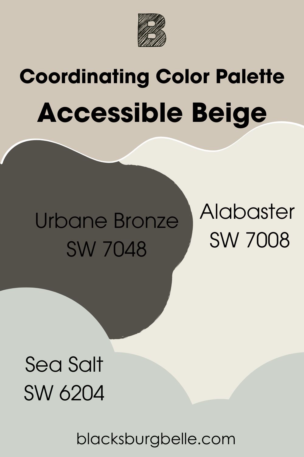
Sherwin Williams Accessible Beige Color Palettes
As a suitable neutral for many decor types, Accessible is not always picky with colors. However, some work better with it than others. With this in mind, I’ve created a few color palettes which you can use to make Accessible Beige appear striking in any room.
Coordinating Color Palette
- Alabaster SW 7008: A warm white paint color with creamy undertones to use as ceiling, door, or trim color when the walls are done in Accessible Beige.
- Urbane Bronze SW 7048: A deep brown with obvious gray undertones that throw make Accessible Beige appear light and airy, especially in a well-lit room.
- Sea Salt SW 6204: A pale green paint color with blue undertones for something different and soft in the decor.
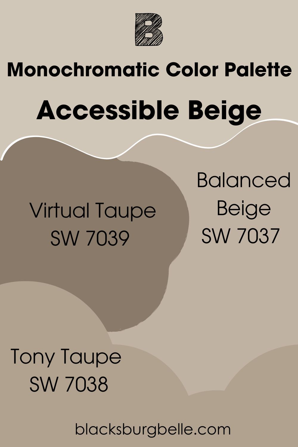
Monochromatic Color Palette
- Virtual Taupe SW 7039: A deep shade of beige paint color from the same collection as Accessible Beige for a saturated and sophisticated look.
- Tony Taupe SW 7038: A slightly lighter shade of beige than Virtual Taupe that reads taupe and holds the room together with its balanced hue.
- Balanced Beige SW 7037: Just a shade darker than Accessible Beige, this paint color can stand in the place of the color under review without looking off.
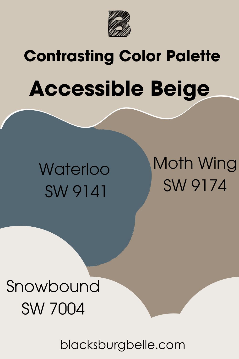
Contrasting Color Palette
- Waterloo SW 9141:A deep blue paint color with a warm gray cast that complements Accessible Beige, while the blue color contrasts with it.
- Moth Wing SW 9174: A much darker shade of beige than Accessible Beige that throws it to the light end of the spectrum without being out of place.
- Snowbound SW 7004: A clean and cool white paint color with enough hues to contrast with Accessible Beige and deepen its shade.
Sherwin Williams Accessible Beige vs Other Paint Colors
I talked about how there are many shades of beige, from light to dark, and how Accessible Beige is only one of them. But there are those that are pretty similar to it, and I want to show you how they perform side by side.
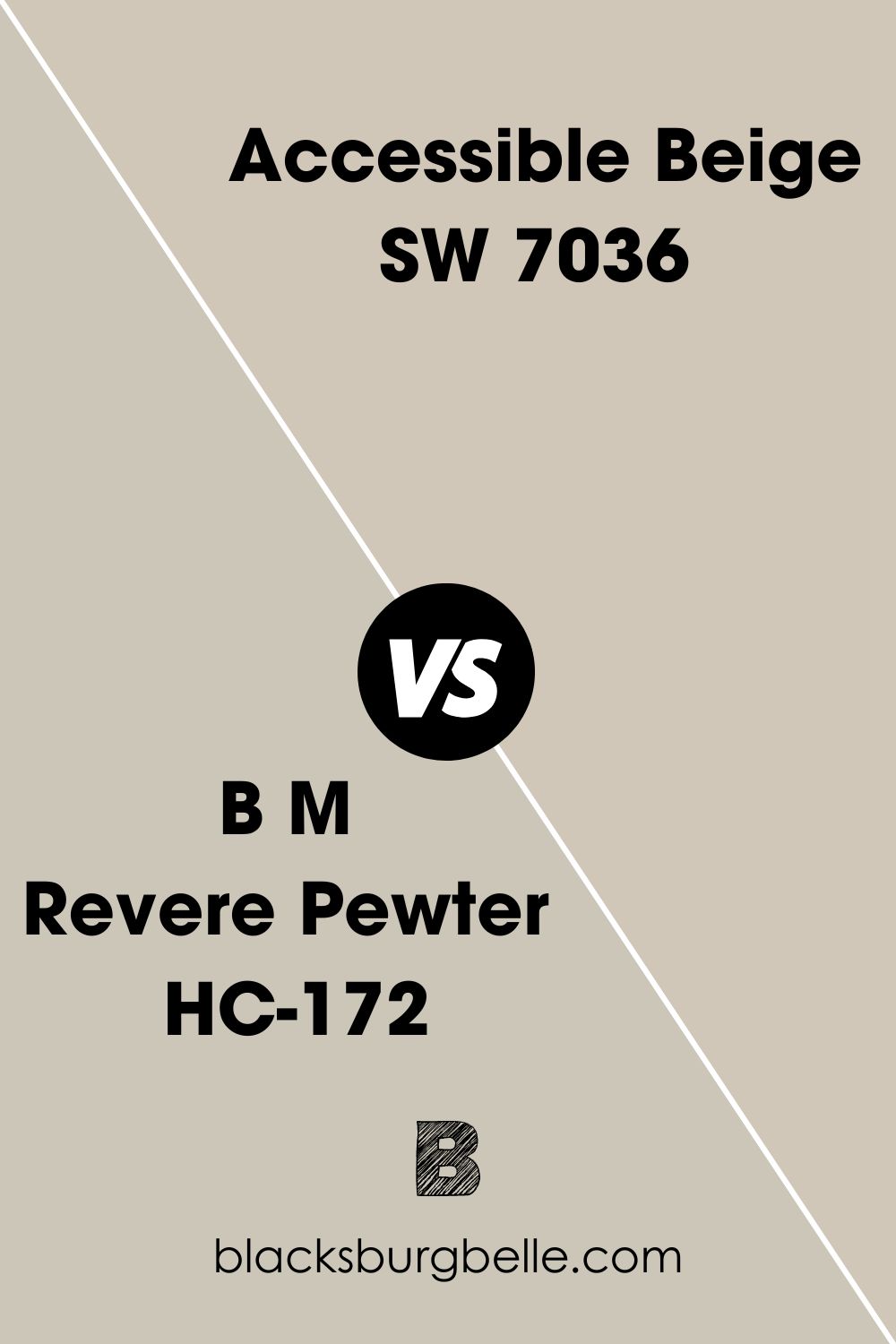
BM Revere Pewter vs SW Accessible Beige
Both paint colors have similar green undertones and look almost the same in shade. But Accessible Beige is slightly lighter with an LRV of 58, while Revere Pewter has an LRV of 55. Besides, Revere Pewter looks closer to gray than Accessible Beige.
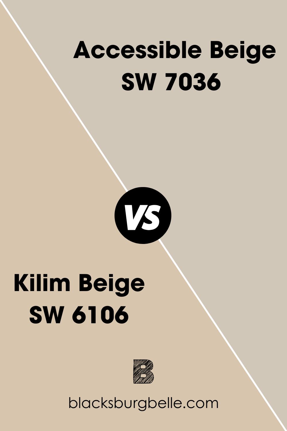
SW Kilim Beige vs SW Accessible Beige
Kilim Beige is closer to what a beige paint color should look like than Accessible Beige is. Also, it is warmer and has orange hues, distinguishing it from Accessible Beige.
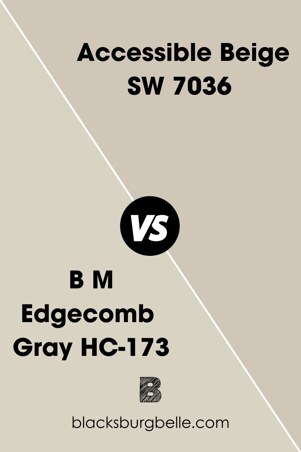
SW Accessible Beige vs BM Edgecomb Gray
Benjamin Moore’s Edgecomb Gray has a higher LRV of 63 and looks cleaner than Accessible Beige. However, both paint colors have similar green undertones and are close enough in shade to be interchangeable.
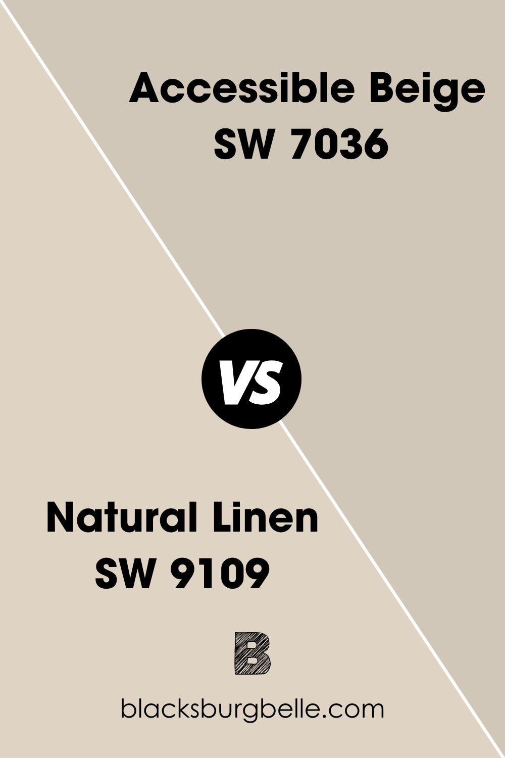
SW Natural Linen vs SW Accessible Beige
Natural Linen is lighter and warmer than Accessible Beige. It also looks creamy when compared to Accessible Beige.
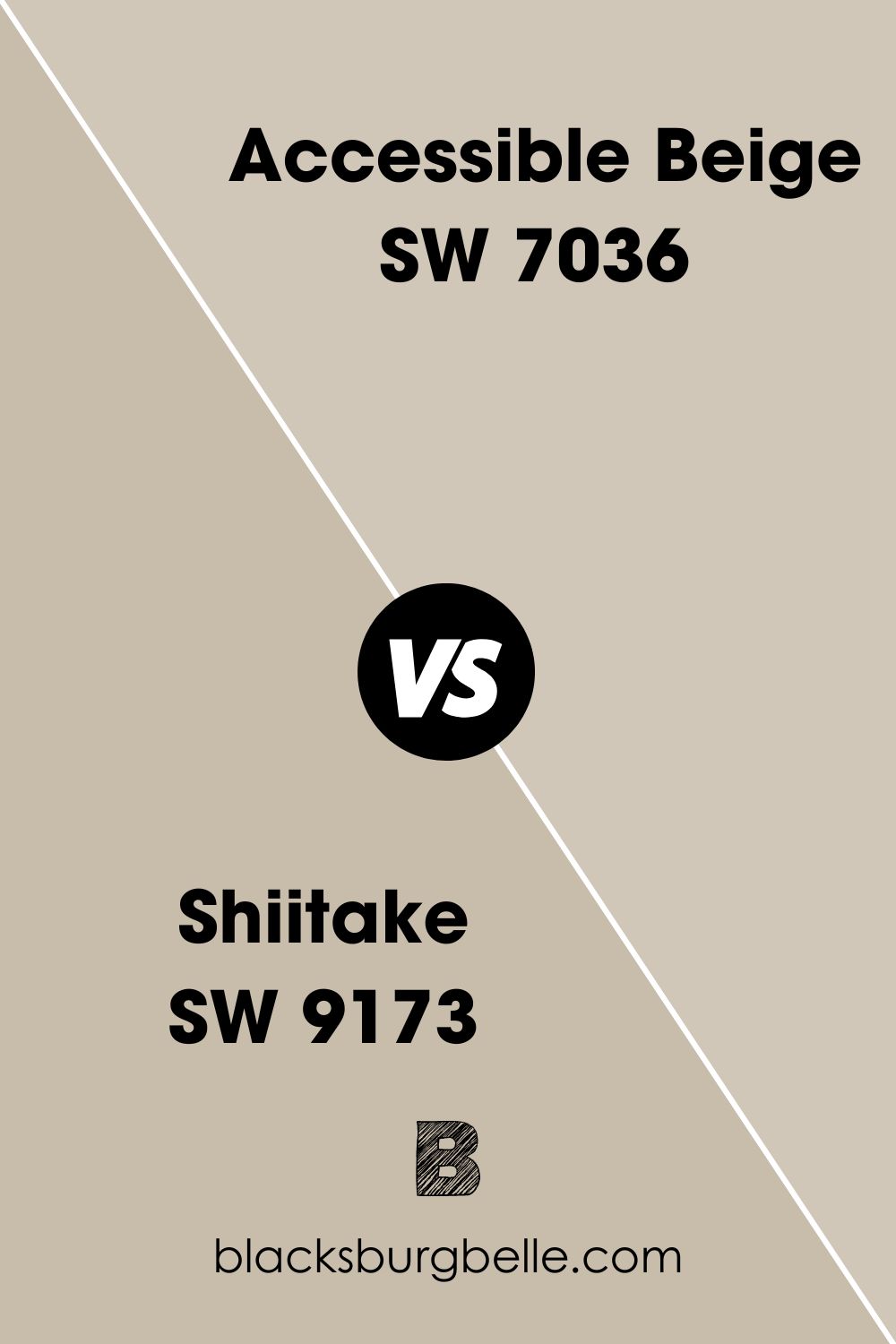
SW Shiitake vs SW Accessible Beige
Shiitake has a lower LRV than Accessible Beige. Because of this, it tends to look a little darker than Accessible Beige. But they are pretty similar and can work in the same room, despite Shiitake’s taupe undertones.
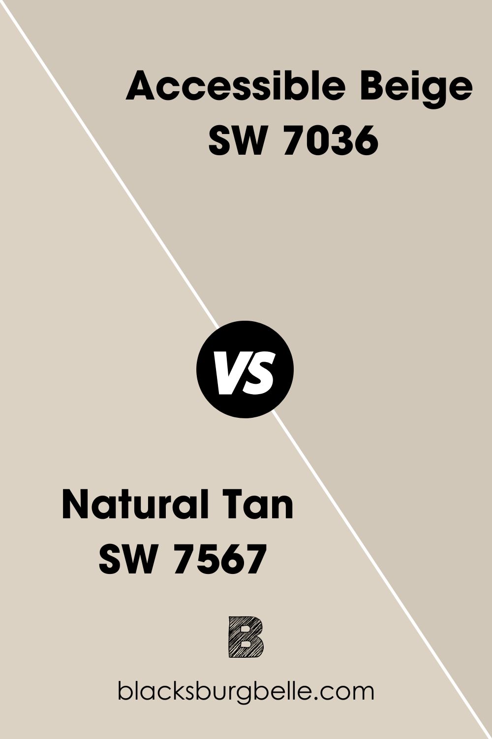
SW Natural Tan vs SW Accessible Beige
Natural Tan looks almost the same as Accessible Beige. But it is lighter, with an LRV of 65, and softer in shade.
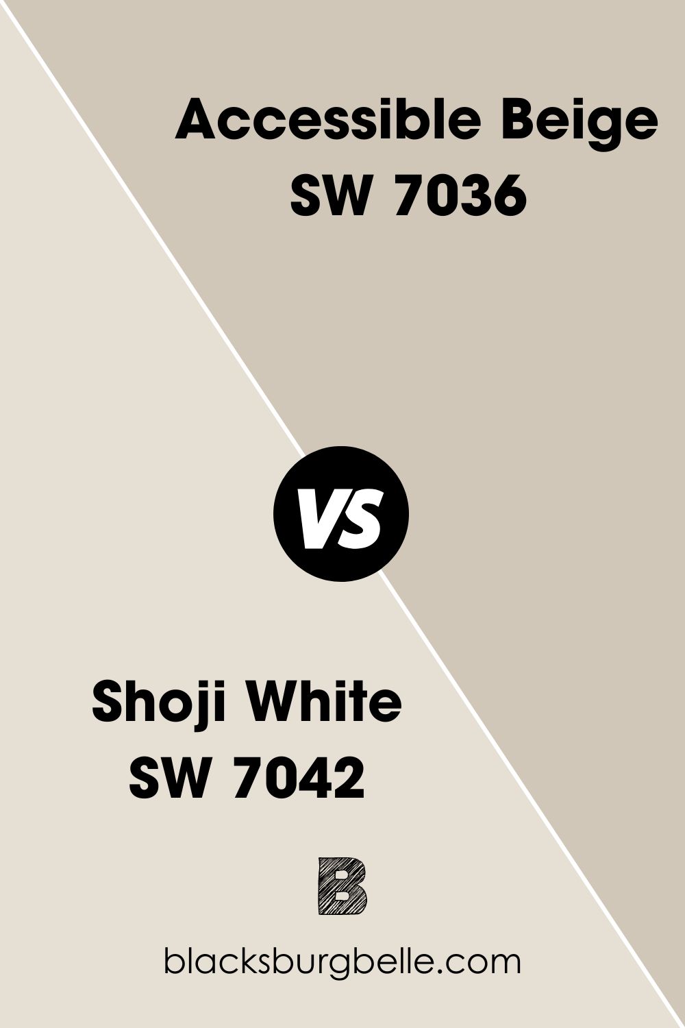
SW Shoji White vs SW Accessible Beige
Shoji White is an off-white paint color, but its creamy beige undertones make it close to Accessible Beige and sometimes show a wink of green. However, it has a pretty high LRV of 74 compared to that of Accessible Beige.
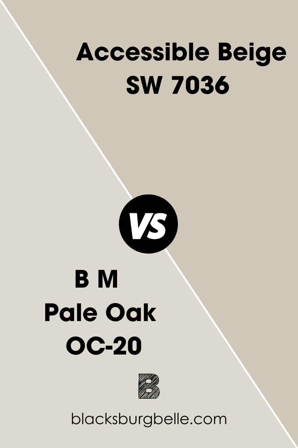
BM Pale Oak vs SW Accessible Beige
Pale Oak is a light color, with an LRV of 69, and has pink-violet undertones. It looks greige but can also appear like cream because of its peculiar color. Compared to Accessible Beige, the difference is clear.
What Cabinet Color Goes with Accessible Beige Walls?
Off-white, warm light gray, or cream colors go with Accessible Beige walls. You can try a brighter white, but remember that the undertones of this paint color can turn yellow-green if the lighting is right. And if the white is cool, the undertones may clash.
Benjamin Moore Paint Color Equivalent to SW Accessible Beige
There is no exact Benjamin Moore equivalent paint color for Accessible Beige. Every paint color is unique and comes with its own characteristics. However, you can compare Accessible Beige to Benjamin Moore’s Pale Oak, Edgecomb Gray, and Revere Pewter.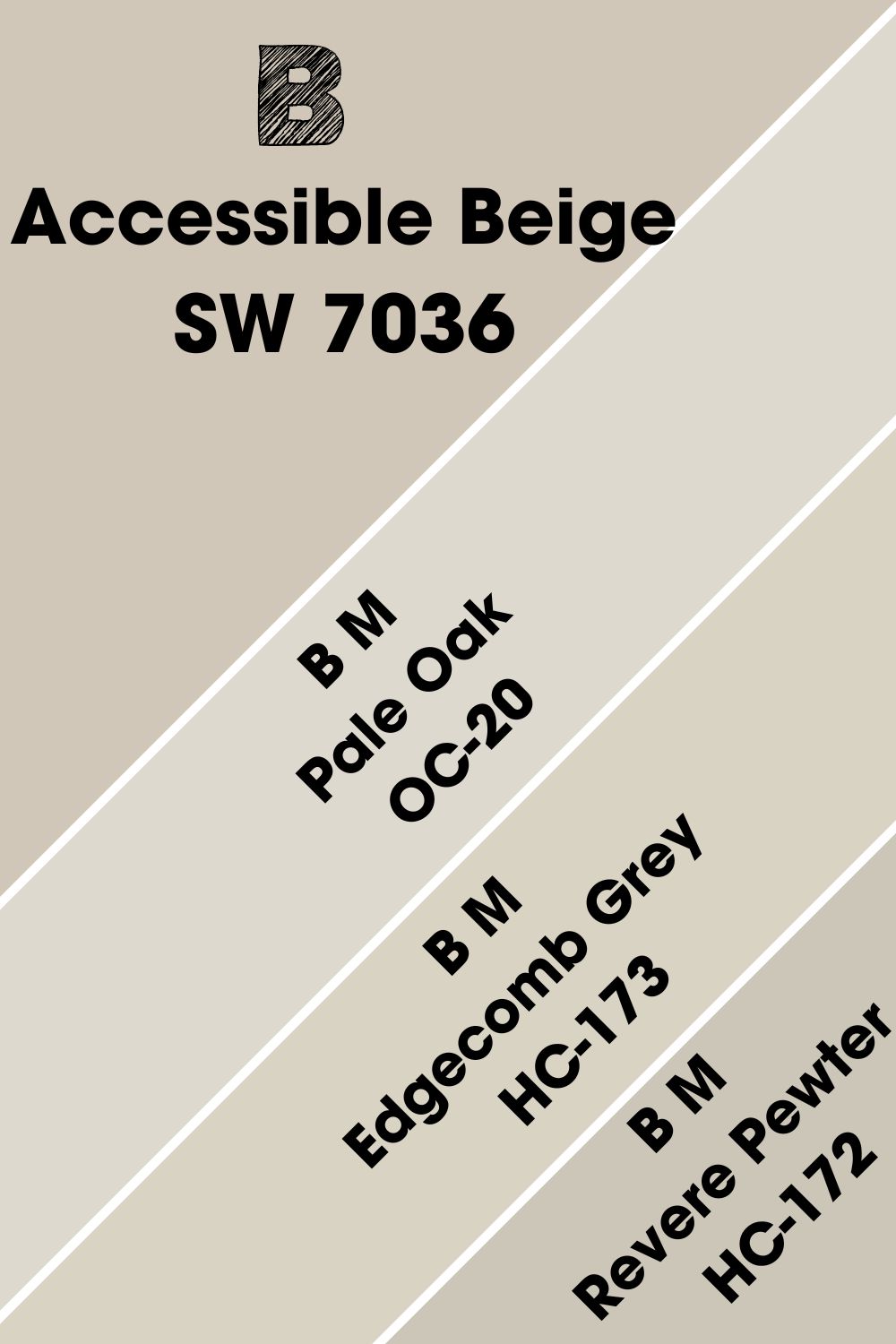
Revere Pewter may be slightly darker, so it may not give you the same light effect. But it may be your best shot at getting something like Accessible Beige from Benjamin Moore. Close to it is Edgecomb Gray because of its green undertones.
Where Can You Use Sherwin Williams Accessible Beige?
Neutrals will always be trendy, especially neutrals with color and warmth like Accessible Beige. But does this paint color fit every room? This will depend on style and personal preference.
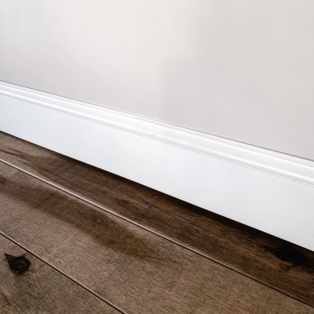
Best Trim Color for SW Accessible Beige Walls
Warm whites or off-whites are the best trim colors for Accessible Beige walls. Such colors bring out the shade of the beige without clashing with the undertones. Here, the homeowner used SW Alabaster on the trim.
What Ceiling Color Goes with SW Accessible Beige Walls?
Again, warm white work well on the ceiling if you paint the walls in Accessible Beige. This is because the undertones of cool white may clash with the warm undertones of this beige color. However, you can try bright whites like SW Ceiling Bright White or Extra White.
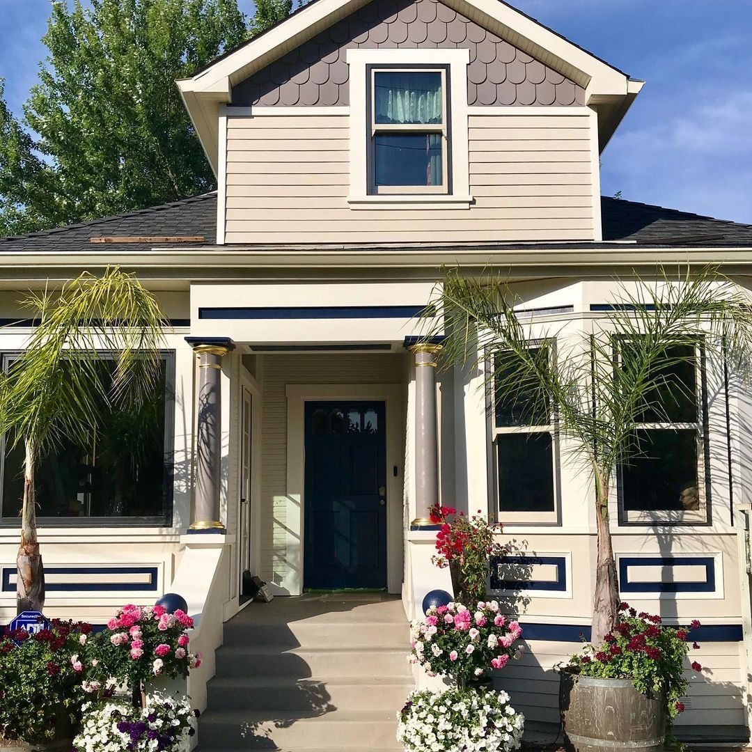
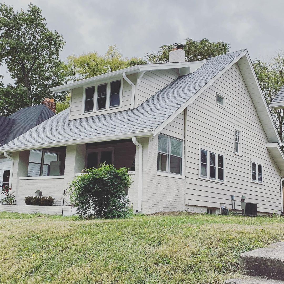
Best Trim Color for SW Accessible Beige Exterior
Id you know you could try a dark trim color on the exterior of your house if you use Accessible Beige on the walls? It may not have the same effect as white, but the result is no less striking. This house has SW Naval and SW Mink as well as Accessible Beige on the exterior.
Sherwin Williams Accessible Beige on Trim
You can try this paint color on trim if the walls are light or white. That means reversing the order: white on walls and Accessible Beige on trim.
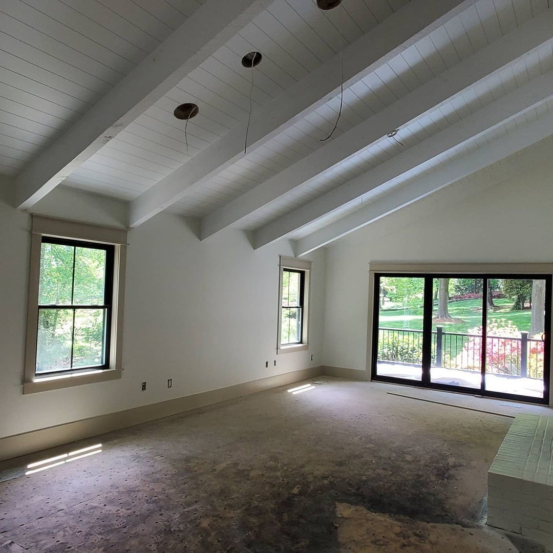
Sherwin Williams Accessible Beige on Exterior
This next picture is that of a house done almost exclusively in Accessible Beige. It looks amazing because of how bright and creamy the paint color looks.
Sherwin Williams Accessible Beige on Doors
Be versatile with your use of colors. White may be the staple color for doors, but you can try something different by using Accessible Beige as your door color. The wall color here is SW Alabaster.
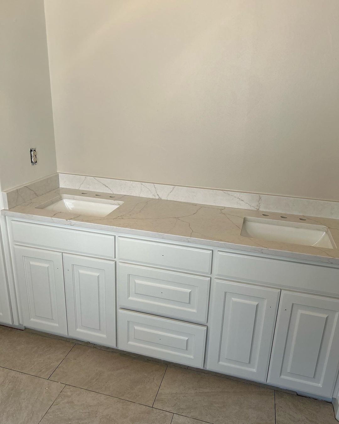
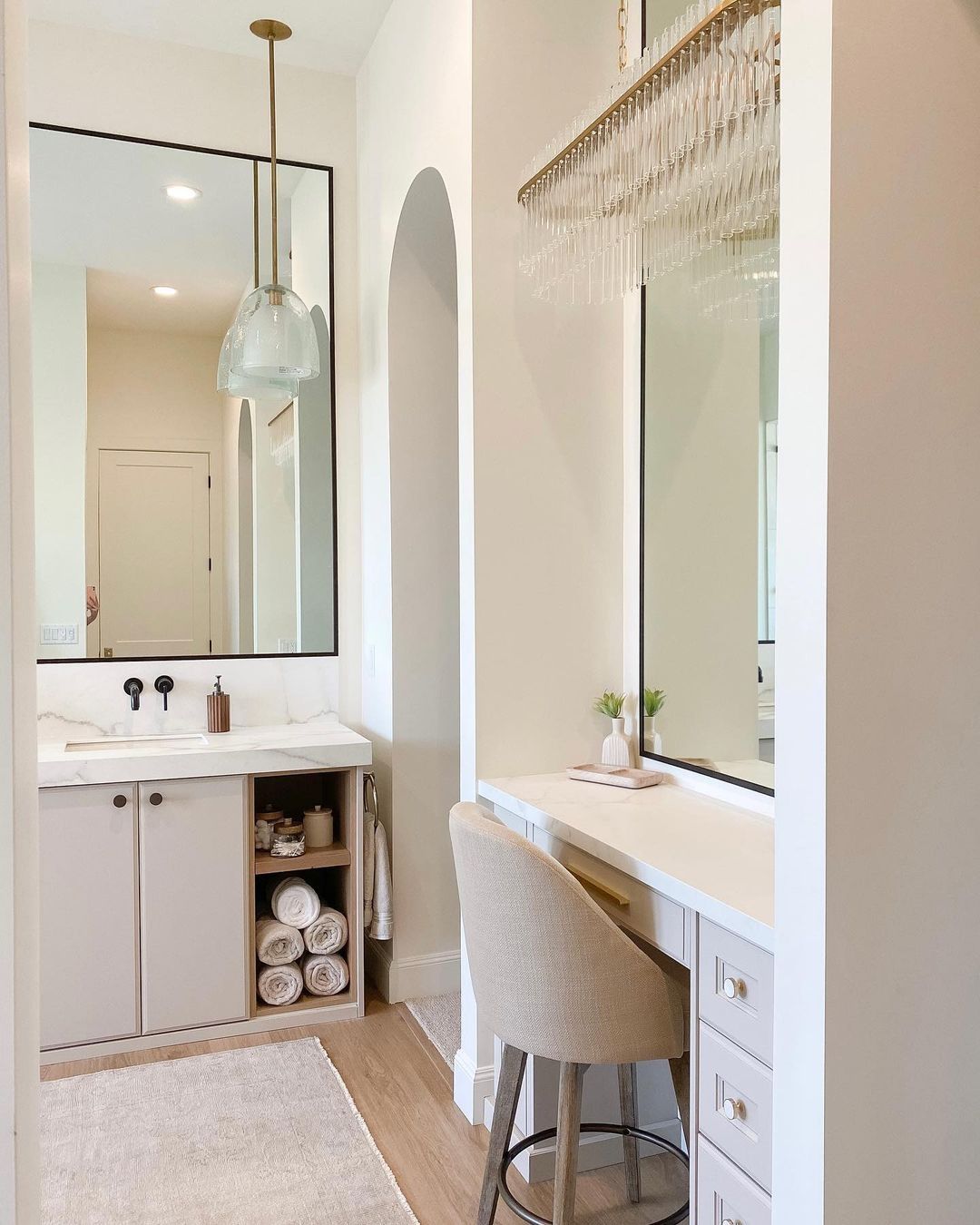
Sherwin Williams Accessible Beige in Bathrooms
This next picture is so beautiful! It is a bathroom but shows only the dressing area. You will understand why Accessible Beige is one of the best neutral paint choices for bathrooms, especially if there is bright natural or artificial lighting.
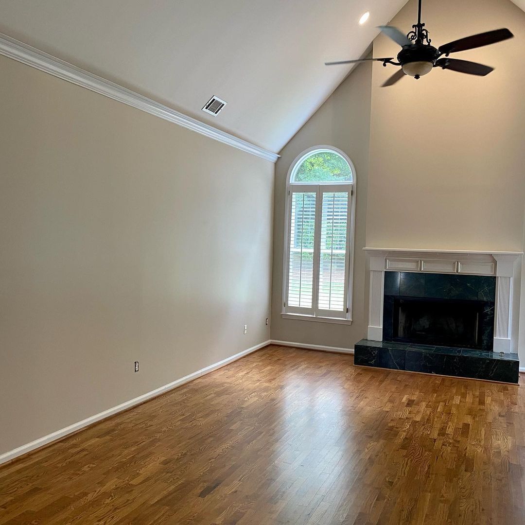
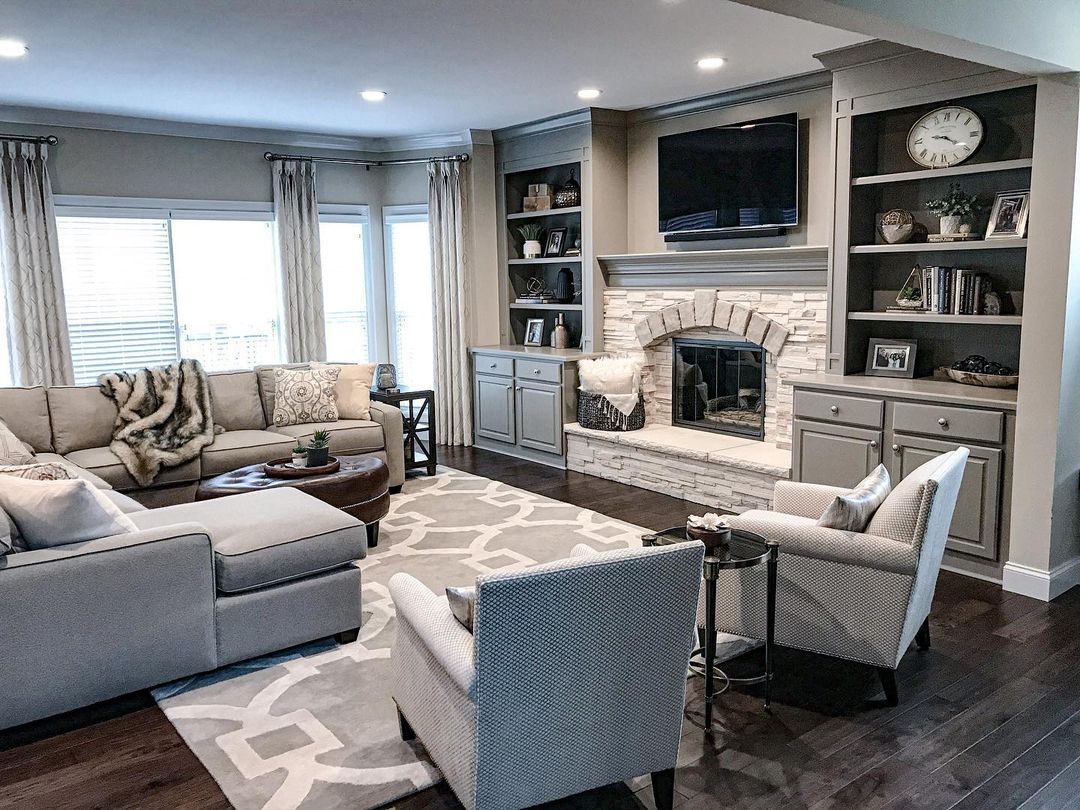
Sherwin Williams Accessible Beige in Living Rooms
If you want to keep it simple yet classy in your living room, neutrals should feature largely in the space. This living room has Accessible Beige on the walls, and it plays so well with the other neutral-colored accessories, furniture, and upholstery.
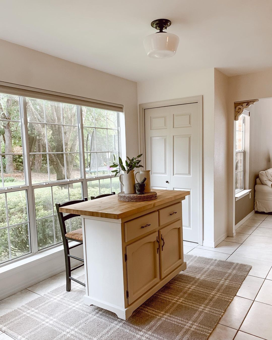
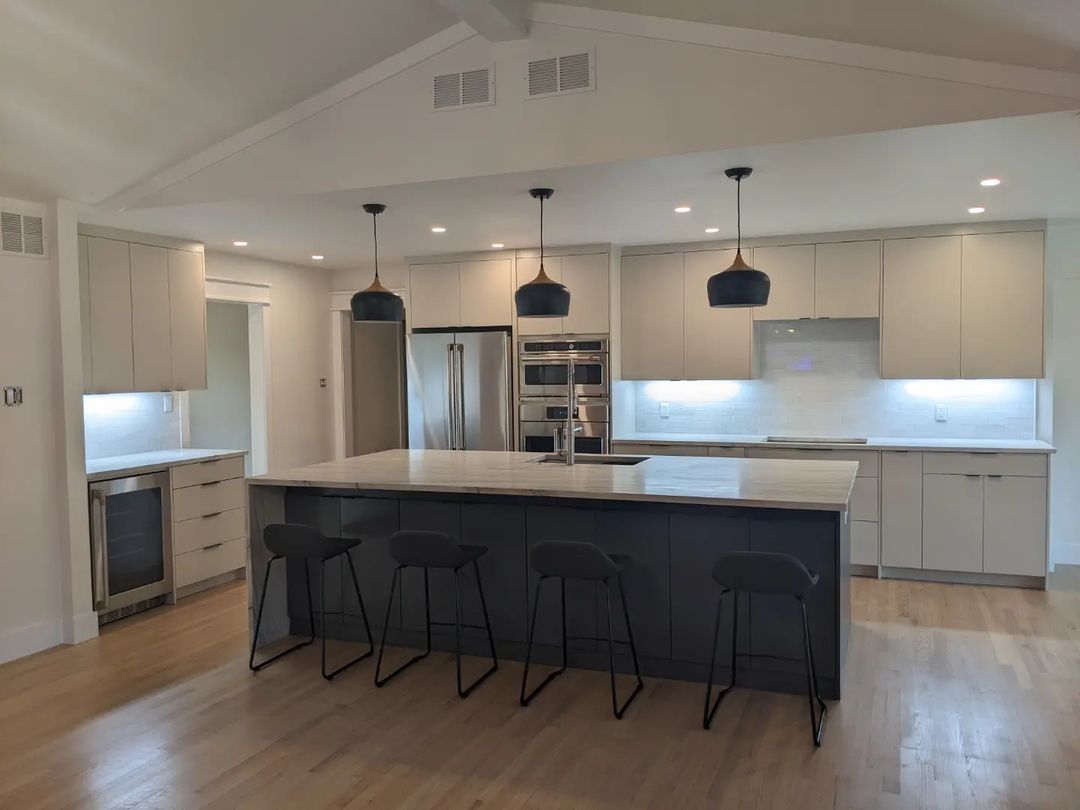
Sherwin Williams Accessible Beige on Kitchen Cabinets
If you don’t fancy using white on your kitchen cabinets, compromise and use Accessible Beige. It is light enough to play the role of white but has warmth and a bit of color so it’s not bland.
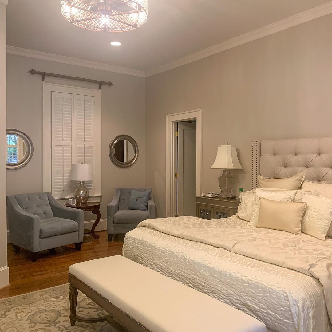
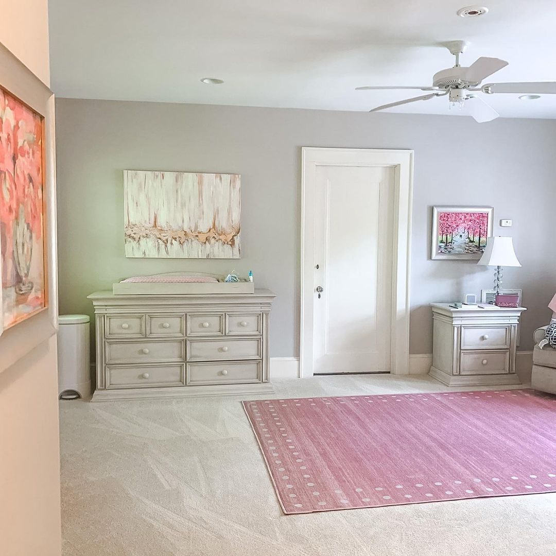
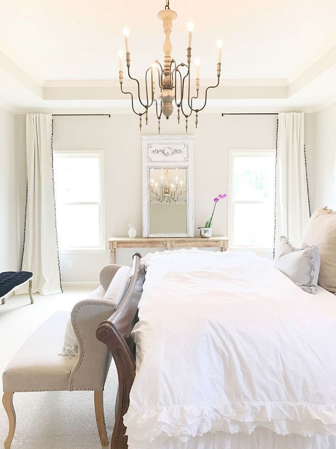
Sherwin Williams Accessible Beige in Bedrooms
Like bathrooms, bedrooms are personal spaces that help us relax. For that to happen, the setting must be right, starting with the paint color. If white is off the list, try Accessible Beige. It’s light, gray, and warm.
Conclusion
Sherwin Williams Accessible Beige is a popular and trendy neutral paint color. Users like it because it mimics a warm gray without sacrificing color. It can even appear brighter than usual if the lighting is right.
With an LRV of 58 and gray undertones that can read green in some rooms, Accessible Beige is a solid color that works in any room. The real-life pictures above prove that. You will also find suitable color palettes to start you on your journey of having striking and stunning decor.
Let me know your thoughts and experience with this paint color in the comments section.
 Sherwin Williams Silverpointe (Palette, Coordinating & Inspirations)
 Sherwin Williams Ivory Lace (Palette, Coordinating & Inspirations)
 Sherwin Williams Rock Candy (Palette, Coordinating & Inspirations)
 Sherwin-Williams Blue Peacock (Palette, Coordinating & Inspirations)
 Sherwin Williams Ivoire (Palette, Coordinating & Inspirations)
 Sherwin Williams Gale Force SW 7605: Paint Color Review
