
Are you in search of a deep color that boasts versatility? Then you won’t be wrong if you are considering opting for Benjamin Moore Essex Green for your next paint project.
The rich and cool green in this paint color reminds me of nature’s freshness, and when mixed with other colors, it delivers a burst of energy and vibrance.
I enjoy reviewing unsung colors and discussing the possibility of making them work in real life. With pictures and detailed analysis to aid my quest, one thing is certain at the end of this piece; you’d never look at Essex Green the same. Let’s dive in.
Table of Contents
When to Choose Benjamin Moore Essex Green OC-117
Choosing a color for your next paint project goes beyond picking the first paint shade that catches your fancy, there are certain factors to consider. Thankfully, I’ve done the heavy lifting.
Here I showcase scenarios where the Essex Green by Benjamin Moore will excel.
You Love Dark Colors
Dark colors have a reputation for calming tense nerves and creating a cozy atmosphere anywhere it graces. If you desire this, then Benjamin Moore Essex Green brings that into your space.
Your Space Gets Lots of Natural Lighting
If your space gets an extreme dose of lighting, then Benjamin Moore Essex Green comes in handy to complement it and ultimately bring the much needed touch of coolness.
Looking for the Right Trims For Your Walls
Essex Green is dark enough to pop against any bright wall as trims. If you’ve been searching for that right fit, here’s your cue to search no more.
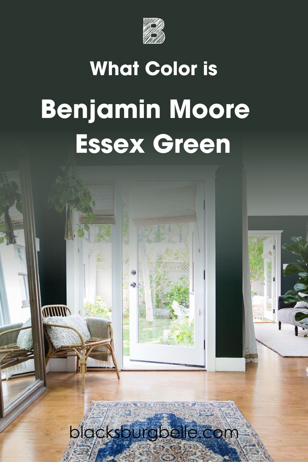
What Color is Benjamin Moore Essex Green OC-117?
Benjamin Moore Essex Green is a cool, dark green and part of the company’s Historical Collection “inspired by the 18th and 19th-century Northern American estates.” It’s a rich tone created to evoke a cool, calm, and collected feeling the moment you enter the room.
Not only is Essex Green intriguing, this unique paint color also wraps you up with its coolness and ingenuity while leaving a classic touch one stroke at a time. Deep colors like EG are versatile because you can use them alongside many light and medium colors.
I’d like you to think of this color as a neutral (it’s close to black anyway) that simply gives you the freedom to express your artistic and creative prowess. There’s so much to learn about Essex Green, but first, let me introduce you to its numerical properties.
Snapshot of Benjamin Moore Essex Green Specifications
The following data lends a quick insight into the buzzing world of Benjamin Moore Essex Green and all its numerical statistics. From LRV to RGB and the Hex Code, you can determine the end of your journey from this section.
| Color Name | Benjamin Moore Essex Green |
| LRV | 5.64 |
| RGB | 41, 53, 46 |
| Undertones | Gray, Black and Blue |
| Hex Code | #29352E |
The LRV of Benjamin Moore Essex Green
LRV is short for Light Reflective Value, and it’s represented by a scale that runs from 0-100, with 0 being the least and 100 being the highest light reflecting value.
Benjamin Moore Essex Green has an LRV of 5.64, which means it’s pretty low and reflects a poor amount of light. This isn’t necessarily a bad thing, it depends on your preference.
Now that you’re armed with this fact, it’s best to use Essex Green in a space with access to lots of natural light or at least compensate for the lack of natural light with artificial lighting.
If you apply Essex Green in a dark room or a place with low lighting, this color connects to its depth and may cause your space to appear smaller (claustrophobic much?).
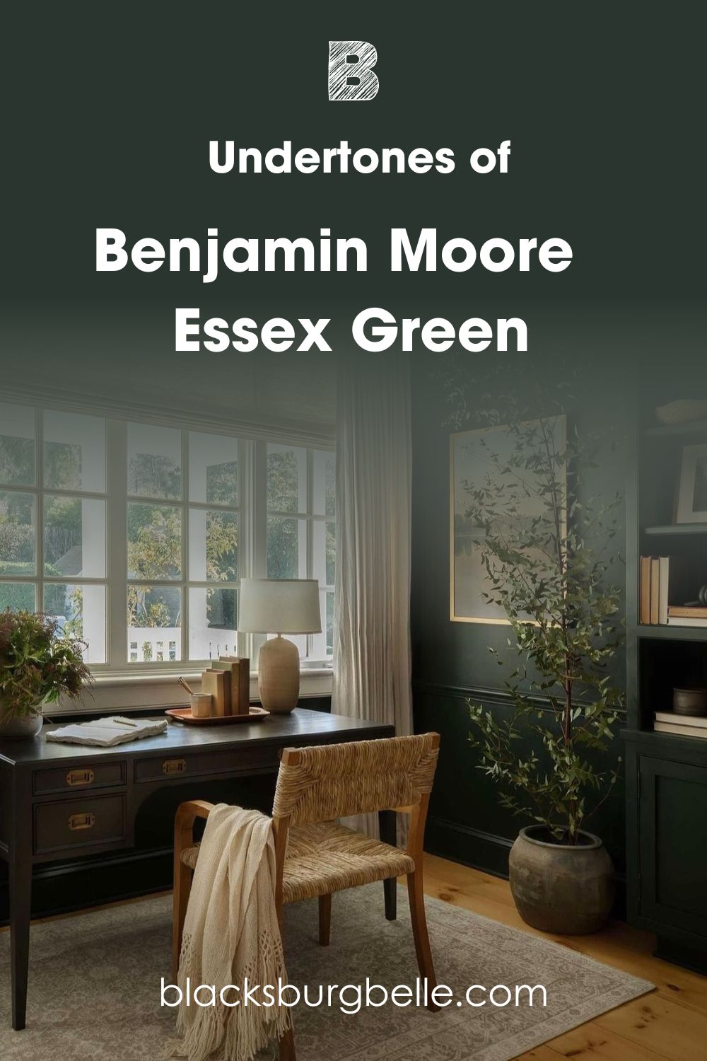
Undertones of Benjamin Moore Essex Green OC-117
Undertones are a huge part of any color, and if you decide to commit to Essex Green, you must know that you’re committing to an impressive collection of undertones like blue, black, and gray.
These three alien shades will show up under different lighting conditions and dictate where Essex Green is fit to be used, what other tones to pair it with, and accessories to add to the mix.
Does Lighting Condition Affect the Appearance of Essex Green?
My answer will always be the same: every color on earth is greatly impacted by surrounding lighting conditions as they help bring the personality to life. Now, there are two types of lighting, namely artificial and natural.
While you don’t have much control over the forces of nature on your color, you can very much control the narrative with light bulbs. How amusing! I’m sure you can’t wait to try it out.
Under warm artificial lighting, Essex Green will show off its natural dark green shade, and the same goes for Southern-facing rooms whose golden tones keep the original green color grounded.
When you switch to cool bulbs or lighting, Essex Green bids farewell to the warmth and wears a rather cold smile. The same applies to Northern-facing rooms, too; the blue tint from this direction cools down any color.
East and Western-facing rooms alternate their impact. So expect Essex Green to stay warm in the mornings for the latter and late afternoon for the former.
This means that as the sun sets in the west, Essex Greens gets cold for Eastern Facing rooms, and as it rises in the east, Essex Green stays passive in Western Facing rooms.
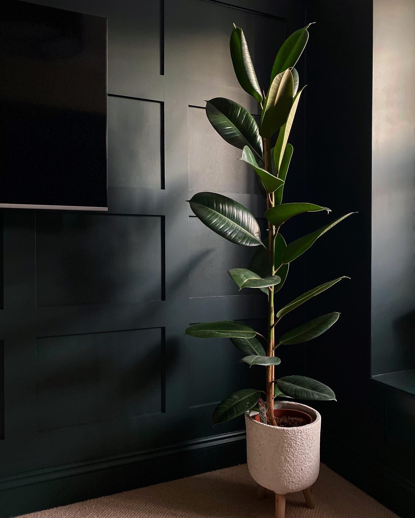
Can I Find Black in Benjamin Moore Essex Green?
When used indoors in areas with low light, regardless of the direction it faces, Essex Green shuts down all traces of color and sticks to its black roots. Check out the image below for more context. Even the green plant did nothing to call out the green tones.
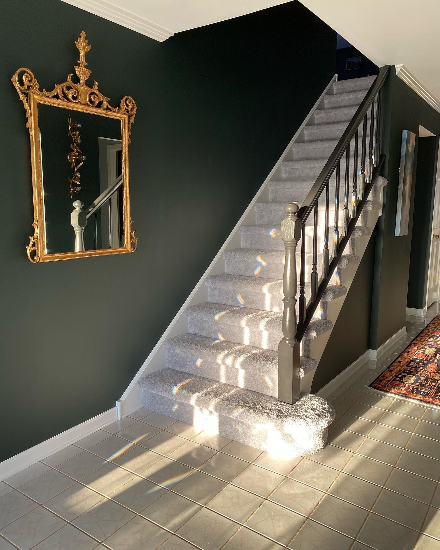
A Tiny Wink of Gray?
When a reasonable amount of warm lighting hits Essex Green, you get a whiff of gray. It’s very quick to sink back in, so you have to be very observant for this one, but it’s there. Notice how the part close to the white trims and white stairs appears gray? Point made!
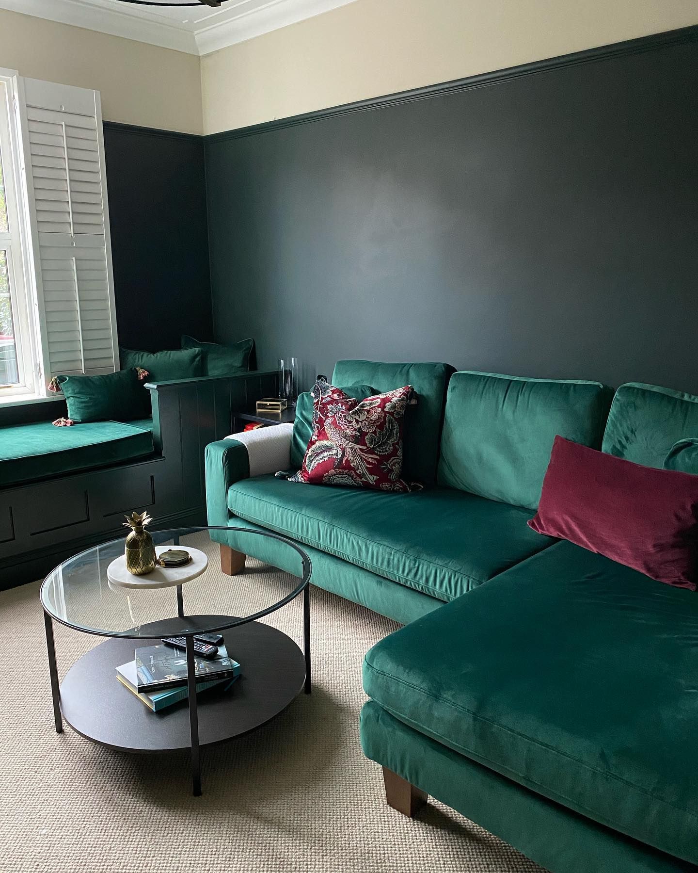
Does Benjamin Moore Essex Green Read Blue?
I didn’t believe it was possible to obtain a blue from this color until I found this delicious image where the curator paired Essex Green with a creamy off-white wall and bright green couch.
The general ambiance of this room reads cooler than usual. Hence, your guess is as good as mine; it’s a north-facing room!
Benjamin Moore Essex Green: Is It a Warm or Cool Color?
Don’t let the black undertones confuse you. Benjamin Moore Essex Green is a cool color, especially when its soft blue undertone appears.
Generally, colors with blue, green, gray, and purple undertones are largely regarded as cool shades, while those with red, orange, and red-based tones fall under the warm category.
It’s important to sample your paint before going full throttle on the application, as it allows you to see things clearly, especially under different lighting conditions and with different tones, textures, and accessories.
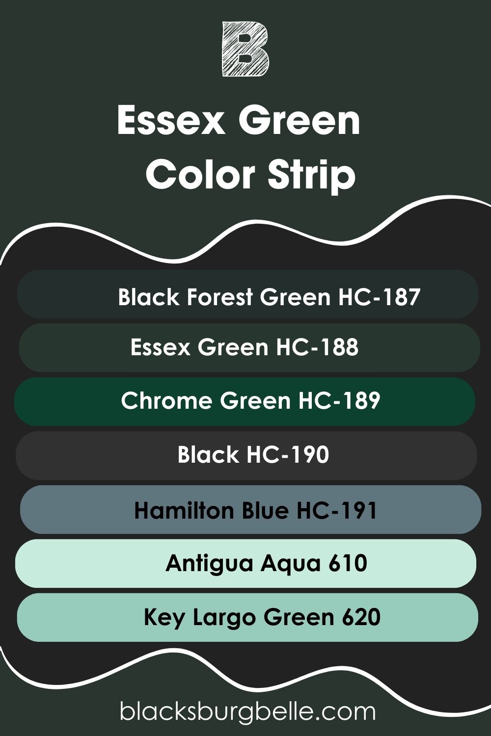
Benjamin Moore Essex Green Color Strip: Lighter or Darker Exploration
I must confess that it was tricky curating this color strip for you as Benjamin Moore Essex Green is tucked deep between beiges and blacks; hence, I had to surf through the HC collection to draw up something.
The colors here share similar undertones with Essex Green and variations, too. Forget all you know about the uniformity of numbers; there’s a bigger picture.
A typical color strip contains 7 shades and tints of one base color and may work on a monochromatic palette in the same vein.
- Benjamin Moore Black Forest Green HC-187
- Benjamin Moore Essex Green HC-188
- Benjamin Moore Chrome Green HC-189
- Benjamin Moore Black HC-190
- Benjamin Moore Hamilton Blue HC-191
- Benjamin Moore Antigua Aqua 610
- Benjamin Moore Key Largo Green 620
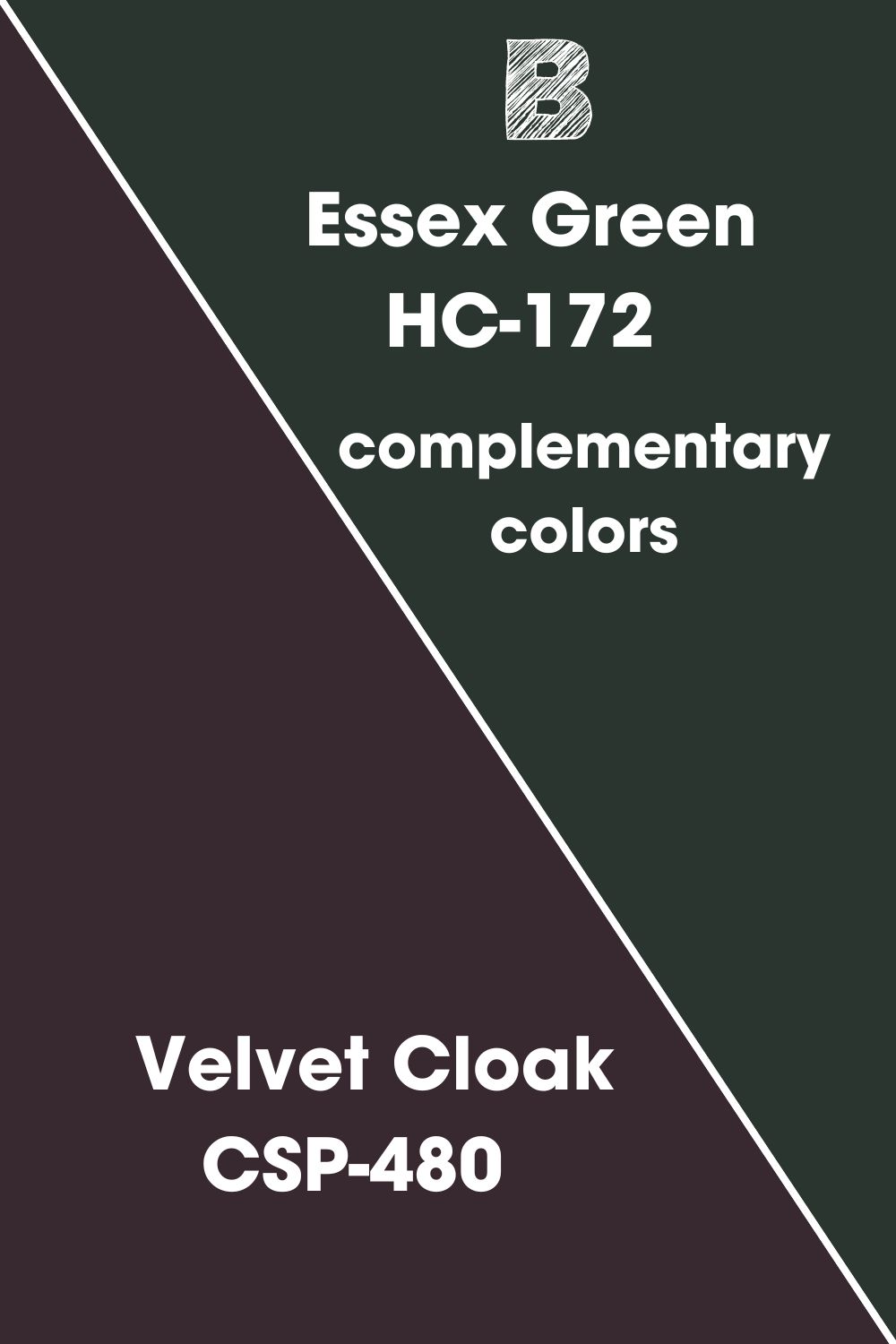
Benjamin Moore Essex Green Complementary Colors
Complementary colors are a pair of colors positioned in the opposite direction to each other on the color wheel, and when they’re placed beside each other, they show a great deal of contrast and make each other look brighter.
When mixed, complementary colors lose their initial hue and produce black or white. Examples of complementary pairs are blue-orange, yellow-purple, and red-green. They’re also called “opposite colors.”
Now, being a cool color, Benjamin Moore Essex Green’s ideal complementary color is warm, and as an OG green shade, you’d expect a red-based tone as our pick.
Benjamin Moore Velvet Cloak CSP-480 is the second half of this arrangement. It’s a warm and dark burgundy with black and brown undertones and an LRV of 4.72
Benjamin Moore Essex Green Coordinating Colors
This right here is for those who haven’t mastered the art of combining seemingly different colors to produce a beautiful result that makes sense to all and sundry. So, how do you go about it?
Well, there are 6 popular schemes that your color arrangement can take to help you, and I understand the relationship these colors have with each other.
A color scheme is a cluster of aesthetically pleasing colors appealing to the eyes.
Let’s check them out:
- Monochromatic Color Scheme:When an amateur sees a monochromatic arrangement, it may seem those colors are the same. True, they are, but the dramatic element is that they exist in certain variations known as shades and tints.
In essence, a monochromatic color scheme contains one base color, upon which different intensities of that same color are achieved simply by adding black and white. It’s easy to work with and perfect for minimalist and modern decor.
- Analogous Color Scheme: Don’t let the bougie name faze you. This scheme is made of three colors that stay beside each other on the color wheel. They share a very close resemblance due to their physical closeness on the color wheel, and the best way to interpret this formation is to use one as a dominant color while the two accent it.
- Complementary Color Scheme: Opposites surely attract and look more attractive with this arrangement. Complementary colors stay directly opposite each other on the color wheel and portray a very intense contrast.
You’ll find this combination in most ads because they look catchy and have a way of sustaining attention.
- Split Complementary Color Scheme: This arrangement contains two opposite colors on the color wheel and then colors next to them. You get the complementary scheme effect with the split complementary color scheme but with more color options..
- Triadic Color Scheme: Want to take your color exploits outside one hue? This scheme is perfect for that. The Triadic arrangement is a combination of three colors that are evenly spaced on the wheel.
- Tetradic Color Scheme: Otherwise known as the double-complementary or rectangular color scheme. This one contains two complementary pairs, i.e., four tones that create a rectangle on the color wheel.
Pick one main color and let the three act as accent colors to avoid a messy outcome or scare away your guests.
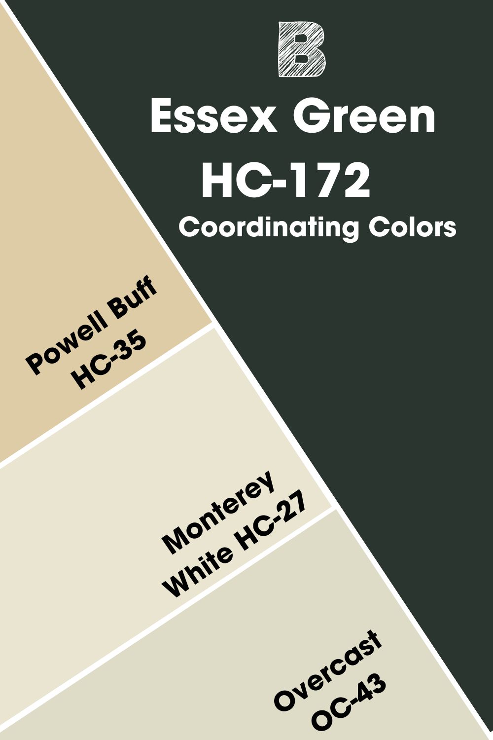
Coordinating Colors of Benjamin Moore Essex Green
Coordinating colors are the accompanying players to your anchor shade. In simpler terms, they make your desired color appear better when you pair them together, whether as accent walls or trims (outdoors and indoors).
- Benjamin Moore Powell Buff HC-35: Take a glance at this sectionto see how a powdery beige like Powell Buff behaves when paired with Essex Green. Powell Buff has an LRV of 59.43 and will also work as a trim color.
- Benjamin Moore Monterey White HC-27: This is a soft neutral with subtle green and yellow undertones with a high LRV of 75.33 as the icing on the cake. Pair this color with Essex Green in the bathroom.
- Benjamin Moore Overcast OC-43: A cool off-white with rich green undertones and an LRV of 68.93. I see this color on the kitchen cabinetry as it would contrast beautifully with an Essex Green wall.
Benjamin Moore Essex Green Color Palette
You need a color palette to help you express yourself with Essex Green. The palettes I have lined up here contain colors you can pair with Essex Green to interpret a theme.
So, if you’re a minimalist or you love to take things over the top, there’s something for you here. I’ve added white as the third color on the analogous and triadic color palettes to balance the whole arrangement. The choice to use it is absolutely yours!
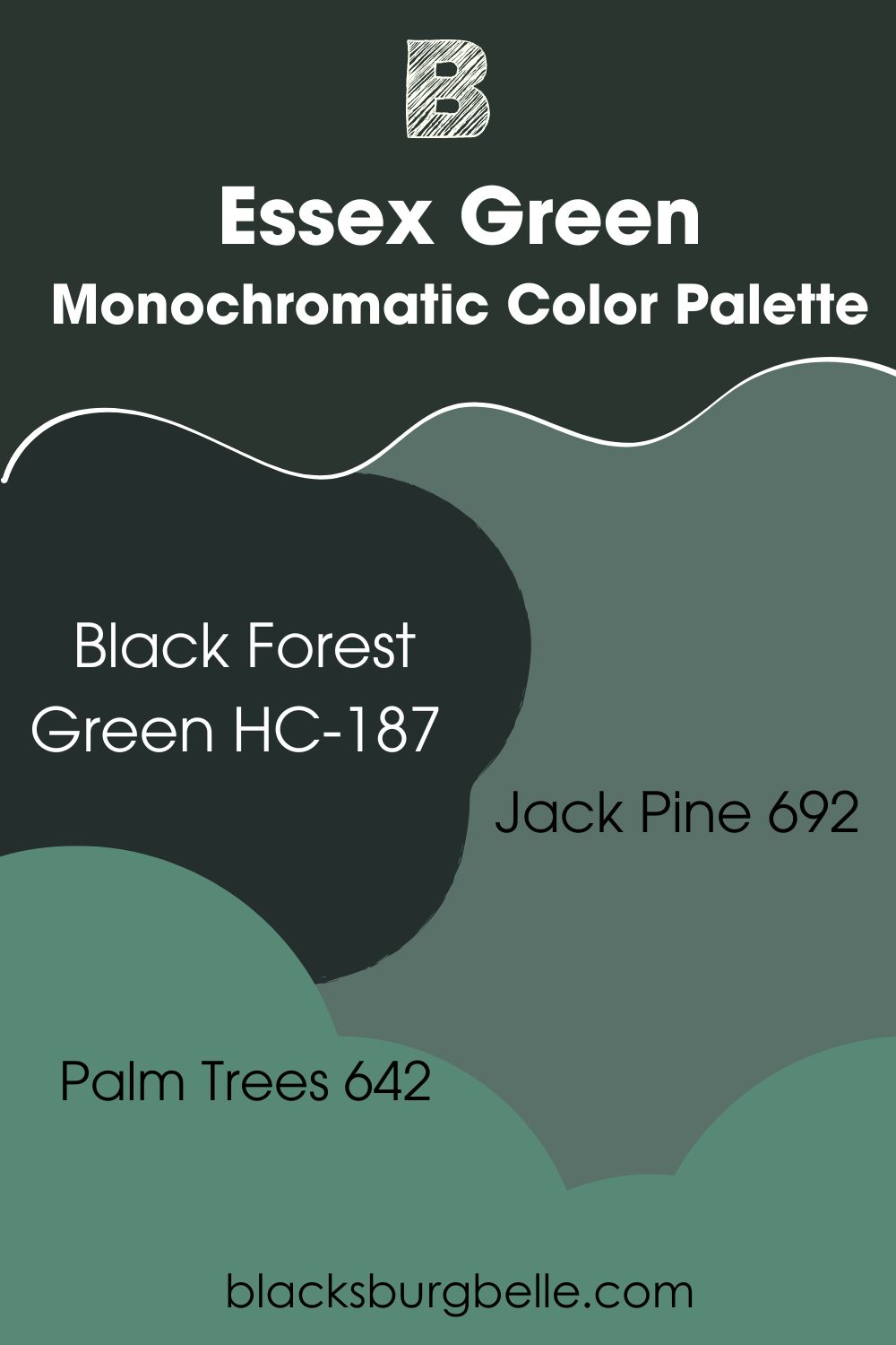
Monochromatic Color Palette
- Benjamin Moore Black Forest Green HC-187: Like Essex Green, this one is a dark green with black and blue undertones and an LRV of 4.85. You won’t spot much difference between this one and Essex Green upon application.
- Benjamin Moore Jack Pine 692: This rich emerald green has trendy teal undertones that keep it fresh and organic all day long. It has an LRV of 16.45, which is way lighter than Essex Green, but would look ravishing regardless.
- Benjamin Moore Palm Trees 642: A vibrant green with soft gray undertones and an LRV of 21.87. You can use Essex Green as an accent wall or even a trim color alongside this wall.
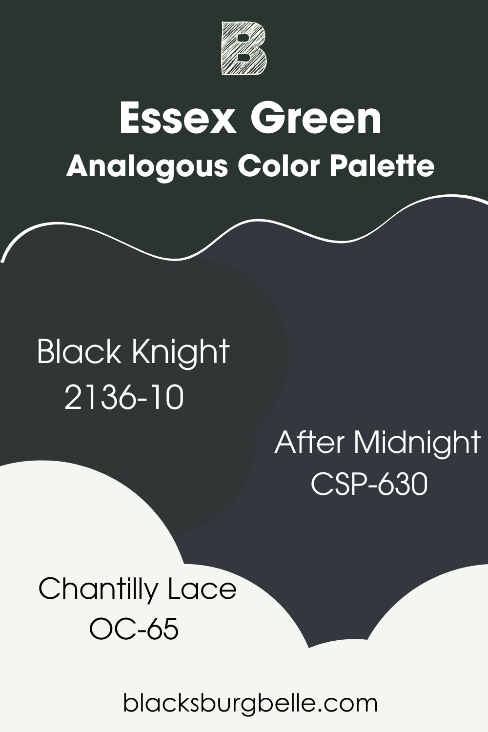
Analogous Color Palette
- Benjamin Moore Black Knight 2136-10: A dark green with black undertones and LRV of 4.76. You can almost confuse this color for black on your wall. It can be used as an accent or trim wall on an Essex Green Analogous Palette
- Benjamin Moore After Midnight CSP-630t: A captivating blue-black with an LRV of 6.01. This rich color also has hints of gray and can be paired with Essex Green in a dining space or kitchen.
- Benjamin Moore Chantilly Lace OC-65: One of the brightest whites from Benjamin Moore. This versatile color has little to no undertones, but you can sometimes get green feedback. Chantilly Lace has an LRV of 90.04 and can work as trims.
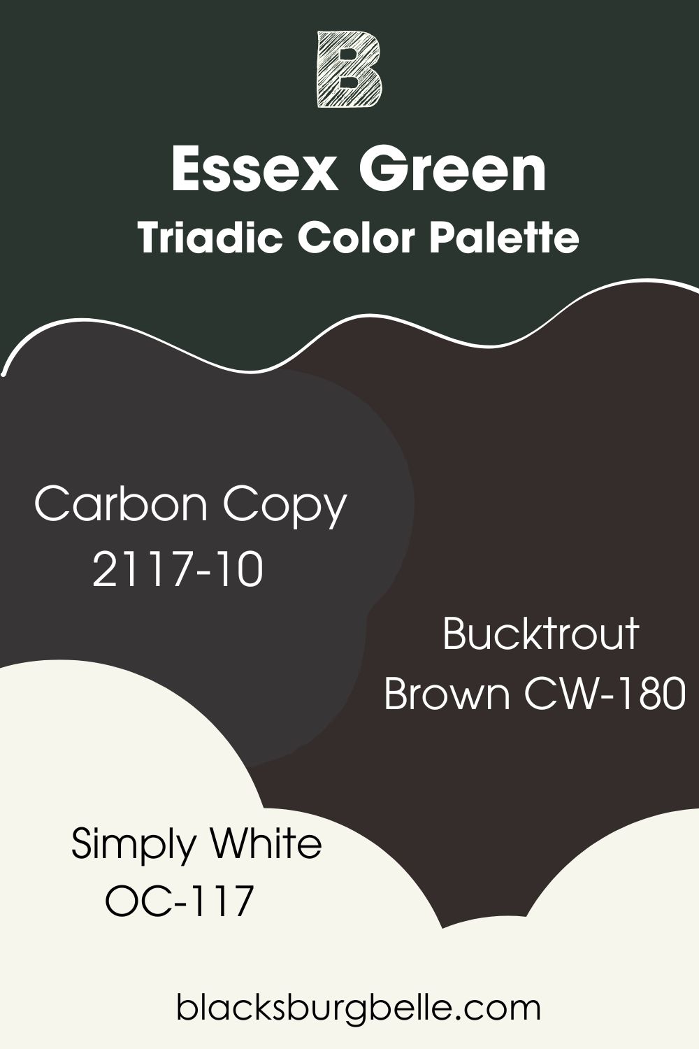
Triadic Color Palette
- Benjamin Moore Carbon Copy 2117-10: A black shade with unique brown and violet undertones to complement Essex Green. Carbon Copy has an LRV of 5.33 and will ace it as an accent wall or trim color.
- Benjamin Moore Bucktrout Brown CW-180: This dark brown with black undertones is a popular choice for cabinetry, doors, and trim colors, which is exactly how you should pair it with Benjamin Moore Essex Green.
- Benjamin Moore Simply White OC-117: This warm, clean white is a winner on any palette with an LRV of 91.7. It also has an LRV of yellow, which perfectly complements the violet undertones in Carbon Copy perfectly.
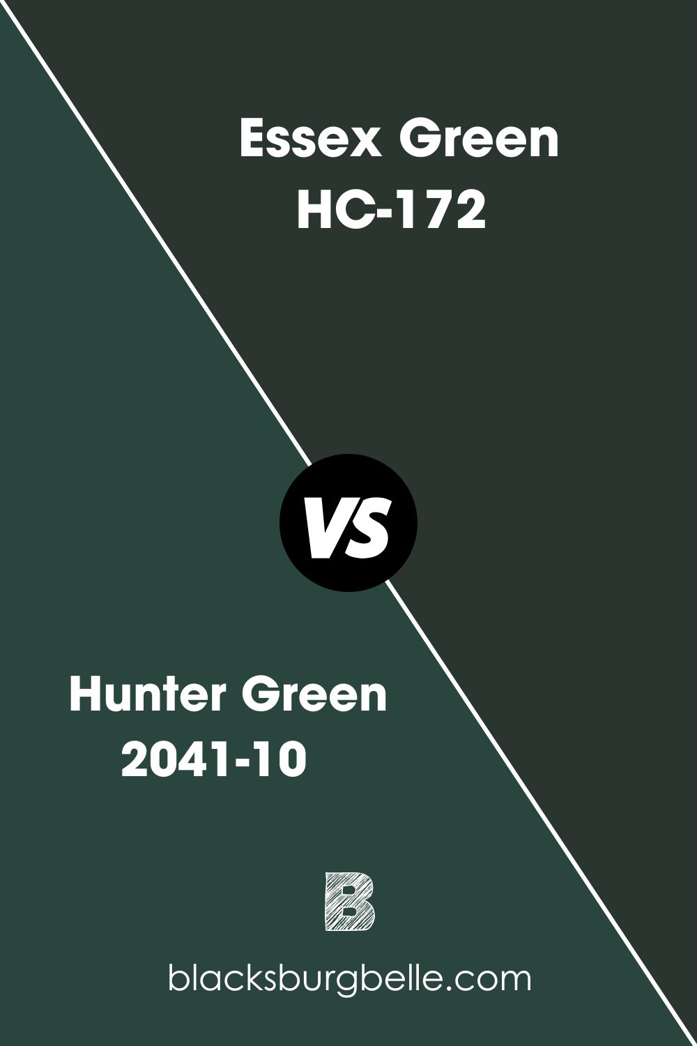
Benjamin Moore Essex Green vs. Hunter Green 2041-10
Hunter Green is another gorgeous color used alongside Essex Green in a space. Hunter Green’s LRV is slightly higher than Essex Green, and Essex Green will appear darker than HG upon application because of the presence of black undertones in it.
If you’re not into the near-black aesthetic Essex Green offers, then you should try out Hunter Green.
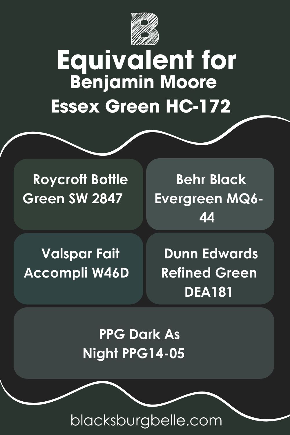
Benjamin Moore Essex Green Equivalent in Sherwin Williams and Other Brands
Other brands also have their version of Essex Green, and while they’re not completely identical, they share similarities like undertones and depth. Overall, you can use these colors as an alternative should Benjamin Moore Essex Green be missing on the aisle.
Sherwin Williams Roycroft Bottle Green SW 2847, Behr Black Evergreen MQ6-44, Valspar Fait Accompli W46D, Dunn Edwards Refined Green DEA181, and PPG Dark As Night PPG14-05.
These colors have either black, blue, or gray undertones and will have almost the same effect EG is projected to have in your home.
Where can you use Essex Green OC-117?
Homeowners have described Essex Green to be versatile, organic, luxurious, and comforting as it brings relaxing vibes to any space it’s used. Whether indoors or outdoors, this color has proven to be accommodating to other tones and makes a bold statement of its own.
My claims won’t do justice, so I’ve attached real-life pictures for you to experience the beauty of Essex Green in actual spaces.
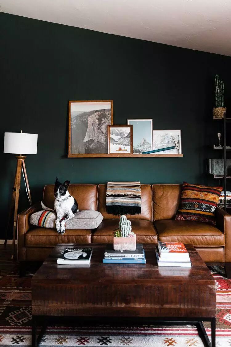
Essex Green in the Living Room
Think sophistication, think Essex Green. I absolutely love the cool cast this deep green gives this space and the rich contrast between it and the dark brown couch and accessories. Essex Green isn’t doing much here in terms of undertones, as it stays pretty green and complements the pure white ceiling.
Lovers of traditional decor can reenact this look to really connect with nature in their homes. Add a minimalist twist to it by pairing it with a pure white or creamy white accent wall, and keep the accessories lightly toned too.
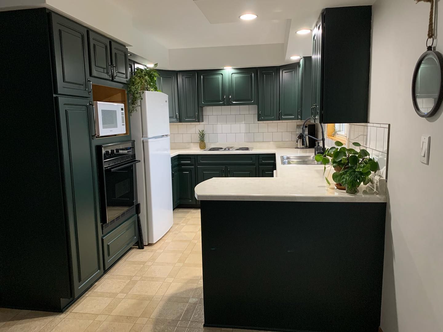
Essex Green in the Kitchen
Essec Green is a tasteful choice for kitchen cabinetry as it leaves a classic finish on your wood and adds very much-needed drama to a plain wall. I love what’s happening in this image, especially with the cool lighting and black hardware on the cabinet.
The white countertops, light beige flooring, and creamy off-white walls cleaned things up nicely in this space.
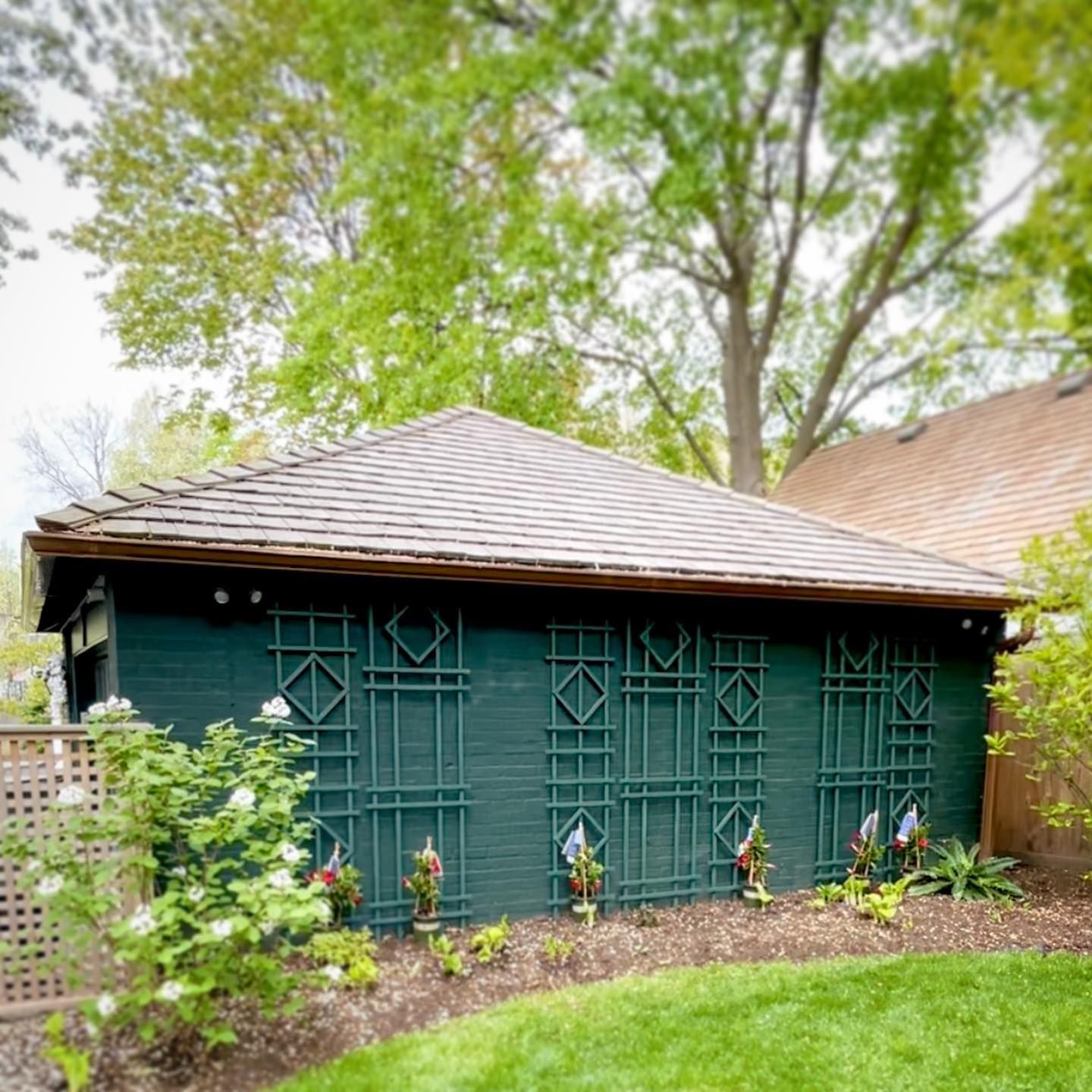
Essex Green on an Exterior
It’s quite daring to use Essex Green outdoors because it appears too intense, but it’s not impossible. Nature is absolutely healing, and when it comes to pairing colors, no one does it better than Mother Nature.
Studying the image below, you can observe that Essex Green is the only deep color in that setting and how the surrounding greenery craftily complements and brightens the moodiness of Essex Green on that wall.
Brown and green will forever be a smart combination (per the roof in this picture). The other earthy tones add a soft, warm touch to the coolness and depth of Essex Green.
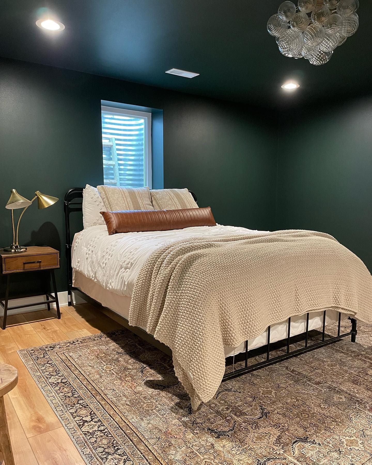
Essex Green in the Bedroom
Your bedroom is a place of rest and escape from the rowdiness of it all. Essex Green is your best bet at creating that safe haven. Being a very dark color, it may get dicey to use in rooms that don’t get enough light, but the image below proves that you can make things work.
I must commend the bold move by this owner to paint this room Essex Green from top to bottom and then balance the overwhelming depth with light wooden floors, light bedding, and soft, warm lights to stop things from looking too cold.
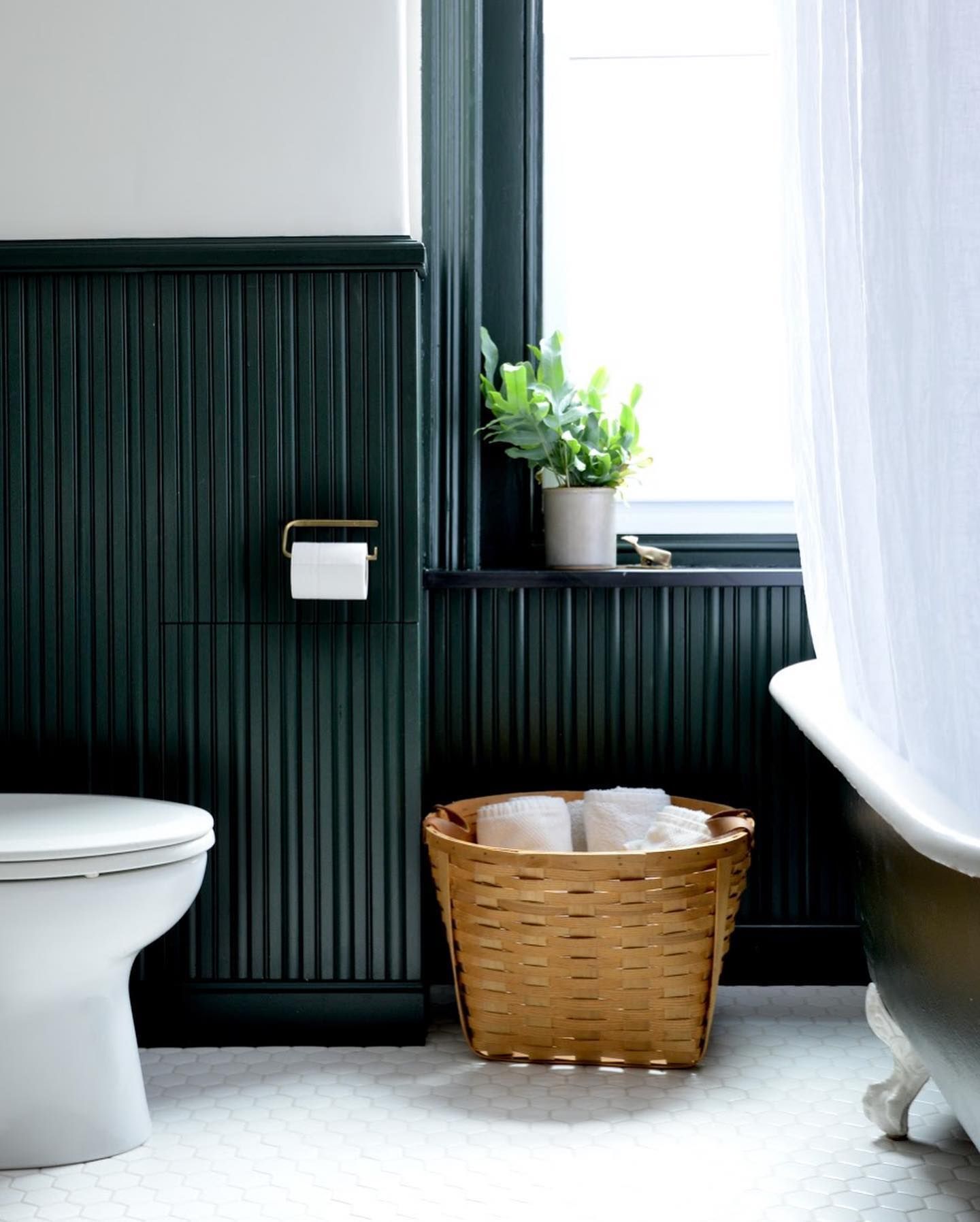
Essex Green in the Bathroom
Take a break from the world of white, grays, powder blue, and pinks for your bathroom color. Essex Green will bring a natural and chill vibe to your space without looking too bright and uncomfortable.
The image below is the best way to apply this color, in my opinion, as it works great with the white accent wall and white patterned tiles, and the fresh flowers in the white ceramic vase perfectly complement the richness of Essex Green.
What Colors Go With Benjamin Moore Essex Green OC-117
Dark greens like Essex Green will work with a wide range of colors, especially ones that are lighter than them. Try pairing it with beige, light brown, yellow, gold, black, creamy bright whites, gray, pink, blue, and taupe.
The possibilities with Essex Green on your palette are honestly endless. I can’t stress my likeness for this color enough. Everything bounces off it, and you don’t need to do too much to make things pop.
Conclusion
I can’t possibly deny the boldness of Essex Green and how it instantly captivates your attention while drawing you closer to nature’s goodness. One thing I adore about it is that you can layer it with any bright color or even neutral tones, and get amazing feedback.
Let me leave you with quick facts about EG.
- It’s a dark green with blue, gray, and black undertones.
- Essex Green works best in areas with lots of lighting.
- It’s a very accommodating color and leaves a relaxing vibe in your home.
Everyone should experience Essex Green. I fully endorse it. Don’t forget to leave those comments and suggestions in the box below.
 Sherwin Williams North Star (Palette, Coordinating & Inspirations)
 Sherwin Williams Clary Sage (Palette, Coordinating & Inspirations)
 Sherwin Williams Coastal Plain (Palette, Coordinating & Inspirations)
 Sherwin Williams Balanced Beige SW 7037: Paint Color Review
 Sherwin Williams Kilim Beige SW 6106: Paint Color Review
 Sherwin Williams Pediment SW 7634: Paint Color Review
