
Seeing Sherwin-Williams Balanced Beige, you’d think the color has a high LRV, but it’s a medium-dark hue. This color earned its name from its seamless blend of warm beige with cool gray.
It’s one of my favorite neutrals because of its subtle and almost insignificant undertone. That makes Sherwin-Williams Balanced Beige an ideal hue for mature designs especially centered monochrome themes.
Nonetheless, you can pair this color with the brightest hues regardless of shade. Scroll down to learn about its undertones, RGB, LRV, and how to coordinate Sherwin-Williams Balanced Beige.
Table of Contents
What Color is Sherwin-Williams Balanced Beige?
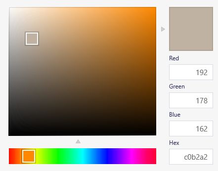
Balanced Beige is a two-toned warm, cool color with the faintest sage green undertone. It comprises 192 Red, 178 Green, and 162 Blue, culminating in an LRV of 46. Hence, Sherwin-Williams Balanced Beige is almost 100 percent neutral.
| Manufacturer | Sherwin Williams |
| LRV | 46 |
| RGB | Red 192 | Green 178 | Blue 162 |
| Hex Value | #C0B2A2 |
| Color Collections | Top 50 Colors, Pottery Barn (Fall/Winter) |
RGB of Sherwin-Williams Balanced Beige
With 192 Red, 178 Green, and 162 Blue mixed into absolutely black paint, you’ll get Sherwin-Williams Balanced Beige. Its RGB puts the color within the vicinity of orange on the color wheel, although another color is hidden.
Light Reflective Value (LRV) Of Sherwin-Williams Balanced Beige
One of the selling points of Sherwin-Williams Balanced Beige is its ability to maintain the same hue regardless of the lightning around it. Its Light Reflectance or Reflective Value (LRV) tells you the color’s potential to absorb or reflect Light.
With 47 LRV, Sherwin-Williams Balanced Beige is three percent off the median of the LRV scale, which ranges from 3 – 97. It should be 0 (darkest) – 100 (lightest), but there’s no true black or white paint without undertones to compromise its LRV.
Is Balanced Beige a Warm or Cool Color?
Due to its undertones, you’ll get a little warmth and coolness from Sherwin-Williams Balanced Beige. However, the warm note outweighs the cool tints due to the overwhelming red in its makeup.
Every color on the wheel falls into two categories – warm or cool, depending on the aura they exude. The fire colors (red, orange, and yellow) are warm, while ocean hues (purple, green, and blue) are cool.
What are the Undertones in Balanced Beige?
Orange is the dominant undertone in Sherwin-Williams Balanced Beige, but it also has hints of sage green. So, what are undertones, nuances, tints, or notes? They’re alternate colors that reflect from your paint when used with bright lights.
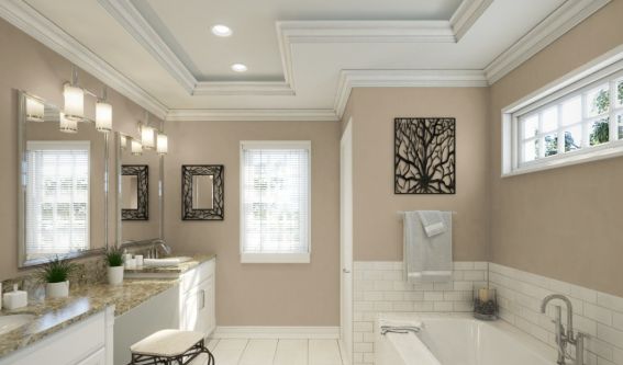
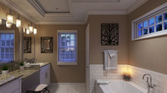
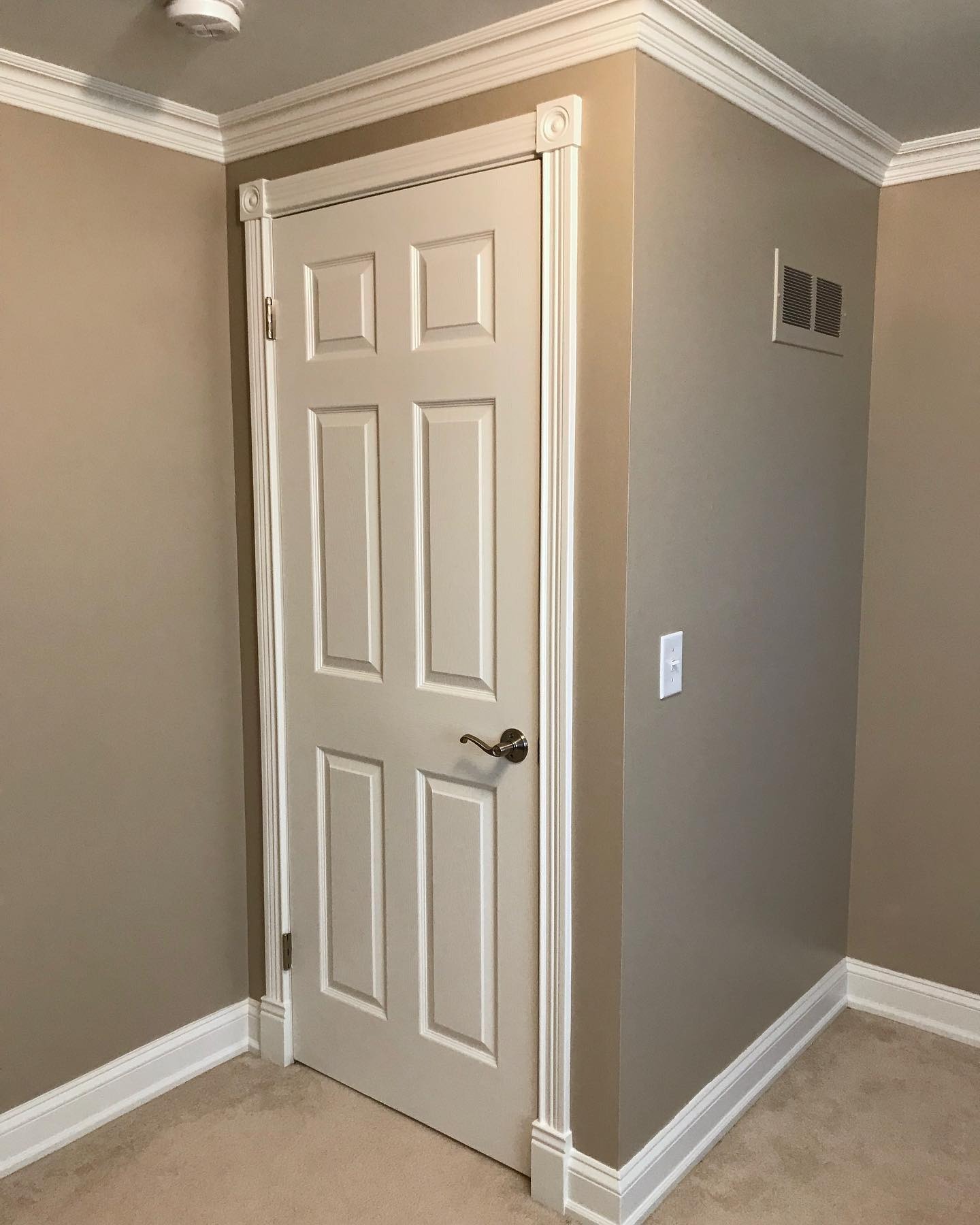
You must always sample a paint before settling on a purchase to avoid regrets post-use. Check out the illustrations below showing Sherwin-Williams Balanced Beige inside (with and without Light) and outside.
Sherwin Williams Balanced Beige Color Strip
Discussing the Balanced Beige Color Strip is preemptive, as you’ll only understand its importance when learning about the color palette. A color strip combines three or more hues curated around one base tone to create a cohesive palette.
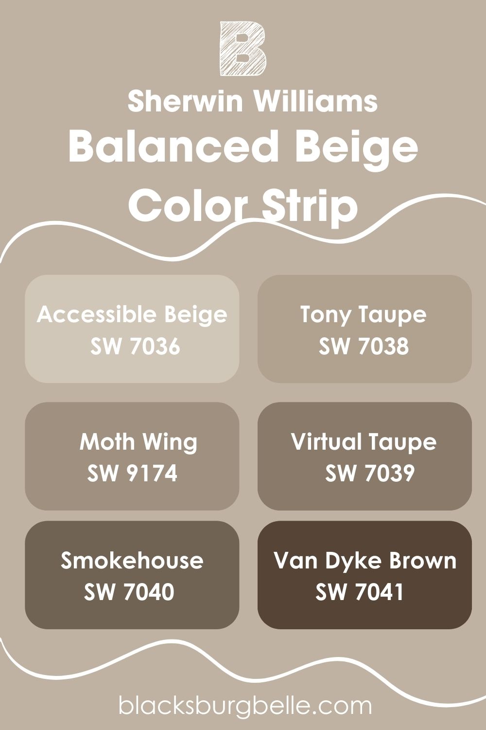
You form each color apart from the primary shade by adjusting its parameters from the brightness to the saturation and shadows. Check them out below.
| Color Code | Color Name | Location Number | LRV | Color Tone |
| SW 7036 | Accessible Beige | 249-C1 | 58 |  |
| SW 7037 | Balanced Beige | 249-C2 | 46 |  |
| SW 7038 | Tony Taupe | 249-C3 | 37 |  |
| SW 9174 | Moth Wing | 249-C4 | 29 |  |
| SW 7039 | Virtual Taupe | 249-C5 | 20 |  |
| SW 7040 | Smokehouse | 249-C6 | 13 |  |
| SW 7041 | Van Dyke Brown | 249-C7 | 7 |  |
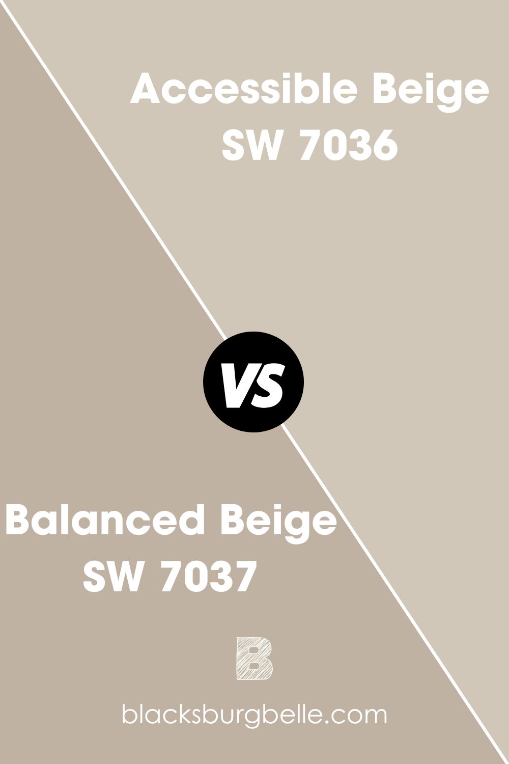
Sherwin-Williams Accessible Beige vs. Sherwin-Williams Balanced Beige
People often use Sherwin-Williams Accessible Beige as an alternative to Balanced Beige due to their close LRVs, but they couldn’t be more different.
Whereas Balanced Beige is a medium-dark tone leaning toward the black end of the spectrum, Accessible Beige is lighter as it leans towards the white end.
Their overtones differ because Accessible Beige is grayer than its counterpart but has similar undertones.
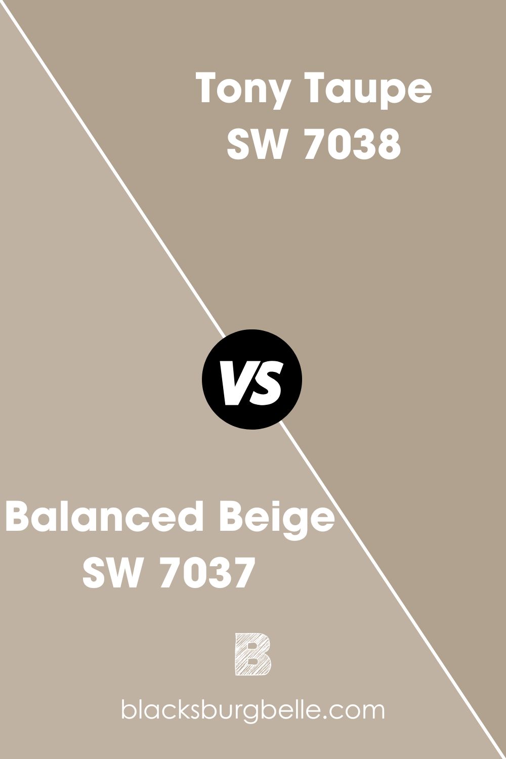
Sherwin-Williams Tony Taupe vs. Sherwin-Williams Balanced Beige
With Sherwin-Williams Tony Taupe, you’re going down to the dark end of the LRV scale and stopping on 37. Unlike Balanced Beige, a wannabe mid-tone color, Tony Taupe is clear about being medium-dark by sitting in the sweet spot between 0 and 50.
This color is an earthy neutral paint with more sandy notes than its counterpart. It’s a beautiful shade for relaxation rooms, especially when paired with white, despite its warmth. Use it in bathrooms and bedrooms for vintage contemporary themes.
Sherwin-Williams Tony Taupe comes alive with wooden trims to complete the earthy vibe.
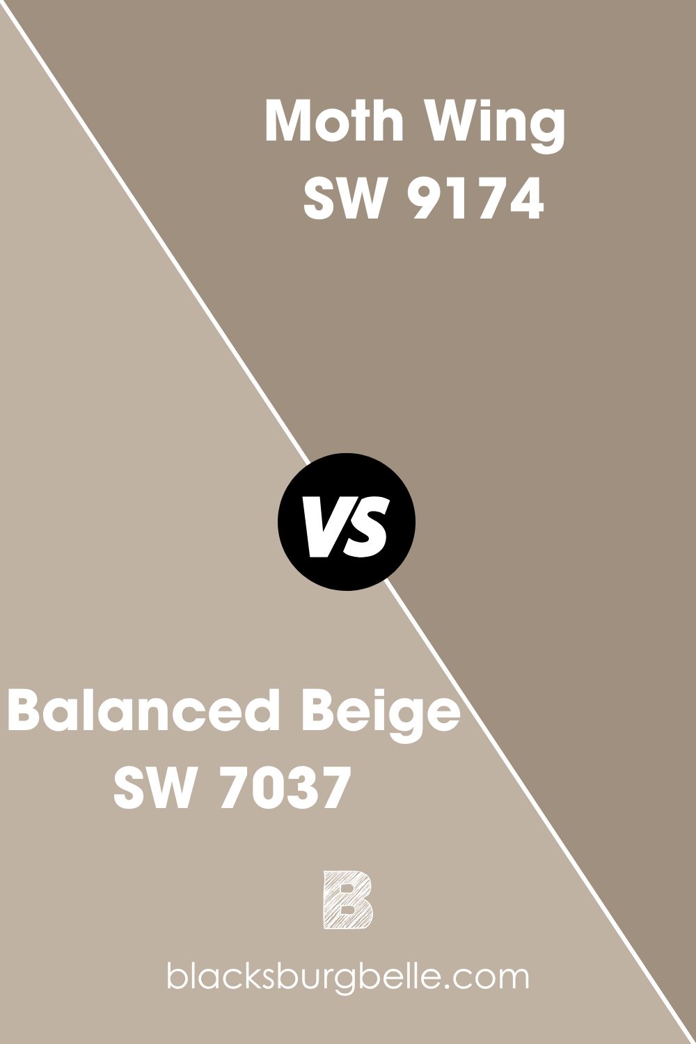
Sherwin-Williams Moth Wing vs. Sherwin-Williams Balanced Beige
When Sherwin-Williams Balanced Beige and Tony Taupe aren’t dark enough for your taste, but you don’t want a color too dark, Moth Wing is the one for you. The color has strong gray undertones that overtake its overlay underneath bright lightning.
It’s beautiful because of its soft outlook and works well inside and outside, especially with brownstone exteriors. Use Sherwin-Williams Moth Wings in the kitchen or living room to create a balanced palette of neutral brown colors.
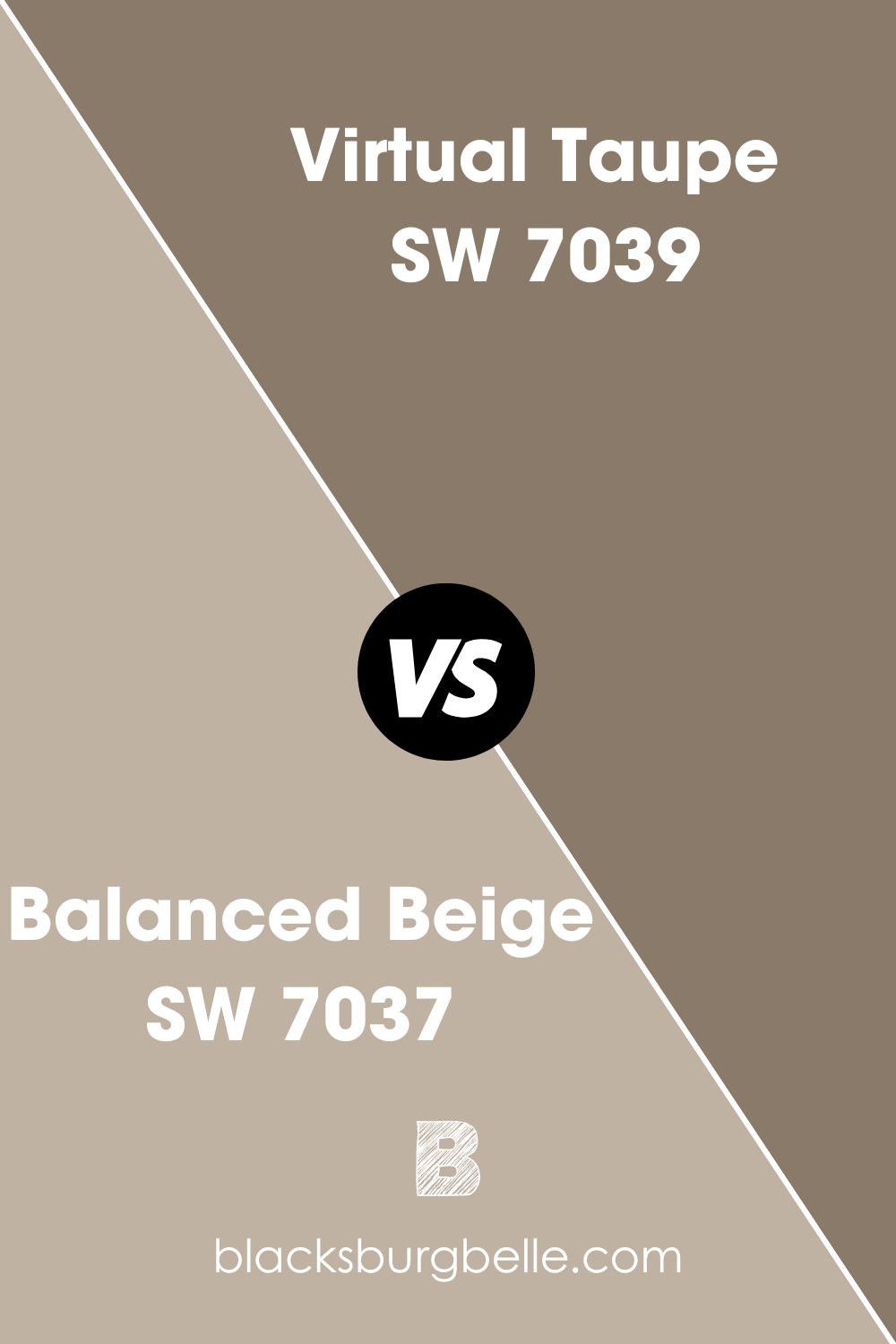
Sherwin-Williams Virtual Taupe vs. Sherwin-Williams Balanced Beige
Virtual Taupe by Sherwin-Williams is more gray than beige and possesses a surprising warmth despite its darkness. As a 20 LRV paint, Virtual Taupe mostly absorbs light, but that doesn’t stop it from beautifying your space.
Although it’s mostly used as an exterior with granite stones, you’ll enjoy this color inside. It has interesting undertones from violet to pink and sage green, which you can explore with interior decorations.
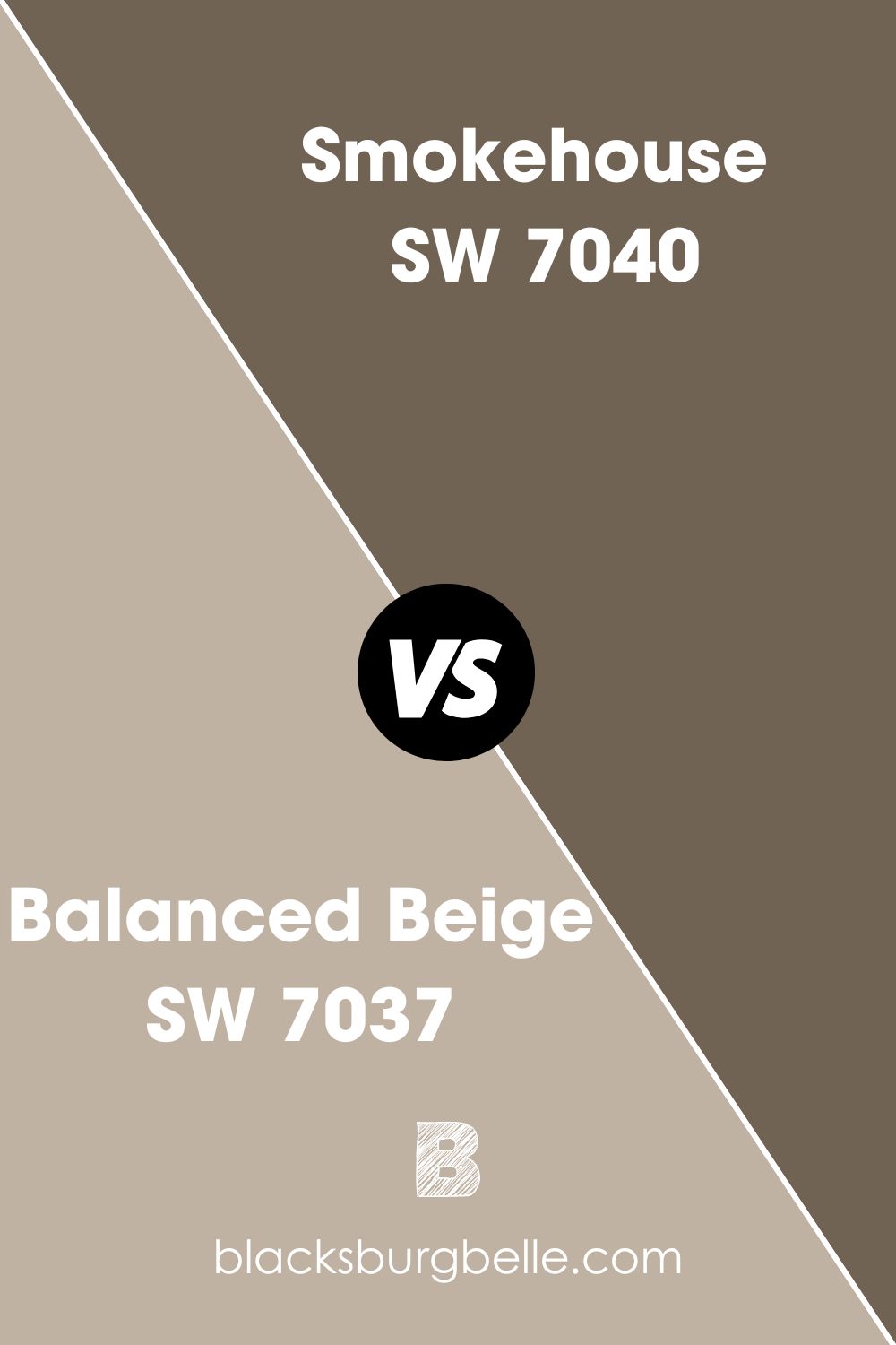
Sherwin-Williams Smokehouse vs. Sherwin-Williams Balanced Beige
Warm, gray, and comforting are three words that best describe Sherwin-Williams Smokehouse. It has no cool hints like Balanced Beige, which makes it an interesting color. There’s no either/or feeling in its presence.
This dark paint creates an accommodating backdrop for the right coordinating colors like Sherwin-Williams Auric (SW 6692), Brittlebush (SW 6684), Maison Blanche (SW 7526), and Waterloo (SW 9141).
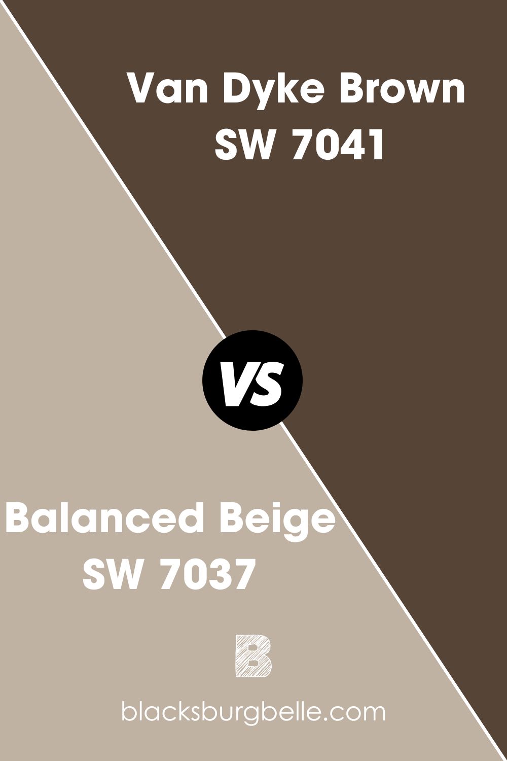
Sherwin-Williams Van Dyke Brown vs. Sherwin-Williams Balanced Beige
Despite being visibly dark with a 7 LRV, Van Dyke Brown is a warm neutral paint suitable for serious areas in the home, like studies and guest lounges. It’s an ideal choice when you want to create a subdued aura without using the typical black paint.
Introduce medium-toned hues into the space with colors like Peace Yellow (SW 2857) | 65 LRV, Ivoire (SW 6127) | 64 LRV, Rayo de Sol (SW 9020) | 60 LRV, and Cupola Yellow (SW 7692) | 53 LRV.
Sherwin-Williams Balanced Beige Color Palette
Designing your space, whether a home or office, requires a color palette to achieve a harmonious design regardless of the number of colors used. A color palette combines two or more hues for synergy and to create a central theme.
Not using a color palette puts you at risk of designing a chaotic space, like using clashing hues.
You’ll notice that Balanced Beige appears different based on the colors you pair with it. So, ensure your choices reflect the right mood you want. That’s the essence of a palette – you can test your theory multiply before you arrive at your best combo.
Coordinating Colors for Sherwin-Williams Balanced Beige
What do you want your space to say about you? How many colors would be enough to realize your vision? Answer those questions before creating your color palette.
If you want a subdued vibe, choose a monochrome theme. You can use a contrast or triadic theme for a more creative space, depending on your taste. Scroll down to learn how to coordinate each design.
Monochrome Decoration with Sherwin-Williams Balanced Beige
There’s beauty in using one color as your centerpiece and curating the rest of your interior design based on its variations. Here’s where Sherwin-Williams Balanced Beige Color Strip factors.
You can use Balanced Beige as the star of the room and surround it with the colors in its strip, from Tony Taupe to Moth Wing, Smokehouse, and Van Dyke Brown.
Since the color blends warmth and coolness seamlessly, you can use it anywhere, from small bedrooms to wide kitchens.
Triadic Decoration for Sherwin-Williams Balanced Beige
Three isn’t a crowd regarding Triadic themes using Balanced Beige as the center of attention. The other two colors in the trio must be equally spaced from the central hue. As a tertiary color, there’s no straightforward combo for Balanced Beige, but we can deduce.
You can pair Balanced Beige with Green and Purple using the orange undertone. However, if you’re going for a neutral theme, pair the color with other hues developed from green and purple. In this case, they’re Greige and Taupe.
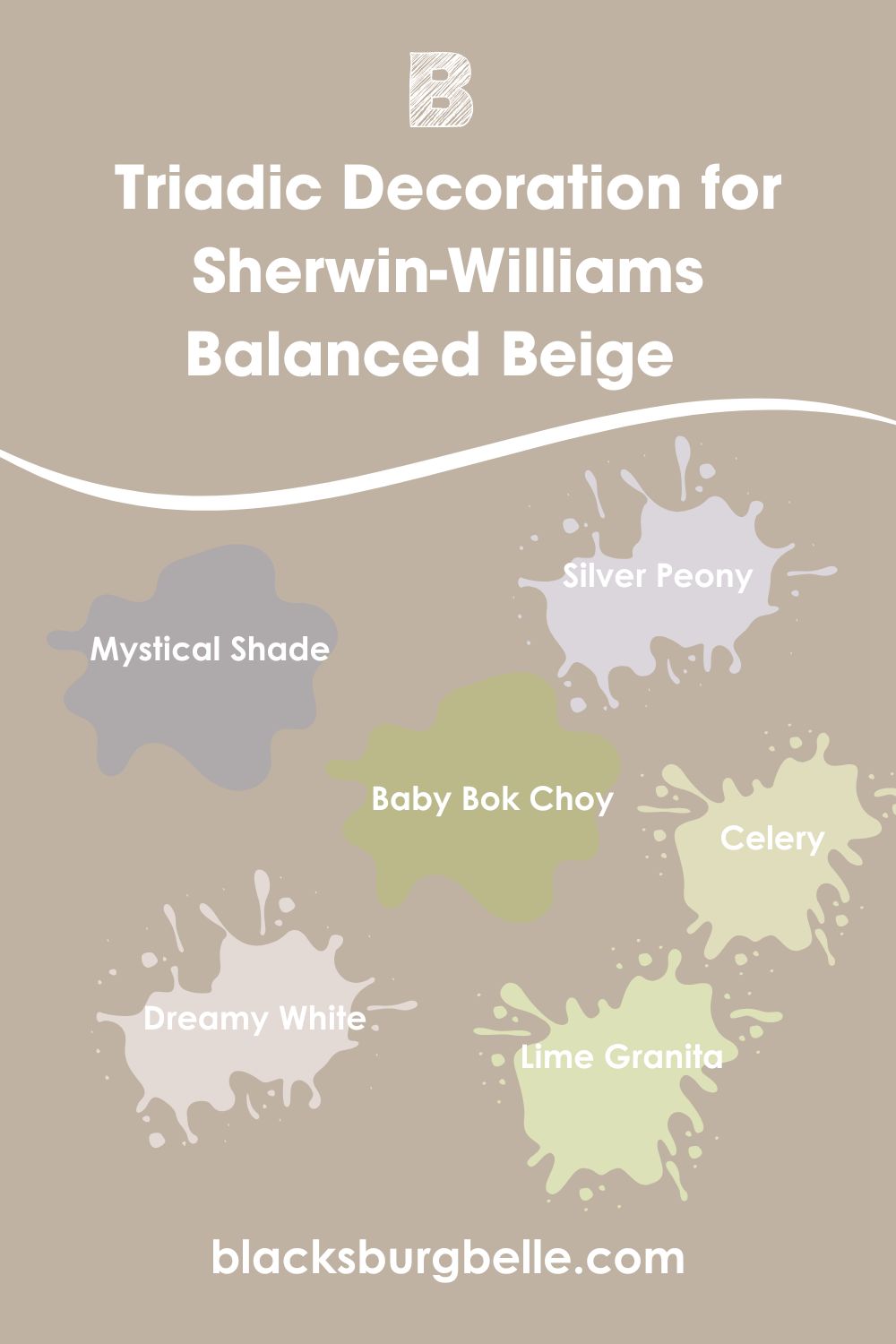
Some examples from Sherwin-Williams include Mystical Shade (SW 6276), Silver Peony (SW 6547), and Dreamy White (SW 6021) for taupe and Lime Granita (SW 6715), Celery (SW 6421) and Baby Bok Choy (SW 9037) for green.
Contrasting Sherwin-Williams Balanced Beige with Complementary Colors
When three colors are too many for your taste, stick to the dependable contrast using another hue.
Once more, you can base the contrast on the orange undertone and complement Balanced Beige with the right shade of blue or stick to neutrals and use bluish-gray/bluish-white.
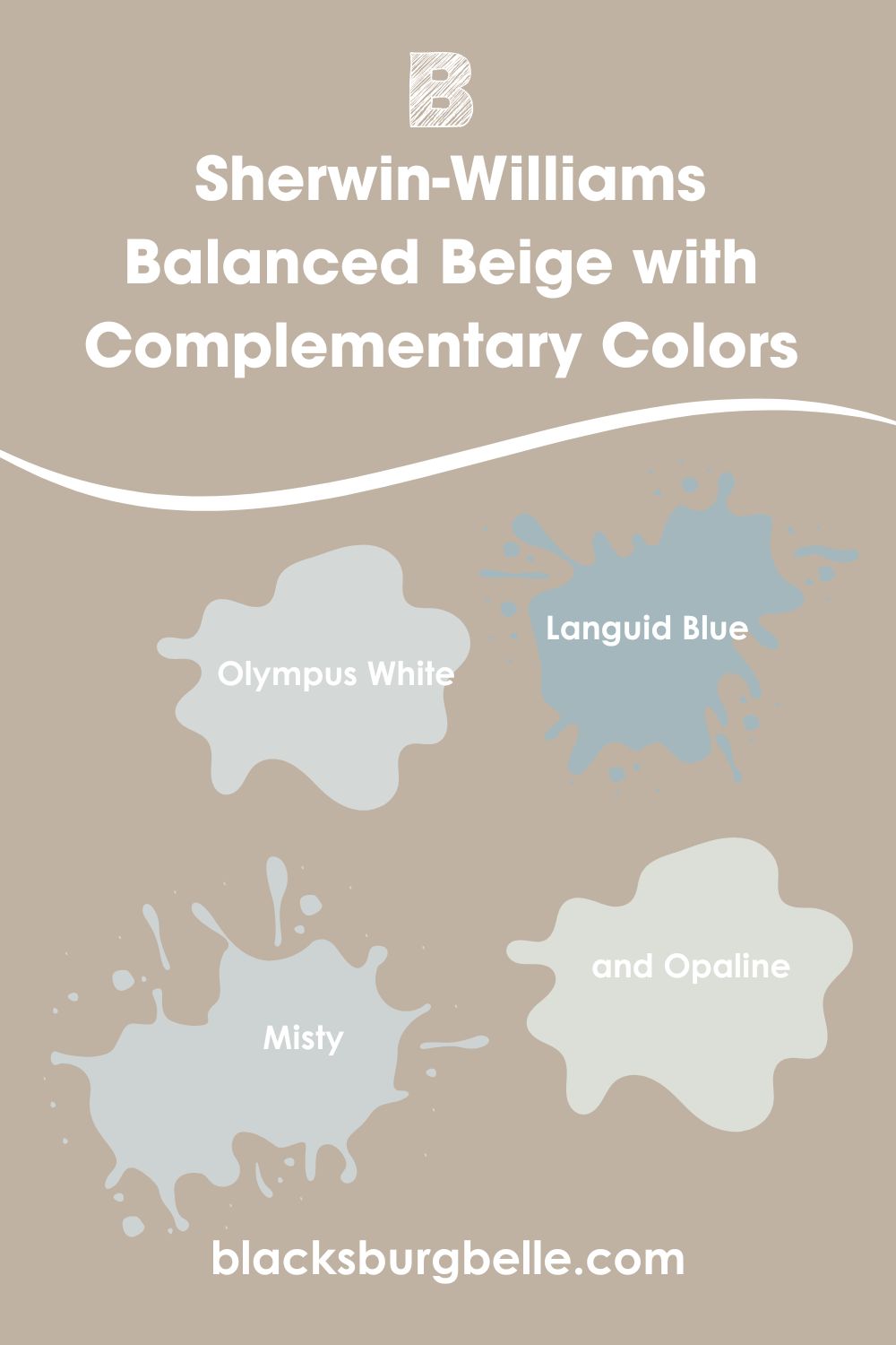
Some suitable Sherwin-Williams blue paints are Olympus White (SW 6253), Languid Blue (SW 6226), Misty (SW 6232), and Opaline (SW 6189.)
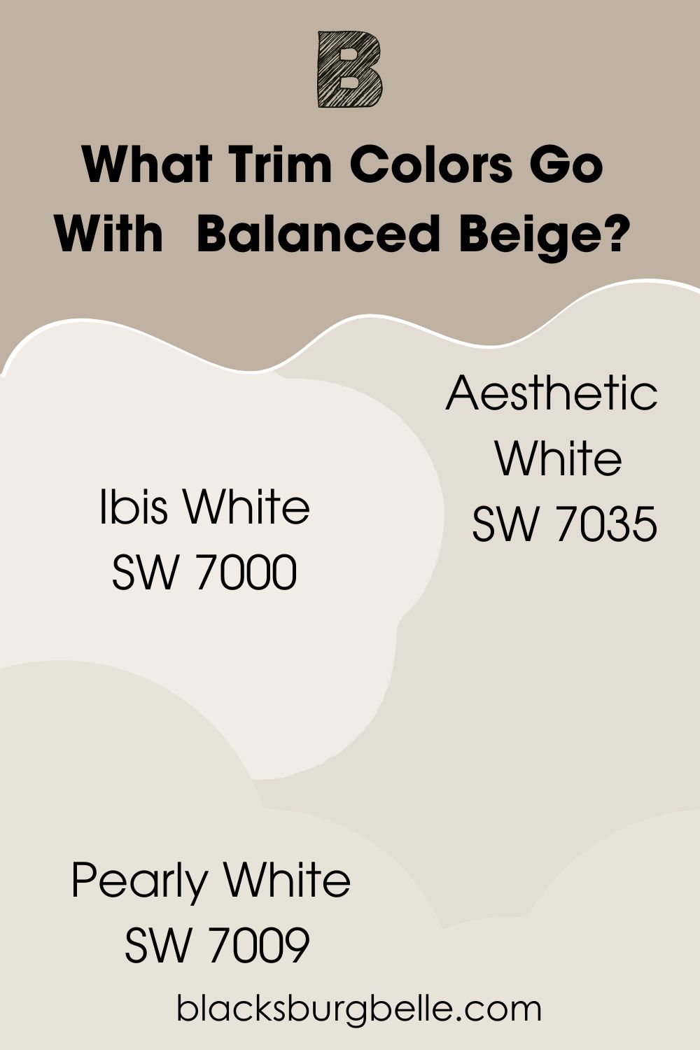
What Trim Colors Go With Sherwin-Williams Balanced Beige?
Balanced Beige does well with off-white, bluish-white, and lighter beige trims. Sherwin-Williams recommends Aesthetic White (SW 7035), but you also use Ibis White (SW 7000) and Pearly White (SW 7009).
Sherwin-Williams Balanced Beige Color Comparisons
What can you do when Sherwin-Williams Balanced Beige lacks the right oomph for your vision? You explore other alternatives with similar features but different undertones and overlays. It’ll help you decide whether to jump ship or stick with what you’ve chosen.
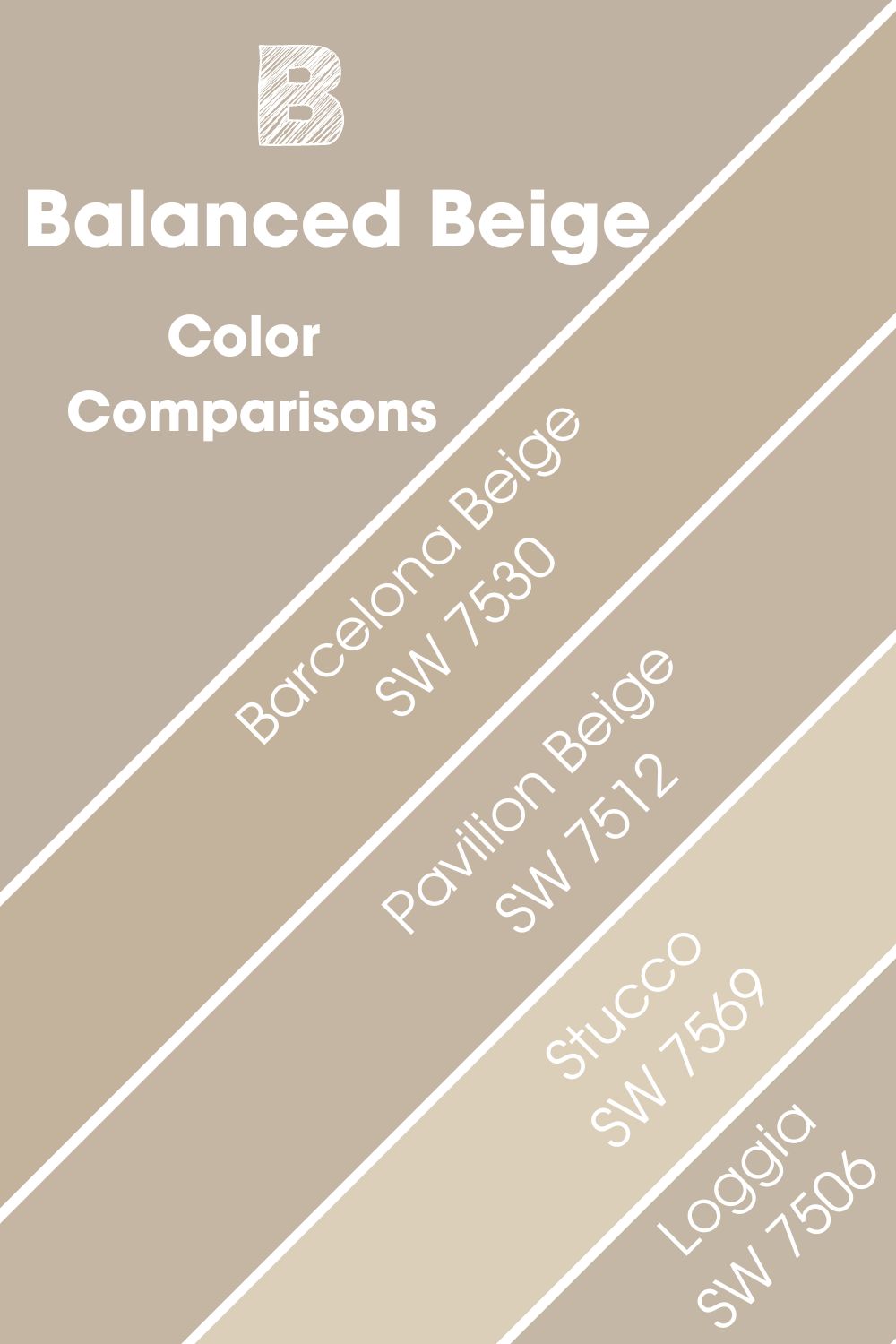
Also, these comparisons can help when Sherwin-Williams Balanced Beige is out of stock, but you need the same color.
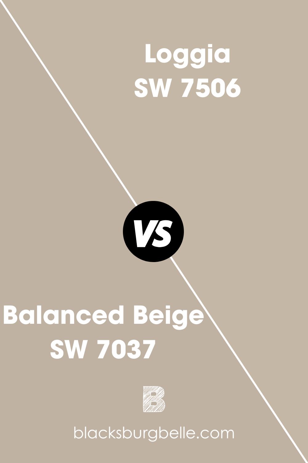
Sherwin-Williams Balanced Beige vs. Sherwin-Williams Loggia (SW 7506)
Sherwin-Williams Loggia and Balanced Beige have similar overlays, so you can’t tell the difference until you place them side by side. However, lighting would highlight those minute nuances you didn’t know existed.
Unlike Balanced Beige, Loggia is purely warm, which makes it a great fit for office spaces and living rooms. It’s inviting enough to make anyone feel comfortable without being boring.
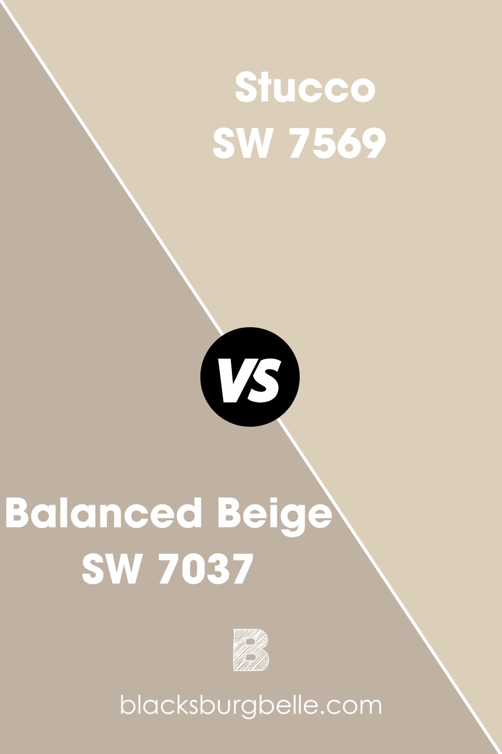
Sherwin-Williams Balanced Beige vs. Sherwin-Williams Stucco (SW 7569)
Unlike most paints in Sherwin-Williams Balanced Beige’s Color Strip, Stucco (SW 7569) is a yellow-based beige tone. Hence, it’s visibly brighter than its counterpart with an LRV of 63, and you can use it as an accent for Balanced Beige.
The gray and green undertones embedded in this traditional beige paint would bounce off those in Balanced Beige effortlessly to create a symphony of the timeless decor.
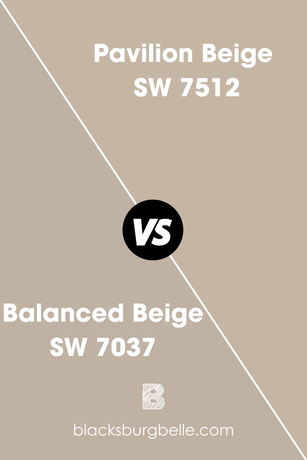
Sherwin-Williams Balanced Beige vs. Sherwin-Williams Pavilion Beige (SW 7512)
By now, the multifaceted nature of beige paints shouldn’t surprise you anymore as you explore the nuances of Pavilion Beige. It’s similar to Balanced Beige on the face, like Loggia but shares a closer LRV at 48.
You’ll notice the difference in saturation and shadows when compared beside each other, but Pavilion Beige is a good supplement for Balanced Beige. These colors work well with wooden trims as it emphasizes their warmth.
Sherwin-Williams Balanced Beige vs. Sherwin-Williams Barcelona Beige (SW 7530)
Barcelona Beige is another classic yellow-based beige paint like Pavilion Beige, and it has a similar LRV at 47. Although it has a green undertone like Balanced Beige, it lacks the purple and gray tints that make up this nuance. 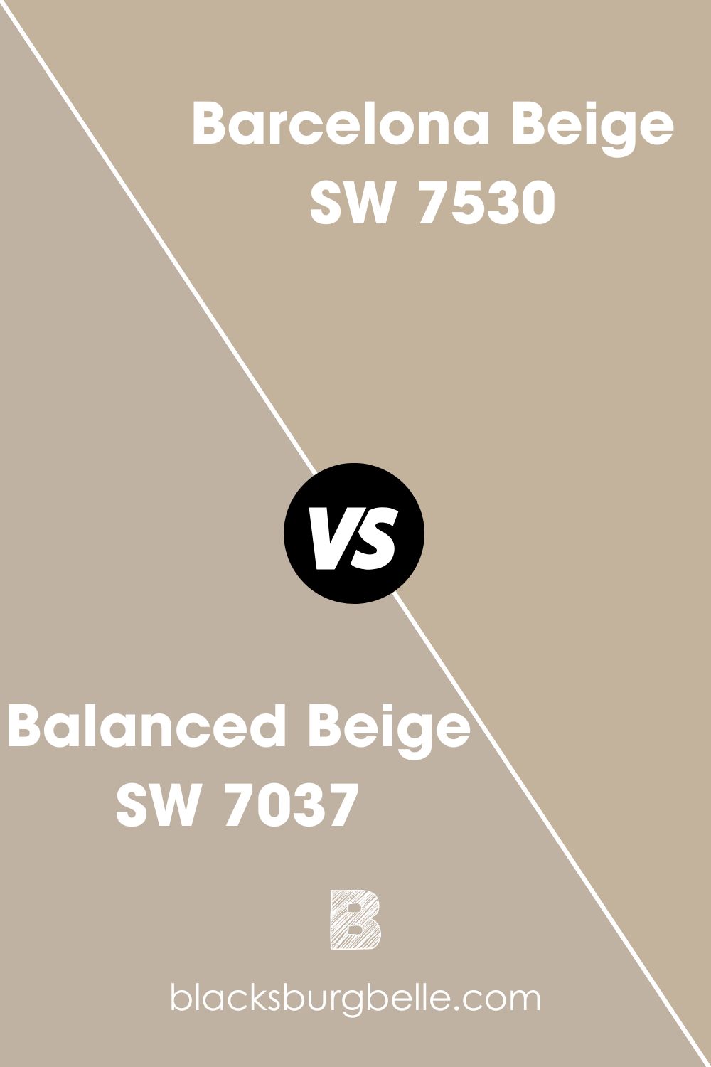
Benjamin Moore Balanced Beige Color Comparison
Benjamin Moore is a good alternative brand when you don’t have access to Sherwin-Williams. It also has interesting beiges ranging from yellow-based to orange-based and gray-blended. Check out some of them below.
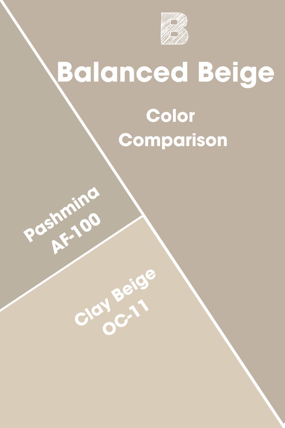
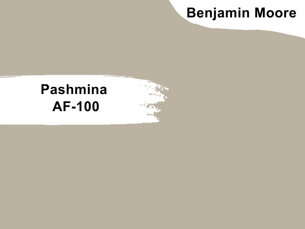
Pashmina (AF-100)
Benjamin Moore’s Pashmina (AF-100) is two-toned like Sherwin-Williams Balanced Beige. They have warm and cool features that can shine depending on the lighting. However, unlike its counterpart, Pashmina’s greige nature favors its gray element over its Beige.
It has an LRV of 44.2, meaning it’s darker than Balanced Beige but not by a large margin.
Clay Beige (OC-11)
Although Benjamin Moore’s Clay Beige is another mid-toned color, it’s a different kind of medium. It sits on the middle of the light end of the LRV spectrum at 61.61, meaning its sandy outlook is way brighter than Balanced Beige’s almost neutral overlay.
Their only similarities lie in their warmth, but beyond that, Clay Beige couldn’t be more different than Balanced Beige if it tried.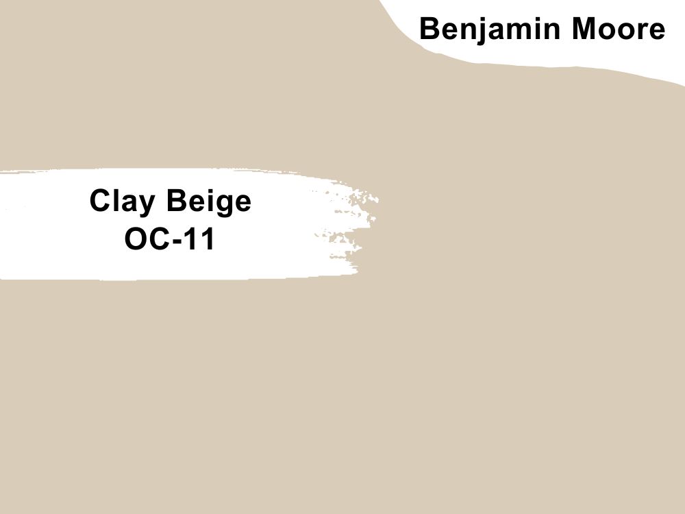
Benjamin Moore Balanced Beige Version
Many top-quality paint brands share similar names with their unique hues but often differ in elements. Luckily, you won’t make any mistakes with “Balanced Beige,” as it’s unique to Sherwin-Williams.
If you want a hue similar to the greige Balanced Beige, look no further than Benjamin Moore’s Gallery Buff.
Gallery Buff by Benjamin Moore (CSP-225) can pass as Sherwin-Williams Balanced Beige to the untrained eye. They’re similar in genetic makeup, but Gallery Buff appears grayer in dim light than Balanced Beige.
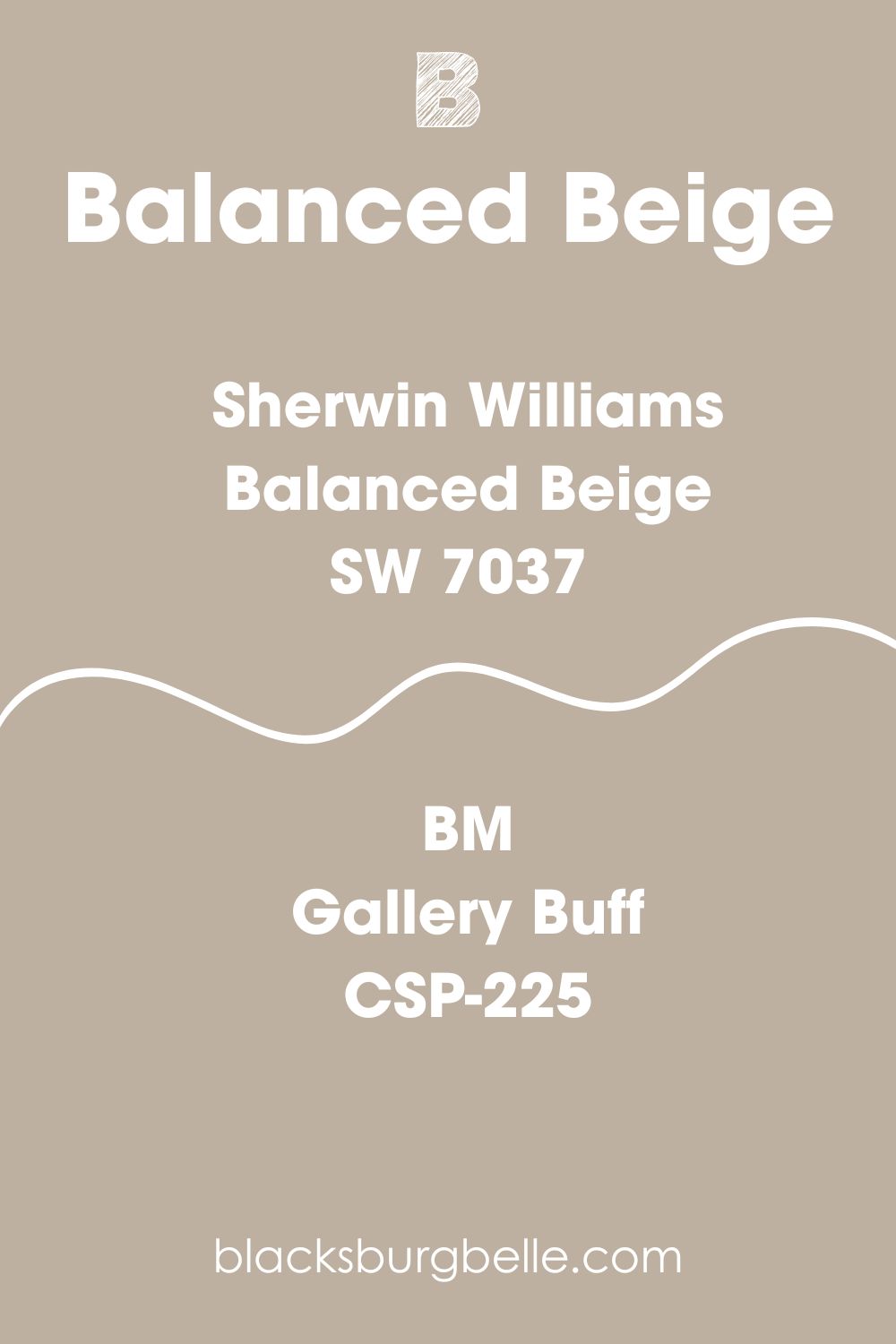
Unlike Sherwin-Williams Balanced Beige, Benjamin Moore doesn’t recommend using Gallery Buff outside despite its neutral tone and 46.22 LRV. However, when painted indoors, this color stands out while harmonizing the rest of your interior decor.
Other brands with likely alternatives include Valspar’s Kiln Clay, PPG Discover, Farrow & Ball’s Jitney, and Behr’s Smokestack.
How Does Light Affect the Color?
Where would you rather paint with Sherwin-Williams Balanced Beige? What part of the color do you want to highlight? Your answer to question number two would determine the answer to question one.
Some rooms receive more natural light than others because of their window placement. Hence, those spaces reflect the most sunlight despite Balanced Beige being semi-absorbent.
North-facing windows receive steady sunlight that’ll translate into the most neutral iteration of your paint. If you want it’s undertones to be the star of your room, then use the color in South-facing rooms. Note that you’ll get the least light from the East windows.
Best Rooms To Paint Balanced Beige
Now that we’ve established the scientific and creative aspects of using Sherwin-Williams Balanced Beige, it’s time to test the theory. Using your window placement, lighting, and color coordination knowledge, here’s how to use Balanced Beige in your space.
Balanced Beige for Interior
This warm/cool neutral paint is made for interior coloring due to its versatility. You can use it anywhere inside, from the bathrooms to the living room, kitchen, office, laundry, or game room.
The best part is its suitability to male and female tastes from closets to dens. Check out the different ways you can use the color below.
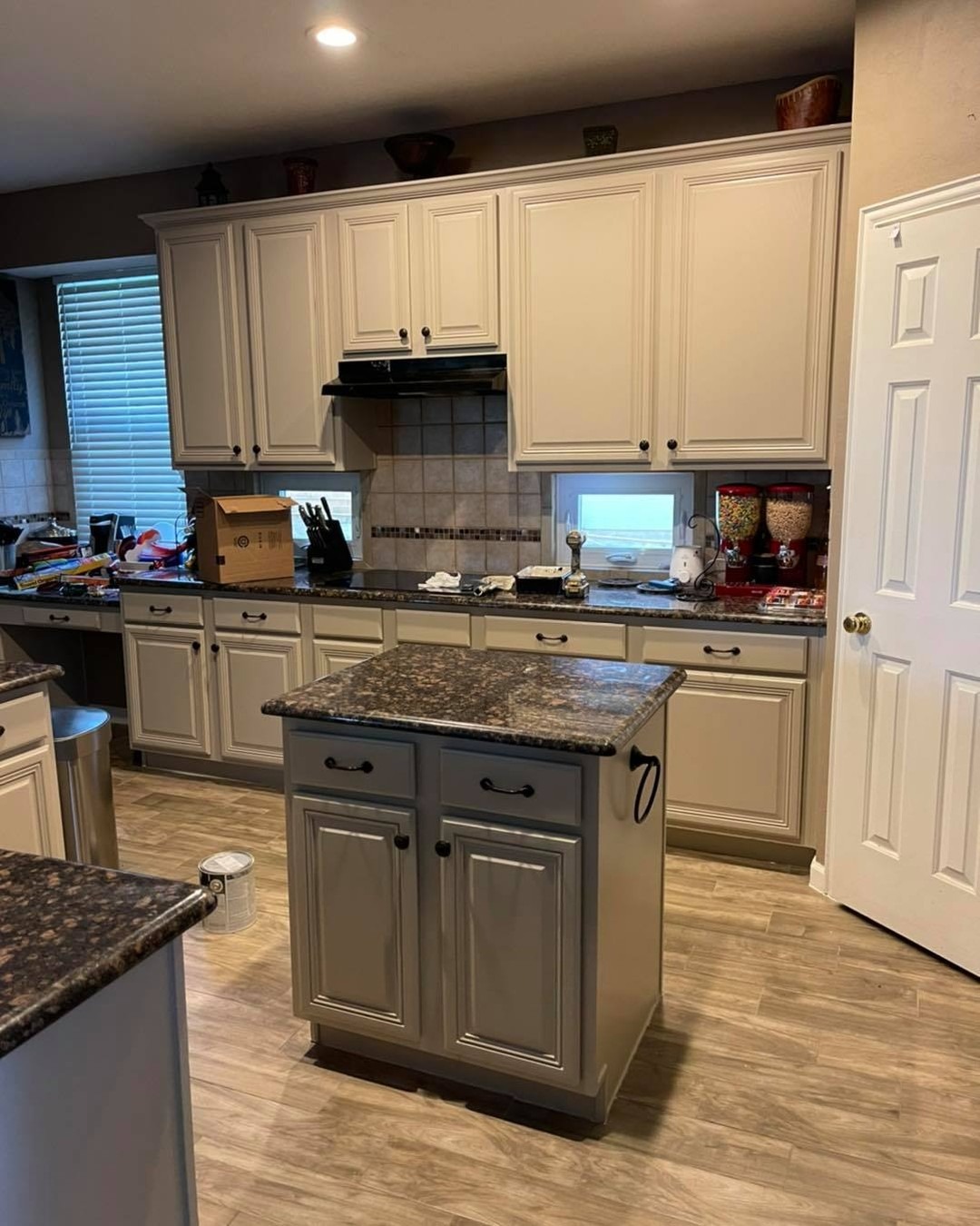
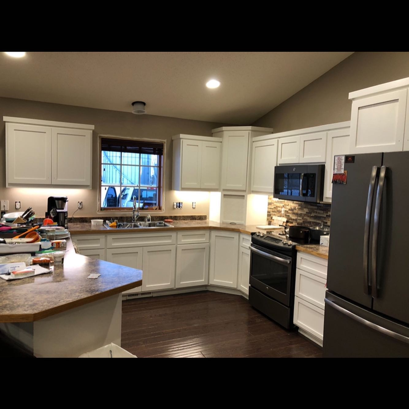
Balanced Beige for Cabinets
Cabinets are a great way to incorporate Sherwin-Williams Balanced Beige into your home as an accent. If you’ve chosen to use the color sparsely, invest in kitchen cabinets, bathroom cabinets/organizers, credenzas, wardrobes, and fireplaces.
The color is bold enough to stand out while blending into its surroundings – a perfect oxymoron. Referencing the color palette above, use Balanced Beige cabinets against an off-white, blue-gray, taupe, green, or orange walls.
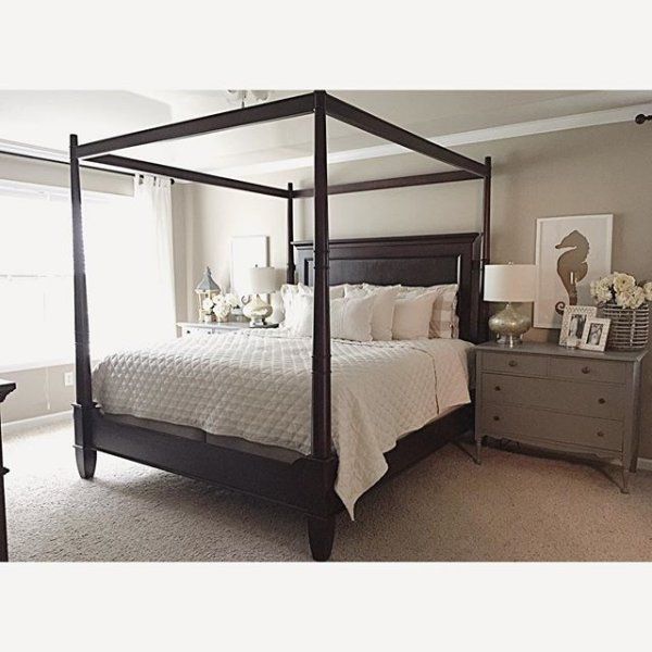
Balanced Beige Bedroom
Your bedroom should be your sanctuary since it’s the place you lay your head after a stressful day of activities. Typically, people prefer cool colors to create a relaxing aura, but there’s no reason you can explore the dual-purpose Sherwin-Williams Balanced Beige.
Highlight its gray undertone by pairing the color with cool bluish-grays or bluish-white paints as trims or accents.
You can introduce those colors with the interior decor, from the bedding to the upholstery and floorings. Then, blend it all with the artwork.
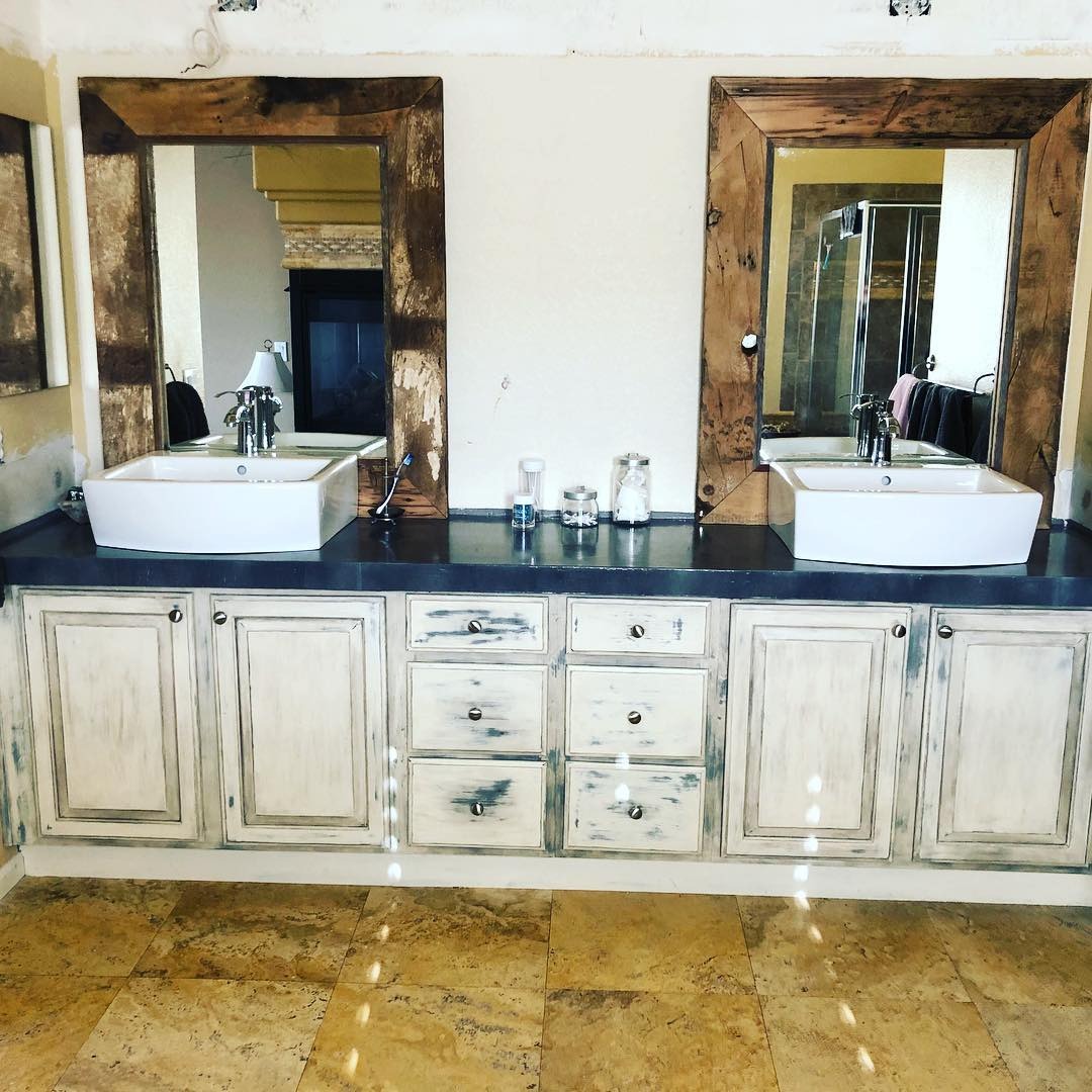
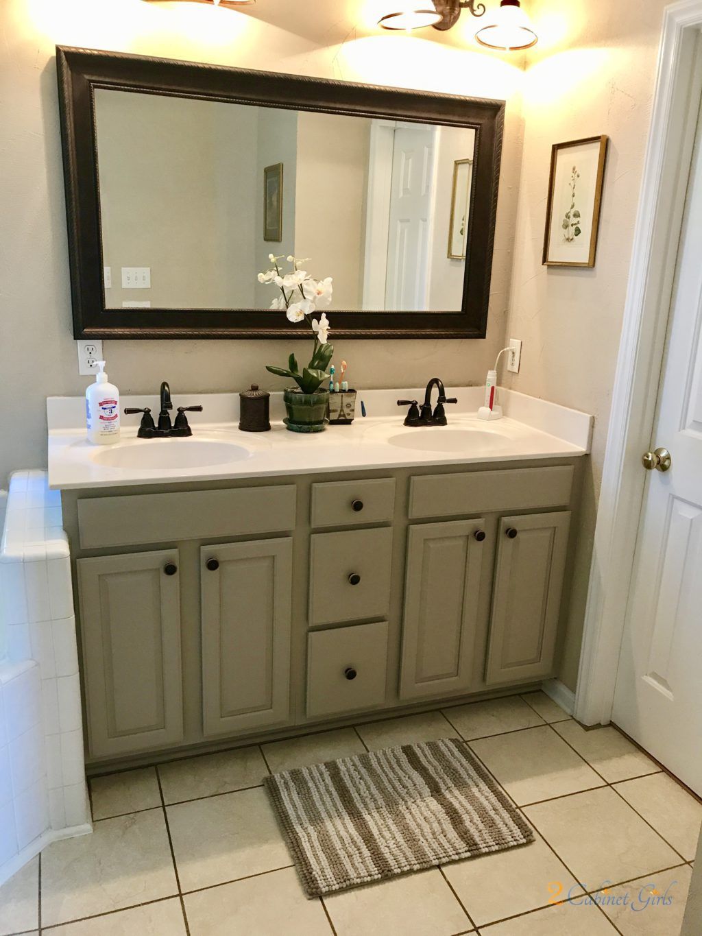
Balanced Beige Bathrooms
Every day can be Spa Day and feel like a vacation in a tropical resort when you use Sherwin-Williams Balanced Beige. The beauty of this choice is that you can pair the paint with wooden trims, marble, or tile.
Wooden trims sell the tropical vacation aesthetic, while marble and tile create a luxurious atmosphere.
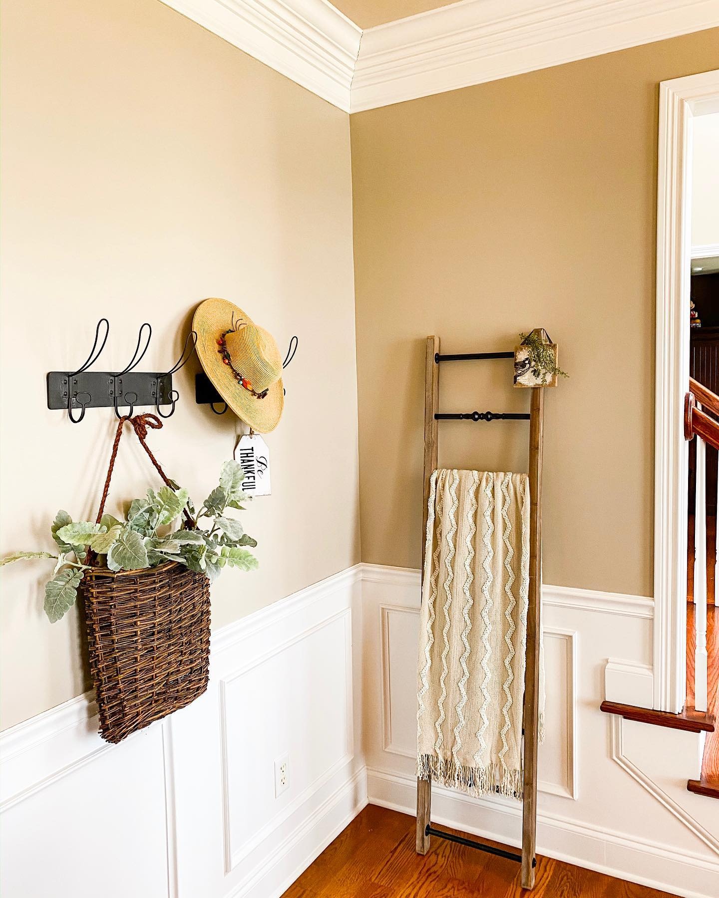
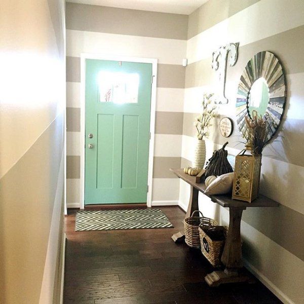
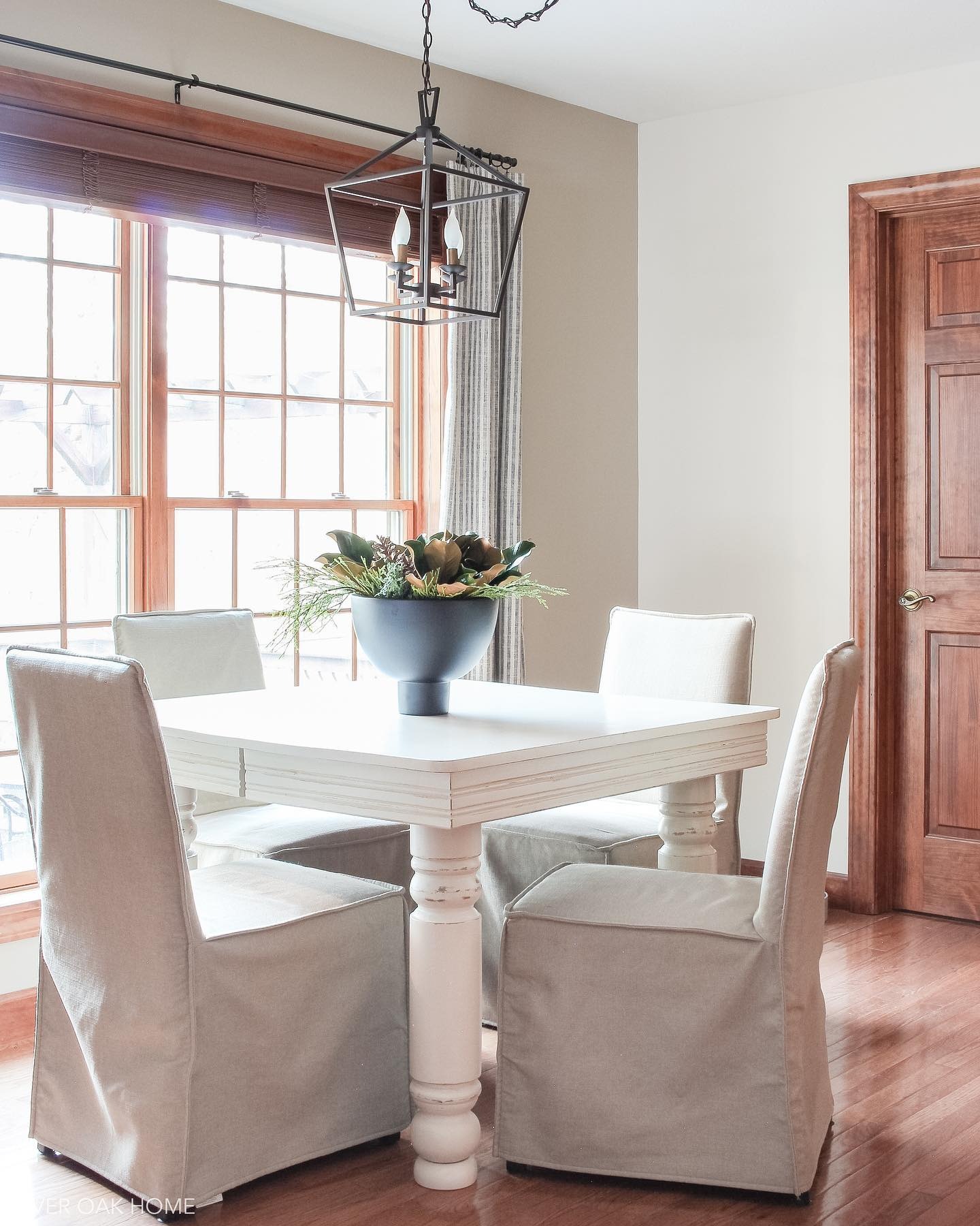
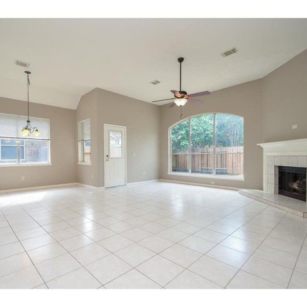
Balanced Beige Living Room
Most living rooms are large, but if yours is small, don’t worry, Balanced Beige would still shine effortlessly inside. Here’s the trick – don’t use the paint as a full coloring for small living areas. Instead, make it an accent wall, fireplace, credenza, or organizer.
However, if there’s enough space to play around, use Balanced Beige as the only wall coloring. Then, introduce diversity with other colors through furniture, flooring (carpets and rugs), and accessories like throw pillows and blankets.
Once more, refer to the color palette for inspiration on coordinating Balanced Beige.
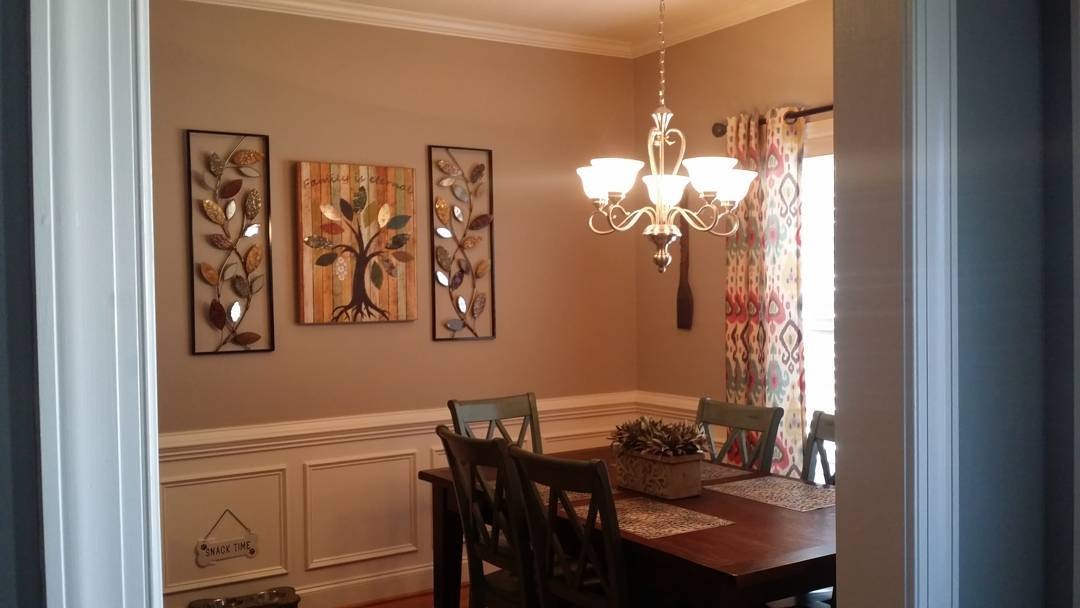
Balanced Beige in the Kitchen & Dining Room
I typically review kitchens and dining rooms separately, but there’s no need for that anymore since they’re extensions of each other.
Designing each space depends on your home layout, as some houses have both functions in one room while others separate them with doors or arches.
If your dining room and kitchen are distinct, it’s best to invert your color coordination. That means Balanced Beige walls in the kitchen work with an alternate color in the dining room wall. However, it should match the cabinets in the kitchen and vice versa.
Balanced Beige as an Accent Wall or Full Wall?
Choosing Balanced Beige as an Accent Wall or Full Wall depends on your room’s size and window placement. Remember that dark colors make spaces appear smaller, so Balanced Beige as a full wall works in large rooms.
However, if the room is small, it doesn’t need to look smaller. Use Balanced Beige as an accent wall instead, then take it up a notch by pairing it with a lighter color as complementary wall paint and interior accessories.
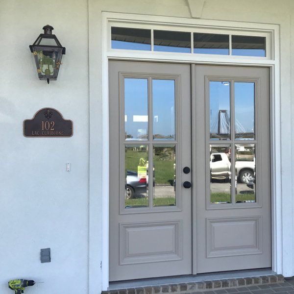
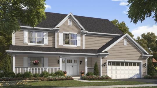
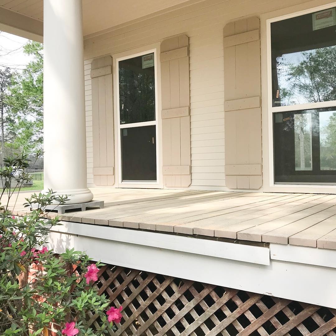
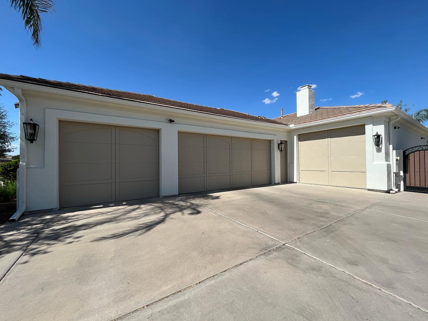
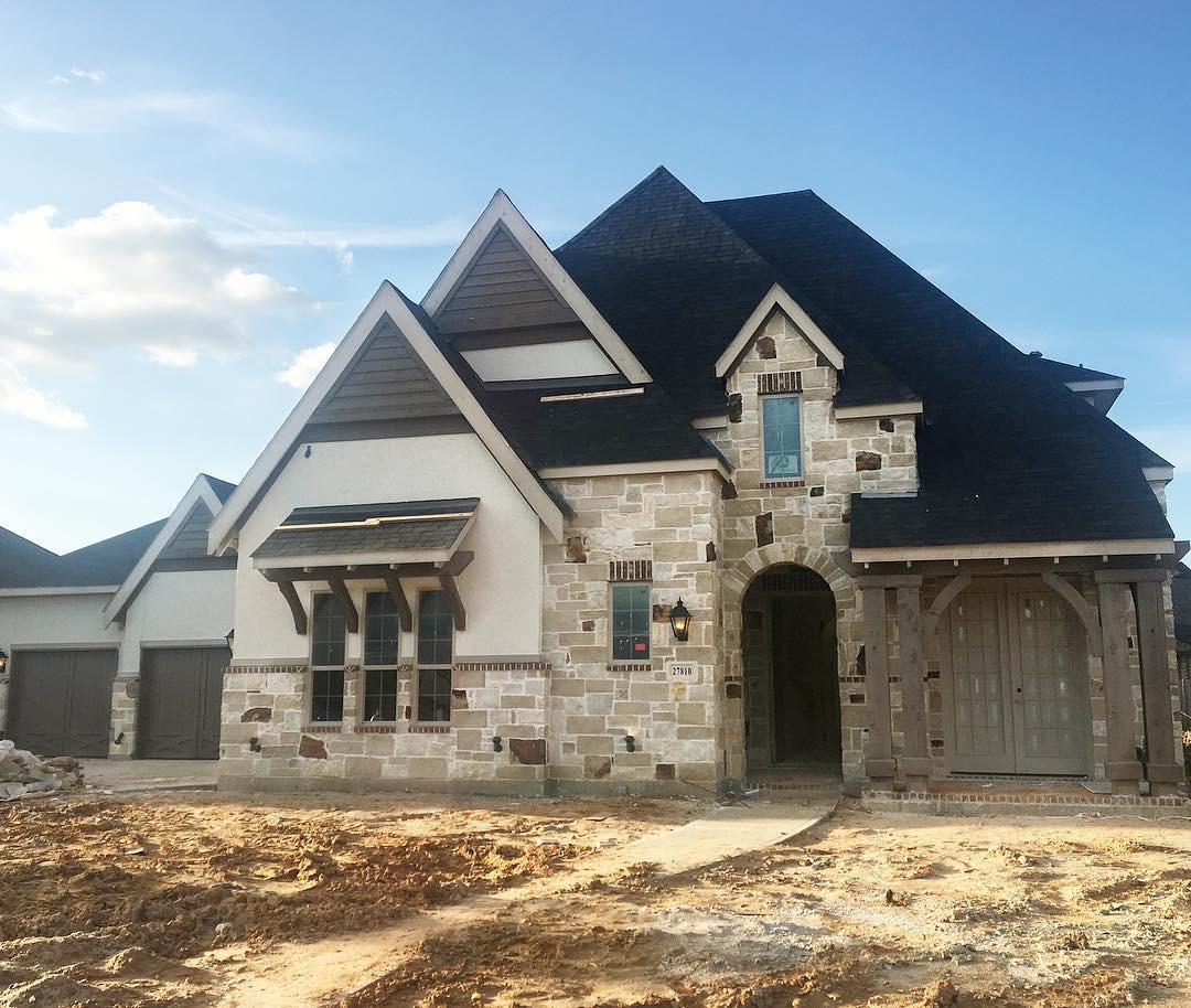
Balanced Beige Exteriors
Balanced Beige isn’t restricted to interior coloring as it works wonders on garages, sheds, and even full exterior wall paintings. It’s best paired with stone when used outside.
Sampling Sherwin-Williams Balanced Beige
Sherwin-Williams offers three sampling options from Color-to-Go to Color Chips and Peel & Stick Strips like Samplize.
You must test the product before purchase because real-life appearances slightly differ from digital visualizers, no matter how exact the company promises you it is.
Final Thoughts
I hope you love reading this Sherwin-Williams Balanced Beige color review as much as I enjoy writing it. There’s so much this color can do due to its diverse nature.
Although it’s not the only warm/cool paint, it’s a refreshing change from popular neutrals with cool bases. Check it out today and share your creations.
 Sherwin Williams North Star (Palette, Coordinating & Inspirations)
 Sherwin Williams Cascades (Palette, Coordinating & Inspirations)
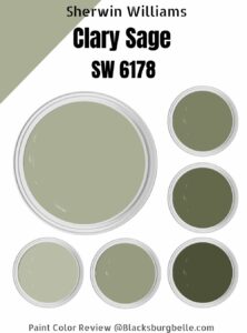 Sherwin Williams Clary Sage (Palette, Coordinating & Inspirations)
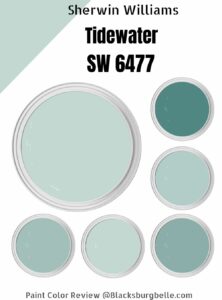 Sherwin-Williams Tidewater (Palette, Coordinating & Inspirations)
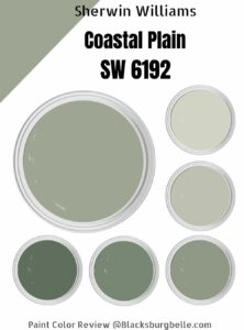 Sherwin Williams Coastal Plain (Palette, Coordinating & Inspirations)
 Sherwin Williams Alabaster SW 7008: Review & Inspiration
