

If you think all white paints are the same then you have a lot to learn.
Benjamin Moore offers a wide range of white colors including medium-light tones like Seapearl OC-19 and although this grayish-white paint is part of the Off White Collection it is not a bestseller.
Unlike most popular bright whites with faint undertones, Seapearl has a muted presence. But that’s what makes it ideal for certain palettes and rooms. If you’d like to know the specifications, LRV, RGB, and color coordination tips for Seapearl stick around.
I’ll start with quick tips on choosing Benjamin Moore Seapearl.
Table of Contents
When to Choose Benjamin Moore Seapearl?
Do you avoid white paints because you think they’re boring? I want you to know you’re not alone because I’ve been there. Luckily off-whites Benjamin Moore Seapearl aren’t in the same bracket.
Their dual tones offer a wider range of emotions and creativity.
Are you in a rush? Then, check out this quick summary on using Seapearl.
Want An Anonymous Color?
Sometimes you need a blank space to think, and that’s what Seapearl walls give you. You can be yourself without worrying about the color influencing your mood too much.
Looking for Neutrality?
Seapearl isn’t a mid-toned white paint, but it’s not a pushy shade. Instead, you’ll get a subtle lightness that only shines when there’s direct lighting.
Playing with Off-White Color?
Many people shy away from white because of its brightness and uptight nature, but that’s not the same with off-white. Seapearl is a mix of neutrality and character.
Need an Exterior Makeover?
Seapearl makes your building’s exterior look ten times better, richer, and attractive.
What Color is Benjamin Moore Seapearl?
If you’ve ever seen a pearl fished from the ocean, you’ll know where Seapearl gets its name. Pearls are off-white with sometimes pinkish, bluish, or gray tints.
In the case of Seapearl, there’s only one gray undertone which I’ll discuss in detail soon.
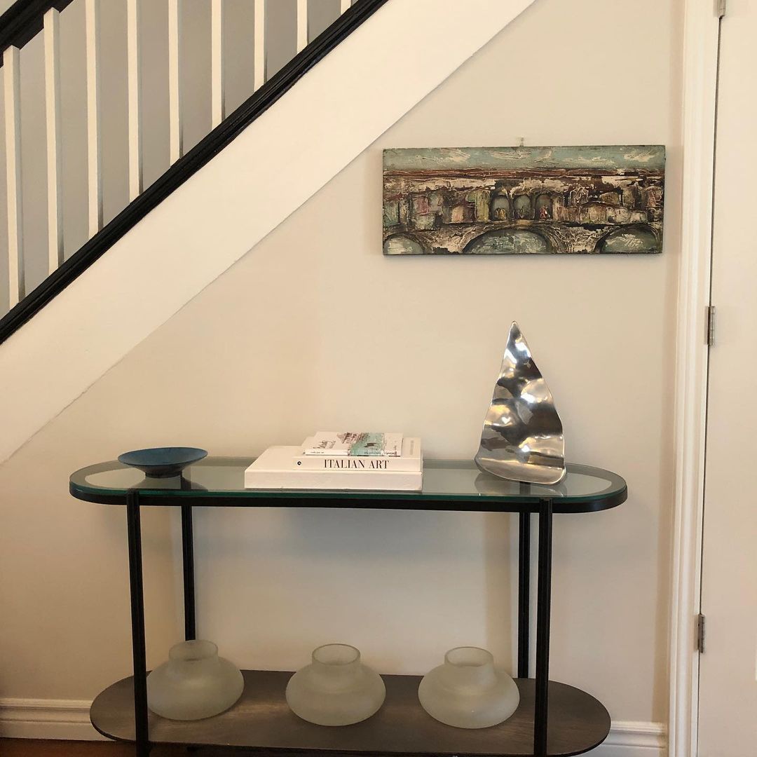
For now, observe the color on this staircase wall.
Because of its gray undertone Seapearl appears hazy and somewhat dull even though it’s a white color. So, don’t expect an energy burst from when you use it on your walls or furniture. Instead, think of it as a mood stabilizer especially when you highlight its gray tints.
Before I continue dissecting the details of Benjamin Moore’’s Seapearl, let’s take a look at the specifications.
Snapshot of Benjamin Moore Seapearl Specification
This table has all the info you need for a quick decision on whether you should buy Seapearl.
| Name | Seapearl OC-19, 961, PM-20, OC-141 |
| RGB | Red 231 | Green 228 | Blue 217 |
| Hex Value | #E8E3D8 |
| LRV | 76.43 |
| Undertones | Gray |
The Light Reflectance Value (LRV) of Benjamin Moore Seapearl
LRV is measured on a scale of 0 – 100 where 0 is the darkest black and 100 is the purest white. With paints, that figure caps at 3 – 97 because of undertones which prevent purity. 50 is the median, 56 – 79 is medium-light, 80 – 97 (light), 45 – 30 (medium-dark) & 29 – 3 (dark).
Benjamin Moore’s Seapearl has an LRV of 76.43.
As a medium-light color, Seapearl brightens up a room on its own but doesn’t have a blinding reflection. Instead, you’ll get a laidback coolness like a chilled evening cloud.
If you want a bright reflection from your Seapearl paint, get a large window in the room to receive natural light or use artificial lighting.
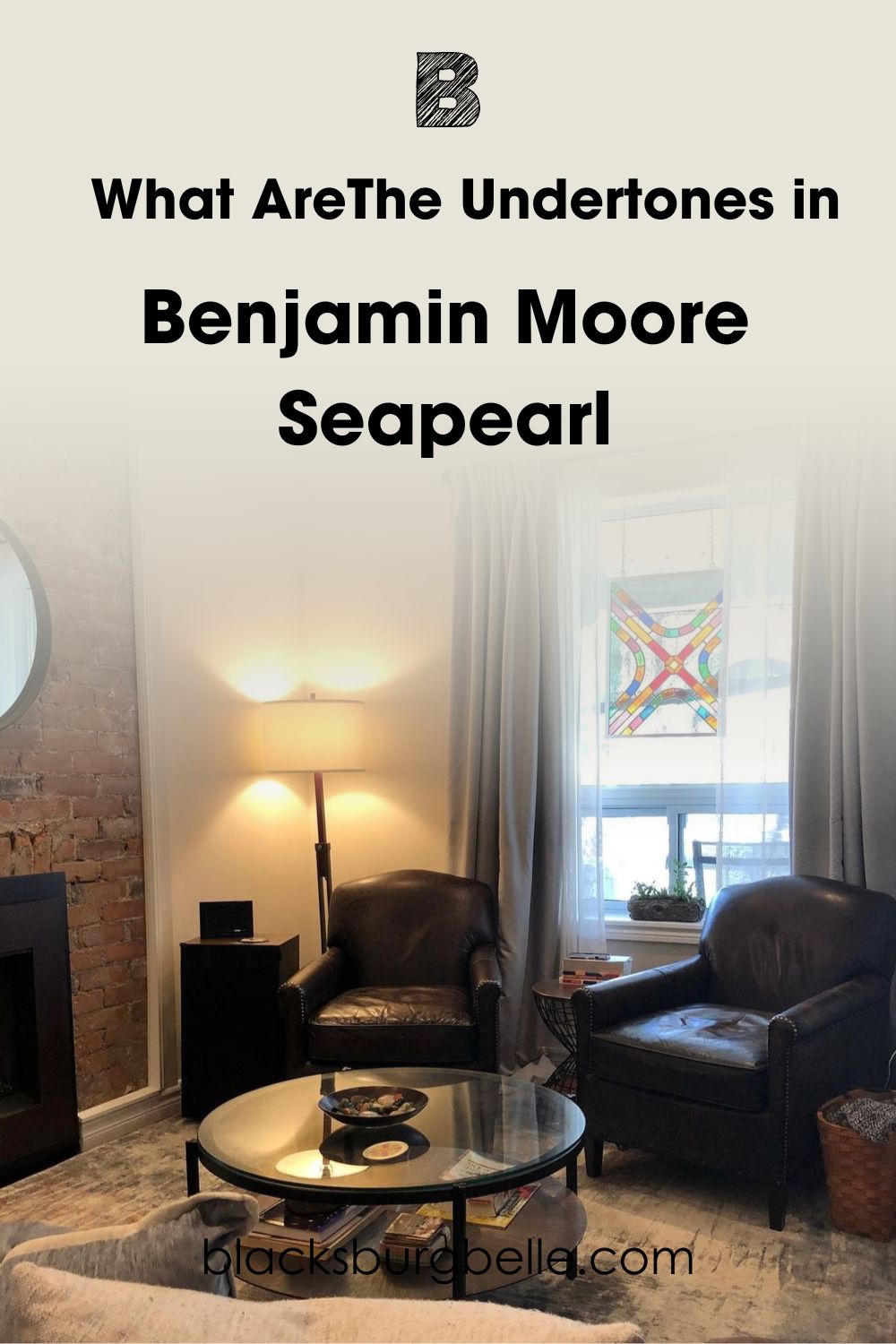
What AreThe Undertones in Benjamin Moore Seapearl?
Lighting exposes the gray undertone in Seapearl. But positioning and type matters. If you don’t understand why Seapearl doesn’t appear as a pure white you’re about to learn. It takes a measured mix of red, green, blue (RGB) and pure black to create every unique paint color.
This RGB mix creates a main color and alternate undertones. That’s why one color can appear in three different shades based on its surrounding lighting. See an example below.
How Does Light Affect Benjamin Moore Seapearl?
You can highlight the gray or white part of Seapearl depending on how you manipulate the surrounding lighting. I’ll show you how to use natural sunlight in your room then we’ll get to the artificial illumination.
Here’s a quick geography refresher to help you along:
The Sun rises in the East and sets in the West.
Use a compass to determine your room’s position. But if you can’t assess one that’s not a problem.
Stand outside your building by sunset and point towards the sun with your right hand. That’s the Western position. Then, point your left in the opposite way for East. Your face looks to the North while your back faces the South.
With this info, let’s see how natural lighting works.
Southern-facing light shines the brightest in mid-morning until noon. From 12:00 p.m. – 4:30 p.m. the Eastern-rooms get more sun. Then West-facing rooms receive dwindling sunlight from 4:00 p.m. till sunset and Northern-light is steady at all times.
Southern-facing and Eastern-facing rooms will keep Seapearl looking white with the gray undertone at bay. But Western and Northern light will highlight the gray undertone and make the color cooler.
Get white or blue lighting to make Seapearl appear chill and warm lighting for a muted off-white glow.
Does Seapearl look Gray?
Because Western-facing and Northern-facing light are low, the reflection from Seapearl will be dim. So, the color’s gray undertone becomes more prominent. See how the color translates on this bedroom wall.
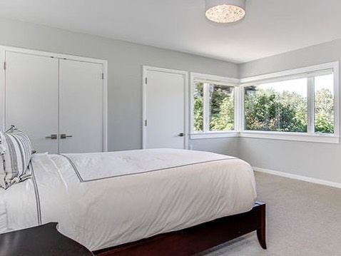
You’d think Seapearl is a purely gray color until you look at the wall’s base receiving redirected light. The dim areas translate a misty gray while the bright spots show up as white.
Is Benjamin Moore Seapearl a Warm or Cool Color?
Benjamin Moore Seapearl is a cool color but not in the way you know. “Uhh?” I can see the wheels turning in your head, so I’ll explain.
Cool colors look like they’re moving away from you and make rooms appear larger than their actual size.
Those colors also remind you of still waters and the skies. They include blue, violet, and green.
The same theory applies to neutral paints like Seapearl but you have to look at the undertones to determine its temperature.
Seapearl has a gray undertone with an icy blue note meaning it’s a chill color. That’s why I saw enough inspirations for Seapearl in bedrooms, bathrooms, and living rooms. Those rooms require the most relaxed environment and Seapearl will give you that.
You can also use the color if you’re in the health & wellness business. Its grayish-white presence will relax your guests while they spend time in your establishment. I don’t recommend using Seapearl for
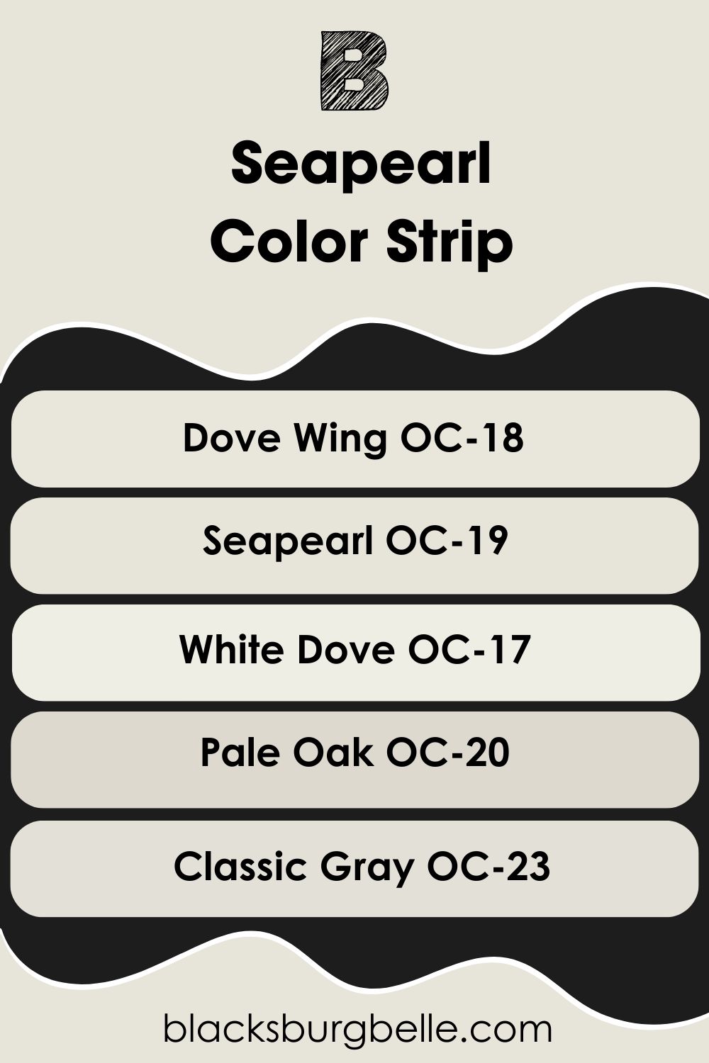
The Benjamin Moore Seapearl Color Strip: Lighter and Darker Versions
Do you feel Benjamin Moore Seapearl is too dull, bright, or insufficient? Then you can explore its color strip until you find the perfect tone. This strip contains colors with a few lighter or darker tones to Seapearl but the same grayish-white element.
See them below:
- Benjamin Moore Dove Wing OC-18
- Benjamin Moore Seapearl OC-19
- Benjamin Moore White Dove OC-17
- Benjamin Moore Pale Oak OC-20
- Benjamin Moore Classic Gray OC-23
Dove Wing is almost 2% lighter than Seapearl but if you want a very bright off-white get White Dove. For darker versions get Classic Gray (73.67 LRV) and Pale Oak.
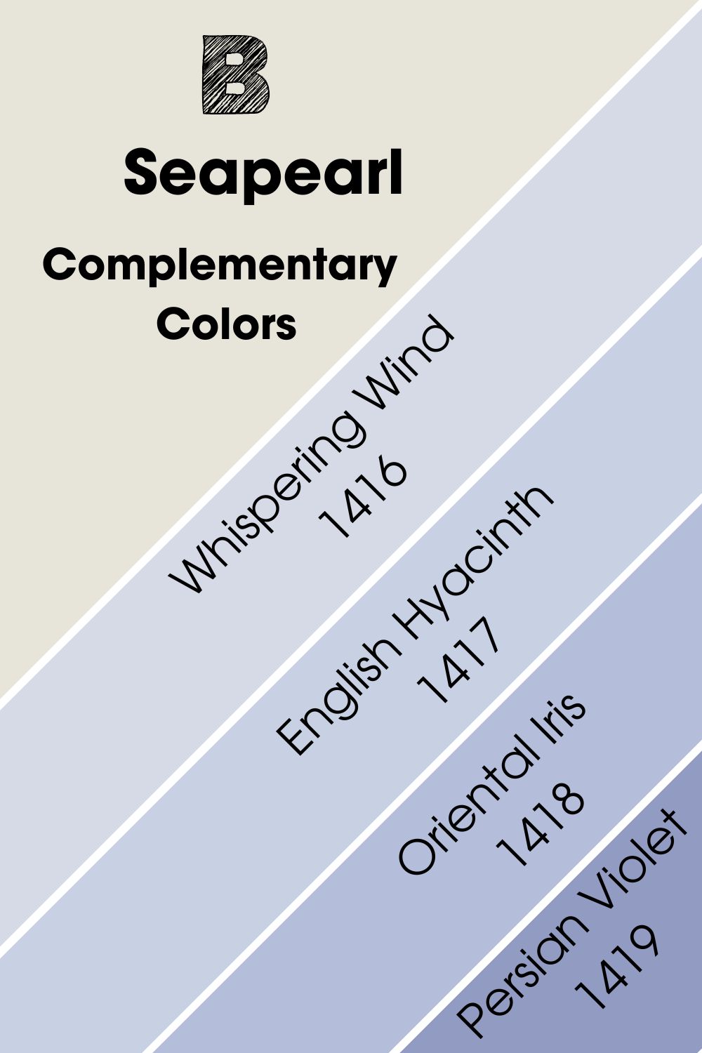
Complementary Colors for Benjamin Moore Seapearl
Have you ever wondered why some color combos are recurrent? That’s because their different auras and tones suit each other, and complementary colors are one of those. Complementary colors are two opposite hues on the color wheel.
Because they give contrasting energies, they create a balance while making a bold statement. You’ve seen them on brand logos, football club jerseys, and more. But if you can’t remember, here are some popular combos:
- Blue – Orange
- Yellow – Purple
- Red – Green
Benjamin Moore’s Whispering Wind 1416 complements Seapearl. You can complement Seapearl with darker shades of Whispering Wind for a bolder contrast. I’ve added some mid-toned violets and medium-dark shades to give you options.
- Benjamin Moore English Hyacinth 1417:This medium-light inky blue has a faint lilac undertone that gives it a soft finish.
- Benjamin Moore Oriental Iris 1418:A mid-toned pastel violet hue to neutralize the brightness of Seapearl.
- Benjamin Moore Persian Violet 1419: This medium-dark violet paint has an overwhelming blue undertone.
You can use any of these beautiful violet-blue colors to complement Seapearl. But I recommend using an all-in-one space if you want a genuinely mesmerizing space.
You can make the deep Persian Violet your accent and highlight Seapearl with English Hyacinth and Oriental Iris.
Benjamin Moore Seapearl Best Coordinating Colors
There are so many other ways you can design Benjamin Moore Seapearl beyond contrasting with blue colors. I’ll briefly touch on five popular color-coordinating themes and give you three inspirational combos.
- Analogous Theme: A combination of three colors based on their proximity. Being side-by-side makes a gradient of similar colors. Examples are Green-Blue-Yellow and Red-Orange-Yellow.
- Complementary Theme: Pairs two opposite colors from the color wheel.
- Triadic Theme: Combine three colors that form an equal triangle. It’s mostly the three primary colors in one group and the secondary colors in another.
- Split Complementary Theme:Pick analogous colors for the complementary color of your anchor paint. So, for Red, you’ll have Green as the contrast. Then pair it with Yellow-Green and Blue-Green.
- Monochromatic Theme: Add drops of white and black paints to create tints and shadows of one color. It keeps the space harmonized and simple.
Monochromatic and Analogous themes are my favorite neutral colors because they expand your creativity. With monochromatic themes, you can explore the different tones of your chosen paint, while Analogous themes will make you explore the deepest undertones.
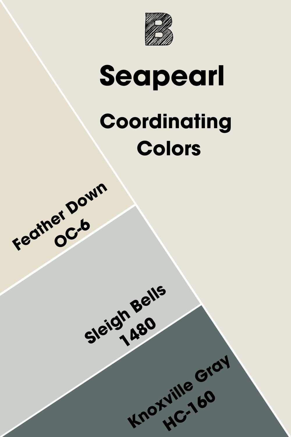
Coordinating Colors for Benjamin Moore Seapearl
- Benjamin Moore Feather Down OC-6:This medium-light off-white paint has a purely beige undertone that gives it a warm exterior.
- Benjamin Moore Sleigh Bells 1480:A crispy and cool gray with an almost mid-toned surface.
- Benjamin Moore Knoxville Gray HC-160:The blue-green undertone in this dark gray color has an intense and enticing look.
Knoxville Gray is the darkest tone in this palette but it has a mesmerizing warmth. Use it as an accent against Feather Down walls, Seapearl trims, and Sleigh Bell adjacent walls.
All colors in this palette appeal to the two sides of Seapearl from the gray to the off-white surface.
Color Palette For Benjamin Moore Seapearl
I skipped the Split-Complementary palette because it’s complex for neutral colors like Seapearl. Also, the single undertone in this muted white paint doesn’t have the range to really push the envelope in curating the palette.
Now see the colors I’ve selected for you from these top palettes.
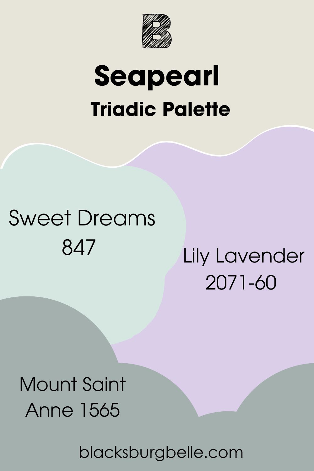
Triadic Palette
- Benjamin Moore Sweet Dreams 847:A minty blue-green with a gentle medium-light tone.
- Benjamin Moore Lily Lavender 2071-60:A soft purple paint with a charming blush undertone.
- Benjamin Moore Mount Saint Anne 1565:A warm and medium-dark gray color with a blue-green undertone.
Use Lily Lavender inside only. You can pair it with Sweet Dreams to maintain a similar LRV but add the darker Mount Saint Anne for shadows. Finally use Seapearl as your main wall or trims.
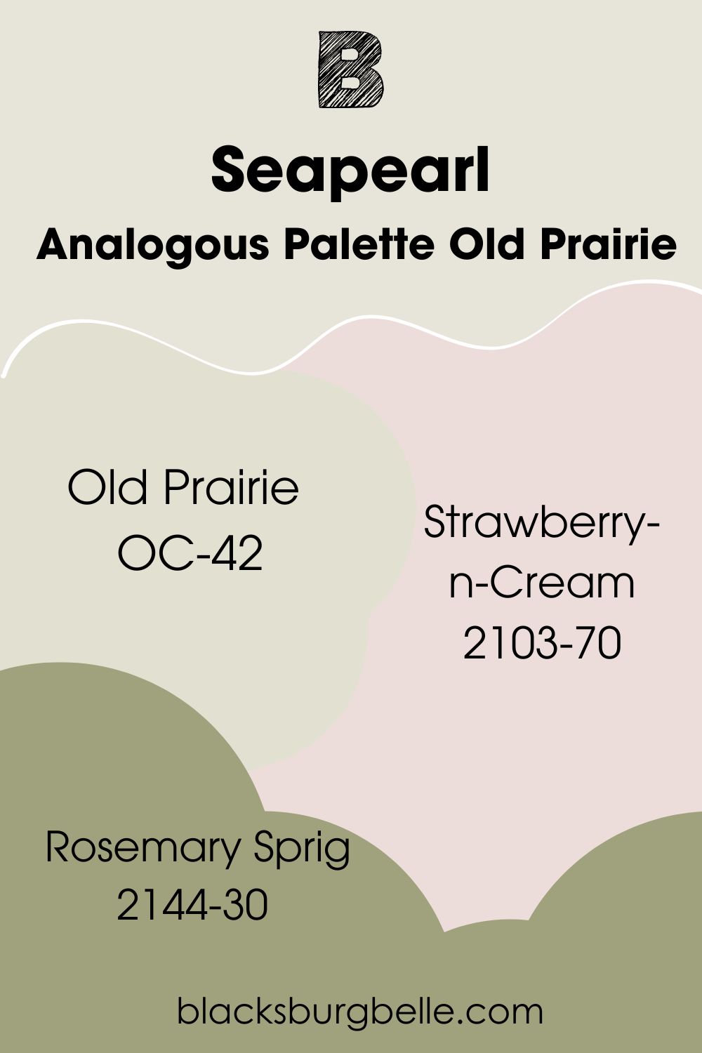
Analogous Palette Old Prairie
- Benjamin Moore Old Prairie OC-42:This medium-light off-white paint has a green-gray undertone to give Seapearl an earthy reflection.
- Benjamin Moore Strawberry-n-Cream 2103-70: A soft and light pale pink with a white-gray undertone giving it a silky finish.
- Benjamin Moore Rosemary Sprig 2144-30:A medium-dark khaki green color.
Seapearl and Old Prairie are two off-whites in this palette but their varying undertones create different vibes. Deepen the earthy aura with Rosemary Sprig and soften the palette with the silkiness of Strawberry-n-Cream.
Quick Tip: Seapearl is the lighter white so use it as the trim.
Monochromatic Palette
- Benjamin Moore Winter White 2140-70:This crisp white paint has an icy blue undertone to balance the gray in Seapearl.
- Benjamin Moore White Dove PM-19:A warm and light off-white with a green-yellow undertone.
- Benjamin Moore April showers 1507:A medium-light misty green-gray.
The beauty of an all-white design is that you can explore the undertones of different shades. In this palette I’ve added white paints with blue, yellow, green, and gray undertones. Because Winter White is the crispest and lightest, make it the ceiling and trim coloring.
You can then use the others as you see fit. But note that April Showers is the darkest of the group followed by White Dove and Seapearl.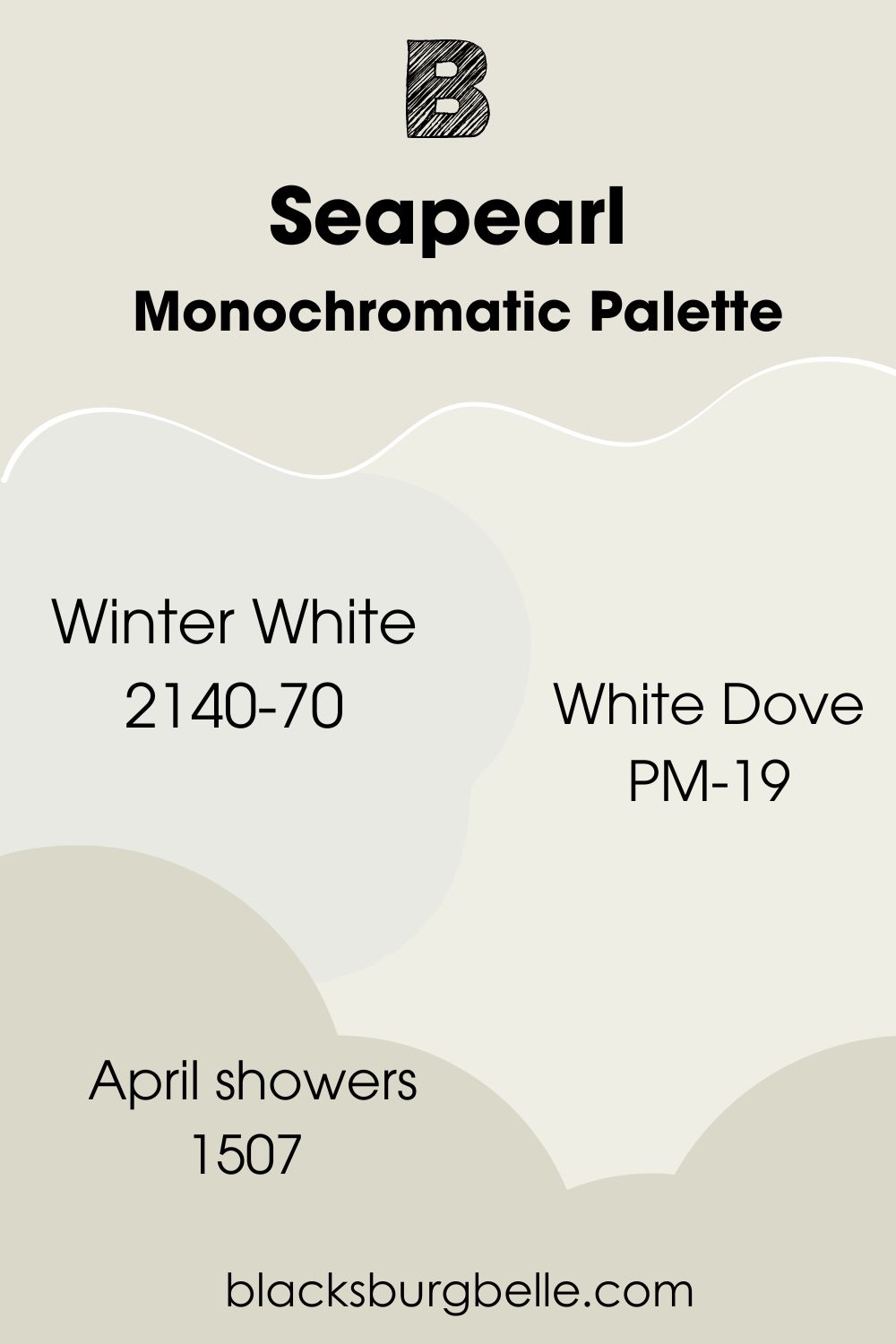
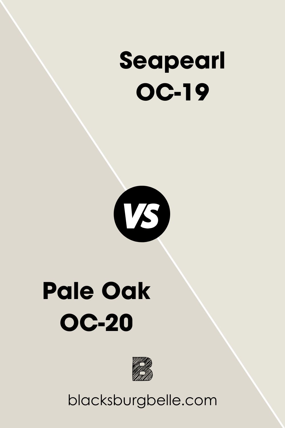
Benjamin Moore Seapearl vs. Benjamin Moore Pale Oak
Pale Oak is a bestseller and a much darker version of Seapearl with an LRV of 68.64.
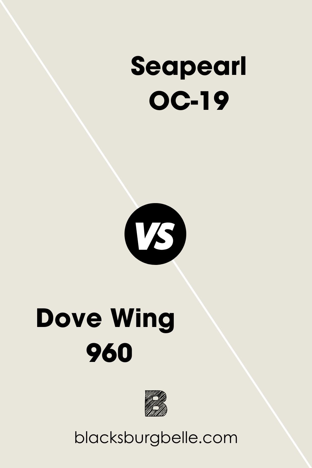
Benjamin Moore Seapearl vs. Benjamin Moore Dove Wing
Dove Wing is slightly lighter than Seapearl and has a silvery beige undertone.
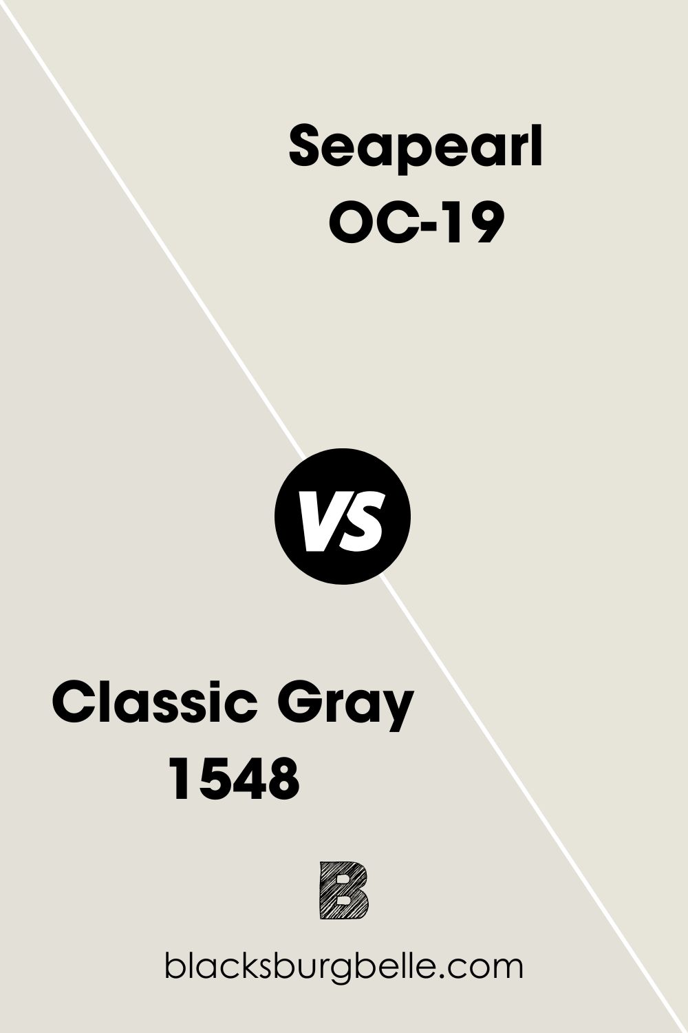
Benjamin Moore Seapearl vs. Benjamin Moore Classic Gray
Although Benjamin Moore Classic Gray and Seapearl are both off-white with gray undertones, Classic Gray is the darker tone.
Benjamin Moore Seapearl vs. Benjamin Moore Full Moon
Benjamin Moore Full Moon is a soft white with a light bluish-gray undertone unlike Seapearl which has a strictly gray undertone.
Benjamin Moore Seapearl Equivalent with PPG (Sea Pearl 1136-1)
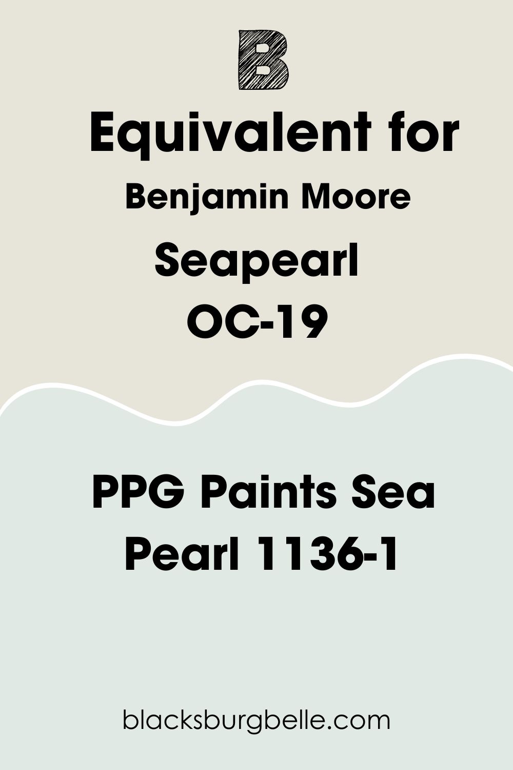
PPG’s Sea Pearl is a silvery light blue color with a green undertone unlike Benjamin Moore’s grayish–white version. It has an RGB of Red 224, Green 233, Blue 228 and an LRV of 79. This is what PPG’s Sea Pearl looks like:
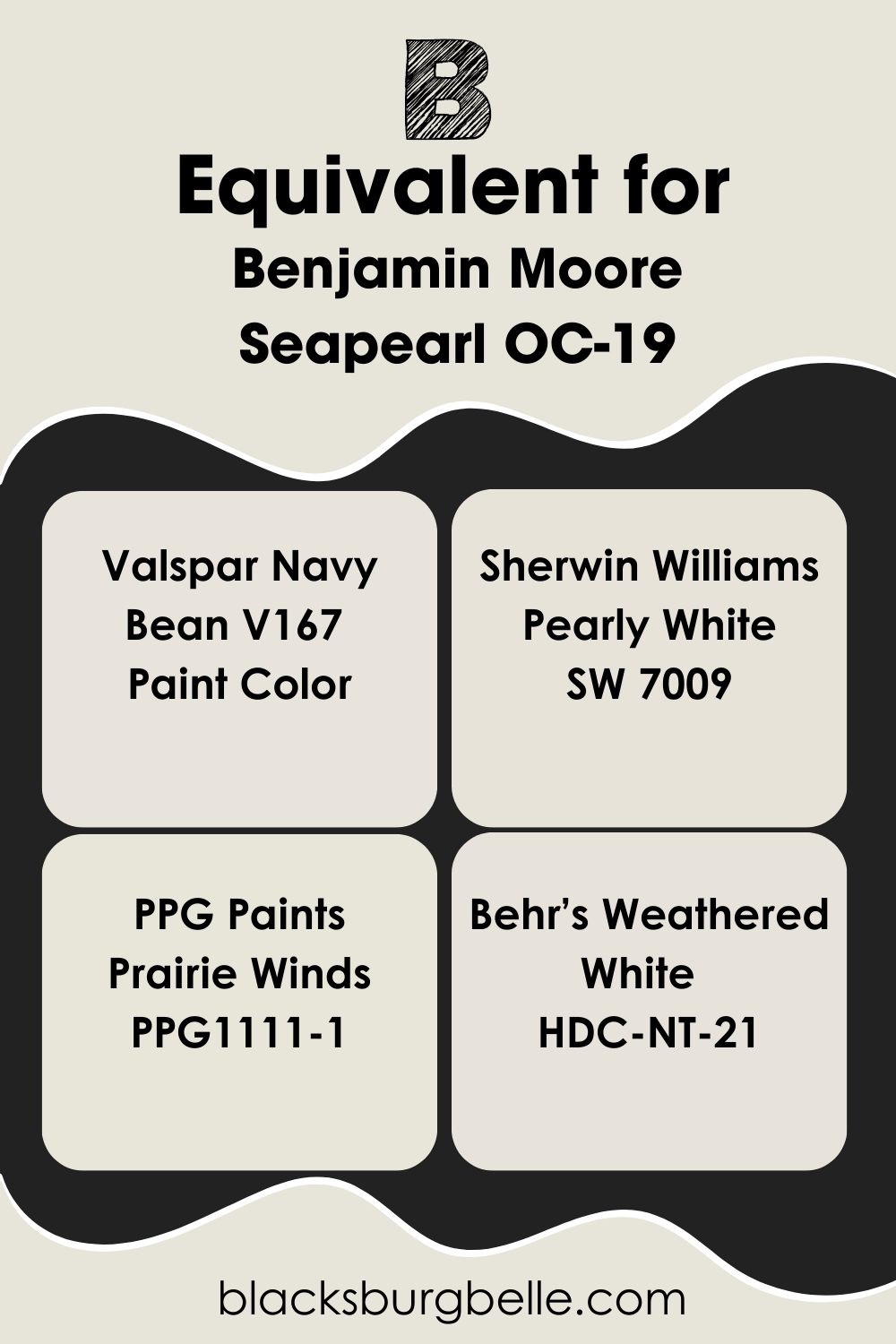
Benjamin Moore Seapearl Equivalent with other Brands
I can’t promise an exact match from other quality paint manufacturers but you can get similar grayish-white colors. Get Navy Bean from Valspar, Pearly White from Sherwin-Williams, Prairie Winds from PPG, and Behr’s Weathered White.
Where can you use Benjamin Moore Seapearl?
Now that you know the basics about Benjamin Moore Seapearl, it’s time to discuss the creative aspect. This muted white paint isn’t the most versatile neutral because of its gray undertone. But it works well in several spaces, from walls to furniture and accents.
Here are some inspirations I found on the internet.
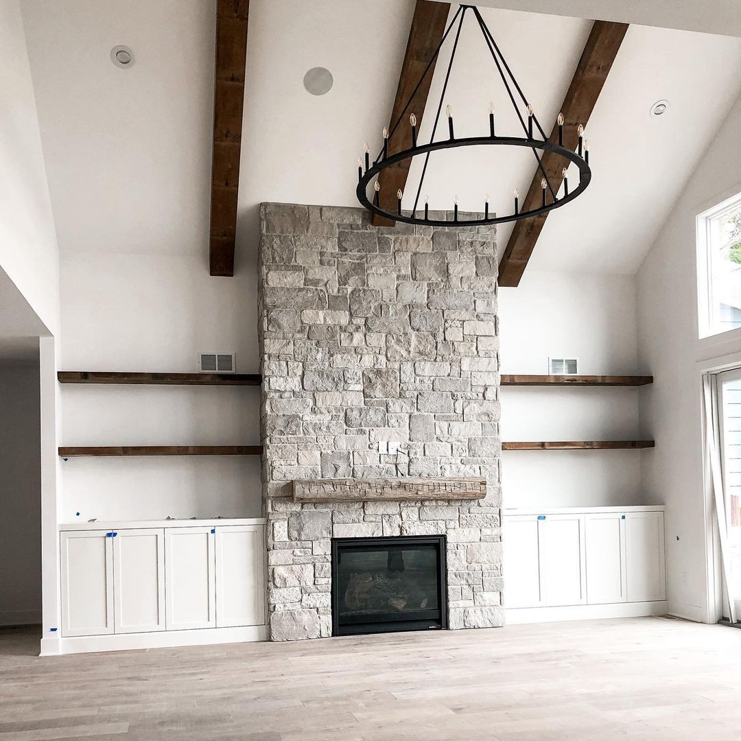
Benjamin Moore Seapearl on Walls
Seapearl appears bright and cool when used on walls with direct lighting. You can see the contrast between this staircase’s grayish tone and the crisp white trim. It gives the wall a clean and simple look, perfect for a refined palette.
That’s why the interior designer used minimalist decorations and furniture to complement the wall.
Benjamin Moore Seapearl in the Living Room
When it comes to using Benjamin Moore Seapearl in the living room, there are two factors to consider: Lighting and Palette. This is the best room to explore bold colors and daring palettes like Analogous and Triadic.
You can use Seapearl on your walls and add colors with throw pillows, carpets, settees, and more accessories.
Secondly, as you’ve learned earlier, you can use lighting to create your preferred mood. In this living room, the homeowner prioritized warmth and made the vibe with yellow lighting.
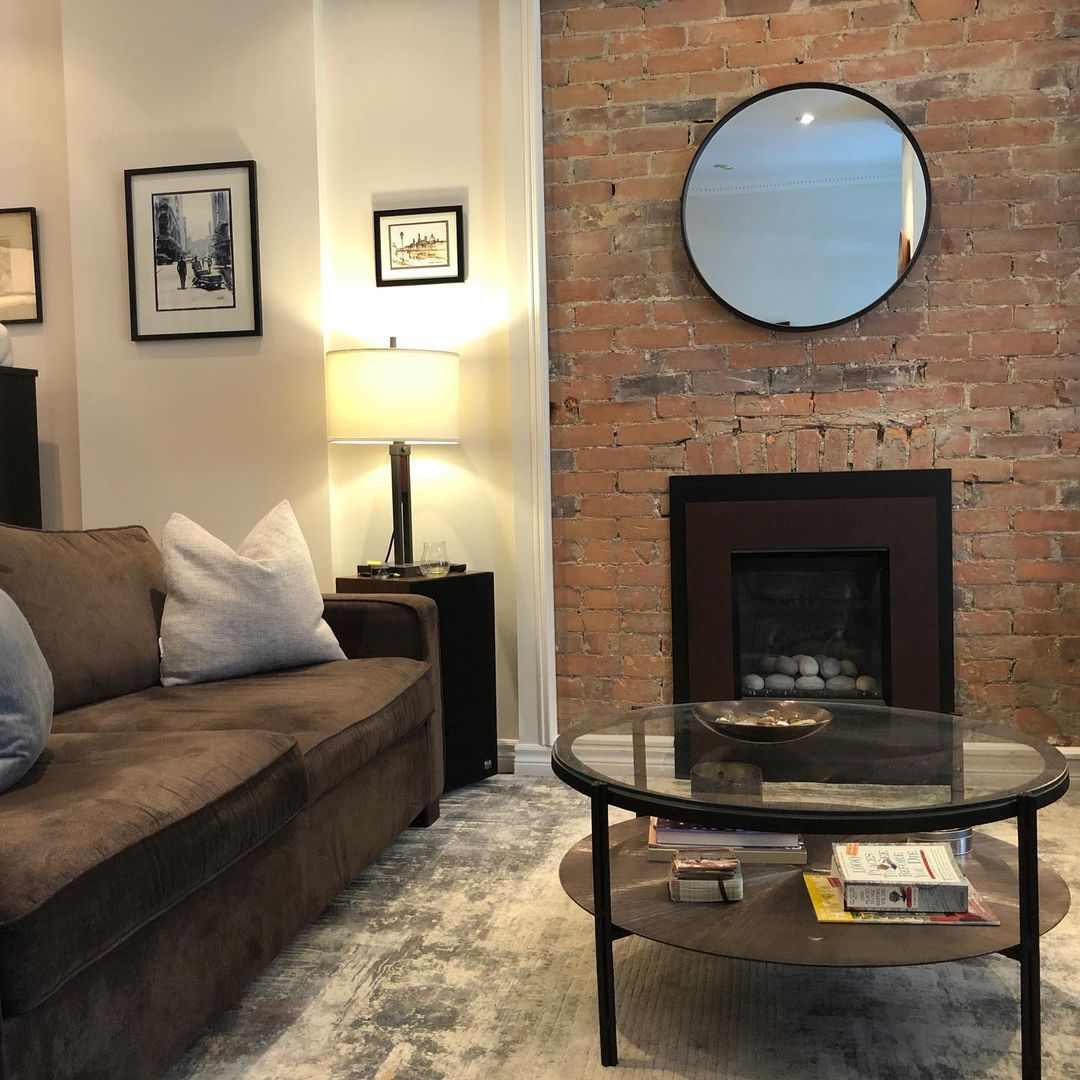
Meanwhile, the designer used large windows and glass doors in this living room to direct sunlight to the Seapearl walls. The gray undertones became more obvious compared to the whiter rugs and trims.
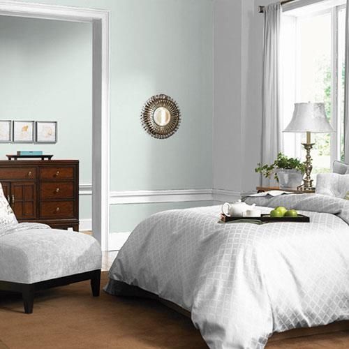
Benjamin Moore Seapearl in the Bedroom
It’s harder to highlight Seaperal in this bedroom because of the overwhelming presence of pure white beddings and side panels. But if you look at the wall behind the side table and flower vase, you’ll notice it’s darker than the rest of the paneling.
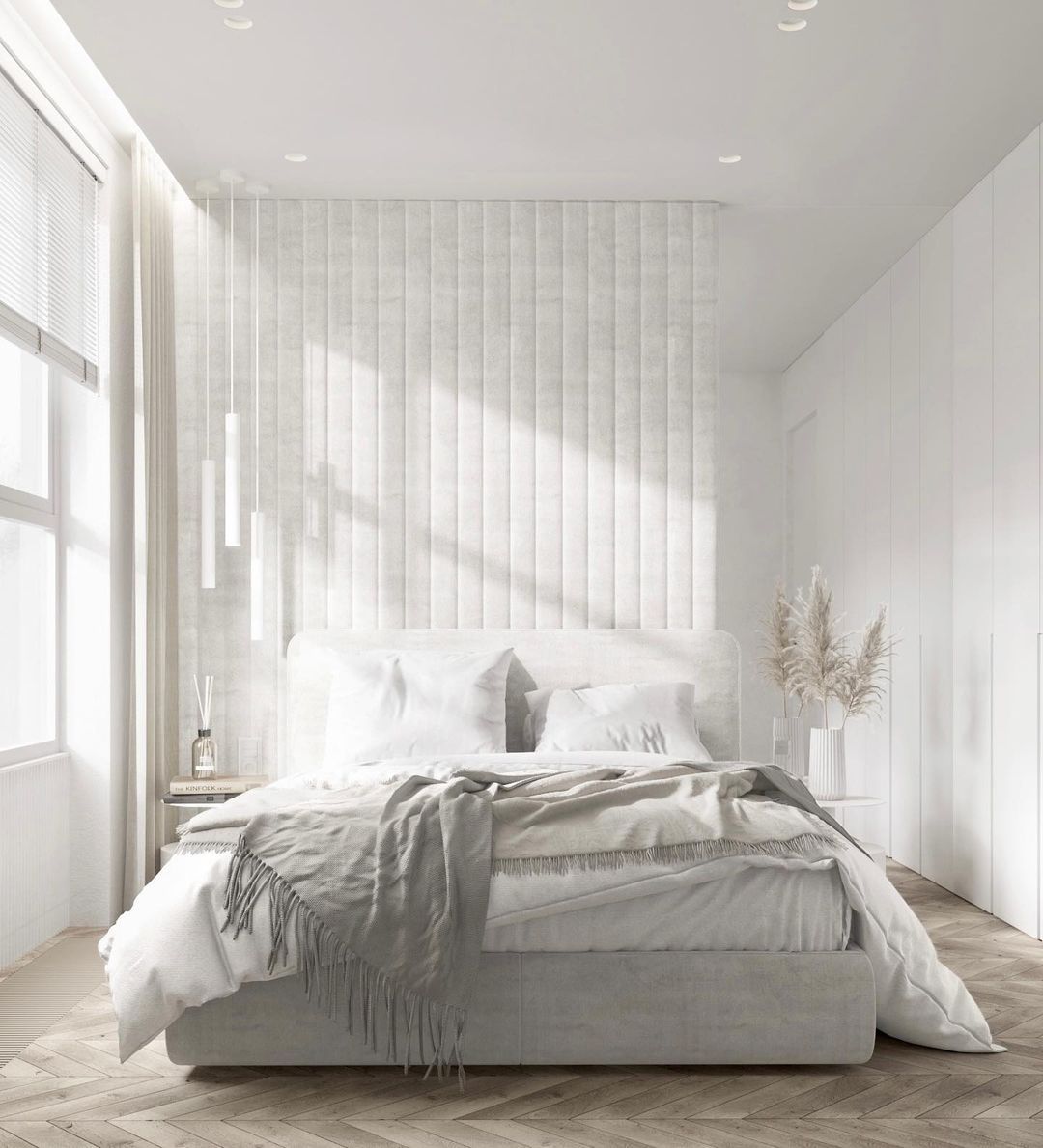
This is only one bedroom and there are many more ways to add Seapearl in your resting space.
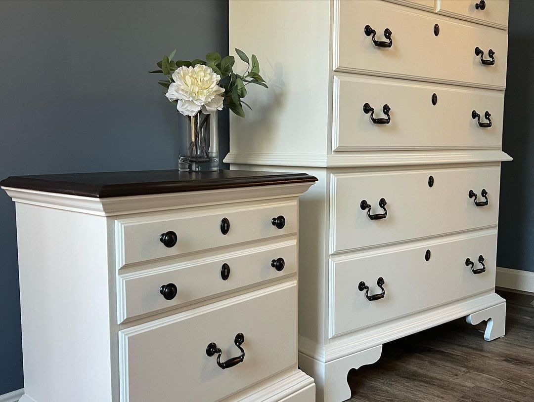
Benjamin Moore Seapearl as an Accent
Accents can be walls or furniture; in this review, I’ll focus on the latter. I like furniture accents because they’re removable. That allows the homeowner to switch up the interior color palette at will.
This dark gray and Seapearl combo is fitting for a monochrome and coordinating palette. If it wasn’t on a shelf, you could use this grayish-white paint on an adjacent wall, and it would still work.
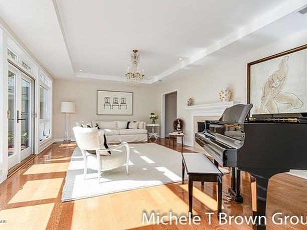
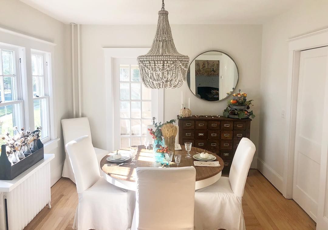
Benjamin Moore Seapearl in the Dining Room
Coziness in the dining room is always my priority, so how can you make it work with Seapearl? Lighting is the cheat code.
Seapearl on the walls looks very bright because of the sunlight entering from the French windows and doors. If not for the chocolate brown cabinet in the corner, I’d tag this theme as modernist.
But the combination of the roundtable, chandelier, and classic doors seals this dining room as a traditional 1940s – 1950s design. So, it’s safe to say Seapearl appeals to classic and traditional interior decor.
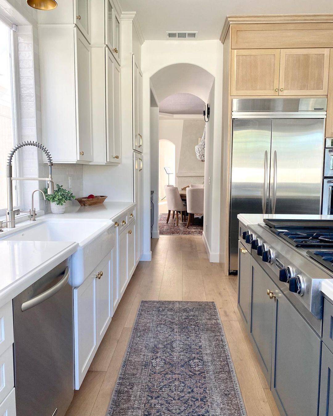
Benjamin Moore Seapearl on Cabinets
I briefly touched on cabinets earlier, but it’s time to shed more light on how to use them with Seapearl coloring. If you want your kitchen to retain a homely aura with a slightly modern touch, using Seapearl cabinets is a good option.
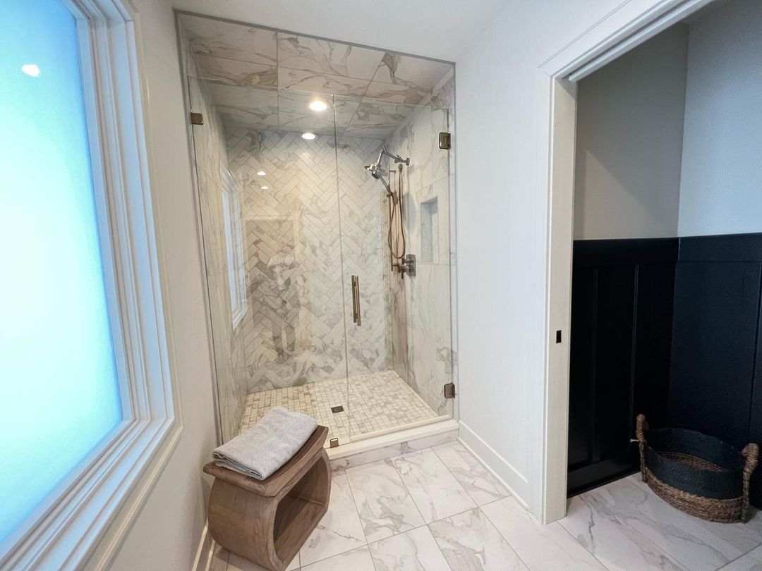
Benjamin Moore Seapearl in the Bathroom
I love an obviously chilled bathroom where I can relax after a long work day. So I didn’t think Seapearl would shine in this space. But imagine my surprise to realize this mute doesn’t fade into the background just because it’s a bathroom.
The key, however, is the bathroom’s design. I noticed that Seapearl bathrooms are modern with a touch of deep-toned colors to add a mysterious aura to its sophisticated space.
Benjamin Moore Seapearl on Furniture
If you want to give your furniture a facelift and maintain its character, I believe Seapearl is an ideal choice. Painting this in-built cabinet Seapearl gives this living room a dual vibe.
There’s a nod to the classical era without ignoring the modern fusion of neutral light colors and large windows.
Benjamin Moore Seapearl on Exteriors
First take a look at this beautiful transformation before I gosh about Seapearl on exteriors.
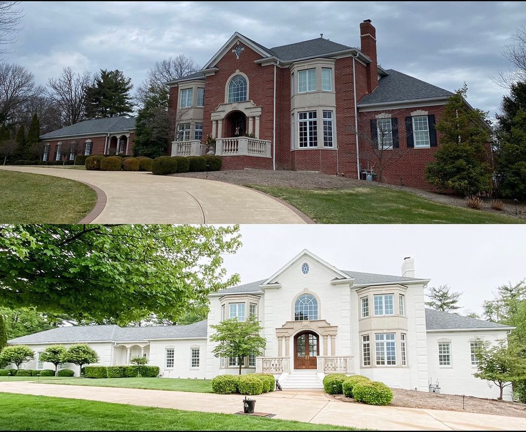
You can see how Seapearl on the walls changed this old Stonehouse into a modern mansion. I believe this is my winner for places to use Benjamin Moore Seapearl. The elegance speaks for itself.
Conclusion
I don’t quite fancy Seapearl because of its muted and cool gray undertone. I find the combination boring, but that doesn’t mean it’s not the one for you. If you love minimalist themes and traditional interior and exterior decor, you’ll love Seapearl.
It’s an excellent exterior color because the walls will directly catch the sunlight. You can then witness its interaction with light from all positions throughout the day and enjoy the gray and off-white reflections.
 Sherwin Williams Rock Bottom (Palette, Coordinating & Inspirations)
 Sherwin Williams Steamed Milk (Palette, Coordinating & Inspirations)
 Sherwin Williams Topsail (Palette, Coordinating & Inspirations)
 Sherwin Williams Anew Gray (Palette, Coordinating & Inspirations)
 Sherwin Williams Ice Cube (Palette, Coordinating & Inspirations)
 Sherwin Williams White Heron (Palette, Coordinating & Inspirations)
