
Picking paint colors sometimes feels like walking on pins and needles. You know that your decor is something you’ll have to live with if you get it wrong. Therefore, neutrals help you play it safe, especially with a unique combination like Benjamin Moore’s Quiet Moments.
You may have looked at this color and wondered how best to use it to fit your style. The good news is that Quiet Moments can perform well as a neutral paint color, allowing you to add other bolder and deeper colors. So, let’s explore Quiet Moments to learn more about it.
Table of Contents
When to Choose Benjamin Moore Quiet Moments
Quiet Moments doesn’t exactly look like a difficult color to use. It’s pretty, light, and neutral. So, you can always find room for it in your decor. However, if you feel stuck trying to decide, here are some ideas to consider.
Looking for a nuanced neutral background color?
Quiet Moments is a beautiful and careful mix of some of the colors we love. The result is a pale neutral that doesn’t lack color but can still act as the perfect background color if you don’t mind the nuances.
Unsure of your decor theme?
If you’re yet unsure of the theme of your decor, it is ideal to pick a color that works well with all decor styles. Neutrals fit into this category, but so do blues and greens in pastels. Quiet Moments allows you to fit these colors into your decor to accommodate your style.
Thinking of redoing your bathroom or bedroom?
Because of its peculiar and soft shade, Quiet Moments is one of the best colors to use in a bathroom or bedroom. It brings a soft tranquility to the space and brightens rooms without a lot of natural light, like bathrooms.
This paint color is versatile, and there’s a lot you can do with it. But before you start painting, I have other aspects of Quiet Moments to show you. They are crucial to understanding how best to work the color into a color scheme or use it with other colors.
What Color Is Quiet Moments?
If you have ever imagined that peace and quietness were a person or thing, you may have a specific picture in mind. That deep sense of calm that comes with the right decor and style is what Quiet Moments represents, and the best part is that it’s not a fussy color.
Benjamin Moore’s Quiet Moments 1563 is a light shade of blue-gray with a hint of green. It reminds you of the peaceful waters of the sea and white sands on the beach on a particularly bright and mildly warm day.
A Snapshot of the Specifications of Benjamin Moore Quiet Moments
Although there are a lot of aspects of this paint color to learn about, I want to break down the key ones to make them easy to refer to when necessary, and I’ve done that using a chart. Let’s take a look.
| Benjamin Moore Quiet Moments | |
| RGB | 199, 207, 200 |
| LRV | 60.73 |
| Undertone | Green |
| HEX Code | #C7CFC8 |
The LRV of Benjamin Moore Quiet Moments
Certain terminologies of paint colors make them easy to identify and use without seeing them. One such terminology is LRV, which means the light reflectance value of color. It indicates how much light the color reflects on a scale of 0 to 100.
White has an LRV of 100, while black has an LRV of 0. So, the brighter the color is, the higher the LRV and the darker the color is, the lower the LRV.
However, paint colors are a little different because of their design. No paint color is without another hue under it since all colors have a bit of red, green, and blue (RGB). Therefore, the scale for paint colors is 2.5 to 94.
Benjamin Moore’s Quiet Moments has an LRV of 60.73, a decent value that reflects a fair amount of light. It means you can use this color in a room without a lot of light, and it won’t appear dull or too muted.
The Undertones of Benjamin Moore Quiet Moments
Undertones are crucial to how much you like or dislike any paint color. They can change with different lighting conditions, which can significantly affect the paint colors when dried on the walls.
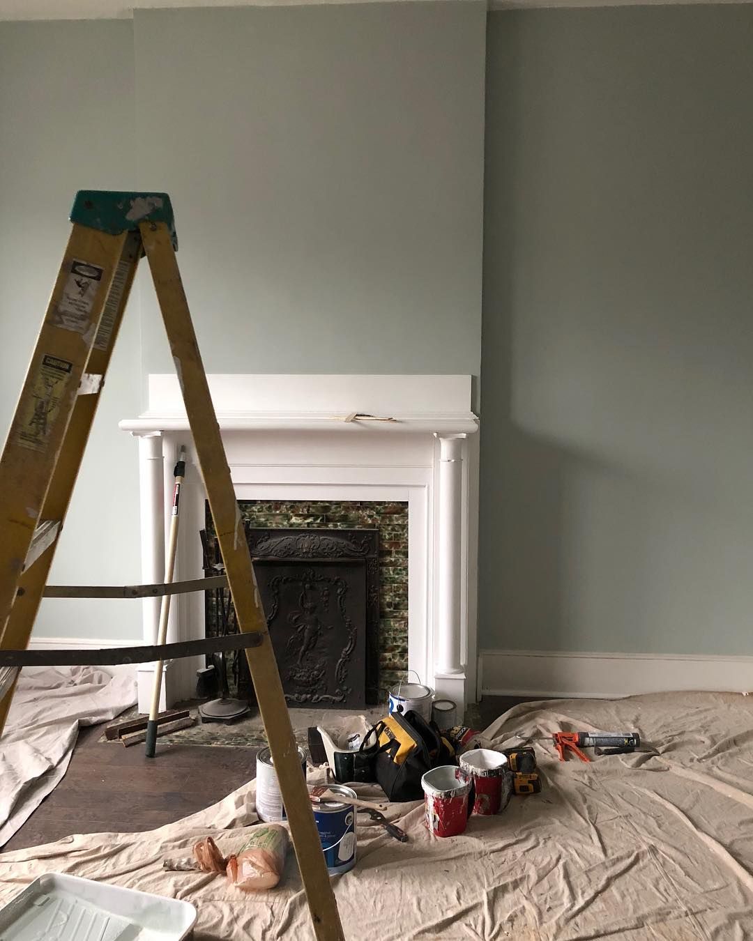
Quiet Moments is a mixture of gray, blue, and green, so it’s not easy to tell which is the undertone. But by looking at it, you can easily see the blue and gray, so it’s safe to say the undertone is green. However, you’re not wrong to say it has a gray undertone or simply a mix of these colors.
Quiet Moments looks more blue-gray than green-blue-gray in this photo.
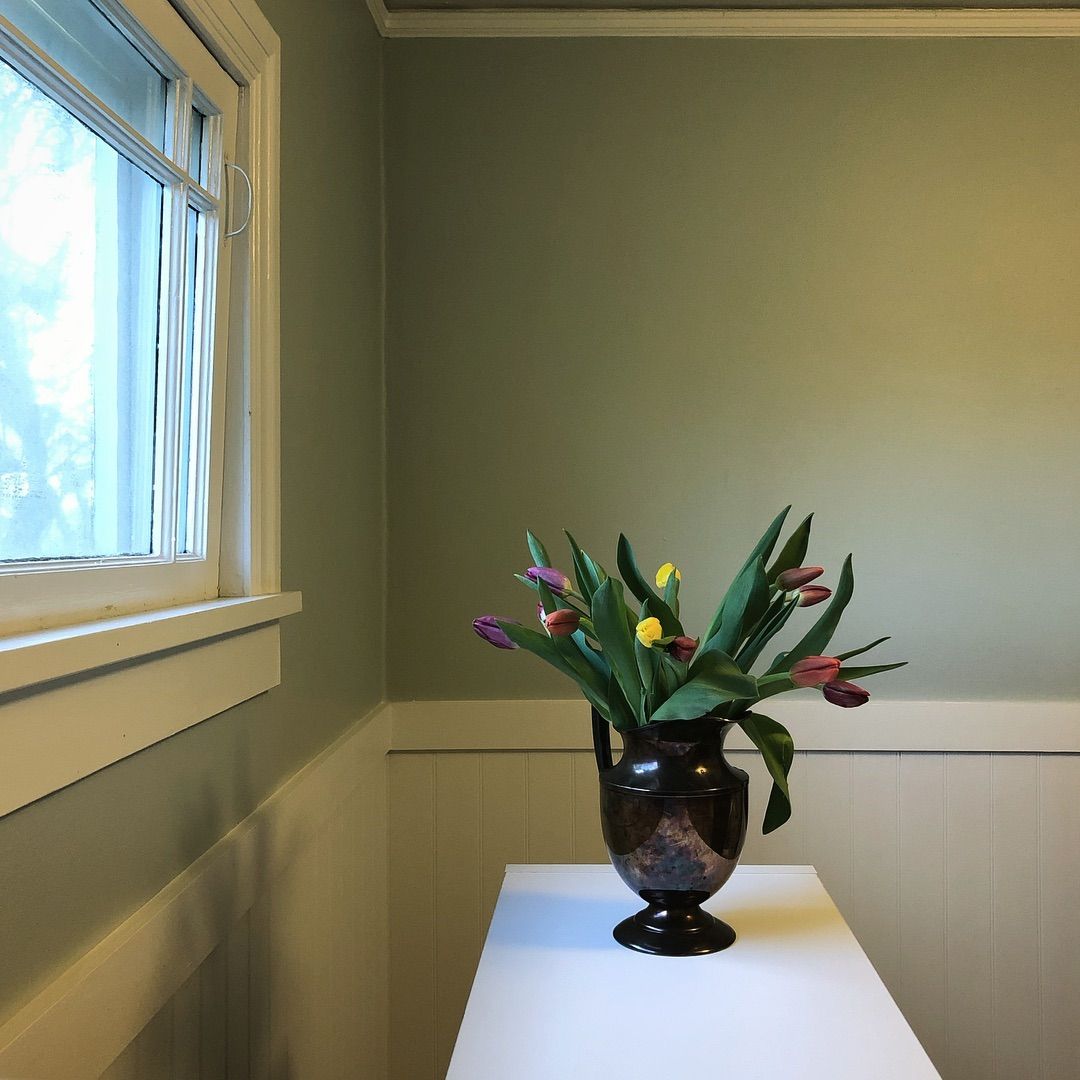
But you can see more of the green in the paint color in this next photo, so the color looks blue-green with just a dash of gray.
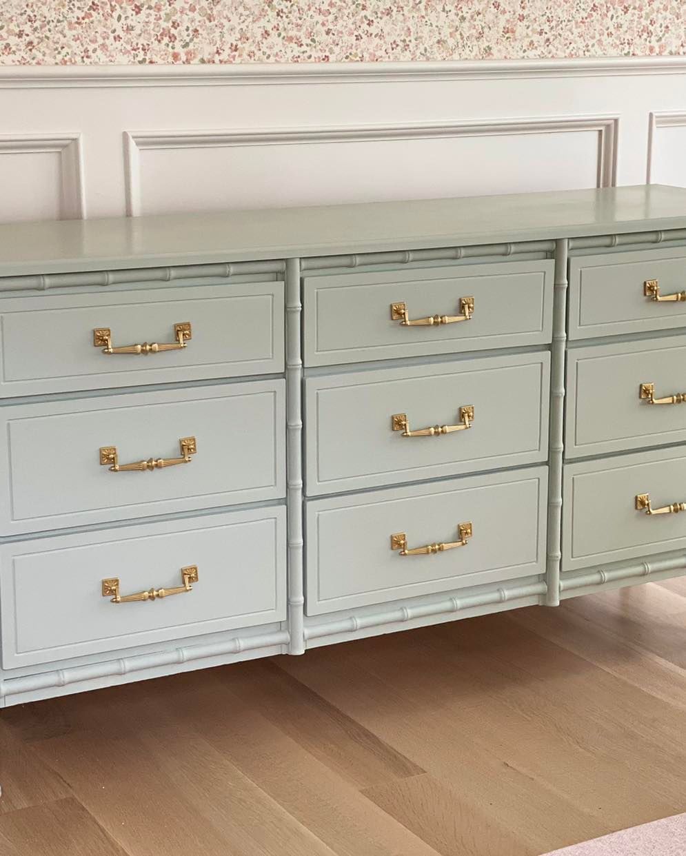
Here, you can see that the color is a perfect mix of all three, giving the room a coastal look.
Does Lighting Play a Role in How Quiet Moments Appear?
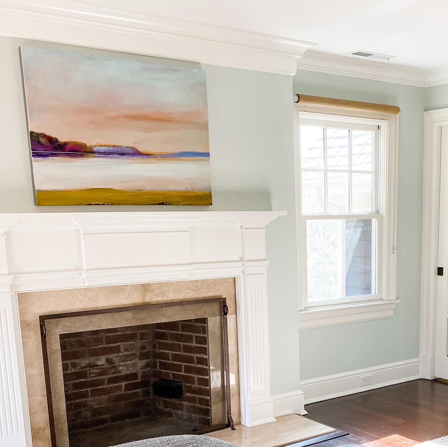
The lighting you use in a room painted with Quiet Moments will determine the result you see. Quiet Moments is hugely influenced by the lighting and surrounding elements such as colors. If the lighting is low or cool, like in a north-facing room, it may show more of its gray side.
In warm lighting, the color may look slightly different. Because it has green in it, Quiet Moments may reveal just a little yellow, but most of it is the result of the lighting. Here’s a look at what I mean.
And in bright natural lighting, whether warm or cool, Quiet Moments tends to look its best.
How Does Quiet Moments Feel in a Room?
Just like the name suggests, Quiet Moments feels quiet and peaceful in a room. Most light blue-green paint colors have the same effect, but the gray in Quiet Moments keeps it from being loud or too vibrant. The mixture produces a color that makes you feel as if you’re on a peaceful beach.
Benjamin Moore Quiet Moments: Warm or Cool?
Quiet Moments is a cool color because of the blue in it. Blue is typically a cool color, but green and gray can lean warm or cool. This cool tone is what makes the paint color have a fresh, quiet, and calming vibe. That’s part of the reason it is a favorite bathroom and bedroom paint color.
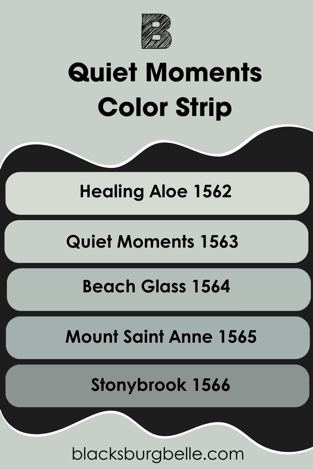
Benjamin Moore Quiet Moments Color Strip: Lighter to Darker Exploration
I’ve carefully picked other colors from the same strip as Quiet Moments to give you options if you find the main color too light or not exactly what you want. The following are the options arranged from light to dark.
- Benjamin Moore Healing Aloe 1562
- Benjamin Moore Quiet Moments 1563
- Benjamin Moore Beach Glass 1564
- Benjamin Moore Mount Saint Anne 1565
- Benjamin Moore Stonybrook 1566
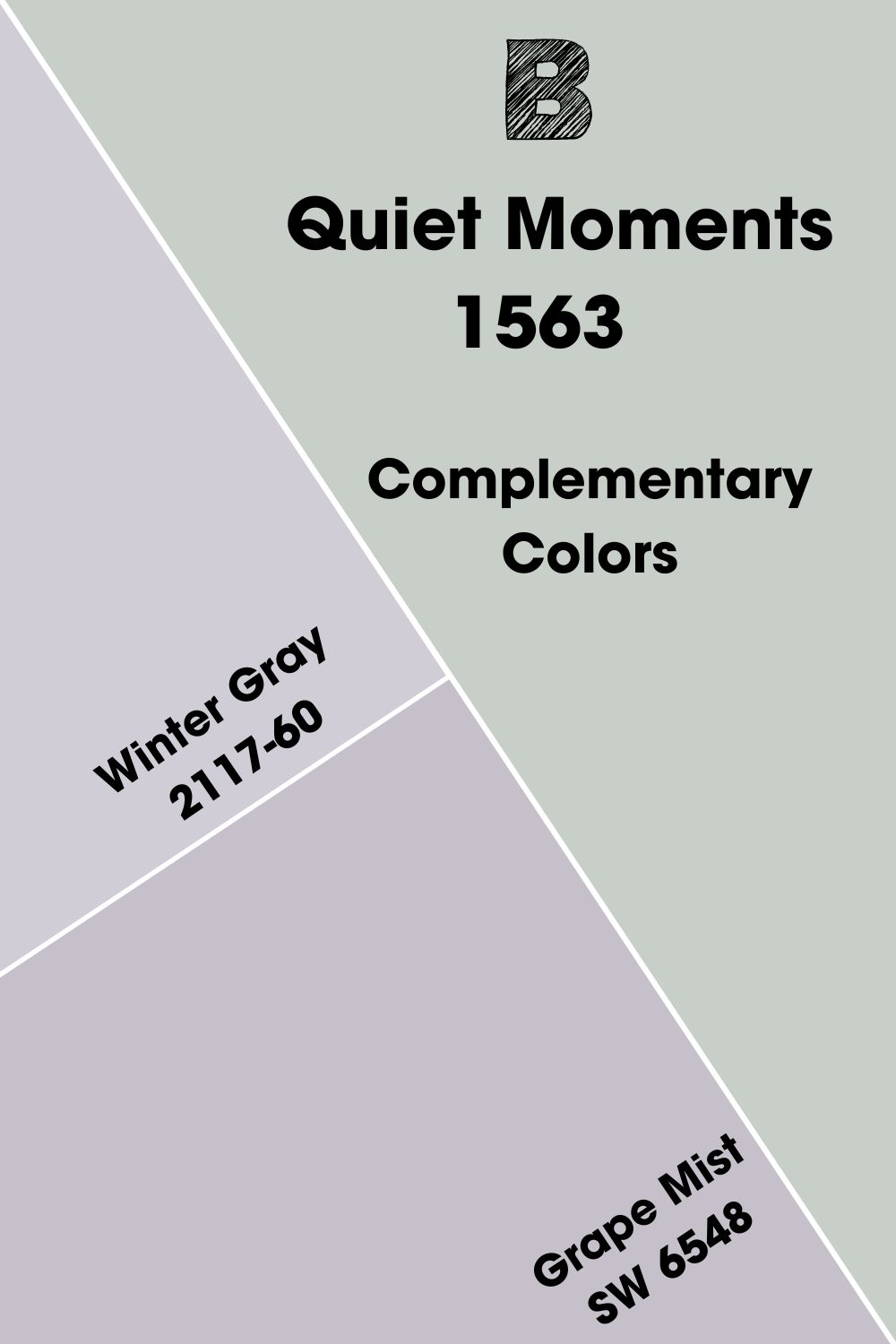
Benjamin Moore Quiet Moments Complementary Color
When you look at the color wheel, you’ll notice that the colors are arranged in a specific way. Those opposite each other are complementary, and they cancel each other when mixed to produce a grayscale color such as gray, white, or black. Examples include blue and orange.
Quiet Moments is a mixture of different colors, so you’re not likely to find it on the color wheel. However, you can locate its complementary color, which is a lavender-gray shade. Benjamin Moore’s Winter Gray 2117-60 is close to it, and so is Sherwin Williams Grape Mist SW 6548.
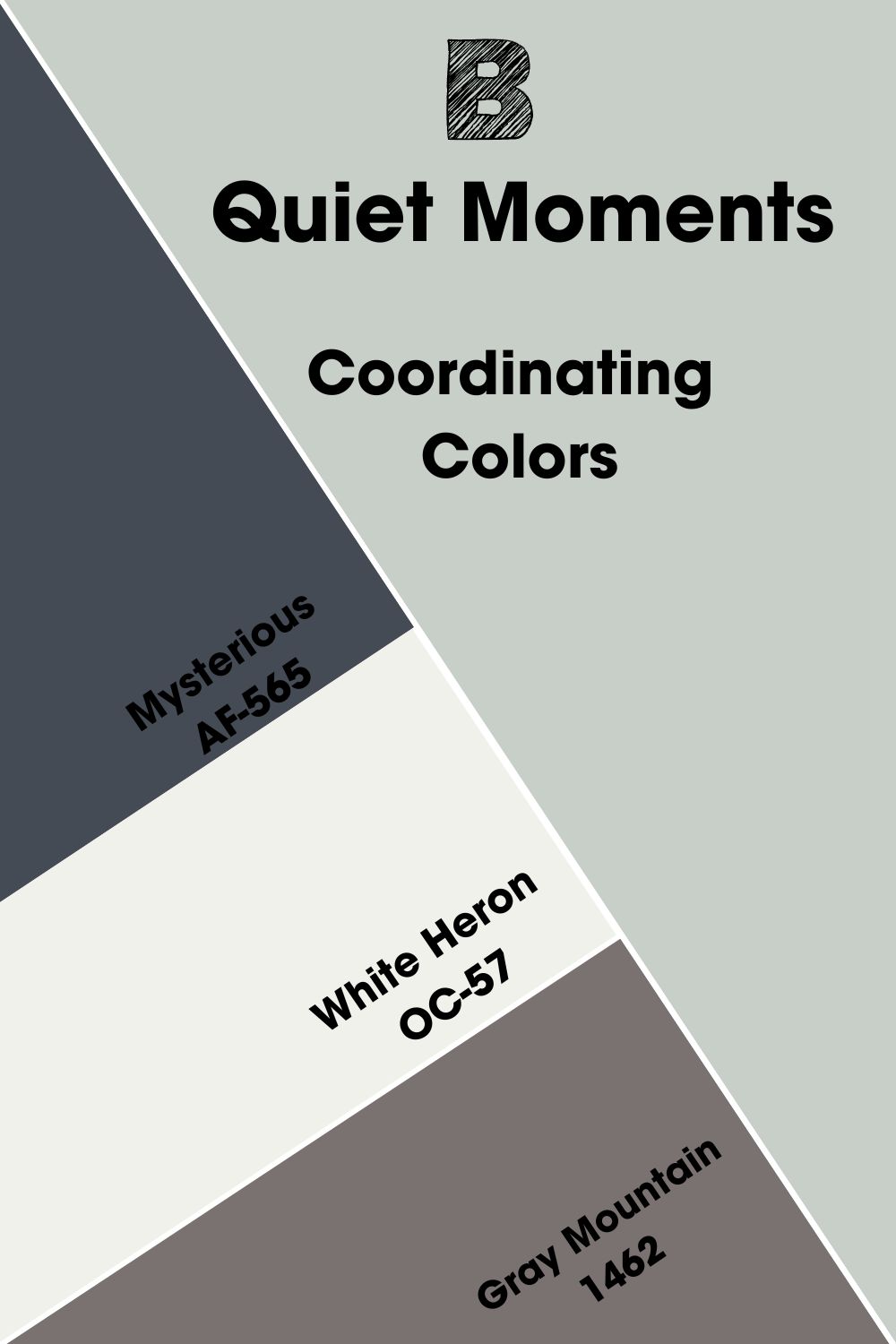
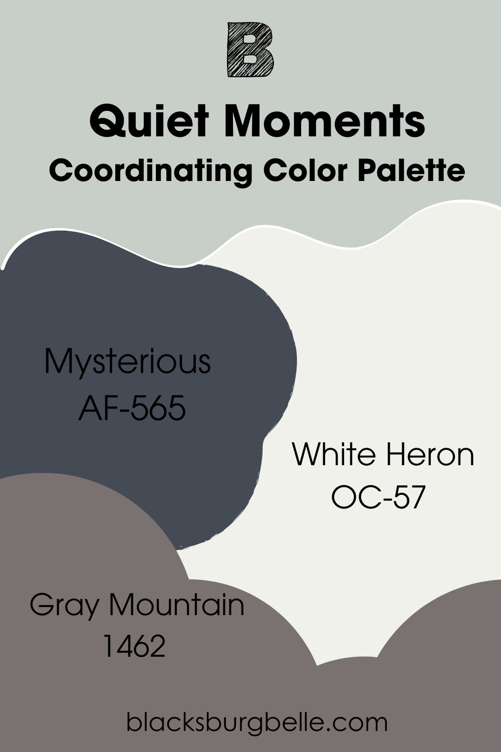
Benjamin Moore Quiet Moments Coordinating Colors
These colors pair well with Quiet Moments in a color scheme, although they may not have any similarities at face value. Their easy and pleasing flow usually points to how similar they are. Quiet Moments has several coordinating colors, including Mysterious, White Heron, and Gray Mountain.
- Benjamin Moore Mysterious AF-565: A deep denim blue paint color with a hint of gray that can act as navy blue or black to complement Quiet Moments.
- Benjamin Moore White Heron OC-57: One of the brightest white paint colors from Benjamin Moore and has a slightly cool cast to match the cool Quiet Moments as a trim color.
- Benjamin Moore Gray Mountain 1462: A dark gray with a brown undertone that fills it to give it a unique shade.
Benjamin Moore Quiet Moments Color Palettes
Let’s explore some color palette possibilities for Quiet Moments. You may be surprised at what you find and like.
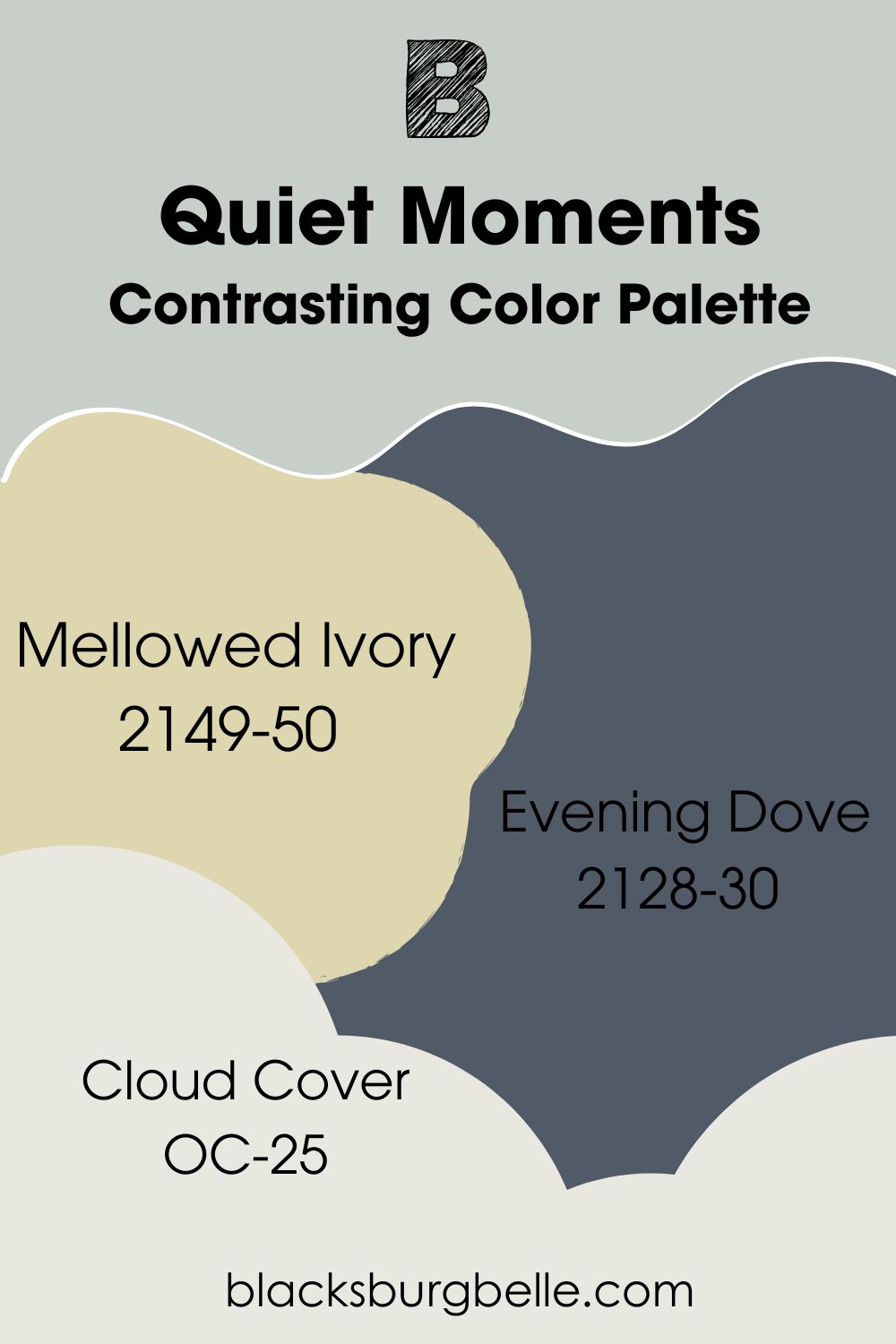
Contrasting Color Palette
- Mellowed Ivory 2149-50: A shade of beige whose yellow and gold undertones make it deeper and warmer than usual.
- Evening Dove 2128-30: A sophisticated blend of charcoal, black, and navy blue that makes the much lighter Quiet Moments pop with brightness.
- Cloud Cover OC-25: A little gray-blue in this bright white lends it a quiet elegance that matches the laid-back Quiet Moments.
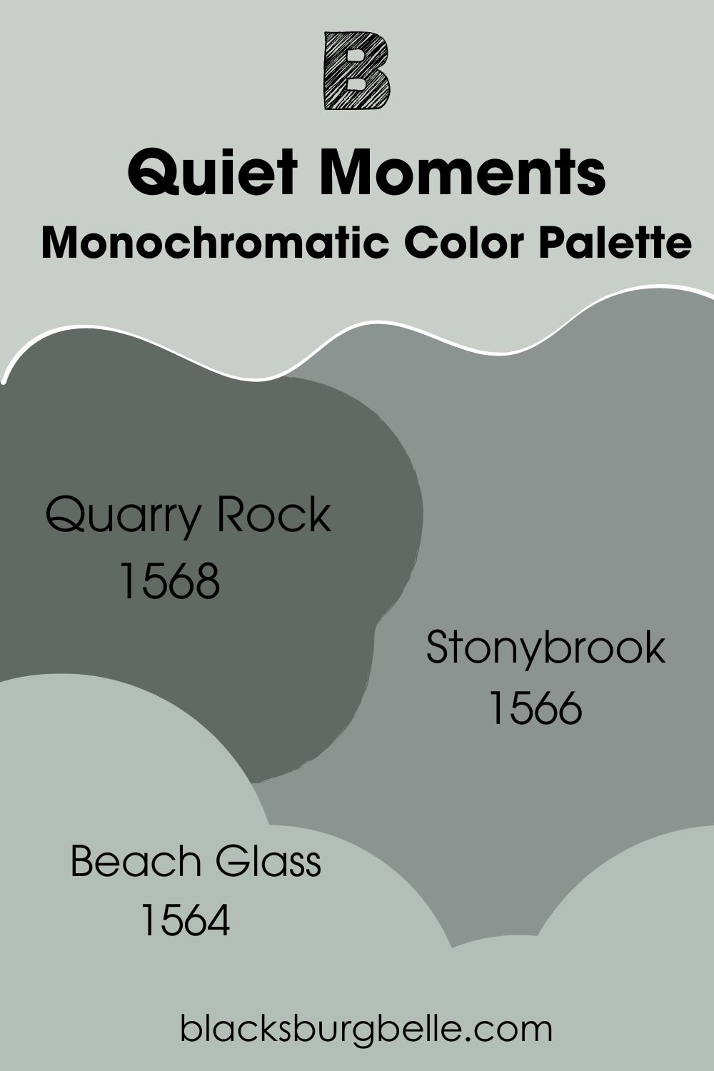
Monochromatic Color Palette
- Quarry Rock 1568: A dark green paint color with a hint of gray that adds a bit of mystery to the decor.
- Stonybrook 1566: A beautiful mix of gray, blue, and green that is a darker shade of Quiet Moments for something different.
- Beach Glass 1564: A popular blue-green paint color with a gray undertone that grounds and makes it calm.
Coordinating Color Palette
- Mysterious AF-565: A deep denim blue paint color with a hint of gray that can act as navy blue or black to complement Quiet Moments.
- White Heron OC-57: One of the brightest white paint colors from Benjamin Moore and has a slightly cool cast to match the cool Quiet Moments as a trim color.
- Gray Mountain 1462: A dark gray with a brown undertone that fills it to give it a unique shade.
Benjamin Moore Quiet Moments vs Similar Colors
How does BM Quiet Moments compare to similar colors? You’d be surprised to learn the differences between them, even though they appear to look almost the same.
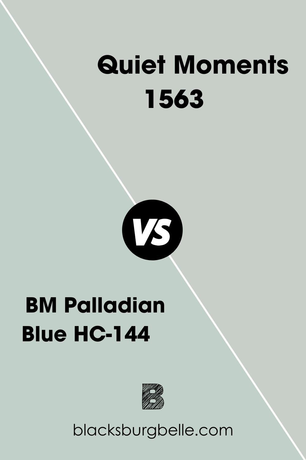
BM Palladian Blue vs BM Quiet Moments
Palladian Blue contains less gray than Quiet Moments, which makes it bluer than the color under review. It also has a slightly higher LRV of over 61, making it brighter than Quiet Moments.
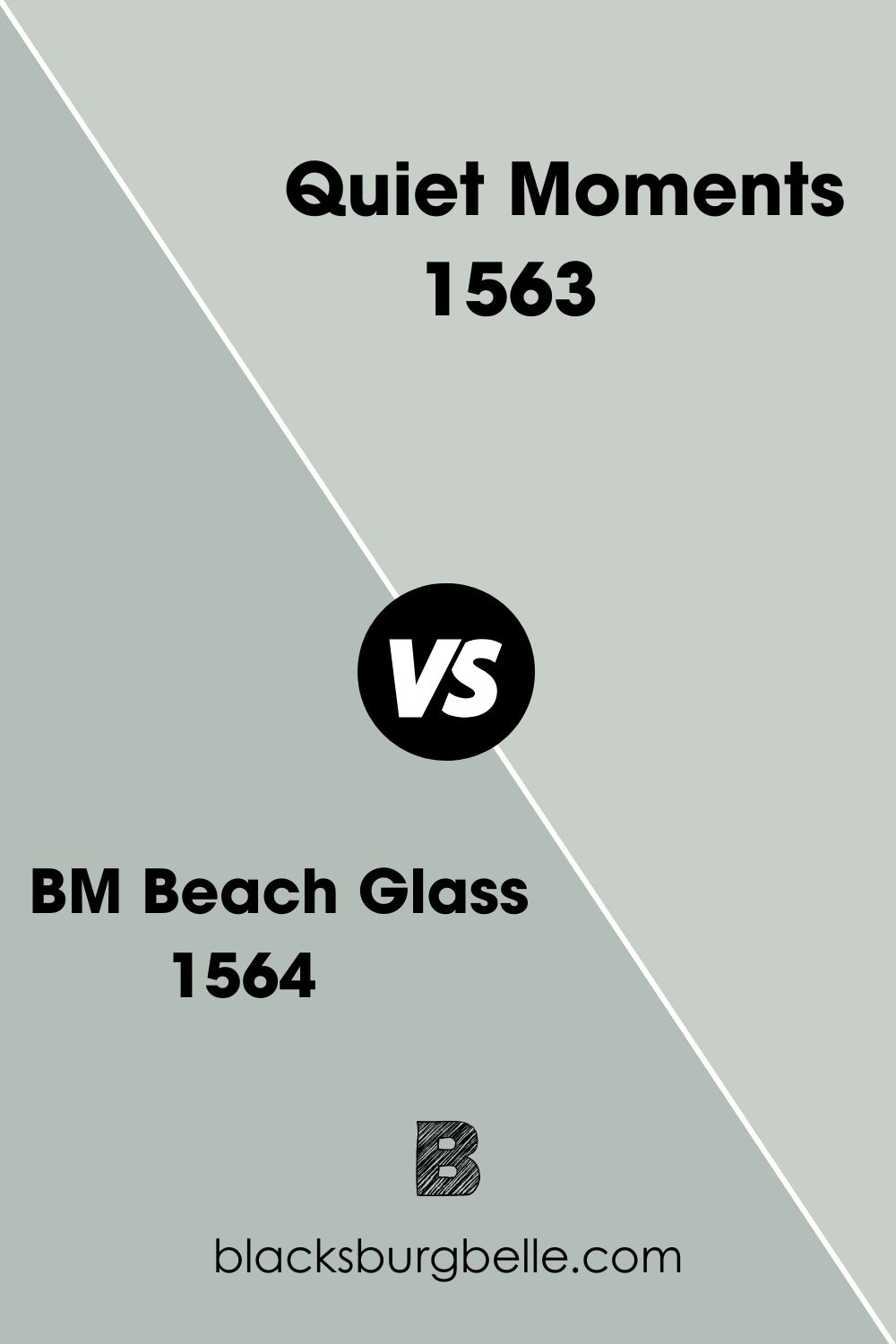
BM Beach Glass vs BM Quiet Moments
Beach Glass is a more saturated version of Quiet Moments and has a lower LRV of 49.17. The paint color appears to have more blue and green than gray.
BM Tranquility vs BM Quiet Moments
Tranquility is another color that is similar to Quiet Moments but looks more gray-green than gray-blue. It also doesn’t reflect as much light as Quiet Moments.
SW Sea Salt vs BM Quiet Moments
Sea Salt from Sherwin Williams is more gray-green than gray-blue and has a higher LRV of 63. So, while they look pretty much the same, Sea Salt is brighter.
BM Gray Wisp vs BM Quiet Moments
Both paint colors are pretty similar, but Gray Wisp is slightly darker with more green in it than Quiet Moments.
BM Healing Aloe vs BM Quiet Moments
Healing Aloe is a considerably lighter version of Quiet Moments, with an LRV of 68.25. Apart from this difference, both colors look the same.
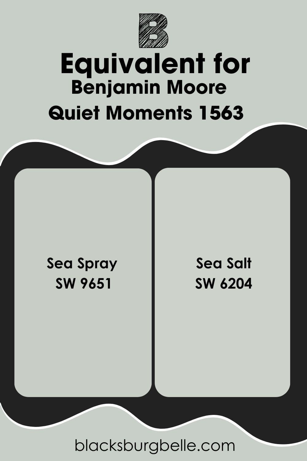
Sherwin Williams Paint Color Equivalent to BM Quiet Moments
Sea Spray SW 9651 is the closest equivalent Sherwin Williams paint color to Quiet Moments. Although there are subtle differences between their base colors, you can easily swap one for the other. The truth is that no two colors are the same; you can only find look-alikes. Sea Salt SW 6204 is also close to the Quiet Moments shade.
Where Can You Use Benjamin Moore Quiet Moments?
You can use Quiet Moments in any room you like, but it performs best in bathrooms and bedrooms because of its color. You may not easily find it on kitchen cabinets, but that’s not to say it doesn’t look on good them. Let’s see some examples.
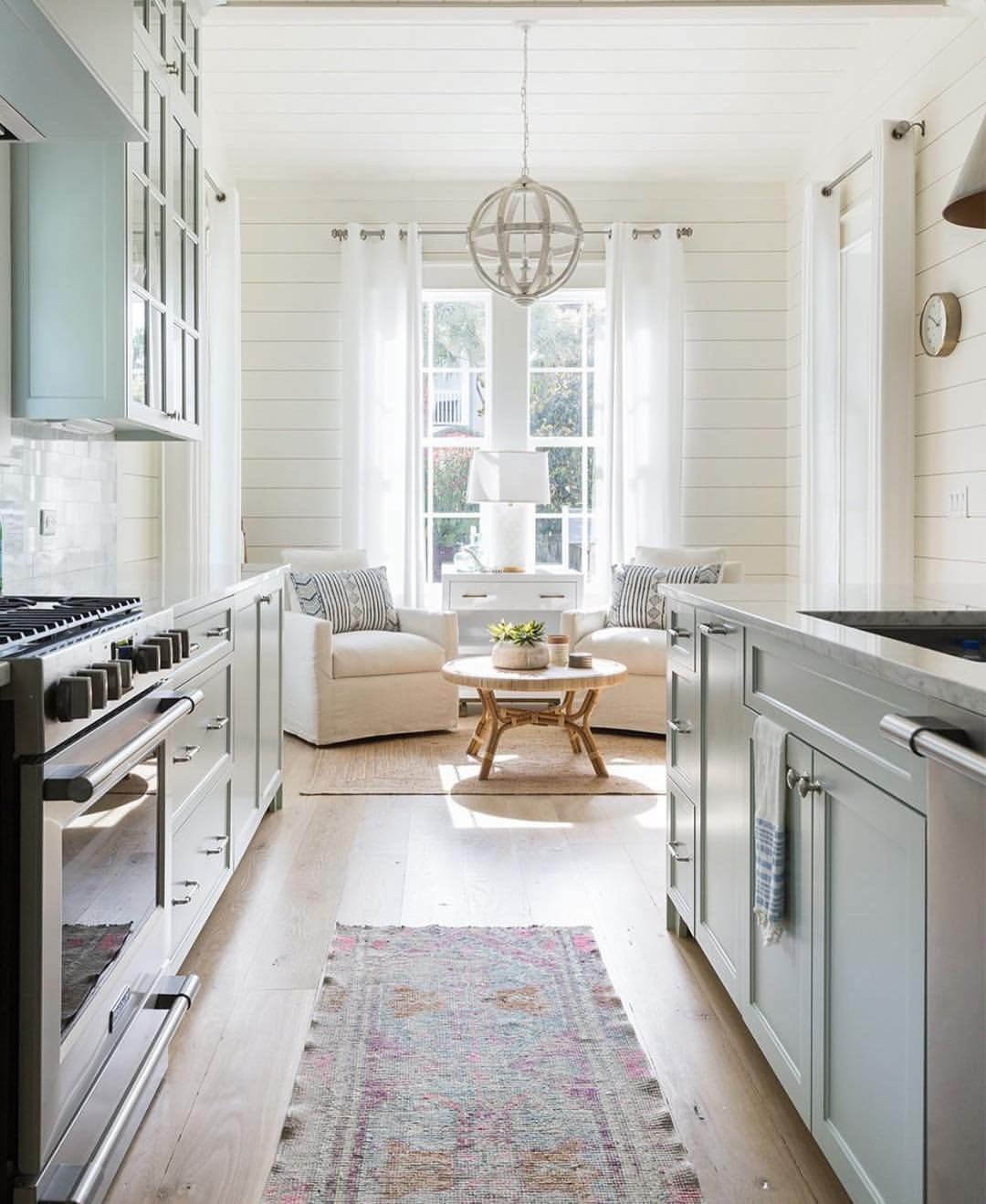
Benjamin Moore Quiet Moments on Kitchen Cabinets
This kitchen looks light and airy with Quiet Moments on the cabinets. The white walls help to create a coastal style, and the colors match the stainless steel range.
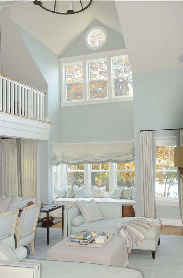
Benjamin Moore Quiet Moments in a Living Room
Quiet Moments is a soft color for a living room, but you can add wood tones, light neutrals, and splashes of bold colors to create versatility.
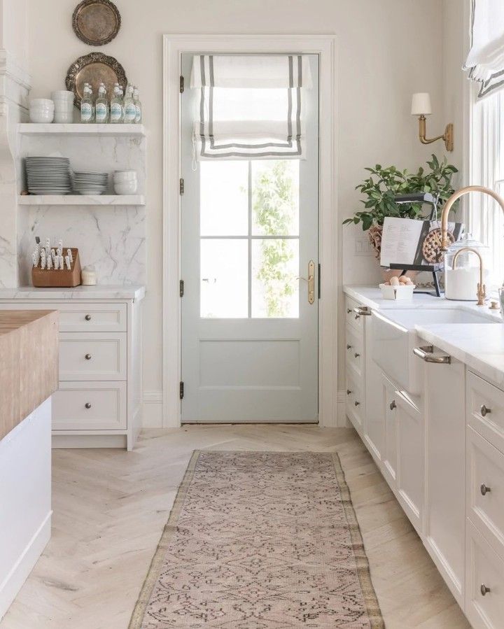
Benjamin Moore Quiet Moments on a Door
This paint color is ideal for interior doors, but it also works for a front door if you don’t mind a light and soft color.
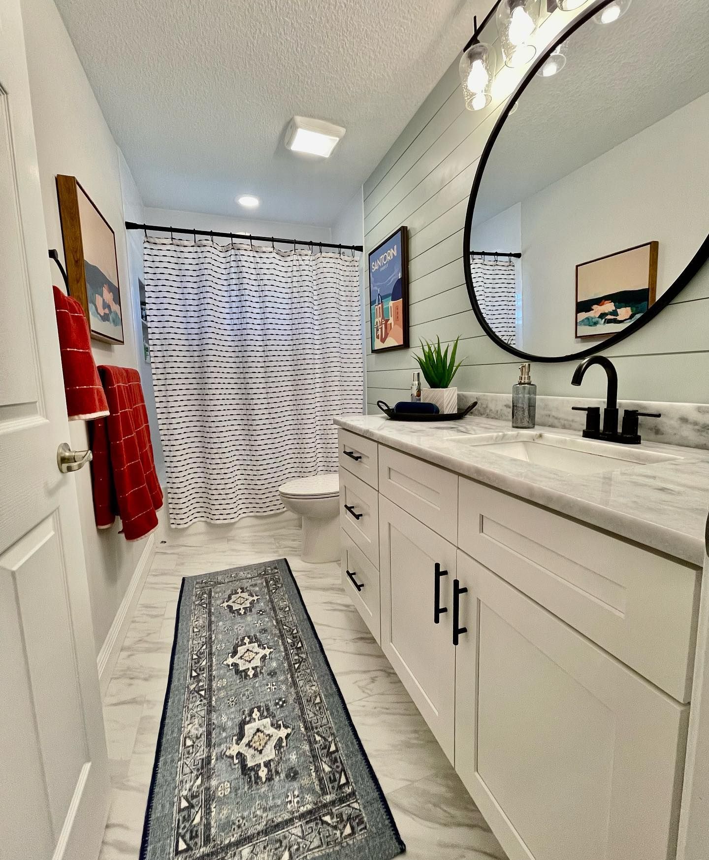
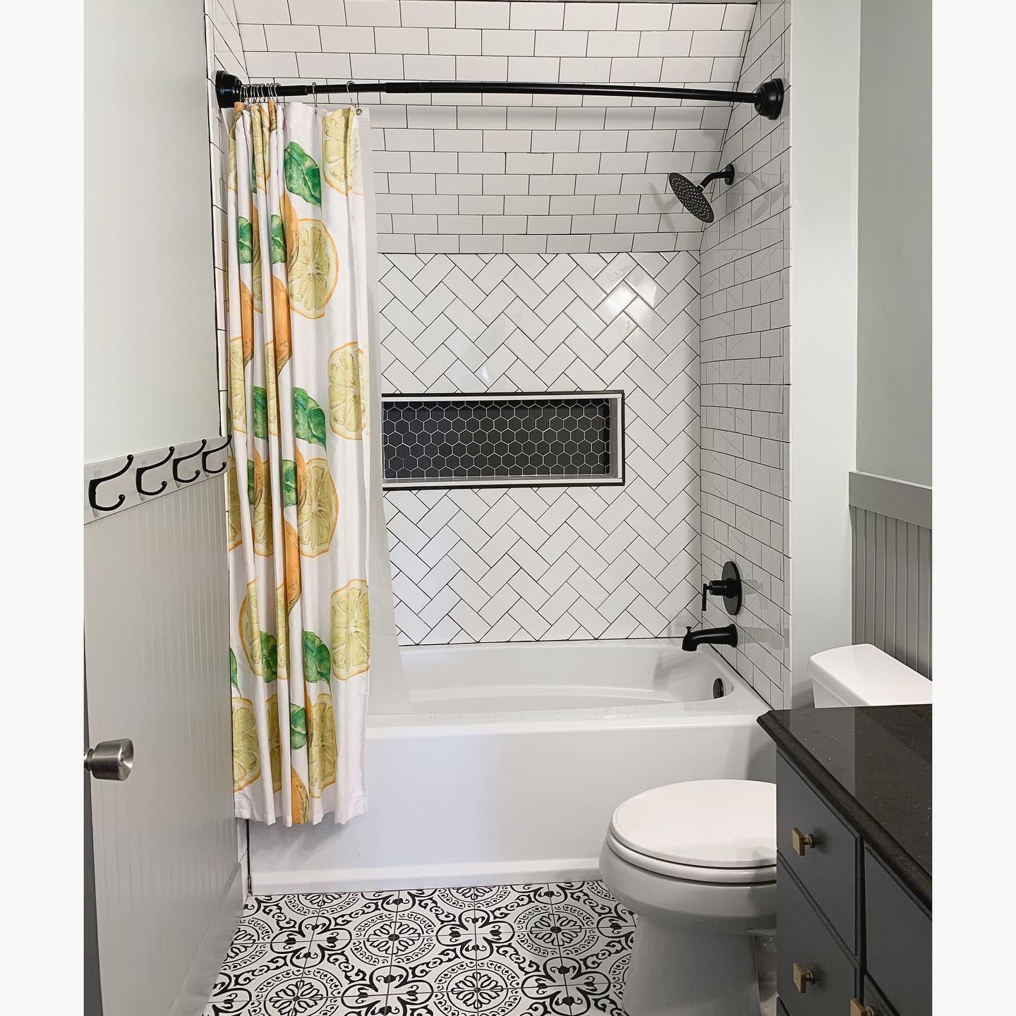
Benjamin Moore Quiet Moments in a Bathroom
As mentioned, Quiet Moments is one of the best paint colors to use in a bathroom. It brightens the room, considering you may have to use artificial light. Check out this bathroom for ideas.
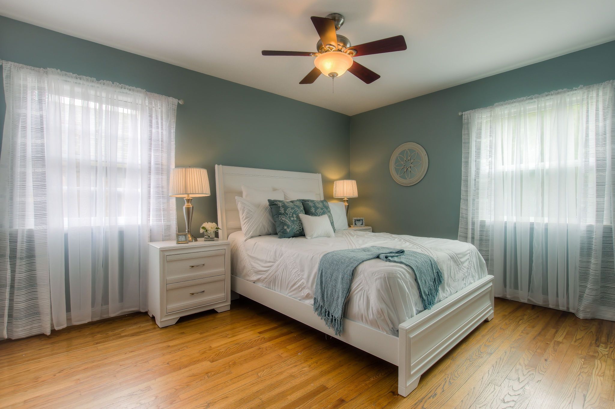
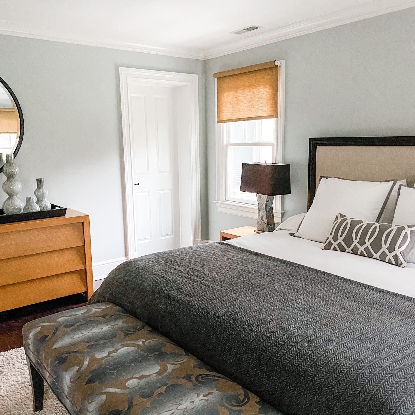
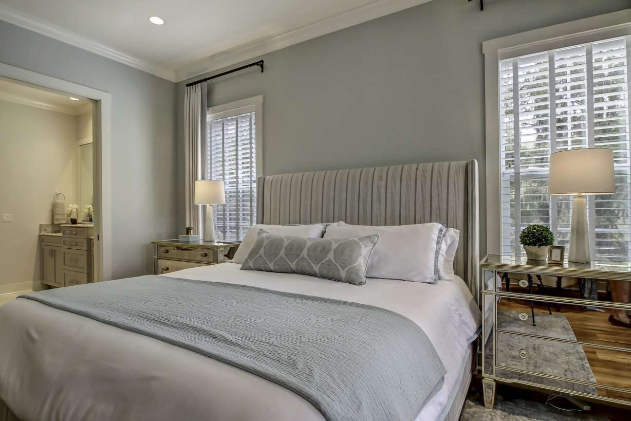
Benjamin Moore Quiet Moments in a Bedroom
Like in a bathroom, Quiet Moments brightens a bedroom, bringing tranquility that every bedroom needs to be a haven.
Best Trim Color for Benjamin Moore Quiet Moments Walls
I recommend white because it’s versatile and easy to use. However, if you want something different, consider dark gray or black. Benjamin Moore’s Trout Gray is on the trim.
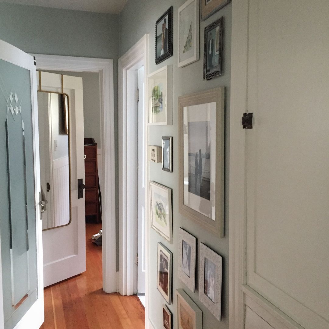
Benjamin Moore Quiet Moments in a Hallway
Because it’s a bright and soft color, Quiet Moments looks great in a hallway, whether or not there’s a lot of natural light.
Best Ceiling Color for Benjamin Moore Quiet Moments
White is the go-to color for the ceiling if the walls are done in Quiet Moments. This is especially true if the trim is white. Try BM Chantilly Lace since it has almost no undertones. That is not to say you can’t get creative and try a different ceiling color.
Conclusion
You’ve got to love blue-green-gray paint colors like Benjamin Moore’s Quiet Moments. It’s bright enough to hold up in a room without warm bright light, although it looks its best in bright natural light. How you use the paint color and the lighting determine the dominant color.
The name represents the color; it’s quiet, peaceful, and fresh. Try it in your bedroom, bathroom, or even a nursery. You can also use it on cabinets in your kitchen or a bathroom vanity. Quiet Moments works well with wood tones, light colors, and dark neutrals.
I know you’ve got a lot from this guide, especially when considering colors that match it. I’d love to see what you do with it and the color palettes you create. So, share your thoughts and decor styles with me in the comments section.
 Sherwin Williams Iron Ore (Palette, Coordinating & Inspirations)
 Sherwin Williams Caviar (Palette, Coordinating & Inspirations)
 Sherwin Williams On The Rocks (Palette, Coordinating & Inspirations)
 Sherwin Williams Essential Gray SW 6002: Paint Color Review
 Sherwin Williams Grizzle Gray SW 7068: Paint Color Review
 Benjamin Moore’s Wind’s Breath OC-24: Review & Inspiration
