
Are you in the market for the perfect white paint color with only a hint of warmth? Let’s compare Benjamin Moore’s Simply White vs Cloud White. You may find that one or both are ideal for your decor.
These two white paint colors are very popular in the paint world because of how well they perform on any wall. People also like them because of their brightness. However, they are so similar that it is usually difficult to tell them apart at just a glance.
So, how do you choose the better white paint color? There are a few differences between the two paint colors. The primary difference is in their light reflectivity: Simply White OC-117 is obviously whiter than Cloud White OC-130. Another difference is their undertones. Cloud White has slightly warmer undertones than Simply White.
Before I get ahead of myself, I want to show you some key pointers on when to use each paint color. This is because it can get confusing to determine the best time to pick one over the other.
Table of Contents
When to Use Benjamin Moore Simply White vs Cloud White
When is the best time to use Simply White instead of Cloud White? And when is it ideal to pick Cloud White over Simply White? Let me break it down for you in simple points.
Use Simply White if:
- You want a bright white that shows only a little yellow
- A warm white to brighten up the space is what you are looking for
- A white paint color to tie everything together is important to you
Use Cloud White if:
- A clearly warm white is your go-to option
- Yellow hues in white paint colors do not bother you
- You want a softly balanced white without too much starkness
It will amaze you how similar these paint colors are. Viewed apart from each other, you may conclude that they are the same color. But you clearly see the difference when you see them side by side. Simply White is, without a doubt, brighter and cleaner than Cloud White.
If you want a bright white that offers a bit of warmth and does not compromise color, pick Simply White. Cloud White is still a bright white, but it can look creamy or off-white when paired with whitey-whites like Chantilly Lace or even a brighter white like Simply White. So keep this in mind when deciding between the two.
Visually Exploring Benjamin Moore Simply White vs Cloud White
Individually looking at the paint colors should help you decide which is ideal for your specific needs. So, I want to show you a picture of the two white paint colors used in real-life occasions.
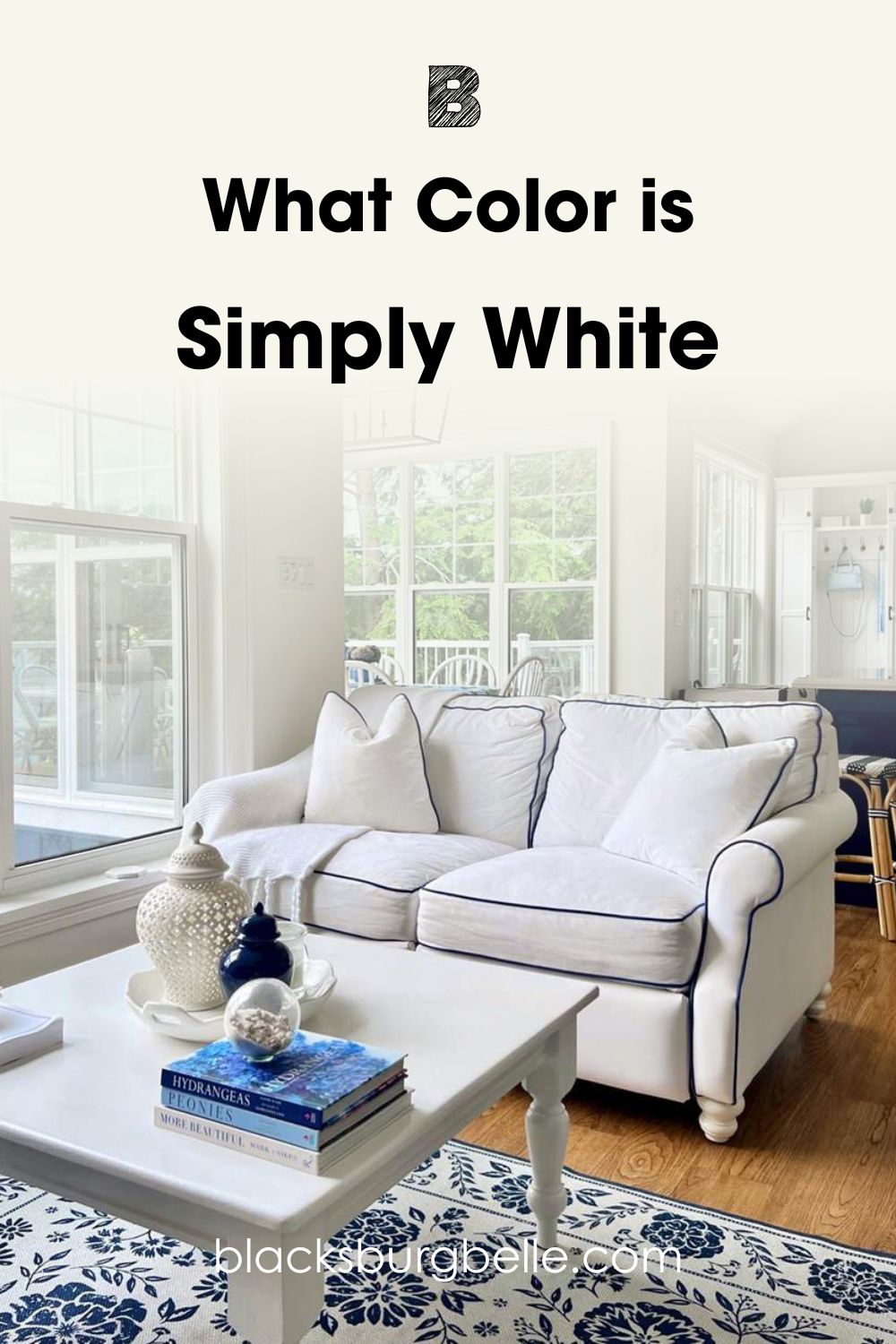
First, this is Simply White looking bright and white with just a hint of warmth:
Now, here is Cloud White looking even warmer in bright sunlight:

I deliberately picked pictures where both colors are displayed under natural lighting conditions. The bright lights show the warmth and hidden colors in each white paint color, and it is obvious that Cloud White is a little warmer than Simply White.
Both are clearly bright whites, evident by their LRVs – I will get to LRVs later in this guide. However, Cloud White is slightly creamier and more muted than Simply White. This is despite the fact that Simply White is exposed to more bright natural light in the picture above than Cloud White.
The next step is to briefly compare both paint colors using a chart. This should go a long way in taking you closer to deciding which is the better of the two.
A Swift Comparison: Benjamin Moore Simply White vs Cloud White
This chart details the basic attributes of these paint colors. They may be points that you are unaware of but are crucial in helping you differentiate between Simply White and Cloud White.
| Simply White | Cloud White | |
| RGB | 246, 246, 237 | 242, 241, 230 |
| LRV | 89.52 | 85.05 |
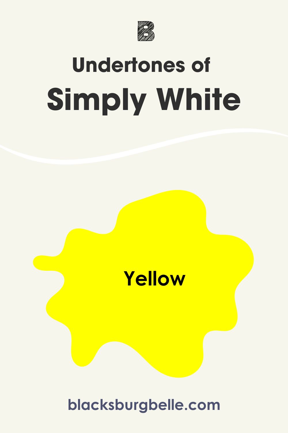
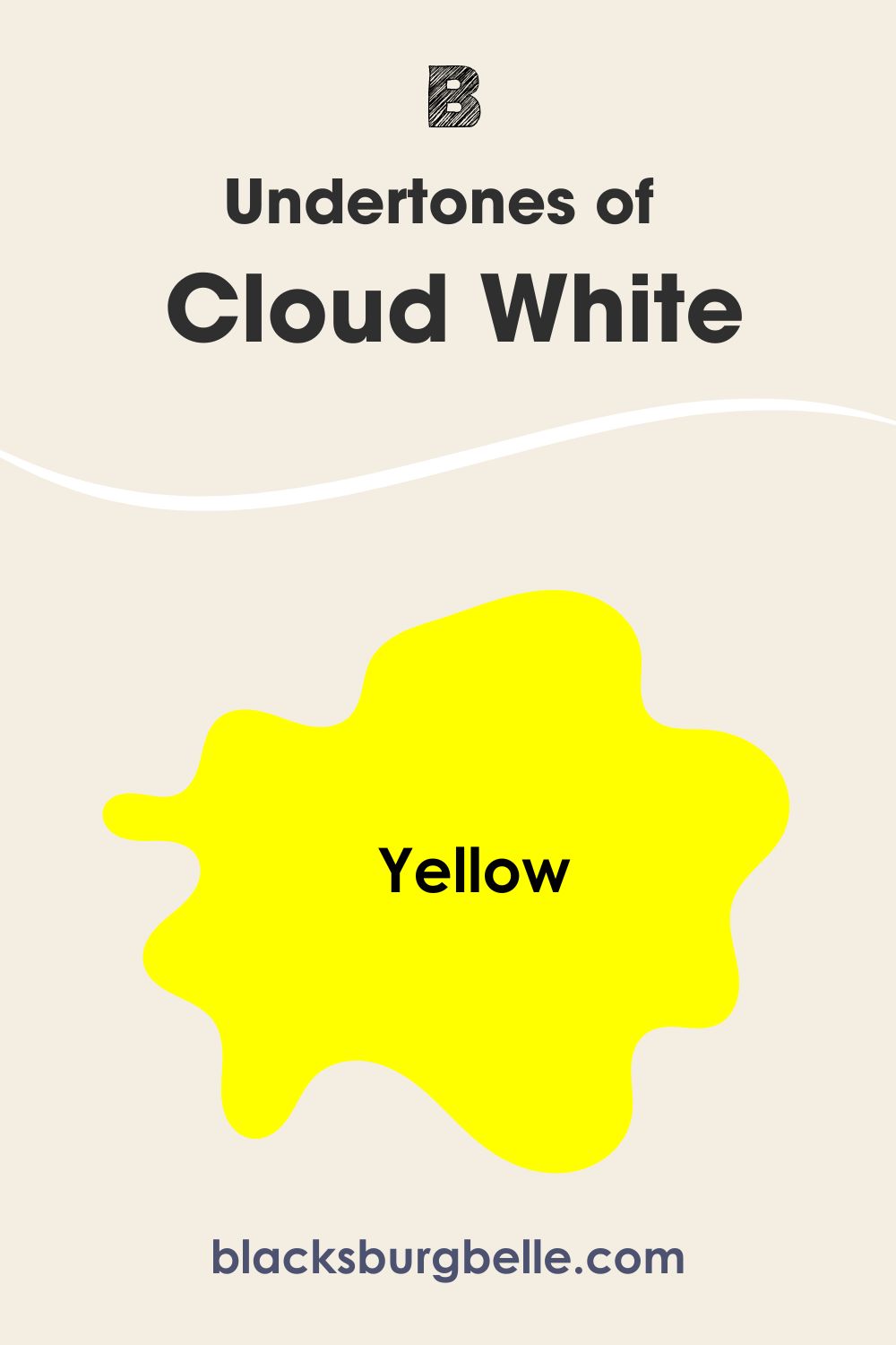
| Undertone | Yellow-green | Yellow |
| HEX Value | #F6F6ED | #F3EEE1 |
Emotional Effects: Benjamin Moore Simply White vs Cloud White
Colors move us emotionally, whether or not we realize it. They can determine how well we relate to a place and how relaxed we become with any decor. So, it is safe to say that Simply White and Cloud White can sway your feelings, depending on how you see them.
Simply White, being the brighter white of the two based on the LRV, is cleaner and whiter than Cloud White. It may appear crisp and stark in some rooms, depending on the exposure. So, it may make you feel calm and serene after the hustle and bustle of the day. Consider using it if you want just a sliver of warmth but can’t compromise brightness.
On the other hand, Cloud White is warm and creamy because of the yellow undertones. As a result, it creates a slightly cozy and inviting atmosphere, drawing you in and helping you release the stress of the day. None of us is averse to warmth, so Cloud White will always be ideal for any decor.
LRV of Benjamin Moore Simply White vs Cloud White: Which Reflects More Light?
I mentioned earlier that the LRV of Simply White and Cloudy White makes them bright white paint colors. But what is LRV? It is the acronym for light reflectance value. It refers to the ability of a color to reflect or absorb light in any room.
The value uses a scale from 0 to 100. True blacks have a value of 0, while true whites have a value of 100. That means that the closer a color is to 0, the more light it absorbs, and the closer it is to 100, the more light it reflects.
BM Simply White has an LRV of 89.52. This is pretty close to the brightest end of the light reflectance scale. In other words, it reflects a lot of light.
BM Cloud White has an LRV of 85.05. This value is slightly lower than that of Simply White, but that slight difference is crucial. Simply put, Simply White reflects more light than Cloud White because of the difference in their LRVs.
Undertones of Benjamin Moore Simply White vs Cloud White: Are They the Same?
Simply White and Cloud White have similar undertones, which explains the confusion people encounter when trying to differentiate between them. Both paint colors have yellow undertones, making them look creamy and warm, especially in warm sunlight.
When you look at each paint color in different rooms, they may look the same. But side by side, Simply White looks brighter and cleaner than Cloud White. Cloud White looks creamier and slightly warmer than Simply White.
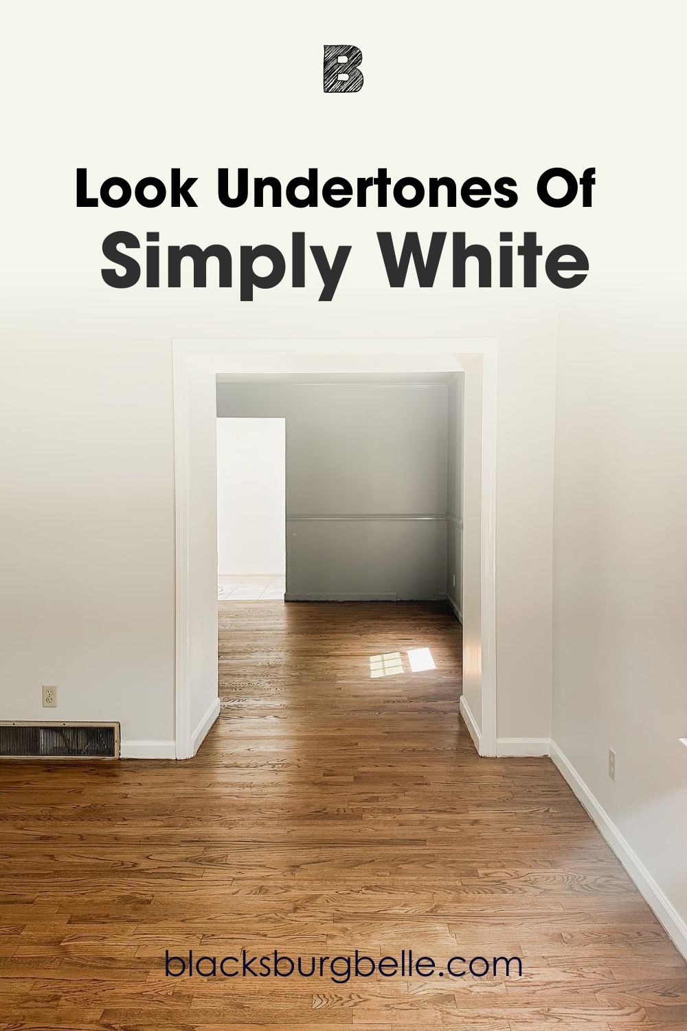
A Closer Look at the Undertones of BM Simply White
Pictures will do a better job of showing you clear undertones in Simply White. I picked a picture of a room with sufficient natural light to reveal how this color performs. You will notice a slight warmth, proving this color is not as stark white as it may sometimes appear.
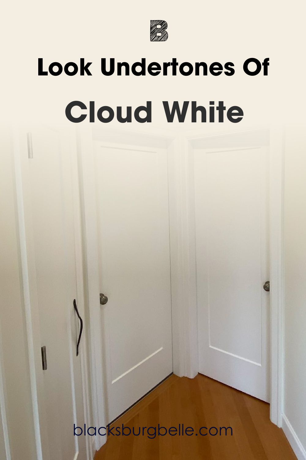
A Closer Look at the Undertones of BM Cloud White
In this next picture, Cloud White hints at more warmth and creaminess than Simply White. The bright artificial light does nothing to diminish its warmth, although the color remains bright.
Simply White is pretty close to the green on the color wheel. Because of this, it can show a bit of green as an undertone if there is low lighting or greenery outside the window looking into the room. But it ordinarily has just a hint of yellow in normal lighting conditions.
From the picture above, you can see that Cloud White is warm and more yellow than Simply White. The doors are obviously a brighter white than the walls, so you can see how it compares to cool or stark whites.
Benjamin Moore Simply White vs Cloud White: Are They Warm or Cool?
Both white paint colors are warm because of the yellow undertones. Cloud White typically looks warmer than Simply White because it has more yellow in it. Besides, Simply White can read slightly cool sometimes because of the hint of green that peeks through in certain lighting conditions or rooms.
If a warm white is what you are looking for, and you do not mind seeing some yellow in it, consider using Cloud White. But if a clean and bright white is preferable, try Simply White. But bear in mind that it may show a little yellow and lean toward warmth in most rooms.
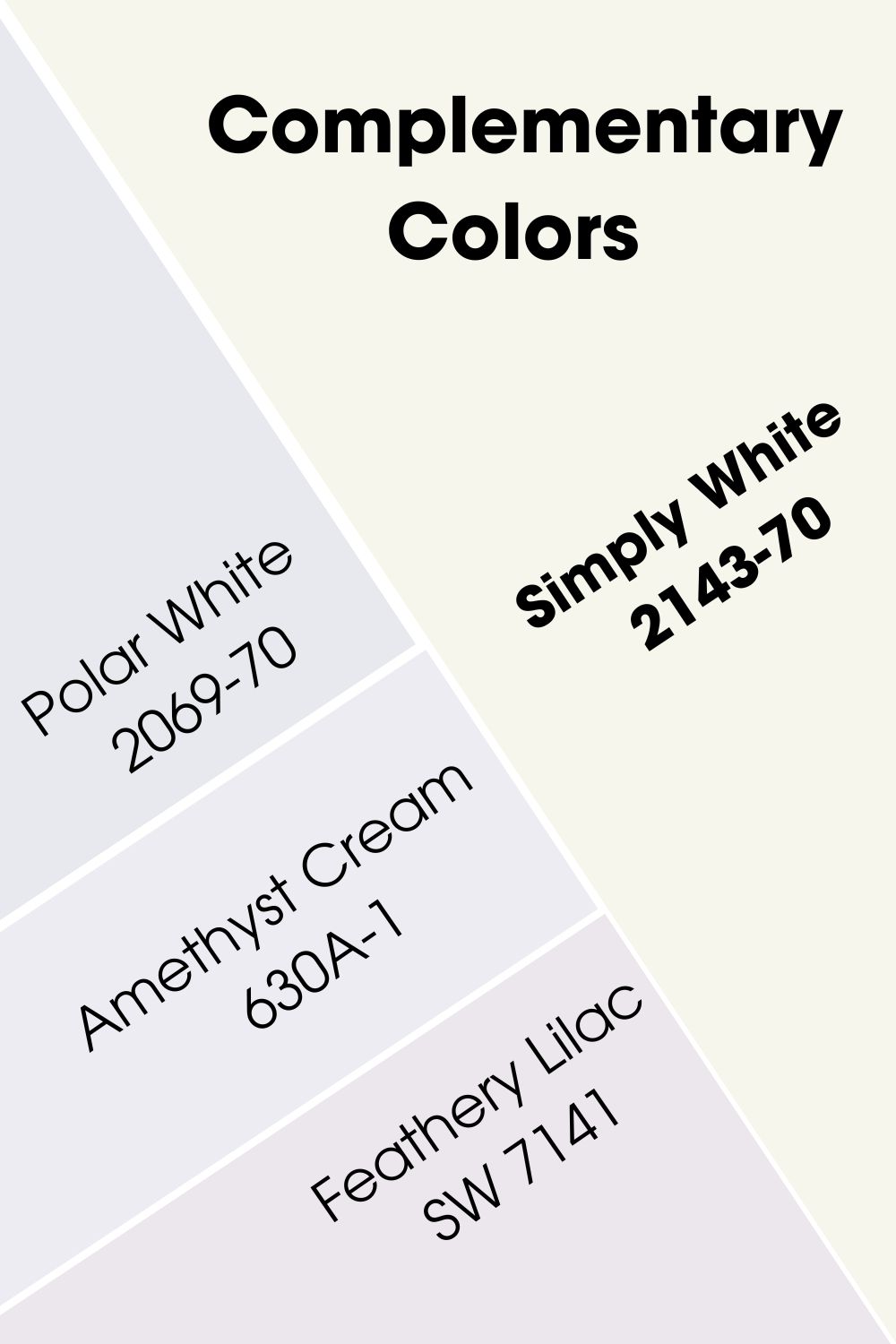
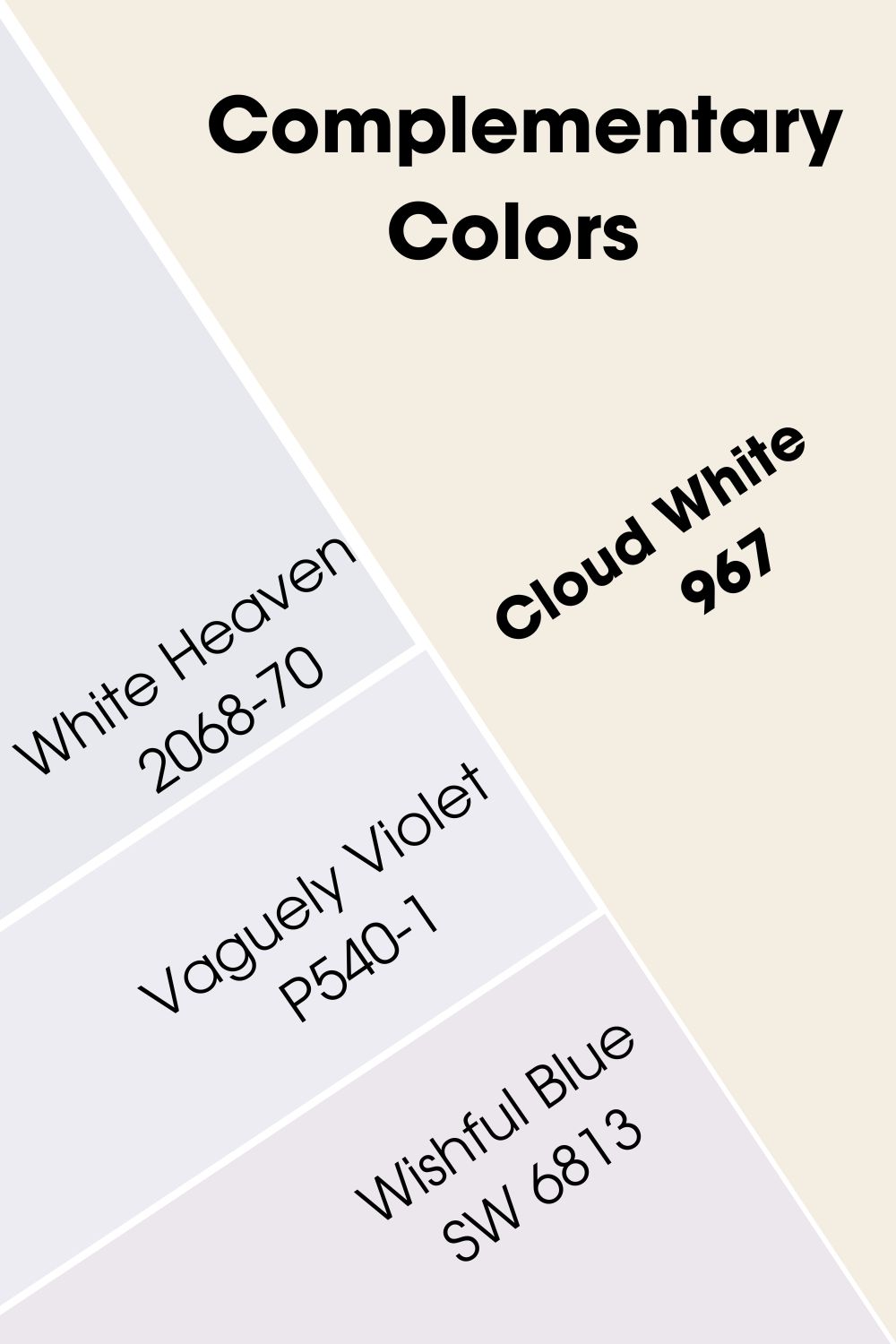
Benjamin Moore Simply White vs Cloud White Complementary Colors
Complementary colors are those opposite the main hue on the color wheel. They may not necessarily match the main color, but they can work well together if you know how to use them. For example, red is opposite green, and blue is opposite yellow on the wheel.
Since these paint colors are not exactly pure white, it may be a little difficult to pick a complementary color on the color wheel. But I’m happy to help you figure that out.
The best complementary color for BM Simply White is Benjamin Moore’s Polar White 2069-70. It is an off-white paint color with hints of lavender. You can also try Behr’s Amethyst Cream 630A-1 or Sherwin Williams’ Feathery Lilac SW 7141.
For Cloud White, the best complementary color is Benjamin Moore’s White Heaven 2068-70. You can also try Behr’s Vaguely Violet P540-1 or Sherwin Williams’ Wishful Blue SW 6813.
Benjamin Moore Simply White vs Cloud White Color Palettes
Color palettes make every paint color work better than when they stand alone. They may look mismatched at first, but to the trained eye, they are excellent pairings. So, what colors are great for these color palettes? Let’s find out!
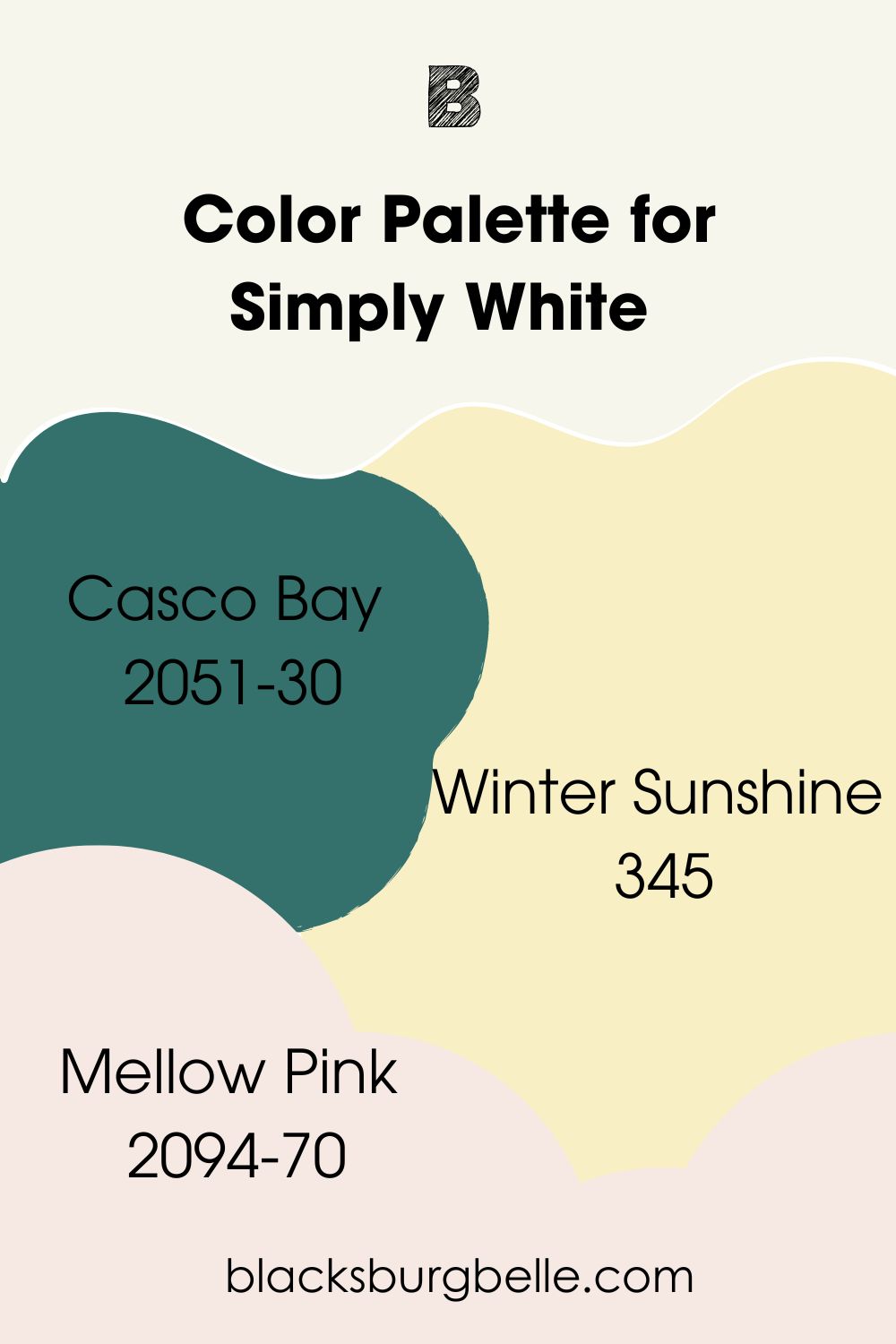
Color Palette for Simply White
Casco Bay, Winter Sunshine, and Mellow Pink are some colors that make a great palette for Simply White. You can always add other colors as this is only a guide in the right direction.
- Casco Bay 2051-30: It is a deep-hued green paint color with teal undertones that is in direct contrast with Simply White
- Winter Sunshine 345: It is a pale yellow that warms any room and brings the beauty of Simply White into sharp relief
- Mellow Pink 2094-70: A pale pink with a hint of gray that adds elegance and softness to the decor when used with Simply White
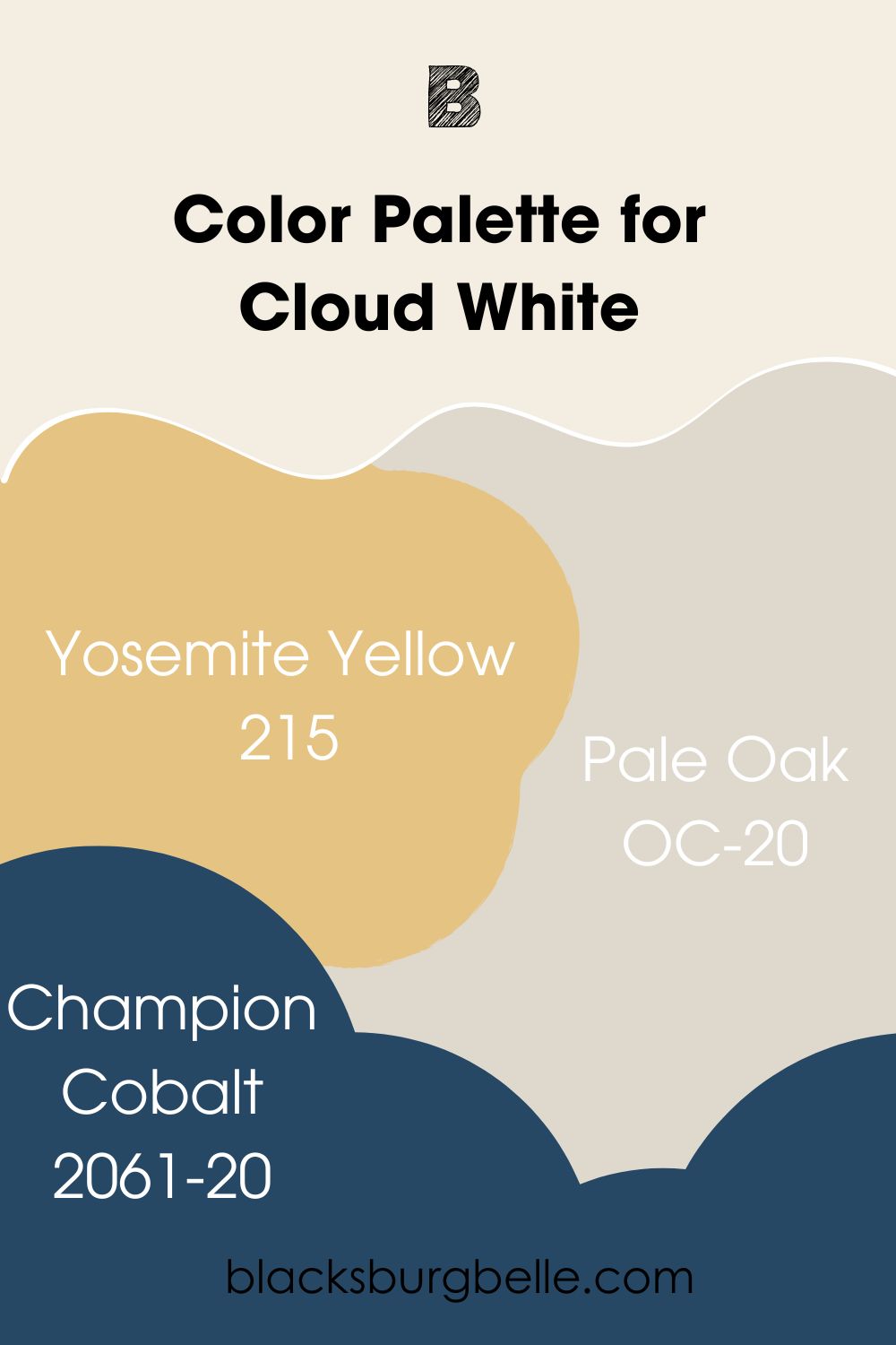
Color Palette for Cloud White
Yosemite Yellow, Pale Oak, and Champion Cobalt can work well in a Cloud White color palette. They superbly combine with Cloud White and can make it look amazing in any decor.
- Yosemite Yellow 215: A yellow paint color with earthy tones that bring out the warmth of Cloud White without becoming overwhelming
- Pale Oak OC-20: A neutral paint color with warm gray undertones that pair well with the warmth of Cloud White
- Champion Cobalt 2061-20: A royal blue paint color with a touch of teal that adds elegance and stunning beauty when paired with Cloud White
Benjamin Moore Simply White vs Cloud White on Doors
White is a classic color for every decor. It may surprise you how often doors are overlooked when it comes to interior decor. They may be the last thing you think to paint, but the outcome is usually amazing when done right. So, let’s see what Simply White and Cloud White look like on doors.
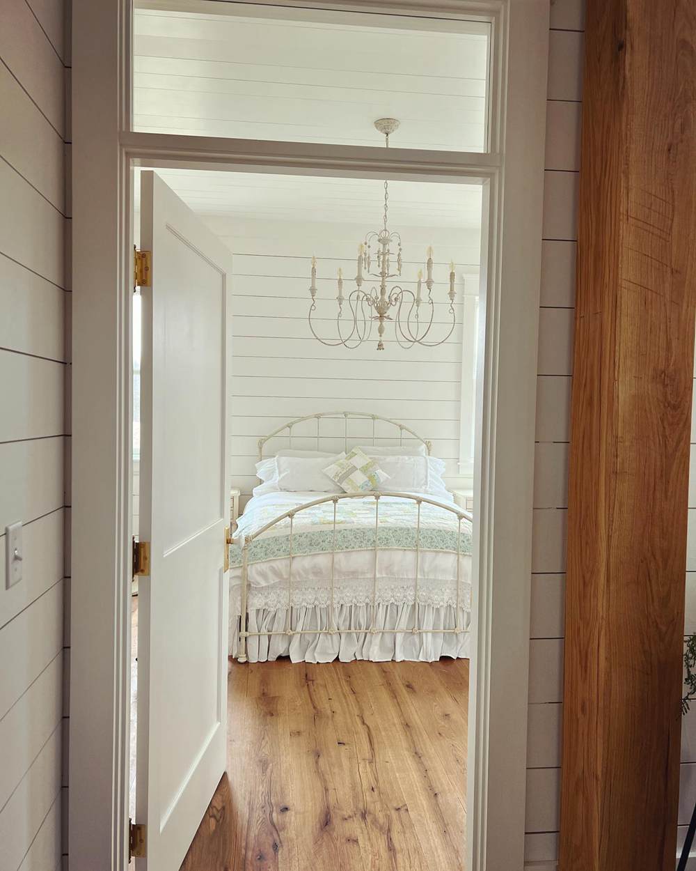
BM Simply White on Doors
The door and room in this picture are done in Simply White, and the paint looks warmer than usual. This may have something to do with the warm light from the window hidden from view.
BM Cloud White on Doors
In this powder room, the walls and doors are painted with Cloud White. The warmth is undeniable, although the lighting contributes to it in this picture.

Benjamin Moore Simply White vs Cloud White on Trim
Many of us use white as the trim paint colors because of how well they match everything. However, knowing that warm whites can clash with cool whites may help you decide on a better combination. Here are Simply White and Cloud White on the trim.
BM Simply White on Trim
Simply White is a beautiful white to use on trim, as this next picture proves. It looks bright next to Benjamin Moore’s Spiced Apple Cider.
BM Cloud White on Trim
Here, Cloud White is used on the board and batten to complement the warm green paint color at the top. The dark green makes Cloud Wwhite appear whiter than it usually is.
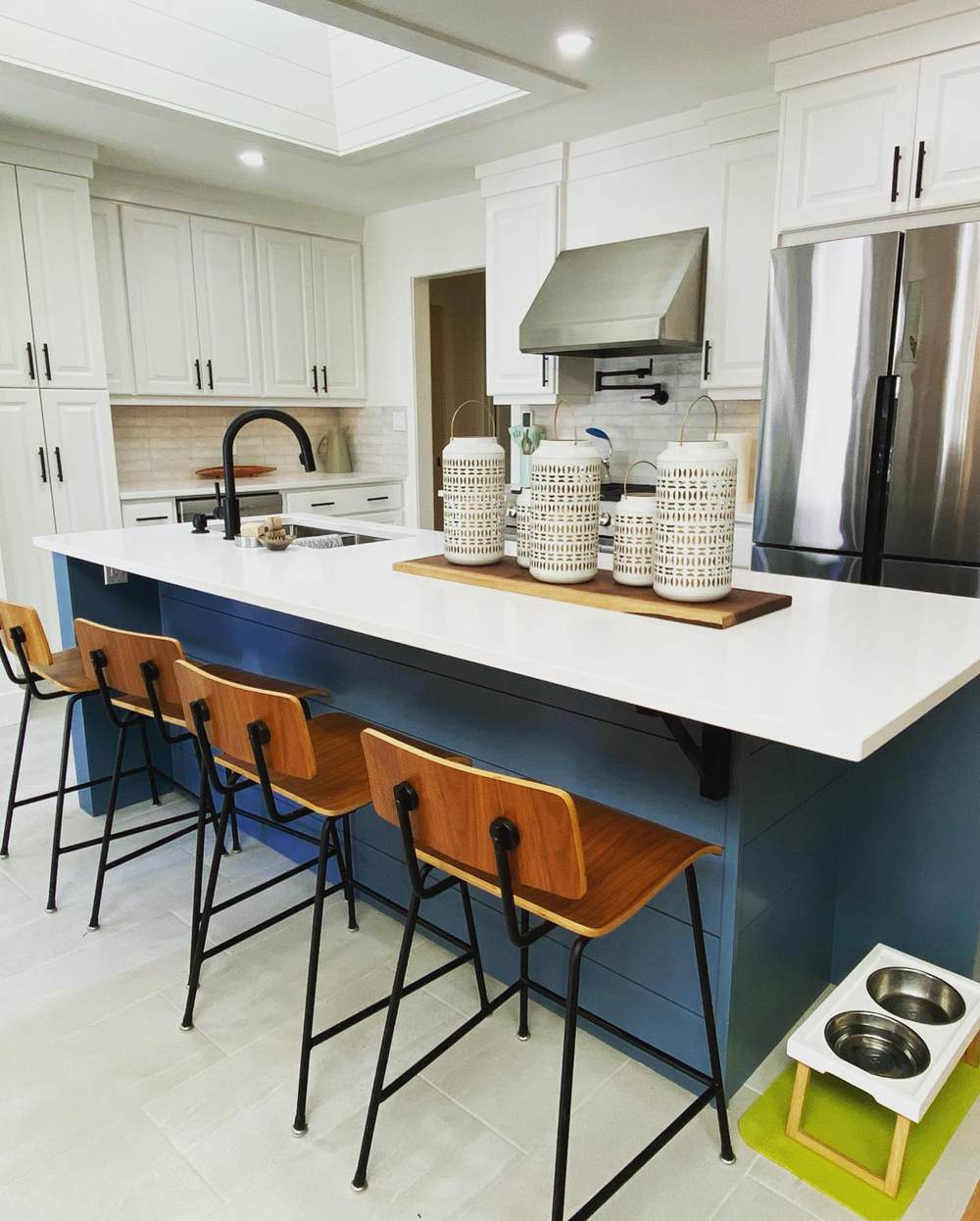
Benjamin Moore Simply White vs Cloud White on Cabinets
You can use any color of appliances if the cabinets are white. The same is true for the walls because white goes with everything as long as they are the same tone. So, warm whites go with warm colors, and I want to show you kitchens done in warm whites with cabinets painted with Simply White and Cloud White.
BM Simply White on Cabinets
Although a white kitchen, this decor exudes such warmth and coziness. And that is because it is done all in Simply White.
BM Cloud White on Cabinets
The kitchen island is painted in Benjamin Moore’s Philipsburg Blue to match the countertop. But the rest of the room is done in Cloud White, and it pairs well with the blue island.
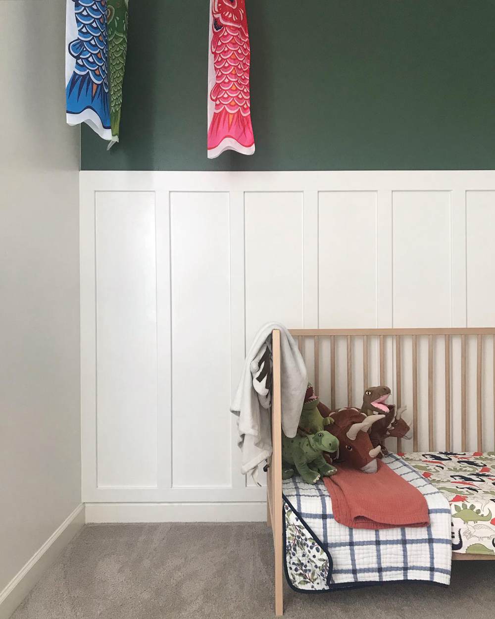
Benjamin Moore Simply White vs Cloud White on Interior Walls
If you pick the right color palette, your decor will turn out amazing with Simply White or Cloud White. You don’t even need to go overboard with the colors. Keep it simple and safe.
BM Simply White on Interior Walls
Check out how good Simply White looks on these walls when paired with green and wood tones. It works so well because of the hint of warmth in the white paint color.
BM Cloud White on Interior Walls
In this picture, Cloud White looks a teeny bit brighter than Simply White. This may have something to do with the natural light from the windows coupled with the bright artificial lighting.
Benjamin Moore Simply White vs Cloud White with Various Colors
Have you ever noticed your white paint color changing hues at different times of the day? It may be because of the various colors in the room.
Paint colors can pick up the hues of vibrant colors around them or reveal more of their undertones, some more than others. Let’s see if that is true of Simply White and Cloud White.
BM Simply White with Various Colors
This is a fantastic shot of deliberate and beautiful decor. There are many colors vying for attention, but Simply White on the wall picks up a slightly green hue due to the green plants around it.

BM Cloud White with Various Colors
Although there are also many colors in this room, Cloud White does not seem to pick up any of them. Instead, it remains a warm white, looking slightly warmer under the artificial light.

Benjamin Moore Simply White vs Cloud White on Exterior Walls
Did you know Simply White and Cloud White can be used on exterior walls? Well, now you know. But bear in mind that they may appear too bright because of their high LRVs. Don’t be alarmed if they appear stark in bright sunshine; they are still amazing colors.
BM Simply White on Exterior Walls
Simply White only looks slightly warm outdoors on this bright winter day. The wreaths add some versatility to the color so it doesn’t look too bland.

BM Cloud White on Exterior Walls
And here, Cloud White looks its usual warm self in bright sunlight. The black window frames set it off, making it look so buttery and creamy.

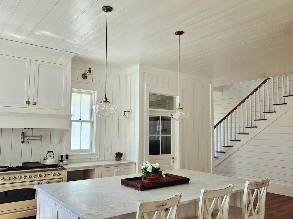
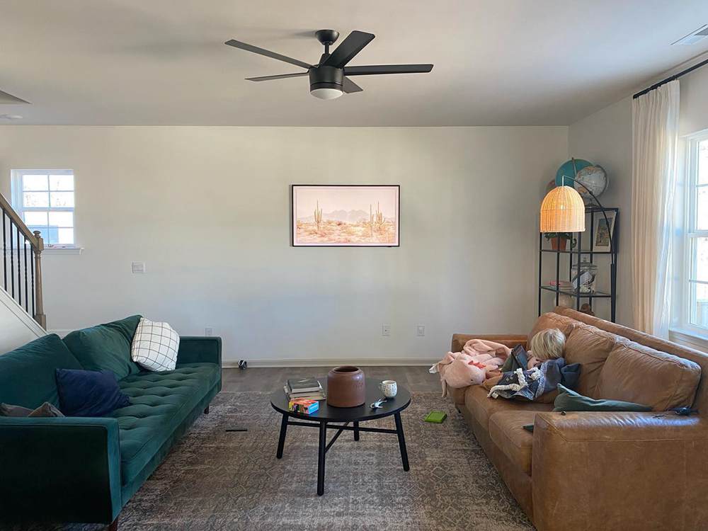
Benjamin Moore Simply White vs Cloud White in Natural Light
Light can affect how these colors appear, so I want you to see them in bright natural light. You may notice a considerable difference when viewed under artificial lighting.
BM Simply White Under Natural Lighting
Here is Simply White looking buttery and warm in this kitchen decor. The bright light streaming in from the windows makes it look so beautiful.
BM Cloud White Under Natural Lighting
Cloud White looks slightly warmer in this living room than Simply White in the kitchen decor above. Again, the bright natural light makes it warm and inviting, and the colors do not rub off on it.
Lighting Conditions
Natural lighting conditions make these white paint colors appear different from when viewed under artificial lighting conditions. The same is true when you see the colors in a room facing north, one facing south, one facing east, and another facing west.
This is because the lighting changes with these different exposures. North-facing rooms have cold light, which means there is no direct sunlight. Simply White may show more green than yellow in such a room.
South-facing rooms have ample direct sunlight, east-facing rooms have warm light in the mornings and cold light in the evenings, while west-facing rooms have cold light in the morning and a warm glow in the evenings.
Conclusion
Benjamin Moore’s Simply White and Cloud White are excellent warm white paint choices for bedrooms, living rooms, kitchens, laundry rooms, nurseries, entryways, and other spaces. They are not dull because of their undertones, which make them warm.
I would recommend using them with warm colors to avoid clashing tones. However, you can also check the lighting conditions in a room and determine whether or not they will work there with other colors. When in doubt, use samples or paint swatches of different colors and compare them.
Have you ever tried these colors in your home? Do you have pictures or questions about these or other colors? I would love to hear from you in the comments section.
 SW Alabaster Vs BM White Dove: How to Choose!
 White Dove vs Swiss Coffee: How to Choose?
 SW Dover White vs BM White Dove: Let’s Compare
 Benjamin Moore Pale Oak Vs Edgecomb Gray: How to Choose?
 Sherwin Williams Snowbound vs Alabaster: How to Choose?
 Benjamin Moore Palladian Blue vs Woodlawn Blue: How to Choose?
