
Finding it a bit challenging to pick the perfect white paint color for your home? Well, you are not alone. Although several options exist, most people still find themselves at the Snowbound vs. Alabaster crossroad.
Either one of these lovely whites can make your space something out of a fairytale. Their qualities make it quite challenging to make a choice. However, here’s a quick and condensed review of both colors.
Snowbound is brighter and looks cooler in a space. On the other hand, Alabaster has more beige, making it warmer.
Read on if you want to understand this comparison more deeply. What are their qualities? How do they look in homes? What colors work best with them? You will have a detailed answer to these questions and more by the end of this article.
Let’s jump right in!
Table of Contents
A Pictoral Comparison of Snowbound and Alabaster
From the above pictures, you can already see a bit more color and warmth in Snowbound. Also, the pink tinge in the beautiful white is more evident now that we made a visual comparison. Alabaster on the walls in the other picture looks brighter and a little stark because of the extra natural light.
Snowbound vs. Alabaster – A Quick Comparison
Here, we’ll take a quick look at the key features of both paint colors. I have selected the most crucial attributes that anyone would need for any color.
| Properties | Snowbound | Alabaster |
| RGB | 237 / 234 / 229 | 237 / 234 / 224 |
| LRV | 83 | 82 |
| Undertones | Pink and Gray | Greige |
| Hex Value | #EDEAE5 | #EDEAE0 |
Emotional Effects: Snowbound vs. Alabaster
It is an established fact that colors affect our feelings and can influence our mood.
In this case, Snowbound gives a relaxing and refreshing feel like a snowy glade. Its pinkish tinge prevents it from looking stark, ensuring you always enjoy a homely and welcoming vibe.
Alabaster brings more of a cozy feel and a sense of gentle comfort. It adds a touch of majesty on top of homely, refreshing vibes. This white paint color breathes art and soothing calm into any space.
That said, Snowbound works best for spaces where you want a refreshingly calm atmosphere. On the other hand, if you want a gentle, tranquil feel that caresses the mind, go for Alabaster.
LRV of Snowbound vs. Alabaster – Which Reflects More Light?
The LRV of a color indicates on a scale of 0 – 100 how much light a color reflects (or doesn’t reflect). True black has an LRV of 0, indicating no reflection of light, while pure white has an LRV of 100, signifying full reflection of light.
Snowbound has an LRV of 83.
Alabaster has an LRV of 82.
Although Snowbound has a slightly higher LRV, it isn’t noticeably brighter than Alabaster. The LRV difference of 1 is negligible, as both paint colors have around the same reflectance. While you will spot differences in their looks, one won’t appear darker.
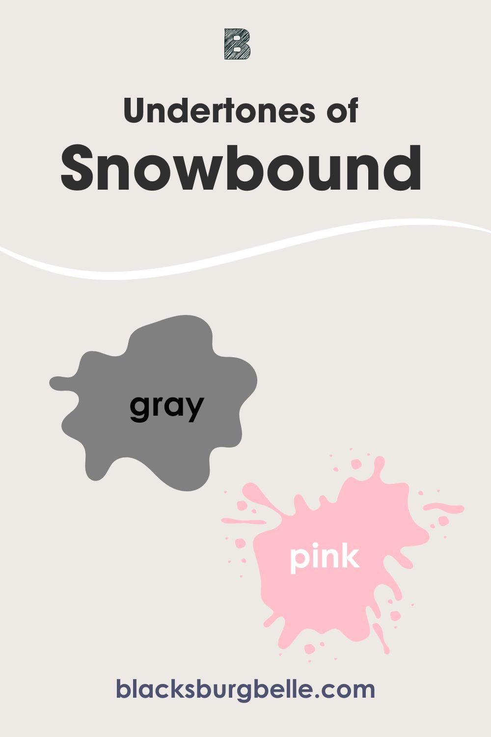
Undertones of Snowbound vs. Alabaster: Are They The Same
One way to easily discern between Snowbound and Alabaster is to look at their undertones. Snowbound has subtle gray undertones with hints of pink. While it largely hides the gray, you will spot the pink tinge in spaces with incandescent lighting.
Alabaster has more gray, with some beige to it, hence its greige undertones. The beautiful white also has a gentle touch of cream. This is why it can sometimes look slightly yellow in warm lighting.
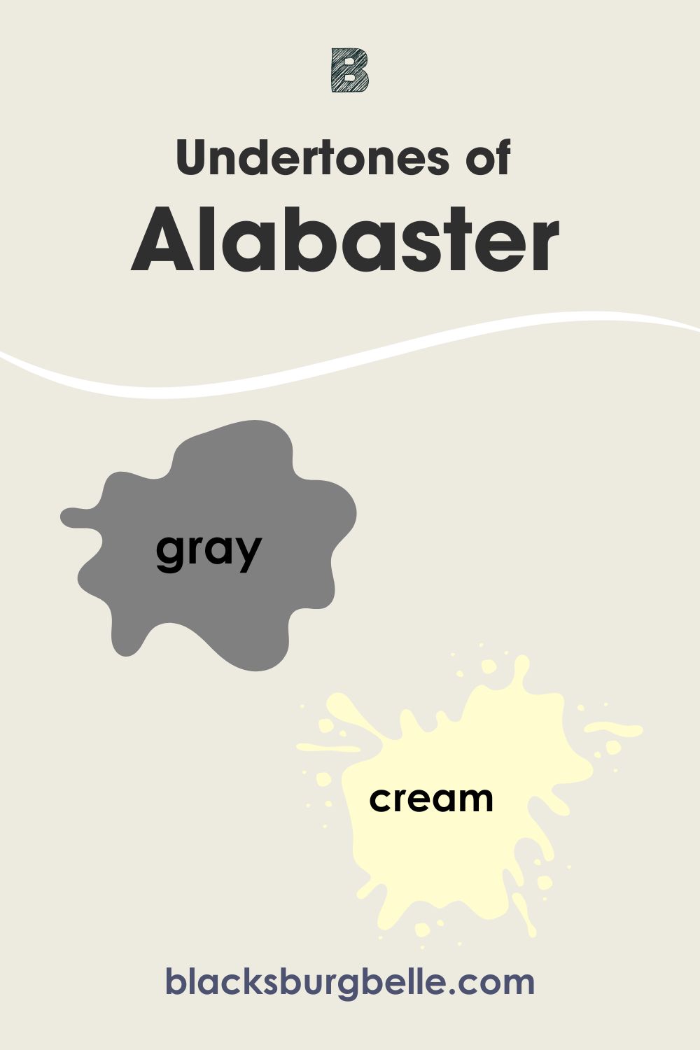
When placed side-by-side, Snowbound will look slightly pink, and Alabaster’s subtle cream becomes evident.
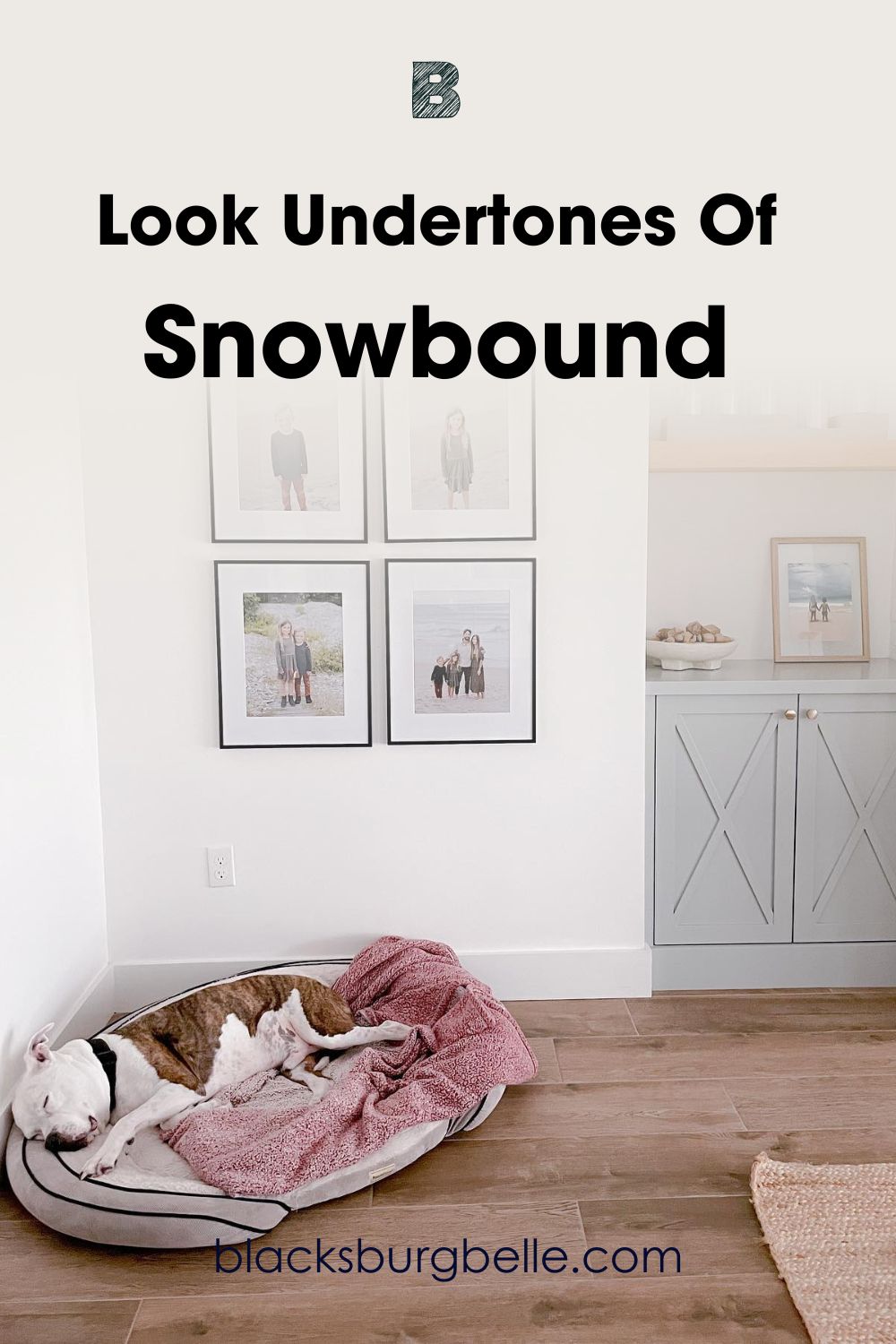
A Closer Look at Snowbound Undertones
Undertones might not show up often, but they determine the overall look of a paint color. In some cases, they appear under certain lighting or color pairings.
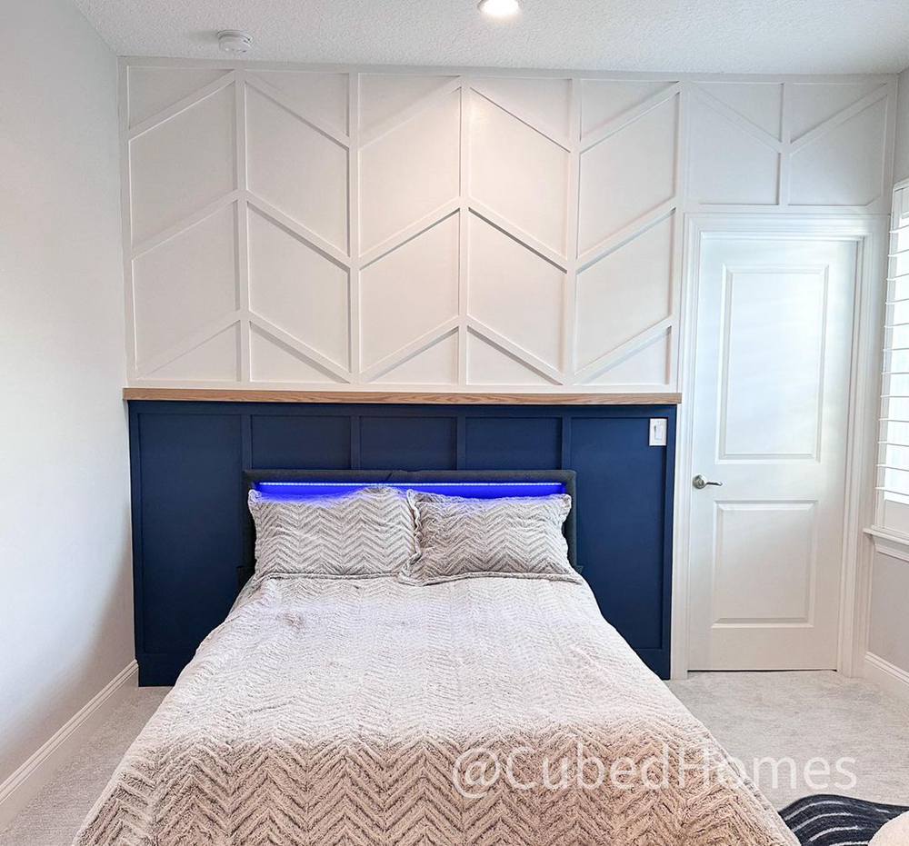
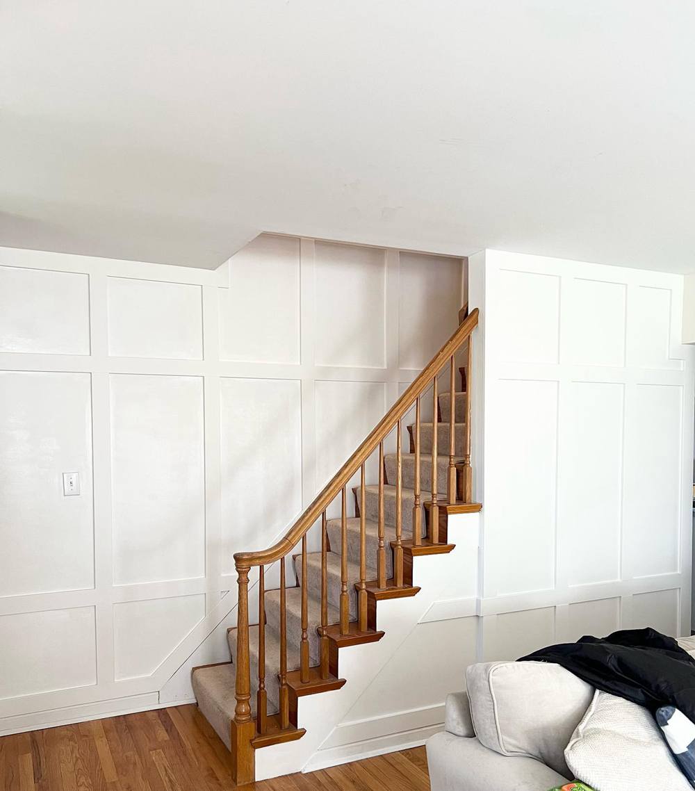
How would Snowbound’s undertone look on interior walls? Let’s take a look at the picture below. You will notice the gray undertones on the left side of the picture. The reason is that more lighting is striking the paint color on the wall. Snowbound will reveal more of its gray undertones in this sort of scenario.
The right side of the wall receives less light, which allows other colors in that space to influence Snowbound. As such, you will notice its pink tinge more on this side of the picture than the other.
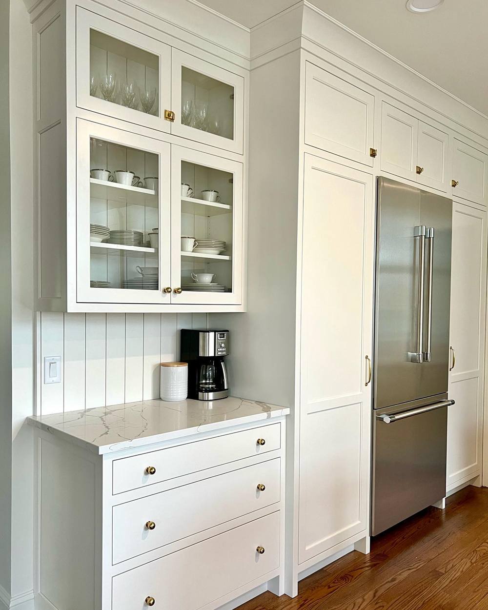
A Closer Look at Alabaster Undertones
The picture below shows Alabaster on the kitchen cabinets and Sherwin Williams Drift of Mist on the walls. Although it has more gray than Snowbound, Alabaster looks purer and more white next to Drift of Mist’s gray.
You will also notice that Alabaster does an excellent job of hiding its greige undertones in this setting.
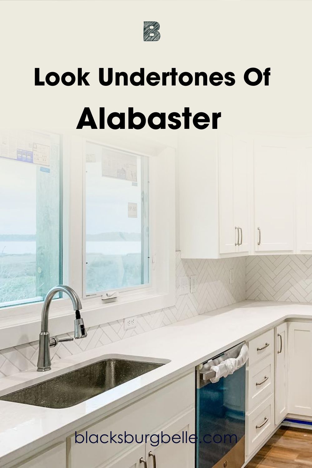
Note: Snowbound looks softer and more homely compared to the other.
Snowbound vs. Alabaster – Are They Warm or Cool?
With their different undertones, you might sometimes wonder if these whites are warm or cool.
Sherwin Williams Snowbound has a soft look that could pass as cool. However, its pink tinge gives it a homely warmth. This makes it significantly warmer than the average white paint color. But then, it will not heat up your space, thanks to its gentle gray undertones.
Moving on, Sherwin Williams Alabaster has beige undertones that are absent in Snowbound. This makes it significantly warmer, especially when you place both side by side. Also, Alabaster’s slight creamy look hints at more warmth than Snowbound.
Cool lighting and north-facing rooms bring out the gray in both white paint colors. In this case, Alabaster will still appear warmer. On the other hand, warm lighting and south-facing rooms warm the lovely whites.
Spaces like those will bring out the pink in Snowbound and the beige in Alabaster. However, Sherwin Williams Alabaster will exude a little more warmth in such rooms.
Snowbound vs. Alabaster Complementary Colors
While any paint color can look good in a space, it can look even better with complementary colors. These colors pair nicely with your main paint color to give your space an even more beautiful look.
That said, what colors can you use to push Snowbound and Alabaster to their full potential?
Snowbound (SW 7004) Complementary Colors
The best complementary colors for Snowbound are Sherwin Williams Twinkle and Lavender Wisp. However, the brand has long discontinued the colors. This doesn’t mean that there aren’t other options, and I have included them below.
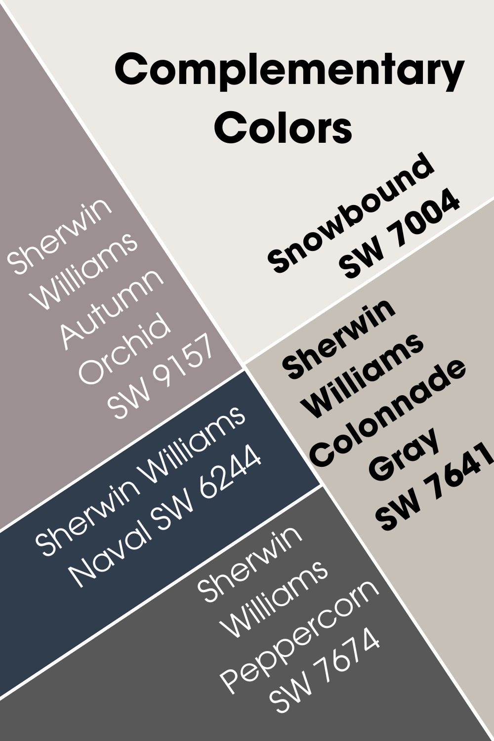
Sherwin Williams Colonnade Gray (SW 7641)
A warm, muted stone gray that works best with cool white paint colors. Sherwin Williams Colonnade Gray has an LRV of 53, making it a medium-toned gray. Pairing it with Snowbound brings put its natural warmth.
Also, Sherwin Williams Colonnade Gray complements Snowbound to give a balanced, soothing vibe. While both colors look good on walls, don’t hesitate to flex either of them on cabinets or furniture.
Sherwin Williams Autumn Orchid (SW 9157)
Sherwin Williams Autumn Orchid is a filmy purple with a gentle but sophisticated look. It has an LRV of 29 but looks lighter than you would expect. The paint color pairs nicely with Snowbound and goes well with its undertones.
While you can pair both paint colors in any space, they work best in interior areas and rooms. For the best effect on furniture, consider using Autumn Orchid on the walls and Snowbound on the furniture.
Note that both paint colors can also work as a trim for each other.
Sherwin Williams Naval (SW 6244)
This deep blue paint color exudes serenity and boldness. It goes perfectly with Snowbound’s homely vibes. The most effective way to harness this pairing is to put Sherwin Williams Naval on furniture and Snowbound on the walls.
Doing this will give the space an inevitable sense of calm and tranquility. Also, Naval’s gray and soft green undertones play well into Snowbound’s gray and pink.
Sherwin Williams Peppercorn (SW 7674)
While Snowbound works with just about any color, it is quite popular with gray. Sherwin Williams Peppercorn is a dark gray paint color that perfectly balances warmth and coolness. When paired with Snowbound, your space will easily look like something right out of a magazine.
Sherwin Williams Peppercorn has an LRV of 10 and works on any surface.
Alabaster (SW 7008) Complementary Colors
Like Snowbound, Alabaster goes great with almost any other color. However, I have picked out complementary colors that are worthy of note.
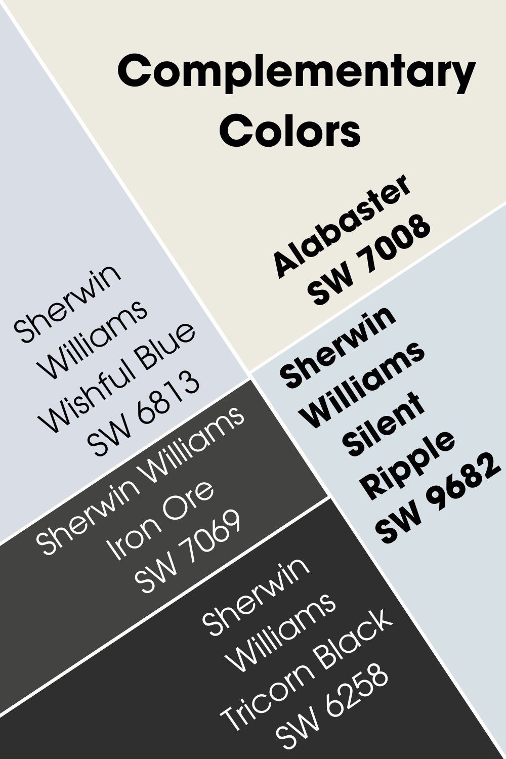
Sherwin Williams Silent Ripple (SW 9682)
Here, we have a light-hearted blue with a relaxed, airy feel. Sherwin Williams Silent Ripple has an LRV of 74 and can easily fit into a spa or beach theme. When you pair it with Alabaster, you get a soothing, euphoric vibe in the room or space.
Incase you can’t get your hands on Silent Ripple, similar colors from the same brand include:
- Iceberg (SW 6798)
- Sky High (SW 6504)
- Hinting Blue (SW 6519)
- Dew Drop (SW 9641).
Sherwin Williams Wishful Blue (SW 6813)
Sherwin Williams Wishful Blue is another perfect complementary color for Alabaster. I see it as the purple variation of Silent Ripple. As such, it has a little more depth and mystery compared to Silent Ripple’s sincere look.
With an LRV of 72, Wishful Blue can go in any room you want. You can also use it as a trim for Alabaster or vice versa.
Sherwin Williams Iron Ore (SW 7069)
If you want to add a sophisticated and grounded look to your space, consider pairing Alabaster with Iron Ore. You can pair them together on walls or use the dark charcoal on an accent wall.
What’s more? Sherwin Williams Iron Ore looks great on furniture, which broadens your options. It is an excellent alternative to Tricorn Black if you want something with a bit more personality and color.
Sherwin Williams Tricorn Black (SW 6258)
Sherwin Williams Tricorn Black is the closest color to true black that you can get from the brand. The sophisticated black is so deep that you will not find any undertones in it. This attribute gives it almost limitless versatility.
If you want a sharp contrast that will emphasize Alabaster’s gracefulness, consider Tricorn Black. Like almost any other black paint color, it goes great on furniture too. Also you can use it in your home’s exterior too.
Snowbound and Alabaster Color Palette
At this point, you already have a solid idea of the differences between Snowbound and Alabaster. However, you are probably wondering about the various ways of pairing these colors for the best effects.
Let’s check out possible palettes for both paint colors that you can use in your space.
Note that while these examples work wonders, you can always come up with others, depending on your preferences. I have included a short explanation behind each color in the palettes.
Sherwin Williams Snowbound Color Palette
This palette that I created put a couple of things into account.
Firstly, it considers Snowbound’s brightness, gray undertones, and occasional pink tinge. Also, the palette covers for the paint color’s homely and soothing feel, playing to these strengths. I selected paint colors that harmonize wonderfully with these attributes.
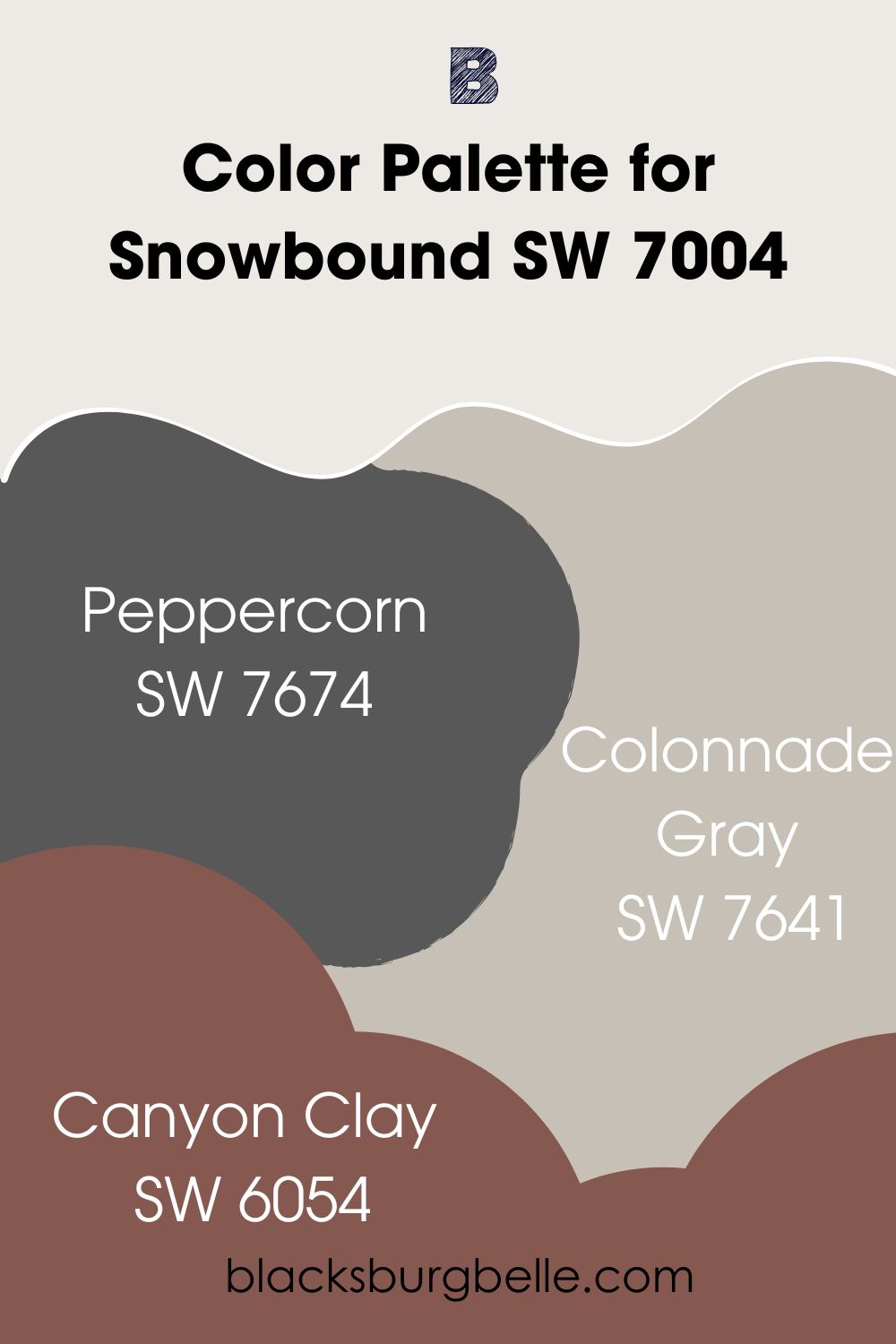
Sherwin Williams Snowbound (SW 7004)
Our primary tone. Snowbound can go on both walls and cabinets. However, a significantly darker color can work better on furniture.
Hence, the next on this list.
Sherwin Williams Peppercorn (SW 7674)
This balanced and sophisticated dark gray pairs perfectly with Snowbound, like a match made in heaven. Whether you choose to pair them up on walls or flex Peppercorn on an accent wall or cabinet, the result is amazing.
Sherwin Williams Peppercorn has an LRV of 10. Also, did you know that it has equal parts of red, green, and blue? Yes, its RGB value is 88/88/88.
Sherwin Williams Colonnade Gray (SW 7641)
Sherwin Williams Colonnade Gray pairs so well with Snowbound it fits into almost any palette that has the lovely white.
For this palette, I see it as a bridge between Sherwin Williams Snowbound and Peppercorn. Its LRV sits at 53, putting it in a mid-tone range on the spectrum.
Colonnade Gray is a warm, muted stone gray. It will not overwhelm other colors in your space.
Sherwin Williams Canyon Clay (SW 6054)
Sherwin Williams Canyon Clay adds more color to the palette. It infuses it with a little extra energetic vibe. You could use the color sparingly and still get wonderful results.
The paint color has an LRV of 13 and works well in both interior and exterior spaces.
Sherwin Williams Alabaster Color Palette
This Sherwin Williams Alabaster color palette emphasizes the color’s warmth and coziness. You can use it for large and small spaces, including for your home’s exterior.
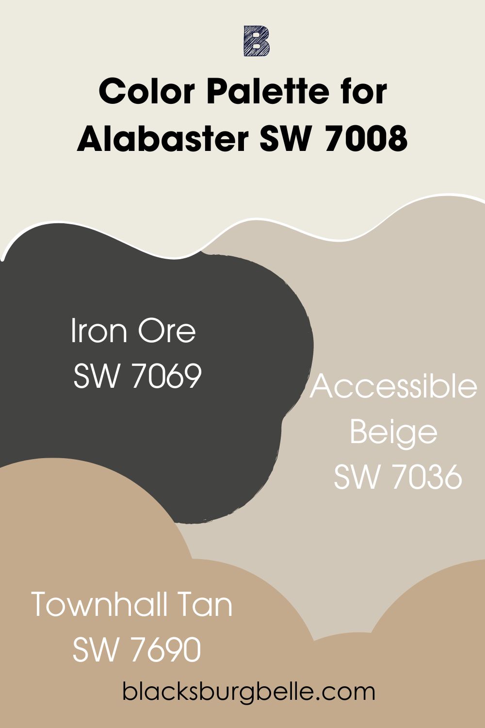
Sherwin Williams Alabaster (SW 7008)
The main color in this case. Sherwin Williams Alabaster works wonders in interior and exterior spaces. It can look creamy, depending on lighting and other factors. However, it will never appear yellow.
Sherwin Williams Iron Ore (SW 7069)
A deep charcoal paint color that pairs perfectly with Alabaster. Sherwin Williams Iron Ore is arguably the best dark neutral for the bright white. Fortunately, it goes well on furniture too. Its cool, sophisticated vibe balances Alabaster’s warmth.
Sherwin Williams Iron Ore has an LRV of 6. It contrasts nicely with the beautiful white paint color.
You can check out Sherwin Williams Tricorn Black as a great alternative.
Sherwin Williams Accessible Beige (SW 7036)
Sherwin Williams Accessible Beige works so well with Alabaster that I wish everyone could experience it.
Firstly, Accessible Beige goes with Alabaster’s beige undertones. Also, the snug beige has some gray in it too! What more could one ask for in a palette?
Sherwin Williams Townhall Tan (SW 7690)
I included Sherwin Williams Townhall Tan in case you need some extra color and warmth in your space. It brings some extra cheerfulness to the palette.
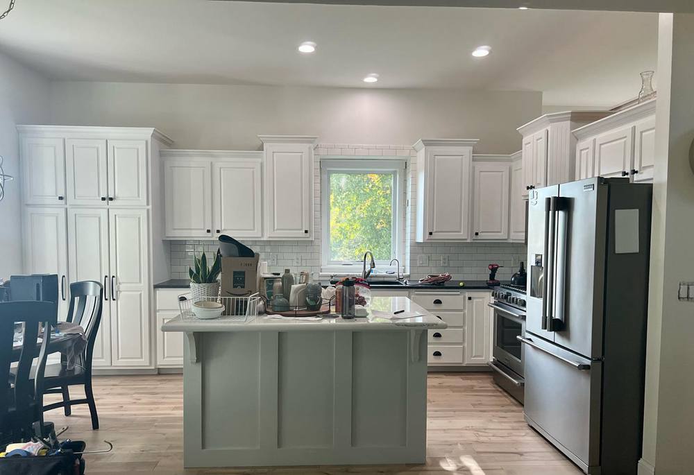
Snowbound vs. Alabaster on Cabinets
Wondering how these colors might look on your cabinets? Snowbound and Alabaster go really on cabinets. And I’ve got pictures to convince you.
Snowbound on Cabinets
Who says you can’t add style to your kitchen while maintaining a decluttered look? Snowbound is an excellent choice if you want this vibe.
Using Snowbound on cabinets gives a pristine and refreshing look. The lovely white goes nicely with almost any other color you might want for the walls or countertop. This makes it a safe option.
You can achieve this look with the palette I mentioned earlier. Have fun!
Alabaster on Cabinets
You can already see the warmth and gracefulness of Sherwin Williams Alabaster from the picture below. The paint color on the cabinets gives a cozy, soothing feel to this space.
You can use a different color on the walls for an even better look. With the Alabaster’s high versatility, you have almost limitless options.
Snowbound vs. Alabaster on Exterior
How do these paint colors look on exterior walls? Naturally, you should expect a magnificent outlook for any home that uses white on its exteriors.
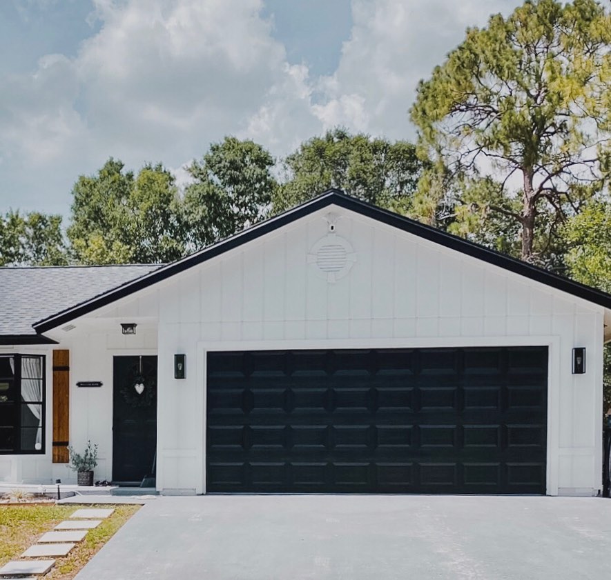
Snowbound on Exterior
Here, we have got a monochromatic look for the home’s exterior. You can pick up the lovely, welcoming vibe right away. The picture also serves as an example of the amazing synergy between Snowbound and Tricorn Black.
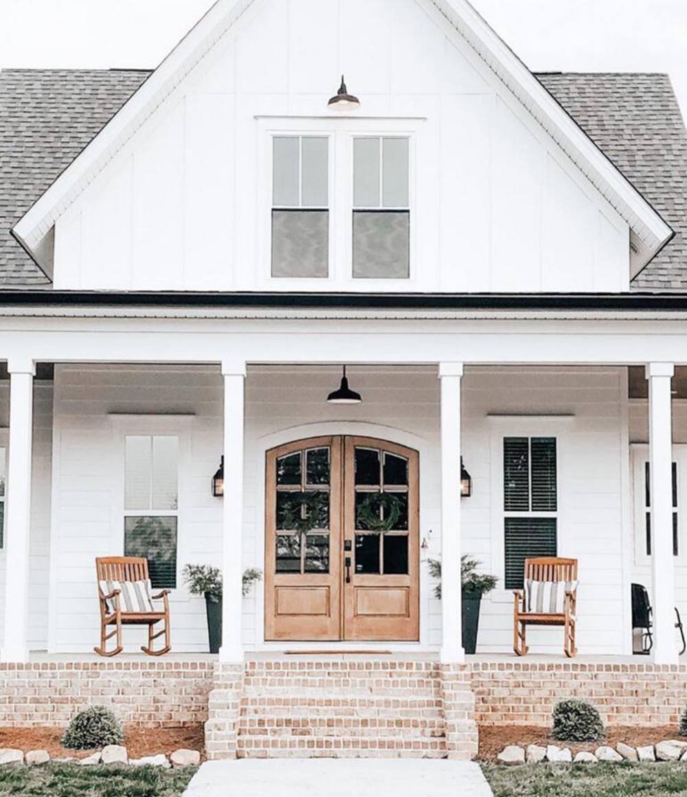
Alabaster on Exterior
The outdoors have abundant access to natural lighting. This makes Alabaster lean more towards white and away from cream.
Notice how the paint color warms up in areas that have shade? That shows how it appears depending on the lighting.
Snowbound vs. Alabaster on Interior Walls
How do these colors look on interior walls? Let’s check them out.
Snowbound on Interior Walls
Here, we have Snowbound pairing nicely with Rock Bottom for a lovely interior look. The gray is more evident with this lighting, while the pink remains hidden.
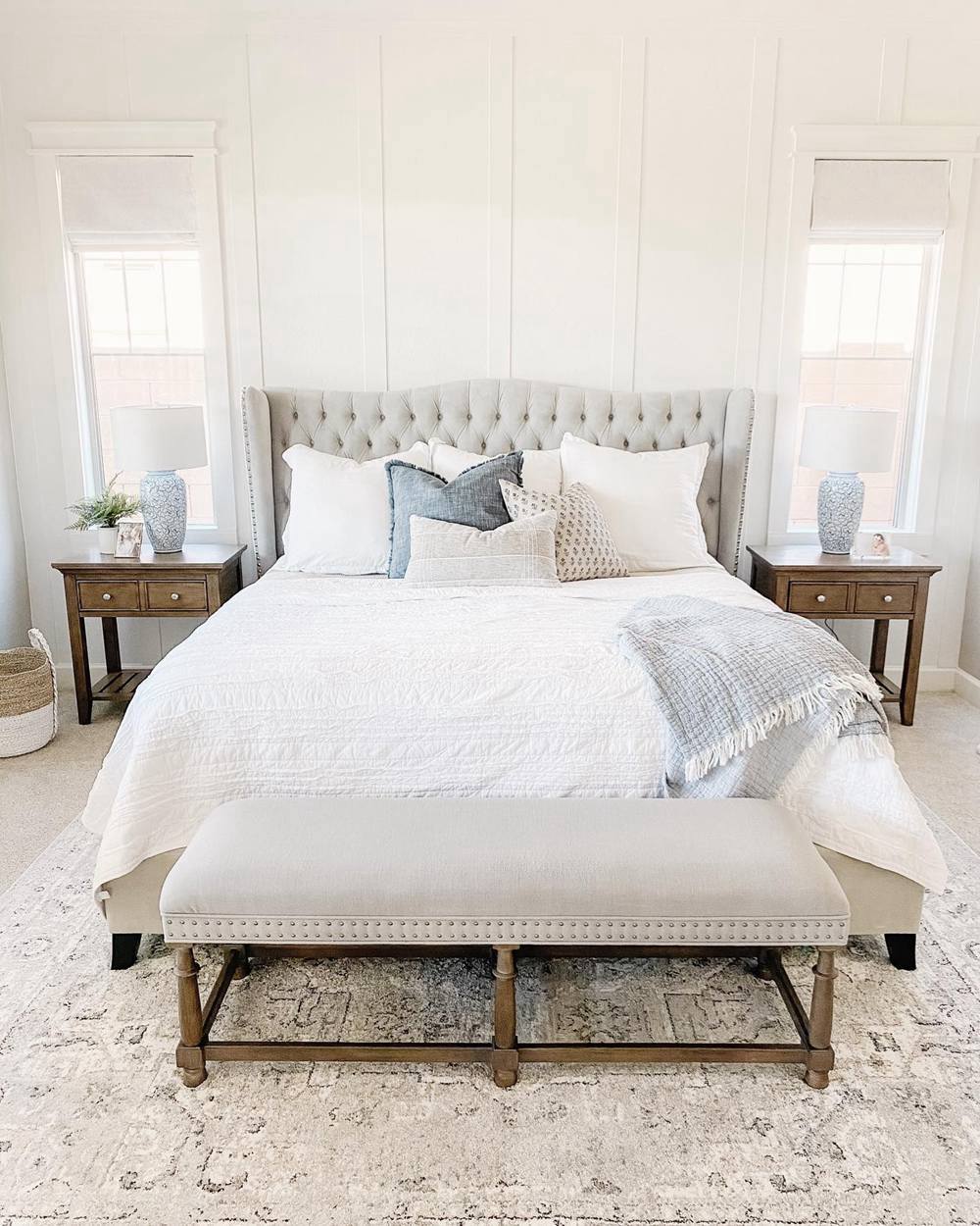
Alabaster on Interior Walls
Alabaster pairs nicely with the color of the wood in this picture. It gives a stylish yet homely look to this living room.
Snowbound vs. Alabaster on Woodwork
For those who would prefer these colors on woodwork, let’s see how they look.
Snowbound on Woodwork
As you can see in this picture, Snowbound looks amazing on woodwork. You can easily spot the mild pink tinge this time because of the warm lighting.

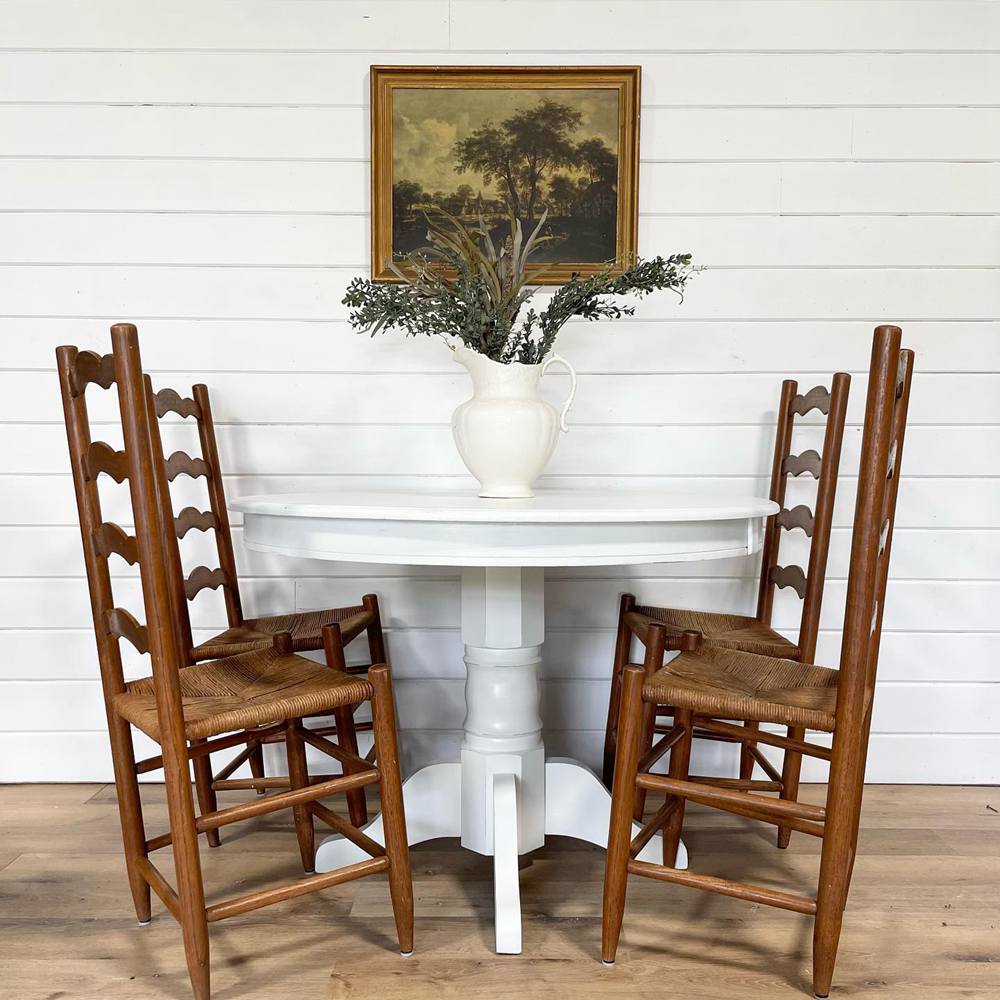
Alabaster on Woodwork
Alabaster looks great on the table. However, it doesn’t appear warm because of the warmer colors in the same space. Also, the lighting is abundant enough to hide its beige undertones.
Conclusion
With every aspect we have touched on, I am sure you now understand the two beautiful white paint colors. Snowbound and Alabaster are both popular in home decor and have high versatility.
Although they have significant differences, you will most likely have to choose based on personal preference. Regardless, you should keep in mind that Snowbound gives a cooler look, and Alabaster gives a cozier one.
The following are summarized steps to make a quick choice between both paint colors:
- Go for Snowbound if you want a true white that isn’t stark or too crisp. Its gray undertones keep it in check despite its high LRV.
- Snowbound’s pink tinge helps to add a bit more color and cheerfulness. It gives a homely, gentle vibe.
- On the other hand, you should pick Alabaster if you want something creamy but not yellow.
- Alabaster is more of an off-white with a high LRV. It has gray undertones that prevent it from looking yellow. Beige undertones give it more warmth, making it the cozier one of the two.
If you still have questions about Snowbound vs. Alabaster, feel free to drop them in the comments section.
 Sherwin Williams Alabaster Vs Pure White: How to Choose!
 Mindful Gray Vs Repose Gray: How to Choose?
 Agreeable Gray Vs Repose Gray: What’s The Difference?
 Revere Pewter vs Agreeable Gray: What’s The Difference?
 Light French Gray vs Repose Gray: How to Choose?
 Benjamin Moore Chantilly Lace vs Simply White: Which Is Better?
