
Haven’t we all been stuck between two very similar paint colors and have no idea how to choose? Two such colors are Benjamin Moore’s Palladian Blue vs Woodlawn Blue. If you have looked at these two colors, you’d understand how close they are in hue.
But there is a key difference. Palladian Blue HC-144 is more of a light blue-green color than any other shade. On the other hand, Woodlawn Blue HC-147 leans toward blue-gray instead of just blue. In other words, Woodlawn Blue tends to read more blue than Palladian Blue in many cases.
Because of their similarities, it is not strange to think they are the same color. However, this difference is all you need to know how to choose. But there are other aspects that can make your choice even easier and present colors that match well with these two. Come along with me to learn more.
Table of Contents
When to Use Benjamin Moore Palladian Blue vs Woodlawn Blue
To get you going, I want to show you when using Palladian Blue is better than Woodlawn Blue. Also, you will see when Woodlawn Blue trumps Palladian Blue.
Use Palladian Blue if:
- A blue-green paint color works best for your decor
- You want that feeling of the sea around you
- You need color to soften vibrant colors or bring mild color to neutrals
Use Woodlawn Blue if:
- You don’t mind some gray in your blue paint color
- A soft color that works well as a neutral is ideal
- You want to blend similar colors without using too many neutrals
What you use will depend on the lighting. In other words, lighting is an important aspect in selecting which paint color works better. I would also love to point out that both paint colors have gray in them, although Woodlawn Blue shows more of it than Palladian Blue.
Why is this important? Using a blue paint color with gray in it in a north-facing room may cause it to look more gray than blue. While this may be beautiful, it may defeat the purpose of choosing the blue paint color in the first place.
But in a brightly-lit room, the color looks airy and fresh, more blue-green than blue. This is especially applicable to paint colors like Palladian Blue and Woodlawn Blue which have green and gray in them. It may lean toward aqua, which is blue-green.
Simply put, low light makes the paint colors look more gray than blue. Direct light makes the colors appear true to their name. They will also appear warm and inviting with more light on them.
Benjamin Moore Palladian Blue vs Woodlawn Blue: Visualizing the Differences
What do Palladian Blue and Woodlawn Blue look like when in use? We may talk about them in different ways but can only drive home the point with visuals.
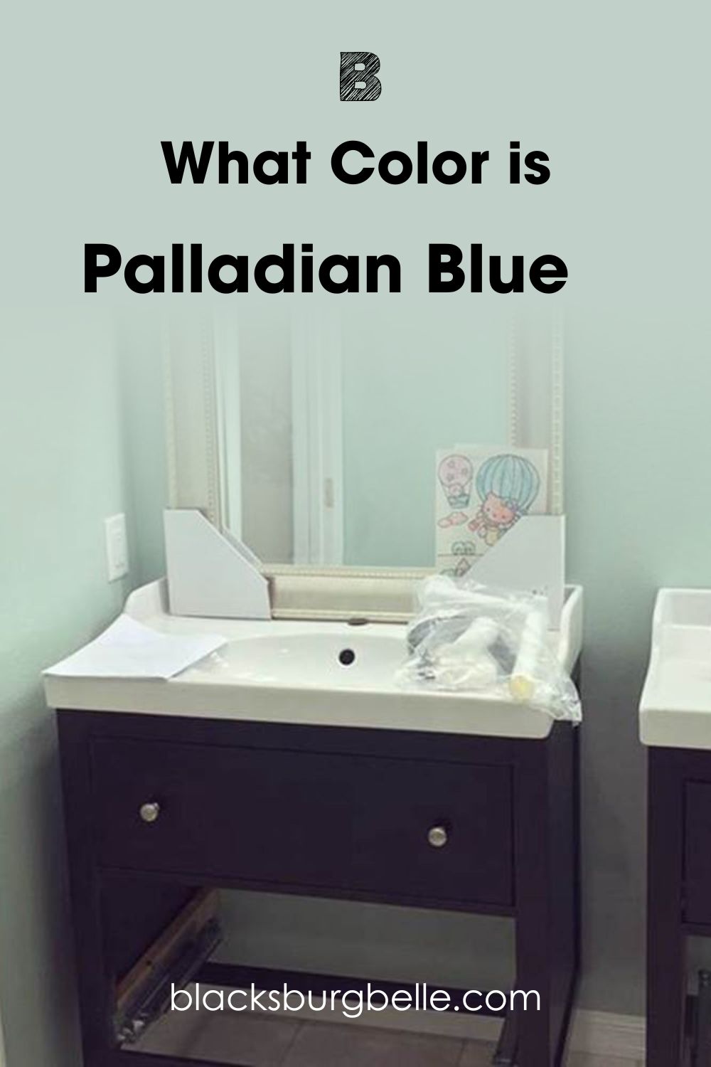
So, here is Palladian Blue looking bright and clearly blue-green:
And here is Woodlawn Blue looking laid-back and more gray than blue in this well-lit room:
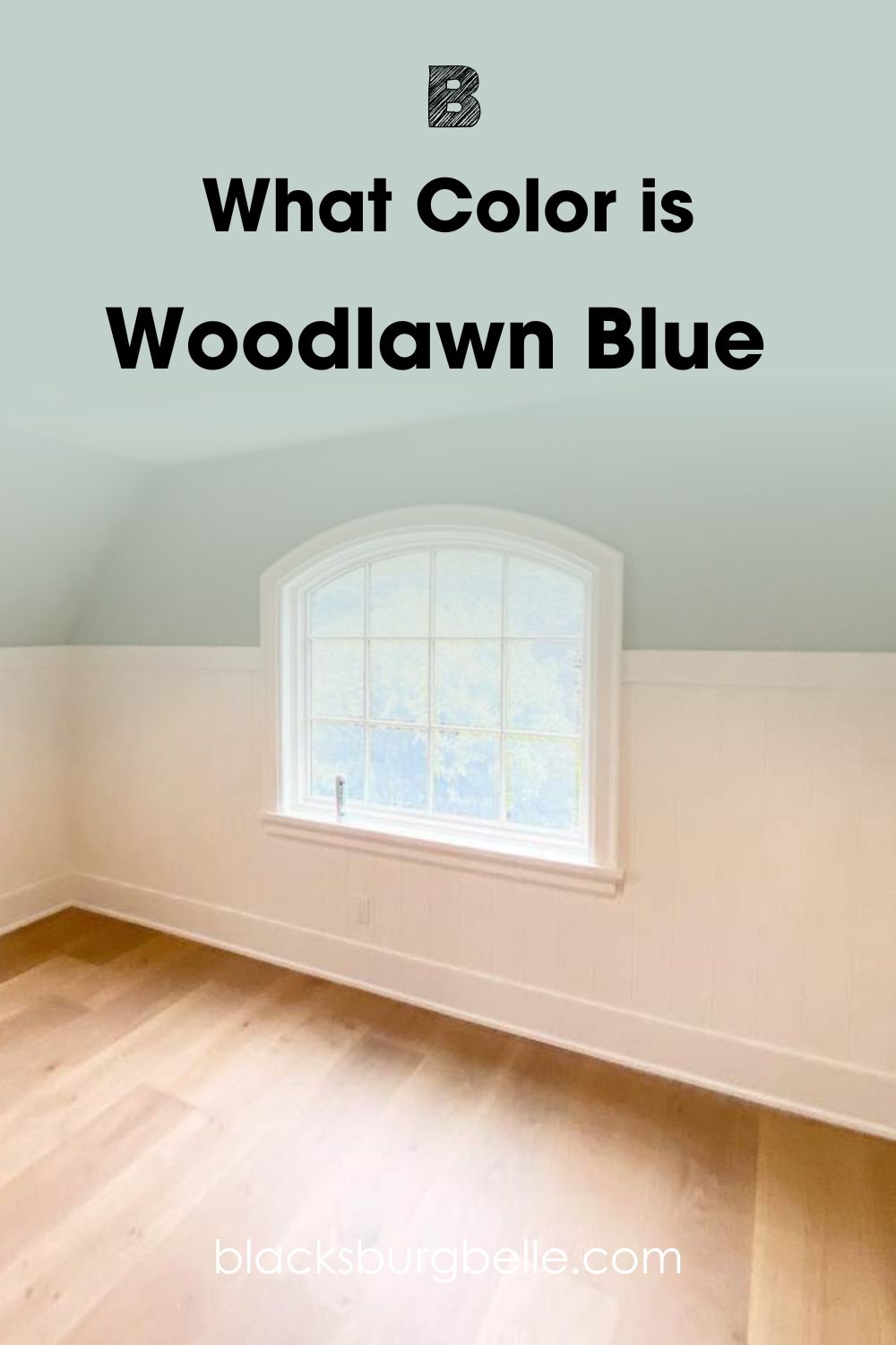
You can already imagine how much Woodlawn Blue will change with different lighting conditions. It also pairs well with light neutrals like white and gray. However, it is best to use it in well-lit rooms if you want to see its beauty.
Palladian Blue looks bright and ‘aqua’ in this room. Although the lighting is artificial, it is bright and white, showing the tones of the paint color. But you can see how the green pokes through and makes the color look more green than blue, which is its actual color.
Choosing Between Benjamin Moor Palladian Blue vs Woodlawn Blue: A Swift Comparison
If you want to know more about these colors, there are basics to consider. Every paint color has undertones because of the inclusion of red, blue, and green (RGB) as well as other colors in some cases. Plus, how much they reflect and absorb is crucial. So, let’s look at them in a chart.
| Palladian Blue | Woodlawn Blue | |
| RGB | 193, 201, 209 | 193, 208, 202 |
| LRV | 60.4 | 60.65 |
| Undertone | Green and gray | Gray and green |
| HEX Value | #C1D1C9 | #C1D0CA |
Emotional Effects: Benjamin Moore Palladian Blue vs Woodlawn Blue
Since they are similar colors, you may get the same feeling by using them, even if they are different rooms. However, one has more gray in it, while the other has more green in it.
Gray can turn a room cool, although there are warm grays. But when used in a room that faces north, it may turn the color calm and cool.
If that is what you want, Woodlawn Blue may be the ideal option. It is a blue paint color, but it also has gray to tone things down and create a calm atmosphere, and green to keep the room from being too cool. You will feel serene and calm with this paint color.
Palladian Blue is more blue and green than gray. So, it may show some warmth and hold up better in a north-facing room than Woodlawn Blue. This paint color gives the feeling of being on the beach, a feeling of airiness and freshness. You will need this if you want to relax and release the stress of the day.
LRV of Benjamin Moore Palladian Blue vs Woodlawn Blue: Which Reflects More Light?
I earlier talked about how color reflects or absorbs light, and this refers to LRV. It is the acronym for light reflectance value and is the rated capacity of any color to reflect or absorb light. The scale is from 0 to 100; 0 is for pure black and 100 is for pure white.
Paint colors have a scale of 2.5 to 94 because there is no pure black or true white paint color. I want you to have an idea of how bright or dull these paint colors are.
Palladian Blue has an LRV of 60.4. With an above-average value, which is above 50, the paint color is bright enough to reflect a reasonable amount of light. You can see this in the picture above.
Woodlawn Blue has an LRV of 60.65. This is barely higher than the LRV of Palladian Blue. In other words, the difference is negligible. But Woodlawn Blue has a higher LRV and may reflect more light than Palladian Blue.
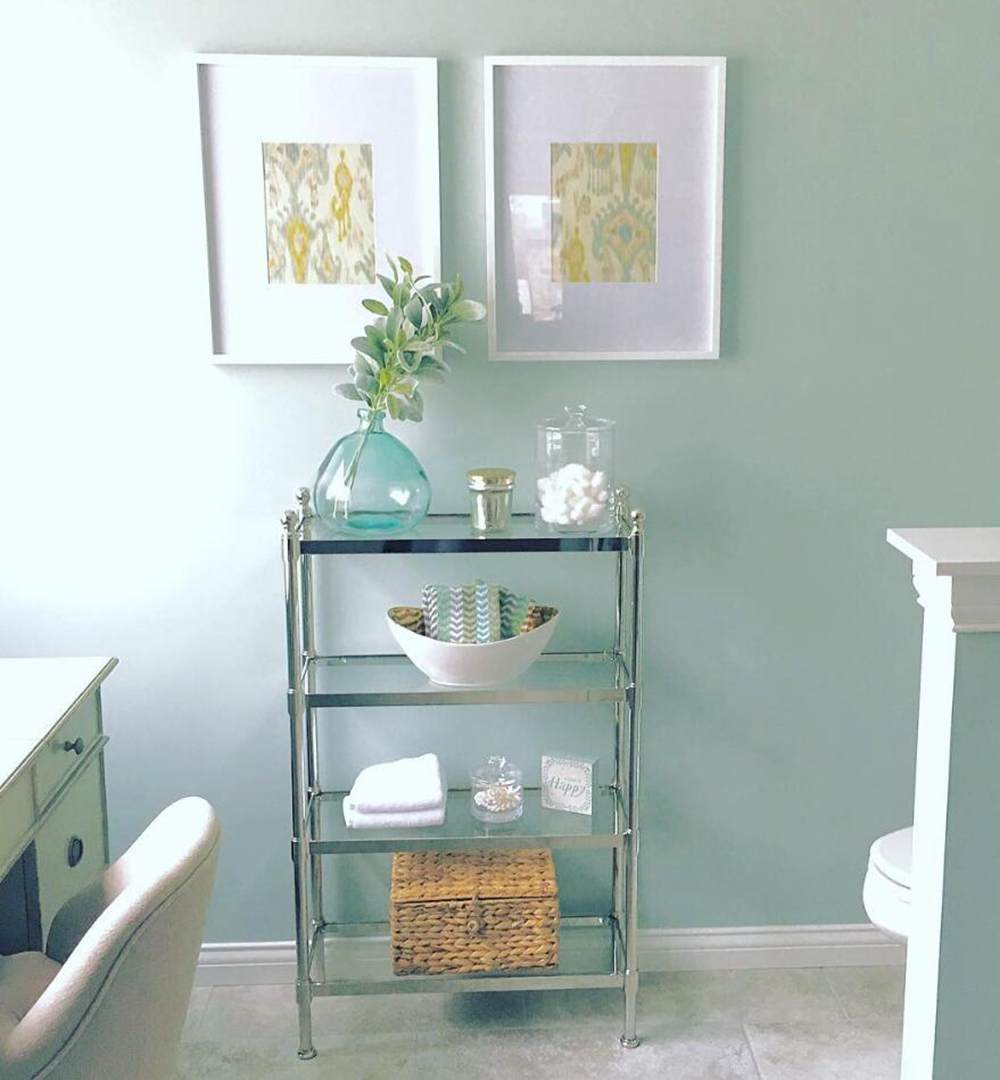
Undertones of Benjamin Moore Palladian Blue vs Woodlawn Blue
As mentioned, there is not much difference between the undertones of Palladian Blue and Woodlawn Blue. Both paint colors are blue with green and gray in them. But Palladian Blue has more obvious green tones, while Woodlawn Blue has more obvious gray tones.
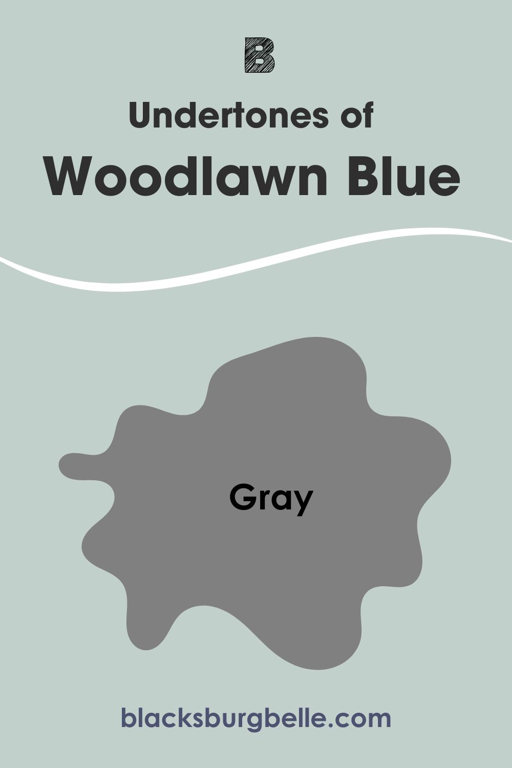
That means Palladian Blue appears blue-green in most settings. Its RGB value shows there is more blue than green, although it may not appear so to the untrained eye. Woodlawn Blue has more blue than green or gray, although it shows more gray than green in most cases.
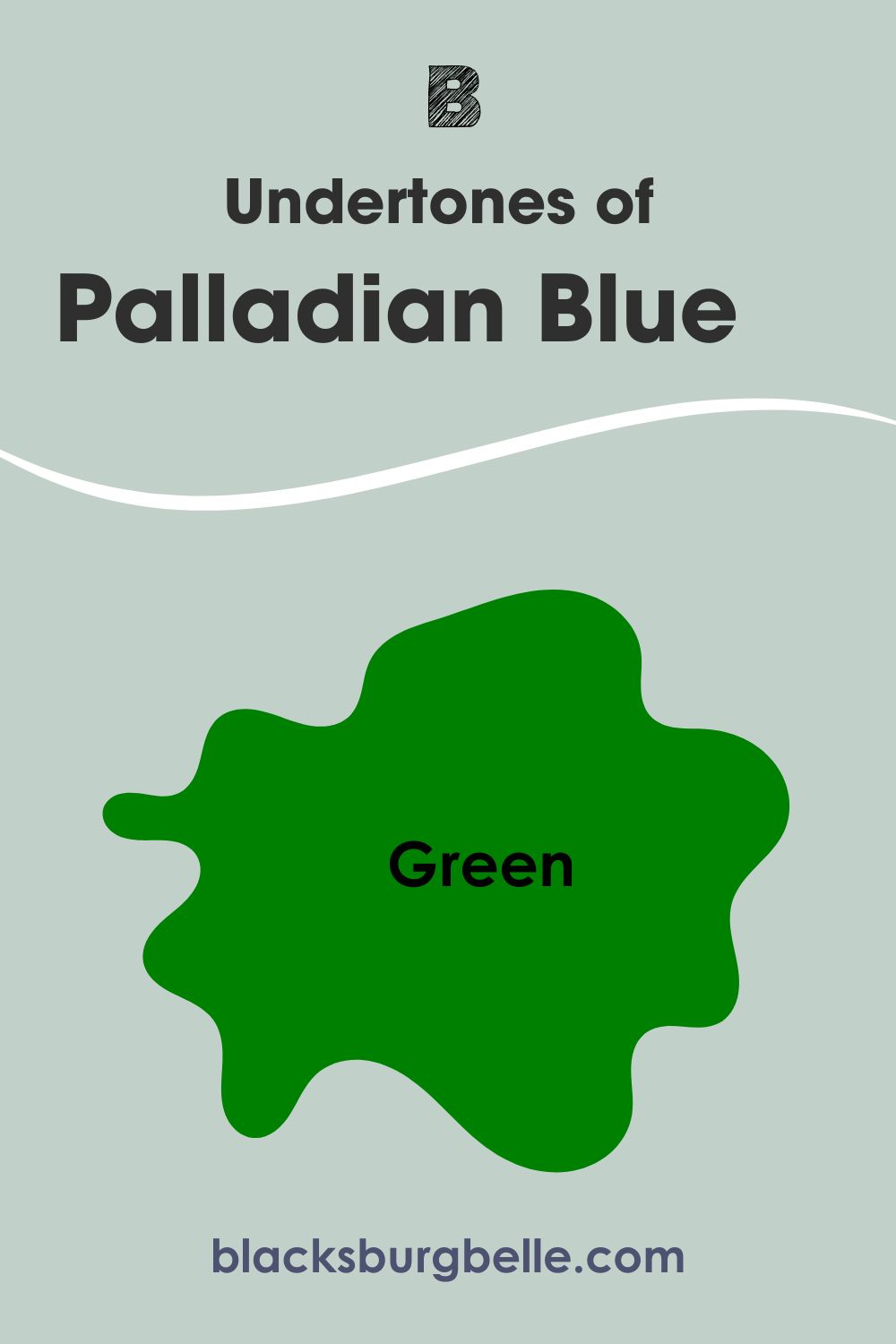
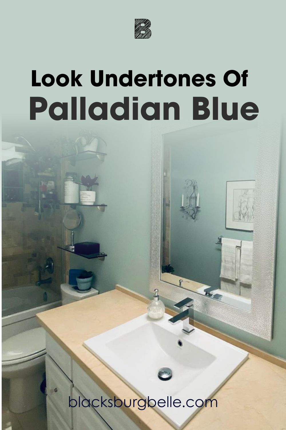
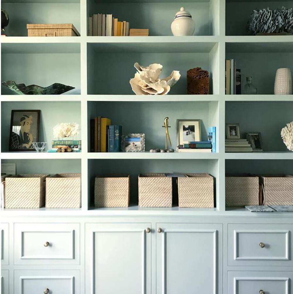
Picking Up on the Undertones of Palladian Blue
I want to give you a closer look at the undertones of Palladian Blue. I carefully picked a picture that reveals all its hues for easy reference.
Picking Up on the Undertones of Woodlawn Blue
This next picture also picks up on all the undertones of Woodlawn Blue. You can see a bit of gray, green, and blue, although the lighting is bright.
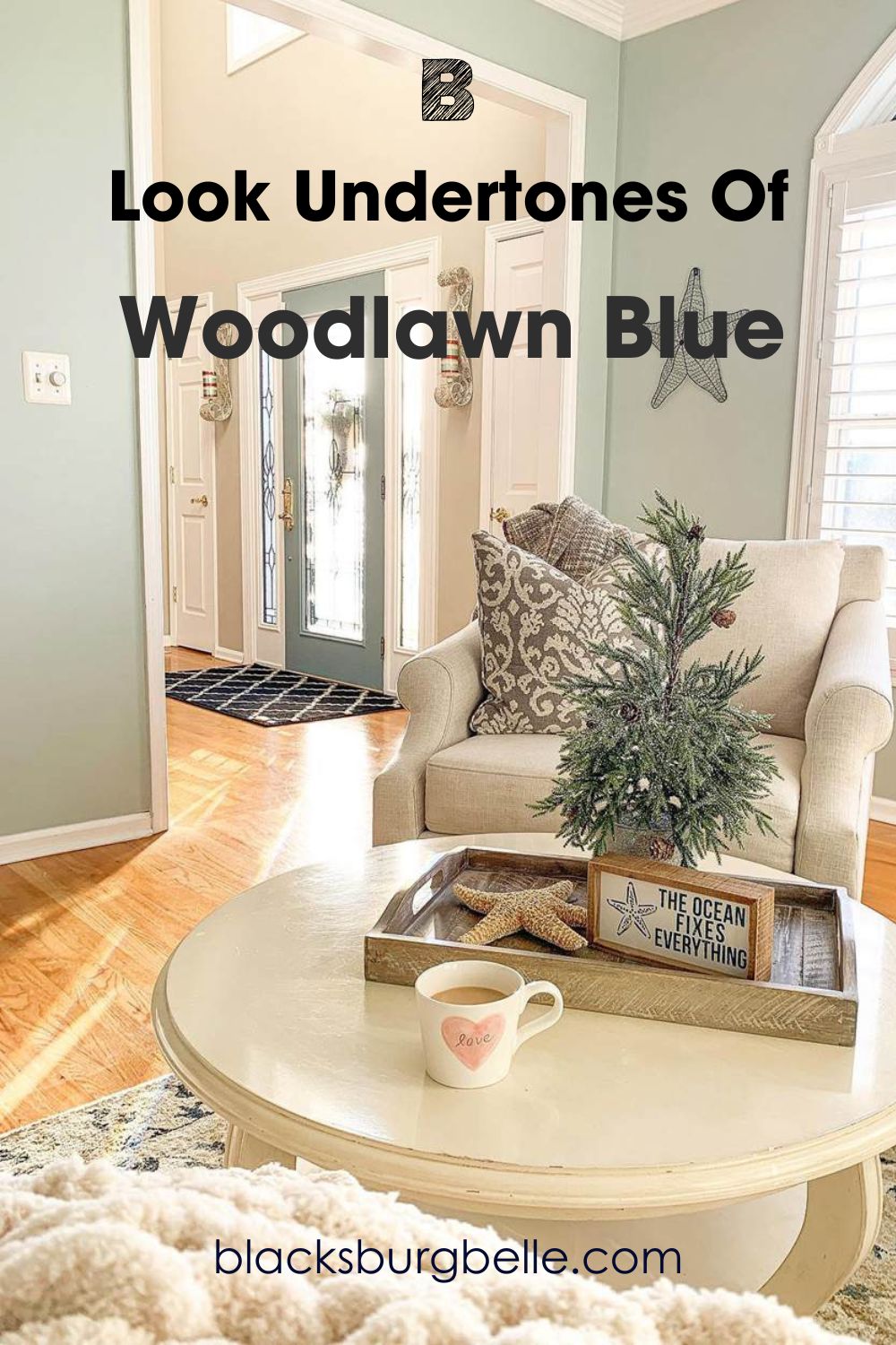
Palladian Blue shows more green than Woodlawn Blue. Fortunately, both colors hold up well under different lighting conditions, which makes it easy to use them. You only have to decide whether you want more gray or green to show in your choice of blue paint.
Benjamin Moore Palladian Blue vs Woodlawn Blue: Are They Warm or Cool?
Palladian Blue and Woodlawn Blue have this in common: they are both cool paint colors. Blue is typically a cool color, but that is not the only reason I call them cool. Green and gray are also cool colors. And although gray can be warm, in this case, it is cool.
Therefore, the two blue paint colors are cool. This is why they perform better in warm lighting conditions than in cool ones. While they may hold up well in col light, they may present a cool face and change the feeling and vibe of the room. Rooms with bright direct lighting make them look their best.
Benjamin Moore Palladian Blue vs Woodlawn Blue Complementary Colors
What are complementary colors? They are colors that are opposite each other on the color wheel and cancel each other when mixed. They don’t have to match; all you have to do is check the wheel and find colors opposite each other. Blue and orange are opposite each on the wheel, as are red and green. These are perfect examples.
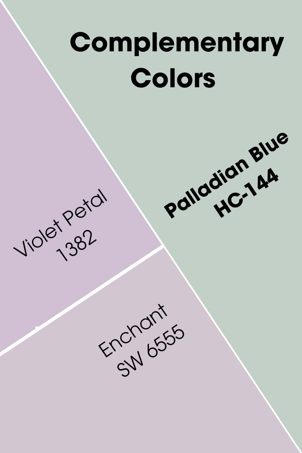
The complementary color for Palladian Blue is a medium shade of purple. And the best match is Benjamin Moore’s Violet Petal 1382. You can also try Sherwin Williams’ Enchant SW 6555.
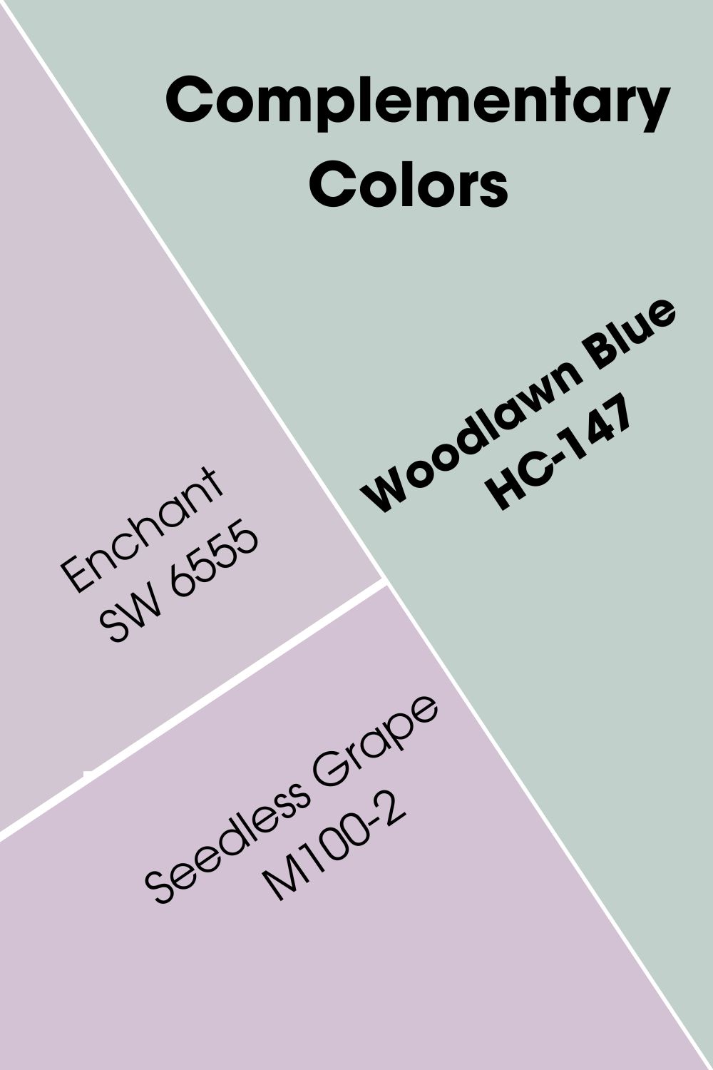
For Woodlawn Blue, the color that best complements it is similar to that of Palladian Blue. So, you can stick to Violet Petal or use an alternative in Enchant by Sherwin Williams. You can also try Behr’s Seedless Grape M100-2.
Benjamin Moore Palladian Blue vs Woodlawn Blue Color Palettes
You will need the right colors to make these paint colors work. A good color palette incorporates different colors that have the same tone as the primary hue. So, while we know that light neutrals like white and light gray pair well with Palladian Blue and Woodlawn Blue, what other colors work well with them? Let’s find out.
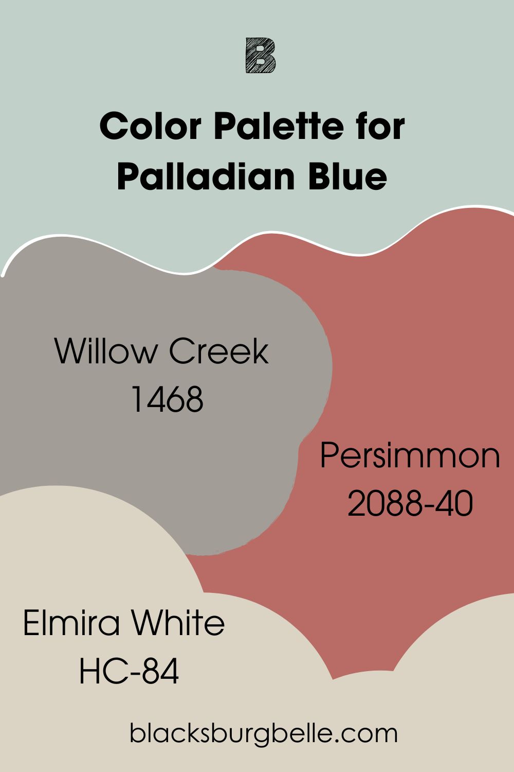
Color Palette for BM Palladian Blue
Willow Creek, Persimmon, and Elmira White are examples of colors that blend well in a Palladian Blue color palette. From here, you can build a suitable one if you want to add other colors.
- Willow Creek 1468:With just a touch of violet, this medium gray shows promises of warmth and elegance that complement Palladian Blue
- Persimmon 2088-40: This is a combination of terracotta and rose that creates a vibrant hue for versatility
- Elmira White HC-84: A greige paint color with a hint of pink to add some soft color that pairs well with Palladian Blue
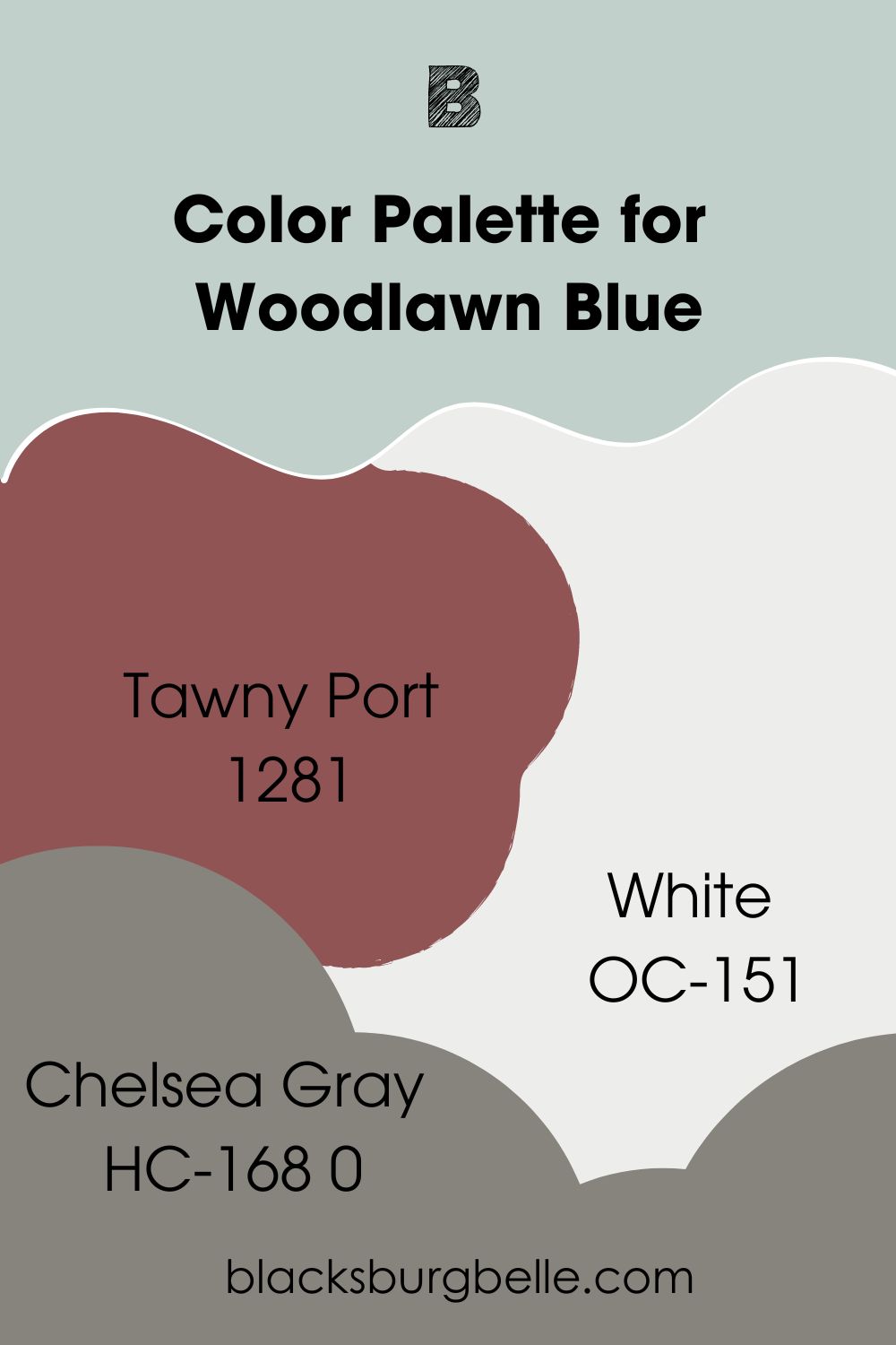
Color Palette for BM Woodlawn Blue
Tawny Port, White, and Chelsea Gray are good color choices to start with when creating a suitable palette for Woodlawn Blue. You can always add or remove colors as long as you stick to the right color scheme.
- Tawny Port 1281: A warm dark red that adds versatility and depth to any decor, especially when you have a light color like Woodlawn Blue
- White OC-151: This is a white paint color that is bright enough to fit Woodlawn Blue and make it pop
- Chelsea Gray HC-168: A dark gray paint color with enough depth to transform the look of Woodlawn Blue
Benjamin Moore Palladian Blue vs Woodlawn Blue on Cabinets
Light blue or blue-green may not be your first choice for cabinet colors, regardless of the room and decor. However, they can change the look to create some fresh airiness if you want a different look.
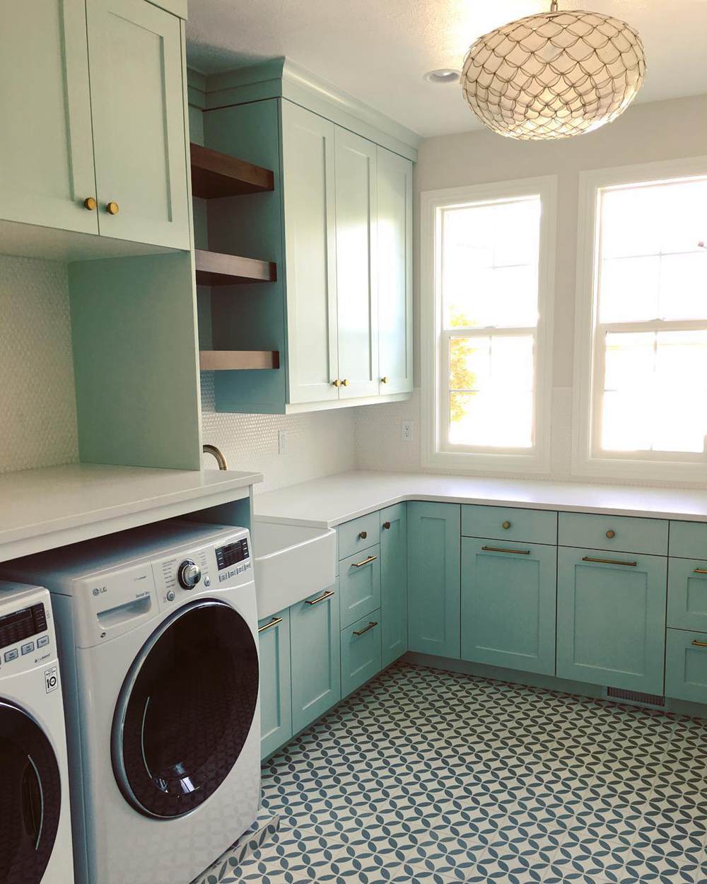
BM Palladian Blue on Cabinets
This laundry room looks bright without using white on the cabinets. The sunlight makes it even better.
BM Woodlawn Blue on Cabinets
This paint color also looks great on cabinets, especially with bright light. And because it’s not a conventional color for cabinets, it stands out in any room.
Benjamin Moore Palladian Blue vs Woodlawn Blue on Doors
As with cabinets, doors can benefit from a splash of color instead of the usual white or brown. How about Palladian Blue or Woodlawn Blue? They can make the doors stand out, especially if they are front doors.
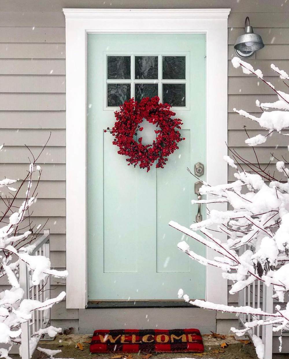
BM Palladian Blue on Doors
Try Palladian Blue on your front door, and you’ll never go back. It is a soft color that welcomes anyone since it is the first thing they see.
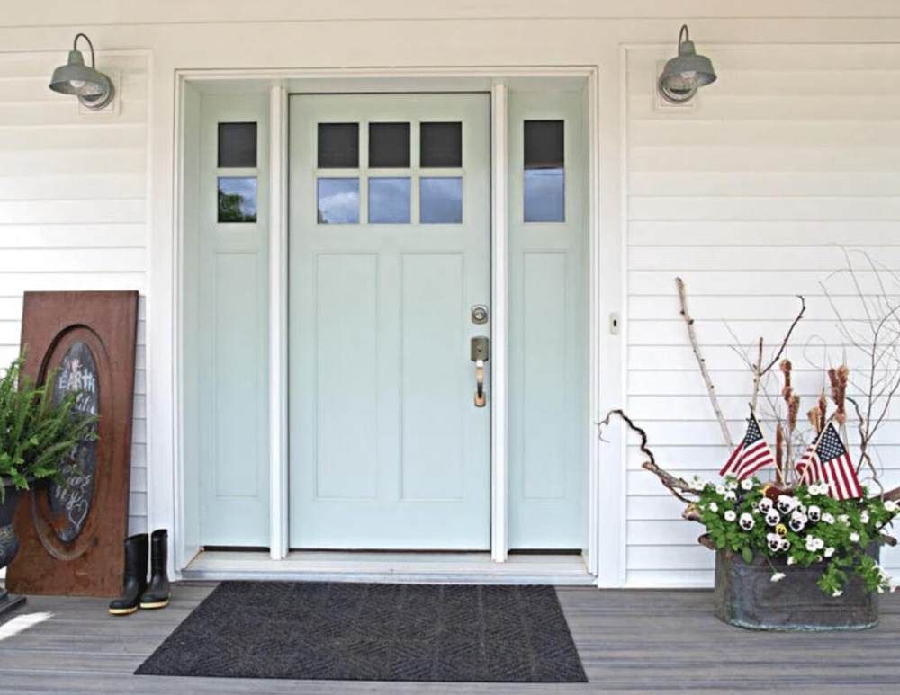
BM Woodlawn Blue on Doors
This is another excellent option for a front door paint color if you want something different yet suitable. In this next picture, Woodlawn Blue is surrounded by white and creates a soft ambiance.
Benjamin Moore Palladian Blue vs Woodlawn Blue in Bedrooms
If you want to create a relaxing and peaceful atmosphere in your bedroom, you must have the right paint color. Palladian Blue and Woodlawn Blue give vibes that feel like being close to the ocean with soft waves crashing against the beach. What is better than that?
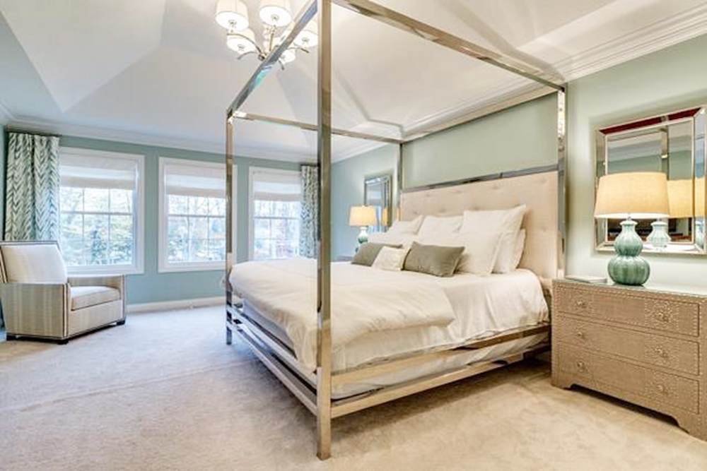
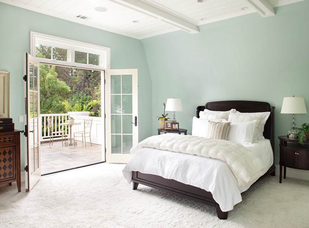
BM Palladian Blue in Bedrooms
This picture shows how Palladian Blue performs in bedrooms if you are wondering whether or not it is the right choice.
BM Woodlawn Blue in Bedrooms
Woodlawn Blue looks bright and almost all blue in this bedroom. It is such a beautiful setting with that view. What can keep you away from home?
Benjamin Moore Palladian Blue vs Woodlawn Blue on Kitchen Walls
While they are great choices for cabinets, do Palladian Blue and Woodlawn Blue look great on kitchen walls? The answer depends on the existing decor, your style, and the cabinets and appliances’ color. I think they make a kitchen look bigger and fresher, especially with white cabinets and appliances.
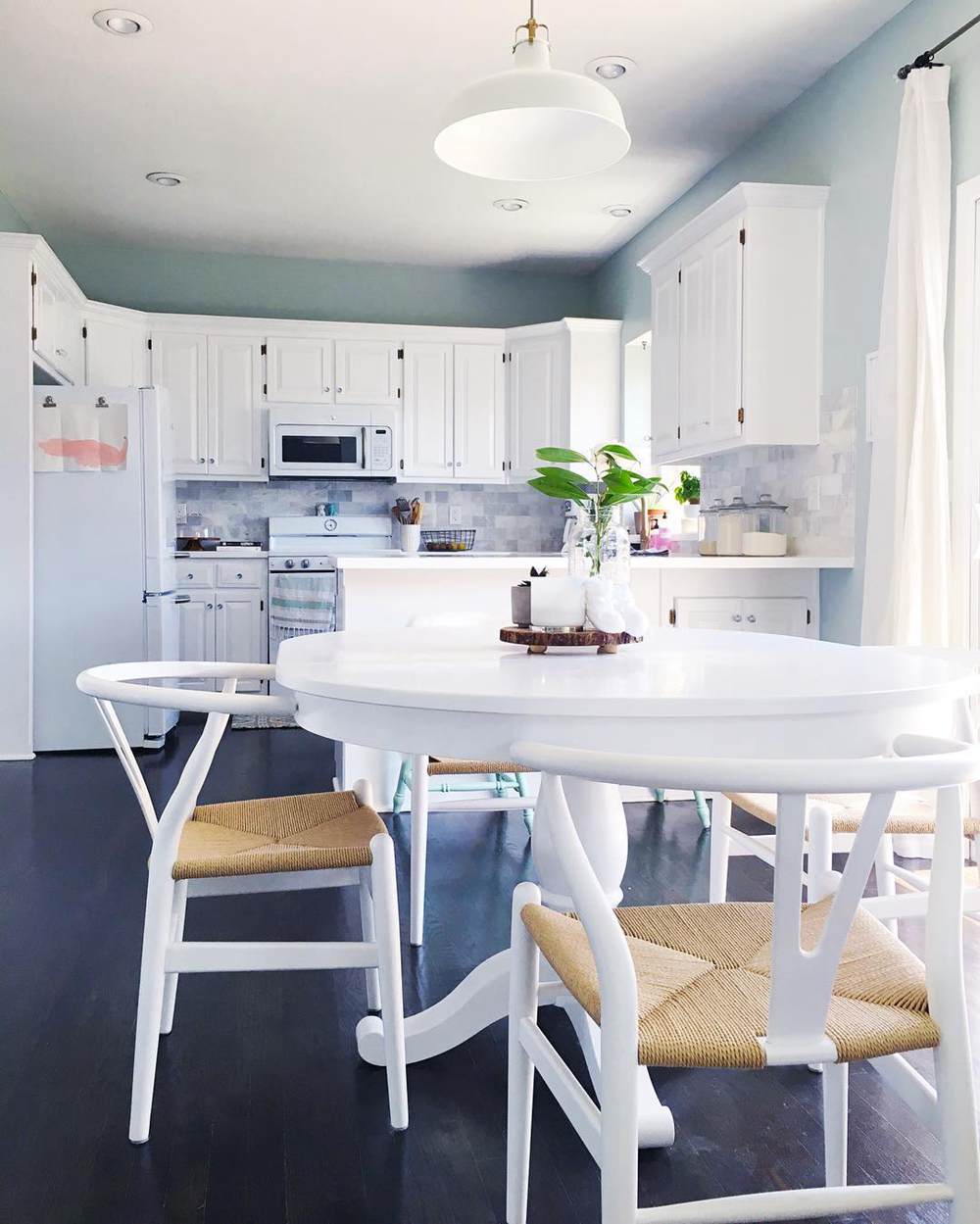
BM Palladian Blue on Kitchen Walls
Take a look at the next picture to decide whether or not Palladian Blue is ideal for your kitchen. You can try this color combination if at a loss for how to use colors.
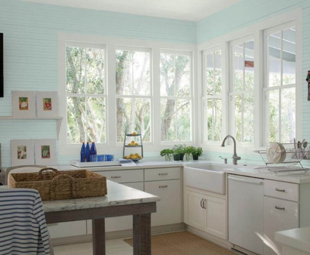
BM Woodlawn Blue on Kitchen Walls
As with Palladian Blue, Woodlawn Blue may also work for your kitchen walls if you pair it with white. But the choice is up to you.
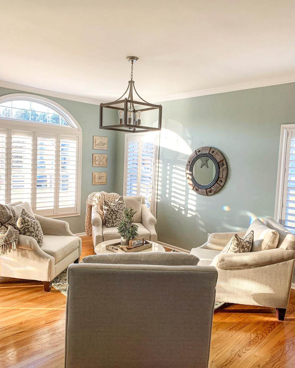
Benjamin Moore Palladian Blue vs Woodlawn Blue in Living Rooms
The living room is one place we want to use use the best paint color. Thankfully, there are many options. But is blue-green like Palladian Blue and Woodlawn Blue ideal? Let’s find out!
BM Palladian Blue in Living Rooms
This paint color gives the feeling of home and relaxation in your living room. If you are not keen on white or blue, try this option for a change.
BM Woodlawn Blue in Living Rooms
This living room is better-lit than the one before. So, Woodlawn Blue appears like green with blue-gray undertones. It is a beautiful shade that matches the chairs and accessories.
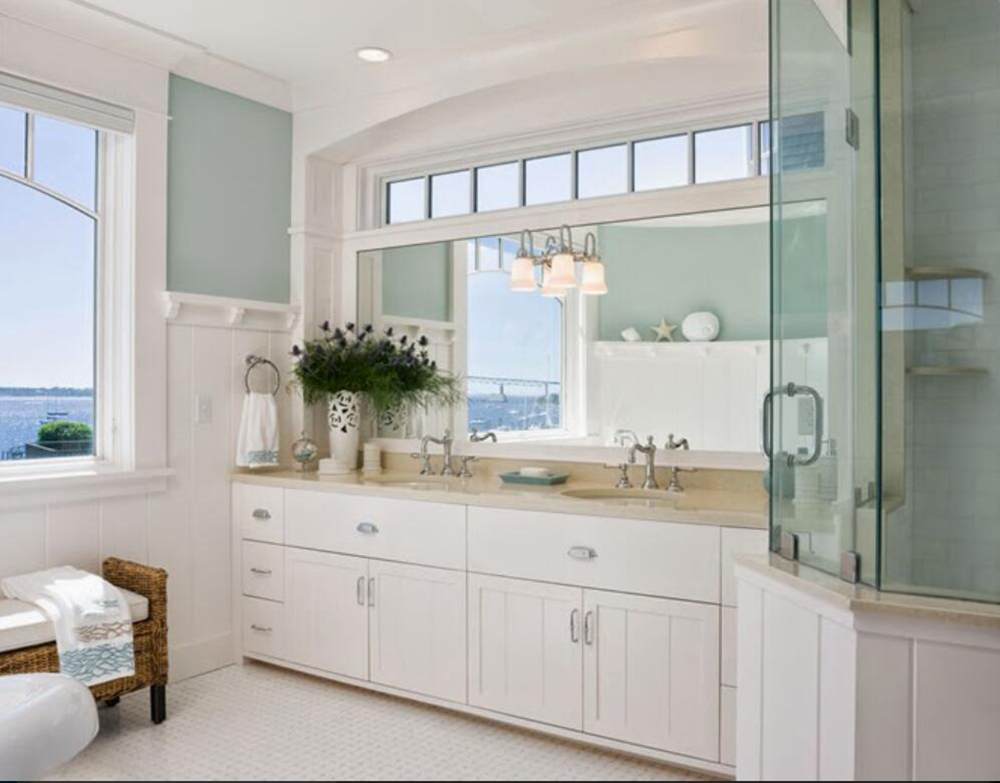
Benjamin Moore Palladian Blue vs Woodlawn Blue in Powder Rooms
Let your powder room present a peaceful face to visitors, calming them when using the room. Many colors can do this, including Palladian Blue and Woodlawn Blue.
BM Palladian Blue in Powder Rooms
This room usually needs a soft color because of the purpose it serves. So, shift from the usual white and try something equally soft without sacrificing color.
BM Woodlawn Blue in Powder Rooms
If Palladian Blue is not your style, try its sibling Woodlawn Blue. It is more muted because of the presence of gray in it but is a soft color.
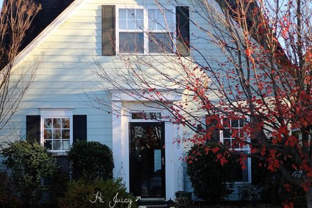
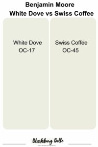
Benjamin Moore Palladian Blue vs Woodlawn Blue on Exterior Walls
Exteriors may beg to differ, but Palladian Blue and Woodlawn Blue are great on them. They are unconventional, but gone are the days when the convention was the norm. Besides, normal is boring.
BM Palladian Blue on Exterior Walls
Like it or not, this house looks amazing with the soft Palladian Blue and white trim all over it. The sunlight and autumn leaves add color and style to it.
BM Woodlawn Blue on Exterior Walls
And here is Woodlawn Blue on this house’s exterior. It is pretty similar to what we have in the Palladian Blue picture, but the color has more depth in this next picture.
Lighting Conditions
At the beginning of this guide, I extensively explained how lighting can affect paint colors. This is especially true of paint colors like Palladian Blue and Woodlawn Blue which easily change their hue with different lighting conditions.
There is no direct sunlight in north-facing rooms, so they need warm colors in the decor. Green usually performs well in such rooms, but if there is gray in the mix, it may become more evident. Consequently, the decor may have a muted look instead of the bright airiness you may want.
South-facing rooms usually don’t have this issue because they have direct sunlight. So, warm or cool color schemes work well in them. West-facing, east-facing, and other exposures may need a bit of tweaking to adjust to these paint colors because the light may be warm one moment and cold the next.
Conclusion
I’ve listed and explained key aspects of Benjamin Moore Palladian Blue vs Woodlawn Blue, pitting them against each other in this guide to make it choosing easier. You can see that their undertones of green-gray are similar, as are their LRVs.
It is only in the amount of green and gray in them that the difference occurs. And while this may look small, it is crucial in deciding the rooms where each goes, especially based on the exposure. The color palettes are simple, but you must ensure they match the primary hues to maintain a seamless pattern in your decor.
I’m always available to help you if you have further questions, and I appreciate your contributions. I look forward to hearing from you in the comments section.
 SW Alabaster Vs BM White Dove: How to Choose!
 Sherwin Williams Rainwashed vs Sea Salt: How to Choose?
 White Dove vs Swiss Coffee: How to Choose?
 SW Dover White vs BM White Dove: Let’s Compare
 Benjamin Moore Pale Oak Vs Edgecomb Gray: How to Choose?
 Sherwin Williams Snowbound vs Alabaster: How to Choose?
