
Blue paint colors have relaxing effects on people, and Green paint colors make us feel closer to nature. Some paint colors combine these shades to give you the best of both worlds. And Benjamin Moore Wythe Blue is one of these amazing color blends.
Wythe Blue belongs to Benjamin Moore’s Historic Color Collection and 191 Time-honored hues. These collections are some of the most popular from the brand. Wythe Blue also won the brand’s Color of the Year in 2012.
But how does this color look in a space? How does Wythe Blue interact with light, room orientation, and color pairings? I have addressed all of these questions and more in this Benjamin Moore Wythe Blue Review.
Let’s get started!
Table of Contents
When to Choose Benjamin Moore Wythe Blue (HC-143)
Although it works well in several spaces and with lots of colors, knowing when to use Wythe Blue might look difficult. Check out the following tips to know the right time to choose Benjamin Moore Wythe Blue:
Looking for deeper coastal/spa vibes?
Benjamin Moore Wythe Blue brings spa vibes to any space with its coastal look and medium to light shade. This is why it excels in such palettes, especially when paired with relevant colors.
Want some green and blue in your space?
Wythe Blue is a blend of green and blue with some gray in it. If you don’t mind having these tones in your space, the paint color is good to go!
Working on a bathroom or bedroom?
Having spa vibes makes Wythe Blue an excellent choice for spaces like bathrooms and bedrooms. Since the paint color doesn’t need lots of lighting to work well, it increases your options for using it in your home
Want some extra color and cheerfulness in your space?
Wythe Blue is known for its cheerful vibe and infusion of color into any space. The paint color works well in exterior spaces and on furniture too.
What Color is Benjamin Moore Wythe Blue?
Benjamin Moore Wythe Blue is a green-gray blend with strong aqua-blue undertones. This composition sometimes makes the paint color appear green-blue with gray undertones. Its description also states it as such.
“An easy, genteel blue-green with a subtle gray cast.” Interestingly, Wythe Blue often appears green, hiding its blue behind strong gray undertones. But don’t worry; you can always bring out its blue with color pairings and lighting. Pretty fun paint color, right?
Wythe Blue has a mid-tone that gives it enough depth but doesn’t prevent it from working well in dark spaces. Therefore, this lovely color blend has an impressive versatility. What’s more? Benjamin Moore Wythe Blue brings relaxing spa-like vibes to spaces like bedrooms and bathrooms.
You will also get splendid results when using it on cabinets and furniture.
Snapshot of Wythe Blue’s Specifications
Below is a table that shows Wythe Blue’s specifications. These attributes determine the paint color’s appearance in your home.
| Specifications | Wythe Blue |
| RGB | 170, 190, 180 |
| HEX Value | #AABEB4 |
| LRV | 48.11 |
| Undertones | Strong Gray and Aqua Blue |
The LRV of Benjamin Moore Wythe Blue
Benjamin Moore Wythe Blue has an LRV of 48.11. But what does this value mean? And how does it affect the paint color?
LRV refers to Light Reflectance Value, and it informs you of how much light a paint color reflects. This value can also show how much light the color absorbs, depending on how you look at it.
Light Reflectance Value runs on a scale of 0 – 100, with 0 representing true black and 100 indicating true white. Other paint colors fall between the values of 3 – 97. This is because they can’t look as pure as true black or white. You can also understand a paint color’s brightness based on its LRV.
Wythe Blue’s LRV of 48.11 puts it in the medium range on the LRV scale. This makes the paint color suitable for both dark and bright spaces. However, you will get the best look when using it in well-lit spaces. The abundant light brings out its cheerful and colorful tones.
Undertones of Benjamin Moore Wythe Blue (HC-143)
Sometimes, your paint color shows tones you probably didn’t notice before. These are called undertones and they contribute to your color’s uniqueness and look. Undertones also help to differentiate between colors.
Benjamin Moore Wythe Blue has gray and aqua blue undertones. They contribute to its calm, cheerful look in any space. The blue undertones can sometimes show up strong. So much so that you will see a green-blue blend.
However, the paint color can sometimes display aqua blue as its main tone. It then shows green and gray undertones instead. These appearances largely depend on factors such as lighting and color pairings.
Is Wythe Blue more green or blue?
Benjamin Moore Wythe Blue has stronger green tones than blue. As a green-gray with aqua blue undertones, Wythe Blue generally displays more green. However, the paint color can show more blue, depending on the lighting or other colors in your space.
Is Benjamin Moore Wythe Blue too dark?
Benjamin Moore Wythe Blue has an LRV of 48.11. This value puts the color in the medium range. Therefore, Wythe Blue is not a dark paint color, neither is it on the bright end. The paint color sits somewhere between bright and dark.
Is Wythe Blue a Warm or Cool Color?
Benjamin Moore Wythe Blue leans more to the warm side. Despite its name and undertones, the paint color generally looks cozy in a home. The main reason is because of its strong green tones. Wythe Blue has green tones that are close to yellow in the color wheel, this puts them on the warm side.
However, the paint color can also appear cool. This happens in areas that bring out its blue tones. North-facing rooms and cool lighting help Wythe Blue lean toward the cool side. Nevertheless, the paint color will never look icy or cold, thanks to its gray and green.
South-facing rooms and warm lighting strengthen its green. This makes it easy for the paint color to appear cozy while displaying its gray undertones. Wythe Blue can read warm in such spaces.
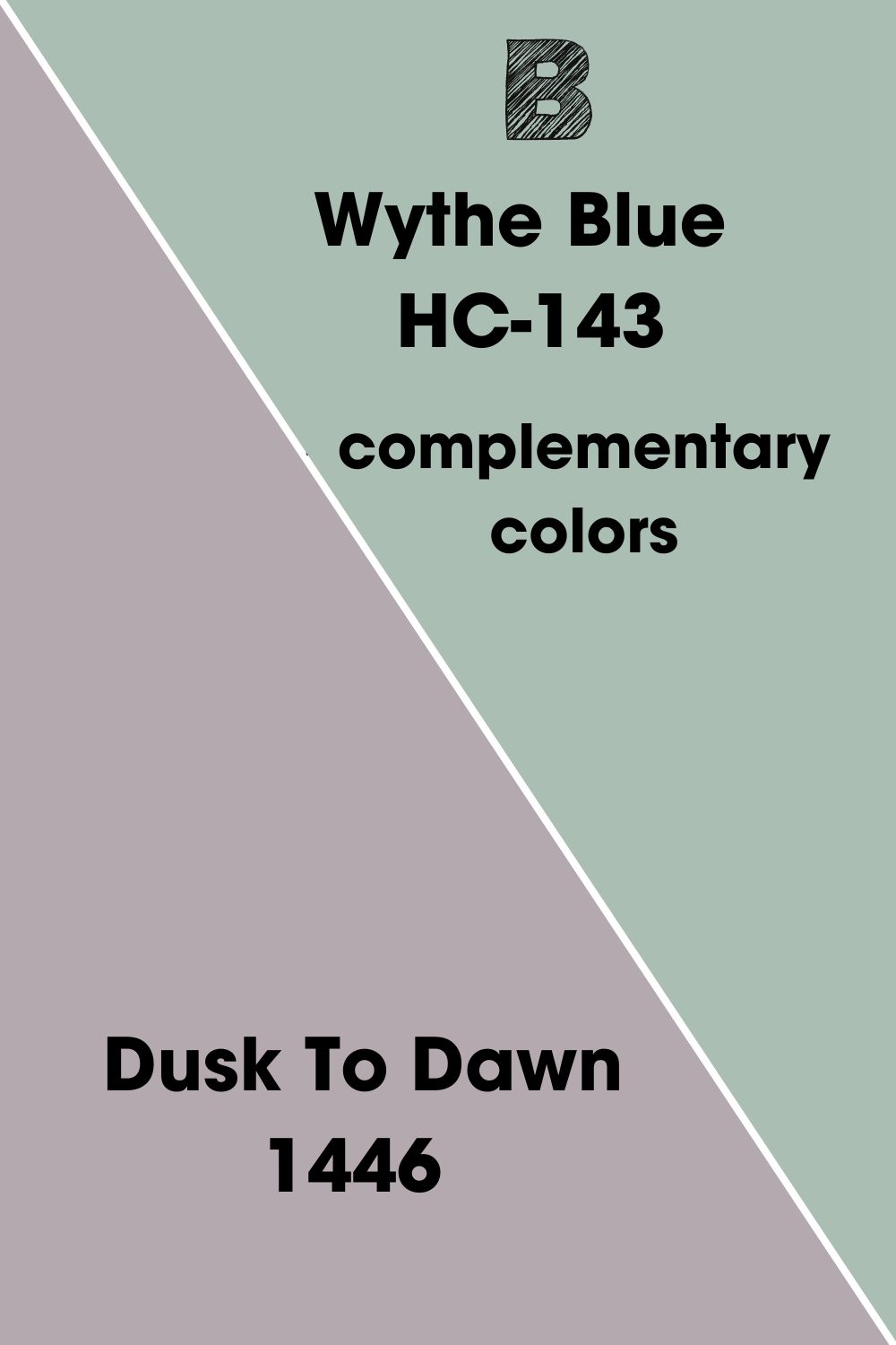
Wythe Blue’s Complementary Color
Every paint color has one hue that complements it. Colors of this complementary hue help the paint color look better in any space when paired with them.
Interestingly, your color’s complement will cancel it out to give black if you mix them together. This is because of their opposing positions on the color wheel. As such, complementary colors contrast best with your paint color.
BM Wythe Blue complementary color is Benjamin Moore Dusk To Dawn. The paint color is the closest Benjamin Moore product to Wythe Blue’s complementary hue.
Benjamin Moore Dusk To Dawn 1446
This mid-toned purple shade finds the perfect spot between some extra color for your space and a medium neutral. Benjamin Moore Dusk To Dawn looks close to gray sometimes. Other times, the paint color flaunts its purple base.
Dusk To Dawn has gray undertones that can sometimes lean into greige. It has an LRV of 41.85 and falls under the brand’s Classics Color Collection. You can flex this paint color in both the interior and exterior spaces of your home.
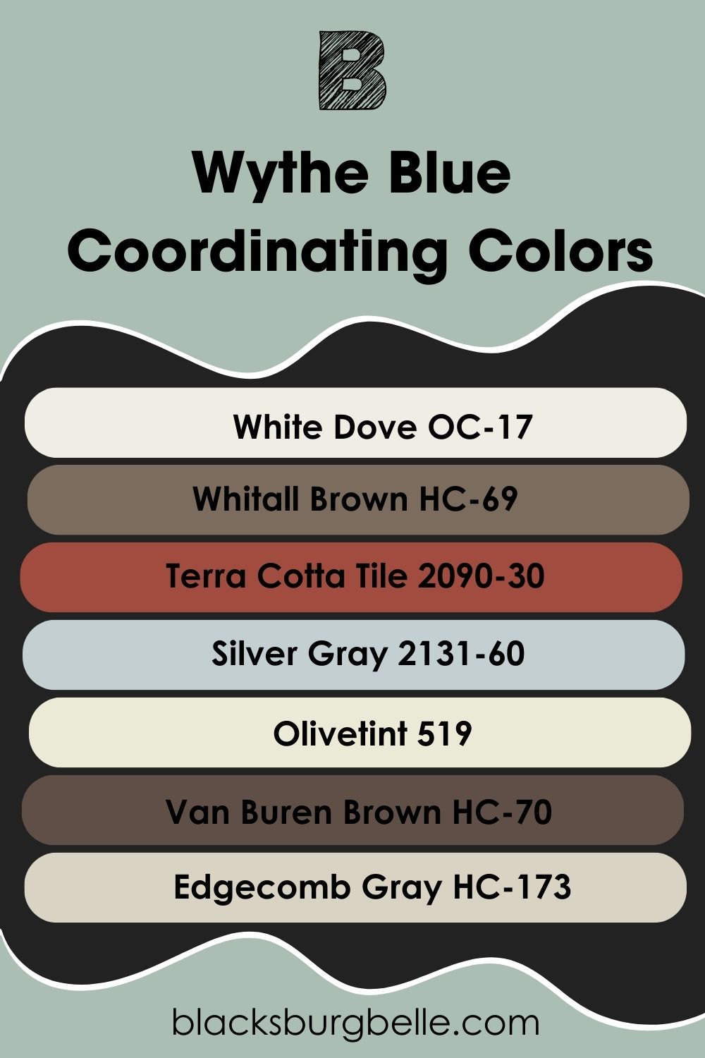
Benjamin Moore Wythe Blue (HC-143) Coordinating Colors
We’ve already established the fact that pairing other colors with your main one helps it look better. But since you’ll generally have one complement for your color, we need other options to work with. Fortunately, we’ve got coordinating colors!
As their name implies, coordinating colors pair nicely with your main color for several vibes and looks. It all depends on your preferences. The following color schemes represent the common ones out there.
- Analogous Color Scheme: You form this color scheme using colors that sit side-by-side on the color wheel. Analogous color schemes give a gentle, gradient vibe.
- Triadic Color Scheme: Triadic color schemes come from colors whose positions on the color wheel form a triangle. It’s the scheme with the most vibrant vibe.
- Complementary Color Scheme: Remember complementary colors and what they do? These color schemes consist of hues that complement your main color. Generally, complementary color schemes give the best contrast effects.
- Split Complementary Color Scheme: As its name implies, Split Complementary color schemes have more variation. They combine a complementary color and two analogous colors.
- Monochromatic Color Scheme: These color schemes have the classiest vibe. Monochromatic color schemes consist of different shades and tints of the same color.
Now you have an idea of the different coordinating color schemes. Here are colors that coordinate well with Wythe Blue.
- Benjamin Moore White Dove OC-17: White Dove is a bright white with an LRV of 83.16 and mild creamy undertones. However, the paint color doesn’t look warm when compared to other warm whites. White Dove has lovely, stylish vibes and works well in any space.
- Benjamin Moore Whitall Brown HC-69: Whitall Brown is a dark shade of nutty brown with an LRV of 16.54. The neutral has strong, smoky gray undertones that give it a filmy look. Whitall Brown has good versatility. It works well on accent walls and furniture too.
- Benjamin Moore Terra Cotta Tile 2090-30: Terra Cotta Tile is a deep, vibrant red paint color with an LRV of 14.14. It has an appealing look and welcoming vibe that draws attention in any space. What’s more? Terra Cotta Tile infuses any room with color and energy.
- Benjamin Moore Silver Gray 2131-60: Here, we have a bright gray with strong blue-green undertones and an LRV of 60.27. Benjamin Moore Silver Gray has a refreshing feel that can look minty in some areas. The paint color reads cool and works well with spa-inspired decor and palettes.
- Benjamin Moore Olivetint 519: This warm, bright off-white has yellow and green tones that make it cozy and colorful. Olivetint pairs nicely with Wythe Blue for a lovely, soft touch to any space. Both paint colors also give a relaxing feel and cozy vibe to your bathroom or bedroom.
- Benjamin Moore Van Buren Brown HC-70: Van Buren Brown is a deep, sophisticated brown shade with an LRV of 9.52. Benjamin Moore describes it as “a deep, dignified brown that leans towards black.”You can always use it on accent walls and cabinets too. The paint color works well with several palettes, especially earth-inspired ones.
- Benjamin Moore Edgecomb Gray HC-173: Edgecomb Gray is one of the most popular neutral from Benjamin Moore. The paint color looks greige (gray and beige) but can lean into either tone, depending on lighting and color pairings. Edgecomb Gray has has green-gray undertones but generally reads warm and cozy in any space.
Benjamin Moore Wythe Blue Color Palettes
Wythe Blue works well with several palettes and decor outside of spa-inspired ones. The paint color’s cheerful, welcoming vibes make it suitable for any room and space. Here are some wonderful palettes to try out.
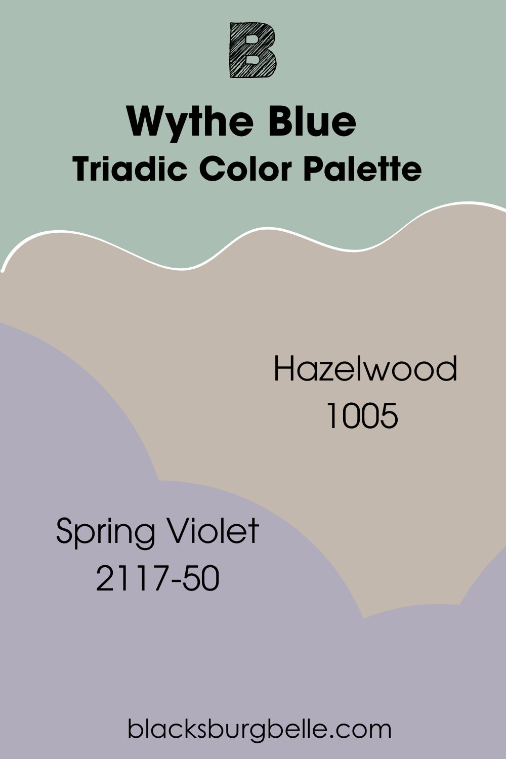
Triadic Color Palette
- Benjamin Moore Hazelwood 1005: Hazelwood is a moody shade of gray but not dark, thanks to its LRV of 48.88. Mauve undertones prevent the paint color from looking foreboding in any space. Instead, Benjamin Moore Hazelwood gives a classy, cozy feel in interior and exterior spaces.
- Benjamin Moore Spring Violet 2117-50: This soft, faded purple has a refreshing and calm vibe. Benjamin Moore Spring Violet works well with Wythe Blue, thanks to its complementary hue. It has an LRV of 42.87, making it suitable for both dark and bright spaces.
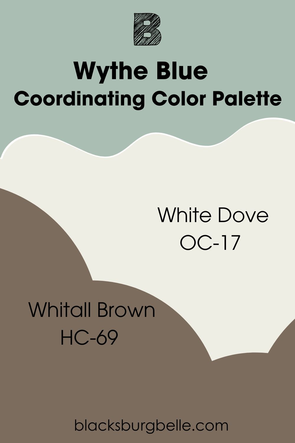
Coordinating Color Palette
- Benjamin Moore White Dove OC-17: White Dove is the brightest member of this palette. It has subtle warmth and cozy vibes, trimming well for the other colors. However, you can also use White Dove on walls for a brighter feel and mildly creamy touch.
- Benjamin Moore Whitall Brown HC-69: Whitall Brown acts as an anchor for this palette. The deep, nutty brown has earthy tones and goes great on accent walls and furniture. It brings a sense of welcome and a gentle touch to your space.
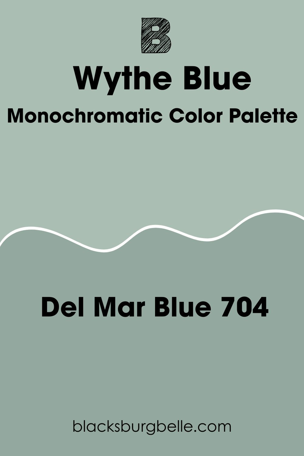
Monochromatic Color Palette
- Benjamin Moore Del Mar Blue 704: Also known as Stratton Blue, this blue-green blend has the same tones as Wythe Blue. However, it has a deeper color depth with an LRV of 37.77. Benjamin Moore Del Mar Blue pairs with Wythe Blue for a monochromatic effect.
Benjamin Moore Wythe Blue vs. Similar Paint Colors
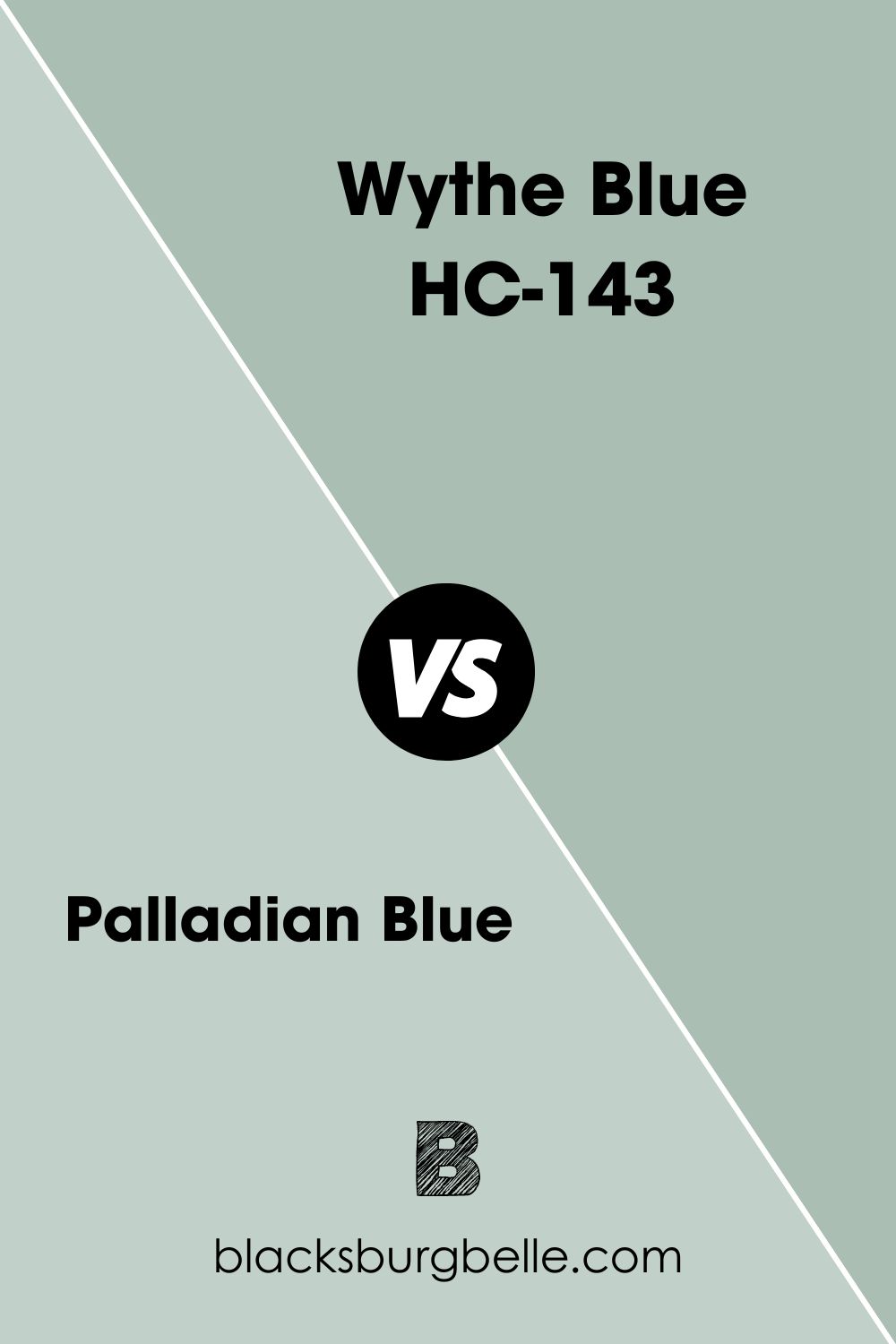
Palladian Blue vs Wythe Blue
Although both paint colors have similar tones, Palladian Blue has a higher LRV of 60.4 and looks brighter. Also, they differ in main tones and undertones.
Benjamin Moore Palladian Blue is a blue paint color with green and gray undertones. Wythe Blue is a green paint color with aqua-blue and gray undertones. The former has beachy vibes and fits into coastal and spa palettes, while the latter is more popular with spa palettes.
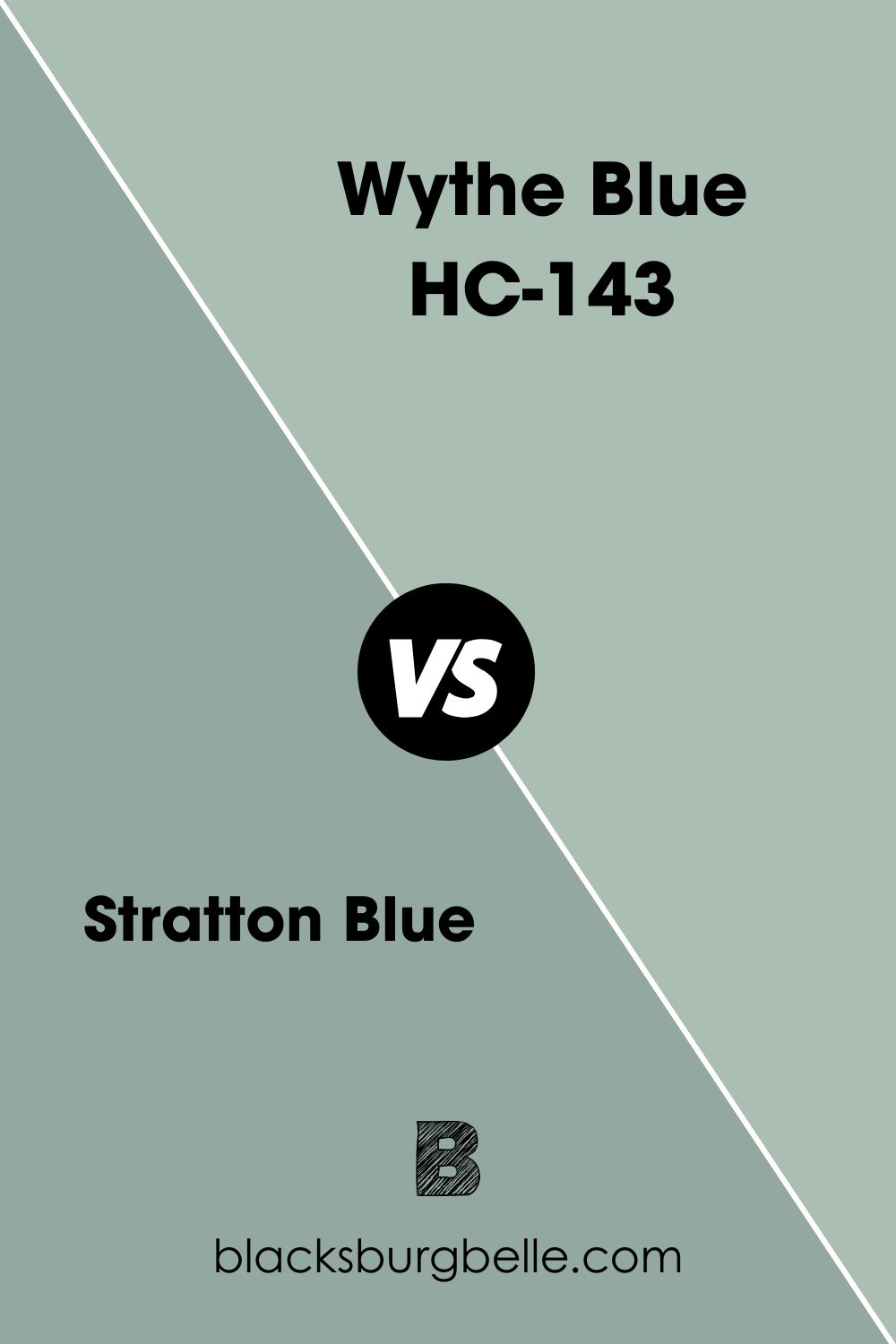
Stratton Blue vs Wythe Blue
Benjamin Moore Stratton Blue has blue, green, and gray tones like Wythe Blue. However, the coastal color has a lesser LRV of 37.77 and deeper tones. Both paint colors work well together in monochromatic palettes, with Stratton Blue anchoring the brighter Wythe Blue.
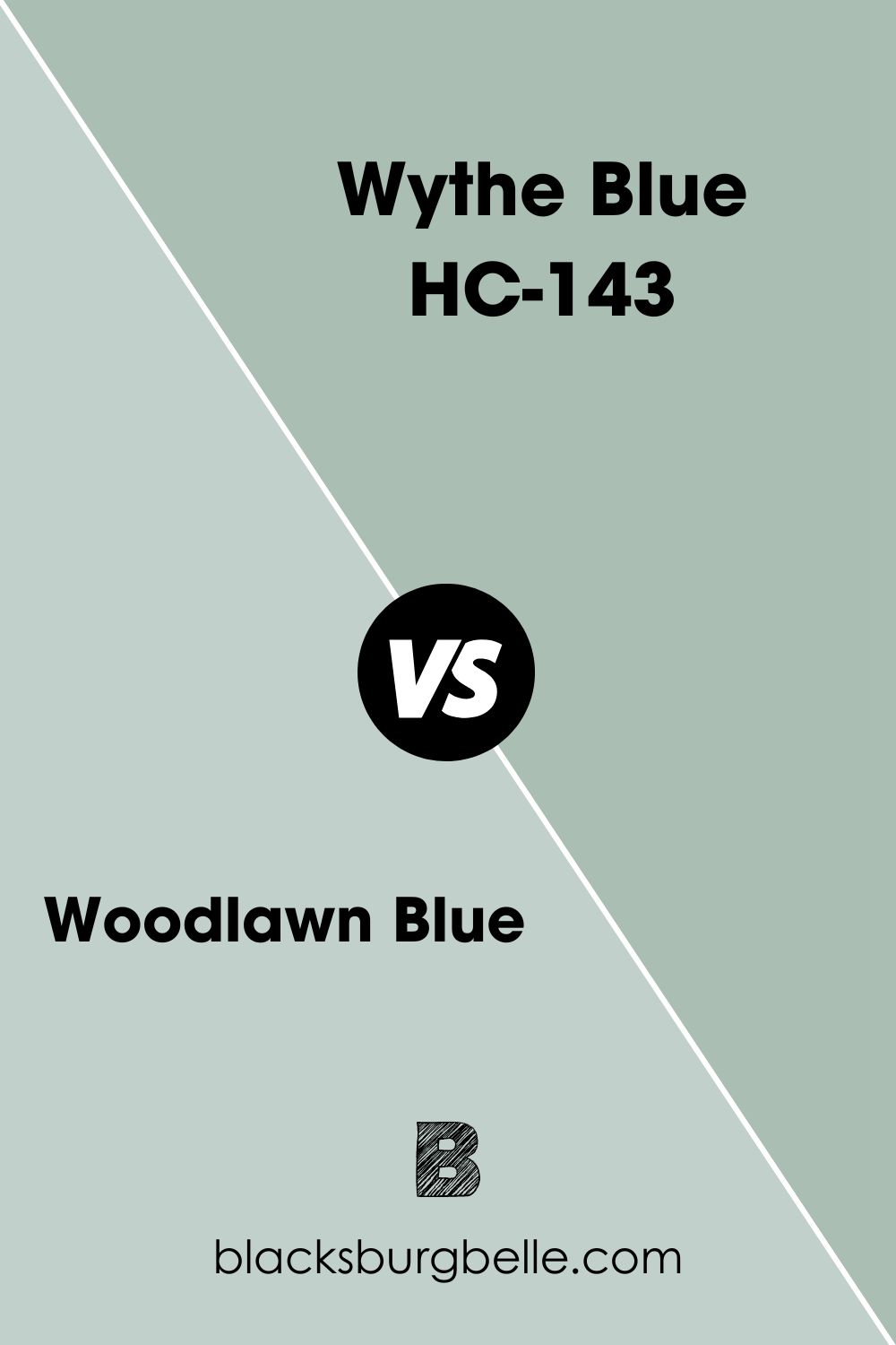
Wythe Blue vs Woodlawn Blue
Benjamin Moore Woodlawn Blue is a bright, airy blue with green undertones. This makes it different from Wythe Blue, a green paint color with aqua blue undertones. Also, Woodlawn Blue has a higher LRV of 60.65.
Both paint color fit into spa-like and beachy palettes. However, Woodlawn Blue finds more use as a coastal color. Its higher LRV also makes it more popular.
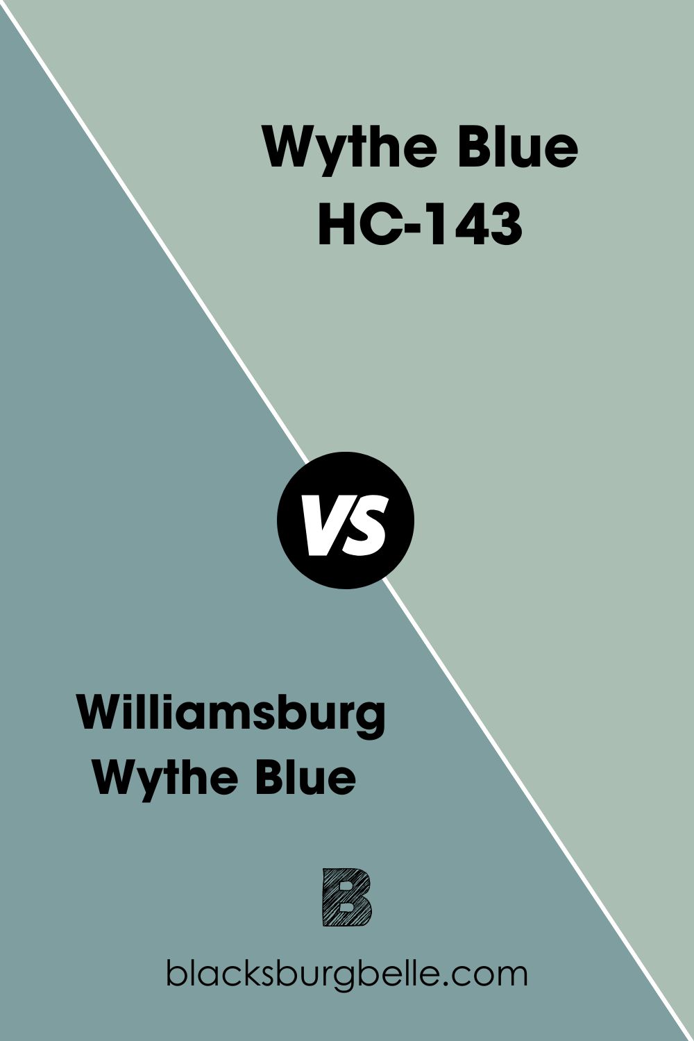
Williamsburg Wythe Blue vs Wythe Blue
Even though they have similar names, these paint colors don’t look the same. Williamsburg Wythe Blue is a mid-to-dark Prussian blue with gray undertones. As opposed to Wythe Blue’s green with aqua blue and gray undertones.
As such, you won’t find green tones in Williamsburg Wythe Blue. Also, the paint color has a lower LRV of 33.4 and stronger blue tones.
Note that both paint colors came from the same brand, which is Benjamin Moore.
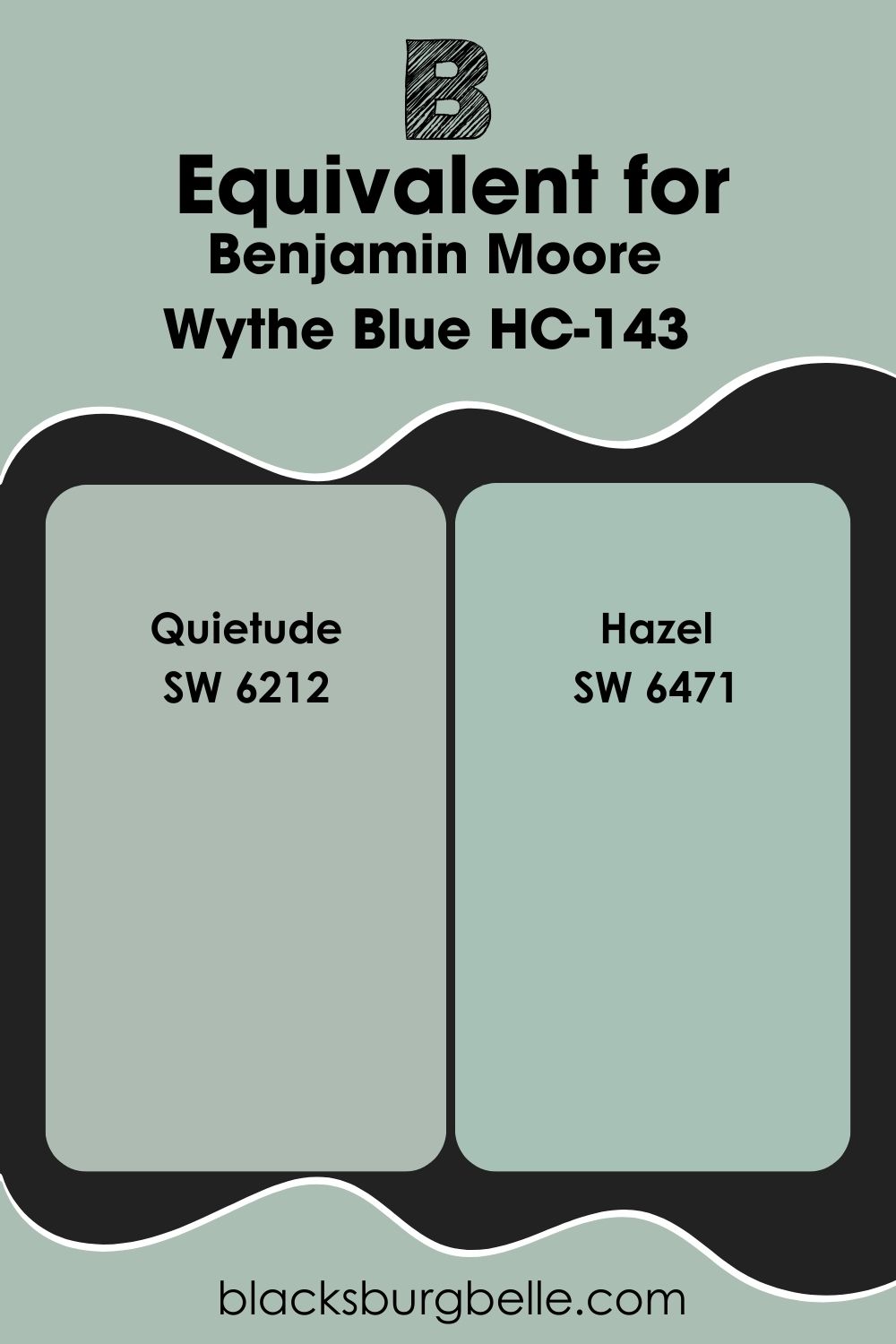
Benjamin Moore Wythe Blue Sherwin Williams Equivalent
Paint brands often have color that look similar or simply have the same names. This comes in handy when you want a particular look but would prefer one brand over the other. Also, one might not be able to get a paint color from one brand and might want to try another.
In this case, you can work with two Sherwin Williams paint colors to get something similar to Benjamin Moore Wythe Blue.
Sherwin Williams Quietude (SW 6212)
Quietude is a light-hearted green with blue-gray undertones. It has an LRV of 48 and displays stronger gray tones than Benjamin Moore Wythe Blue. The paint color also looks cozy, especially in interior spaces.
Sherwin Williams Quietude is arguably the more popular paint color of the two.
Sherwin Williams Hazel (SW 6471)
Hazel looks similar to SW Quietude and Benjamin Moore Wythe Blue. However, it is a blue paint color with green-gray undertones. Sherwin Williams Hazel works best in spaces like bathrooms and front porches. The paint color has beachy vibes and fits well into coastal and spa-like decor.
It has a slightly higher LRV of 50 but just about the same reflectance as the other two paint colors.
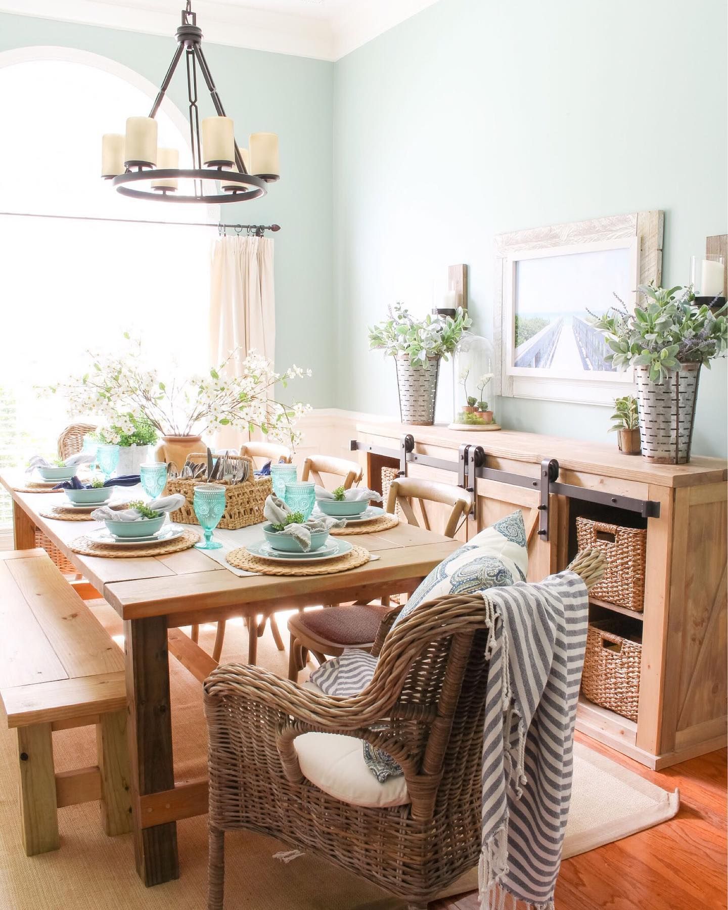
Benjamin Moore Wythe Blue Living Room
Wythe Blue offers coastal vibes with some extra depth in any space. The living room is one of the areas where works best. Whether you use it on walls or as a trim, the paint color will deliver splendid results.
Benjamin Moore Wythe Blue Furniture
You can flex Wythe Blue on furniture since it works just as well on woodwork. This opens up your options on the number of places to use the paint color.
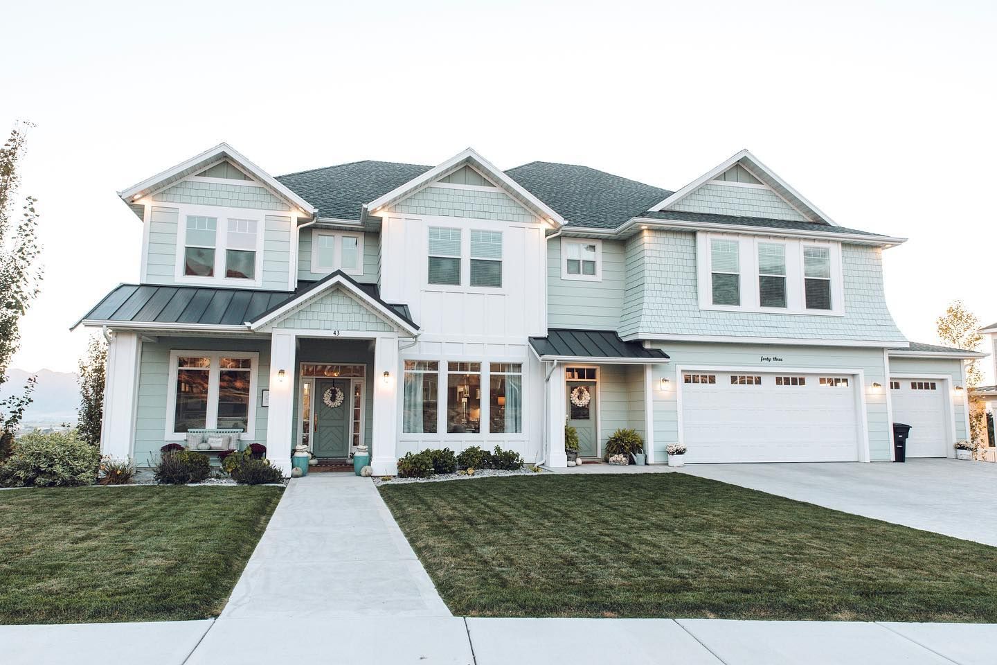
Benjamin Moore Wythe Blue Exterior
Set the ultimate coastal/beachy vibe for your home’s exterior using Benjamin Moore Wythe Blue. Trim it with white for the classiest of looks!
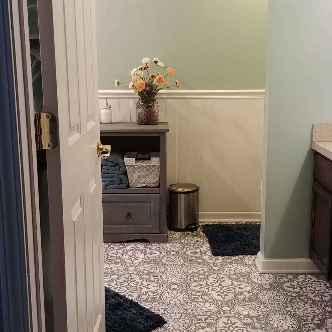
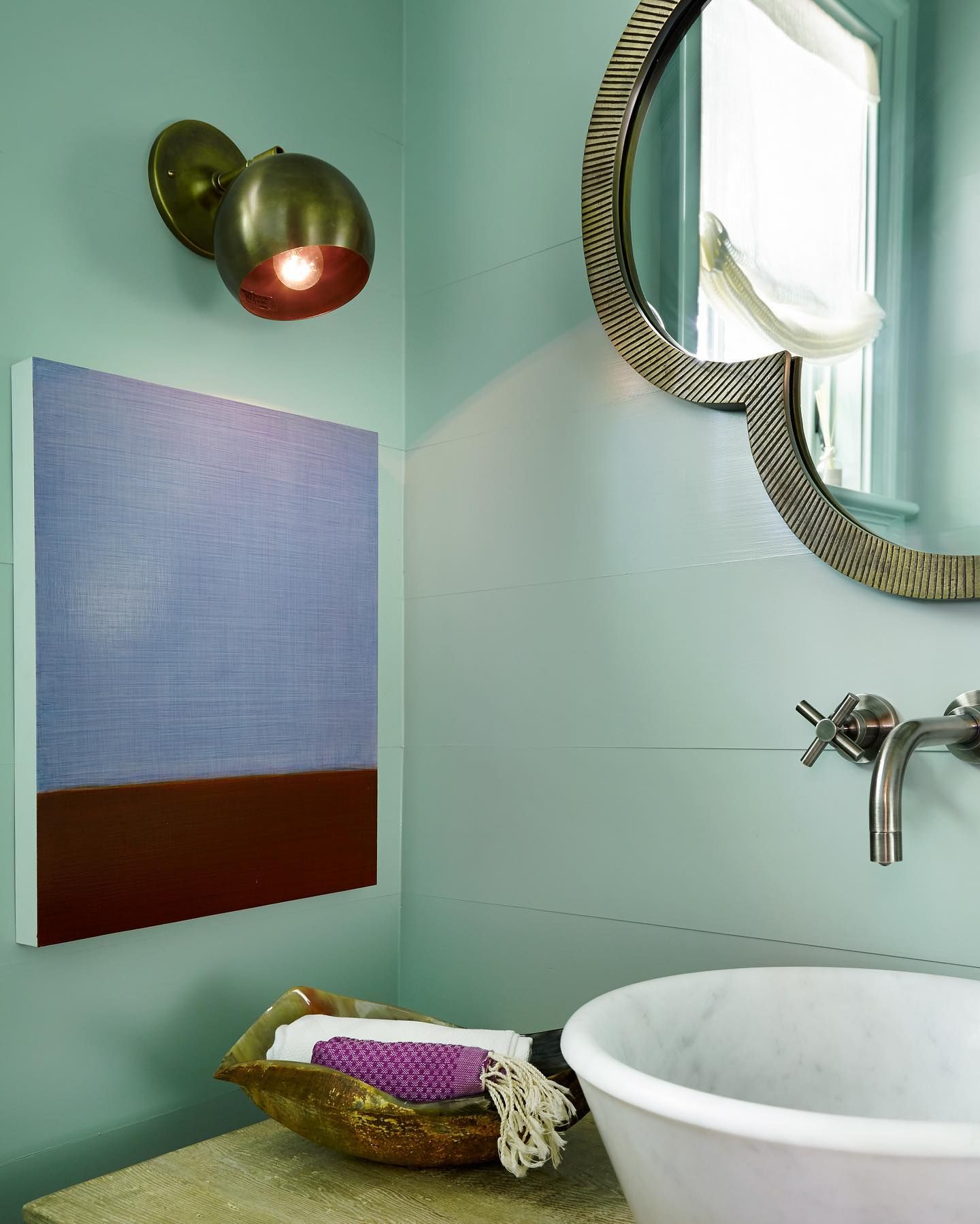
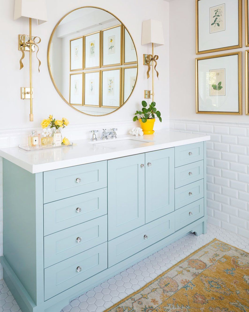
Benjamin Moore Wythe Blue Bathroom
Not only can Wythe Blue give a spa-like look, but the blue-green blend can also give a cozy, colorful look to your bathroom. Notice how the paint color emphasizes its green tones in the picture below.
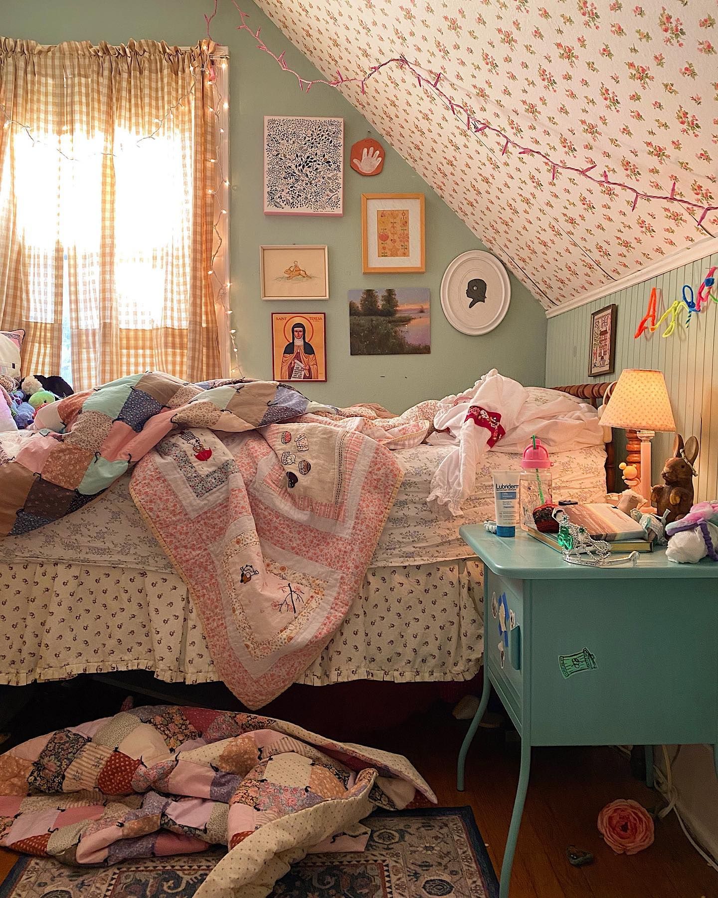
Benjamin Moore Wythe Blue Bedroom
Wythe Blue takes on a cozy green look in the pictures below, thanks to the surround colors and lighting. If you want the paint color to lean more into blue, use cool lighting or pair it with a cool white.
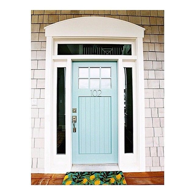
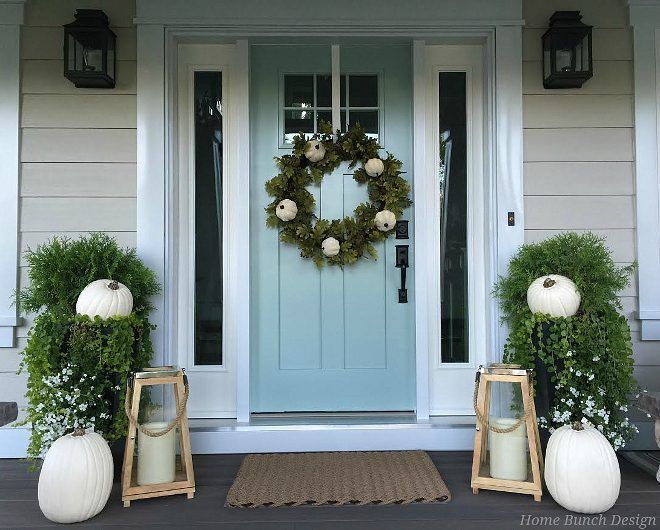
Benjamin Moore Wythe Blue Front Door
What better way to give your home’s exterior a lovely coastal feel than using Wythe Blue on the front door and trimming it with white?
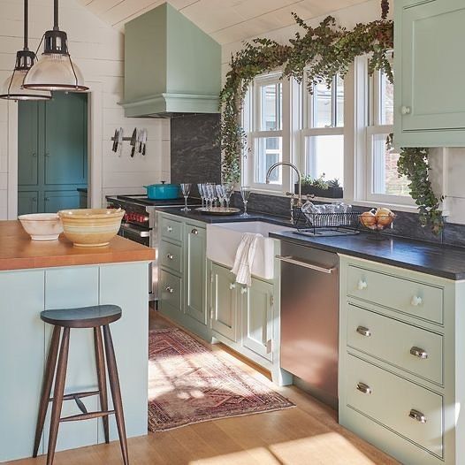
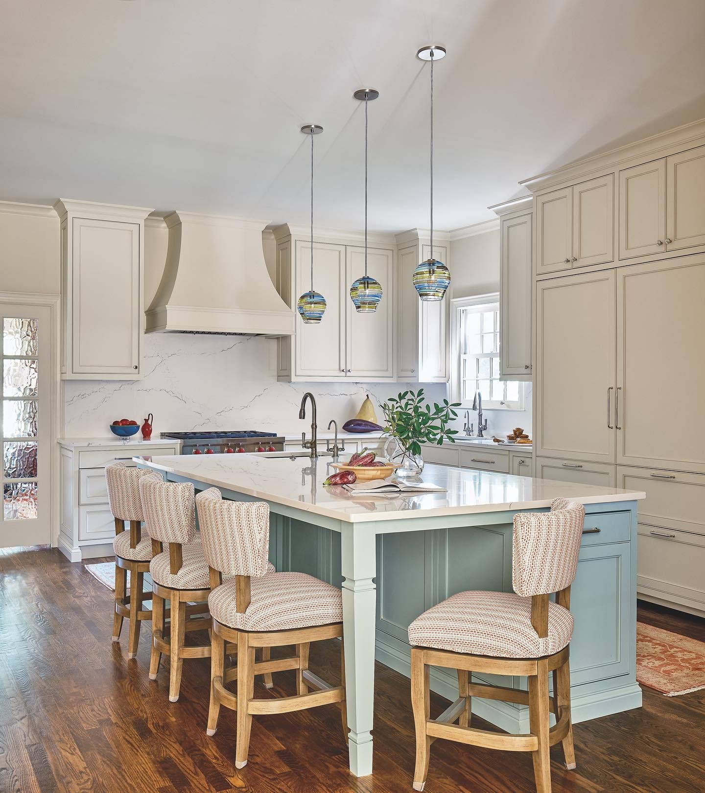
Benjamin Moore Wythe Blue Kitchen
Wythe Blue works well on both cabinets and walls in the kitchen. However, the paint color is more popular for cabinets since white can simply go on the walls instead.
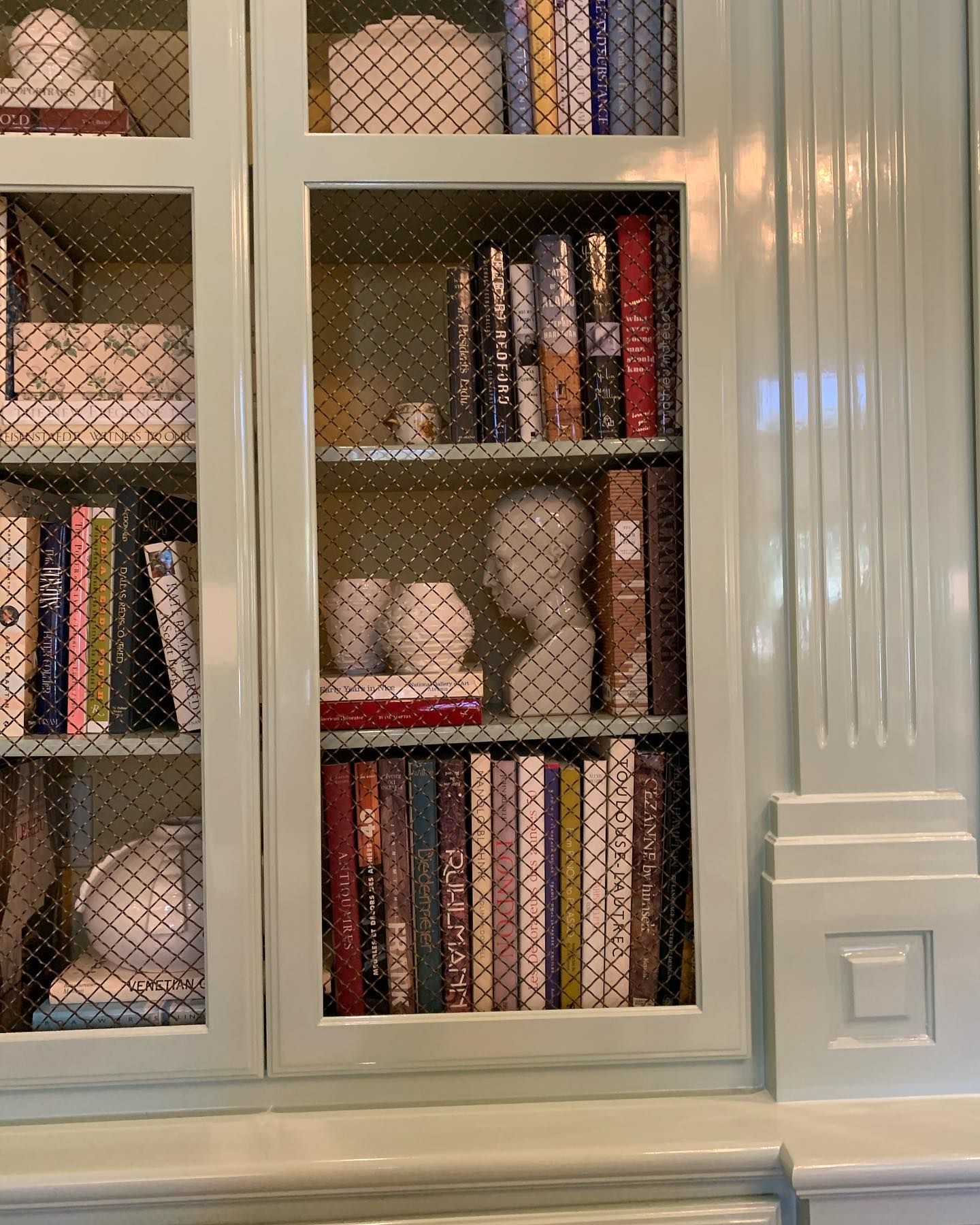
Benjamin Moore Wythe Blue Cabinet
Wythe Blue looks more blue than green on the cabinet in the picture below. The reason is that it’s paired with a bright, cool white. Also, the space has lots of illumination.
Conclusion
With Benjamin Moore Wythe Blue, you can set a spa-like tone in your bedroom or bathroom. Lest you forget, sampling a paint color before use remains important, and you should do it for Wythe Blue too.
Here’s a quick summary of Wythe Blue paint color review:
- Benjamin Moore Wythe Blue is a blue-green blend with aqua-blue and gray undertones.
- The paint color has an LRV of 48.11 and works fine in any space, regardless of lighting.
- Note that north-facing rooms and cool lighting make the paint color lean more into blue.
- South-facing rooms and warm lights bring out more of its green and gray.
- Quietude and Hazel are both viable Sherwin Williams equivalents of Benjamin Moore Wythe Blue.
Don’t forget to drop any questions you might have about Wythe Blue in the comments section.
 Sherwin Williams North Star (Palette, Coordinating & Inspirations)
 Sherwin Williams Clary Sage (Palette, Coordinating & Inspirations)
 Sherwin Williams Coastal Plain (Palette, Coordinating & Inspirations)
 Sherwin Williams Balanced Beige SW 7037: Paint Color Review
 Sherwin Williams Kilim Beige SW 6106: Paint Color Review
 Sherwin Williams Pediment SW 7634: Paint Color Review
