
Are you looking for the perfect blue paint color? Then you’ll love Sherwin-Williams Upward (SW 6239). I noticed it’s not a common choice amongst designers and the few who use it like it for their bedrooms and bathrooms.
Seeing Upward for the first time at night had me questioning their choices. But I understood why they loved this calming, sweet blue-gray color in the morning.
Here, I’m answering all your questions about Sherwin-Williams Upward, including when and how to use it, specifications, and color palettes.
Table of Contents
When to Choose Sherwin-Williams Upward (SW 6239)?
Sherwin-Williams Upward is all about relaxing, getting zen, and having an organized space. Here’s when and how to use this blue-gray tone in your home or office.
Want Chilled Vibes?
Start and end your day in a stress-free zone with the calming aura of Sherwin-Williams Upward.
Looking for Steady Light?
I advocate for “not too much” light, and that’s what you’ll get with Upward. It’s bright enough not to feel gloomy yet far from being in your face! A dreamy balance.
Playing with Blue Color?
Soft blue tones have my heart, especially when they have cool gray undertones like Upward. There’s beauty in its subtle elegance.
Thinking of a Bathroom Renovation?
Say goodbye to stuffy bathrooms and let Upward bring in an airy vibe for a chilled daily self-care routine.
Getting a New Front Door?
Welcome your guest with the soothing aura of Sherwin-Williams Upward front doors. It’s a promise of the best and most calming time of their lives away from the hassle of daily work.
Now let’s discuss the details that make Sherwin-Williams Upward soft and soothing.
What Color is Sherwin-Williams Upward (SW 6239)?
Sherwin-Williams Upward is a soft mid-toned blue paint with a hazy gray undertone. Unlike most Sherwin-Williams colors, this beautiful two-toned hue doesn’t get its name from a real-life thing we can compare.
Instead, I realized Upward is more about a feeling. You’ll understand it better after you see it in the picture.
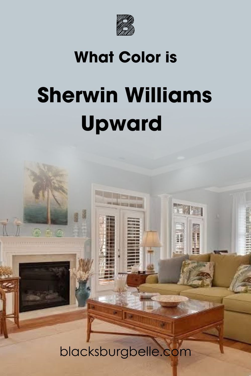
Upward is a calming gray tone with a blue tint under dim lighting. But once it receives direct lighting or you pair the color with a brighter hue like white, you’ll get a bolder blue with less gray.
Combining both tones creates a soothing aura that makes you feel like everything will be okay. Hence, Upward because it’s filled with positivity.
Snapshot of Sherwin-Williams Upward (SW 6239) Specification
Let’s get into the details of what makes Sherwin-Williams Upward a blue-gray color. You’ll see its LRV, Hex Value, RGB, and undertone in this table.
| Name | Sherwin-Williams Upward (SW 6239) |
| RGB | Red 191 | Green 201 | Blue 208 |
| Hex Value | #BFC9D0 |
| LRV | 57 |
| Undertones | Gray |
The LRV of Sherwin-Williams Upward (SW 6239)
Light Reflectance Value measures a paint’s brightness or darkness on a scale of 0 – 100. Zero is for absolute black, while hundred is pure white. But with paints, the scale is 3 – 97 because there’s no pitch black or bright white without undertones, and 50 means neutral.
Sherwin-Williams Upward LRV is 57, meaning it’s very close to the neutral point. So, this color will mostly stay calm and only reflect a soft blue when there’s direct light.
Let’s talk about highlighting the blue and gray tones with natural and artificial lighting.
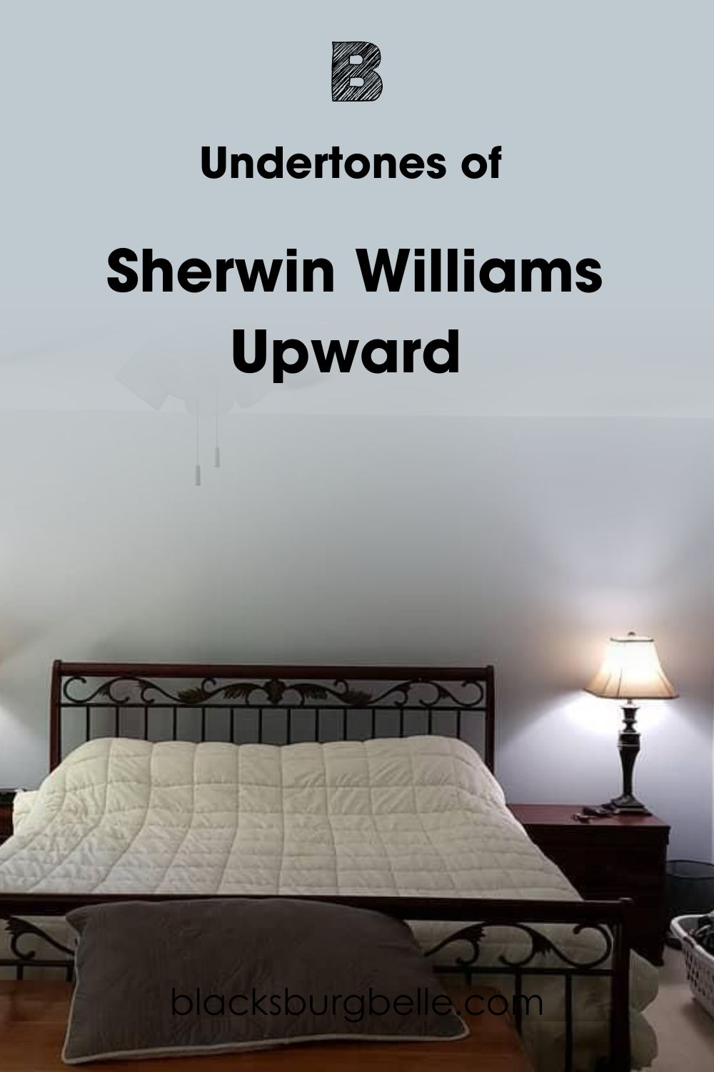
Undertones of Sherwin-William Upward
You’re about to learn why I first saw Sherwin-Williams as a dull gray paint at night, then saw a brighter blue the next morning. Undertones are alternate colors that show when you shine light directly on a paint.
They’re a result of the RGB, and in Upward’s case, that’s blue reflecting over gray because it’s the highest at 208.
Here is an image of what it looks like when the two tones show up at once.
Lighting Effect on Sherwin-Williams Upward
I love explaining how lighting changes color because that’s when you can appreciate the beauty of undertones. Firstly, let’s have a refresher course on geography. The sun rises in the East and sets in the West.
So, get a compass and mark your room’s position. If you don’t have one, stand outside and point to the sun at sunrise or sunset to find east and west. Then mark your front as North and back as South.
Southern light is the brightest. Northern light is the most stable and keeps Upward looking both blue and gray. Eastern light is hot from noon until evening, and Western light reflects a low glow until sunset.
Does it look Gray?
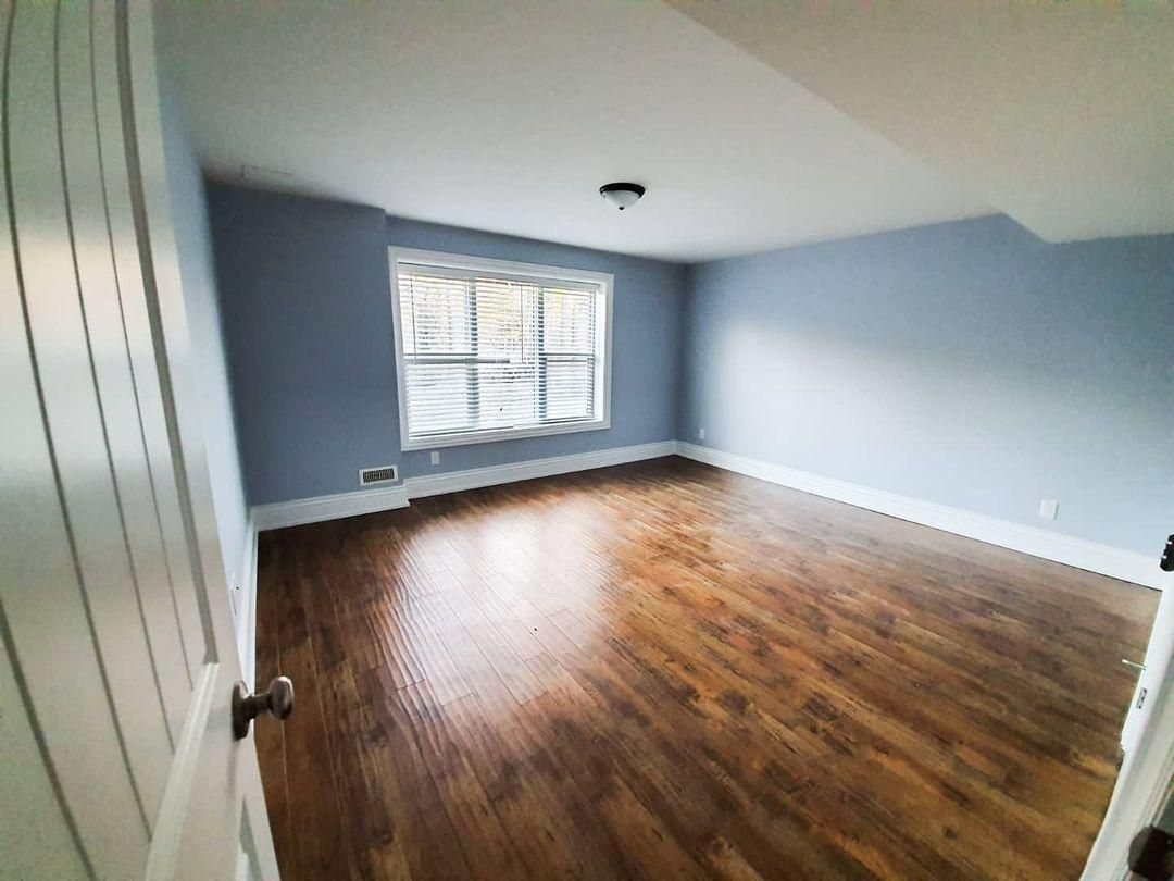
Sherwin-Williams Upward is a hazy gray under dim lighting. So, you’ll mostly see this undertone in the evening and at night or when there’s a shadow from direct lighting.
See this large bedroom above and how the lower part of the adjacent wall shows gray while the upper wall remains a soft mid-tone blue. Also, notice that the side of the wall that gets the least light is a cool gray tone.
It’s beautiful to witness the transformation but also easy to miss because it’s subtle. That’s why you must design your space to match both colors and not just one tone.
Is Sherwin-Williams Upward a Warm or Cool Color?
Sherwin-Williams Upward is a cool blue paint because it’s a receding hue. That means it makes rooms appear bigger than their actual sizes. But Upward is a soothing cool hue that’ll make you forget your worries while adding a storybook charm to your space.
That’s unlike most cool hues that are cold and “emotionless.” It’s why Sherwin-Williams Upward fits family houses and children’s spaces, whether in the hospital, classroom, sports center, or bedroom.
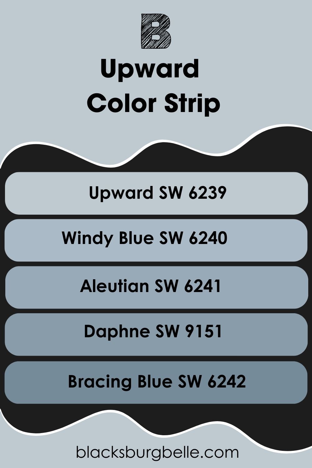
Sherwin-Williams Upward (SW 6239) Color Strip: Lighter or Darker Exploration
Check out these alternatives if you think Sherwin-Williams Upward isn’t neutral enough. Note that it’s the lightest color in the strip. But you can use Sherwin-Williams Icicle, a medium-light blue tone with a 73 LRV and soft violet undertone.
Other colors in the strip include Windy Blue, which is more neutral with a 48 LRV, and Aleutian, a medium-dark blue-gray. Choose Daphne for a softer medium-dark vibe and Bracing Blue for a dark blue-gray hue.
- Sherwin-Williams Upward (SW 6239)
- Sherwin-Williams Windy Blue (SW 6240)
- Sherwin-Williams Aleutian (SW 6241)
- Sherwin-Williams Daphne (SW 9151)
- Sherwin-Williams Bracing Blue (SW 6242)
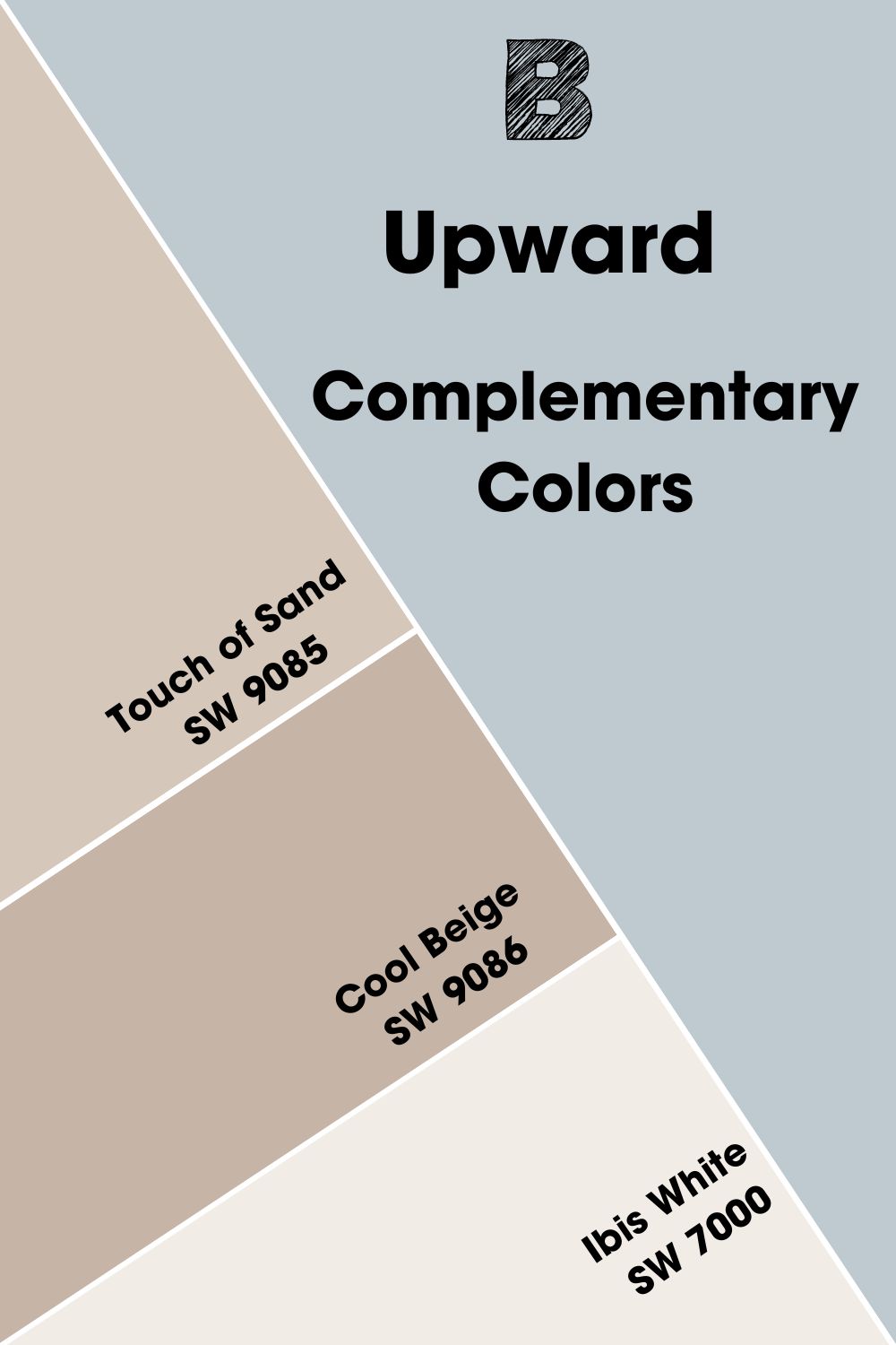
Complementary Colors for Sherwin-Williams Upward (SW 6239)
Everybody knows bread goes with butter and cereal goes with milk, the same way some colors fit. We call these colors complementary because their contrasting tones merge into a bold, balanced look.
We have red/green, yellow/purple, and blue/orange. As a blue-gray hue, the complementary color for Upward will have an orange undertone merged with a neutral color like gray or beige. So, I used the color wheel generator and found this:
Sherwin-Williams Hand-Spun Yarn by HGTV.
It’s a neutral greige hue with a subtle orange undertone matching the blue surface in Upward.
Unfortunately, the HGTV collection is rare and only available on custom orders. But I have good news. You can use Sherwin-Williams Touch of Sand as an alternative. See more colors for a complementary palette.
- Sherwin-Williams Touch of Sand (SW 9085):This calming beige has a sandy overtone that reminds you of a beach shore. It’s the ideal complement for Upward, which has a beachside cloudy look.
- Sherwin-WIlliams Cool Beige (SW 9086):A cool orange-tinted beige that adds a spa feel to your soothing Upward walls.
- Sherwin-Williams Ibis White (SW 7000):Let this cool and bright yet warm white paint be the perfect trim for your contrasting hues.
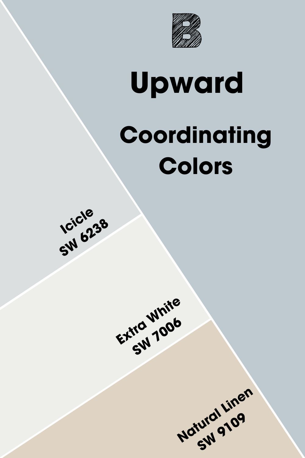
Sherwin-Williams Upward (SW 6239) Coordinating Colors
Pairing colors with Upward can improve or ruin the aura, and that’s why choosing a palette is important. You can use several color themes to tell a story and express your personality.
You can pick any of these popular themes, whether a minimalist or an open individual.
- Analogous Theme:It pairs three colors based on their proximity for a gradient feel. The colors are within the same range, thus giving you a steady yet diverse range.
- Complementary Theme:Make a bold statement with opposite colors by pairing their contrasting energies.
- Triadic Theme:Combine three colors that form a triangle on the wheel for the most unrelated tones. You’ll be surprised at how well they work together. For this, all primary colors and secondary colors form individual triads.
- Split Complementary:A unique combination of adjacent colors to a complementary color. That means you choose the two hues beside the opposite color of your chosen paint. Ex: Upward as blue has orange as its contrast. So, the split complementary will be orange-yellow and orange-red.
- Monochromatic Theme:The simplest combination of shades and tints of a single color.
Palettes with more than three different colors, like Split Complementary, Triadic, and Analogous, are the boldest and best for creative explorers. But conservative designers should stick to one and two-colored palettes like Monochrome and Complementary.
Coordinating Colors for Sherwin-Williams Upward (SW 6239)
- Sherwin-Williams Icicle (SW 6238):A lighter blue-gray tone accentuates Upward and gives it a cooler look.
- Sherwin-Williams Extra White (SW 7006):Use this bright white paint as your trim.
- Sherwin-Williams Natural Linen (SW 9109):A yellowy beige neutral with a soft gray undertone that keeps it warm and mellow.
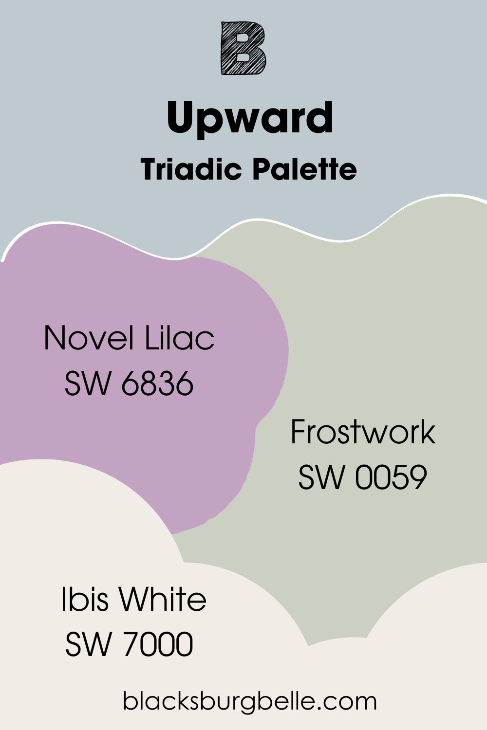
Sherwin-Williams Upward (SW 6239) Color Palette
In these color palettes, you’ll see primary and secondary color variations instead of basic tones. That’s because Sherwin-Williams Upward isn’t a single-tone blue paint. Its gray undertone makes room for more nuanced hues to fit into its palette.
See what I mean below.
Triadic Palette
- Sherwin-Williams Novel Lilac (SW 6836): Give your room a storybook look with this medium-dark lilac. It was the September 2021 Color of the Month.
- Sherwin-Williams Frostwork (SW 0059):This historic soft green paint with a gray undertone and LRV of 62 is a nod to the 1920s.
- Sherwin-Williams Ibis White (SW 7000):A bright white paint blends coolness and warmth to fuse Upward and Frostwork’s coolness with Novel Lilac’s warmth.
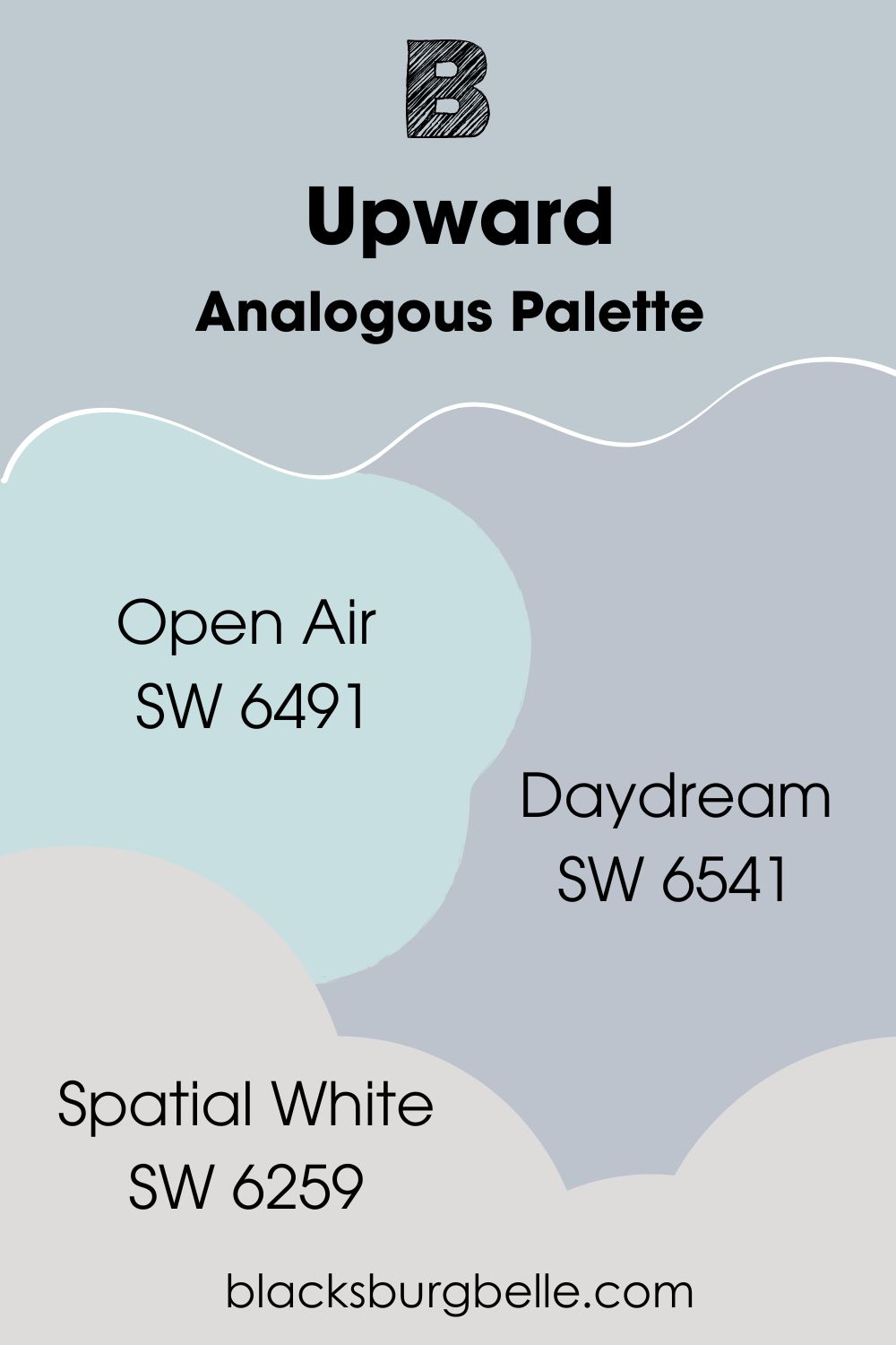
Analogous Palette
- Sherwin-Williams Open Air (SW 6491):An airy cyan blue paint with a teal undertone to intensify the blue hue in Upward.
- Sherwin-Williams Daydream (SW 6541):This pastel violet adds a gentle aura and merges a gray undertone with Upward.
- Sherwin-Williams Spatial White (SW 6259):Use this medium-light white paint as a trim to tie in all three colors.
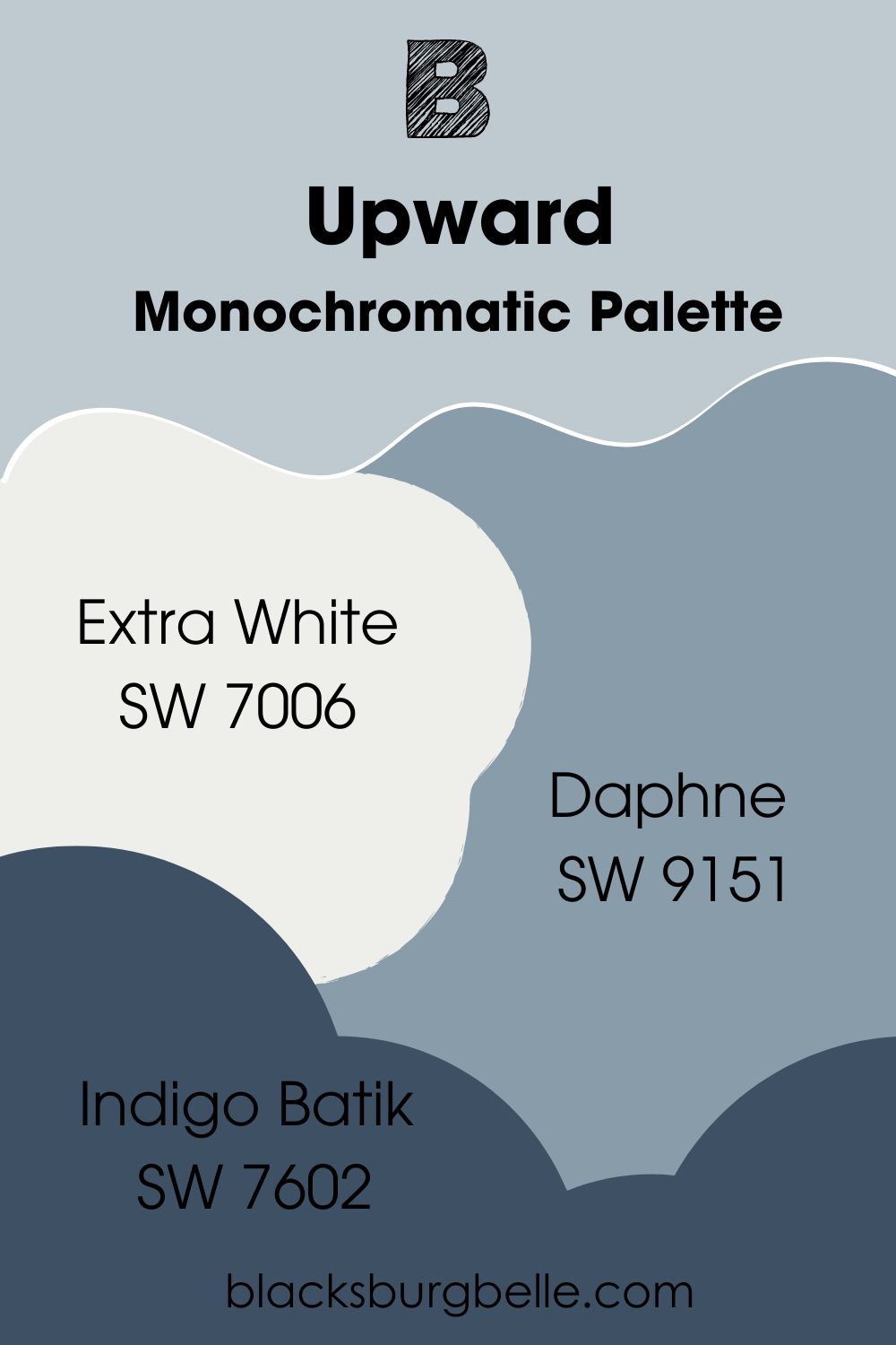
Monochromatic Palette
- Sherwin-Williams Extra White (SW 7006):A bright white paint with a faint undertone that won’t mess with the blue-only theme of this palette.
- Sherwin-Williams Daphne (SW 9151):A medium-dark blue-gray to intensify Upward’s coolness.
- Sherwin-Williams Indigo Batik (SW 7602):Cast a shadow on Upward while maintaining a cool vibe with this moody denim tone.
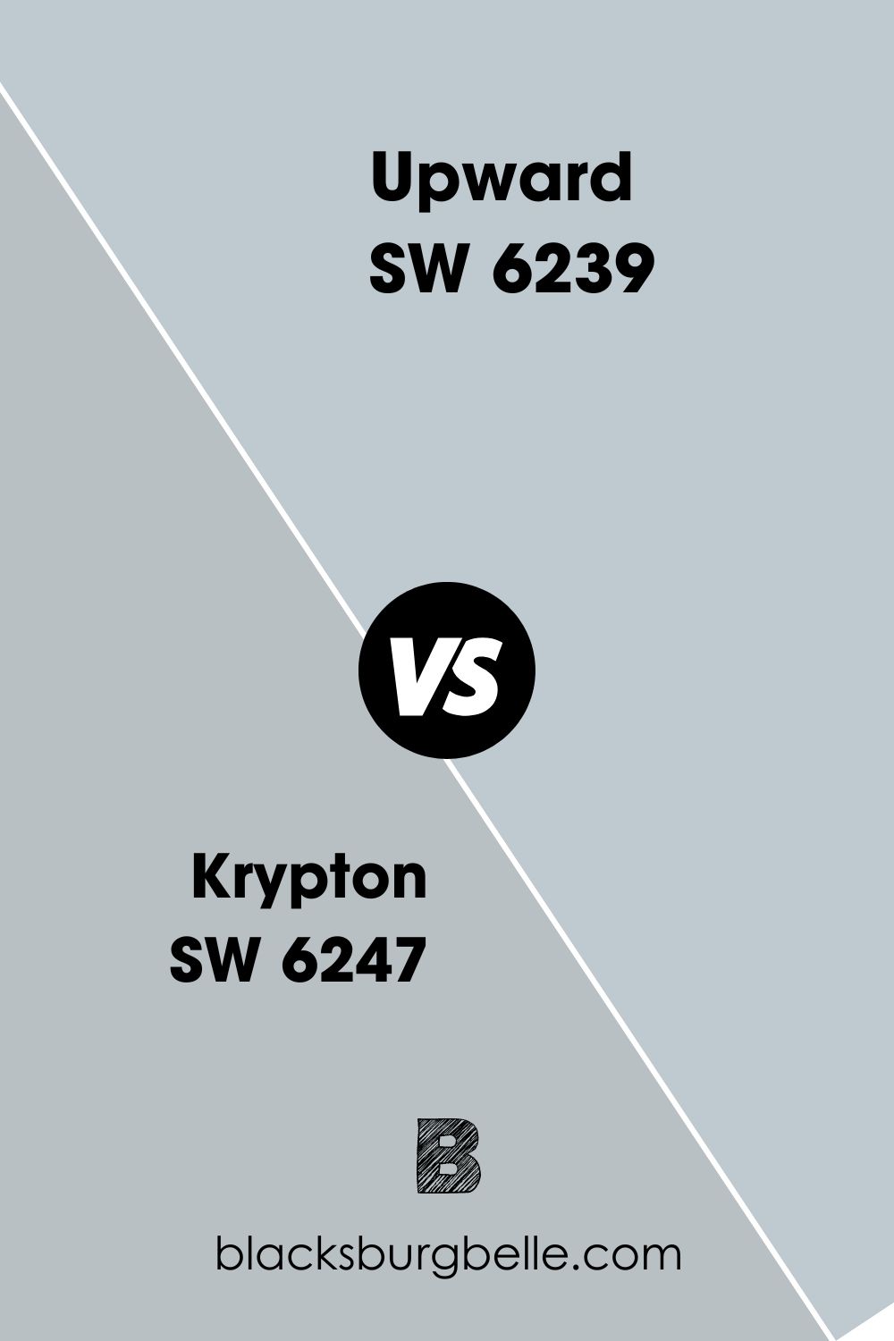
Sherwin-Williams Upward (SW 6239) vs. Sherwin-Williams Krypton (SW 6247)
Sherwin-Williams Krypton is darker than Upward and more neutral, with an LRV of 52.
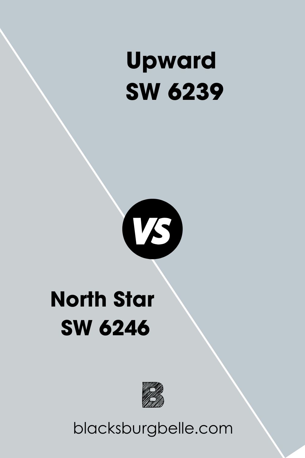
Sherwin-Williams Upward (SW 6239) vs. Sherwin-Williams North Star (SW 6246)
Get Sherwin-Williams North Star because it’s an airier, lighter blue-gray than Upward and has an LRV of 62.
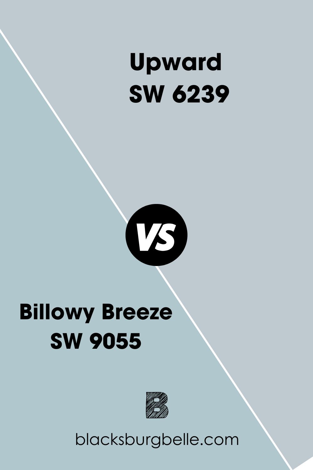
Sherwin-Williams Upward (SW 6239) vs. Sherwin-Williams Billowy Breeze (SW 9055)
For a truer blue paint with a soft cyan undertone, choose Sherwin-Williams Billowy Breeze (SW 9055).
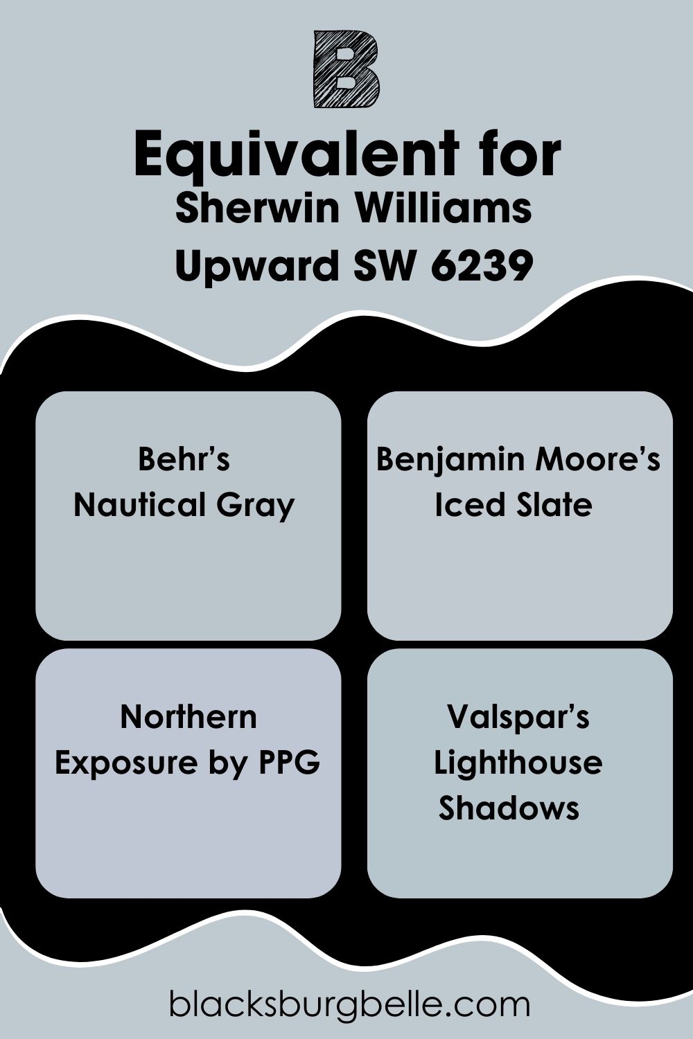
Sherwin-Williams Upward (SW 6239) Equivalent with Other Brands
Only Sherwin-Williams has “Upward” in its catalog, but you can get similar blue-gray paints from other top paint makers in America. There’s no perfect match between LRV and RGB, but the similarities are sometimes uncanny.
Behr’s Nautical Gray, for instance, has a faint green undertone that makes its blue hue aqua, while Benjamin Moore’s Iced Slate has a silvery undertone instead of gray.
Northern Exposure by PPG favors its blue tone more and has an LRV of 57, while Valspar’s Lighthouse Shadows is a dimmer blue-gray.
Despite their differences, they all reflect a similar amount of light between 56 – 58.05.
Where can you use Sherwin-Williams Upward (SW 6239)?
Sherwin-Williams Upward is best in bedrooms and bathrooms, so finding other uses was tough. But I sourced them for you because there are daring creatives out there ready to go against the mood and create spectacular designs.
Here is what I found.
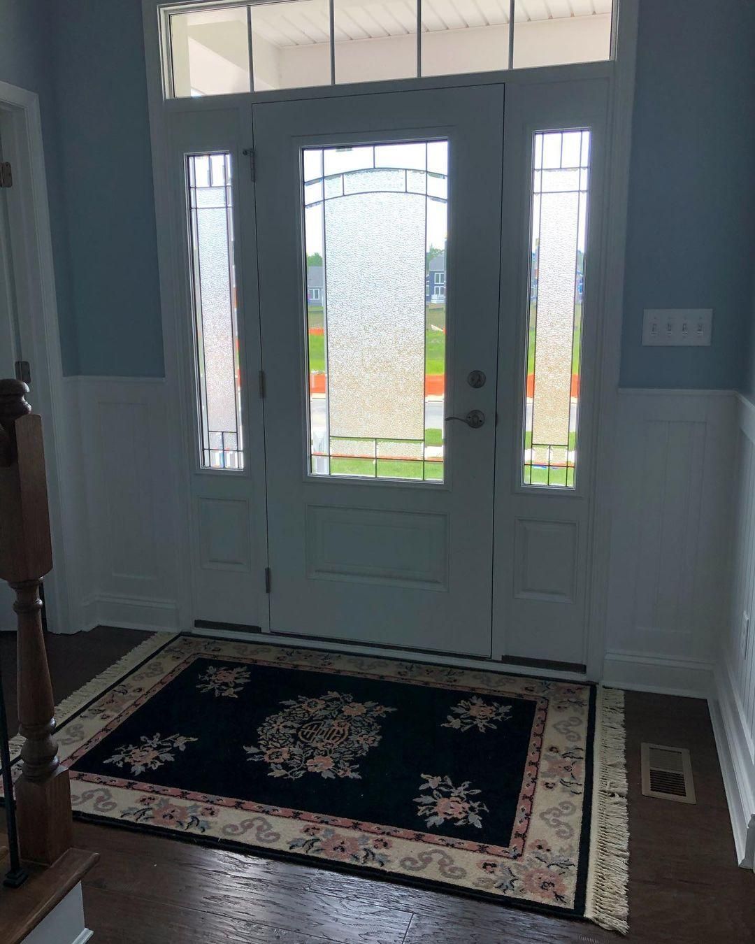
Sherwin-Williams Upward on Walls
Whenever a designer uses Sherwin-Williams Upward on walls, they support it with bright white paint to highlight its cool blue tone.
You can see that in this entryway. But also notice how the rug, hardwood floor, and staircase banister add warmth and depth to the space.
A matching blue floral motif on the rug with bolder pink and yellow hues toned down with a deep navy blue for a triadic theme.
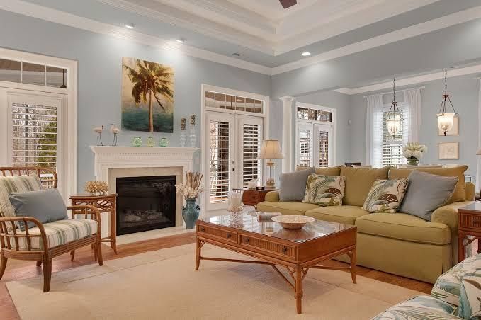
Sherwin-Williams Upward in the Living Room
Most people use warm colors in their living rooms because that’s the energy center of the house. But think of how much more relaxing family time would be when you have Sherwin-Williams Upward in the living room.
You don’t have to lose your warmth, either. Just pair Upward with a warm tone like Ibis White, Novel Lilac, or Touch of Sand, depending on your color palette.
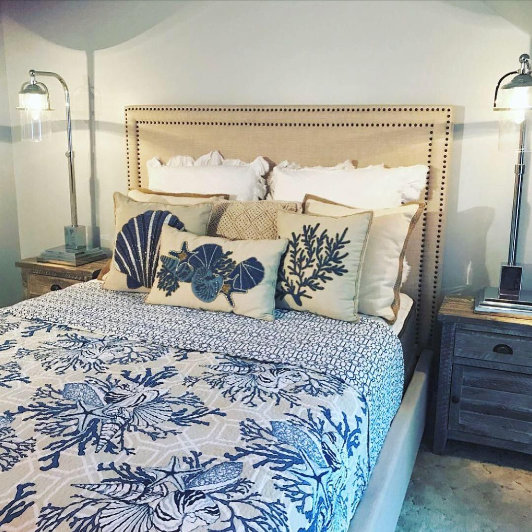
Sherwin-Williams Upward in the Bedroom
Sherwin-Williams Upward and bedrooms go like Mac and cheese. It’s a classic combination! You can highlight the gray tone with white lights that’ll don the paint, then complement it with beige accessories.
Sherwin-Williams Upward as an Accent
When you use Sherwin-Williams Upward as an accent, ensure the background color matches, whether by contrast, analog, monochrome, or triad. You don’t want to clash undertones to counteract its soothing essence.
Sherwin-Williams Upward on Cabinets
If you want to give your cabinet a modern makeover, choose Sherwin-Williams Upward for its cool grayish-blue look. Then highlight its beauty with beige and off-white walls and tiles. It’ll create a perfect balance of warmth and coolness.
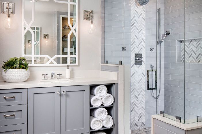
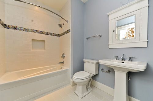
Sherwin-Williams Upward in the Bathroom
One long bath in this bathroom is all you need to feel refreshed and ready for any challenge. The soothing blue tone of Upward on your walls with crisp white trims and fittings creates a relaxed atmosphere.
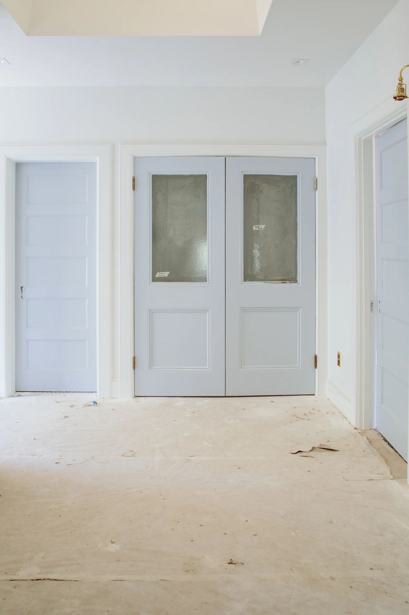
Sherwin-Williams Upward on Doors
Have you ever thought of inverting the classic Upward walls and white doors combo? Now’s your chance, and you have a visual idea of the result.
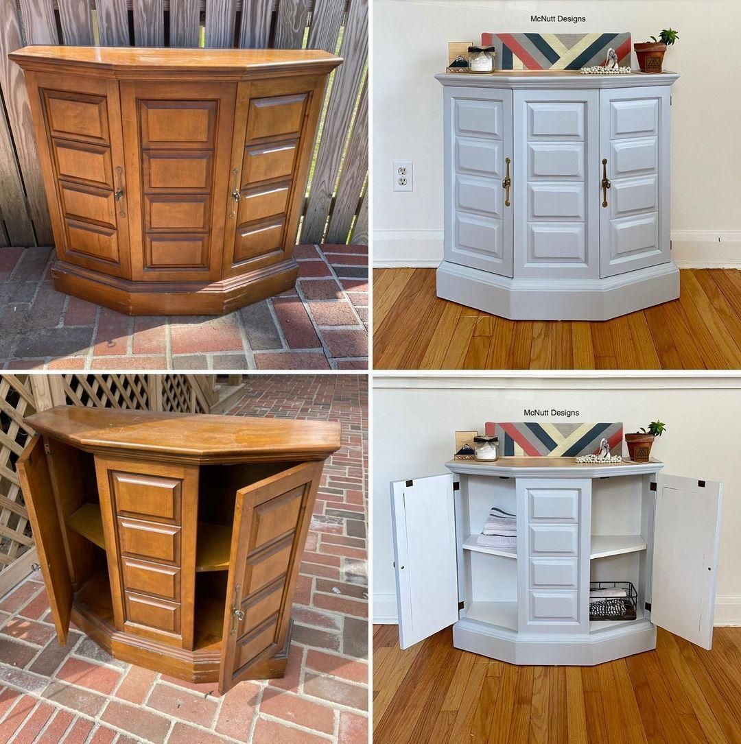
Sherwin-Williams Upward on Furniture
Revamp your vintage cabinets by painting them in Sherwin-Williams Upward. See how this traditional wooden locker transformed into a 2020s-made organizer from IKEA.
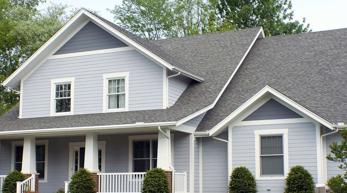
Sherwin-Williams Upward on Exteriors
White exterior walls are overrated and simply dull. Switch up your style by using Sherwin-Williams Upward in your sidings. See how the gray tone cools its blue hue so the building doesn’t look like a kindergarten project.
Also note the dedication to a monochrome theme, with the deep gray roofing matching the accents and the blue-tinted white trims binding all colors together.
Why is Sherwin-Williams Paint so Expensive?
Because Sherwin-Williams produces high-quality paints with long-lasting wear and single-coat technology, it’s economical in the long term and less time-consuming during usage. Everybody loves a durable and reliable product.
Is Sherwin-Williams Upward the Best Blue Paint?
Sherwin-Williams Upward isn’t among the Top 50 Colors or Expert Pick Blue. But SW 6239 is a hidden gem, as you’ll notice when scouting for inspiration, which makes it unique. Who wants a paint color everyone else is using anyway?
How to Sample Sherwin-Williams Upward
Sherwin-Williams provides Color Chip, Peel & Stick, and Color-to-Go, lightwear paint samples. Depending on your budget, you can buy any of the three samples from the company.
It’s always best to test your paint before buying it to see how it reacts to light and matches your interior decor.
Have fun renovating your home with Sherwin-Williams Upward, and watch your days get less tense and more relaxed.
Conclusion
Sherwin-Williams Upward proved its worth during this review. It took a longer time to finish because it made me laidback and chilled, and if that’s the vibe you want for your home, by all means, buy this paint.
Think of all the places that need positive and calm energies like:
- Children’s hospitals
- Nurseries
- Bathrooms and
- Adult Bedrooms
And give SW 6239 a chance. You won’t regret using Sherwin-Williams Upward in any of those spaces.
 Sherwin Williams Origami White (Palette, Coordinating & Inspirations)
 Sherwin Williams Contented (Palette, Coordinating & Inspirations)
 Sherwin Williams Urbane Bronze (Palette, Coordinating & Inspirations)
 Sherwin-Williams Anonymous (Palette, Coordinating & Inspirations)
 Sherwin Williams Extra White (Palette, Coordinating & Inspirations)
 Sherwin Williams Misty SW 6232: Paint Color Review
