
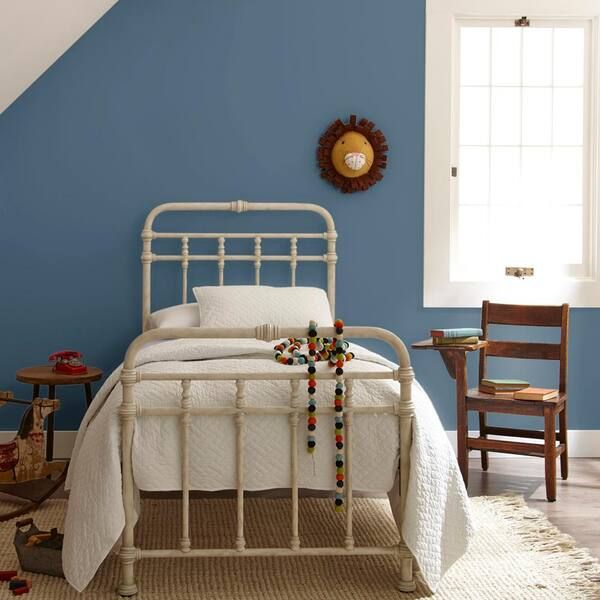
Do you want to create the perfect bedroom space with blue paint colors but don’t know where to start? You’re in the perfect place for answers as this guide simplifies the technicalities of bedroom decoration.
Bedrooms are famous for being the relaxation space where homeowners sleep or nap; the color blue sets the mood for that. However, there’s more to bedrooms than sleeping as it sometimes doubles as a reading room and workspace.
Setting the mood is important, and that’s where choosing the right blue color for your bedroom applies. If you want a light blue to soothe, a vibrant bright blue for energy, or an elegant dark shade for inspiration while working, there’s something for everyone.
We’ll start with the steps for choosing the right blue paint, then discuss the creative aspect, including undertones, RGB values, and types of blue paints, before ending with the top picks for 2023.

Table of Contents
Steps for Choosing the Right Blue Paint
There’s no need to feel blue about choosing the right blue paint for your bedroom because all the answers are here.
You’ll need to complete seven pre-painting steps: analysis, sizing, lighting evaluation, color observation, and deciding the paint’s long–term value.
Step 1: Analyze The Space and Lighting
You don’t need to be a feng shui expert to create a synergized bedroom theme. Analyzing the space starts by telling you the shade of blue paint that’ll pop best in your bedroom.
The blue wall paint must compliment if you’ve already bought your furniture (bed, wardrobe, shelf, ottoman, and dresser) and drapery. Also, note the sunlight’s entry point into the bedroom, whether by the window or the door.
Well-lit bedrooms don’t need high LRV blue paints, but depending on your taste, it doesn’t rule it out.
Step 2: Measure The Room Size
Use tape to measure your bedroom’s dimensions as bedrooms come in different sizes based on their inhabitant and purpose. They range from kids’ rooms to master, adult, and guest bedrooms.
Master bedrooms are the largest at 10ft x 12ft 6 in – 13ft x 13 ft and often contain king-sized beds. Light blue paint would make the room appear larger unless you complement it with darker tones.
Instead, paint your master suite with elegant dark blue paints to give it a snug look while maintaining its austere aura.
The second largest rooms, sized 10ft x 10ft – 10 x 14ft, are the adult rooms with Queen-sized beds, followed closely by guest rooms of 7ft x 10ft – 9ft x 10ft 6in with double beds.
Using a mid-toned blue paint here is ideal as it suits the room’s purpose of hosting outsiders and older children and being an alternative space for one half of a couple.
Kids’ bedrooms are the smallest in the home and often measure between 3ft – 5ft x 5ft, although older kids (teenagers to young adults) get 10ft x 10ft for more space. Light blue paints work excellently here because it makes the room appear bigger.
Step 3: What’s the Room’s Position?
Once you’ve determined your room’s size, use a compass to note the sun’s direction. It’ll tell you the intensity of sunlight entering the bedroom daily and the peak time.
Bedrooms are best in East-facing sunlight because it’s bright in the morning without being too hot and reduces to a mild glow as day dwindles into the night. Light to mid-toned blue paints is ideal in this position because they wouldn’t overheat the room when reflecting.
Avoid dark blue paints in North-facing windows because they receive the least sunlight in the morning, albeit stable. So, there’s no hope of soaking in the beautiful morning light. However, it’s an excellent combo for study/work spaces as it becomes cool by night.
West-facing bedrooms get the lowest morning and afternoon light, so it’s your surest bet for keeping undertones at bay. However, as the sun sets, this position becomes overheated towards late noon, leading to flashes of secondary tints.
All positions have advantages and disadvantages, like how the overheated west-facing bedrooms become assets in cold winters. Thus, you can use warm blue shades to accentuate the heat.
Step 4: Evaluate Your Lighting Options
Don’t worry about poorly lit bedrooms since artificial lighting exists to supplement the lack of sunlight. We recommend using cool lighting like white and blue in blue-painted bedrooms for a complementary view. However, note that it’ll make the space dim and dull.
Use warm lighting like yellow bulbs in golden lamp holders for a cozy blue bedroom. It’ll give the room a warm and intense look fit for family bedrooms, unlike white lights that make blue hues appear clean and airy.
Step 5: Conduct Sample Area Testing
Testing the bedroom wall or furniture with hyper-realistic samples like peel & stick strips from Sherwin-Williams or Samplize, Color Chips, or Color Cards gives you a real-time perspective of your chosen blue shade.
Sampling under natural and artificial light gives you a glimpse at the blue color’s undertone. That’ll help you confirm if it’s the best choice for your bedroom alongside other factors — size, lighting, and position.
Step 6: Analyze the Long-Term Value of a Paint Color
It’s more realistic to use light blue paints in adult bedrooms and master suites because grown-ups are better at maintenance. Although the shade would add a much-needed airy aura to children’s rooms, they’ll immediately get dirty.
The best compromise is to use an easy-to-clean finish or pair the shade with a darker tone. If you choose the latter, ensure the light blue paint is on the low-traffic areas like higher walls and trims while the dark shade stays low and within reach.
Step 7: Apply Finishing Touches
Low-maintenance finishes include matte, eg-shel, and flat paints, which rarely retain dirt and debris. When they do, washing it off with a simple soap and water routine is easy. However, they’re not flashy and wouldn’t stand out like high-maintenance finishes.
High-maintenance finishes include gloss, luster, and silk. They’re best used as accent walls or furniture paints because of their brightness and high value (they’re expensive.)
Understanding Blue Paints
The generic blue paint is a relaxing hue with subtle undertones making its cool exterior the dominant characteristic, but there’s more to this primary color than its coolness. As a primary hue, blue is at the base of many other tones; hence it presents in different tones.
Scroll down to understand how undertones work and the benefits of choosing each shade of Blue for your bedroom.
What Are The Undertones?
Have you ever wondered why your blue paint looks green, black, or purple under light? Then, you’ve encountered undertones without realizing it. They’re secondary colors existing beneath the veil of paint due to the RGB value.
RGB value amounts to a Hex Code, unique to each color and formed from red, green, blue, and pure black paint. This resulting color sits on a scale of 3 – 97 used to measure its Light Reflectance Value (LRV).
Colors between 3 and 30 are dark, 31 – 45 are medium-dark, 46 – 55 are medium, 56 – 75 are medium-light, and 76 – 97 are light. However, that’s not a strict rule, as undertones sometimes change a blue paint’s LRV and make it appear lighter or darker.
That’s enough of the technical part. It’s time to get creative.
Types of Blue Paints
How do you like your Blue? Should it be as bright as the sky, cool and serene as the ocean, dark with shadows, or soft and still like Summer flowers?
Blue’s range makes it an ideal shade for monochrome decor, but you need to understand the available types before you can do that. Learn the benefits and disadvantages of each blue shade before deciding on your layering method.
Cool Blue Paints
Cool Blue paints are this serene color’s most popular and stereotypical shades. It comes in low and high LRVs, with its undertones fleeting between green and gray. The combination of other calm hues creates a relaxing atmosphere.
Think of the sea and sky when imagining this shade of Blue. The downside is that you’ll barely get work done in bedrooms with blue-green or blue-gray wall paints. Its relaxing aura isn’t the best for motivating homeowners to work.
However, you can add vibrance with warm blue paints or warm colors like beige, orange, and yellow. We recommend Benjamin Moore’s Palladian Blue, Meridian Blue, Whipple Blue, Sherwin-Williams Embellished Blue, Quench Blue, and Krypton.
Warm Blue Paints
Warm Blue seems like a paradox because this color is naturally cool, but vibrant undertones like bright green and gray change its composition. Teal blue, mint blue, turquoise, grayish-blue, and bluish-green fall into this category.
Warm blue shades are similar to cool Blue in range, but it’s mostly mid-tone and dark with few high LRVs tones. We recommend this shade of Blue for multipurpose bedrooms as its dual tone strikes a balance between soothing and bubbly without being too bright.
Popular warm blue paints include Sherwin-Williams Spa, Tame Teal, Powder Blue, Nifty Turquoise, Benjamin Moore’s Delphinium, Anderson Blue, and Brilliant Blue.
Soft Blue Paints
Benjamin Moore’s Turquoise Haze flashes silver tones underneath natural light
Baby nurseries look angelic with soft blue paints, especially in high LRV shades. These pastel tones would transform your bedroom into a peaceful sanctuary where all your worries come to disappear.
Use soft blue tones as the backdrop for monochromatic blue themes, as they’re absorbent. Unfortunately, that feature means it’s not the best shade for a bedroom with a cheerful personality.
Soft Blue’s muted hue says you have your life together and are sweet. Some beautiful shades you can explore include Benjamin Moore Aquarius, Morning Glory, Turquoise Haze, Sherwin-Williams Composed, Aleutian, and Rainsong.
Light Blue Paints

Benjamin Moore Snowdrop gives this bedroom an airy appearance
Mint, ice, high LRV blue-grays, and blue whites are the ranges of light blue paints available to transform your bedroom into a scenic island-themed space. This shade of Blue is often used as a full wall coloring or trim because of its largely neutral undertone.
The high LRV character makes light blue paints subtle enough for background painting yet retaining their mystery underneath lighting. This shade of Blue is best for minimalists who want to add some color to their neutral space.
Top options for consideration include Sherwin-Williams Iceberg, Snowdrop, Swimming, Bluebell, Bora Bora Shore, Benjamin Moore Glacier Blue, Light Blue, and Ocean Breeze.
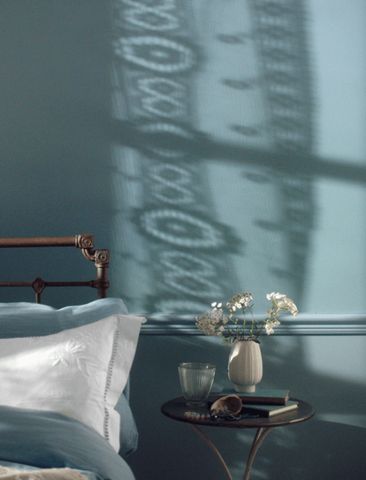
Dark Blue Paints
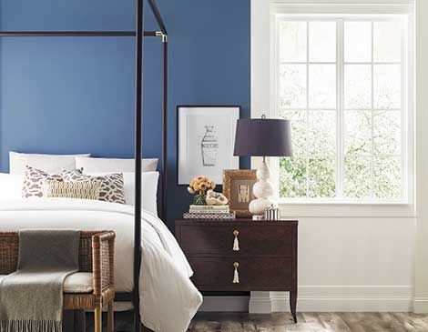
Bedrooms with reading corners, dressing tables, and wardrobes look elegant in dark Blue, whether navy or green-blue. This shade is unapologetically dark, meaning it’ll consume your entire bedroom space when used as wall paint.
Dark blue is best as an accent in the bedroom or paired with lighter shades on adjacent walls to highlight its blue tones. Master bedrooms can use dark Blue for the full wall and introduce brighter hues with the accessories — curtains, carpets, furniture, art, and bedding.
Note that dark blue potentially creates a gloomy vibe, so you need bright lighting and colors to lift the mood.
Check out these eclectic shades from Benjamin Moore (Adriatic Sea, Newburyport Blue, California Blue) and Sherwin-Williams (After the Storm, Cruising, and Ionian).
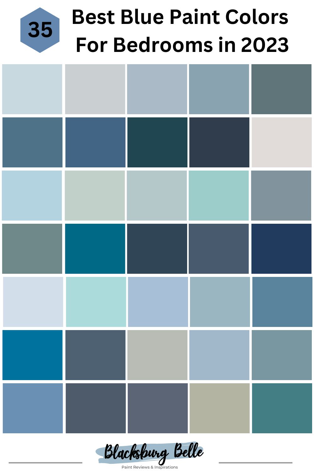
Best Blue Paint Colors (2023 Trends)
From green-blue shades like the ocean to blue-grays like the clouds, navy blues, and soft mid-toned blues, here’s a list of the 35 best blue paints to use this year. Note that the theme for 2023 designers is vibrance and bold colors so, we’re looking at stand-out blue tones.
Sherwin-Williams
Sherwin-Williams paints are relatively affordable depending on your financial strength, as a gallon costs about $40 – $60. Special finishes like gloss and shades like the Emerald Collection cost almost $100 per gallon. However, it’s worth every dollar in quality.
One or two coats are enough for full coverage with Sherwin-Williams paints, making them American bestsellers.
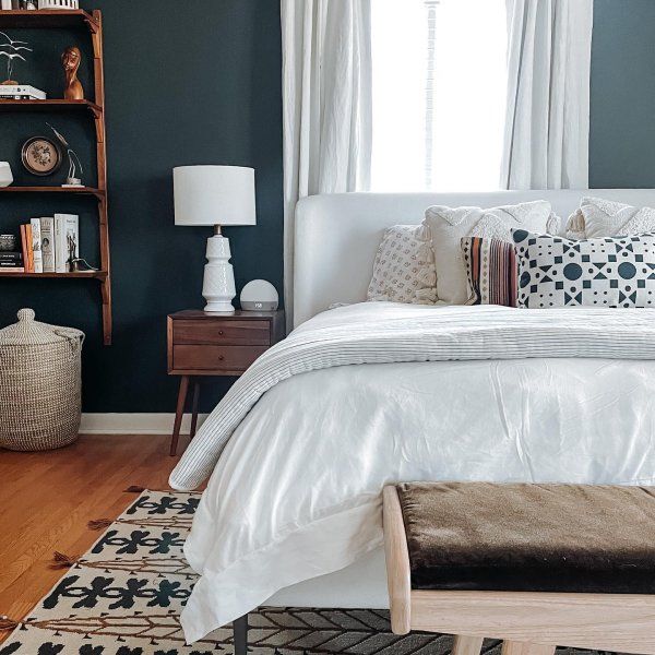
1. Moonmist (SW 9144)
Transform your bedroom into an airy, misty space with the breezy aura of Moonmist (SW 9144). Natural light makes this medium-light 68 LRV blue paint appear gray, but a warm artificial light would highlight its yellow undertones.
Those interesting undertones make Moonmist an ideal choice for creative individuals. One moment, your bedroom is a soft light blue, and the next, it’s a cheerful gray tone reminding you of a walk along the beach. This chameleon nature is ideal as a child’s nursery.
Pair Moonmist with darker gray accessories to accentuate its neutrality and cream paints for a cozy aura.
Moonmist is a gender neutral choice for this child’s nursery
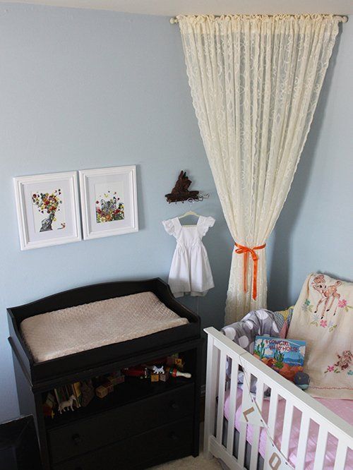
2. North Star (SW 6246)
North Star (SW 6246) is an anchor and mood stabilizer thanks to its breezy 62 LRV outlook. It’s a blue-gray paint with a calming vibe and is best for people suffering from anxiety or busy daily schedules.
Waking up in a North Star-painted bedroom would improve your mood because it exudes an almost neutral grayish glow in the morning sunlight. Pair this beauty with darker gray paints (Cadet) for a neutral-toned look, and lean towards off-white (Alabaster) for a snug look.
The medium-light aura of North Star in this bedroom stabilizes the mood all day
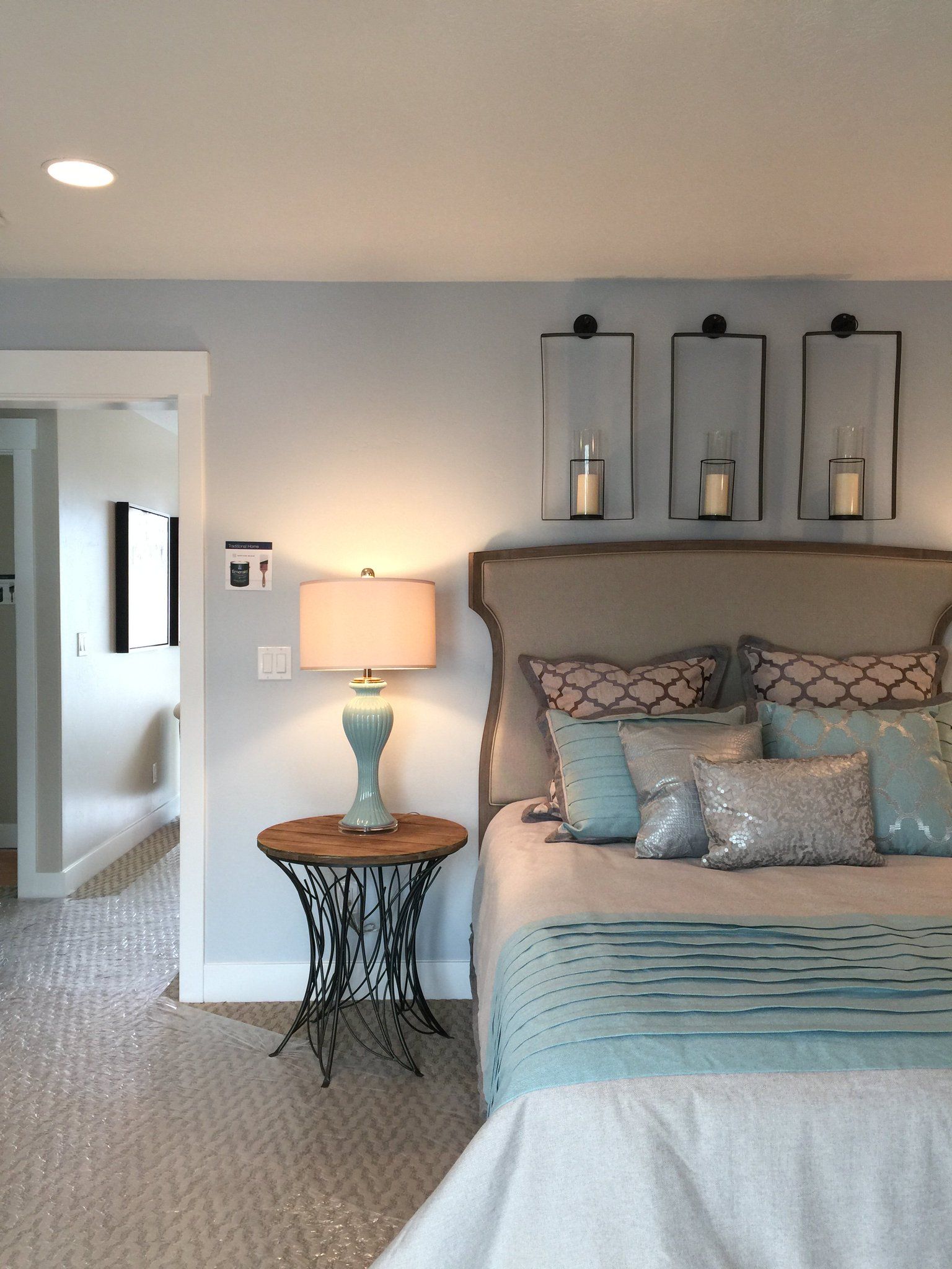
3. Windy Blue (SW 6240)
Unwind daily with the relaxing presence of Windy Blue (6240), a blue-gray shade with a medium LRV of 48. It’s a suitable blue paint for resort and spa center bedrooms, as the neutral tone is calming.
Sherwin-Williams describes it as a balance between playful and subdued energy which is the best for wellness centers. You need its neutrality to keep you grounded in your daily life while maintaining a burst of energy to jolt you into action in the morning.
Pair Windy Blue with vibrant cream paints like Compatible Cream and accessories, golden beige walls, and wooden honey furniture. The mix of blue-gray and warm yellows would create a perfect contrast.
Relax your mind and soul with the calming presence of Windy Blue walls
4. Favorite Jeans (SW 9147)

Medium-dark pastel blue tones like Favorite Jeans (SW 9147) create a secure vibe that has you comfortable throughout the day. Its 35 LRV is ideal for reflecting subtle light without overwhelming your senses.
Favorite Jeans are worthy of their name as it represents that clothing piece you always wear during the summer to uplift your mood. Choose this shade of blue if you struggle with productivity because its reflection underneath direct sunlight is beautiful and energizing.
You can dour Favorite Jeans’ brightness with a navy blue like Salty Dog, highlight its mid-tone aura with a warm, medium neutral like Natural Linen, or keep it airy with a light blue paint like Icicle.
Favorite Jeans portrays comfort which is relaxing for the senses
5. Stargazer (SW 9635)
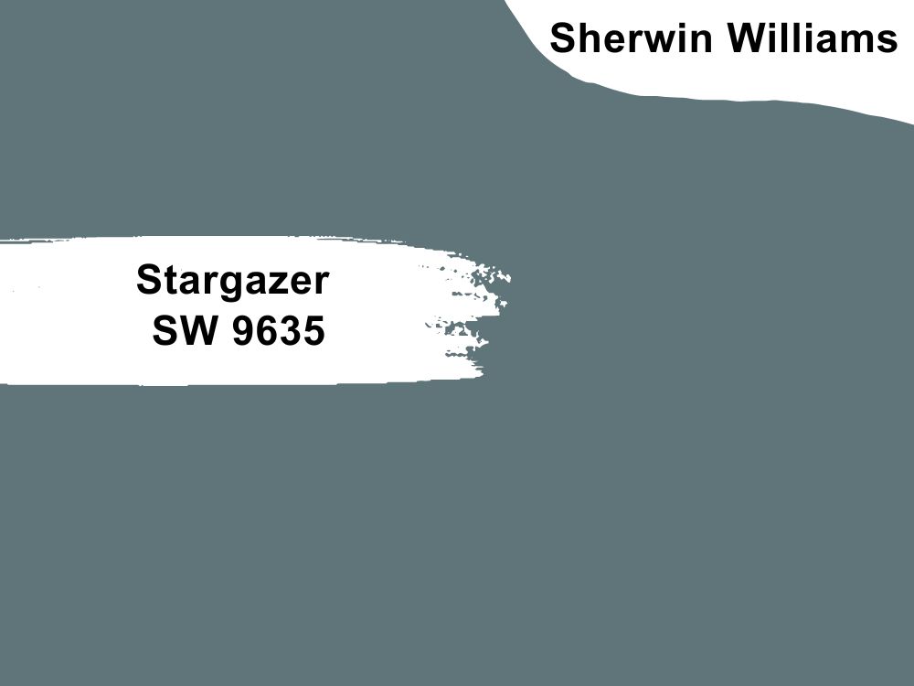
The medium-dark 17 LRV Stargazer (SW 9635) is a vintage green-blue hue made exclusively for interior coloring. It’s part of the Emerald Designer Collection (Rustic + Refined) because it takes inspiration from nature.
Lighting, especially cool light accentuates the grayish blue tone of this color while its natural state appears as a warm green color. Use Stargazer with light gray paints for a neutral look while blue coordinates highlight its cool blue hue. Use Stargazer in guest bedrooms.
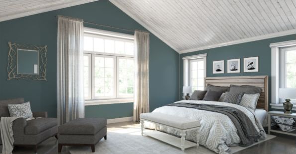
Keep the bedroom rustic and revered with Stargazer walls and gray beddings
6. Inky Blue (SW 9149)
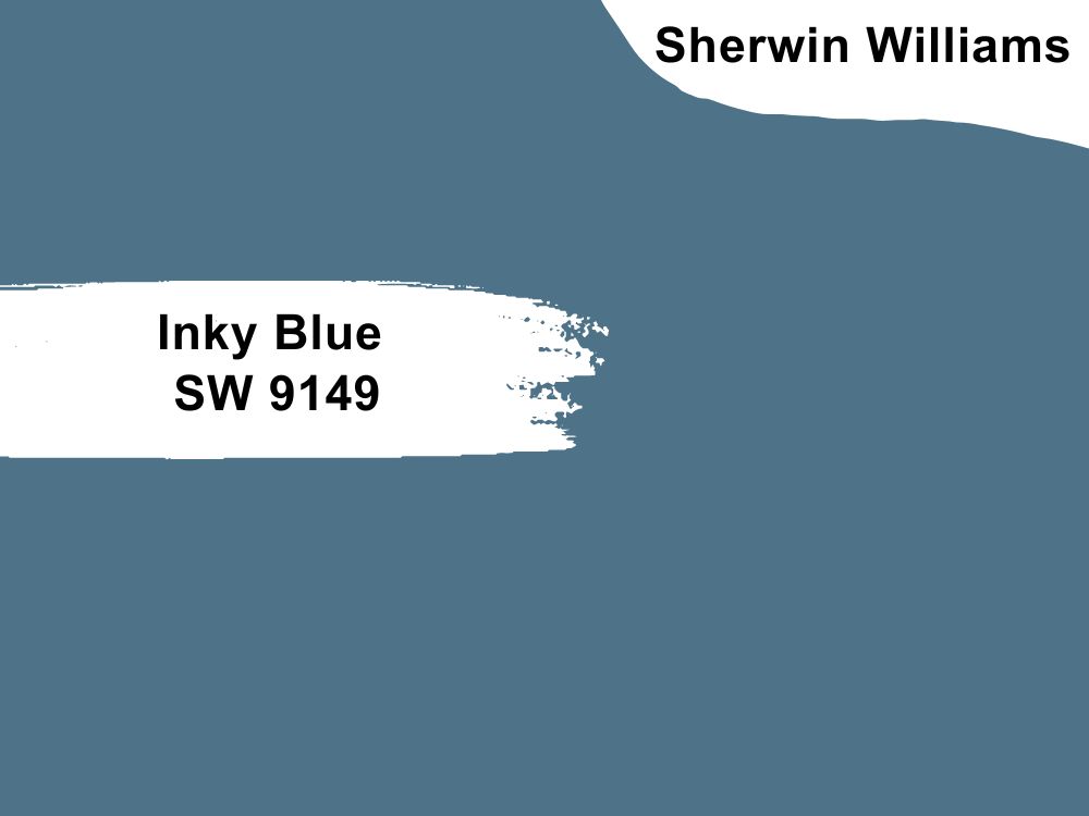
Step away from dull blue and embrace the depths of Inky Blue’s (SW 9149) warm vibe. This medium-dark blue has a bold yellow undertone that creates a 15 LRV, thus slightly illuminating the bedroom.
Inky Blue is a great way to incorporate a study corner into your bedroom. Its dreamy aura sets the mood for groundbreaking thoughts and ideas.
Complete the look with tan and brown wooden furniture from your desks to vanities and beds, then introduce brightness with light tan draperies, carpets, rugs, and bedding. Coordinate Inky Blue with Cocoa Whip, Natural Linen, and light, airy blues like Icicle.
Inky Blue stands out as an accent with the grounding neutral vibe of white walls and tan floorboards
7. Azure Tide (SW 9684)
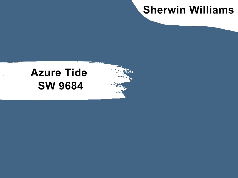
Azure Tide (SW 9684) is a warmer depiction of Inky Blue, creating a cozier bedroom space. Although it has a 12 LRV, this color doesn’t swallow up the entire sq. ft. but creates a backdrop for lighter colors.
You can keep Azure Tide classic using white and blue-white furniture and accessories or push the envelope with lighter yellow paints and maybe orange for color blocking.
Azure Tide keeps the headboard mysterious while the other neutral tones create stability in the bedroom
8. Moscow Midnight (SW 9142)
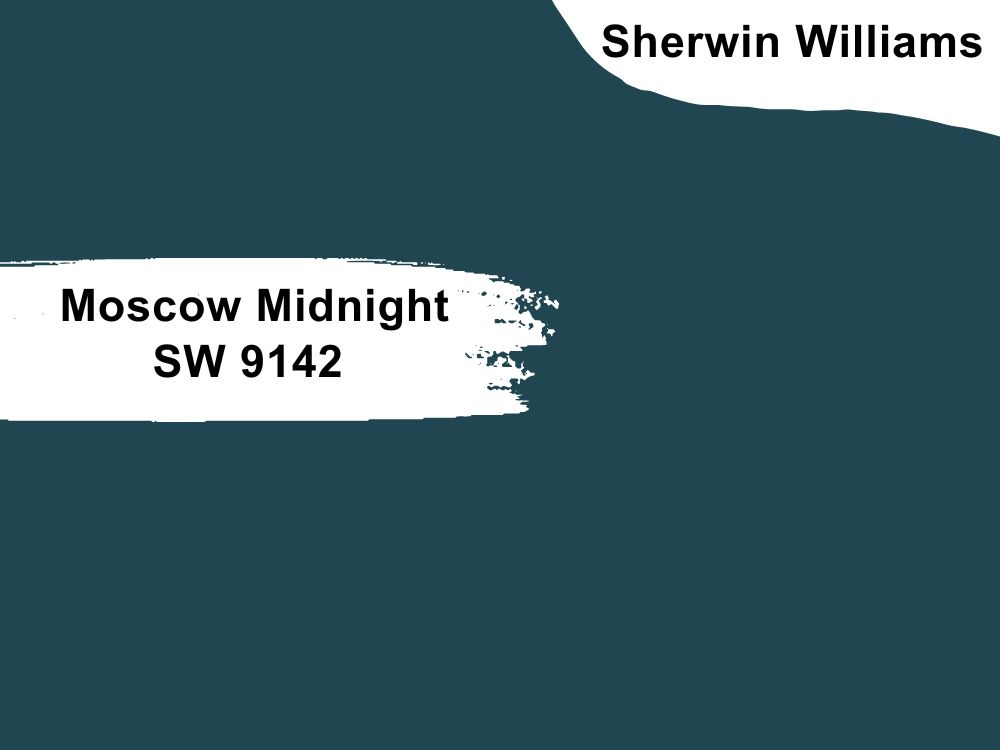
Teal gets a deeper perspective, like the depth of the deep sea with Moscow Midnight (SW 9142). This solid green-blue paint with its 5 LRV exterior creates a tranquil vibe like the ocean at night.
Moscow Midnight is a unique dark tone because it calms the senses while creating a mysterious atmosphere. Elevate its elegance with honey brown leather furniture and mid-toned yellow accessories for a vibrant bedroom.
Alternatively, you can tame Moscow Midnight with medium LRV neutrals like Mountain Air (blue), Pearly White (off-white/cream), or Comfort Gray (slate gray).
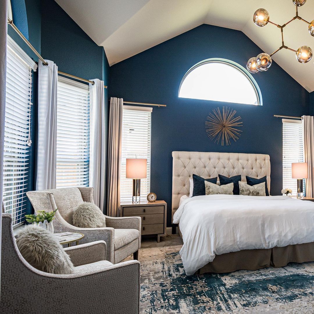
Make your master suite majestic with Moscow Midnight on the walls
9. Naval (SW 6244)
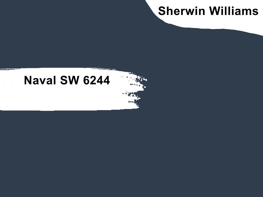
Elegance is more beautiful as Sherwin-Williams Naval (SW 6244), a bestseller at the company for years. It’s a visibly dark navy blue with an LRV of 4, so there’s no question whether it reflects in the bedroom.
However, Naval’s appeal lies in its unique gray-green undertone, which creates a moody aura in your bedroom. It’s the perfect shade for meditative and reflective bedrooms, especially those double as workspaces.
You’ll love Naval on your accent walls and furniture against earthy tan hues like Roycroft Suede and Ramie. Highlight the green-gray undertone in this color by introducing indoor greenery if you’re exploring a monochrome theme.
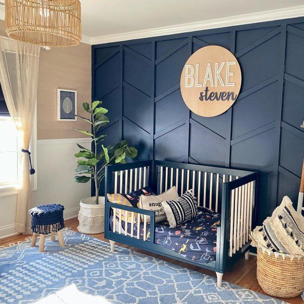
Naval crib and accent keeps this male nursery
10. Dark Night (SW 6273)
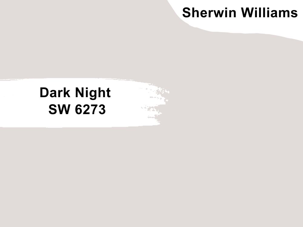
Dark Night (SW 6273) is an unconventional dark blue paint with a deep green-gray undertone veering it away from the popular navy shade. It has an LRV of 4 like Naval but looks moodier and works best with earthy greiges or green-gray paints.
Using Dark Night as an accent in the bedroom is an excellent idea, especially against study walls/workspaces. It adds an interesting perspective to neutral-toned walls and accessories but isn’t a mood booster. So, don’t use Dark Night if you’re prone to depression or anxiety.
Maintain a mysterious atmosphere with multidimensions in your bedroom with Dark Night walls
Benjamin Moore (BM)
Benjamin Moore is another high-quality paint manufacturer often used as an alternative to Sherwin-Williams. Its gallons are within the same price range as SW because it offers the same promise of a stress-free single to double-coating full coverage paints.
BM also has a wide range of blue paints from airy blue-grays to deep navies. Check them out below.
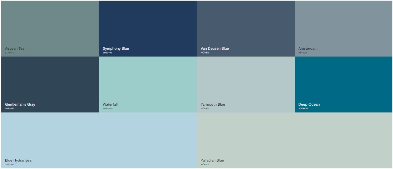
11. Blue Hydrangea (2062-60)
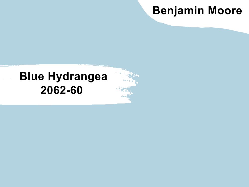
Relive Spring mornings with the powder blue medium-light tone of Blue Hydrangea (2062-60). This color has an LRV of 61.76 which brightens the bedroom with an almost invisible undertone.
It’s a beautiful choice for children’s bedrooms, regardless of gender, as its pastel tone keeps the child relaxed. Pair Blue Hydrangea with Cream Yellow for an energized glow or darker blue paints like Gentleman’s Gray and Polo Blue in adult bedrooms.
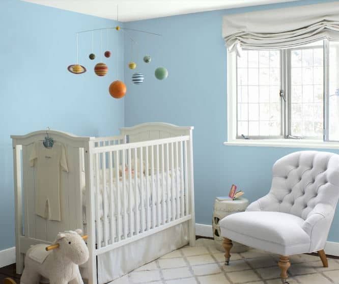
Using Blue Hydrangea in this nursery gives the small room an airy and open look
12. Palladian Blue (HC-144)
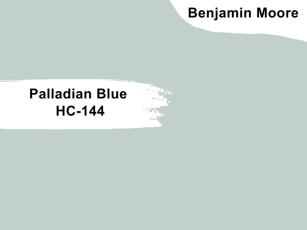
Palladian Blue (HC-144) is a bestseller for its airy look and unique mother-of-pearl undertone, which gives bedrooms a relaxing aura. It’s a mid-toned blue paint with an LRV of 60.4, reminiscent of a bright Winter sky.
As a Historical color, Palladian Blue is ideal for painting vintage-themed bedrooms with classic furniture like French beds, chests, ottomans, and vanities. This calming pastel blue would make the inhabitants of its room feel like royalty.
Pair Palladian Blue with rosy reds like Persimmon for a feminine aura and dark tan or taupe like Wood Grain Brown and Willow Creek for a masculine vibe. Use neutral colors like warm whites and off-whites (Elmira White) for a genderless space.
Palladian Blue in this master bedroom flashes its mother-of-pearl and green undertones thanks to the light entering through the windows
13. Yarmouth Blue (HC-150)
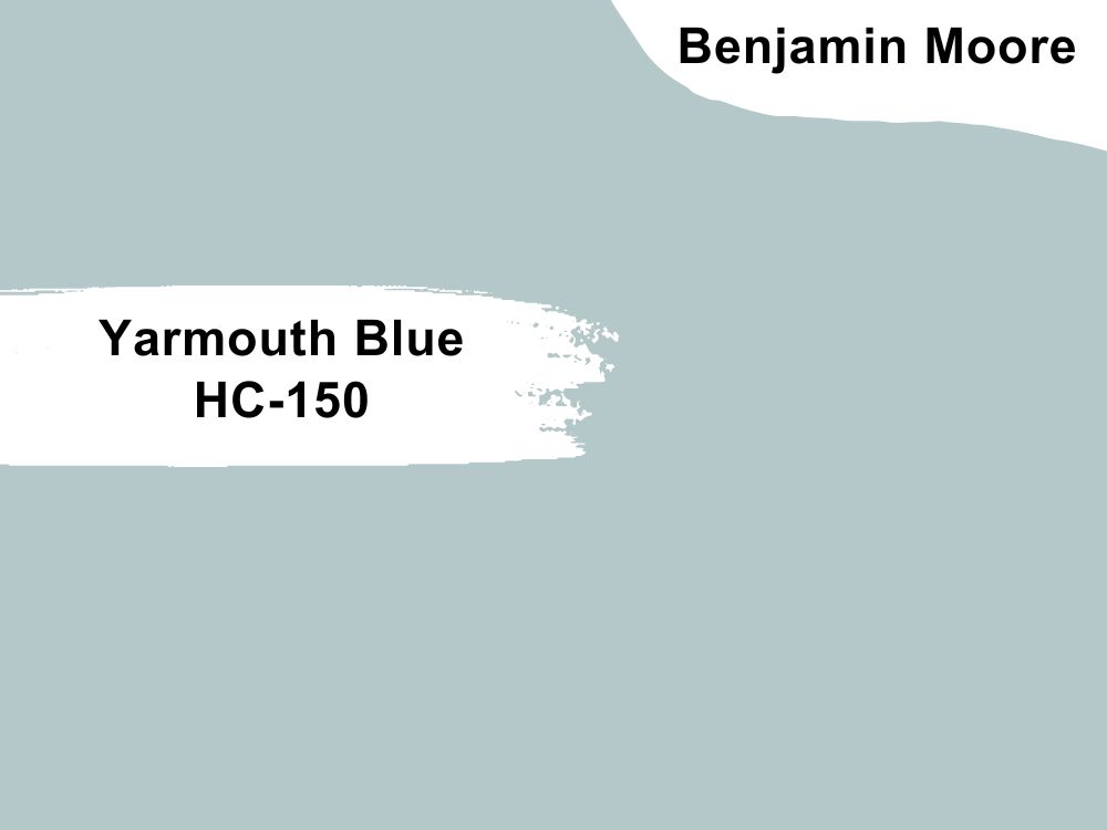
Create an airy and vintage vibe with the steel blue tone of Yarmouth Blue (HC-150), which has a mid-tone LRV of 55.82. This color in your bedroom will refresh you every day, whether waking up to its blue-gray tone or returning home to its open sky vibe.
Yarmouth Blue is a beautiful choice for guest rooms and newborn bedrooms, as its medium tone stabilizes the atmosphere. It pairs excellently with other neutrals like white and gray, but you can add yellow if it’s in a kid’s room.
The yellow hallway walls add warmth to Yarmouth Blue’s steely reflection in this bedroom
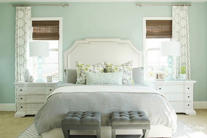
14. Waterfall (2050-50)
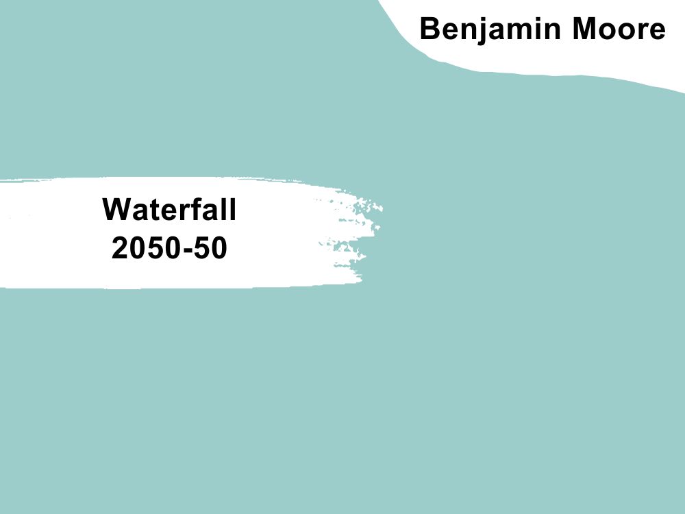
Simulate a beachside view with the refreshing Waterfall (2050-50) on your bedroom walls. It’s a mature shade rich in natural undertones ranging from gray to green. Its 55 LRV makes Waterfall a suitable background paint as it’ll accentuate any other color paired with it.
However, it’s best to stick to the beachside vibe and pair Waterfall with clean white paints like Snow White and Icing on the Cake or green-tinted white colors like White Dove. Pair it with greener shades like Salamander and Dollar Bill Green for monochrome designs.
Waterfall walls make this compact room appear wider than it is
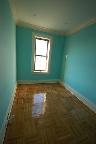
15. Amsterdam (AF-550)
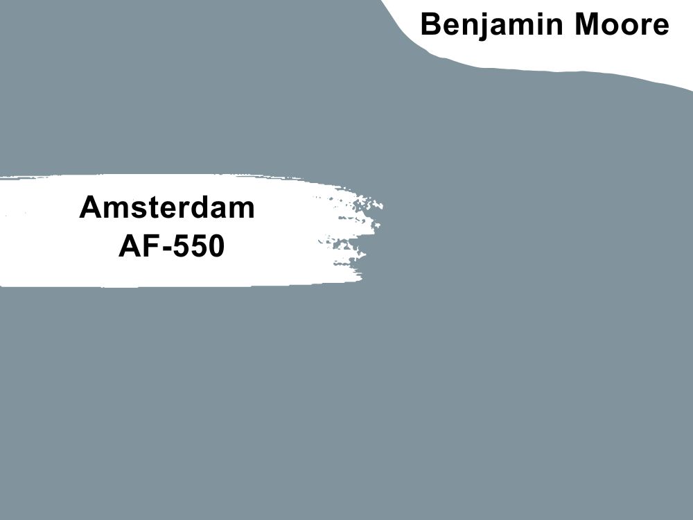
Embrace futuristic themes with the steely blue presence of Amsterdam (AF-550) in your bedroom. Its 29.21 LRV works excellently with open glass windows and contemporary designs.
Amsterdam is an elegant blue-gray paint best used in smart houses with minimalist and pristine accessories from the beds to the wardrobes and tables. Pairing this color with white or gray paints and bedroom pieces is a no-brainer.
Use Amsterdam in adult rooms as a fresh, steely blue paint as they’re more likely to appreciate its elegance than children who need energetic blue shades.
Amsterdam walls make this bedroom look zen
16. Aegean Teal (2136-40)
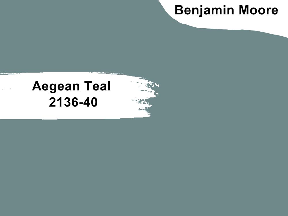
Aegean Teal (2136-40) stands out because there aren’t many teal blue paints with steel gray undertones. This unique tint makes this medium-dark 25.13 LRV paint a bestseller at BM.
Older teenagers, young adults, and adults can express themselves using Aegean Teal as background paint. You can pair it with neutrals like white and gray for a toned-down vibe and deep green-blue like Amazon Green and Black Knight for an intense aura.
Aegean Teal is a moody grayish-teal hue ideal for vintage themes
17. Deep Ocean (2058-30)

You don’t need to build your house by the beach or on an island if you use Deep Ocean (2058-30) on your bedroom walls. It’s a rich, warm royal blue shade with some light in its dark tone, guaranteed to keep your mind working constantly.
Use Deep Ocean in bedrooms with study corners and workspaces so its 14.04 LRV presence can create a thoughtful mood. Accentuate the color with cream and beige paints (Pale Sea Mist & Alpine White) for extra warmth to uplift the atmosphere once the sun is out.
Deep Ocean is a breezy dark tone guaranteed to make your guest
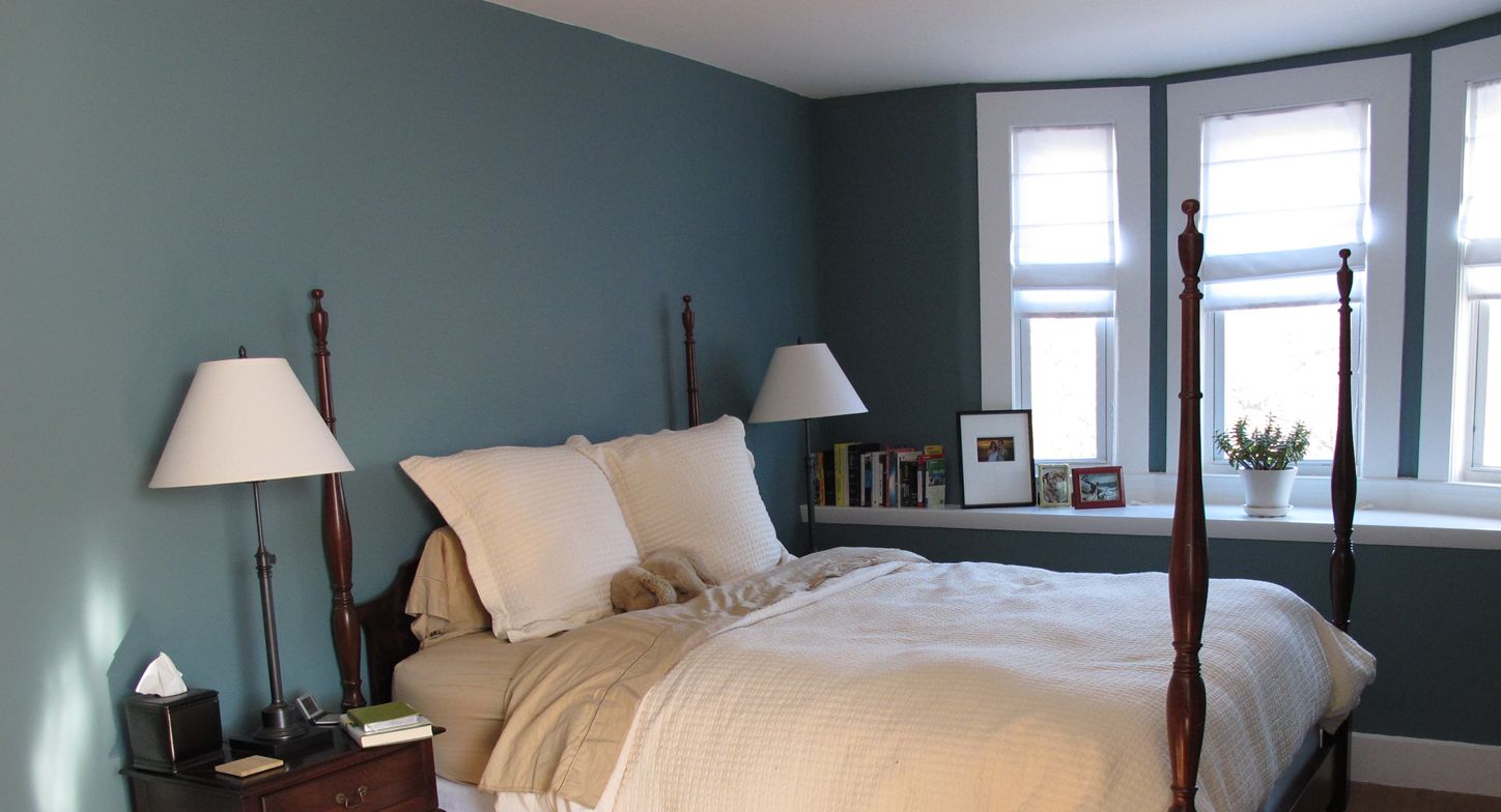
18. Gentleman’s Gray (2062-20)
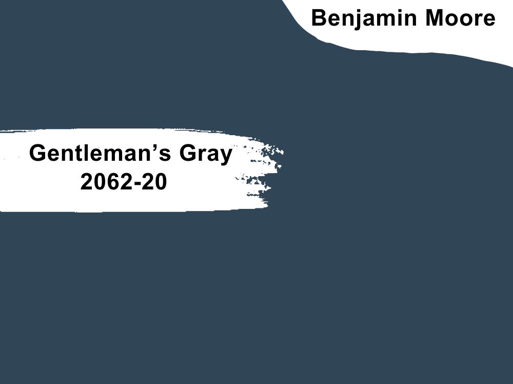
Harness the masculine energy of Gentleman’s Gray (2062-20), a navy blue paint with a charcoal gray undertone that keeps it looking dusky. BM describes it as “a balance of richness and restraint” because its overtone is overwhelming, yet its tint shines subtly.
Gentleman’s Gray’s LRV of 7.26 makes it a dark blue shade but not the kind that leans towards black. Hence, you can use it as a full wall paint in standard to large bedrooms lined with warm wooden floorboards and furniture.
Tame the color’s depth with bright white or light gray trims and accessorize the bedroom with similar neutral shades.
Gentleman’s Gray makes this bachelor’s bedroom look rustic while embracing nature with the open window plan
19. Van Deusen Blue (HC-156)
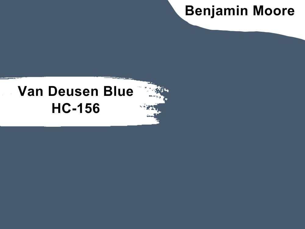
Van Deusen Blue (HC-156) is another blue-gray paint famous for its charcoal undertone and low LRV of 11.97. This bestseller works in modern and traditional bedrooms as its reflection flits between charcoal to blue.
Use Van Deusen Blue in North-facing and South-facing bedrooms to highlight its blue tone and East/West-facing rooms for the charcoal tint to shine more. It’s an ideal shade for guest bedrooms and adult spaces as it’s impersonal.
Van Deusen Blue looks best with open window plans/high LRV trims
20. Symphony Blue (2060-10)
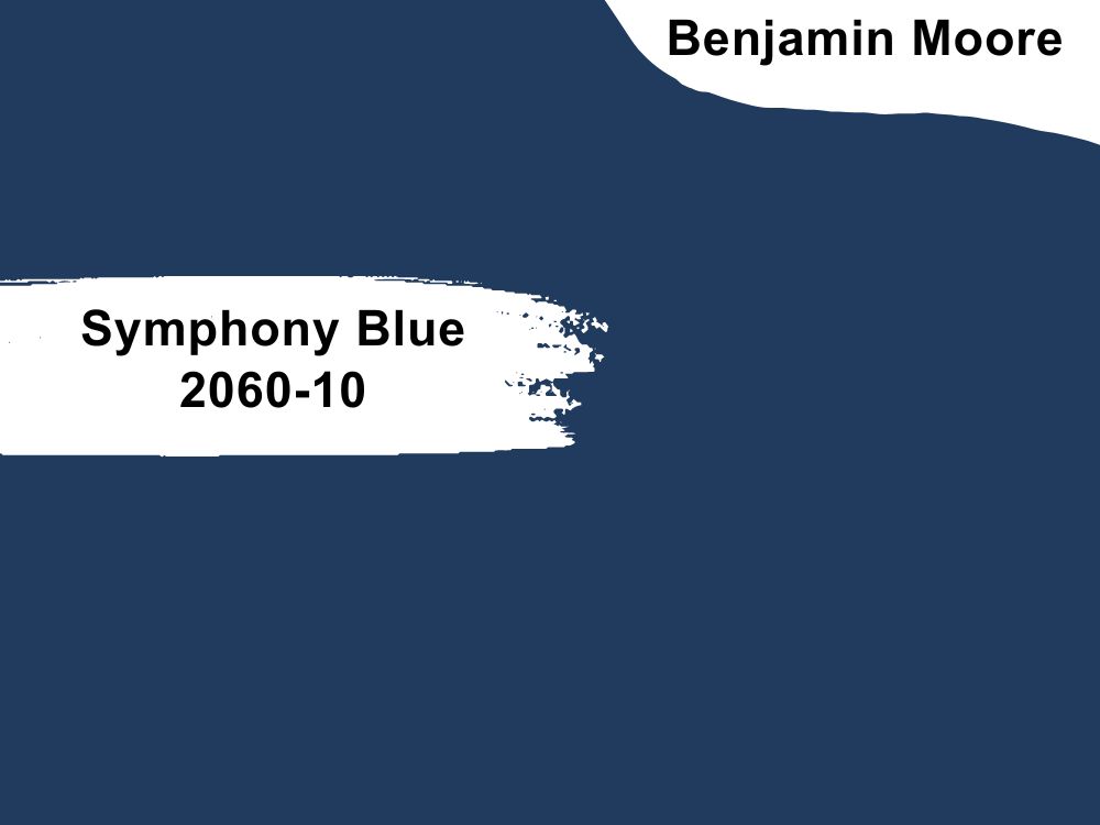
Serve classic energy with Symphony Blue’s 6.16 LRV navy tone. This versatile color sends the same message wherever you use it — a child’s bedroom, guest room, or master suite. It says, “Look at me, I’m here!”
Symphony Blue stands out as full wall paints or accents on headboards and furniture. Crank up the energy in your bedroom by pairing this navy blue color with golden yellow, such as Marblehead Gold.
Create elegance with Symphony walls and white beddings
Behr
Behr paints are economical as they cost less than the popular SW and BM brands. However, that leaves you wondering, “What’s the catch?” Behr paint is of average quality, meaning it’s labor-intensive paint that requires multiple strokes for a bright outlook.
Behr should only be an option if you’re painting on a tight budget. Here are some trending shades regardless of the brand’s disadvantages.
21. Ice Drop (M530-1)
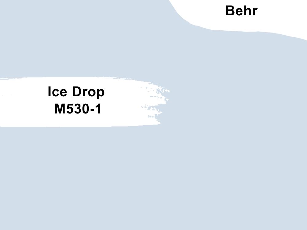
Ice Drop (M530-1) is a high LRV (73) blue paint with purple and gray undertones making its appearance faint. Hence, it’s relaxing and ideal for baby nurseries, especially when paired with crisp white paints as trims and floorboards.
If you use Ice Drop for children’s bedrooms, pair it with vibrant colors like mid-toned yellow and orange. You can keep it neutral with gray coordinates on the curtains, carpets, and bedding.
Ice Drop always appears as a whisper making it suitable for ceiling paintings too like the picture above
22. Beachside Drive (M460-2)
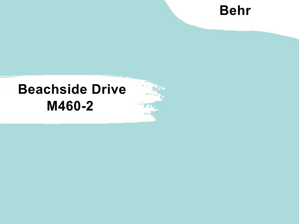
Transform your bedroom into a scenic space like a beachfront house in the Spring using Beachside Drive (M460-2). It’s a medium-light shade with green and blue hues forming an LRV of 65.
Beachside Drive works well in standard-sized and small bedrooms, as the beachy tone illuminates the space without additional lighting. Pair this light blue paint with mustard yellow to highlight its dual tone and dark green to accentuate its undertone.
Make your bedroom a constant vacay worthy space with Beachside Drive walls
23. Skysail Blue (580D-4)
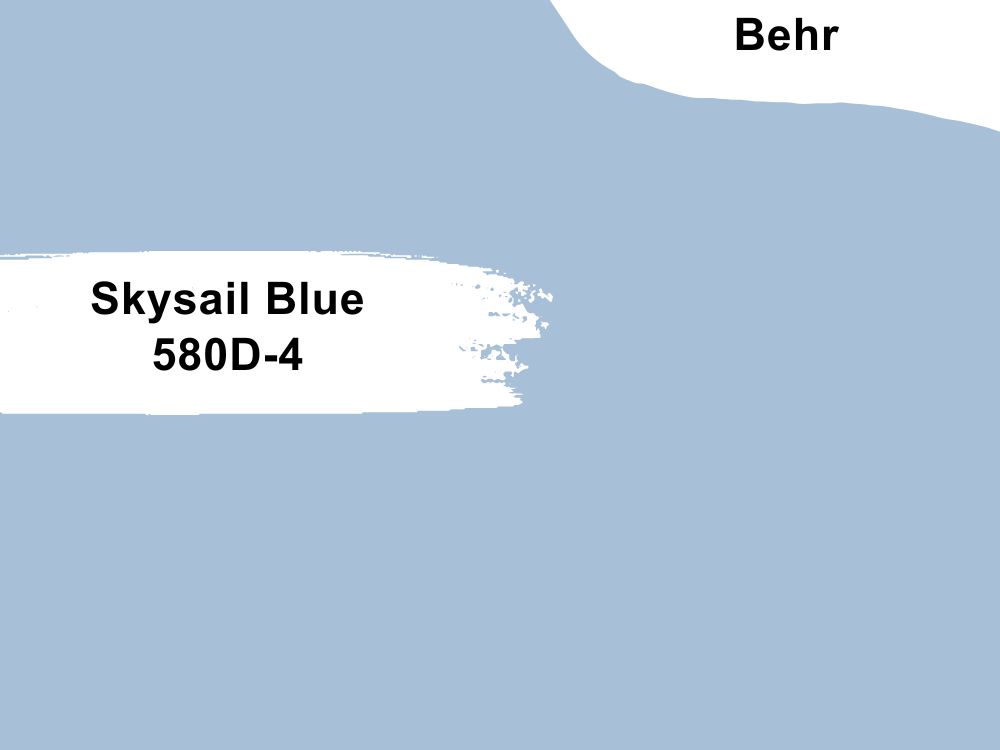
Keep your bedroom’s atmosphere neutral with Skysail Blue (580D-4), a sea-inspired blue paint with purple and green undertones. Its 51 LRV hue keeps the atmosphere neutral throughout the day.
Skysail Blue is excellent in children’s and guest bedrooms, especially ones overlooking the sea. The sunlight’s reflection would draw some color from the ocean and reflect its natural hue onto your blue walls. That combo turns your bedroom into a sea of blue.
Emphasize the neutral mood in your bedroom with the mid-tone Skysail Blue
24. Peaceful Blue (S470-3)
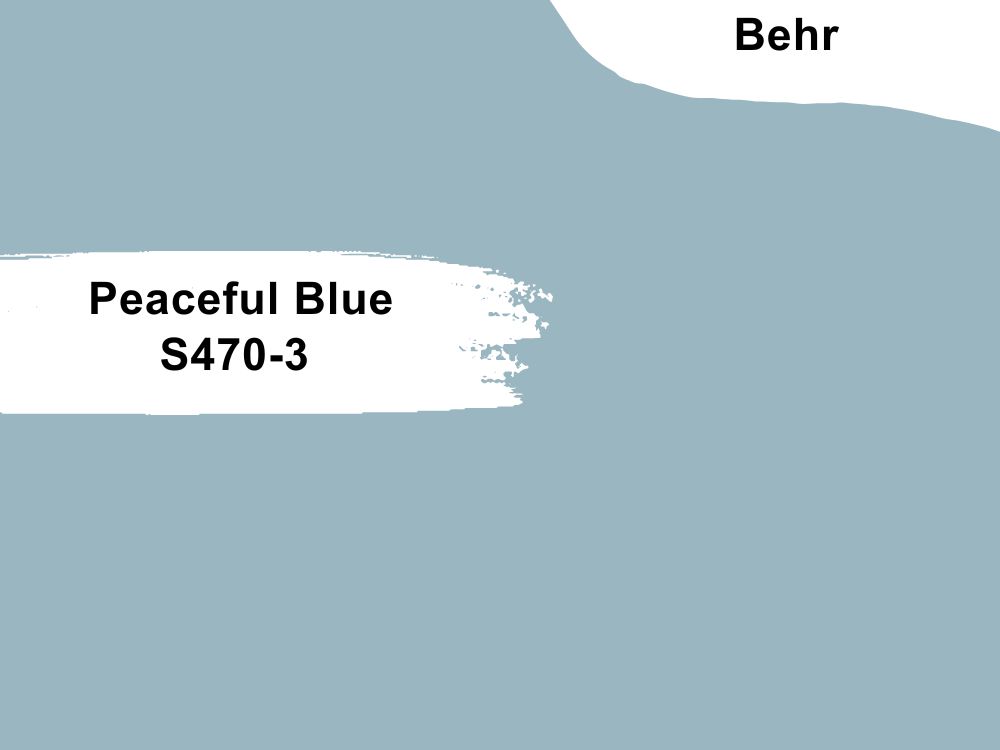
Make your bedroom tranquil with Peaceful Blue (S470-3), a mid-toned pastel blue hue with a 44 LRV. Its soft color means you can pair it with bolder and richer tones for a vibrant and warm vibe.
Accessorize Peaceful Blue walls with cream furniture and green indoor plants for a cozy look, as white furniture would make it appear cool and clean. It’s an excellent color for couples’ bedrooms and family suites.
Stay sane with the relaxing reflection of Peaceful Blue in your bedroom
25. Honest Blue (BIC-38)
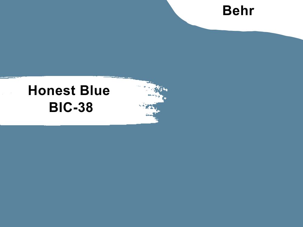
Explore warm blue with the purplish-blue tone of Honest Blue (BIC-38) in your children’s and guests’ bedrooms. Although it’s dark with a low LRV of 21, this color is snuggly and cozy, making it ideal in a family room.
This color uplifts your mood and spirit with its happy aura, so consider it in rooms with workspaces and study tables. It’s a nice deviation from the typical navy blue for the studious vibe. Pair Honest Blue with light yellow or beige paints for a traditional outlook.
You can’t ignore the positive aura from Honest Blue paint on this bedroom wall
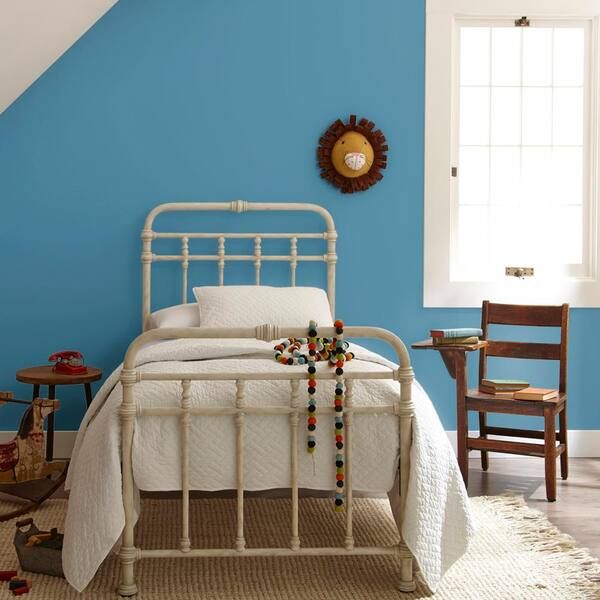
26. Blue Ocean (550B-7)
Blue Ocean (550B-7) is a rich deep blue paint with a bold green undertone reminiscent of the sea’s depth. Waking up in a bedroom with this 14 LRV paint is like diving deep into the ocean hence its name.
Complement this color with golden accessories like barred beds and knobs and yellow-based cream floorings and bedding.
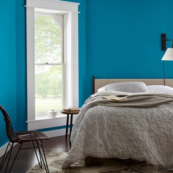
Blue Ocean is made for large spaces as its bold tone has an overwhelming reflection
27. English Channel (PPU14-19)

If you want dusty navy blue paint with a low LRV of 11, English Channel (PPU14-19) is the ideal choice. Its plum undertone presents warm flashes underneath natural light, giving the color a cozy look despite its dark tone.
English Channel is homely, making it suitable for Victorian and Edwardian bedrooms, guest rooms, motels, inns, and Bed & Breakfast bedrooms. The color is typically paired with dark woods like chestnut and oak and accentuated with white trims.
English Channel is an accommodating dark blue shade with its dusky plum undertone
Farrow & Ball (F&B)
Farrow & Ball is an expensive eco-friendly paint made with environmentally conscious products. Knowing the manufacturers did their best to preserve nature while creating the boldest pigments will satisfy you morally.
F&B is famous for its rich pigment paints and handcrafted creation. Check out these eight trending shades from the brand.
All pictures are sourced from Farrow & Ball
28. Light Blue (No. 22)
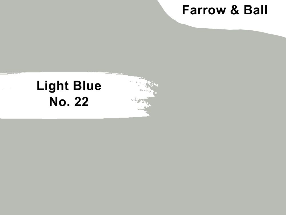
Light Blue (No. 22) is a unique shade of blue with interesting nuances from silver to gray and green. You need an open-plan bedroom with South-facing windows to receive the brightest sunlight highlighting its blue content.
Other directions would accentuate this color’s green and gray elements, which isn’t the goal for 2023. Light Blue relaxes and soothes your mind by exuding a calming vibe when used right.
Use it in older children’s bedrooms so they can interpret the space however they see fit.
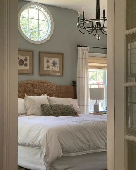
29. Lulworth Blue (No. 89)
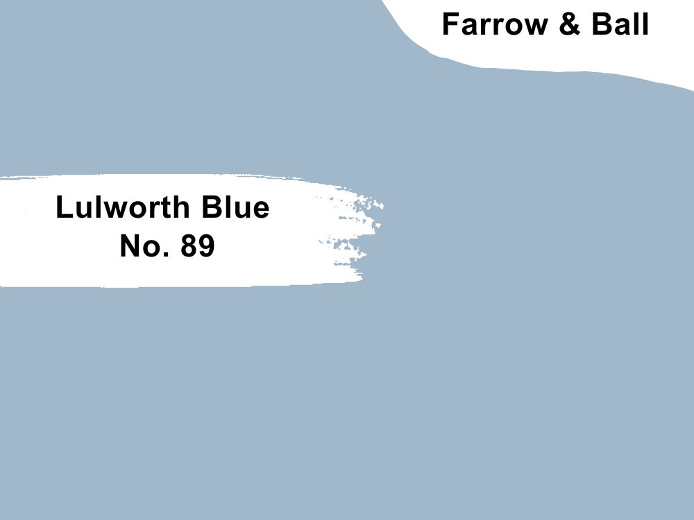
Freshen your bedroom with the ocean-themed Lulworth Blue (No. 89) look. This mid-toned blue paint keeps your mind calm while inspiring your deepest thoughts. It’s best used in North-facing rooms to keep the light low and steady throughout the day.
Lulworth Blue paired with warm wood tones highlight the color’s cozy vibe, and you’ll appreciate it in family bedrooms.
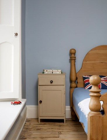
30. Stone Blue (No. 86)
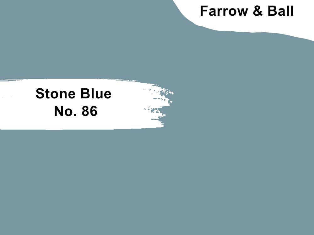
Let Stone Blue’s No. 86 green-based warm look mesmerize your senses alongside a well-curated antique-themed space. It’s a dreamy cyan paint best suited to children’s bedrooms as it’ll challenge their imaginations and give them peaceful sleep at night.
Although Stone Blue is a fierce yet cool blue paint, it pairs excellently with other bold colors, neon pink or mustard yellow.
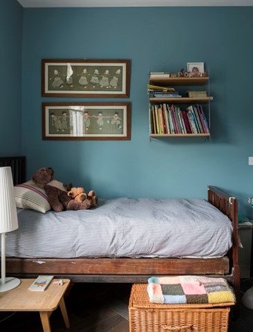
31. Cook’s Blue (No. 237)
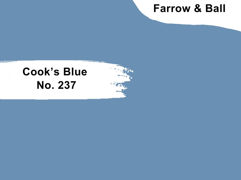
Cook’s Blue (No. 237) isn’t a typical bedroom color, but designers are bolder and more daring this year with their choices. This beautiful deep-toned Blue has a subtle warm undertone that transforms your space into a scenic oceanic sleeping area.
Pair Cook’s Blue in your guest and couple’s rooms with clean white trims and rattan furniture.
32. Stiffkey Blue (No. 281)
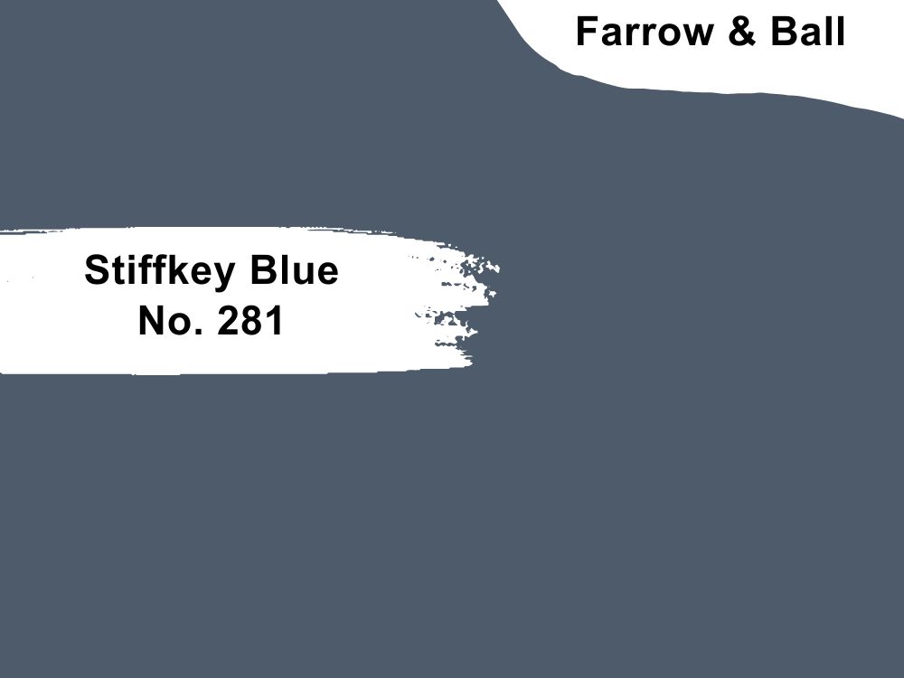
Muddy blue paints like Stiffkey Blue are less popular than many other names on this list, so you should pay more attention. In the spirit of pushing the envelope, this dusty, low LRV blue paint looks like charcoal underneath white lights.
As a dark blue-gray paint, Stiffkey Blue is suited to traditional designs and favored for creating dramatic themes in bedrooms. You’ll love it with game consoles and other gadgets in bachelor’s pads.
33. Wine Dark (No. 308)
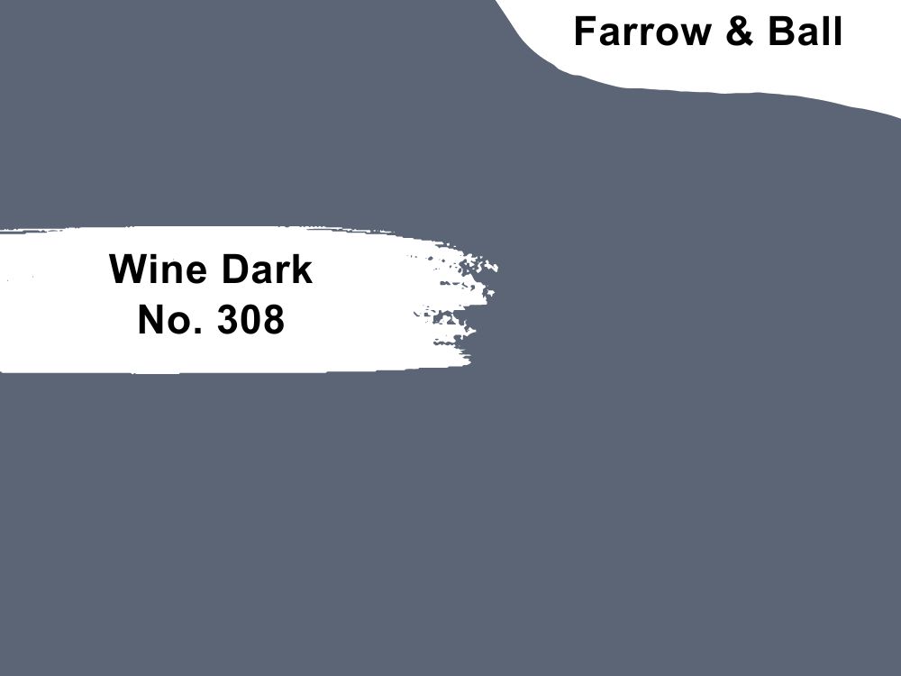
Kill the brightness in your bedroom with Wine Dark’s rich navy presence. It’s the darkest blue shade at F&W with a bold dark gray undertone and creates a mysterious aura. You’ll be surprised at Wine Dark’s ability to set a romantic mood for its occupants.
Pair this rich navy blue with bright white paints like F&B Ammonite.
34. Blue Gray (No. 91)
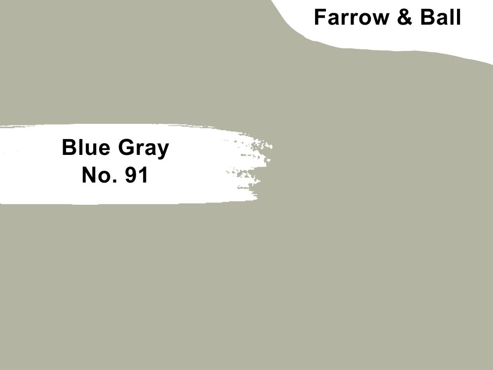
Blue Gray (N. 91) is another rich mix of green, blue, and black into one color such that a beautiful bold blue in the morning changes into a vintage army green-gray at night. Blue Gray is the way to go if you need to stretch your leg after work daily.
Use Blue Gray in your primary suite as children wouldn’t fully utilize the potential in Blue Gray.
35. Vardo (No. 288)

Hypnotize your romantic partner with the bold presence of Vardo (No. 288) in your bedroom. Although many people equate beautiful warm blue paints like Vardo with femininity, you’ll be surprised at the genderless energy it represents.
Use Vardo in your adult bedrooms paired with yellows and rosy pinks in children’s bedrooms. Note that this teal tone takes its green hue over at night.
Conclusion
When choosing multiple blue paint colors, it’s best to stick to a single brand so you can get uniform finishes unless your decor would look tacky. For example, pairing Behr with Sherwin-Williams is a miss as its dull look pales in comparison with the latter.
Farrow & Ball shines bright despite being environmentally friendly. Blue takes you on a rollercoaster of emotions from high to low depending on the shade and room’s position. Follow all the steps in this guide for the best results.
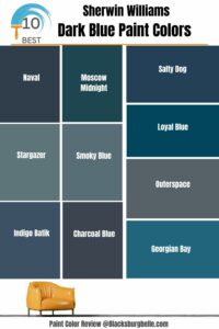 10 Best Sherwin Williams Dark Blue Paint Colors (Trend 2023)
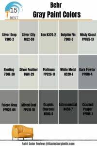 15 Most Popular Behr Gray Paint Colors: From Light to Dark
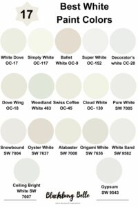 17 Best White Paint Colors For Interior Walls
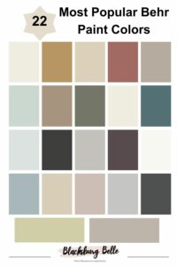 22 Most Popular Behr Paint Colors
 11 Best Dark Sage Green Paint Colors for Interiors and Exteriors
 15 Best Black Paint for Furniture For 2023
