One of the best ways to relax on a weekend is to sit with a good book and a cup of your favorite drink, with sunlight streaming into the room to warm it. Natural light makes everything look so much better, but all these may not be possible if your room faces north.
It is not strange to have a north-facing room, but it can be difficult to determine the right paint color for it. Many times, we select paint colors and accessories based on how they match the existing decor or personal taste. We forget how much impact the direction the room faces changes everything.
However, all hope is not lost as we have some specific details on how to choose paint for a north-facing room. We also have a few paint color options to guide you in creating a color palette for the same room.
Table of Contents
What Is a North-facing Room?
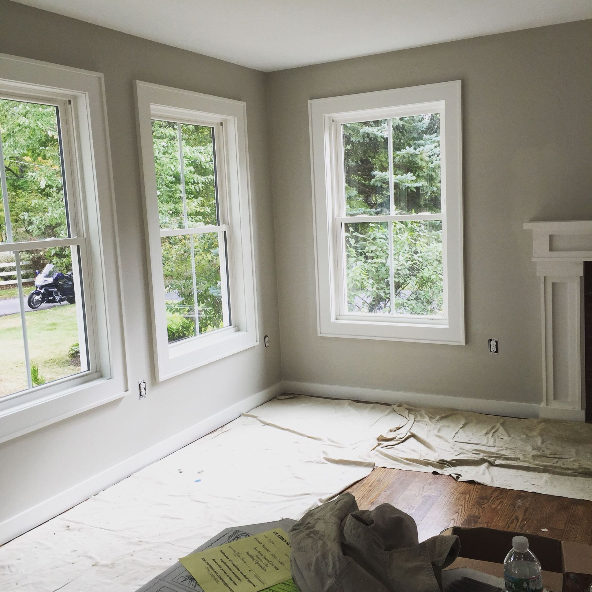
A north-facing room does not get direct sunlight. The natural lighting that flows into the room is usually a reflection from somewhere else and is often muted. There are four main orientations or directions that a roo can face: north, south, east, and west.
A room with northern exposure is usually difficult to decorate or paint. And if you get it wrong, it can decide how much you love the room. While you may have a specific color palette in mind for such a room, you must check the light reflectance value and tone of each color before using it.
Any room with a lot of direct sunlight is a south-facing room. Such a room is usually the easiest to paint and decorate because the natural lighting already shows you how each color reacts to it. You can use cool or warm-toned colors, or go light or dark. It does not matter what you choose, although soft pastels and slightly cooler colors are ideal.
An east-facing room sees more sunlight in the morning than later in the day. This is because the sun rises from the east. Once it gets to noon, the light starts to recede, throwing shadows in the room. Warm colors work better in such a room, although you can add some cool colors to the palette to get a balance.
A room facing west gets the most sunlight in the evenings. As the sun goes down or sets, the room becomes flooded with golden light, which warms it. Warm colors may also be good, especially if you do not mind too much warmth in the evenings. However, combine cool colors to keep a perfect blend so that the room does not feel too warm in the evenings.
Is There a Problem with a North-facing Room?
Now that you know how each orientation determines the natural lighting in a room, it may appear as if a north-facing room is the least likable. We all want to see how well rooms in a house perform when seen in natural lighting.
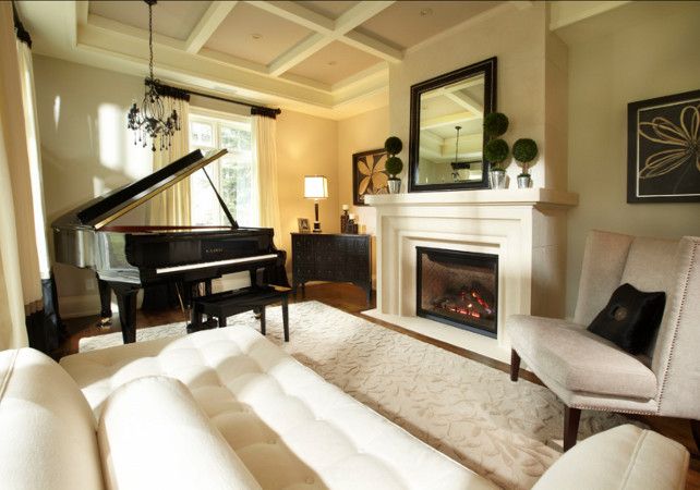
The warmth of a paint color makes every room cozy, inviting, and generally better in a sense. However, it is not always a bad idea to have a north-facing room. In some cases, you get the best views in such a room, and in others, the lighting is all the decor needs to look spectacular.
While it may appear cold and drab, it does not have to be if you know how to pick the right paint colors. Everything becomes much better with the right color palette, and a north-facing room may turn out to be the best in the entire house.
Consider the Location
Interestingly, the location of the house can determine the color palette for a north-facing room. If the area is typically hot, a cool color palette may keep the room from the heat, although it is a cold room. In a cooler clime, the room will be much better with a warm color palette.
Best Color Palette for a North-facing Room
You must note that because of the cool nature of a north-facing room, it tends to reveal a green hue in any color. Each paint color has some red, green, and blue in it, making up the RGB color code.
The amount of each primary color will determine the warmth or coolness of the paint color. But no matter how little the green in any color is, a north-facing room will reveal it because of the orientation. This is good because green neutralizes every cool tone in the room and does not add any yellow.
We are usually quick to pick light neutrals with a warm tone for such a room, and this is an excellent choice if you have such a palette. However, you can also incorporate deeper and more saturated hues into the decor to harness the beauty of the coolness while infusing warmth and color.
Avoid making the room too dark and somber. It is already dark enough with the lack of direct sunlight most of the time. So, while incorporating dark or saturated colors into the light neutral palette, do not overdo it.
The result you want is airy, fresh, bright, and warm without looking washed out, moody, or overwhelming. And if you want to play it safe, keep the palette warm and avoid every cool-toned color. This means avoiding blues, grays, and some greens.
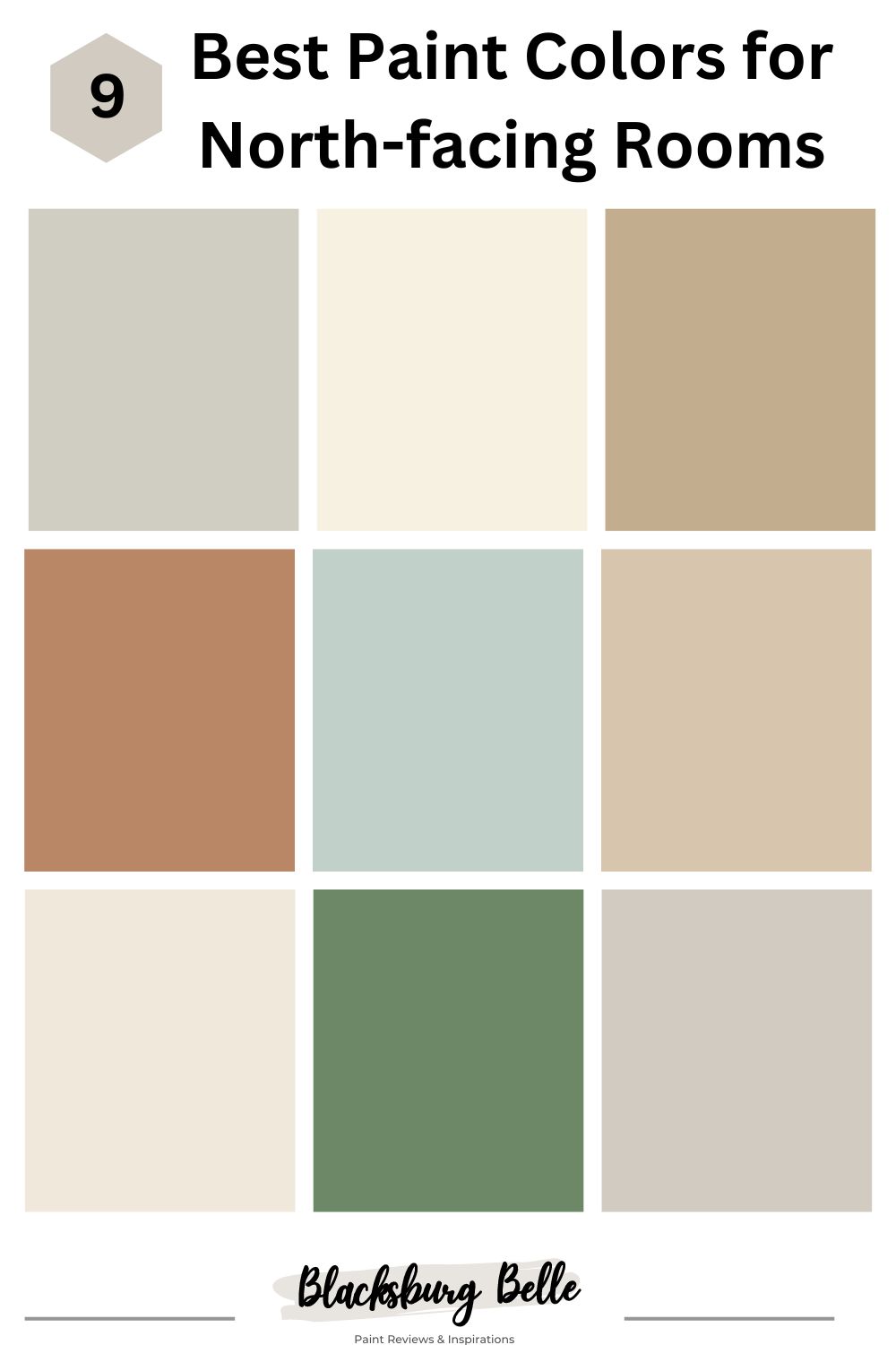
9 Best Paint Colors for a North-facing Room
Here are some of the best paint colors to use in a room with northern exposure from Benjamin Moore and Sherwin Williams
5 Best Paint Colors for a North-facing Room from Benjamin Moore
1. Rodeo 1534
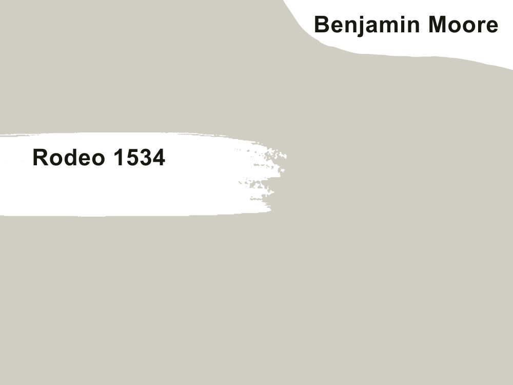
Warm gray paint color
Rodeo looks like warm greige in a south-facing room, but in a room facing north, it looks more like a warm gray than greige. Its subtle undertones of gray make it look calm and collected without looking washed out. That is why it is part of our color list for a north-facing room.
Rodeo has an LRV of 59.84, above average to throw more light into the room. And with an RGB color code of 208, 205, and 194 respectively, this paint color has more red and green in it. So, it will not present a cool face even in the dimmest light. Match with Glacier White and Bachelor Blue or Chantilly Lace and Dove Wing.
2. White Chocolate OC-127
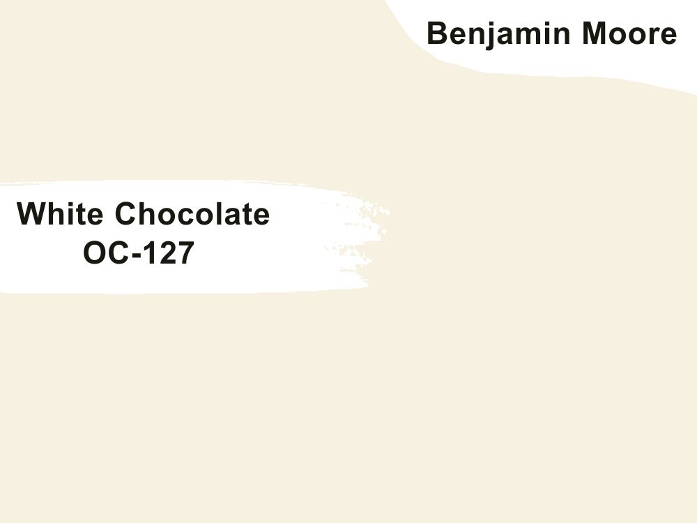
White paint color with cream undertones
White is one of the best neutrals to use in a north-facing room, but it must have warm tones to work well. And that is what you get with White Chocolate because of the creamy hues in it. It is such a rich color that makes any room with northern exposure look better, regardless of the amount of natural or artificial light, or the time of day. Check out the trims in this beautiful setup from Home Bunch.
White Chocolate warms any room, so you can infuse it into a cold color palette to balance it. It has an RGB color value of 247, 241, and 225 respectively. And with a high LRV of 86.83, you already know the color will throw a lot of light into a north-facing room. Coordinate it with Durango and Red River Clay or Honeymoon and Sparrow.
3. Lenox Tan HC-44
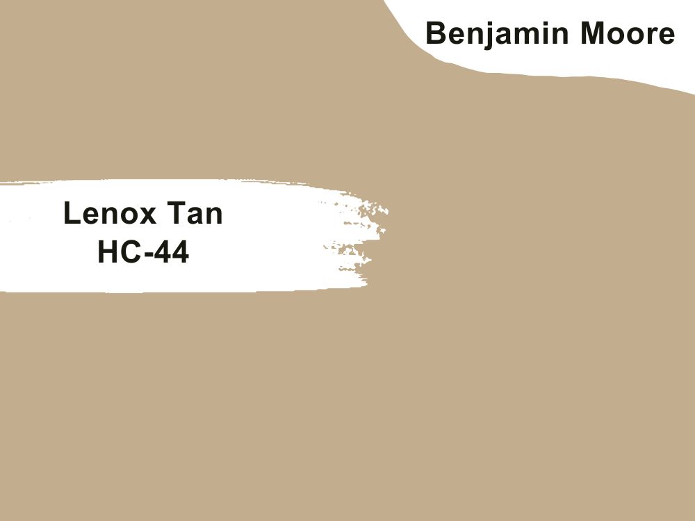
Medium tan paint color with yellow-orange undertones
Lenox Tan not only adds warmth to a cold room but also brings class and sophistication to the entire decor. You cannot go wrong with this color because it has depth and makes a north-facing room warm and cozy.
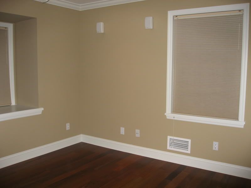
With an LRV of 43.14, Lenox Tan seems too dark for such a room. But when you use white trims, the color becomes better. Alternatively, Lenox Tan works on accent walls to add warmth to the room if you use cool colors for other walls.
That way, the room has an amazing tone balance. The color has an RGB color balance of 194, 172, and 142 respectively, so match it with Marble White and Knoxville Gray or Cloud White and Rockies Brown.
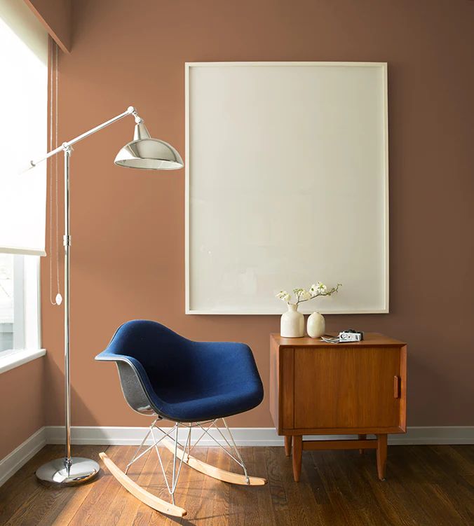
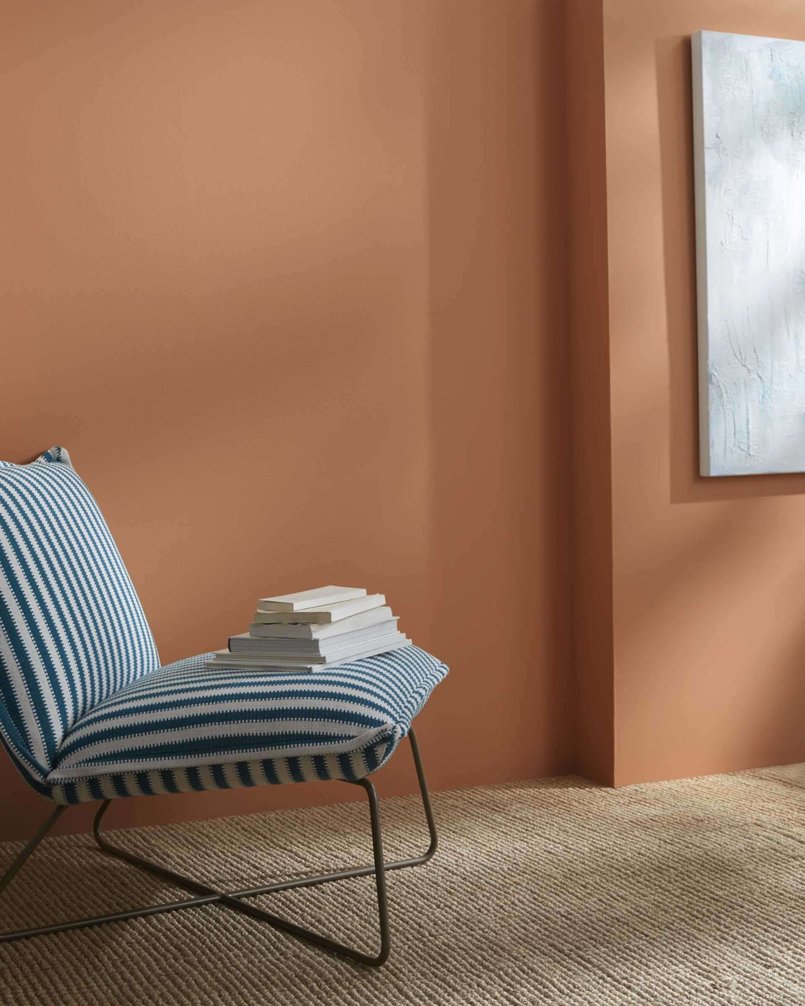
4. Potters Clay 1221
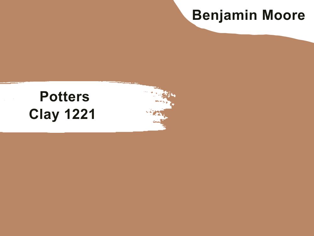
Terracotta paint color with an orange undertone
If you want a saturated and rich color to make any room warm without looking overwhelmingly so, look no further than Potters Clay. It is a deep terracotta orange color that looks amazing in a north-facing room. While it is ideal for accent walls to complement light neutrals, Potters Clay can also work as a standalone color.
The paint color works with different color schemes and hues, so you can opt for light or dark shades to pair with it. Some of the best matching colors include Parchment and Temptation or Super White and November Rain from Benjamin Moore. Potters Clay has an LRV of 28.25 and an RGB color code of 185, 135, and 102 respectively.
5. Palladian Blue HC-144
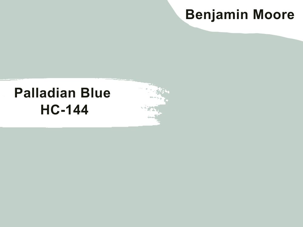
Soft blue paint color with blue-green undertones
Brighten your room or highlight dark colors with Palladian Blue. We know we said that north-facing rooms do not perform well with blue and green paint colors, but this color is not cold. The hint of green in it partially neutralizes the iciness that would have been a part of the paint color, balancing it out.
Do we need to say that it will lighten the dark shadows in a north-facing room? This is because it has an LRV of 60.4, above average on the light spectrum. Palladian Blue also has an RGB color value of 193, 209, and 201 respectively, so consider coordinating it with Elmira White and Persimmon or Willow Creek and Wood Grain Brown.
4 Best Paint Colors for a North-facing Room from Sherwin Williams
1. Kilim Beige SW 6106
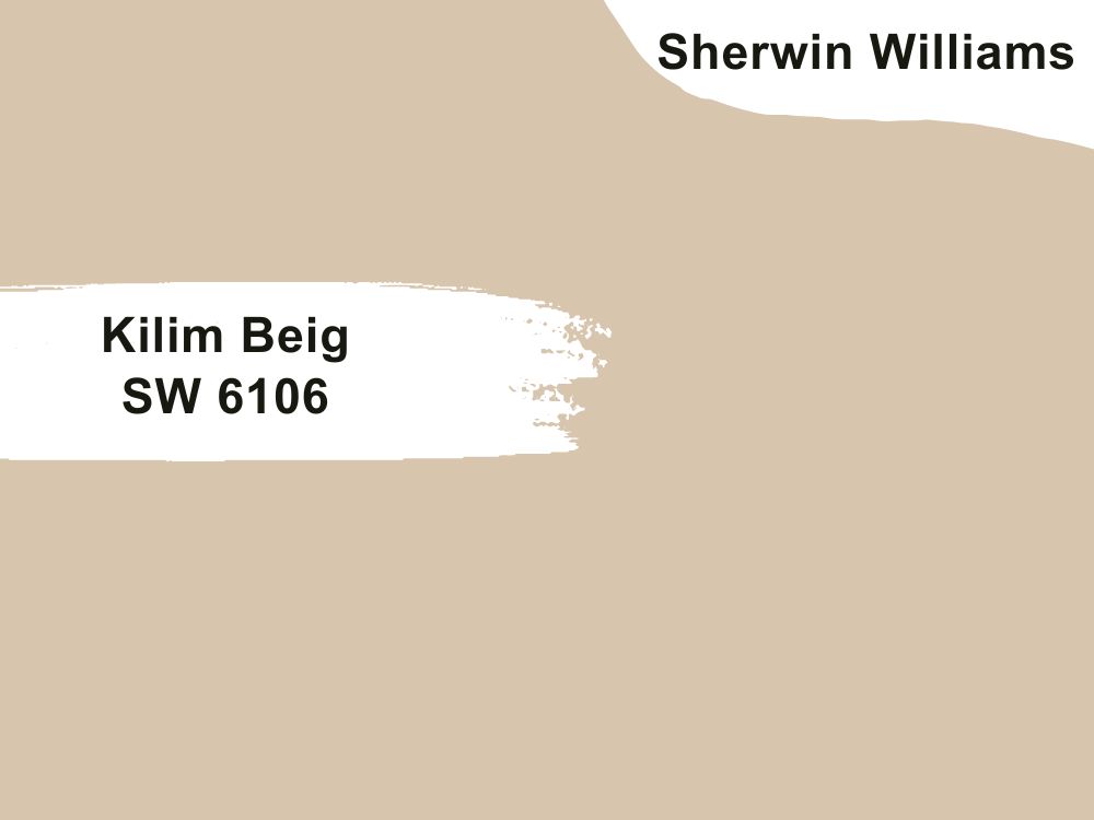
Warm beige paint color with orange undertones
Kilim Beige is a popular neutral with orange undertones. In some lighting, the undertones look a little pink, but this does not remove anything from the color’s warm tone. It is an excellent beige color choice for a room with northern exposure without being too warm.
The brighter the light in a room, the warmer Kilim Beige becomes. With an LRV of 57 and an RGB color code of 215, 197, and 174 respectively, you can coordinate this color with other Sherwin Williams colors like Storm Cloud, Latte, and Divine White.
2. Creamy SW 7012
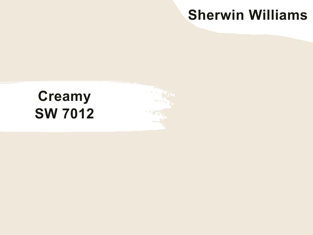
Bright white paint color with yellow undertones
This white paint color is not bland and produces warmth because of the subtle yellow undertones. Since it is a bright and warm color, it can work well as a standalone color in a cold room or on trims, complementing darker hues.
Pair it with colors like Reynard and Studio Taupe, colors from Sherwin Williams, to get the best results. Creamy has a high LRV of 81 and an RGB color code of 239, 232, and 219 respectively. Use it in a bedroom, nursery, living room, or kitchen.
3. Inland SW 6452

Rich green paint color
As we mentioned, the color palette for a north-facing room does not have to include only light colors. Inland is a saturated paint color to add to the palette for a perfect blend. While it has a low LRV of 22, brighter colors like White Mint should make it pop. Alternatively, you can use it on accents while the rest of the room is a light color.
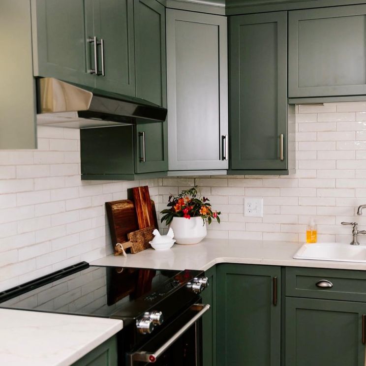
With an RGB color code of 108, 136, and 103, Inland is a great choice for kitchen islands and cabinets too. Coordinate it with colors like Pavestonee, Colonnade Gray, and White Mint for the best results.
4. Agreeable Gray SW 7029
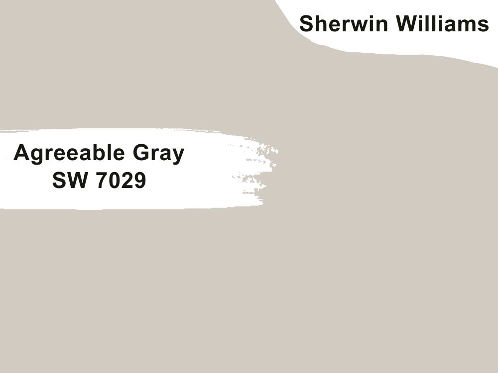
Light gray paint color with beige undertones
What is a neutral color palette without Agreeable Gray? It is Sherwin Williams’ most popular and best-selling paint color, and the reason is not hidden. Agreeable Gray is an almost-perfect neutral that fits any color scheme and works with any color, whether light or dark.
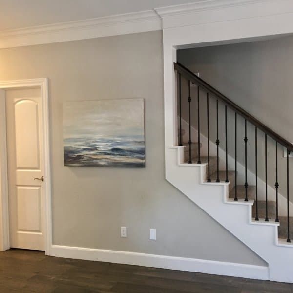
This is why it is one of our best paint color choices for a north-facing room. That, and its LRV of 60. It may not be very high, but it is enough to illuminate the room. With an RGB color code of 209, 203, and 193 respectively, coordinate this soft gray paint color with Coral Rose, Extra White, or Incredible White.
Bottom Line
Gone are the days when painting or decorating a north-facing room was a challenge. With more knowledge of how color interacts with lighting, designers and decorators are better armed to choose the best colors for such a room.
And that is why we have the top 9 paint colors from Benjamin Moore and Sherwin Williams for a room without direct sunlight. The colors are a mixture of light neutrals and saturated colors to add some depth to the decor. However, this is only a guide; build a unique color palette using this guide to fit your unique style.
Do not forget to let us know your thoughts and share your experience with us in the comments section.