
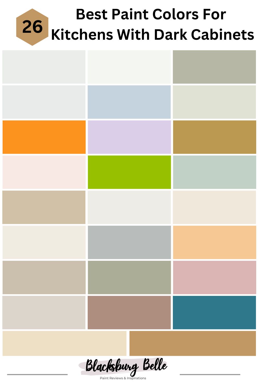
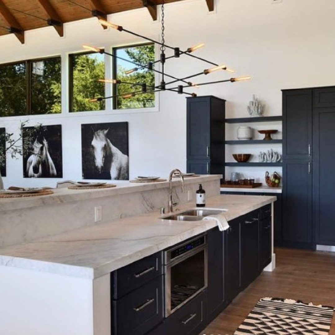
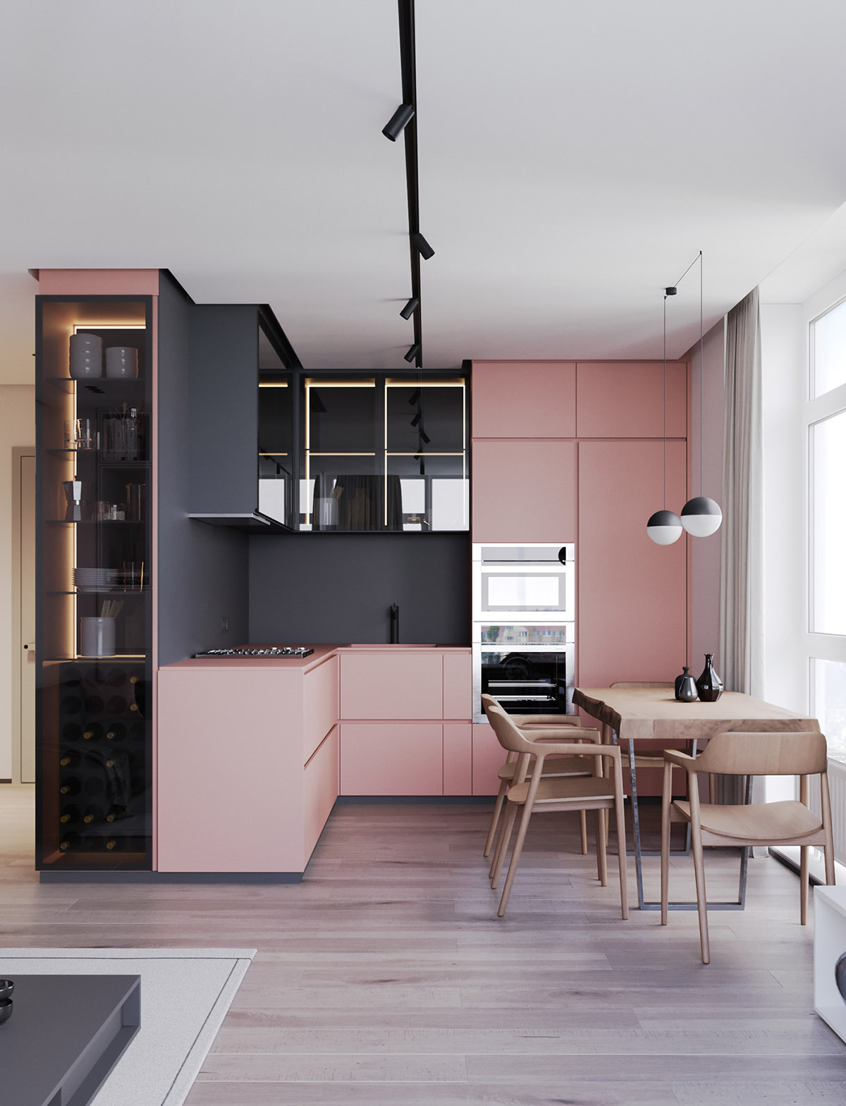
The kitchen is a vital part of the home, and it is always important that we keep it not only functional but smart, chic, and beautiful.
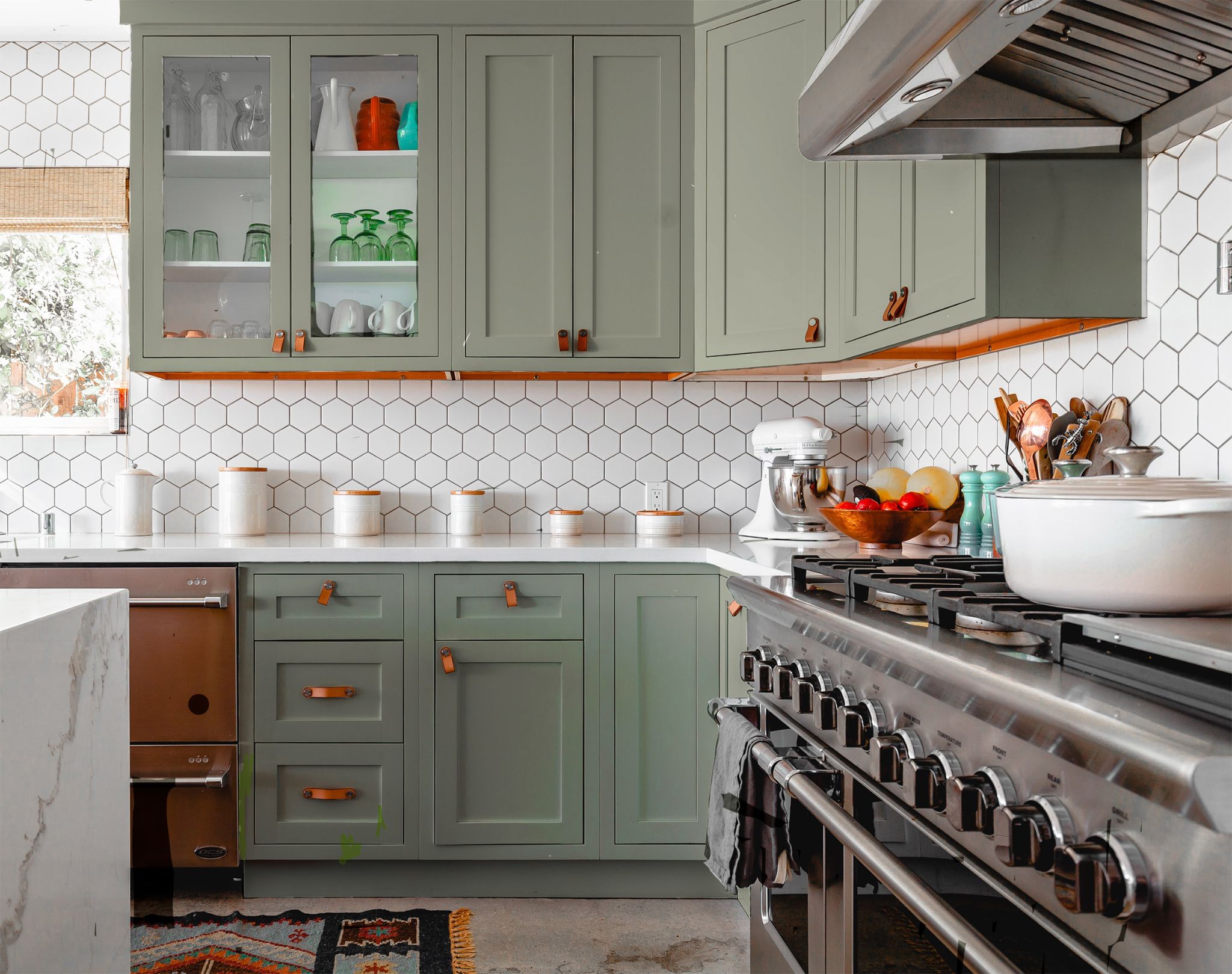
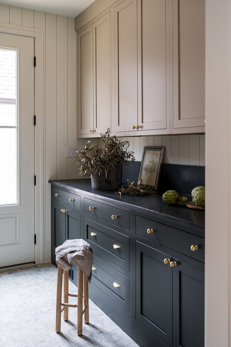
Kitchen cabinets are the backbone of any kitchen and require the most of our attention. Dark cabinets are pretty much in the trend today. They are durable and functional, but they offer a flawless look too but can sometimes pose a problem when it comes to picking a kitchen wall color that suits it.
Below are lists of the best versatile and flexible colors you can pair with your dark cabinets.
Table of Contents
Benjamin Moore Colors For Kitchens With Dark Cabinets
1. Benjamin Moore Decorator’s White CC–20
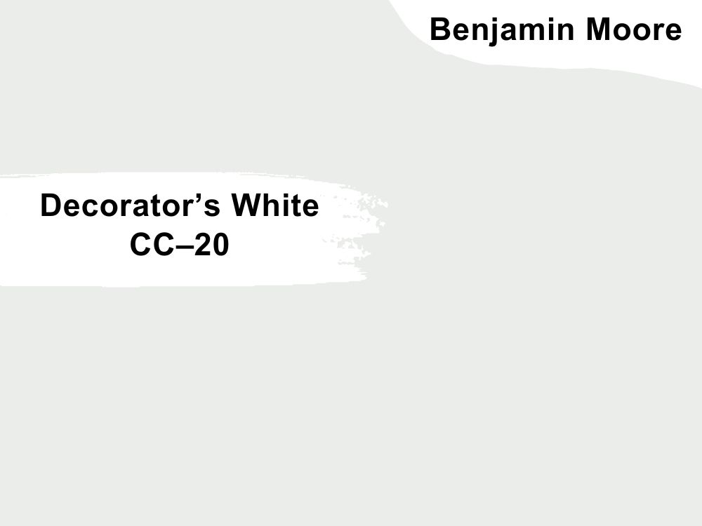
| RGB | 236 237 234 |
| LRV | 82.68 |
| Matching colors | Oxford white, rain dance, blue note |
| Undertones | Gray, blue |
There is no doubt about white paint’s ability to bring more light into any space where it is being used or its ability to carry that light around the space creating a brighter-looking surrounding.
In a kitchen with dark-colored cabinets, it is best to have your walls painted in a bright color like the decorator’s white. This will help to create a beautiful equilibrium between the light that the dark colors absorb and don’t reflect back and the light that your wall will reflect.
However, if your kitchen is facing north where it gets a lot of cool northern light, it is best that you opt for a warmer shade of white especially if your cabinets are blue in color. This is to avoid the kitchen from feeling stale and cold.

2. Benjamin’s Moore Chantilly lace OC-65
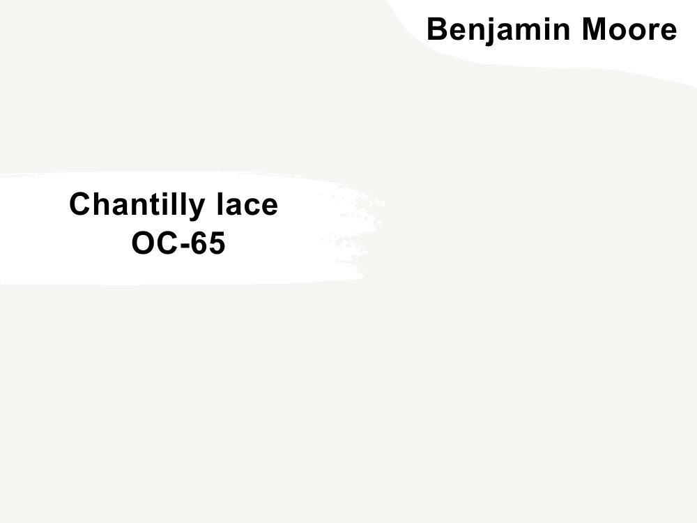
| RGB | 245 245 239 |
| LRV | 90.64 |
| Matching colors | White, horizon, sea pearl |
| Undertones | Neutral |
Chantilly lace is an off-white color that is commonly treated as white. This is a paint color that works perfectly for people who have North facing kitchens with deep to medium shades of blue cabinets. Chantilly lace works well for this kind of kitchen because it brings in light, and warmth, and also balances out the effect of the blue cabinets to create a more homely and welcoming kitchen.
What the neutral undertones do is help tame the brightness and coldness that comes with stark white color, replacing it with warmth instead. The good thing about this color is that it has almost no particular undertone; all the undertones are subtle and reserved.

3. Benjamin Moore’s October Mist 1495
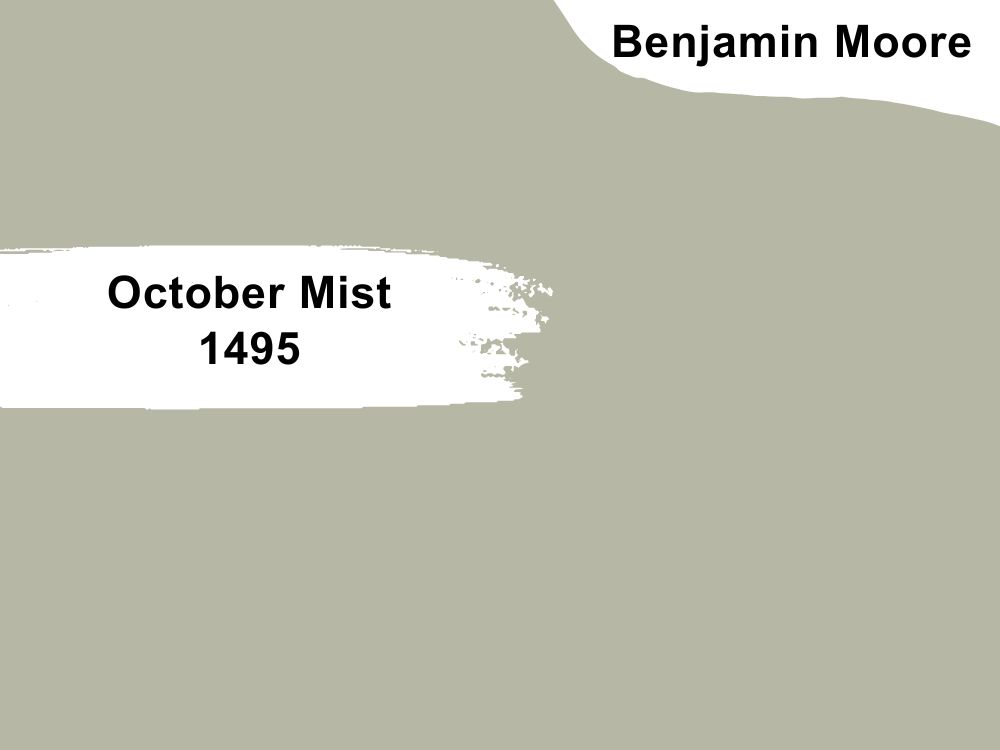
| RGB | 182 184 165 |
| LRV | 46.54 |
| Matching colors | Glacier white, steam, venetian portico |
| Undertones | Gray, silver |
When it comes to softening the appearance of a space, there is no better way than a tranquil touch from a shade of sage.
I will say that in the world of sage, October Mist is one of the designers’ and homeowners favorites. It has just enough pigment to be attractive and a wonderful balance between green and warm gray. This paint color is a versatile shade of sage that is characterized by its gray and sometimes silver undertones.
What this color does is perform pure magic on dark cabinets, especially dark brown cabinets. This shade of sage is one that brings out the beauty in your dark cabinets when it is used in the walls of the kitchen; it gives out an overall vintage aesthetic appearance, and an exceptional homely vibe.
4. Benjamin Moore Misty Gray 2124-60
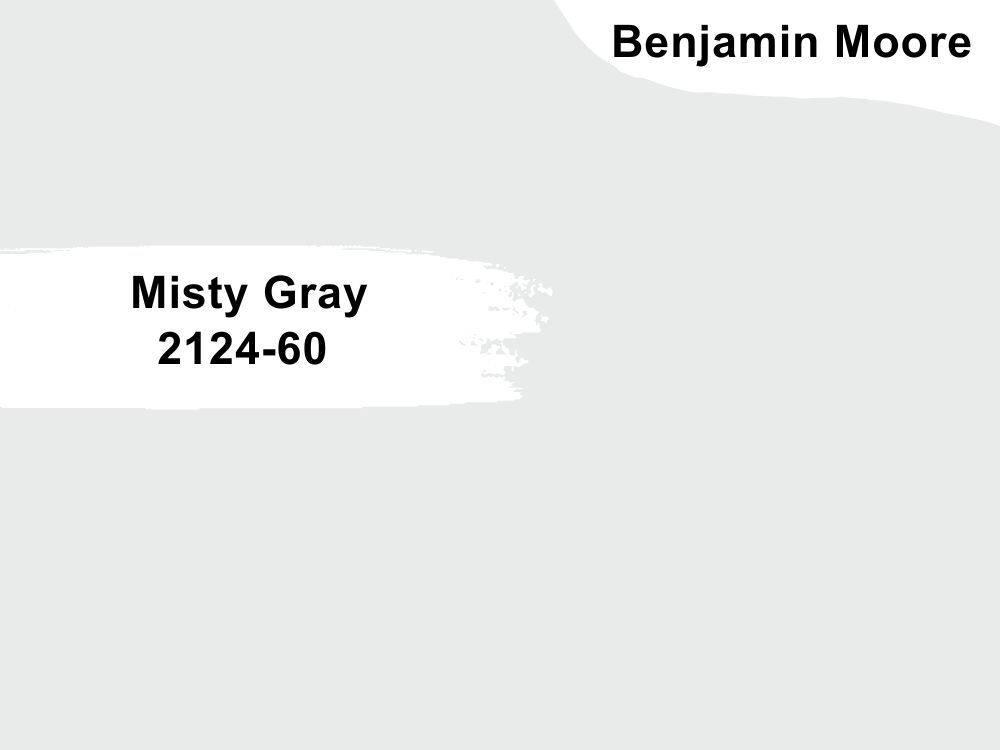
| RGB | 232 235 234 |
| LRV | 80.58 |
| Matching colors | Metallic silver, gray owl, midnight |
| Undertones | Blue |
Misty Gray is a cloudy pale gray with a soft and cool cast.
This is the absolute best of all cool greiges you will find anywhere. It has blue undertones that give the color a spark of cool brightness and makes it very suitable for kitchens that have dark furniture.
Misty Grey is very soothing and with an LVR of 80. 58 tells us that it reflects quite a high amount of light. This color of paint definitely reflects light around the kitchen and blends into the color of the cabinets, not overpowering the color of the cabinets but instead complementing; resulting in the stimulation of a feeling that is warm and welcoming.
5. Benjamin Moore Lake Placid 827
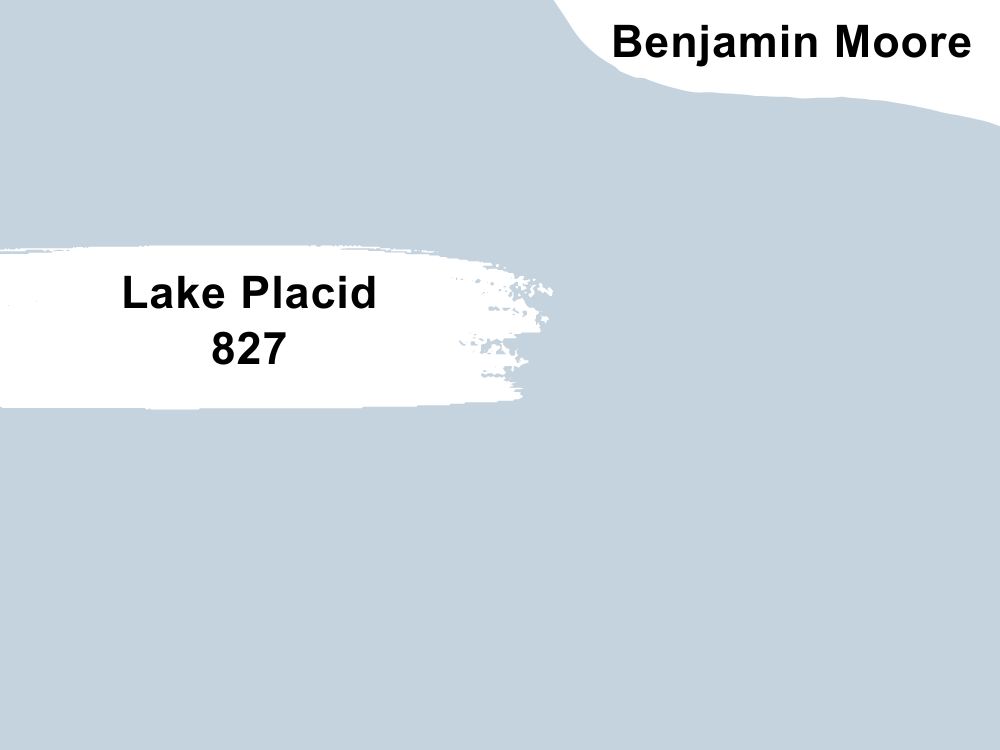
| RGB | 197 211 223 |
| LRV | 64.8 |
| Matching colors | Gray mist, dune white, puritan gray |
| Undertones | Red, gray, violet |
Dark brown cabinets against light blue kitchen walls are the ultimate eye-catcher.
This color is made up of a rich shade of blue with warm undertones of warm red and gray. It is also soothed by hints of violet.
Lake Placid possesses a chameleon-like behavior that allows it to change a bit of its appearance in reaction to the type of exposure it gets and also to be able to blend perfectly with other colors, while still maintaining its stable cool serenity similar to that of a winter lake.
What this color does when used in a kitchen with dark cabinets is not to only obviously bring light or create a splash of color in the kitchen. It also is a very calming color that promotes relaxation, giving your kitchen a calm lively appearance which further promotes and makes the beauty of your cabinets more pronounced.
6. Benjamin Moore Silken Pine 2144-50
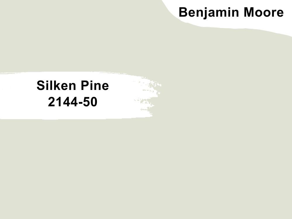
| RGB | 226 225 211 |
| LRV | 74.02 |
| Matching colors | Cloud nine, Normandy, Tate olive |
| Undertones | Silver, cream |
If you have black cabinets in your kitchen, this is most definitely the color for you.
Silken pine dots every I and crosses every T when it comes to creating the best kitchen combo of black cabinets and soft green walls. You can never go wrong with this aloe green.
This color can be described as a soft green with a silvery cast. It is a color that immediately spreads cheer and freshness all over the kitchen, illuminating the kitchen as well as enhancing the look of the dark-colored cabinets.
The undertone in this painting gives the color a shine and warmth that is inviting and equally accommodating. This creates a universal kitchen of perfectly blended colors.
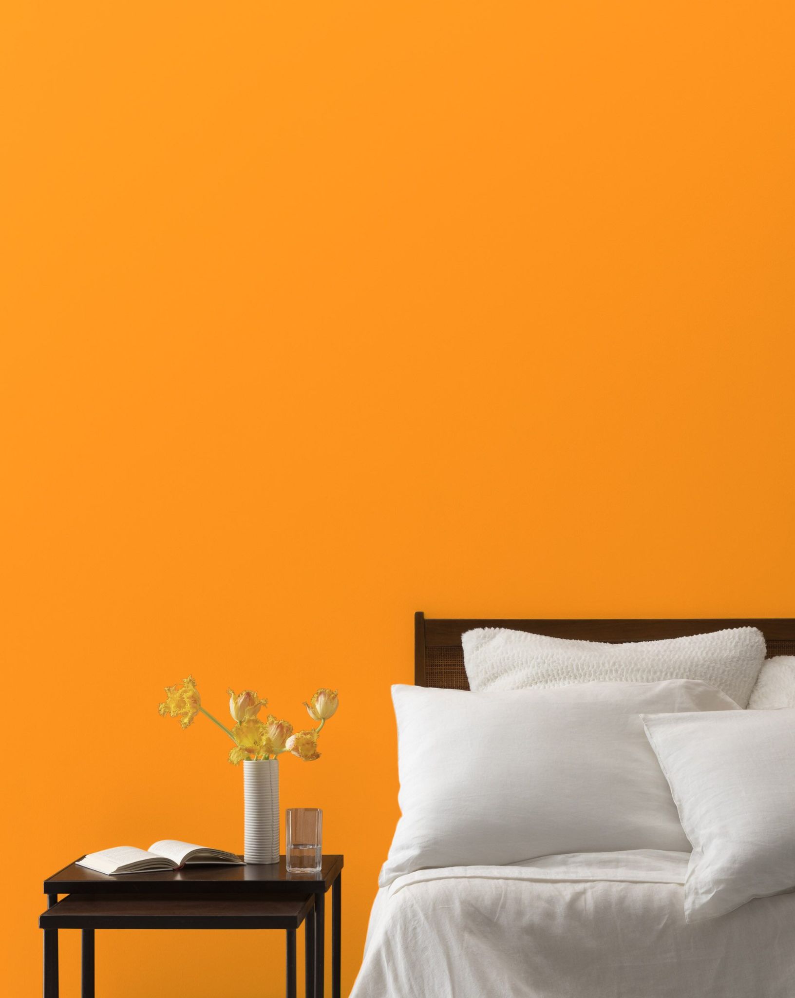
7. Benjamin Moore Sharp Cheddar 2017-20
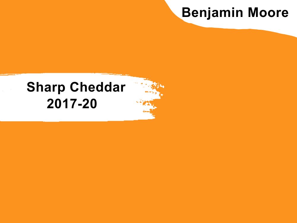
| RGB | 250 140 29 |
| LRV | 39.05 |
| Matching colors | Moonlight white, vanilla ice cream, old claret |
| Undertones | Yellow |
Go bold or go home!!!
Orange might particularly not be the first five shades of color that will come to your mind when you are considering painting or repainting your kitchen walls. But it is a soft yet very strong shade of paint that makes a loud long-lasting statement.
Sharp cheddar is a vibrant shade of orange with yellow undertones. This happy color is one that makes a memorable appearance when used on your kitchen walls, or under cabinets. It doesn’t only add color to the space but it comes with lots of good cheer and a sensation of warmth. This color has a way of making your dark kitchen cabinet (especially black cabinets) look bolder and more confident; while it creates an overall appealing facade.
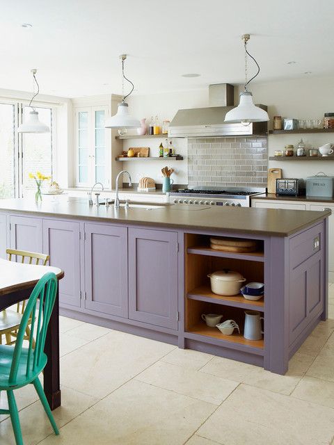
8. Benjamin Moore Lily Lavender 2071-60
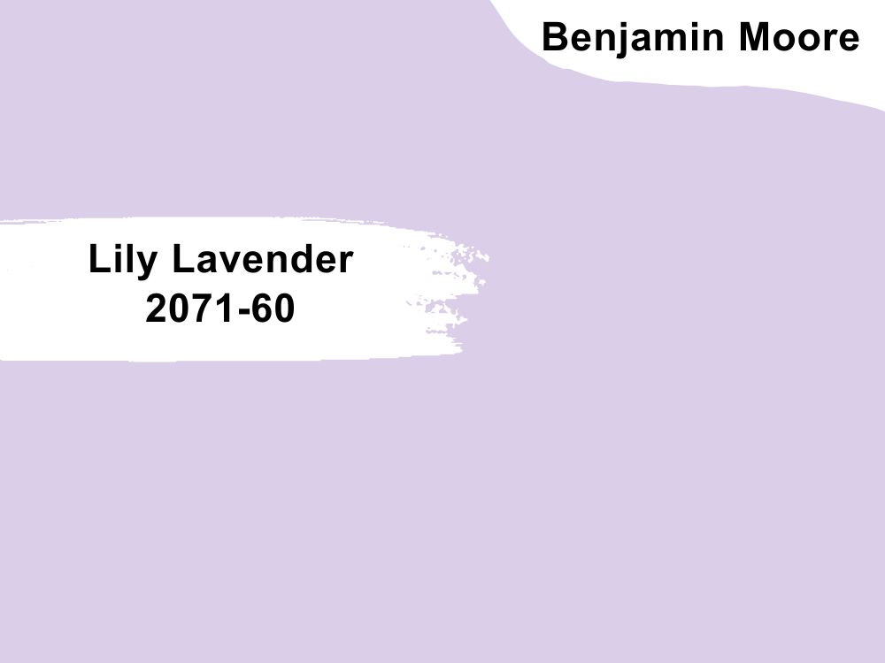
| RGB | 216 208 231 |
| LRV | 64.33 |
| Matching colors | Blue note, cinder, alabaster |
| Undertones | Blush |
Who says purple paint cannot work for a kitchen?
Lily lavender is one of the purples that have succeeded in breaking that fallacy. This is a soft purple paint with blush undertones.
For people looking towards getting a unique yet muted feeling in their kitchen, this paint color answers that quest exceptionally well.
The blush undertones carry out the duty of creating an inviting and sweetly hypnotizing kitchen space perfectly. When used on walls in a kitchen with dark cabinets, it becomes the crème de la crème of any kitchen combination you will find. Lily lavender carries a contagious elegance that it shares with your entire kitchen; bringing out a beauty and light you never knew your kitchen had.
9. Benjamin Moore Ochre 2151-30
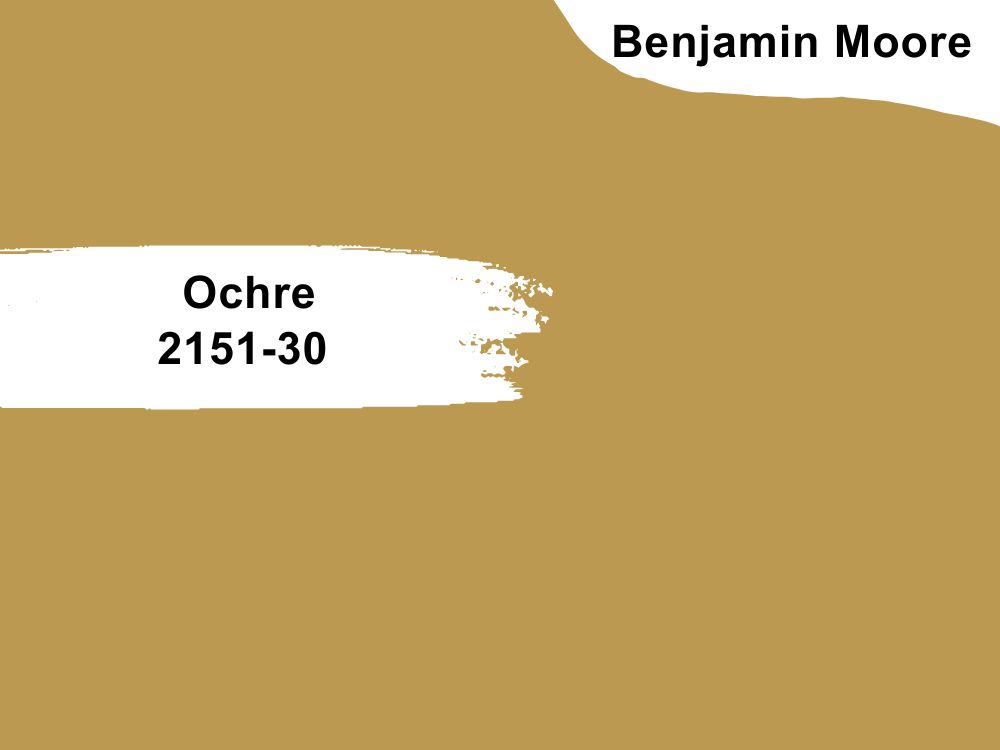
| RGB | 189 147 79 |
| LRV | 33.73 |
| Matching colors | Cotton balls, old navy, white dove |
| Undertones | Gold |
Dark kitchen cabinets against a kitchen wall covered in a yellow paint-like ochre might be just that missing link between your kitchen and perfection.
There is something that Ochre 2152-30 does with brown cabinets to create a very serene and balanced kitchen environment worthy of admiration. This color commands attention with how much it can brighten up the entire kitchen leaving no crumbs left.
This paint is a very playful and vibrant shade of yellow, with a very surprising versatility that can be compared to a neutral. It blends with every shade of color and every kind of kitchen to produce a timeless captivating vibe.
10. Benjamin Moore Cream Puff 2174-70
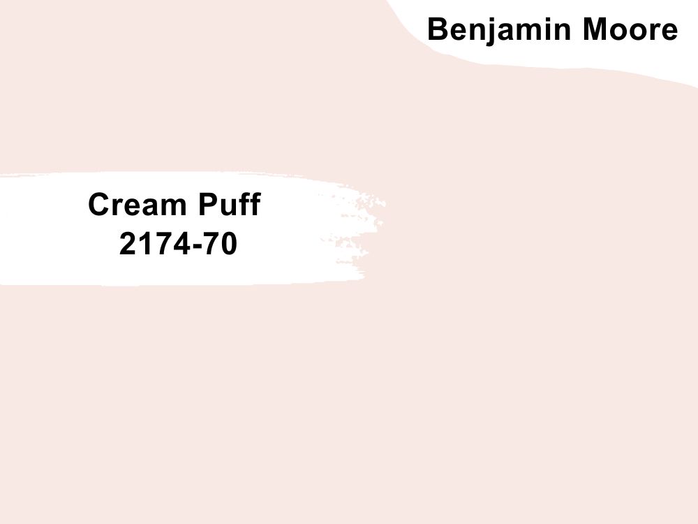
| RGB | 249 232 227 |
| LRV | 82.08 |
| Matching colors | Super white, cumulus cloud, abalone |
| Undertones | Red |
Do you have deep or dark green cabinets and you find it difficult to get paint colors that suit your taste? Try cream puff.
This is a very light shade of blush and is most times considered off-white with red undertones.
It has a very high light reflectance value that makes it possible to reflect quite a good amount of light. This color pairs very well with dark kitchen cabinets, helping to not only illuminate the space but to gently bring in a subtle splash of colors that it gets from the red undertones.
When a dark cabinet is placed on a kitchen wall that is painted in a cream puff, it subdues the dullness of the dark color, replacing it with a brighter-looking picture. This creates an environment in the kitchen that gives out an exotic extraordinary vibe.
11. Benjamin Moore Lime Green 2026-10
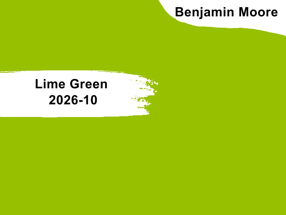
| RGB | 168 182 0 |
| LRV | 44.5 |
| Matching colors | White heron, old navy, polar lights |
| Undertones | Yellow |
A green like lime green works pretty well for a kitchen wall. It is such a fun green that brings in so much bubbling energy and it is definitely a statement-maker.
For someone wanting to make a bold statement on his kitchen walls to complement his dark cabinets can go for this color.
The yellow undertones in this color come with warmth and tame down the green color a bit, releasing a smart yet playful color. This color doesn’t necessarily bring the sun into your kitchen but it sure doesn’t keep your kitchen looking boring, dark, and gloomy. It still keeps your kitchen looking like the happening place while it blends into your kitchen cabinet perfectly.

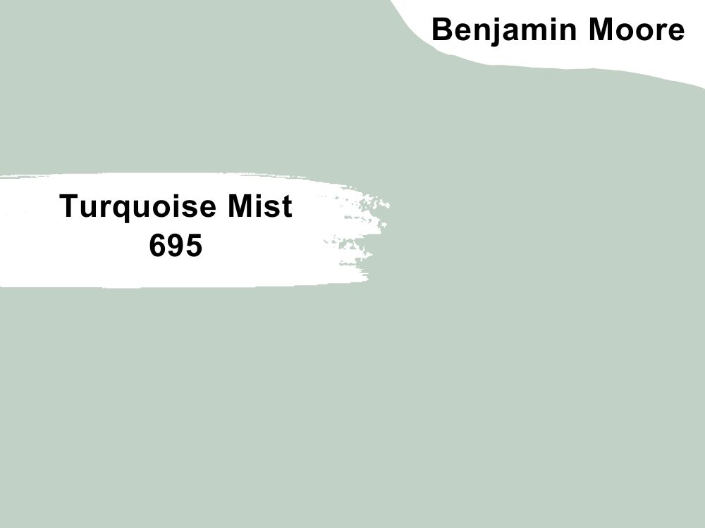
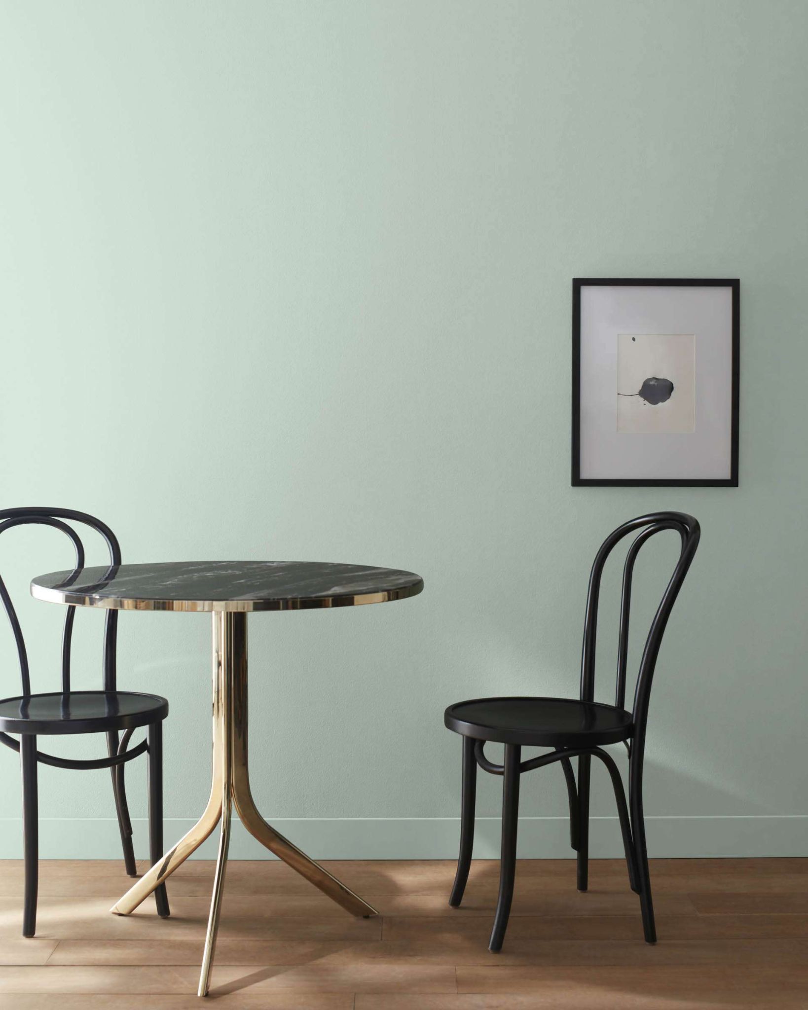
12. Benjamin Moore Turquoise Mist 695
| RGB | 194 206 196 |
| LRV | 60.22 |
| Matching colors | Swiss coffee, new providence navy, cloud white |
| Undertones | Yellow |
Turquoise mist is a flawless mixture of blue and pistachio green. This color has yellow undertones that are the generators of the warmth that it carries. It looks very calm on the outside, but it carries a depth that can only be visible when it is blended or matched with darker-looking shades of color. This makes it a suitable color for kitchen walls that have dark-colored cabinets.
This color finds a way to give the dark-looking cabinets a softer gentler look that is attractive and calling, while it gets a deeper, more pronounced look in exchange.
In the presence of low light, this color exposes its entire beautiful yellow undertone giving us a yummy view, while in the presence of a lot of natural or artificial light, this color serves us with a very pale but gorgeous soft cast.
The pistachio green in this mix makes it possible for this color to give out an aura of freshness and vitality.
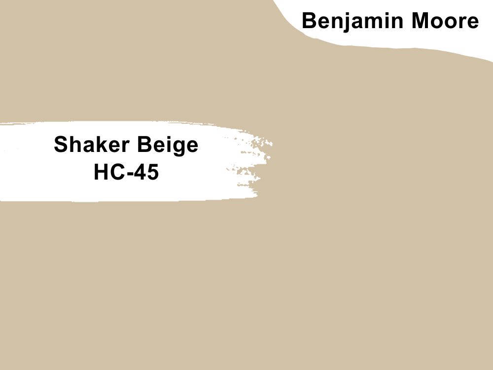
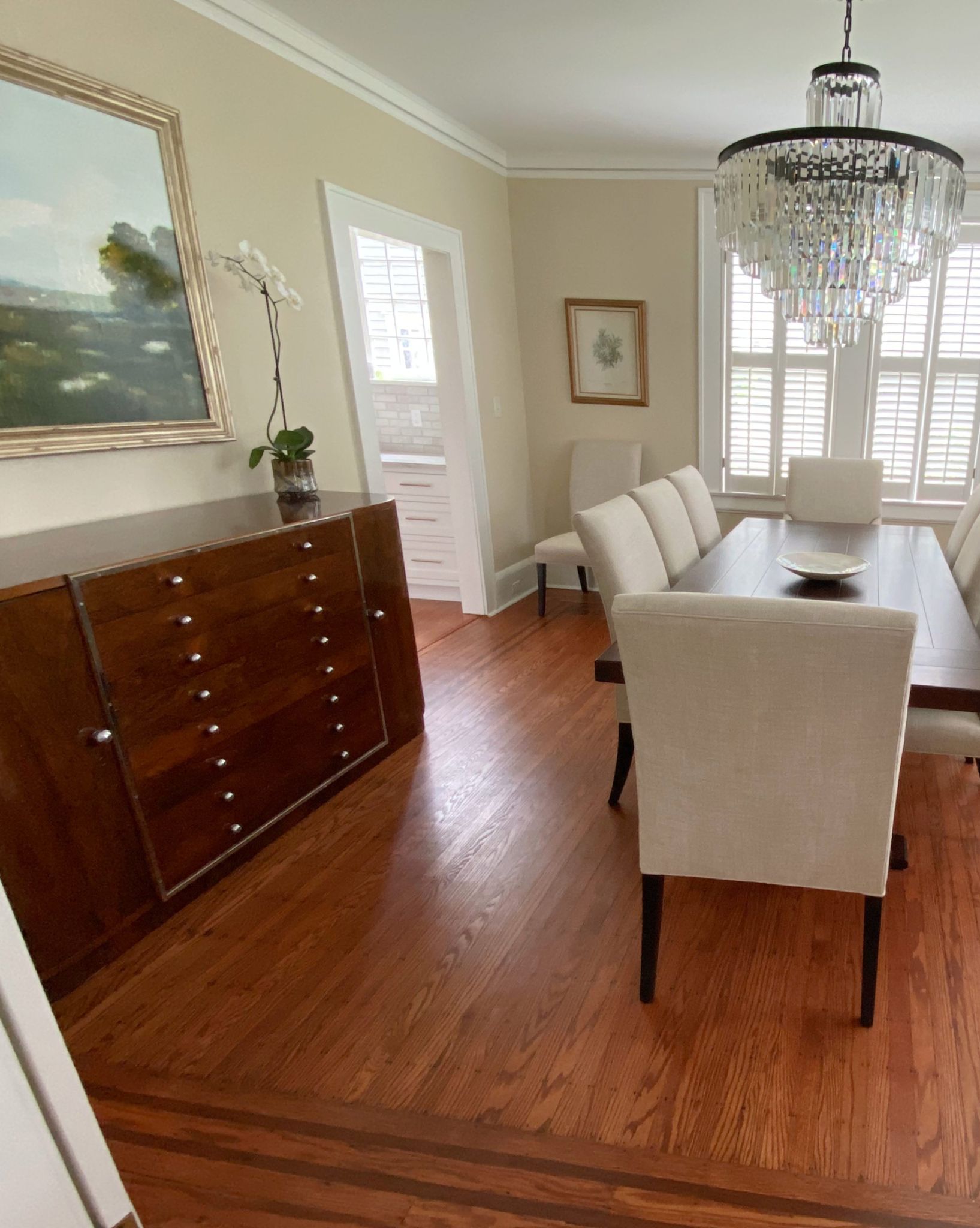
13. Benjamin Moore Shaker Beige HC-45
| RGB | 209 194 167 |
| LRV | 53.53 |
| Matching colors | White dove, bone white, tate olive |
| Undertones | Orange, faint pink |
This is one of the most loved beige colors in the whole world. This elegant color which happens to be an old color has stepped off the list of most beautiful and most versatile beiges since it was discovered amidst trends and changing times. It has a light reflection value of 53.53 which tells us that it reflects quite a good amount of light.
This color when used on the walls of a kitchen with dark cabinets blends into the color of the cabinets to produce a smooth, silky, and balanced appearance. It is not an overly warm color, though it isn’t a cool color either. It is a balanced color that helps to coordinate other colors around it.
Sherwin Williams Best Paint Colors For Kitchens With Dark Cabinets
14. Sherwin Williams Pure White SW 7005
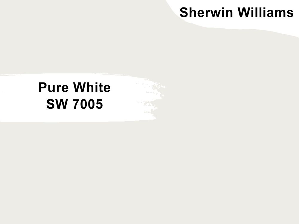
| RGB | 237 236 230 |
| LRV | 84 |
| Matching colors | March wind, extra white, perle nior |
| Undertones | Yellow |
Pure white is one of the best white paints you can find for interior decoration. It is warm, soft, clean, and gorgeous. Having an LRV of 84 proves that it will reflect a good amount of light.
This paint works exceptionally well for kitchens with dark cabinets because it brings in the light it absorbs in just the right proportions without making it look stale and stark. This color has a yellow undertone that is responsible for the warmth it emits. However, the color doesn’t appear yellow no matter what. It just blends into the dark shade of the cabinets creating a solemn attractive stability that is closest to perfection.
However, just like any other paint, direction, and light determines how this paint will look most times. If your kitchen faces north, pure white will look very close to true white. For kitchens that face the south, because of the consistent bright light for most of the day in this position, warm and cool colors work with south-facing light; this light intensifies the color making them appear brighter and warmer. In south-facing rooms, pure light will look warmer.
15. Sherwin Williams Creamy SW 7012
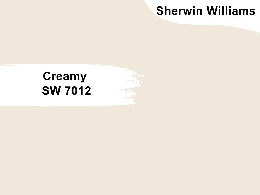
| RGB | 239 232 219 |
| LRV | 81 |
| Matching colors | Reynard, aged white, studio taupe |
| Undertones | Yellow |
For dark kitchen cabinets, lighter warm neutrals like creamy help to emphasize the warmth of the cabinets especially if they are brown or gray in color.
Creamy is a bright white color with the softest form of yellow undertones.
This color when applied to your kitchen walls blends with your dark cabinets to create a warm, smooth, and silky feeling.
For kitchens facing the north, creamy will appear more beautiful, as the cool light will tame down the yellow undertones and make it look like a soft, subtle faint cream.
For south and west-facing kitchens, creamy will intensify in color, showing off its glorious warmth.
16. Sherwin Williams Greek Villa SW 7551
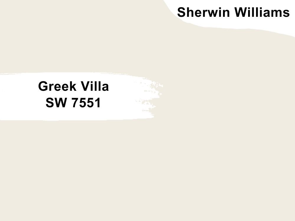
| RGB | 240 236 226 |
| LRV | 84 |
| Matching colors | Rosemary, little blue box, in the navy |
| Undertones | Beige |
This is a warm off-white with deep beige as an undertone. This is the perfect option if you are looking towards giving your kitchen a warm and cozy vibe.
What this bright off-white with a touch of warmth does when it is applied on your kitchen walls with dark cabinets; is to bring in all the warmth and brightness into your kitchen and then balance it all out beautifully. This very versatile shade of white can work with any time of color as well as any type of kitchen design to release a very welcoming vibe.
For kitchens facing the north, the Greek villas will become noticeable.
For south and west-facing kitchens, the Greek villa will intensify in color, showing off its magnificent warmth
For east-facing kitchens, the warm color palette will help to balance out the lack of natural light during the day.
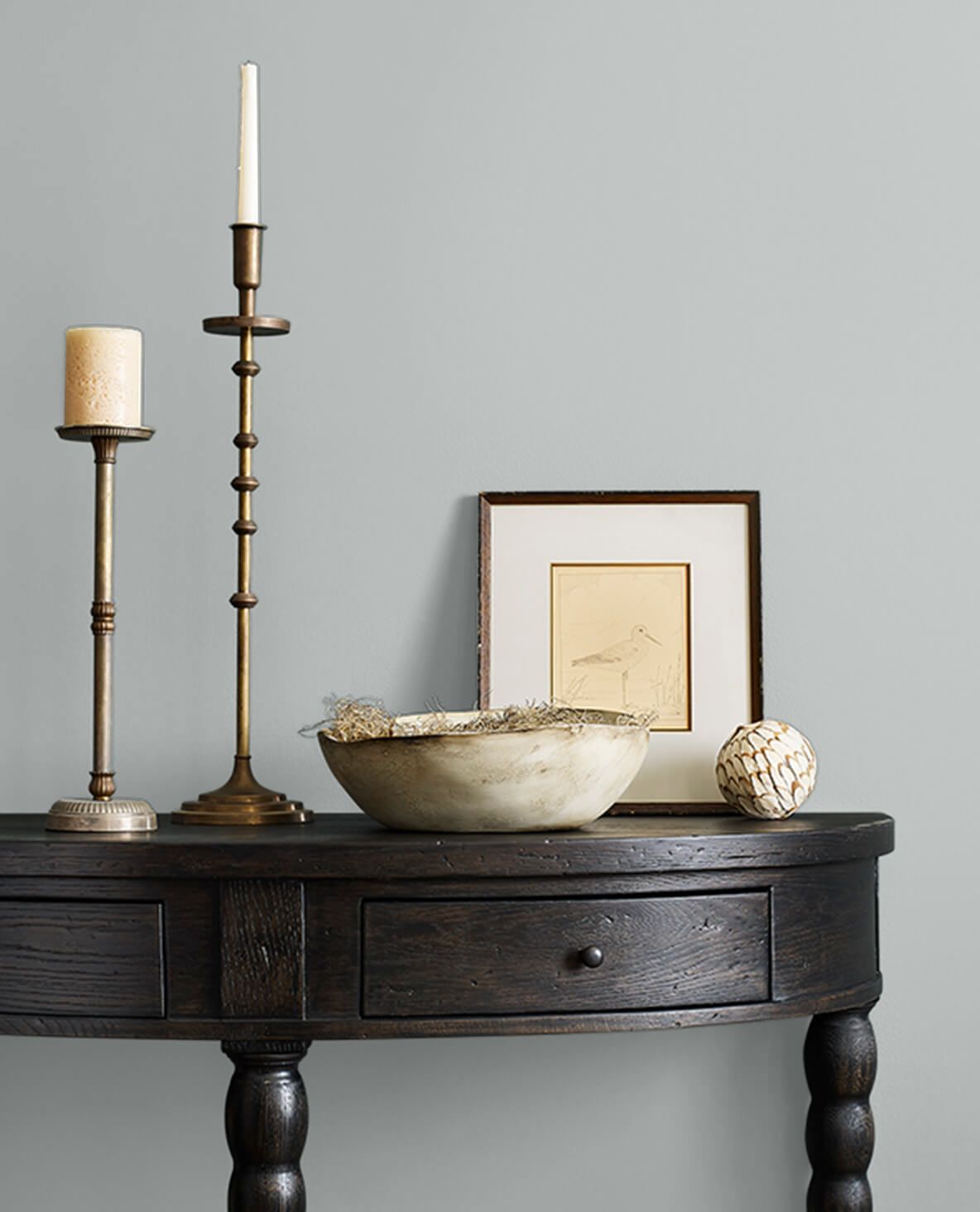
17. Sherwin Williams Monorail Silver SW 7663
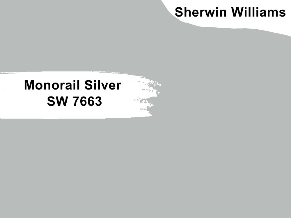
| RGB | 181 187 188 |
| LRV | 48.82 |
| Matching colors | Ice cube, shell white, wall street |
| Undertones | Blue, violet |
If you need your dark cabinets and your entire kitchen to be complimented with and embedded in the most luxurious kind of coolness, then monorail silver is the color for you.
This cool gray color has two main undertones; a blue undertone that showcases itself during the day and leaves an undeniably attractive coolness and then a violet undertone that comes out at night, bringing the most precious form of tranquility.
This chameleon color on the walls of the kitchen in combination with your dark cabinets creates a super easy appearance to look at in the most beautiful textures without making it look too bulky.
18. Sherwin Williams Delicious Melon 6653
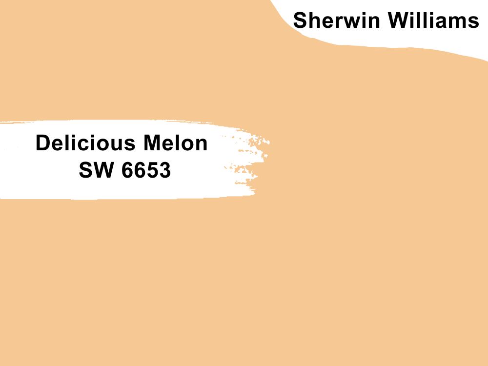
| RGB | 246 200 146 |
| LRV | 62.96 |
| Matching colors | Champagne, paper lantern, honed soapstone |
| Undertones | Red |
Your kitchen doesn’t have to look pale or neutral. Neutral is okay. But, we can go bright and bold also; even with your dark cabinets. Yes, you read right, even with your dark cabinets. Delicious melon is one of those colors.
Though not an eye-bugging or piercing color, it is a very bold color with enough pigment to work well in a kitchen with dark cabinets. What this color essentially does when applied on the walls of your kitchen is to bring in a lot of vibes and positive energy. This color is one that adjusts pretty well to blend beautifully into the dark cabinet.
It brings in light and enhances the look of the dark cabinets creating a nice palatable view.
19. Sherwin Williams Naturel SW 7542
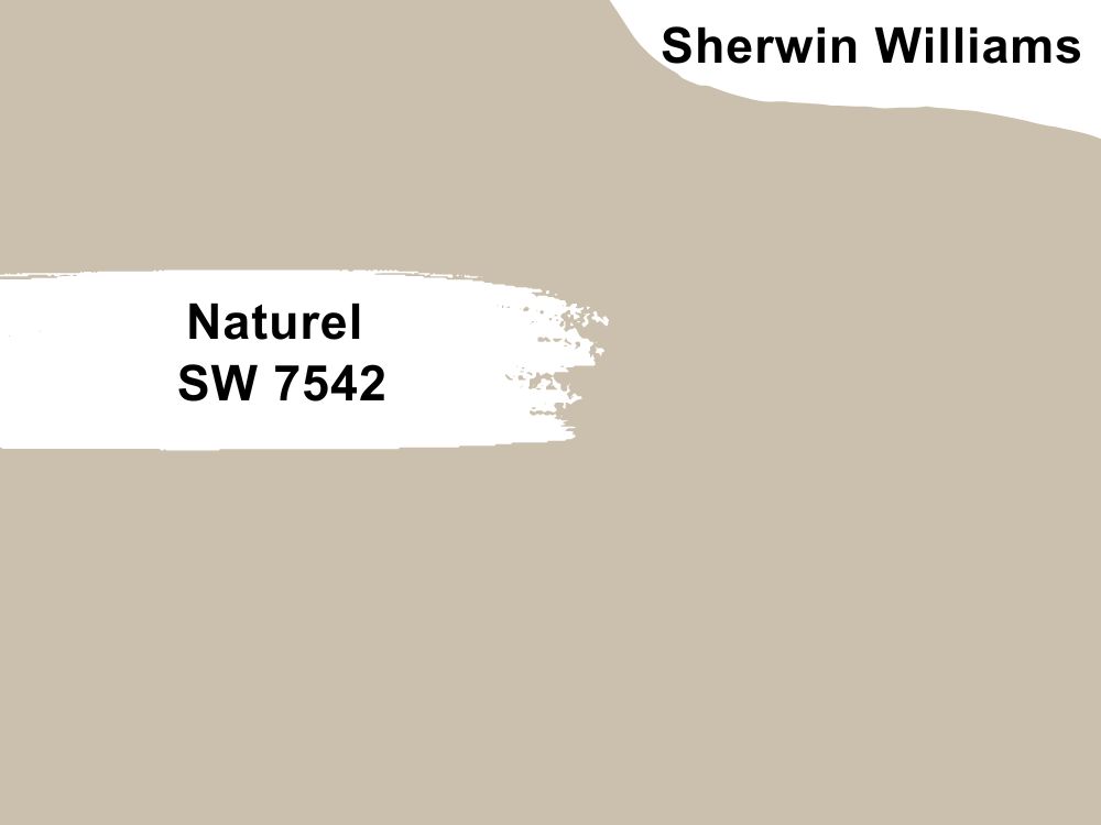
| RGB | 203 193 175 |
| LRV | 54.07 |
| Matching colors | Grecian ivory, hardware, alabaster |
| Undertones | Yellow-green |
Naturel is a light to medium beige with a yellow-green undertone. It has a light reflection value of 54.07 telling us that it doesn’t reflect much light or absorb much either.
Naturel is another fresh warm neutral shade for the kitchen. It is one that allows you to play around with and be creative with colors, ranging from very bright to cool-toned colors without losing their balance.
The primary job this color does when applied to your kitchen walls, is to remove the previous darkness and gloom that your dark cabinets provided, replacing it with light, life, and vibe. This color blends into your walls and colors placed around it very perfectly, further enhancing the color and look of your cabinets.
20. Sherwin Williams Clary Sage SW 6178
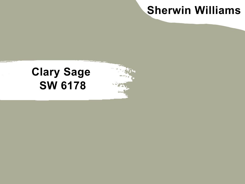
| RGB | 172 173 151 |
| LRV | 41 |
| Matching colors | Sagey, dower white, tumbling tumbleweed |
| Undertones | Yellow |
Clary sage is a soft, beautiful, and versatile shade of gray-green. This color caries nature, freshness, and life on its shoulders
Its ability to make a space feel warmer and cooler at the same time, as well as making the space feel bigger is one of the attributes that makes it an ideal paint for the kitchen walls.
When Clary sage sits on your kitchen walls, after illuminating the place, the next thing it does is bring in a very soothing freshness. Knowingly or unknowingly, this color has the ability to relax anybody with its soft and tranquil appearance.
In north-facing light circumstances, the cool blue-tinted light or exposure will cause clary sage to appear more muted. In south-facing light circumstances; clary sage will appear very shiny or gleaming.
In east-facing light circumstances, clary sage will appear very light in the morning and then have a cooler shade of gray toward the afternoon. In west-facing light circumstances, clary sage will appear gray in the mornings and move towards soft green in the afternoon.
21. Sherwin Williams Apple Blossom SW 0076
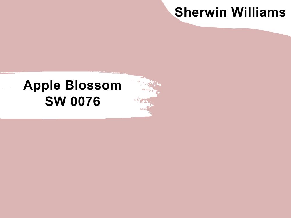
| RGB | 222 185 183 |
| LRV | 53.54 |
| Matching colors | Simple white, palisade, intimate white |
| Undertones | Red |
Pink can be used on a kitchen wall.
I repeat pink came to be used on a kitchen wall. Let us take a look at this shade of pink by Sherwin Williams called apple blossom. This color is one that calls for all the attention it deserves.
Some people might say this color is a little too bright for a kitchen, but who says your kitchen has to lack color and look gloomy always?
The role apple blossom plays on the overall look of your kitchen by just being on your kitchen walls and the effect it has on your kitchen cabinet is tremendously amazing. This color brings a different kind of cheer and softness into the kitchen and compliments the dark cabinets in a way that it makes the color more pronounced and edgy, but not edgy enough to take all the center of attraction, but bold enough to make a really long-standing effect.

22. Sherwin Williams Lime Wash SW 9589
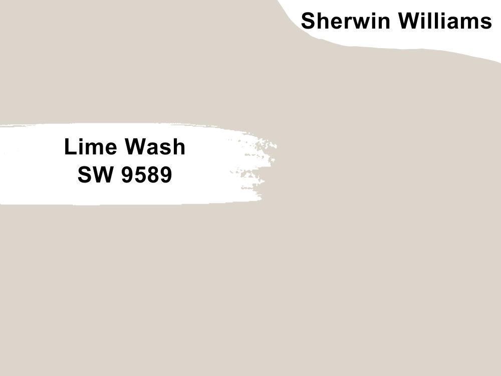
| RGB | 219 213 203 |
| LRV | 67 |
| Matching colors | Origami white, alabaster, |
| Undertones | Yellow |
Limewash is a very light greige that pairs with other dark colors very well. This makes it very compatible with dark cabinets and works well on kitchen walls. This color does five main things when it is applied to your kitchen walls.
It enhances the appearance of the kitchen, giving it a very soft and fresh background. It enhances the appearance of the dark kitchen cabinet, making it look brighter and giving it a spark of life. It brings in a feeling of freshness accompanied by warmth.
In conclusion, when this color is applied to your kitchen walls, it is bound to create a relaxed, bold, and confident feeling.

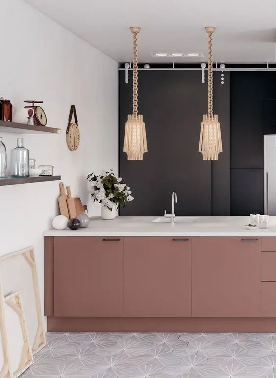
23. Sherwin Williams Redend Point SW 9081
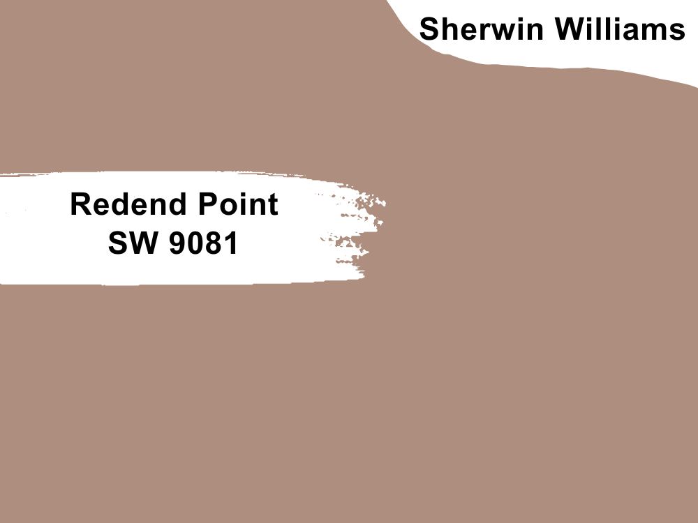
| RGB | 174 141 125 |
| LRV | 29.45 |
| Matching colors | Polite white, canyon clay, kestrel white |
| Undertones | Blush |
Redend point is simply described as a mid-toned clay color. This mid-toned clay color can sometimes be described as a rosy brown.
This color has a warm, inviting, rich, earthy hue that is more neutral than the obvious appearance, with undertones of blue, brown, and red.
The interesting thing about redend point is that it is very flexible, subtle, and warm. When it is applied to your kitchen that has dark cabinets, it appreciates the dark colors of the cabinets, introducing compassion and connection to your kitchen; it carries peace and serenity reinventing the entire kitchen in the warmest way possible.
For kitchens facing the north the warmth of redend will balance out the cooler light. For south and west-facing kitchens, it will intensify in color, showing off its warmth beautifully.
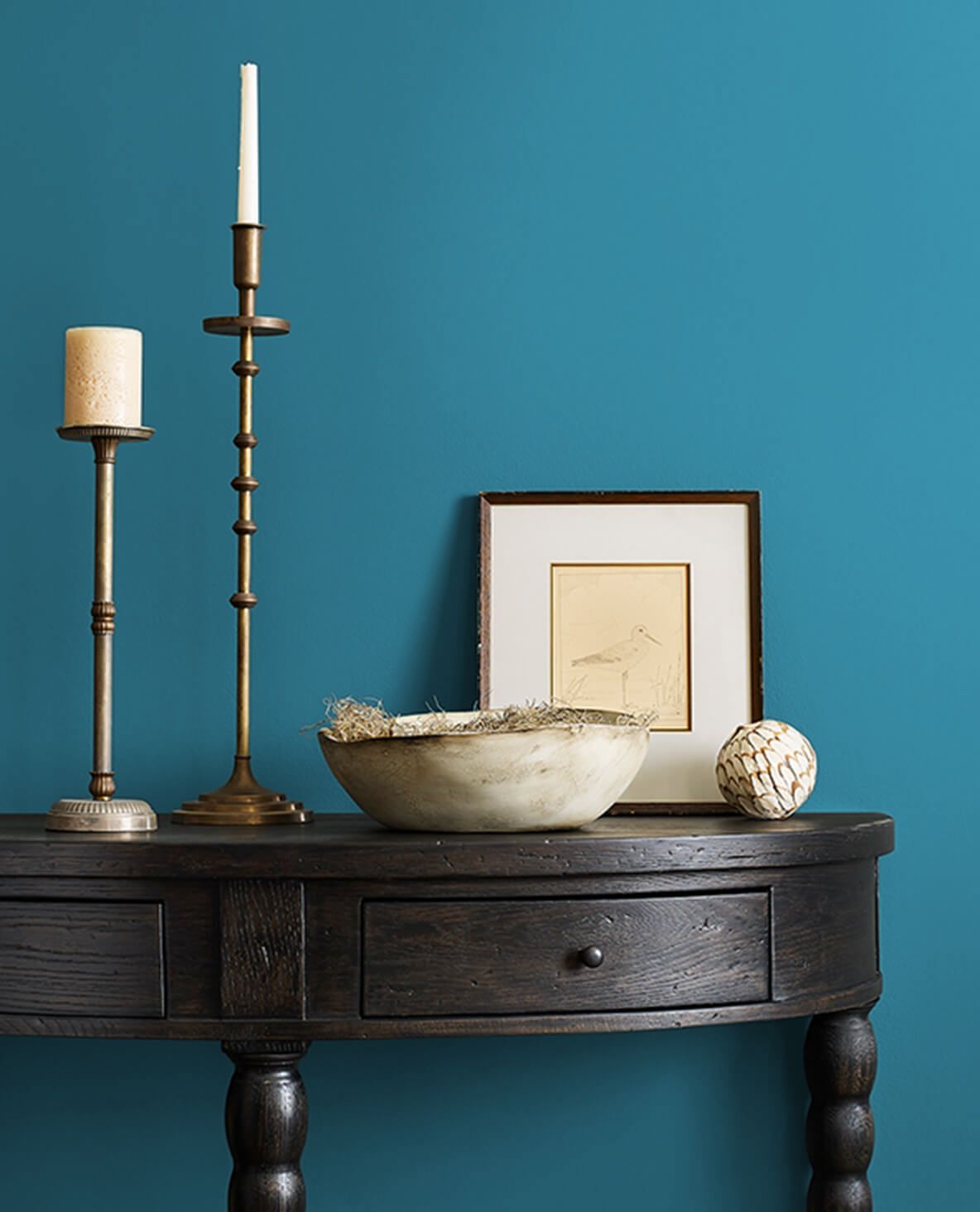
24. Sherwin Williams Loch Blue SW 6502
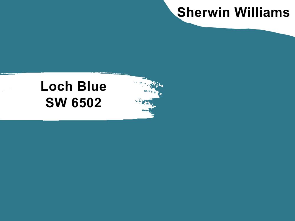
| RGB | 48 119 139 |
| LRV | 16 |
| Matching colors | Blue horizon, antiquity, oyster white |
| Undertones | Gray |
Loch blue gives a beachside aesthetic to your kitchen when applied on your kitchen walls
This dark shade of blue paint is very versatile and attractive. When used on a kitchen wall that has dark cabinets, it gives out a sensation of freedom and a feeling of restfulness. It is paint that when used on the kitchen walls, makes the space have the description of a happy home even without effort. Loch Blue is one of the best things that can happen to your home.
In north and south-facing kitchens, loch blue will tend to look mute while in east and west-facing kitchens you will tend to see loch blue at its full potential.
25. Sherwin Williams Vital Yellow SW 6392
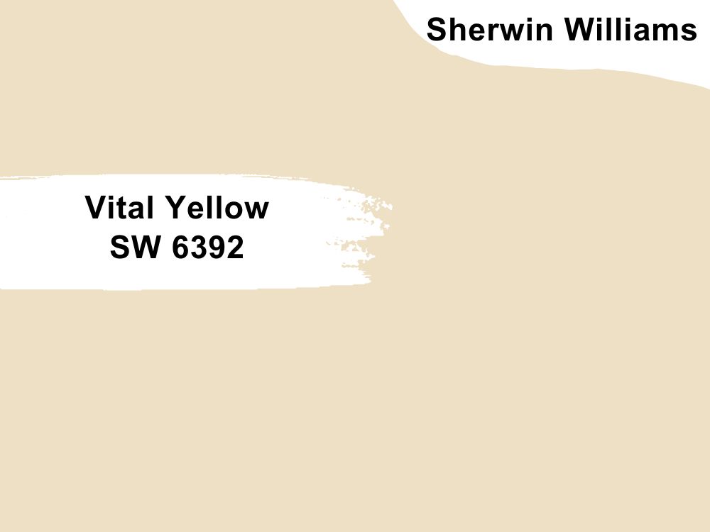
| RGB | 240 226 197 |
| LRV | 76.91 |
| Matching colors | Front pouch, mineral deposit, pure white |
| Undertones | Pink |
When you want a kitchen space that looks cool, yet is still cozy, black is a great color choice for your cabinets. It’s elegant, and inky and will go a long way toward adding character to your kitchen. If your space is larger, and you want to also create a more intimate space, you can go for colors like vital yellow on your kitchen walls. This paint has the ability to give out comforting warmth while still matching your dark–black cabinets perfectly.
This paint, when used on your kitchen walls, reduces the dullness of the dark color and brings out the glossy, attractive part of it, creating an environment that is very inviting and homely in your kitchen space.

26. Sherwin Williams Mannered Gold SW 6130
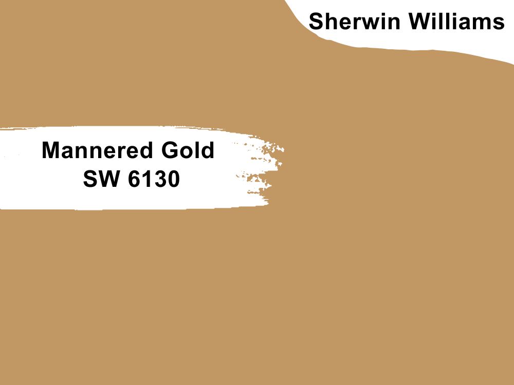
| RGB | 193 152 100 |
| LRV | 34.62 |
| Matching colors | Navajo gold, Grecian gold, blustery sky |
| Undertones | Yellow |
If you dream of having a gold kitchen against your dark furniture and you are scared of mismatching the colors, I’m here with good news. It is 100% possible. A color like mannered gold might just be your answer.
Mannered gold is a shade of gold very close to metallic gold. This is a timeless color that adds depth and personality to your kitchen space when paired with dark cabinets or used on kitchen walls with dark cabinets.
This color adds warmth, sophistication, cheerfulness, modernity, tradition, and luxury to your kitchen.
Conclusion
Your kitchen doesn’t have to look boring, stale, or ugly because you have dark cabinets. If you want to do something out of the box, pop that color somewhere in the kitchen, and bring that big energy into your cooking space.
 10 Best Sherwin Williams Dark Blue Paint Colors (Trend 2023)
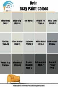 15 Most Popular Behr Gray Paint Colors: From Light to Dark
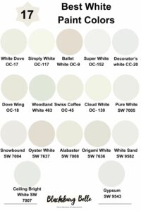 17 Best White Paint Colors For Interior Walls
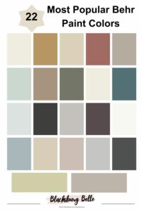 22 Most Popular Behr Paint Colors
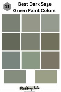 11 Best Dark Sage Green Paint Colors for Interiors and Exteriors
 15 Best Black Paint for Furniture For 2023

:max_bytes(150000):strip_icc()/black-kitchen-designs-4163964-hero-6686fb34c496466bb38165f34e3dbd80.jpg)