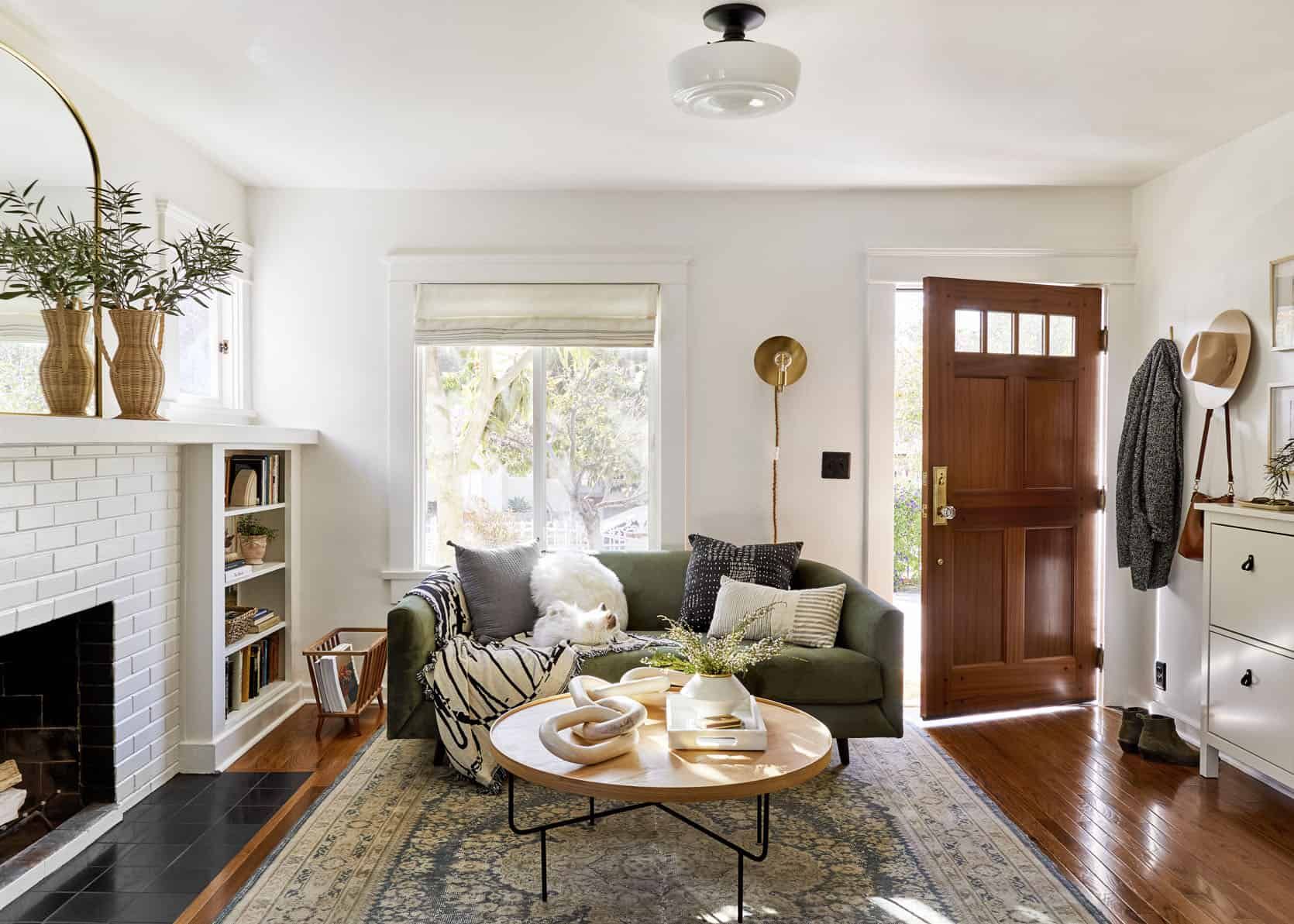
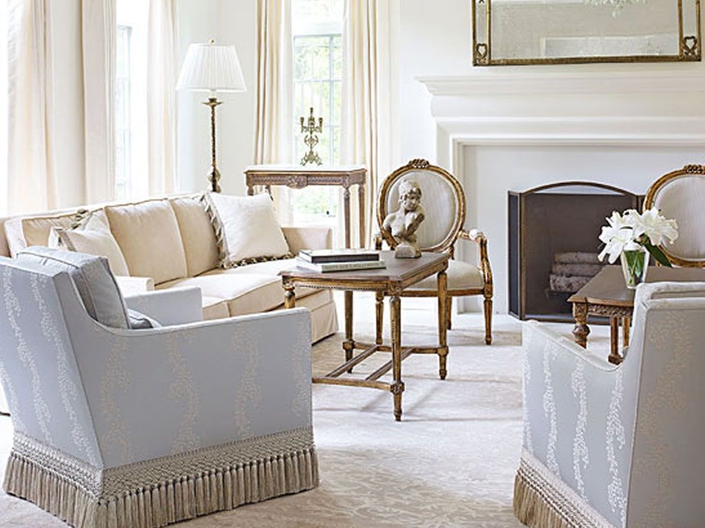
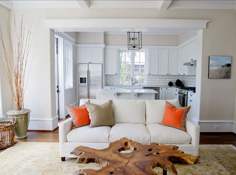
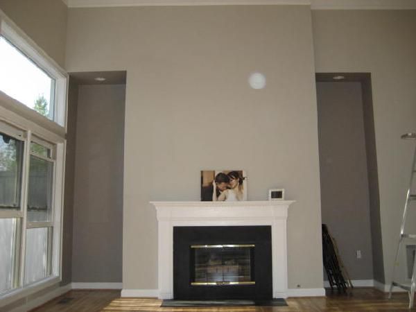
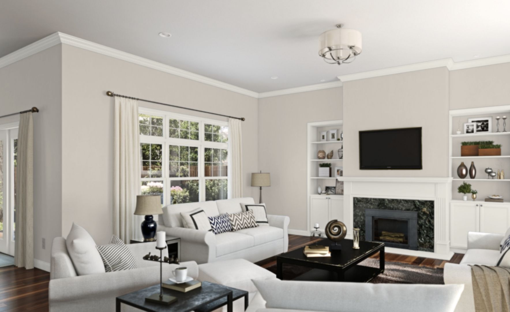
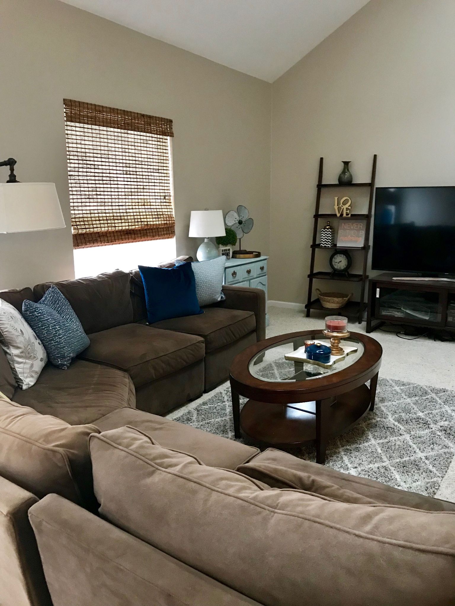
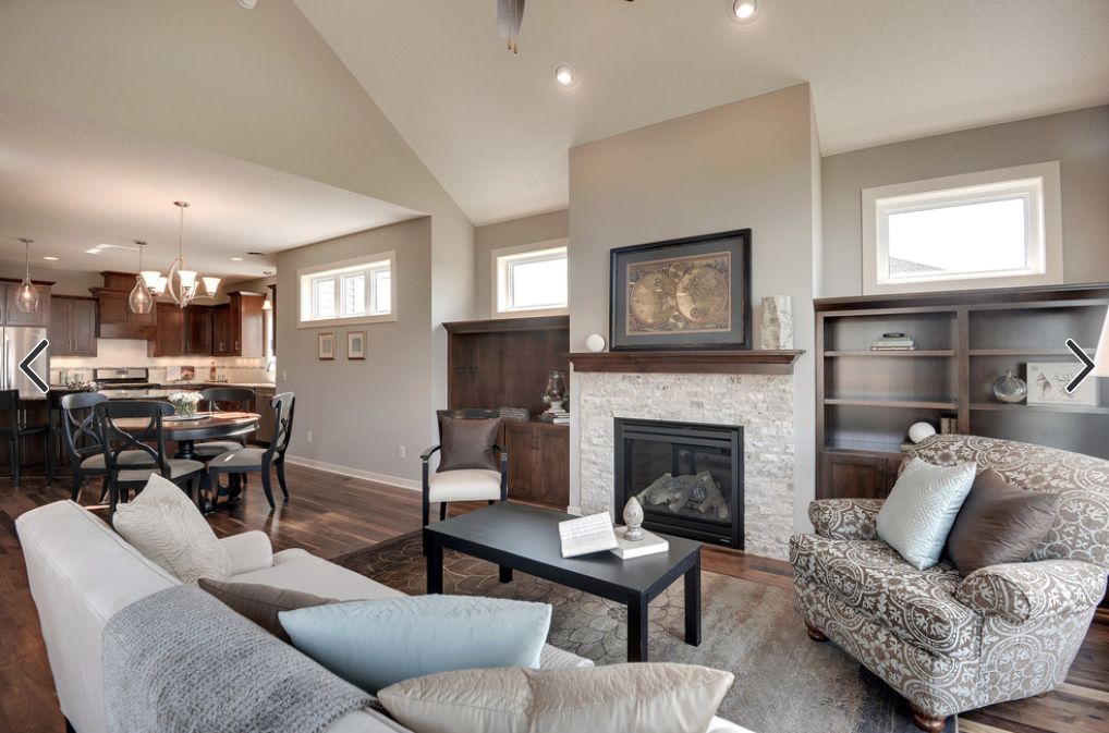
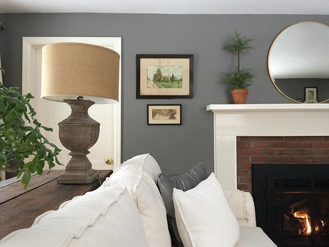
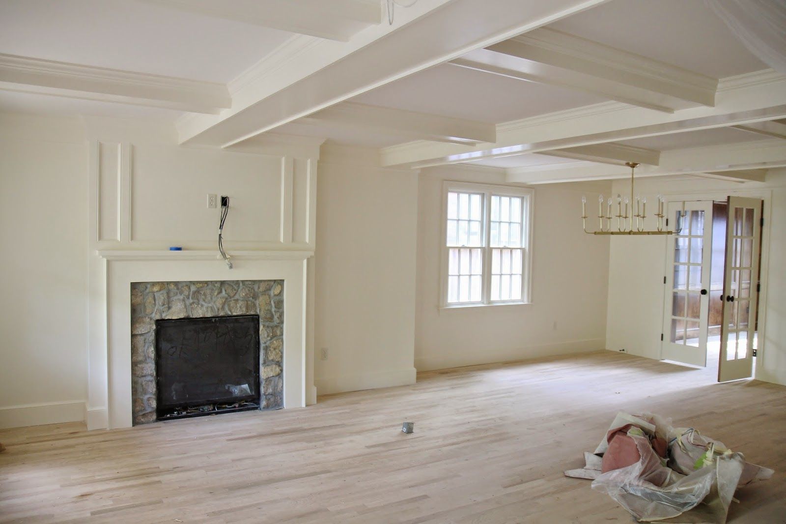
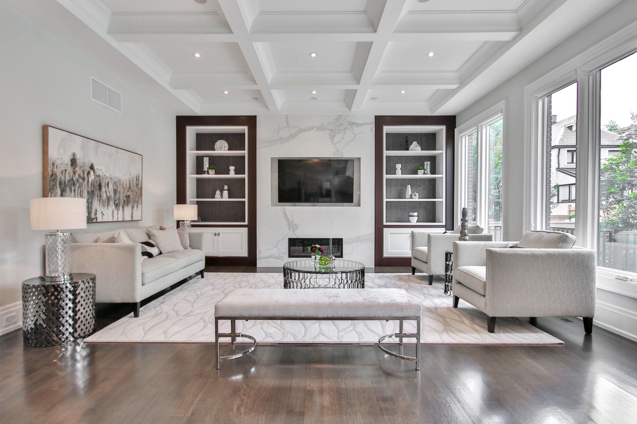
The living room is one of the first places people see when they come to our house. Because of this, we usually want to present our best face. Besides that, the living room is where we mostly relax with family, so it has to look and feel its best at all times.
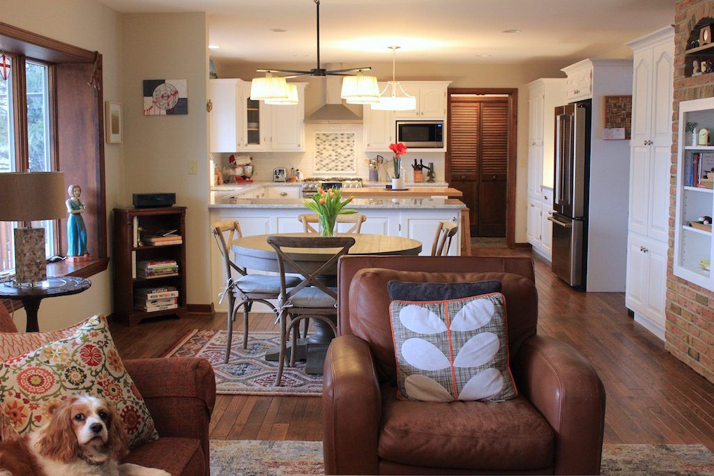
However, it is not always easy to pick paint colors or develop a color palette that works for a living room. This is especially true when it opens up into the kitchen. Because we want the best, we tend to overdo or underdo it. Other rooms are easier to decorate, but living rooms get tricky.
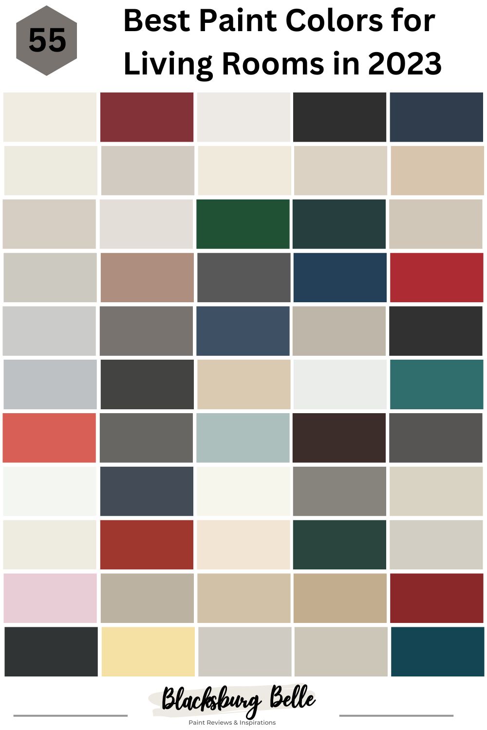
Should you go bold, classic, get creative, or just wing it? Let’s help you get the job done with this guide on the 55 best paint colors from Sherwin Williams and Benjamin Moore for living rooms that are trendy in 2023.
Table of Contents
How to Narrow Your Paint Color Choices for the Living Room
Having a specific color in mind before going to the paint store is ideal, but it does not always guarantee that you will not get confused or frozen while there. For example, you may decide on a classic white living room, but you must know that there are many white paint colors with different undertones.
It is even worse if you have no idea what colors you want, only vague thoughts. The number of colors and shades of colors that are available can numb your mind. So, the following are tips to help you narrow your choices.
1. Pick a Color Scheme
You must consider the elements and accessories in your home to decide what color scheme works for the living room. It does not matter whether or not the bedrooms or bathrooms are cool-toned; you can decide to use warm colors in your living room.
And while there are thousands of paint colors, there are only seven colors on the spectrum, the colors of the rainbow. So, take a few accessories you are already using or plan to use in the living room to the paint store.
Those items will help you pick colors from sample strips, and once you do, you have more than ten colors that can complement the decor. This is because each accessory has at least six colors from the seven on the color spectrum.
2. Check the Lighting
Every room has specific lighting that determines whether it is cool or warm. The direction the living room faces is crucial in determining the paint color that works for it. For example, a north-facing room is cool because it does not have direct sunlight. Therefore, it will need warm paint color to balance it out.
Rooms that have a lot of sunlight face south and will need cool paint colors to make the decor work. This is not to say that warm colors will not work; it all depends on your style. However, if you want to avoid too much warmth, tone it down with a cool color scheme.
Also, note that all paint colors react differently in natural and artificial lighting. This has to do with the undertone in each color. The undertones determine the tone of the color, so you may want to keep this in mind when combining colors. Those with purple undertones, for example, may look odd when paired with others with gold or yellow undertones.
3. Choose Bold and Light Colors
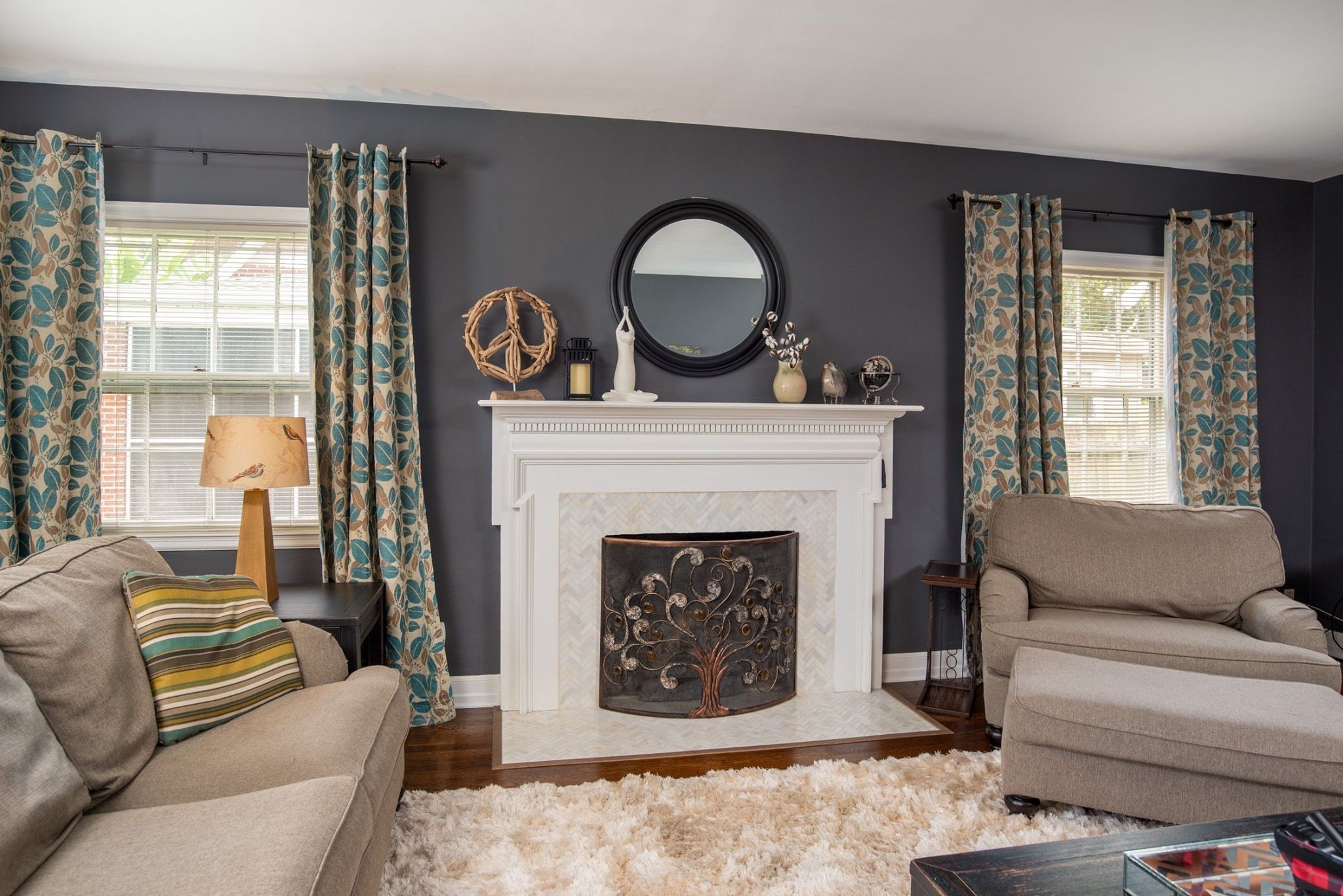
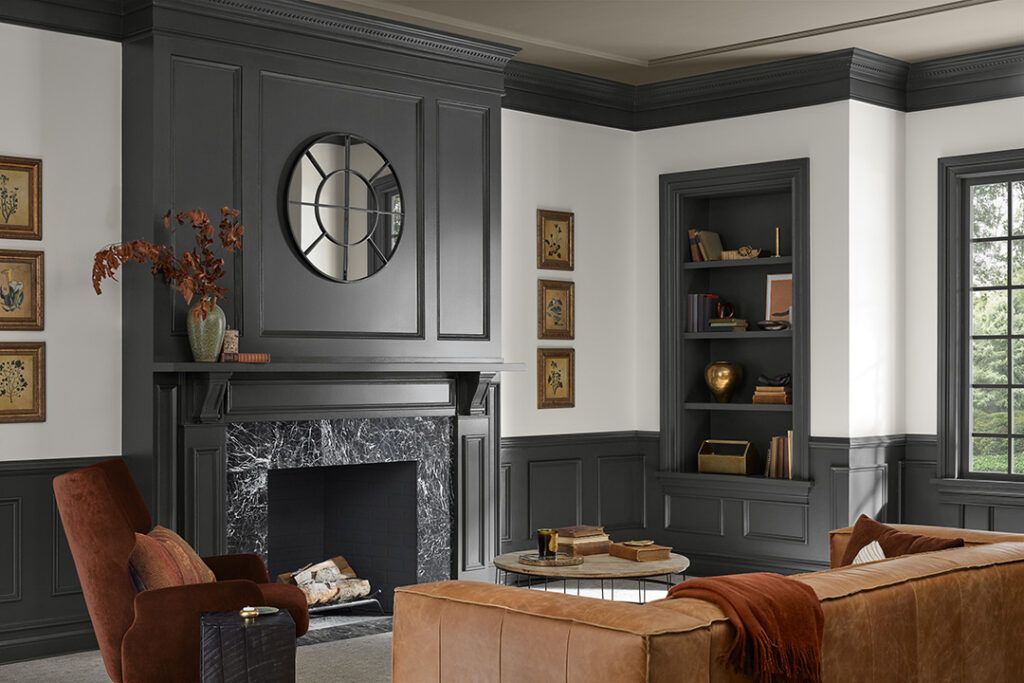
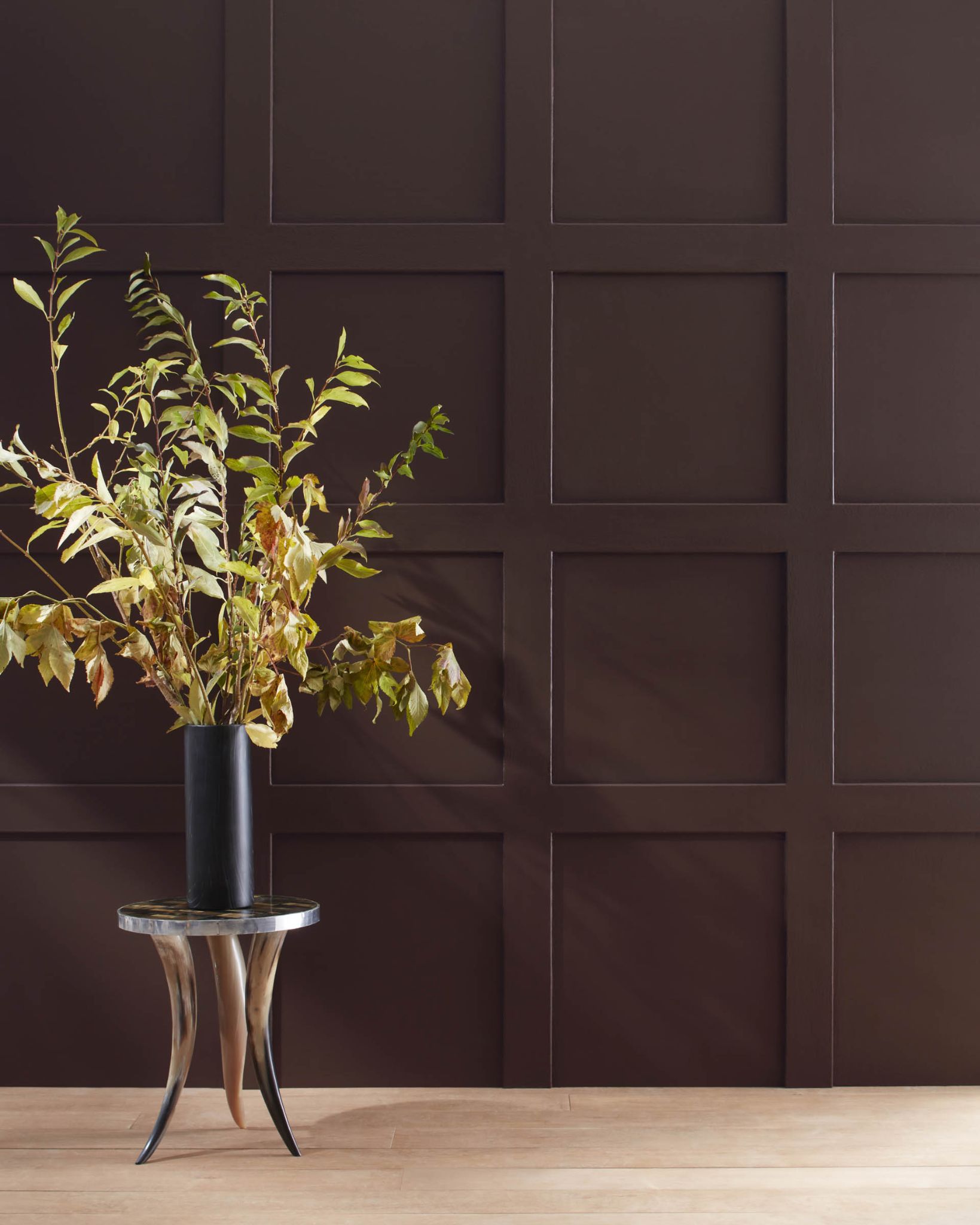
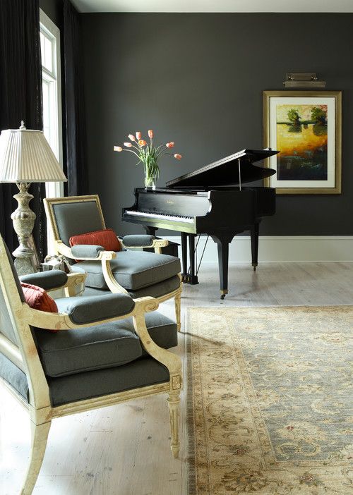
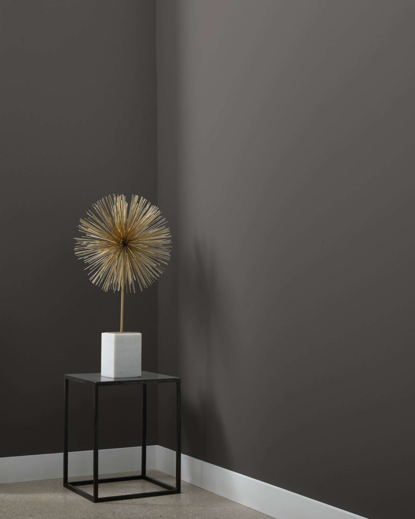
As mentioned, the colors you choose will depend on your style, but consider mixing bold and light neutrals. For example, you can combine charcoal gray with a light pastel color like blush pink or use a light neutral like white. Using too much dark, saturated, or bold colors may make the room feel choked.
And when pairing colors consider the size of the living room. While most living rooms are spacious, a few can be smaller than others. For small living rooms, you may want to use bold colors only minimally and concentrate on light colors.
Saturated colors tend to make the walls feel as if they are closing up or retracting. In other words, they make a small room feel smaller. Light colors give the impression of more space than there is. Large living rooms accept bold and saturated colors better than small rooms.
4. Remember the Ceiling
Many times, we forget the ceiling in a room and how vital it is to the entire decor. This may be because it is usually white. However, you can skip painting accents in bold colors and opt to use them on the ceiling in your living room.
The colors of the walls will help you decide which direction to go for the ceiling paint color. And this can be the decider for what the living room turns out to be when the paint dries.
55 Best Paint Colors for Living Rooms to Guide You in 2023
The following are some of the best paint colors from Sherwin Williams and Benjamin Moore to use in your living room in 2023.
28 Best Paint Colors for Living Rooms by Sherwin Williams
1. Greek Villa SW 7551
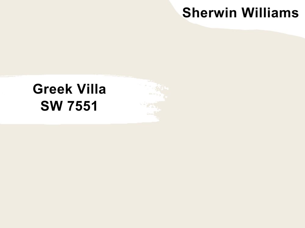
Warm white paint color with slightly yellow undertones
You cannot go wrong with a classic white paint color like Greek Villa for your living room. It is bright and can stand alone. You can also blend it with other colors if you think it is too stark. Greek Villa has an LRV of 84, which is not surprising, and an RGB color code of 240, 236, and 226 respectively. Coordinate it with In the Navy or Illusive Green.
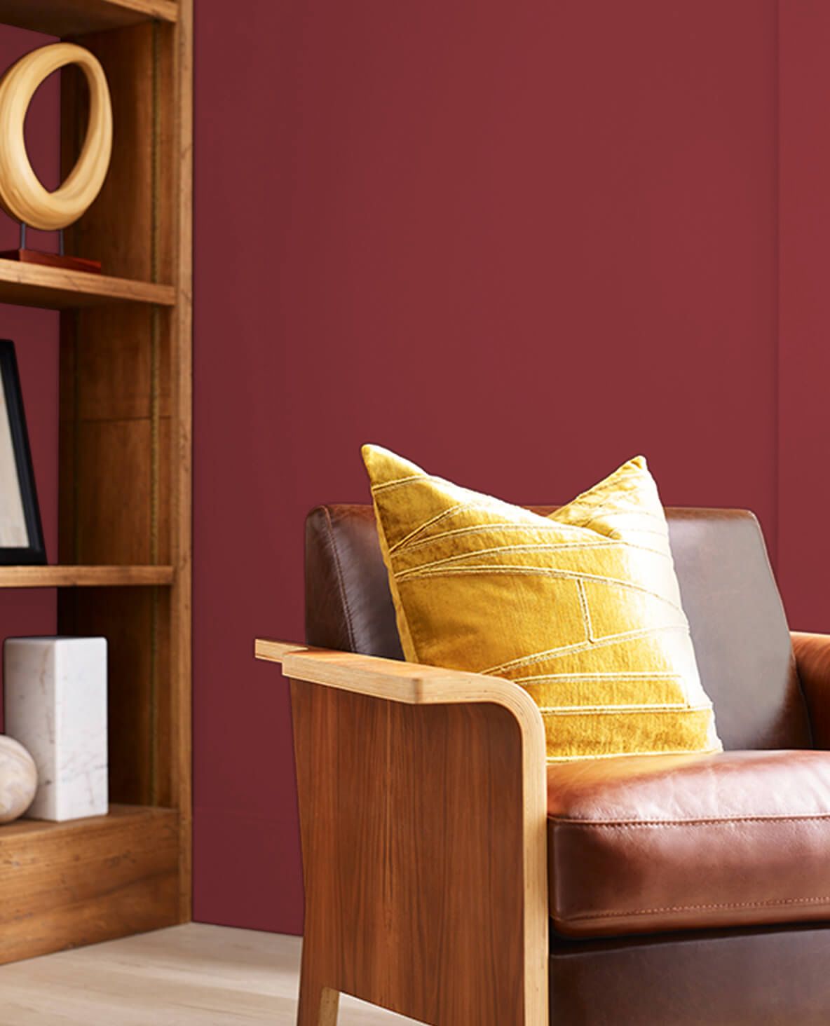
2. Beetroot SW 9695
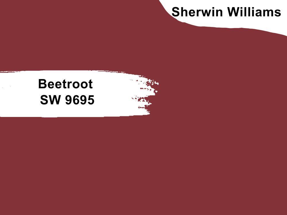
Deep red paint color
Beetroot is a deep red paint color, just like the root from which it derives its name. But while it is deep, it is cool and balanced, hardly feeling overwhelming. However, you can add some light neutrals to the decor if you believe Beetroot is too dark for your style.
Coordinate it with Incredible White or wood tones to bring out its true beauty. Beetroot has an LRV of 7 and an RGB color code of 131, 51, and 55 respectively.
3. Snowbound SW 7004

Cool white paint color with gray undertones
Snowbound is another classic white paint color that brooks no arguments. It is bright for a living room and makes it appear more spacious than it is. The color is perfect for an all-white ensemble in your living room.
You can also opt to add more saturated colors to the decor as long as they agree with the tone of Snowbound. This paint color has an RGB color code of 237, 234, and 229 respectively, with an LRV of 83. Coordinate it with Autumn Orchid or Colonnade Gray.
4. Tricorn Black SW 6258
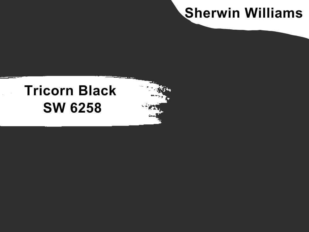
True black paint color
Black has never been the first choice for anyone looking to paint their living room. However, trends are moving to bolder and darker colors, slightly away from light neutrals. And if you want to go black, there is no better place to start than Tricorn Black. It is a true black, which means it has almost no undertones.
Use it as a ceiling color or paint your accent wall with it. The rest of the living room can be in a light color with bits of more vibrant colors in the accessories. Tricorn Black has an LRV of 3 and an RGB color code of 47, 47, and 48 respectively.
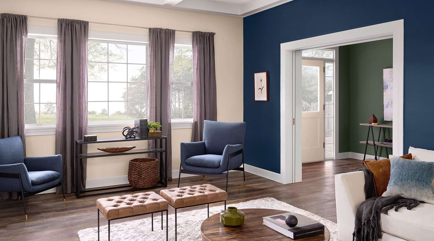
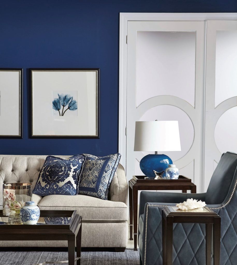
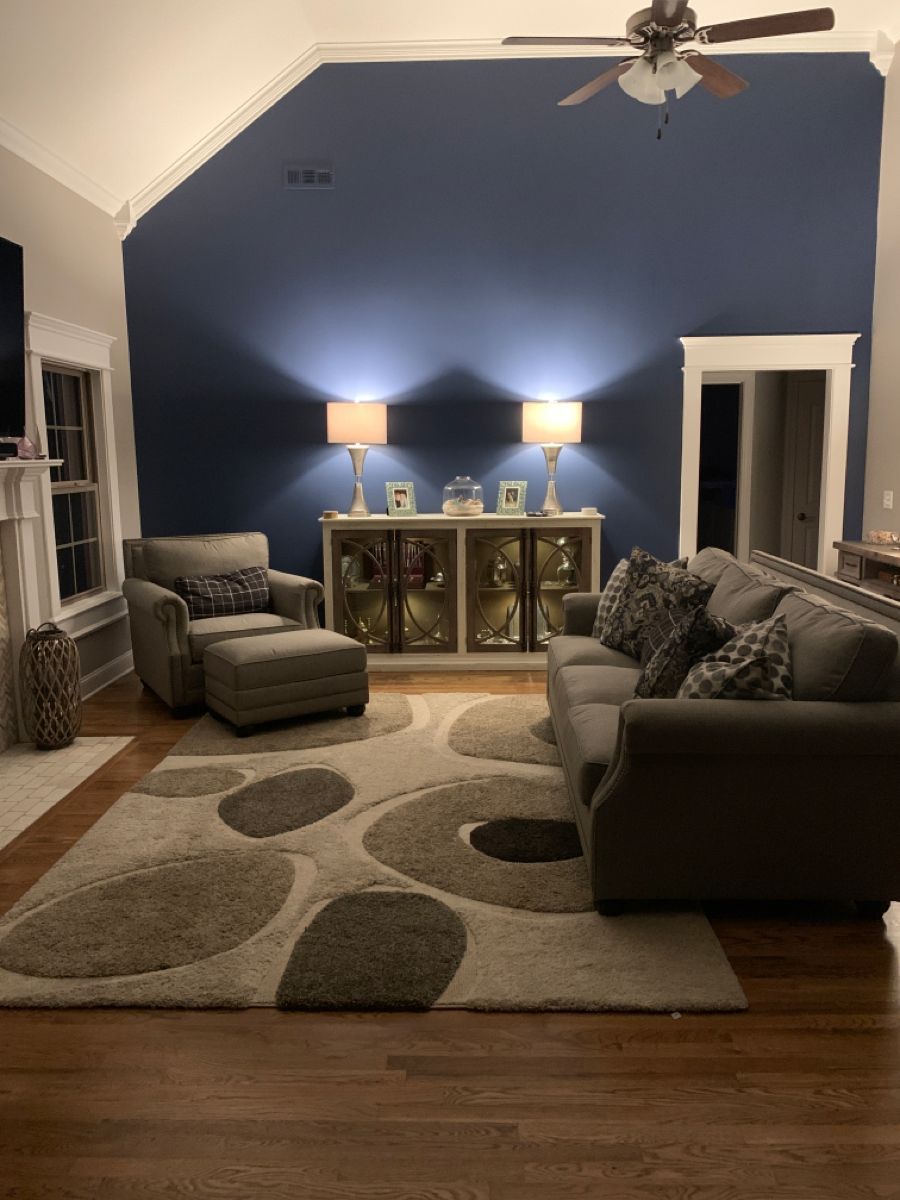
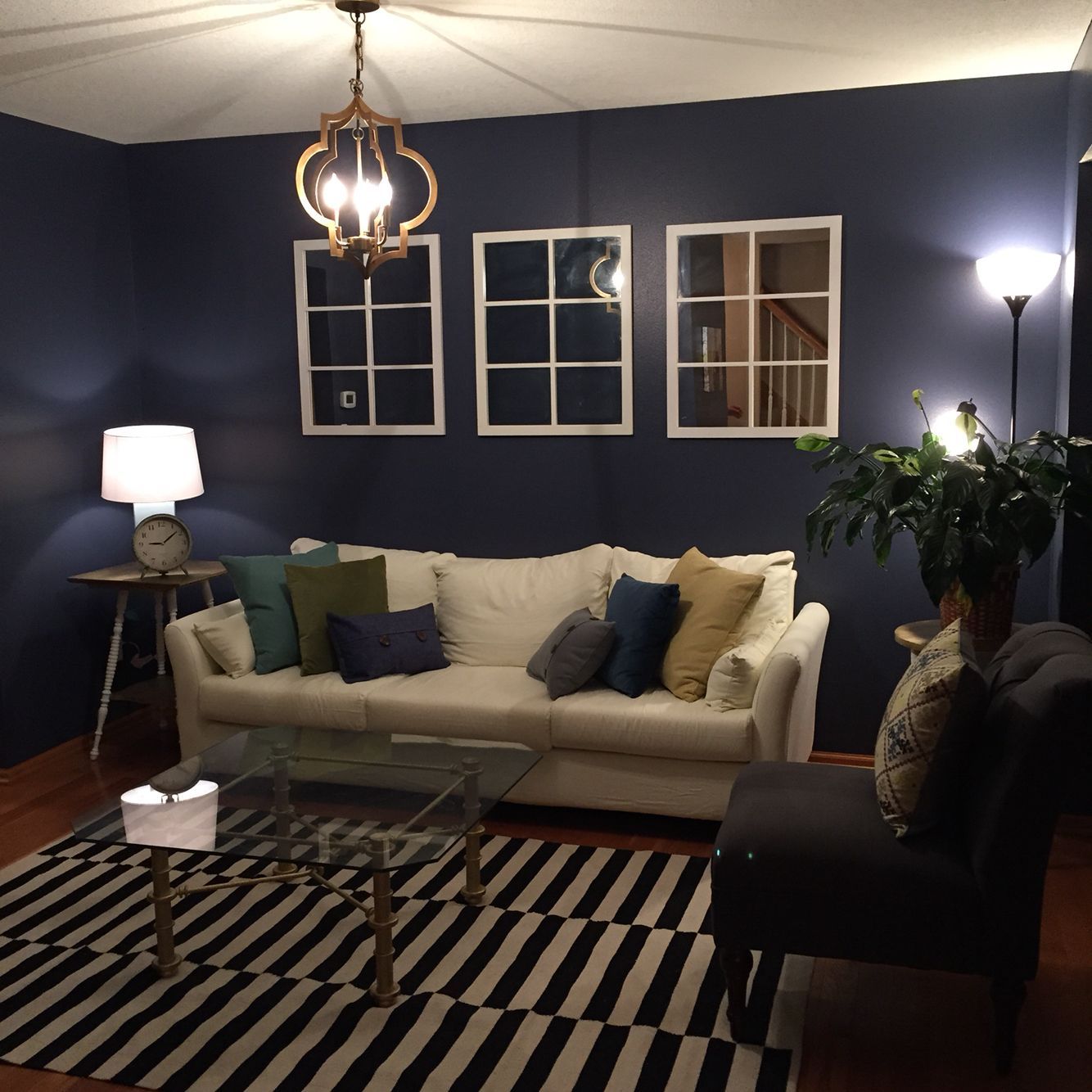
5. Naval SW 6244
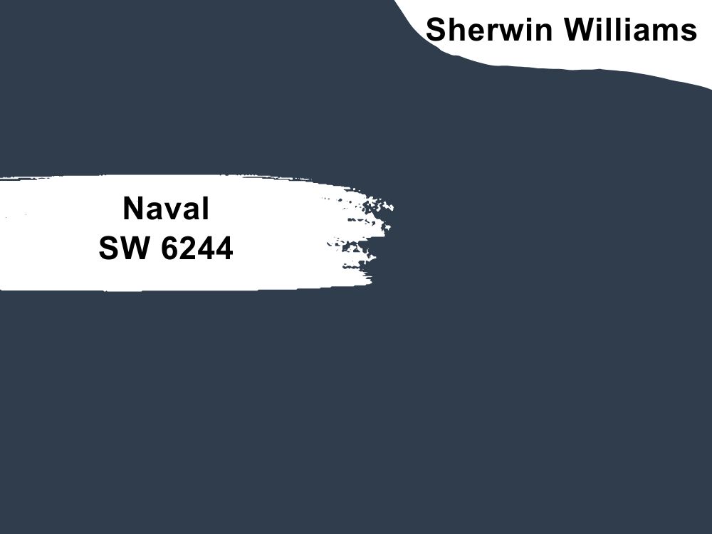
Deep blue paint color with green-gray undertones
We love our blues, and NAval is one of those navy blue paint colors that match everything. It is dark enough to fit in the place of black without its lack of color. You can use it alone, but it is best to add light colors or gray in any shade to make the best of it.
And that is why you should consider coordinating it with Roycroft Suede, Ramie, or Icicle. Naval has an RGB color code of 47, 61, and 76, with an LRV of 4.
6. Alabaster SW 7008

White paint color with beige undertones
Alabaster is a warm white that makes the decor cozy and inviting. It feels as if the color wraps around you, which is the feeling you want in your living room, especially with a family. Add some neutral colors like gray and wood tones to complete the look. Alabaster has an RB color code of 237, 234, and 224 respectively, with an LRV of 82.
7. Agreeable Gray SW 7029
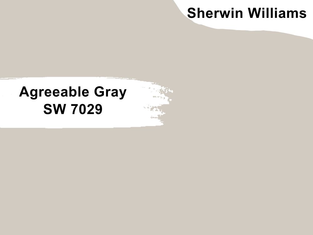
Greige paint color with beige undertones
If you have a living room that opens up into a kitchen, light neutrals are usually some of the best colors to use. It gives the impression of a bigger space and better coordination. Agreeable Gray is one such color that makes an open-floor setting work.
It is not because it is the best and most popular Sherwin Williams paint but because it truly performs well. Agreeable Gray has an LRV of 60 and an RGB color code of 209, 203, and 193 respectively. Match it with Coral Rose, Extra White, or Incredible White.
8. Dover White SW 6385
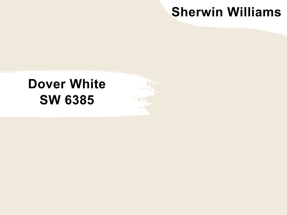
White paint color with creamy yellow undertones
Some call it golden white paint color, so pairing it with cool tones may make it look more yellow than cream. But Dover White is one of the best white paint colors you can use in your living room or any other place.
If unsure of what to pair with it, try Waterloo or Dakota Wheat, both Sherwin Williams paint colors. Dover White has an LRV of 83, which will make the living room truly bright, and an RGB color value of 240, 234, and 220 respectively.
9. Natural Tan SW 7567
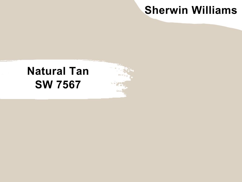
Tan paint color with green-gray hints
Natural Tan is a beautiful shade of light tan that is similar to beige. It creates a warmth in your living room that pairs well with other warm tones like wood colors in any shade. You can also add gray and shades of dark red to create a regal and sophisticated look.
Natural Tan has an RGB color code of 220, 210, and 195 respectively, with an LRV of 65. Coordinate it with Rare Gray, Westhighland White, or Alabaster.
10. Kilim Beige SW 6106
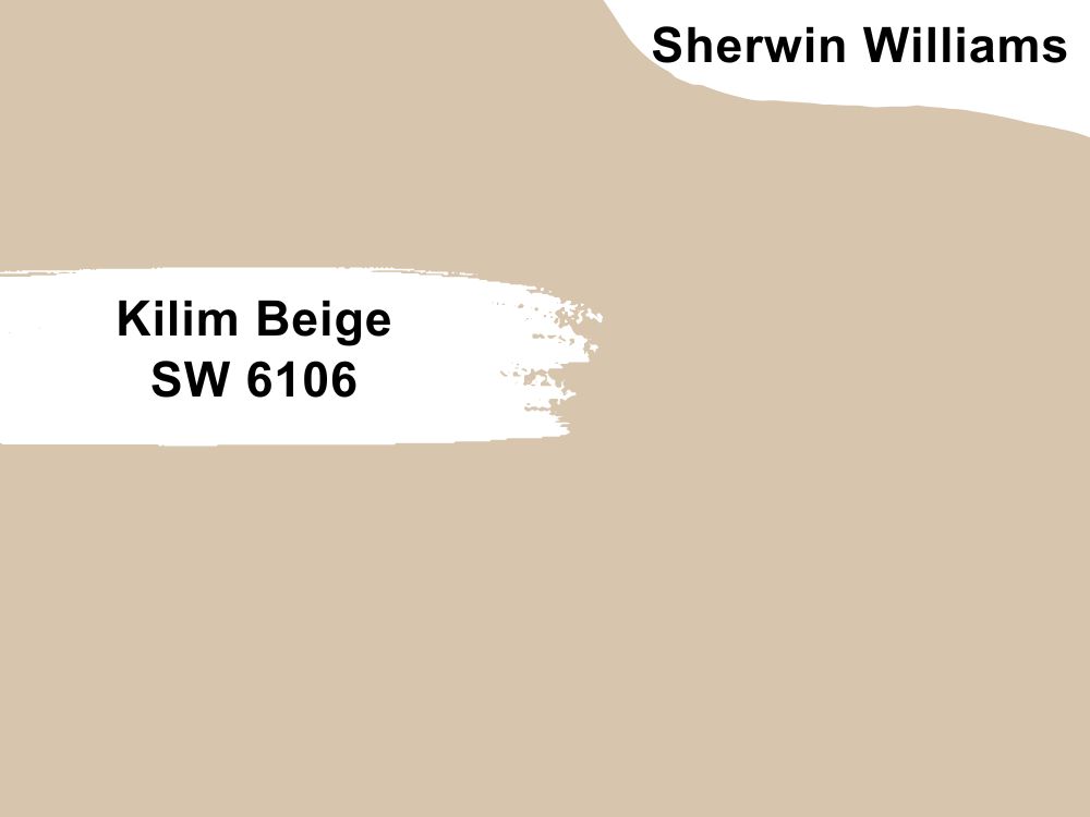
Beige paint color with orange undertones
Kilim Beige is one of the most beautiful shades of beige you will find in the market. It is not as light as the usual beige you are familiar with, and this is because of the orange undertones.
These undertones add depth to the color, making it richer than regular neutrals. Kilim Beige has an LRV of 57 and an RGB color code of 215, 197, and 174 respectively. Pair it with Storm Cloud, Latte, or Divine White.
11. Modern Gray SW 7632
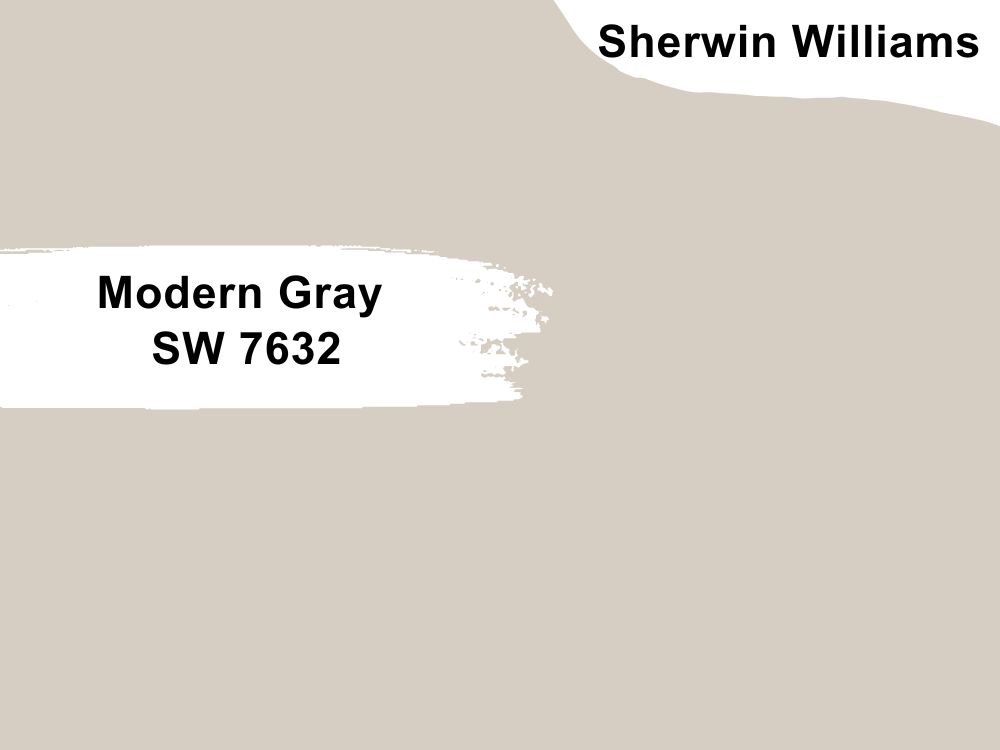
Gray paint color with pink-purple undertones
It does not look like it, but Modern Gray has slightly pink-purple undertones. In certain lighting, the undertone can change to green, only that it is subtle. While it is not as popular as other paint colors on our list, Modern Gray is getting on the radar of interior decorators.
This is because of its neutrality and how well it works as a backdrop for other colors. It has an LRV of 62 and an RGB color code of 214, 206, and 195 respectively. Coordinate it with Plum Dandy, Taupe Tone, or Snowbound.
12. Incredible White SW 7028
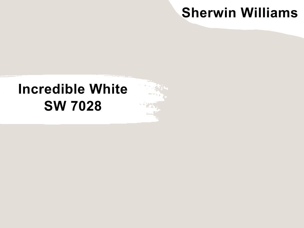
Bright white paint color with hints of gray
Incredible White is a crisp white that brings serenity and calmness to any decor. You may want to keep everything classy and elegant with an all-white living room, and Incredible White may be the best bet.
Alternatively, add bursts of color like blues, greens, yellows, or reds to the decor for some versatility. Incredible White has an LRV of 74 and an RGB color code of 227, 222, and 215 respectively. Coordinate it with In the Navy, Anew Gray, or Snowbound.
13. Shamrock SW 6454
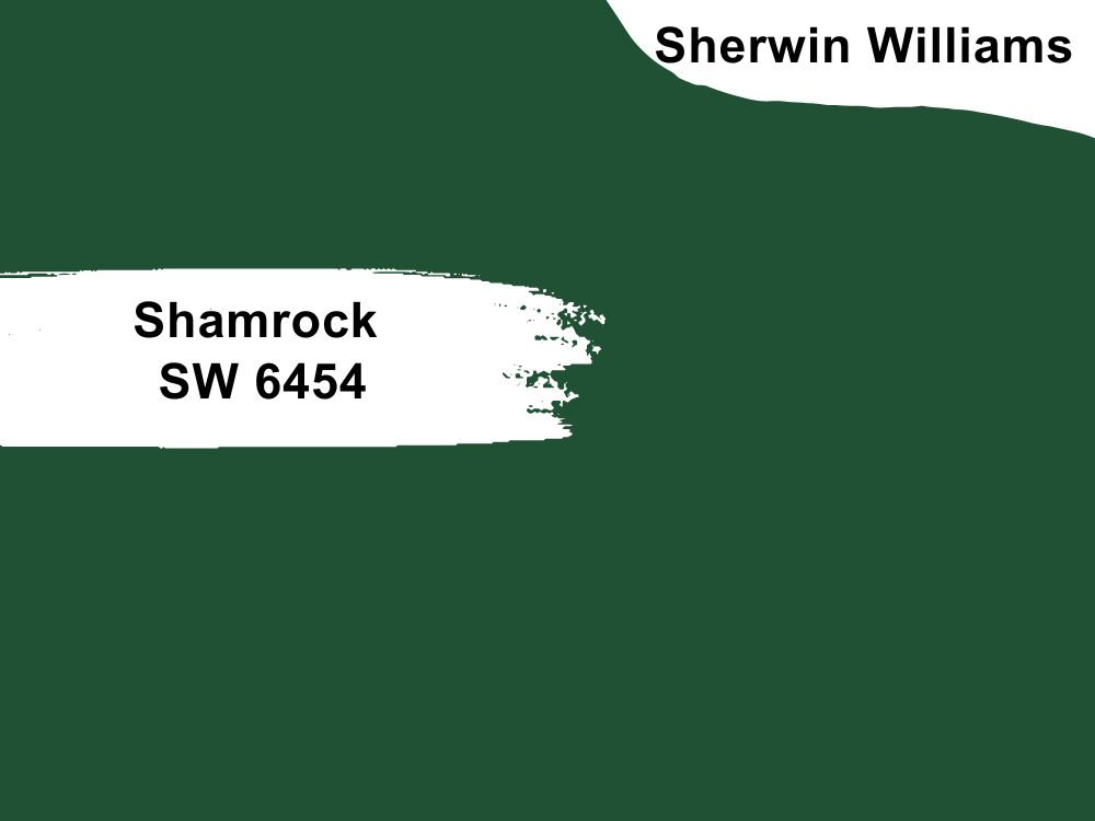
Deep green paint color with blue undertones
Shamrock is a green hue like you have never seen. It has a cool blue undertone that adds depth to the color and makes it serene. While it is a saturated color, it does not overwhelm or make a room moody. Therefore, consider using it in your living room with light neutrals and wood tones. Shamrock has an LRV of 6 and an RGB color code of 32, 81, and 52 respectively.
14. Cascades SW 7623
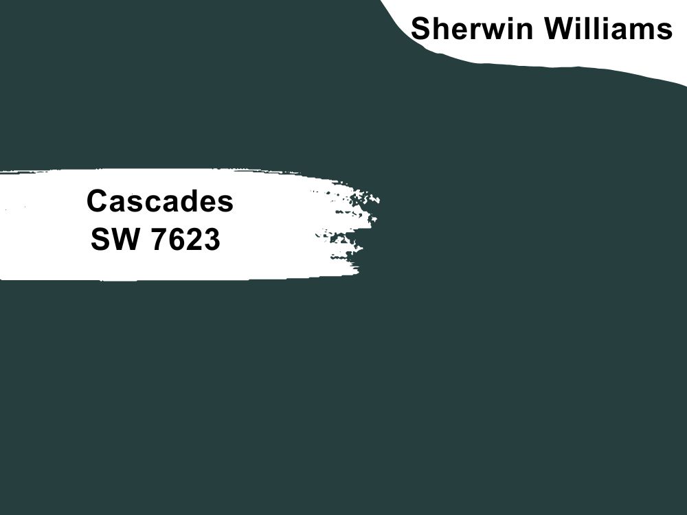
Dark blue paint color with yellow, gray, and blue undertones
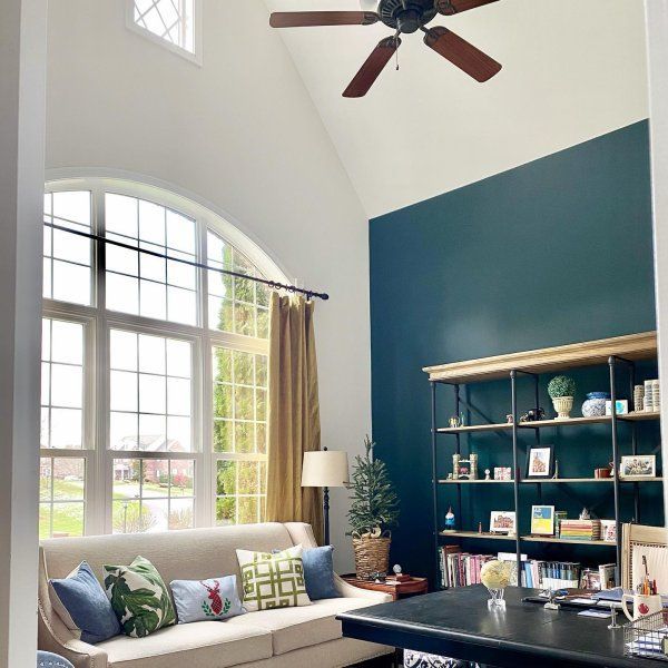
Talk about a complex color, right? Cascades is a saturated color with a mix of other colors, making it rich and deep. It is blue, and you already know how much we like blue. Your living room will spark a conversation with this color on the accent wall or any other wall.
Pair it with Hearty Orange, Oak Creek, or Extra White. Cascades has an LRV of 4 and an RGB color code of 39, 62, and 62 respectively.
15. Accessible Beige SW 7036
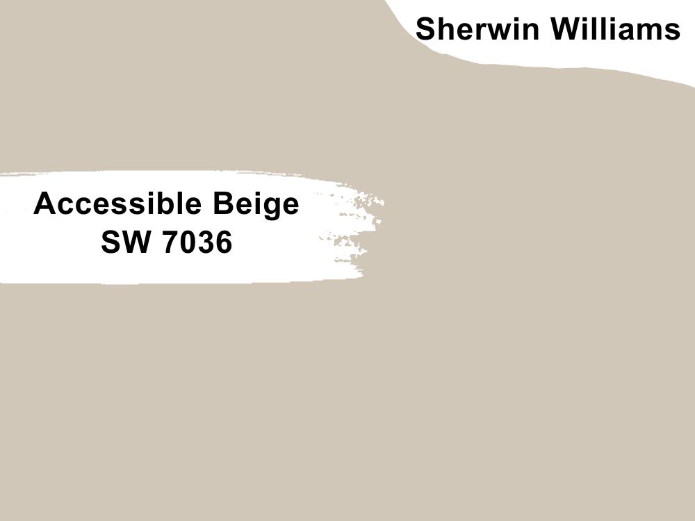
Beige paint color with gray undertones
You cannot go wrong with Accessible Beige in your living room. It is a light beige with gray undertones, which is uncommon with beiges. And if you add browns and dark grays, you make the color even better.
Accessible Beige makes a space look bigger because of its lightness. It has an RGB color code of 209, 199, and 184 respectively. Pair it with Cadet, Sanderling, or Aesthetic White.
16. Repose Gray SW 7015
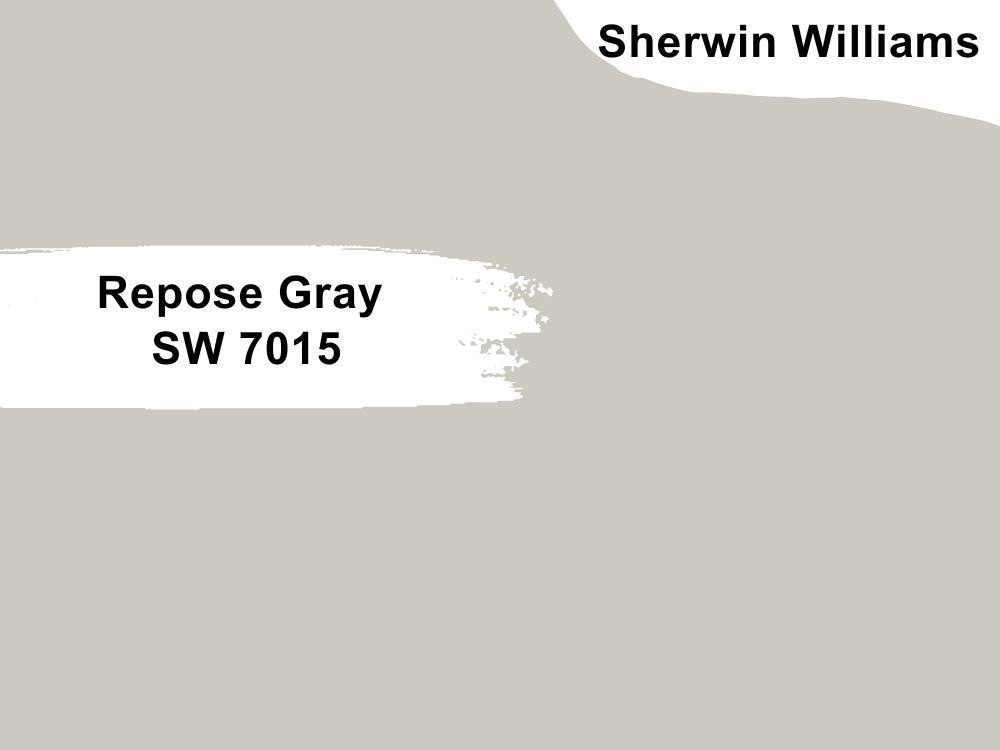
Light gray paint color with hints of violet and green
Repose Gray is a soft shade of gray made better with the violet and green hints. It is the perfect fit for a living room, so try it on all walls while using accessories that have bright colors.
Wood tones also work with this color, so try them in bits around the living room. Repose Gray has an LRV of 58 and an RGB color code of 204, 201, and 192 respectively. Coordinate it with Coral Clay, Pavestone, or Eider White.
17. Redend Point SW 9081
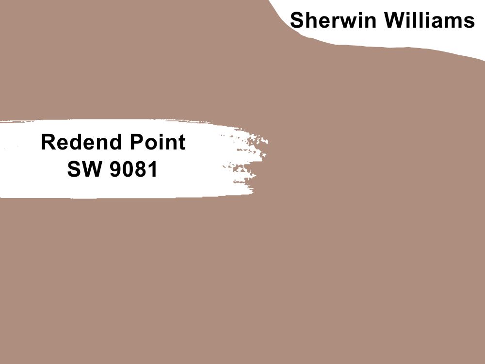
Rosy brown paint color with hints of red and brown
Redend Point is the Sherwin Williams color of the year 2023, and we can see why. It is a rosy color that has an earthy hue due to the hints of brown in it.
Its rich, warm, and inviting shade makes it ideal for the trends of this year and a fitting color for a living room. Redend Point has an RGB color code of 174, 142, and 126 respectively, with an LRV of 30. Coordinate it with Canyon Clay, Kestrel White, or Polite White.
18. Peppercorn SW 7674
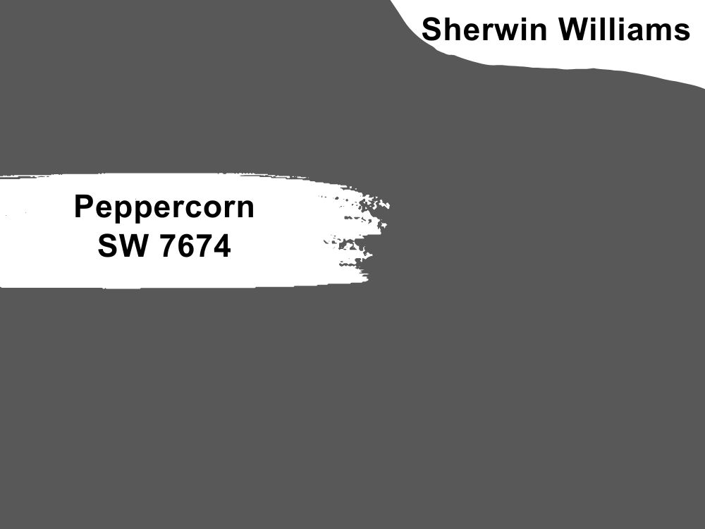
Dark gray paint color with hints of violet and green
Experts say that Peppercorn is a true gray because of the lack of obvious undertones, and we agree with them. However, you cannot deny the hint of violet or green that shows through the paint in certain lighting. A few times, you catch a glimpse of green. This is because there is no color without a subtle hint.
You can use it with white paint colors, such as Windfresh White or Nebulous White. It also goes well with a darker shade like Willow Tree. Peppercorn has an LRV of 10 and an RGB color code of 88, 88, and 88 respectively.
19. Salty Dog SW 9177
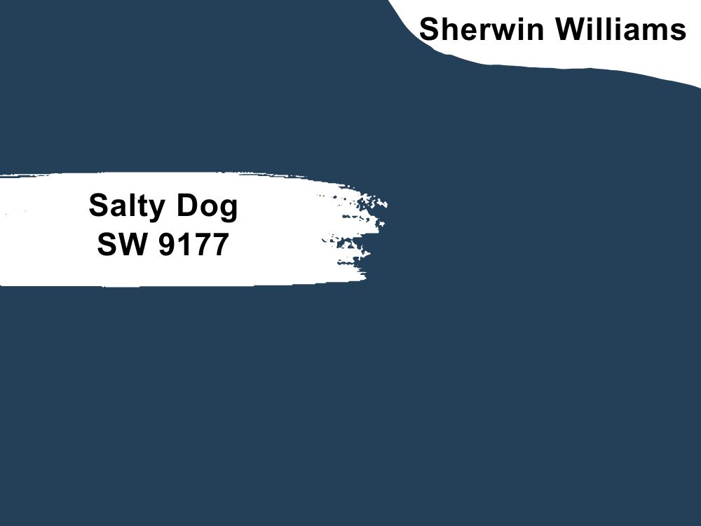
Navy blue paint color
Salty Dog is another deep paint color that makes a lying room look elegant and sophisticated. It is a classy color that pairs well with white and other light neutrals. It is similar to Naval, another navy blue color on our list, but Salty Dog is slightly different.
To get the best out of it, match Salty Dog with Favorite Jeans, Gray Screen, or Pure White. The paint color has an LRV of 5 and an RGB color code of 35, 64, and 88 respectively.
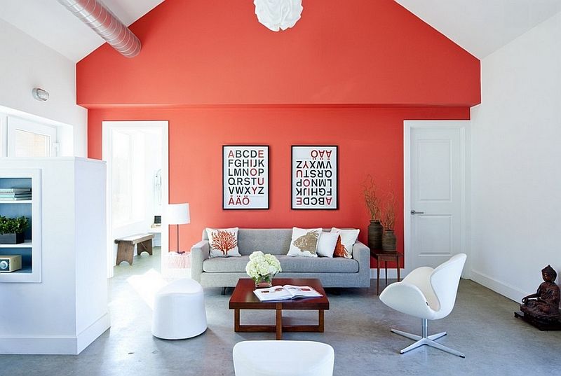
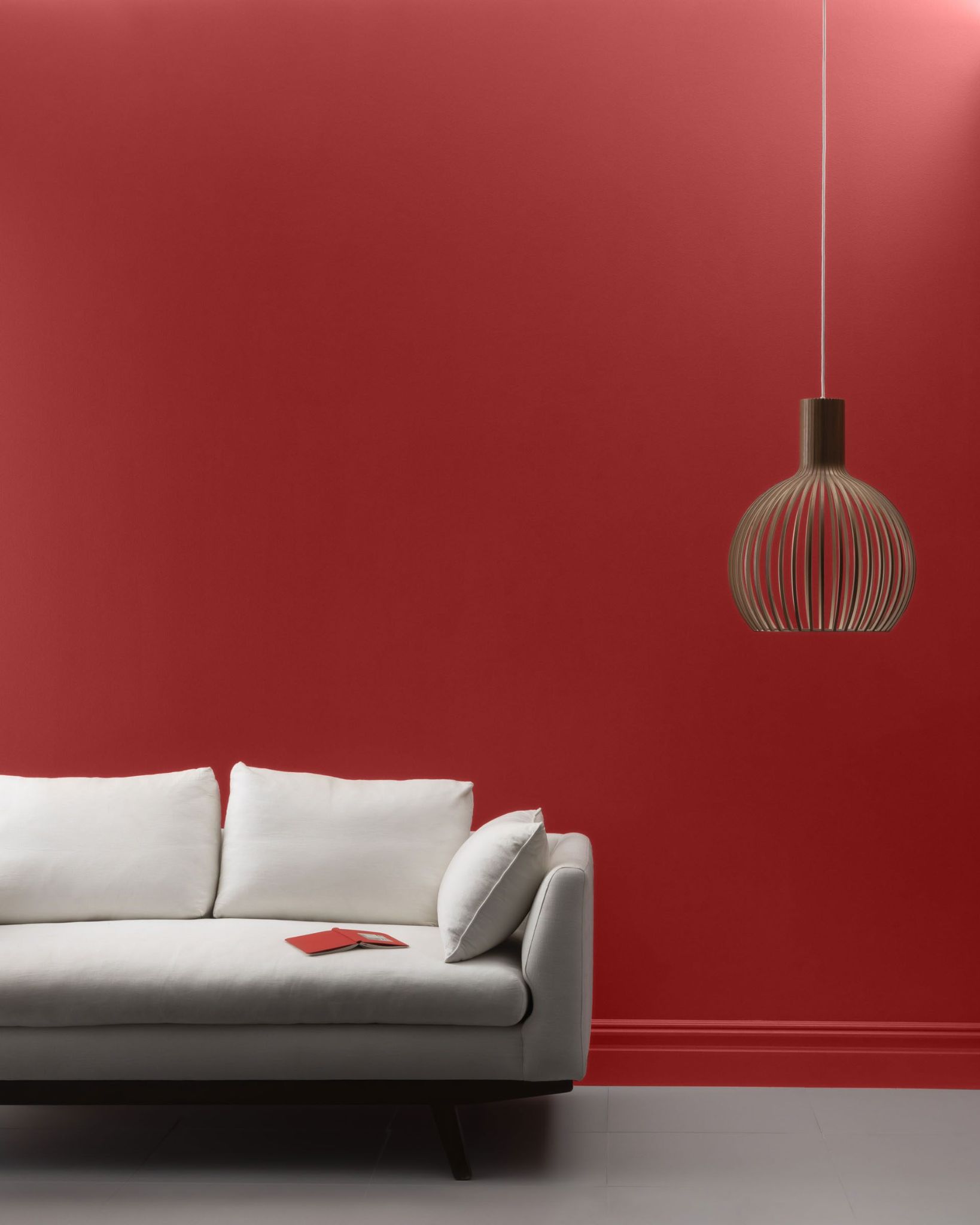
20. Positive Red SW 6871
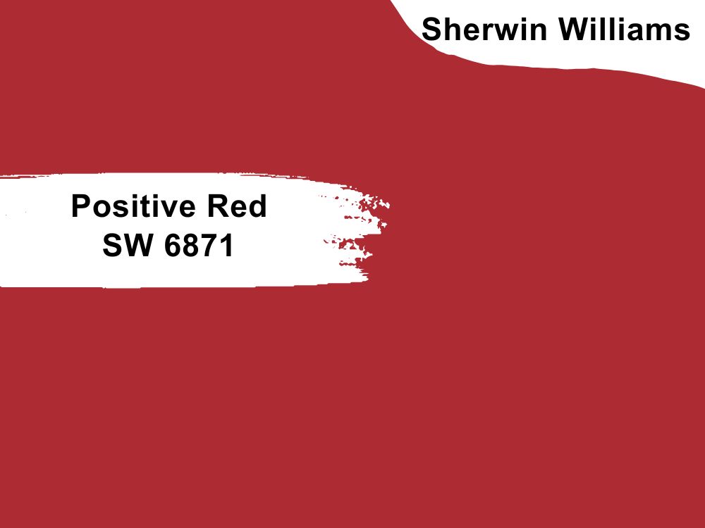
Red paint color with slightly pink undertones
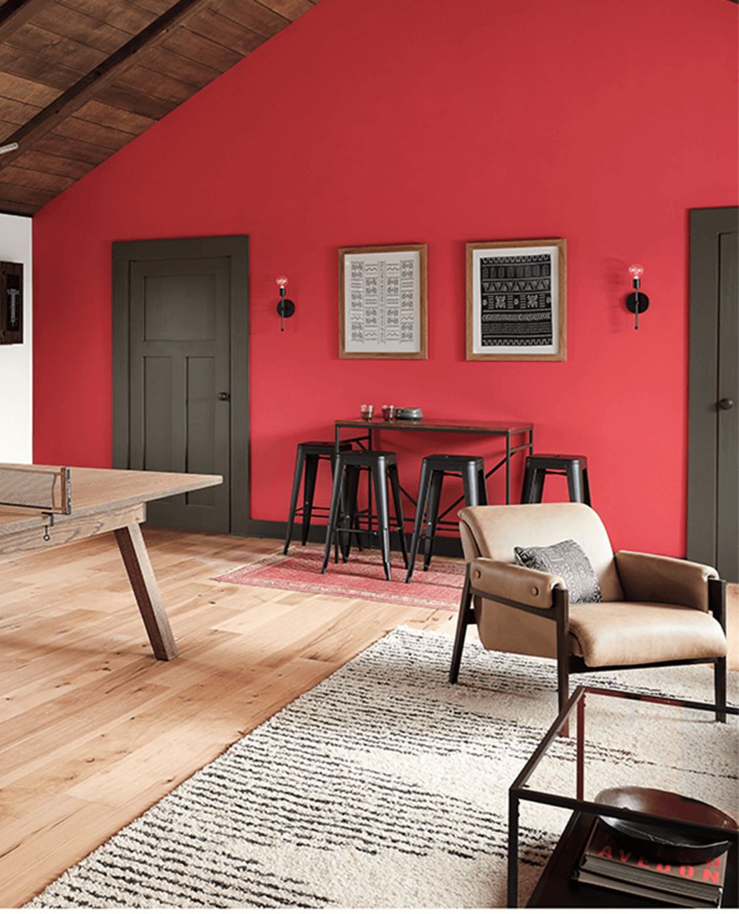
Go red or go home with this paint color. Positive Red may not be the most popular paint color out there, but it is just the right hue for your living room. You do not have to paint the entire living room in this paint color; combine it with less saturated colors for the best results.
Positive Red has an LRV of 11 and an RGB color code of 173, 44, and 52 respectively. Match it with Gauntlet Gray, Toque White, or Ibis White.
21. Passive SW 7064
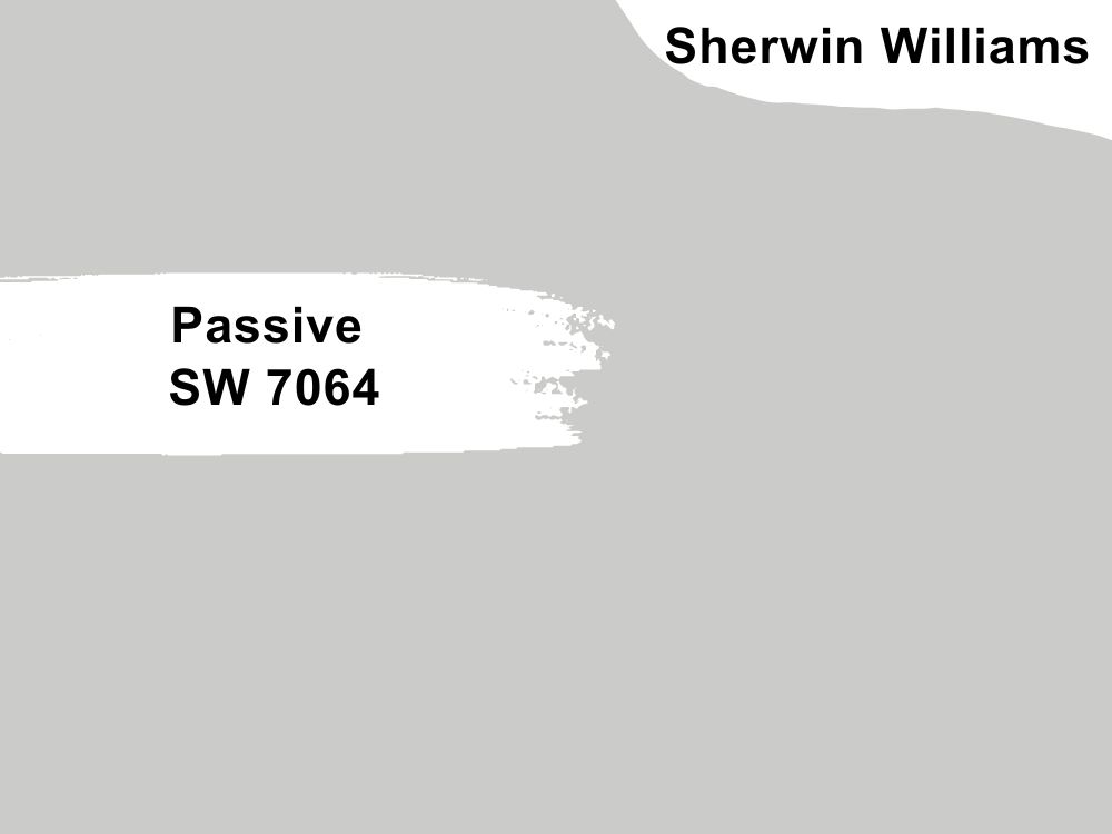
Light gray paint color with blue undertones
This light neutral paint color is what your living room’s decor needs to come together. It is a light neutral that shows a hint of cool color, so it works with almost every color. Pair Passive in your living room with Green Onyx, Shell White, or Nebulous White if you want to keep it light and airy.
Alternatively, add other vibrant and saturated colors to create versatility. Passive has an LRV of 60 and an RGB color code of 203, 204, and 201 respectively.
22. Gauntlet Gray SW 7019
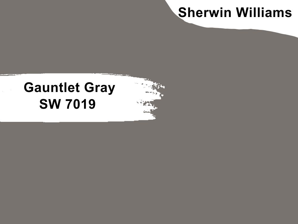
Dark gray paint color with greige undertones
It would have been a dark and bland color but for the warm greige that underlies it. The greige undertones make the color deeper and warmer than the usual gray. Keep your living room up-to-date and trendy with different neutral tones along with Gauntlet Gray to get the best effect.
The paint color has an LRV of 17 and an RGB color balance of 120, 115, and 110 respectively. Coordinate it with Armagnac, Repose Gray, and Eider White.
23. Indigo Batik SW 7602
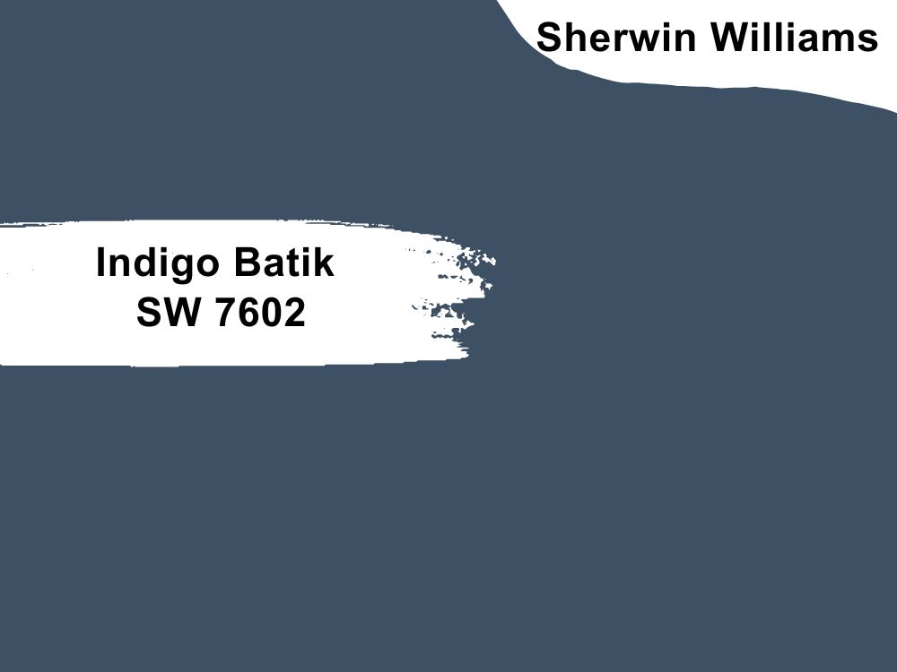
Deep denim blue with slightly purple undertones
Indigo Batik is another navy blue paint color that performs well in a living room. Its saturated tones make the living room sophisticated and trendy. Keep it simple by pairing it with white or light gray.
Add a splash of color like red or yellow so it is not monotonous. Indigo Batik has an LRV of 8 and an RGB color code of 62, 80, and 99 respectively. Coordinate it with Sands of Time, Pacer White, or Icicle.
24. Anew Gray SW 7030
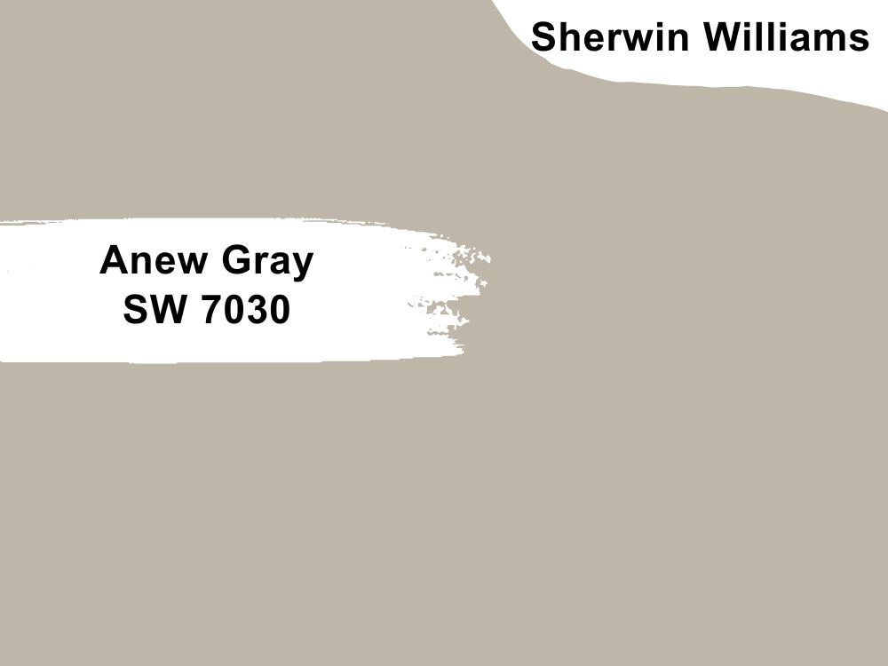
Mid-tone gray paint color with warm undertones
Anew Gray is a perfect neutral that ties everything together in your decor. It is mellow and works well as a backdrop for other colors. You can add black, white, beige, or wood tones to make this color pop. Anew Gray has an RGB color code of 191, 182, and 170 respectively, with an LRV of 47. It is best to coordinate this paint color with Little Blue Box, Pure White, or Incredible White.
25. Black Magic SW 6991
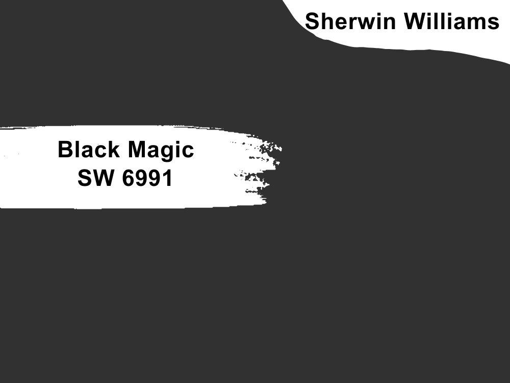
Black paint color
If you are not afraid to make a bold statement in your living room, go for Black Magic. It is one of the truest black paint colors, meaning you will hardly find any undertones in the color. You can use it on accents or ceilings if you are that adventurous.
Black Magic has an RGB color code of 50, 49, and 50 respectively, with an LRV of 3. Consider pairing it with Anjou Pear, Lemon Meringue, or Snowbound.
26. Lazy Gray SW 6254
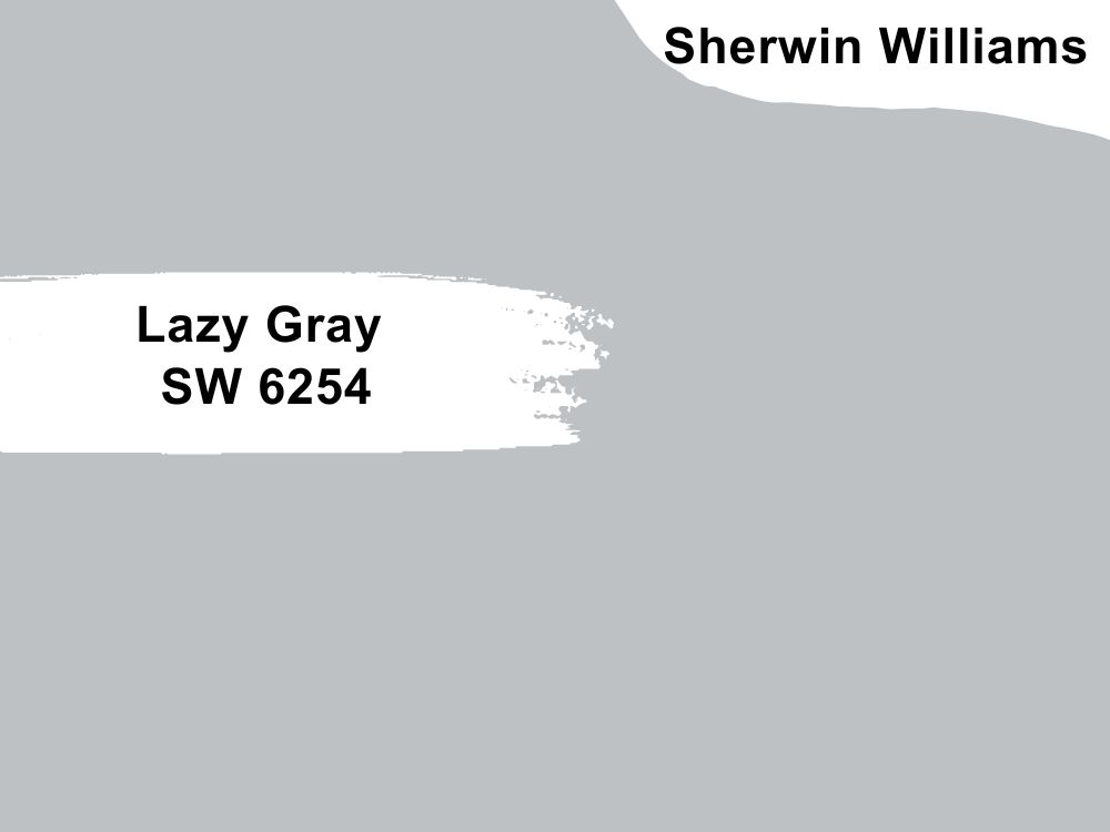
Light gray paint color with a hint of blue
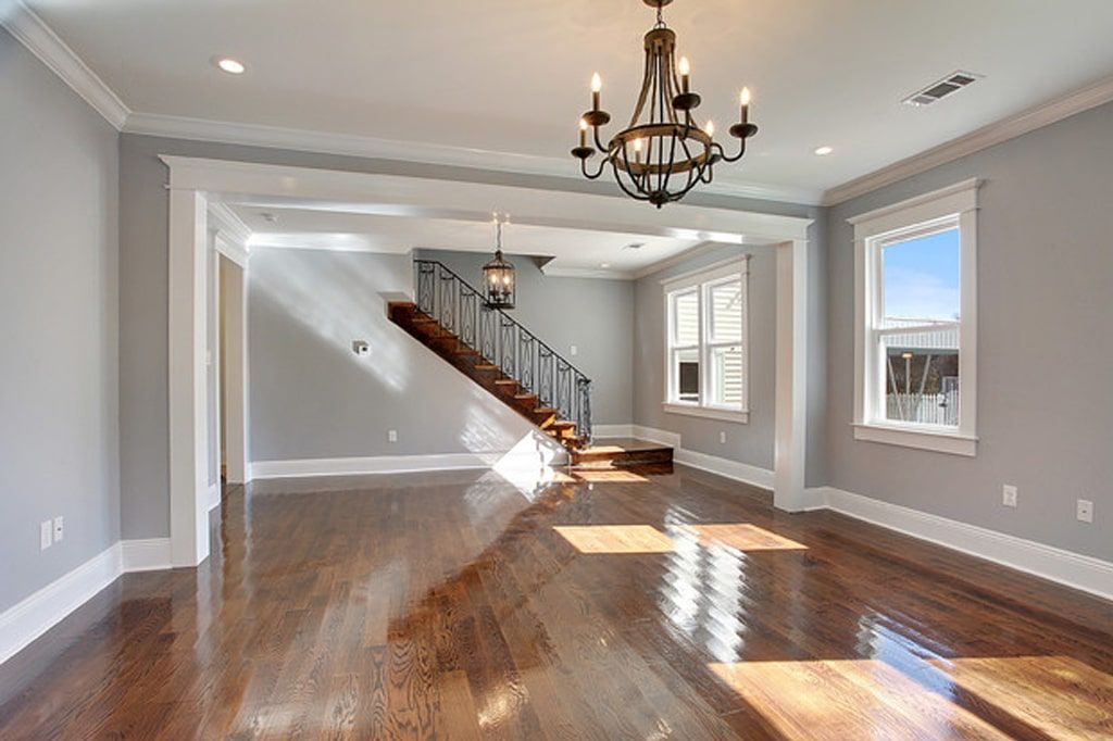
It would have been a light blue paint color but the blue shade is not enough to make it so. Lazy Gray is a pale gray that shows a lot of blue and is a crisp color that matches a living room. The paint color also allows you to throw in other colors for good effect.
Lazy Gray has an LRV of 53 and an RGB color code of 190, 193, and 195 respectively. The matching colors include Cornwall Slate, Peppercorn, or Ice Cube.
27. Iron Ore SW 7069
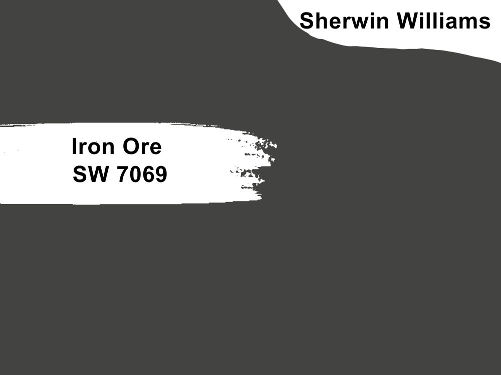
Dark charcoal paint color with neutral tones
This dark charcoal paint color is a great alternative to black. If you are not keen on the deepness of black, consider this slightly lighter option for your mantelpiece or accent wall. Use it as a trim color instead of white for a change. Iron Ore has an LRV of 6 and an RGB color code of 67, 67, and 65 respectively. Pair it with Cityscape, Extra White, or Nebulous White.
28. Softer Tan SW 6141
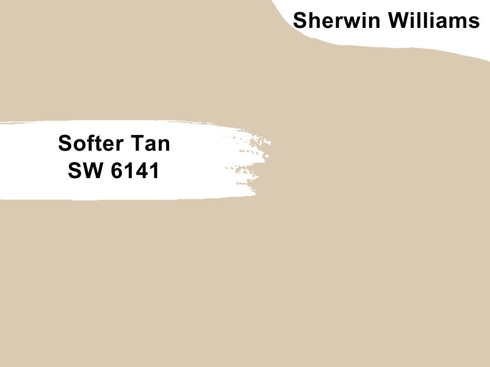
Tan paint color with wheat undertones
Create a warm environment that never gets old with Softer Tan. It is indeed a soft tan paint color that is warmed by the hints of wheat and green in certain lighting. The paint color works for every decor because it is neutral.
And because of this, you can also use it in any room to provide enough coziness. Softer Tan has an RGB color code of 218, 202, and 178 respectively, and an LRV of 60, surprisingly higher than it looks. Match it with Prairie Grass, Creamy, or Moderate White.
27 Best Paint Colors for Living Rooms by Benjamin Moore
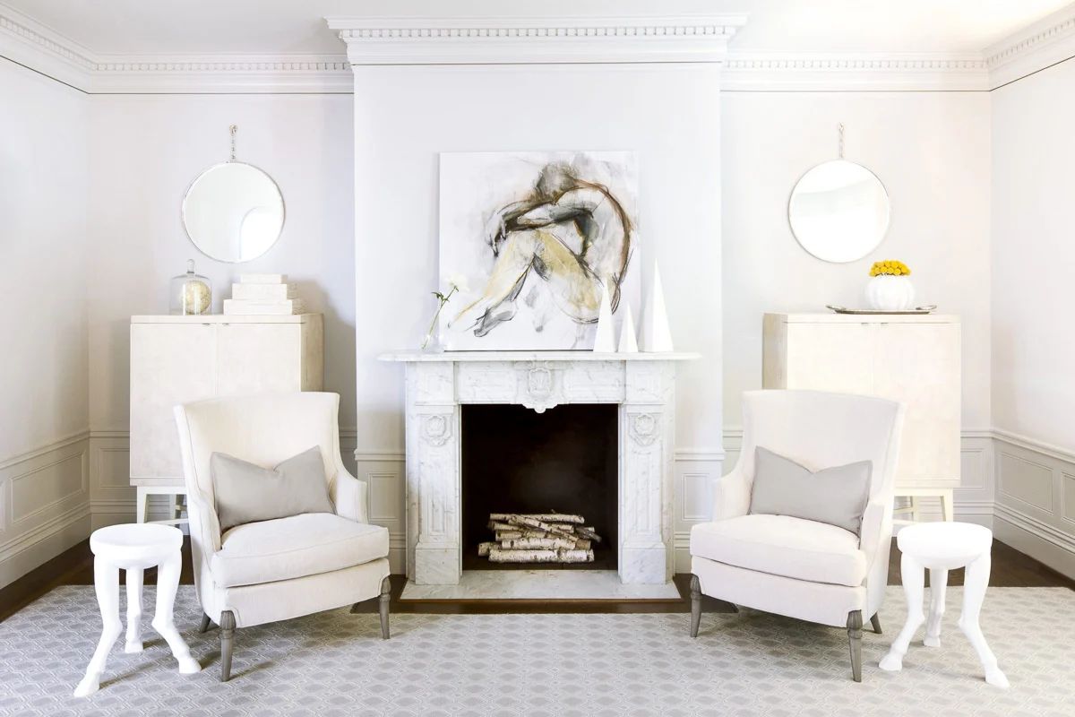
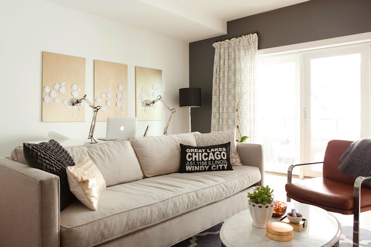
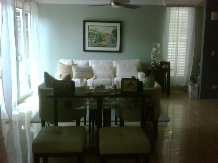
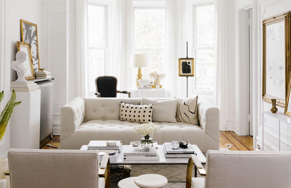
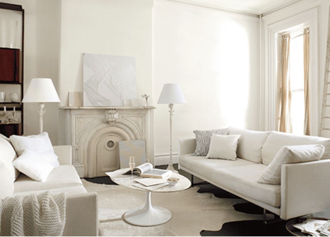
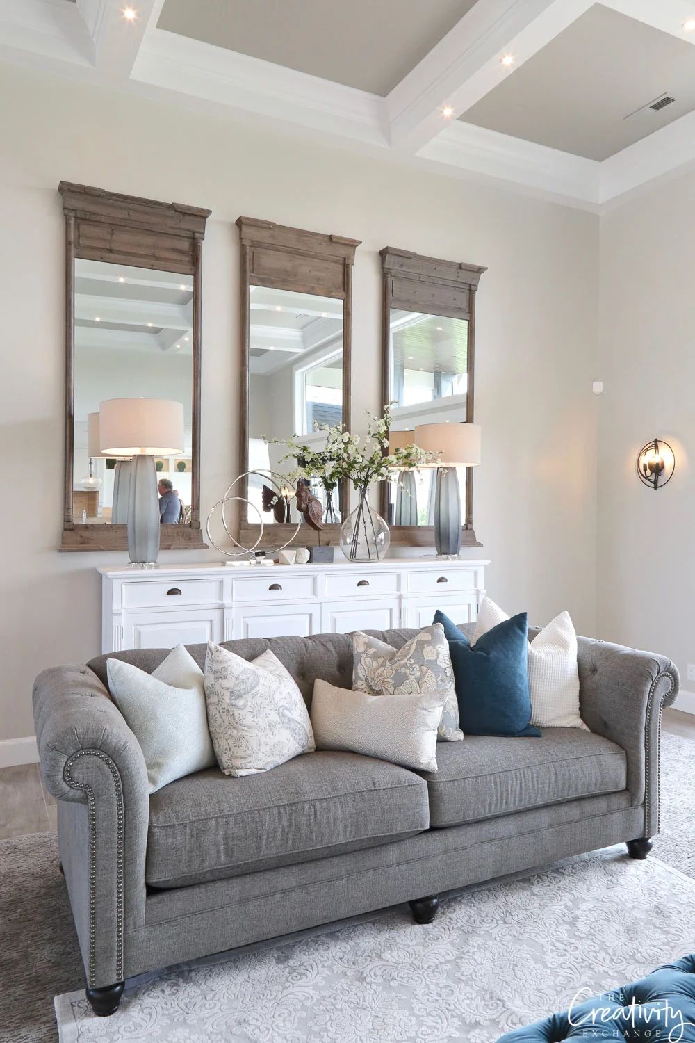
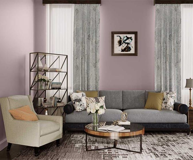
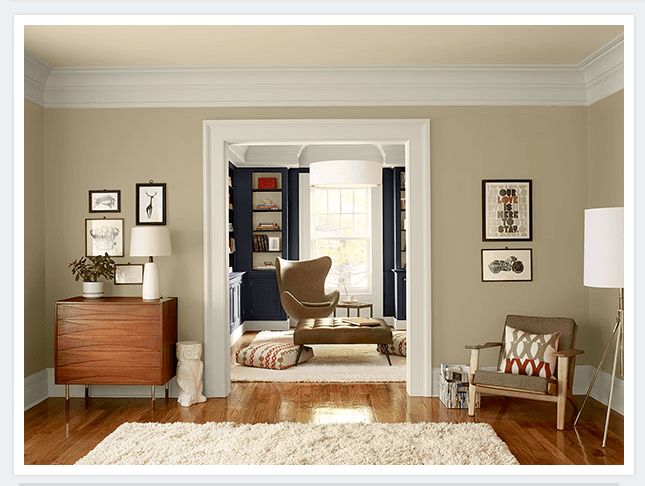
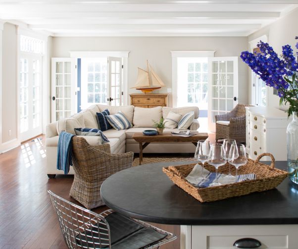
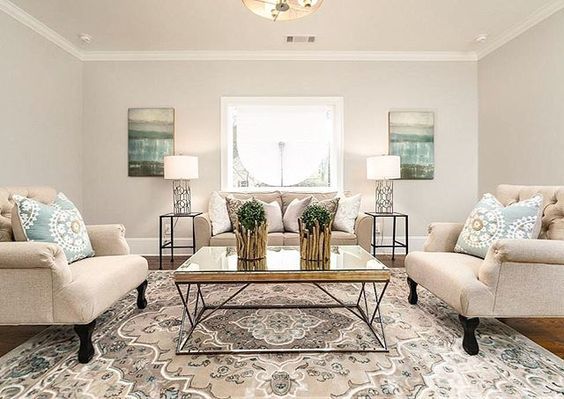
1. Decorator’s White CC-20
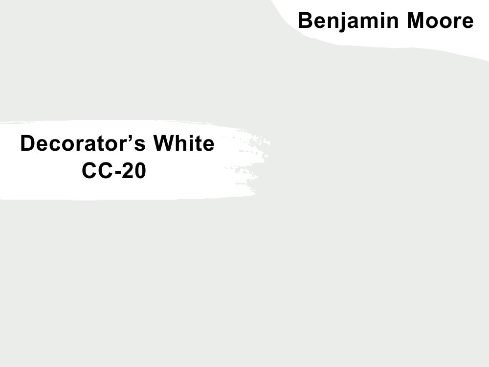
White paint color with hints of gray
White will always be a safe color for any decor, especially that of a living room. The living room decor above shows what colors work well with Decorator’s White, but you can also come up with a unique color palette.
The paint color has an LRV of 82.68, which means it can throw back a good amount of light into the room, and an RGB color code of 235, 237, and 234 respectively. Match it with Oxford White and Raindance or Chantilly Lace and Blue Note.
2. Casco Bay 2051-30

Green paint color with teal undertones
Casco Bay is a rich green paint color that saturates any decor. Using it may mean adding white or off-white to avoid overwhelming the decor. But we love it because of how regal it makes a room, especially a living room.
You may want to use it if your goal is to have a striking room. Casco Bay has an LRV of 15.13 and an RGB color value of 48, 110, and 109 respectively. Coordinate it with Distant Gray and Crystal Blue or Cloud Cover and Gray Owl.
3. Raspberry Blush 2008-30
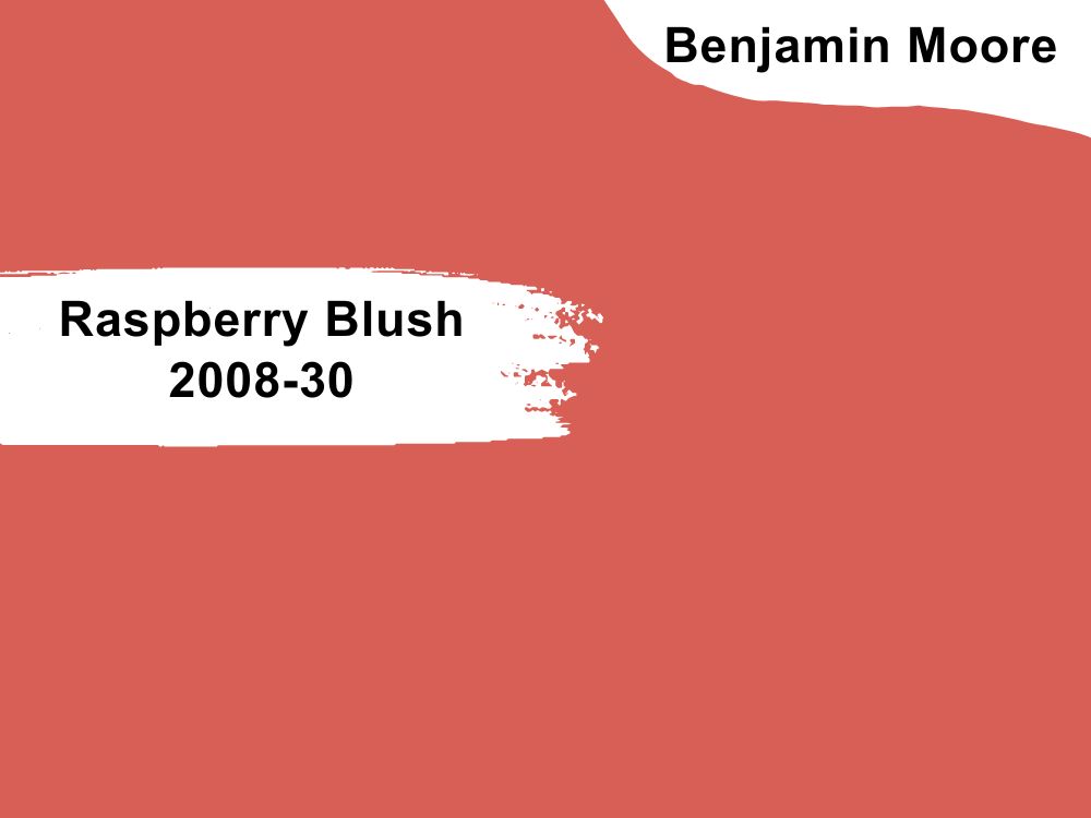
Bright coral paint color with pink undertones
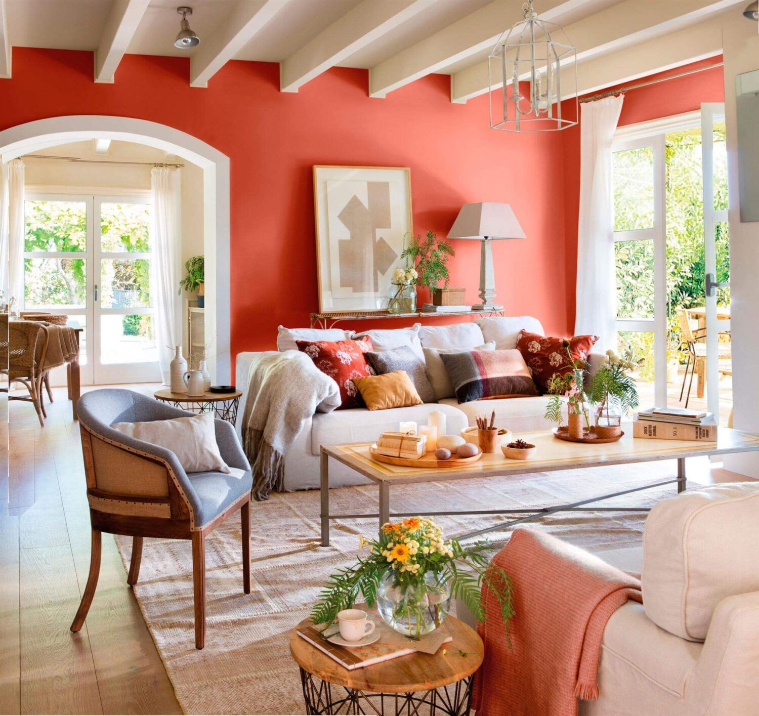
Raspberry Blush is the Benjamin Moore color of the year 2023, and that means something. It is such a rich and warm color, so you may want to use it sparingly. Ensure the living room has a lot of natural light.
Alternatively, use the paint color minimally because it has the potential of overwhelming the room, regardless of how spacious it is. Raspberry Blush has an RGB color code of 210, 95, and 87 respectively, with an LRV of 22. 68. Coordinate it with Chantilly Lace and Ecru or Alabaster and Sail Cloth.
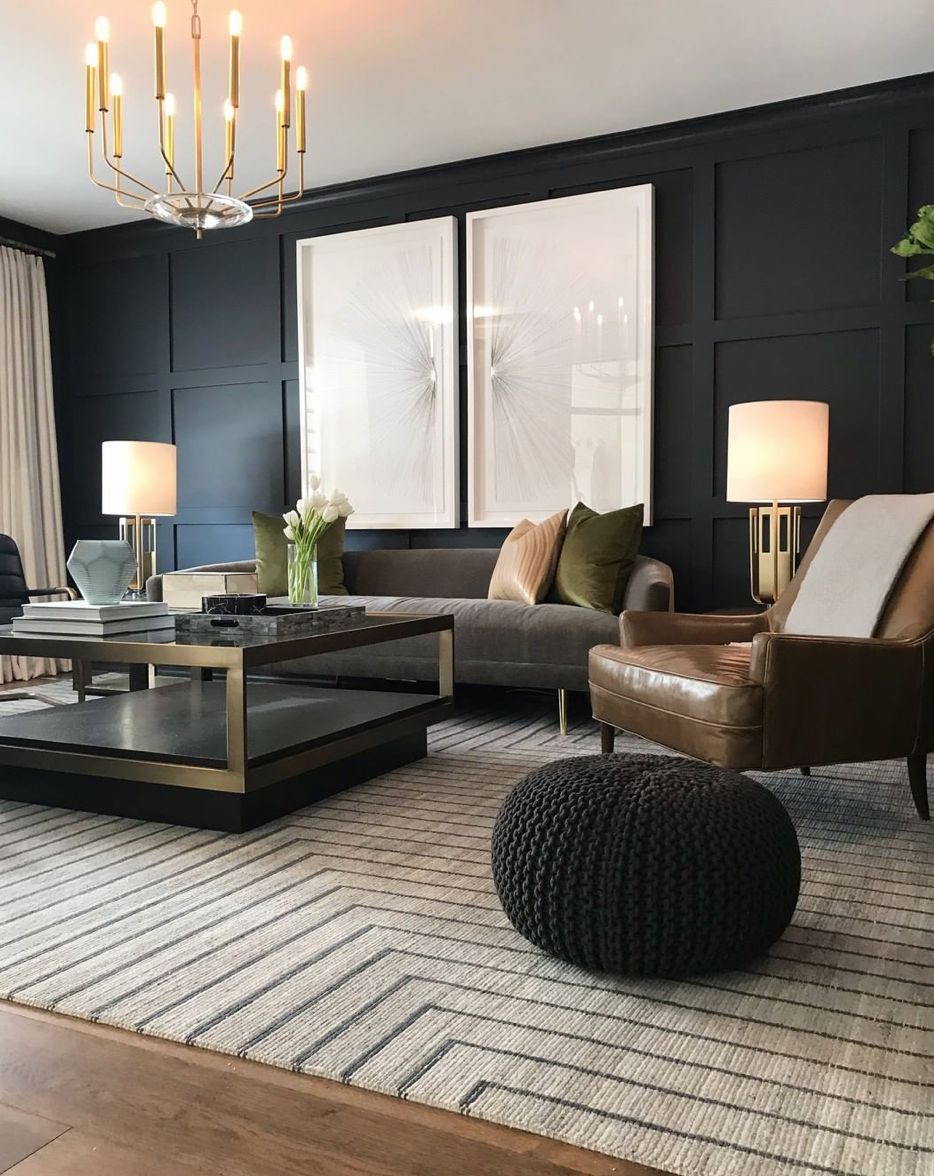
4. Kendall Charcoal HC-166
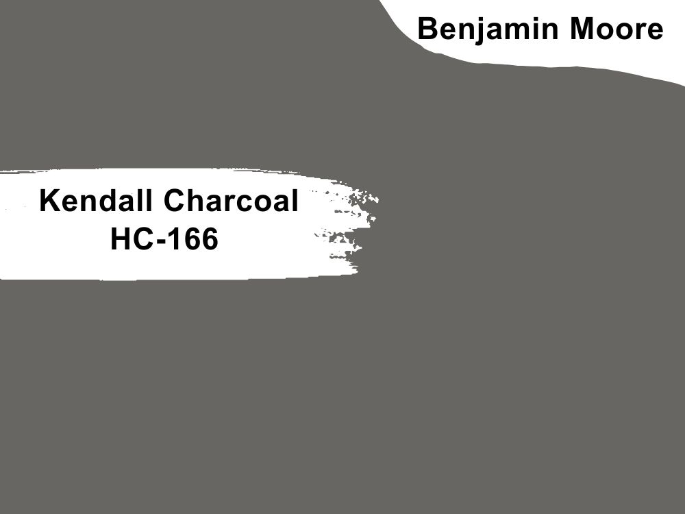
Dark gray paint color with slightly green undertones
Kendal Charcoal is a dark gray paint color, one of the darkest from Benjamin Moore. We like using dark neutrals because of how well they pair with any other color. Besides, it is such a stately color for a living room.
Pair it with Hawthorne Yellow and Simply White or Harbor Haze and Snow White. Kendall Charcoal has an LRV of 14.61 and an RGB color code of 103, 102, and 98 respectively.
5. Wedgewood Gray HC-146
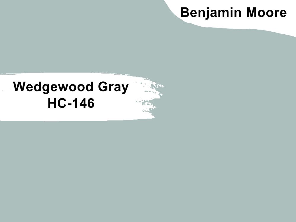
Pale blue paint color with slightly green undertones
Wedgewood Gray is a soft color that leaves a room light and airy. Soft blue is usually a color for bedrooms, nurseries, and powder rooms, but you can switch things up a bit. As with many other colors, it works well with white and light gray.
However, create a striking decor by adding a charcoal gray color and a vibrant one. Wedgewood Gray has an LRV of 49.59 and an RGB color code of 172, 191, and 189 respectively. Match it with Branchport Brown and Steam or White and Winter Ice.
6. Wenge AF-180
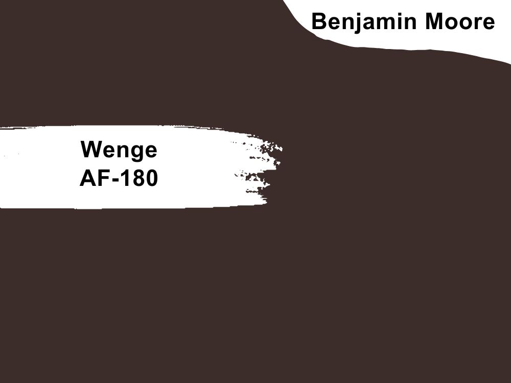
Chocolate paint color with hints of violet, black, and brown
This warm paint color will only make your living room pop. Wenge is a powerful color with rich depth and saturation. The best part is that it is a neutral color. So, add light colors if you think it will be too much for your living room.
Wenge has an LRV of 4.79 and an RGB color code of 60, 45, and 43 respectively. The best colors with which to match this deep color include Flora and Crystalline or White Heron or Majestic Mauve.
7. Iron Mountain 2134-30

Soft black paint color with neutral undertones
This paint color is common for bedrooms and living rooms because it is soft black. It looks almost like dark charcoal gray but is black which fits with other neutrals. And because it has neutral tones, you can use it for both cool and warm color schemes.
Iron Mountain has an RB color code of 60, 45, and 43 respectively, with an LRV of 10.96. Coordinate it with White Dove and Barren Plain or Snowfall White and Stardust.
8. Chantilly Lace 2121-70
Pure white paint color with subtle undertones
Chantilly Lace is popular as a coordinating color because of its lack of undertones. It fits both warm and cool color schemes, making it ideal for any room or decor. There is not much you cannot do with Chantilly Lace, even if you want the popular classic white look in your living room.
The paint color has an RGB color code of 244, 246, and 241 respectively, with an LRV of 90.04. Coordinate it with White and Horizon or Seapearl and Edgecomb Gray in your living room.
9. Hale Navy HC-154

Dark blue paint color with gray undertones
Since it is a deep color that has an obvious hint of gray in it, Hale Navy is ideal for accents instead of entire walls. It is a popular navy blue color that works well in living rooms. You can pair it with whites and grays with a bit of red and wood tones for a striking effect.
Hale Navy has an LRV of 8.36 and an RGB color code of 67, 75, and 86 respectively. Coordinate it with Coventry Gray and White Dove or Lenox Tan and Glacier White.
10. Simply White 2143-70
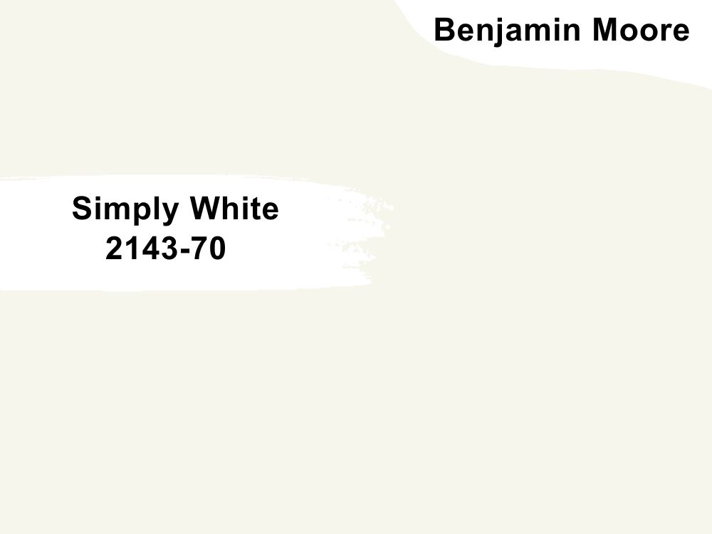
White paint color with yellow undertones
The subtle hint of yellow in this bright white makes it looks slightly off-white and warm. Simply White is another popular white paint color by Benjamin Moore that creates an inviting look and feel. As with other white paint colors on our list, it can stand alone, but you can add other colors if you want your living room to have a splash of color.
Match it with colors such as Dove Wing and Somerville Red or Silver Satin and Casco Bay. Simply White has an LRV of 89.52 and an RGB color code of 246, 246, and 237 respectively.
11. Chelsea Gray HC-168
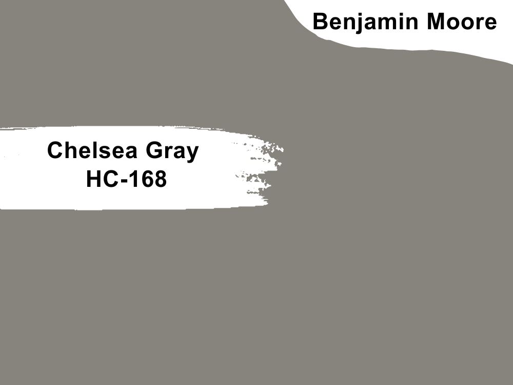
Gray paint color with violet-brown undertones
Dark gray is a great color to consider for your living room because there is a muted sophistication and elegance it brings. Chelsea Gray is one dark gray paint color to try, especially if you match it with white or light gray. Of course, the decor does not have to be monochromatic; add pitted plants and other splashes of color to complete the look.
Chelsea Ggray has an LRV of 23.33 and an RGB color code of 134, 132, and 124 respectively. Match it with other Benjamin Moore colors such as Concord Ivory and Lemon Chiffon or Angelica and Sanctuary.
12. Edgecomb Gray HC-173
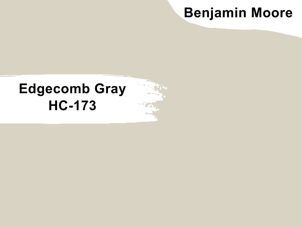
Light greige paint color with green undertones
Edgecomb Gray is not a gray paint color as you would expect. Instead, it is a light and airy shade between beige and gray, making it a beautiful greige. If white appears too stark for you, try this paint color for a warmer effect.
It is one of the best colors for a living room because you can throw in any accessory and it will blend. Edgecomb Gray has an LRV of 63.09 and an RGB color code of 217, 211, and 196 respectively. Consider pairing it with Boothbay Gray and White Heron or Pashmina and Dove Wing.
13. Swiss Coffee OC-45
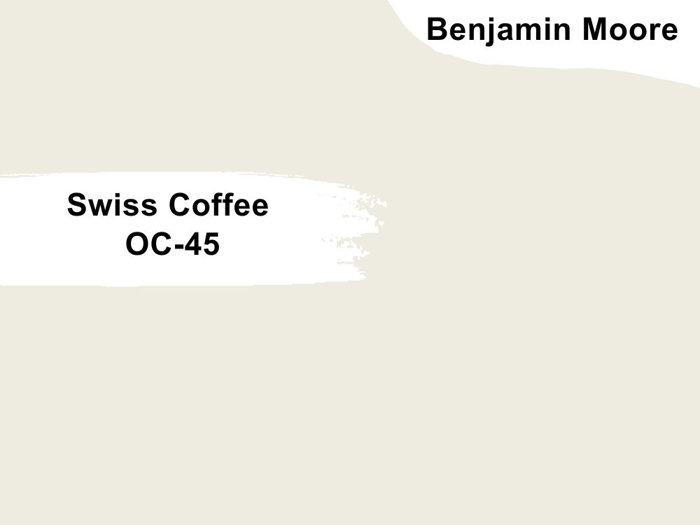
Off-white paint color with complex undertones
Some say Swiss Coffee has several undertones, depending on the lighting. The primary undertone you notice is yellow, but there is also a hint of green. A few people have reported seeing a pinkish hue in the color.
But whatever color you see, Swiss Coffee is a beautiful and warm off-white color that works well in your living room. You can pair it with White Drifts and Lush or Fossil and Newburg Green. The paint color has an LRV of 81.91 and an RGB color balance of 238, 236, and 225 respectively.
14. Deep Rose 2004-10
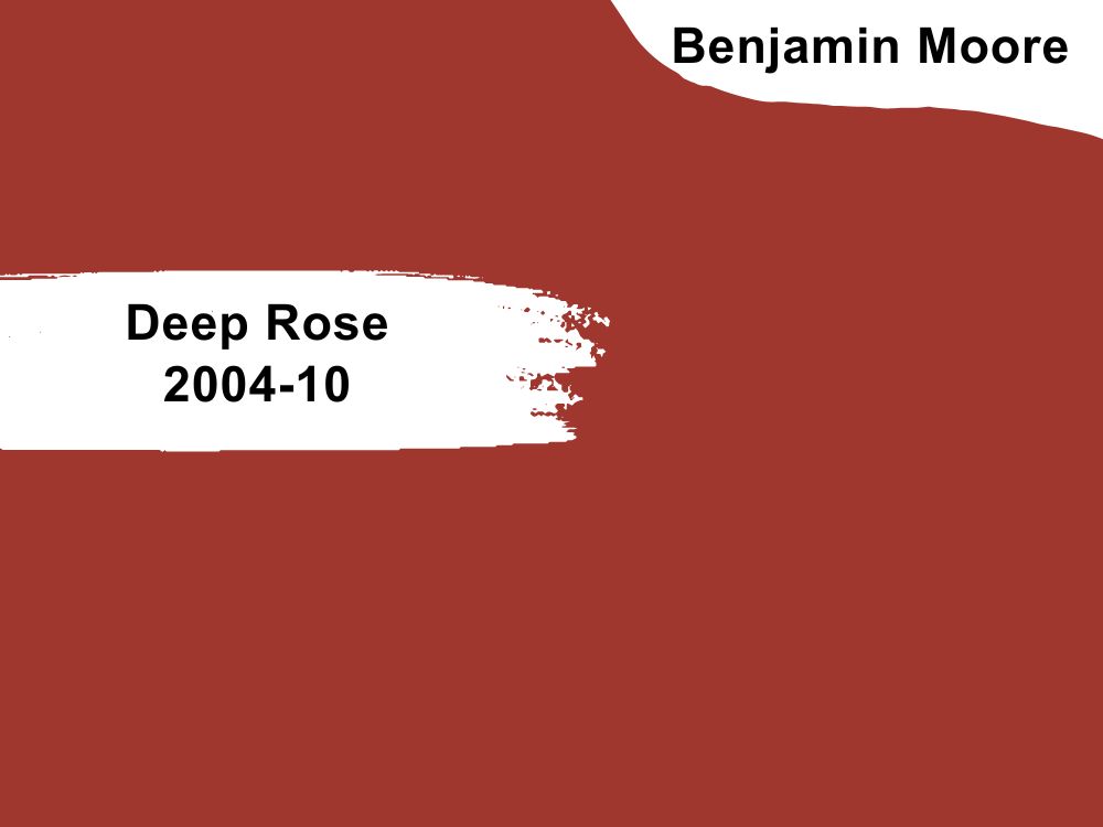
Dark red paint color with russet notes
This paint color is similar to the color of the year 2023 by Benjamin Moore. But subtle differences like the undertones make the two colors unique. Deep Rose is a rich shade of red made richer and deep by the russet notes in it.
For a striking and unique living room, try this paint color with touches of lighter colors. Pair it with Lacey Pearl and Silver Fox or White and Space Black. The paint color has an LRV of 11.35 and an RGB color value of 160, 55, and 47 respectively.
15. Navajo White OC-95
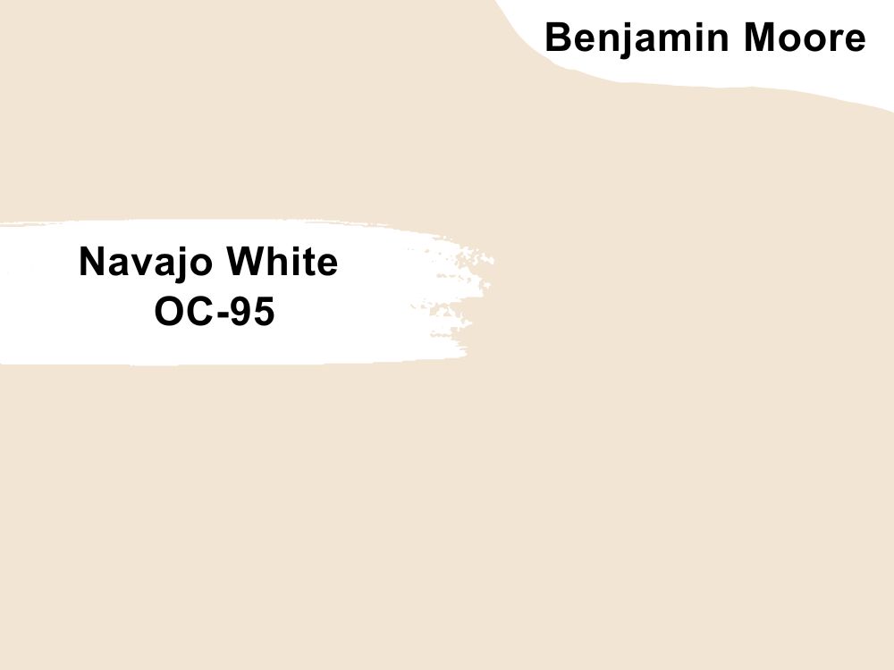
Off-white paint colors with yellow undertones
As with all white and off-white paint colors, Navajo White is an excellent paint color of choice for your living room. And as with off-white and cream paint colors, this option has a warmth that brings everything together in the living room.
You can use it in the place of white if you do not want complete starkness. Navajo White has an LRV of 78.26 and an RGB color code of 242, 229, and 212 respectively. Coordinate it with Simply White and Thicket or Chantilly Lace and Bennington Gray.
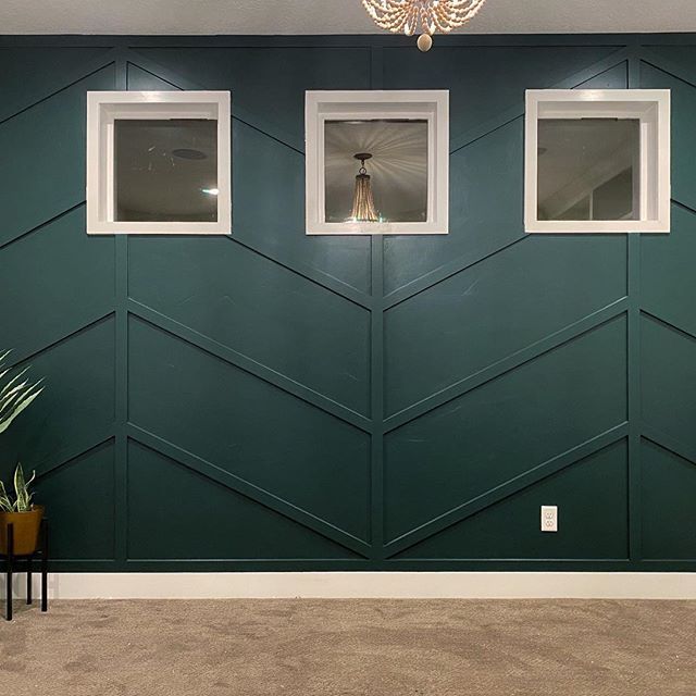
16. Hunter Green 2041-10

Rich dark green paint color
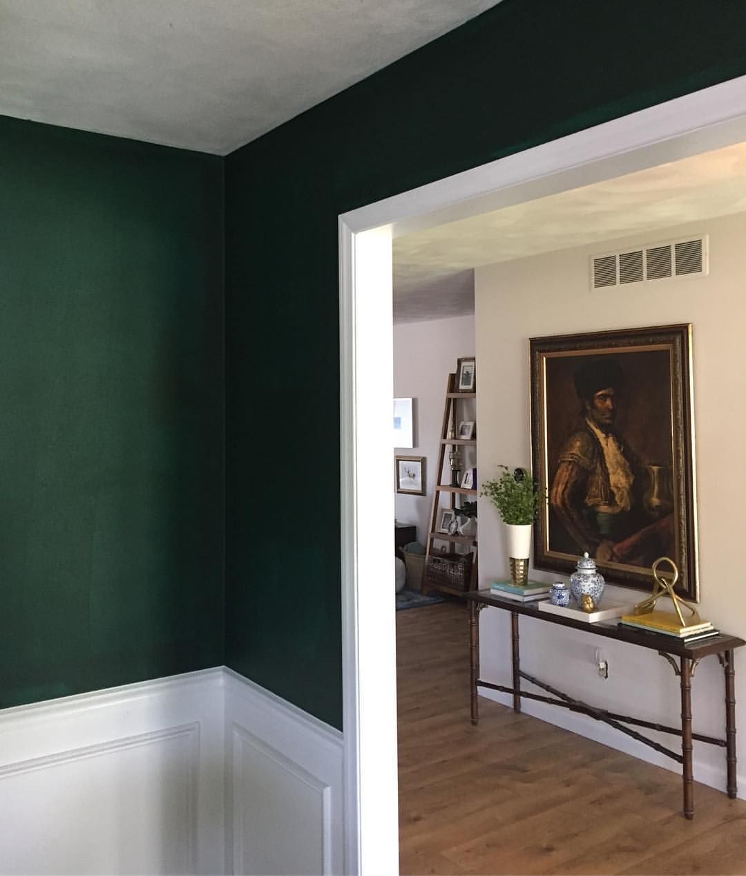
Hunter Green is an unusual color for a living room but not out of range. It is a saturated color but also beautiful. Because it is not the first choice for living rooms or any other room, you may not think about it.
However, try it on one wall and see how you like it. Remember it has a lot of depth, so use it minimally. Hunter Green has an RGB color value of 42, 69, and 61 respectively, and an LRV of 6.39. Coordinate it with Simply White and Old Prairie or Cloud White and Grant Beige.
17. Collingwood OC-28
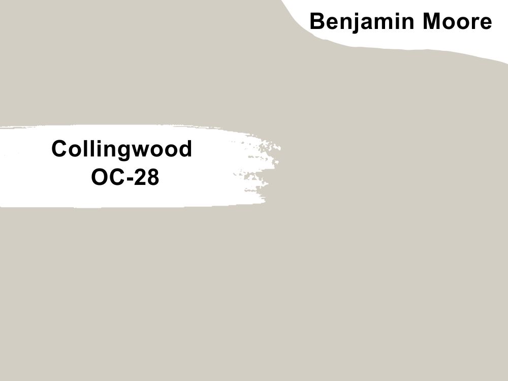
Light gray paint color with purple undertones
Collingwood is a light gray paint color that has a hint of purple. The undertone is not readily visible except in certain lighting. That means the color is cool, so keep this in mind when picking matching colors or a color scheme.
However, it is a great color for a living room, even if you opt to use it alone. Collingwood has an RGB color code of 211, 206, and 196 respectively, with an LRV of 61.52. Match it with White Heron and Amazon Soil or Steam and Silhouette.
18. Misty Rose 1360
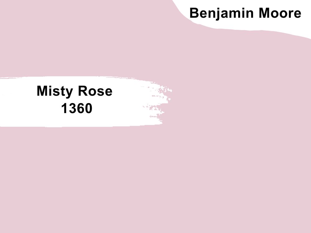
Mid-tone pink with gray undertones
Have you tried a soft pastel in your living room? It may not be a popular choice, but Misty Rose looks amazing in a living room. This is especially true if you use other light colors and wood tones.
The paint color would have been a bright pink but for the gray undertones that mute it. Pair Misty Rose with White Opulence and Cascade Mountains or Cloud White and Mysterious. It has an RGB color code of 233, 205, and 214 respectively, with an LRV of 65.42.
19. Pashmina AF-100
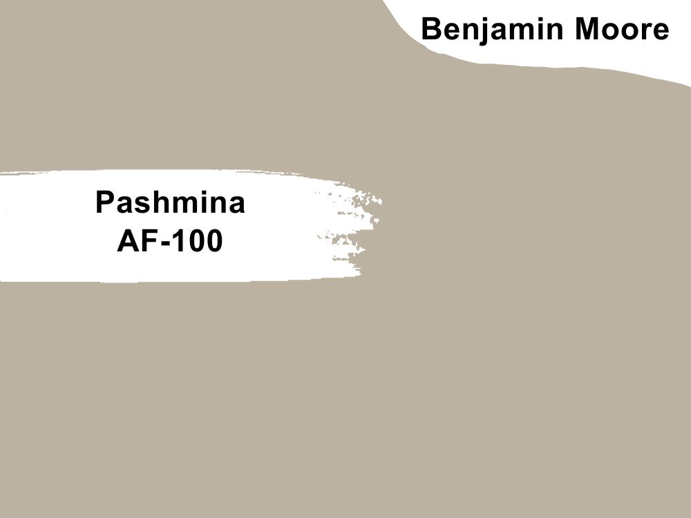
Greige paint color with neutral undertones
Pashmina is a versatile color that has neutral tones, so it can fit all colors, including beige, greige, gray, white, and black. However, Pashmina can show a slightly green hue in certain lighting; keep this in mind when choosing it for any decor.
The paint color has an LRV of 44.2 and an RGB color code of 187, 178, and 161 respectively. Match it with Deep in Thought and Cinder or White Dove and Providence Blue.
20. Shaker Beige HC-45
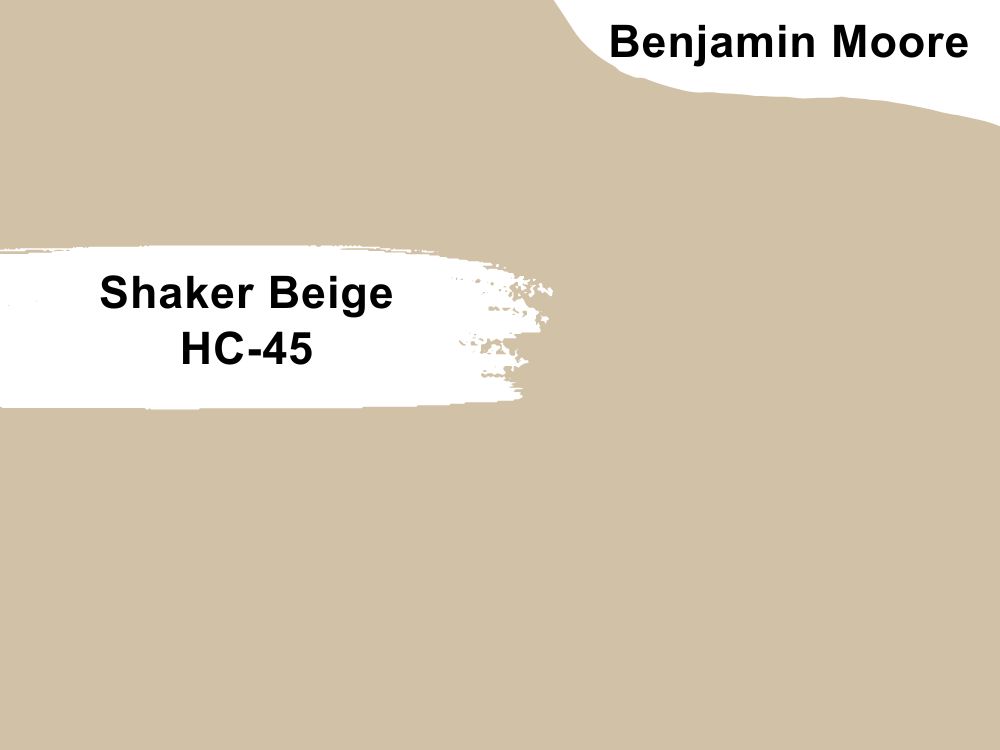
Mid-tone beige paint color with a slightly orange undertone
Shaker Beige is a beige that does not behave like other beiges. While it is a neutral paint color, it also shows a bit of orange in certain lighting. But if you want to see the best of this color, use white trims; white deepens the color and makes it pop.
Shaker Beige has an LRV of 53.53 and an RGB color code of 211, 191, and 166 respectively. Pair it with White Dove and Tate Olive or Mountain Peak White and Bone White.

21. Lenox Tan HC-44
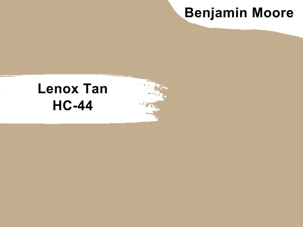
Tan paint color with yellow undertones
Lenox Tan is a smooth khaki color that provides comfort through its warmth and appeal through its modern elegance. It is rustic enough for farmhouse decor but sophisticated for any modern decor.
You can turn your living room into a warm haven with this paint color and add wood tones and light colors to mute it a little. Lenox Tan has an LRV of 43.14 and an RGB color code of 194, 174, and 142 respectively. Consider coordinating it with Marble White and Knoxville Gray or Cloud White and Rockies Brown.
22. Caliente AF-290
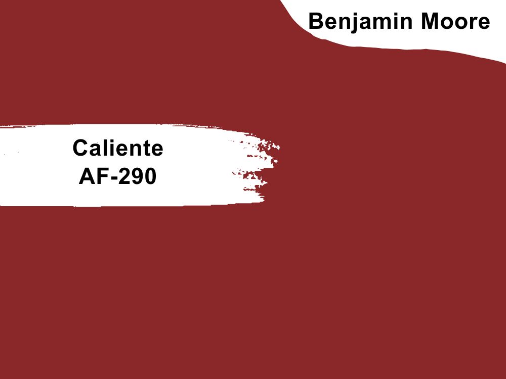
Red paint color with orange-brown undertones
Caliente is a red paint color that looks earthy because of the tinge of brown and orange. These undertones deepen the color, making it saturated and full. As a result, you may want to add other colors to mute the color to keep it from being overwhelming.
Caliente has an RGB color code 138, 39, and 40 respectively, with an LRV of 8.82, a low value that absorbs a lot of light. Coordinate it with Frostine and Wish or White Diamond and Harbor Haze.
23. Black Satin 2131-10
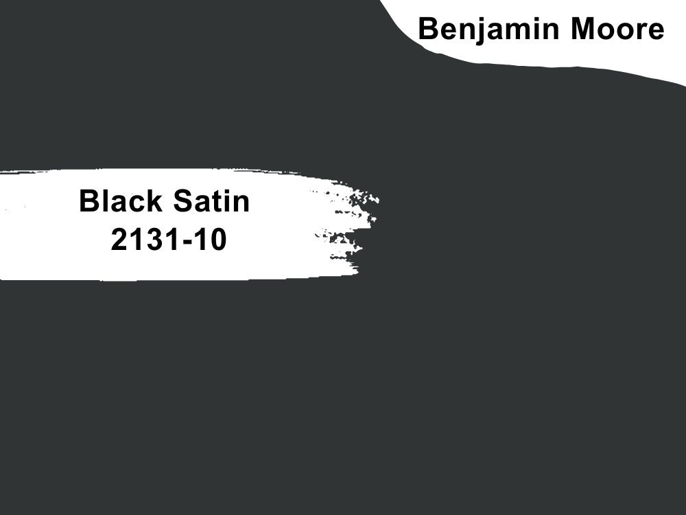
Black paint color with neutral tones
Black Satin is a classic black paint color with neutral tones. It is a beautiful black that is popular with interior decorators because of how well it blends with other colors. While it is saturated, it does not overwhelm a space, but you may want to use it on one wall or the ceiling.
That way, you do not saturate the living room with black. Black Satin has an LRV of 4.58 and an RGB color code of 49, 52, and 53 respectively. Match it with Classic Gray and Raspberry Truffle or Cloud White and Northampton Putty.
24. Hawthorne Yellow HC-4
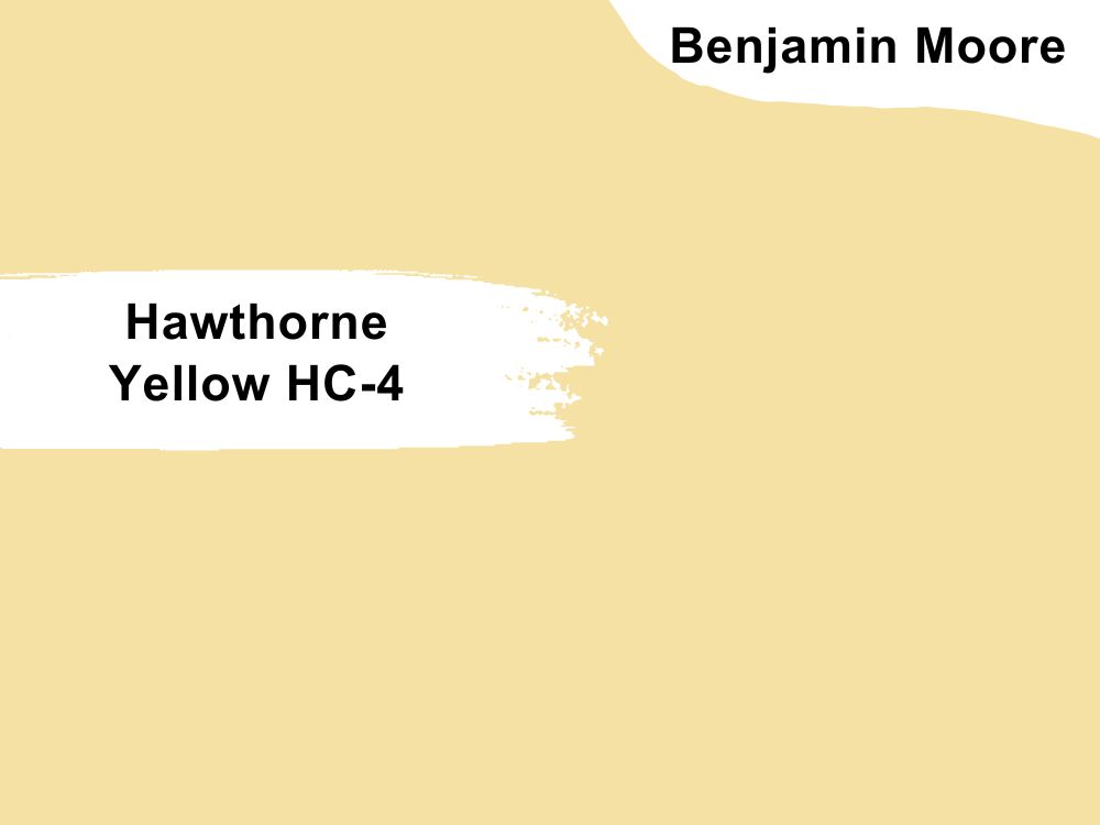
Yellow paint color with slightly gray undertones
This is a bold yellow paint color but balanced by the gray infused into it. Hawthorne Yellow is a cheery color that brightens any decor, especially when paired with white and gray. You can add darker colors to the decor or use Hawthorne Yellow on only a small part of the room.
It is an unconventional color for a living room but works like magic because of its beauty. Pair this paint color with Cotton Balls and Wickham Gray or Lemon Chiffon and Abingdon Putty. Hawthorne Yellow has a high LRV of 71.33 and an RGB color value of 246, 219, and 164 respectively.
25. Wish AF-680
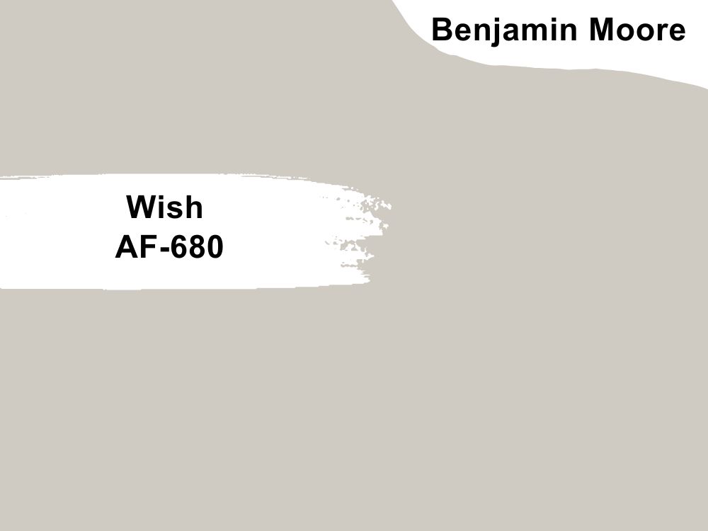
Gray paint color with slightly yellow undertones
Wish is a mellow gray paint color that has an unusual yellow undertone. At first glance, it does not look like it but presents a bland and cool face. However, with the correct light, the paint color becomes warm and slightly yellow. It is a great color for a living because of its neutrality and resulting versatility. Wish has an LRV of 58.58 and an RGB color code of 207, 202, and 194 respectively. Coordinate it with Steam and Chambourd or Super White and Iron Mountain.
26. Revere Pewter HC-172
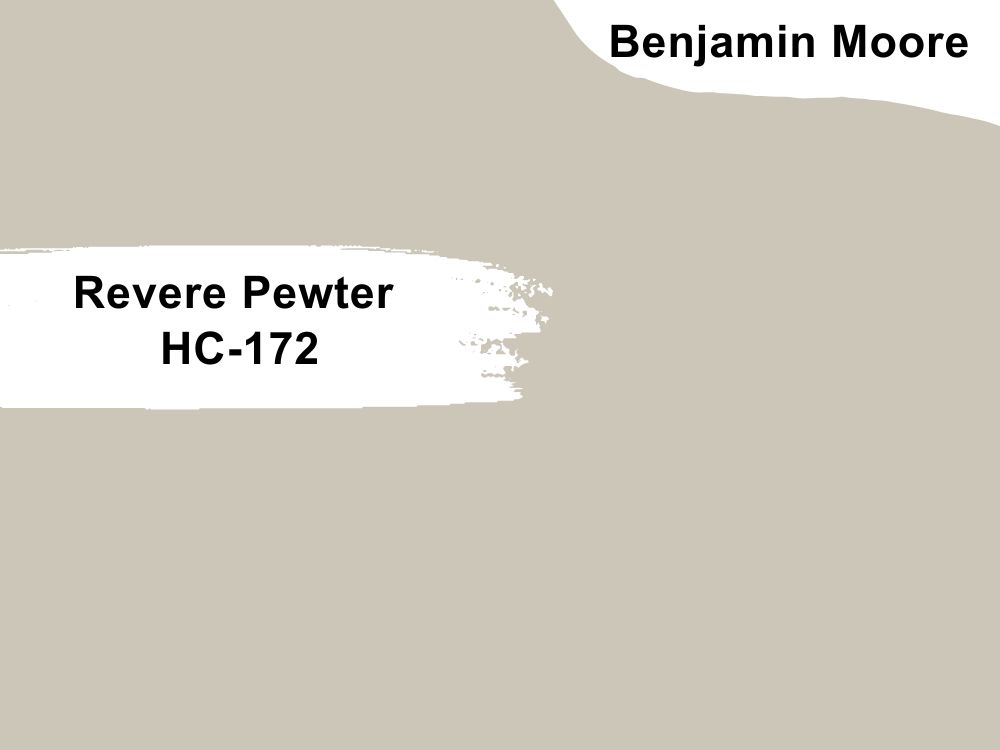
Gray paint color with green undertones
While it looks like a true gray paint color, Revere Pewter has hints of green when exposed to certain lighting. It is a popular paint color used for various purposes because of its neutrality.
You can use it for warm and cool color schemes, which is a relief since it broadens your paint color choices. Revere Pewter has an LRV of 55.05 and an RGB color code of 203, 198, and 184 respectively. Match it with Chelsea Gray and White Dove or Sparrow and Fog Mist.
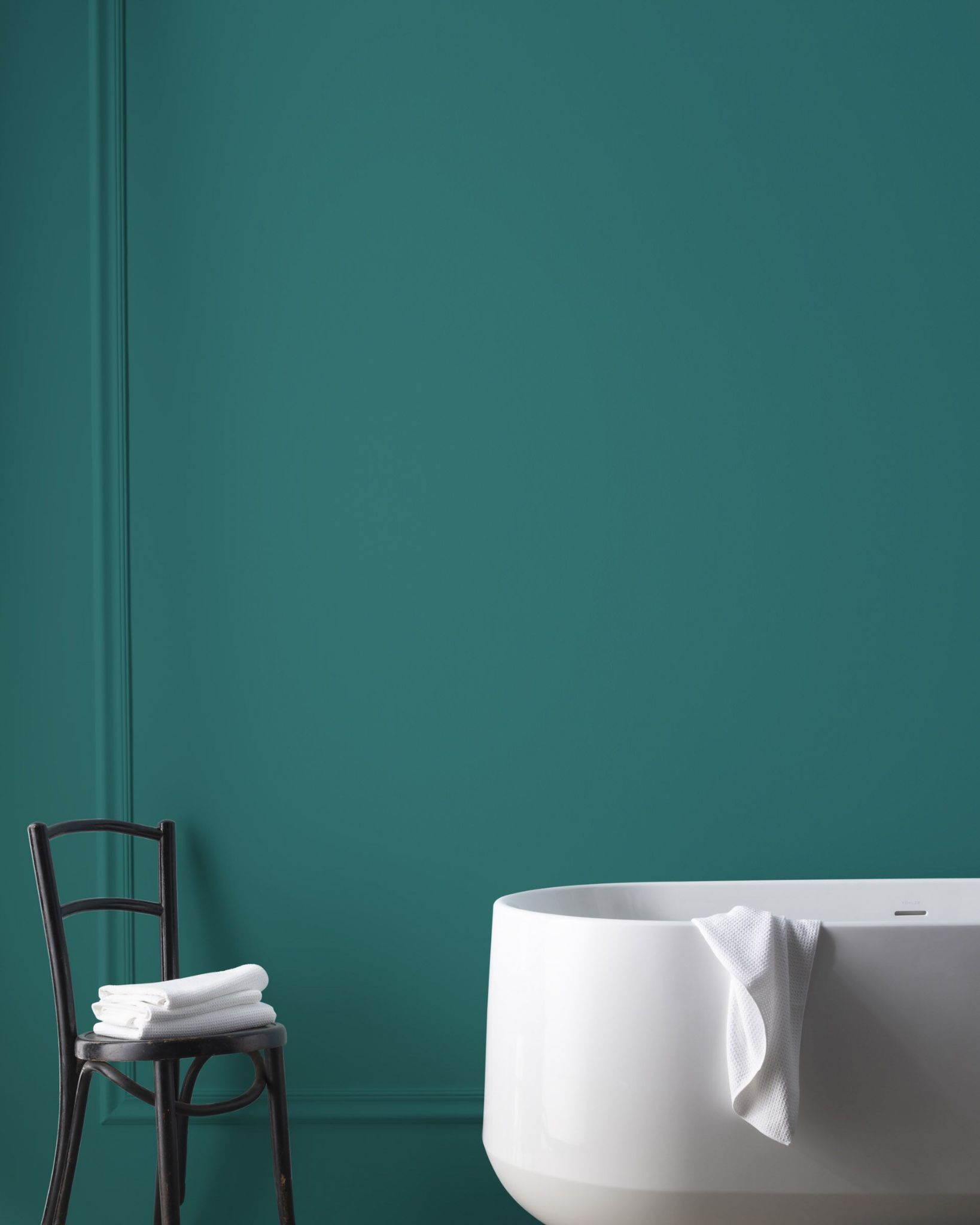
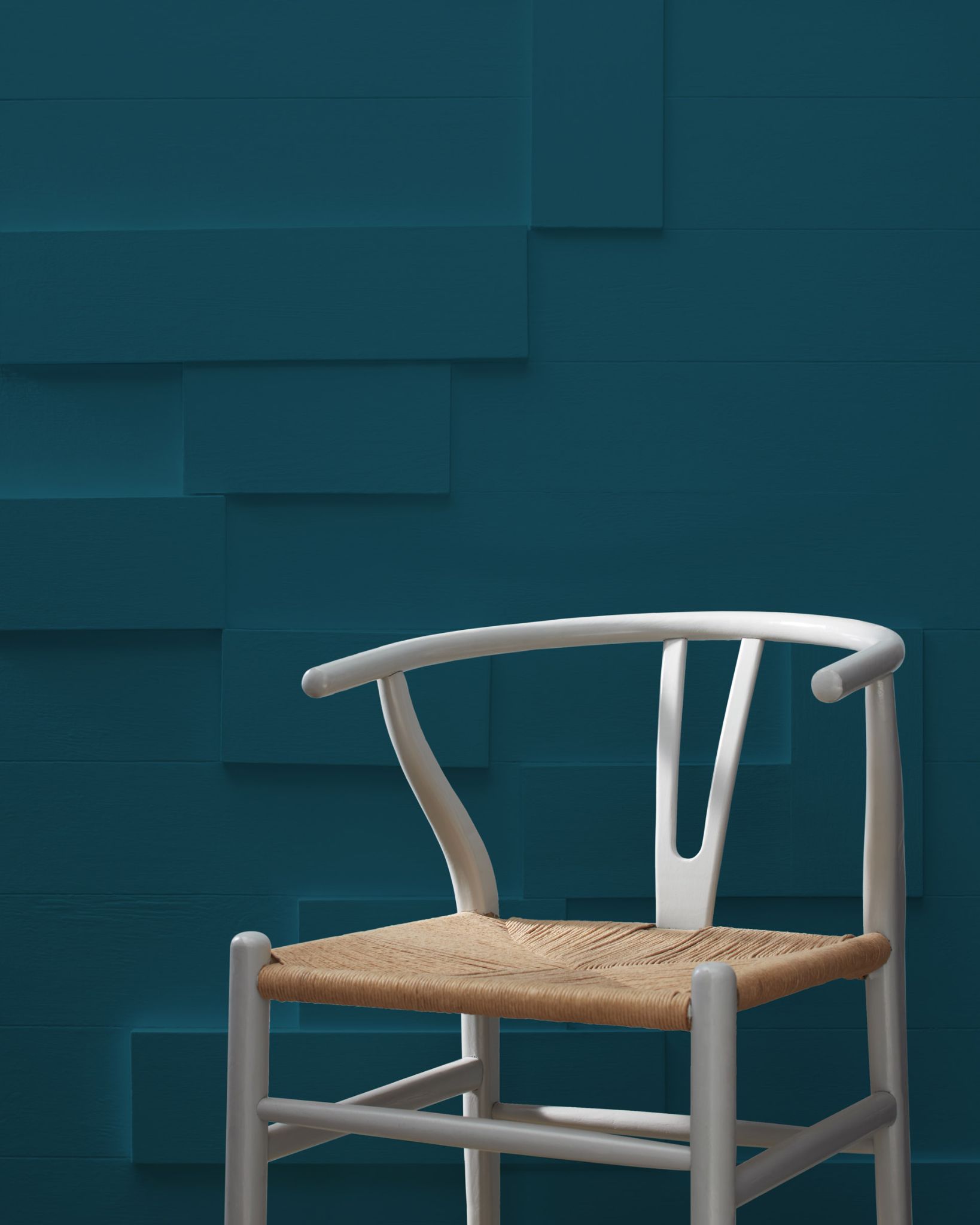
27. Teal 2055-10

Teal paint color with hints of green and blue
Our list will not be complete without talking about the teal paint color. Teal from Benjamin Moore is a deep and saturated paint color, made so by the obvious blue and green in it. If you want to have a unique living room, Teal is one of the best options to consider.
You do not have to use it alone; add light colors if it feels too dark or saturated. Teal has an LRV of 6.49 and an RGB color code of 20, 69, and 82 respectively. Coordinate it with Snowfall White and Rainforest Dew or White Dove and Wickham Gray.
Conclusion
Whether you want a classic white living room, warm and off-white decor, a living room with vibrant colors, or a combination of all these shades, we have got you covered. Since the living room is one of the most spacious and important rooms in your house, picking the right paint color is crucial.
We have researched and reviewed many paint colors from Sherwin Williams and Benjamin Moore to give you an idea of what colors work well for a living room. We have also created it as a guide for building a suitable color palette for your decor, whether you want neutrals, which are popular, or dark and saturated colors.
Do you have unique living room decor or a striking color palette? We would love to share it with you, so reach us and leave a word in the comments section.