
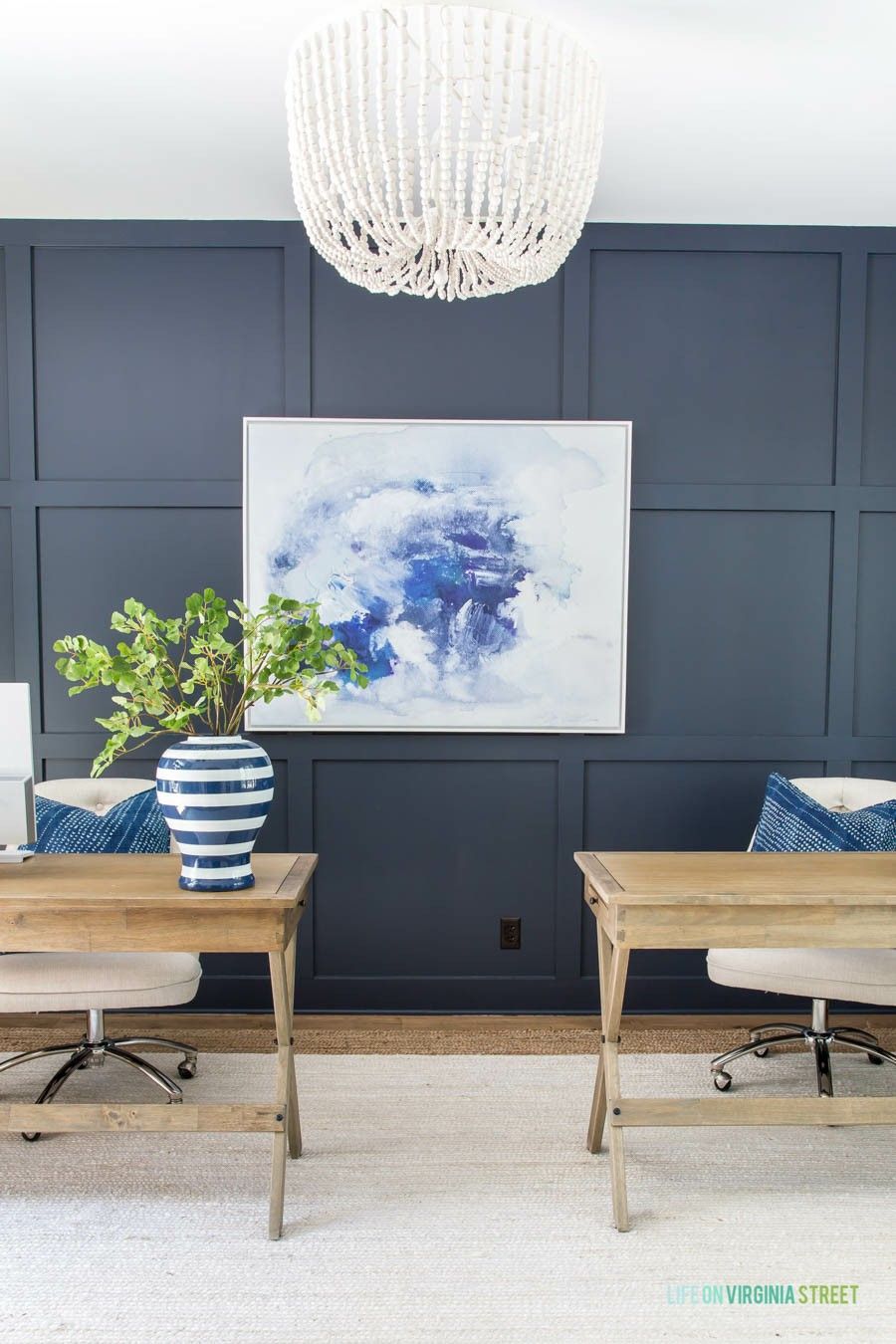
I’m here again with another interesting topic, I’m sure you must have been waiting for.
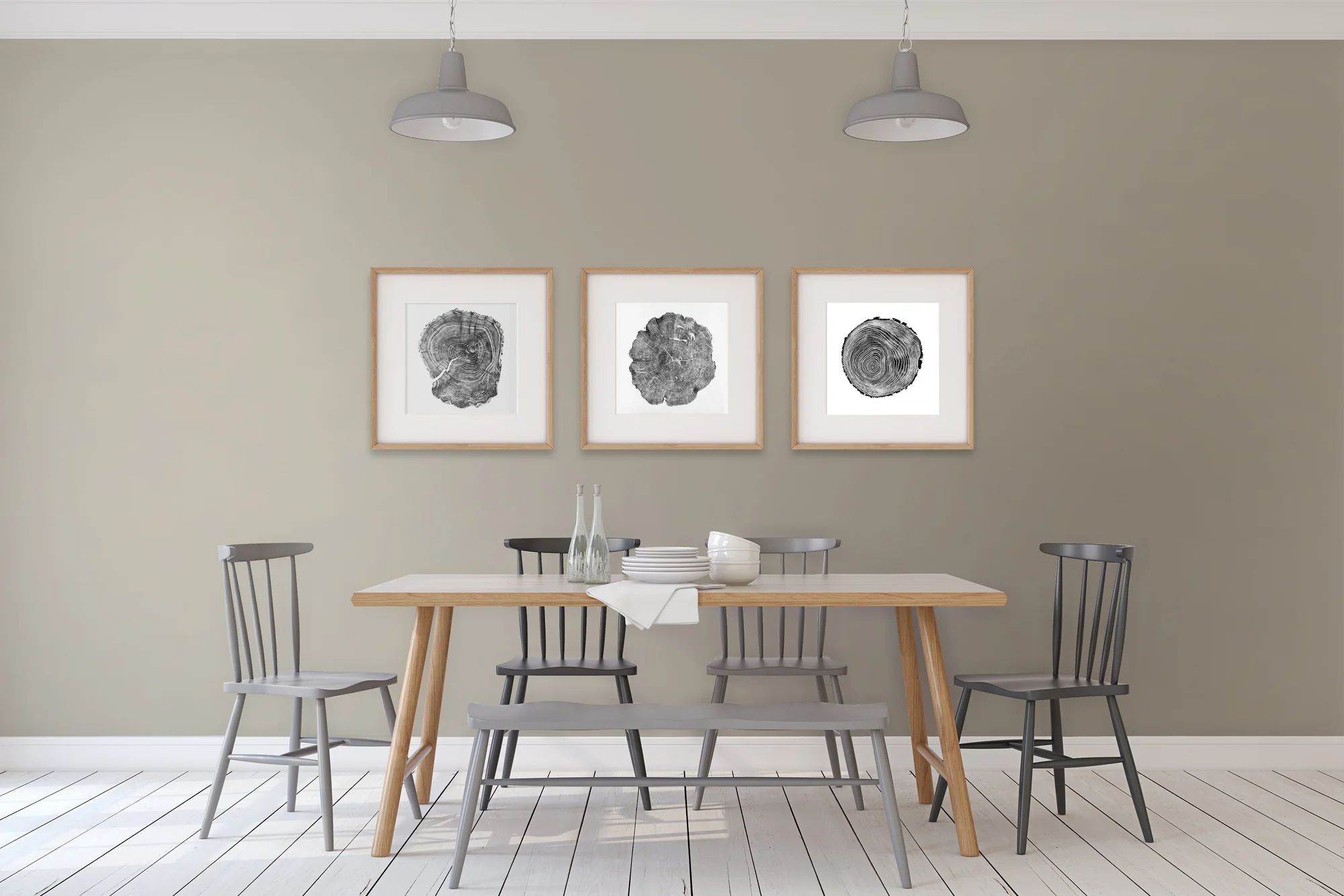
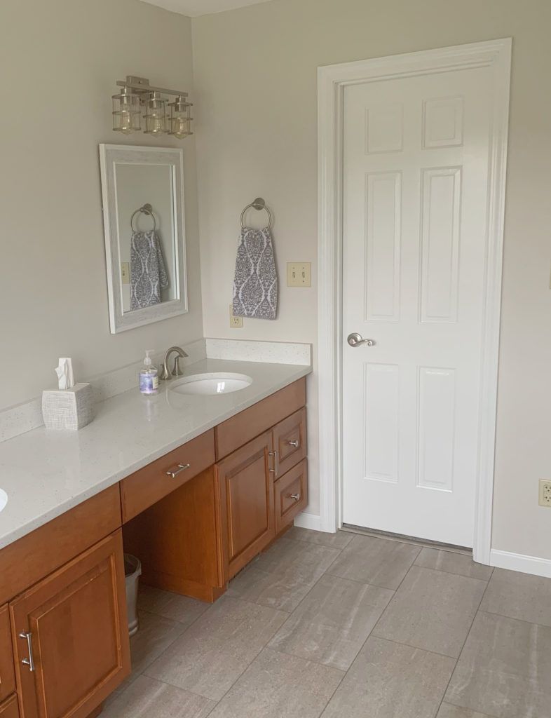
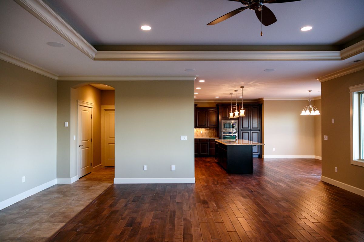
If you could remember vividly when we were little, even during the 90s, the majority of the homes you’ve visited during Christmas or birthday parties including your own house have oak cabinets.
Nothing can ever go wrong with Oak cabinets. With its strong, rich golden tone, it dominates and outshines your entire space. So careful attention should be given when pairing. It has been in existence up till date and the amazing thing is, it has never lost its stunning aura.
Oak color can come in different types. It could come in a light, pale or dark shade, but that notwithstanding, it never fails to give a beautiful end result.
Having Oak cabinets does not mean you’re old school. You can easily use a new splash of paint for a makeover if necessary. It’s never outdated and is still in vogue, which is why it is one of the most preferred colors for cabinets by decorators and homeowners in recent times.
If you have Oak cabinets in your home, and you want a coordination backdrop on your walls that is exquisite, either maintaining a traditional look or transforming it to a modern one; then this post is for you.
Table of Contents
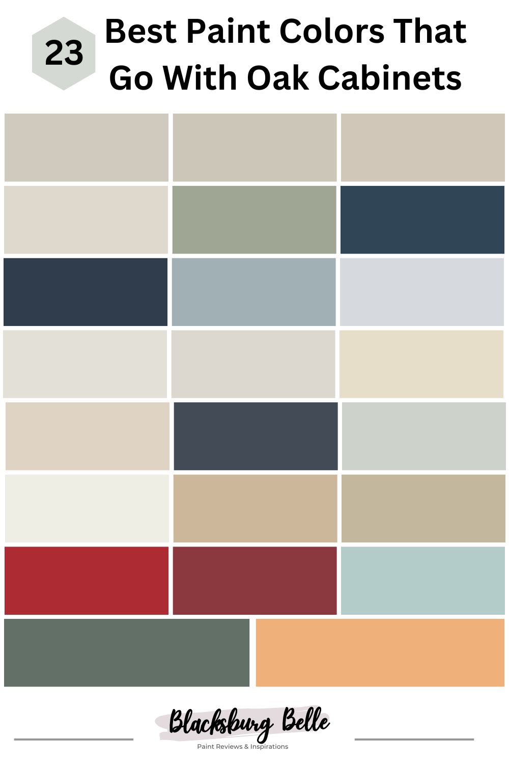
23 Best Paint Colors That Go With Oak Cabinets
We’ve done the heavy-duty job for you by carefully selecting the 23 best paint colors that go with oak cabinets you wouldn’t regret giving a chance on your walls.
1. Useful Gray SW 7050 by Sherwin Williams
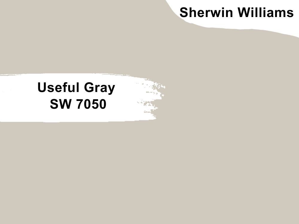
| RGB | 207, 202, 189 |
| LRV | 59 |
| Matching colors | Greek villa, Nuance, Acacia haze |
| Undertone | Green, Yellow, Beige |
Useful Gray as its name implies is really useful when it comes to neutrality and versatility. This warm stone gray with an LRV of 59 brings the perfect amount of light, warmth, and fresh feeling to your space.
Its yellow and green undertone is hardly noticeable, which is why it pairs beautifully well with natural colors like green, blue, and brown.
This timeless hue together with oak cabinets will promote calmness and relaxation, and most definitely turn your ordinary space into an extraordinary one.
2. Revere Pewter HC-172 by Benjamin Moore
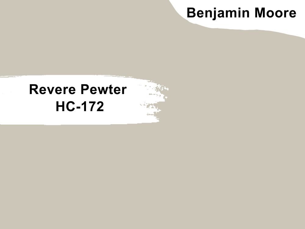
| RGB | 203, 198, 184 |
| LRV | 55.05 |
| Matching colors | Chelsea gray, Fog mist, White dove, Sparrow |
| Undertone | Green |
This gorgeous warm gray hue perfectly matches the fresh undertones of warm wood which oak has. One great thing about this color is it looks great in any type of space, including spaces with oak cabinets, such as the kitchen.
Having an LRV of 55, it’s quite bright enough to reflect said light that compliments your oak cabinets. Although its undertone is green, it looks more gray and can sometimes be confusing.
Benjamin Moore Revere Pewter is quite flexible and would accommodate anything, once used in moderation.
3. Accessible Beige SW 7036 by Sherwin Williams
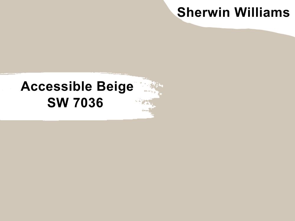
| RGB | 209, 199, 184 |
| LRV | 58 |
| Matching colors | Cadet, Sanderling, Aesthetic White |
| Undertone | Beige, Gray |
Considering this paint color on your walls with oak cabinets would be something you won’t regret. Sherwin Williams Accessible Beige is a neutral, versatile color with a gray-like undertone that perfectly matches the warm tones of your oak cabinets.
This color can complement a variety of colors and make your space cozy and warm. It has an LRV of 58 which puts it between dark and bright. It’s a soft color that tends to have the right amount of saturation and complement different colors.
Because Accessible Beige is an earthly color, it prefers to stay within its family. Pair it with cooler and warm color shades if you must get the best out of it. Now you see why it’s great on oak cabinets.
4. Pale Oak OC-20 by Benjamin Moore
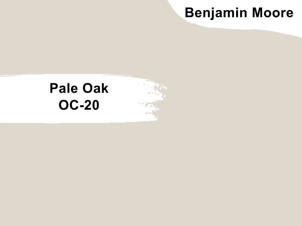
| RGB | 216, 207, 196 |
| LRV | 68.64 |
| Matching colors | Chantilly Lace, Timber wolf, Wrought iron, Dinner party |
| Undertone | Greige, Purple, Gray, Beige |
Pale Oak is a light, warm greige paint that’s the perfect neutral paint color for open interior or exterior walls. This color is both elegant and graceful, adding understated style to any room as a backdrop for furnishings and decors with oak cabinets.
With its bright LRV of 68 and its cool greige, beige, and a splash of violet-pink undertones, this color eludes freshness and radiance. You should use a darker supporting color with it if you must, but it’s a great choice to consider.
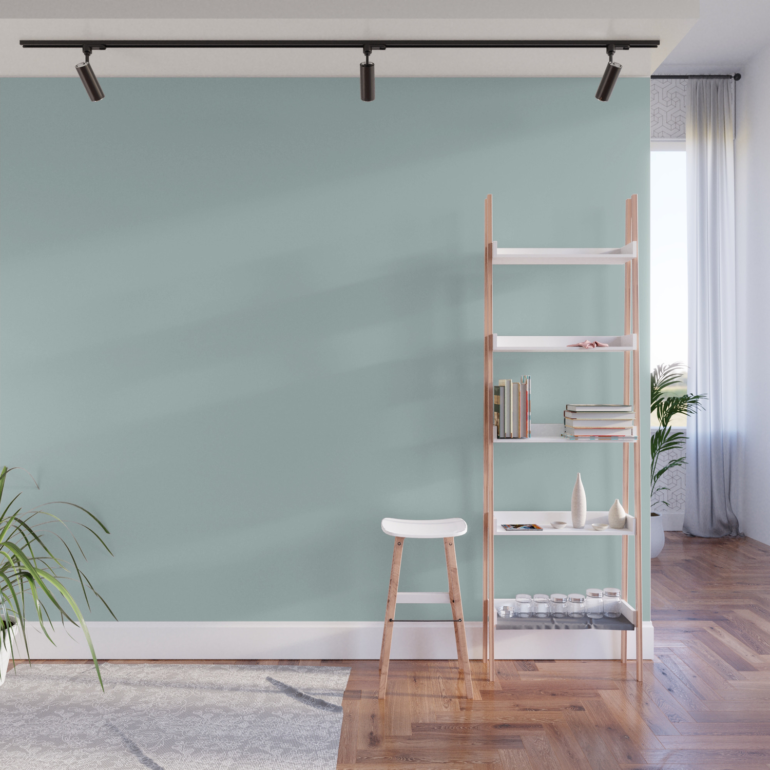
5. Coastal Plain SW 6192 by Sherwin Williams
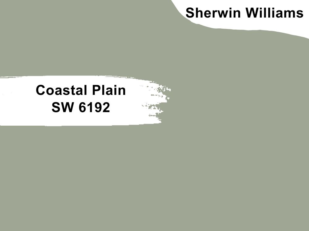
| RGB | 159 166 148 |
| LRV | 37 |
| Matching colors | Opaline, Moderne White, Copen |
| Undertone | Blue, Green |
The elegance and calmness of this color are what a space with Oak cabinets needs. Like many green paints, Coastal Plain looks like thick, dense forest vegetation. With an LRV of 37, one would know it won’t reflect much light.
This pretty green will rejuvenate your kitchen walls and complement your Oak cabinets, although it is quite demanding especially when it comes to lightning. It could be more moody but with proper matching colors on trims or floors, its effect will be minimized.
6. Gentleman’s Gray 2062-20 by Benjamin Moore

| RGB | 48 70 86 |
| LRV | 7.26 |
| Matching colors | Chalk White, Stormy Monday, Gardenia, Charmeuse |
| Undertone | Subtle green, Blue |
Gentleman’s gray is a rich and radiating navy blue paint that’s filled with luxury. This brilliant bold hue paired with oak cabinets proves its existing dazzling appearance.
It’s on the dark side of the scale, with an LRV of 7. This color feels absolutely royal, splendor, and refined when used in the interiors.
I recommend using this color whether warm or cold, since it’s timeless and doesn’t target a specific undertone. Using this color with oak cabinets will create a sense of balance, richness, and restraint.

7. Naval SW 6244 by Sherwin Williams

| RGB | 47 61 76 |
| LRV | 4 |
| Matching colors | Icicle, Ramie, Roycroft Suede |
| Undertone | Cool gray-green |
Sherwin Williams Naval is a classy, refined color with deeply penetrated gray and very tricky undertones. It’s a deep shade of blue with an LRV of 4 that pairs well with almost anything.
Although, it’ll need a lot of lighting, so it doesn’t look too pale and moody. You can also pair it with white, beige, or any bright color of your choice, but be sure not to make the colors conflict. You shouldn’t be surprised at how elegant the Naval paint will perfectly suit your Oak cabinets.
8. Nimbus Gray 2131-50 by Benjamin Moore
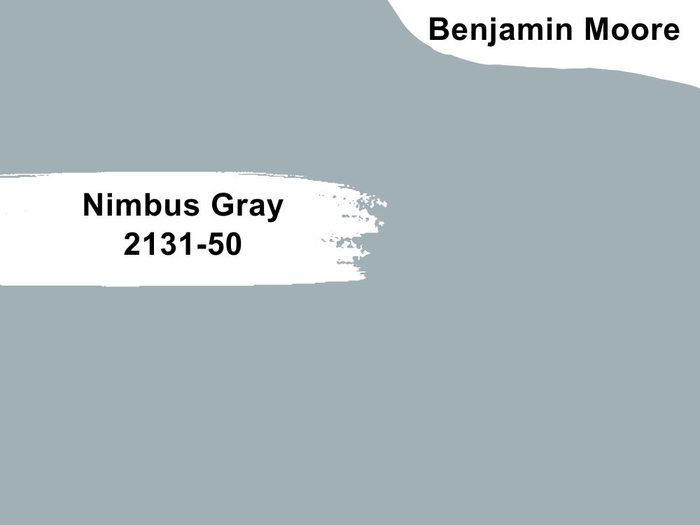
| RGB | 161, 176, 180 |
| LRV | 41.78 |
| Matching colors | Revere pewter, Stone brown, Pure white, Gray owl |
| Undertone | Blue, Purple |
This slightly warm and cool gray paint color has just enough weight to create an appeal on oak cabinets. Nimbus Gray has a soft blue and purple undertone that makes it easier to work with.
Its LRV is 41 making it slightly on the dark end. It could sometimes look more gray, more blue or purple depending on how exposed it is to light. Nimbus Gray with its intriguing notes perfectly feels the space left by oak cabinets. A trial wouldn’t create any havoc at all.
9. Starry Night SW 6540 by Sherwin Williams
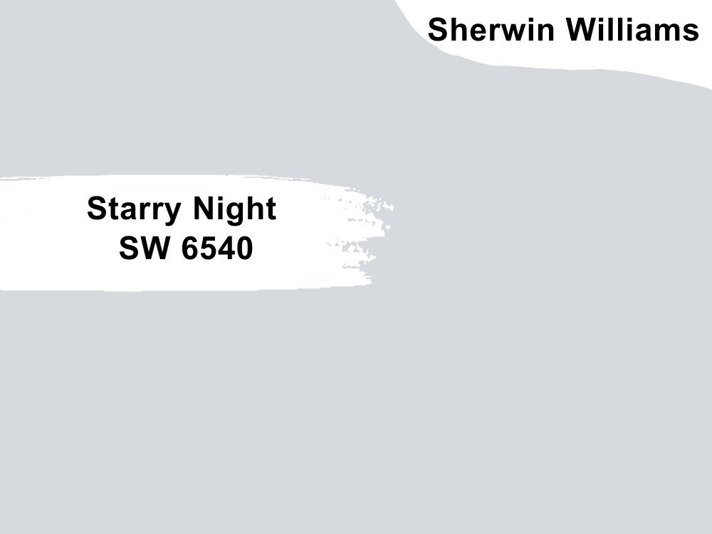
| RGB | 214, 217, 222 |
| LRV | 69 |
| Matching colors | Spatial white, Pure white, Bluesy note |
| Undertone | Blue, Purple |
With an LRV of 69, you can tell this is a bright color. This light and airy violet evoke a vibe of good-natured calmness, ambiance, and emotions. Starry Night is a beautiful color with a realistic color combination that is appealing to the eye.
To emphasize its invigorating essence, pair this rich, neutral, and vibrant color for an accent wall with bright oak-painted cabinets, and it will make the perfect statement you crave.
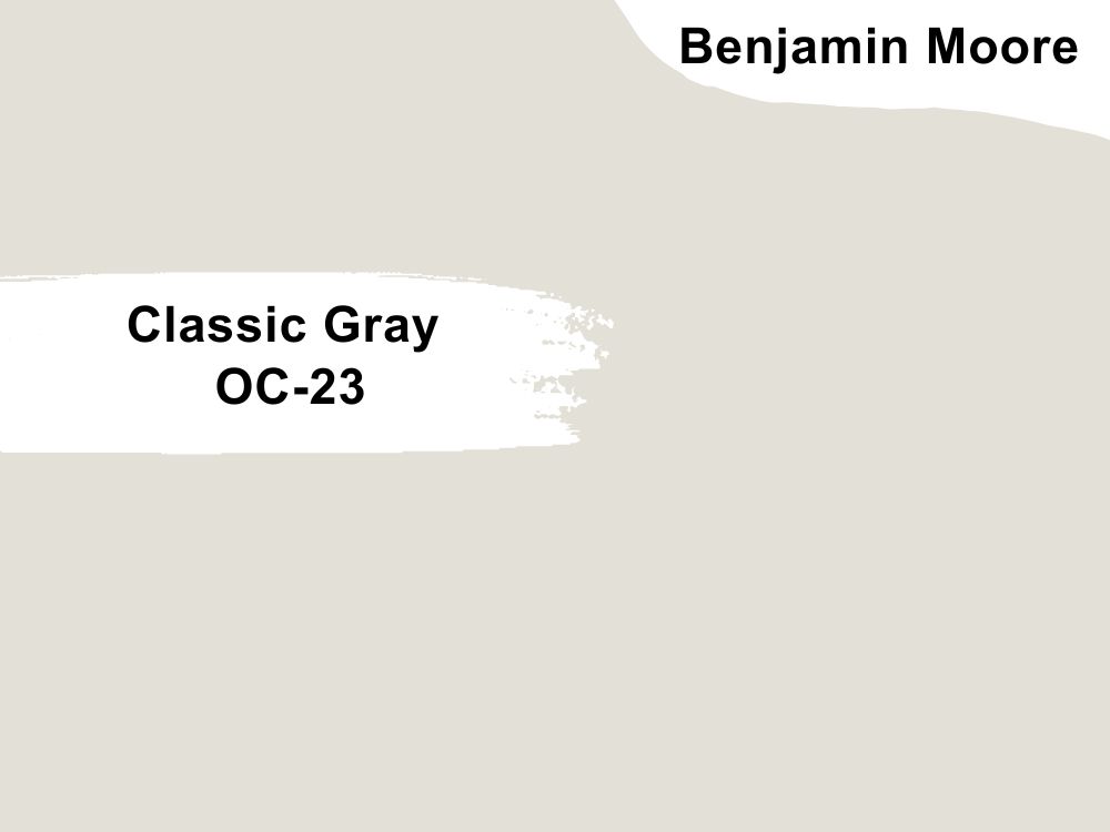
10. Classic Gray OC-23 by Benjamin Moore
| RGB | 216, 211, 201 |
| LRV | 73.67 |
| Matching colors | Stone habor, Simply white, Sone brown, Indian river |
| Undertone | Gray, Beige, Green |
This color is considered a multipurpose color due to its gray, beige, and subtle green undertones. Benjamin Moore’s Classic Gray is a soft and warm, almost off-white light gray. This color is one of his best-selling neutral paint colors.
This versatile light gray with a barely noticeable undertone comes with a light reflective value of 73 and is subtle enough to allow Oak cabinets to reveal their true beauty and elude ultra-modern effect.
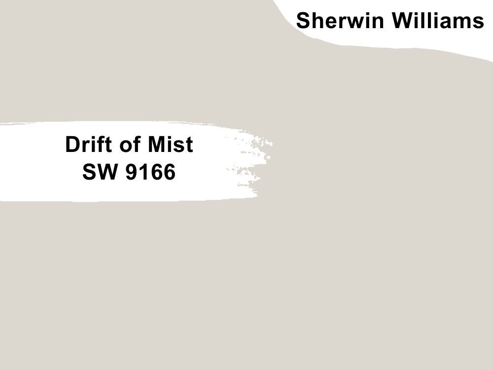
11. Drift of Mist SW 9166 by Sherwin Williams
| RGB | 220 216 208 |
| LRV | 69 |
| Matching colors | Eider White, Polished Concrete, Perle Noir |
| Undertone | Green, Gray |
Sherwin Williams Drift of Mist is an airy, soft white with a touch of Beige. It is such a warm tone off-white neutral that is really timeless and can appealingly refresh the warm undertones of your Oak cabinets.
Since this paint color is mostly used in homes, it has never failed to do magic in complementing other warm and cool tone hues.
With an LRV of 69, Drift of Mist is meant to feel cozier, warmer, airier, lighter, and absolutely delightful when used. I’m sure your oak cabinets wouldn’t mind it at all.

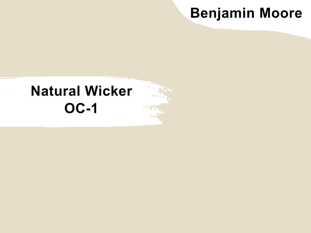
12. Natural Wicker OC-1 by Benjamin Moore
| RGB | 233 220 200 |
| LRV | 72.13 |
| Matching colors | Navajo White, Herbal Escape, Jackson Tan, Earthly Russet |
| Undertone | Warm Beige, Gray, Green |
Natural Wicker is a light, gray, soft beige with a sandy undertone. It is a perfect paint color for a traditional style in any space. This paint is perfect for interior walls and will bring a warm hint of color to your space. It’s a very light paint color with a light reflective value of 72.
13. Natural Linen 9109 by Sherwin Williams
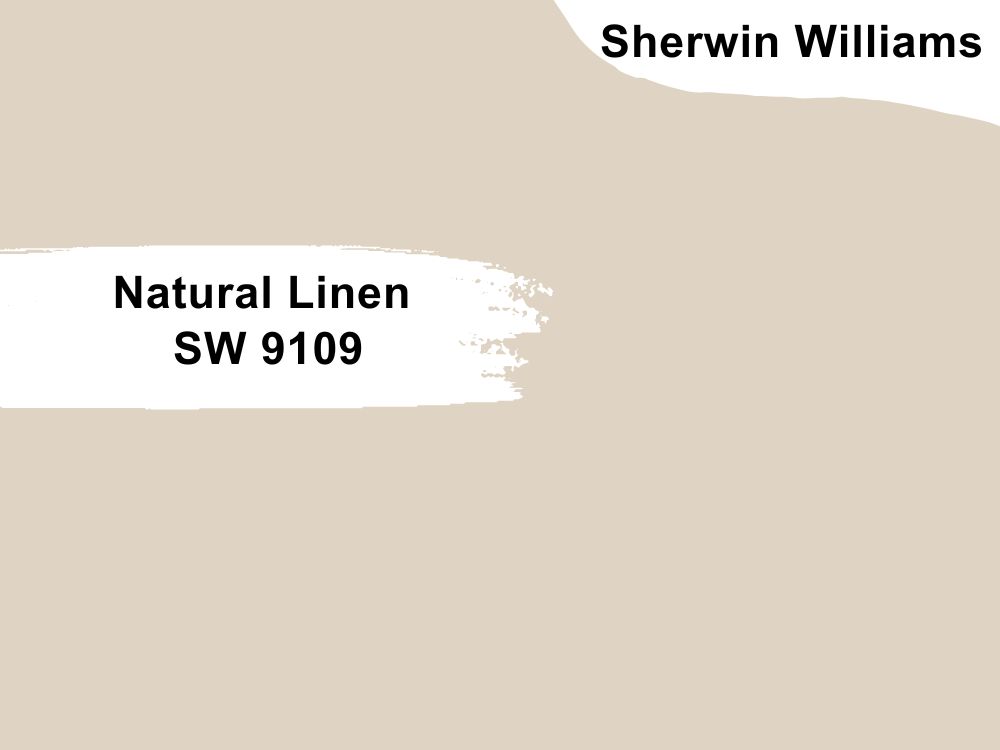
| RGB | 223 211 195 |
| LRV | 66 |
| Matching colors | Divine White, Antler Velvet, Gris Morado |
| Undertone | Soft, Gray, Caramel beige with a bronze |
Let me first say Natural Linen 9109 by Sherwin Williams is a perfect light yellow paint color that can go well with oak cabinets.
This is a light, warm neutral that brings a subtle breezy vibe to any room. With a greige undertone, this beige pairs well with light wood tones, including oak cabinets.
14. Hale Navy HC-154 by Benjamin Moore
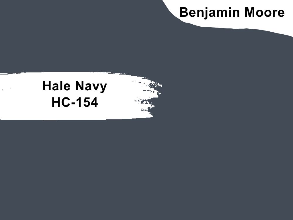
| RGB | 67 75 86 |
| LRV | 8.36 |
| Matching colors | Coventry Gray, |
| Undertone | True Blue |
Hale Navy HC-154 by Benjamin Moore is a very popular color, just like the Navy in its name. This color is not in any way saying “hail navy” though, but it’s a versatile and timeless shade of navy with a classic maritime feel. It is a deep and rich navy blue paint color that can create a really captivating outlook when paired with the warm tones of oak cabinets.
Since Hale Navy has a deep blue hue, it can add a too-dark or overpowering feeling to a space. To balance the deep hue of Hale Navy, it’s advisable to add lighter tones and neutrals into the space to help balance out things.
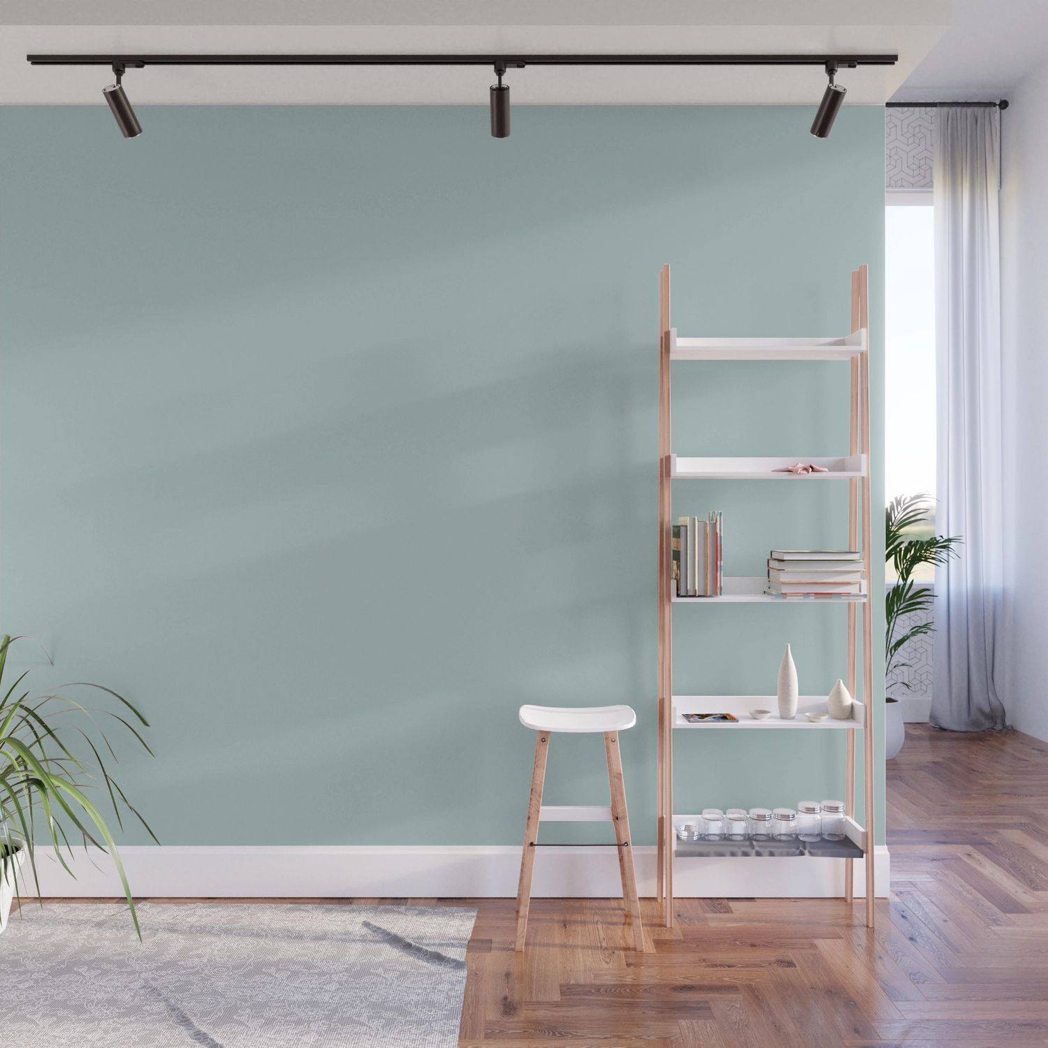
15. Sea Salt SW 6204 by Sherwin Williams
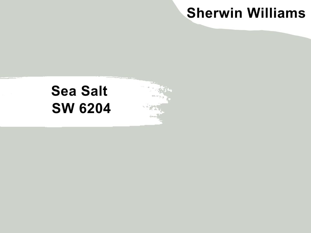
| RGB | 205 210 202 |
| LRV | 63 |
| Matching colors | Space White, Summit Gray, Fleur De Sel |
| Undertone | Muted Green with blue |
Sea Salt SW 6204 by Sherwin Williams is a light green paint color with an LRV of 63 which means it could brighten up a space easily. It falls into the category of soft and soothing hues, known as a “greige” (a blend of gray and beige) with a hint of green undertone.
Sea Salt is a versatile, iconic blue-green paint color that is soft and muted. It is a flexible color that can look good with both muted and fresh color palettes. I can’t say that it’s a color that goes almost everywhere.
Sea salt adds a sense of relaxation and satisfaction to any space, paired with the earthy tones of oak cabinets in a space, you’ll get a sense of depth and warmth.

16. White Dove OC-17 by Benjamin Moore
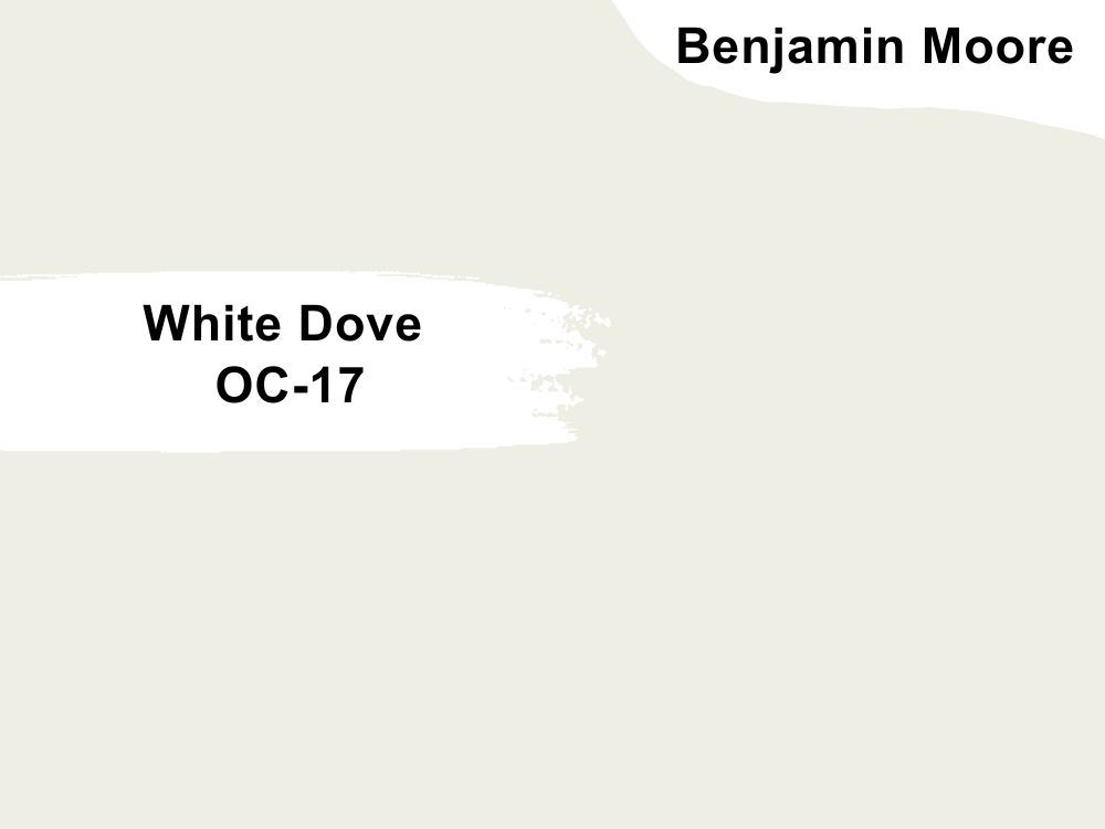
| RGB | 240, 237, 228 |
| LRV | 83.16 |
| Matching colors | Wasabi, Bright lime, Granny smith |
| Undertone | Gray, yellow |
White Dove OC-17 is a soft, warm, and cool white that has a subtle gray and yellow undertone. This great paint color is perfect for creating a cozy atmosphere and will look great in transitioning any form of space.
The classic richness in Benjamin Moore’s White Dove works well in a not-too-bright space due to its high brightness with an LRV of 83. It goes best with nature-inspired shades and will definitely sit well with oak cabinets.

17. Macadamia SW 6142 by Sherwin Williams
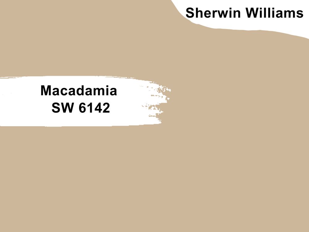
| RGB | 204, 183, 155 |
| LRV | 49 |
| Matching colors | Moderate white, Roycroft adobe, Classic light buff |
| Undertone | Beige, Brown |
This color has the best undertone that pairs well with oak cabinets. Sherwin Williams Macadamia is a perfect, smooth warm beige paint color with an LRV of 49, with orange and brownish undertones.
This color with its rich natural effect makes any dark space feel comfortable and mild. Having this paint color with an oak cabinet gives off a suitable positive vibe. Using this color in a spacious kitchen with enough lighting will give you the most appropriate desired result.
18. Glacial Teal AF 390 by Benjamin Moore
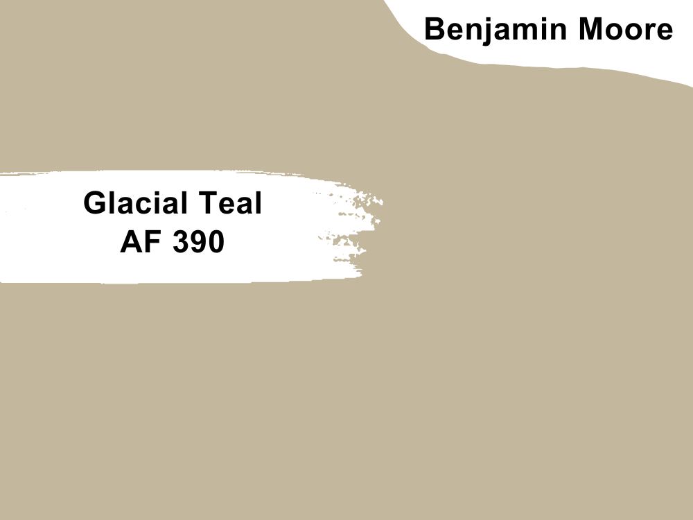
| RGB | 196 180 157 |
| LRV | 47.2 |
| Matching colors | Steam, Satchel, White Dove, KnoxVille Gray |
| Undertone | Yellow, Green |
Glacial Teal (AF 390) by Benjamin Moore is a medium-toned teal with a hint of green, reminiscent of tranquil waters or the coolness of a glacier. More reason why it has Glacial in its name.
When considering pairing Glacial Teal with oak cabinets, the two can create a complementary combination, so, you shouldn’t be bothered about the end result.
Just to be clear, Glacial teal has a very cool but beautiful outlook, and there’s no better way of blending with this color than with the warm tones of oak cabinets.
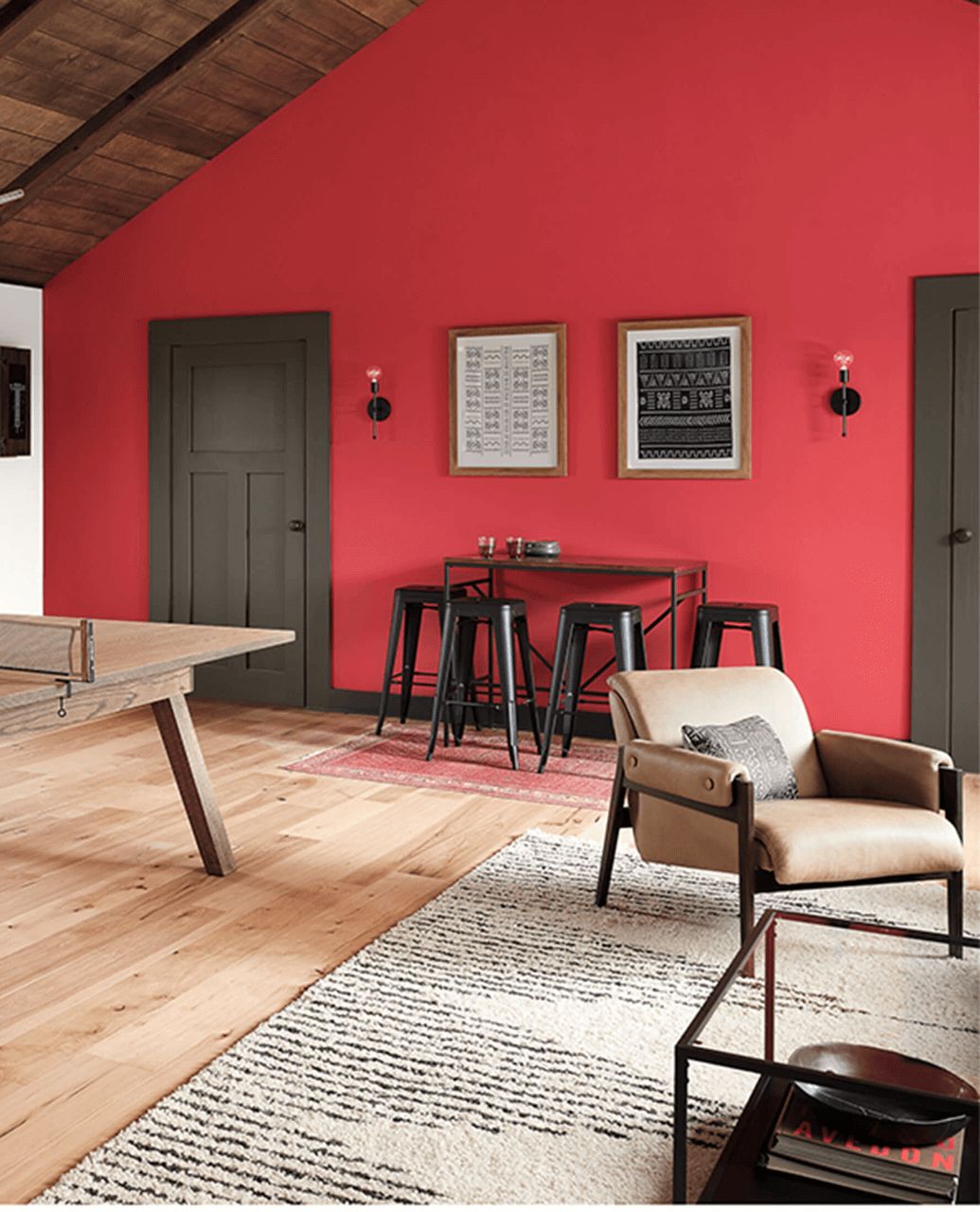
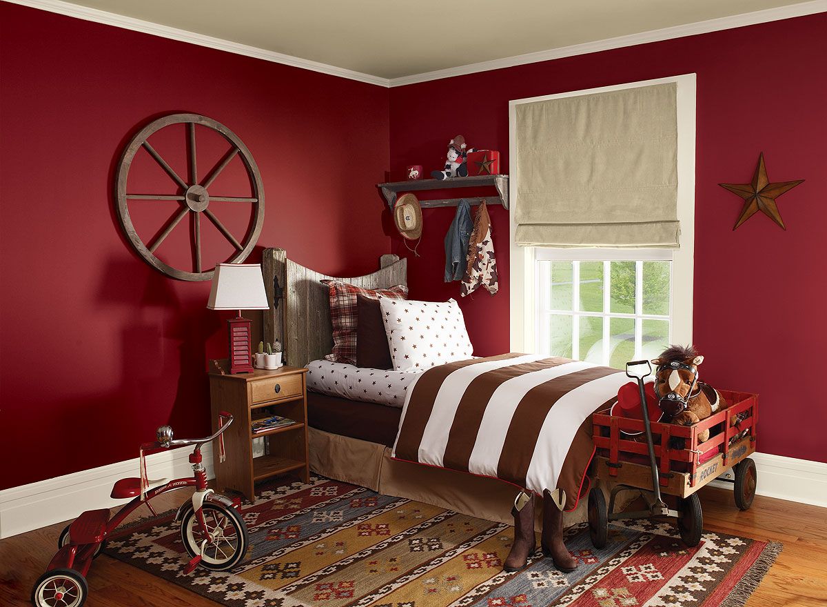
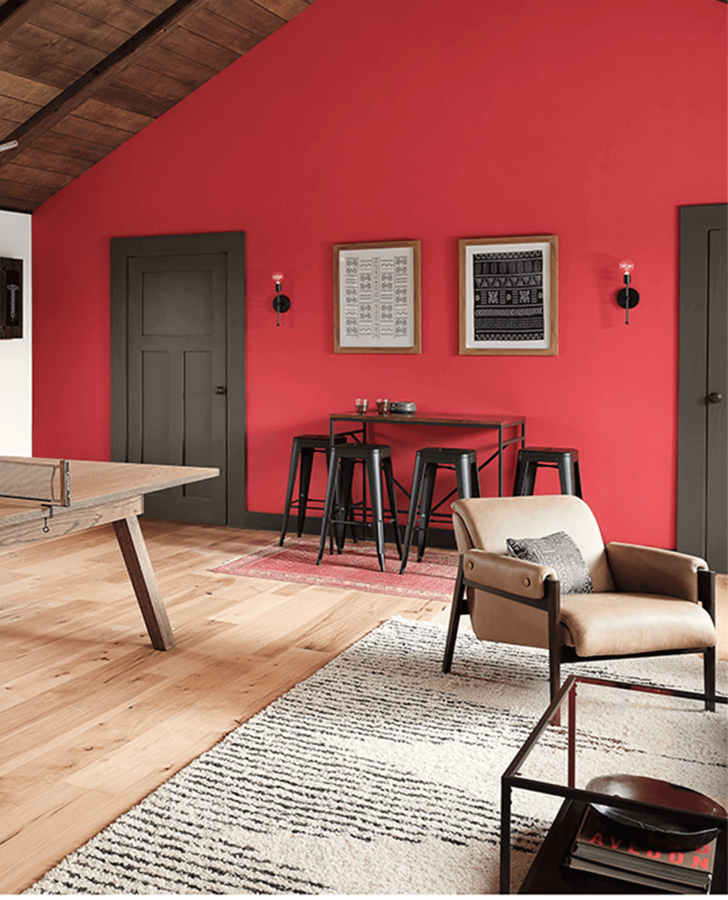
19. Positive Red SW 6871 by Sherwin Williams
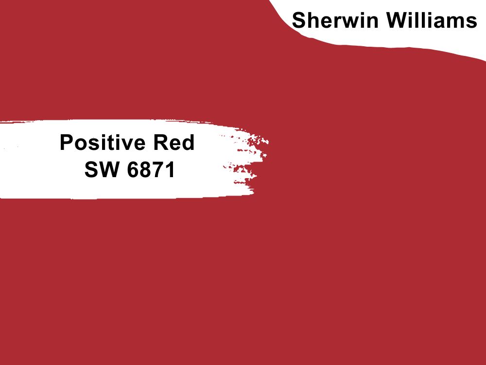
| RGB | 170, 37, 48 |
| LRV | 10.9 |
| Matching colors | Gauntlet Gray, Toque White, Ibis White |
| Undertone | Red, Yellow |
Positive Red, just like Pomegranate AF 295 by Benjamin Moore, is a beautiful, bold, vibrant and energetic red paint color with an attention-grabbing shade. Will a bold color like Positive Red pair well with oak cabinets?
Yes, Positive Red can go with oak cabinets. Positive Red has a bold color and oak finishes have warm, earthy tones that can naturally add a backdrop for the bold and eye-catching look of the red color.
To balance the intensity of Positive Red, it’s advisable to use neutral tones like whites, creams, or light grays in the space as well.
20. Pomegranate AF 295 by Benjamin Moore
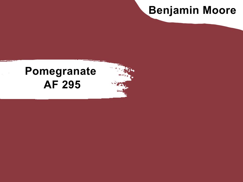
| RGB | 134 57 62 |
| LRV | 10.14 |
| Matching colors | Deep in thought, Sparrow, Acadia White, Arizona Tan |
| Undertone | Orange |
Here’s another gorgeous color on our list that will actually get a stare from you. Let’s talk about Pomegranate AF 295 by Benjamin Moore and how it pairs with oak cabinets.
As intriguing and complex as the ancient fruit, Pomegranate is a bold and vibrant richly hued shade of deep red with orange undertones that easily adds vibrancy to any space.
If you intend to use this color in a space with oak cabinets, that’s a pretty cool decision. Here’s the good news you need to hear. Oak cabinets have a warm, earthy tone that can seamlessly provide a natural backdrop for the vibrant red Pomegranate.
The combination of Pomegranate with oak will give a visually interesting contrast, adding depth and personality to your kitchen or space where oak cabinets are used.
21. Watery SW 6478 by Sherwin Williams
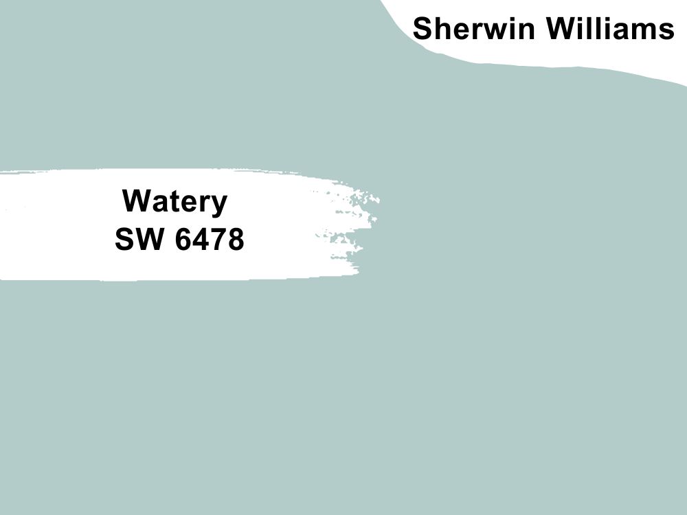
| RGB | 180, 204, 201 |
| LRV | 57 |
| Matching colors | Shell White, Aged White, Glimmer |
| Undertone | Green |
Meet Watery, another very interesting, and somehow popular color on our list today. From the family of blue, watery is a light-toned paint color that looks cool and crisp when applied to the walls. It has a very soothing and calming hue that tends to add a coastal vibe to any and every space.
If you’re wondering if this is a good color to use with oak cabinets, then here’s my verdict.
When it comes to pairing Watery with oak cabinets, you can never go wrong. Watery SW 6478 can create a beautiful and complementary combination with oak finishes.
The warm tones of the oak cabinets contrast nicely with the coolness of the blue-green color, resulting in a balanced and harmonious look.
Also, Watery works well with neutrals such as whites, creams, blacks, and grays. It can also work with yellows, lighter or darker blue-green colors, and navy.
22. Caldwell Green HC-124 by Benjamin Moore
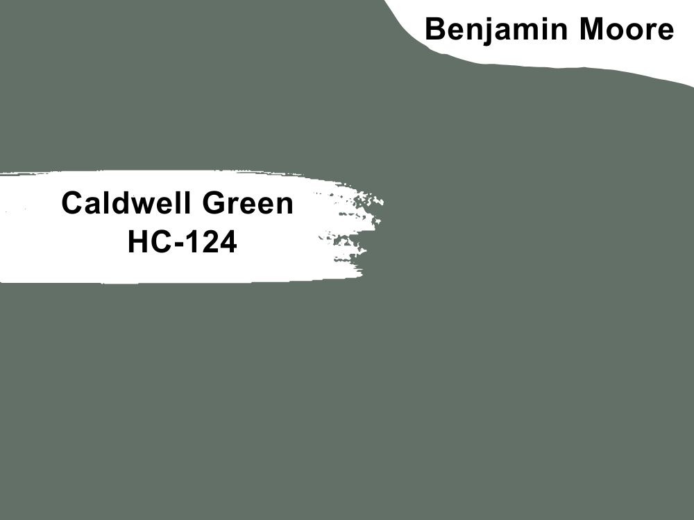
| RGB | 100, 111, 102 |
| LRV | 16.27 |
| Matching colors | Stonington gray, Silver satin, Barley harvest, Coastal fog |
| Undertone | Blue, Green |
If you don’t like flashy or shiny colors, I’m sure this attractive hunter green with regal blue undertones will be a great fit. Caldwell Green HC-124 by Benjamin Moore is a beautiful and versatile green paint color with some classic and timeless hues.
It has a rich and deep green tone with a hint of blue, which gives it an elegant appearance. This particular shade of green has a cool undertone, which can add a sense of freshness and tranquility to a space.
It works well in a variety of settings, including spaces with oak cabinets. The cool undertones of Caldwell Green can easily go with the warm tones of oak, breathing a nice contrast that will add depth to your kitchen or any space where oak cabinets are present.

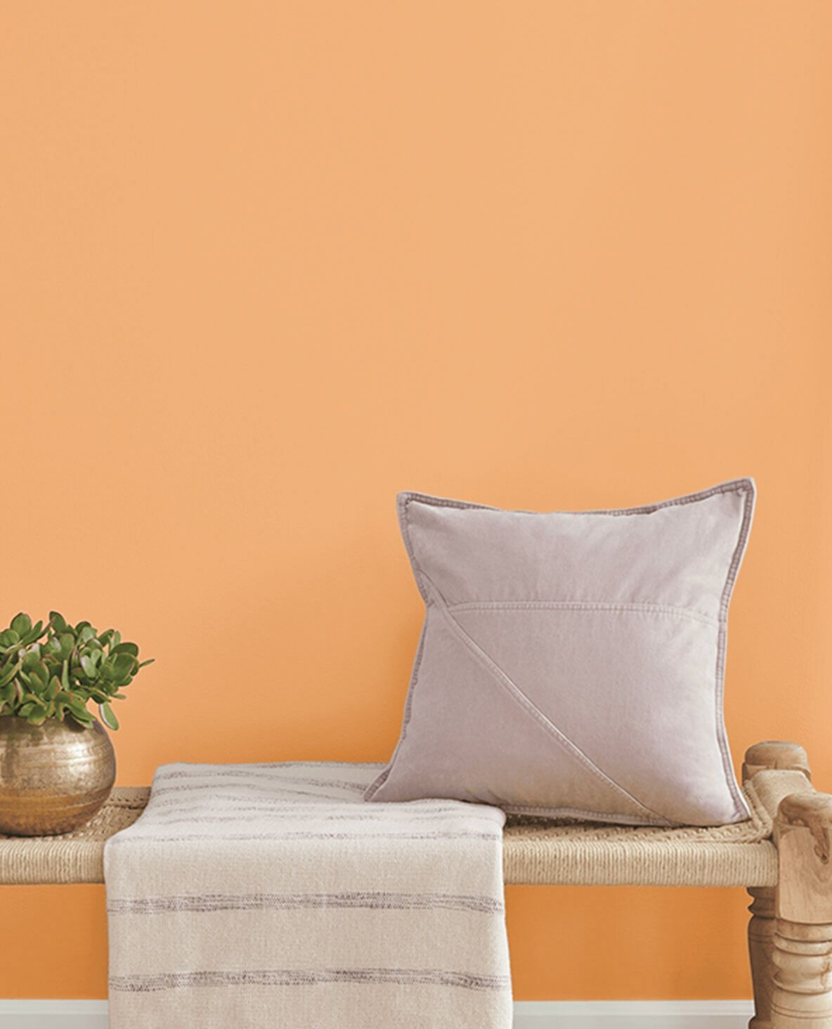
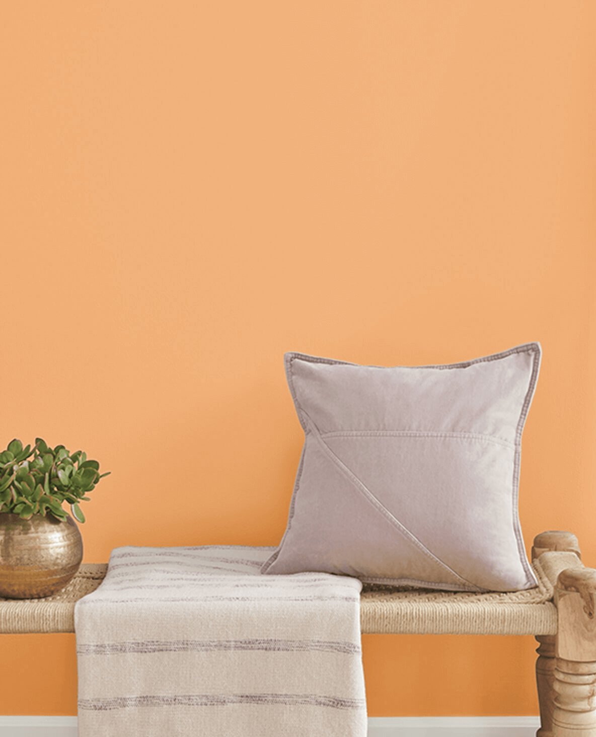
23. Exciting Orange SW 6647 by Sherwin Williams
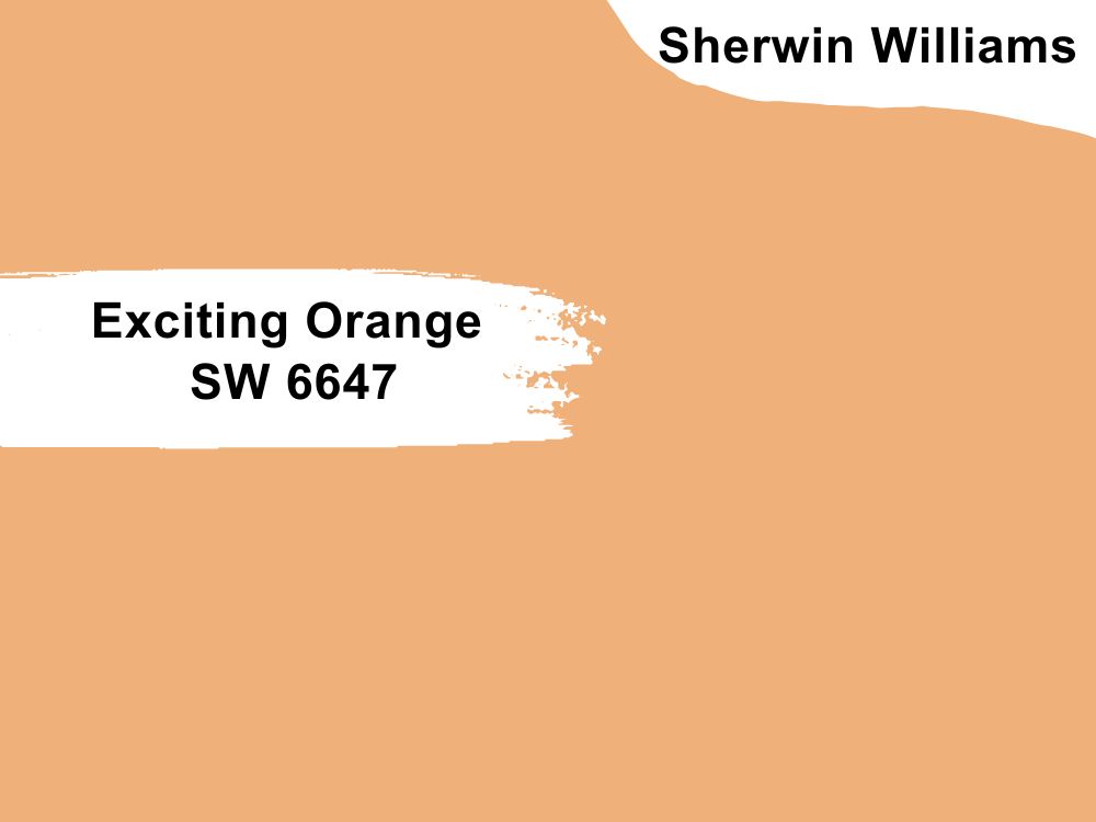
| RGB | 240 176 122 |
| LRV | 51 |
| Matching colors | Casa Blanca, Portobello |
| Undertone | Yellow, brown |
Finally, to wrap up this list of our best picks of paint colors that go with oak cabinets, let’s look at Exciting Orange (SW 6647) by Sherwin Williams. Exciting Orange, as its name implies, is a color from the orange family.
Just like other shades of orange colors, Exciting Orange 6647 is a vibrant and bold orange color that can add a lively and energetic touch to any space. If you want a hue that demands attention and can create a vibrant focal point in a room, this is a food pick.
Can I use Exciting Orange SW 6647 paint color with oak cabinets?
Yes, when it comes to pairing Exciting Orange with oak cabinets, it can create a striking and contrasting look. The warm tones of oak cabinets, with their golden or amber hues, can complement the warmth of the orange color. Now, this combination will leave you with a lively, always-on, and welcoming ambiance in a kitchen or any space where oak cabinets are present.
Conclusion
When it comes to strength and durability, Oak is one of the best kitchen materials you can use. It is one of the least expensive quality wood cabinet types, making it a popular choice for budget-friendly homeowners looking for cabinets that’ll last for years to come.
Every color has its own nuances and there will be no perfect match. You will tend to see shifts in their undertones, temperature, and depths depending on the lighting.
But all in all, It’s easy to work with and will always give you your desired finish. Just don’t go away from its neutral family. Using some fresh coordinating colors will tame well and give your space a unique look.
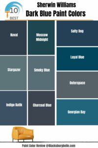 10 Best Sherwin Williams Dark Blue Paint Colors (Trend 2023)
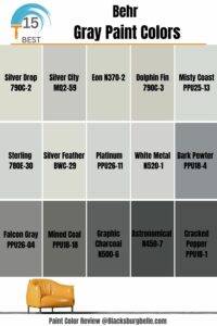 15 Most Popular Behr Gray Paint Colors: From Light to Dark
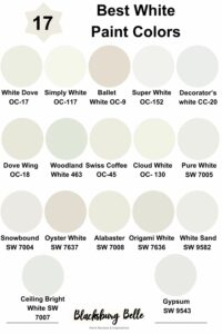 17 Best White Paint Colors For Interior Walls
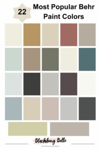 22 Most Popular Behr Paint Colors
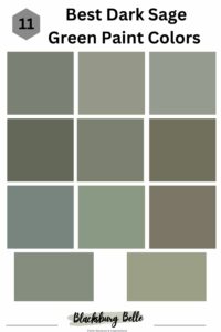 11 Best Dark Sage Green Paint Colors for Interiors and Exteriors
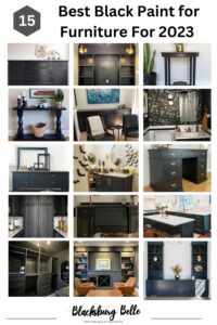 15 Best Black Paint for Furniture For 2023
