
Do you consider white paints easy choices when designing a home or office? Or is it your first choice because it’s a neutral color? Sorry not sorry, but you’re in for a shocker! There’s more to choosing white paints than picking the first random shade you find.
If you’re into warm whites with medium-light reflecting potential, then you’ll love Sherwin-Williams Divine White (SW 6105).
You’re about to learn why Divine White is one of the Top 50 Sherwin-Williams bestsellers. I’ll dish on its specifications, aura, undertones, usage, and comparison with similar tones.
Let’s Begin.
Table of Contents
When to Choose Sherwin-Williams Divine White (SW 6105)?
Welcome to the diverse world of white as we dissect the best scenarios to use Sherwin-Williams Divine White (SW 6105).
Firstly, you must know that this color is snuggly, comforting, and medium-light.
Ready to Get Cozy?
Divine White feels like having a soft comforter to keep you warm by the fireplace while you sip hot cocoa.
Brightness or Not?
The bright reflection from white paint puts many people off the color, but Divine White isn’t like that. You can maintain a clean space without worrying about its tone being overbearing.
Playing with White Color?
Having an off-white color with a pretty pinkish-beige and vibrant orange undertones is a game-changer. When the color changes with lighting and the atmosphere, it leaves a wow effect on everyone.
Kitchen Renovation Anyone?
Divine White allows you to live your white-on-white dream when you paint your cabinets with its off-white tone and pair it with stellar white tiles.
Ready to Be The Talk of The Street?
Your neighbors won’t be able to ignore your house when you paint the walls with Divine White and add a cultured garden for aesthetics.
Divine White tells anyone looking that you’re an elegant person with excellent taste. It speaks up without being showy. What’s not to love about this medium-light white paint? If you’re ready to learn more about Divine White, I won’t keep you waiting any longer!
What Color is Sherwin-Williams Divine White?
I can’t point to an exact reason why Sherwin-Williams named this color Divine White. The “white” part exists for obvious reasons, but you need to understand the color for the “Divine” prefix to make sense.
Divine White likely gets its name from its golden “sun-kissed glow,” which reminds you of heavenly themes.
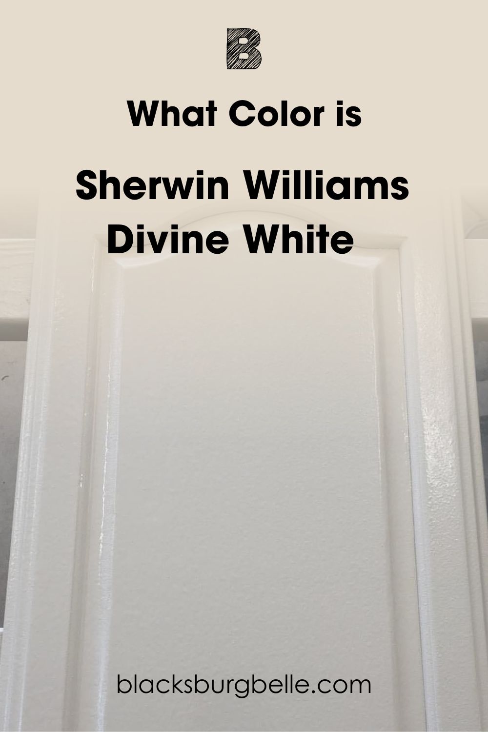
Divine White wraps you in a majestic warmth while maintaining a clean look on your walls and furniture. Although it has about three looks, this color is neutral at its core.
Snapshot of Sherwin-Williams Divine White Specification
See its specifications to understand the mysterious heavenly glow Divine White possesses.
| Name | Divine White |
| RGB | Red 230 | Green 220 | Blue 205 |
| Hex Value | #E6DCCD |
| LRV | 72 |
| Undertones | Beige, Orange, Pink |
The LRV of Sherwin-Williams Divine White
Pure white is 100% reflective, while absolute black has zero reflectance value and absorbs all light. Designers use this fact on a scale of 0 – 100 to measure every paint’s Light Reflectance Value (LRV).
But because of undertones, the actual scale is 3 (black) – 97 (white).
Sherwin-Williams Divine White has an LRV of 72, placing it between the median (50) and 93 for Sherwin-Williams High Reflective White, the cleanest and brightest shade from the brand.
Divine White having a 72 LRV means it maintains a subtle bright look without additional lighting. But with fluorescents and bulbs, the color becomes brighter, and you risk exposing the undertones.
Keep reading if you want to know about the other colors you can get from Divine White.
Undertones of Sherwin-Williams Divine White
It’s best to sample any paint before buying it to avoid getting catfished. Yes, colors can catfish you unintentionally because of their RGB, which gives them one or more undertones.
That’s why white paint like Divine White takes on an orange or beige appearance at different times of the day.
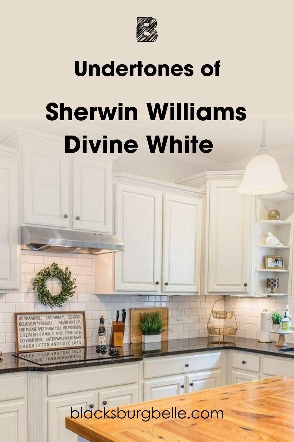
Before I break down the undertones in Divine White, look closely at the wall paint in this kitchen. On the surface, it looks like a regular all-white theme, but a second look shows you the beige-tinted Divine White on the upper wall and trims by the window.
Lighting Condition for Divine White
If you didn’t know before, I’m telling you the secret to highlighting undertones is light manipulation. You can use natural sunlight to your advantage or add artificial light. I’ll show you how both options work then you can pick the one that works best for you.
Taking advantage of natural sunlight is about studying lighting positions. Use Divine White in North-facing rooms to maintain its neutral white look throughout the day. If you want a lighter reflection, South-facing rooms are ideal, while West and East-facing light deepens the color.
When you add light fixtures, note that warm bulbs intensify colors while cold bulbs tone down the warmth. That means you should use yellow/orange bulbs for orange and beige undertones and white/blue lights for the neutral off-white look.
Does Divine White Look Orange?
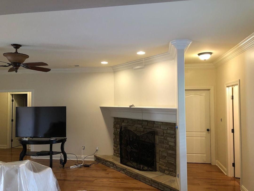
I noticed that warm lighting gives Divine White the sun-kissed glow Sherwin-Williams promised in its color description. This tone comes from its high red pigment, a base tone for orange.
You’ll get this undertone without lighting in small spaces and under a dusky cloud. This all-white home is a perfect example of the orange tint. See how the color shows up in the small hallway mixed with the ceiling light compared to the large living room walls.
Does the Divine White Paint Look Beige?
Seeing the pinkish-beige undertone in Divine White gave me butterflies. It’s a sweet and unexpected undertone that slowly creeps out when paired with light white paint. The large open windows letting in natural light transformed the beige tint to take over.
Again, this pink-based beige tone is a tertiary result of the high red hue in Divine White’s RGB.
Is Divine White a Warm or Cool Color?
Divine White is a warm, fuzzy, and dreamy color. Color theory teaches that the color wheel is split into warm and cool sides.
Each side has distinct characteristics based on their tones. Red, yellow, and orange are warm, while oceanic green and blue are cold. Then, purple switches between warm and cool because it’s a combo of red and blue.
Remember that Divine White has a high red pigment giving it beige, pink, and orange undertones. All these are warm tones that’ll make any space feel intimate and dreamy.
So Divine White gives off cozy vibes and an illusion of smaller spaces since the color looks like it’s moving towards you.
For this reason, use it in your living areas, reception, lounges, and hospitable establishments.
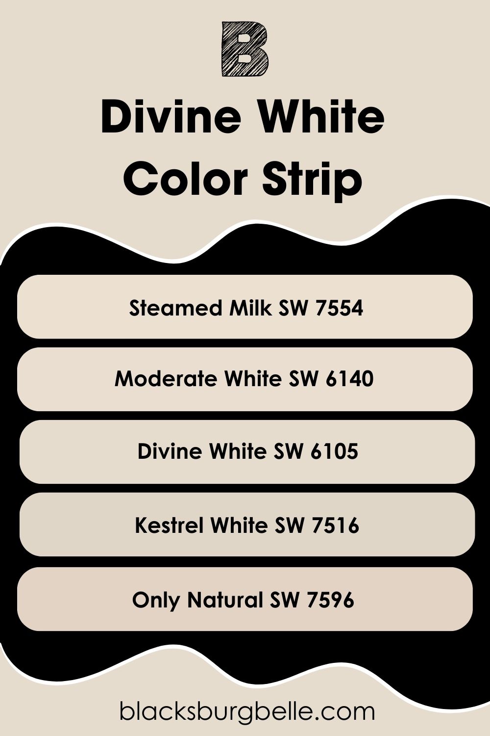
Sherwin-Williams Divine White Color Strip: Lighter or Darker Exploration
Are the pinkish-beige and orange undertones making you dizzy? Don’t worry. You can choose from six other lighter and darker alternatives to Divine White (SW 6105). I selected the four with distinct LRV differences for this review. Check them out below.
- Sherwin-Williams Steamed Milk (SW 7554)
- Sherwin-Williams Moderate White (SW 6140)
- Sherwin-Williams Divine White (SW 6105)
- Sherwin-Williams Kestrel White (SW 7516)
- Sherwin-Williams Only Natural (SW 7596)
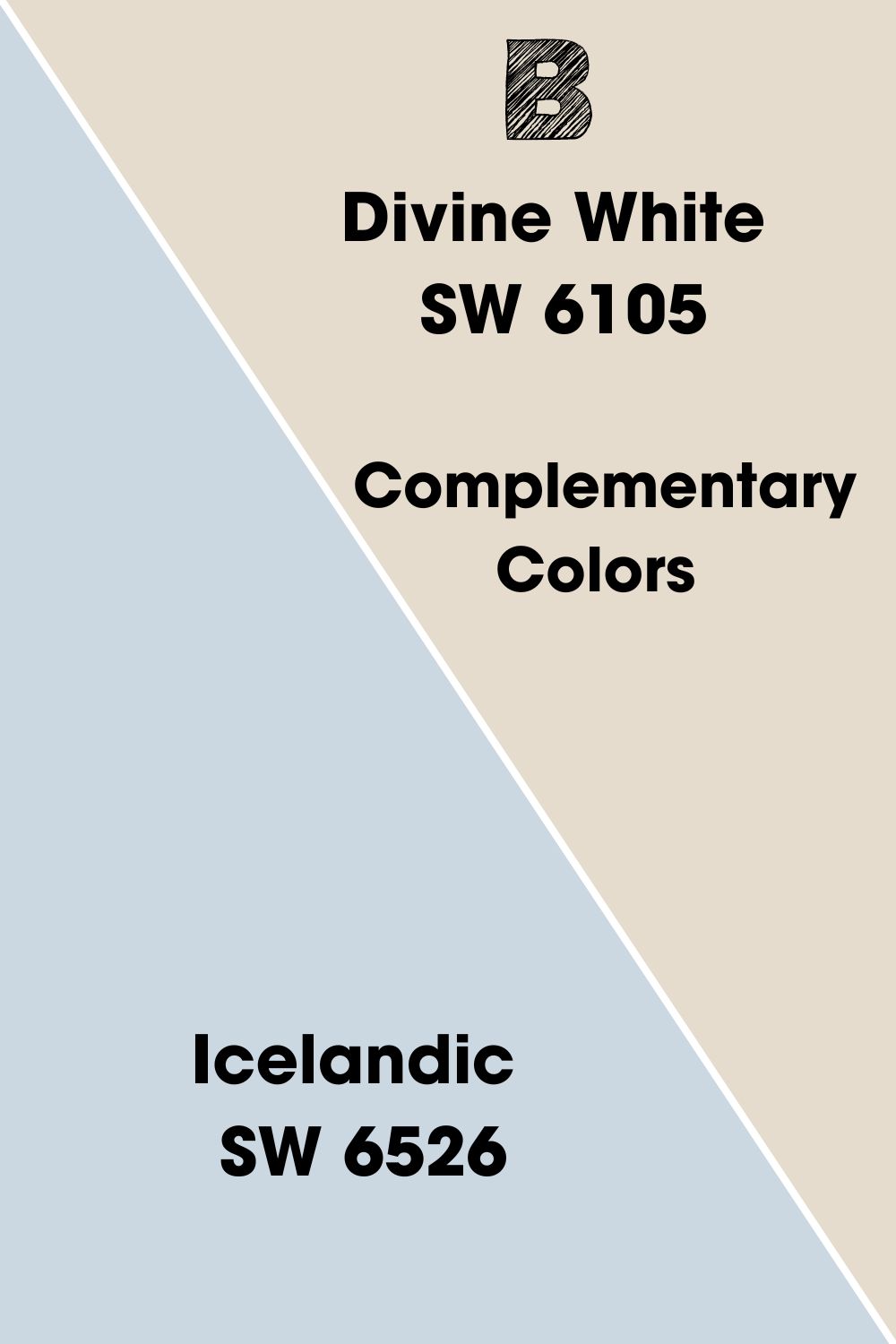
Complementary Colors for Sherwin-Williams Divine White
Creating contrast with complementary colors helps you make a bold design statement. Pair your anchor color with its opposite shade from the color wheel. The fixed combos are red-green, yellow-purple, and blue-orange.
Divine White is white paint, so I used the orange undertone to pick its contrast, which is blue. Then, I searched for a shade close to LRV because contrasts still need balance. Voila, that’s how I arrived at Sherwin-Williams Icelandic to complement Divine White.
Icelandic appears as a cold medium-light violet with an LRV of 67. It has a purple undertone that’ll complement the beige tint in Divine White, creating a perfect combination!
Depending on your lighting and positioning, you’ll get blue/orange or beige/purple.
Sherwin-Williams Divine White Coordinating Colors
Are you into all-white designs, or are you a risk-taker? Don’t worry if you don’t have an answer. I’ve curated a list of the top five popular themes to give you options.
- Analogous Themes:Select three colors beside each other on the color wheel for a beautiful gradient. Choose within the same temperature to maintain a steady vibe and avoid clashing undertones.
- Complementary Themes:This is the simplest combo because it requires only two opposite colors. If you decide to use different shades of each complementary color, that’s your choice.
- Triadic Themes:Draw an equal triangle on the color wheel with Divine White as the starting point. The other two equally spaced colors in the triad complete the theme.
- Split Complementary:Once you’ve found the complementary color for Divine White, pick one color each from its side on the color wheel. For Icelandic (violet), they’re tan (red-orange) and amber (yellow-orange).
- Monochromatic Themes:The easiest combo to curate by pairing an anchor color with lighter and darker shades.
Use the color strip for a perfect monochromatic theme in your living room and kitchens. Creative combos like triadic and analogous are ideal in bedrooms and recreation spaces. Finally, use complementary themes in your bathrooms, living rooms, and exteriors.
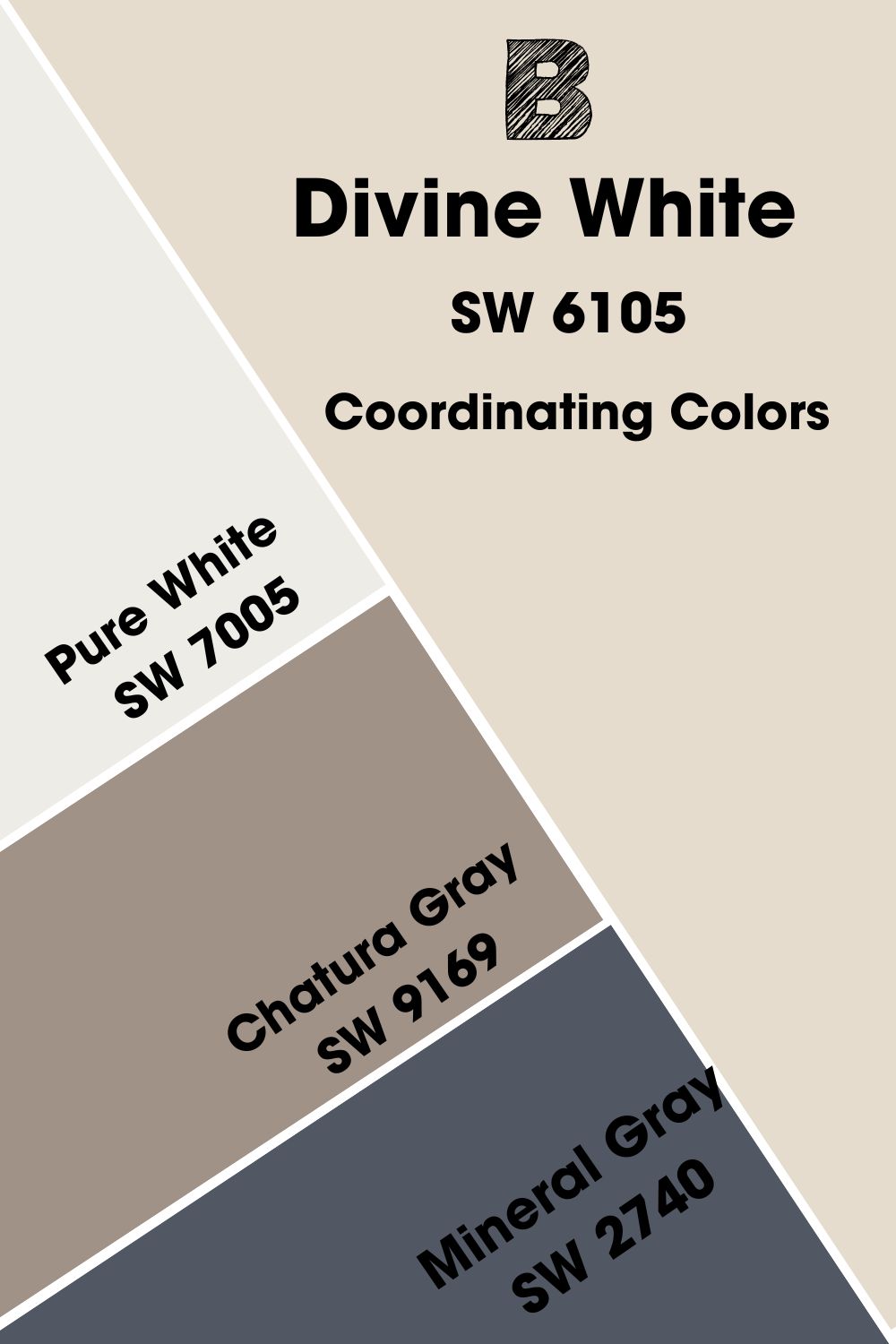
Coordinating Colors for Sherwin-Williams Divine White
- Sherwin-Williams Pure White (SW 7005):A bright white paint with the faintest yellow undertone and an 84 LRV.
- Sherwin-Williams Chatura Gray (SW 9169):This medium-dark greige paint adds an earthy aura to the sunny Divine White.
- Sherwin-Williams Mineral Gray (SW 2740):Use this deep gray paint with a navy undertone instead of black to add a soft shadow to Divine White.
Sherwin-Williams Divine White Color Palette
I’m giving you these three palettes for different reasons. White always looks beautiful and elegant in monochromatic themes, so that’s a no-brainer. But I also want you to explore the untapped potential of bold combos like analogous and triadic color palettes.
I carefully chose each color for their unique undertones and how they look when paired with Divine White.
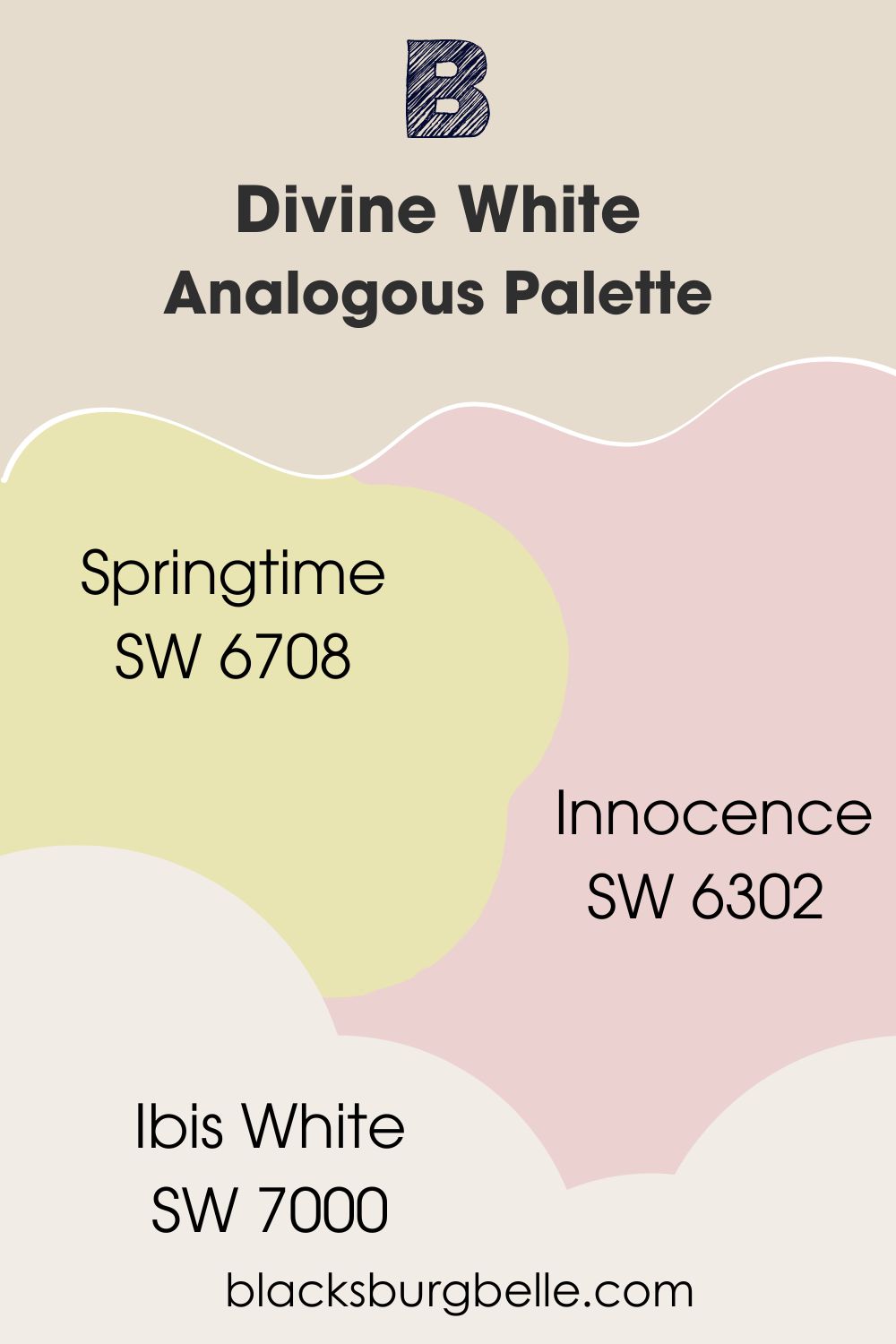
Analogous Palette
- Springtime (SW 6708):A cheerful yellow-green with a pastel look guaranteed to brighten Divine White without extra lighting.
- Innocence (SW 6302):This soft, medium-light red paint blushes Divine White walls.
- Ibis White (SW 7000):Use this bright white paint with red and violet tints as a trim to match the three colors.
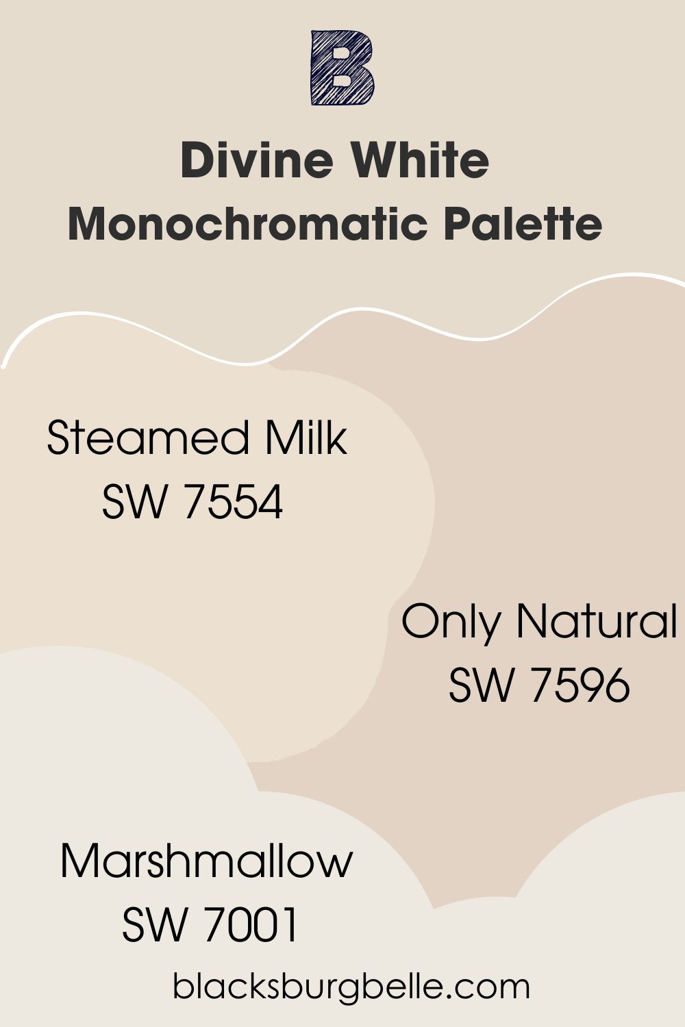
Monochromatic Palette
- Steamed Milk (SW 7554):Adding this medium-light white paint into the mix keeps Divine White steady.
- Only Natural (SW 7596):This beige-toned white paint with a 67 LRV adds renewed energy to any room.
- Marshmallow (SW 7001):You’ll need bright white paint with pink undertones like this one for your trims.
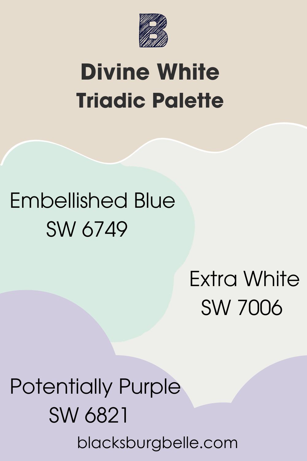
Triadic Palette
- Embellished Blue (SW 6749): This seafoam pastel blue is medium-light and bold enough to carry the entire room.
- Potentially Purple (SW 6821):A dreamy pastel lavender with no noticeable undertone to clash with the other colors.
- Extra White (SW 7006):Complete your palette with crisp white paint on your trims and borders to accentuate Divine White.
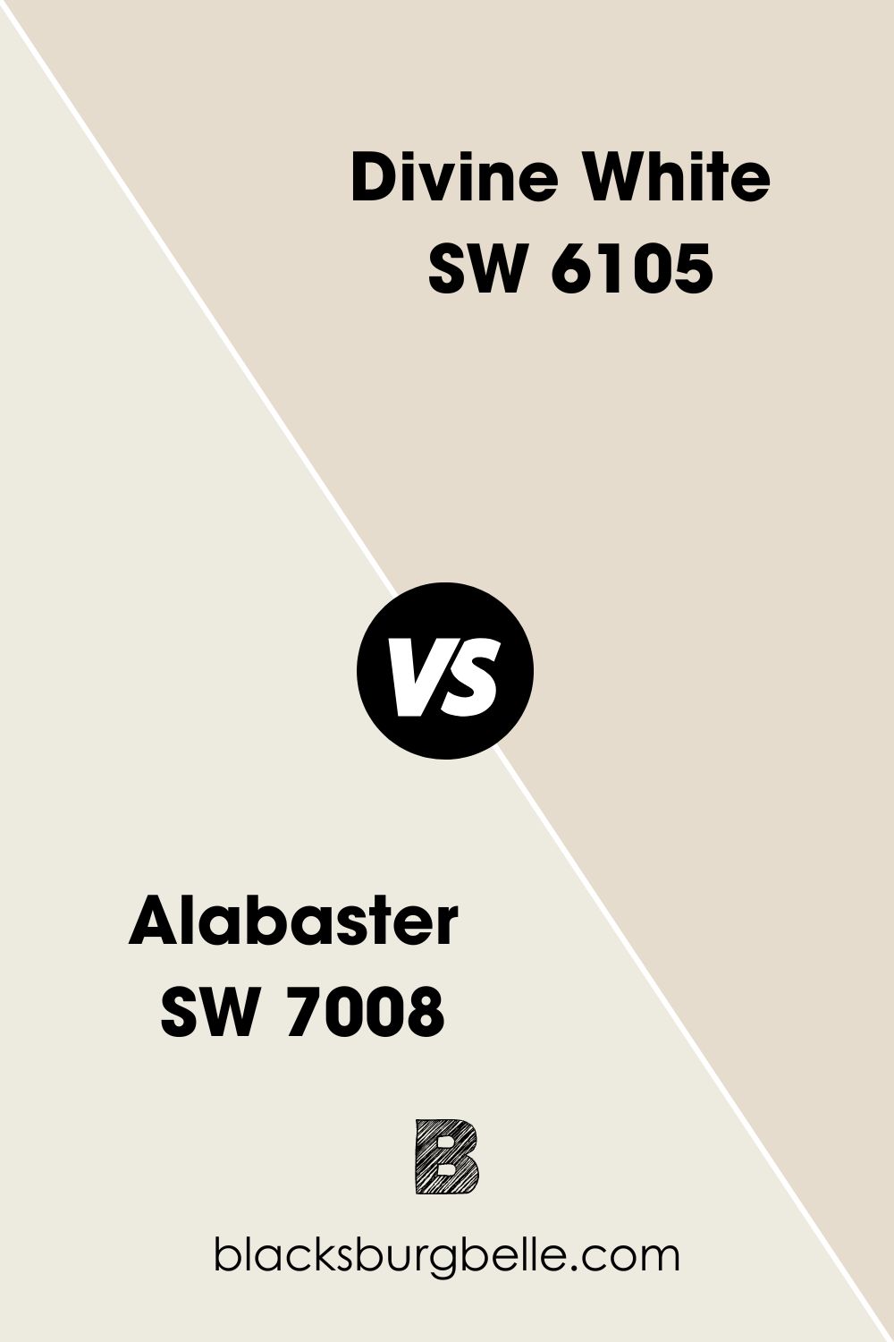
Sherwin-Williams Divine White vs. Sherwin-Williams Alabaster (SW 7008)
Alabaster is a lighter and cooler color with a gray undertone, unlike Divine White which is warm.
Sherwin-Williams Divine White vs. Benjamin Moore Muslin (1037)
Muslin has a deeper beige tone that makes Divine White look brighter when placed side by side.
Sherwin-Williams Divine White vs. Sherwin-Williams Aged White (SW 9180)
Divine White has orange and beige undertones but Aged White (SW 9180) favors a yellow tint.
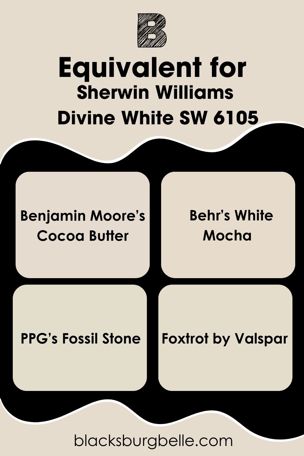
Divine White Equivalent with Other Brands (Benjamin Moore, Behr, PPG, & Valspar)
You won’t find “Divine White” from any brand, not Sherwin-Williams. But if you’re looking for similar colors, try the following:
Benjamin Moore’s Cocoa Butter, Behr’s White Mocha, PPG’s Fossil Stone, and Foxtrot by Valspar.
Where can you use Sherwin-Williams Divine White?
Even though Divine White is a neutral paint, you can’t use it anywhere without thought. Use it when you want your guests to trust you and feel comfortable. The color can also fit in relaxing spaces when you pair it with cool colors.
See some visual examples.
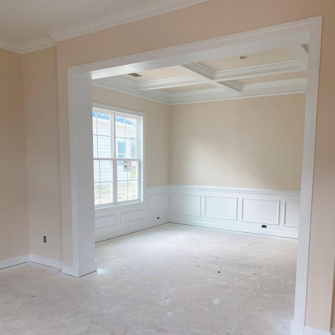
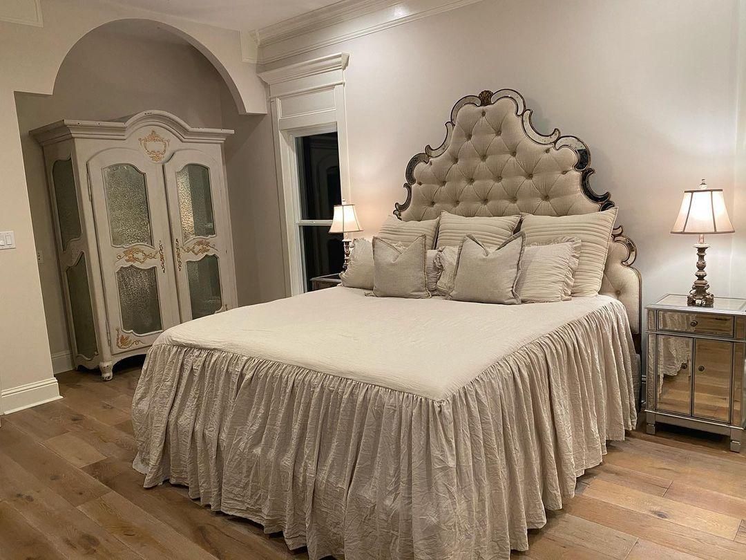
Sherwin-Williams Divine White on Walls
Divine White walls give a room a clean white look without making it look stuffy or boring. Instead, when you add warm lighting, you give the color’s pink-beige and orange undertones a chance to show up.
The color gives this bedroom a classic and mature look without looking like you traveled back to the 1800s.
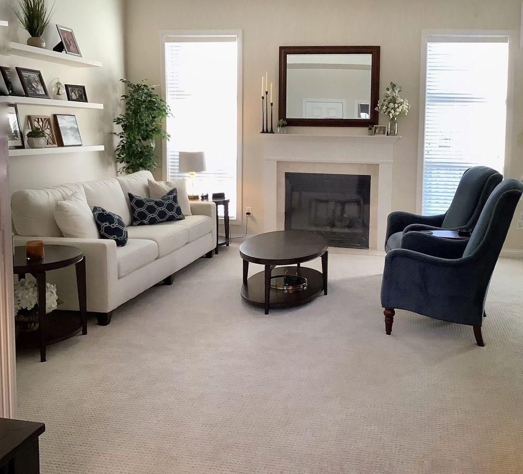
Sherwin-Williams Divine White in Living Rooms
Of course, you want your visitors to feel welcome in your living room, so why not give the walls a Divine White treatment. It’s the perfect shade if you’re going for a dominant white look.
You can use a brighter shade to highlight Divine White, then add complementary colors using your furniture and other interior decor. This living room uses navy blue chairs and throw pillows to complement the Divine White walls.
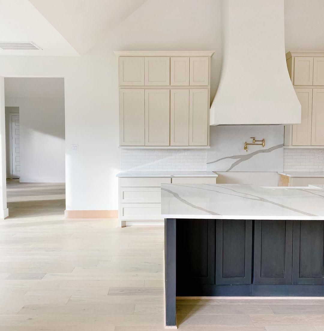
Sherwin-Williams Divine White on Cabinets
White on cabinets is always a hit, but using Divine White takes it to the next level. That way, you can maintain a brighter white paint on your walls and keep the room clean and fresh.
Again, see how the coordinating color comes as an accent island. It adds a subtle coolness to the space without ruining the overall warmth.
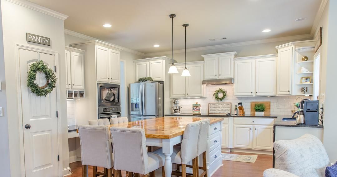
Sherwin-Williams Divine White in the Kitchen
Nothing says vintage classic kitchen like the all-white decor. Because Divine White is an off-white tone with beige and orange undertones, you can use it throughout.
The added lighting gives hints of the undertones to add nuances to the kitchen so it doesn’t look clinical or boring. Also, notice warm wooden floorboards and pieces of blue accessories around to complement the color.
Sherwin-Williams Divine White on Furniture
Everyone knows painting furniture adds to its appeal and gives it a facelift. Instead of throwing away your vintage or outdated bookshelves, cupboards, wardrobes, dressers, and woodwork, why not repaint Divine White?
The color will give it a modern touch, hide old stains, and improve the aesthetic of your room.
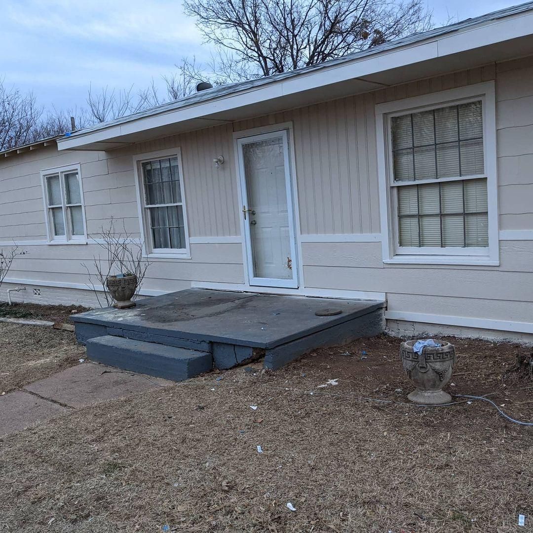
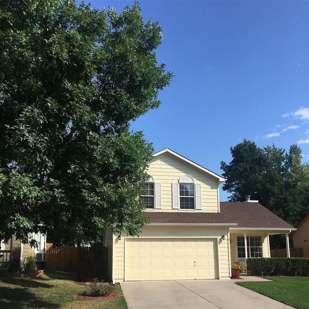
Sherwin-Williams Divine White on Exteriors
Forget crisp white paints for traditional paneled walls, and say hello to Divine White. Its warm undertones and natural sunlight will give your building an inviting look. Don’t choose this color unless you’re ready for your home to stand out from others on the street.
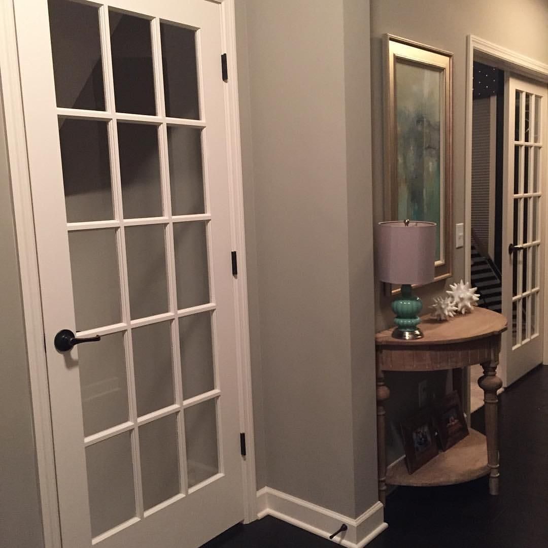
Sherwin-Williams Divine White on Trims
On its own, Divine White isn’t very reflective, so many designers shy away from using it as trims. But when you pair it with a darker warm paint like this creamy white, it’s magic.
Antique White is on the windows, panes, pillars, and borders; you can see it’s not standing out like a sore thumb. Instead, it blends into the creamy paneled walls, adding to the Antique White trims’ reflections later in the day.
Sherwin-Williams Divine White on Doors
White doors are another American home classic. Using a nuanced white paint like Divine White adds a twist to the traditional style because you can watch the undertones take turns covering the door throughout the day.
What is the Difference between Sherwin-Williams Divine White, Shoji White, and Dover White?
Sherwin-Williams Shoji White (SW 7042) and Dover White (SW 6285) are very similar to Divine White, leaving customers wondering why they should pick one and not the other. I’ll give you the differences between them so you can decide quickly.
Dover White is bright with an LRV of 83 but shares the same undertones as Divine White. Meanwhile, Shoji White has almost the same LRV at 74, but its undertones differ greatly. Shoji White is creamy with a greige undertone making it earthier than Divine White.
Is Divine White too White?
NO! You don’t have to worry about the pristine nature of traditional white paints with Divine White. I hate to call it a “dupe,” but that’s the best way to describe the color compared to other bright white paints.
Its orange and pinkish-beige undertones make it a more fun white paint.
Conclusion
Now I must say goodbye because that’s everything about Sherwin-Williams Divine White (SW 6105). Although I am not too big on white paints, this warm, off-white color however has stolen my heart the more I learned about it. Seeing its unique styles was enough to convince me.
Here are a few hot tips to remember about Dover White:
- It’s strictly warm
- It’s a medium-light tone and
- It can work as a full paint or a trim
That’s all on Dover White, but I hope you return with comments and pictures of your experience using this pretty white paint.
 Sherwin Williams Origami White (Palette, Coordinating & Inspirations)
 Sherwin Williams Contented (Palette, Coordinating & Inspirations)
 Sherwin Williams Urbane Bronze (Palette, Coordinating & Inspirations)
 Sherwin-Williams Anonymous (Palette, Coordinating & Inspirations)
 Sherwin Williams Extra White (Palette, Coordinating & Inspirations)
 Sherwin Williams Misty SW 6232: Paint Color Review
