
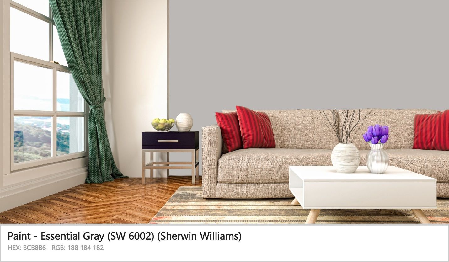
Ever found yourself in a tricky situation where you want to depart from beige or white but still want to keep your home neutral and light? This can be a confusing situation. However, when you deeply understand paint colors, the ideal choice for you, in this case, will probably be Sherwin Williams Essential Gray.
I have used Sherwin Williams Essential Gray in most of my rooms for a straightforward reason: it allows me to keep my home neutral while adding a touch of sophistication and warmth to my spaces.
This detailed paint color review will dive deep into the SW 6002. We will also compare this color to its close relatives, like response gray and agreeable gray.
Are you ready? Let’s see what you get when you have Essential Gray on your walls!
Table of Contents
What Color is Sherwin Williams Essential Gray (6002)?
| Manufacturer | Sherwin Williams |
| LRV | 48 |
| RGB | R: 188 G: 184 B: 182 |
| Hex Value | #bcb8b6 |
| Color Collections | Living Well, Pottery Barn Teen, Minimalist |
The SW 6002 is a light gray color. This paint color can also be described as a medium light shade of red-orange. When people think of this light, they associate it with sincere, clean, sleek, and something classic.
The CMYK color model often identifies the Sherwin Williams Essential Gray (SW 6002) as containing 2.1% magenta, 26.3% key (black), 3.2% yellow, and 0.0% cyan. The paint color has a hue of 20 degrees, a lightness of 72.5%, and a saturation of 4.3% on the HSV scale.
RGB of Sherwin Williams Essential Gray
RGB is a widespread abbreviation in the interior design community. For example, interior designers use RGB when describing the amount of Red, Green, and Blue in a specific color, respectively.
This scale runs from 0 and tops out at 255. In the case of Sherwin Williams Essential Gray, the paint color has Red: 188, Green: 184, and Blue: 182.
LRV of Sherwin Williams Essential Gray
You probably already know that different paint colors will have varying abilities to reflect light. The degree to which each paint color can reflect light is measured on the LRV (Light Reflective Value) scale, which runs from 0 to 100. Sitting at 0 is pure black, which has zero reflective power, while at 100 is pure white, reflecting maximum light.
SW 6002 sits near the middle of the scale, with an LRV of 48. The paint color has a near-medium reflective ability, although it falls on the lower medium side, reflecting less light.
Is Sherwin Williams Essential Gray a Warm or Cool Color?
As noted earlier, SW 6002 is a medium-light shade of red-orange. This essentially puts the paint color on the warm side of the color wheel.
However, it is a medium-light shade, so it’s not too warm. The color is right in the middle of the warmth region, balancing the coolness and warmness. This makes it an effective color in almost any room, irrespective of the light orientation.
What Are the Sherwin Williams Essential Gray Undertones?
SW Essential Gray (SW 6002) has one prominent undertone—lavender. The lavender undertone can, however, be a little bit stronger in some types of lighting.
This suggests that when deciding whether to use Essential Gray in a room, you have to consider the lighting in the room to see if lavender will end up dominating. Painting a smaller portion of the wall with Essential gray as a test can help you gauge the degree of visibility of the lavender undertone.
Moreover, you may want to look at the other colors in your room. For instance, if you have a maroon sofa in a room that allows the lavender undertone to shine through, the Essential Gray paint color may be effective for a straightforward reason: maroon boasts similar undertones—mauve/lavender.
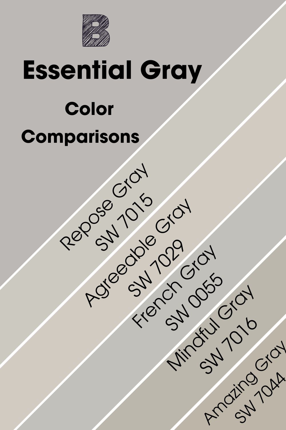
Sherwin Williams Essential Gray Color Strip: Sherwin Williams Essential Gray Color Comparisons
The SW 6002 bears some very close resemblance to several paint colors. So, if you are out shopping for paint colors, you may want to know the exact differences between these colors. Below, we will take a deeper look at these colors.
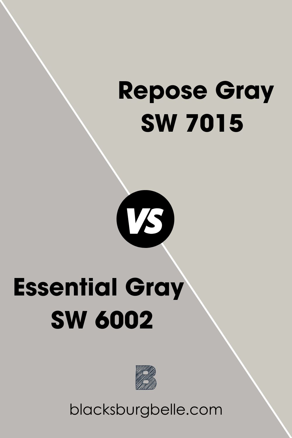
Sherwin Williams Essential Gray vs Repose Gray (SW 7015)
The main similarity between Repose Gray and Essential Gray is that both colors are neutral gray. Repose Gray, however, reflects more light than Essential Gray—Repose Gray is 10 points higher on the LRV scale, with a value of 58, unlike Essential Gray, which is 48 on the same scale. While Essential Gray and Repose Gray are warm colors, they also tend to be slightly cool, almost sitting in the middle of the warmth scale.
Regarding their undertones, SW 6002 and SW 7015 are very different. While Essential Gray has a lavender undertone, Repose Gray will display a combination of purple/blue undertones depending on the light in the room.
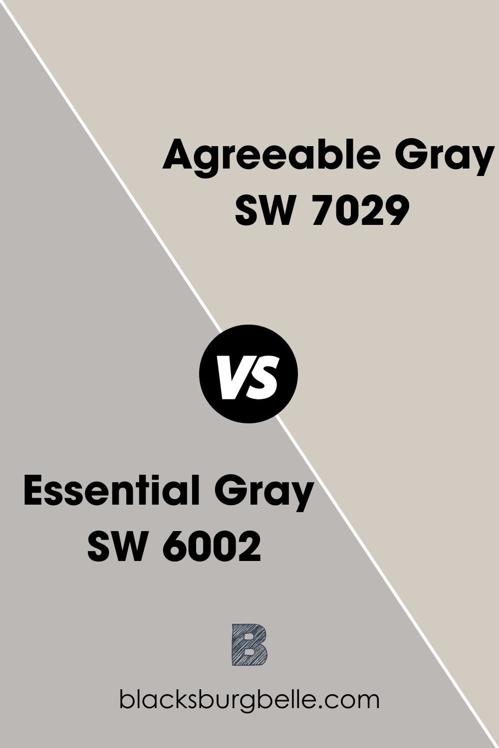
Sherwin Williams Essential Gray vs Agreeable Gray (SW 7029)
Twelve points above Sherwin Williams Essential Gray on the LRV scale, Agreeable Gray reflects much more light with an LRV of 60 as opposed to Essential Gray, which has an LRV of 48. Both colors, however, fall in the neutral gray color category.
While Essential Gray is famous for its lavender undertone, Agreeable Gray puts taupe/brown and violet undertones in a room. Both paint colors feature a nice balance of cool and warm tones, explaining why people refer to them as neutral grays.
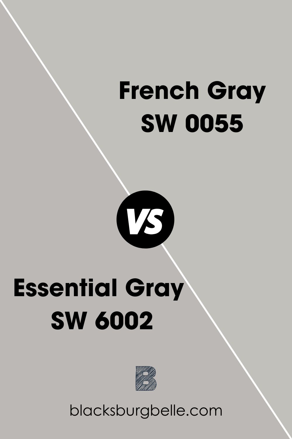
Sherwin Williams Essential Gray vs French Gray (SW 0055)
Sherwin Williams French Gray is also as neutral-toned as the Essential Gray (SW 6002). On the Light Reflectance scale, French Gray is much closer to Essential Gray, with the two colors having the values 53 and 48, respectively—this indicates that French Gray reflects more light.
French Gray does not boast strong undertones; however, a touch of Blue is often visible when viewing it in a north facing room. Just like French Gray, Essential Gray also has one undertone, only this time, the undertone is lavender and not blue.
Both SW 6002 and SW 0055 are considered warm. However, French Gray is just as close as you will get to the pure gray paint color, considering it features an ideal balance of cool and warm tones with no strong undertones to steal the show.
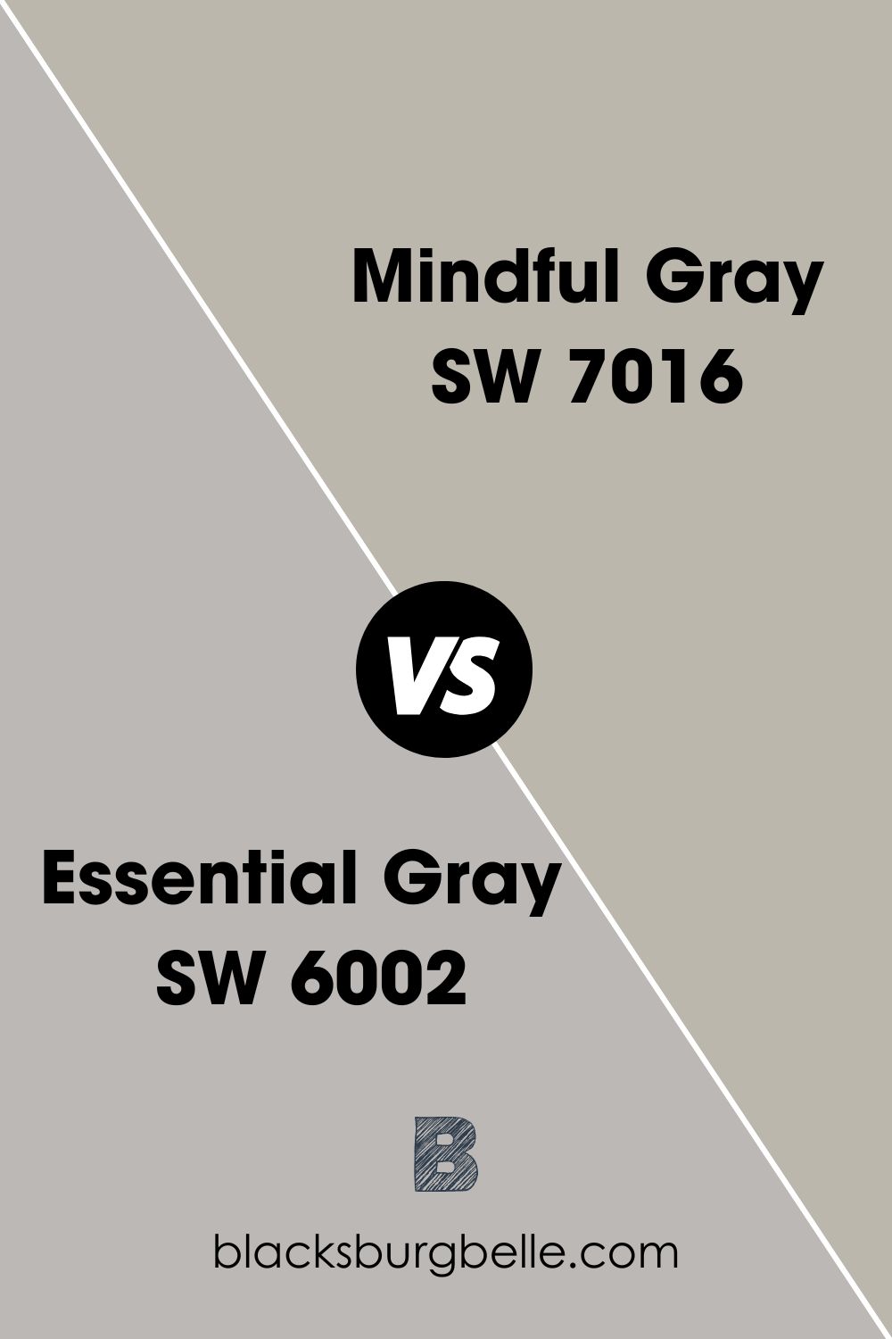
Sherwin Williams Essential Gray vs Mindful Gray (SW 7016)
Sherwin Williams Mindful Gray is a mid-tone, light gray paint color that is extremely close in terms of its properties to Essential Gray. Both Essential Gray and Mindful Gray have an LRV of 48, reflecting the same amount of light.
On the RGB scale, the two paint colors are also very close. While Essential Gray SW 6002 boasts Red: 188, Green: 184, and Blue: 182, Mindful Gray boosts Red: 188, green 183, and Blue 173—this means that the variation is only in the Green and Blue shades, where Essential Gray is higher by only 1 in Green and 9 in Blue.
Just like Essential Gray, Sherwin Williams Mindful Gray also does not have any stand-out undertones—the Mindful Gray boasts some very subtle bluish/green undertones, just like Essential Gray has very subtle lavender undertones. Moreover, Like Essential Gray, Mindful Gray features a balance between cool and warm tones, keeping it from getting too warm irrespective of light orientation in a room.
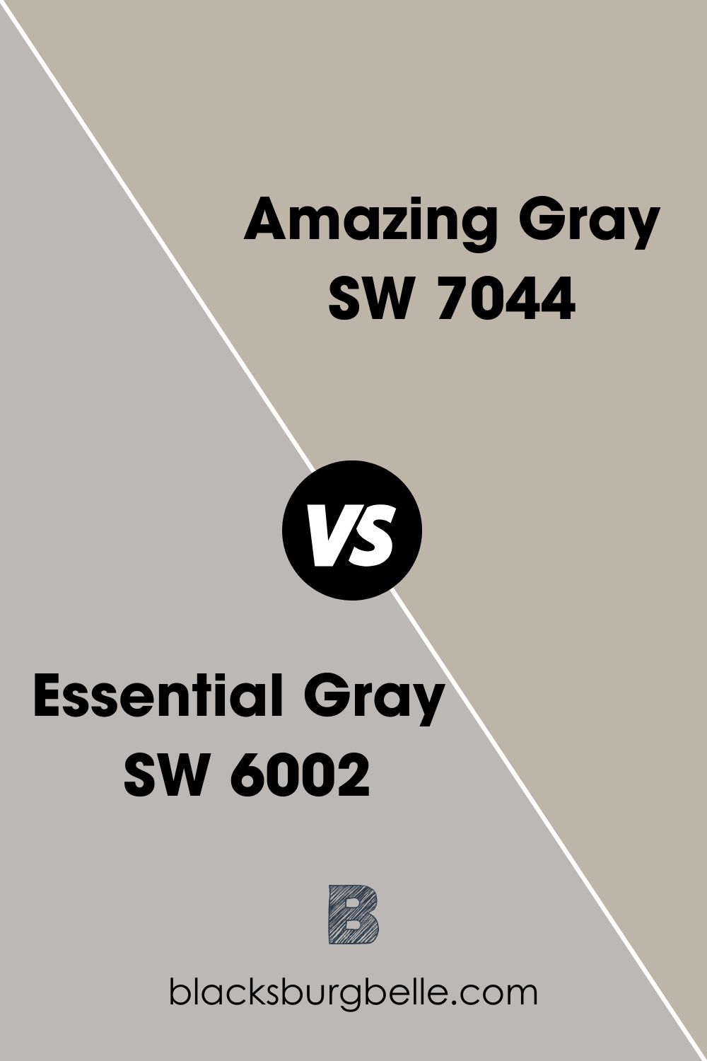
Sherwin Williams Essential Gray vs Amazing Gray (SW 7044)
Similar to Essential Gray in terms of warmth, Amazing Gray sits in the middle of the warmth scale—it is not as warm as beige nor as cool as pure gray. Like Sherwin Williams 6002, Amazing Gray is still considered a warm color.
On the Light Reflectance Value scale, the two colors are very close, with Essential Gray boasting an LRV of 48 and Amazing Gray boasts an LRV of 47. Both colors add a balance to bright light, while they tend to look a little bit dingy and flat in a darker room.
Essential Gray and Amazing Gray have one undertone—Essential Gray has a lavender undertone, while Amazing Gray features a green undertone. The undertones in both colors are very subtle.
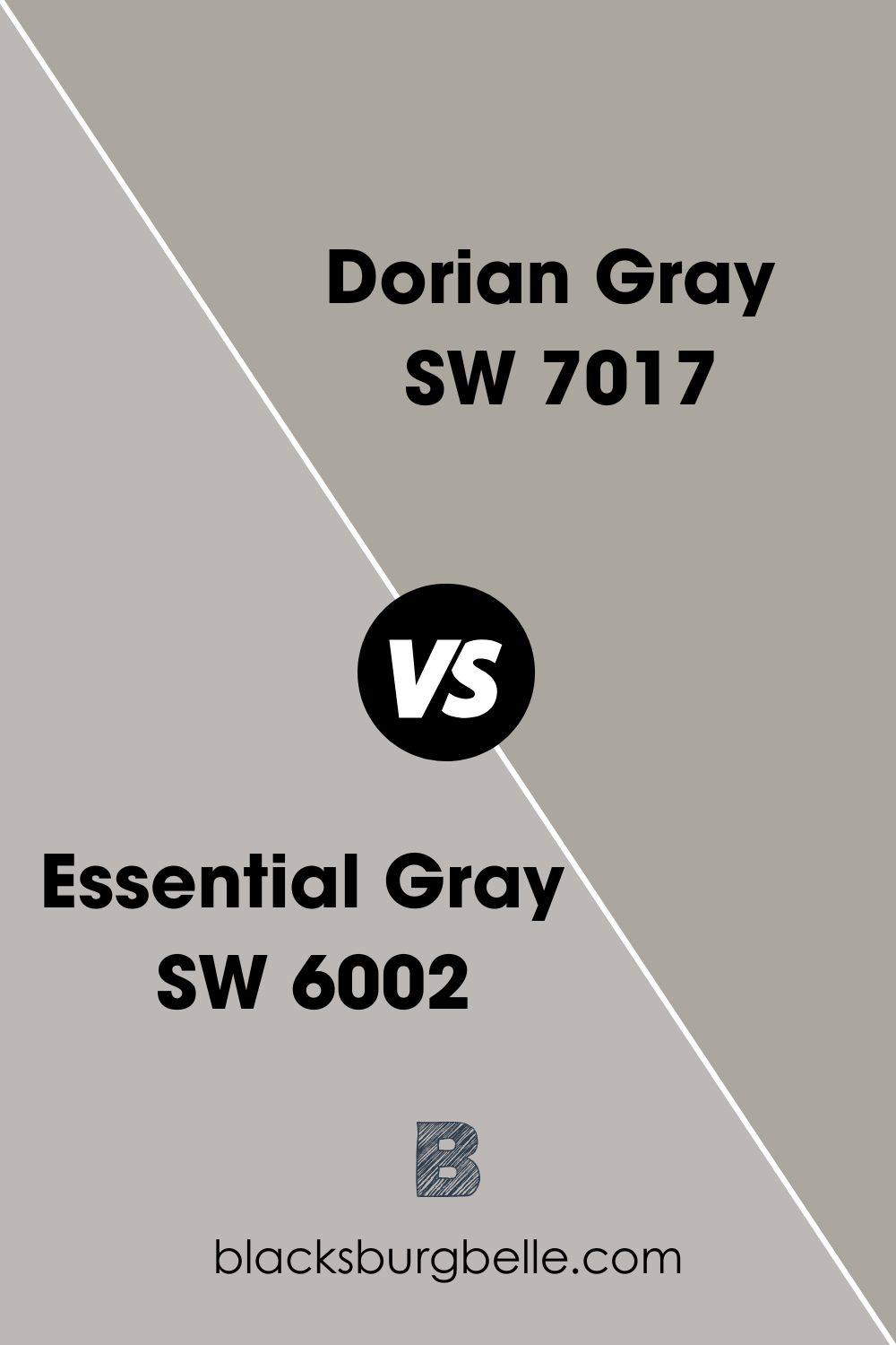
Sherwin-Williams Essential Gray vs Dorian Gray (SW 7017)
Dorian Gray is a versatile yet neutral gray that shares many similarities with Essential Gray. For starters, both colors are mid-tone grays that are neither too light nor too dark.
When you paint Dorian Gray in a room with the proper lighting, the only undertone you should expect to see is purple. Similarly, Essential Gray has one undertone—lavender.
These two colors differ in their ability to reflect light. For example, with an LRV value of 48, Essential Gray (SW 6002) will reflect more light than Dorian Gray, which has an LRV of 39.
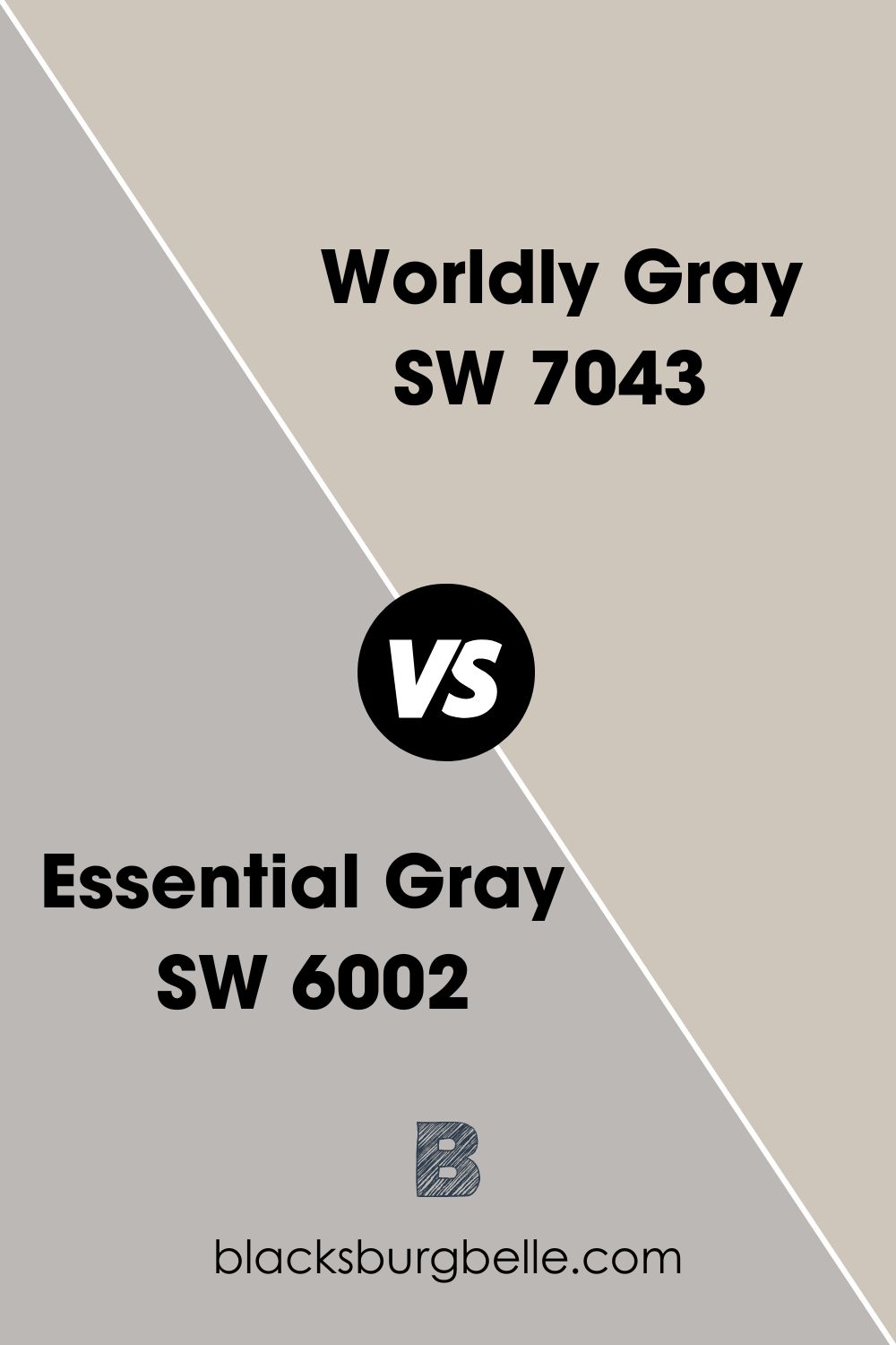
Sherwin Williams Essential Gray vs Worldly Gray (SW 7043)
With a Light Reflectance Value of 57, you should expect Worldly Gray to reflect more light than Essential Gray with an LRV of 48. Both colors, however, still sit in the mid-range on the LRV scale.
Just like SW 6002, SW 7043 is considered warm. However, the degree of warmth on both colors depends on the light involved—in some cases, the colors may look more cool than warm, while in others, their warmth is strong-.
Unlike Essential Gray, which has one lavender undertone, Worldly Gray has two undertones—mainly green with a sprinkling of violet. However, the undertones in either color will only show depending on the lighting in the room.
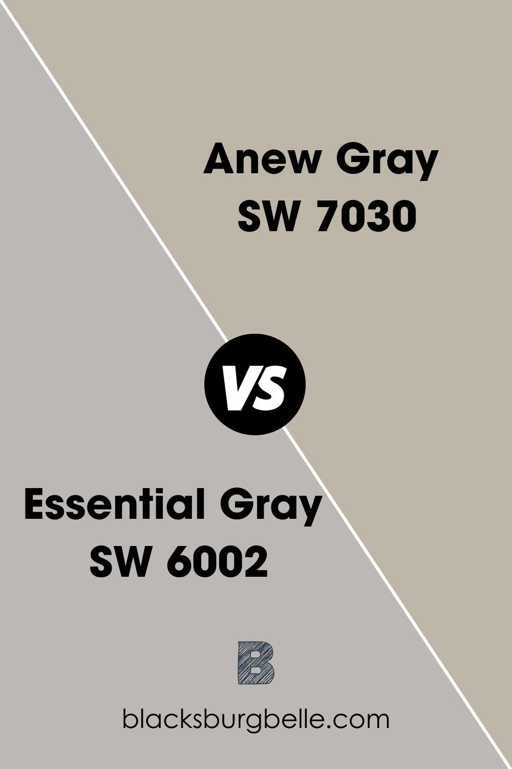
Sherwin Williams Essential Gray vs Anew Gray (SW 7030)
Essential Gray and Anew Gray boast a perfect blend of warmth and coolness. However, while Essential Gray may look a little bit washed out in a very bright room, Anew Gray boasts the ability to balance bright light without looking too washed.
Interestingly, these two colors are very close on the LRV scale—Anew Gray boasts an LRV value of 47 while Essential Gray boasts an LRV scale of 48. As a result, the two colors reflect an almost similar amount of light.
Both Sherwin-Williams Anew Gray and Essential Gray are very subtle in their undertones. While Anew Gray boasts green/violet undertones, you will find a lavender undertone in Essential Gray.
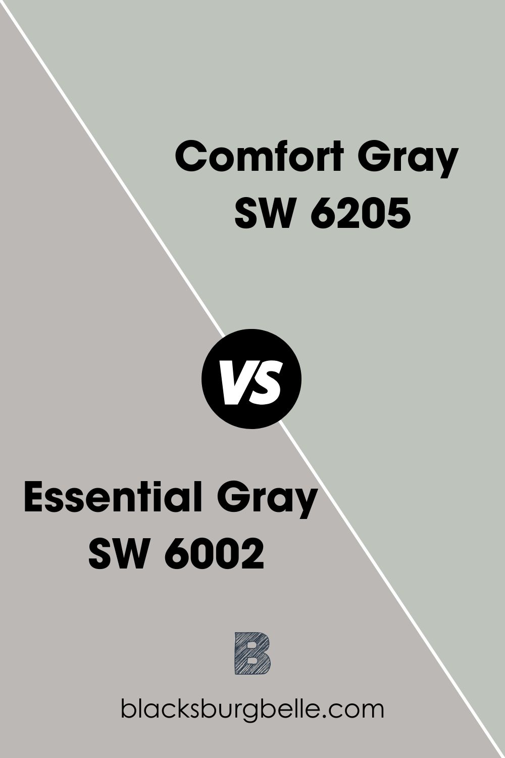
Sherwin Williams Essential Gray vs Comfort Gray (SW 6205)
Comfort Gray boasts a Light Reflectance Value of 54, just 6 points above Essential Gray, with an LRV of 48. The two colors are similar in that they both fall in the middle of the reflectance scale—neither too light nor too dark.
One thing that differentiates Sherwin Williams Comfort Gray from Essential Gray is that Comfort Gray behaves more like a chameleon. This color shifts between blue-green and green-blue depending on its location and lighting. This differs from Essential Gray, which boasts a very subtle lavender undertone—Essential Gray does not carry any other undertone.
Unlike Essential Gray, which is warmer, Comfort Gray is cooler and works well to balance out rooms with warm light. It is, however, worth noting that when observing the two paint colors on the warmth scale, they both sit in the middle.
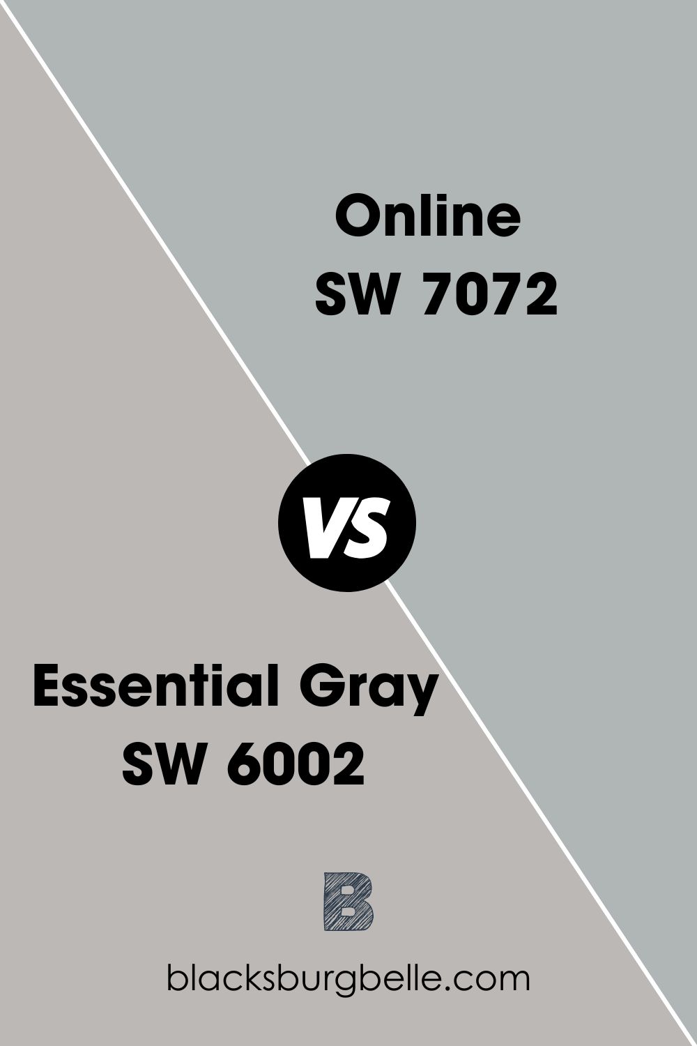
Sherwin Williams Essential Gray vs Online (SW 7072)
Unlike SW Essential Gray, which leans on the warm side, SW Online is a cool color. SW Online is a mid-tone color with an LRV of 45—this means that SW Online reflects less light compared to Essential Gray, which has a Light Reflectance Value of 48.
Regarding undertones, you will find notes of cool Green and Blue on SW Online. This is different from Sherwin Williams Essential Gray’s lavender undertone.
Sherwin Williams Essential Gray Color Palette
Coordinating Colors for Essential Gray
Essential Gray SW 6002 pairs nicely with the following colors:
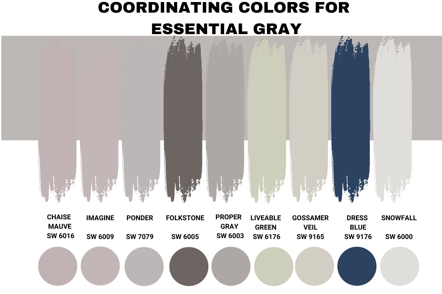
Chaise Mauve SW 6016
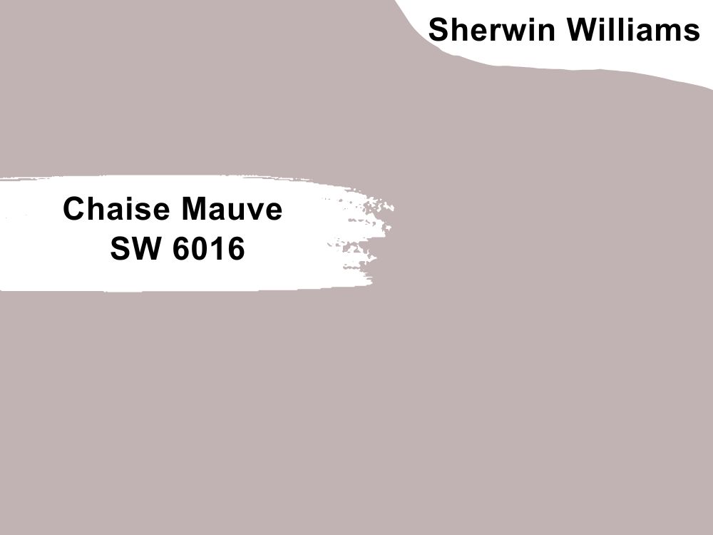
Sherwin Williams Chaise Mauve is a stunning color combination of Red: 193, Green: 178, and Blue: 179. Although this color belongs to the purple color family, whenever I see a pairing of SW 6016 and SW 6002, the two colors always seem to flow extremely well.
Chaise Mauve has a hue of 356 degrees, a saturation of 7.8%, and a brightness of 75.7% on the HSV scale. Regarding its ability to reflect light, Chaise Mauve is pretty close to Essential Gray, with an LRV of almost 46. The difference is that Chaise Mauve reflects less light than Essential Gray.
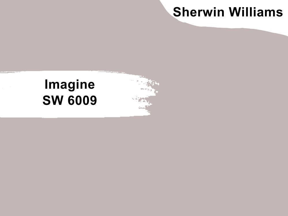
Sherwin Williams Imagine (SW 6009)
While SW Imagine SW 6009 is considered a light gray paint color, it features a purple tinge. The color is often regarded as clean, elegant, accessible, and glamorous—this makes it extremely close to SW Essential Gray, explaining why the two colors can be perfect in any room.
On the RGB scale, Essential Gray boasts Red: 199, Green: 182, and Blue: 178. Whenever I come across SW Imagine, it amplifies the warmth on the walls of healthcare facilities—this explains why you may want to pair it with Essential Gray, which shares an almost similar warmth.
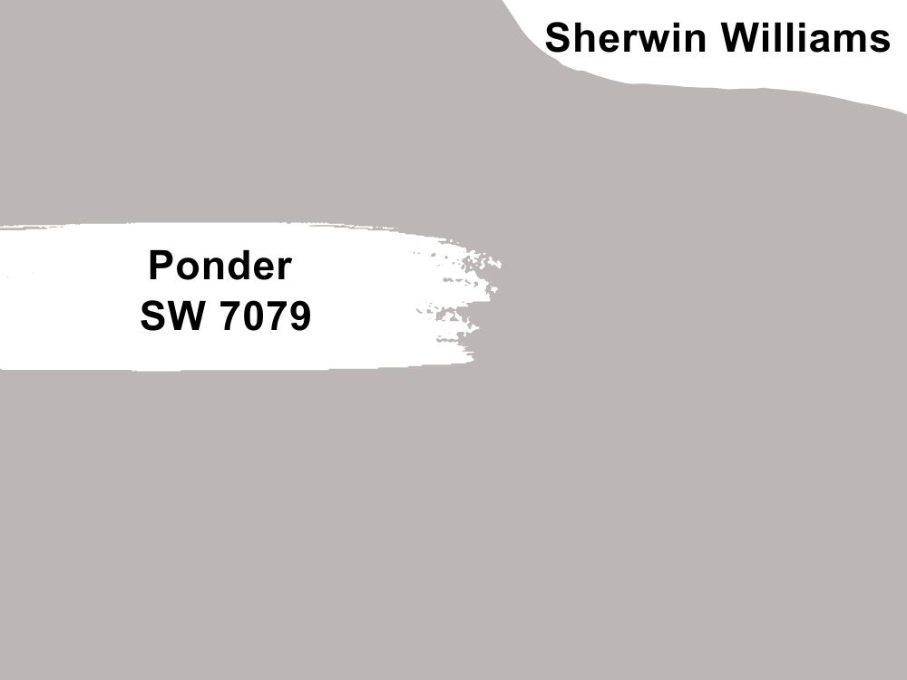
Sherwin Williams Ponder SW 7079
This is yet another purple paint color. Its RGB is not too far from Essential Gray—SW Ponder boasts Red: 188, Green: 182, and Blue: 182.
This color is famed for adding a modern or futuristic, clean, and graceful appearance to any space. This makes it a perfect pairing color to enhance the overall look of the SW Essential Gray SW 6002.
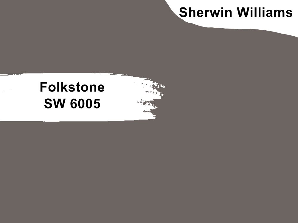
Sherwin Williams Folkstone SW 6005
Just like Essential Gray, Folkstone belongs to the neutral color family. Therefore, the RGB scale for Folkstone SW 6005 features Red: 109, Green: 101, and Blue: 98.
With an LRV of only 13, Folkstone is a pretty dark color. Whenever I have come across a pairing of Folkstone and Essential Gray, it has been only in very bright rooms where they balance the light with their darkish nature. Essential Gray and Folkstone in dark rooms do not produce the best results as they are too dull.
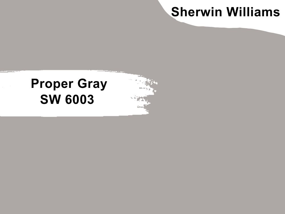
Sherwin Williams Proper Gray SW 6003
This is another paint color in the Neutral family. On the RGB scale, Proper Gray boasts Red: 173, Green: 168, and Blue: 165. The color boasts a hue of 22.5 degrees on the HSB/HSV/HSL scales. In addition, the paint has a saturation of 4.6% and a lightness of 66.3% on the HSL scale.
Proper Gray has an LRV of almost 40. This makes it a perfect pair for Essential Gray in bright light. However, you wouldn’t want to use the two colors in a dark room as they would turn out too dull/bland.
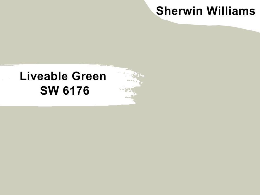
Sherwin Williams Liveable Green SW 6176
Unlike gray and typical beige, Liveable Green adds an exciting distinction to a room with Essential gray. This neutral green color boasts Red: 206, Green: 206, and Blue: 189 on the RGB scale.
Boasting an LRV of 61, this color is slightly brighter than Essential Gray. This means it can add some interest in the darker room where Essential Gray has been used.
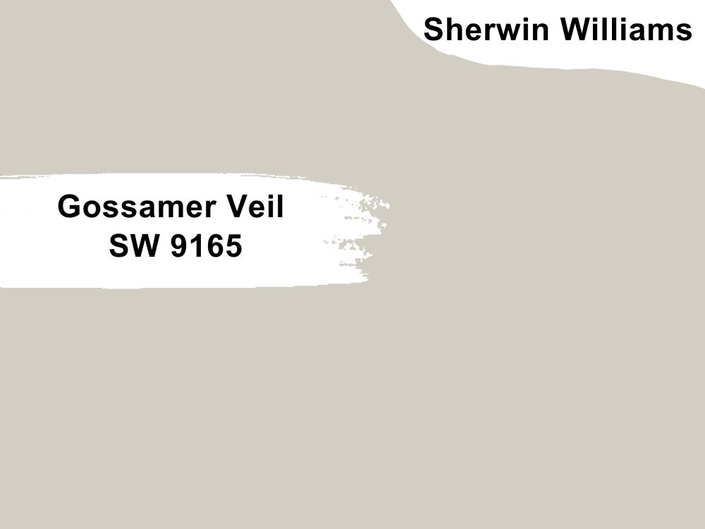
Sherwin Williams Gossamer Veil SW 9165
While SW Gossamer Veil is relatively new in the painting scene, it is slowly gaining popularity. This warm gray works perfectly with Essential Gray, which uses its bit of coolness to balance its warmth.
This color has an LRV of 62, which would work perfectly to create interest if you have Essential Gray in a darker room. Additionally, gossamer Veil boasts Red: 211, green: 206, and Blue: 196 on the RGB scale.
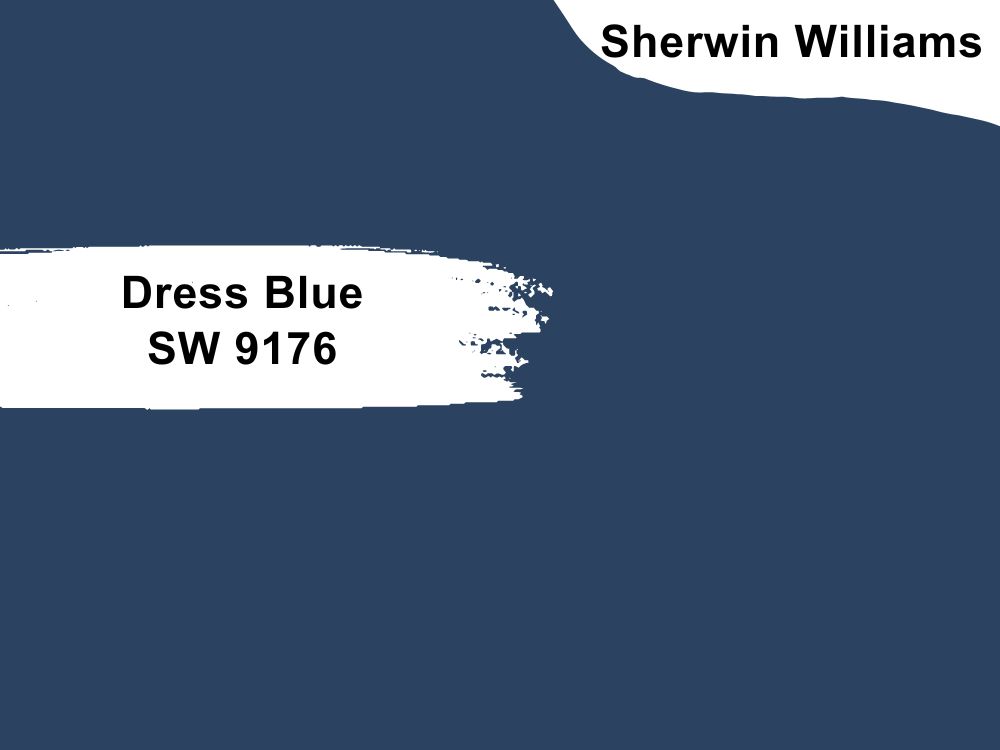
Sherwin Williams Dress Blue SW 9176
On the RGB scale, Dress Blues boasts Red: 43, Green: 67, and Blue: 96. The color has an LRV of 5, meaning it does not reflect much light. Therefore, when pairing Dress Blues with Essential Gray, I recommend using these paint colors in a brightly lit room to ensure the room is not too bland.
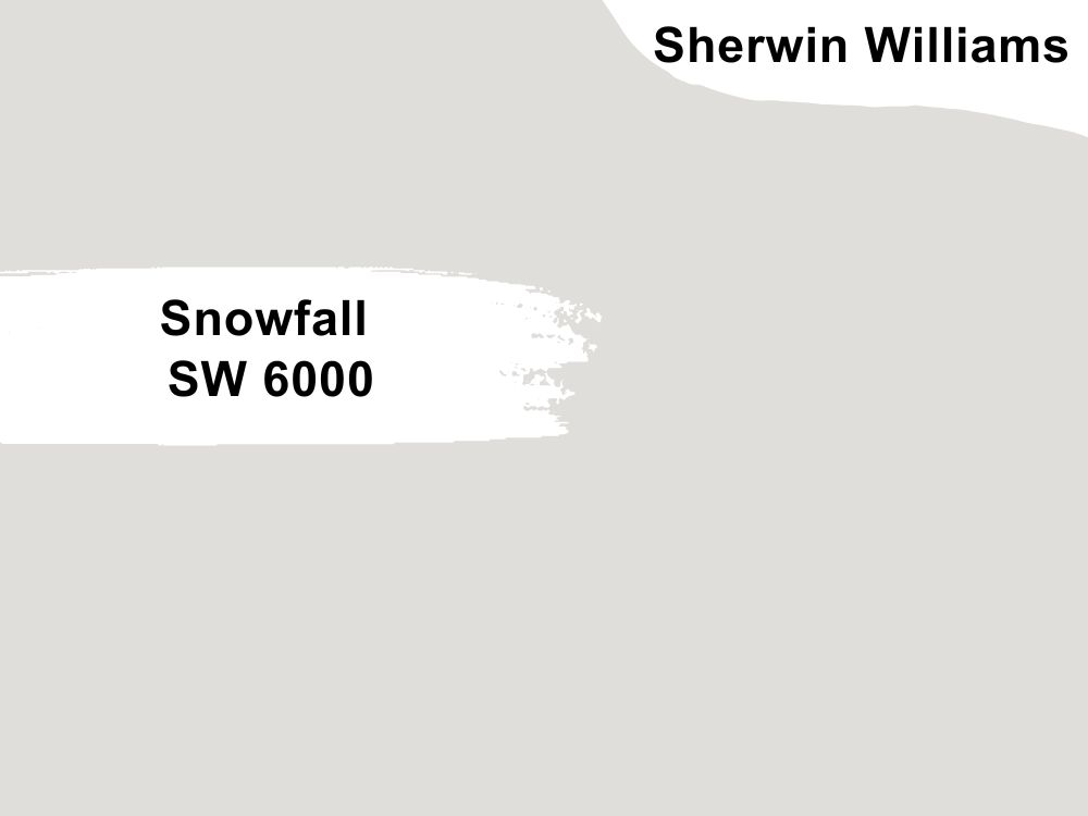
Sherwin Williams Snowfall SW 6000
This color is one of the brightest colors you can pair with Essential gray—it has a Light Reflectance Value of 73, making it ideal for a dark room where Essential Gray has been used.
The SW 6000 boasts Red: at 224, Green at 222, and Blue: at 218. The color is often used in areas that demand cool neutrals, for example, living well centers.
Essential Gray Complementary Color
Complementary colors are two colors that, when mixed, cancel each other, losing their hue to produce white or black (grayscale color). When you place the two colors side by side, they feature the most significant contrast—they are two opposite colors on the color wheel.
For Essential Gray SW 6002, the closest complementary color is Onyx—this color has a hex code of #434749. On the RGB Scale, Onyx boasts Red: 67, Green: 71, and Blue: 73.

What Trim Colors Go with Sherwin Williams Essential Gray?
My first step in the wall trimming process is painting my wall trims the same color as the main wall space. For instance, when painting my wall with Essential Gray, I would first paint the trim with Essential Gray. The only difference is that I would give my trim a unique semi-gloss finish. Next, I would use the following trim colors:
Sherwin Williams Natural Tan SW 7567
Off-white trims travel along mid-gray walls (such as Essential Gray) with a visual calm rather than the overbearing contrast or extreme harshness of more white trims. Natural tan is a perfect off-white that you can use on trims for Essential Gray.
Natural Tan boasts an RGB of (220, 210, 195). Regarding Light Reflectance Value, Natural Tan is 65, which makes it more reflective than essential gray, yet not too reflective.

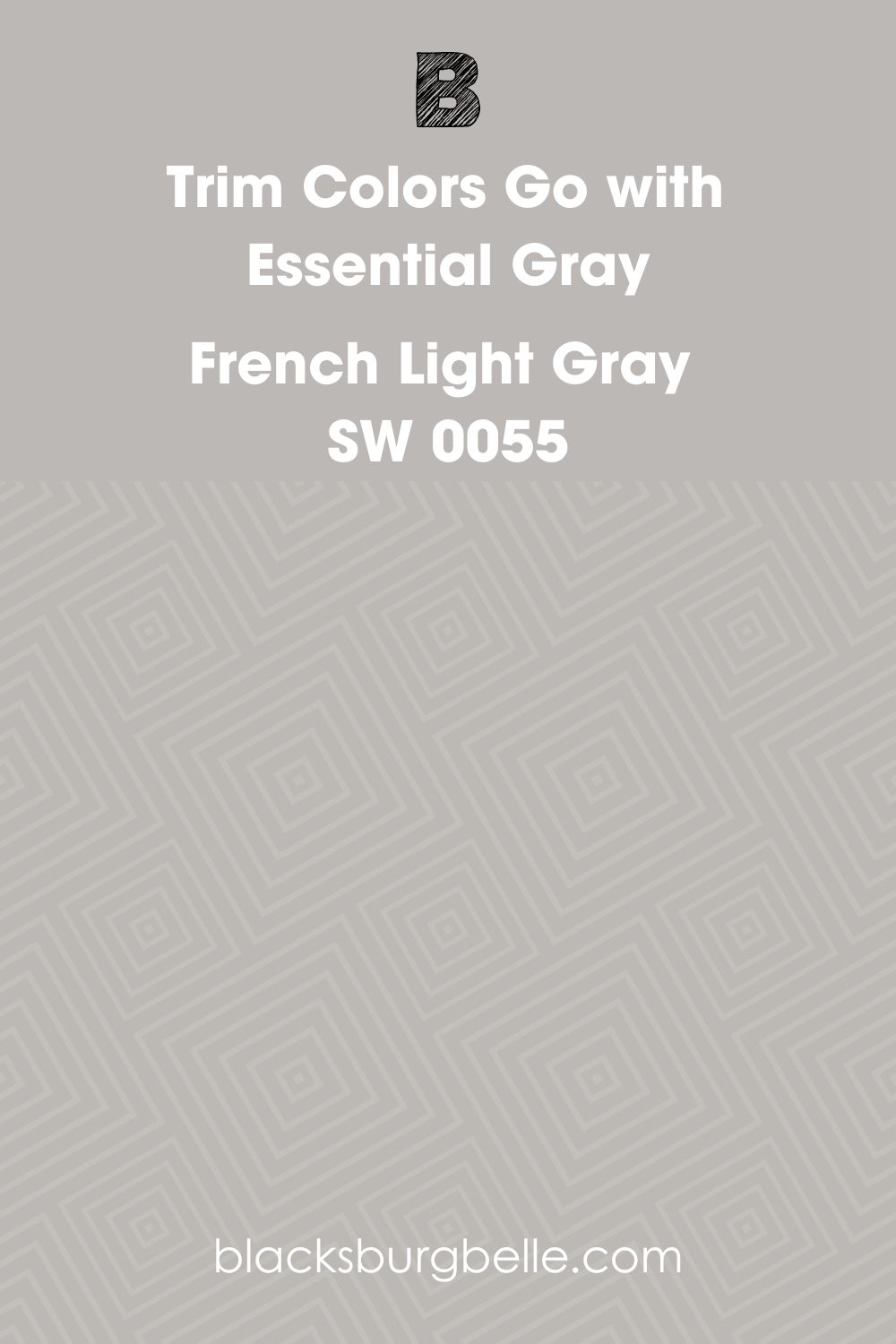
Sherwin Williams French Light Gray SW 0055
A light gray trim wrapped around any medium gray wall—in this case, our medium gray is Essential Gray—plays down insignificant moldings or flawed design, for example, a low ceiling. To further lessen the contrasting impact, I like to give the French Light Gray more sheen to create a subtle distinction while maintaining the cleaning ease.
French Light Gray has an RGB (194, 192, 187) and an LRV of 53. This makes it pretty similar to Essential Gray.
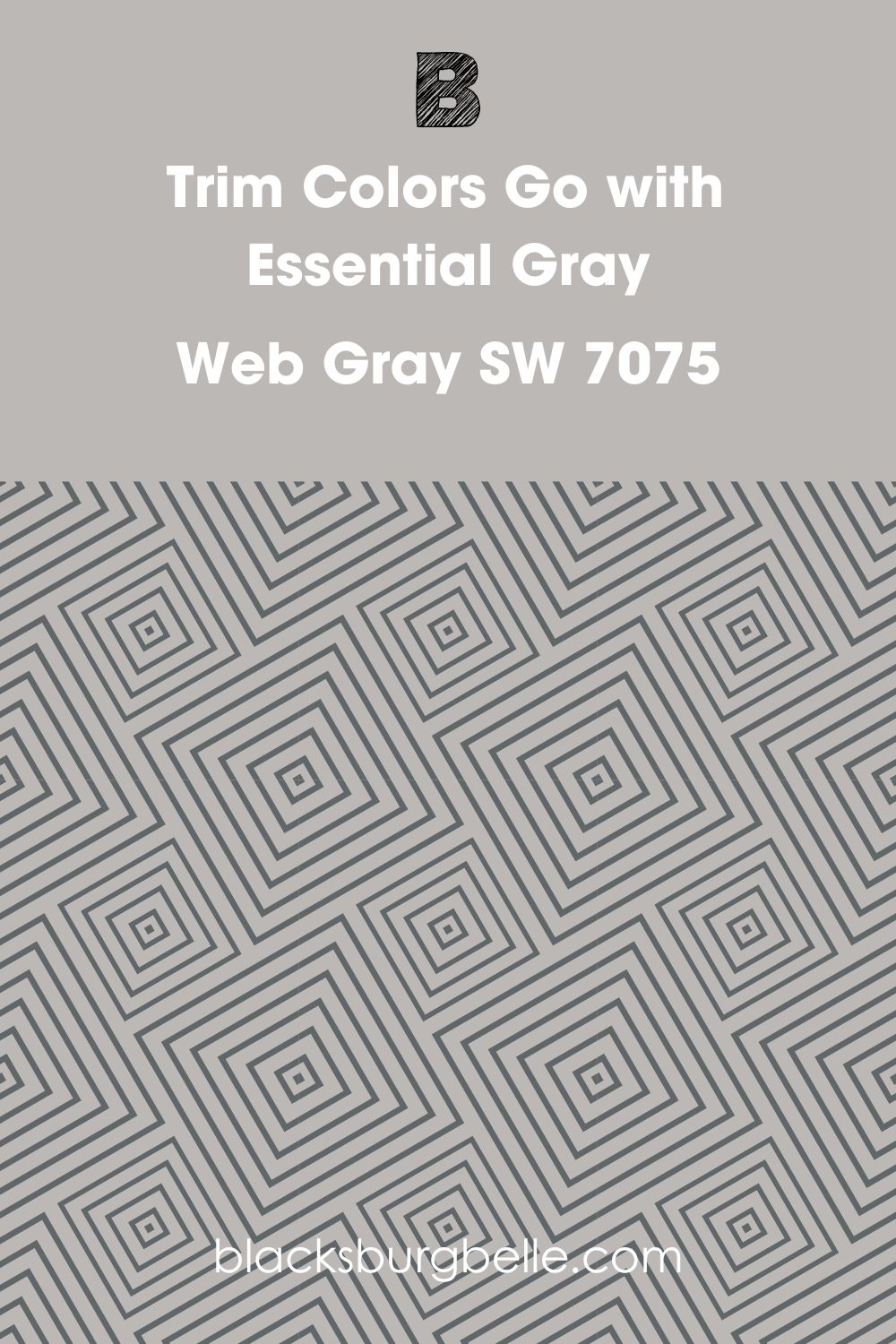
Sherwin Williams Web Gray SW 7075
A dark gray trim can give a calming look when paired with light gray walls. With an LRV of only 13, you can be sure that Web Gray SW 7075 is pretty dark.
Web Gray boasts Red: 97, Green: 102, and Blue: 105 on the RGB scale. In addition, the paint color also has blue and green undertones. So, the only thing you will need to do before pairing it with Essential Gray is to ensure that it will play into the color scheme of everything you have in the room.
Sherwin Williams Essential Gray Benjamin Moore Version HC-169
If you are on the market shopping for a Benjamin Moore version that resembles SW Essential Gray, you may want to try Benjamin Moore Coventry Gray. Like SW Essential Gray, the BM Coventry Gray boasts an LRV of 48.
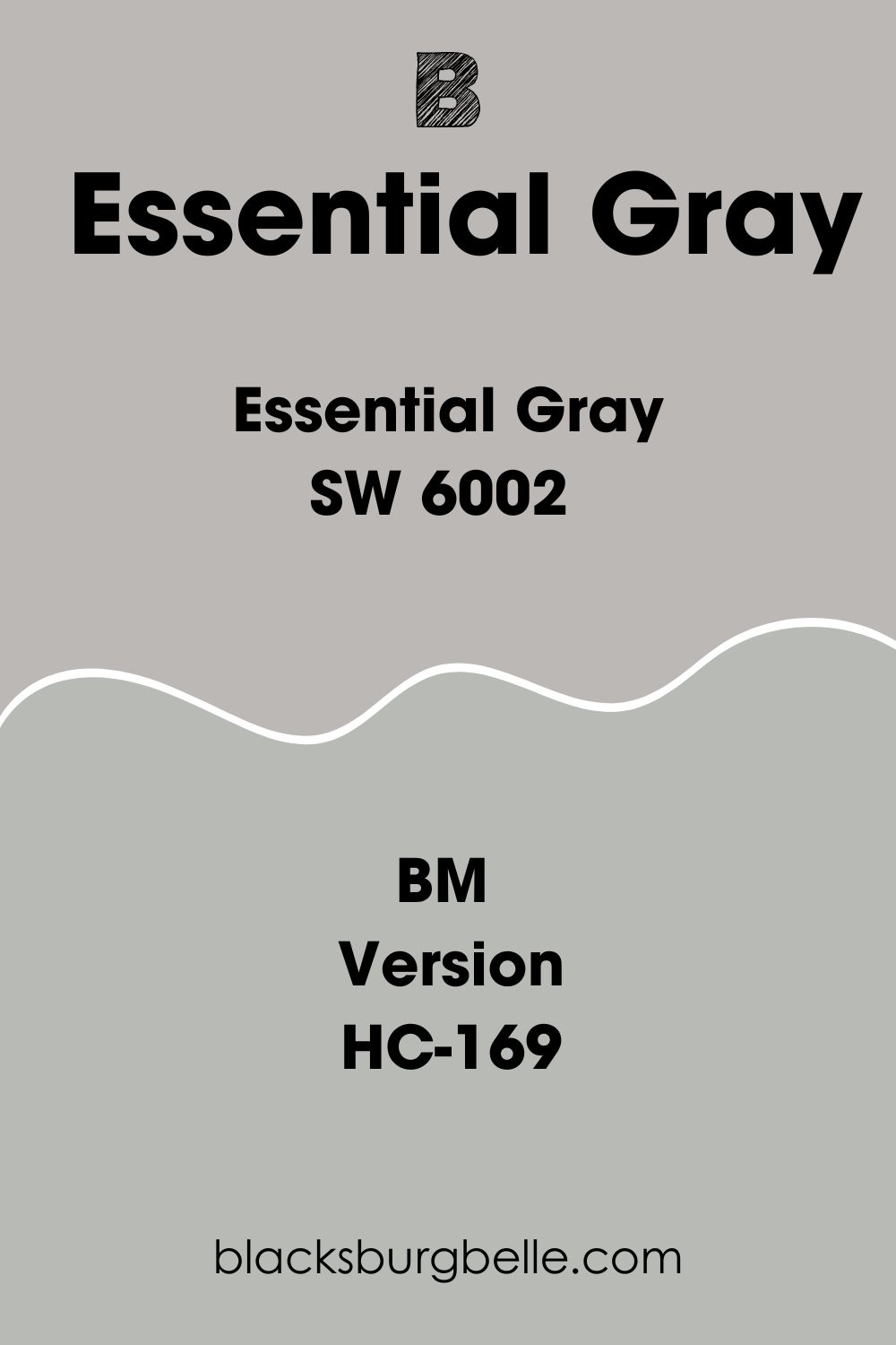
Coventry Gray boasts Red: 184, green: 186, and Blue: 182, which is not too different from Essential Gray, which has Red: 188, Green: 184, and Blue: 182.
Coventry Gray has a gentle blue undertone but can sometimes slide into a blue-green appearance in some lighting conditions. The color may also display a purple undertone, although rare.
BM Coventry Gray sits in the middle on the warmth scale like Essential Gray. It is neither too warm nor cool. If the light in the room faces north, Coventry Gray will appear cooler, with the south-facing light making it warmer.
How Does Light Affect Essential Gray?
Light in the north-facing rooms makes Essential Gray look slightly cooler by bringing out its lavender undertone. However, the lighter color (lavender) may appear somewhat muted, while the bolder color will be more visible.
In south-facing rooms, your Essential Gray will be in more light. The cool and warm tones in Essential Gray tend to work perfectly with south-facing light. However, the light can intensify the colors in the paint, such that its darker colors seem brighter, and its softer color (lavender) may seem as if it is glowing.
Best Rooms to Paint Essential Gray SW 6002
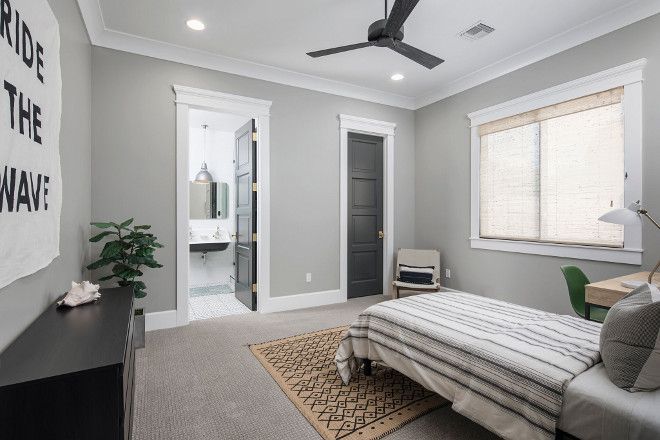
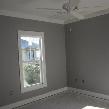
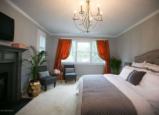
Sherwin Williams Essential Gray Bedroom
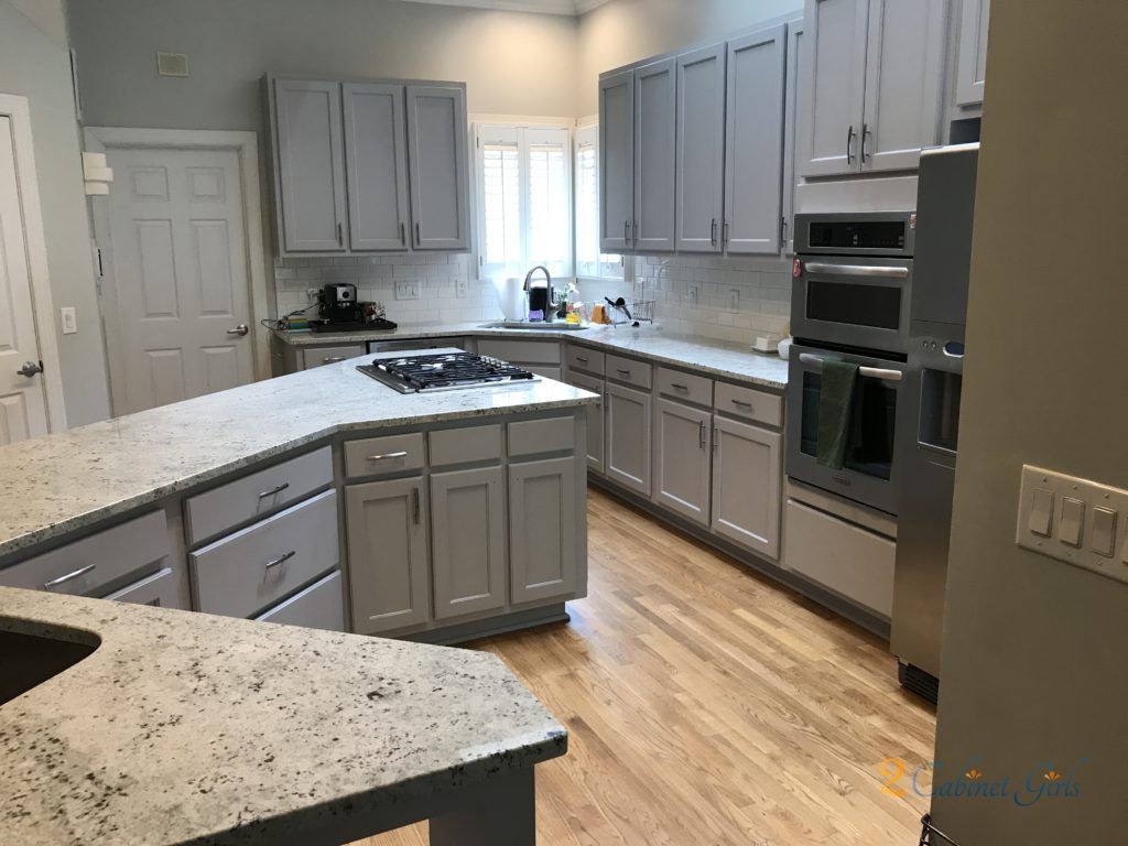
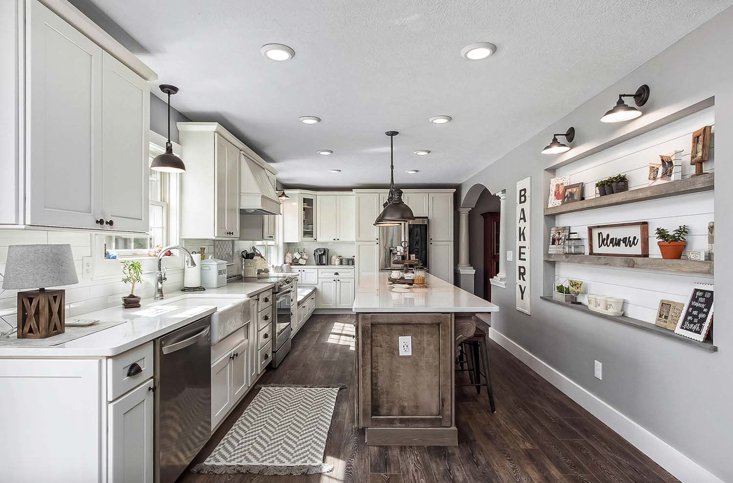
Sherwin Williams Essential Gray in Kitchen
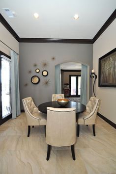
Sherwin Williams Essential Gray in Living Room
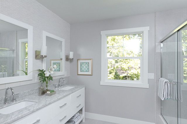
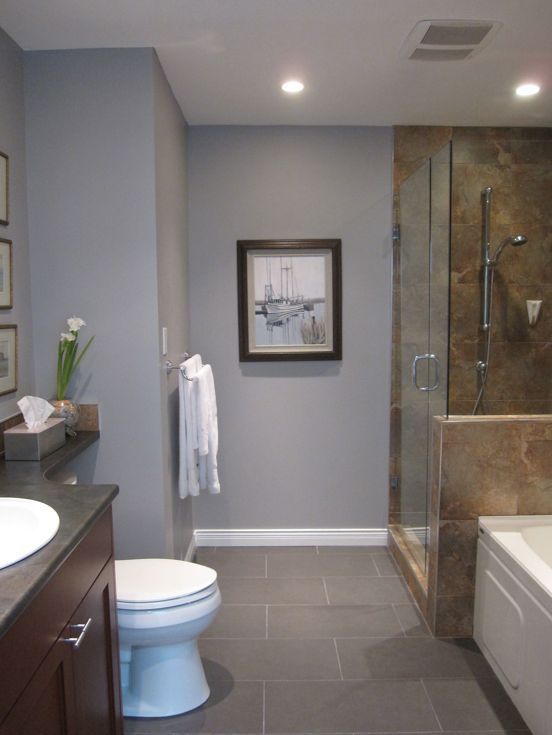
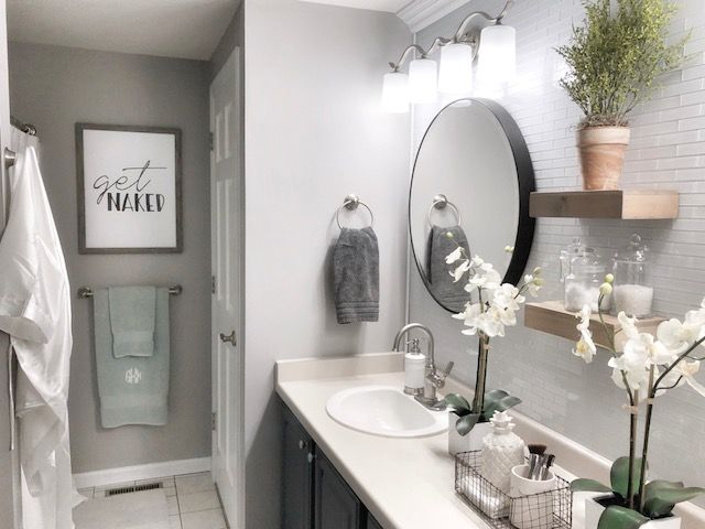
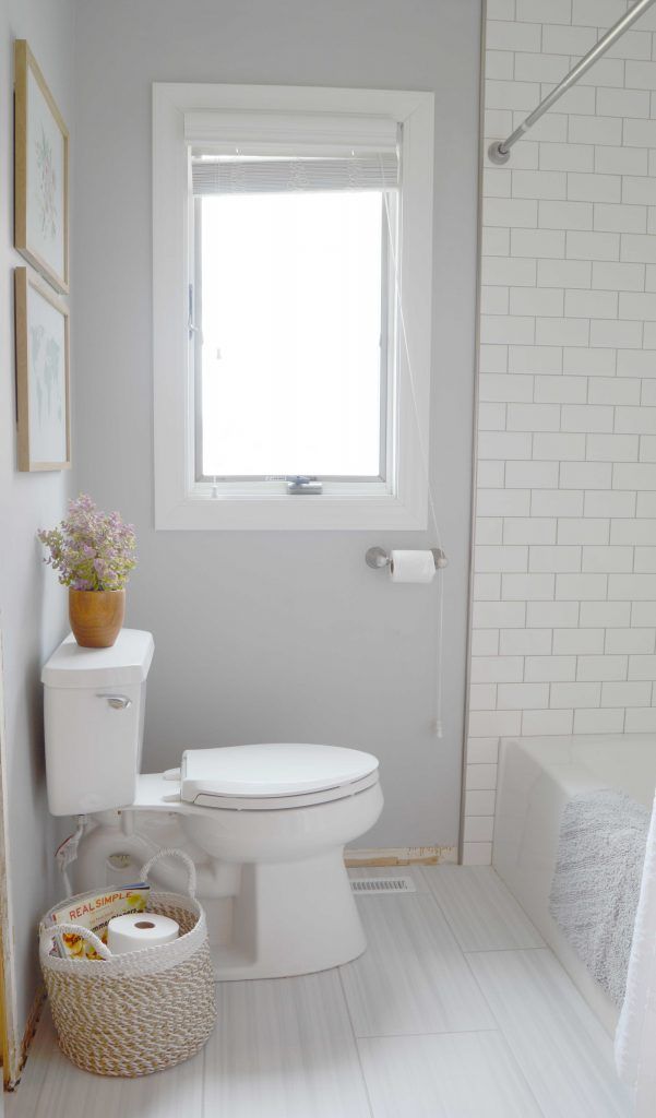
Sherwin Williams Essential Gray in Bathroom
Overview
Sherwin Williams Essential Gray is an excellent paint color for brighter rooms—with a Light Reflectance Value of 48; the paint color can make a dark room bland but balances out light in bright rooms. In addition, the color is sophisticated and coordinates well with a wide range of colors, so you won’t fall short of colors to use in your interior design project.
Essential Gray SW 6002 comes in handy for a wide variety of spaces. You can use it in your kitchen, living room, bathroom, and bedroom.
This paint color does not feature loud undertones. Therefore, you won’t have to worry about the paint color messing up your design with its lavender undertone.
We hope this article has answered your questions about Sherwin Williams Essential Gray. If there is a question we did not answer to your satisfaction, do not hesitate to let us know in the comments.
 Sherwin Williams Smoky Blue (Palette, Coordinating & Inspirations)
 Sherwin Williams Debonair (Palette, Coordinating & Inspirations)
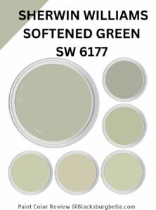 Sherwin Williams Softened Green (Palette, Coordinating & Inspirations)
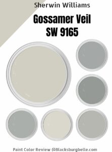 Sherwin-Williams Gossamer Veil (Palette, Coordinating & Inspirations)
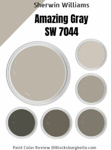 Sherwin Williams Amazing Gray (Palette, Coordinating & Inspirations)
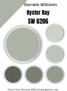 Sherwin Williams Oyster Bay (Palette, Coordinating & Inspirations)
