
Trying to pick a gray paint color for a neutral backdrop? There are many options, but one of the best ones is Repose Gray. This popular paint color from Sherwin Williams has everything you may want in a neutral choice, but is it ideal?
Sherwin Williams Repose Gray SW 7015 is a beautifully soft gray with enough neutrality to fit any color scheme. You will hardly get it wrong with this color because it can read cool and warm.
If you are torn between this color and other ones, this guide will show you every aspect of Repose Gray to help you decide. I’ll also compare it with other colors so you can an idea of how much better (or not) this light gray is over other options on your radar.
Table of Contents
When to Choose Sherwin Williams Repose Gray
Because of its versatility and neutrality, Repose Gray fits all colors. That is why it’s popular and finds itself on the bestseller list every year since its production. So, when is it right to choose Repose Gray over other similar gray paint colors? The following are pointers:
Want a balanced neutral?
It is not always easy to find that perfect gray that fits every color. Gray usually has undertones, sometimes warm, sometimes cool. But Repose Gray is the perfect fit for warm and cool colors because it is a balanced neutral.
Have crisp whites in your decor?
Crisp whites can make a space look stark and pristine. Therefore, it is usually better to use a complementary neutral or any other color with a corresponding tone. And Repose Gray fits that description. This is especially true for your kitchen.
Is there an abundance of light?
Repose Gray is not muted shade. And because it has a relatively decent LRV, it can appear washed out in bright lighting. As a result, avoid using it in a room with too much light to keep it from looking too stark.
Dealing with a lot of wood finishes?
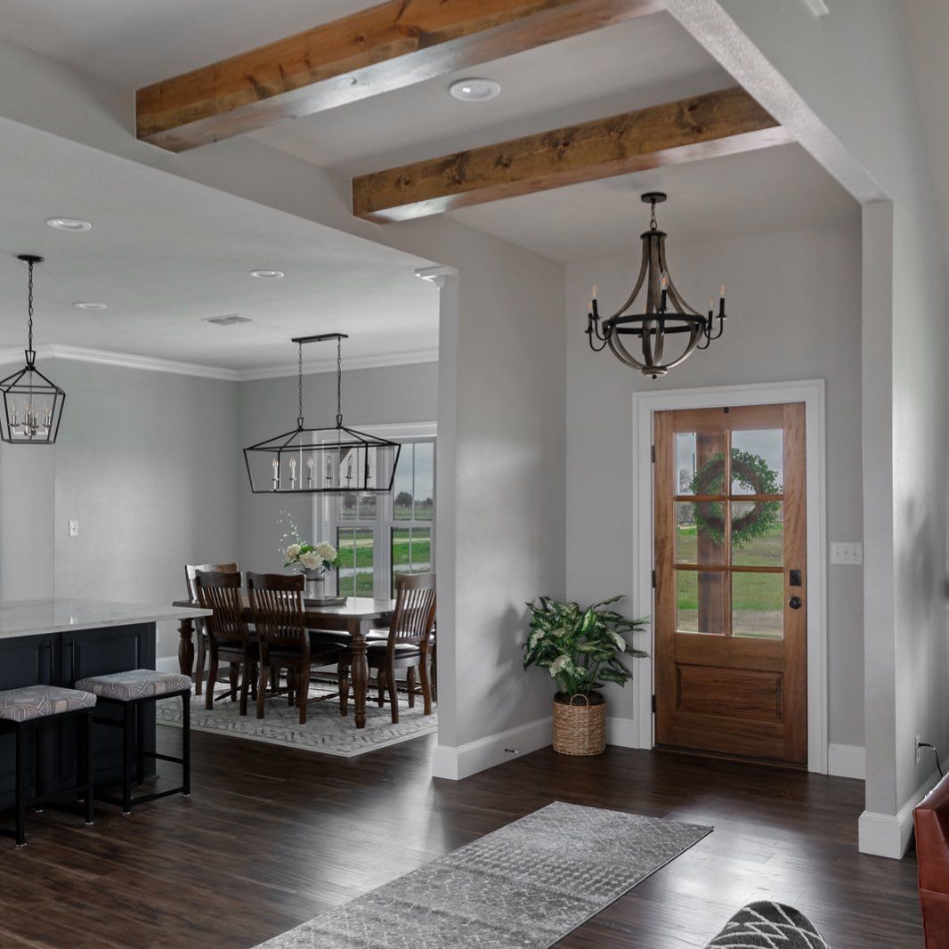
If your decor has wood finishes or flooring, Repose Gray looks striking when paired with them. This is because it can complement both warm and cool tones.
These points are a guide to determining when to use Repose Gray. There may be other reasons to pick it, but you now have an idea of where the paint color works best.
This should be enough to help you decide if it is a good choice, but I have other exciting things to show about this color. Come along with me on this journey.
What Color Is Repose Gray?
It may come as a surprise, but paint colors have names peculiar to their shades. Some are derived from nature or natural elements, while others get their names from elsewhere. They are deliberate to portray what these colors represent when in use.
Repose means to be asleep, to be tranquil, or to be in a state of rest. It can also mean being relaxed. So, the name Repose Gray refers to a tranquil and relaxed shade of gray. When you look at the paint color, you will understand why it has that name.
This particular shade is distinct from other shades because of its undertones, and the subtle hues that peek through the surface. You may not find any specific color that is similar to it in nature because of the infusion of colors to differentiate it from others.
Repose Gray is a light shade of gray with subtle undertones. It is a complex color that can show a bit of violet or green undertones. You may even notice a bit of brown or blue, depending on the lighting and surrounding elements. We will discuss more on the undertones later.
A Snapshot of Sherwin Williams Repose Gray Specifications
I created a chart to show the basic details of Repose Gray for a better understanding of what makes it unique. As already mentioned, the undertones of a paint color distinguish it from others, but the same is true about the LRV.
| Sherwin Williams Repose Gray | |
| RGB | R:204, G: 201, B: 192 |
| LRV | 58 |
| Undertone | Violet-green |
| HEX Code | #CCC9C0 |
The LRV of Sherwin Williams Repose Gray
If you’re new to the paint world, the term LRV may sound foreign to you. It simply means light reflectance value and refers to how much light a particular color reflects using a scale of 0 to 100. The scale puts pure white at 100 and puts pure black at 0.
However, no paint color has an LRV of 0 or 100 because none is an absolute color. So, the LRV of paint colors uses a scale of 2.5 to 94. This explanation is to help you understand how bright or dull this paint color is.
Repose Gray has an LRV of 58. Since the middle point of the scale is 50, you can see that this paint color is only slightly above this point. That means it reflects decent light but not too much to make it look bright.
I would like to point out that Repose Gray may look too light in a brightly lit room. It is a light gray paint color but not so light as to be mistaken for white. Therefore, the LRV is perfect for its shade, but it may appear too washed out if there is an abundance of natural light.
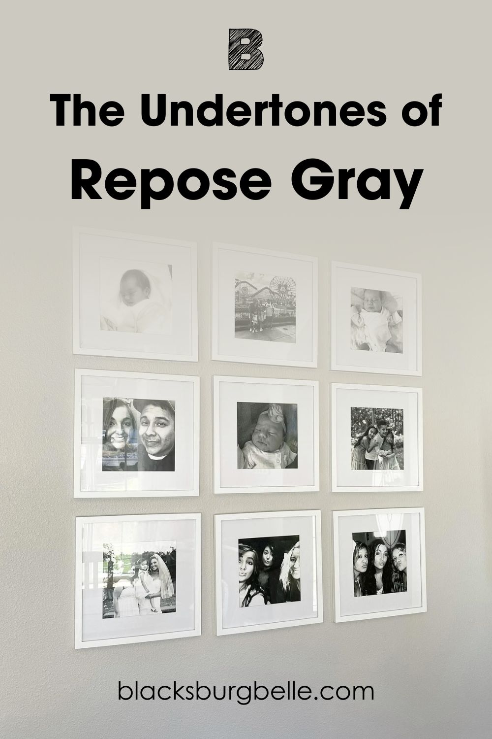
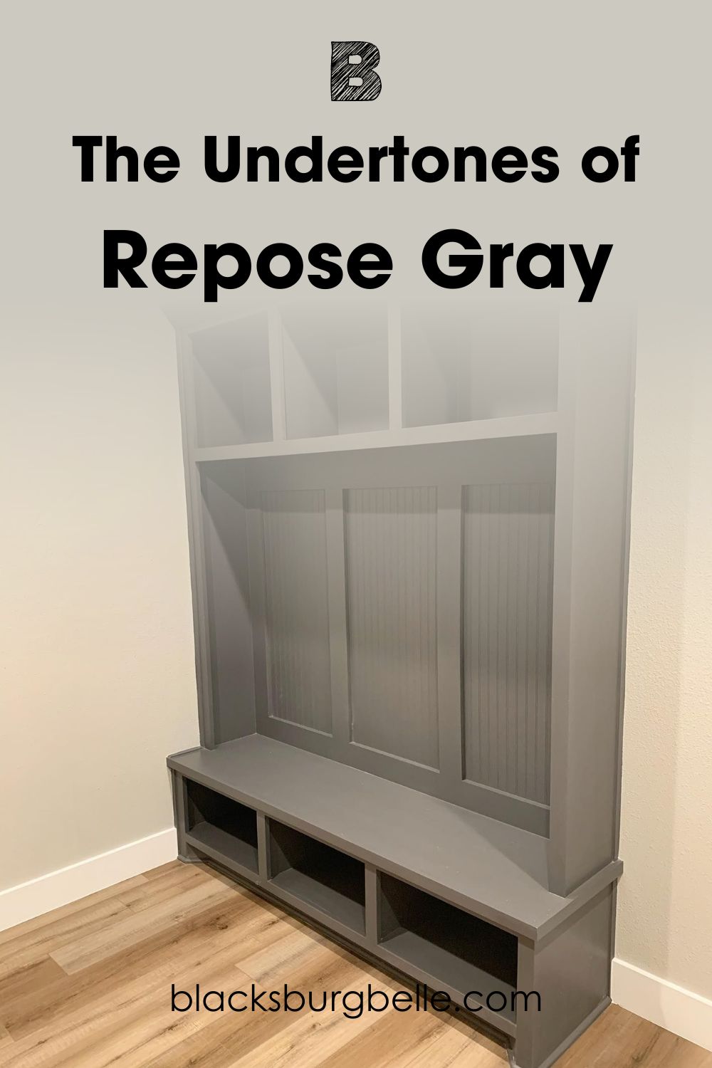
The Undertones of Sherwin Williams Repose Gray
I explained a little about the undertones of Repose Gray, but there are a few aspects that are crucial. Repose Gray has violet undertones that sometimes read like blue. It is easy to say the undertones are blue, and I can’t argue with that. However, the shade can change and look violet instead of blue.
At other times, you can see a hint of green or a warm beige in it. This paint color is complex when it comes to undertones as there is no specific one that remains constant.
This first picture is a true representation of Repose Gray:
But here is the paint color under bright light, looking warm and beige:
How Does Lighting Affect It?
Lighting may be the biggest factor affecting paint colors and how much they change, including Repose Gray. The paint color may read subtly warm one moment, and the next, it looks cold and crisp.
This next picture shows a hint of violet in the paint color because of the low light:
The color looks completely different from the one in the previous picture. It looks bland and gray with a hint of cool purple to add to its crispness.
In another room, Repose Gray shows a bit of green because of the different lighting:
Rooms can have different exposures based on the four cardinal directions and every other direction in between them. Rooms that face north have the least light, so Repose Gray tends to look obviously purple.
South-facing rooms have the best and brightest light, so Repose Gray may look less gray and more off-white. Such rooms have direct sunlight, and if you don’t want that effect, minimize the lighting in the room.
Artificial Lighting
Natural lighting is not the only lighting factor to consider. If you use a lot of artificial lighting, it is crucial to note how much the color can change. The same applies if the lighting is low. For example, these kitchen cabinets are painted in Repose Gray.
The white artificial light makes it appear off-white:
Keep in mind that colors can also change the colors. Light colors tend to pick up hues from vibrant colors used in the same room. For example, if you use vibrant blue accessories in a room with a light-colored wall, it may reflect on the wall, making it look slightly blue.
Is Sherwin Williams Repose Gray Warm or Cool?
Repose Gray is subtly warm, but that is not all there is to it. Many times, the paint color reads neutral and other times, it reads cool. This depends on the visible undertones per time. But its actual color makes it appear neutral.
That is why it is suitable for many homes, although no paint color is absolutely compatible with EVERY color. However, some are more balanced when it comes to tones than others, and Repose Gray falls in that category.
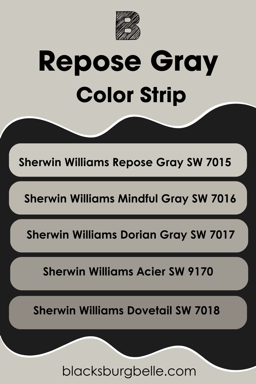
Sherwin Williams Repose Gray Color Strip: Lighter or Darker Exploration
Sometimes, our ideal paint color ends up not looking exactly like what we have in mind. This is especially true when we see it in real-life use.
If you find that Repose Gray, as great as it may seem, is not the exact gray shade you want, I have a color strip, from light to dark, to show you. There may be a better shade that performs just as excellently as Repose Gray.
- Sherwin Williams Repose Gray SW 7015
- Sherwin Williams Mindful Gray SW 7016
- Sherwin Williams Dorian Gray SW 7017
- Sherwin Williams Acier SW 9170
- Sherwin Williams Dovetail SW 7018
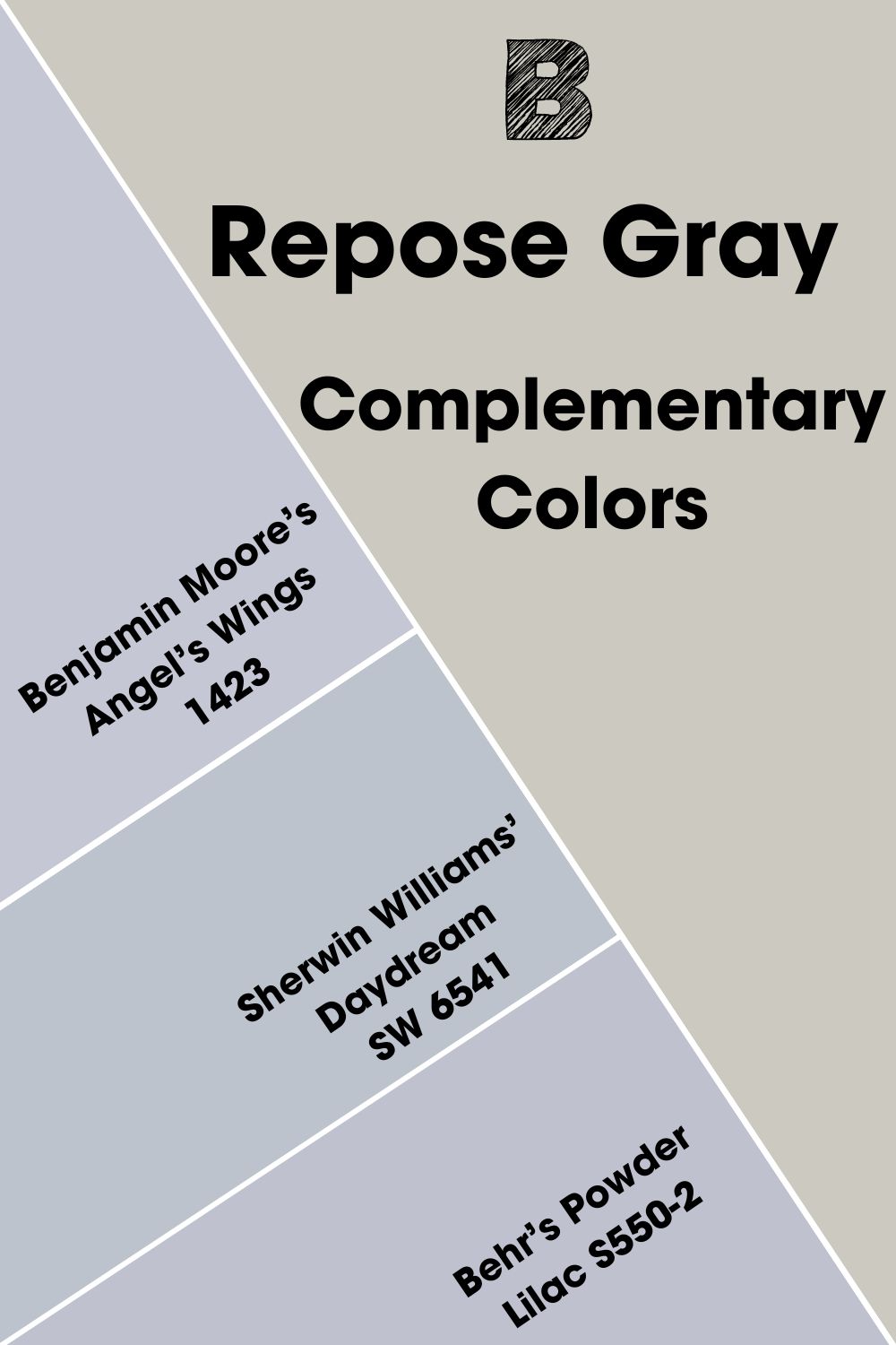
Sherwin Williams Repose Gray Complementary Colors
You may have heard about complementary colors but have no idea what they are. If you have ever seen a color wheel, complementary colors are those opposite each other. Unlike the name, these colors don’t necessarily have to match at first glance.
They are usually shades that cancel each other to produce a grayscale of back, white, or similar hues. Good examples include violet and teal, green and red, or blue and orange.
The best complementary color for Repose Gray is a light lavender gray with an RGB of 192, 195, and 204 respectively. Benjamin Moore’s Angel’s Wings 1423 is the color that best matches this shade in this regard. If that isn’t available, try Sherwin Williams’ Daydream SW 6541 or Behr’s Powder Lilac S550-2.
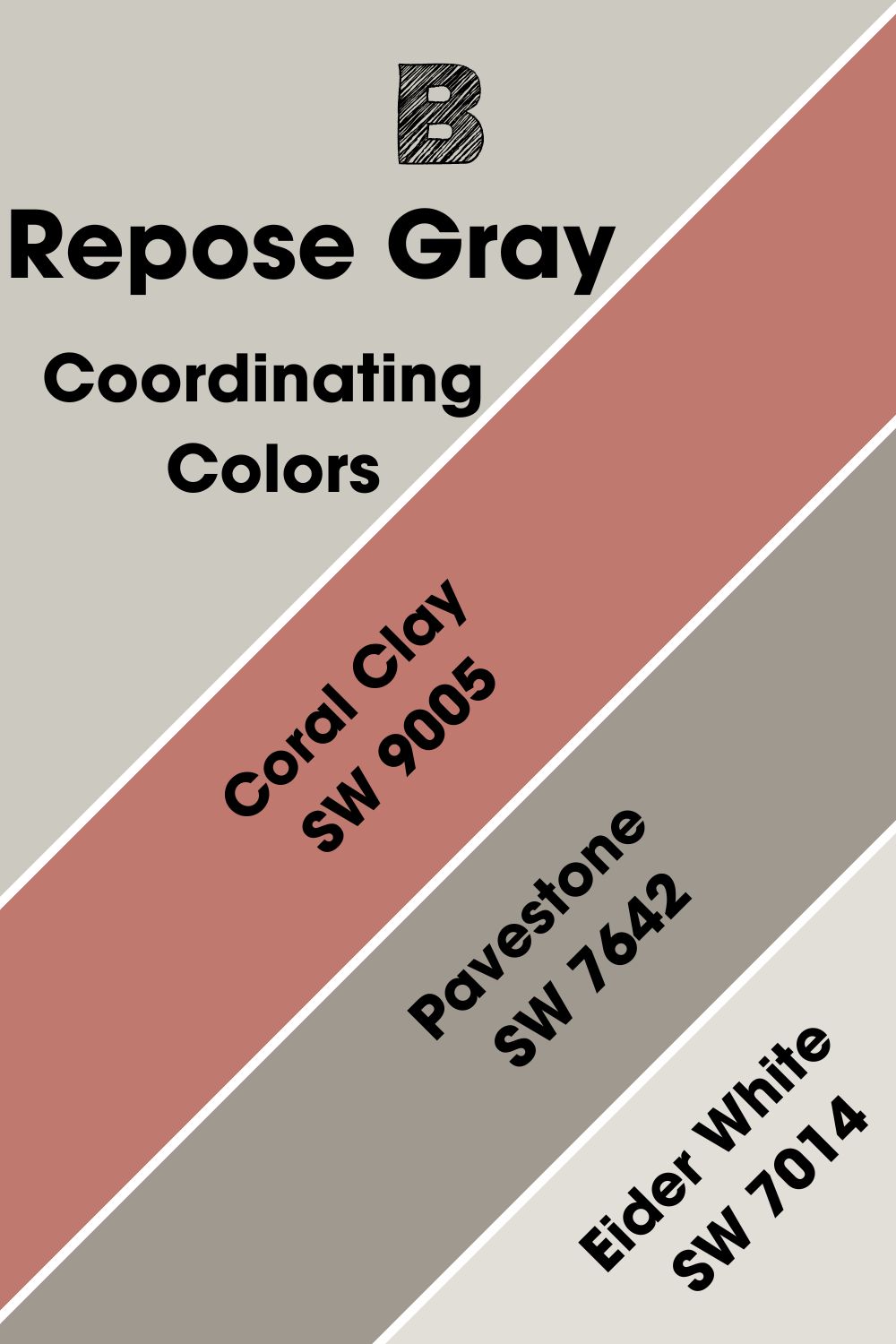
Sherwin Williams Repose Gray Coordinating Colors
If you have had issues identifying coordinating colors, you don’t have to look any further. Coordinating colors work and pair well with other colors or color schemes. They usually have similar tones, although the colors may appear different.
What colors make the best-coordinating colors for Repose Gray? They include Coral Clay, Pavestone, and Eider White.
- Sherwin Williams Coral Clay SW 9005: A rich red paint color with a gentle touch that corresponds well with Repose Gray, especially with its orange undertones.
- Sherwin Williams Pavestone SW 7642: A more saturated gray paint color with depth and strength to make Repose Gray work.
- Sherwin Williams Eider White SW 7014: A white with gray undertones that pair well with the Repose Gray shade for a neutral and seamless flow.
You can use these colors to create a color palette, but there are other colors to consider, and I’ll get to that next.
Sherwin Williams Repose Gray Color Palettes
Some paint colors are not suitable for whole-house use, so you must find other colors to support them. That is why you create a color palette according to the colors in your decor or what fits your style.
Contrasting Color Palette
- Snowbound SW 7004: A cool white paint color with slightly gray undertones that pair well with other gray-hued colors.
- Black Bean SW 6006: A cool neutral paint color with enough depth to blend with a light neutral like Repose Gray.
- Softened Green SW 6177: Its name tells you how calming and soft it is, and it creates a soft contrast with Repose Gray, despite the touch of gray in it.

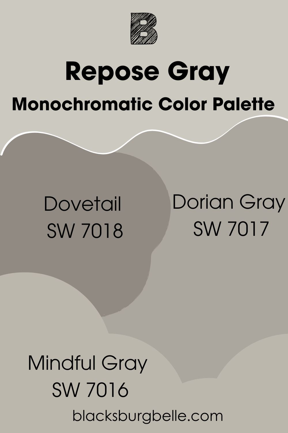
Monochromatic Color Palette
- Dovetail SW 7018: A more saturated version of Repose Gray that brings depth and balance to the decor.
- Dorian Gray SW 7017: Still on the same trajectory, Dorian Gray is slightly lighter than Dovetail but darker than Repose Gray for a fuller feel.
- Mindful Gray SW 7016: You can use this option in place of Repose Gray if you want a gray shade that doesn’t look washed out in bright light.
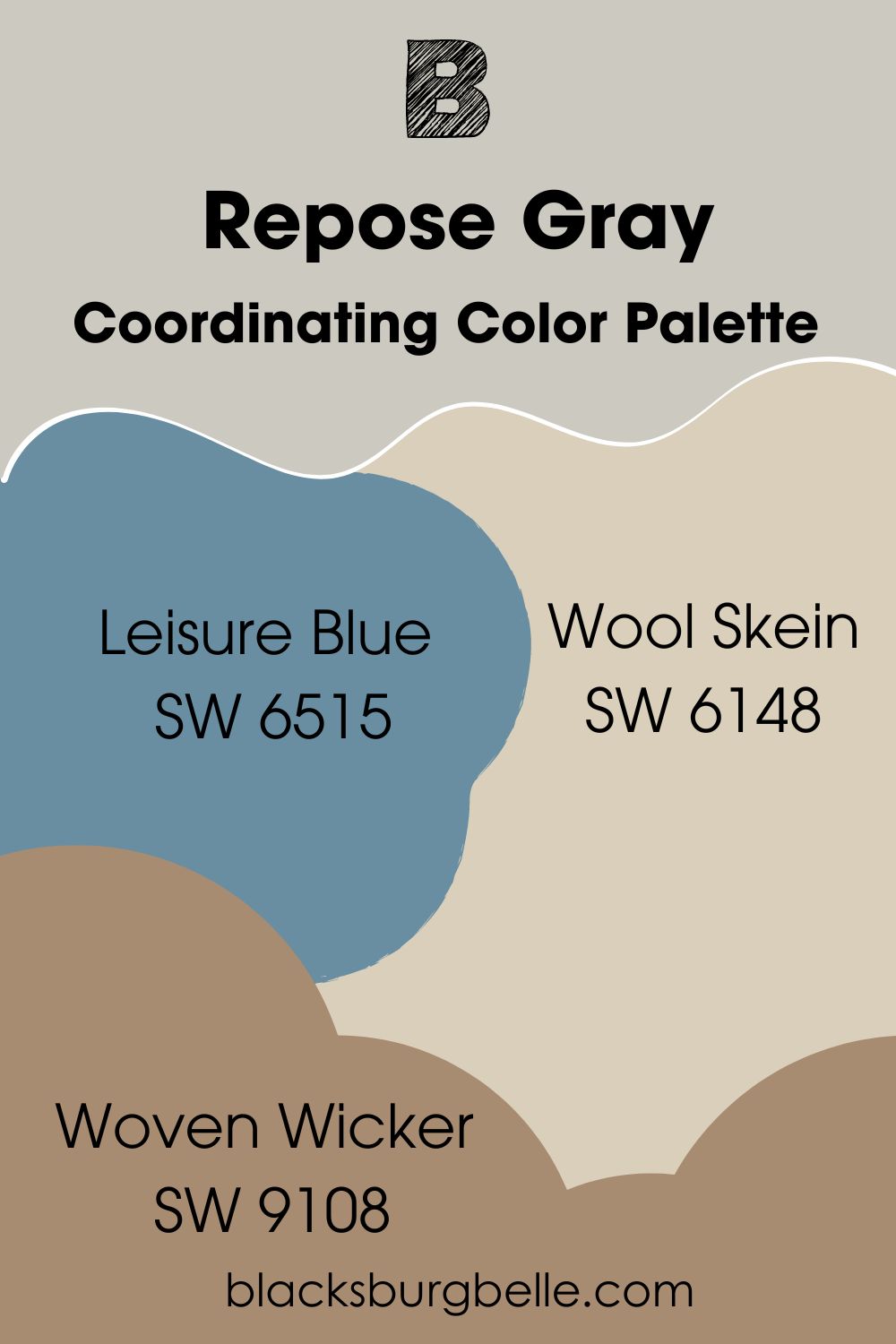
Coordinating Color Palette
- Leisure Blue SW 6515: A saturated blue paint color with a hint of purple that coordinates well with the hint of purple in Repose Gray.
- Wool Skein SW 6148: A light tan with slightly yellow/orange undertones that bring warmth into the decor.
- Woven Wicker SW 9108: A dark shade of tan with wheat undertones to coordinate well with a soft color like Repose Gray.
Sherwin Williams Repose Gray vs Similar Colors
Have you compared Repose Gray to similar colors? Its lightness appears like white or off-white in some cases, but I’d like you to see how it performs against other colors with similar tones.
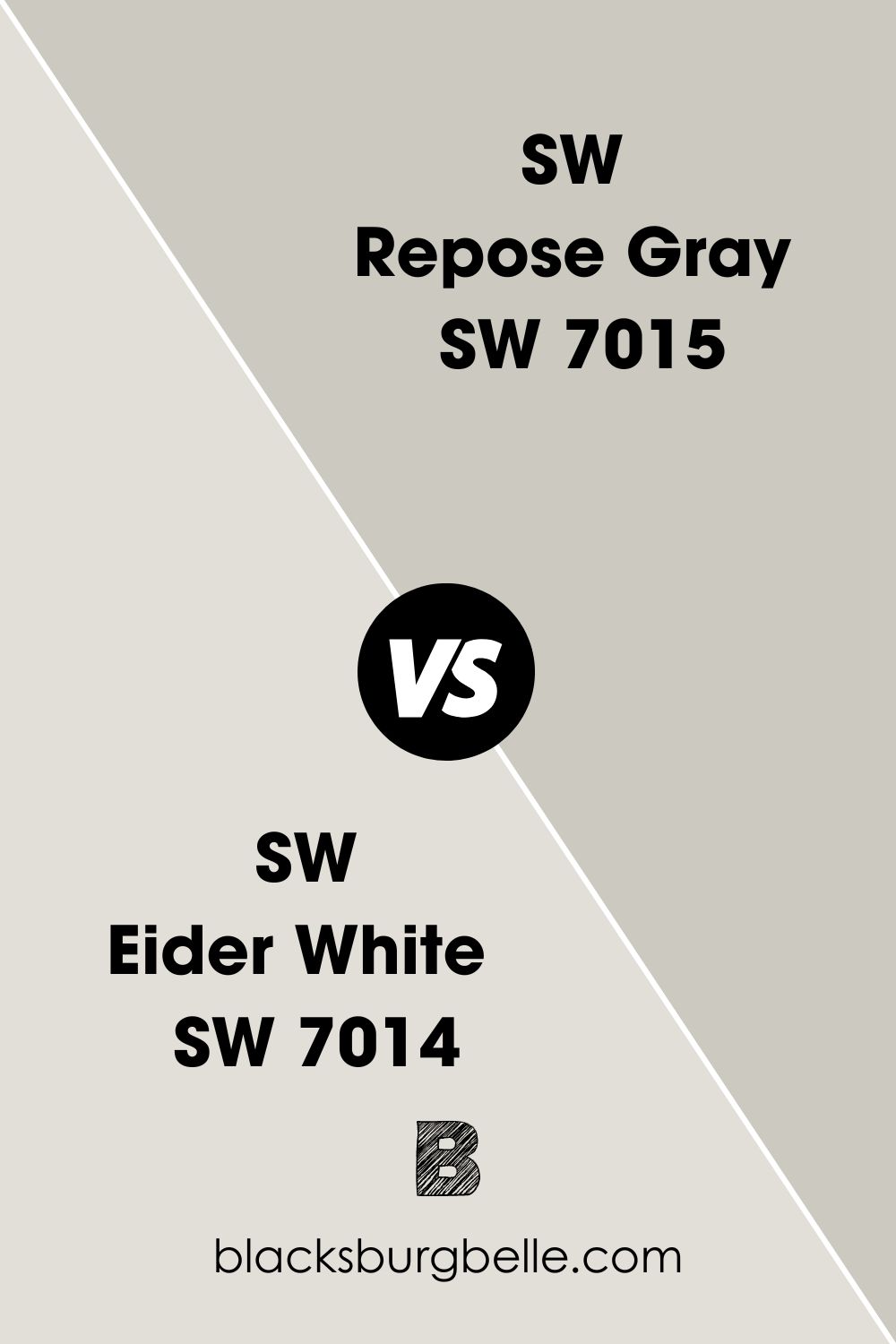
SW Eider White vs SW Repose Gray
Eider White looks bright and white compared to Repose Gray. This is because it has a higher LRV and is a white paint color, although it is muted. But both colors have similar undertones of purple.
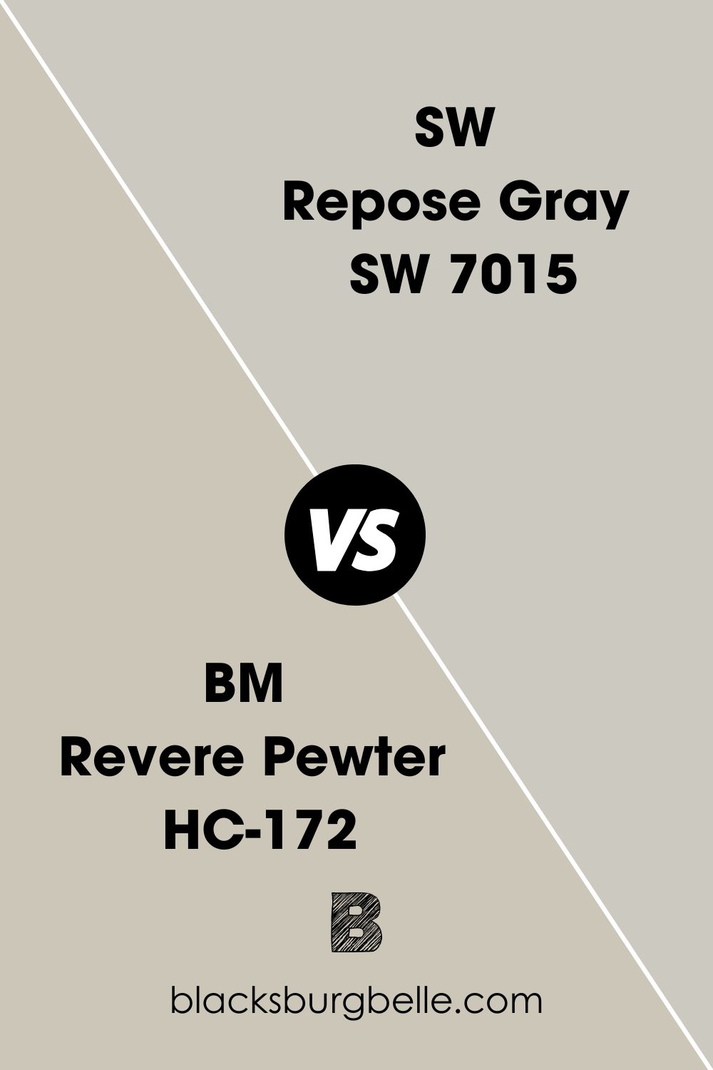
SW Repose Gray vs BM Revere Pewter
Benjamin Moore’s Revere Pewter is a warmer color and is technically not gray. Repose Gray looks clean and crisp beside it, although they have similar green hues in them.
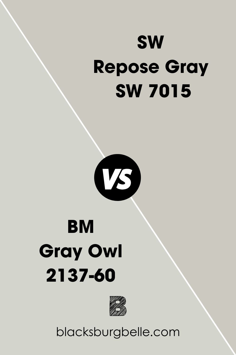
BM Gray Owl vs SW Repose Gray
Gray Owl appears cooler than Repose Gray when they are used side by side. It has greenish-blue undertones, which make it slightly different. Besides, it is a brighter gray paint color than Repose Gray.
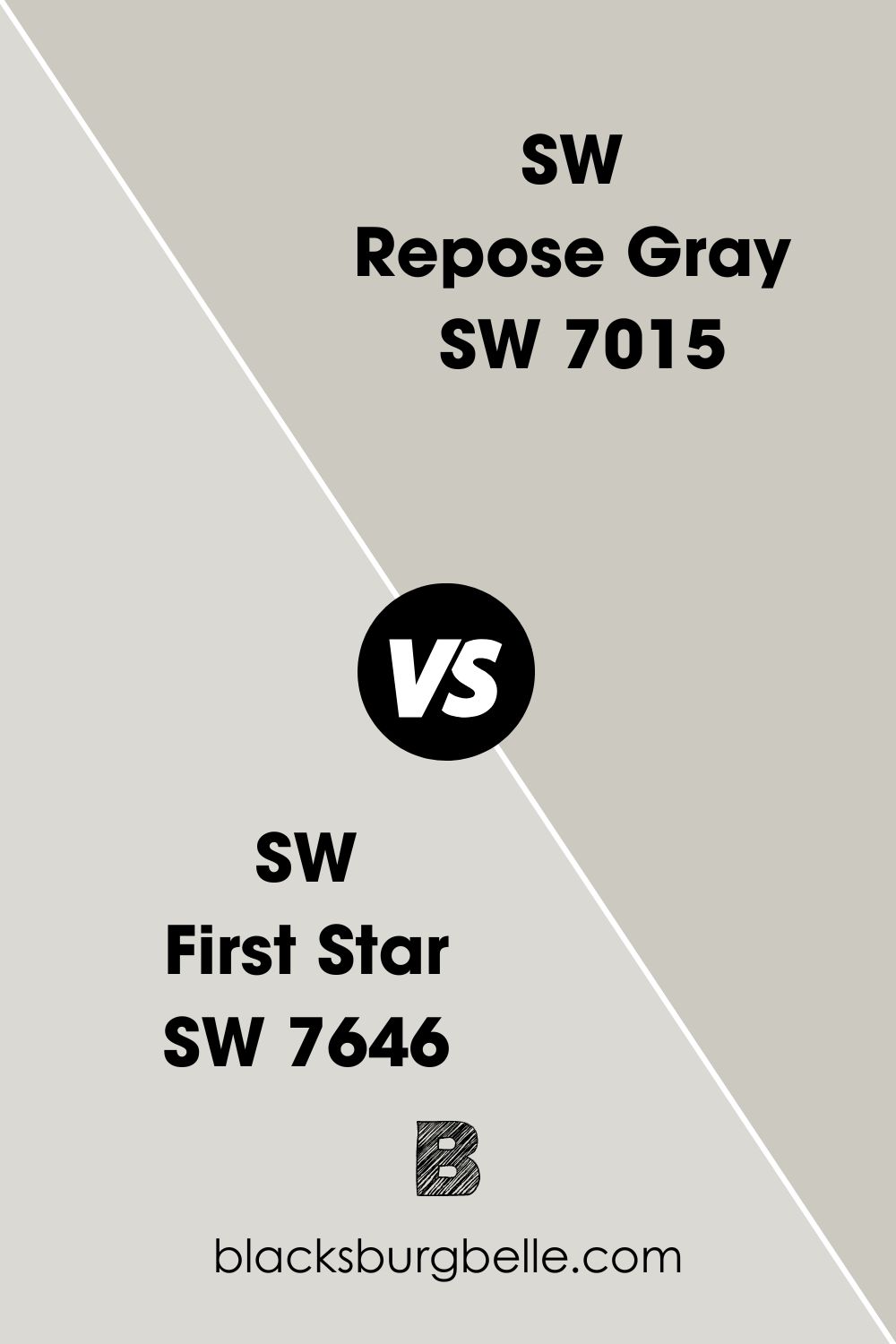
SW First Star vs SW Repose Gray
First Star has a higher LRV than Repose Gray. This means it reflects more light than Repose Gray. Moreover, it has more obvious blue undertones that make it look crisp and cool.
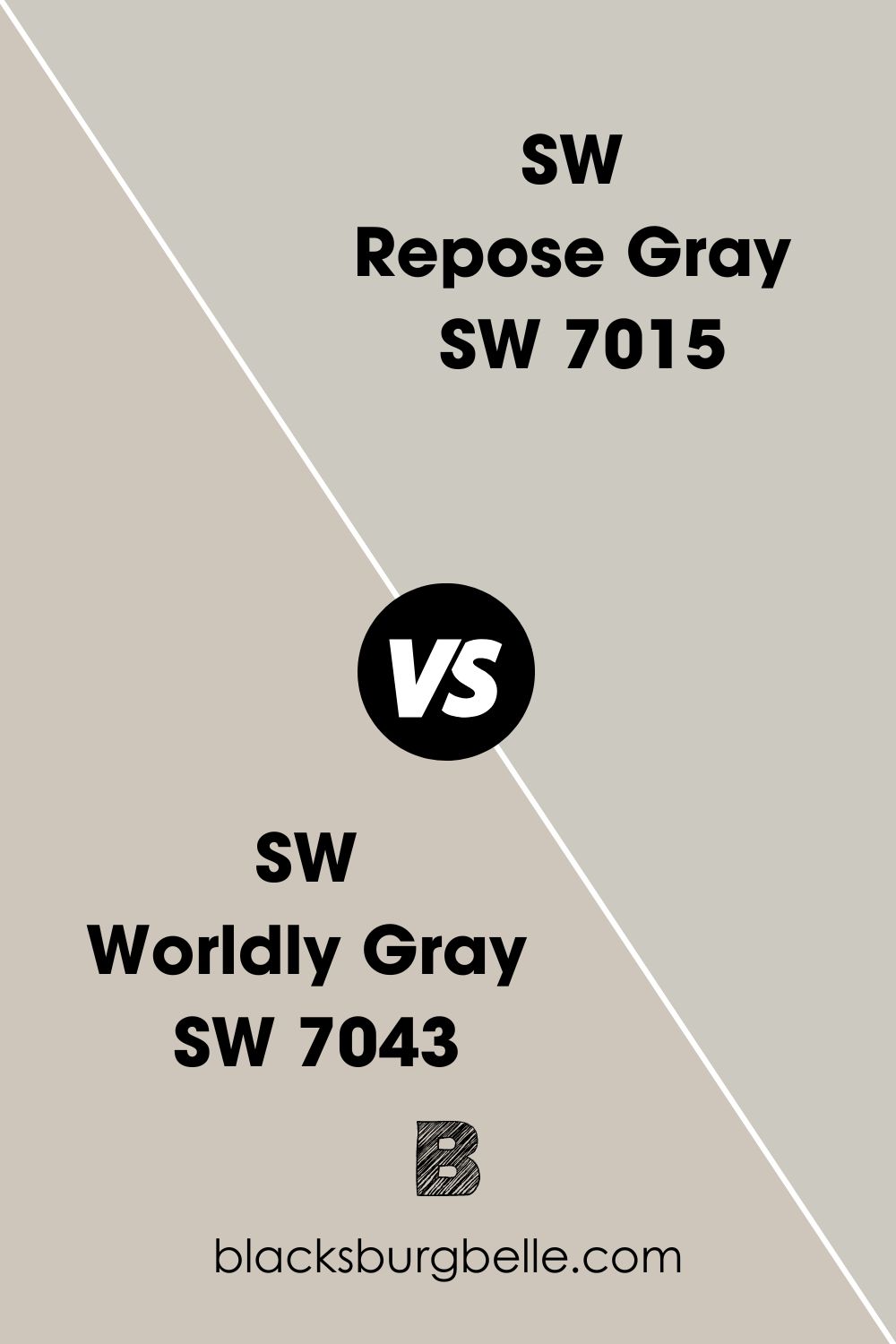
SW Worldly Gray vs SW Repose Gray
Worldly Gray is warmer than Repose Gray and has more obvious green undertones. You may not see the difference until you compare them side by side. Repose Gray grows cool and crisp beside Worldly Gray.
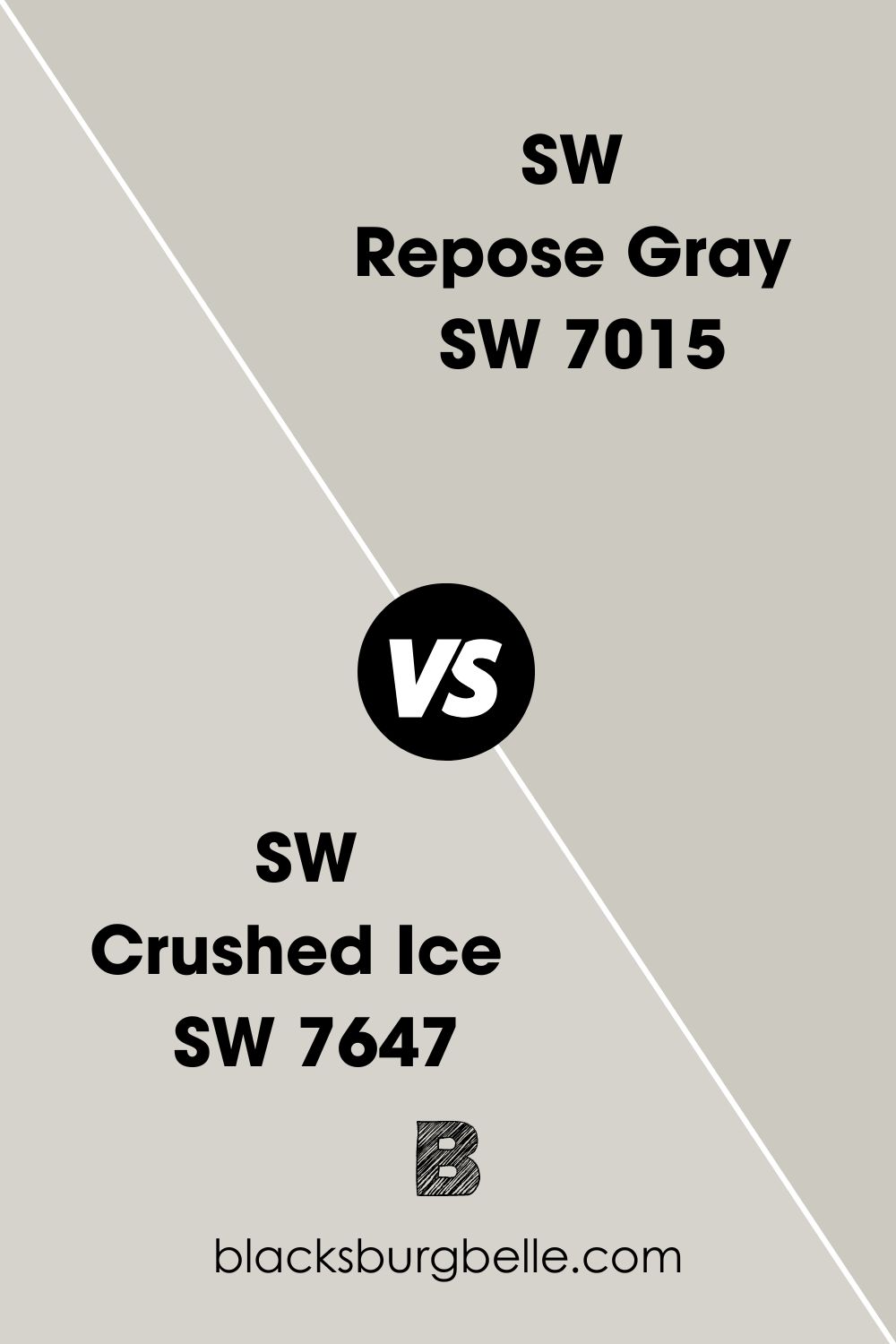
SW Crushed Ice vs SW Repose Gray
While they may look alike when apart, Crushed Ice is cooler and lighter than Repose Gray. That said, you can interchange one for the other if you don’t mind the slight difference in shade and undertone.
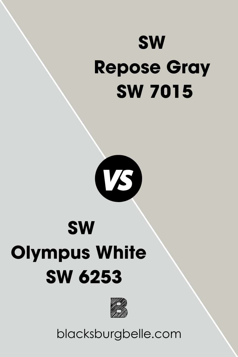
SW Olympus White vs SW Repose Gray
Olympus White is much brighter than Repose Gray. To the untrained eye, the difference may not be immediately clear when they are apart, but a trained eye immediately knows there’s a difference. Besides, Olympus White is cooler with blue undertones.
What Color of Cabinets Go with Repose Gray Walls?
This paint color is light and neutral, which means it works well with many colors. White is one of those colors that pair well with Repose Gray walls when used on cabinets. High Reflective White, White Dove, Cloud White, and Eider White are some to consider for the cabinets.
But if white is too mainstream for you, consider black like SW Tricorn Black or green like sage green and mint. Dark grays like Iron Ore or Chelsea Gray may also work if you don’t mind the monochromatic look.
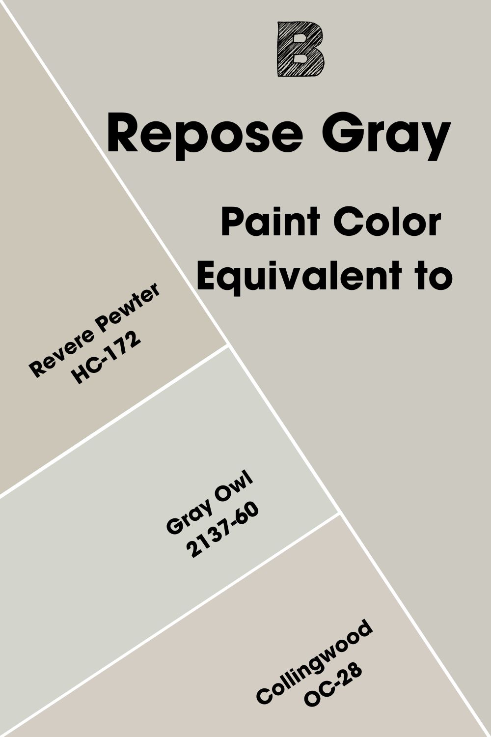
Benjamin Moore Paint Color Equivalent to SW Repose Gray
Paint colors can look the same, but there are usually no two colors that are the same. There must be differences, no matter how subtle, because they make the colors unique.
Collingwood OC-28 is pretty close in shade and undertone to Sherwin Williams Repose Gray. It has slightly purple undertones, which are similar to what you get with Repose Gray in some lighting. But you can also use Revere Pewter HC-172 or Gray Owl 2137-60.
Where Can You Use Sherwin Williams Repose Gray?
I like this part of the guide because it brings real pictures of where you can use this paint color. The best part of it is that Repose Gray works for interiors and exteriors, and for many rooms in the house, which makes it versatile. So, let me show you some places where you can use Repose Gray.
Best Trim Color for Repose Gray Walls
SW Westhighland White is a warm white paint color and works well with the slightly warm Repose Gray. So, it is usually a great trim color for Repose Gray walls. Extra White and Pure White are also excellent options because they are bright and won’t look yellow beside the gray walls.
Best Ceiling Color for Repose Gray Walls
You can get adventurous and try dark neutrals like black or brown on the ceiling to match Repose Gray walls. However, consider playing safe with the usual white ceiling. Go the route of the trim and use Pure White or Extra White on the ceiling. You can also try High Reflective White for a truly pure look.
Best Trim Color for Repose Gray Exterior
There’s no need to beat about the bush: Extra White and Pure White – again! – are excellent trim color choices on the exterior of your house. In the next picture, the house owner used Alabaster for the trim, and the result is beautiful.
Source: https://lifeonsummerhill.com/repose-gray-paint/
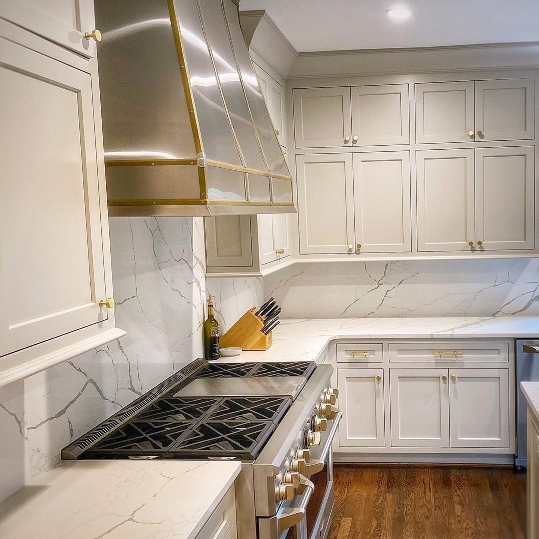
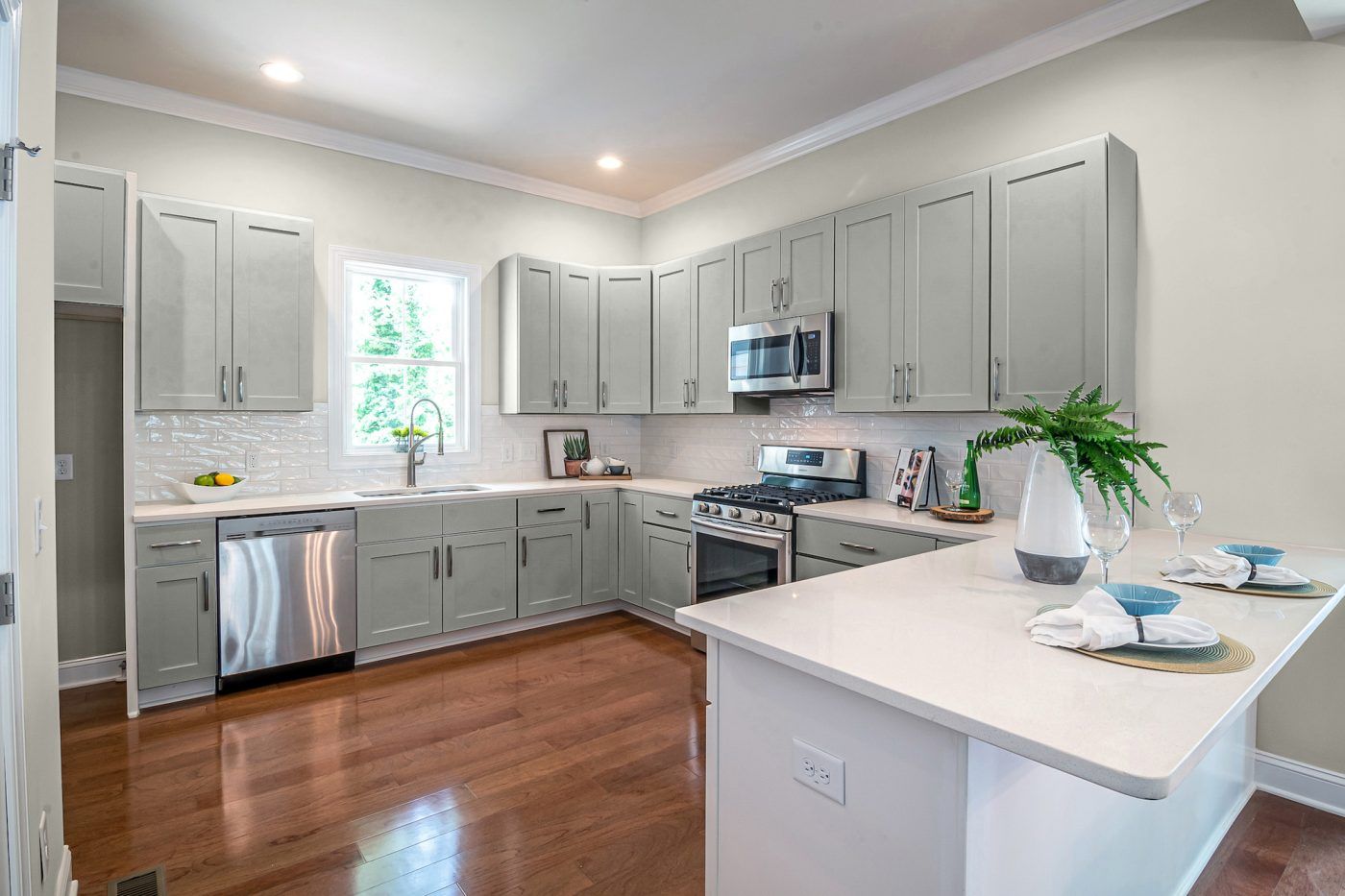
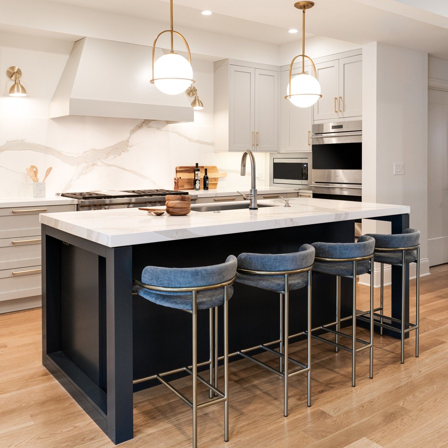
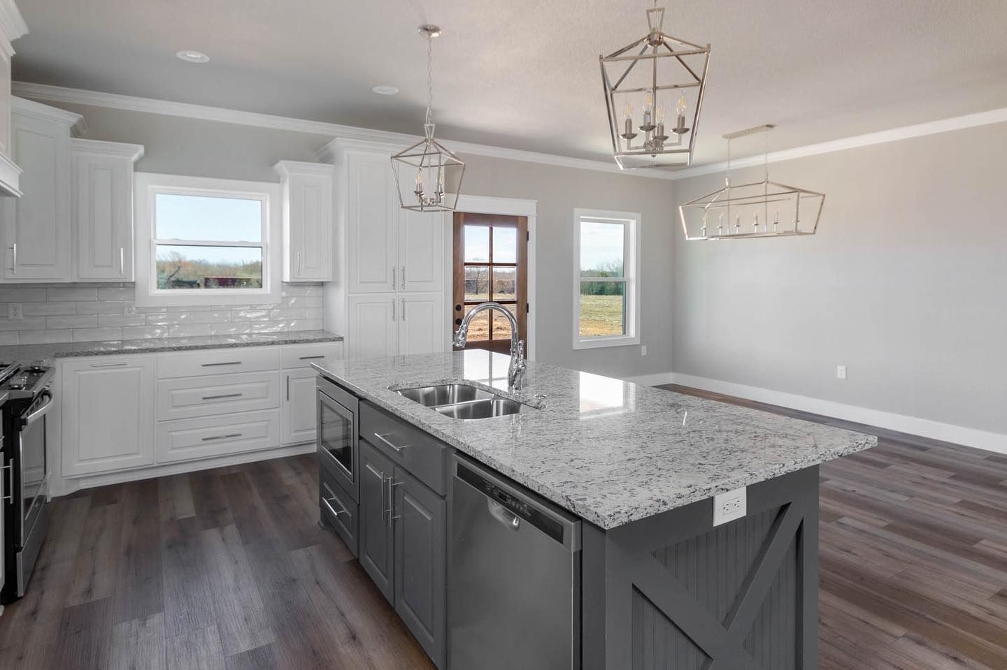
Sherwin Williams Repose Gray on Kitchen Cabinets
Your kitchen remains bright and beautiful if you use Repose Gray on the cabinets. This is true even if the walls are another color. This kitchen looks amazing with Repose Gray cabinets and Iron Ore island.
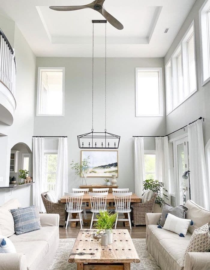
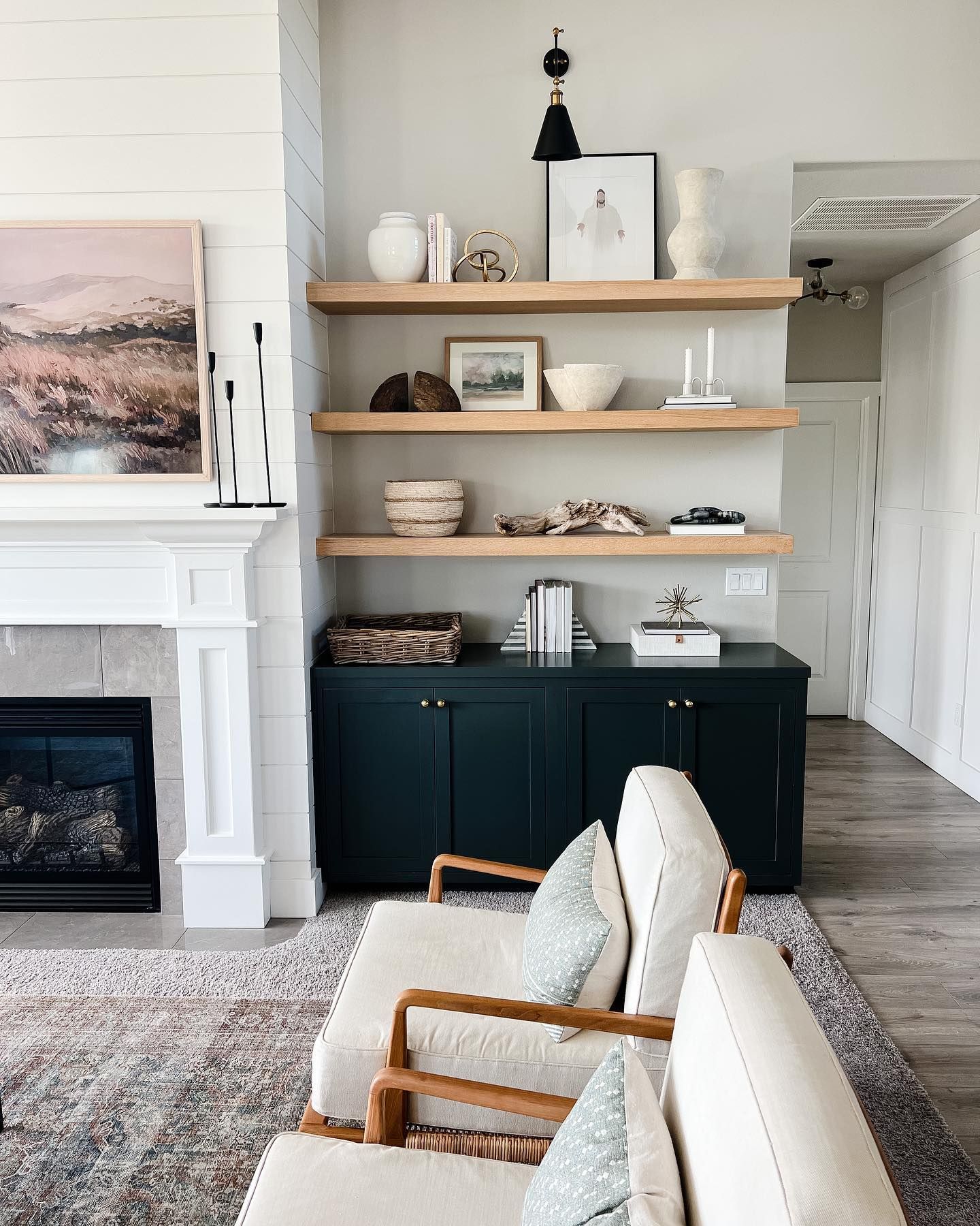
Sherwin Williams Repose Gray in Living Rooms
These rooms enjoy the best of colors and we want them to look their best because they are where we receive guests. But is Repose Gray ideal for living rooms? Let’s find out in the next picture.
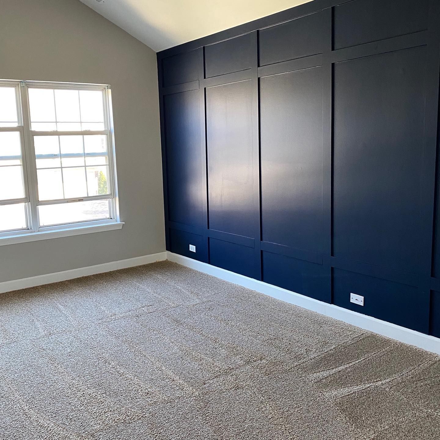
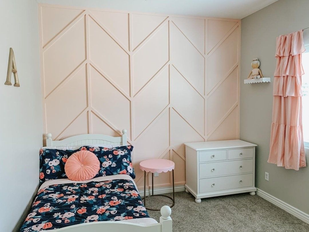
Sherwin Williams Repose Gray in Bedrooms
Like living rooms, bedrooms are a relaxation spot, sometimes even more so. It only goes that we should have the best color to help us enjoy the space, right? This next picture has Repose Gray on the walls and SW Koral Kicks on the accent.
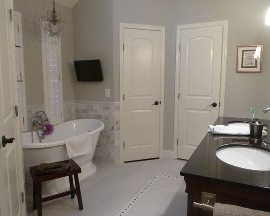
Sherwin Williams Repose Gray in Bathrooms
Your bathroom needs a relaxing and calming color, but this can vary from person to person. However, there is no doubt that Repose Gray is cool and calming enough for a bathroom. Decide for yourself using this next picture.
Sherwin Williams Repose Gray on Kitchen Walls
This kitchen is not yet fully decorated but already looks amazing. The white cabinets combine well with the gray walls and the white trim with the dark gray island.
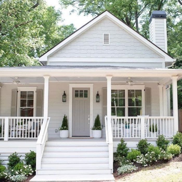
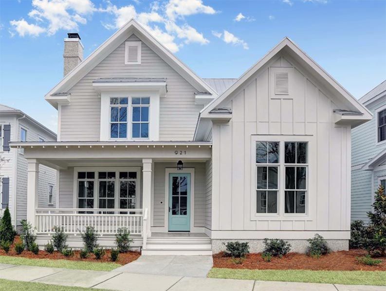
Sherwin Williams Repose Gray on Exterior Walls
Use Repose Gray on the exterior of your house if you don’t mind a laid-back look. Don’t worry about the house looking too muted; Repose Gray is light and fresh. This is especially true if trimmed with white.
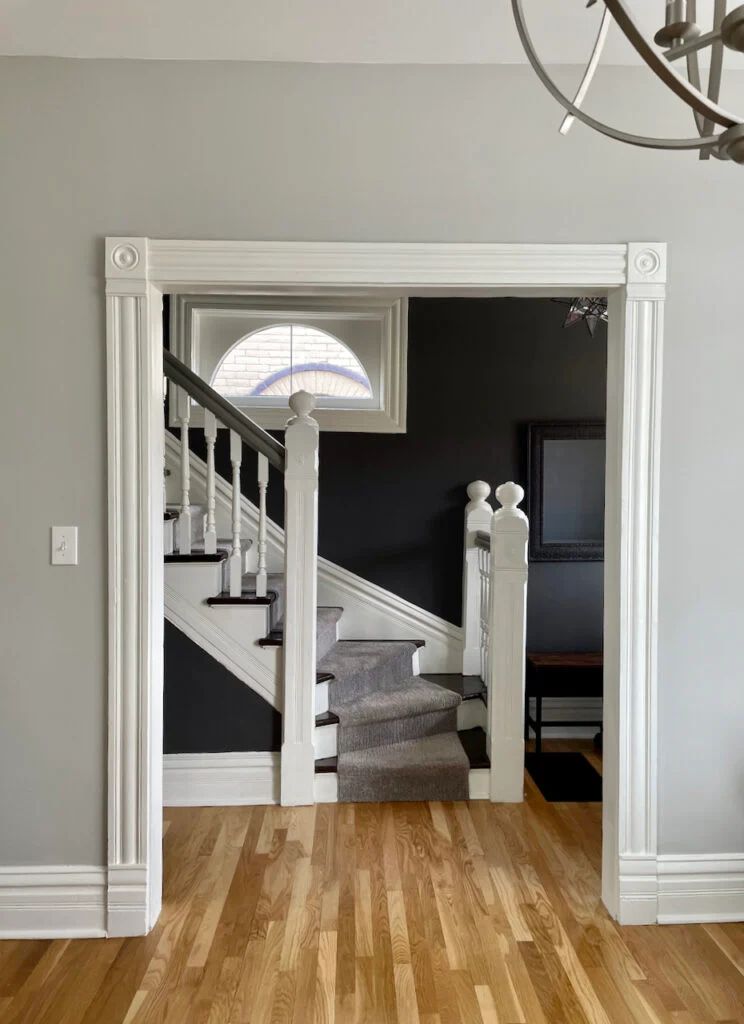
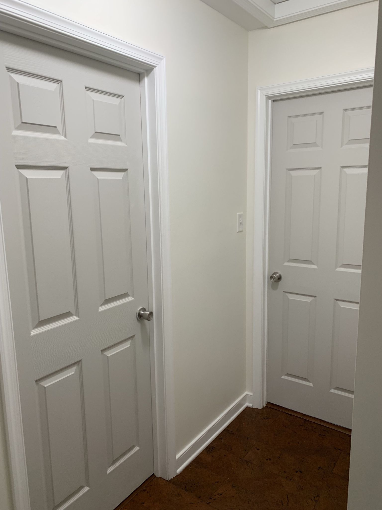
Sherwin Williams Repose Gray on Doors
Your doors, whether inside or outside, can get the best of love when we use the right colors. However, is Repose Gray one of those colors that work well on the door? Surprisingly, it is! Check out the next picture.
Sherwin Williams Repose Gray with Various Colors
Does Repose Gray pick up the hues from vibrant colors? You can check and determine if this applies using the next picture.
Conclusion
Now, you can decide whether or not Sherwin Wiliams Repose Gray is a good paint choice, especially if you want a neutral one. It has pretty minimal undertones, but when they show, you can work with them. Green is not very fussy, and violet is mild in this color.
You will also find its relatively high LRV for a gray paint color. So, you can use it in a room with good lighting but nothing too low. Low lighting can bring out the violet and make the color too cold. Too much bright light makes it too bland and washed out.
However, use Repose Gray if you want a clean and excellent neutral backdrop for other colors. And it works well in different rooms. I’ve also provided color palettes to guide your decision for striking decor.
If you have further questions, I would love to answer them in the comments section. I hope you have the best time decorating.
 Sherwin Williams Gauntlet Gray (Palette, Coordinating & Inspirations)
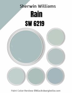 Sherwin Williams Rain (Palette, Coordinating & Inspirations)
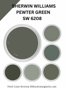 Sherwin Williams Pewter Green (Palette, Coordinating & Inspirations)
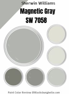 Sherwin Williams Magnetic Gray (Palette, Coordinating & Inspirations)
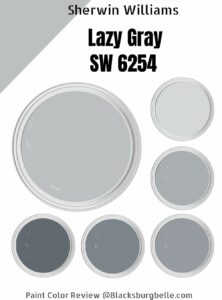 Sherwin Williams Lazy Gray (Palette, Coordinating & Inspirations)
 Sherwin Williams Rhinestone (Palette, Coordinating & Inspirations)
