
Gossamer Veil by Sherwin-Williams is an interesting blend of gray and white with colorful undertones. Its unique multi-toned hue makes this paint a great neutral shade for creative minds.
Its chameleonic nature also makes it a tricky color to decorate as the undertones can appear anytime. Gossamer Veil is on Sherwin-Williams’ editors’ pick for best colors this year and appears as the best coordinating shade on many of the brand’s paints.
One too many encounters with this color prompted me to highlight its features, and I didn’t regret my choice. Stick around to learn about this beautiful pastel hue and how to incorporate it into your space.
Before I continue, I’d like to wish you Happy Holidays.
Table of Contents
What Color is Sherwin-Williams Gossamer Veil
Gossamer Veil is an airy shade of pastel white with sharp gray, green, and violet undertones. Its name comes from its resemblance to airy cobwebs woven sparsely. While it’s not a common gray color, this Sherwin-Williams paint has my heart.
Scroll down to learn why it should become your go-to gray paint henceforth.
| Manufacturer | Sherwin Williams |
| LRV | 62 |
| RGB | Red 211 | Green 206 | Blue 196 |
| Hex Value | #D3CEC4 |
| Color Collections | Color ID (Naturalist), Living Well (Renew), Top 50 Colors, Finest Whites & Neutrals (Finest Whites, Cool Neutrals) |
RGB of Sherwin-Williams Gossamer Veil
Gossamer Veil combines 211 Red, 206 Green, and 196 Blue paints mixed into a true black color. Every painting has an RGB value to guide its creator in recreating the perfect hue for future supplies.
This RGB value amounts to a unique Hex Value which you can use as an alternative to customize the hue. Hence, Gossamer Veil’s Hex Value is D3CEC4. Enter it into a digital paint generator to see what to expect.
Note that all paints have a maximum value of 225 for the RGB measurement.
Light Reflective Value (LRV) Of Sherwin-Williams Gossamer Veil
Would your paint reflect light or retain it? That’s the essence of knowing the Light Reflective Value, a.k.a. LRV. Gossamer Veil’s value is 62, meaning it’s a medium-light hue that reflects light.
The LRV scale ranges from 3 (true black) to 99.9 (pure white) because there’s no paint without undertones. The closer the LRV of paint to each scale extreme determines its light retention or reflection.
You’ll understand this better based on the comparison to other colors below.
Is it a Warm or Cool Color?
Sherwin-Williams Gossamer Veil is warm due to its green and greige undertones. Every hue falls into two groups based on its relation to fire and ice. Colors that remind you of heat are warm, while those that mirror the ocean are cool.
Gossamer Veil is a warm color that gets brighter underneath natural and artificial light. This brightness unveils the other colors embedded in the hue’s genetics. Learn more about that below.
What are the Undertones?
Undertones make paint colors what they are and separate each shade from the other through their appearances. Sherwin-Williams Gossamer Veil has three undertones – Green, Violet, and Greige. I’ll start with the greige because it’s the foundation for the other two undertones.
Greige is a marriage of gray and beige such that a neutral paint can morph into one of either. It’s the color at the base of sage green, which forms the second undertone in Sherwin-Williams Gossamer Veil paint.
The final undertone, violet, is the faintest note hidden deep beneath the paint, such that it needs the brightest natural light to shine.
Check out the different colors for the undertones.

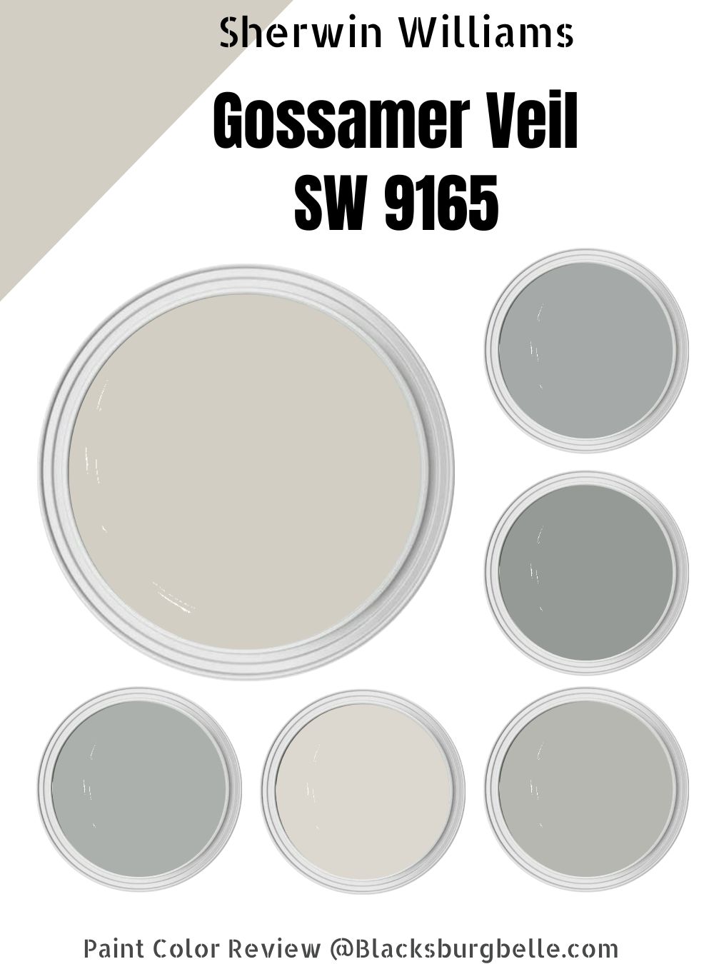
Sherwin-Williams Gossamer Veil Color Strip
Gossamer Veil’s color strip contains shades of gray ranging from bluish-gray to greenish-gray and medium-dark gray. A color strip is a group of hues of the same core components ranging from lightest to darkest. It’s handy when you’re decorating in a monochrome theme.
Check out the strip below and how the colors differ from each other.
| Color Code | Color Name | Location Number | LRV | Color Tone |
| SW 9166 | Drift of the Mist | 238-C2 | 69 |  |
| SW 9165 | Gossamer Veil | 238-C1 | 62 |  |
| SW 7658 | Gray Clouds | 238-C3 | 47 |  |
| SW 7652 | Mineral Deposit | 238-C4 | 43 |  |
| SW 7659 | Gris | 238-C5 | 39 |  |
| SW 7660 | Earl Grey | 238-C6 | 32 |  |
| SW 7622 | Homburg Gray | 238-C7 | 15 |  |
Sherwin-Williams Drift of the Mist (SW 9166)
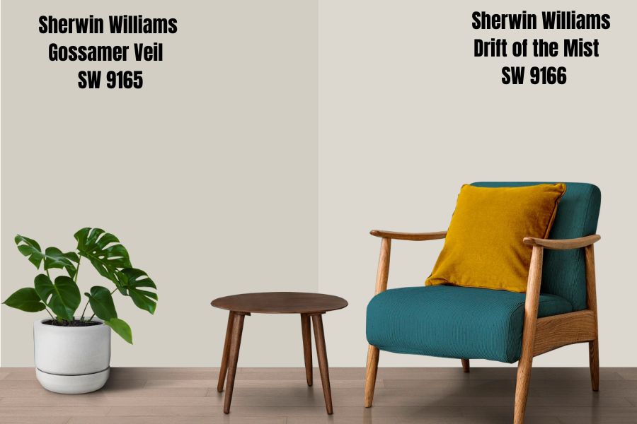
Choose Drift of Mist to go a shade lighter than Gossamer Veil and get a strong icy-gray paint. It’s as airy and bright as its counterpart but does more to open the space than the latter would.
As its name suggests, the hue is a fading morning mist with rich violet and blue undertones.
The undertones make the color appear more like matte silver paint than gray, so it’s an exotic hue should you ever need one.
Recreate this shade with its Hex Value – DCD8D0.
Sherwin-Williams Gray Clouds (SW 7658)
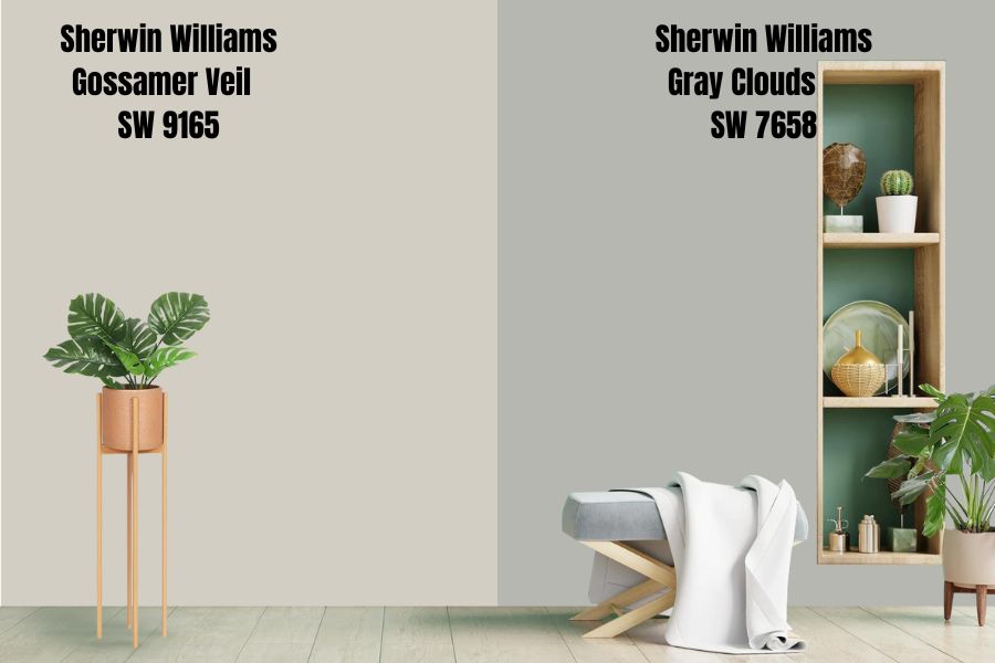
Recreate the serenity of a clear sky in your space with Gray Clouds. Although it has similar undertones to Drift of the Mist, the color is a solid neutral lying three percent beneath the median.
It’s a serene gray that works well with white and other neutrals without overwhelming them with its hue.
Its Hex Value is B7B7B2.
Sherwin-Williams Mineral Deposit (SW 7652)
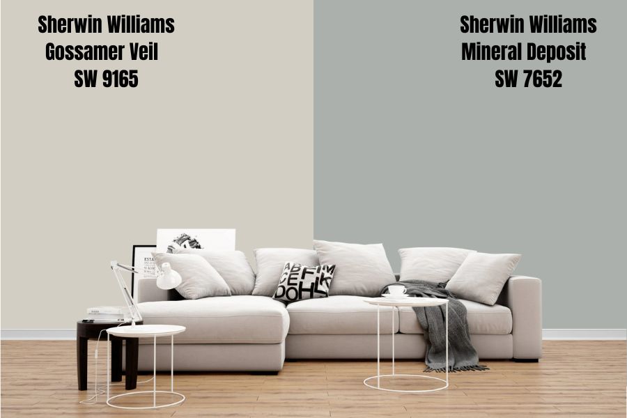
Step into the beachside evening air with Mineral Deposit paint on your walls and furniture. It’s a soothing color suitable for indoor painting, especially in places that require calm auras, such as the bedroom and bathroom.
It has a unique cyan undertone which gives it a stony outlook making it a neutral paint for any sea blue color for relaxation or a tan hue for warmth. Customize Mineral Deposit with Hex Value ABB0AC.
Sherwin-Williams Gris (SW 7659)
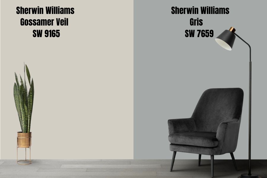
Gris is Gray in French, and that’s the vibe you’d get from this Sherwin-Williams paint. It’s an exotic shade of gray thanks to its charcoal overlay on a cyan and green base note. With so many possibilities based on lighting, Gris creates a stimulating and striking space.
Think of the number of decorative themes you could explore based on their undertones. Choosing between Sherwin-Williams Gris and Gossamer Veil is tough since they’re both versatile. However, you can break the tie with your preferred LRV (Gris is 39).
Recreate this shade using Hex Value A5A9A8.
Sherwin-Williams Earl Grey (SW 7660)
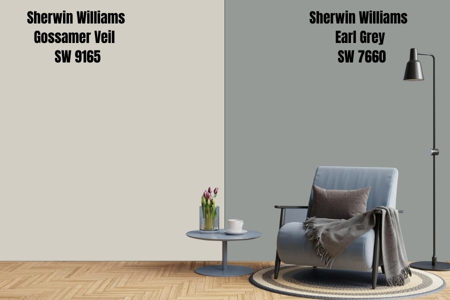
With Earl Gray, you’re delving further into the charcoal gray territory and veering off the airy Gossamer Veil. Its top qualities include subtle undernotes, including sage green and beige, which make it suitable for restless minds.
The subdued gray works as a soothing hue and would thrive in a reading room, bedroom, or bathroom. Don’t use it in rooms without adequate lighting since it contributes little brightness per its 32 LRV. Mix this paint with 969A96 Hex Value.
Sherwin-Williams Homburg Gray (SW 7622)
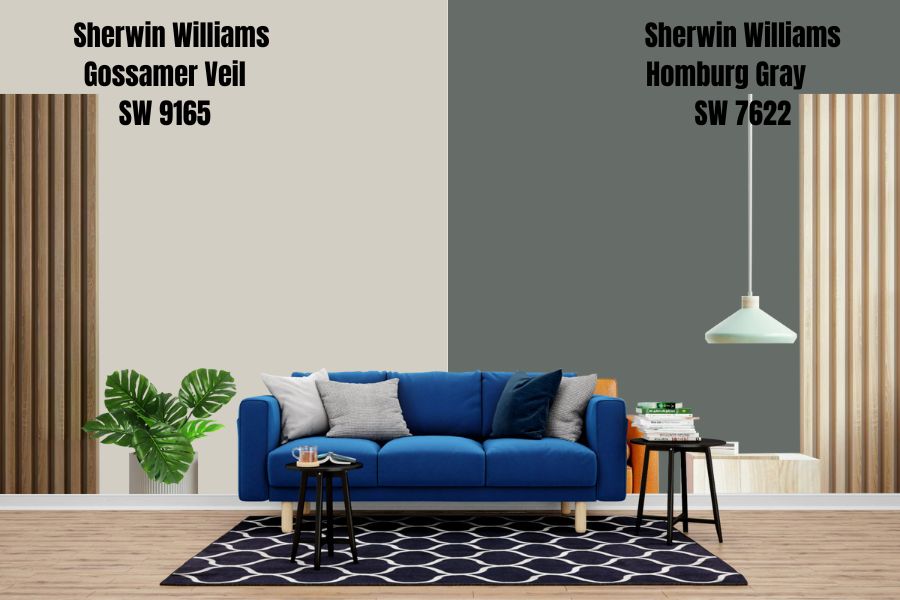
If you want a solid color to pair with Gossamer Veil without using black, then Homburg Gray is the one for you. The neutral hue is medium-dark at 15 LRV, with cyan, green, and charcoal undertones lurking on its surface.
You don’t need much light to tease any of those base colors, as they all shine harmoniously. Sherwin-Williams is already touting this as a potential top-seller for the next year due to its creative potential.
Sherwin-Williams Gossamer Veil Color Palette
We all need a color palette to create the best theme for our space. Finding the perfect paint for your mood is one thing, but getting the right pairings, from accents to furniture and interior accessories, is the icing on the cake.
Coordinating Colors for Gossamer Veil
There are several ways interior decorators coordinate colors for a space to suit each customer. The top three themes include Monochromatic, Complementary/Contrast, and Triadic decoration. Each one has a unique signature that suits every personality type.
Check them out below with pictorial references.
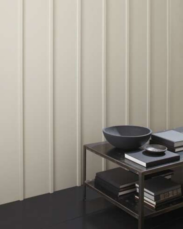
Monochrome Decoration with Gossamer Veil
The monochrome theme is for the minimalist who hates clutter and enjoys a clean space. Having a range of gray colors in your home presents a harmonious front and enhances the serenity of the environment.
Be careful not to mix just any gray into the space, as everyone has unique properties that make them perfect or wrong for each other. Consider the undertones while curating the palette to avoid a color clash.
Pro Tip – Use the Color Strip.
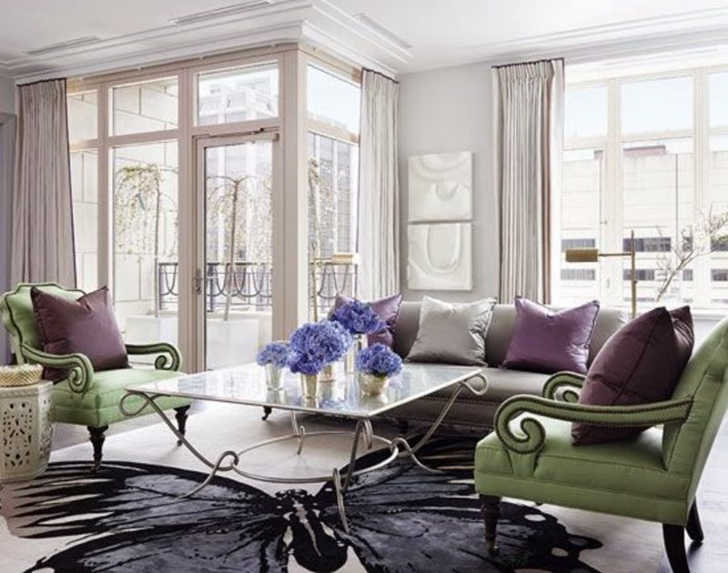
Triadic Decoration for Gossamer Veil
Triangulate your design by choosing colors on equally spaced planes of the color wheel per an equilateral triangle. For neutral colors like Gossamer Veil, you’ll work with the undertones green, violet, and beige.
You don’t need to look too far because those colors already form a triad on the color wheel. All that’s left is to choose the right shade for your coordinating palette. Here’s a hint – use sage greens, greige, and subtle lavender.
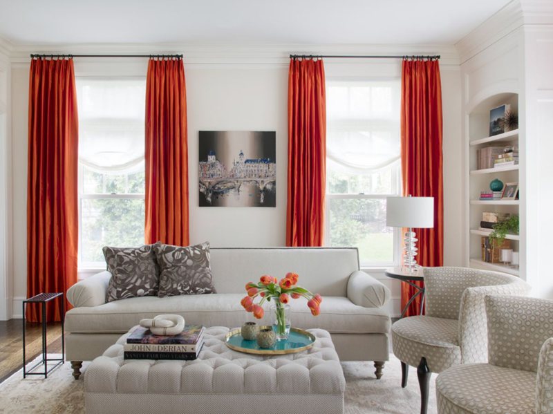
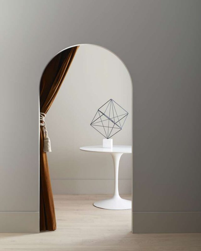
Contrasting Gossamer Veil with Complementary Colors
Contrasting themes with complementary colors is my favorite interior design because it elicits creativity in everyone. How can opposite colors work? Use them as accents and not main colors unless you don’t mind going wild with your design.
The Editors pick contrasting tones for Gossamer Veil, including Eider White, African Gray, and Anchors Aweigh (a rich blue-black). You can highlight green, violet, orange, or all for a more daring palette.
Green and violet accents would add an unrivaled pop of color to your space, reminiscent of a lavender field. You can also curate it in reverse with Gossamer Veil as the trim or accent and either of those colors as the main paint.
Check some samples out below.
What Trim Colors Go With Sherwin-Williams Gossamer Veil?
Do you find yourself at a crossroads with the trimming choices? Or hear yourself asking questions like, “does Gossamer Veil go with Honey Oak?” “Should I use a Black trim with the paint?” “Can I use Gossamer Veil for my ceiling?”
All those questions are valid, and I have the answers for you. Before you settle on a trim for your Gossamer Veil paint, always remember that it has three undertones waiting to shine under the right circumstances. Answer them first, and every other thing will follow.
Next, you have to choose a trim based on the theme in your space, as explained earlier in the coordination section. Using the wrong trim with the wrong theme would cause a color clash, ruining your hard work. So, curate your palette carefully.
Using Black Trim with Gossamer Veil
Black trims and Gossamer Veil can work when paired correctly, but it’s not the best option. The darkness from a true black paint would clash with the soft, fleshy tone of the pastel, greige hue. However, if you choose black paint with green or violet undertones, then you’ll get something.
Sherwin-Williams Greenblack (SW 6994) is a great choice as an accent wall or cabinet. When the light shines on it, the green in Gossamer Veil and Greenblack would find each other and reflect a natural glow into your space.
Other black colors with green undertones include Black of Night and Black Emerald.
Choose airy black paints like Perle Noir and Darkroom, which have overpowering purple undertones.
Using Honey Oak with Gossamer Veil
Perfection. You’ll get that when you pair a warm trim like honey oak wood with Gossamer Veil. It’s great for complementary coordination because of its red undertone, which gives you a warm aura in your space.
Honey oak would tease out the greige lying beneath your Gossamer Veil paint, so avoid it if you’re not with that vibe. With this trim, there’s no worry about going overboard. You can use it on your ceilings, floorboard, and cabinetry.
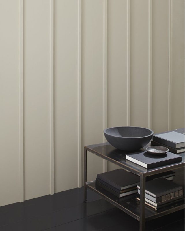
Painting your Ceiling Gossamer Veil
Before reviewing Gossamer Veil as the main paint, the color often appeared as the best trim for other medium-dark and dark gray paints in my other reviews. That tells you it’s a versatile hue that works well as an accent.
The key to perfection is pairing Gossamer veil ceilings with the right colors, often neutrals or shades of violet, green, and greige in their undertone.
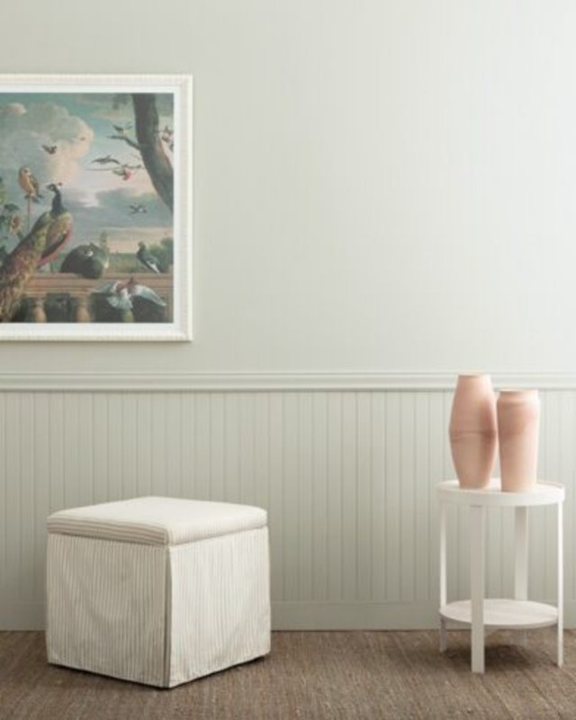
Using White Trims with Gossamer Veil
White is the best trim to pair with Gossamer Veil especially soft off-white with beige or green undertones. They work seamlessly as accent walls, ceilings, cabinetry, and furniture against Gossamer Veil walls.
Try the following Sherwin-Williams shades – Greek Villa, Pure White, Eider White, and Extra White. Don’t use creamy whites, as the tone would clash with Gossamer Veil’s purity. You can pair it with Honey Oak wood to add character.
Sherwin-Williams Gossamer Veil Color Comparisons
Sometimes you can’t tell the extent of a color’s beauty until you compare it to similar shades. Let’s see how great (or not) Gossamer Veil is, compared to other greige and gray colors.
Warning: You may change your mind about getting Gossamer Veil after reading this.
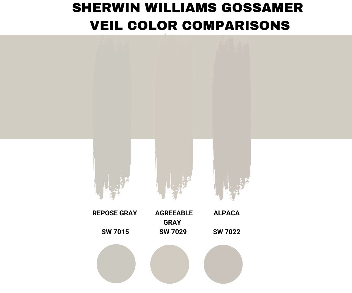
Sherwin-Williams Gossamer Veil vs. Sherwin-Williams Repose Gray (SW 7015)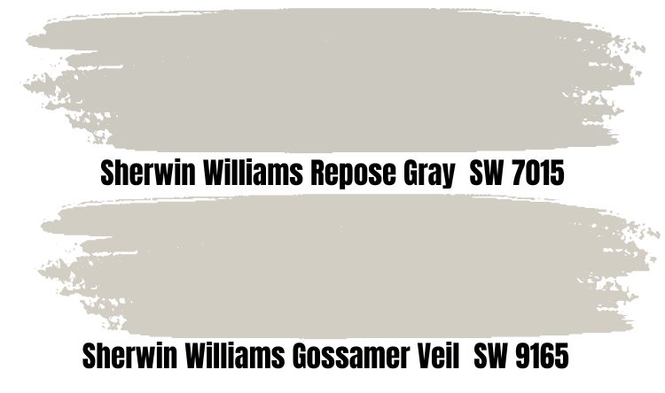
Gossamer Veil is brighter than its counterpart, making it an airier paint, albeit with more undertones. If you want a cooler and darker medium-light gray paint, choose Repose Gray.
You’d only have to contend with one undertone, violet, with Repose Gray making it a more streamlined color choice. This paint is suitable for a tranquil and soothing environment and shines best with white.
Hence, stick to Gossamer Veil to explore your creativity.
Sherwin-Williams Gossamer Veil vs. Agreeable Gray (SW 7029)
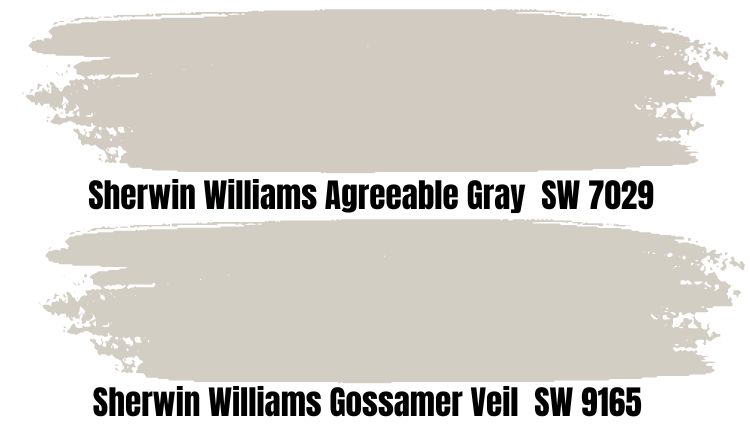
Agreeable Gray is the king of all gray paints made by Sherwin-Williams and has gained popularity as its best-seller. Until you place Gossamer Veil and Agreeable Gray side by side, you’d think they’re the same color.
It’s the most neutral gray paint, so what makes Agreeable Gray special? I’ll start with the similarities, as both colors have green, beige, and violet undertones, making them creative neutrals. It has a two percent LRV lower than Gossamer Veil, so it’s cooler and darker.
The LRV difference also makes Gossamer Veil’s green undertone stronger than Agreeable Gray, meaning the latter’s violet is stronger.
Sherwin-Williams Gossamer Veil vs. Alpaca (SW 7022)
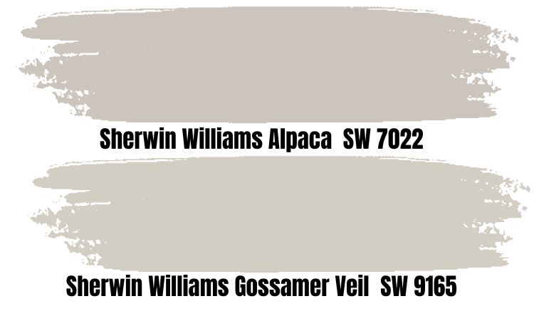
Remember how I said Gossamer Veil has greige hints beneath its green and purple undertones? Alpaca is the color to choose if you want more than a hint. This color got its name from its resemblance to the South American camelid mammals.
It’s soft and breezy, making it a great pair for other light neutrals and sometimes darker grays.
Gossamer Veil Benjamin Moore Color Comparison
Are you a Benjamin Moore fan? Then, don’t fret. There are nice alternatives to Gossamer Veil from the brand, although you won’t find an exact match. I’ve listed some of them in comparison to Gossamer Veil below.
Northern Cliffs (1536)
Northern Cliffs is darker than Sherwin-Williams Gossamer Veil and is best for exterior painting. Its beige undertone is so overpowering that it falls comfortably in the greige category. It comes alive best in neutral white or dark tan colors that can pull its undertone.
Vapor Trails (1556)
Vapor Trails is a bright gray paint similar to Gossamer Veil, although it’s more silver than the latter. It reminds you of an evaporating steam, a faint mist that disappears as fast as it appears.
Vapor Trails has a lower LRV than its Sherwin-Williams counterpart at 61.41, making it appear silver with a sharp green undertone.
Seattle Mist (1535)
Seattle reminds me of rain, so I wasn’t surprised when I looked up Seattle Mist and encountered a gray hue as clear as a morning drizzle. As the name suggests, it’s foggy but doesn’t hide much beneath its medium-dark neutral DNA.
Cumulus Cloud (1550)
Cumulus Cloud is one of the truly neutral gray paints made by Benjamin Moore, as its undertones are muted. It reminds you of a warm August afternoon with the sun getting ready to shine beneath a clear cloud.
There’s a subtle earthy beige beneath its Veil so, so it’s close to Gossamer Veil, but that’s where the similarities end.
Gossamer Veil Benjamin Moore Version
There’s no Benjamin Moore paint with the name Gossamer Veil, but the brand has some cool gray colors with similar components as Sherwin-Williams’ paint. The most similar Benjamin Moore paint to Gossamer Veil is Apparition (860).
Until you place them beside each other, you’d think they were the same shade. The two colors share violet as an undertone making Apparition a velvety gray. Choose this paint if you’re a romantic looking for a minimalist dreamy space.
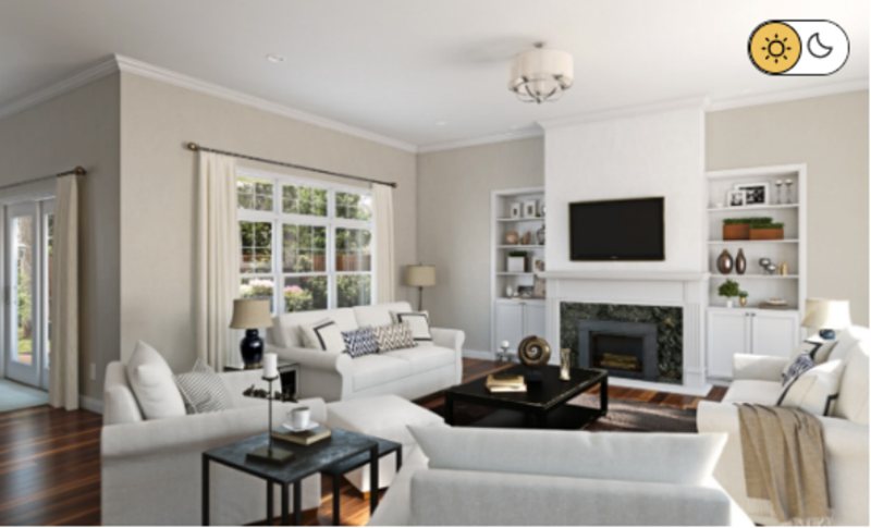
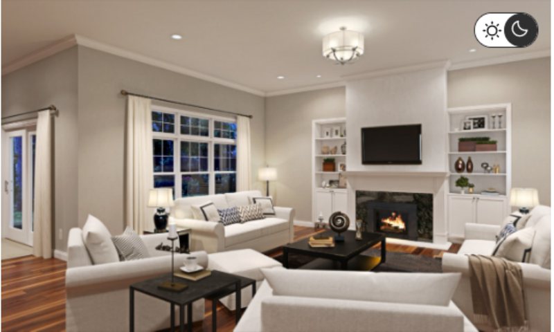
How Does Light Affect the Color?
One of Gossamer Veil’s selling points is its 62 LRV which gives it a bright reflection in unlit rooms without being too light. Its pastel gray hue often stays unchanged in dim-lit rooms but to get its undertones, explore its usage in Northern-facing rooms.
Gossamer Veil appears darkest in East-facing rooms since they receive the least light. For a consistent texture and reflection, use the paint in a North-facing room.
Best Rooms To Paint Gossamer Veil
Now we get to the fun part – painting and decorating. You’ve learned so much about Gossamer Veil in a short while that implementing it can get overwhelming. Don’t panic. Take a deep breath and act based on the knowledge you gained.
Before I continue, be reminded that Gossamer Veil is an interior and exterior paint, so it fits everywhere. However, it thrives better as an accent and as full coloring in others. How do you know which to use?
See the examples below.
Gossamer Veil for Interior
Gossamer Veil inside gives you a soothing aura with its filmy overlay and interesting undertones. The choices are endless, from cabinetry to furniture, bedroom, living room, and bathroom.
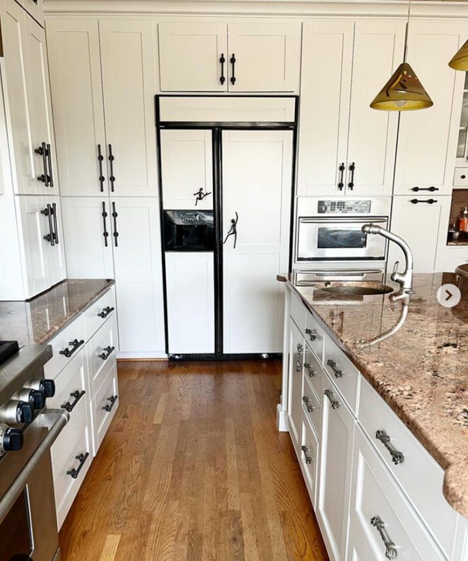
Gossamer Veil for Cabinets
Gossamer Veil for cabinetry is best for rooms with any of its three undertones as the primary color. I’m talking about sage green walls with lilac or violet furniture and beige trims. You can also randomize the usage based on taste.
The cabinets would stand out against those three colors, as you’ll see below.
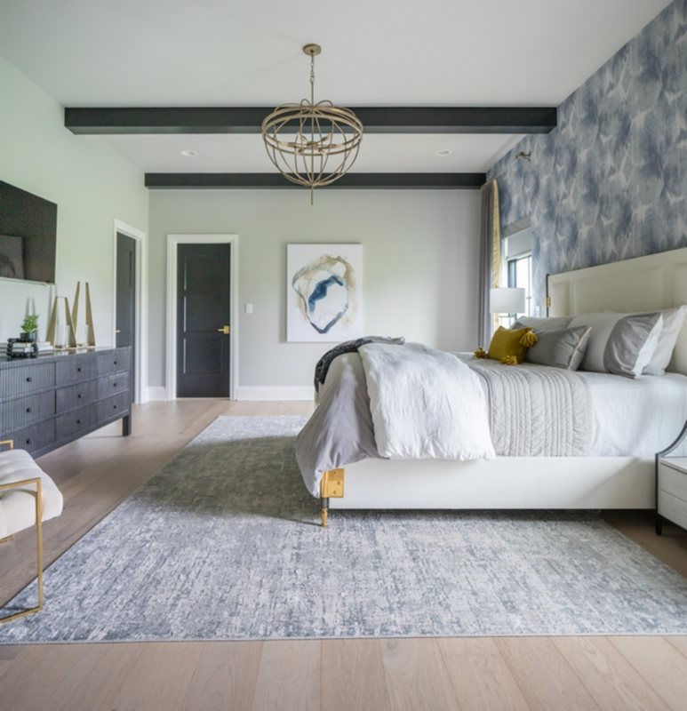
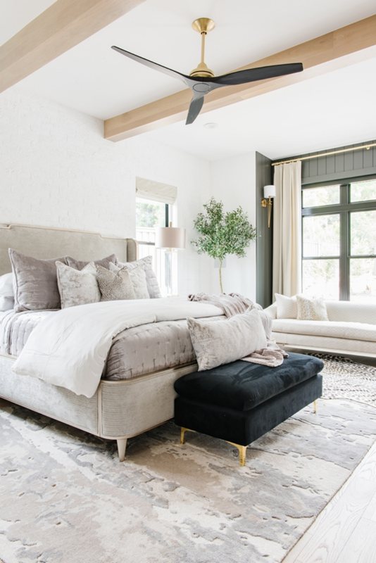
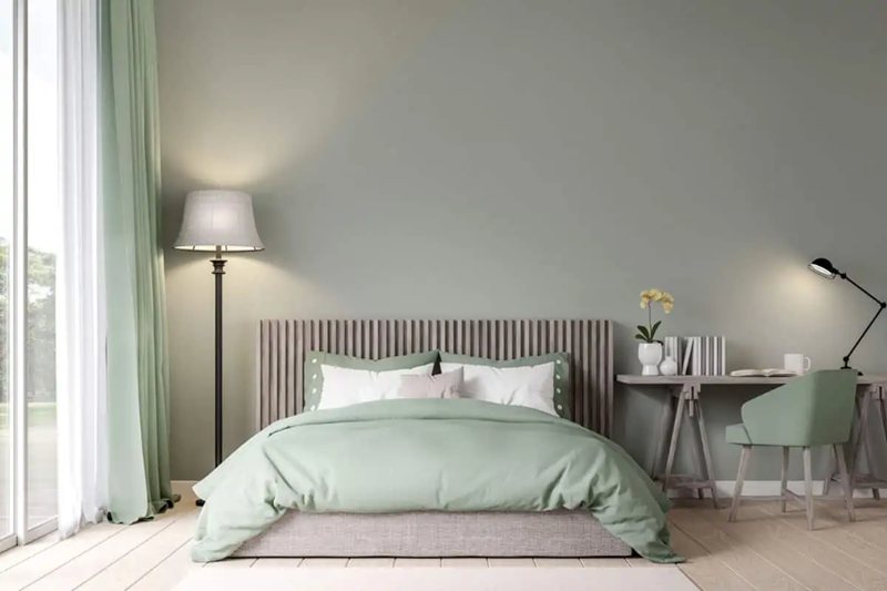
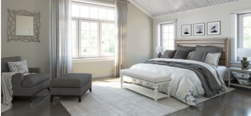
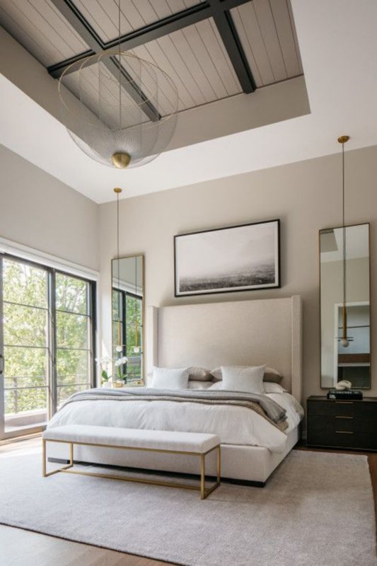
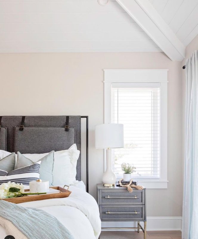
Gossamer Veil Bedroom
Set a tranquil mood in your bedroom with Gossamer Veil walls and highlight it with serene gray paints like Drift of the Mist or Gris. The bedroom is perfect for a monochrome theme, as the harmonious coloring helps you relax.
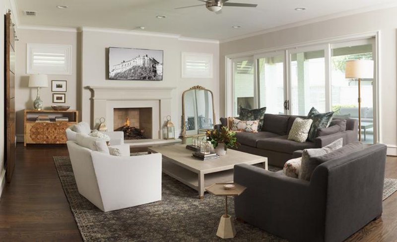
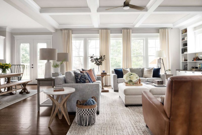
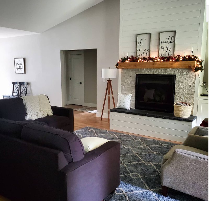
Gossamer Veil Living Room
Since the living room is for entertaining guests and spending most of your waking day during the weekend, unleash your imagination to its fullest extent on the decoration. Don’t be afraid of colors. You can choose between the triadic decoration or a complementary contrast.
Make the undertones the stars of your living room.
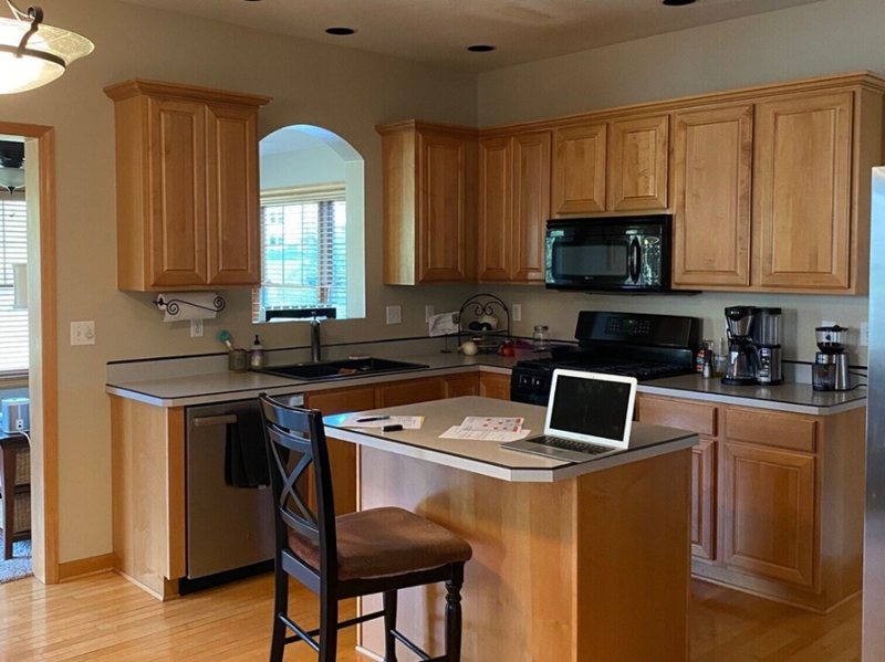
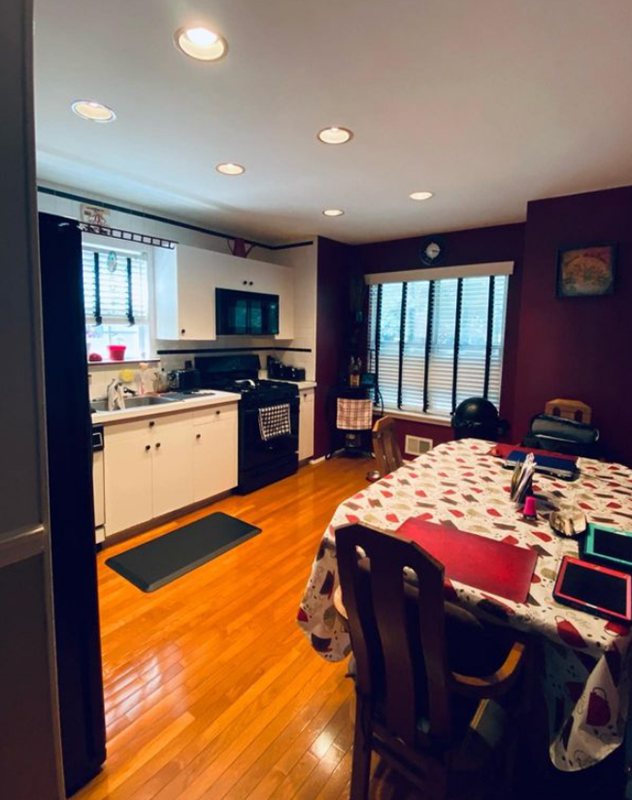
If you paint your kitchen walls, Gossamer Veil, don’t use it on the cabinetry to avoid overkill. Instead, contrast it with soft white paint, then introduce warmth with honey oak wood floorboards and an island.
White and gray marbles are also good options as accents. For white walls (or other complementary colors), you can paint your pantry door or backyard door Gossamer Veil.
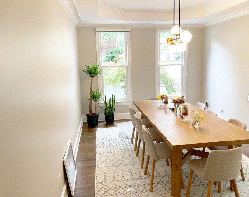
Gossamer Veil Dining Room
Your kitchen theme determines the dining room’s coloring since they’re often extensions of themselves. Whatever you choose in one should be the opposite in the other. That means Gossamer Veil kitchen walls require Gossamer Veil Dining Room furniture and tapestry.
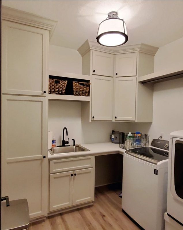
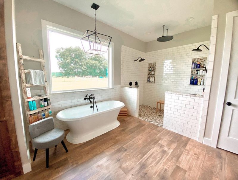
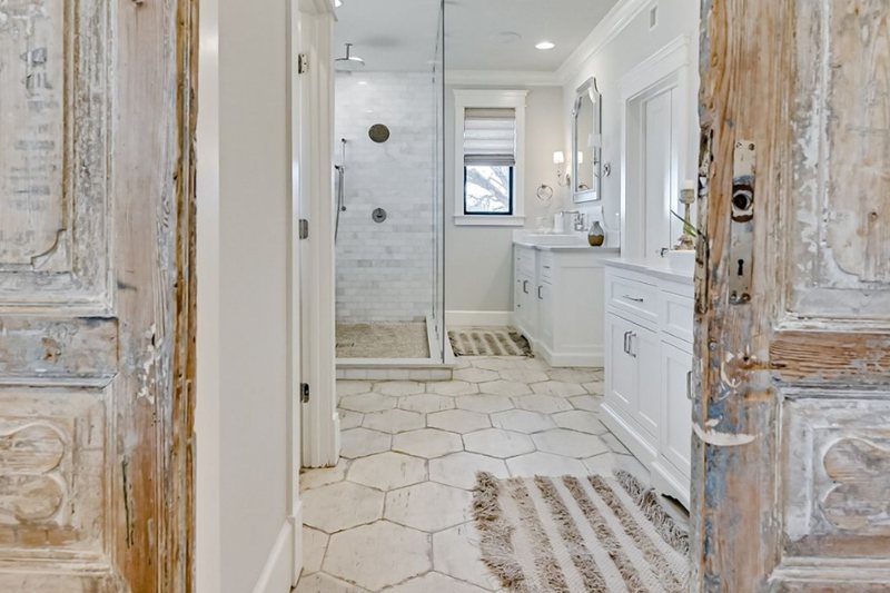
Gossamer Veil Bathrooms
Bathrooms like your Bedroom shouldn’t be cluttered to create a serene environment. Use it on your walls if your cabinetry isn’t already Gossamer Veil-painted wood. You’d love the final result.
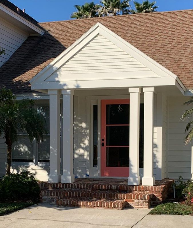
Gossamer Veil Exteriors
I say yes to Gossamer Veil on exteriors since the natural sunlight transforms its airy gray into a soft white hue. You can pair it with medium-dark grays on the doors and lentils while using black or dark gray for the roofing.
Alternatively, Gossamer Veil blends well with gray and earthy bricks while you use it as the trim.


Sampling Gossamer Veil
You can get any available samples at Sherwin-Williams or use the Samplize peel & stick strip available on demand.
Final Thoughts
Gossamer Veil is on its way to becoming a fan-favorite paint for its versatility, and there’s no reason you shouldn’t give it a chance. No matter your styling preference, you don’t have to be drab when decorating a space.
Let your personality shine through by exploring all the possibilities.
 Sherwin Williams Silverpointe (Palette, Coordinating & Inspirations)
 Sherwin Williams Ivory Lace (Palette, Coordinating & Inspirations)
 Sherwin Williams Rock Candy (Palette, Coordinating & Inspirations)
 Sherwin-Williams Blue Peacock (Palette, Coordinating & Inspirations)
 Sherwin Williams Heron Plume (Palette, Coordinating & Inspirations)
 Sherwin Williams Extra White (Palette, Coordinating & Inspirations)
