
Are you looking for true blue paints guaranteed to brighten up your space? Then Sherwin-Williams Krypton is the color for you. The name is deceptive and makes you think of the comic book superhero Superman’s weakness – Kryptonite, a bright green shade.
Don’t beat yourself up; I fell for the trick too. It’ll please you to learn that Sherwin-Williams Krypton is nothing like the emerald shade but a soothing blue-gray color designed for tranquility and calmness.
You’ve come to the right place to learn more about this airy blue paint, how to use it and when to avoid it.
Table of Contents
What Color is Sherwin-Williams Krypton (SW 6247)
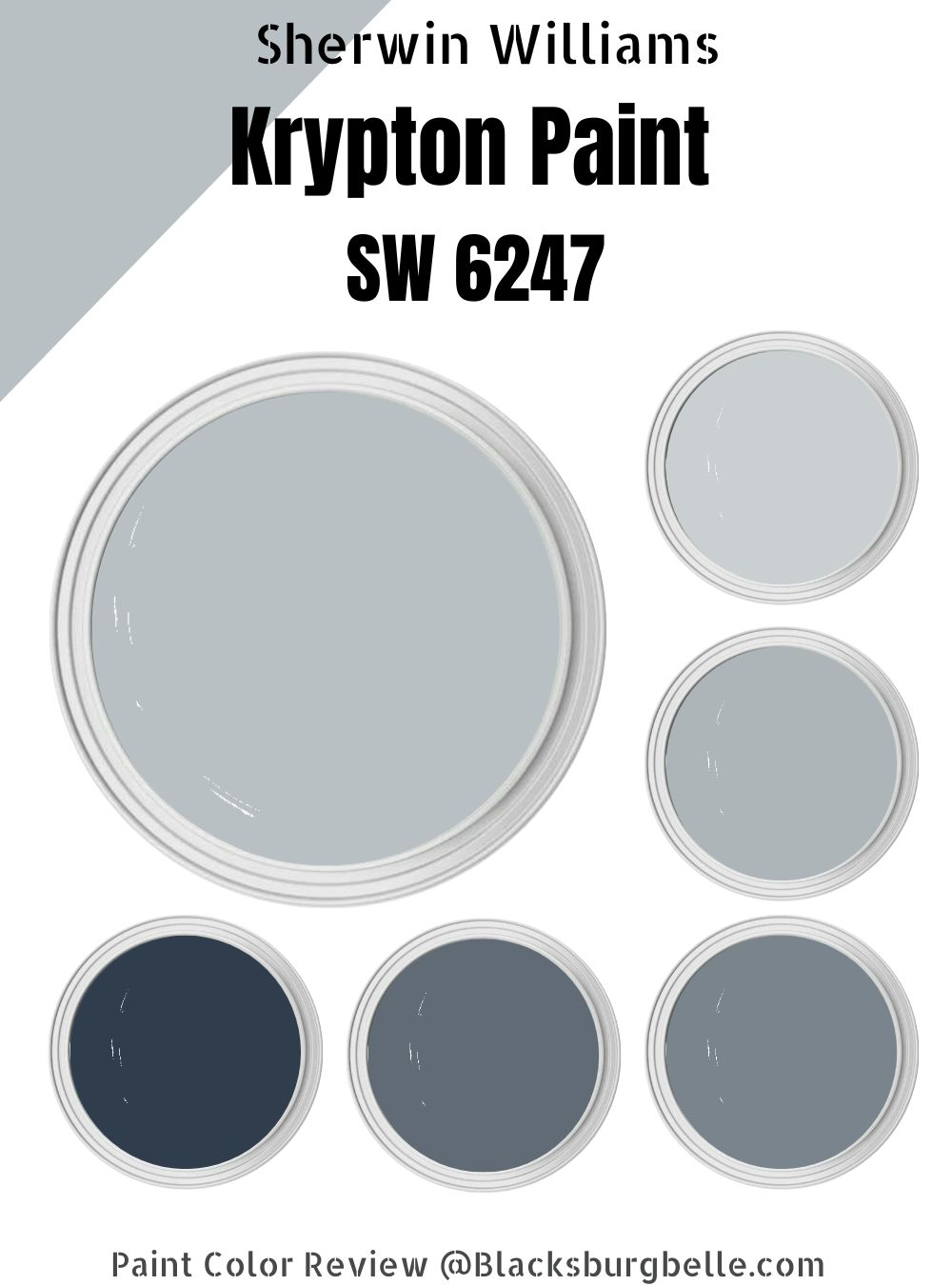
Sherwin-Williams Krypton is a blue-gray color bluer in real life with gray undertones. On the sample, you’d think the color is gray because it appears like that, but once you swipe it across a surface, the blue pops out.
It’s a tricky tone, so it’s best to test with liquid, not chips or cards. Regardless of its undertone, Sherwin-Williams Krypton is a true blue that appears baby blue in natural light.
| Manufacturer | Sherwin Williams |
| LRV | 52 |
| RGB | Red 184 | Green 192 | Blue 195 |
| Hex Value | #b8c0c3 |
| Color Collections | Naturally Neutral, Minimalist, Living Well – Focus |
RGB of Sherwin-Williams Krypton
The RGB (Red/Green/Blue) value of paint ranges from 0 – 255, and it tells you how much of those three colors mixed into a true black paint make the unique shade. For Sherwin-Williams Krypton, the value is R 184 | G 192 | B 195, while its HEX Value is #b8c0c3.
Light Reflective Value (LRV) Of Sherwin-Williams Krypton
Sherwin-Williams Krypton is the closest to perfection you’ll ever get, with a Light Reflective Value (LRV) of 52. LRV tells you how much your paint reflects or absorbs natural and artificial light. That means it’s right between the light and dark spectrum – how cool is that?
Colors with low LRV absorb light rather than reflect it, so they often retain their natural tones, but Krypton isn’t like that. It’s also not too light that the blue would get lost in the brightness. At worst, you’ll get the gray undertone, which isn’t dark.
Scroll for more details on Undertones.
Is it a Warm or Cool Color?
Sherwin-Williams Krypton is a cool color that evokes feelings of calmness, tranquility, and peace in its environment. The color wheel has two sides based on the energy each group of colors produces, whether warm or cool.
You can imagine what colors fall under each category without looking at a screen. Bright shades like Red, Yellow, and Orange signify heat; hence they’re termed warm tones, while Blue, Green, and Purple relate to the earth and ocean, thus providing relaxing auras.
Because Sherwin-Williams Krypton is a neutral tone, you can blend it with other complementary colors.
What are the Undertones?
Undertones are the sneaky secondary colors that pop out when you least expect them and make you question your choice of paint. Though, undertones define a paint as much as its primary color because they’re there whether you notice them or not.
For Sherwin-Williams Krypton, you have a light gray undertone that shows on the sampling strips, chips, and cards. It often confuses novices who believe the paint is gray, but once you swab it on a surface, the baby blue blossoms.
You already know that Krypton has a median LRV, so don’t expect the undertone to overshadow the primary color.
Check out the different colors for the undertones.
Sherwin-Williams Krypton Color Strip
The color strip is a group of colors (3 – 4) created with gradations of white and black. It’s either light or dark, depending on your search. So, move three to four steps below or above your constant, which is Krypton.
This is one of my favorite parts of curating a new space because it allows you to use your imagination. Check out the table below, and let’s get into the details of the Krypton color strip.
Light Color Strip
| Color Code | Color Name | Location Number | Color Tone |
| SW 6245 | Quicksilver | 273-C2 |  |
| SW 6246 | North Star | 225-C1 |  |
| SW 6248 | Jubilee | 225-C3 |  |
Dark Color Strip
| Color Code | Color Name | Location Number | Color Tone |
| SW 6249 | Storm Cloud | 225-C5 |  |
| SW 6250 | Granite Peak | 225-C6 |  |
| SW 6244 | Naval | 253-C6 |  |
Sherwin-Williams Quicksilver (SW 6245)
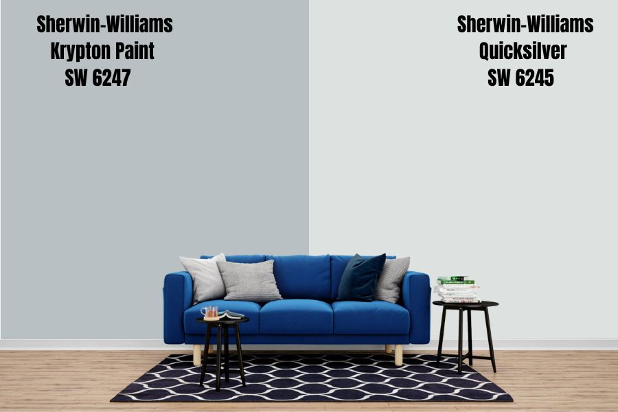
Quicksilver is a shade lighter than Krypton and leans more into its gray color. It’s a variation of white rather than blue, unlike its counterpart. When you want a reflective surrounding without a hint of “color,” then Sherwin-Williams Quicksilver is the choice.
Quicksilver is excellent for making small spaces appear wide since it has an LRV of 75. It thrives on vast walls because it’s a suitable anchor for other shades during decoration. You can also use it as an accent piece without fear of looking clinical.
Sherwin-Williams North Star (SW 6246)

When you hear the word North Star, Christmas comes to mind as you envision Santa Claus riding down from the clouds. Sherwin-Williams Company naming this paint after that festive light isn’t far-fetched as the bright silver-gray tone is a shining star.
It’s brighter than Krypton with its LRV of 62 but not as bright as Quicksilver. Thus, like Krypton, North Star retains some of its icy blue colors, visible under light. You can coordinate it with either of those tones if you’re going for a monochrome design.
Sherwin-Williams Jubilee (SW 6248)
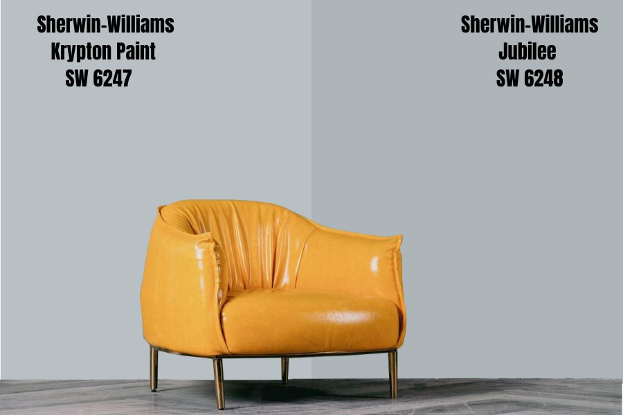
No, it’s not a mistake that the next color on this strip doesn’t have a consecutive number, and you’ll soon learn why. Jubilee is another bluish-gray paint by Sherwin-Williams designed to walk the line between dark and neutral, so it’s medium-gray.
The color has an LRV of 45, so it’s a solid gray, even without light but retains a good quantity of blue to keep the space looking calm. Jubilee does well with a Quicksilver or Krypton pairing, as their brightness would tamper with its dark tone.
Sherwin-Williams Storm Cloud (SW 6249)
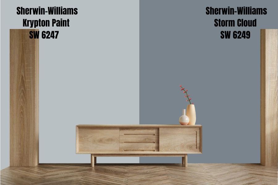
Now, we’ve ventured onto the dark end of the spectrum, starting with Storm Cloud, a solid dark blue-gray. As the name suggests, it’ll give you the aura of a gloomy sky before it rains. You’ll need light to get it blue if you care about that.
The color has a low LRV of 23, so without proper lighting, don’t expect the blue to shine. It’s great for a retro vibe and does well with rattan and historic vintage or antique pieces. If you want to mix it with Krypton, go ahead.
Sherwin-Williams Granite Peak (SW 6250)
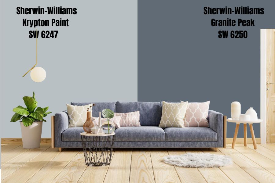
With Granite Peak by Sherwin-Williams, you’re now in the dark blue-gray realm. Upon first look, you’ll think there’s no hint of the bright, bubbly shade in this dusky paint. Its gray is so strong that the blue is the undertone.
The 14 LRV makes it an absorbent color than typically retains its solid gray hue. For decoration, this works best with high LRV paints like Quicksilver or a neutral like Krypton. It’s best to use those colors as they’ll intertwine once light reflects on the space.
Granite Peak is okay as an indoor paint, depending on your vibe, but it works best outdoors or in a shed.
Sherwin-Williams Naval (SW 6244)
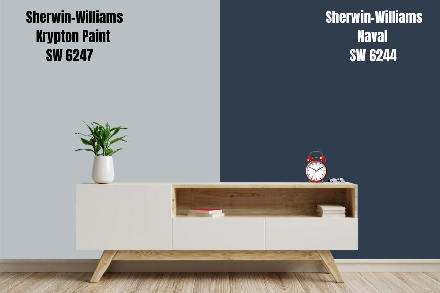
Sherwin-Williams Naval has as much personality and presence as a real-life Naval officer. It’s one color you can’t ignore, no matter where you put it. So, it works best in large spaces like wide walls and multiple cabinets.
Despite being a dark shade with an LRV of 4 (yes, it’s that dark), the blue is brilliant. It’s an excellent shade for children’s playrooms as it works well with other colors without fear of your kids ruining it with marks. Also, its 4 LRV makes it one of the genuinely neutral paints by Sherwin-Williams.
Bring your Naval wall alive with a houseplant, painting, musical instruments, and other interior decorations.
Sherwin-Williams Krypton
Sherwin-Williams Krypton is a true-blue paint with a median LRV guaranteed to soothe your environment. The color does well with others and fuses its beautiful two-toned shade into one baby blue presence in a well-lit room.
Sherwin-Williams Krypton Color Palette
Knowing Sherwin-Williams Krypton is a neutral shade tempts you to go all out for your décor, and why not? When paired correctly, the color would be the best thing to ever happen to your space and create a haven.
I’ll walk you through decorating with Krypton using a color palette. Now, the color palette is a group of colors you can use to get the best possible outcome from your paint. You may coordinate with complementary tones, monochrome hues, or contrasting colors.
What does that mean?
Coordinating Colors for Krypton
Even though I tag Krypton as a true-blue and natural neutral Sherwin-Williams paint, pairing it with other colors shouldn’t be by chance or whim. Doing that is a recipe for disaster, and you don’t want that having come this far.
Let’s assess the three basic designing styles and how your Krypton space factors into them. After all, your space should be a place that makes you eager to return.
Monochrome Decoration
If you chose Sherwin-Williams Krypton as your wall paint, you’re a chill person. Indulge in monochrome designs to create a relaxed vibe with your peaceful anchor color.
There’s something authentic and beautiful about different shades of the same color, and we’re talking blue here. Think of it as bringing the ocean into your home and imagine a coral reef or gradients of its depth.
You learned about the LRV, color strips, and undertones earlier, so this is the time to put that knowledge to the test. Krypton has an LRV of 52, so you may decide to go higher or lower but within the same primary color of blue.
You can use colors like North Star, Quicksilver, Jubilee, Naval, Granite Peak, and Storm Cloud based on the color strip.
Note that these colors don’t use the same name outside Sherwin-Williams, so find equivalent shades (Use the HEX/RGB value) when picking items.
Pro Tip: Use the Color Strip.
Contrasting Decoration
Have you ever heard, “opposites attract?” It does with paints, too, but even that has its limits. Firstly, you need to get a visual color wheel to know which colors contrast with your wall paint. I’ll help you out – Krypton is a blue shade, so you’re looking at Yellow as the opposite color.
Next, we’ll consider what type of blue Krypton is by placing a color wheel with gradients of blue opposite yellow shades. Pick out the Yellow and possibly Orange shades that fall within the spectrum, and there you have your contrasting tones.
Your mind should now connect the yellow gradient with bronze, tarnished trumpet, gold, and rattan brown. See, it’s not so hard when you know what you’re doing.
Krypton Complementary Colors
Are you more into color pops? Then, complementary designing is for you. Pay attention. Krypton is still the anchor for this method, but you’re taking it further than monochromatic pairings. Any color on this palette must compliment the anchor tone.
You may decide to go lighter or darker, but remember, the key to a beautiful complementary décor is choosing colors that allow your anchor tone to shine. Don’t pick anything too loud, as the Krypton would get lost in its brightness.
Use other neutrals but choose tones with a character like bronze, copper, or gold. If you’re choosing from Sherwin-Williams, the company suggests Tarnished Trumpet, Greek Villa, or Quicksilver, and I agree.
Two colors are lighter than Krypton, while the third (Tarnished Trumpet) is darker without being too dull. Tarnished Trumpet is a shade of yellow with brownish nude undertones giving it the look of a pastel gold or bronze tone.
Before we move on, let me remind you that you can use your complimentary tone to close or open up your space. Use dark shades to close and light shades to open, but I prefer closing since the color is already an opener unless you want the area to look vast.
What Trim Colors Go With Sherwin-Williams Krypton?
There’s good news here – you don’t need to look further than the Sherwin-Williams suggestions of Tarnished Trumpet, Greek Villa, and Quicksilver. I’d suggest using the Tarnished Trumpet paint as an accent or highlight rather than a full trim but do you.
Sherwin-Williams Krypton Color Comparisons
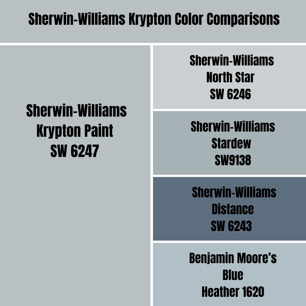
It’s almost time to say goodbye but I won’t leave you without proffering alternatives in case you can’t find Sherwin-Williams Krypton in a store near you. Here’s a comparison of the shade with other colors, including the Benjamin Moore alternative.
Sherwin-Williams Krypton vs. Sherwin-Williams North Star
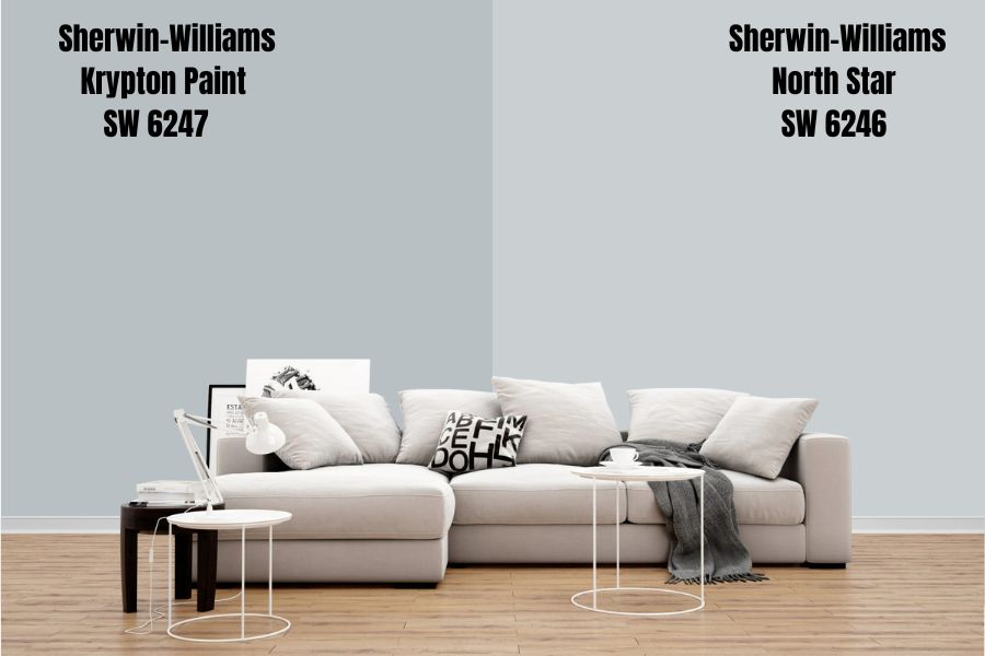
Sherwin-Williams North Star is on the Krypton color strip, so it’s only fitting to compare them. Krypton is a shade darker than North Star but looks the same from a distance. To spice things up, you can use North Star as an accent wall against a Krypton wall.
North Star has more RGB content than its counterpart and sits at R202|G208|B210. Its HEX Code is #CAD0D2 and goes by the name Iron. Under bright lighting, North Star appears like a light gray shade while Krypton shows as a light blue shade.
That’s the critical difference.
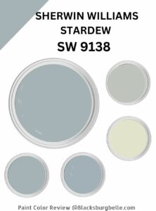
Sherwin-Williams Krypton vs. Sherwin-Williams Stardew (SW9138)
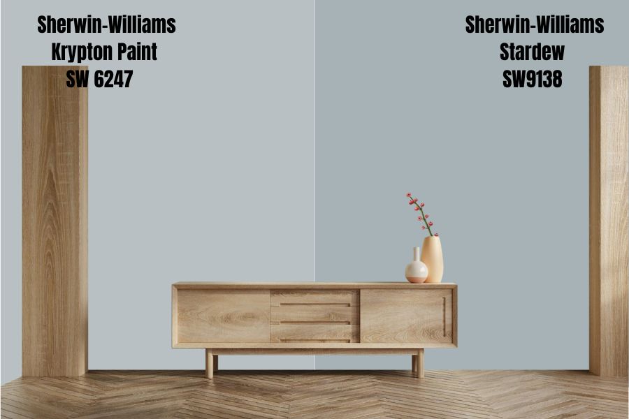
Stardew is a shade darker than Krypton and leans into its blue element. The color has an LRV of 43 with a HEX Value of #a6b2b5.
If Krypton feels too “baby blue” and bright for your eyes, go for Stardew.
The color has personality and works well with others with its blue tone standing out in the dark or low light. It’s under the Living Well – Unwind collection and made the top pick for Rejuvenation – Fall/Winter 2022.
Once you see how well it blends in the snowy season, you’d understand why many people selected it this season.
Sherwin-Williams Krypton vs. Sherwin-Williams Distance (SW 6243)

Distance would make a four-shade color strip, as it’s about three to four shades darker than Krypton. You can pair the two on one spot and never regret it. The HEX Value is #5d6f7f.
Be careful when using them together, though, because Distance is a solid color with the potential to overshadow Krypton’s subtle blue shade. You can choose it if you want a medium-dark room since it sits between neutral and dark at 15 LRV.
Sherwin-Williams Krypton vs. Benjamin Moore’s Blue Heather (1620)
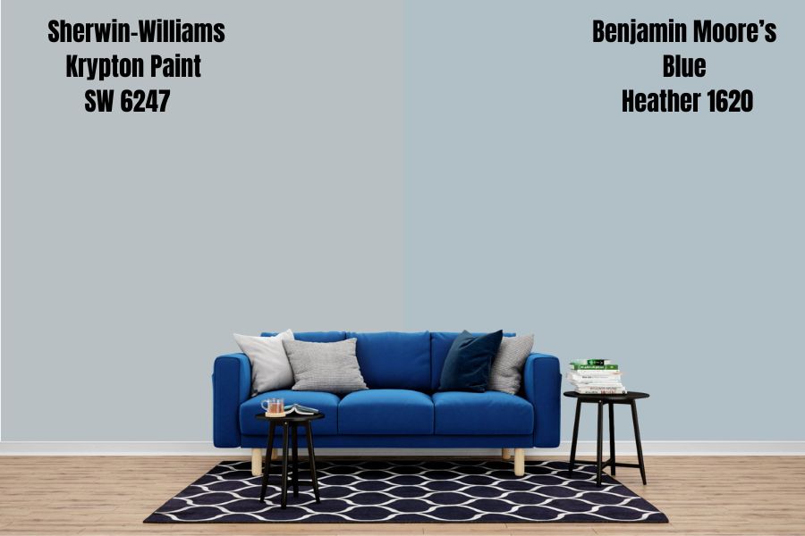
You won’t ever find an exact match across multiple brands, but Blue Heather is the closest to Sherwin-Williams Krypton you can get in Benjamin Moore. The color has a 50.92 LRV making it a balanced blue (neither dark nor bright) like Krypton.
It’s also one of Benjamin Moore’s classics. Unlike Krypton, Blue Heather is evidently blue, even from its pictures and samples. Its undertone is a subtle silver-gray and violet.
Krypton Benjamin Moore Color Comparison
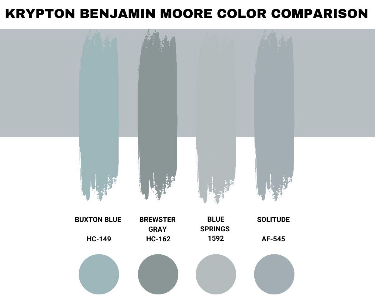
Benjamin Moore also has a range of blue-gray paints, but as I said before, they always differ from Sherwin-Williams paints. Some of the brand’s top blue-gray shades, excluding Blue Heather, are;
Buxton Blue (HC-149)
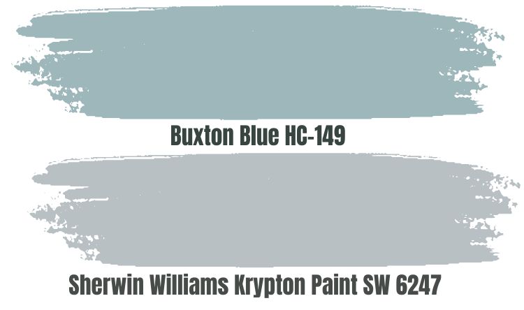
Buxton Blue by Benjamin Moore is another classic blue-gray tone that reminds you of the Victorian era. It has a 44.97 LRV making it a dark color, although it’s close to the median spot. As a solid color, there’s no flitting between two shades like you’d get with Krypton.
As the brand describes it, Buxton Blue is a charming shade that embraces its blue element more than the gray undertones.
Brewster Gray (HC-162)
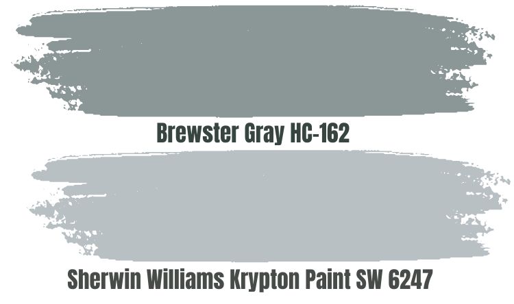
With Benjamin Moore Brewster Gray, you’d get more of the gray than the blue, but in the right-facing light, the blue undertone shines. That makes it an ideal exterior paint. It’s another one of BM’s historical colors and has an LRV of 29.97.
Blue Springs (1592)
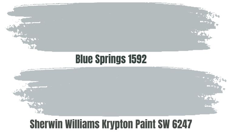
Blue Springs is similar to Krypton in that it appears gray at first look until you switch on a light or expose it to natural light. It’s an ambient tone and a classic blue-gray color. If you want neither here nor their space, check out Blue Springs.
Solitude (AF-545)
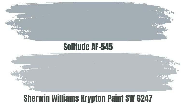
Benjamin Moore’s Solitude gives you the best of both worlds with its slate-blue shade. It has an LRV of 41.61, meaning it’s an absorbent medium-dark tone. However, that doesn’t swallow its domineering blue hues. I love this color.
Krypton Benjamin Moore Version
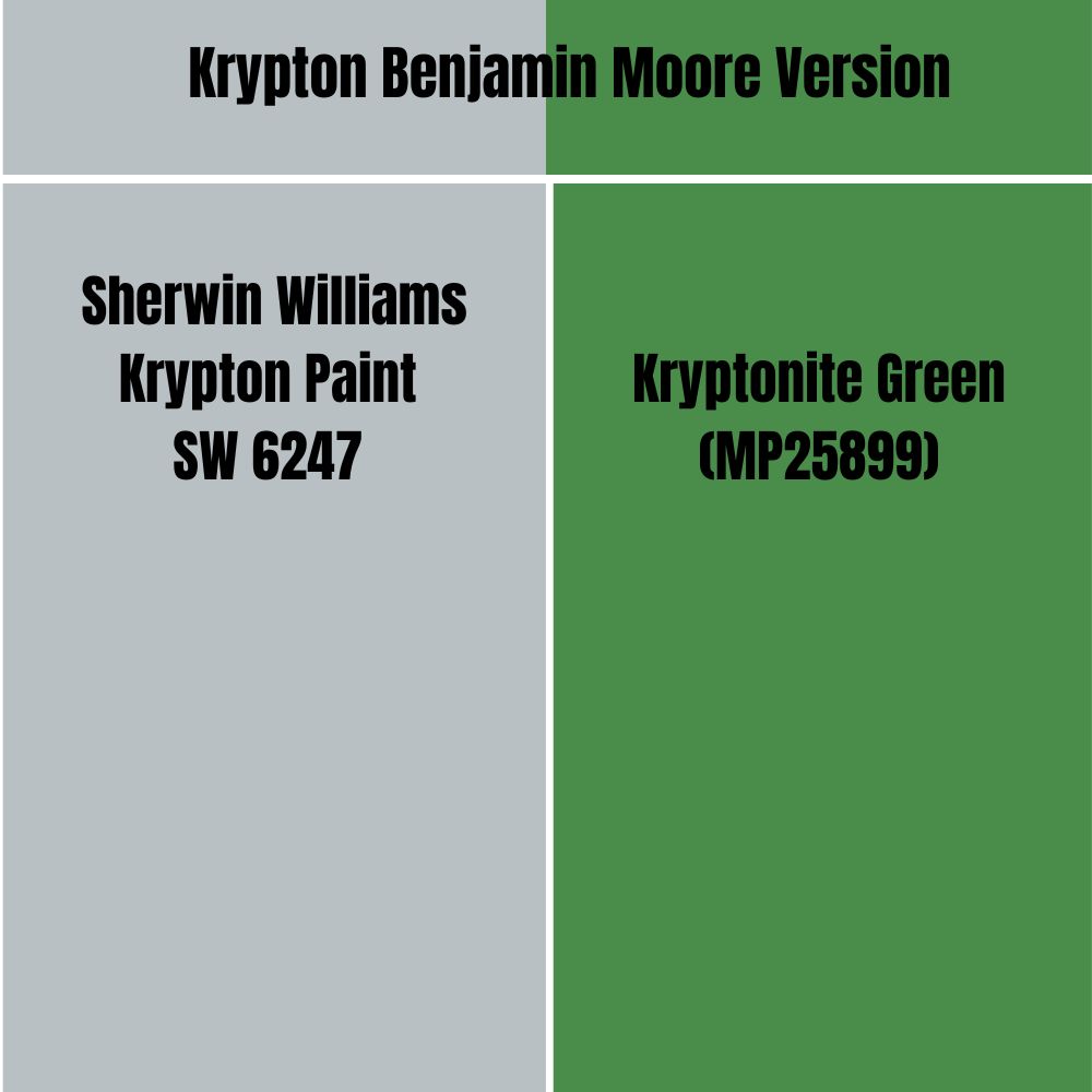
There’s no Benjamin Moore version of Krypton, unlike other colors with similar names but different shades. The closest brand sharing a similar name is Kryptonite Green (MP25899) by Matthews Paint, and they’re worlds apart.
Whereas Sherwin-Williams’ Krypton is a misdirection, Matthews’ Kryptonite Green is true to its inspiration. It’s a medium-dark green with an LRV of 20.89% and an RGB value of 74|141|75.
How Does Light Affect the Color?
Light makes the blue in Krypton more prominent than its gray side and appears as a bright baby blue. The best-facing lights for Krypton walls are East, South, and West. However, in dim-lit spaces, the color produces a faint hint of gray.
Best Rooms To Paint Krypton
The possibilities for Sherwin-Williams Krypton are endless because of the color’s nature. Since it’s a neutral paint, Krypton can fit in any room, especially if you want to open it up.
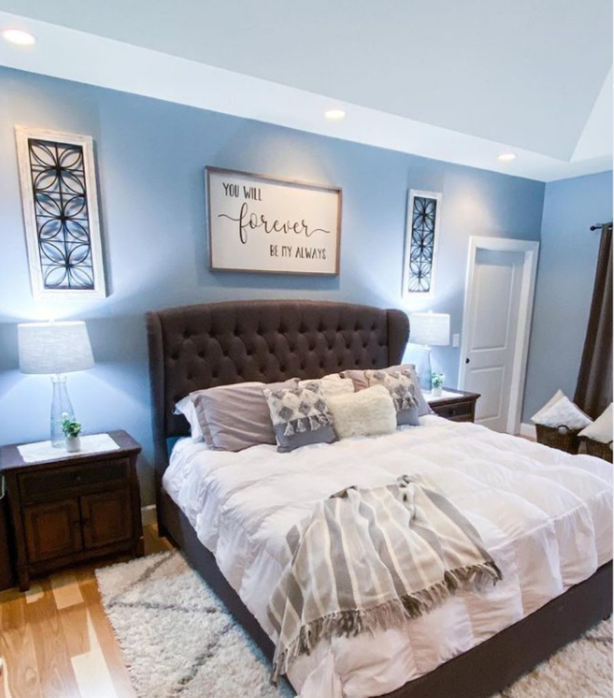
Krypton Bedroom
Your room is a sanctuary that should provide peace and soothe you after a stressful day working, and Krypton would do that for you. Check out these Krypton bedrooms below.
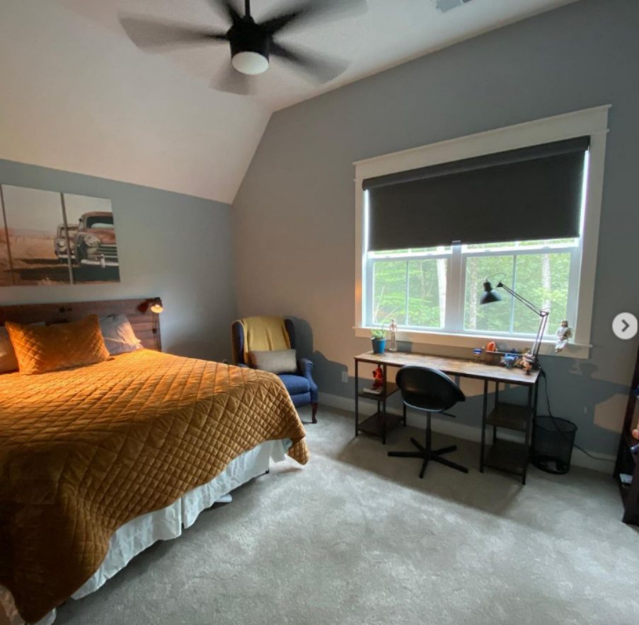
A Lit Krypton Walled Bedroom
A Krypton Bedroom with Yellow Bedding
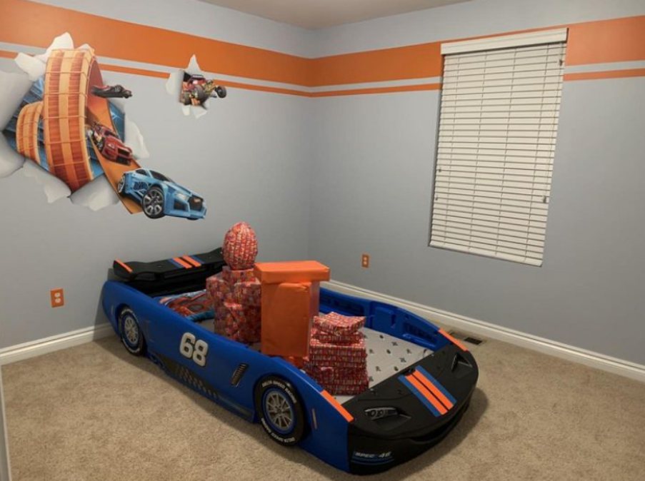
A Krypton Kids Playroom
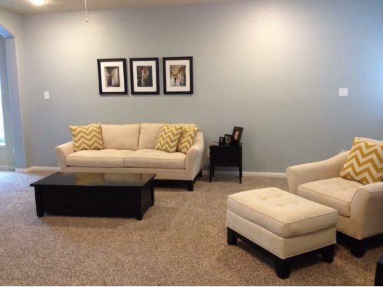
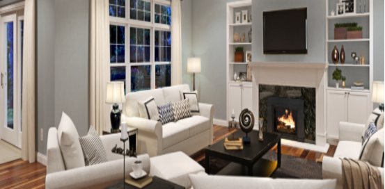
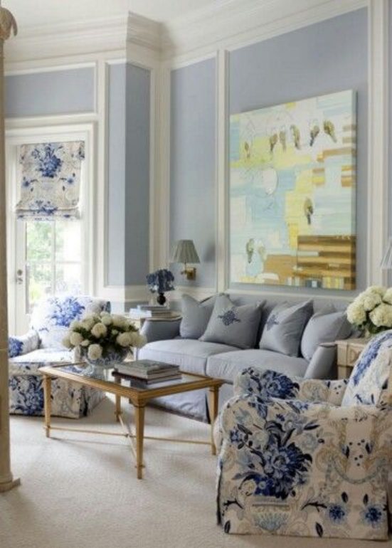
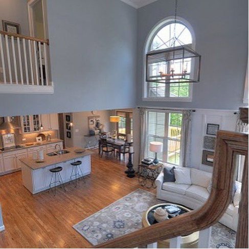
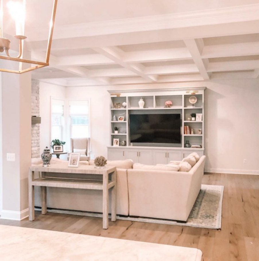
Krypton Living Room
Using Krypton for your living room is a no-brainer, as the color does wonders in opening up a space. It’s particularly best when the room is small, and you need it to look bigger. Use the color strip and palette to create the perfect ambiance with the paint.
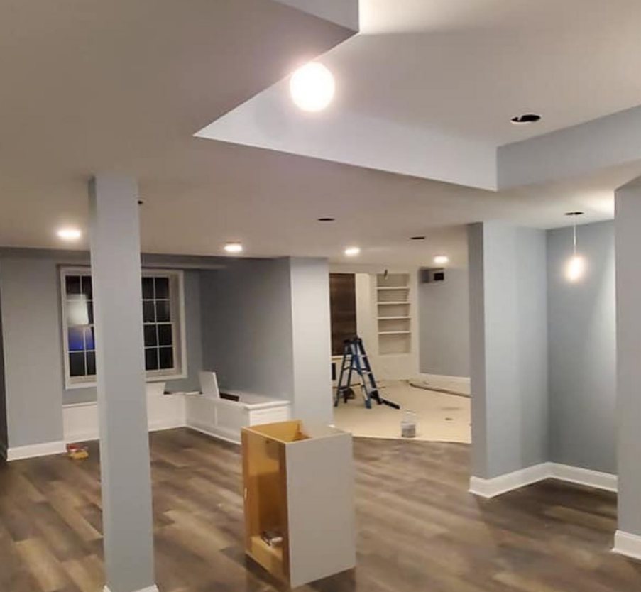
An Empty Krypton Living Area
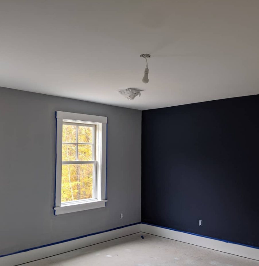
A Krypton Wall with a Naval Coordination
A Krypton Living Room in Natural Light
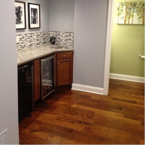
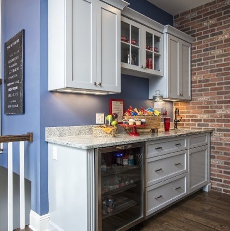
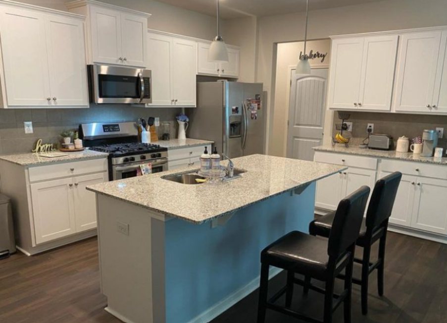
Krypton Kitchen
If you don’t want your kitchen to look clinically white, Krypton is a good alternative. It’s bright enough and works well with other tones. You can pair it with whites and wood to give the space character or stick to dark neutrals.
A Krypton Kitchen Station
A Krypton Island
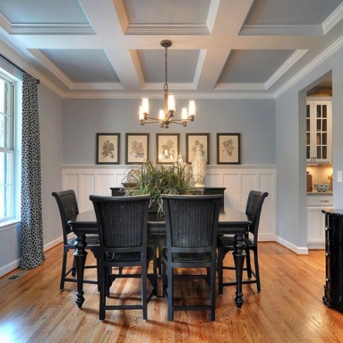
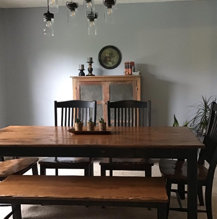
Krypton Dining Room
Using Krypton in your dining room would whet your appetite because it’s a subtle color, but it’s great if you’re disciplined about following a strict diet. Also, dining rooms are for something other than eating; sometimes, you could work at the table or relax while enjoying your meal.
A Krypton Dining Room
Krypton Bathrooms
Bathrooms are one of the best places to relax after a stressful day, and painting it with Krypton would serve you beyond your imagination. The color is inherently cool and designed to calm the nerves, so there’s no reason not to use it to its full extent.
Paint your walls or cabinets with Sherwin-Williams Krypton.
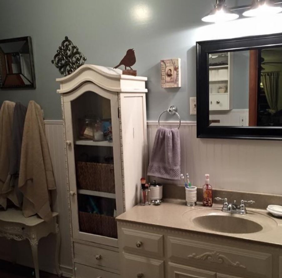
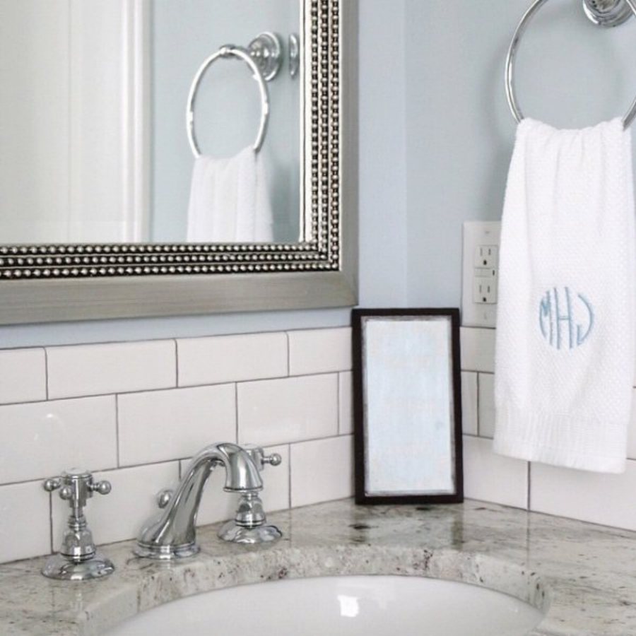
A Krypton Bathroom
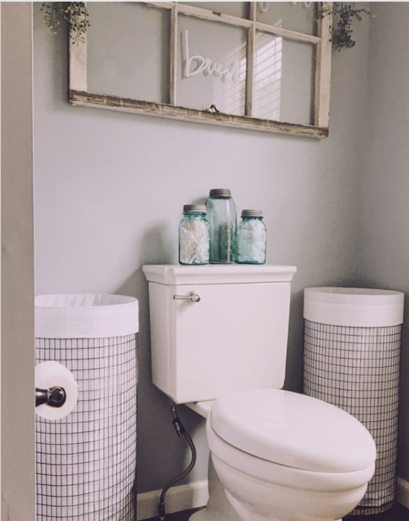
A Krypton Bathroom with white cabinets
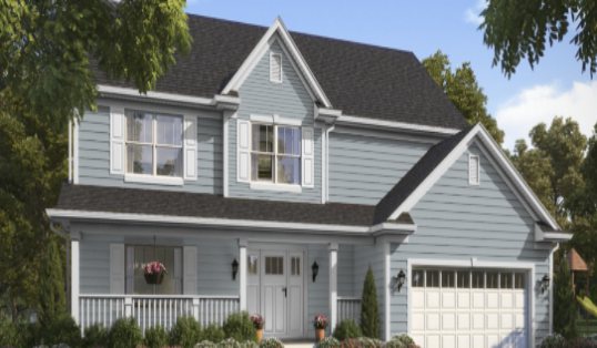
Krypton Exteriors
Use Krypton for your exteriors if you don’t want to go the traditional route and make the entire building white. You can also use it as an accent or trim on a coordinating color to brighten the spot. Try Krypton on your indoor doors, and thank me later.
Sampling Krypton
Use Samplize strips or buy samples from Sherwin-Williams but remember they could be a better representation of the shade despite what the company says. The best way to make a perfect comparison is by buying a liquid paint sample, not a card or strip.
Final Thoughts
If you’ve gotten this far, you’re ready to redecorate your space to perfection. Ensure your room is well-lit before painting it with Sherwin-Williams Krypton; otherwise, you’ll lose the beauty. Krypton is a happy and tranquil color, so don’t use it if you’re into a brooding vibe.
Please share your pictures once it’s complete.
 Sherwin Williams Crushed Ice (Palette, Coordinating & Inspirations)
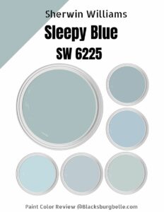 Sherwin Williams Sleepy Blue (Palette, Coordinating & Inspirations)
 Sherwin Williams Stardew (Palette, Coordinating & Inspirations)
 Sherwin Williams Olympus White (Palette, Coordinating & Inspirations)
 Sherwin Williams Malabar (Palette, Coordinating & Inspirations)
 Sherwin Williams Rhinestone (Palette, Coordinating & Inspirations)
