
Have you ever tried to pick out the right white paint color? There are a lot of white color choices, from crisp whites to warm off-whites, so it can get overwhelming. However, Benjamin Moore’s Calm can be an ideal white paint color choice if you are torn between cool and warm tones.
I’m excited to show you what this paint color can do to any decor. It’s such a stunning choice, and I believe you picked it for a reason. Let me show you specific details that make it a unique color, including its undertone and LRV. let’s get right to it, shall we?
Table of Contents
When to Choose Benjamin Moore Calm
Because Calm can take on different looks in different settings, I understand if you’re confused about how it will perform in your decor. As I said earlier, it is a stunning color, but you must know how to use it. So, when is Calm ideal for your decor? Here are a few ideas.
Have wood tones in your decor?
Calm has a soft and warm glow that makes it pair well with warm wood tones. If you have wood flooring, ceiling beams, or paneling, Calm should be part of your color palette.
Want a hint of color in your white paint?
This paint color can stand alone as a whole-house color because it’s not stark like many whites. When used right, Calm shows a hint of color that makes it different from ordinary white.
Need a bridge for color tones?
Calm can act as a neutral paint color to bridge the gap between warm and cool colors. If you must add both tones to your decor, consider using Calm as the backdrop to accommodate other colors.
There are many ways to use Benjamin Moore’s Calm because of its peculiar shade, and I’ve got much more to show about using this color. Stick around on this ride to learn whether or not Calm is the best choice.
What Color Is Benjamin Moore Calm?
The name of this paint already tells you what to expect. Some paint colors bring vibrance to a room, some give the feeling of fresh crispness, some bring an undeniable warmth to the decor, and others exude calmness and serenity.
Calm is part of the last group because it’s such a laid-back and creamy color. If you want a color that welcomes you at first glance, it should top your list.
Benjamin Moore Calm OC-22 is a soft off-white paint color with enough brightness to work in a low-lit room. It’s an excellent background color as it sets the tone and mood in the room.
A Snapshot of the Specifications of Benjamin Moore Calm
This chart shows the basic characteristics of Benjamin Moore’s Calm, such as its LRV and undertones, to help you understand the color. That way, you can decide whether or not it can work in your decor.
| Benjamin Moore Calm | |
| RGB | 230, 228, 223 |
| LRV | 75.83 |
| Undertone | Lavender-gray |
| HEX Code | #E6E4DF |
Benjamin Moore Calm: Examining the LRV
Are you wondering what LRV means? It means the light reflectance value of color, referring to how much light the color reflects on a scale of 0 to 100. Black doesn’t reflect light so has an LRV of 0, while white reflects a lot of light so has an LRV of 100.
Paint colors are slightly different; they don’t have pure black or white. So, the scale is from 2.5 to 94; bright colors are high on the scale, while dark colors are low on the scale.
Benjamin Moore’s Calm has an LRV of 75.83, almost 76. While it’s not high enough to qualify as white, it is high enough to be an off-white color. In simple terms, Calm reflects a lot of light.
Benjamin Moore Calm: Understanding the Undertones
The undertone of this paint color is what distinguishes it from similar colors. Calm is an off-white color with a hint of lavender and gray. The undertone is the reason it can work in warm and cool color schemes.
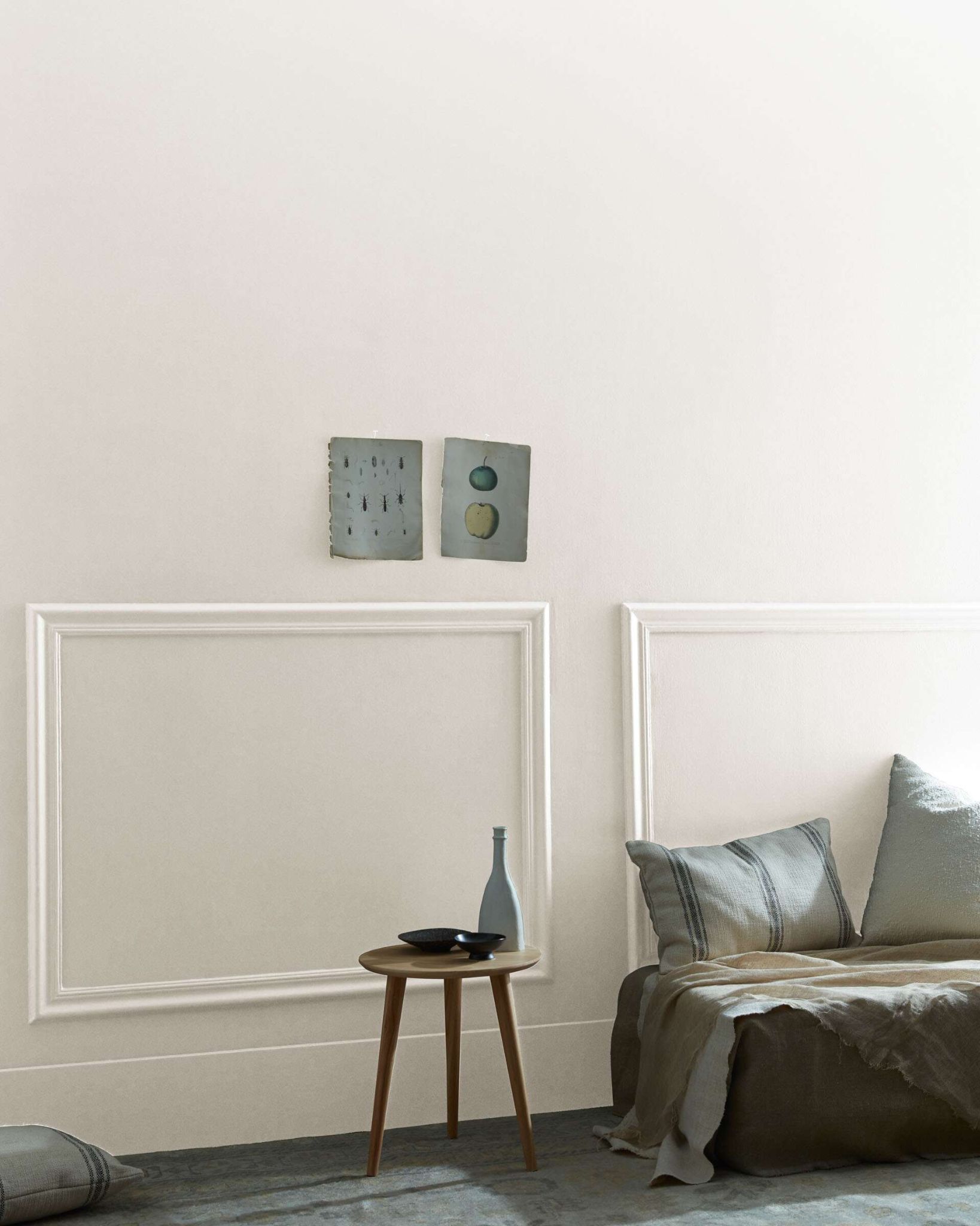
You won’t notice the undertone at first glance. In fact, the gray hint may be more obvious than lavender. However, its true shade becomes obvious in certain lighting.
This photo shows the true color of Calm without any interfering hues.
But here is Calm with just a wink of lavender peeking through to the surface.
And in this living room, the paint color reveals some of its gray undertones.
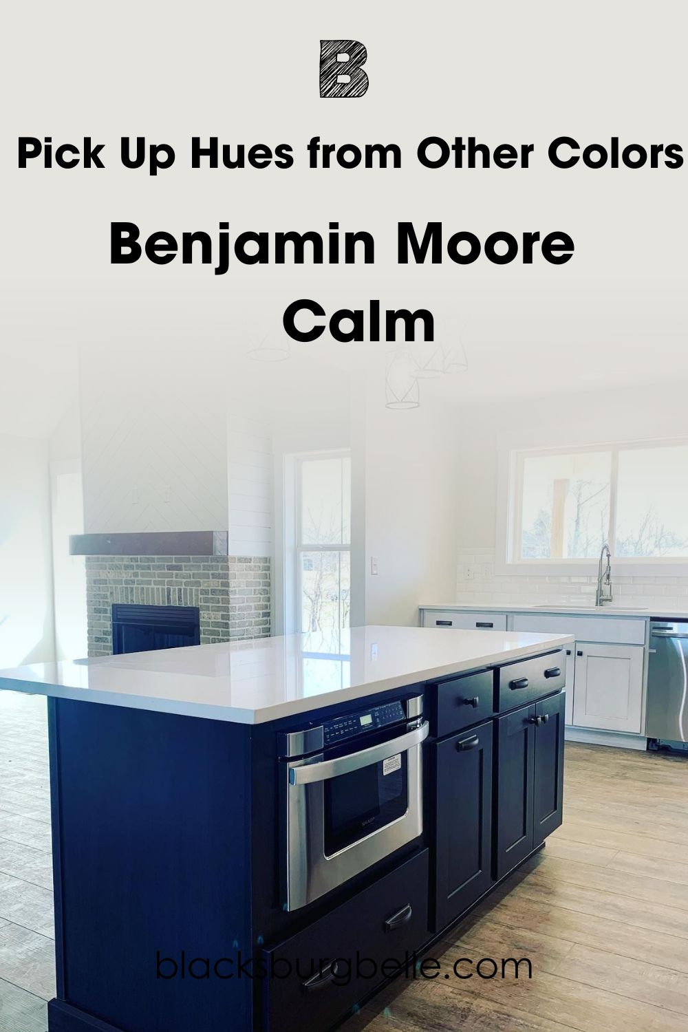
Does Benjamin Moore Calm Pick Up Hues from Other Colors?
Some colors, especially bright ones, tend to pick up hues from bold and vibrant shades. This can make them appear to be different or have undertones that are not actually there. Calm may pick up a little of the vibrant colors around it, but this can be a matter of perception.
How Does Lighting Affect Benjamin Moore Calm?
This paint color can look pretty warm and bright in natural lighting, especially if there’s direct sunlight. Lighting is one of the biggest factors to consider when picking any color, and this applies particularly if you are not of fan of washed-out colors.
Here is Calm in warm sunlight, looking creamy with only a bit of gray showing.
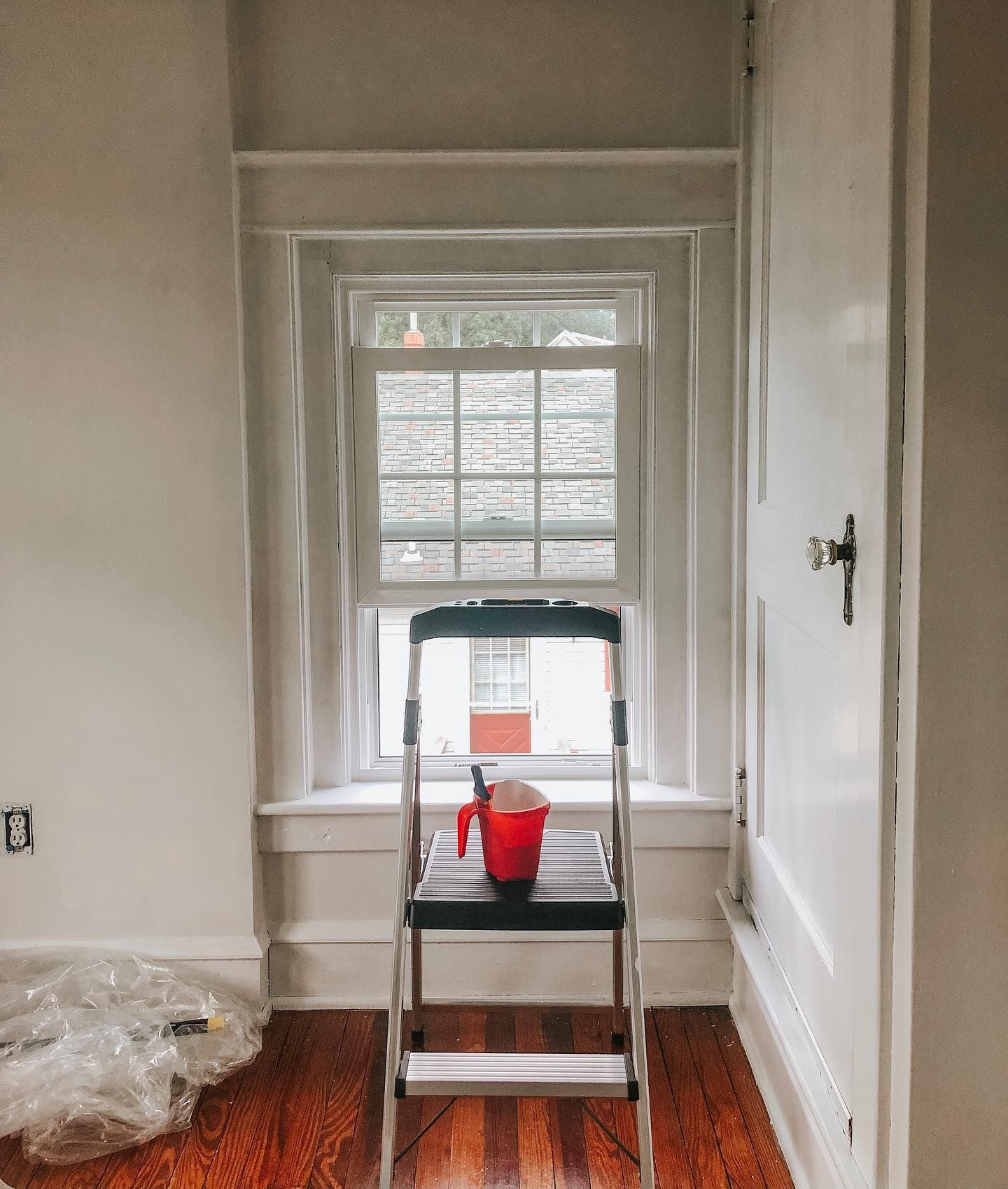
The same paint color looks slightly muted but not to the point that it looks drab or dull. Check ut this passageway in this next photo to see how Benjamin Moore’s Calm appears in low light.
You may also notice that Calm looks different in artificial lighting. If you plan to use it in a bathroom, which typically doesn’t have a lot of natural light, keep in mind that the color can change.
Benjamin Moore Calm: Warm or Cool?
Calm is relatively warm but can lean a little away from warmth in cool light. This paint color doesn’t disappoint if the lighting is not perfect, but it presents its best face in warm sunlight or bright artificial lighting. Calm feels soft, welcoming, and complete when used in a room.
Benjamin Moore Calm Color Strip: Lighter to Darker Exploration
If you find that Calm is not the exact shade you want or think having options is ideal, you have nothing to worry about. The paint color has alternatives that come from the same color strip, and I’ve arranged them from light to dark options.
- Benjamin Moore Calm OC-22
- Benjamin Moore Inukshuk CC-460
- Benjamin Moore Rocky Road CC-470
- Benjamin Moore Cabot Trail CC-480

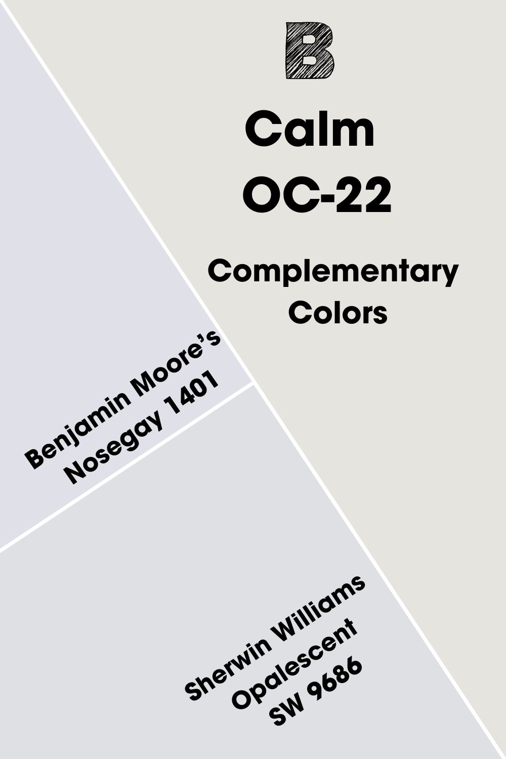
Benjamin Moore Calm Complementary Colors
Have you ever considered how complementary colors work? They are not random pickings but are carefully arranged on the color wheel to show their relationship with each other.
To the untrained eye, complementary colors don’t have anything in common, but when paired, they can bring out vibrant hues in each other. Examples include red and green or blue and orange.
Benjamin Moore’s Calm is an off-white color, and white is technically not on the color wheel. However, the paint color is not your typical white, so we can find its complementary color.
It is a pretty pale shade of blue, and Benjamin Moore’s Nosegay 1401 is the closest match. You can also try Sherwin Williams Opalescent SW 9686 if you want an option from another brand.
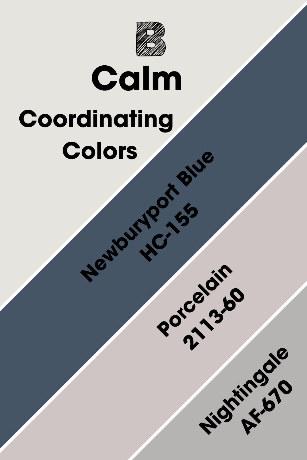
Benjamin Moore Calm Coordinating Colors
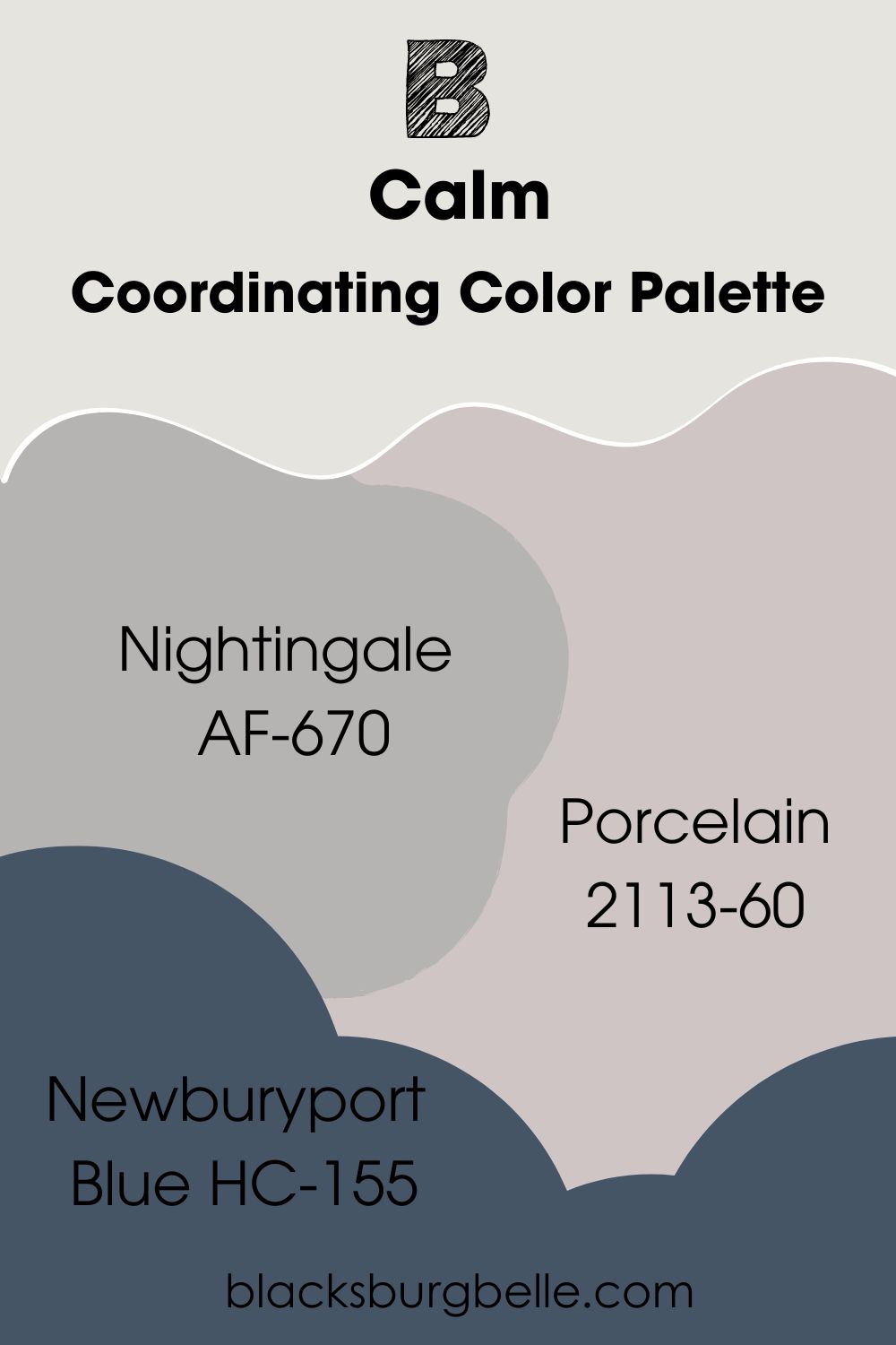
These colors match Calm and make it work well in any decor. While Calm can work alone, it looks even better with the coordinating colors. Newburyport Blue, Porcelain, and Nightingale are its coordinating colors according to the brand.
- Benjamin Moore Newburyport Blue HC-155: A deep blue nuanced with gray for an understated but sophisticated look.
- Benjamin Moore Porcelain 2113-60: A dusty lilac paint color to complement the slight lavender hue in Calm.
- Benjamin Moore Nightingale AF-670: A smidge of violet warms this mid-tone gray, making it ideal to pair with the lighter Calm.
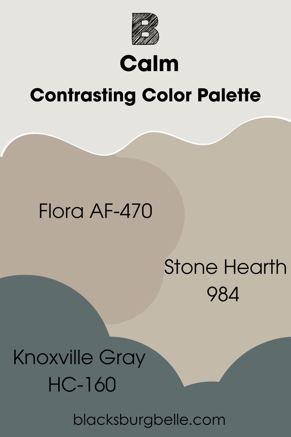
Benjamin Moore Calm Color Palettes
Colors look their best when you use them with shades that flow well with them in a color scheme. A color palette allows you to create the decor of your dreams by using colors with some similarities for a seamless flow. Let’s look at some examples.
Contrasting Color Palette
- Flora AF-470: A blue-green with surprising depth that pairs well with the soft Calm as a trim color.
- Stone Hearth 984: A stone gray paint color whose warmth brings out the soft glow of Calm in any decor.
- Knoxville Gray HC-160: A deep blue-green that reminds you of the sea and brings a certain depth to the decor when combined with Calm.
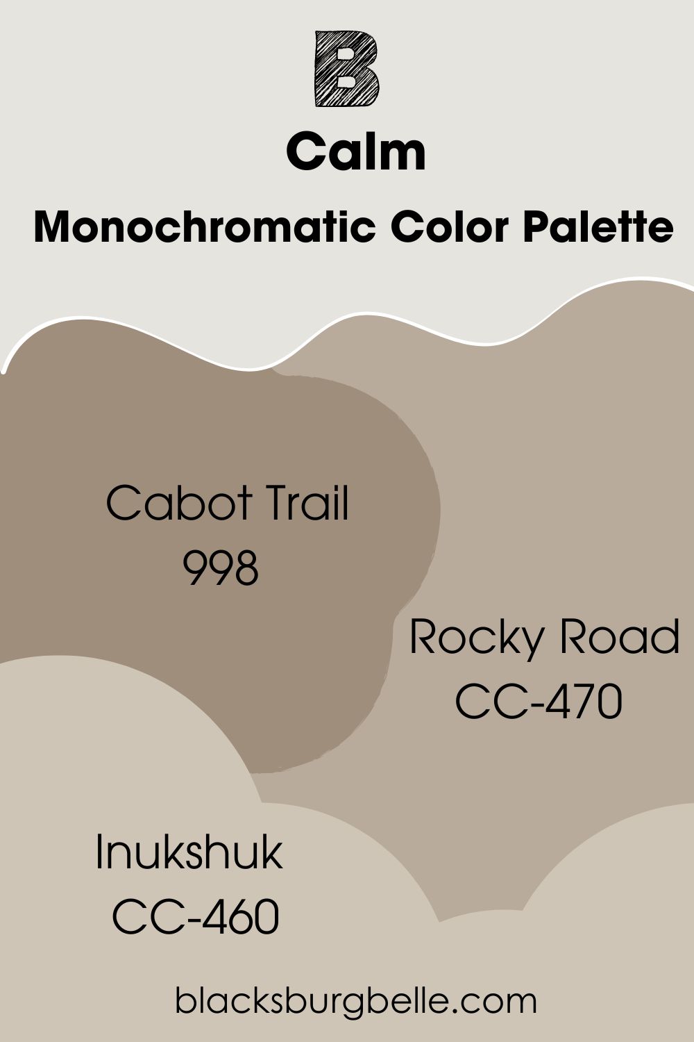
Monochromatic Color Palette
- Cabot Trail 998: A rich and creamy color with slightly green undertones but with similarities to Calm to make for a seamless flow.
- Rocky Road CC-470: A slightly lighter shade of Cabot Trail with similar undertones to blend with the decor.
- Inukshuk CC-460: A fairly bright gray paint color that complements the warmth of Calm and pairs well with it.
Coordinating Color Palette
- Nightingale AF-670: A smidge of violet warms this mid-tone gray, making it ideal to pair with the lighter Calm.
- Porcelain 2113-60: A dusty lilac paint color to complement the slight lavender hue in Calm.
- Newburyport Blue HC-155: A deep blue nuanced with gray for an understated but sophisticated look.
Benjamin Moore Calm vs Similar Colors
You may be considering colors similar to Calm and wondering how they compare. Let’s look at some of them side by side.
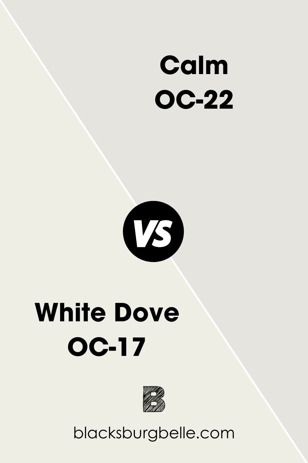
BM Calm vs BM White Dove
Calm reflects less light than Benjamin Moore’s White Dove; the latter has an LRV of 85.38. White Dove also has yellow undertones, making it obviously warmer than Calm.
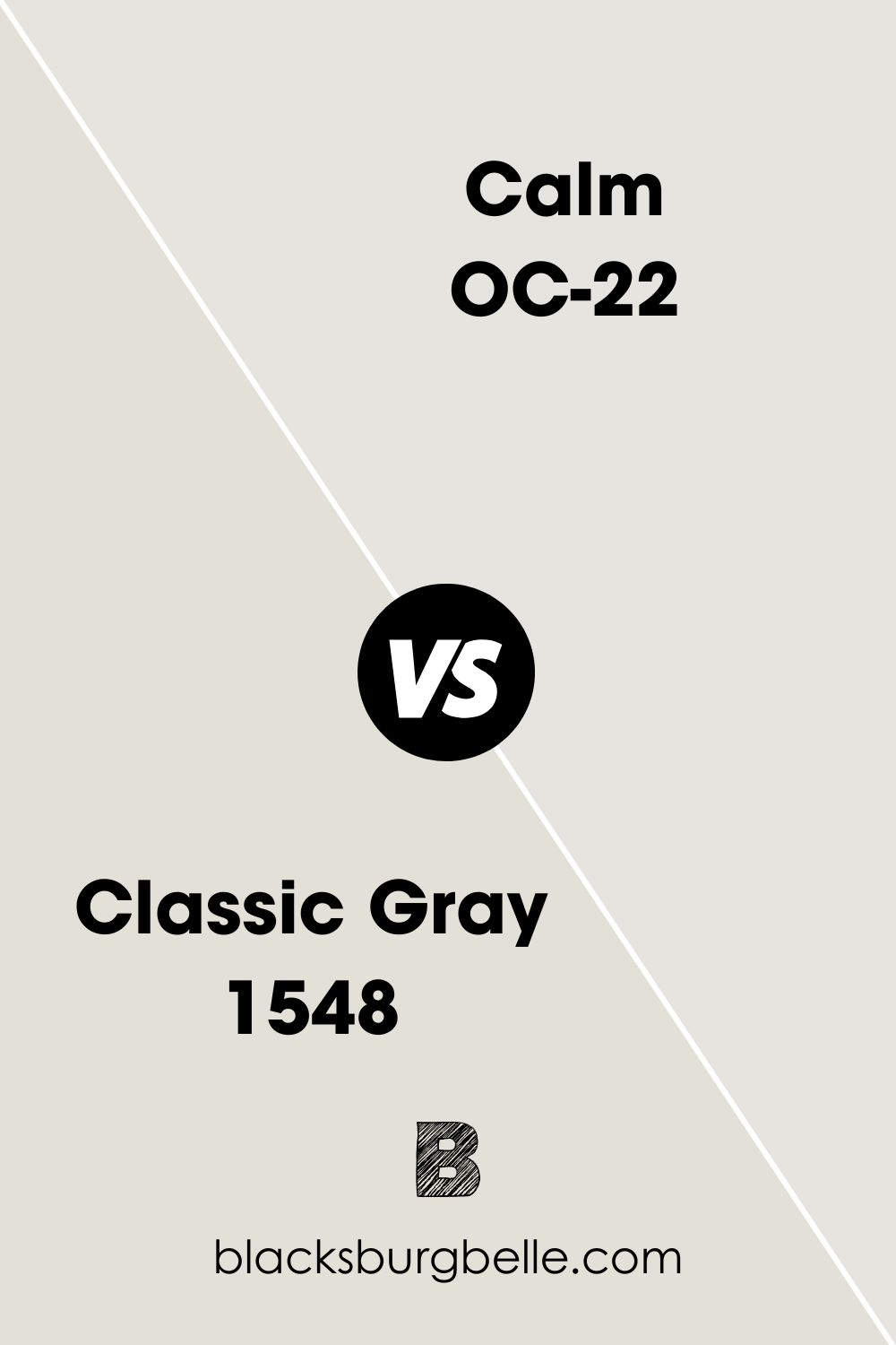
BM Classic Gray vs BM Calm
Benjamin Moore’s Classic Gray is slightly darker than Calm, with an LRV of 73.67. But apart from that, both colors look almost the same because of their purple undertones.
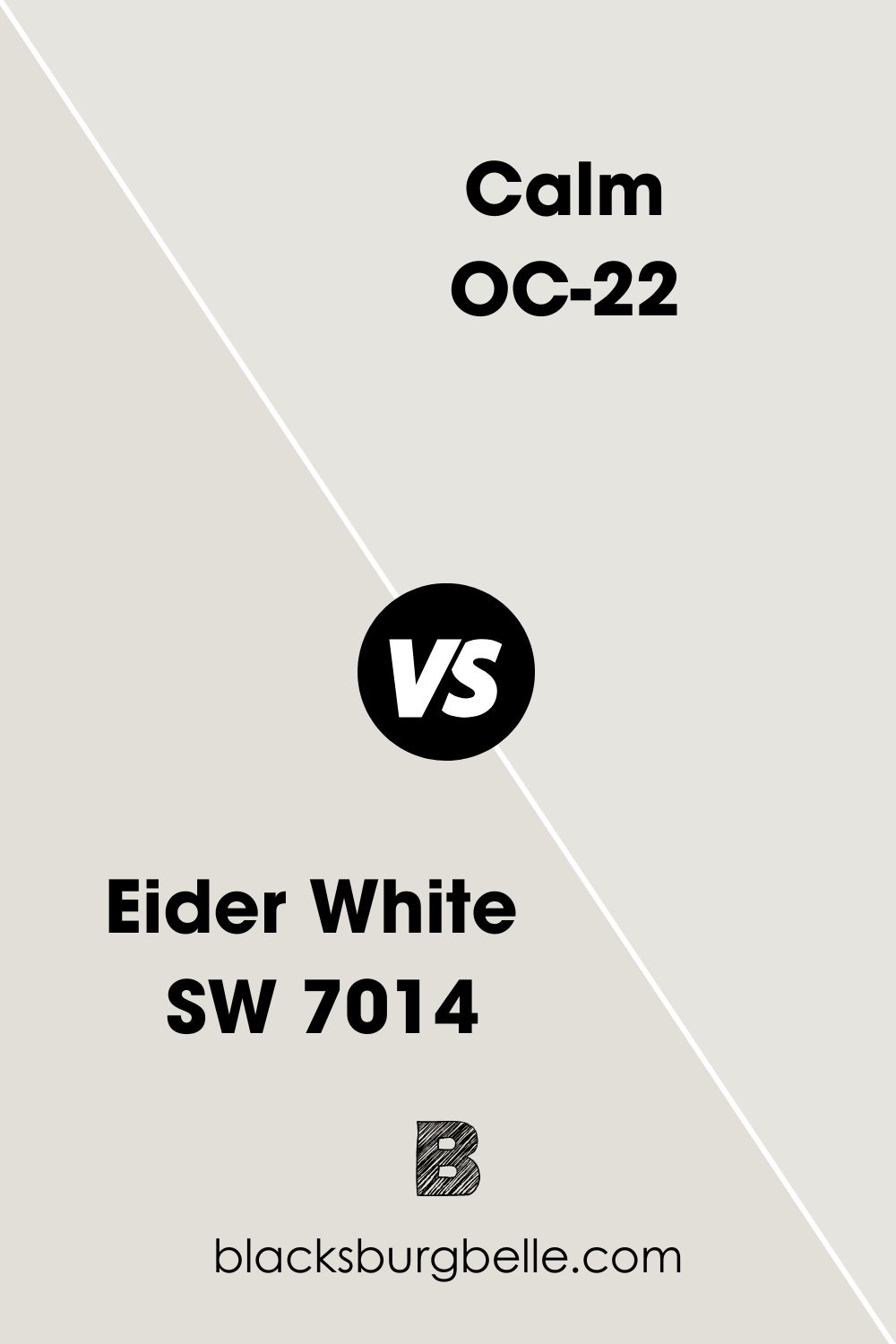
SW Eider White vs BM Calm
Eider White has obvious gray undertones and has an LRV of 73. So, it appears darker and more muted than Calm.
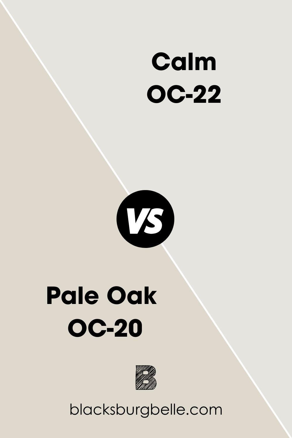
BM Pale Oak vs BM Calm
Pale Oak has more obvious warmth because of its pink-purple undertone. Moreover, it is greige and has an LRV of 68.64, making it darker than Calm.
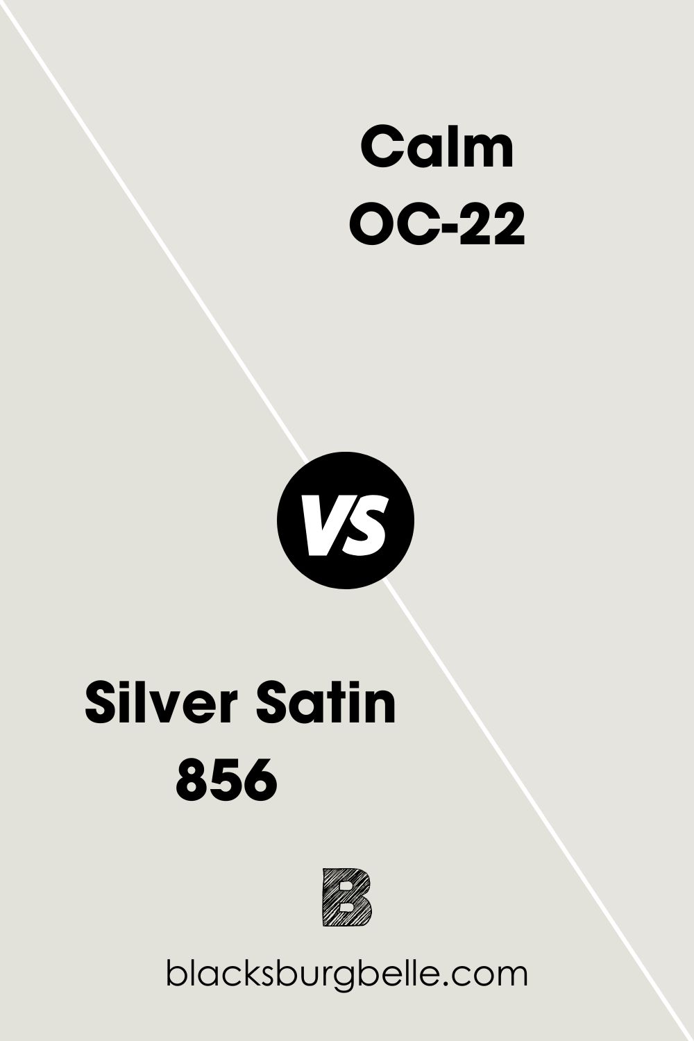
BM Silver Satin vs BM Calm
Silver Satin has the same lavender-gray undertone as Calm but its LRV of 74.9 makes it just a tad darker than Calm.
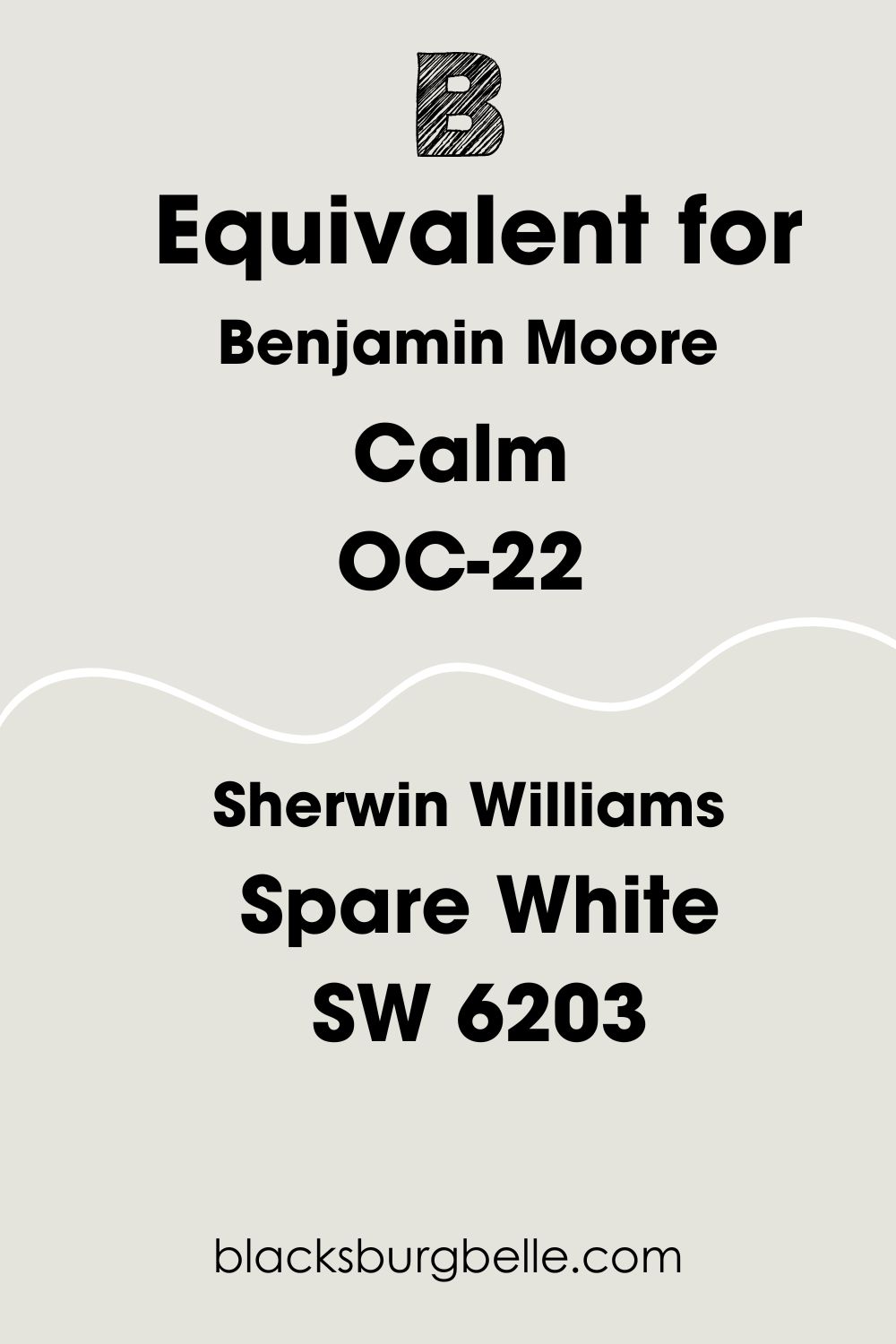
Sherwin Williams Paint Color Equivalent to Benjamin Moore Calm
This paint color is unique, and while you may find a few others that look like it, none performs the same way. The same is true of every paint color because they are carefully designed to deliver something unique to the user.
In simple terms, there is no equivalent for Benjamin Moore’s Calm from any brand. That said, Sherwin Williams’ Spare White SW 6203 comes close to the color, especially when you compare their RGB. However, Calm has a subtle green undertone, while Calm has lavender-gray.
Where Can You Use Benjamin Moore Calm?
If you want a new cabinet color, or kitchen wall shade, or are thinking of redoing your bedroom, bathroom, or living room, Calm is ideal because of its soft glow and subtle neutrality. Pair it with soft pastels, bold shades, or vibrant hues, and the decor comes out looking stunning.
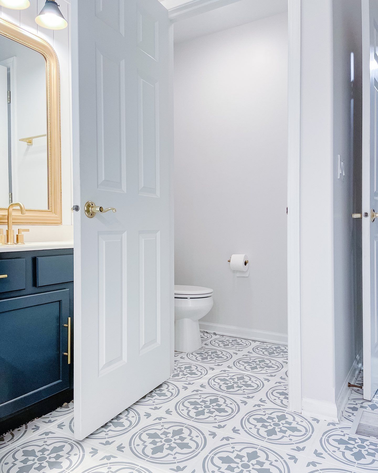
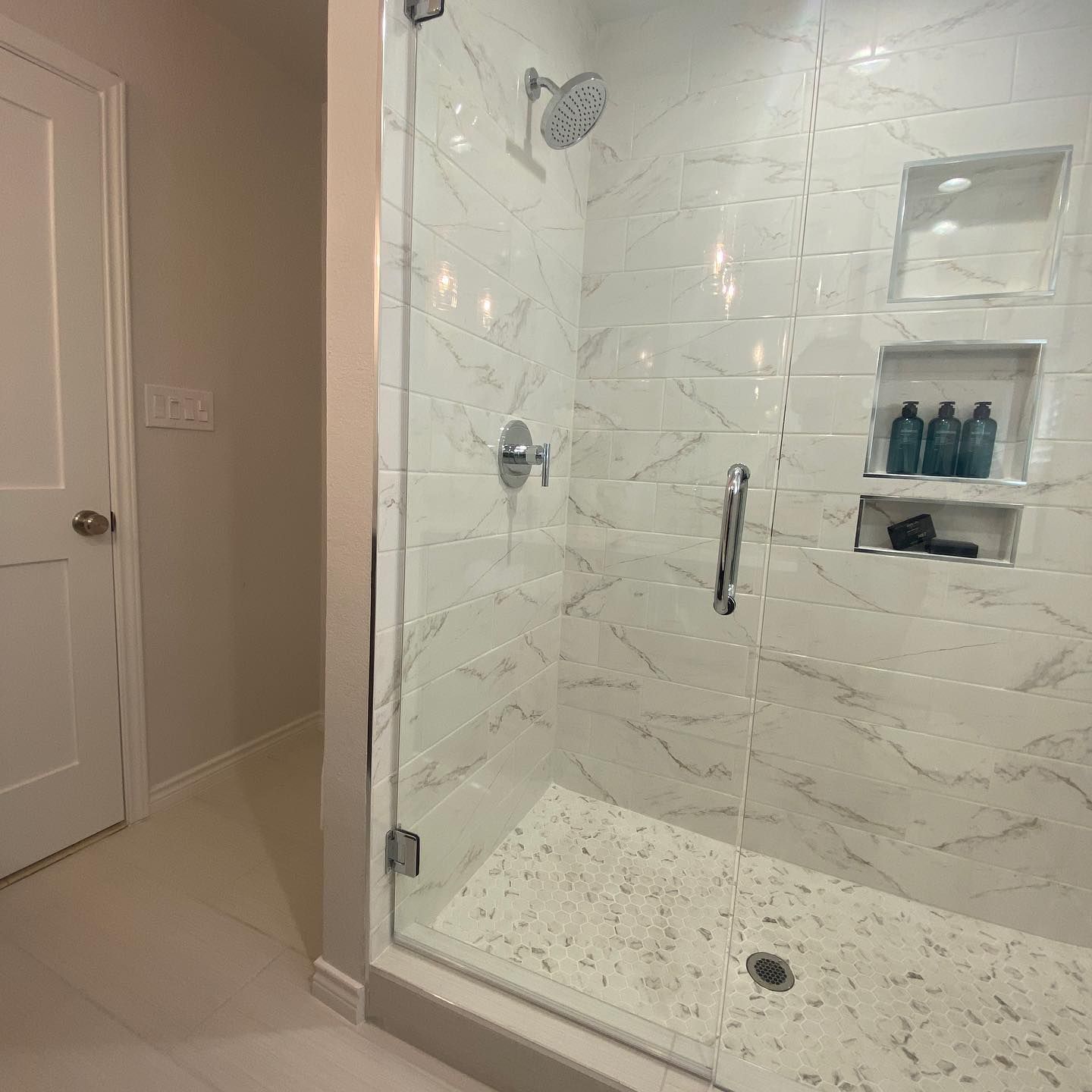
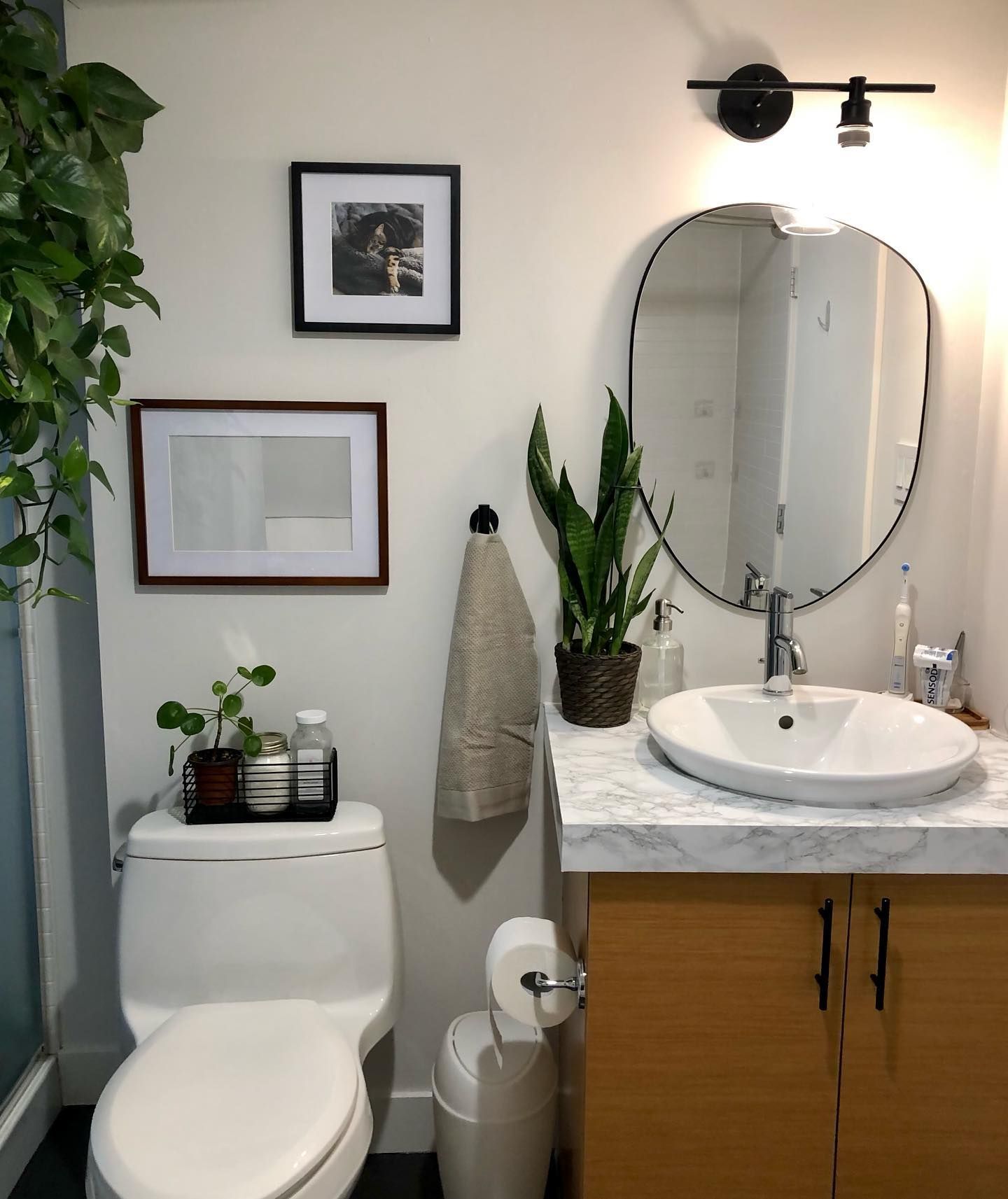
Benjamin Moore Calm in a Bathroom
Calm feels like a warm hug, which is why you should consider it as the bathroom color of choice.
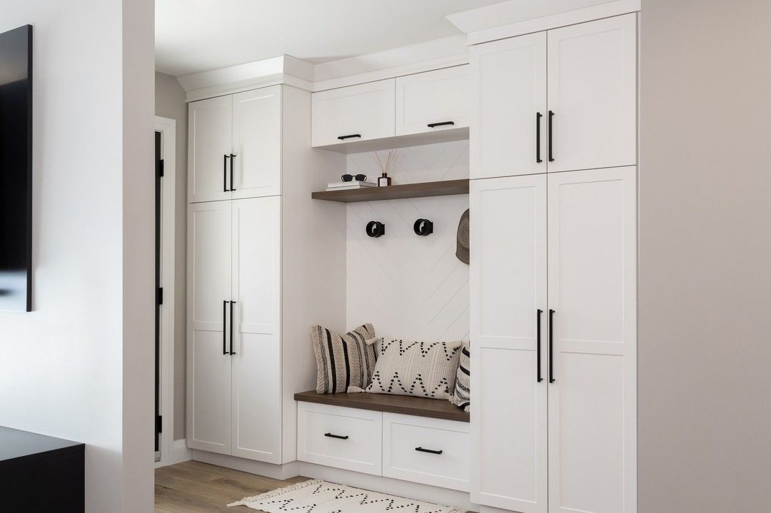
Benjamin Moore Calm in an Entryway
Who said you can’t use such a warm color in your entryway? Since it’s the first place you see when entering your home, you might as well make it welcoming.
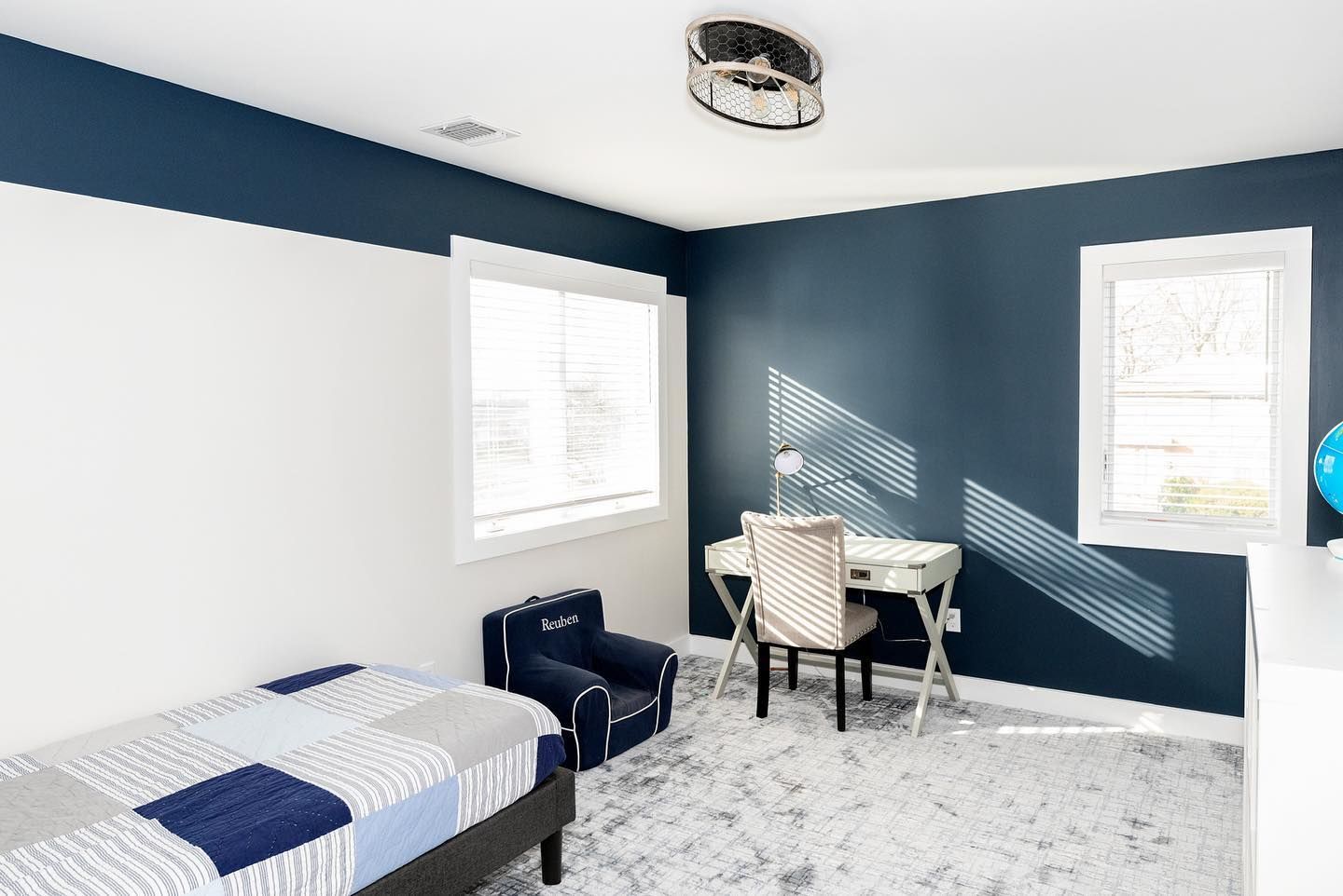
Benjamin Moore Calm in a Bedroom
Whenever I look at this bedroom, I have the urge to redo mine. Maybe because I love blue, but the combination is stunning. The design makes all the difference, and I love it. The trim is BM Chantilly Lace, the blue is BM Hale Navy, and the white part of the wall is Calm.
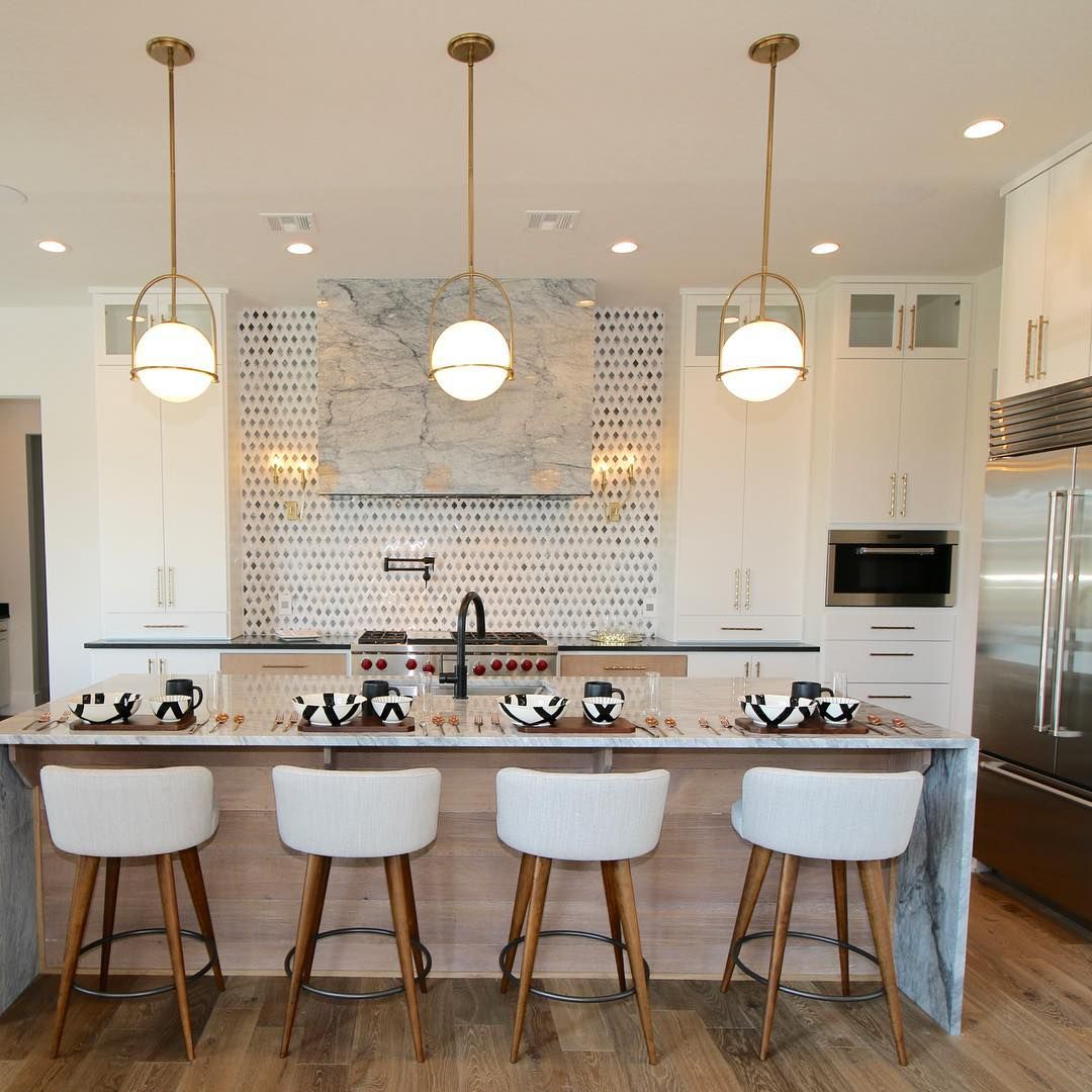
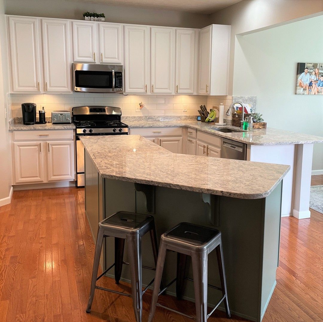
Benjamin Moore Calm on Kitchen Cabinets
If you want to create the look and feel of a warm and cozy kitchen, Calm works well on the cabinets to reach that goal.
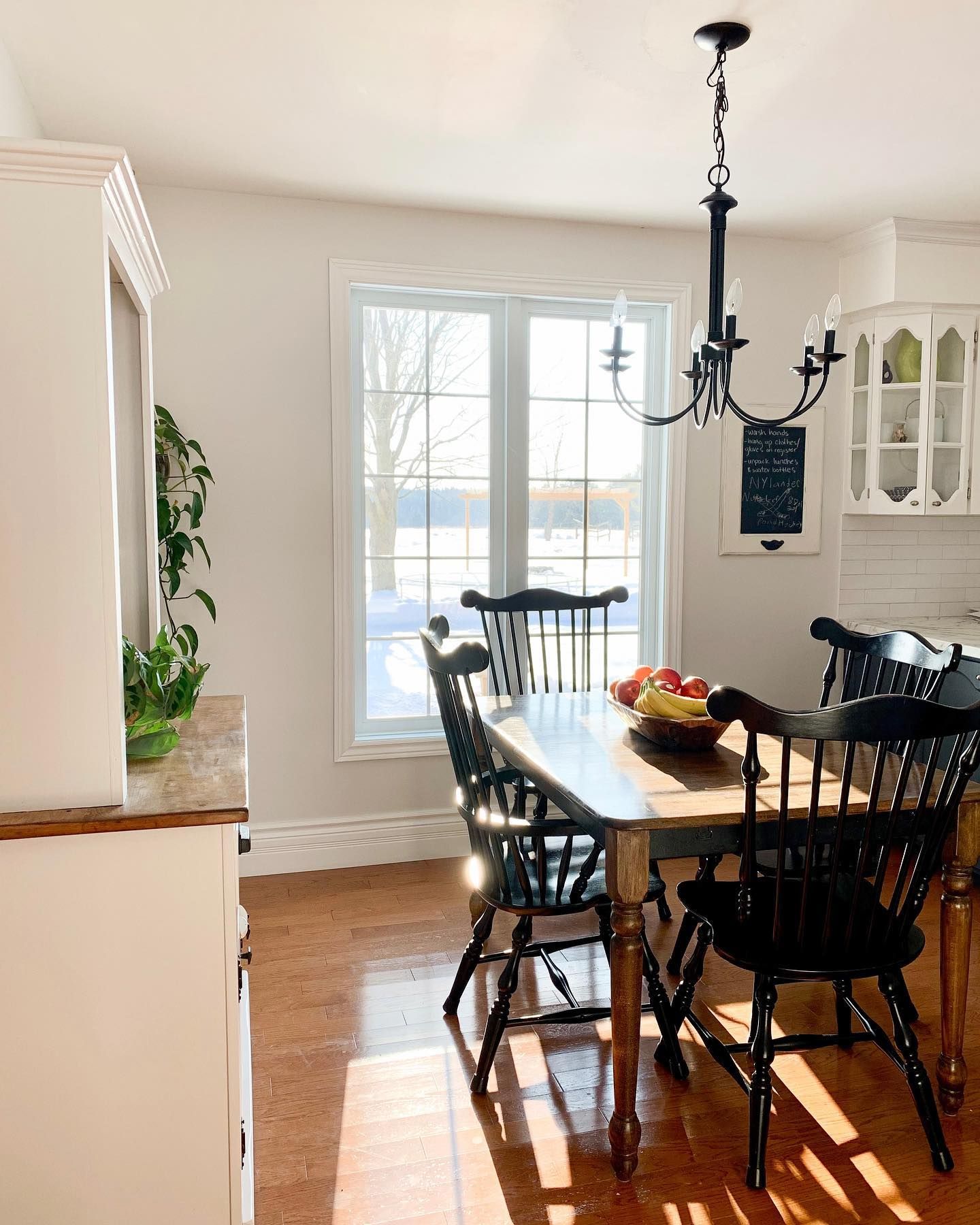
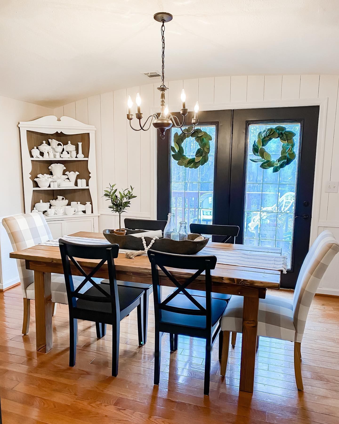
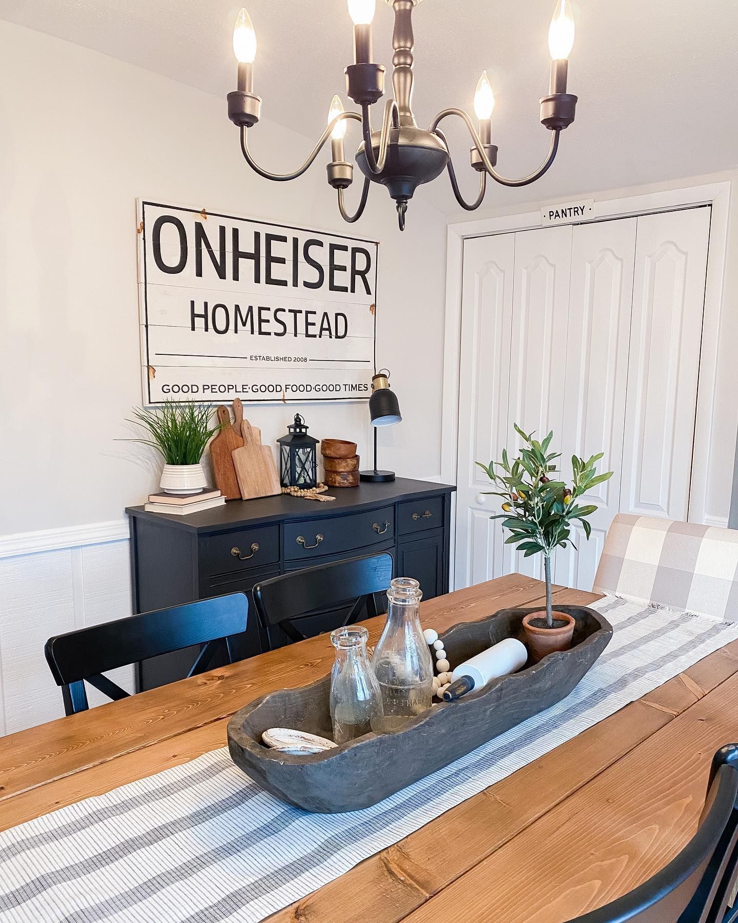
Benjamin Moore Calm in a Dining Area
Unless you have a living room that accommodates a dining nook painted in the same color, dining areas tend to be overlooked. But try a warm off-white color like Calm. The vertical shiplap is painted in Calm, and the warm lighting makes all the difference.
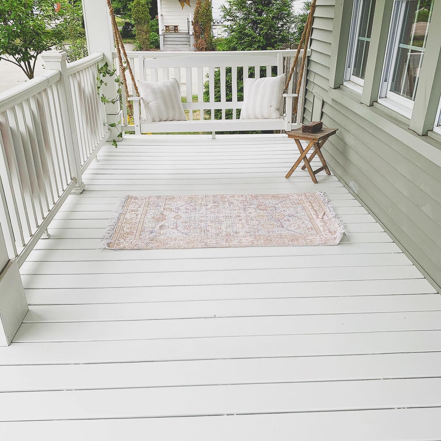
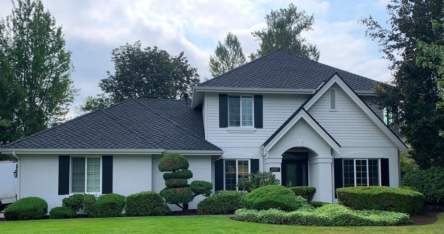
Benjamin Moore Calm on the Exterior
This porch looks like something out of a decor magazine because of the color combination. It is beautiful.
Best Ceiling Color for Benjamin Moore Calm Walls
Since it’s versatile, you can try a light gray. But I would stick with white and throw in splashes of other colors elsewhere.
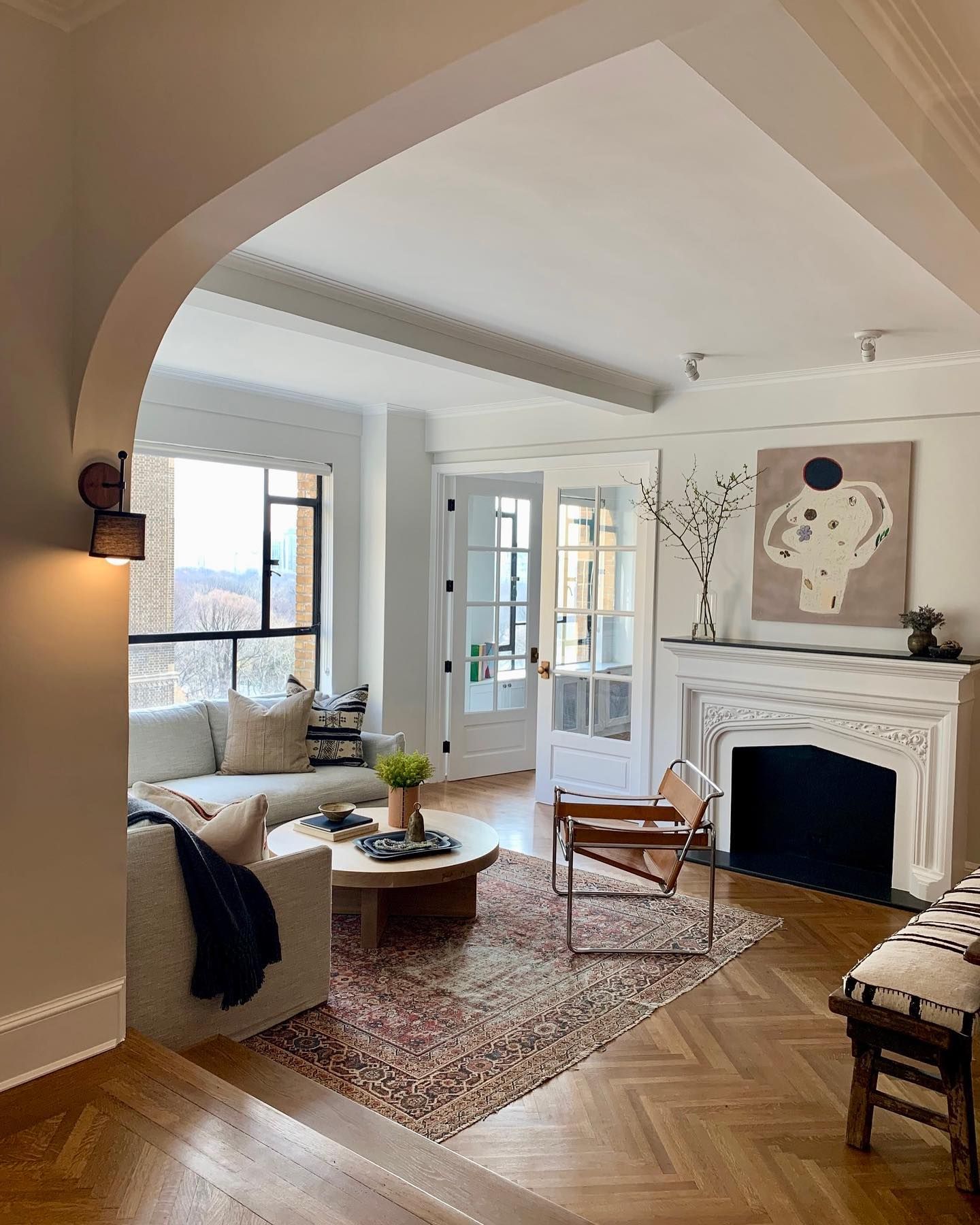
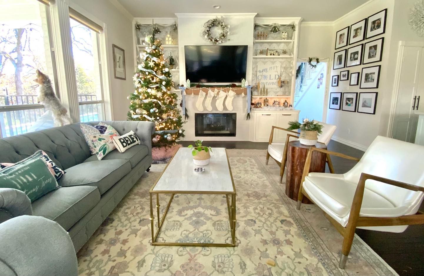
Benjamin Moore Calm in a Living Room
Calm picks up a hint of green, probably because of the green in all the decorations. It still looks good paired with BM Simply White.
Best Trim Color for Benjamin Moore Calm Walls
I recommend white if you want the wall color to pop. Use a neutral white like Chantilly Lace, like in the photo below, or a warm white like Pure White. Simply White also works, and these colors are all from Benjamin Moore.
Benjamin Moore Calm on Exterior Walls
Calm is a warm color, so it looks great on exterior walls. It won’t look washed out or stark, especially if you trim it with darker colors.
Conclusion
There you have it: Benjamin Moore’s Calm and everything about it. The paint color is an off-white shade with a lavender-gray undertone. It is bright enough to perform well in a low-lit room and won’t look too washed out in bright natural light.
Create a suitable color palette following my guide and ensure all the colors flow well. The beautiful thing about Calm is that you can use it in any room and on exterior walls.
So, go ahead and make the most of it. Share your thoughts, color palettes, and design inspiration with me in the comments section.
 Sherwin Williams Smoky Blue (Palette, Coordinating & Inspirations)
 Sherwin Williams Debonair (Palette, Coordinating & Inspirations)
 Sherwin Williams Softened Green (Palette, Coordinating & Inspirations)
 Sherwin-Williams Gossamer Veil (Palette, Coordinating & Inspirations)
 Sherwin Williams Oyster Bay (Palette, Coordinating & Inspirations)
 Sherwin Williams Panda White SW 6147: Review and Inspiration
