
Don’t you wish that your interior design had a little more “porpoise”? You’ll have to excuse the pun, but in this paint review, we are looking at the incredibly striking bronze-laden hues of Sherwin Williams Porpoise SW 7047.
This gorgeous paint color is the perfect mix between a smoky gray and a deep bronze, and I love its show-stopping appeal. If you are looking for a color that oozes drama, then Porpoise is definitely the one for you!
Keep on reading and I’ll let you in on all the details when it comes to Sherwin Williams Porpoise SW 7047.
Table of Contents
When to Choose Sherwin Williams Porpoise?
With a paint color that sounds as intriguing as Sherwin Williams Porpoise you bet I had to try this paint out for myself! However, not only that, but I also scoured the internet for all of the very best inspiration when it comes to Sherwin Williams Porpoise SW 7047.
So, here are my top highlights on when you should choose this paint color.
Give Your Exterior Some Porpoise
When looking for inspiration, you can’t help but notice how many people have used Sherwin Williams Porpoise on the outside of their properties. And, this is for good reason! This paint color looks fantastic on all kinds of exterior walls, whether they have wood siding, shingles, or even brick!
It can either be used as the main color and supported by white and cream colors, or you could let it be the supporting act and use it on details such as trims or shutters.
Door Decor
Thanks to its showstopping appeal as a color thanks to the bronzy undertones, Sherwin Williams Porpoise makes for a great choice to paint your doors, whether it is your front door or those inside your home. This is particularly true if you have a light hallway or one with lots of other neutrals to spice things up a little.
Get a Little Moody
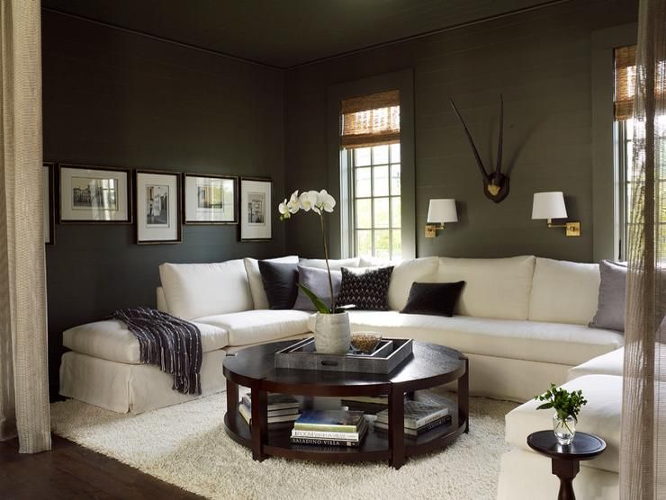
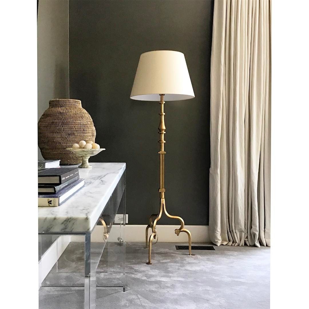
Thanks to its dark and rich pigment and LRV of 13, Sherwin Williams Porpoise is perfect for creating a moody vibe in a space. This can work really well in living rooms and bedrooms, or for creating a darker feature wall such as on a fireplace surround.
Furniture Freshen Up
Got an old cabinet or dresser that is starting to look tired and is showing some wear? Why not revive it using a coat of Sherwin Williams Porpoise to help bring back its wow factor?
Of course, this is only the beginning of the things that you can do with Sherwin Williams Porpoise SW 7047. I strongly advise sticking around and I’ll showcase everything there is to know about this paint!
What Color is Sherwin Williams Porpoise?
I know I made a little pun earlier, but you might be wondering why this paint from Sherwin Williams got its name. Its name stems from the marine mammal called a porpoise. Looking similar to dolphins, some porpoises have a rather distinct color to their skin. I’ll show you what I mean.
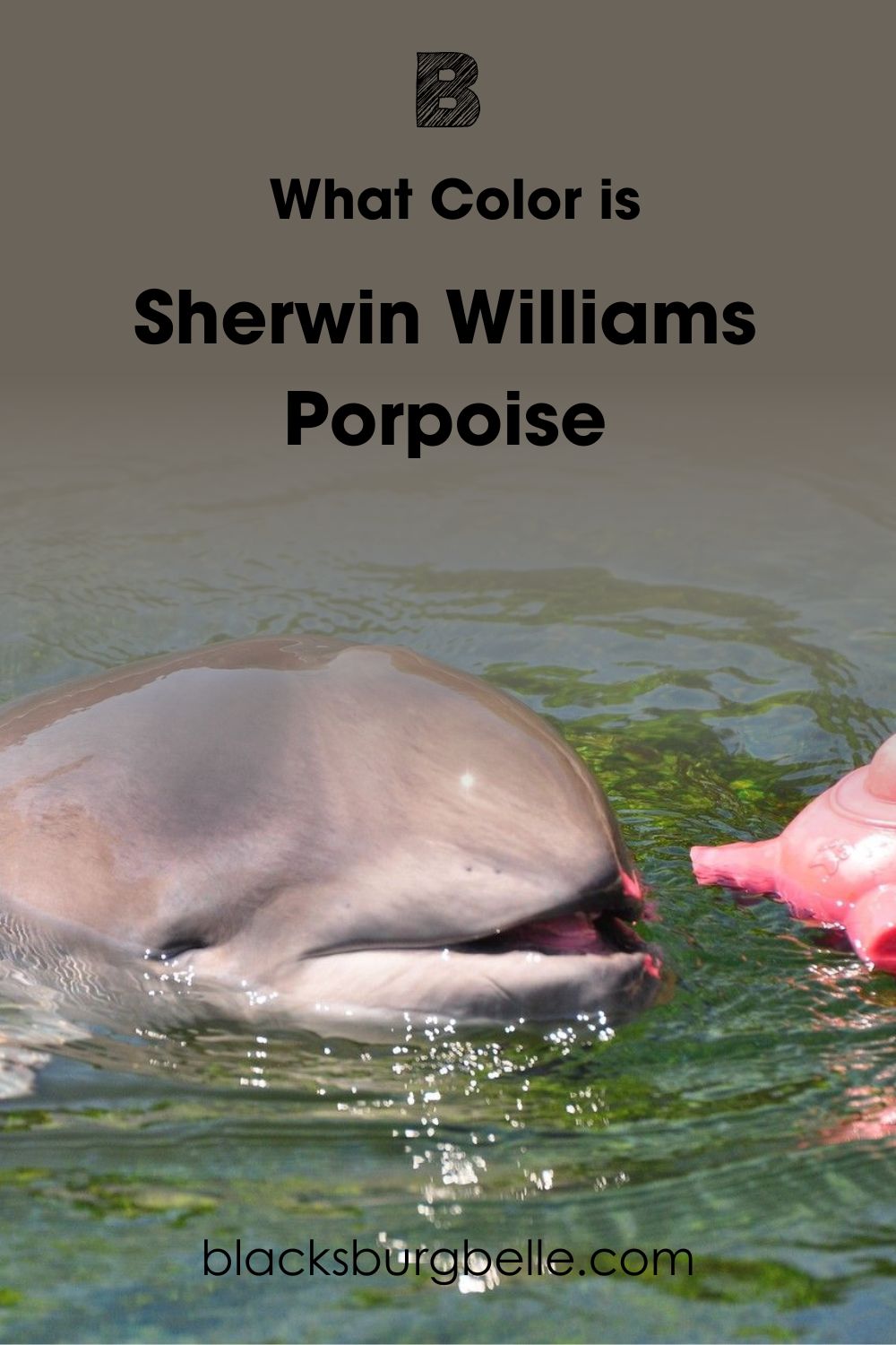
If you look at this harbor porpoise enjoying some play time, you’ll notice that it is not entirely gray. Instead, there are some brown and bronze notes coming through on its skin, and you’ll start to realize why Sherwin Williams took inspiration from these amazing animals.
Snapshot of Sherwin Williams Porpoise Specifications
Of course, me just talking about marine mammals isn’t going to be enough to sell you on this paint color. So, let me give you some key technical details about Sherwin Williams Porpoise that you might find more useful. You can find them in my handy table below.
| Sherwin Williams Porpoise SW 7047 | |
| RGB | R: 107 G: 100 B: 91 |
| Hex Value | #6B645B |
| LRV | 13 |
| Undertones | Brown, Gray |
LRV of Sherwin Williams Porpoise
For those unfamiliar with the term, LRV simply means Light Reflective Value. It’s used to measure how much light a color reflects. The scale goes from 0 to 100, with a true black being 0, meaning it reflects no light, and a pure white being 100 with the maximum reflectiveness.
When it comes down to it, no color is truly black, or white. There is always some sort of pigmentation due to the manufacturing process and just general everyday life! As a result of this, paint is measured using LRV values between 2.5 and 94.
The LRV of Sherwin Williams Porpoise is 13. This means it’s a pretty dark color, although this is what gives it its rich and dramatic appeal.
Undertones of Sherwin Williams Porpoise
The undertones of Sherwin Williams Porpoise are a little bit different than other paints, as the key undertones of brown and gray are also present in the main body of the paint. If it is put in a room where it picks up more on its gray nature, the brown will be the undertone, and vice versa.
However, there is also a more curious undertone that some people have spotted in Sherwin Williams Porpoise. That is a green that can come through in certain conditions, although I have found it hard to find this note in the paint color myself.
I’ve found the most neutral photo of Sherwin Williams Porpoise on a wall for you below so you can make up your mind on the undertone’s feel.
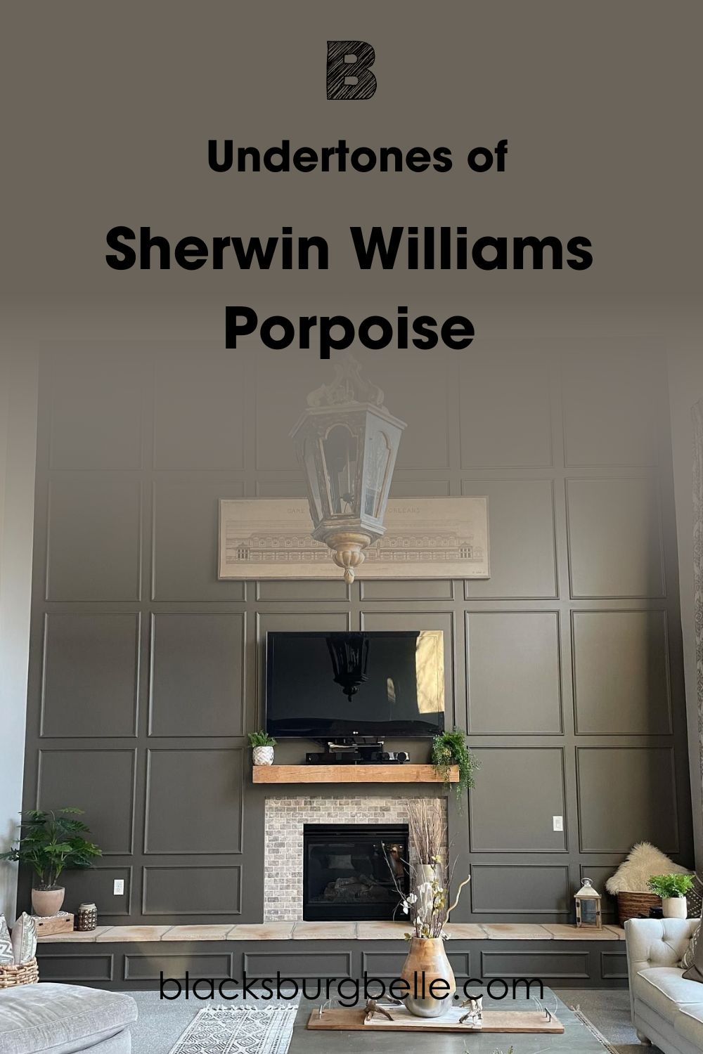
For example, on this gorgeous paneled fireplace surround, I see gray being the main color and the bronze and brown accents working more as the undertone. However, you might see the exact opposite, and that’s all part of the magic of Sherwin Williams Porpoise SW 7047!
Is Sherwin Williams Porpoise too Dark?
The idea of a paint color that meshes together gray and bronze might be exciting to you, but you may be wondering if Sherwin Williams Porpoise might be too dark of a color for you to use.
The simple answer is that yes, Sherwin Williams Porpoise is a dark paint color. However, this is something that some people absolutely love, especially if they want to create a moody atmosphere with some drama.
However, if you use Sherwin Williams Porpoise a little more sparingly and pair it with lighter paint colors, Porpoise doesn’t feel all that dark and oppressive and you still get that drama factor. Here’s an example to show you what I mean.
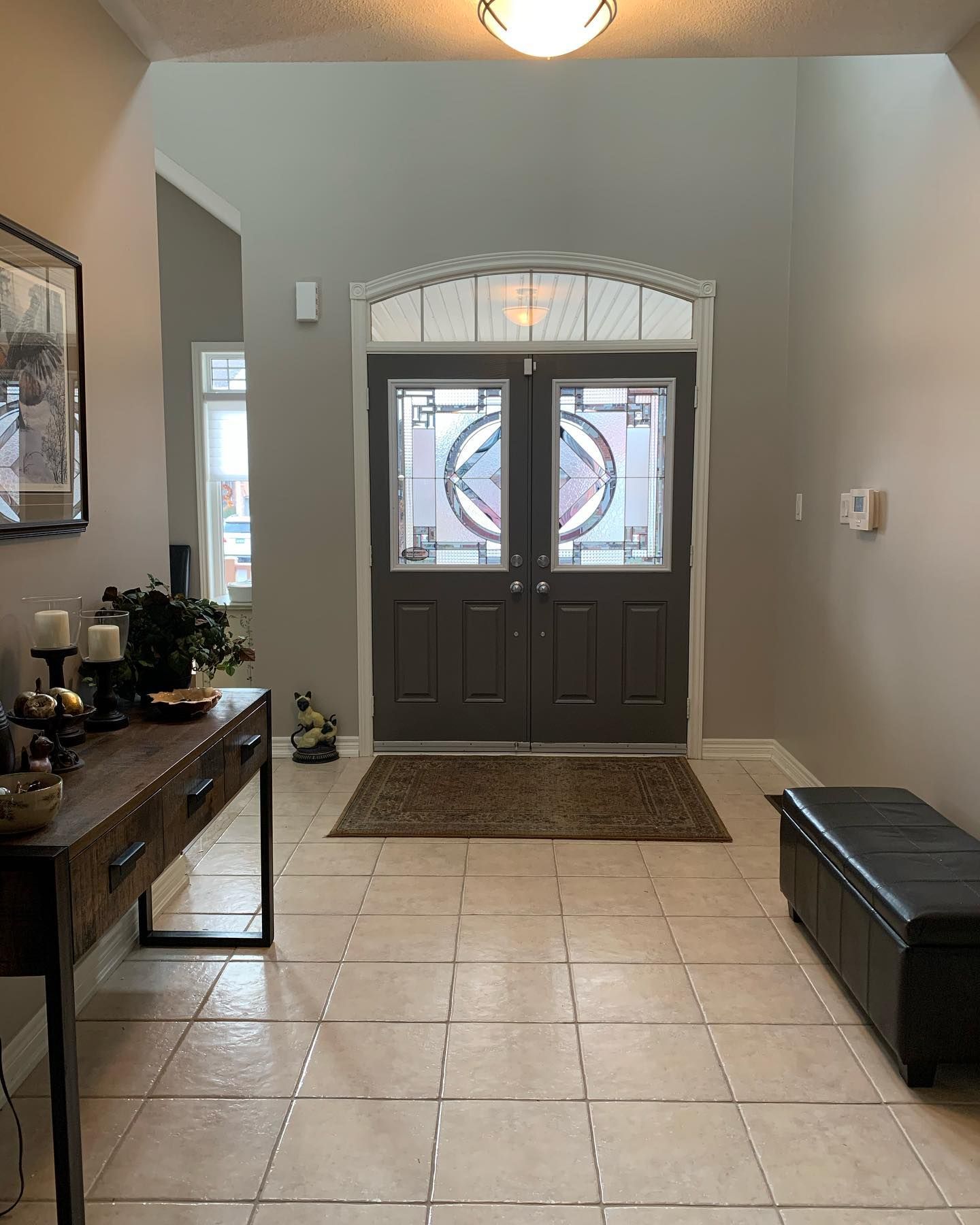
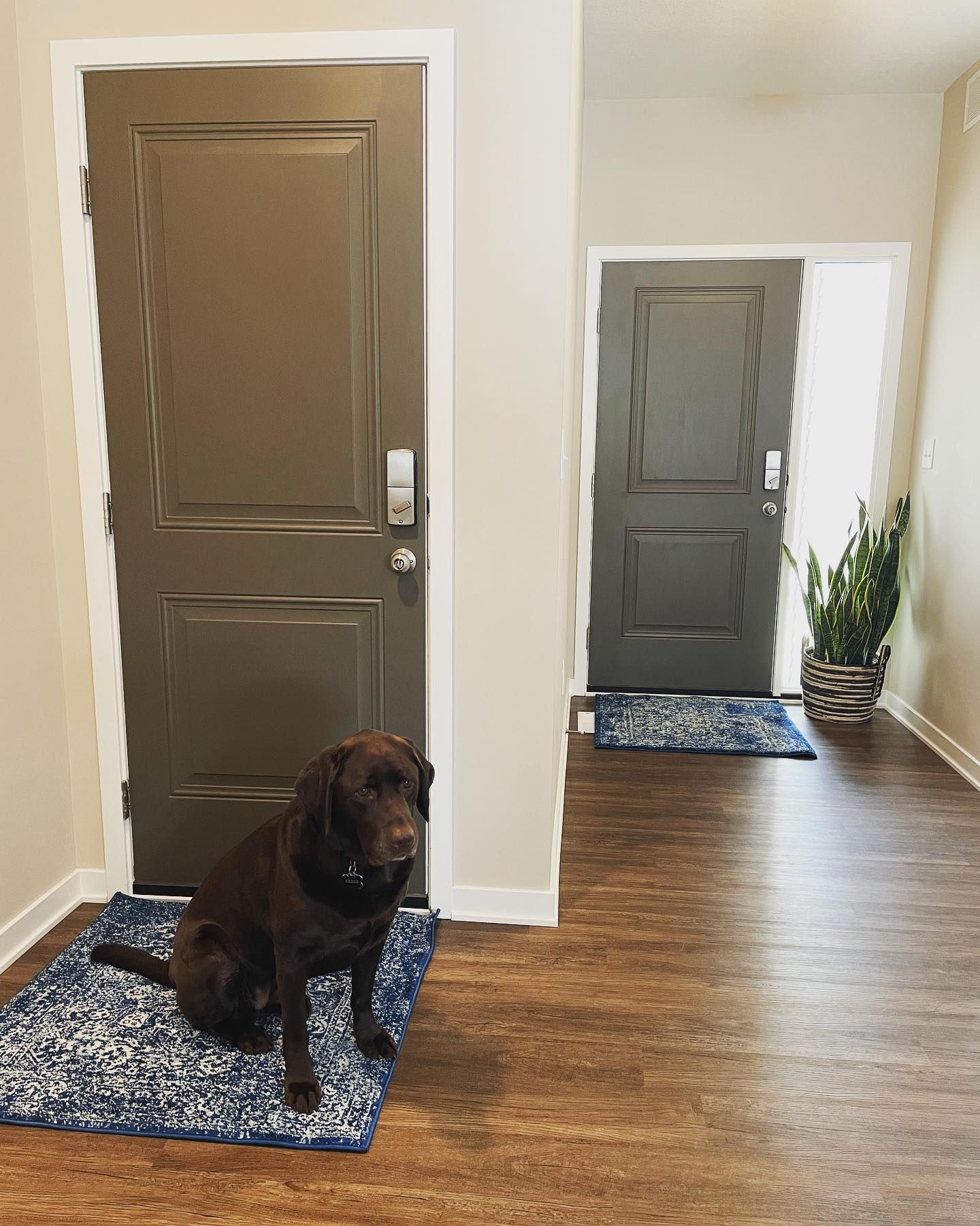
By painting this hallway in a lighter gray and only using Sherwin Williams Porpoise on the door, this room still feels like a light and welcoming one. At the same time, looking at the door doesn’t make you feel like you are staring into a dark void.
Sherwin Williams Porpoise is Warm or Cool Color?
At first, it might be hard to tell, but thanks to the warming brown and bronze notes within this paint color, Sherwin Williams Porpoise leans on the warm side.
This means that although it leans on the darker side of the color spectrum, it still helps a room to feel cozy rather than too cold.
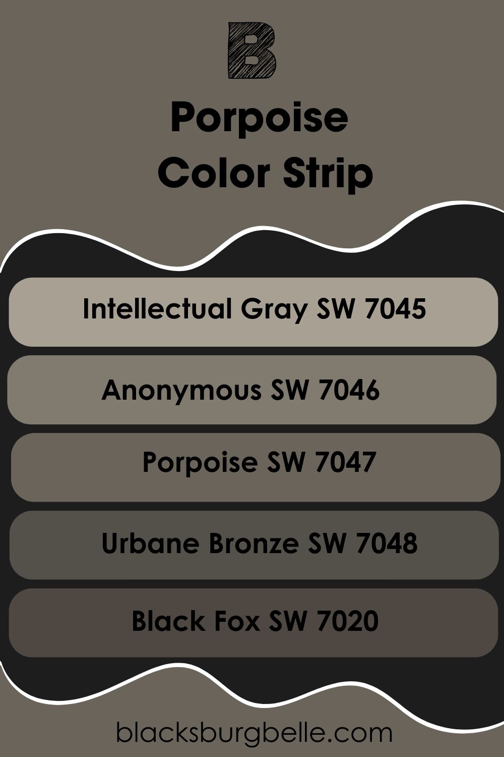
Sherwin Williams Porpoise Paint Strip: Lighter or Darker Exploration
I know we spoke earlier about whether you could be worried if Sherwin Williams Porpoise is too dark for you, or in fact, you might want this color to be even darker! In that case, I have got you covered as I have gone through the paint catalog of Sherwin Williams to find similar paints to Porpoise that are a touch lighter or darker.
You can find my list below going from light to dark, with Sherwin Wiliams Porpoise in the middle.
- Sherwin Williams Intellectual Gray SW 7045
- Sherwin Williams Anonymous SW 7046
- Sherwin Williams Porpoise SW 7047
- Sherwin Williams Urbane Bronze SW 7048
- Sherwin Williams Black Fox SW 7020
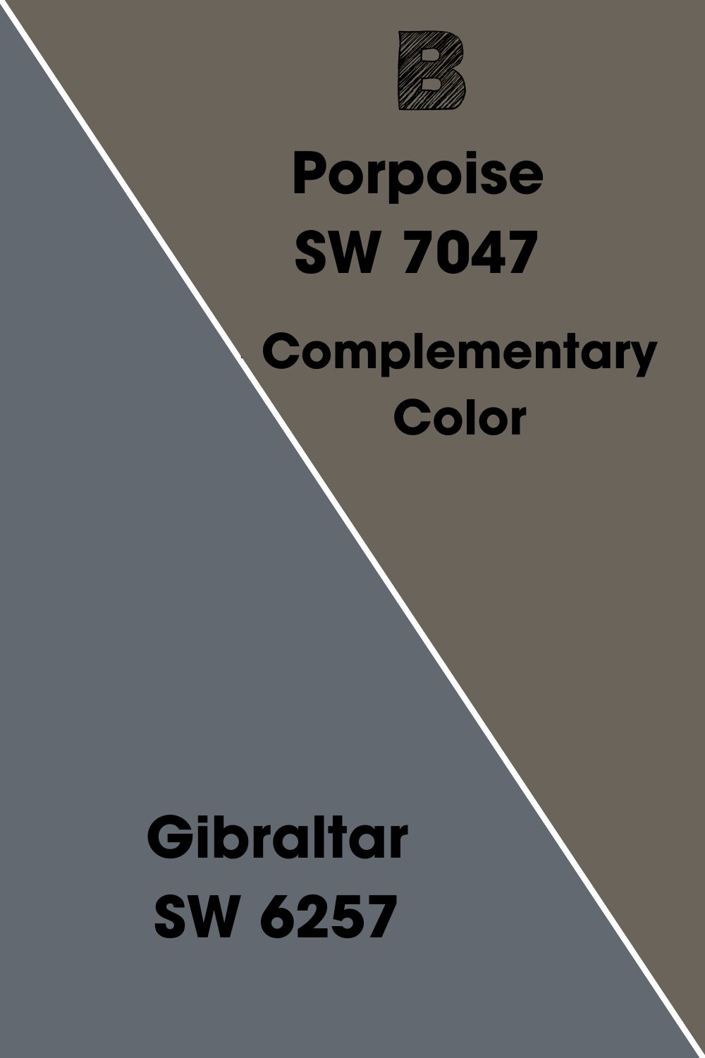
Sherwin Williams Porpoise Complementary Colors
If you have finally settled on Sherwin Williams Porpoise as a color for your design project, then you are probably going to want some paint colors to go with it. If that is the case, then a good place to start is to look for the complementary color.
This is the color that is an equal distance on the opposite side of the color wheel to the original shade, so in the case of Sherwin Williams Porpoise, this is a stony blue-gray, and the paint that best describes this in the Sherwin Williams paint catalog is Gibraltar SW 6257.
This color provides a contrast to Sherwin Williams Porpoise, but in a way that actually looks appealing rather than being a complete clash.
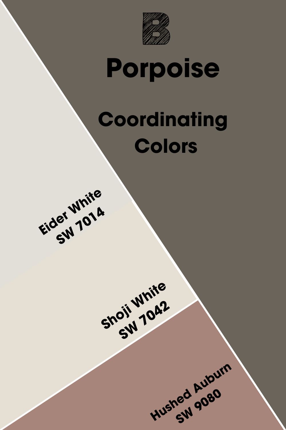
Sherwin Williams Porpoise Coordinating Colors
If your Porpoise doesn’t want to make a splash with a contrasting color, you might want to look at some coordinating shades instead. These colors often provide a more harmonious balance with the original paint color, and I have narrowed down my top 3 for you below.
- Sherwin Williams Eider White SW 7014:This cool white makes for a great contrast to Porpoise, while still complementing it with its gray undertone.
- Sherwin Williams Shoji White SW 7042: This warm white has elements of brown and gray in its undertones, so it is only natural that it is a perfect partner to Sherwin Williams Porpoise.
- Sherwin Williams Hushed Auburn SW 9080: This dusky coral brings a subtle warmth much like Sherwin Williams Porpoise, and can help you to create some really cozy and relaxing spaces.
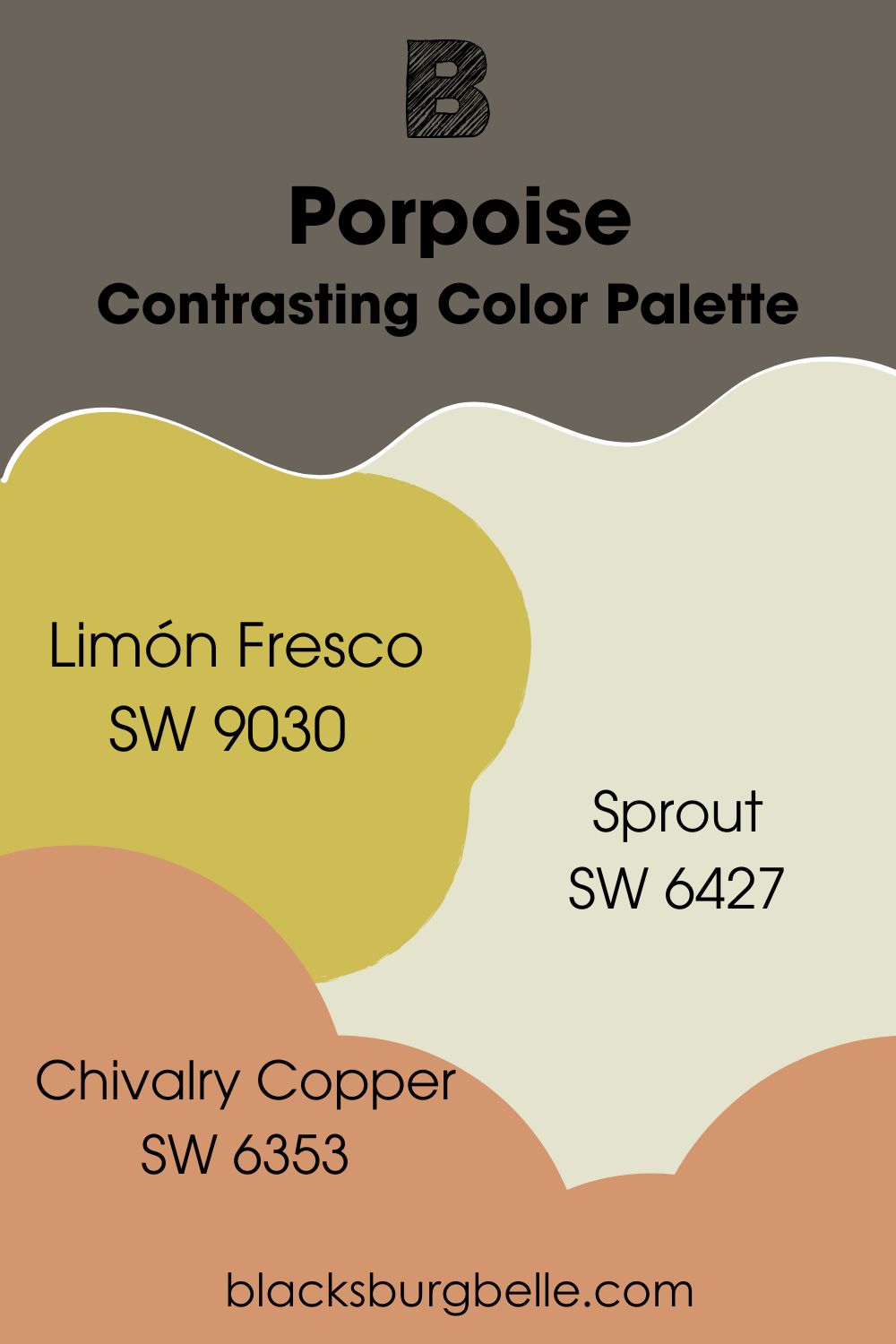
Sherwin Williams Porpoise Color Palette
Of course, this is only the start of our journey to find colors that go well with Sherwin Williams Porpoise, as there are many combinations and looks you can create by using this paint. As an example, I’ve put together 3 differing color palettes for you below.
Contrasting Color Palette
- Sherwin Williams Limón Fresco SW 9030:This citrus yellow paint color also has hints of gold in it, helping it to pick up on the bronze notes in Porpoise while still providing a contrast.
- Sherwin Williams Sprout SW 6427: This creamy yellow has just a hint of green, which is one of the lesser-seen undertones of Porpoise to some. It is also the lightest color in this scheme.
- Sherwin Williams Chivalry Copper SW 6353: This rich and deep orange is a real color pop against Sherwin Williams Porpoise, but it still lets the bronze notes in Porpoise shine through beautifully.
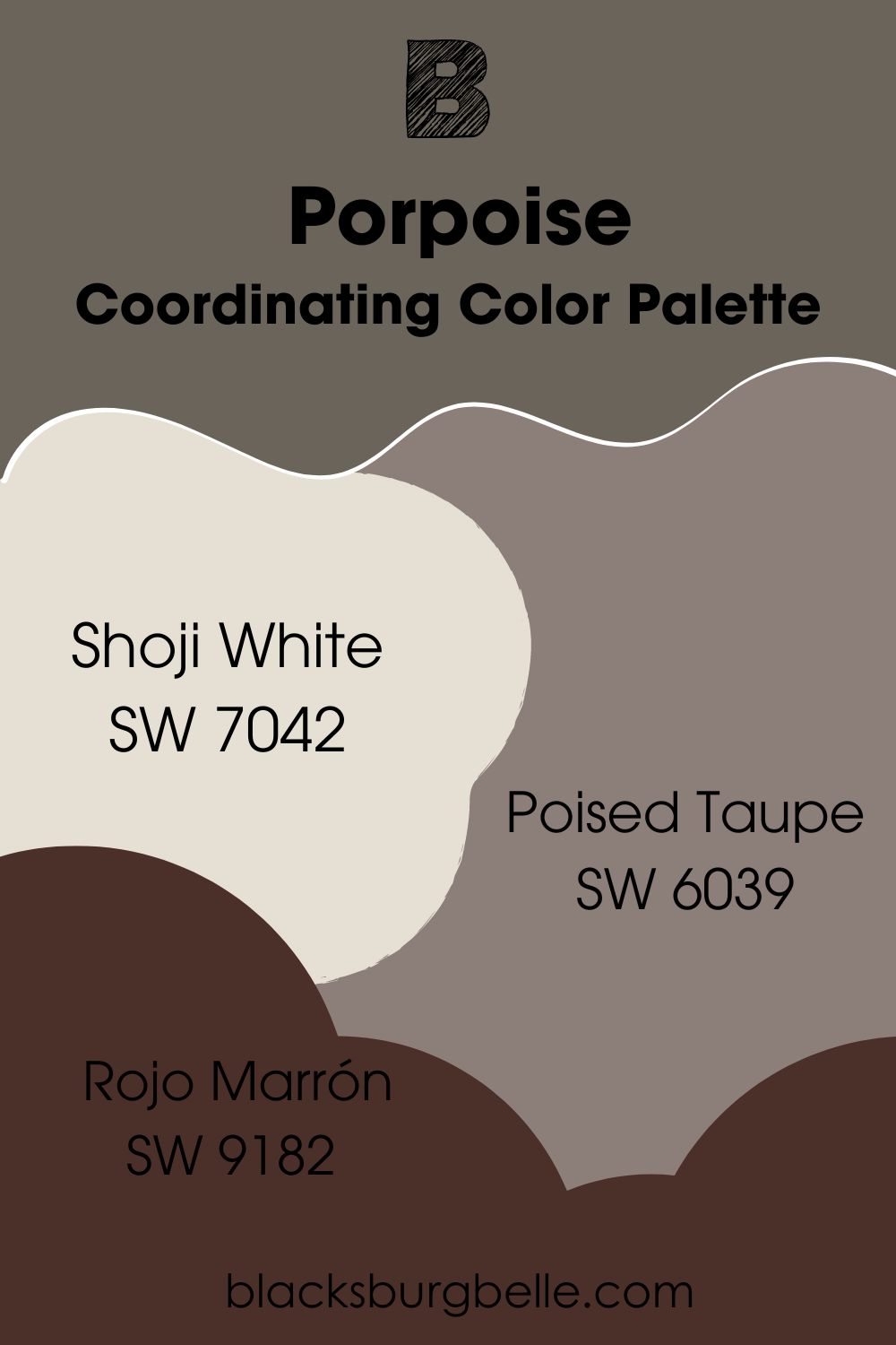
Coordinating Color Palette
- Sherwin Williams Shoji White SW 7042:This warm white was one of my top picks for coordinating colors with Sherwin Williams Porpoise, as the greige notes help to pick up on the gray elements while adding brightness.
- Sherwin Williams Poised Taupe SW 6039: This color is like the cool-toned cousin of Sherwin Williams Porpoise, but it still adds a charm with its clay brown and gray notes that complement Porpoise.
- Sherwin Williams Rojo Marrón SW 9182: This deep, dark, and rich brown with hints of red add a chocolatey and luxurious feel to a room when you use it with Sherwin Williams Porpoise.
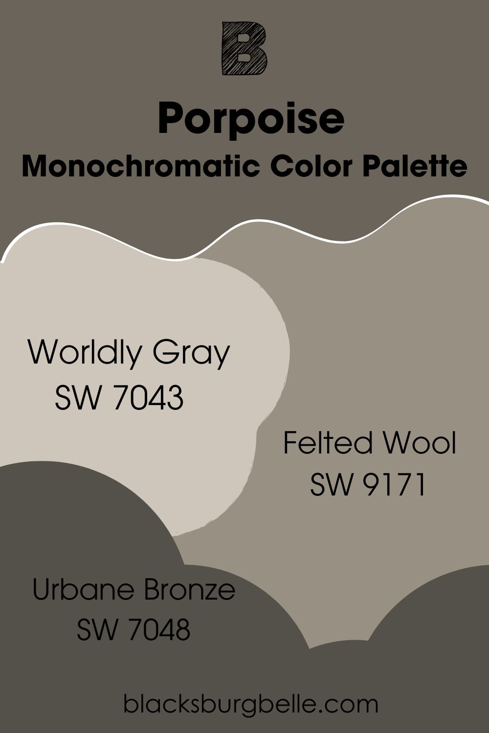
Monochromatic Color Palette
- Sherwin Williams Worldly Gray SW 7043:This gray color borders on being beige, but it adds a warmth that works well with Porpoise.
- Sherwin Williams Felted Wool SW 9171:This rich brown-gray has slight green undertones in it which help to highlight the bronze accents in Porpoise as well as its seldom-seen green undertone.
- Sherwin Williams Urbane Bronze SW 7048: This paint color leans more on the gray side than Porpoise, but it is a darker complement that helps to add depth and dimension to a room.
Sherwin Williams Porpoise vs Other Paint Colors
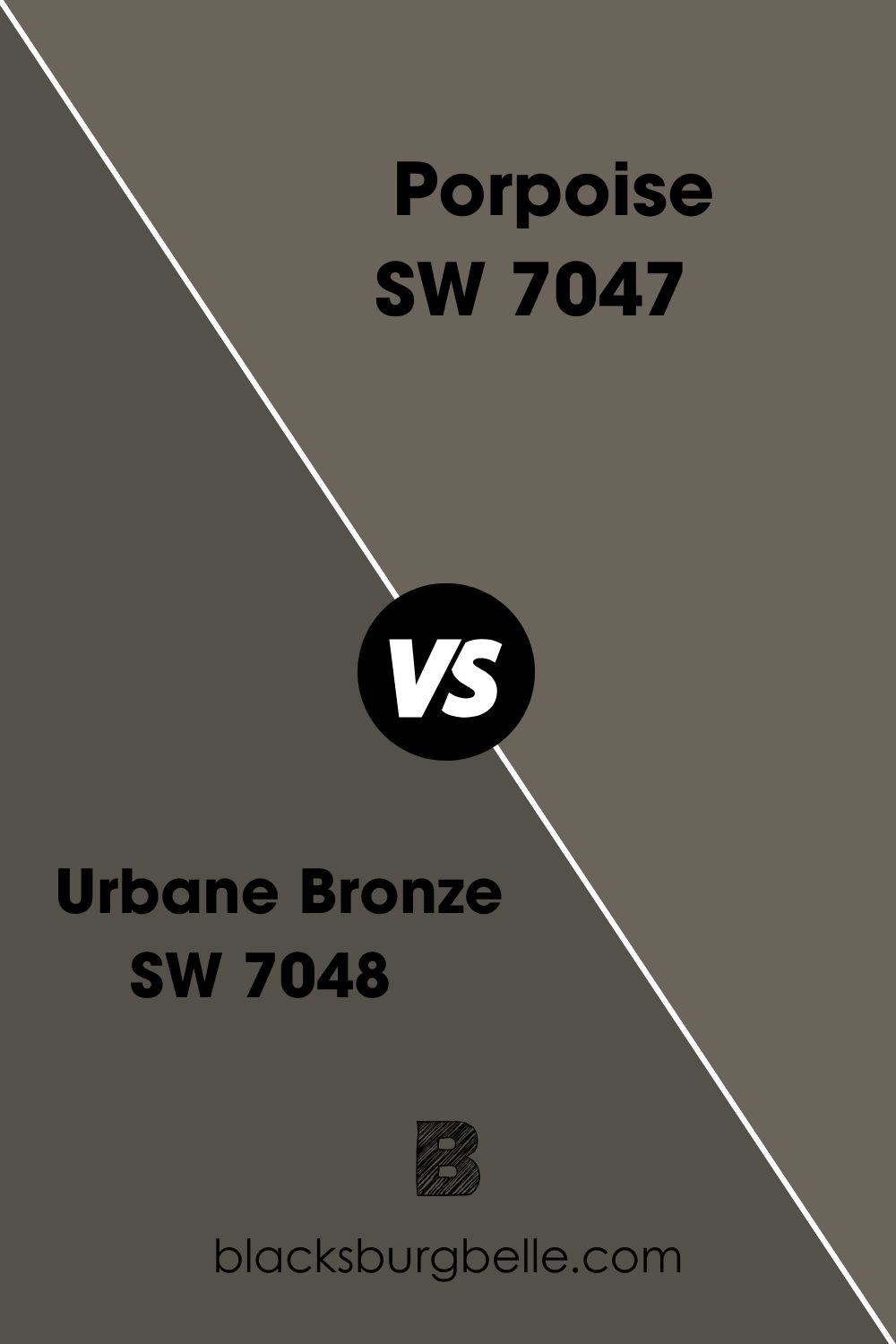
Sherwin Williams Porpoise vs Urbane Bronze
Sherwin Williams Porpoise and Urbane Bronze are incredibly similar colors, both being gray-brown with bronze accents. In fact, they sit right next to each other in the Sherwin Williams paint catalog, with Porpoise being SW 70747 and Urbane Bronze being 7048!
However, the key difference between these two colors is their LRV level. Sherwin Williams Urbane Bronze has an LRV of 8, making it much darker than Porpoise with an LRV of 13. The darkness of urbane bronze also allows more of the gray notes to come through, too.
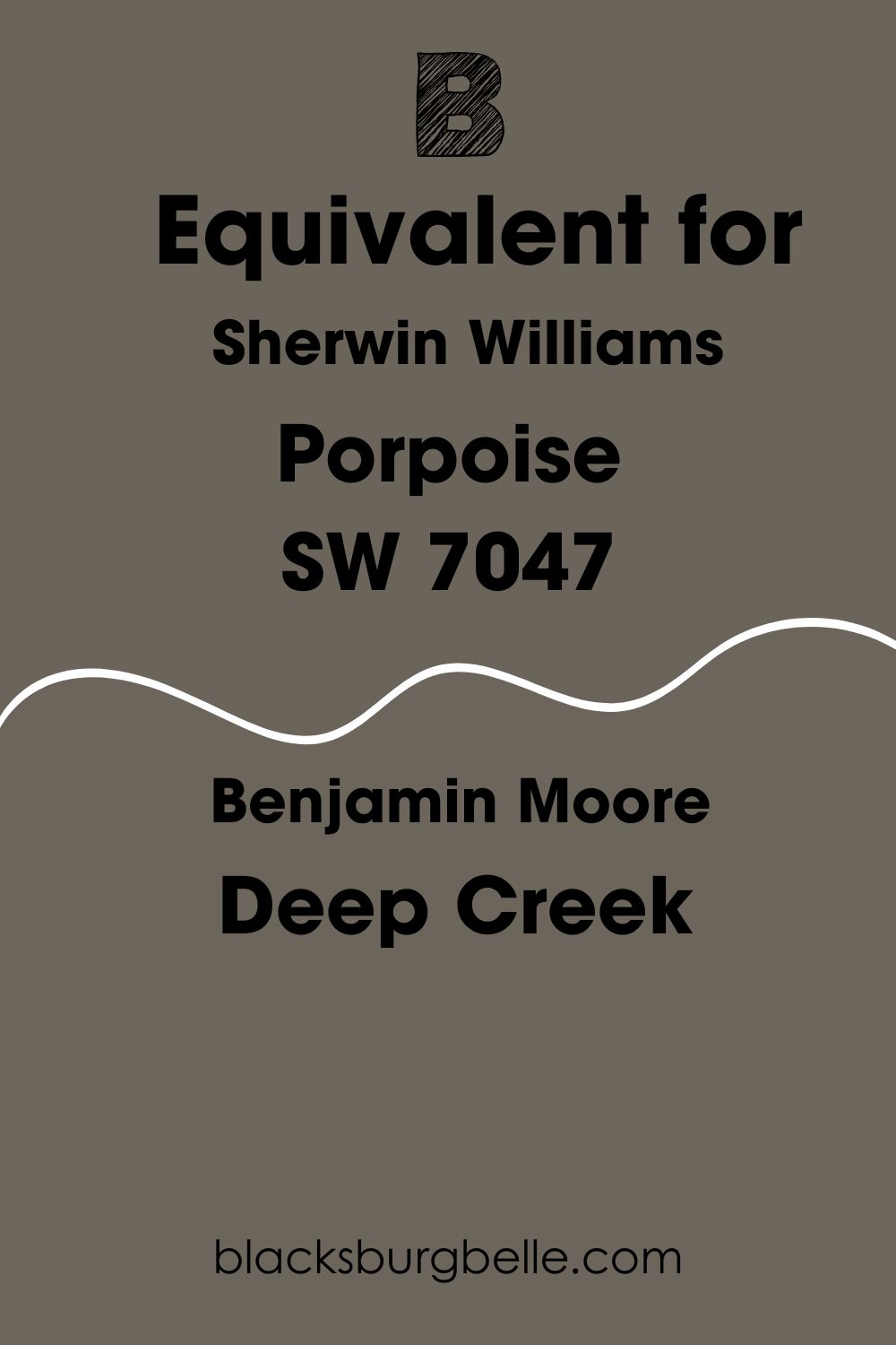
Sherwin Williams Porpoise Benjamin Moore Equivalent
If you can’t get yourself some Sherwin Williams paint, or perhaps you are just too much of a diehard Benjamin Moore fan, you might be wondering whether there is an alternative paint to Porpoise.
I’ve done the digging for you, and although I can’t find an exact match, I can get pretty close. The Benjamin Moore equivalent of Sherwin Williams Porpoise is a paint color called Deep Creek. This paint color is only off of Porpoise by a super slight margin, so you might not even notice a difference between them put side by side!
Where Can You Use Sherwin Williams Porpoise SW 7047?
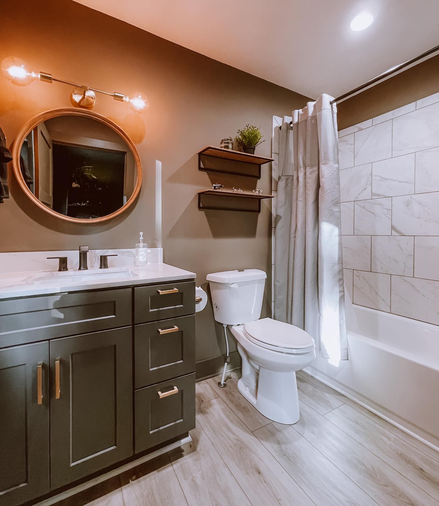
Sherwin Williams Porpoise Bathroom
Sherwin Williams Porpoise works incredibly well when it is paired with both warm and cool whites, so using it in a bathroom where these colors usually appear makes a fantastic choice.
This bathroom has a real earthy feel about it, with the natural tones of this paint color coming through and being supported by the warmer lighting situated above the mirror.
Sherwin Williams Porpoise Exterior
One of the most popular ways to use Sherwin Williams Porpoise SW 7047 is to consider it when painting the outside of your property. In this image below, it has been chosen as the main house color and has been painted on both the shingles and the siding, with a white trim just to round things off.
In fact, due to the greenery surrounding this home, you can see that green undertone coming through!

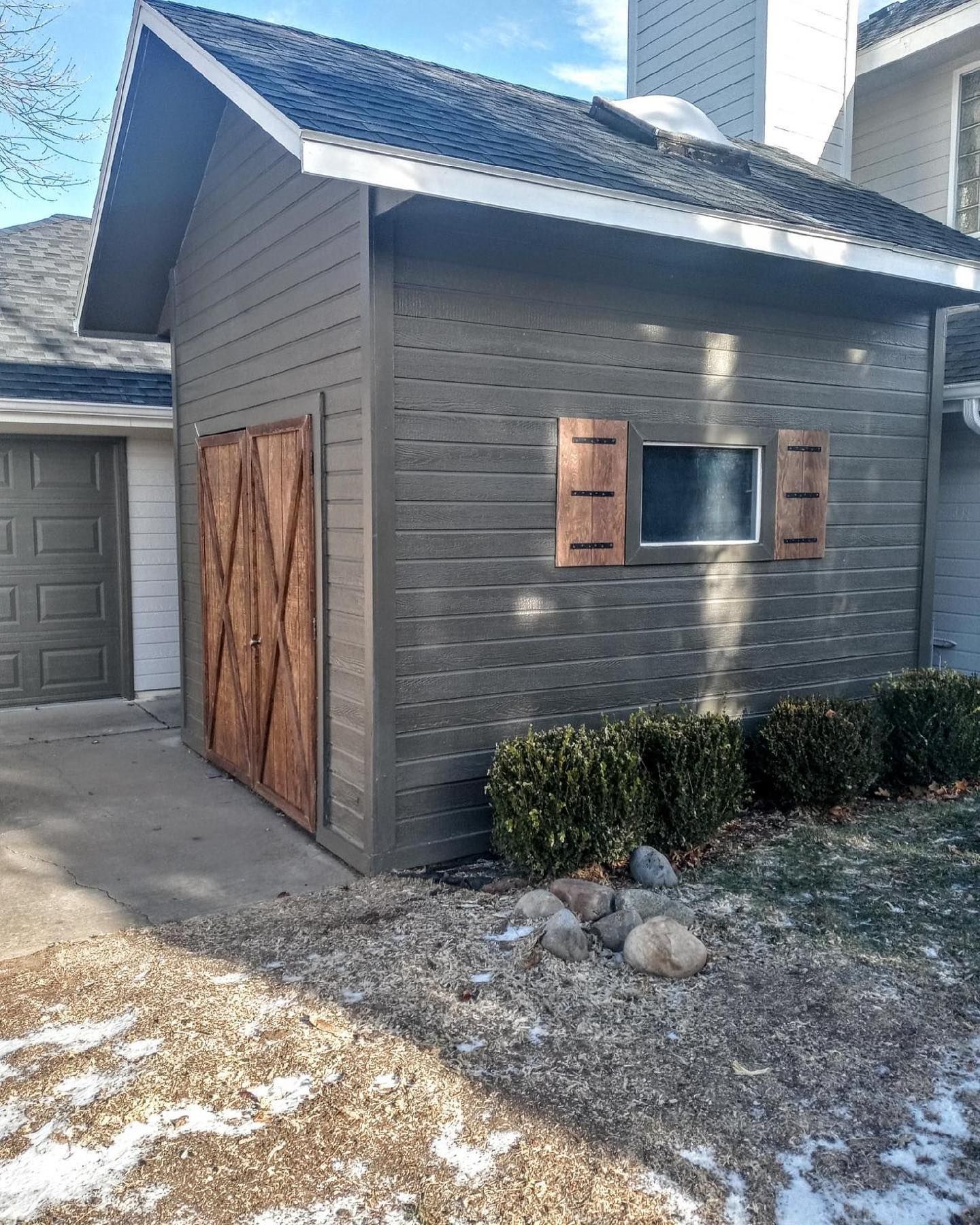
Sherwin Williams Porpoise can also lend itself to a more rustic and distressed feel when used as an exterior paint, as you can see in this example below. With the warm wood shutters and barn door this extension gives a farmhouse vibe.
If you don’t want to go all out with Sherwin Williams Porpoise and put it all over the main body of your property, you could always consider it as an exterior trim color, or perhaps even on details such as the shutters, which you can see in this photo below.
This example also helps to emphasize the way in which Sherwin Willaims Porpoise can work well with lighter whites and grays, too.

Sherwin Williams Porpoise on Furniture
If you have a piece of furniture that is looking a little bit old and tired, why not give it a lick of Sherwin Williams Porpoise? Not only will it help to breathe new life into it, but it will also help to make it a standout piece in your room and up the wow factor. Your guests might not even know that it’s not a new piece!
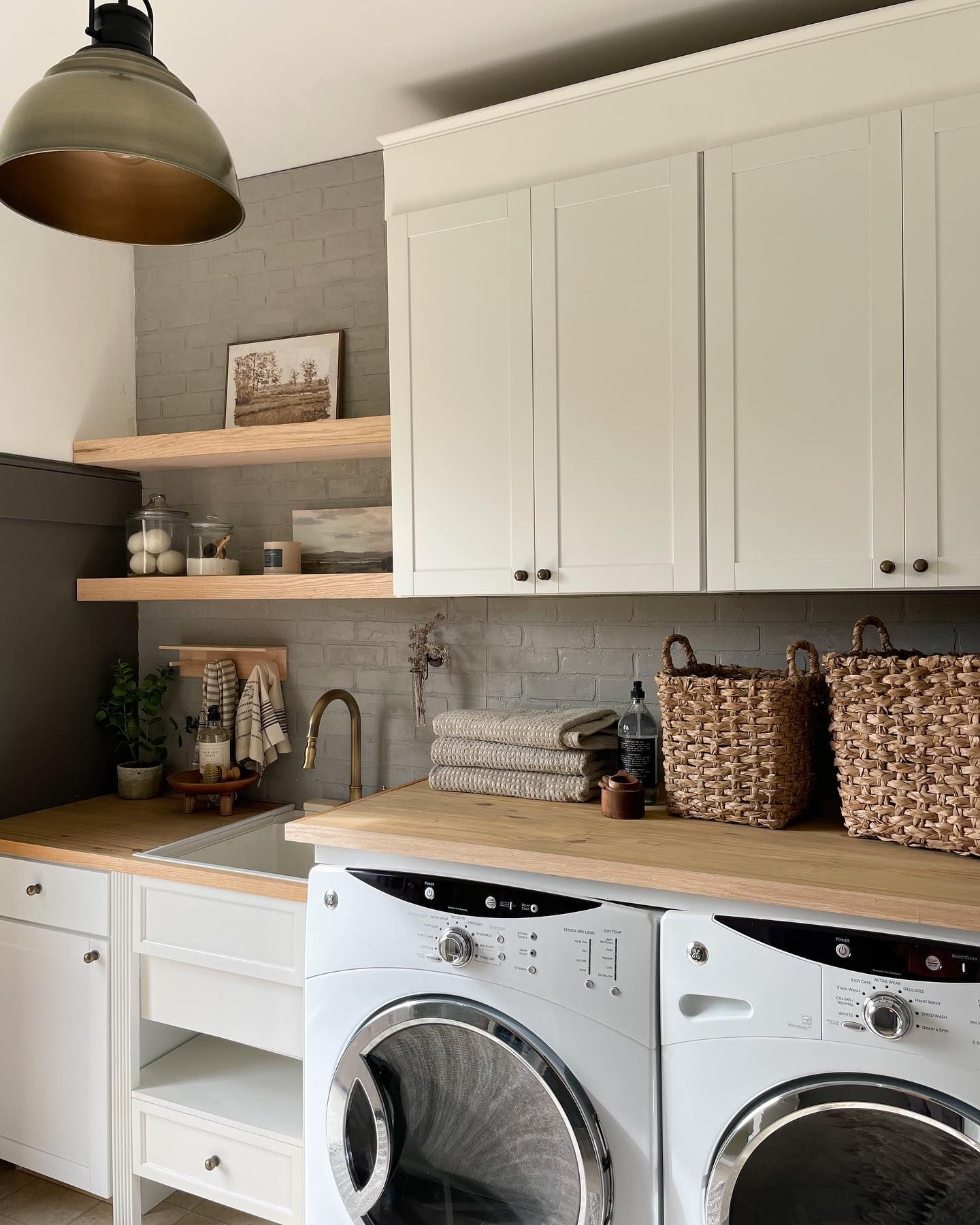
Sherwin Williams Porpoise Laundry Room
The gray and bronze notes in Sherwin Williams Porpoise SW 7047 mean that it has some metallic and industrial notes to it when used in the right space. This makes it perfect for a laundry or utility room, especially if you pair it with some industrial fixings such as the pendant lamp in the example below. You’ll be completing your hard work in no time!
Sherwin Williams Porpoise on Doors
A quick and easy way to spice up your home is to paint your doors, especially if you have a neutral color scheme. Sherwin Williams Porpoise is perfect for the job, helping your doors to feel sleek and expensive thanks to its bronze vibes. It’s even dog-approved as you can see below!
Sherwin Williams Porpoise Living Room
If you want to up the drama factor of your lounge, why not use Sherwin Williams Porpoise? This color works amazingly on a fireplace surround or as an accent or feature wall to add a showstopping appeal and a touch of luxury.
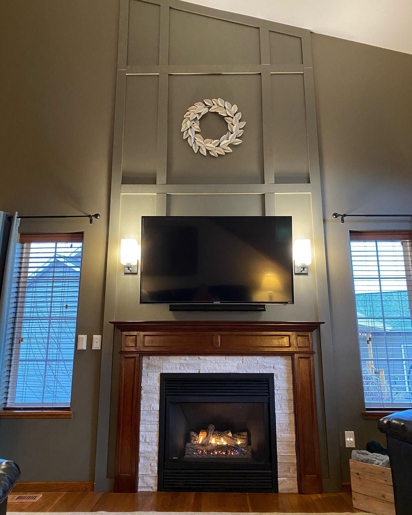
I know I said before that Sherwin Williams Porpoise can help to bring that real dark and moody vibe that some people crave, and this living room shows it off perfectly! Although the walls are dark and rich, the lighter furnishings stop things from feeling too harsh.
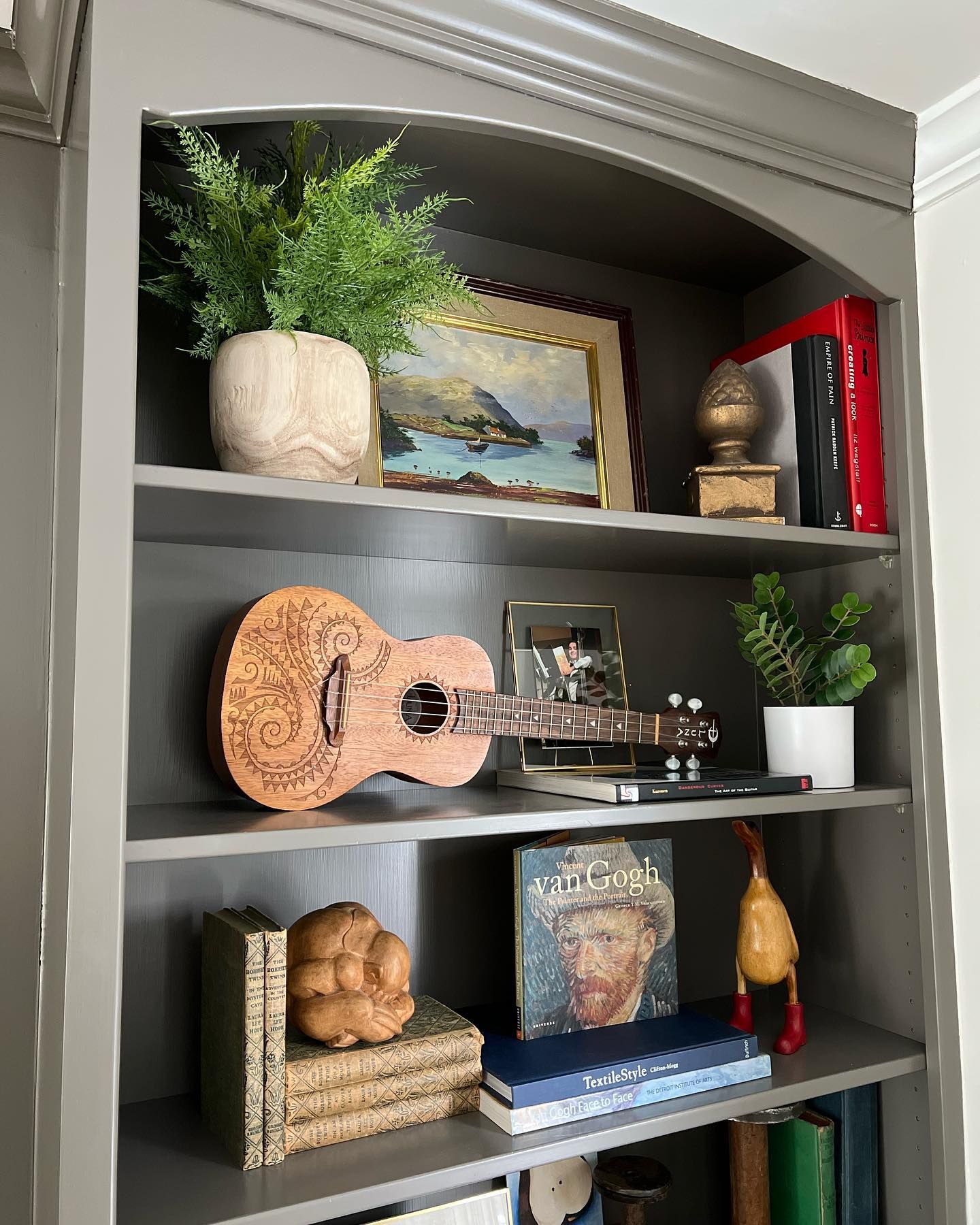
What Colors Go With Sherwin Williams Porpoise?
This corner of a bedroom is a great example of what colors go with Sherwin Williams Porpoise. Here you can see light whites and other neutral tones at work to help keep the space light and airy. These paint colors also work wonders to bring out the natural earthy tones of Sherwin Williams Porpoise.
Sherwin Williams Porpoise Bedroom
This deep and warming color also makes a perfect choice for a bedroom. Even though the example below uses playful contrast for a teenage boy’s room, you could easily swap out some of the brighter pieces for more muted neutrals to create a really adult space to kick back and relax. Using bronze or gold accents on things such as mirrors and light fittings will also up the feel of luxury.

Conclusion
All in all, if you are looking for a color that brings something a little different to the party, consider Sherwin Williams Porpoise.
With its ability to switch between emphasizing natural, earthy tones, yet also bringing a wow factor with its metallic bronze notes, it’s perfect for those who are looking to make a bit more of a splash when it comes to both interior and exterior design.
Personally, I love the way this color mashes with other lighter neutrals. It creates a moody atmosphere yet it’s not too harsh!
If you are still undecided, it never hurts to pick up a sample pot of this paint color. Why not head out and grab some Sherwin Williams Porpoise SW 7047 to try for yourself?
 Sherwin Williams Smoky Blue (Palette, Coordinating & Inspirations)
 Sherwin Williams Debonair (Palette, Coordinating & Inspirations)
 Sherwin-Williams Gossamer Veil (Palette, Coordinating & Inspirations)
 Sherwin Williams Oyster Bay (Palette, Coordinating & Inspirations)
 Sherwin Williams Panda White SW 6147: Review and Inspiration
 Benjamin Moore Kendal Charcoal HC-166: Paint Color Review
