
Are you trying to decide whether or not Benjamin Moore’s Pale Oak is the right paint color for your decor? Pale Oak can be a strange color, not quite telling you its exact shade. You can say it is a chameleon color, and this can be a good thing.
However, it can make you undecided about where and when to use it. Fortunately, this guide shows you all you need to know about the paint color. You’ll learn how its undertone interacts with light and how bright the color is based on its LRV. You may just be looking at one of the best neutral colors in the market.
Table of Contents
When to Choose Benjamin Moore Pale Oak
The beautiful thing about this color is that it is versatile. In other words, you can use it in different ways and areas of your house. If you are wondering when this color is better than other options, check the following ideas.
Trying to brighten a room?
Pale Oak likes light, as many other paint colors. However, its brightness can change the look and feel of a room, brightening it if there is not enough light. But it may look washed out in bright natural light.
Looking for a stunning neutral?
If you want an unassuming but stunning light-neutral paint color, Pale Oak may be your best bet. It mimics white without sacrificing color, so it works well as a background or even a whole-room color.
In the market for a new kitchen color?
Your kitchen walls may need to be redone, and if you want to stick to a bright color scheme, Pale Oak should be on your list. It’s not too bright and doesn’t interfere with other colors.
Thinking of changing the exterior color?
Pale Oak looks stunning and bright on exterior walls. If you are thinking of changing the color to something bright, consider a neutral that mimics white so much like Pale Oak.
If these ideas are enough to get you going, my job for you is done. But I’m far from finished, as there are so many other aspects to explain with real photos to inspire you. Come along with me on this journey.
What Color Is Pale Oak?
Many of us are familiar with the oak tree, and oaks are considered one of the strongest wood types. While there’s no tree known as the pale oak, the paint color’s name may come from the usual white oak. It’s a beautiful color close to the paint’s shade.
I’ve got nothing from Benjamin Moore to say the name came from any specific tree or object, but I know it’s reminiscent of the white oak. You can compare a white oak wood sample to the color of this paint.
Benjamin Moore’s Pale Oak is a light greige paint color with a soft and laid-back look. It brings a glow into any decor and performs well as a whole-house color because of its versatility.
A Snapshot of Benjamin Moore Pale Oak Specifications
The following is a chart I created to show the basic characteristics of Pale Oak for easy reference. You can easily point out its LRV and undertone by looking at the chart.
| Benjamin Moore Pale Oak | |
| RGB | 222, 216, 205 |
| LRV | 68.64 |
| Undertone | Gray |
| HEX Code | #DDD9CE |
The LRV of Benjamin Moore Pale Oak
If you’re not familiar with the term, LRv is the light reflectance value of color. It refers to how bright or dark the color is on a scale of 0 to 100; black has an LRV of 0 and white has an LRV of 100. In other words, dark colors have lower LRVs than bright colors.
However, paint colors don’t have extreme colors, only those close to both ends of the scale. So, there are no white paint colors with an LRV of 100 nor is there a black paint color with an LRV of 0. The scale for paint colors ranges from 2.5 to 94.
Benjamin Moore’s Pale Oak has an LRV of 68.64, which is pretty right for a greige. That means the color reflects a good amount of light but not enough to term it an off-white color.
The Undertones of Benjamin Moore Pale Oak
The undertone of this paint color is what sets it apart from other similar colors. Pale Oak typically has a warm gray undertone, which means the color exudes a slight warmth. However, the undertone may lean a little pink or violet, but this hardly happens.
Here is a photo of Pale Oak without any nuances, that is, an undertone peeking through the surface.
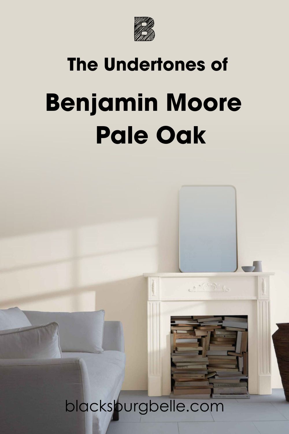
It looks pretty much like cream or off-white. But in this next photo, Pale Oak reveals its gray undertone, changing its hue.
And here is the same paint color showing a little pink-violet:
How Does Lighting Affect Benjamin Moore Pale Oak?
Lighting can bring out the undertone of this color or make it appear slightly different from its natural hue. For example, warm lighting, especially artificial yellow lighting, can make Pale Oak look less greige and more beige.
Bright natural lighting can make Pale Oak appear washed out, looking more like white than any other color.
But low light mutes the brightness of the color. It may not appear drab, but Pale Oak may show more of its gray undertone than usual, giving it a cool tone.
Does Benjamin Moore Pale Oak Look Yellow?
Because it has no yellow base, Pale Oak doesn’t read yellow in any lighting or room. However, you may notice that it looks a little creamy or buttery when the light is direct and very warm. It may even look a little beige.
How Does Benjamin Moore Pale Oak Feel in a Room?
If you want a balance between gray and white, Pale Oak is one of the best colors to try. It can be a whole room color or act as the background for bright splashes of vibrant shades. It brings a warm glow that helps you relax and unwind. Pale Oak is such an elegantly soft and warm neutral.
Benjamin Moore Pale Oak: Warm or Cool?
By now, you may already know that Pale Oak is a warm paint color. Its warmth comes from its gray undertone, and while gray is typically classified as a cool color, it can lean warm in some instances.
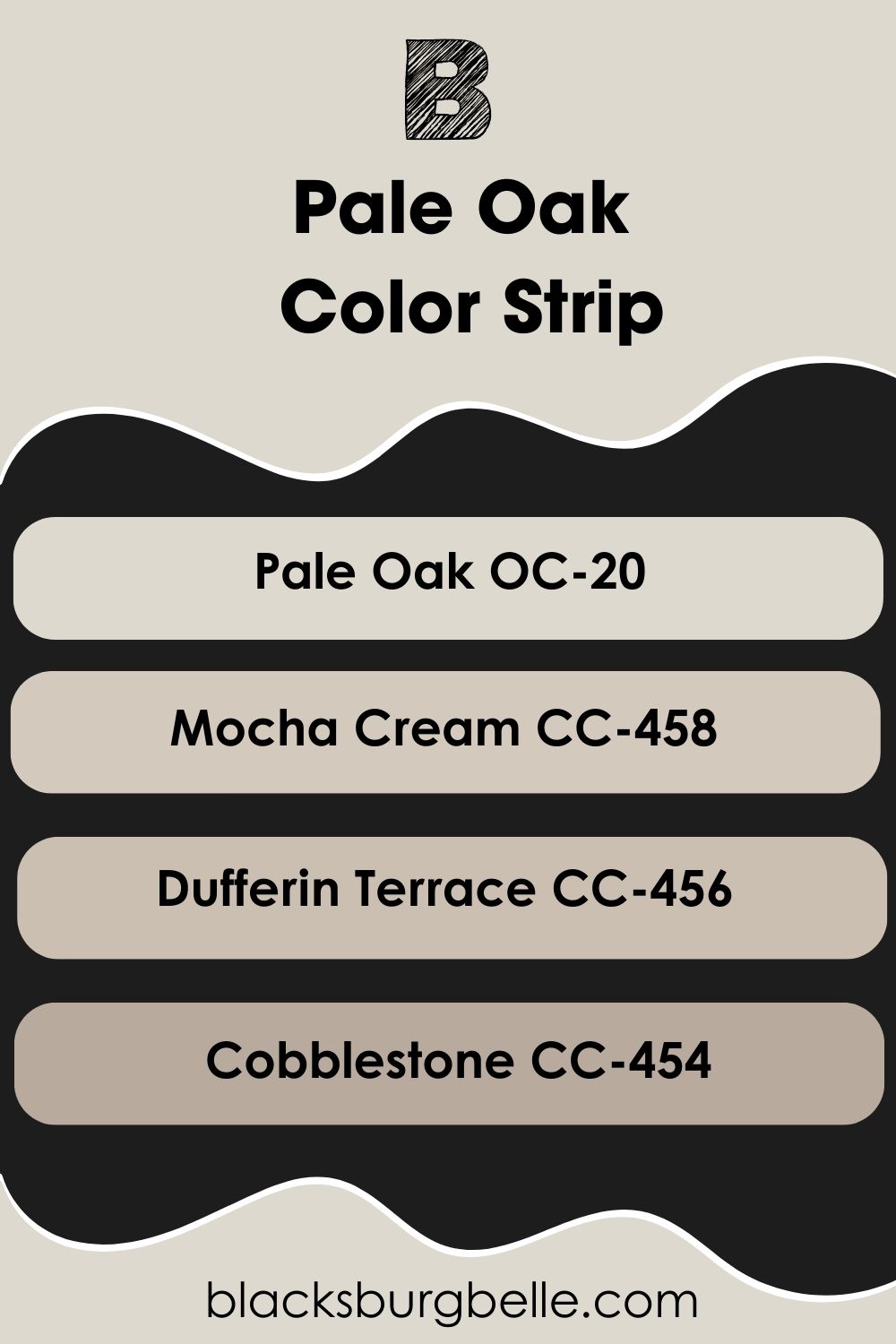
Benjamin Moore Pale Oak Color Strip: Lighter to Darker Exploration
You may find that Pale Oak is not the exact shade that matches your decor or you want options. I’ve carefully picked other colors from the same color strip as Pale Oak, ranging from light to dark, so you can have alternatives.
- Benjamin Moore Pale Oak OC-20
- Benjamin Moore Mocha Cream CC-458
- Benjamin Moore Dufferin Terrace CC-456
- Benjamin Moore Cobblestone CC-454
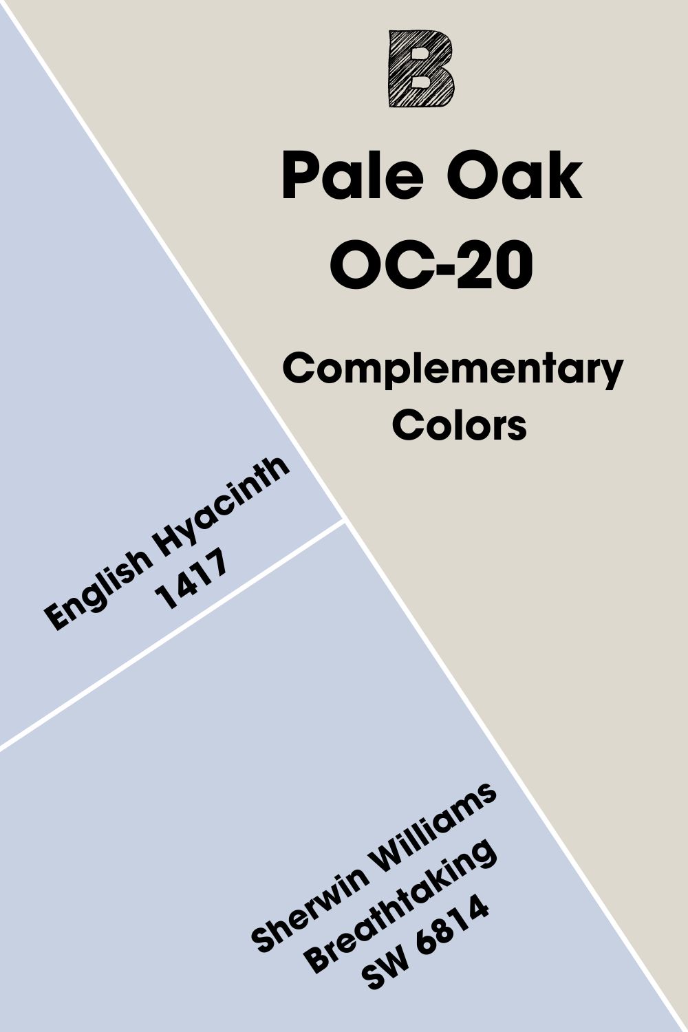
Benjamin Moore Pale Oak Complementary Colors
Every color has a few others that pair well with it because they create a seamless and pleasing flow of color when used in the decor.
Complementary colors have this attribute, and this is why the color wheel arranges them according to their relationship with each other. Examples are blue and orange or purple and yellow.
Pale Oak is a shade that’s part of the color wheel, but it’s not easily discernible. However, you’ve got nothing to worry about because I’ve picked its complementary color, which is a pale shade of lavender gray.
Benjamin Moore’s English Hyacinth 1417 is closest to this color. Try Sherwin Williams Breathtaking SW 6814 if the Benjamin Moore color is unavailable.
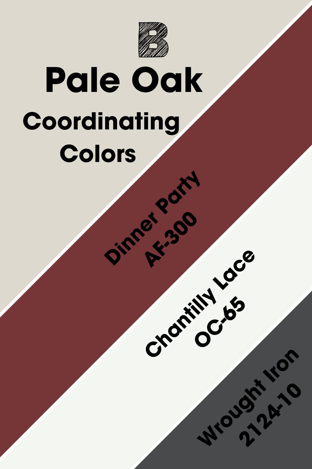
Benjamin Moore Pale Oak Coordinating Colors
These colors can be any shade but must have a similarity with the other colors in the same decor. For example, Pale Oak is a neutral color, so it can have several coordinating colors. But the best of them are Dinner Party, Chantilly Lace, and Wrought Iron.
- Benjamin Moore Dinner Party AF-300: An earthy and rich red that complements the subtle pink-violet in Pale Oak.
- Benjamin Moore Chantilly Lace OC-65: A bright white neutral paint color that complements any color because it has almost no undertones. Use it as a trim color.
- Benjamin Moore Wrought Iron 2124-10: A soft black paint color that doesn’t feel overwhelming and blends with any decor.
Benjamin Moore Pale Oak Color Palettes
You can create a palette for your decor using Pale Oak as the central color. Since it’s neutral, it makes the job of putting colors together easier. But you must keep its undertone and subtle color hues in mind.
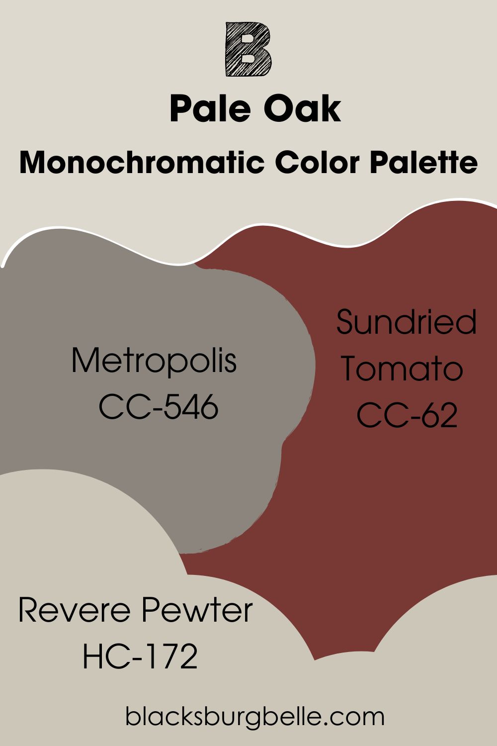
Contrasting Color Palette
- Metropolis CC-546: A deep and warm taupe paint color with a hint of plum to pair with the slightly pink hue in Pale Oak and bring out the lightness of the color.
- Sundried Tomato CC-62: Reminiscent of ripe tomatoes and red wine, this earthy red adds depth and character to the decor when paired with Pale Oak.
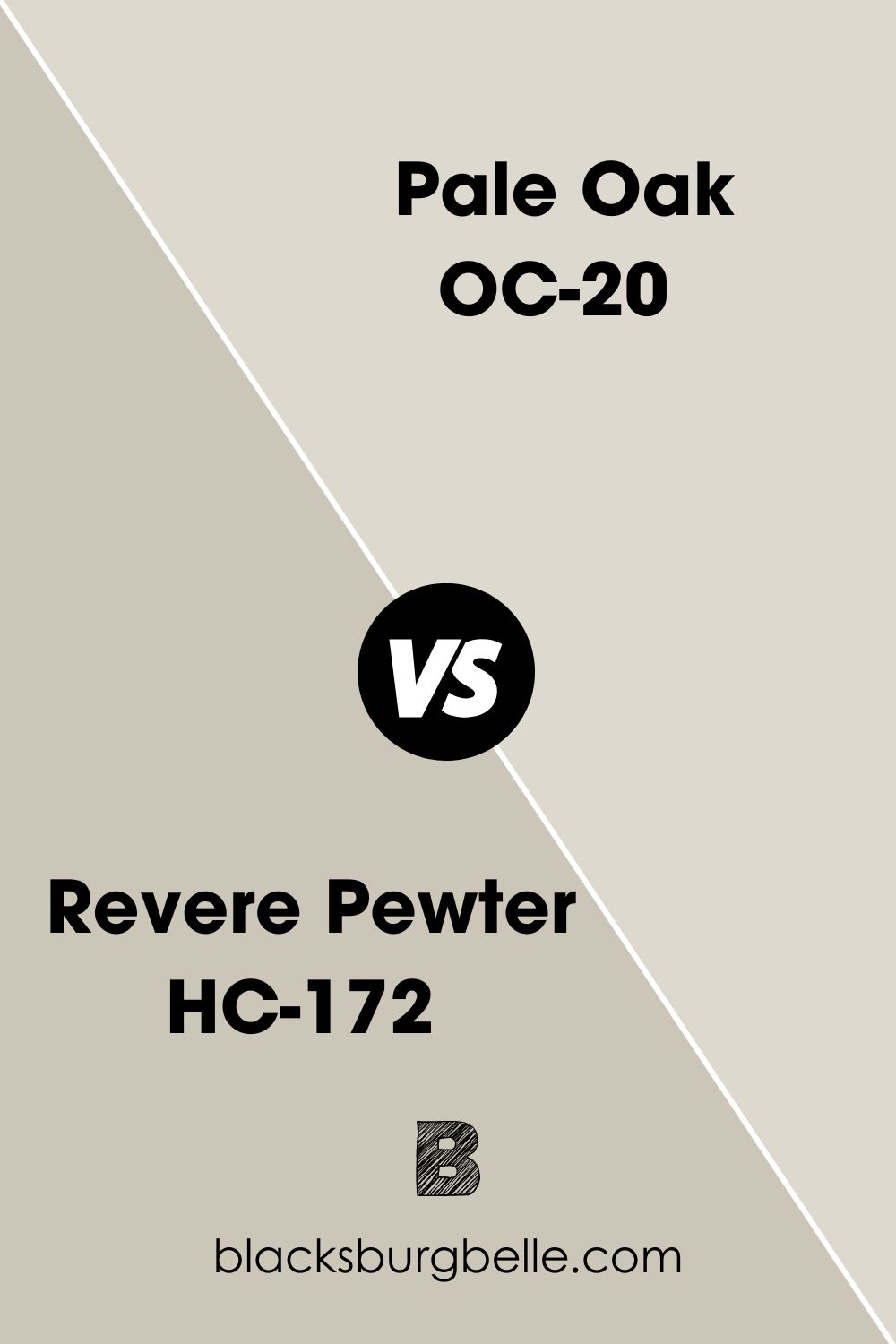
- Revere Pewter HC-172: A popular neutral paint color that allows you to use warm and cool colors in the same decor.
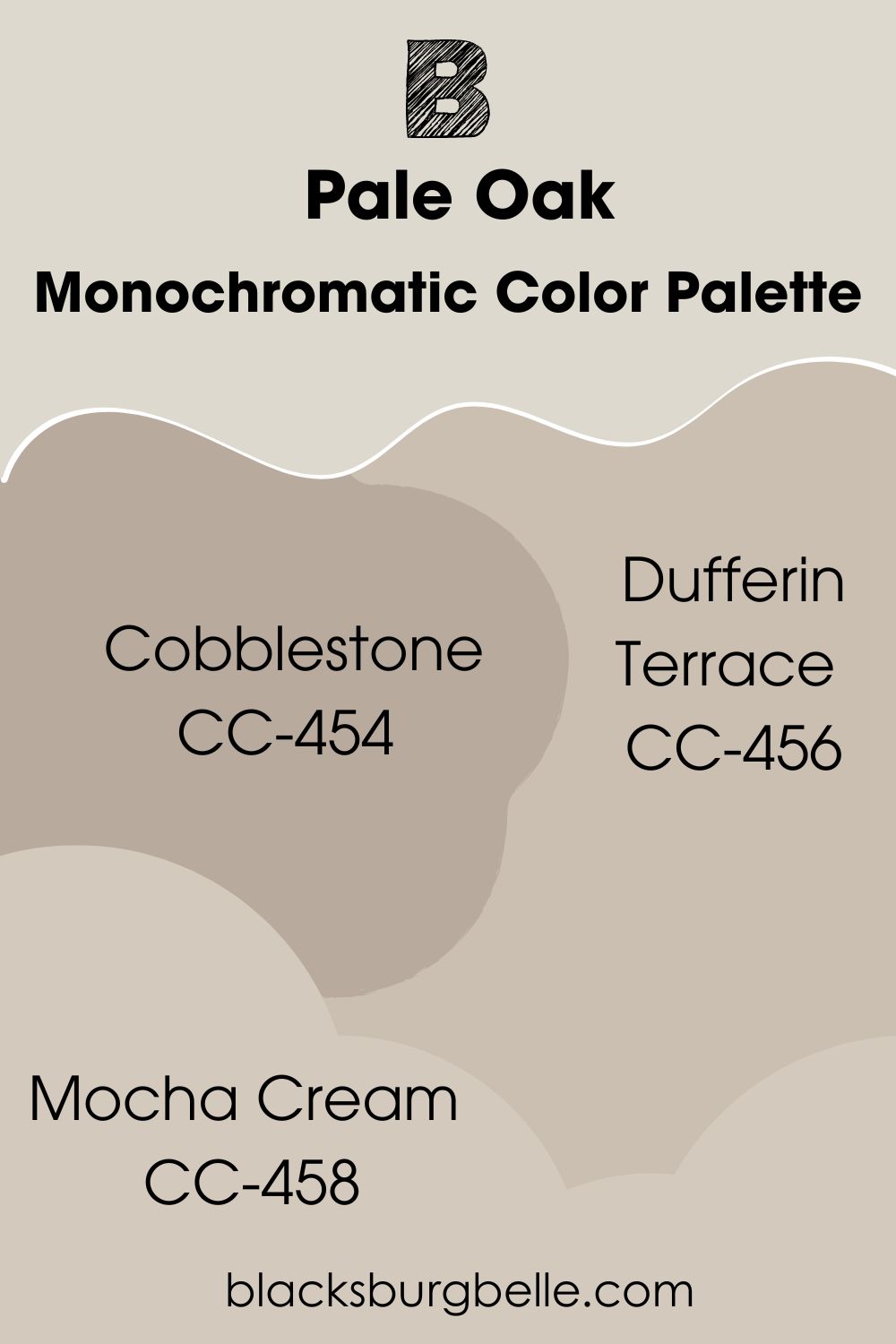
Monochromatic Color Palette
- Cobblestone CC-454: A mid-tone gray with a hint of violet that matches the hues in Pale Oak.
- Dufferin Terrace CC-456: A similar shade to Pale Oak, showing a rosy taupe undertone but with a slightly darker shade to make Pale Oak pop.
- Mocha Cream CC-458: With a light violet undertone, this gray paint color is a perfect alternative to Pale Oak if you want a slightly darker shade of the same color.
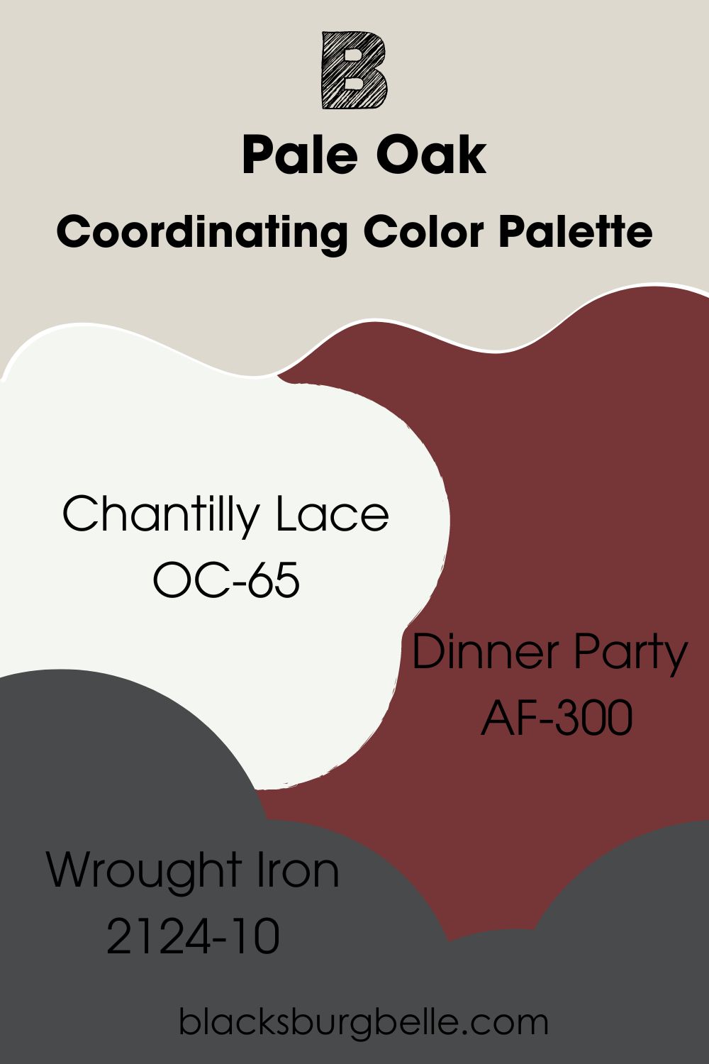
Coordinating Color Palette
- Chantilly Lace OC-65: A bright white neutral paint color that complements any color because it has almost no undertones. Use it as a trim color.
- Dinner Party AF-300: An earthy and rich red that complements the subtle pink-violet in Pale Oak.
- Wrought Iron 2124-10: A soft black paint color that doesn’t feel overwhelming and blends with any decor.
Benjamin Moore Pale Oak vs Similar Colors
Let’s look at some similar colors and see how they compare to Pale Oak.
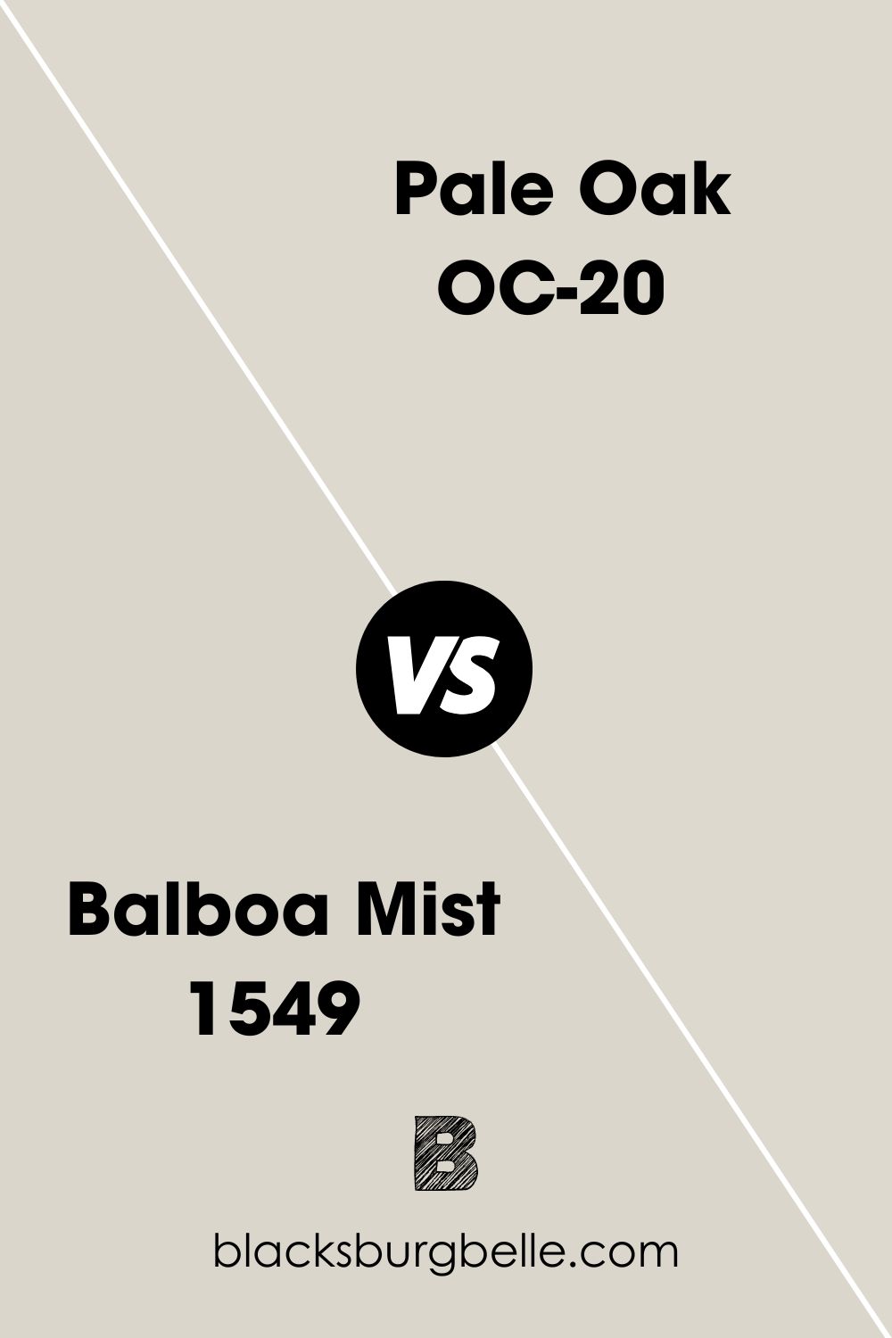
BM Balboa Mist vs BM Pale Oak
Balboa Mist is a hint darker than Pale Oak and shows a little cooler than Pale Oak. Besides, it has a lower LRV of 65.53.
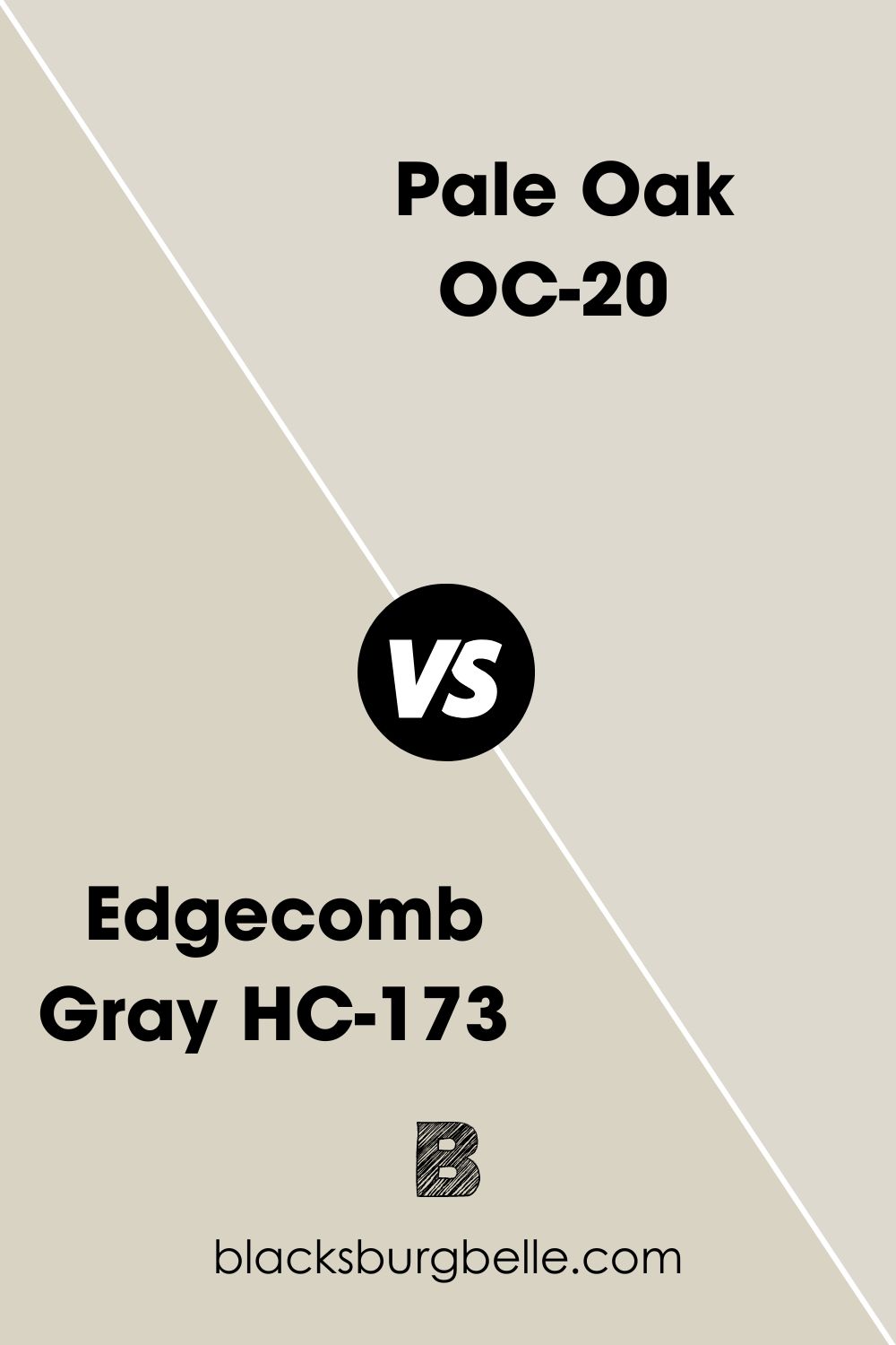
BM Edgecomb Gray vs BM Pale Oak
Edgecomb Gray is more bodied and warmer than Pale Oak, closer to beige than gray. It also has a lower LRV of 63.09.
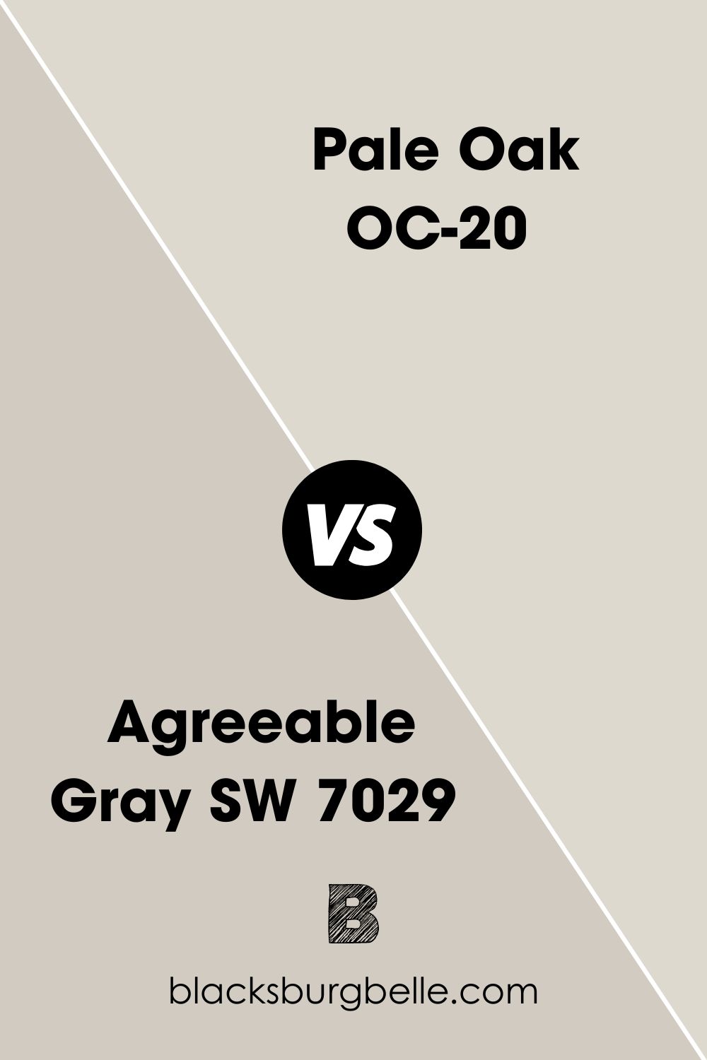
SW Agreeable Gray vs BM Pale Oak
Sherwin Williams Agreeable Gray has an LRV of 60, which makes it darker than Pale Oak. Moreover, Agreeable Gray looks more like a typical gray than Pale Oak.
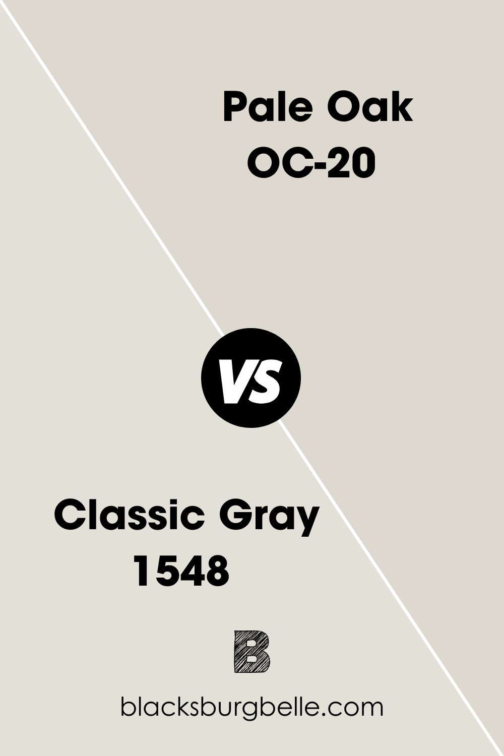
BM Classic Gray vs BM Pale Oak
Classic Gray is much lighter and brighter than Pale Oak, with an LRV of 73.67. It also has a slightly green undertone but may show a little pink sometimes.
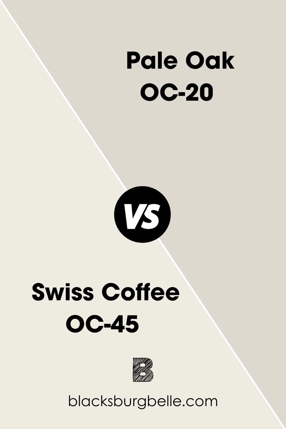
BM Swiss Coffee vs BM Pale Oak
Swiss Coffee is technically a white paint color; it’s off-white with an LRV of 83.93. That makes it much lighter and brighter than Pale Oak. Besides, it has a slightly yellow undertone that may lean a little toward green.
BM Revere Pewter vs BM Pale Oak
Revere Pewter is much darker than Pale Oak, with an LRV of 55.51. It looks more solid and deeper than the light Pale Oak.
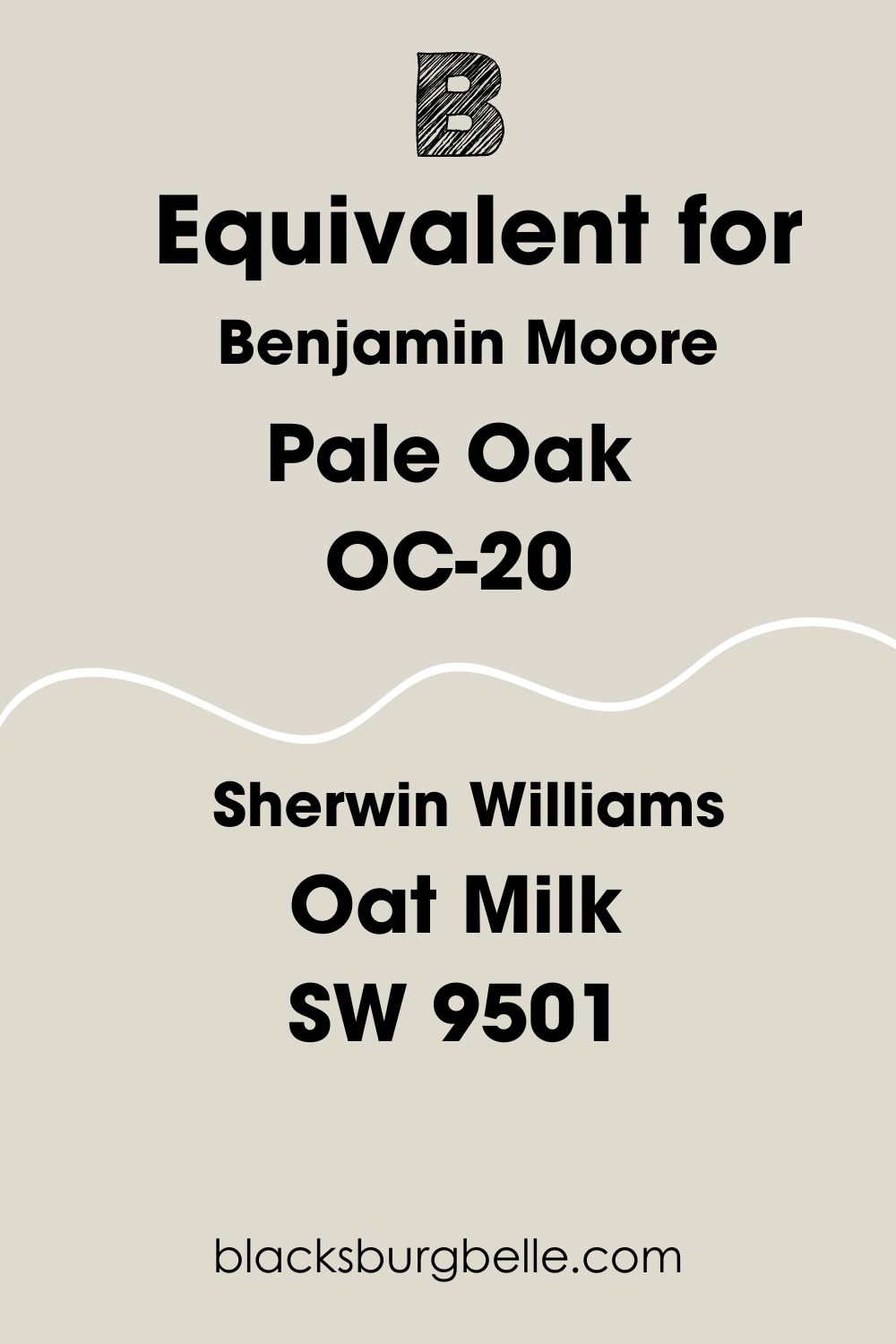
Sherwin Williams Paint Color Equivalent for BM Pale Oak
This aspect is something many users want to know in the event of changing their minds about one brand. However, you may not find an exact match for Pale oak within the Sherwin Williams collection because no two paint colors are the same.
That said, Sherwin Williams Oat Milk SW 9501 is uncannily similar to Pale Oak.
Where Can You Use Benjamin Moore Pale Oak?
I like to say that this is the fun part of this guide because you get to see different real photos of the paint color in action. Pale Oak is neutral, so you can use it anywhere, including on exterior walls. Let’s take a look.
Best Cabinets Color for BM Pale Oak Kitchen Walls
Deep wood tones or black cabinets will look good against Pale Oak walls in the kitchen. You can also try an off-white color, like this kitchen which has BM Dove Wing on the upper cabinets.
Best Ceiling Color for Benjamin Moore Pale Oak Walls
I recommend white to play it safe. Use a warm white like White Dove or try a neutral white like Chantilly Lace.
Best Trim Color for Benjamin Moore Pale Oak Walls
Choose white if you want to maintain a neutral color flow or use wood for a striking contrast.
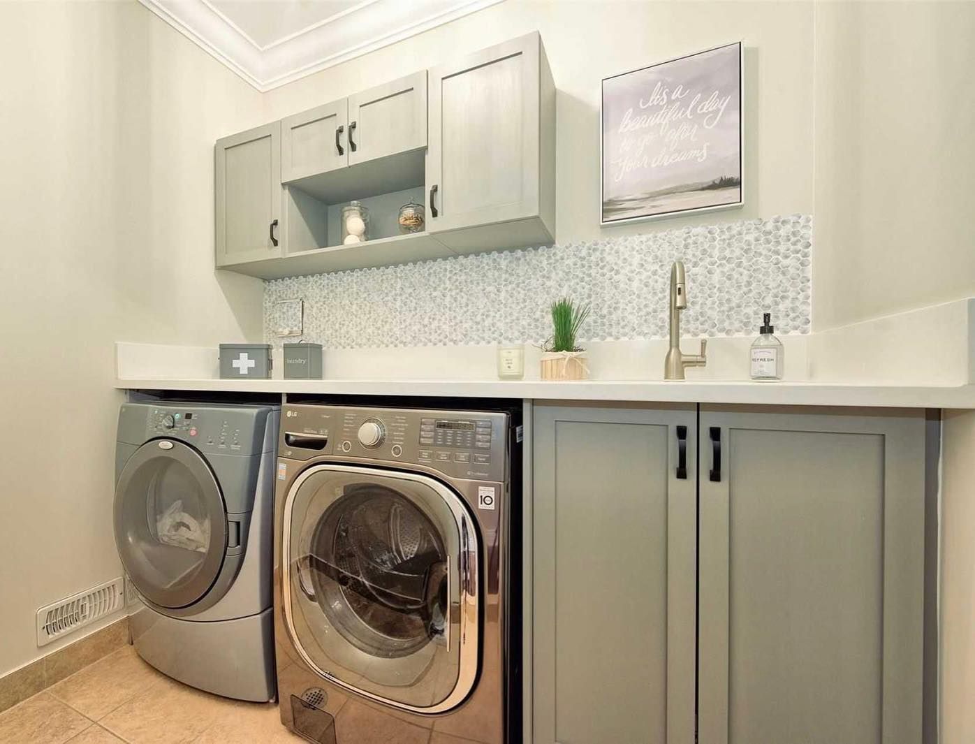
Benjamin Moore Pale Oak in a Laundry Room
Pale Oak will look good in a room without bright light, although it may appear a little grayer than usual. Laundry rooms usually don’t have a lot of natural lighting, so use as much artificial light as can brighten the room, as the next photo shows.
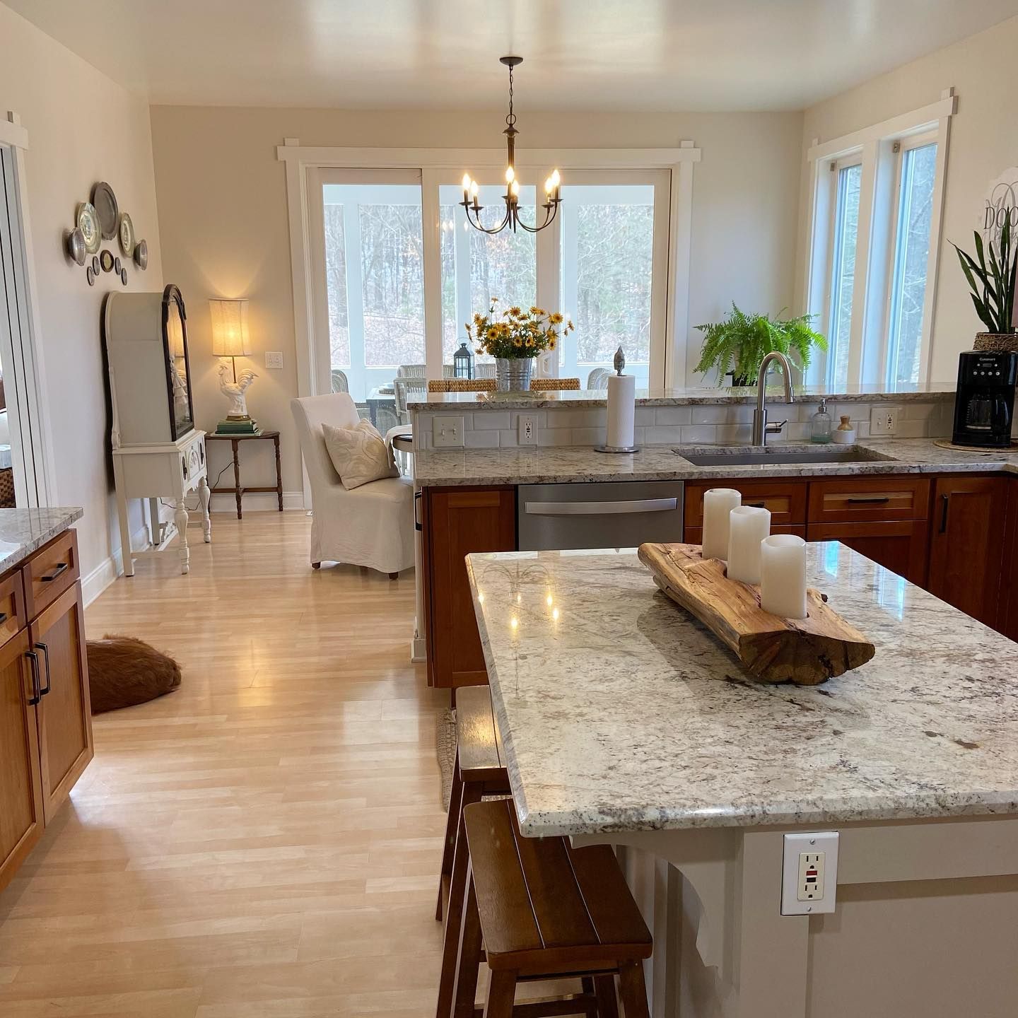
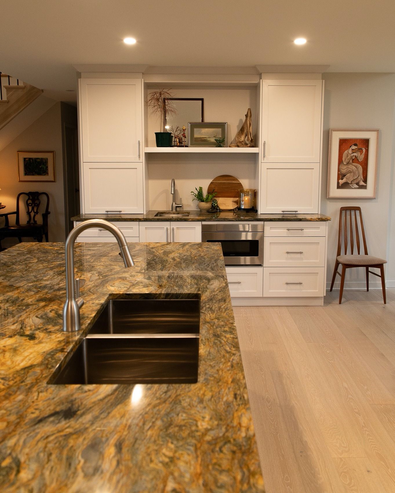
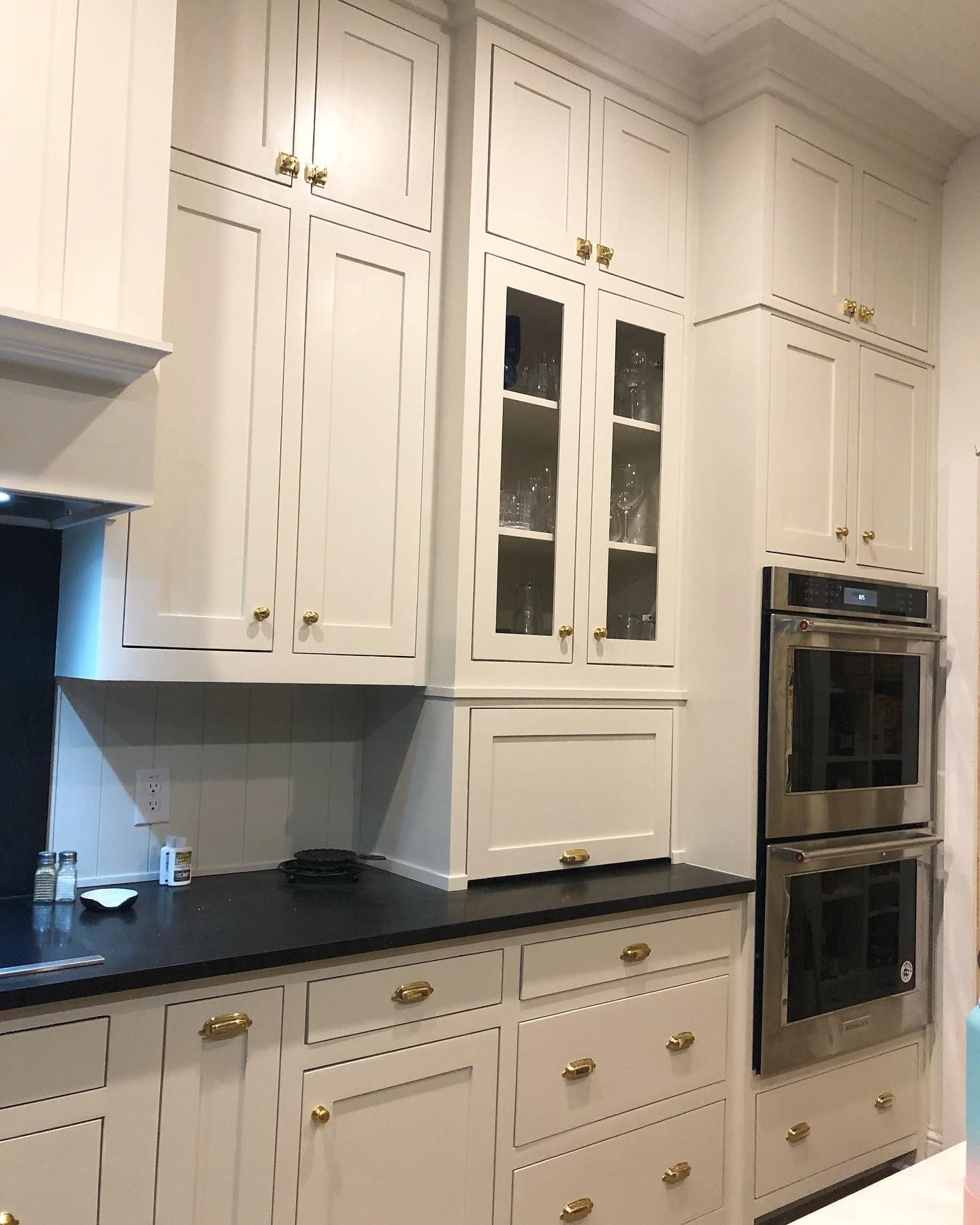
Benjamin Moore Pale Oak on Kitchen Cabinets
The color looks creamy and smooth on these cabinets, and can be a great alternative if you don’t want a stark white in your kitchen. Check out how it matches the black marble countertop.
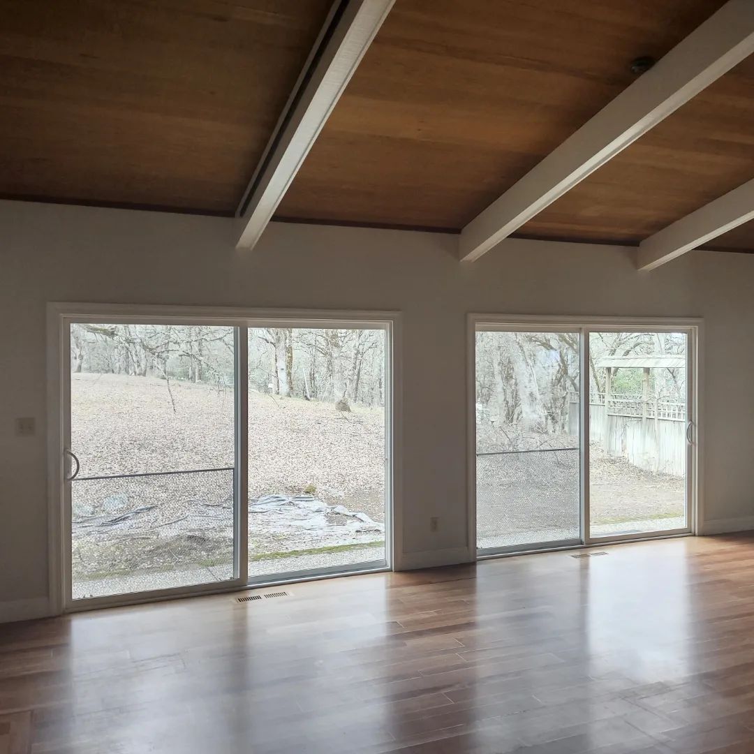
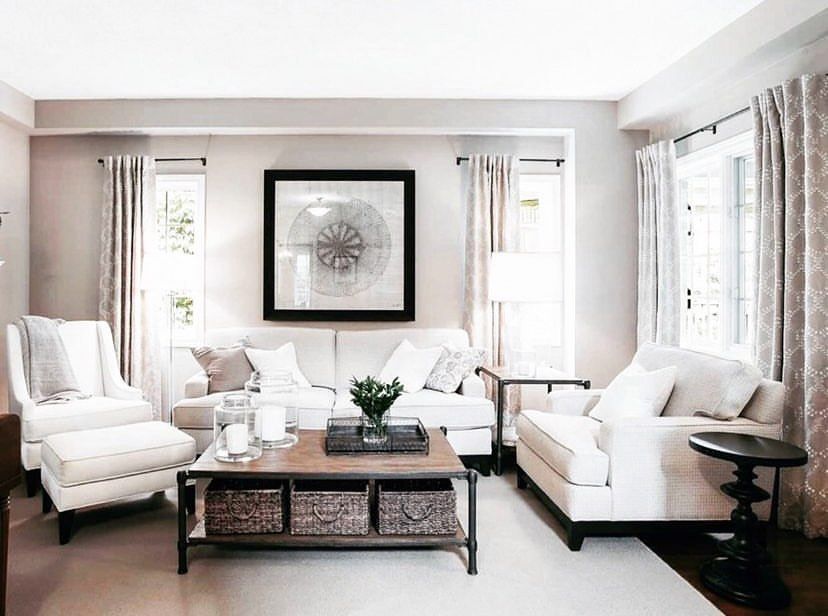
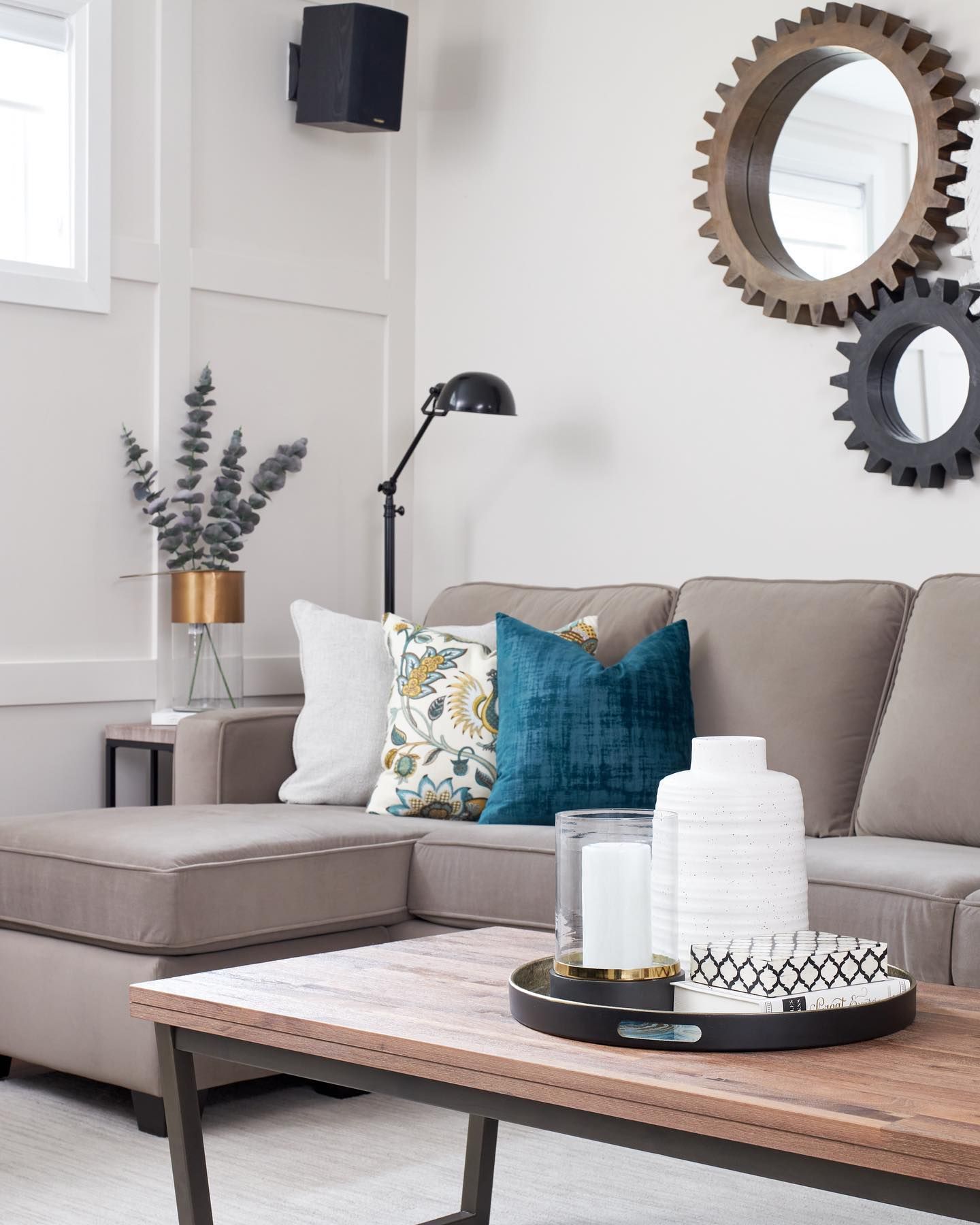
Benjamin Moore Pale Oak in a Living Room
Using a monochromatic color scheme for your living room gives it a certain feel and vibe. This living room looks sophisticated and welcoming, despite the lack of bold or vibrant colors. The walls are done in BM Pale Oak.
Benjamin Moore Pale Oak in a Basement
Are you wondering what color to use in your newly-done basement, especially without enough natural light? Try Pale Oak.
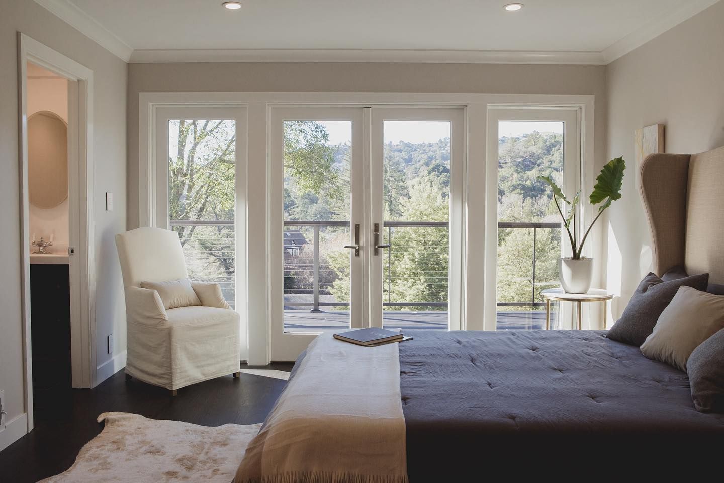
Benjamin Moore Pale Oak in a Bedroom
This guest bedroom is what we all dream to have. Throw in the view, and you’ve got yourself the best deal. It’s such a beautiful and peaceful space.
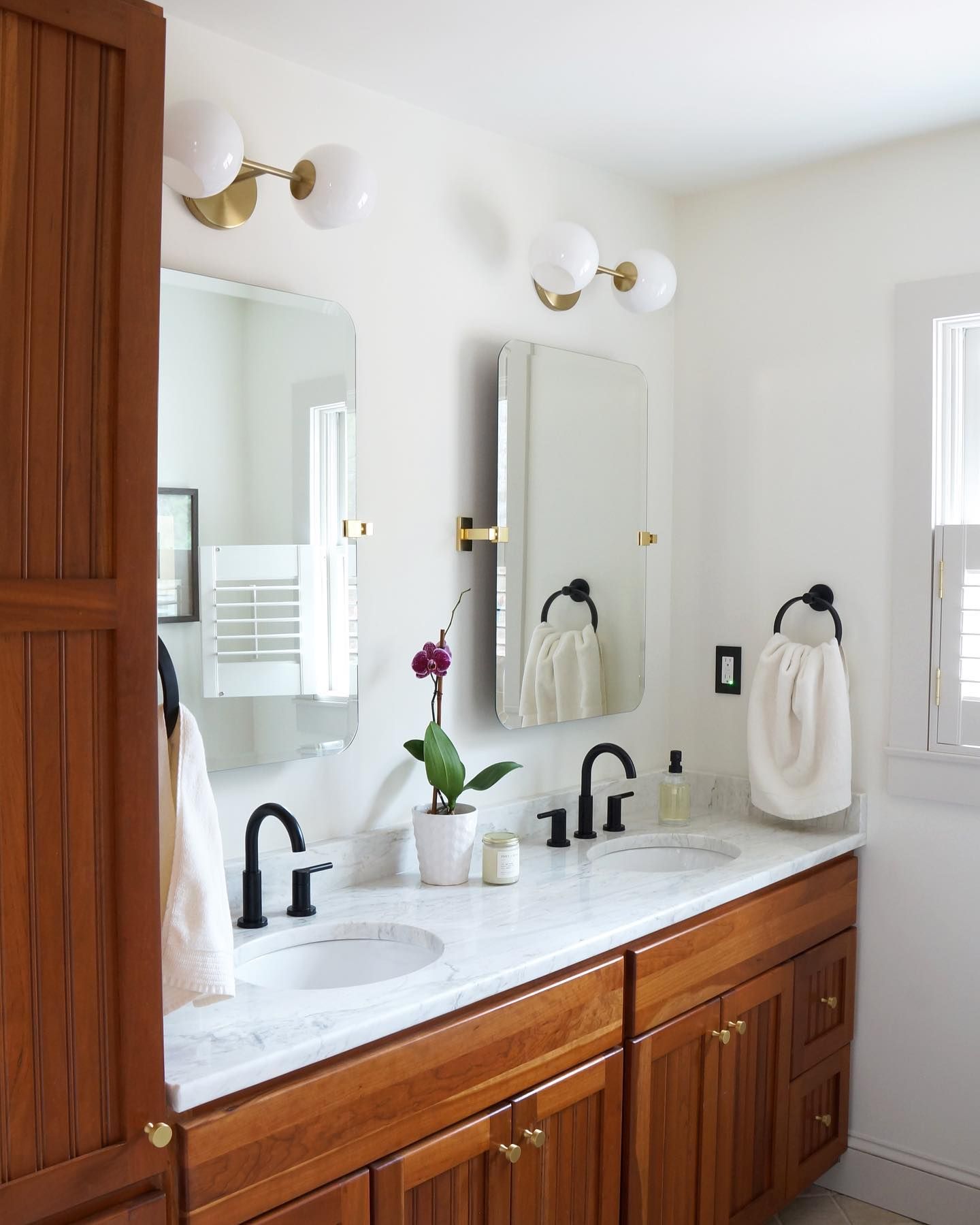
Benjamin Moore Pale Oak in a Bathroom
This bathroom combines White Dove and Pale Oak with wood tones to give this stunning finish.
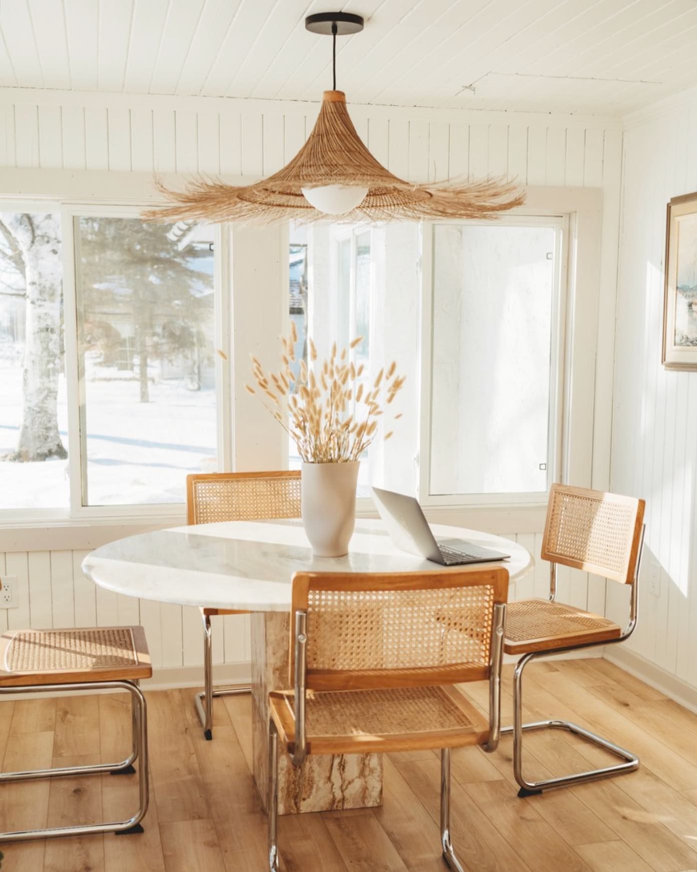
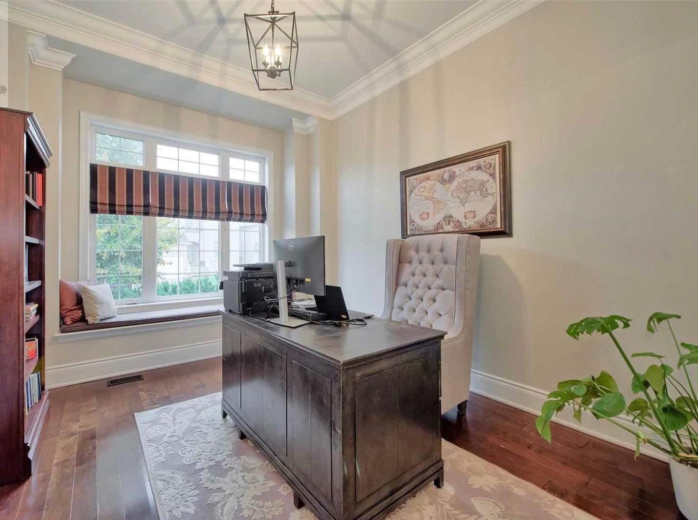
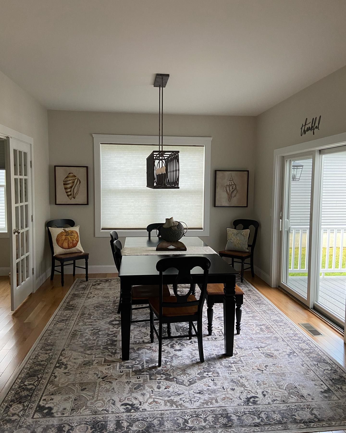
Benjamin Moore Pale Oak in a Dining Area
This room looks great even without adequate lighting. Imagine it with bright white artificial lighting.
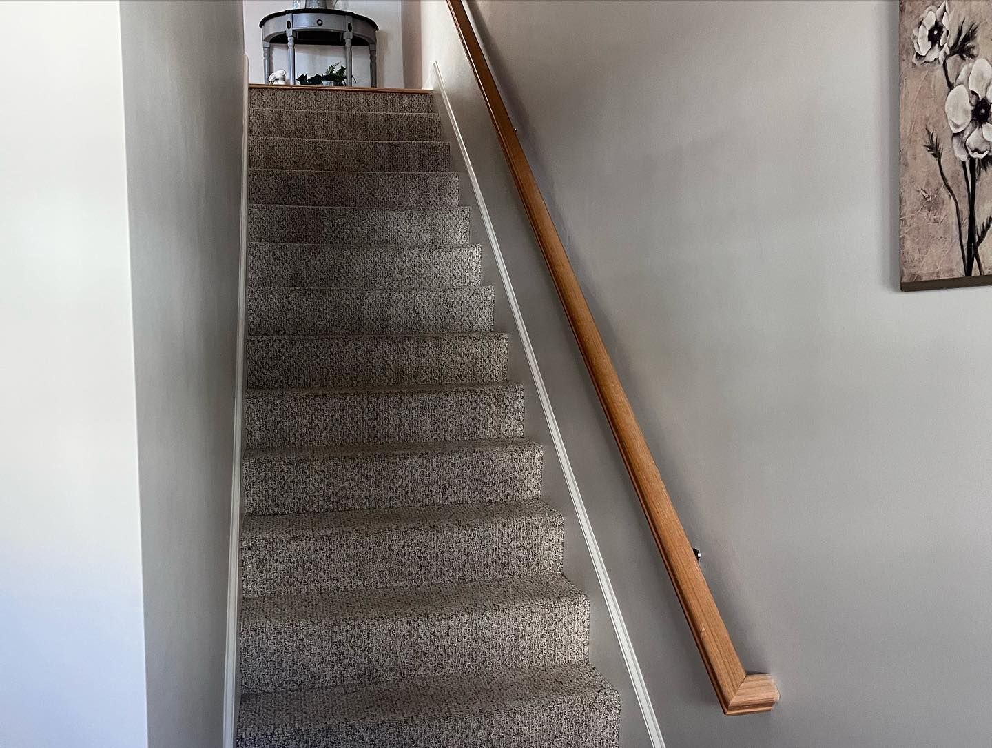
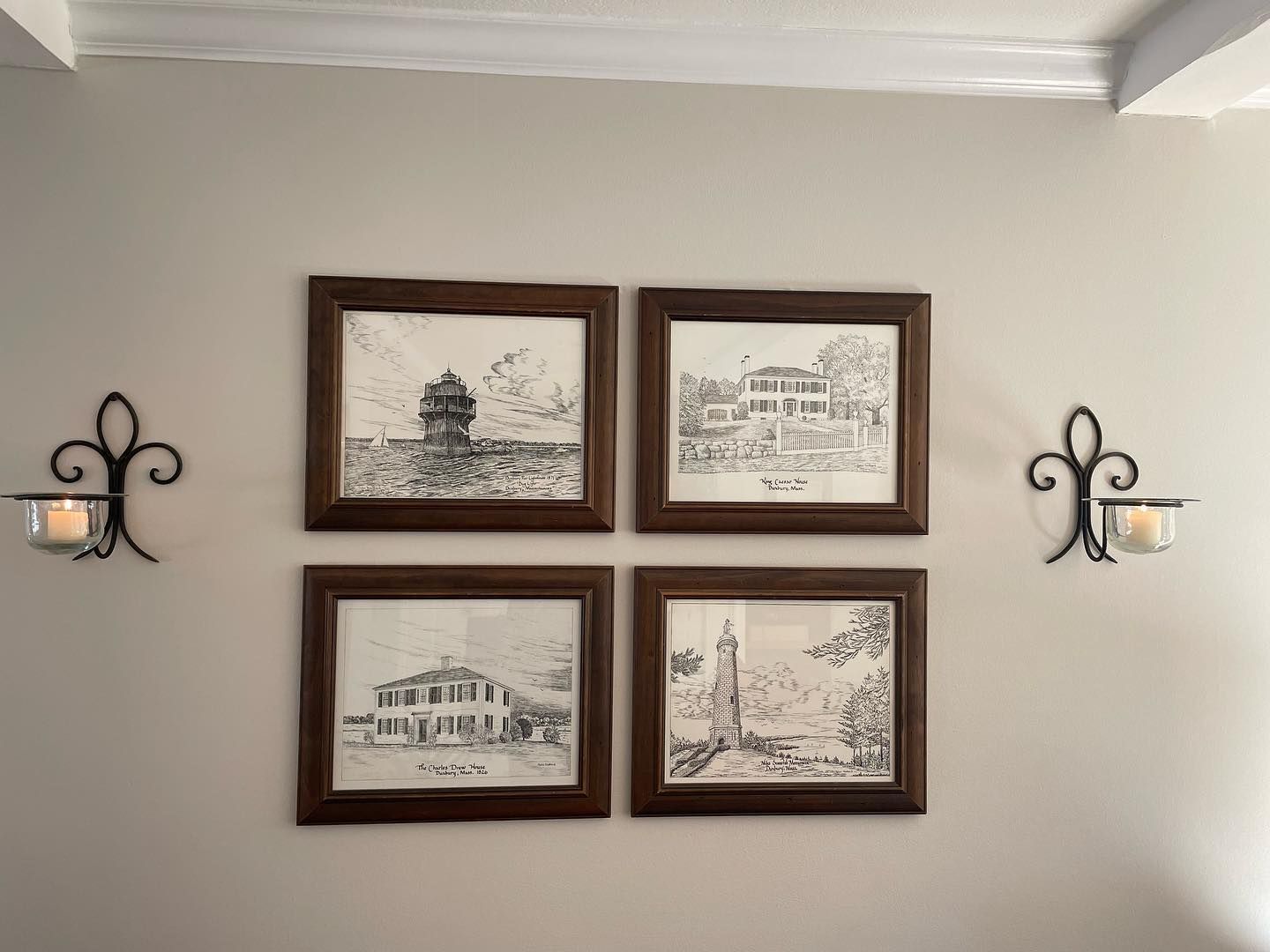
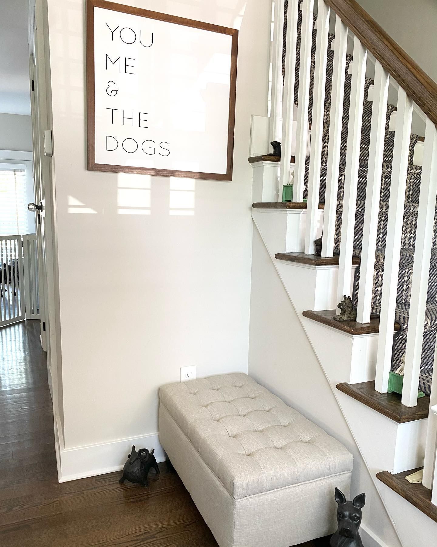
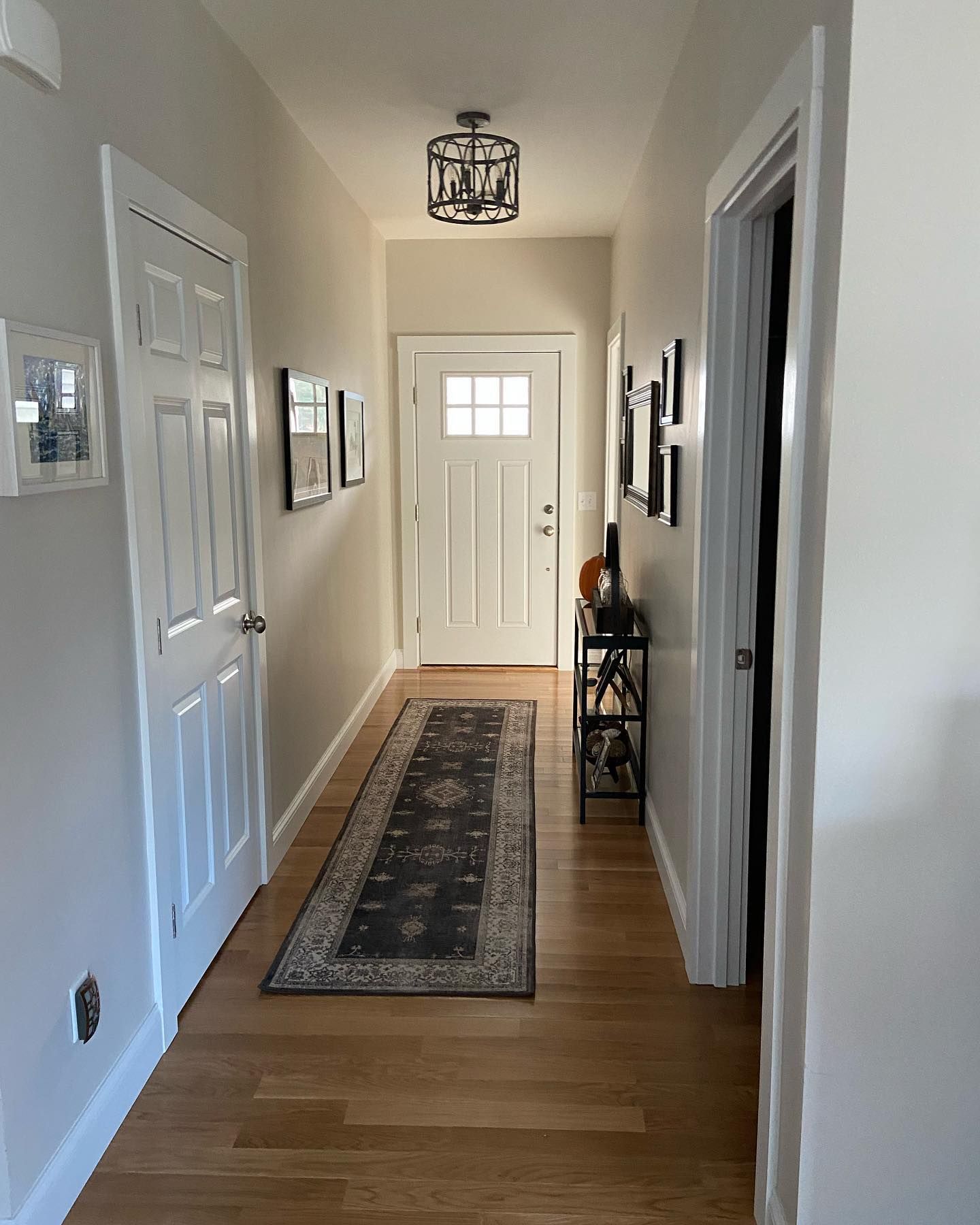
Benjamin Moore Pale Oak in a Hallway
Although it looks dark, this hallway doesn’t hide the beauty of Pale Oak. The color looks like a muted greige color. See how the white doors and trim contrast beautifully with the wall color.
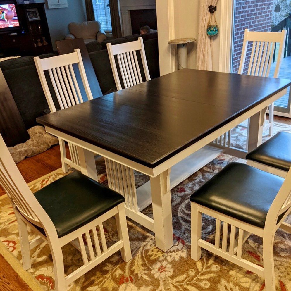
Benjamin Moore Pale Oak on Furniture
Wood looks good with Pale Oak, and you can try painting your wooden furniture in this color. It usually creates a cohesive flow of color in the decor.
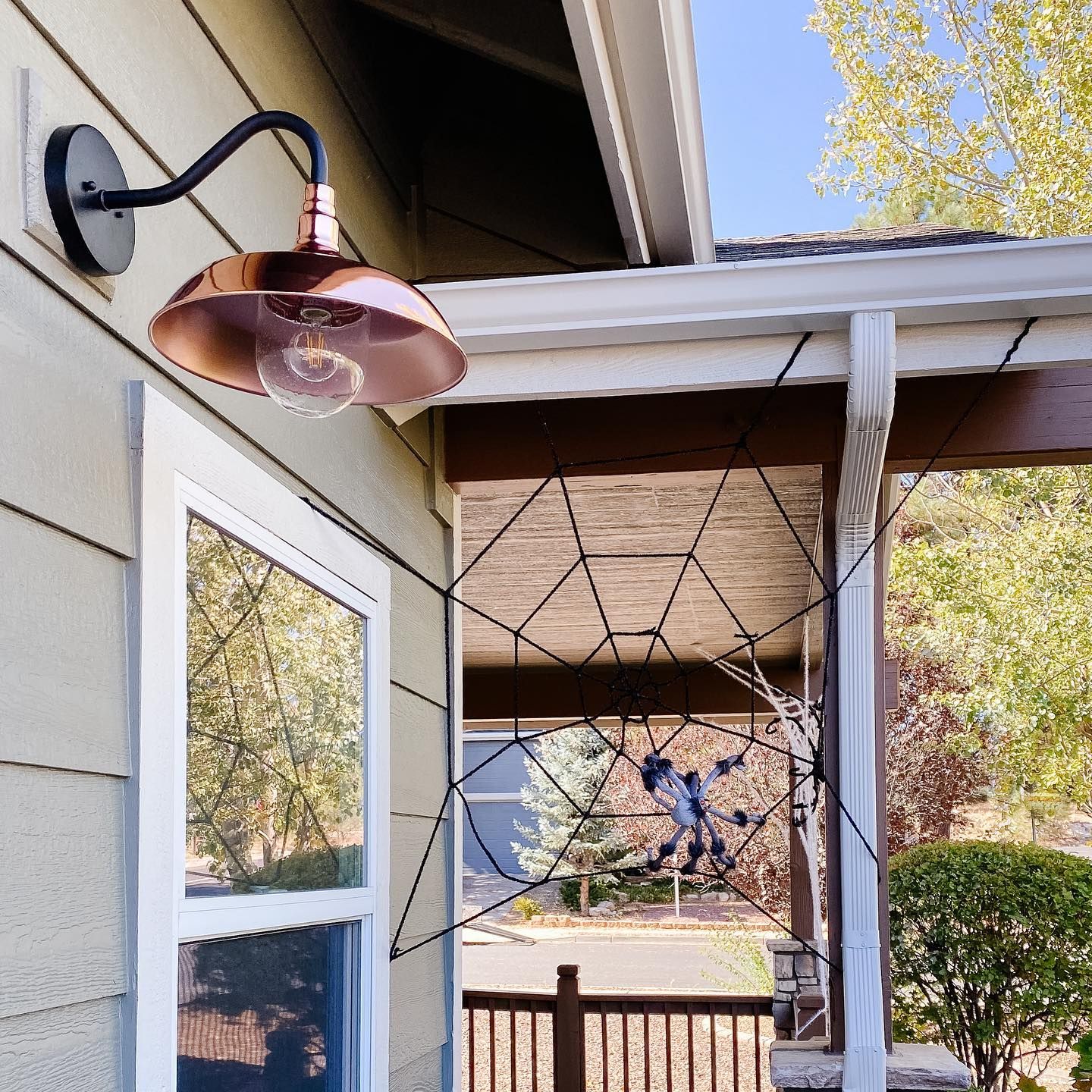
Benjamin Moore Pale Oak on Exterior Trim
The walls on the exterior of this house are painted in Benjamin Moore Gunsmith Gray and the trims are Pale Oak.
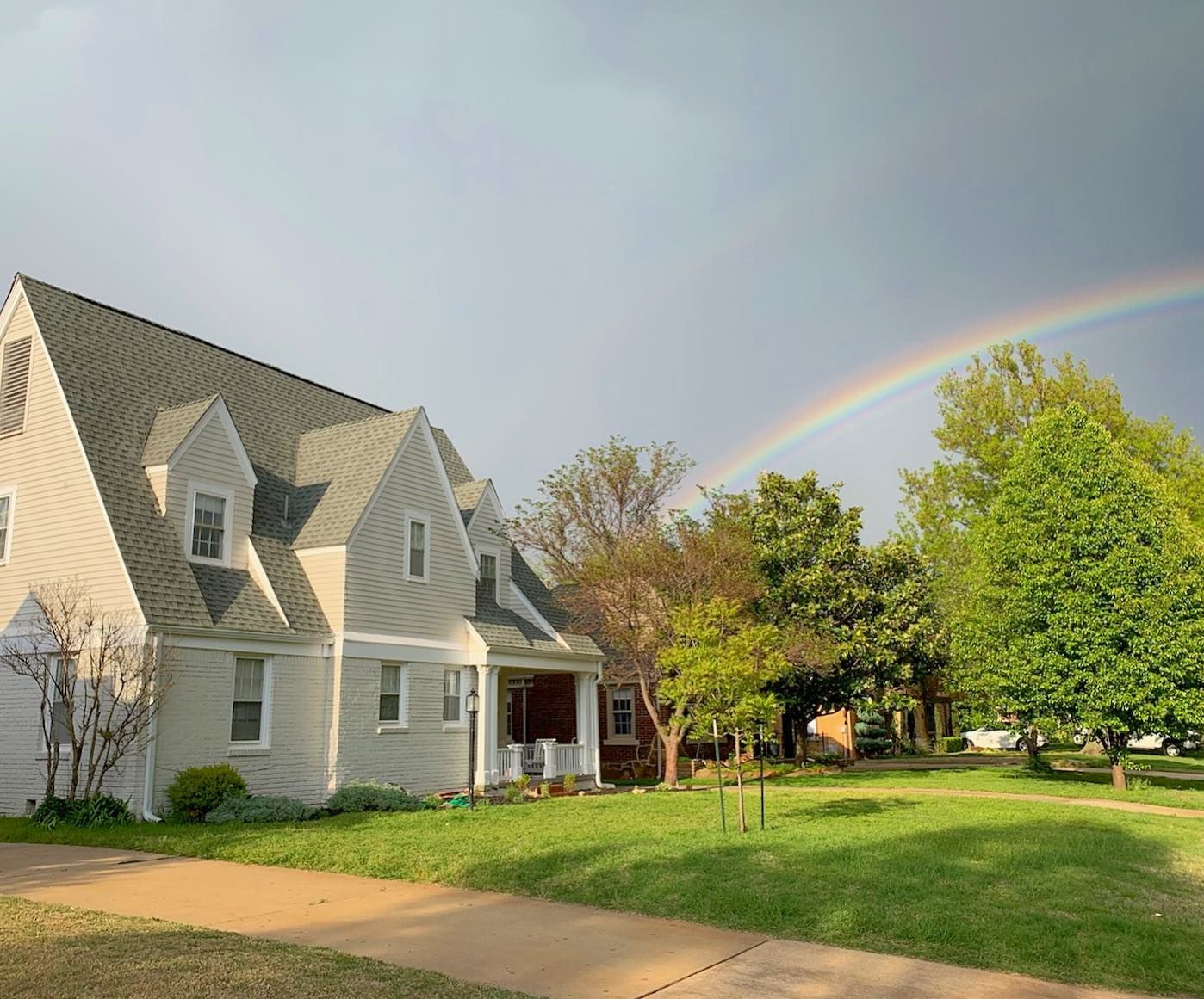
Benjamin Moore Pale Oak on Exterior Walls
Wondering if you can use Pale Oak on the exterior walls? Here’s a photo to inspire you.
Conclusion
Benjamin Moore’s Pale Oak OC-20 is a light greige paint color with warm gray undertones. This neutral color fits any room and accommodates other colors, including soft pastels and vibrant colors. With an LRV of 68.64, Pale Oak is relatively bright and may look washed out in excessively bright light.
Pair it with blues, pinks, reds, oranges, browns, blacks, wood tones, and other colors. Use it in your bedroom, living room, bathroom, entryway, hallway, kitchen, and on exterior walls. Have a fun time creating a color palette and share with me your creative ideas.
If you have further questions, feel free to reach me in the comments section.
 Sherwin Williams Origami White (Palette, Coordinating & Inspirations)
 Sherwin Williams Contented (Palette, Coordinating & Inspirations)
 Sherwin-Williams Anonymous (Palette, Coordinating & Inspirations)
 Sherwin Williams Extra White (Palette, Coordinating & Inspirations)
 Sherwin Williams Misty SW 6232: Paint Color Review
 Sherwin Williams Windy Blue SW 6240: Review & Inspirations
