
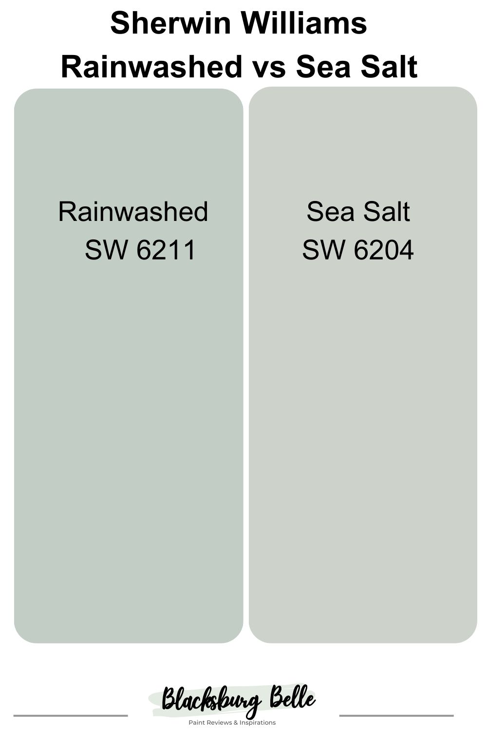
Are you trying to choose between Sherwin Williams Rainwashed vs Sea Salt? We understand how difficult that can be because of their similarities. Fortunately, distinct differences can help you decide between the two.
Both colors are in the green paint color family, but Rainwashed SW 6211 is more saturated and green than Sea Salt SW 6204. Sea Salt looks muted and brighter than Rainwashed. When paired, you can readily see the difference between them.
This primary difference can help you pick one of these paint colors if their hues are all you need to make a decision. However, we have so much more to discuss about them, and you may want to stick around to learn more about what makes each unique.
Table of Contents
When to Use Sherwin Williams Rainwashed vs Sea Salt
We go a step further to help you determine when each paint color is ideal. Knowing the difference in their colors may not be enough. Because they are both green paint colors with blue in them, when is the best time to use Rainwashed instead of Sea Salt and vice versa? Here are a few pointers:
Use Rainwashed if:
- You want a soft pastel that does not compromise color
- You do not mind an obvious green paint color with a little blue
- Your color scheme leans toward the cool end than the warm end
Use Sea Salt if:
- You do not mind a muted green paint color
- You are keen on creating brightness in your decor
- You have a small space that needs to appear bigger
Soft pastels like these paint colors are beautiful in any decor and work well with white and other pastels. However, they always look better when paired with more saturated colors. These deeper colors make the pastels pop, and the pastels soften the deep hues.
So, consider using Rainwashed or Sea Salt with darker and saturated colors for the best results. Still wondering about the details of each paint color? Come along with us as we discuss specific aspects of these colors with images for easier reference.
Visually Exploring Sherwin Williams Rainwashed vs Sea Salt
Pictures always go a long in helping us decide what works best, especially when it comes to picking paint colors. When they are as similar as Rainwashed and Sea Salt, it is even more vital to see what they look like side by side.
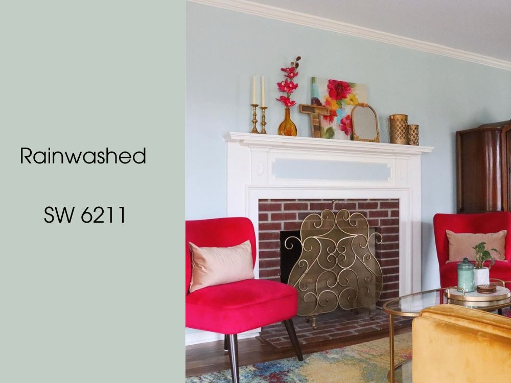
So, here is Rainwashed used in this sitting room:
In contrast, this is Sea Salt used in this bare room:
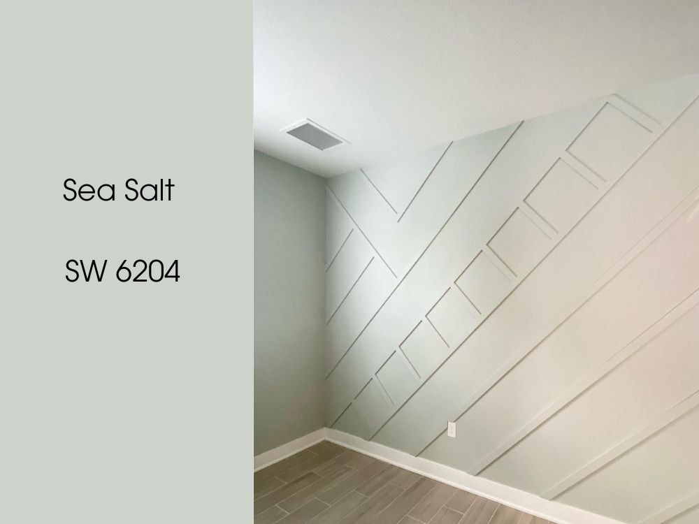
Rainwashed looks more blue-green than Sea Salt from the pictures above. We carefully picked the images because they show a lot of natural light to help you see how each one performs. Sea Salt looks very muted, more green-gray than blue-gray.
If you want a more obvious green-blue paint color, you may want to go for Rainwashed. It has more color and vibrance than its sibling color. On the other hand, Sea Salt is ideal for decor that requires a muted pastel. It appears more neutral and works better as a neutral backdrop than Rainwashed. But it depends on the lighting and surrounding elements.
And when it comes to brightness, Sea Salt has a higher capacity to reflect light than Rainwashed. It does not look like it because of its muted tones, but there are other ways to measure a paint color’s capacity to reflect light. So, keep this in mind when choosing any of these two colors.
Head-to-Head Comparison: Sherwin Williams Rainwashed vs Sea Salt
If you are already wondering what we mean by how much light a paint color reflects, you are not alone. Some colors can absorb or reflect more light than others.
Also, every color is made up of red, blue, and green, and the value of each color is vital to the final result of the paint color. This chart explains these aspects of Rainwashed and Sea Salt, and we will explain further as we go on.
| Rainwashed | Sea Salt | |
| RGB | 194, 205, 197 | 205, 210, 202 |
| LRV | 59 | 63 |
| Undertones | Blue | Blue-gray |
| HEX Value | #C0CCC4 | #CCD1C8 |
Emotional Effects: Sherwin Williams Rainwashed vs Sea Salt
Soft pastels have a calming effect on everyone, especially when they are paired with light neutrals like white. The same is true about SW Rainwashed and SW Sea Salt. Since they are very similar, you will find that both paint colors make you feel relaxed and peaceful.
They also create an airy and fresh feeling in any decor. Their lightness contributes to this, although they are not very high on the light reflectance value chart. Interior designers usually use them with white for that breezy feeling and throw in bits of other vibrant colors.
However, you may get more minty freshness from Rainwashed than from Sea Salt. With Sea Salt, it is more of a muted and understated feeling of relaxation. This is because of the color that is more readily visible with Rainwashed than with Sea Salt.
And because both colors are cool-toned, they make a room look more spacious and serene than it is. This is especially true for small rooms.
LRV of Sherwin Williams Rainwashed vs Sea Salt: Which Reflects More Light?
Before we go further, it is vital to explain what LRV means. It is an acronym that experts and interior designers use to refer to the light reflectance value of a color. It refers to the capacity a paint has to absorb or reflect light and uses a scale of 0 to 100. 0 is the absolute ability to absorb light and 100 is the absolute ability to reflect light.
SW Rainwashed has an LRV of 59. Since 50 is the middle point, it means this paint color has a fair light reflectance capacity. It can throw a good amount of light back into a room. This LRV may be more obvious if the paint color is used with darker colors.
SW Sea Salt has an LRV of 63, slightly higher than that of Rainwashed. As mentioned, Sea Salt does not look like it can reflect a lot of light because of its muted hue. But when used together with Rainwashed, its higher brightness is immediately evident.
Sherwin Williams Rainwashed vs Sea Salt: Do They Have Similar Undertones?
SW Rainwashed has similar undertones to SW Sea Salt. Both paint colors are primarily green but have blue in them with a hint of gray. In some settings, Rainwashed looks more blue with green undertones than green with blue undertones. In other words, it shows more color than Sea Salt.
However, Sea Salt has more gray in it than Rainwashed. Most times, you may not notice any gray in Rainwashed, but the gray in Sea Salt is unmistakable. It is the hue that makes the paint color muted. The gray mixes with blue to give the color a unique appeal from what Rainwashed offers.
The red, green, and blue (RGB) value of each color also shows how much of the primary color they contain. Sea Salt has more of each primary color than Rainwashed, showing better promises of blue and green than its sibling color. But let’s look at how these undertones appear when the paint colors are in use.
A Closer Look at the Undertones of SW Rainwashed
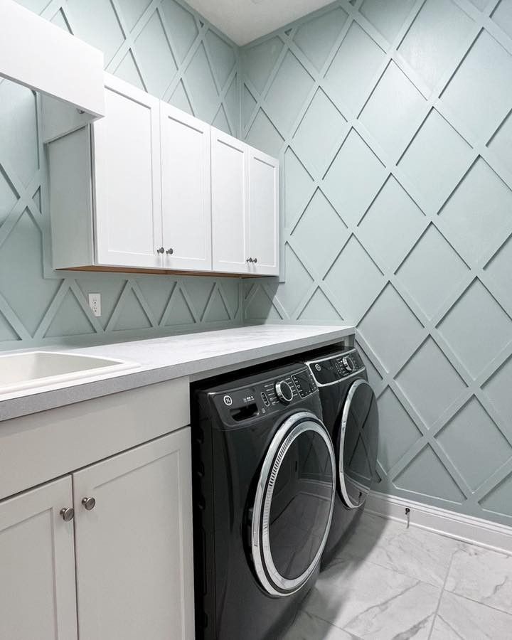
As mentioned, Rainwashed is a green paint color with blue undertones and a bit of gray. In the picture of the laundry room below, the paint color looks more blue than green, and this may be because of the lighting and the surrounding white.
A Closer Look at the Undertones of SW Sea Salt
As the more muted color of the two options, Sea Salt shows more gray than green, although it is primarily a green paint color. In this next picture, it looks like a bright blue-gray instead of green.

We like these colors because they work well with natural or artificial lighting. In the pictures above, there is a lot of light to do justice to their beauty, and you can clearly see their undertones.
But we must point out that green can be a fussy color, being selective with other colors. This is especially true when it appears as an undertone. Therefore, we recommend that you carefully pair the colors to avoid a clash in your decor.
It may be safer to use them with white or on trims and wainscoting if you have trouble finding suitable complementary colors or color palettes. Pairing them with white always looks stunning because of the bright, airy, and fresh look they present.
Sherwin Williams Rainwashed vs Sea Salt: Are They Warm or Cool?
SW Rainwashed and SW Sea Salt are both cool-toned colors. This is because of the undertones of blue and gray, although Sea Salt shows more gray than Rainwashed. That also means that the paint colors work better with cool colors than with warm ones.
Consider using them in a south-facing room with a lot of direct sunlight than in a north-facing room without direct sunlight. The lighting conditions can significantly affect the appearance of the colors, especially Sea Salt.
It tends to change its appearance with different lighting conditions, so you may see it as blue-gray with a hint of green or a blue-green with a hint of gray. Opt for Sea Salt if you do not mind the changing color at different times of the day or with various lighting types. But stick with Rainwashed if you want a clear and soft blue-green pastel.
Sherwin Williams Rainwashed vs Sea Salt: Complementary Colors
Complementary colors are directly opposite the central color on the color wheel. For example, blue is directly opposite orange on the wheel, red is opposite green, and blue is opposite yellow. Therefore, these colors complement each other.
Since SW Rainwashed and SW Sea Salt are about the same shade, they both have the same complementary color of a soft shade of purple. This is one of the best colors with which to complement these soft pastels, and our best pick from Sherwin Williams is Grape Mist SW 6548. It is similar to lilac and shows a hint of gray, but combines well with these green blues to deliver stunning decor.
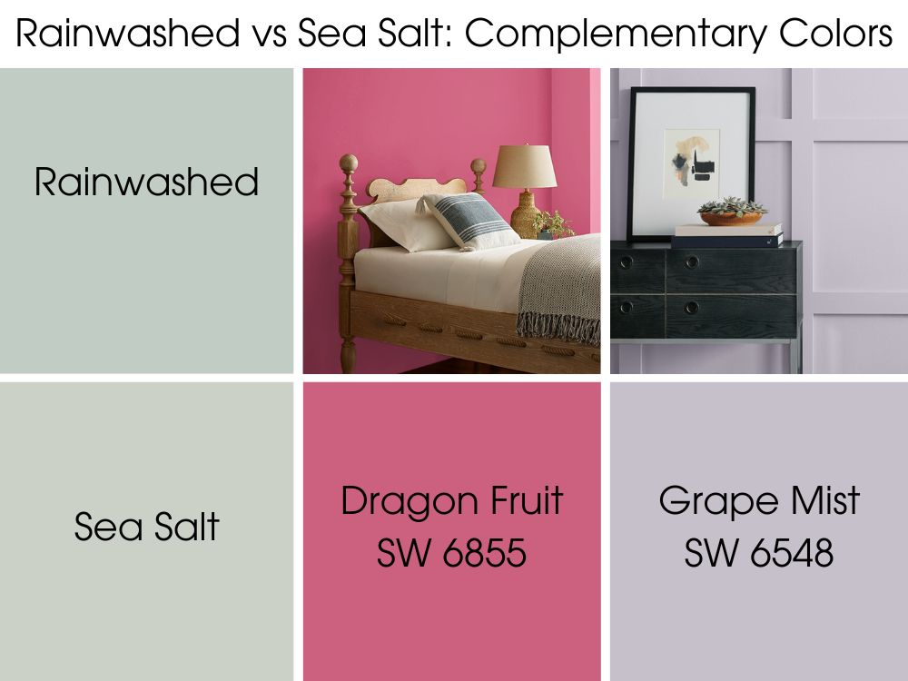
Pinks are also great complements for all shades of blue-green, even those with hints of gray. So try Sherwin Willaims’ Dragon Fruit SW 6855. It is a saturated pink color with red undertones that looks great with Rainwashed or Sea Salt.
Sherwin Williams Rainwashed vs Sea Salt Color Palettes
Everyone knows that colors make our world what it is. Without them, it would be a dull place, and the same is true of paint colors and what they do for our decor. It is one thing to find the perfect central hue, but what about other colors that go well with it? Let’s discuss color palettes for SW Rainwashed and SW Sea Salt.
Color Palette for SW Rainwashed
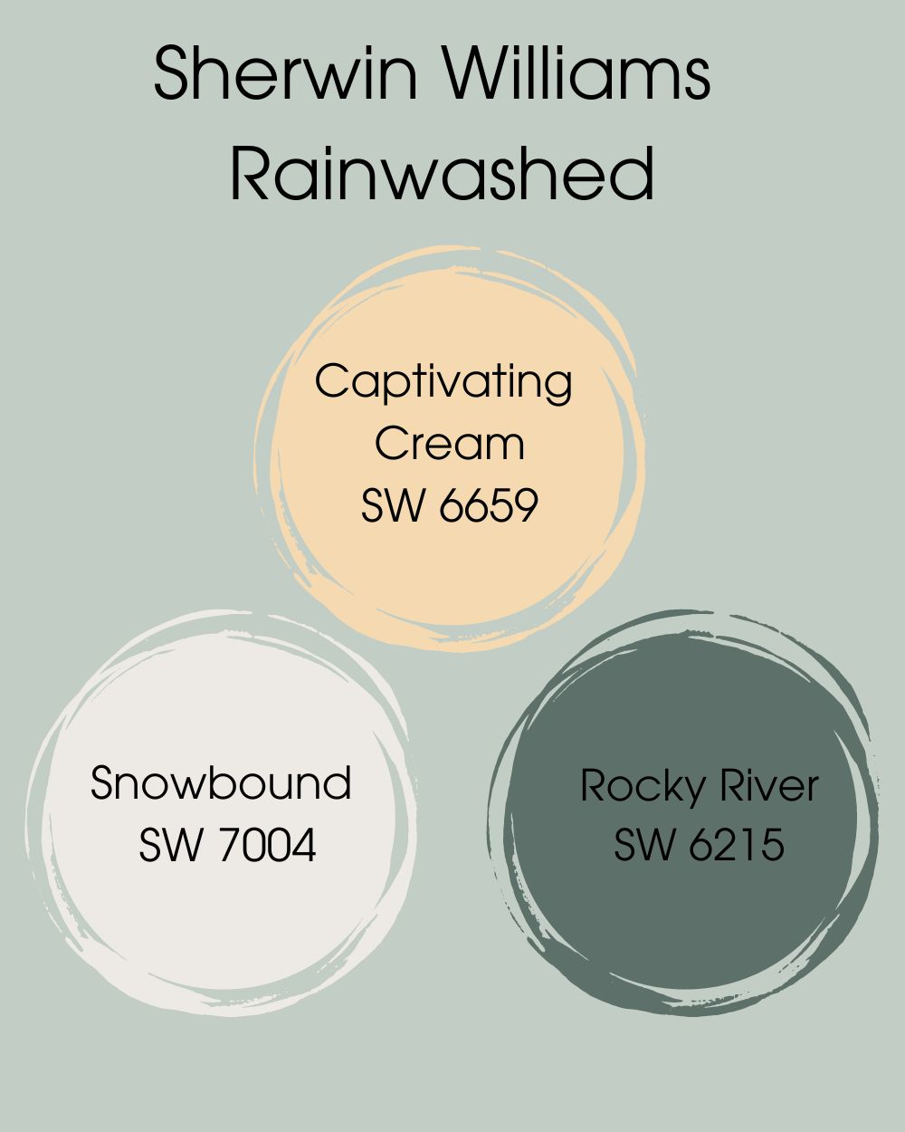
The colors you choose to add to the color palette for Rainwashed will depend on the decor you want. You can use only contrasting colors for a striking look, matching colors for a perfect blend, or coordinating colors for a conversation starter.
Since Rainwashed is a cool color, you may want to use only cool colors in the palette. This applies even if you want to mix different color shades. But you can also add some warm shades for some versatility. So, here are some colors to begin your journey.
- Captivating Cream SW 6659: This is a light orange paint color with a creamy undertone, and it works when used in bits with Rainwashed
- Snowbound SW 7004: This is a cool white paint color that brings a gray undertone that perfectly matches the blue hue in Rainwashed.
- Rocky River SW 6215: As a cool and dark green with hints of blue-gray, it is the striking contrast that Rainwashed needs to shine.
Color Palette for SW Sea Salt
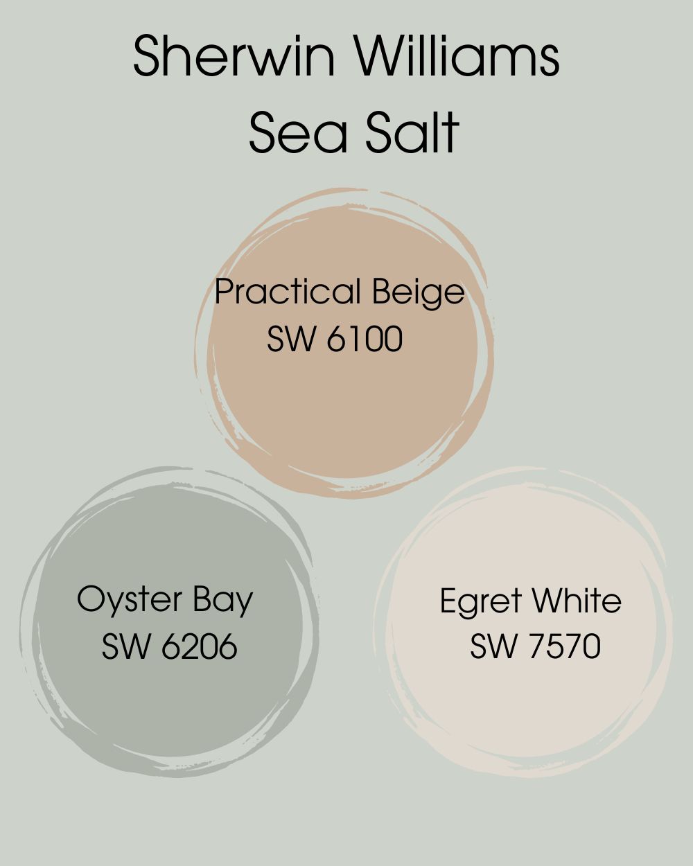
As with Rainwashed, you can choose cool colors for this palette, but you can get adventurous and add some warm colors. It may even work better with Sea Salt because of the more obvious gray in it. While you may want that zen in your home, splashes of color do not hurt.
So, try the following colors as part of your Sea Salt color palette.
- Practical Beige SW 6100: It is a warm beige that looks more like it is brown than any other color and is a suitable contrasting color for Sea Salt
- Oyster Bay SW 6206:A cool neutral with slate blue undertones that align well with the muted Sea Salt
- Egret White SW 7570: This paint color is white with a cool undertone that brings out the best in Sea Salt, especially when used as a trim color
These colors are only a start and a guide to show you what you can do with Rainwashed or Sea Salt. Get creative and take advantage of their versatility to create the decor you want. We have already shown you what other colors work well with them, especially vibrant ones. We may learn a thing or two from you.
Sherwin Williams Rainwashed vs Sea Salt on Cabinets
Like white paint colors, SW Rainwashed and SW Sea Salt do well on cabinets, whether in the kitchen or elsewhere. The truth is that cabinets are usually the best places to test colors as long as they complement the other colors in the room. Without further ado, let’s see Rainwashed vs Sea Salt on cabinets.
SW Rainwashed on Cabinets
Rainwashed is a beautifully soft color that tones down dark colors and pairs well with white. If you want a bit of color in your kitchen, powder room, or any other room painted white, try this option.
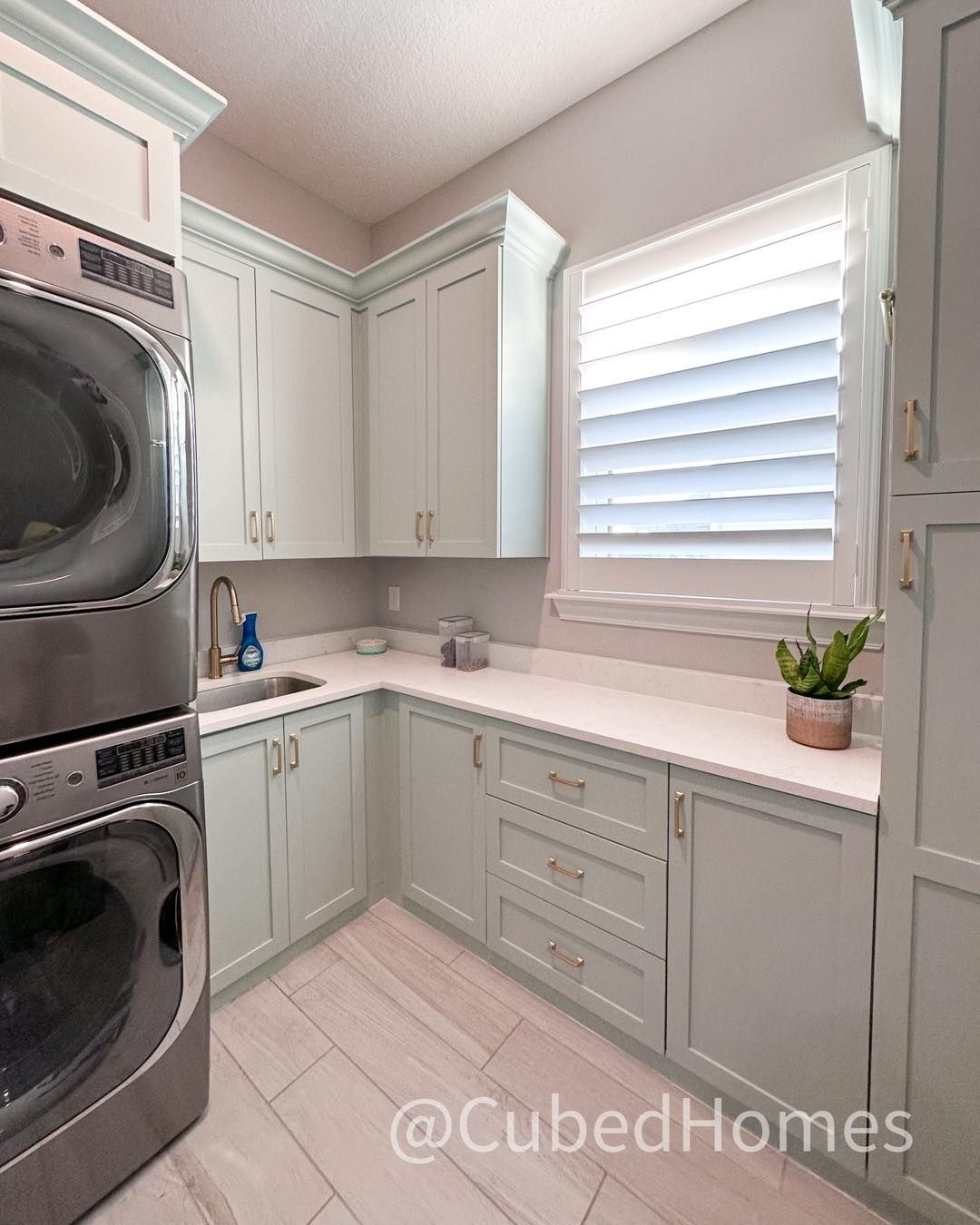
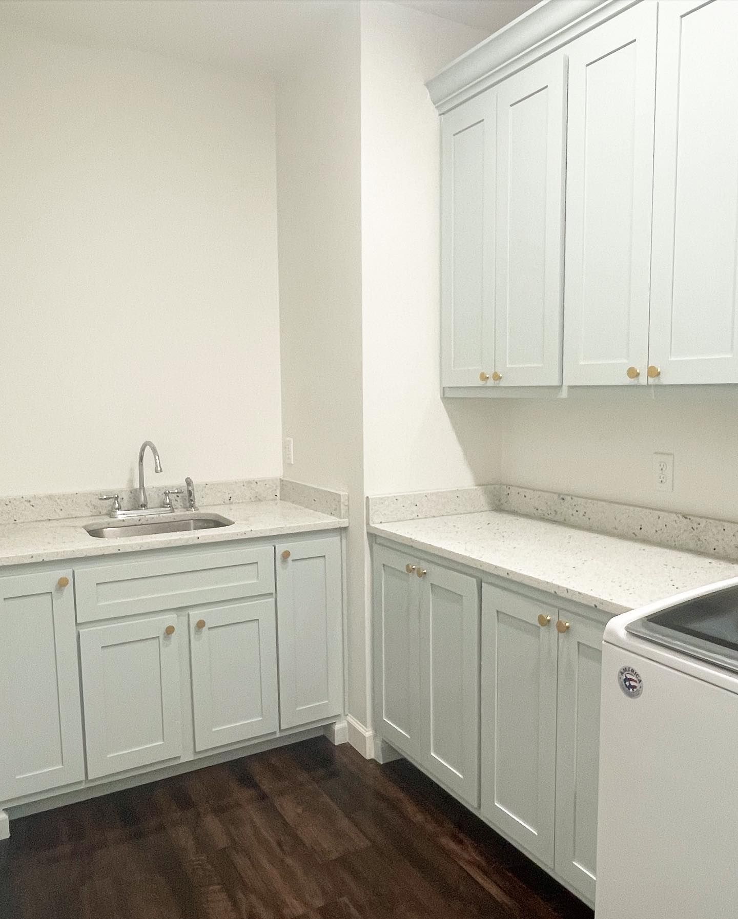
SW Sea Salt on Cabinets
This is also a great option for cabinets, especially because it looks neutral. In this laundry room picture, it looks light and green with only a touch of gray. You will hardly see any blue. Remember how we said it changes color with different lighting? This is proof.
Sherwin Williams Rainwashed vs Sea Salt on Interior Walls
The best place to check any paint color is on the interior walls. You can determine how lighting conditions affect the color and what other colors work best with it. Let’s show you how Rainwashed and Sea Salt work on the interior walls.
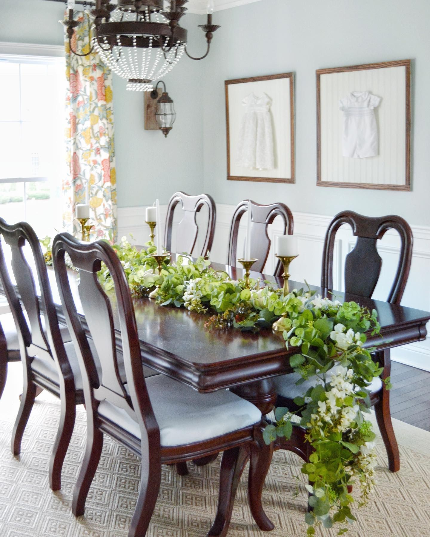
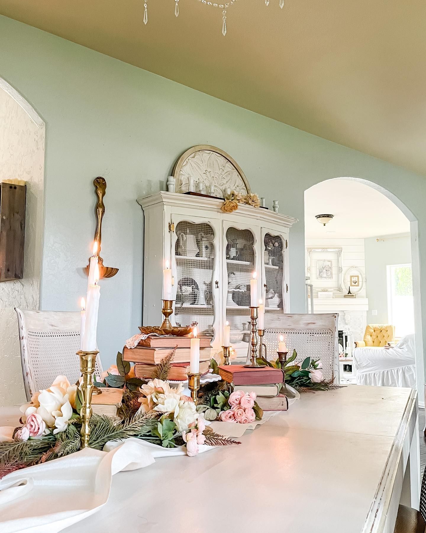
SW Rainwashed on Interior Walls
We like how soft and accommodating Rainwashed can be, especially in the presence of neutrals. This dining area uses this paint color with white and dark wood tones.
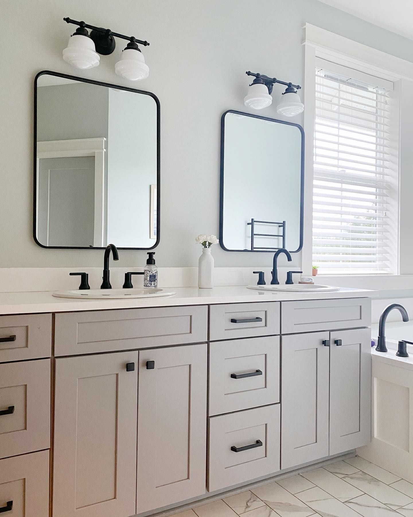
SW Sea Salt on Interior Walls
It is another great color option for interior walls because of its muted hues. It pairs well with other colors because it steps back and allows others to shine. Here is the color paired with white in a bathroom.
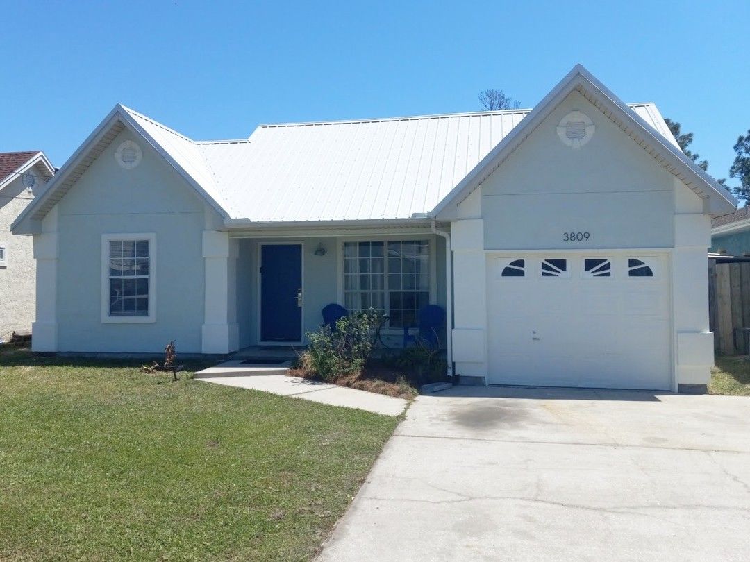
Sherwin Williams Rainwashed vs Sea Salt on Exterior Walls
Although they are light colors, some use Rainwashed and Sea Salt on Exterior walls. You would be surprised at how beautiful they look, even on exterior ceilings. Let’s explore some visual examples of these colors on the exterior.
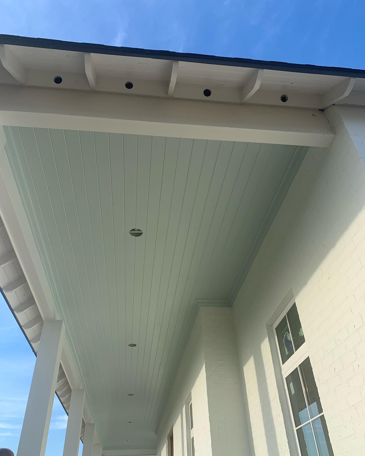
SW Rainwashed on the Exterior
We picked an image where a homeowner used Rainwashed on the ceiling on the porch. The rest of the porch is white, and the combination is simply amazing. Check it out.
SW Sea Salt on the Exterior
White always looks good on exteriors, but you can switch things up with a touch of another color. In the next picture, the house has a combination of Sea Salt, and the trims are done in Greek Villa.
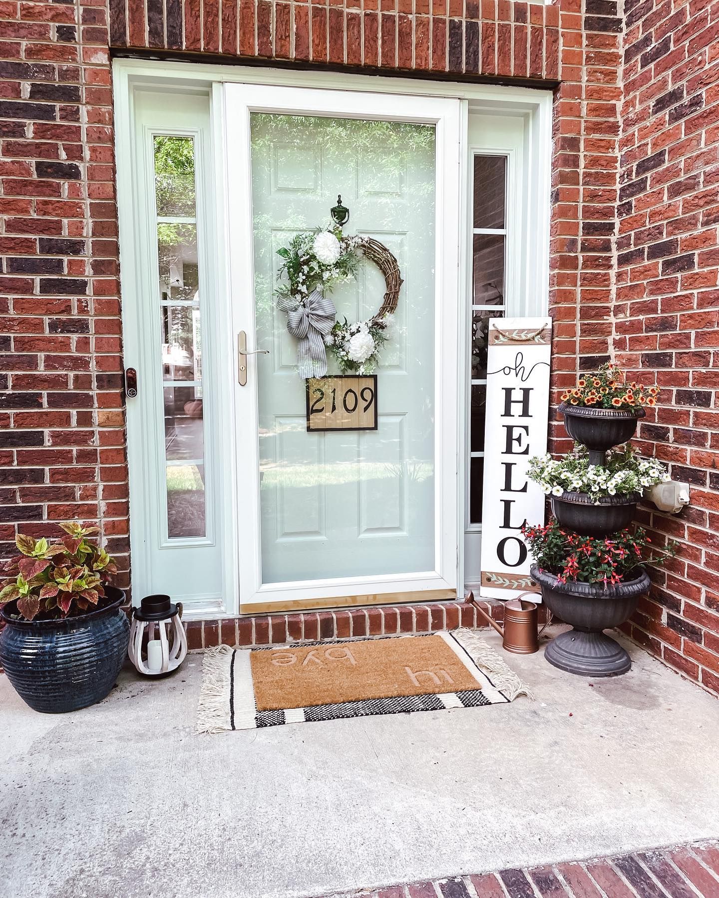
Sherwin Williams Rainwashed vs Sea Salt on Doors
In this section, you will see how beautiful Rainwashed and Sea Salt look on doors. We deliberately picked images that have the colors looking almost the same so you see that they can be used one in the place of the other.
SW Rainwashed on Doors
Surrounded by wood tones and gray, Rainwashed brightens and looks like seafoam green. The green wreath on the door further brings out its true color.

SW Sea Salt on Doors
The next image shows Sea Salt looking almost exactly like Rainwashed, although it is surrounded by red and brown bricks. The door is framed by white trims that deepen its color.
Sherwin Williams Rainwashed vs Sea Salt with Various Elements
We will not fail to tell you that elements in a room significantly affect paint colors. They can deepen, lighten, or completely change the hue. In this case, elements and the artificial lighting change the hue of Sea Salt from a muted green to a more obvious green.
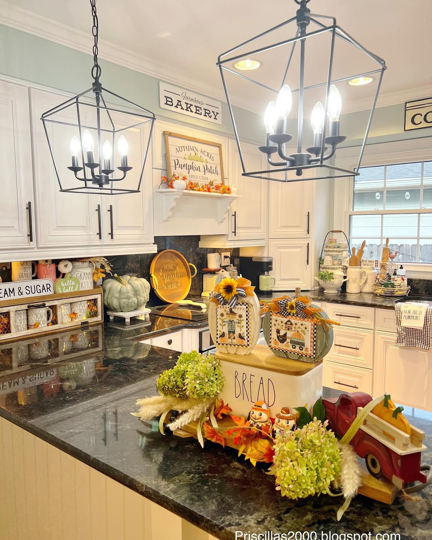
SW Rainwashed with Various Colors
In this kitchen, there is an unbelievable number of colors to complement the wall color. This includes warm whites, orange, wood tones, yellow, and red. Coupled with the artificial lighting, Rainwashed on the wall looks slightly warm and yellow.
SW Sea Salt with Various Colors
In the next image, there is a mixture of colors that include green, pink, and red. The lighting is a combination of artificial and natural, but everything changes the hue of Sea Salt to a brighter green that looks slightly warm.
Sherwin Williams Rainwashed vs Sea Salt in Muted Lighting
As we have already explained and will still explain in detail later, lighting can change these colors to different shades. This section shows how much they change in muted lighting.
SW Rainwashed in Muted Lighting
You would not believe how much more obviously green Rainwashed can appear if used in muted lighting. Check out the next image to see what we mean.
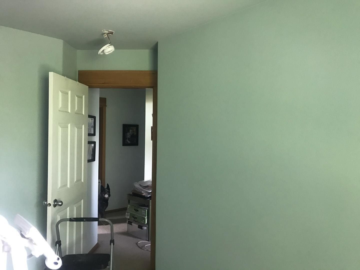
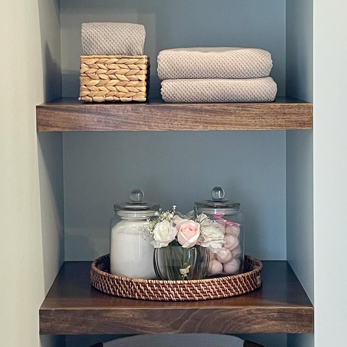
SW Sea Salt in Muted Lighting
In contrast, this shelf decor shows that Sea Salt exhibits more blue than you are aware it has. With only a faint hint of gray, Sea Salt shows no clear sign of being a green paint color in this picture.
Lighting Conditions
Bear in mind that light can play tricks with colors. This may happen in some colors more than in others, and Sea Salt is one of them. At first, it looks like a dull green with hints of blue and gray. But in some lighting conditions, it looks more green and vibrant, closer to the Rainwashed hue.
As a cool color, Sea Salt works best in a room with warm lighting conditions. The same is true about Rainwashed; warm light makes it look less crispy or icy. If used in a room with cold lighting conditions, you may notice too much green, and this may not fit your style.
Lots of natural or artificial lighting make all the difference with these paint colors. And the surrounding elements are also vital. Use the right colors and accessories for the best results.
Conclusion
We have onboarded the specifics and details of Sherwin Williams Rainwashed vs Sea Salt to help you tell the difference. That way, you can compare them and pick the more suitable one for your decor. Concentrate on the undertones and how they respond to light, and you will not get it wrong.
Also, check the complementary colors and color palettes. We have created a brief guide for selecting palette colors, so use it to find what you need or create a unique one. However, if you have questions or thoughts about these colors or any other ones, we would love to hear from you in the comments section.
 Sherwin Williams Worldly Gray Vs Agreeable Gray
 Sherwin Williams Alabaster Vs Pure White: How to Choose!
 Benjamin Moore Alabaster vs Sherwin Williams Alabaster: What’s the Difference?
 Revere Pewter vs Agreeable Gray: What’s The Difference?
 Light French Gray vs Repose Gray: How to Choose?
 Repose Gray Vs Revere Pewter: How to Choose?
