
Are you looking to paint your new home or are you doing a complete revamping of your old home and you’re caught between choosing the Repose Gray or the famous Revere Pewter? I understand your position.
Before getting started, let me give you a brief description and overview of each paint color and what they represent.
Repose Gray is an excellent light-medium gray paint color with a green undertone. If you are a lover of gray, this is a paint color you will want to consider.
Revere Pewter is “an iconic neutral that provides a versatile bridge between warm and cool tones.” The Revere Pewter sits in the greige category of paint colors and equally straddles between gray and beige.
Let’s take a journey into exploring the differences between both paint colors and how they work in different spaces.
Table of Contents
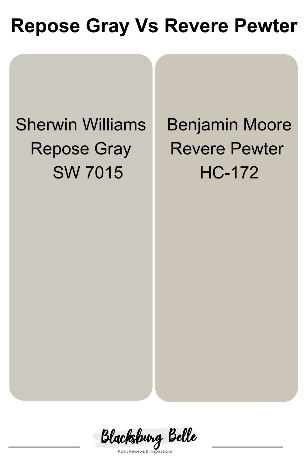
Visual Comparison: Repose Gray Vs Revere Pewter
If you look closely, you’ll notice that Repose Gray is a light-medium gray paint color that is not too dark, heavy, or light compared to Revere Pewter.
Revere Pewter appears gray in spaces with cool or low natural light while rooms with brighter rooms bring out its neutral warmth.
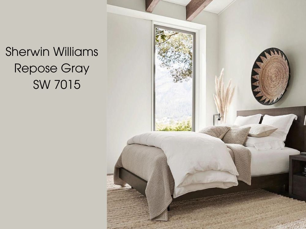
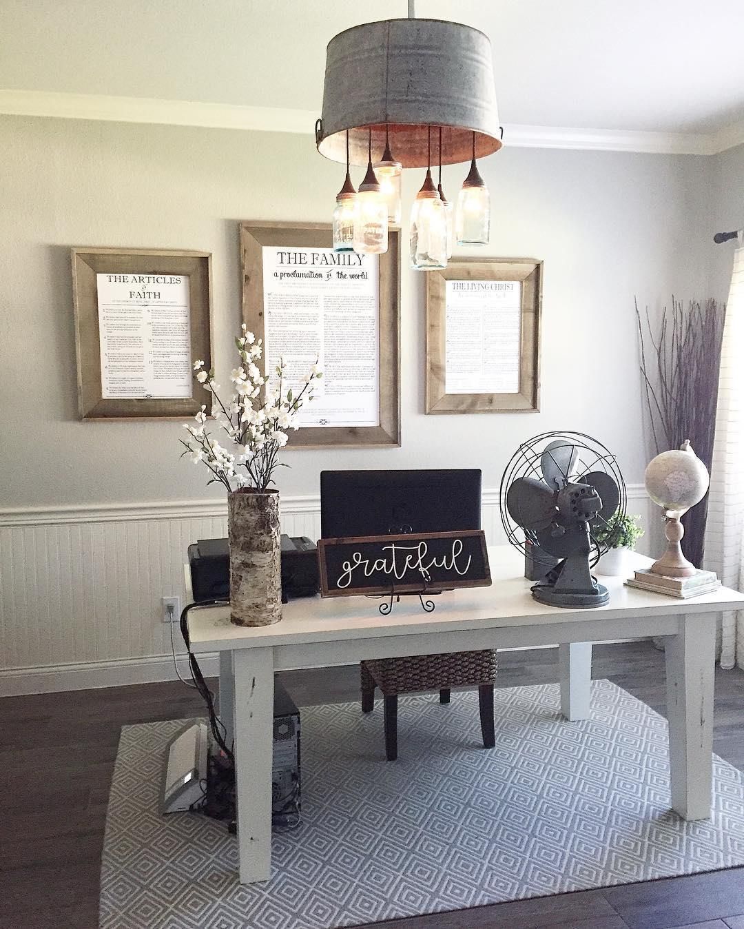
Below is a picture of a bedroom with the walls painted in Repose Gray.
And below is Revere Pewter also used on the walls of yet another bedroom area.
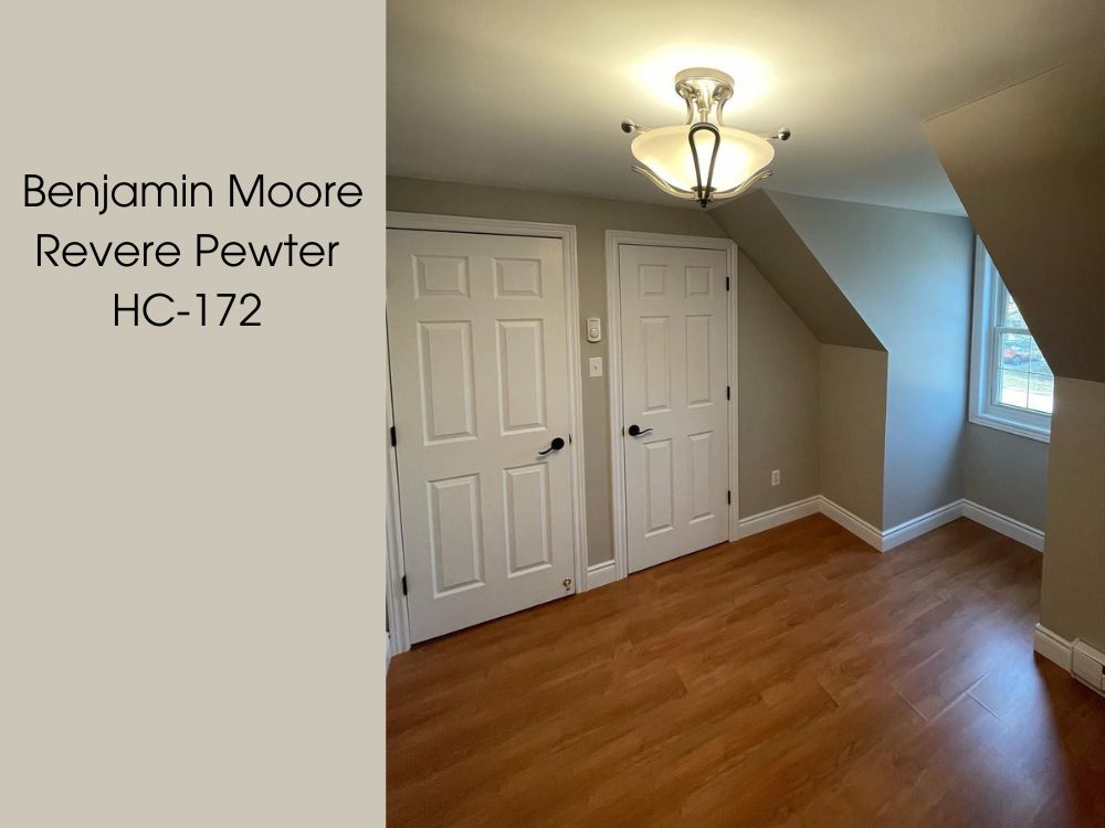
By simply looking at the images above, one could easily spot the difference between both colors with the bare eyes. Repose Gray appears to be somewhat lighter and brighter than Revere Pewter.
Repose Gray and Revere Pewter are known for the subtle and refined tones that they emit in any space, while these two unique hues are neutral colors and may seem alike, however upon close and thorough examination you can spot varying differences in undertones, emotional effect and more.
However, we can easily summarize to say in simple terms that one color is way brighter than the other with Revere Pewter being the darker shade of the two.
Emotional Effects: Repose Gray Vs Revere Pewter
You’d agree with me that colors have a way of affecting your feelings and moods. Take this from someone who loves cool and dark spaces.
Repose Gray brings a feeling of energy, excitement and light into your space but still retains a soothing feeling. Repose Gray appears somewhat brighter compared to Revere Pewter, a light shade of gray and warmth emanates from repose gray thus giving it a pristine appeal. The luminosity of repose gray can make a room look airy and more spacious.
On the other hand, Revere Pewter gives off a more earthy feel and presence thanks to its unique undertones, this slightly darker shade of gray emanates comfort and a sense of warmth bringing about calmness in any space. Revere Pewter brings with it a homely, calm and snuggling feeling – the kind that makes you in touch with your world. Also, with the right amount of light, it can put you in an excited and energetic mood.
When to Choose Repose Gray Vs Revere Pewter
Let’s know what to consider when deciding to go for any of these beautiful paint colors. Here are factors to put in place.
You should go for Repose Gray:
- When you need a color that will bring in a considerable amount of light to your space and complements dark finishes.
- If you love greige with a brown taupe to it and subtle undertones that adjust to any lighting.
You should go for Revere Pewter:
- If you need a color that works well with other colors and blends pretty well in any space.
- If you love an earthy, desaturated, mellow & dulled-down atmosphere.
- If you are considering creating a space that is cool and doesn’t reflect a lot of light. Putting into consideration that Revere Pewter doesn’t reflect lots of light due to its LRV.
Detailed Comparison Of Repose Gray Vs Revere Pewter
The table below highlights the individual properties and key features of these paint colors. Knowing and understanding their unique differences brings you to a state of clarity of going for the color that suits you. You’d want to check this out.
| Repose Gray SW 7015 | Revere Pewter HC-172 | |
| RGB | 204 200 191 | 204 196 184 |
| LRV | 58.13 | 55.98 |
| Undertones | Blue and Violet | Green |
| Hex Value | #CCC8BF | #CCC4B8 |
Repose Gray Vs Revere Pewter: Their LRVs
Light Reflectance Value (LRV), measures the percentage of light a paint color reflects. It’s a number that shows how light or dark a paint color looks on a scale of 0 (black) to 100 (white). The LRVs of both paints aren’t far apart in differences.
The LRV of Repose Gray is 58.13. This means that Repose Gray reflects more light – meaning that it is a light gray paint color that will reflect light in certain situations.
The LRV of Revere Pewter is 55.98. On the flip side, Revere Pewter LRV isn’t low and it isn’t high either but it is in between light and light-medium spectrum as it doesn’t have much weight to it.
So, if a warm and brighter space is your preferred choice, Repose Gray is your go-to paint color. And if you need a room or space that is bright but still has that cool tone to it, Revere Pewter is your guy.
Repose Gray Vs Revere Pewter: Their Undertones
Let’s talk about the undertones of these paint colors.
The undertones of Repose Gray lean towards the Blue and Violet (Purple) side. It is a complex color that often exhibits the characteristics of a chameleon – it can have a green undertone or a blue undertone depending on the lighting in the room.
On the other hand Revere Pewter has a warm green undertone that gives off an earthy feel to any room or surface it is painted on. Despite their undertones, these paint colors are still capable of adding brightness, warmth, and depth to your space respectively.
Finding the Undertones of Repose Gray
Below is the image of a mini living room painted in Repose Gray
The blue and purple (Violet) undertones of Repose Gray are seen to be more evident around the bright areas that have adequate light. The presence or absence of light can enhance the exposure of any gray paint color.
Below is yet another example of Repose gray in a brighter situation.
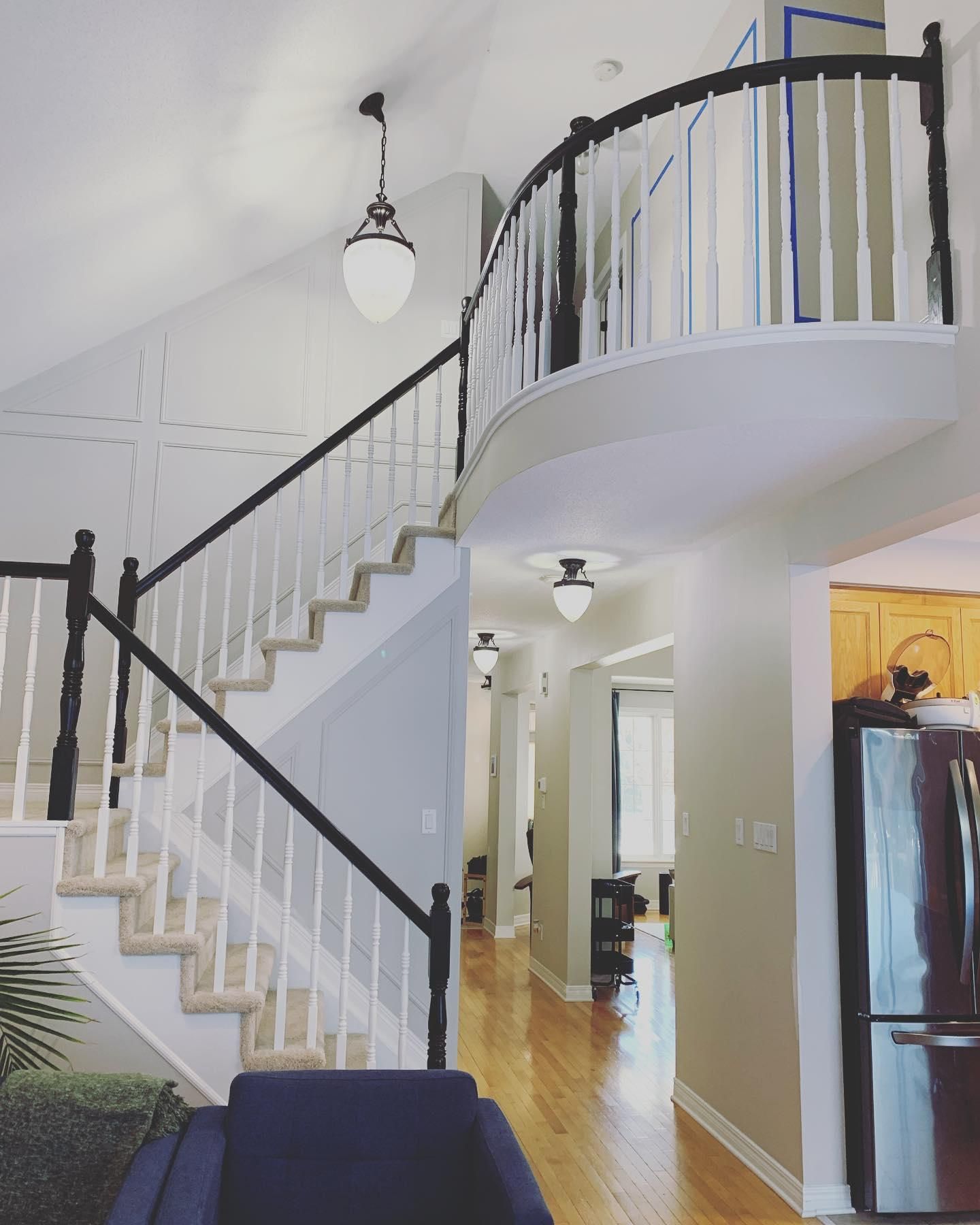
The walls above are all painted in Repose Gray, you can see that this color too has a bit of green undertones, however the purple and blue are quite obvious in the wall along the stairs.
Finding the Undertones of Revere Pewter
The image below shows a living room wall painted in Revere Pewter.
The green undertone can be seen on the walls of this room as a result of the poor lighting. As with Repose Gray and any other paint color, the presence or absence of light enhances the undertones of the paint color.
The entire walls in the image below is painted in Revere Pewter, the green undertone is more prominent here.
Repose Gray Vs Revere Pewter: Which Has More Green Undertones?
Looking at both paint colors, it’s not difficult to tell that Revere Pewter has more green undertone.
The trick in getting the green undertone from Revere Pewter is to use it in a space with low lighting, and pairing it with a bright paint color or probably a color that has green undertones.
Repose Gray Vs Revere Pewter – Are they Warm or Cool Paints?
For a while, the debate has gone on as to which gray color is warm and which is cool. It is important to know which of the colors is cool or warm to make a well informed choice for your desired feel.
Warm colors are known to bring energy, positivity and a sense of sunshine into any space. Cool colors on the other hand evoke relaxation and calmness.
Repose Gray is a warm paint color. However, it tilts towards a cool paint color than other gray paint colors because of its blue and violet undertone. On the other hand Revere Pewter is a warm paint color, thanks to its green undertones.
Repose Gray Vs Revere Pewter: Their Complimentary Colors
When it comes to creating a perfect space or home, choosing the right coordinating colors can transform your home to a whole new level.
So, What colors bring out the best in Repose Gray and Revere Pewter?
Repose Gray Complementary Color
Repose Gray is warmer in its undertones when beautifully complemented with:
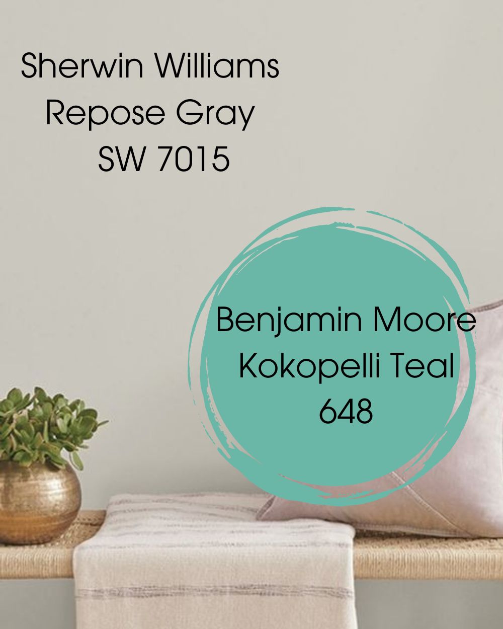
- BM Kokopelli Teal 648: This is an amazingly outstanding shade of teal from Benjamin Moore that brings out repose gray perfectly well. Koopelli Teal brings back memories of Native American culture and the color is closely alike to that of the iconic Turquoise jewelry of the Southern United States. When compared closely, Kojopelli Teal does bring out the color in Repose Gray.
Revere Pewter Complementary Color
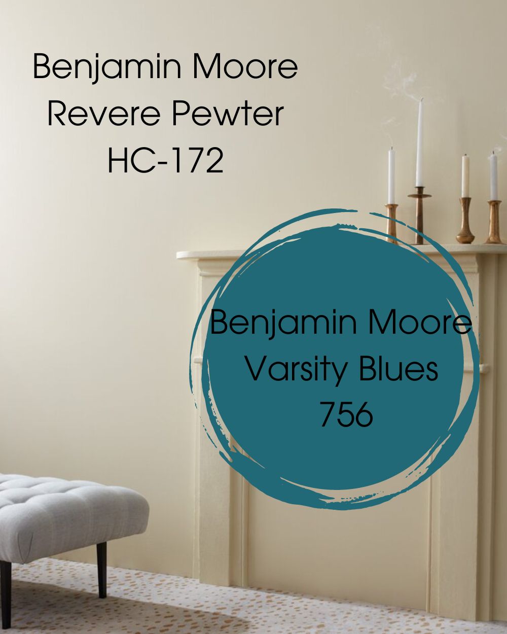
Revere Pewter is a paint color that sits in the greige category of paint colors and straddles between gray and beige. The complementary color that sits on the opposite side of Revere Pewter is Varsity Blues, other shades might exist but this surely does bring out the hidden undertones in Revere Pewter.
- BM Varsity Blues 756: This amazing shade of dark teal from Benjamin Moore evokes nostalgic memories from school day competitions. When paired with Revere Pewter it immediately brings out the green undertones and the true beauty of the Benjamin Moore Revere Pewter.
SW Repose Gray Vs BM Revere Pewter Color Palettes
The versatile nature of these colors makes it possible to adapt to different colors with each blend giving off the right mood.
Color Palette For SW Repose Gray
Putting into consideration the different undertones of Repose Gray should be your top priority when choosing an ideal color palette. The colors that match up with Repose Gray are;
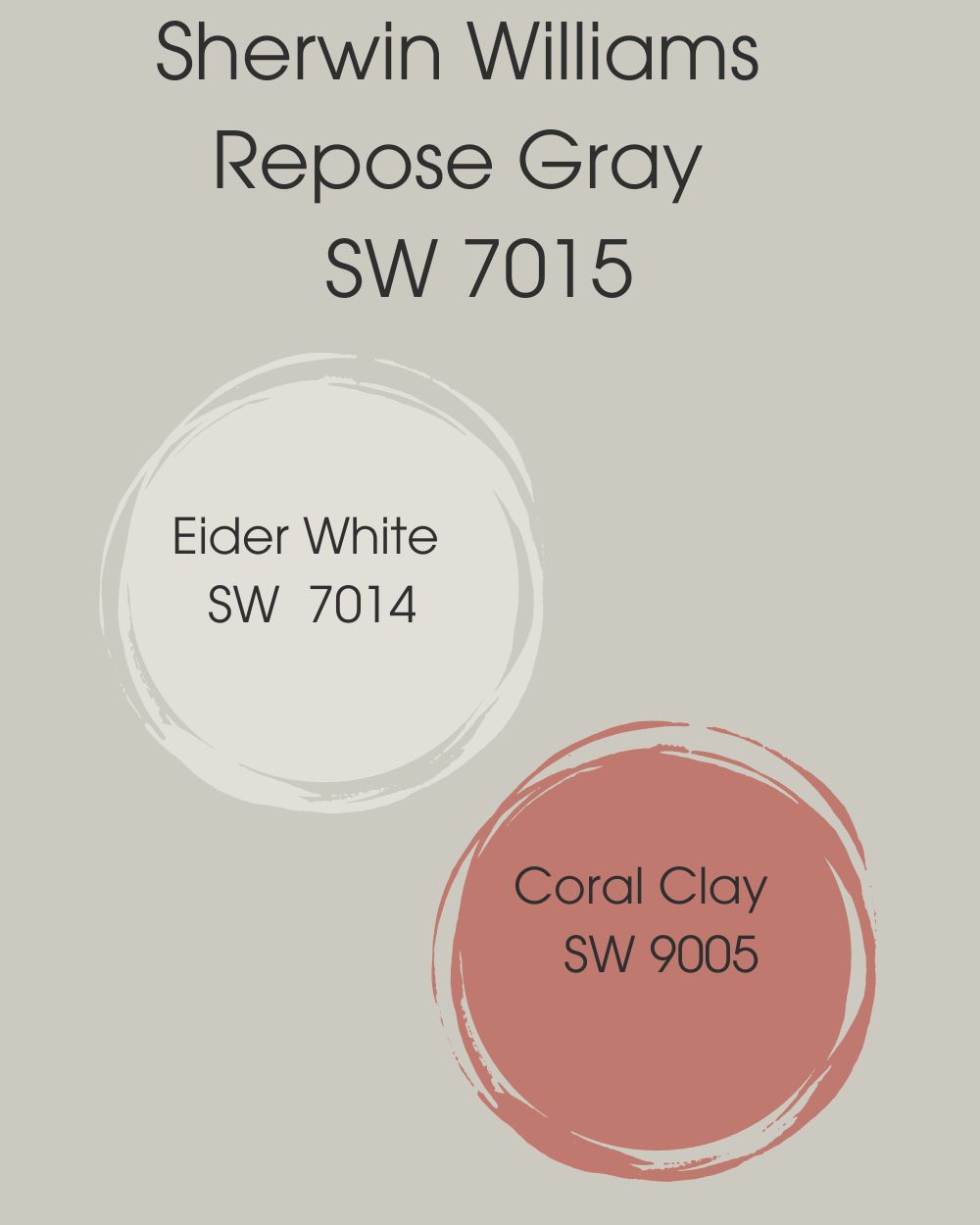
- Sherwin Williams Eider White (SW 7014): A cool white paint color with gray undertones that brings a warm and bright contrast to Repose Gray.
- Sherwin Williams Coral Clay (SW 9005):A deep but gentle rich red paint color that acts as a soft glowing backdrop when meshed with Repose Gray.
Color Palette For BM Revere Pewter
The Revere Pewter paint color blends well with a lot of colors, but let’s stick with these two – Chelsea Gray HC-168 and Fog Mist OC-31. These colors compliment Revere Pewter and give a modern vibe to any space.
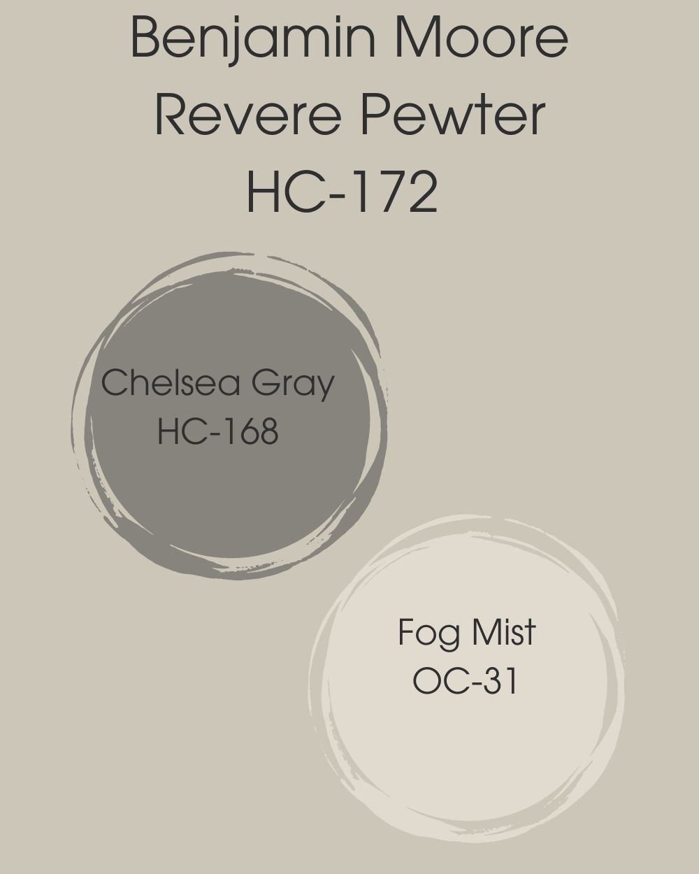
- Chelsea Gray HC-168: This gray paint color compliments Revere Pewter and is known to be seasoned and sophisticated. It’s a paint that “feels crisp and has a slightly metallic touch.”
- Fog Mist OC-31: An Off-White Colour collection that is known to be a sophisticated and versatile paint color that offers subtle nuances of whites that suit tranquil environments.
SW Repose Gray Vs BM Revere Pewter on Cabinets
Have you got cabinets to paint? Both Repose Gray and Revere Pewter can come in handy adding class and finesse to your kitchen or bathroom cabinets. They appear much better when merged with other colors.
Let’s take a closer look at both colors on Cabinets.
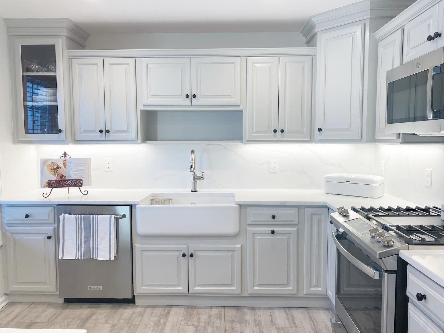
Repose Gray on Cabinets
Repose Gray on cabinets creates a sophisticated, excellent and elegant feeling to your space. It leaves your space looking bright and radiant. If you need your space to have that royal and exotic feeling, this is your buddy.
Here’s a kitchen area with all cabinets painted in Repose Gray.
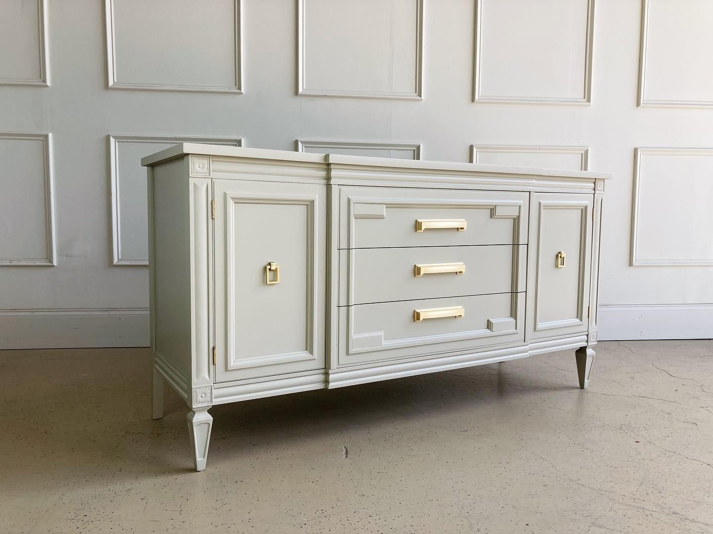
Revere Pewter on Cabinets
Going with the idea to paint your kitchen cabinets with this paint color is one of the best decisions you will make to upgrade the look of your kitchen. A rich paint color will give your kitchen an updated, modern look without having to spend lots of money.
Below is a stand alone cabinet drenched in Revere Pewter with gold knobs, it looks elegant, earthy and classy.
So, if you’re looking to bring an elegant and classy feel to your kitchen, Repose Gray is your guy. If you’re looking for a modern look but affordable, Revere Pewter will be a good choice.
The bottom line is to go for what matches your space’s vibe.
Repose Gray Vs Revere Pewter on Exterior Walls
Another fantastic place to consider using Repose Gray and Revere Pewter is on your home’s exterior. Let’s get right to it.
Repose Gray On Exteriors
Repose Gray appears differently depending on its surroundings and depending on the amount of light. If you need the vibe or energy of a modern farmhouse, a contemporary style or even a traditional look, this is your go-to.
Below is a first hand image showing what Repose Gray looks like on the exterior of this modern home. The black trims are just perfect.
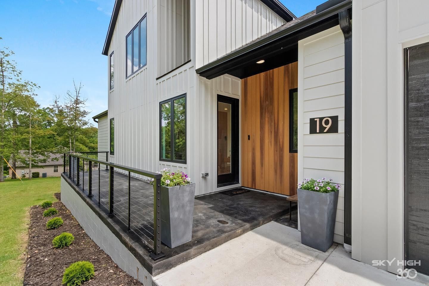
As you can see, Repose Gray makes the exterior appear bright especially on sunny days.
Revere Pewter on Exteriors
The exterior of a home receives all the natural light. So when you use Revere Pewter for your exterior, it comes off much lighter than when used on the inside of the home.
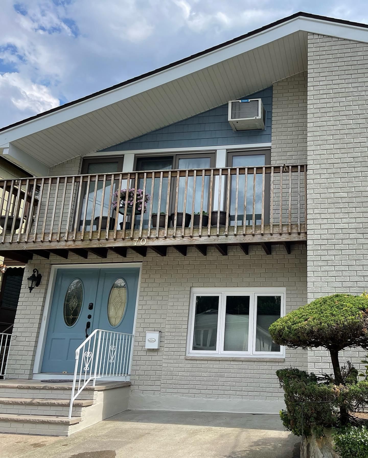
However, the difference between Revere Pewter and Repose Gray on Exteriors is still obvious, this color appears to be greeny while Repose Gray obviously seems lighter and brighter.
Repose Gray Vs Revere Pewter on Interiors
Heading inside the home, let’s take a quick peek at how these two colors turn out on interior walls. Shall we?
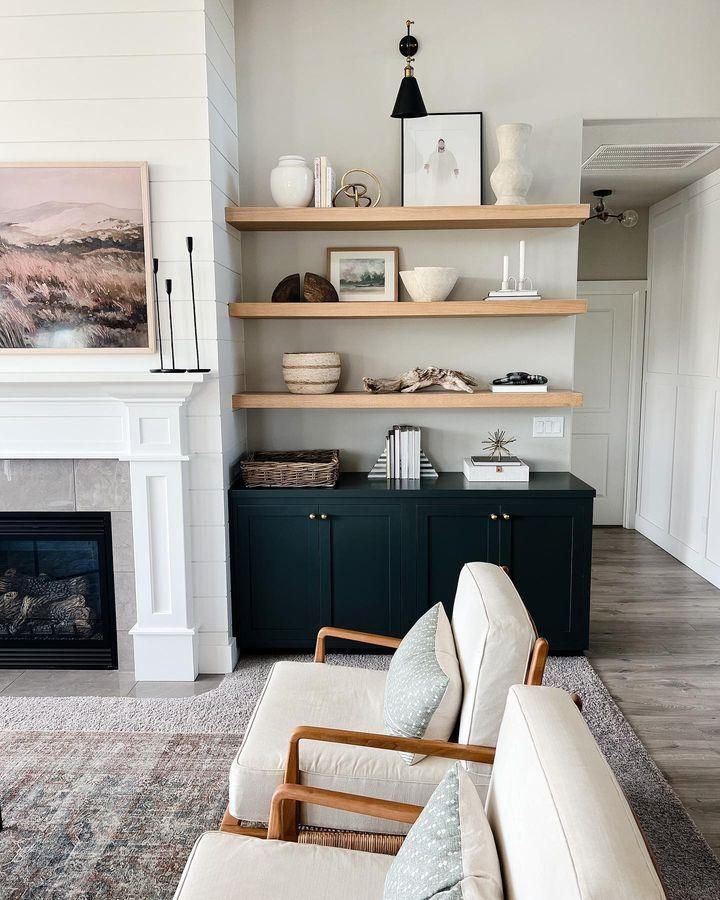
Repose Gray on Interior Walls
Not too light or too dark, Repose Gray is a warm paint color to use on your interior walls. However, it’s not a completely warm color because of its blue and violet undertone.
Here’s a living room area with the walls painted in Repose Gray showing a perfect blend alongside a dark green cabinet and wood trims.
Love what you see? Let’s see how well Revere Pewter performs inside the house.
Revere Pewter on Interior Walls
Revere Pewter is a neutral greige paint color that works perfectly well on interior walls. And it’s been called the “perfect whole house color” because of its uniqueness. Take a look at Revere Pewter on the interior.
Here’s an image of a two-toned wall where the upper part is painted in Revere Pewter and the lower part in white.
Repose Gray Vs Revere Pewter on Doors
Are you wondering how Repose Gray and Revere Pewter will turn when painted on doors? Let’s check out some examples below and see how well they differ.
Repose Gray On Doors
See how elegant Repose Gray makes the door and the entire space turn out. But it must be used on doors depending on the paint colors used on the walls and trims to compliment it. You will have to go with a complimentary color to get the best from Repose Gray on your door.
Here’s a perfect example of Repose Gray on a door, this homeowner uses white on the walls to compliment the gray door and it works perfectly well.
Revere Pewter On Doors
Revere Pewter on the door creates a feeling that brings warmth and a strong feeling to the space. It also creates a feeling of acceptance and luxury which you can’t ignore.
You could easily count this door painted in Revere Pewter as “light green” if you aren’t careful enough.
In the image below, the owner uses Revere Pewter on the doors and merges it with a wall paint that looks very close to Repose Gray.
Today, in the world of interior design, understanding the difference between various paint shades can greatly impact the ambiance of any space.
When it comes to Repose Gray by Sherwin Williams and Revere Pewter by Benjamin Moore, Both paints are well known choices in the world of gray tones and both can have a unique influence on the overall aesthetic of any space.
Whether bathed in natural sunlight or illuminated by artificial lighting, Repose Gray remains steadfast in its ability to create a bright, calming and happy atmosphere.
On the other hand, Revere Pewter possesses warm and earthy undertones that infuse a cozy and inviting feel into a space making it a popular choice for those seeking a classic and refined aesthetic.
Whether you prefer a modern and serene atmosphere or a timeless and sophisticated feel, understanding the unique qualities of these shades will guide you in selecting the perfect color to transform your living space to what you want it to be.
Conclusion
There is no right or wrong choice of paint color when it has to do with decorating your home. You only have to go with what suits you personally, the furniture, and the aesthetic. But ensure that you test out the colors in your space to see how different light intensity affects it before you make your final decision.
There’s no harm in experimenting with different paint colors in different areas of your home until you find the one that matches your choice. Don’t stop exploring until you get that perfect feel for your home. Thanks for stopping by, if you have any questions you can ask us in the comments section and we will respond promptly.
 Accessible Beige Vs Agreeable Gray: Which is Good?
 Greek Villa vs Alabaster: How to Choose
 Sherwin Williams Tricorn Black vs Iron Ore: How to Choose?
 Sherwin Williams Rainwashed vs Sea Salt: How to Choose?
 SW Dover White vs BM White Dove: Let’s Compare
 Benjamin Moore Pale Oak Vs Edgecomb Gray: How to Choose?
