
Choosing between two gray colors is much like choosing between two blue denims. The matter becomes even more complicated when the two grays are both warm colors. If you find yourself in this predicament, worry no more because we’ve done the work for you.
In this article, you are about to learn everything you need to know about Revere Pewter from Benjamin Moore, and Agreeable Gray from Sherwin Williams. Now, let’s take this comparison one step at a time by beginning with what is meant when paint is referred to as warm.
Generally, warm colors are yellow, orange, and red. When a gray paint color has any of these colors as undertones, the gray paint is said to be a warm gray.
So how then do you know which of these gray paint colors to use for your home? Well, It depends on what you want to achieve in a particular space as many factors come into play like undertones, shades, matching colors, complimentary colors, and how you want the different elements in a room to interact with each other.
Table of Contents
A Visual Comparison Of Revere Pewter vs Agreeable Gray
While both colors belong to the family of “gray”, you could still easily spot the differences by simply looking at both paint colors in a real-time scenario.
The images below show both paint colors in different settings, with the bare eye, you could easily spot the difference between both colors.
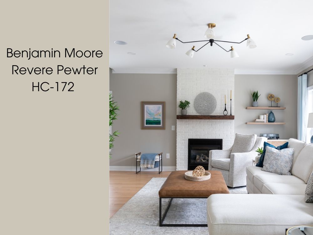
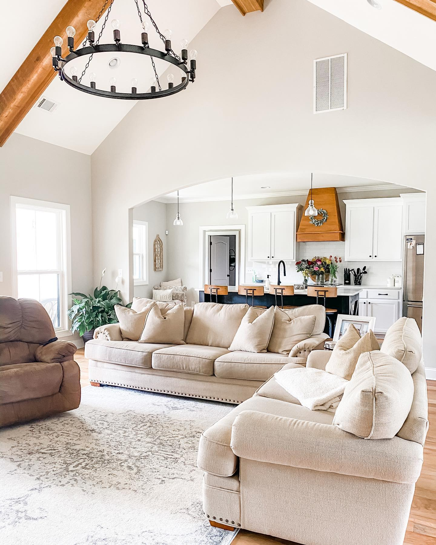
Below is a living room area where the wall has been painted with Revere Pewter.
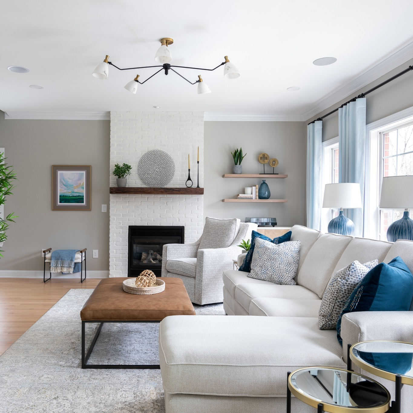
And below is Agreeable gray used on the walls of this modern kitchen.
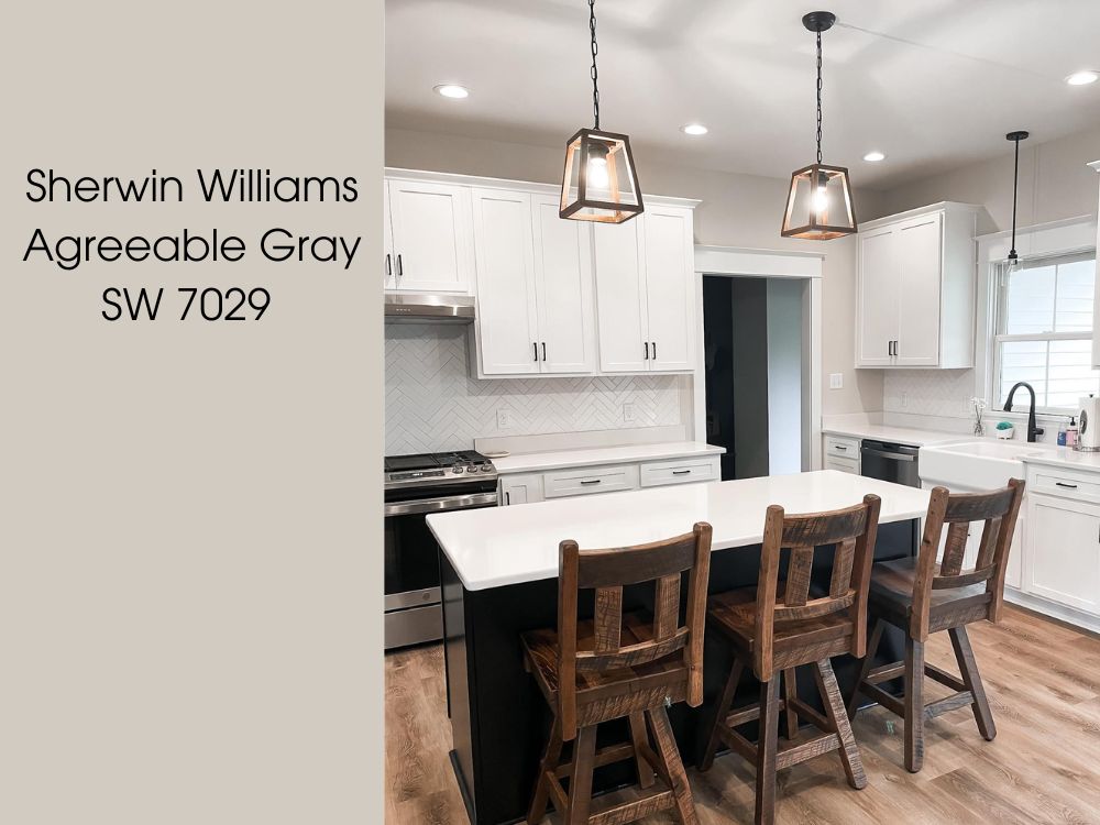
At first glance you could spot the differences already, notice that Revere Pewter has green undertones present making it slightly darker even with light introduced, Agreeable Gray on the other hand appears to be brighter with the purple and beige undertones visible.
While the differences might be easily spotted in bright light conditions, it might not be the case when there’s minimal light in the room, of course they both remain grays and might almost appear as the same color in low light situations.
Let’s dive in further and explore other traits about these colors that make them differ, at the end you would be able to choose which color is best for you and where to use it.
In the photos above notice that Revere Pewter is a darker gray than Agreeable Gray. Both pictures are spaces from parts of the home that get plenty of natural light, yet you can clearly see that Revere Pewter has a darker hue.
Emotional Effects: Revere Pewter And Agreeable Gray
Fun Fact: Did you know colors have effects on our moods as humans?
Well, Revere Pewter and Agreeable Gray both have their emotional effects, just like any color out there. The colors you match up with Revere Pewter And Agreeable Gray will also play a vital role in emotions you’d feel.
The sheer brilliance of Revere Pewter, with its luminous gray hue, imparts an overwhelming sense of joy, invigoration, and rejuvenation whenever you step foot into your cherished domain. This vibrant shade of gray exudes an aura of happiness, electrifying the atmosphere and infusing it with a surge of positive energy.
Agreeable Gray, in stark contrast to its counterpart Revere Pewter, evokes a profound emotional experience, immersing individuals in a soothing and grounded ambiance. This remarkable hue emanates a serene and earthy essence, instilling a profound sense of tranquility and harmony within its surroundings.
Where To Use Revere Pewter Gray And Agreeable Gray
If you’ve ever wondered why fast food restaurants often have the color yellow on their walls, it is because yellow makes you just want to eat.
For this reason, you want to know how Revere Pewter and Agreeable Gray affect emotions or mood.
Use Revere Pewter if
- You want a slightly green undertone.
- You want a shade of gray that is a bit bright.
- You want to liven up your space without using pure white.
Use Agreeable Gray if
- You want warmer gray with a purple undertone.
- You want a gray color with a beige undertone.
- You prefer a darker shade of gray.
Detailed Comparing Revere Pewter And Agreeable Gray
We are peeling the layers on these two paints now. Picking a color for your home is serious business. The more you know about these two paint colors, the better your judgment. It’s time to consider the factors that make a paint color suitable for a wall or a specific area of the home. Factors like LRV and undertone.
Take a good look at the chart below and spot detailed differences between both colors;
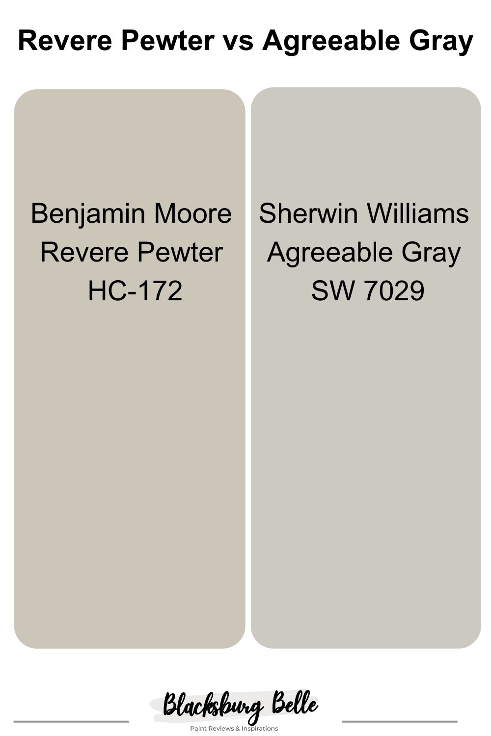
| Revere Pewter | Agreeable Gray | |
| RGB | 204 196 184 | 209 202 192 |
| Hex Value | #CCC4B8 | #D1CAC0 |
| LRV | 55.98% | 59.82% |
| Undertone | Green | Beige, Purple |
Revere Pewter Vs Agreeable Gray: Their LRVs
Ever heard of the word LRV? Well, it simply means Light Reflectance Value. Every paint either spends most of its time absorbing light or giving it off. The amount of light a paint gives off is measured from 0 to 100, and it is how we are able to appreciate the beauty of the paint.
Revere Pewter has an LRV of 55.98%: This makes it a little darker because it absorbs less light. The effect of this is that it leaves your room cozy, best for a bedroom. Usually, you would be careful to choose a paint with this LRV value for parts of the home where the amount of natural light coming in is low. Conversely, if you are one who loves to have a suffused atmosphere in your home then this is the gray paint for you.
Agreeable Gray has an LRV of 59.82%: This gray paint absorbs more light due to the high LRV This paint will collect more light and spread it around any space you use it in. You’ll find this paint being the best companion in hallways and stairways where the natural light coming in, is less abundant.
Revere Pewter Vs Agreeable Gray: Their Undertones
Undertones is what happens when more than one paint color is blended together. For example a blue paint can have a turquoise undertone if the blue paint has been blended with green paint.
The dominant paint color is the one that is obvious to the eyes upon first glance. In the case of these two paints, gray is the dominant color or mass tone. The tone that is less obvious is the undertone. For Revere Pewter and Agreeable Gray, the mass tone is gray and the undertone is as shown below.
Revere Pewter has a strong green undertone with a slight touch of violet. Revere Pewter is generally a neutral paint which means its undertones don’t show up to the eyes until the paint is placed near another gray with a different undertone.
On the other hand;
Agreeable Gray has beige, purple, and some may argue “green” undertones. The purple undertones might not be so evident until you see it in good natural light and when placed near other similar colors or some brighter paints.
Finding The Undertones Of Revere Pewter
Below is a kitchen with the cabinets painted in Revere Pewter, here we can easily spot the undertones.
The green undertone of Revere Pewter seems more evident around the dark areas. The abundance or less abundance of light — can enhance the appearance of any gray paint color causing you to see or not see undertones. The top of the cabinet on the far right shows that Revere Pewter can appear to have a pink undertone if the amount of light on it is significantly high.
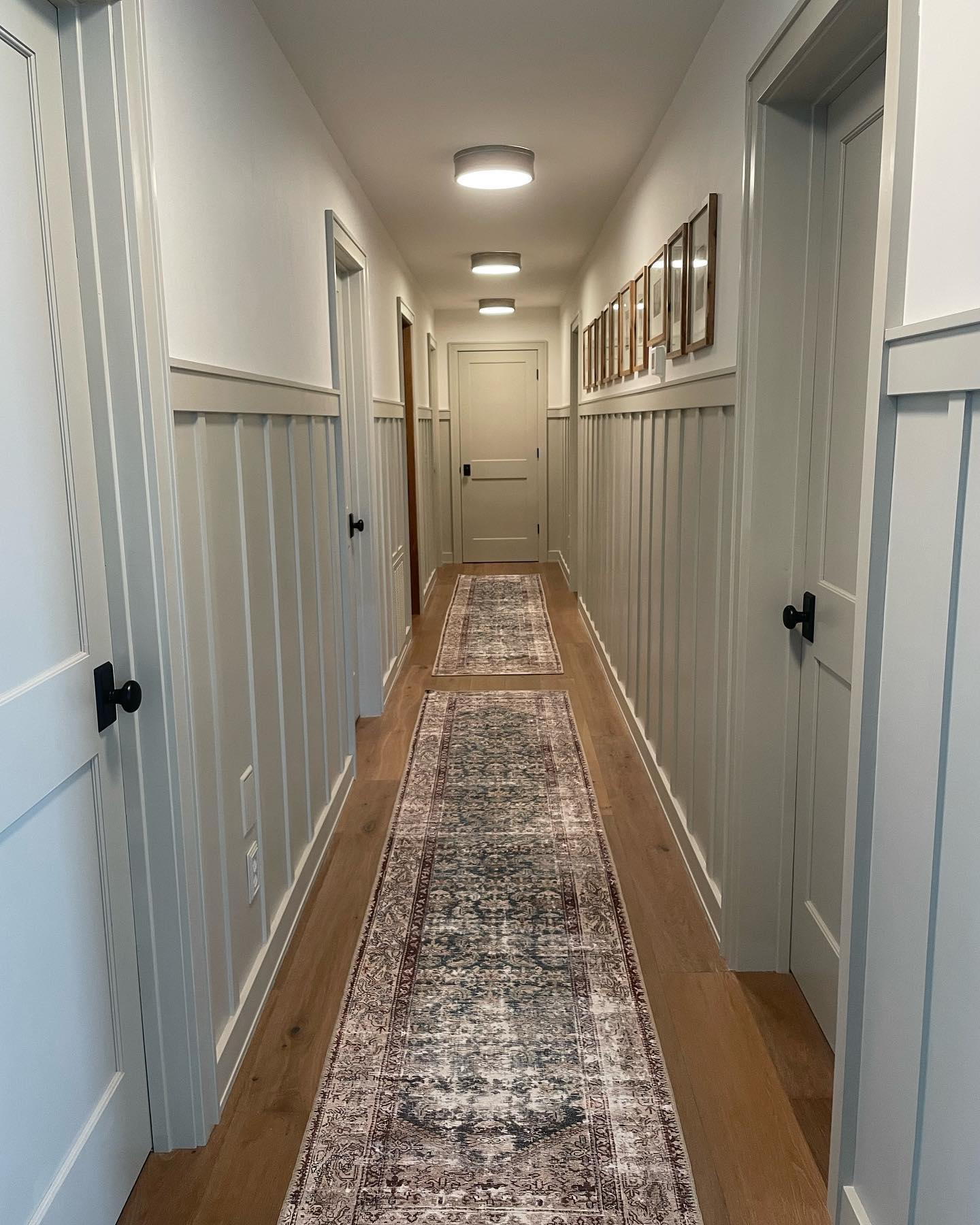
Finding The Undertones Of Agreeable Gray
The image below shows a corridor painted in Agreeable gray.
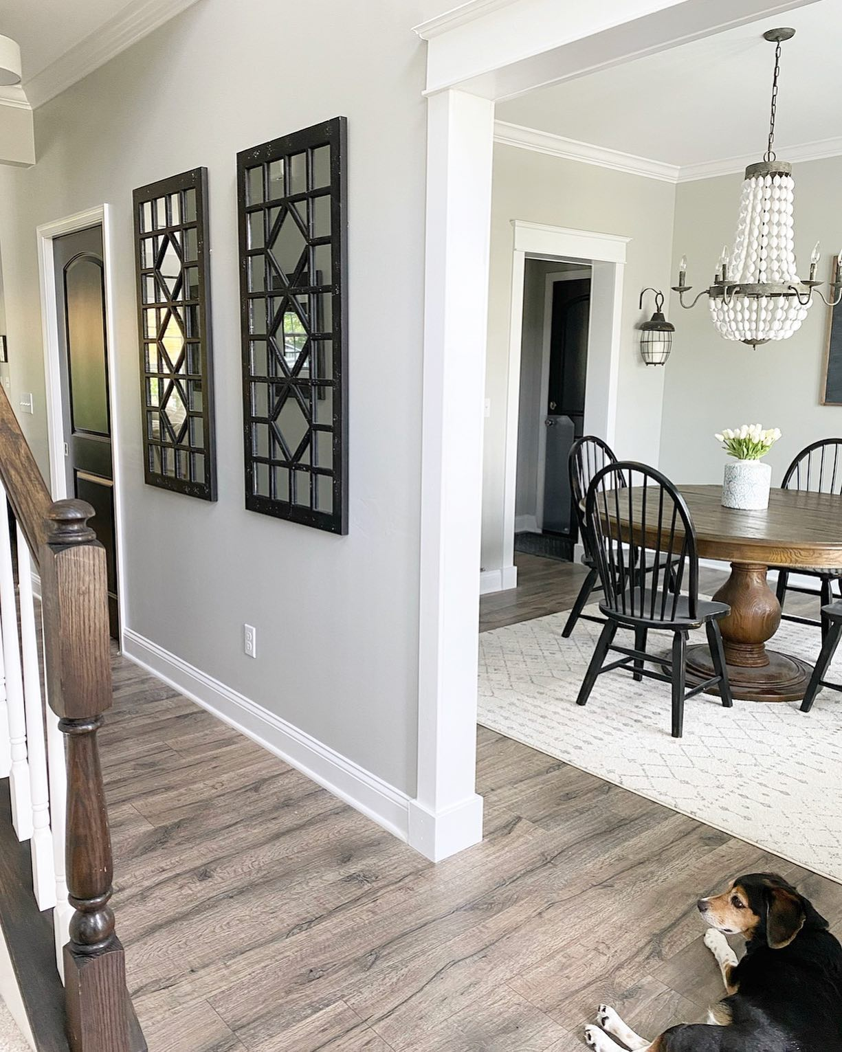
Immediately one can spot all the purple, beige and even green undertones. Also you can see how the rest of the other colors in the area enhances or adds to the appeal of the gray paint on the wall.
Revere Pewter Vs Agreeable Gray: Which Has More Green Undertones?
It’s not hard to see that Revere Pewter from Benjamin Moore shows more green undertone, overall. The trick in bringing out the green undertone, if that’s what you want, is lining up another paint color with a green undertone with Revere Pewter.
You can also achieve this with things as simple as your curtains. A light green curtain will surely bring out the best in Revere Pewter.
Revere Pewter Vs Agreeable Gray: Are They Warm or Cool Paints?
In the realm of paint colors, the debate between Repose Gray and Revere Pewter arises, particularly when it comes to determining their temperature characteristics. It is essential to discern whether these shades lean towards warmth or coolness to make an informed choice for your desired aesthetic.
You’ve heard of paints being warm or cool and have probably wondered what that has to do with anything.
Well, you probably don’t want your room giving off the feeling of a boring parlor. Revere Pewter is a warm gray color. In a room or space with plenty of natural light, the Revere Pewter paint color will give a warm, welcoming impression.
Agreeable Gray on the other hand is also warm but has a negligible amount of green undertones when compared with Revere Pewter. For this reason this gray paint can have the same effect as Revere Pewter but become quite muddy where the light is dimmer.
Revere Pewter Vs Agreeable Gray: Complimentary Colors
The rules when it comes to complimentary colors for these two paint colors are not set in stone or hard and fast. Of course, you don’t want to be haphazard about your choice. Below I am going to show you some complimentary colors of Revere Pewter by Benjamin Moore and Agreeable Gray by Sherwin Williams.
Revere Pewter Complementary Color
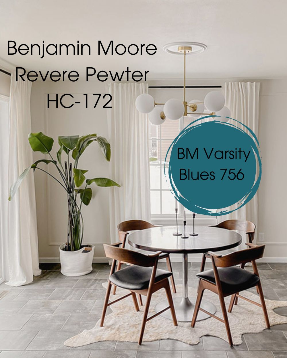
Revere Pewter is under the greige classification and sits halfway between gray and beige. Varsity Blues is the color that sits opposite Revere Pewter in the color wheel. Other shades may exist, but this one definitely brings out the undertones in Revere Pewter.
- BM Varsity Blues 756: This amazing shade of dark teal from Benjamin Moore evokes nostalgic memories from school day competitions. When paired with Revere Pewter it immediately brings out the green undertones and the true beauty of the Benjamin Moore Revere Pewter.
Agreeable Gray Complementary Color
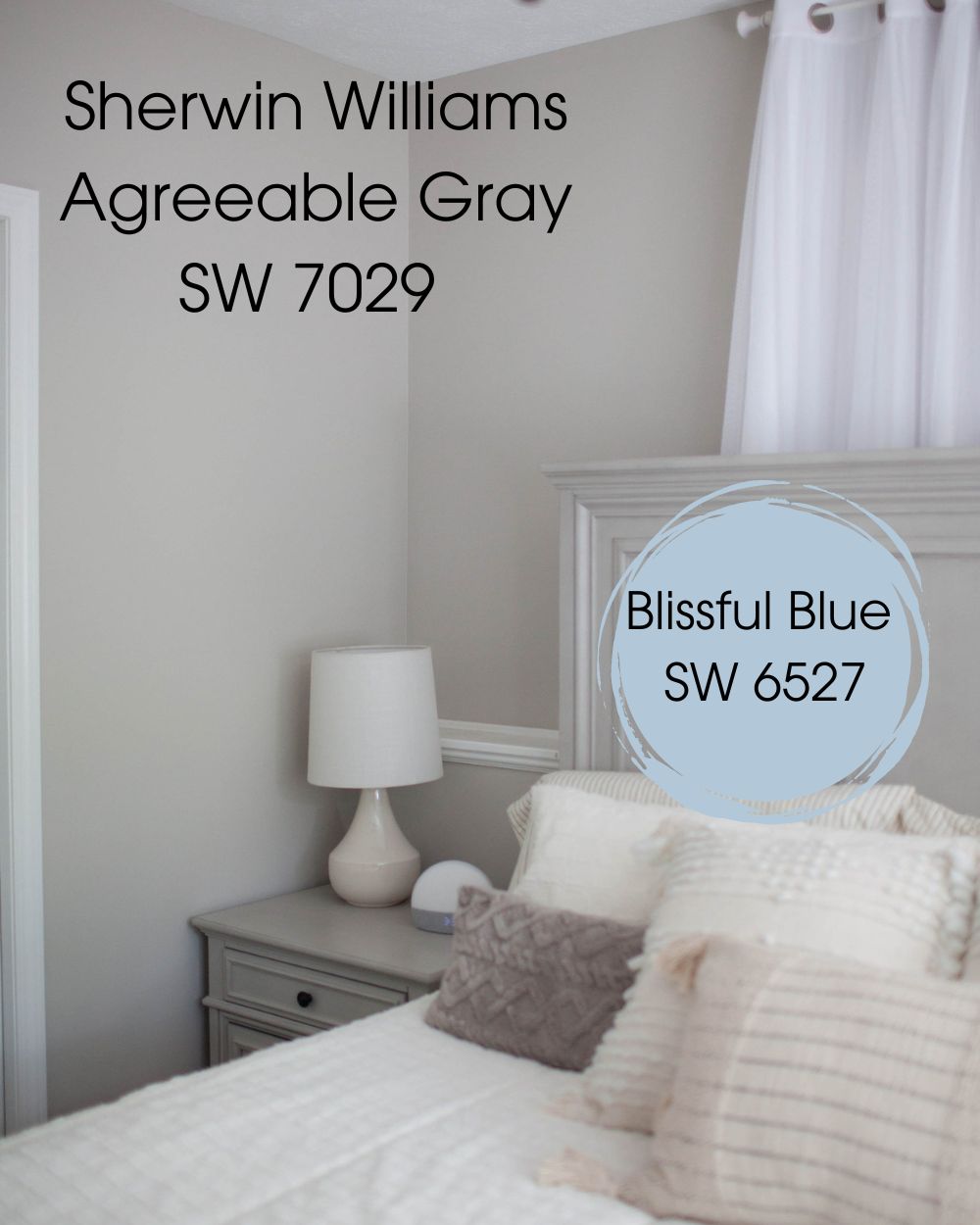
Since it is a neutral gray, agreeable gray goes well with a wide variety of colors, including rich and bold colors. Here is the perfect complementary hue for Agreeable Gray, notwithstanding the fact that it complements practically any other color nicely.
- Blissful Blue SW 6527: This is a unique shade of blue from the Sherwin-Williams collection that is known to create an abiding calm.
BM Revere Pewter Vs SW Agreeable Gray Color Palettes
The color palette of Revere Pewter and Agreeable Gray showcases a harmonious blend of timeless elegance and modern neutrality. The versatile nature of these colors makes it possible to adapt to different colors with each blend giving off the right mood.
Color Palette For BM Revere Pewter
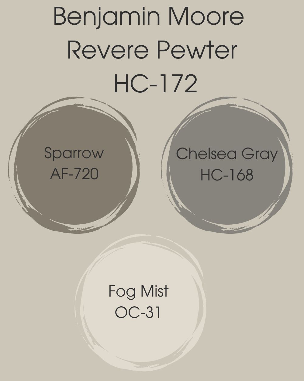
Revere pewter goes well with a lot of colors, but let’s stay on the neutral ground and go with Sparrow, Chelsea Gray, and Fog mist. These colors match perfectly well with Revere Pewter and give off a soothing modernized blend.
- Sparrow AF-720: This is a unique dark gray color that matches well with the rich green undertone in Revere Pewter, Sparrow has earthy brown undertones that are quite adorable.
- Chelsea Gray HC-168: Another color to try out with Revere Pewter is Chelsea Gray, a darker shade of gray with rich brownish and violet undertones. Chelsea Gray also goes well with Concord ivory and Lemon Chiffon.
- Fog Mist OC-31: Here’s a brighter color that sort of looks like white, The subtle nuances of greige tones create a harmonious blend, facilitating the seamless integration of this pale hue into diverse environments.
Color Palette For BM Agreeable Gray
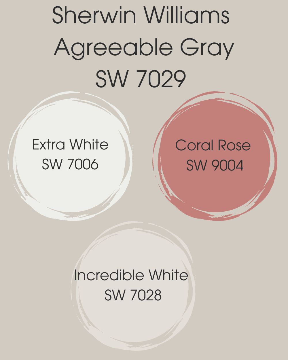
When matching Agreeable Gray with other colors, you should consider that this unique color has different undertones present, one needs to consider these undertones when choosing an ideal color palette. We found some colors that match up well; Coral rose, Extra white and Incredible White.
- Coral Rose SW 9004: This color belongs to the family of red colors, its pink and red undertones bring out the hidden undertones in Agreeable Gray. A perfect fit indeed!
- Extra White SW 7006: This color does the trick if you are looking for a clean and crisp look, you can Agreeable gray on your walls and Extra white on your trims and ceilings.
- Incredible White SW 7028: The infusion of gray undertones imparts a refreshing coolness to this luminous white shade. Alongside Agreeable Gray, you could elevate the prominence of trim and cabinetry with the embracing allure of Incredible White.
BM Revere Pewter Vs SW Agreeable Gray On Cabinets
Although images can be deceiving, looking at the paints in different scenarios would give you a feel of how it would look if you used it in your home, in this section, you will see how Revere Pewter looks on cabinets compared to Agreeable Gray.
Revere Pewter On Cabinets
On cabinets Revere Pewter appears to be bright, one could easily mistake this color for white, however, it gives off a warm and soothing atmosphere in your kitchen. If you plan on using this color for your cabinets, be sure to check out the color palette section for options that will go well with Revere Pewter.
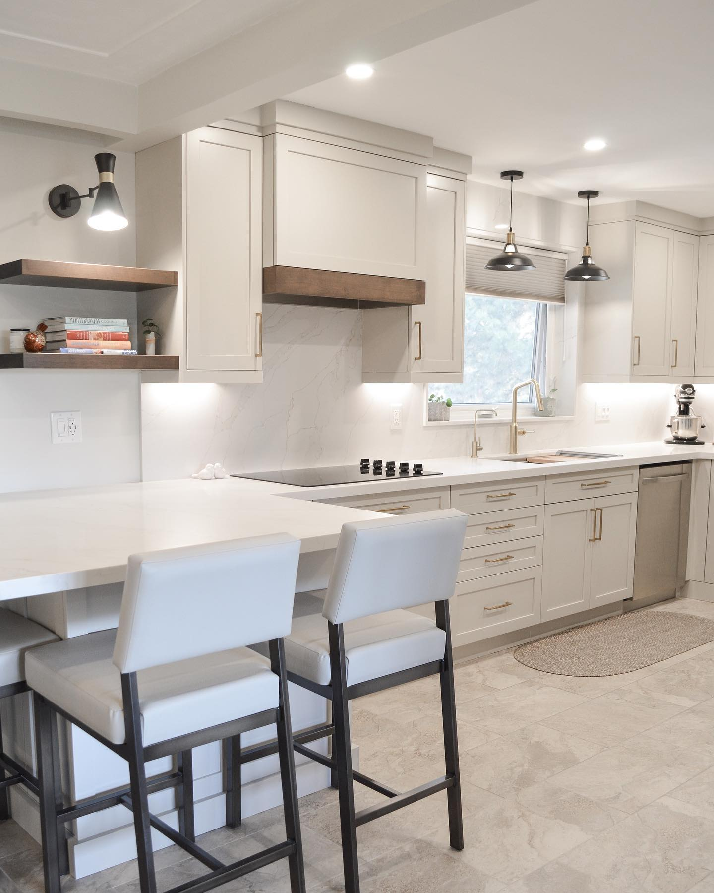
Agreeable Gray On Cabinets
Agreeable Gray on the other hand is darker in shade and sort of gives your kitchen a dim effect, this color makes your kitchen warm and dim, the perfect atmosphere for a rustic kitchen.
Revere Pewter Vs Agreeable Gray On Exterior Walls
Below are examples of exterior walls showing the two gray colors for comparison.
Revere Pewter On Exterior Wall
Note how the green undertone comes out in Revere Pewter. This wall here appears to be a north facing one, hence the suffused lighting you see which does nothing to dampen the look.
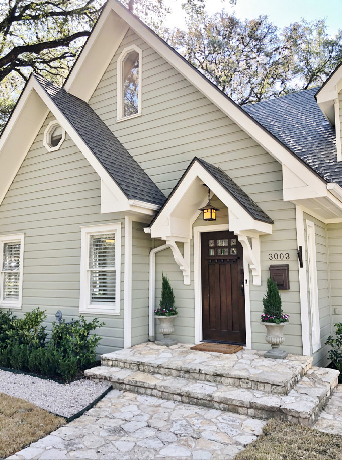
Agreeable Gray On Exterior Wall
This example here is proof that unlike Revere Pewter, Agreeable Gray can serve as an alternative color to white paint for exterior walls. As already noted, gray is a neutral paint color. Agreeable gray however shows more versatility than Revere Pewter for exterior walls.
Revere Pewter Vs Agreeable Gray On Interiors
Your interior walls are the most important part of painting your home, you can set any mood you want based on the colors you decide to use, in this case, we’ll be comparing Revere Pewter and Agreeable Gray and see how well they perform on walls in real-time situations.
Benjamin Moore Revere Pewter On Interior Walls
The true beauty of Revere Pewter is in its ability to blend with a wide range of colors, being that it is a brighter shade of gray, many individuals see this color as the perfect substitution for pure white. This cool and lively gray color breathes life into any modern decor, giving an exceptional atmosphere to any space.
Sherwin Williams Agreeable Gray On Walls
The color Agreeable Gray from Sherwin Williams is well known for its versatility and calming presence, and can appear slightly darker when used in interior spaces. To make the most of this beautiful dark-shade of gray, it’s important to choose the right colors that will complement and enhance its characteristics.
Revere Pewter Vs Agreeable Gray On Doors
In the following images, Revere Pewter and Agreeable Gray are used on doors with or without trims. Pay attention to how the colors compliment each other.
Benjamin Moore Revere Pewter On Doors
See how nicely the Revere Pewter looks on the door. It exudes a solid feeling of presence, which is what makes a door special in the home. This color gives importance and significance to something you would ordinarily ignore.
Agreeable Gray On Doors
See how Agreeable Gray makes this door standout here even though it is alone in that corner of the house. Note also how the trim makes what should be an ordinary feature of the home become prominent.
Up until now, we have been examining and comparing Revere Pewter from Benjamin Moore and Sherwin Williams Agreeable Gray, and we have seen how they both work on walls and spaces.
Revere Pewter and Agreeable Gray present distinct characteristics that cater to different design preferences in your home. While Revere Pewter offers classic and refined elegance, Agreeable Gray provides you with a cozy and versatile charm.
By understanding their differences, you as a homeowner can make an informed choice that aligns with your vision for their space.
Final Words
Both paint colors are beautiful. Your choice would depend on what you want to achieve aesthetically in your home or the feelings you want to evoke in your spaces.
Revere Pewter is the kingly, solid gray for doors, cabinets, or offices while Agreeable Gray is the lighter one for a less cozy feel and more warmth and exuberance in living rooms, hallways, and exteriors.
If you have further questions feel free to contact us in the comments section below and we would respond accordingly. Thanks for stopping by!
 Sherwin Williams Alabaster Vs Pure White: How to Choose!
 Forest Green Vs Hunter Green: What are the Differences?
 Benjamin Moore Alabaster vs Sherwin Williams Alabaster: What’s the Difference?
 Repose Gray Vs Revere Pewter: How to Choose?
 Mega Greige vs Perfect Greige: How to Choose?
 Sherwin Williams Snowbound vs Pure White: Which Is Better?
