

For the modern-day homeowner, one difficult hurdle they have to overcome is choosing the right paint color for their space. Sherwin Williams Waterloo can be your perfect partner in creating the home of your dream.
There are many reasons why the Waterloo color is a winner, and all of it is related to its absolutely enchanting and mesmerizing blue hue that introduces a soothing feel to your home. In this review, we’ll highlight everything about this color, including its specifications, to help you understand how truly understand the beauty of this Waterloo paint color from Sherwin Williams.

Table of Contents
What Color Is Sherwin Williams Waterloo?
While it may be relatively unknown in the paint world, nothing takes away from the fact that Sherwin-Williams Waterloo is in a league of its own as one of the subtle and muted blues that channels the deep ocean vibes.
It’s a majestic color that we classify as a true blue due to its ability to give depth to any room, and it neither swings toward the greens nor grays. You need this dark-toned blue in your home for that versatility and calmness that it embodies.
When it adorns a space, the Waterloo is bold, energetic, electric, and aquatic. As a main or accent wall, the strong illusion this hue helps to give off comes through.
RGB Of Sherwin Williams Waterloo
Before settling for a paint color, it’s important to know the specifications and not just care about aesthetics. One of the most important components of Sherwin-Williams Waterloo is its RGB. If you think this means the primary colors, you’re not wrong!
Experiments over the years have proven that when you add an equal amount of Red, Green, and Blue to a palette, you get pure white. This means that every color got its root from these three gems, and they’re added in given measurements to get a desired color, this is also a determinant in the undertones, but we’ll check that later.
Without further ado, the RGB of Sherwin Williams Waterloo is 83, 104, 114. I’m not surprised blue has the highest ratio here; after all Sherwin Williams Waterloo is true blue!
LRV Of Sherwin Williams Waterloo
Sherwin Williams Waterloo is a dark tone, according to its LRV of 13. When you use this color in your space, it’ll reflect low light and give an illusion of a closed-up space, so our advice to anyone seeking something different is to steer clear off this color and use it as an accent wall instead if you still won’t let go.
Don’t understand what LRV means? I’ll get right on that.
LRV, short for Light Reflective Value, is a scale used to represent how much light a color can reflect in the presence of sunlight and other artificial or natural light sources; it is graded on a scale of 1-100. Hence, the higher a paint’s LRV, the more eligible to reflect light; the lower it is, the poorer it reflects.
N.B: A Low LRV is not bad; we recommend you opt for it when dealing with extra large space. When you use a color with low LRV in this space, you’ll literally feel the walls caving in.
However, because there’s no true white or black, color experts like us begin our measurement from 3 and stop at 97. This range is more decisive and easier to work with.
Is It A Warm Or Cool Color
All color belongs to two main categories- warm or cool. You’ll reckon that as soon as you walk into a space, even to a novice, the paint on the wall will feel easy or just chaotic, but in a good way.
Like all blues, Sherwin Williams Waterloo is a cool color and is an excellent choice if you want to experience the coolness of the sea in your home. Its gray, green, and blue properties all belong to the cool section of the color wheel.
Cool tones introduce a calming effect into any space, and if you use Sherwin Williams Waterloo in your home, that’s exactly what you’re getting.
What Are The Undertones
There is no denying that Sherwin Williams Waterloo is a true-blue paint color, however, even with this, it does have little peeks of green and gray undertones in it. So, you must be extra cautious, especially when trying to accessorize your space, so that you won’t get a clash of colors.
Undertones are as essential as discussing every other specification about a paint color. At the end of the day, these “background” characters largely determine which accessories you’d include in your house- failure to listen and really see your undertones will leave you with a tacky finish.
Sherwin Williams Waterloo Color Strip
On a paint color strip, you’ll find one color in variations of the same formula; they share the same undertones but always deliver varying intensities.
Want to learn a trick to determine how you can use a shade on your color strip to determine the undertone of your anchor/preferred color? Well here’s how. The last color on the strip helps you get a clear view of the undertone, what a hack.
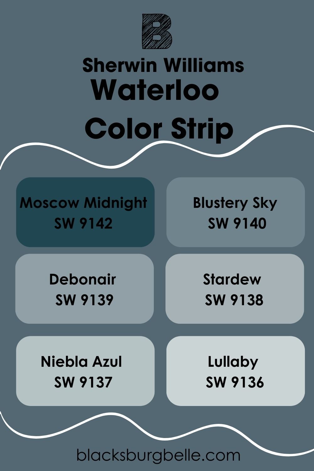
For Sherwin Williams Waterloo, the color strip is on location number 221, which means we’ll be moving from the darkest to the lightest color on that strip to discover ways to make them work together in a space and also introduce other willing tones.
Dark Color Strip
Sherwin Williams 221 dark color strip produced just one tone for us to work with. If you look at the graduation and LRV, this is the darkest you’ll find. Sometimes, the darkest color on your strip may also be your beloved anchor color, and that’s okay. So here you go.
| Color | Location Number | Tone |
| Sherwin Williams Moscow Midnight | 221-C7 |  |
Sherwin Williams Moscow Midnight
This is the only dark color on the Sherwin William Waterloo Color Strip and the location number 221. Moscow Midnight is a dark blue with green undertones, just like waterloo. The only difference is that this one has an LRV of 5; that’s 8 points away from Waterloo and basically screams more depth and thickness to it.

Moscow Midnight is an excellent choice for a large space as it completely absorbs the light and makes it feel smaller. It’s easy on the eyes and works well with black and white accessories. You can throw in some pop of rose gold or gold for warmth and sophisticated touch.
Light Color Strip
There are so many light colors to work with for the Waterloo light color strip. The beautiful arrangement of colors lets you see the increase in lightness and intensity of these tones, one LRV gradually gets higher than the next, and that’s the point of the whole arrangement.
| Color | Location Number | Tone |
| Sherwin Williams Blustery Sky | 221-C5 |  |
| Sherwin Williams Debonair | 221-C4 |  |
| Sherwin Williams Stardew | 221-C3 |  |
| Sherwin Williams Niebla Azul | 221-C2 |  |
| Sherwin Williams Lullaby | 221-C1 |  |
Sherwin Williams Blustery Sky
This is a very bold and classy choice of color, and like its name, it’s prone to change due to the surrounding effects of light. In dark spaces, the green undertones in this color make an appearance as it appears deeper. But as soon as a healthy amount of light shines on it, you get a beautiful bright blue.

Combine this color with white trims, gray accents, wooden materials, and reddish-orange accessories to add an edgy vibe to it. It has an LRV of 22, coming before Waterloo on the color strip.
Sherwin Williams Debonair
A unique cool blue with slate gray undertones oozing subtleness and tranquility in every sense. This color is charming and adds an edge to the reputation blue has as a quiet hue. It has an LRV of 34, bringing it a bit close to the medium category, but you can use this color in any space you desire and get away with it regardless.

Simply pair it with browns, off-whites, and beiges to add a pop of color, or combine it with Waterloo in your space to get a sweet monochromatic palette.
Sherwin Williams Stardew
Stardew is top on most homeowners’ lists due to its very subtle hues. This color relaxes you and is very soothing to look at in your space. It has an LRV of 43, making it the perfect medium cool blue with gray undertones that shifts it more toward the pastel category.

This color works excellently in a space with lots of natural light, making the location feel lighter and airy; it draws out the coolness. You can add a warm or yellow saturation light to draw out the warmth in it and create a balance.
Pair it with Sherwin Williams Extra White, Charming Pink, and Tony Taupe for a contrasting palette.
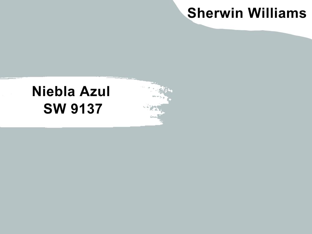
Sherwin Williams Niebla Azul
This is a very fresh blue with green undertones that lightens your space up. Pair it with white or stained wood trims for excellent projection. It has an LRV of 53, putting it in the light-medium category and making it perfect for use anywhere in your home. It’s lighter than Stardew and possesses an airy vibe to it.
Sherwin Williams Lullaby
Like its name, this color is a true blue with hints of green that peeps out every now and then. This one is the lightest on the color strip with an LRV of 65, which makes it an excellent choice for a small space as it adds a bit of personality and gives the illusion of a much bigger space.
Pair this with crispy grays and off-white for a monochromatic palette, and match with the undertones by introducing green and violet paint colors for that bold look.
Sherwin Williams Color Palette
Creating a color palette is important for maintaining a beautiful ambiance in your home and color order. Applying the wrong paint can make everything go wrong all at once in your space if care isn’t taken.
See the Sherwin Williams Waterloo color palette as the guide you need when you appear at crossroads and don’t know which way to take.
To get the perfect coordinating colors for Waterloo, I have decided to put it in two categories: monochromatic and contrasting color palettes. So whether you’re a modern minimalist or the good old traditional décor enthusiast, there’s something for everyone to work with.
Monochromatic Color Palette For Waterloo
A monochromatic color palette helps you understand that lighter/ similar tones as your anchor color can create lots of graduated and dramatic effects in a space. The goal here is not to deviate from the line of blues., but also to be creative and meticulous enough to create a perfect balance between your choices and the anchor color in whatever capacity you decide to use them.
Some of the colors I’ll pick for a monochromatic palette include Debonair (SW 9139), Moscow Midnight, and Blustery.
Contrasting Color Palette
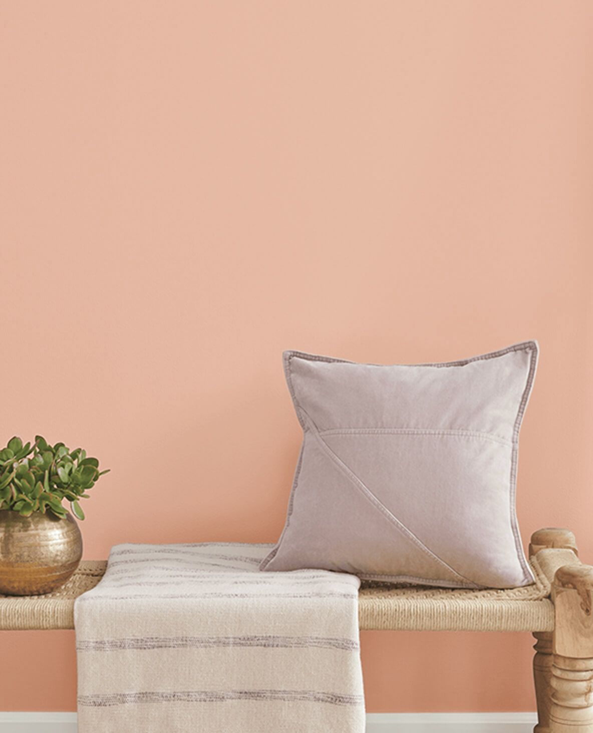
Depending on how high you desire to go for the contrasting palette, there’re colors tailored to suit your needs. Since Waterloo is a cool blue, you can go for Sherwin Rhinestone to get that warmth. The soft peachy touch of Malted Milk and Warming Peach are also very excellent choices for your contrasting palette.
Sherwin Williams Waterloo Complementary Colors
Complementary colors on any palette refer to hues that are opposite your anchor color on the color wheel. They’re very different, yet they fit your vision like a glove and will only help your space look better.
Try out Sherwin Williams Mountain Air, Kestrel White, and Coral Clay to get the best of the warm and cool aura in your space. It’s not rocket science; it just works.
What Trim Colors Go With Sherwin Williams Waterloo
Sherwin Williams Waterloo is versatile and very welcoming, which means you can pair it with crisp white colors like Chantilly Lace which doesn’t have any undertones, Pure White that’s a true white but can also display blue undertones (since the anchor color is blue) but not strong enough to clash with Waterloo.
One thing for sure is that this color works efficiently with white; the contrast is amazing. This is your sign to go all the way.
Waterloo Benjamin Moore Version
Benjamin Moore has some unique shades that are somewhat closer to Sherwin-Williams Waterloo, but the similarities don’t exist beyond that. No two colors have the same formation when it comes to their ingredients or setup, so while you may notice a lot of overwhelming differences, these colors will surely suffice for the absence of Waterloo on the store shelf.
Benjamin Moore Newburg Green
This one looks like a true dark teal with an LRV of 8.79. Newburg Green has green undertones, just like the green in its name, and can work as a full color or an accent wall in your home. This shade makes your home experience modern sophistication like never before.
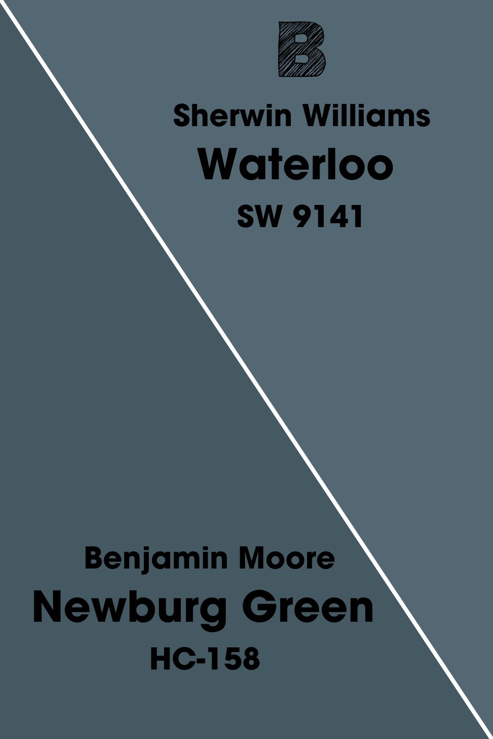
It works well with beige, whites, off-white, and even lighter shades of blue to create that monochromatic effect you’d love to see in your space. Remember that this one is very prone to lighting effects, so you must sample it before committing.
Benjamin Moore Gentleman’s Gray
This color is a versatile deep blue that closely resembles classic navy. It has undertones of green like Waterloo, with an LRV of 5.37 that may let it give off a formal and masculine feel in your space.
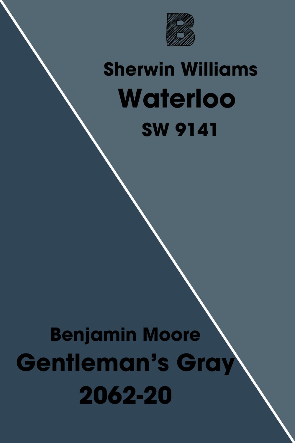
Its strength lies in its versatility, as you can use it as an accent wall or go bold and commit your entire house to this one. Pair it with crispy whites, grays, and beiges to get your space together and make it the cynosure of all eyes.
Benjamin Moore Hale Navy
Its rich undertones of green and gray take this one to a whole different level, and what you really get with this tone is range. The gray helps tone down the blue, while the green peaks keep it from leaning towards purple, which most blue-gray tones lean towards.
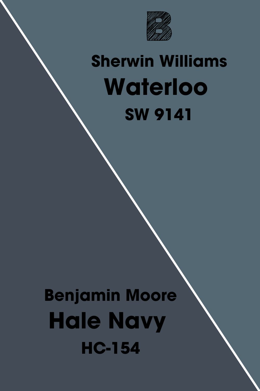
Another advantage of this color is that it can act as a neutral, letting other colors be themselves and embrace it in any environment.
How Does Light Affect The Color

Be it artificial or natural; light has a major effect on how you view your color or how it appears on a surface. When light meets any paint color, the expected response is that it becomes lighter than expected as it begins to display its true color.
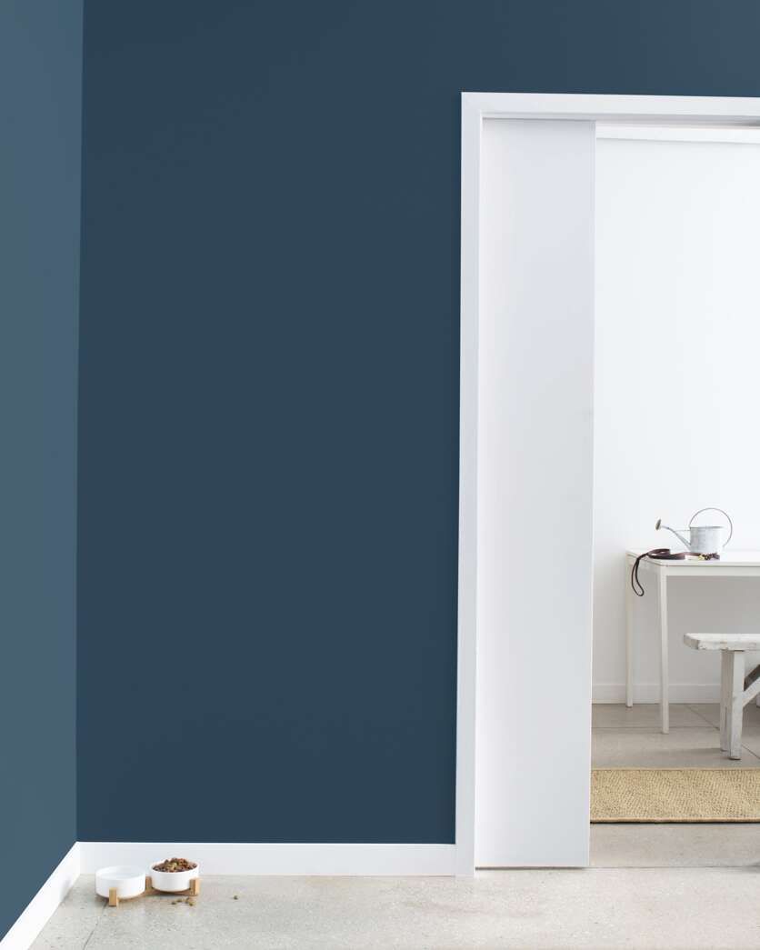
If there are no light sources around Sherwin Williams Waterloo, the ensuing result is a dark, deep blue that you can mistake for black in some conditions.
Now that we’re past that hurdle let’s look at how Sherwin Williams Waterloo fares under east, west, and south-facing rooms. If you use this hue in the room, the color will gradually fade due to the warm sunshine coming in and losing its depth-giving property.
It’s completely different for north-facing spaces; the weak light here restores the true shade of Waterloo by adding the needed saturation, which is why I wouldn’t advise anyone to use this color in a small room.
Best Rooms To Paint Sherwin Williams Waterloo
As cool as Sherwin Williams Waterloo is, it’s also a versatile color that can work in any space given the right use. So you may decide to break the norm and use it as an anchor color in your house or introduce it in small doses as an accent wall; whichever way, you’re assured of an incredible experience with this one.
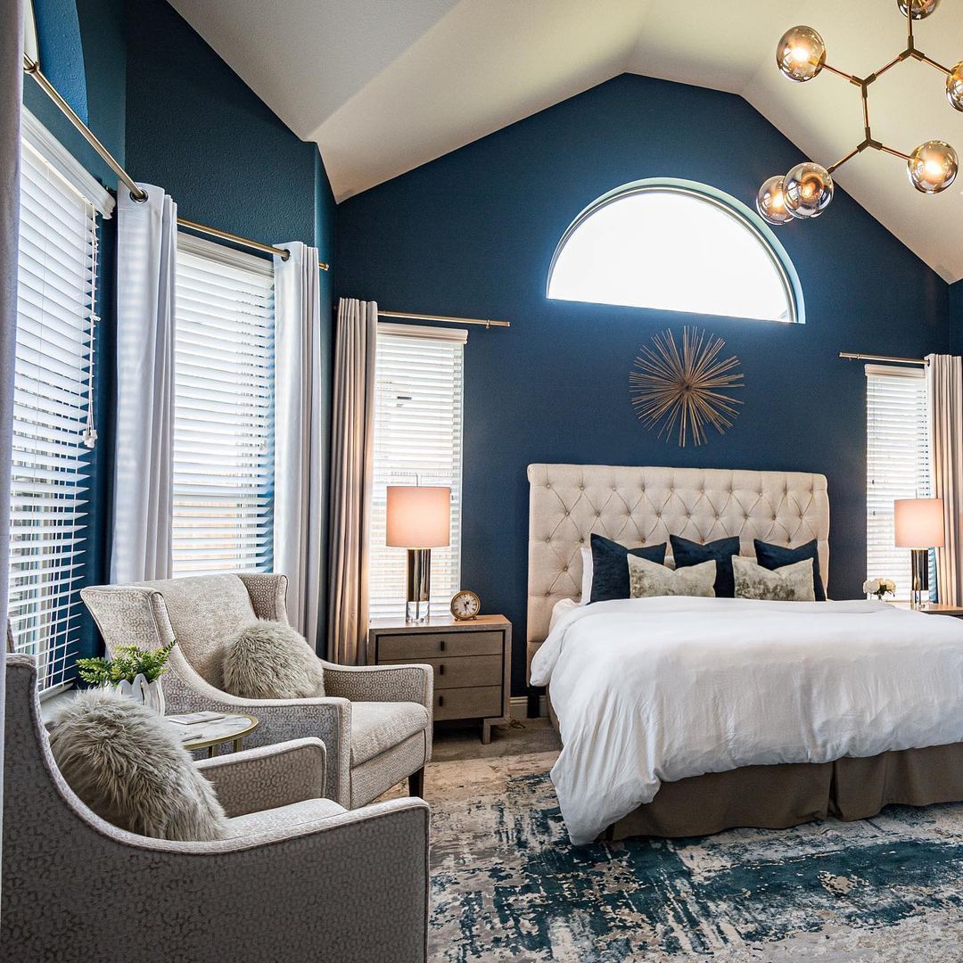
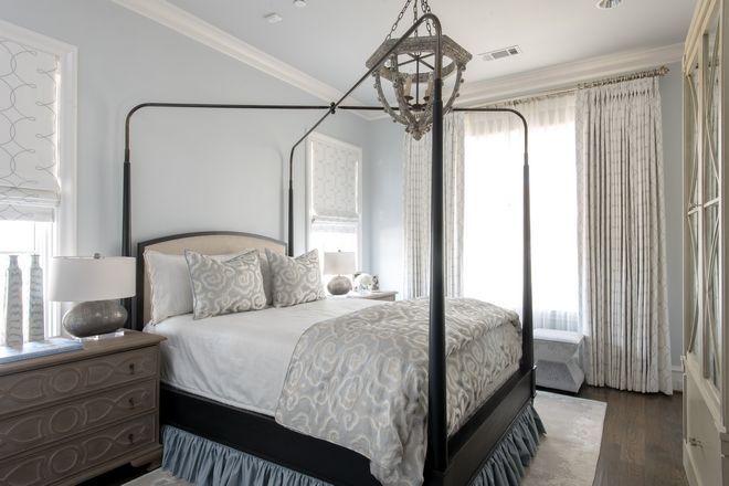
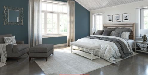
Sherwin Williams Waterloo Bedroom
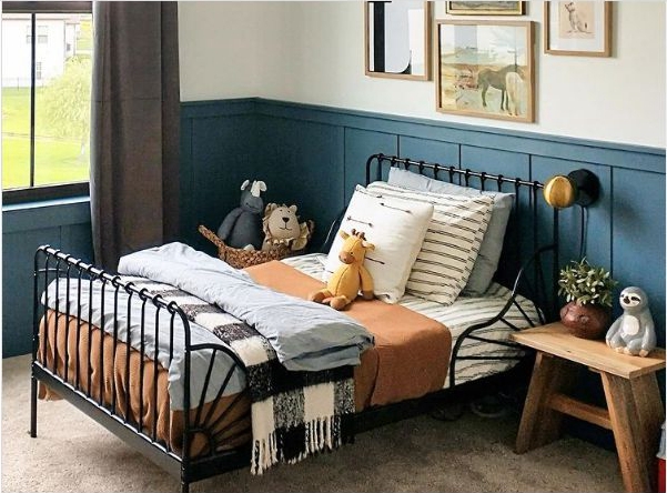
After a long day’s job, the next thing you want to do is get a good night in your cozy bedroom. Waterloo adds a bold and calming touch to any bathroom due to its low LRV and the depth it gives your space (an added advantage is if your room has a great source of light to balance it out). In the absence of natural light, you can opt for artificial white lights that’ll help reduce the illusion of a tight space (Claustrophobia alert!).
Introduce neutral materials and accessories in whites, grays, off-white curtains, throw pillows, and floor rugs. Ensure your light fixtures come with a few golden tints or chrome effects for that clash of colors.
Get inspired by the range of colors on our monochromatic palette for your bedding, drapes, and furniture if you desire to create a dramatic bedroom.
Sherwin Williams Waterloo Bathroom
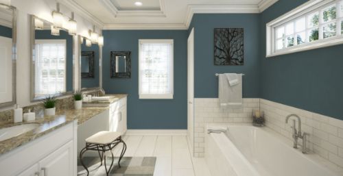
Waterloo isn’t a bad idea for your bathroom at all. Bring the deep blue sea into your home by using this color as an accent wall for a white background. Should you decide to paint all your walls Sherwin Williams Waterloo, throw in some white, gold, and black details for that contrast.
Incorporate warm lights into this space to really elevate it and bring out a side you’ve never seen before; after all, Waterloo is a very versatile shade. Soft beige paints and white trims are your able allies any time of the day for a Sherwin-Williams Waterloo bathroom.
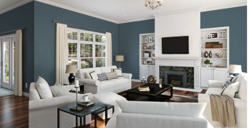
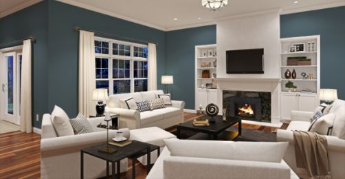
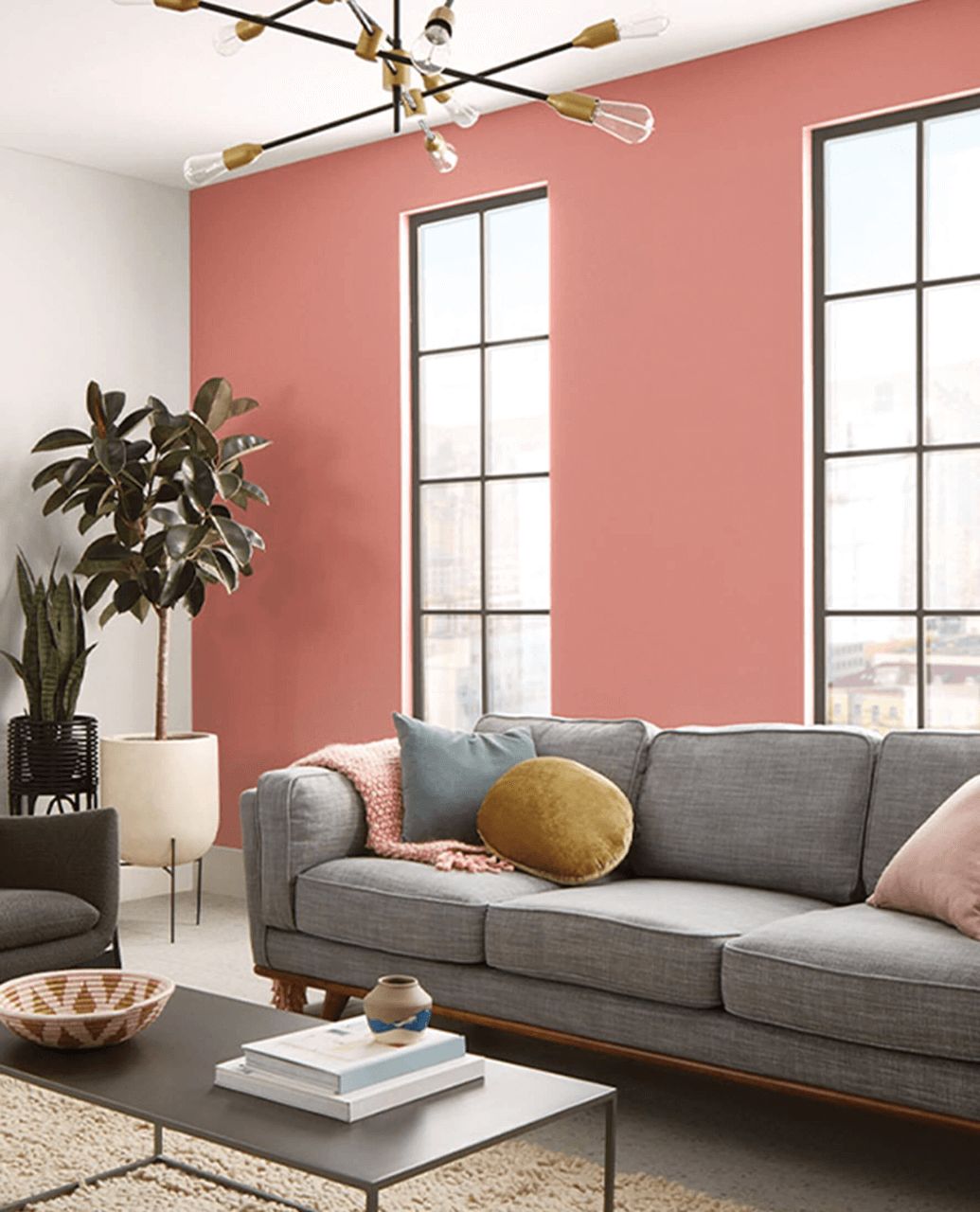
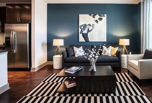
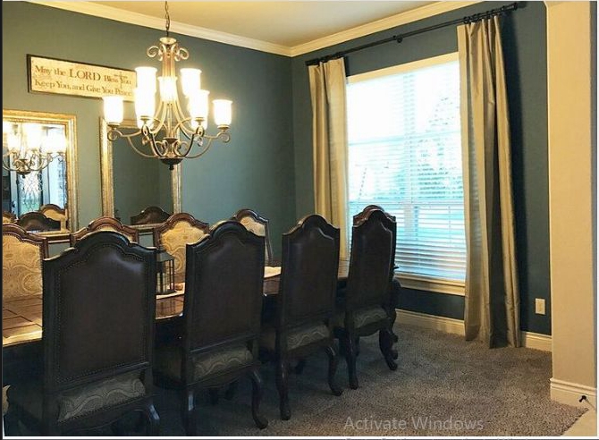
Sherwin Williams Waterloo Living Room
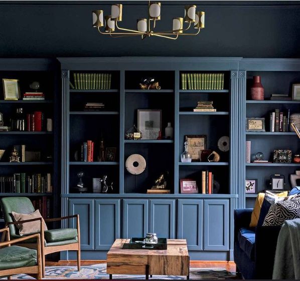
This color is perfect for you if you have a large living room with enough space to experiment. I emphasized the large space simply because Sherwin Williams Waterloo has so much depth that it closes the wall and makes your space appear smaller- if your living room is nowhere near big, you can still incorporate it into your home, but as accent walls at the fireplace or pillars.
Pair this chic color with gray upholstery, off-white rugs, greige, taupe, mustard accessories, and pink and mauve curtains for that pop of color. You’ll really love the turnout of this one!
Sherwin Williams Waterloo Exterior

This is an excellent choice for your home exterior, especially if you crave that Caribbean, deep coastal vibe. The thickness and depth of this color instantly vanish when it gets rich outdoor sunlight, so you can easily pair it with light grays and whites on the window frames and trims without making it look too overwhelming.
If you change your mind about going all the way with Waterloo, switch its place for an all-white wall with Waterloo as an accent. You can fully explore your artistic side by opting for travertine stone, wainscotting, or any stone with a touch of dark gray.
A Sherwin Williams Waterloo front or garage door sounds like an excellent idea, thanks to the peaks of green undertones that’ll come out due to the surrounding green scenery and bright light.
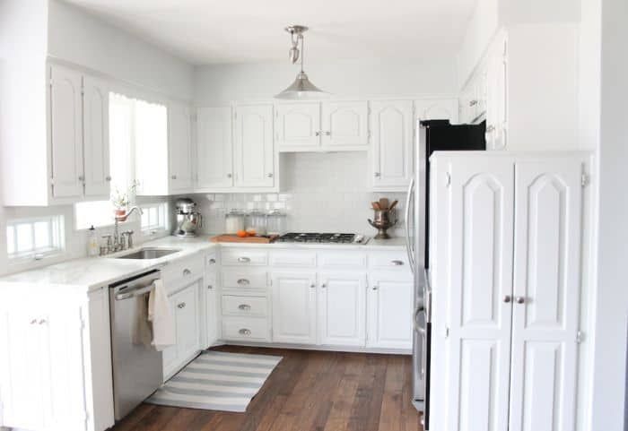
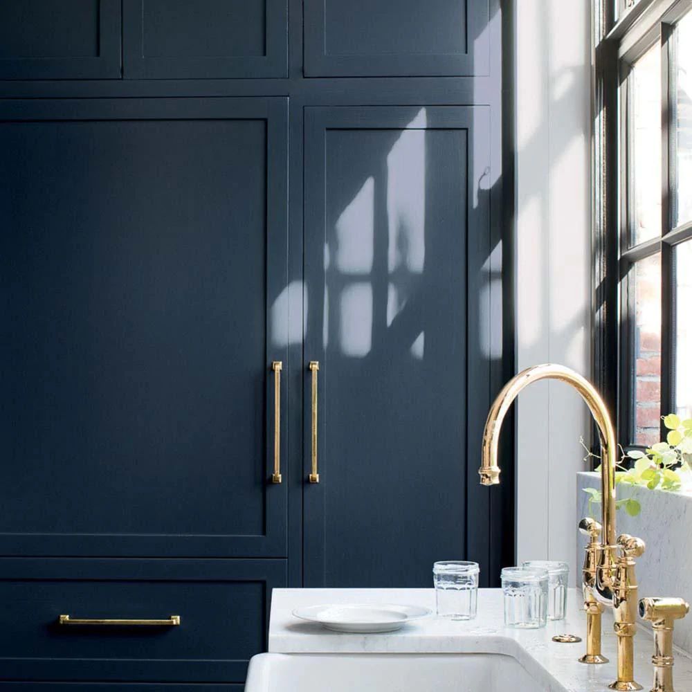
Sherwin Williams Waterloo Kitchen

It’s a no-brainer that this color will ace it in any kitchen. Use it on your upper and lower cabinets in an all-white kitchen. Go wild and add white backsplash tiles, white marble countertops, and gold-tinted pull drawers and handles to complement your Waterloo wall.
This color is so subtle yet rich that it works with almost anything. As we said earlier, if you use Sherwin Williams Waterloo in a dark space, chances are high that it can be mistaken for black; perhaps that’s why it works with a wide range of colors.
Sampling Sherwin Williams Waterloo
You can’t make a decision as serious as picking a preferred paint color for your space and throw caution into the wind. What this means is that the importance of sampling paint colors before committing to one cannot be overemphasized.
One of the major advantages of sampling your color before use is that it helps you get a first-hand view of how your color will fare under varying light conditions and different spots around the house.
That said, a new technology for sampling paint colors has been created, saving you time, money, and resources. With Samplize, you can try out as many colors as you want and decide based on your results.
These peel-and-stick strips are easily removable and reusable, which means you can test them out in different places, leave them on for a few days if you’re not sold on that color yet, and try them out as main colors or on accent walls.
Be careful not to use your peel-and-stick sample strips on your current wall that carries your former color (due to the chemistry of undertones, your intended color may be forced to mirror the existing color, causing further confusion). You can only get the desired result on a pure white background.
Final Thoughts
Now that you have all the necessary information about this amazing color, it’s time to begin introducing it to your space. However, I must refresh your memory that Sherwin Williams Waterloo is a dark-toned color, and you may not like the result if applied in a small space with little exposure to light.
Make sure to sample this color before inviting its unique, aquatic, and calming feel into your home.
 Sherwin Williams Sea Salt (Palette, Coordinating & Inspirations)
 Sherwin Williams Agreeable Gray (Palette, Coordinating & Inspirations)
 Sherwin Williams City Loft (Palette, Coordinating & Inspirations)
 Sherwin Williams Colonnade Gray (Palette, Coordinating & Inspirations)
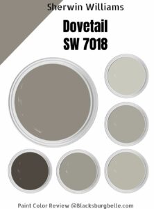 Sherwin-Williams Dovetail (Palette, Coordinating & Inspirations)
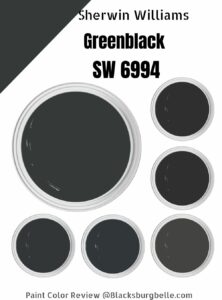 Sherwin Williams Greenblack (Palette, Coordinating & Inspirations)
