
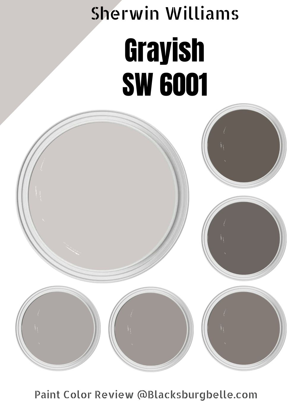
 Sherwin-Williams Grayish isn’t among the brand’s most popular neutrals, but it’s one paint color you should give a chance. It’s suitable for spaces lacking natural light because of its medium-light LRV.
Grayish is hardly a nuanced paint as it has tinges of red and violet in its makeup, but that’s not bad. You can use its plain coloring to your advantage and create the most serene space with Sherwin-Williams Grayish at the center.
With time, this paint can become a popular gray shade from Sherwin-Williams. Stay with me to learn everything about this color, from its hints to the LRV, curating a color palette, using the color strip, and alternatives from Sherwin-Williams and other brands.
Table of Contents
What Color is Sherwin-Williams Grayish?
Grayish is a warm and cool neutral tone because of its double undertones. Light changes its outlook and gives it a brighter tone making it adequate for every room, from general living areas to private bed spaces.
Learn more about Grayish below.
| Manufacturer | Sherwin Williams |
| LRV | 60 |
| RGB | Red 207 | Green 202 | Blue 199 |
| Hex Value | #CFCAC7 |
| Color Collections | Colormix Forecast 2020 (Mantra), Living Well (Center) |
RGB of Sherwin-Williams Grayish
The red coloring in Grayish is the most of its RGB makeup at 207 while the green coloring comes second at 202, and the blue makes 199 mixed into absolutely black paint. Every painting has an RGB and hex value (Grayish’s is #CFCAC7).
You can use that info to create the color and understand how undertones work.
Light Reflective Value (LRV) Of Sherwin-Williams Grayish
Grayish appears cool without natural light, but underneath the right lighting -artificial and natural – its undertones pop out and turn it warm. A color’s Light Reflective Value (LRV) determines whether it’s a bright or dark hue.
You can measure each paint’s LRV on a scale of 0 – 100, where 0 is black and 100 is white. The value is 3 – 99.9 since there’s no pure white or absolute black.
Is Grayish a Warm or Cool Color?
Sherwin-Williams Grayish is one of those paints with warm and cool characteristics thanks to its base notes. Although the outlook is a cool silvery gray with shiny violet hints, it can become a warm gray with reddish tinges.
What are the Undertones?
Grayish has two strong undertones – red and purple – which have contrasting shades depending on the lighting. The red undertone gives the neutral color a warm look that brightens a room.
Thanks to the hex value, you can decipher the undertones of color, and when you check Grayish’s surrounding hues, you’d see it between red and purple.
All Pictures sourced from Sherwin-Williams
Sherwin-Williams Grayish Color Strip
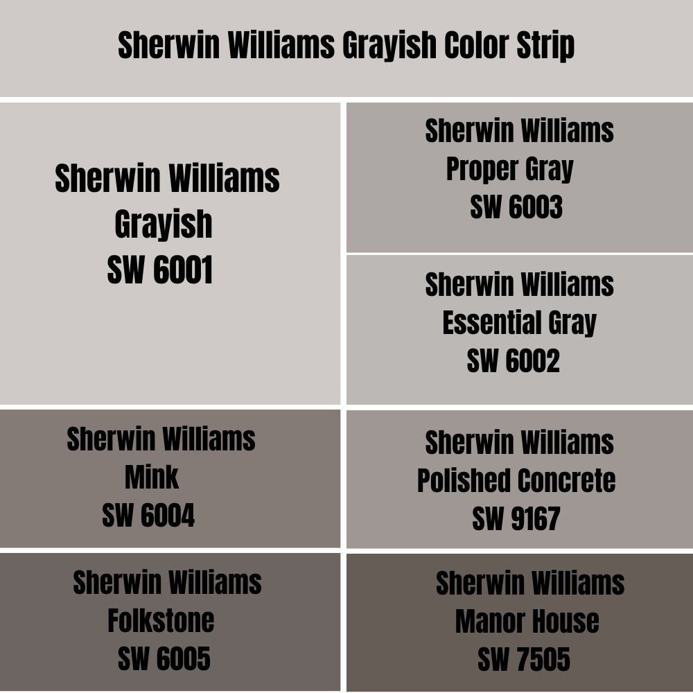
Grayish is the lightest shade on its color strip due to its high LRV. A color strip consists of multiple colors generated from one base note and altered through color grading from light to dark.
It’s a straightforward way to create a monochromatic design.
| Color Code | Color Name | Location Number | LRV | Color Tone |
| SW 6001 | Grayish | 240-C1 | 60 |  |
| SW 6002 | Essential Gray | 240-C2 | 48 |  |
| SW 6003 | Proper Gray | 240-C3 | 39 |  |
| SW 9167 | Polished Concrete | 240-C4 | 32 |  |
| SW 6004 | Mink | 240-C5 | 21 |  |
| SW 6005 | Folkstone | 240-C6 | 14 |  |
| SW 7505 | Manor House | 240-C7 | 11 |  |
Sherwin-Williams Essential Gray
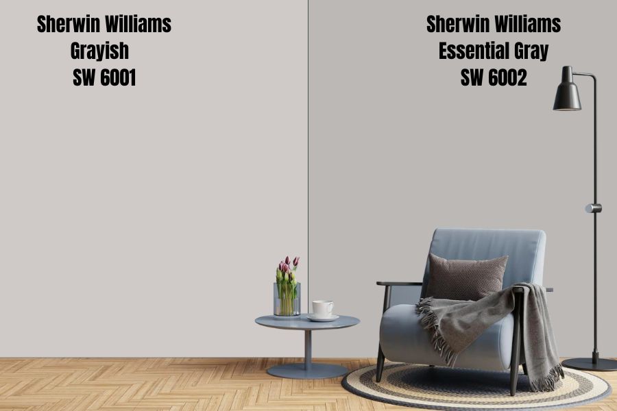
Essential Gray is a neutral paint with earthy undertones making it appear muddy and cloudy at night. It comes alive when paired with light white tones or other bright colors with red and purple undertones.
Choose this paint for a minimalist theme.
Sherwin-Williams Proper Gray
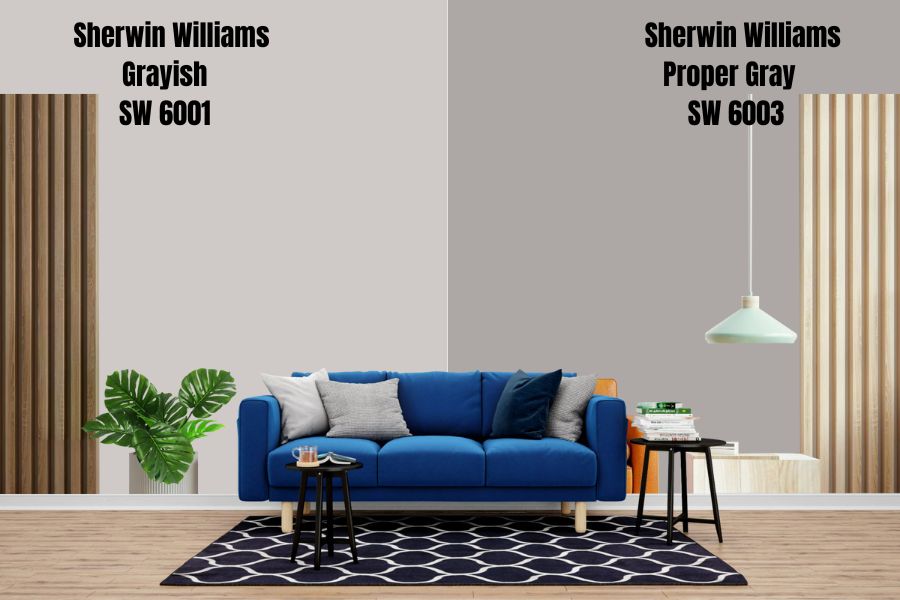
Sherwin-Williams Proper Gray is the way to go when you want a medium-dark warm neutral paint. It appears bright and produces an energetic aura underneath natural light while it turns dim towards the night.
As its counterpart, Grayish, Proper Gray has a reddish-violet undertone but is more greige due to its low LRV.
Sherwin-Williams Polished Concrete
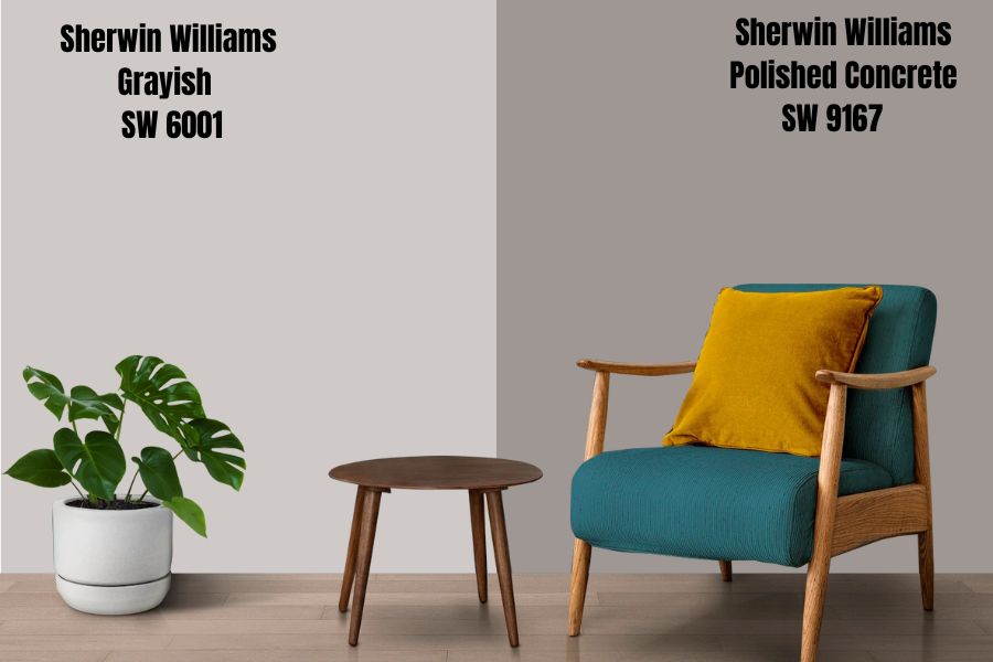
Polished Concrete reminds you of pavement regularly, and its tone changes based on light reception. It’s an earthy neutral with brownish undertones from red and violet shades.
Due to its dark tones, Polished Concrete works best for less-used interiors like kitchens, pantries, laundry rooms, and garages.
Sherwin-Williams Mink
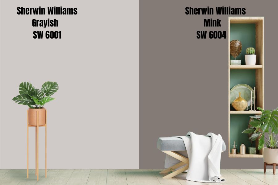
With Mink, you’re veering into the dark range of gray shades as it has an LRV of 21. It’s one of those neutral colors with rich undertones which make a sophisticated paint. Sherwin-Williams categorizes it as a trendsetter, and rightfully so, considering it has a beautiful mix of neutral colors from brown to violet, red, and gray overlay. Due to its nuanced genetics, Mink is a versatile paint that works with bright whites and other neutrals.
Sherwin-Williams Folkstone
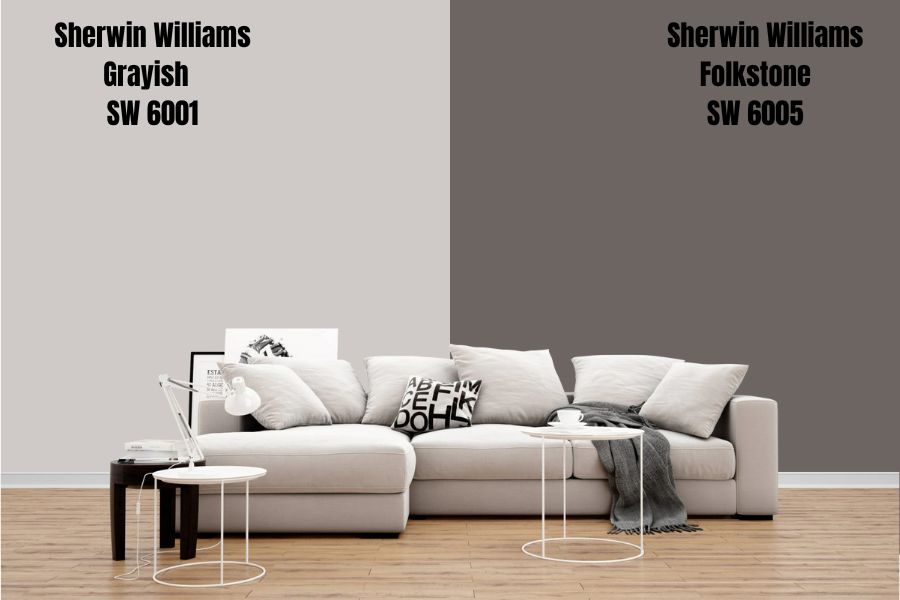
Folkstone is a chalky greige paint with tinges of red and violet hence its presence in the Grayish color strip. Despite being a warm paint, Folkstone has a low LRV (14), making it a dark paint that needs as much light as possible to shine.
Its beige is overwhelming, so avoid this paint if you don’t like creamy grays.
Sherwin-Williams Manor House
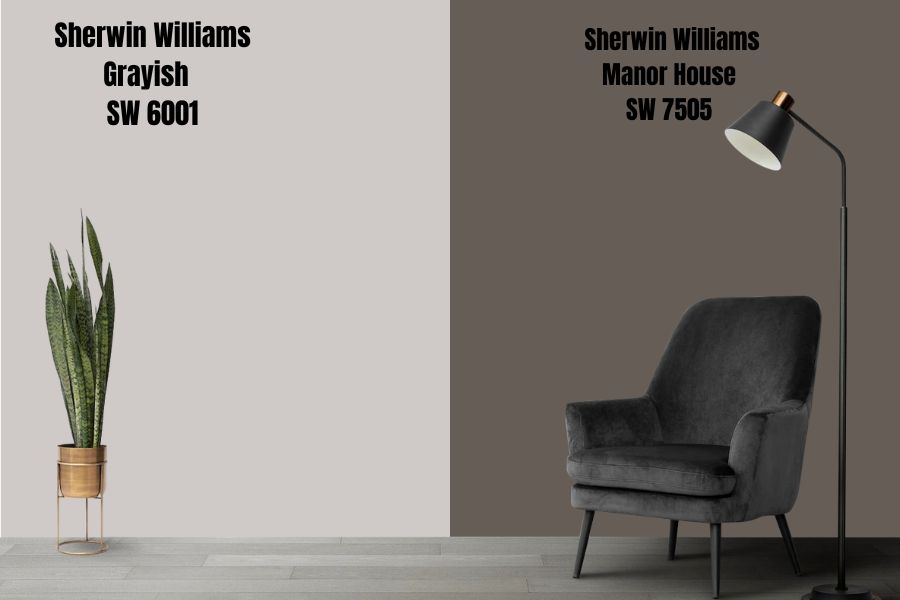
Most gray paints are interior and exterior-appropriate, but Manor House is the best outside or as an accent due to its overwhelming dark tone.
Underneath a bright artificial light, this color shows a warm and inviting tone while it turns into a charcoal gray in the dark.
Sherwin-Williams Grayish Color Palette
Now we get to the interesting and creative part – designing with a color palette. Color palettes determine the theme of a space, whether it’s a minimalistic monochrome design or a vibrant complementary and triadic vibe.
Curating your color palette requires combining all the scientific information you learned earlier. Each undertone and LRV is important as it influences your choice in accessories from flooring to tapestry, bedding, pillows, and accents.
Let’s start with coordinating colors.
Coordinating Colors for Grayish
Every space has a personality depending on how you coordinate it, and it’s often a reflection of its owner’s taste. Do you favor minimalistic designs over vibrant colors or want to keep things cool? Then use your palette to create what you love.
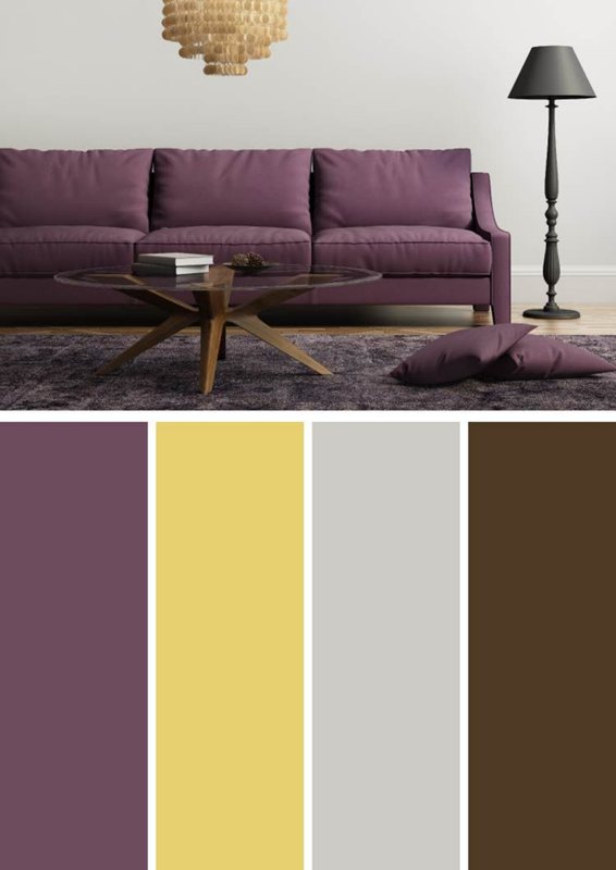
Monochrome Decoration with Grayish
Coordination doesn’t get more elegant than a beautiful mix of one color in different shades, and that’s what monochrome designs create. Start with your wall paint as the anchor. Then, move either up or down on the gradient, depending on your preference.
Use darker tones on light paints and brighter tones on dark paints.
Pro Tip – Use the Color Strip.
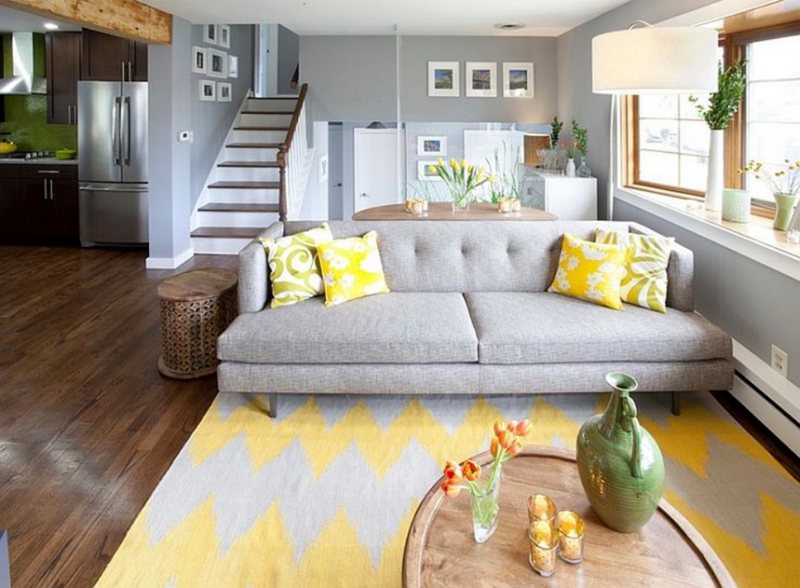
The color strip already contains the best tones from Sherwin-Williams arranged in ascending gradients, and Grayish is the first in its swatch as a light paint. Check out some examples of a monochrome décor with Grayish.
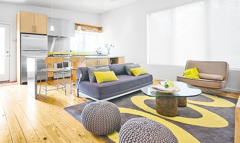
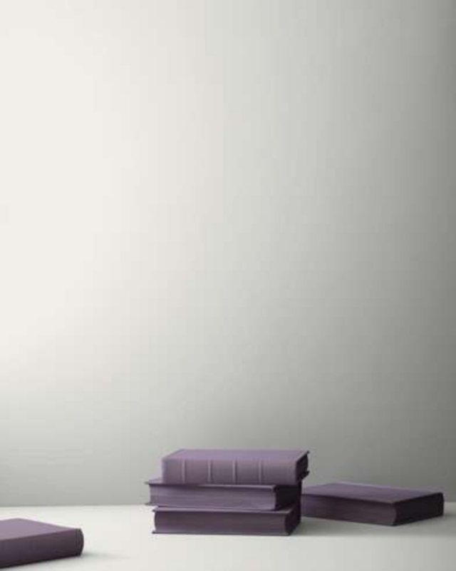
Triadic Decoration for Grayish
A triadic theme uses three colors, with the main paint, Grayish, at the center and the next two positioned three spaces apart on the color wheel. The color wheel, in this case, includes secondary and tertiary hues.
As a reddish-purple gray color, paints with yellow/orange and blue/purple (violet) undertones form its triad. A triadic theme is your answer if you love a colorful space but don’t want anything too bright. See the example below.
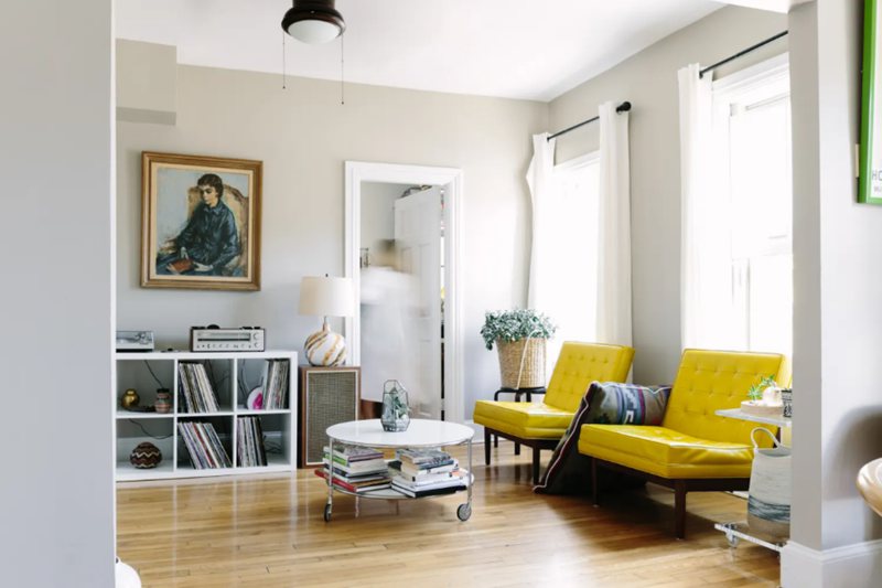
Contrasting Grayish with Complementary Colors
“What if I like colors but don’t want too many contrasting hues?” There’s something for you too. Coordinate the design using complementary colors, which provide the perfect contrast. Complementary colors sit on the direct opposite ends of the color wheel.
For the red-purple, which is Grayish’s base note, that color is Yellowish-Green/greenish-yellow.
What Trim Colors Go With Sherwin-Williams Grayish?
Grayish works well with crisp white trims and NOT cream or beige white, as that’ll clash with its red and purple undertones. You can also use marbled gray, granite, and stone based on the color strip.
Sherwin-Williams Grayish Color Comparisons
Grayish is a beautiful color, but it’s not the only Sherwin-Williams gray paint. Most times, it takes a direct comparison with other shades to appreciate your chosen paint truly, and that’s what we’re about to do.
This part can make or break your creative process, as you may fall in love with another shade of gray. Brace yourself.
All pictures are from Hextoral.
Sherwin-Williams Grayish vs. Sherwin-Williams Snowfall (SW 6000)
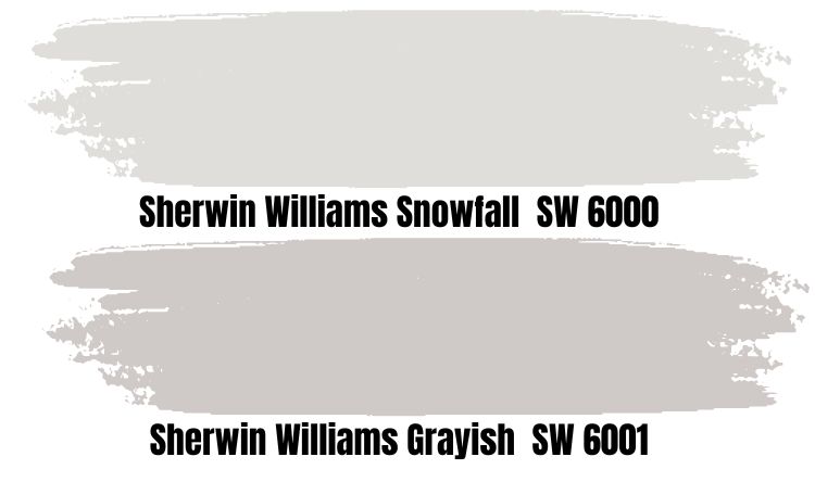
If you want your gray to look white, then Snowfall is the way to go. The color is a shade lighter than Grayish with an LRV of 73. Unlike its counterpart, however, it’s a crisp color with blue and purple undertones making it purely cool.
Sherwin-Williams files it under purple because of its strong undertones, which make it appear lavender at night. Use this paint for a cozy, breezy, and cool theme.
Sherwin-Williams Grayish vs. Roman Column (SW 7562)
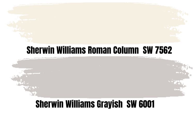
Roman Column is a bright white paint with a slight yellow undertone that turns it khaki at night. This shade inspires warmth and happiness wherever you place it and can work as a great trim or accent for your Grayish wall.
The only condition is that you use Roman Column trims in a complementary theme since it contains one of the contrasting hues for Grayish’s red and purple undertones.
Sherwin-Williams Grayish vs. Sherwin-Williams Agreeable Gray (SW 7029)
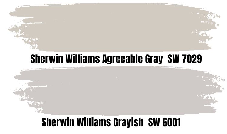
When you search Sherwin-Williams Gray on the web, Agreeable Gray is the first color to pop up. It’s the most popular shade made by the brand, thanks to its nuances. The paint has a strong beige undertone, making it the perfect chameleon neutral.
Agreeable Gray and Grayish have the same LRV – 60 – but different components. You’d get a warm beige or cool gray depending on the lighting, and that’s what makes it unique. Check out its strip in the Expert Pick section.
Sherwin-Williams Grayish vs. Sherwin-Williams Repose Gray (SW 7015)
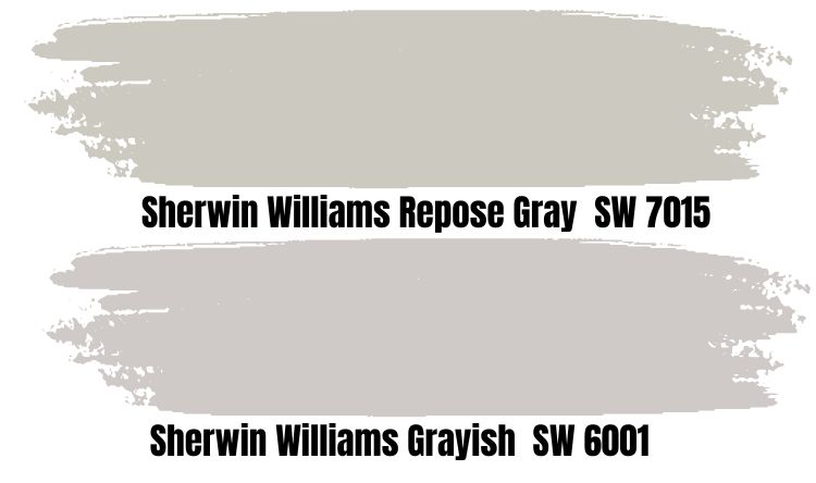
Repose Gray is the second-most-popular gray paint by Sherwin-Williams due to its almost perfect neutral LRV (58). The paint is a medium-light warm shade with violet undertones which is ironic considering those are cool colors.
To get its cool vibe, use Repose Gray in a room with low lighting, like North-facing windows or underneath white lights. Otherwise, its warmth would take over the room with a beautiful neutral reflection.
Sherwin-Williams Repose Gray is the darker alternative to Agreeable Gray and Grayish since it’s in this conversation. Don’t expect it to brighten your space like the other two, even without lighting.
Sherwin-Williams Grayish vs. Sherwin-Williams Light French Gray (SW 0055)
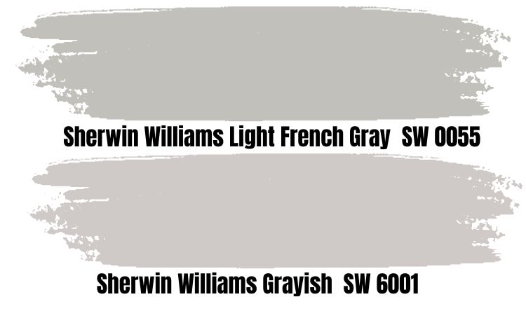
If you want gray paint with a historical presence that’ll give your space a vintage look, then this Sherwin-Williams Light French Gray is a great choice. As its counterpart, Grayish, Light French Gray has a vibrant undertone of red and purple, creating a balanced warm, and cool tone.
It’s closer to the median on the LRV scale, making it an almost perfect neutral. Light French Gray presents a timeless, regal view that will relax you after a hectic day at work. Feel free to use it anywhere from the bedroom to the kitchen, living room, and bathroom.
Sherwin-Williams Grayish vs. Sherwin-Williams Argos (SW 7065)
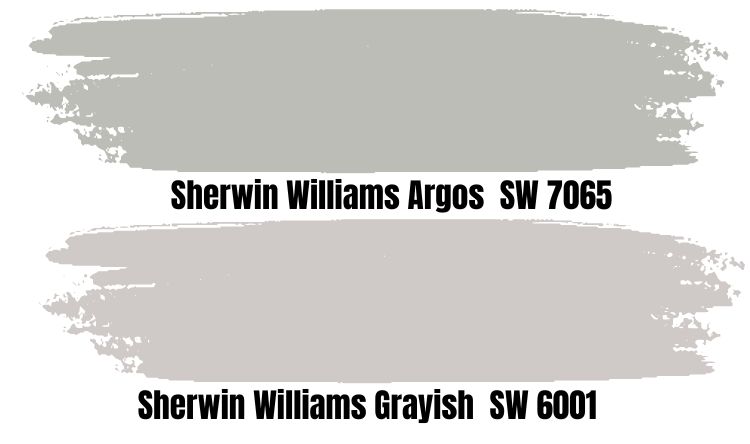
Argos is a purely cool neutral paint with an oceanic teal (green and blue) undertone at its core. If you’re wondering why and when gray paints overtook beige and cream as the preferred neutrals for interior and exterior coloring, look no further than Argos.
The color is soothing, like a cool evening breeze or a walk by the ocean. That makes Argos best-suited for retreat-like decorations in bedrooms, living rooms, and bathrooms.
Sherwin-Williams Grayish vs. Sherwin-Williams Curio Gray (SW 0024)
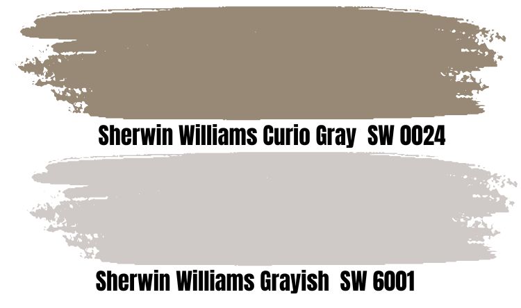
Sherwin-Williams Curio Gray isn’t on the same plane as the other gray paints in this section, as it has an overwhelming brown undertone. It’s a warm paint that gives off khaki vibes at night and often comes off as a tan shade.
When Sherwin-Williams categorized it as a Historic Victorian-era hue, it nailed its aura. After all, they’re the creators of the color. Curio Gray is a medium-dark paint with a low LRV of 26, meaning there’s hardly a chance of lighting up your space despite its warmth.
This comparison isn’t a discouragement but a warning to choose Curio Gray. You must be ready to explore your creativity to its extent.
Sherwin-Williams Grayish vs. Keystone Gray (SW 7504)
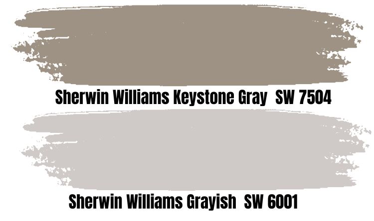
Curio Gray is closer to Keystone Gray than the latter is to Grayish due to its earthy undertones. It’s a stony gray that reminds you of the pebbles on beach sand, so it’s suited for living room or bathroom coloring.
Bring Keystone Gray alive with a jar of seashells and beach pebbles on a mantelpiece if it’s on the wall, or place the jar on a cabinet if that’s where the coloring goes.
Grayish Benjamin Moore Color Comparison
Every interior decorator and a paint-savvy person knows that the only alternative to Sherwin-Williams in quality is Benjamin Moore. If you’d rather buy a BM paint than an SW one but love everything about Grayish, from its undertones to the LRV, this is for you.
More pictures from Hextoral and Benjamin Moore
Sherwin-Williams Grayish vs. Matthews Stonington Gray (MP 7897)
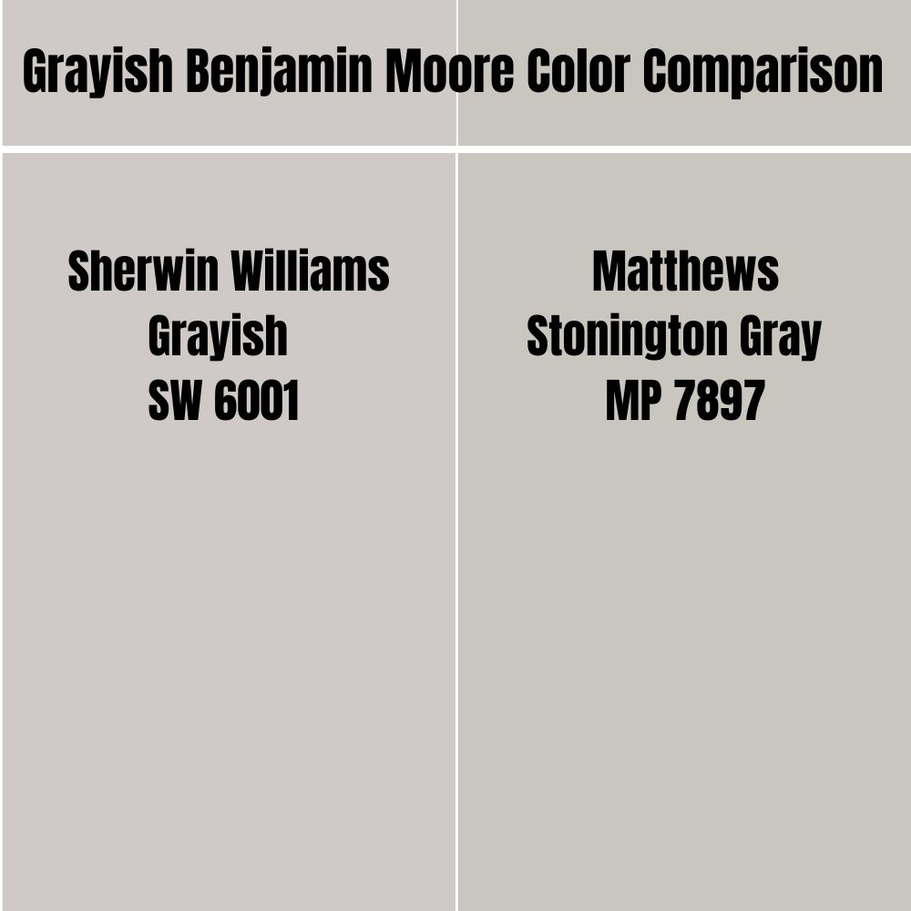
Matthews Stonington Gray isn’t Benjamin Moore, but we can’t ignore it because it’s one of the closest alternatives to Grayish you’d ever get from another brand. Its Hex Code is #C9C6C0 with an RGB value of – Red 78.82 | Green 77.68 | Blue 75.29.
Don’t confuse it with Benjamin Moore’s darker version, which lacks the yellow undertone that makes Matthews Paint’s version warm.
Silver Chain (1472)
Benjamin Moore’s Silver Chain is a beautiful cool gray paint used often for sophisticated contemporary designs. The color thrives best with brighter tones, neon yellow or green as accents against its cool shade.
Due to its muted undertones, Silver Chain is a true gray with an LRV of 57.46. Its ability to morph overtones based on its surroundings makes it a popular neutral in Benjamin Moore.
Metro Gray (1459)
With Benjamin Moore Metro Gray, you’d get a bright neutral tone with hints of yellow and red in its base note. It’s not Grayish, but this color has a strong presence without overshadowing the rest of your interior décor.
Whisper (CSP-500)
If you want gray paint with a dim hue that succumbs to its undertones at the slightest sign of light, then Whisper does the trick. It can pass off as white paint under the right condition, but it’s not the best hue for outdoor painting.
The color comes alive inside since the enclosed space would tease out its muted tones. Unless you don’t care for its nuances, look at it outside.
Seersucker Suit (CSP-580)

Connoisseurs of unique colors would love Seersucker Suit because it’s part of a special collection – Aura Color Stories – at Benjamin Moore, so it’s not popular. The shade comes with a storyline about an elegant man in his classy suit hence the name.
Seersucker Suit is a dapper gray color with silvery overlays, making it a cool color suitable for bathrooms and closets.
Grayish Benjamin Moore Version
So, does Benjamin Moore have a paint named Grayish? No. However, it has a wide range of gray colors similar to Grayish’s components but not exact. Check out Stonington Gray, a silvery gray paint with an LRV of 59.36, a few decimals lower than its counterpart.
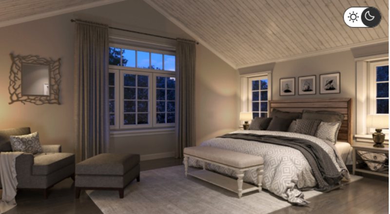
How Does Light Affect the Color?
You’ve learned about undertones; now it’s time to discover how to manipulate them. You can minimize both by placing Grayish paint in a room with North facing-windows.
Northern light produces a steady reflection that gives the paint’s natural state. If you want the red undertone to thrive and create a warm aura, use artificial yellow lighting or place the paint underneath a Southern-facing light.
White lights emphasize Grayish’s cool violet undertones, so that’s another alternative.
Best Rooms To Paint Grayish
With your knowledge of lighting, undertones, and RGB values, let’s see how Grayish fares around the house and office.
Grayish for Interior
Rule number one: Always use it in a smaller room. You can never go wrong with Grayish used in an enclosed space because the compactness gives its nuances room to shine.
Grayish for Cabinets
If you must use Grayish in a wide space, it’s best to make it your trim or accent color, not the wall’s coloring. One way to make that work is painting your furniture and cabinetry with the paint against a plain colored wall like white.
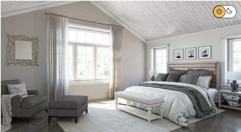
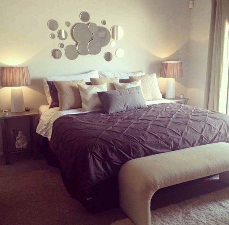
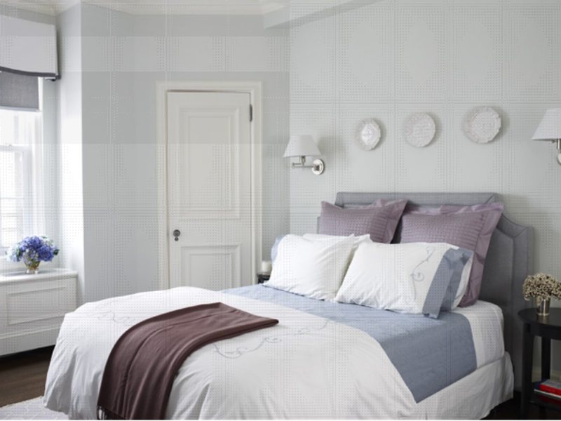
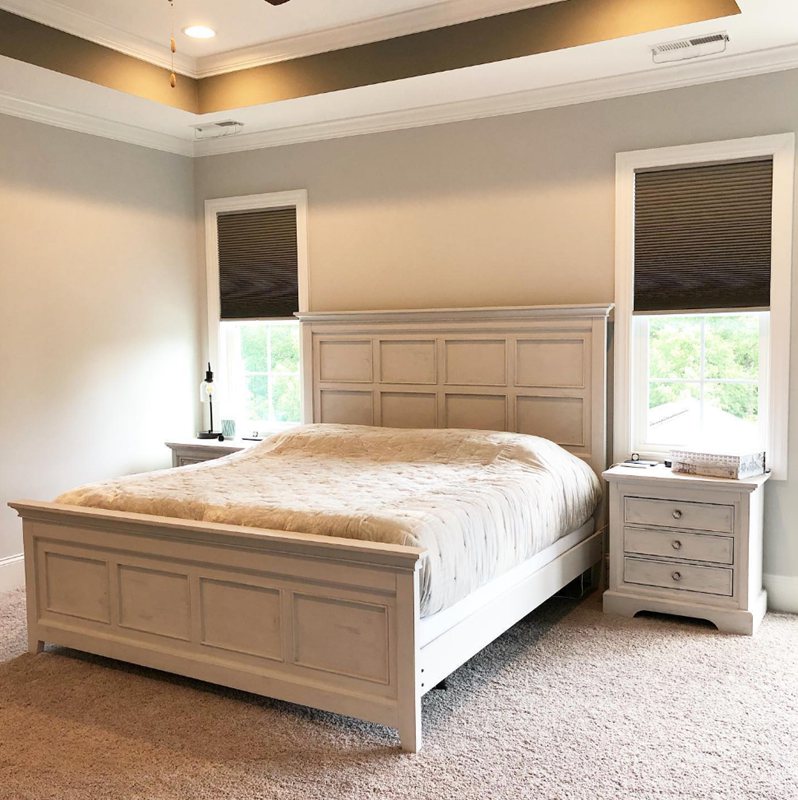
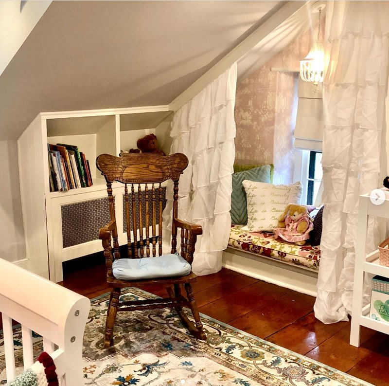
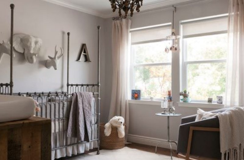
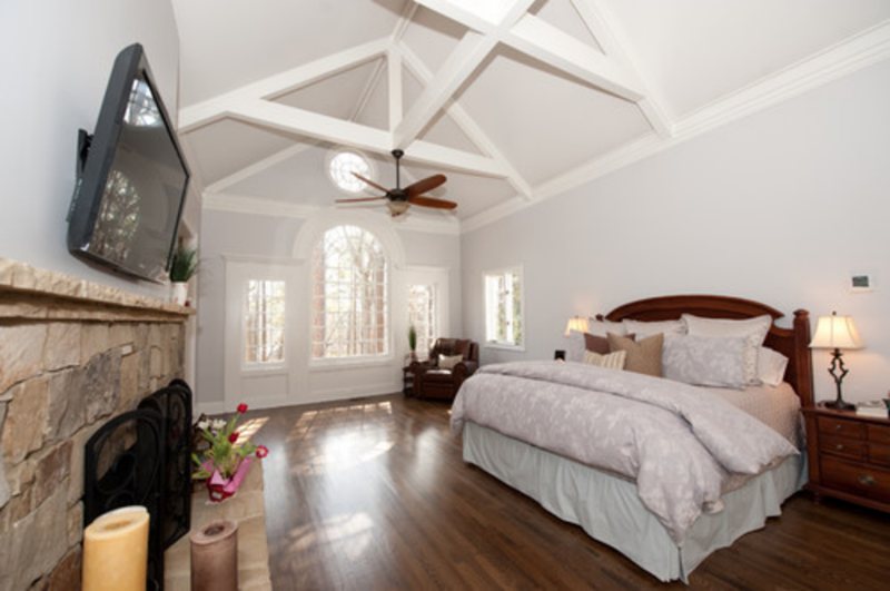
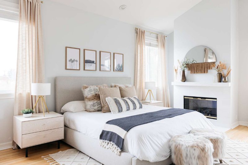
Grayish Bedroom
Nothing says cozy like a bedroom, especially when it’s a small space with just enough room to move around.
Paint the walls Grayish and pair it with a beautiful monochrome interior decoration from the tapestry to the beddings and floorings, and I guarantee you a serene space worthy of sleeping in daily.
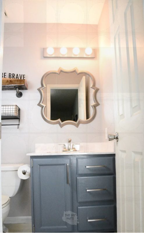
Grayish Bathrooms
Still on the topic of serenity and soothe, let’s discuss Grayish for your bathroom because why not? There’s no question about whether to use white as your accent and trim here.
Get the crispest one you can find for the paint and accessories from toilet seats to flushers, sinks, and cabinets unless your wall is white; then, the cabinetry should be Grayish.
You can curate a modern or rustic-style bathroom with the paint. It’s all in the accessories – lighting, accents, flooring, and more.
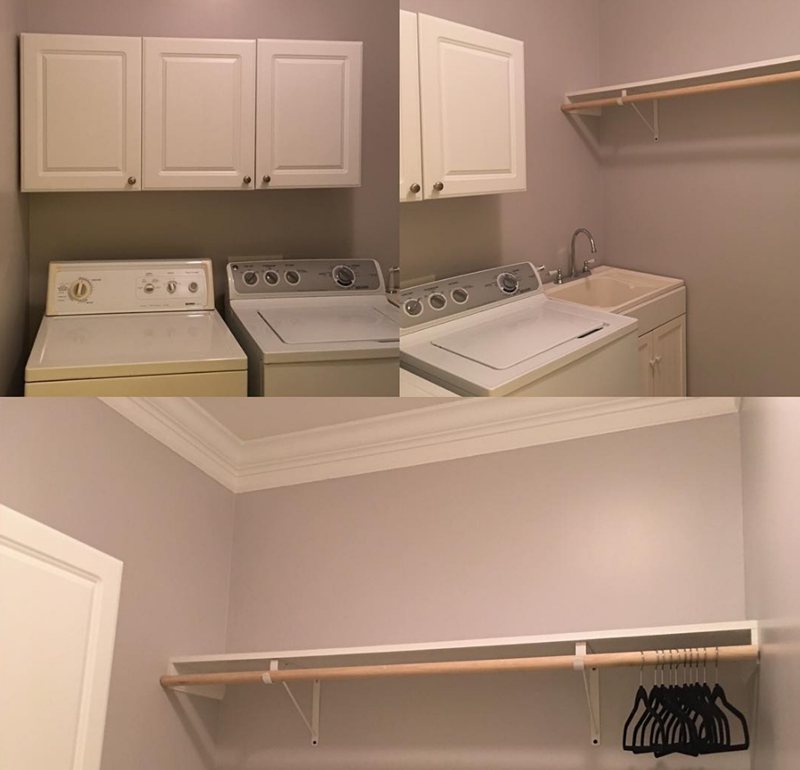
A Grayish Laundry Room
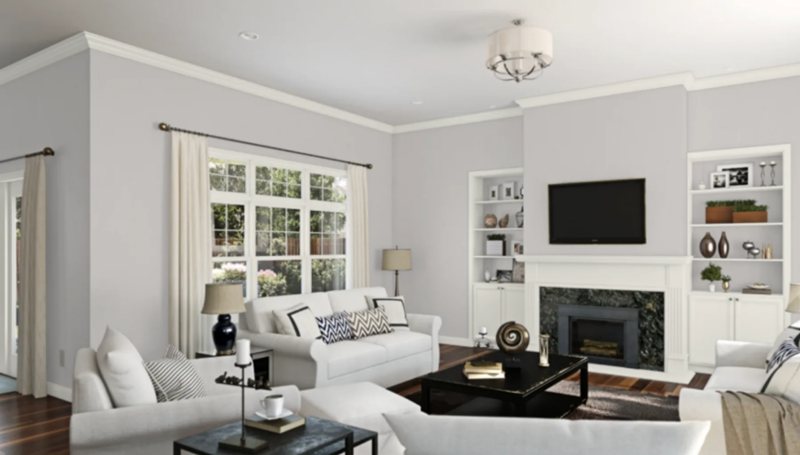
Grayish Living Room
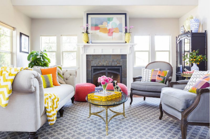
The beauty of Grayish is its ability to compliment almost any color you can think of, provided it’s within a theme.
Since bedrooms are best in monochromatic styling, it’s time to throw in some color in your living room unless you’re into all-around neutral vibes.
The living room is perfect for trying out daring themes like analogous, triadic, or tamer contrast. Feel free to go big with prints and patterns for your furniture and flooring, while the Grayish walls introduce a calm aura.
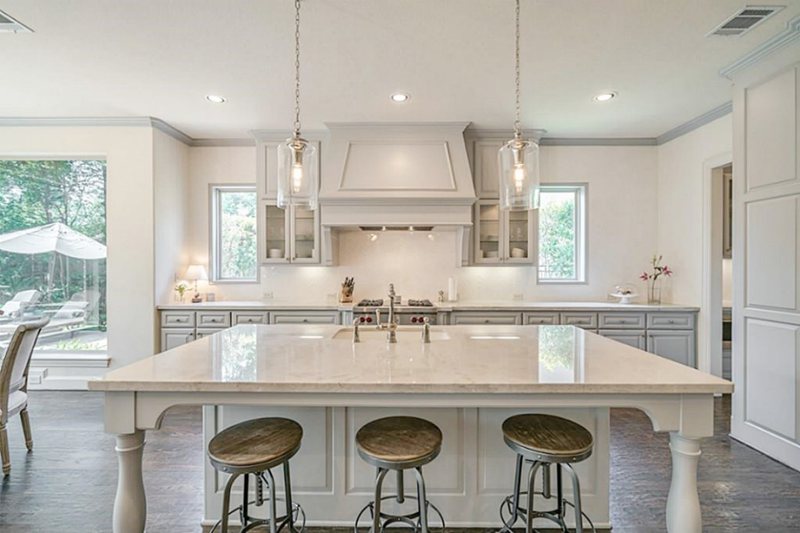
Grayish in the Kitchen
I love kitchens because the decoration can go either way. You can decide to keep things interesting with Grayish walls or use the traditional route on your cabinetry.
Remember, the best trim is white, and the best accent is marble on the island or floor tiles.
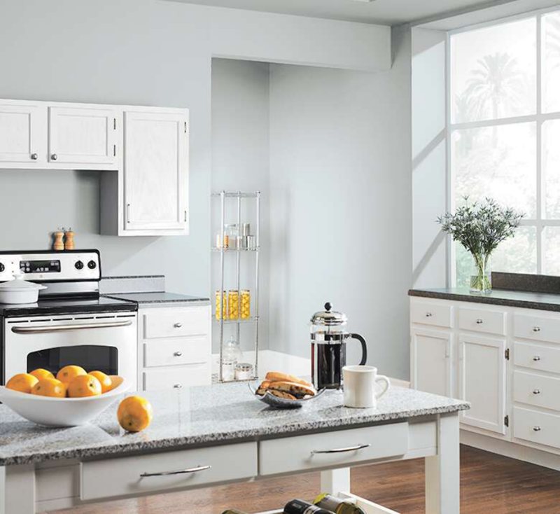
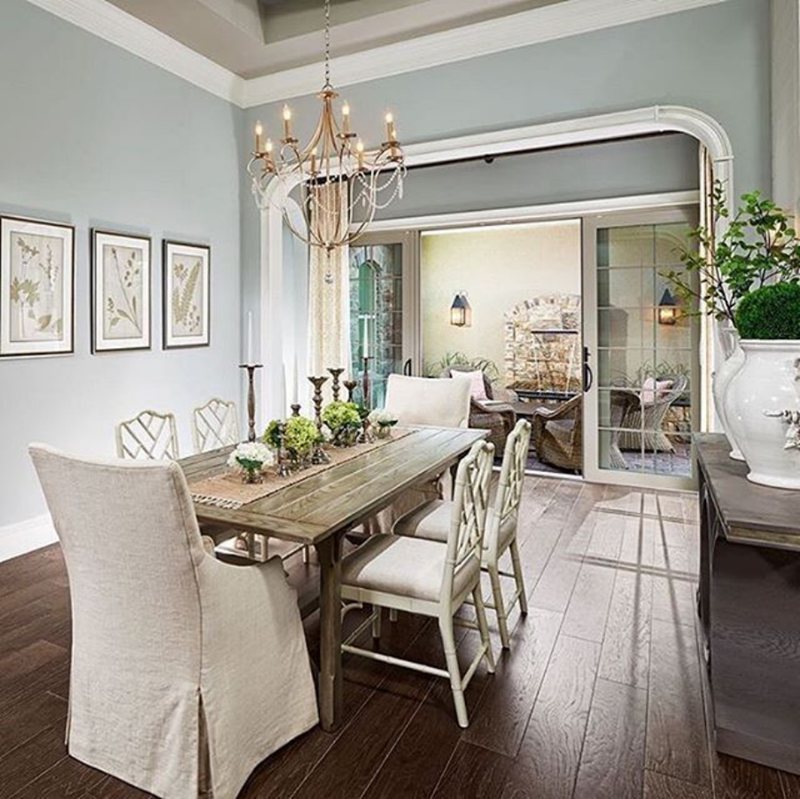
If your Dining room is separate from the kitchen but connected, it requires reverse decoration. Where the kitchen walls are Grayish, the paint should form your Dining Room furniture, and where the cabinetry is Grayish, use the hue for your Dining walls.
The reverse design balances out instead of creating what would appear as an unending kitchen space.
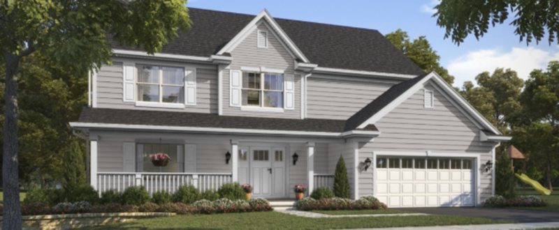
Grayish Exteriors
Grayish exteriors aren’t bad, as the paint’s multiple undertones can create a rainbow of colors for your home. Wherever the lighting shines from, ensure you use dark concrete tile roofing, preferably charcoal gray or black.
Sampling Grayish
You can use any of the Sherwin-Williams’ provided sample options from the Color-To-Go, to the Color Chips and realistic, Peel & Stick Strips.
Final Thoughts
Sherwin-Williams Grayish is a nice neutral color with double interpretations (warm and cool), so you won’t regret your choice unless you want strictly one undertone. While the color does well with multiple tones, it’s best to stick to a monochromatic decoration.
 Sherwin Williams Iron Ore (Palette, Coordinating & Inspirations)
 Sherwin Williams Tradewind (Palette, Coordinating & Inspirations)
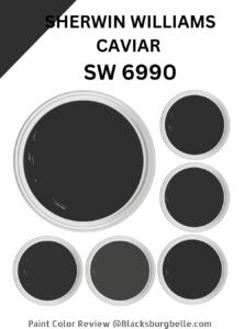 Sherwin Williams Caviar (Palette, Coordinating & Inspirations)
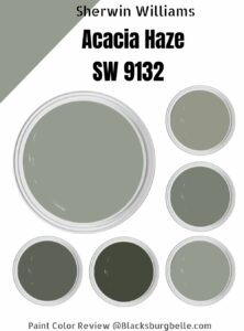 Sherwin Williams Acacia Haze (Palette, Coordinating & Inspirations)
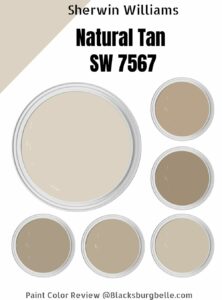 Sherwin Williams Natural Tan (Palette, Coordinating & Inspirations)
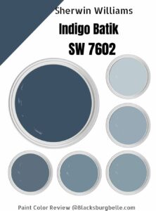 Sherwin Williams Indigo Batik (Palette, Coordinating & Inspirations)
