
Are you considering Benjamin Moore Feather Down as your preferred off-white paint but need clarification on its potential? That’s why I’m here. This review will show you the best and average parts of this Benjamin Moore Classic.
If you love minimalist decor, then you may like the beige-tinted white that’s Feather Down. It’s a bright yet reserved neutral paint suitable for interiors and exteriors.
Although the new wave of gray paints swept the design world in the last five years, I promise you this beige-white is never going out of style. Here’s a review of the specifications and creative ways to use Benjamin Moore Feather Down.
Table of Contents
When to Choose Benjamin Moore Feather Down?
If you’re already eyeing Feather Down, I can’t blame you. But pump the brakes for a second and check if it’s your speed before getting in too deep.
Looking for Warmth?
Feather Down walls are warm and welcoming with a touch of elegance.
Minimalist Lover?
This color is the definition of “not-doing-too-much” to make a mark.
Playing with Beige Color?
The faint green tint in Feather Down’s beige undertone is a pleasant surprise.
Want A Classy Deck?
Transform your fun brunches and parties with the golden glow of Feather Down off-white reflection. Add some potted plants for more elegance.
What Color is Benjamin Moore Feather Down?
You can often tell the inspiration of a paint’s color from its name, especially when it imitates life. Benjamin Moore Feather Down is one of those, even though it’s not a clear-cut inspiration.
Firstly, feathers don’t have a single color. But most white ones often have beige, cream, or tan undertones. With Benjamin Moore Feather Down, picture the downside of the white dove’s plumage. Then, compare it to this wall.
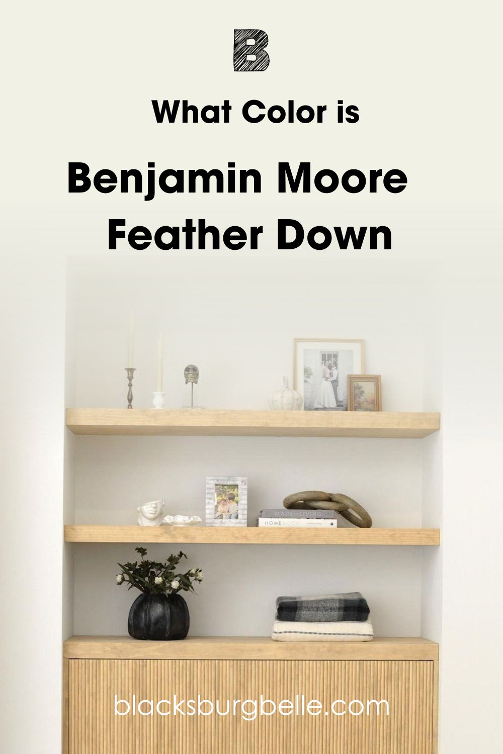
Even though you can see the bright white finish of this Feather Down wall, its golden beige undertone shines through. The reflection then gives you a warmer and softer look of the color.
That’s why Feather Down is for the sophisticated individual unbound by gender distinctions. You’ll get a neutral space with a hint of warmth and elegance, the ideal backdrop for minimalist decor.
Pair Feather Down walls and furniture with golden brown wooden floorboards, furniture, and ceiling for a simplistic style. To add more flair, you’ll need to explore color theory and use bolder colors on your accessories, from settees to throw pillows, rugs, and curtains.
Before getting to the fun part, let’s take a look at the specifications that make up Benjamin Moore Feather Down.
Snapshot of Benjamin Moore Feather Down Specification
A look at this table is your second chance to change your mind about Benjamin Moore Feather Down. Here, you’ll get a whiff of its full specifications, including RGB, Hex Value, LRV, and Undertones.
| Name | Feather Down 953 | OC-6 |
| RGB | Red 230 | Green 224 | Blue 207 |
| Hex Value | #E6E0CF |
| LRV | 73.16 |
| Undertones | Beige |
The LRV of Benjamin Moore Feather Down
Light Reflectance Value is measured on a scale of 0 – 100 to show how much a color absorbs or reflects light. Absolute black is 0 and purely absorbent, while pure white is fully reflective at 100. With paints, the scale is 3 – 97 because there are undertones.
Perfect neutrals are 50, mid-tones are 46 – 55, medium-darks are 45 – 30, darks are 29 – 3, medium-lights are 56 – 79, and light colors are 80 – 97.
Benjamin Moore Feather Down’s LRV is 73.16, making it a medium-light color. You’ll understand this better when you learn about its undertones. On the surface, this color is a bright white, but the beige undertone reduces its brightness and gives it a subtle glow.
Lighting Effects on Benjamin Moore Feather Down
Highlighting undertones works by using natural or artificial lighting. With artificial lighting, you’ll need warm yellow – orange bulbs to create an intense and cozy reflection of your paint. But to get the coolest and softest tone of the color, use white – blue bulbs and fluorescents.
You’ll need to know your room’s position near the sunlight for natural lighting. You can use a compass or go elementary with your body and sunrise/sunset tips.
Sun rises in the East and sets in the West.
When the sun rises, South-facing and East-facing rooms receive the most light. By late noon, the sun moves towards the West, preparing to set, so West-facing rooms get a measured yet dominant sunlight reflection.
North-facing rooms get sunlight throughout the day, but it’s not as bright as in the morning or as low as in the evening.
Stand outdoors during sunrise and point your right hand towards the sun for East. Your left hand in the opposite direction is to the West, the front faces the North, and the back is to the South. Here’s what happens when you alter the lighting and position of Benjamin Moore Feather Down.
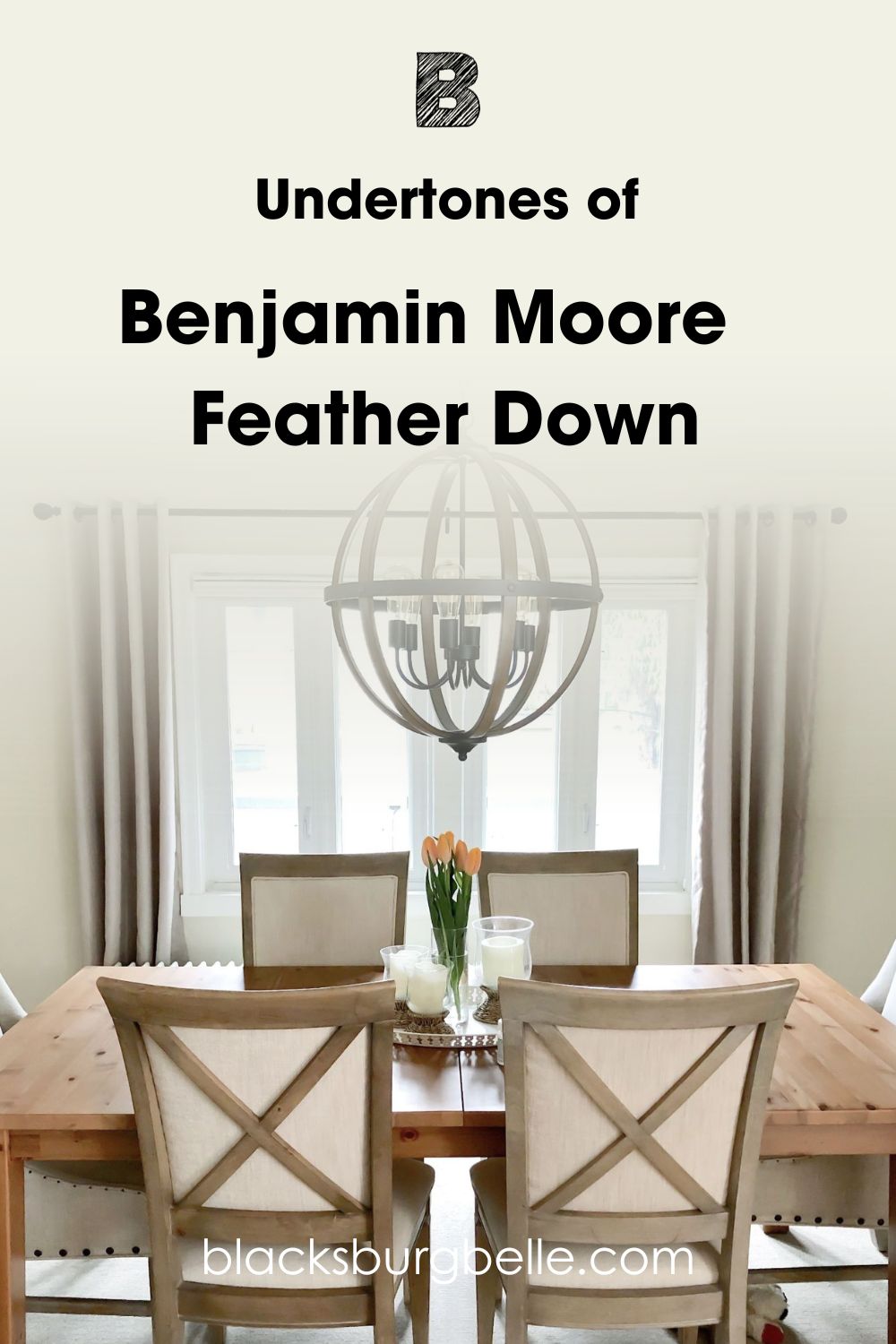
Undertones of Benjamin Moore Feather Down
If you thought you saw a slight green flash in Feather Down, you’re not crazy. But its dominant undertone is a bright yellow that comes out as beige. Together, these multiple colors that make you wonder whether Feather Down is white or not are undertones.
You can’t escape undertones in paints because of the RGB. I’ll break it down, but first, take a sneak peek at the undertones in Feather Down.
You can break down the genetics of any paint mixture with its Hex Code, RGB, or CMYK value. For this review, let’s talk about RGB and how it affects undertones.
RGB is the acronym for Red, Green, and Blue which are the basic hues mixed into a pure black paint to create any unique color. Depending on the percentage of each shade, a color will always have one dominant tone and another subtle tint or even more.
These undertones appear when you manipulate the lighting around a color, including Benjamin Moore Feather Down.
Does it look Beige or Green?
I say yes to both questions, and you’ll see why. Apart from the apparent beige undertone in Feather Down, when you look at its color strip, especially the shades, you’ll notice tan and earthy green colors like Military Tan and G.I. Green.
If you look at Feather Down’s RGB, you’ll notice that its red and green pigments are the highest at 230 and 224. And going back to elementary color theory, green is a result of mixing yellow and blue. So, that explains the two undertones.
If you want to highlight the yellowish beige of Feather Down, use the color underneath direct morning sunlight and with warm yellow or orange lighting. You’ll need cooler surroundings and lower lighting for the green tint, so go white or blue.
Is Benjamin Moore Feather Down a Warm or Cool Color?
Benjamin Moore Feather Down is warm, cozy, classy, and reminds me of a white wedding by the beach. That’s saying Feather Down is romantic and elegant with a subtle purity that mesmerizes you.
I noticed that most designers used Feather Down in minimalist decorated living rooms, kitchens, and exteriors. That’s because the color inspires serenity as much as it wraps you in a warm embrace. You’ll love Feather Down walls if you crave peace with a hint of beauty.
Unlike cool colors that are strictly relaxing, Feather Down has a playful and warm aura. So, now that you know what to expect from this off-white paint let’s discuss how to use it in your home.
Benjamin Moore Feather Down Color Strip: Lighter or Darker Exploration
Before we get into the fun and creative part, let’s check out variations to Feather Down. Perhaps this color isn’t your cup of tea, and you’d prefer a tone lighter or several shades darker. Here are your options:
- Benjamin Moore White Opulence (879)
- Benjamin Moore Feather Down (953)
- Benjamin Moore Jonesboro Cream (241)
- Benjamin Moore Shakespeare Tan (228)
- Benjamin Moore Military Tan (2148-30)
White Opulence is a bright white with a soft pink undertone while Jonesboro Cream is an almost neutral taupe with a green-gray undertone. Shakespeare Tan is a rich sandy tan with a golden undertone and Military Tan is a medium-dark greenish tan with a golden tint.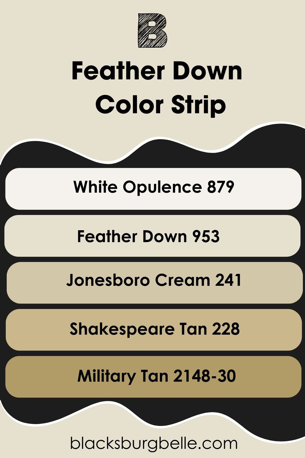
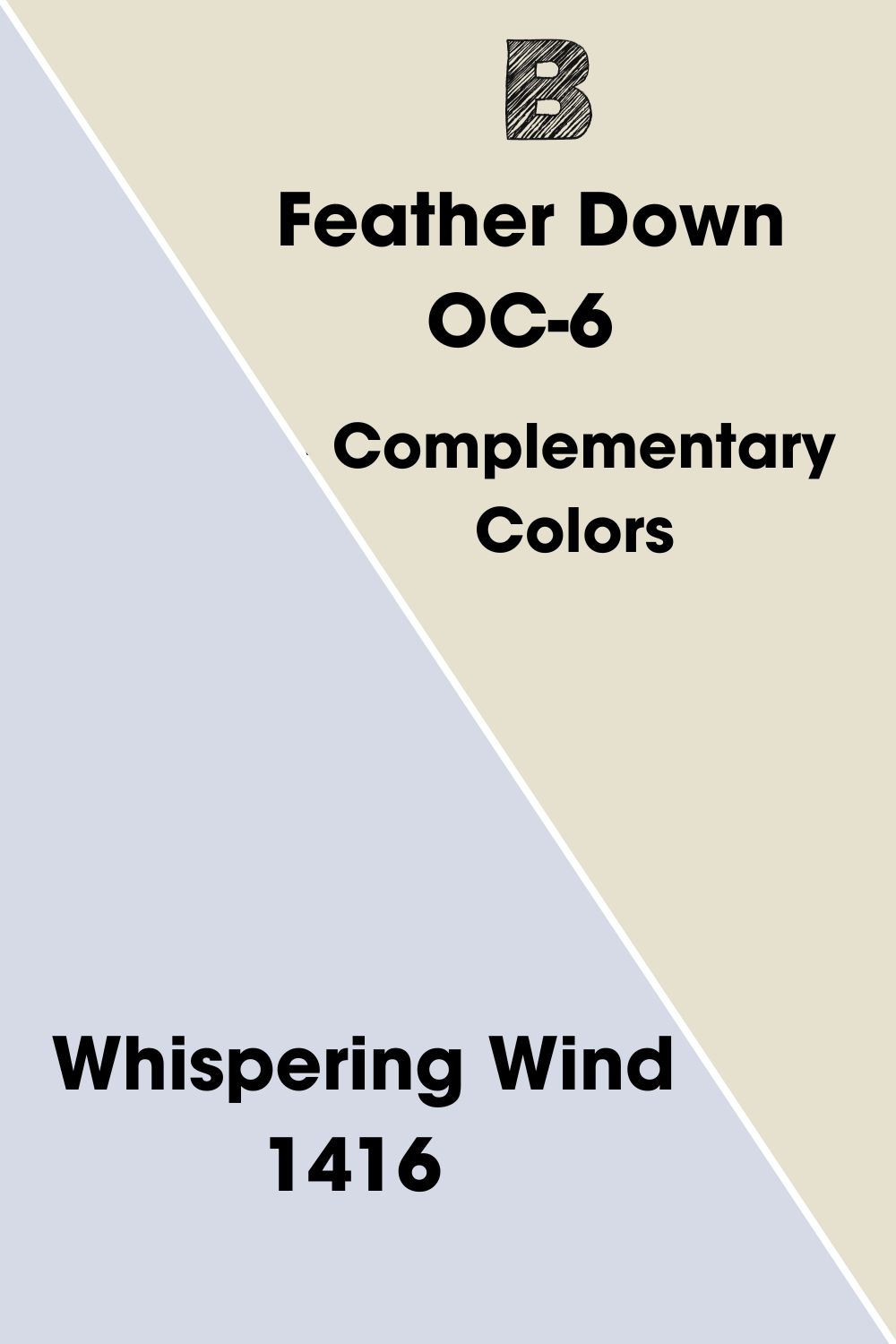
Complementary Colors for Benjamin Moore Feather Down
If you want a perfect pair of one color to Feather Down, you need the complementary hue. That’s the exact opposite tone from the color wheel to create a bold and contrasting pair. You’ve seen them on brand logos like red – green, blue-orange, and yellow-purple.
You can use these basic pairs to create complementary tones for neutrals like Benjamin Moore Feather White. Or you can use a color generator like ColorsX or Canva to get the perfect pair.
Benjamin Moore Whispering Wind (1416) is the complementary color for Feather Down. It’s a light lavender with a blue-gray undertone that makes it appear soft. This color’s gentleness matches Feather Down’s elegance while adding a cool aura to the space.
Because Whispering Wind is the bolder color in this pair, I recommend using it as an accenting furniture against a Feather Down wall. You can also use it in reverse by painting a Feather Down cabinet against a Whispering Wind wall in the bathroom or kitchen.
Benjamin Moore Feather Down Coordinating Colors
Try any of these five popular color themes for a bolder or softer decor. Every personality has a palette, and you only have to find the one that speaks to you. Here’s a summary to help your decision.
- Analogous Theme: Pairs three colors beside each other on the color wheel. The similar tones create a balanced vibe in your space.
- Complementary Theme: Use two opposing colors from the wheel to create a bold and contrasting look.
- Triadic Theme: Draw a triangle on the color wheel and pair the three equidistant colors. You’ll have all color groups in one palette. That’s red-blue-yellow and green-purple-orange.
- Split Complementary Theme: Split the complementary color of your chosen paint into a compound color. So for Yellow – Purple, you’ll get red-purple and blue-purple.
- MonochromaticTheme: Combine different tints and shades of a single color in one space.
Use monochromatic and complementary themes for minimalist decors then Split-Complementary, Triadic, and Analogous palettes for more creative and colorful designs.
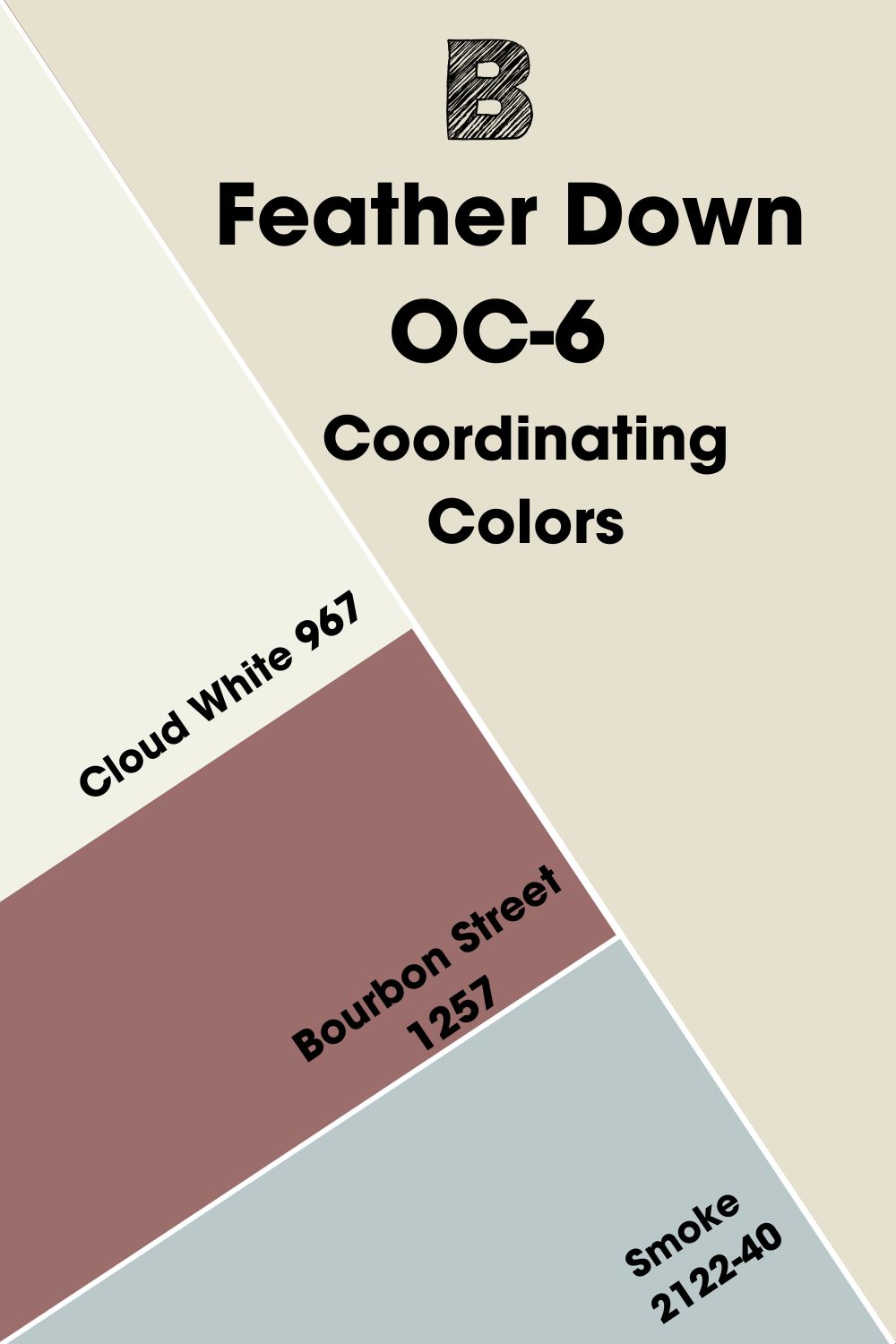
Coordinating Colors for Benjamin Moore Feather Down
I selected the best three of the four recommended coordinating colors for Feather Down, according to Benjamin Moore, by excluding one of the other two whites because Feather Down is a multifaceted white, so that you can pull off a classic white-on-white design with it.
Check out the best three coordinating colors:
- Benjamin Moore Cloud White (967):A brighter yellow-tinted white paint to highlight Feather Down.
- Benjamin Moore Bourbon Street (1257):The most beautiful dusty plum with a soft tan undertone to create a warm, romantic tone.
- Benjamin Moore Smoke (2122-40):This bestseller is an almost neutral grayish-blue paint with a green undertone.
I picked Cloud White instead of Chantilly Lace because it’s not a cold and crispy shade. Instead, its filmy whiteness blends excellently with Feather Down’s golden off-white tone. Then, complement its beauty with Smoke and accentuate both hues with Bourbon Street.
Benjamin Moore Feather Down Color Palette
Here are my top picks from two creative and one minimalistic palette suited to Benjamin Moore Feather Down. Personally, the monochromatic palette is my favorite for Feather Down because it highlights its two undertones.
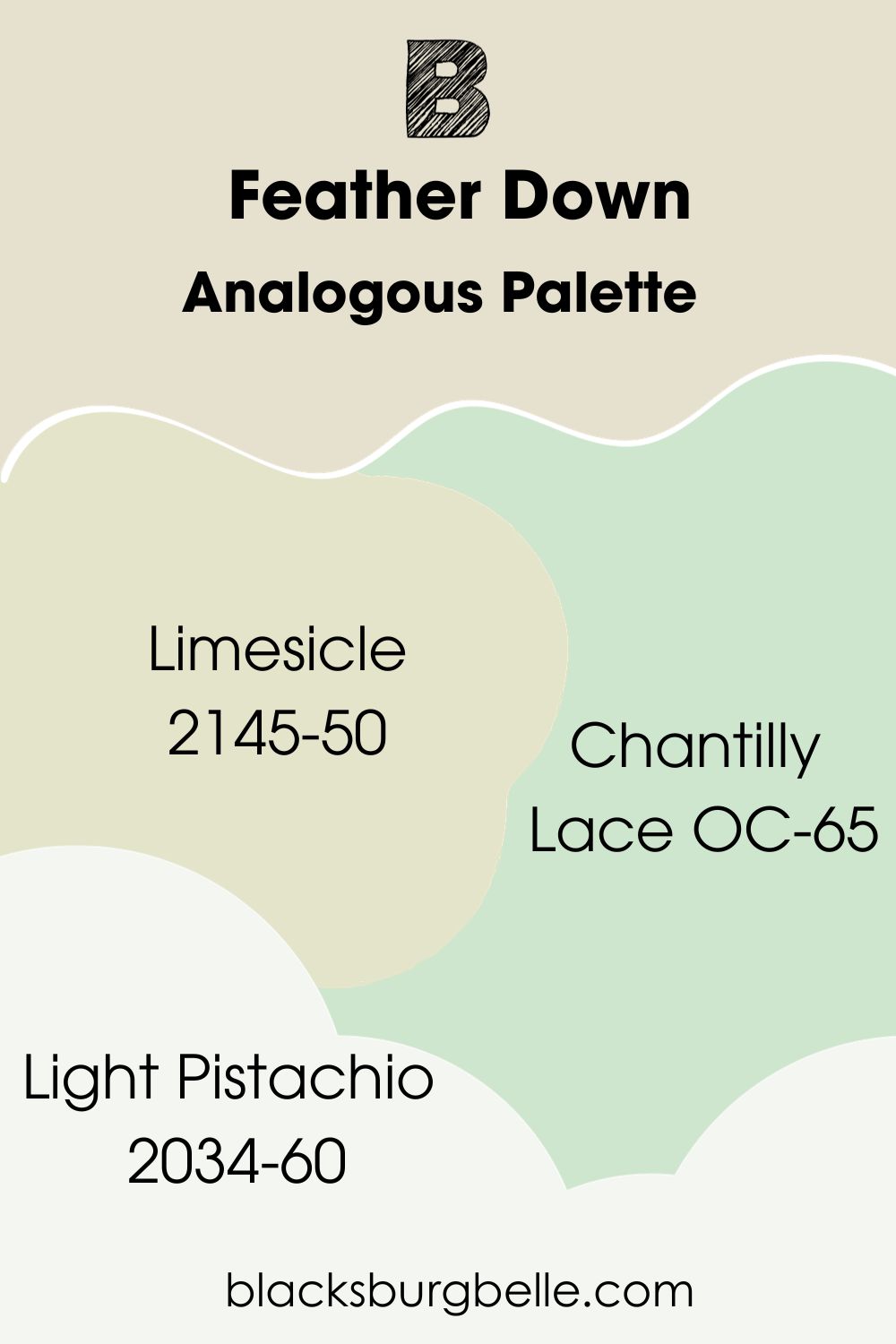
Analogous Palette
- Benjamin Moore Limesicle (2145-50):A medium-light yellow-green with the softest gray undertone.
- Benjamin Moore Light Pistachio (2034-60):This pastel green has a hazy gray undertone that cools its brightness.
- Benjamin Moore Chantilly Lace (OC-65):This best-selling bright white has a silky undertone that makes it look bridal like Feather Down.
Use Chantilly Lace as the trim or furniture accent depending on how bright you want your space. Both Light Pistachio and Limesicle are medium-light greens but Limesicle is warmer because of its yellow undertone. So, your overall idea determines which green to highlight.
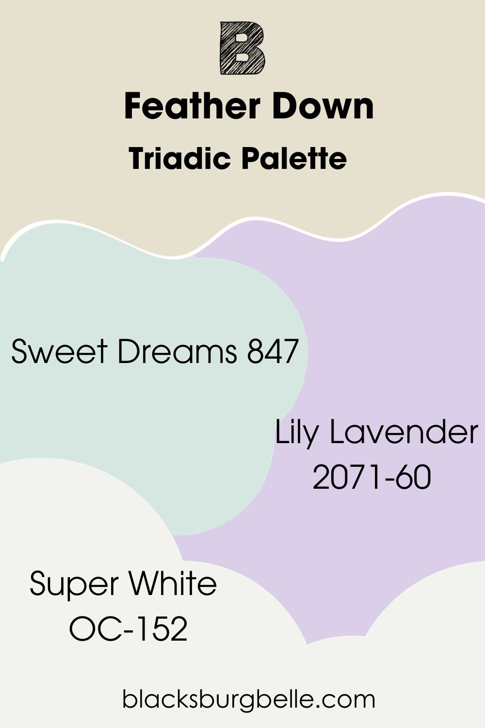
Triadic Palette
- Benjamin Moore Sweet Dreams (847):A medium-light baby blue color that looks like cotton candy.
- Benjamin Moore Lily Lavender (2071-60): This charming blush-tinted lavender is a best-seller for its soft yet bright tone.
- Benjamin Moore Super White (OC-152):A bright yet cool white color with a faint gray undertone.
Use Sweet Dreams and Lily Lavender as alternating accents for a Feather Down wall. Then trim all three colors with the clean and crisp Super White.
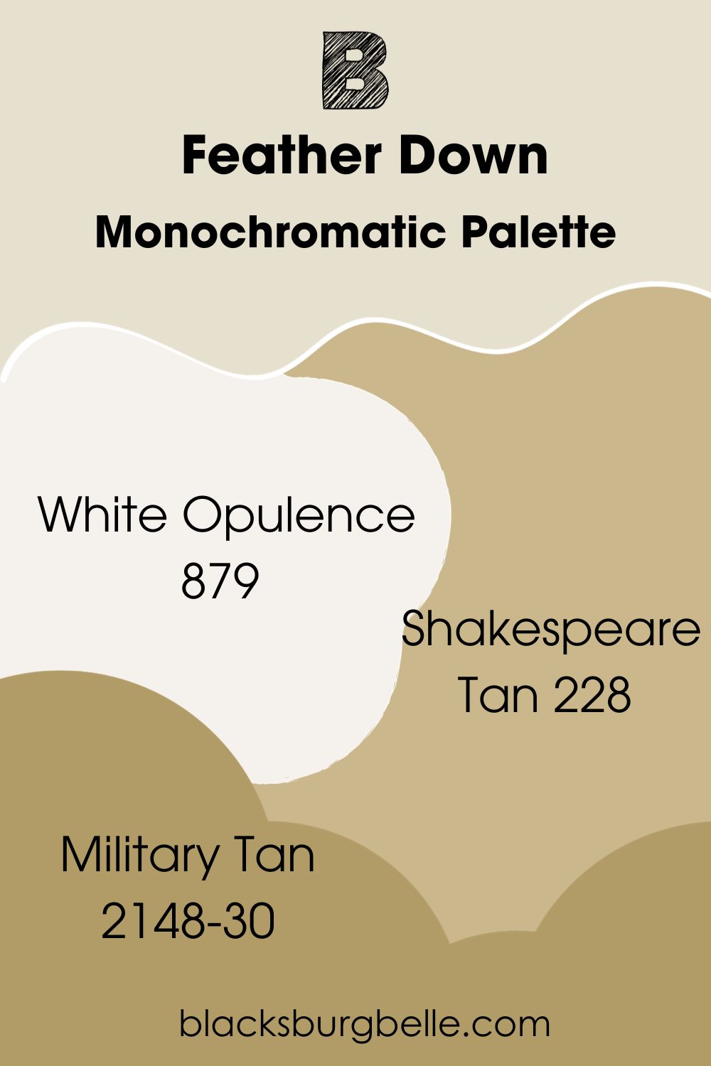
Monochromatic Palette
- Benjamin Moore White Opulence (879):A bright off-white with a pinkish-beige undertone.
- Benjamin Moore Shakespeare Tan (228):This golden tan has an earthy brown tint.
- Benjamin Moore Military Tan (2148-30):A rich medium-dark tan with a golden-olive undertone.
You can interchange Military Tan and Shakespeare Tan as accenting walls and furniture against a Feather Down wall. Then highlight all colors with a White Opulence trim.
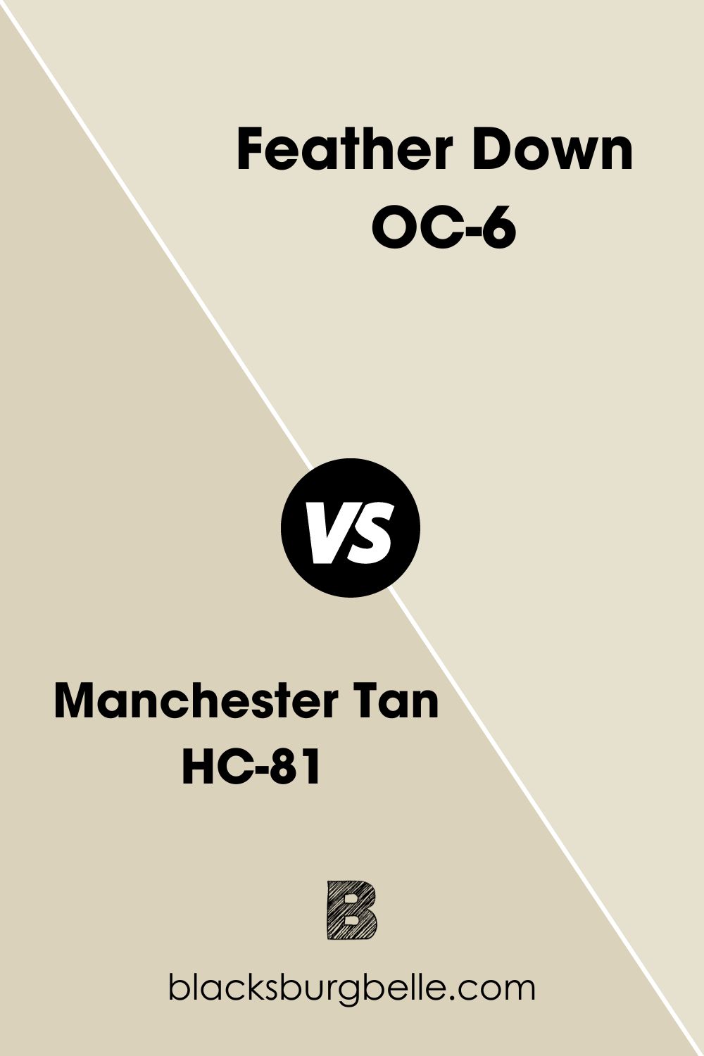
Benjamin Moore Feather Down vs. Benjamin Moore Manchester Tan
Manchester Tan is darker with a more pronounced beige tone than Feather Down.
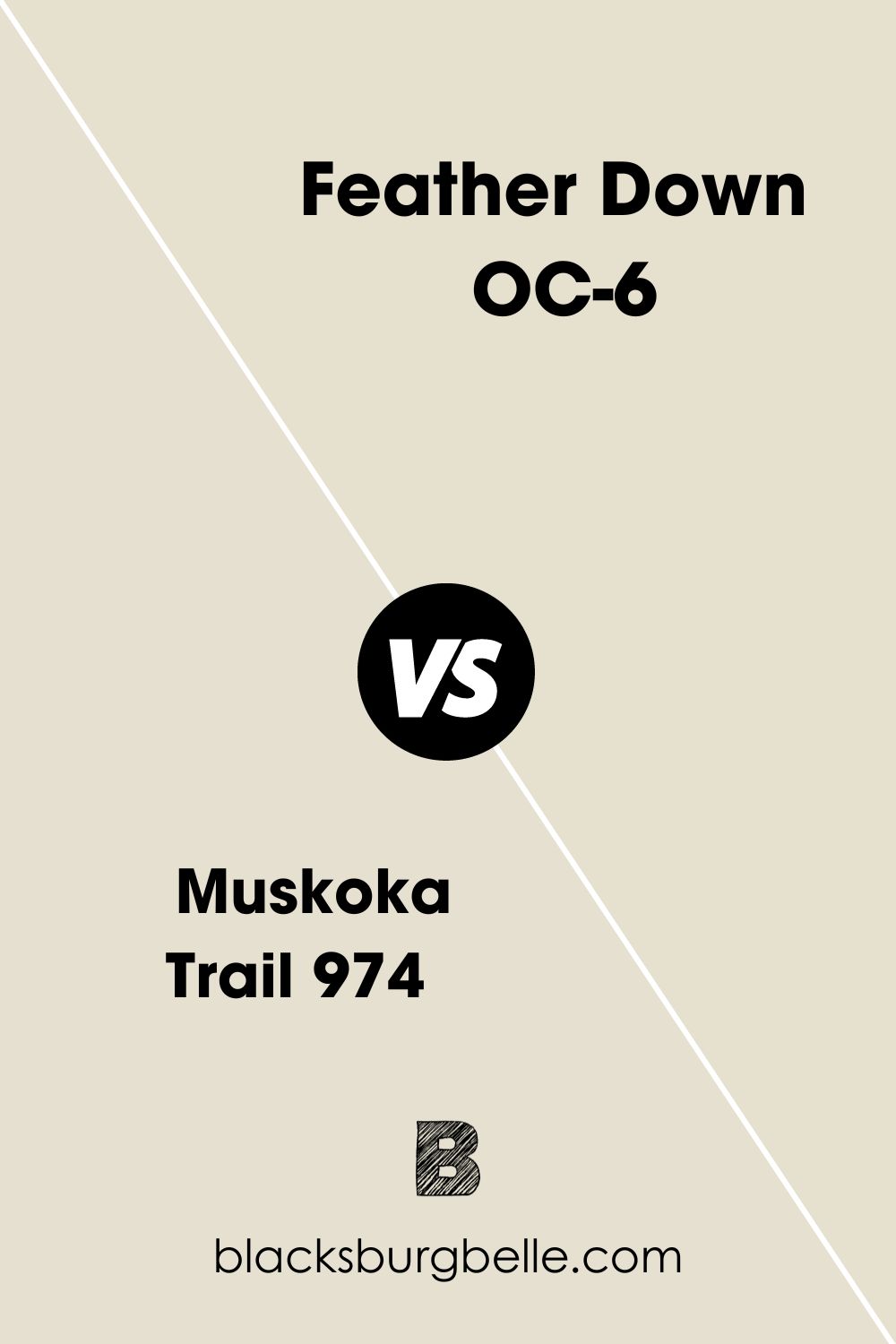
Benjamin Moore Feather Down vs. Benjamin Moore Muskoka Trail (974)
Muskoka Trail is also off-white with a beige undertone but slightly darker than Feather Down.
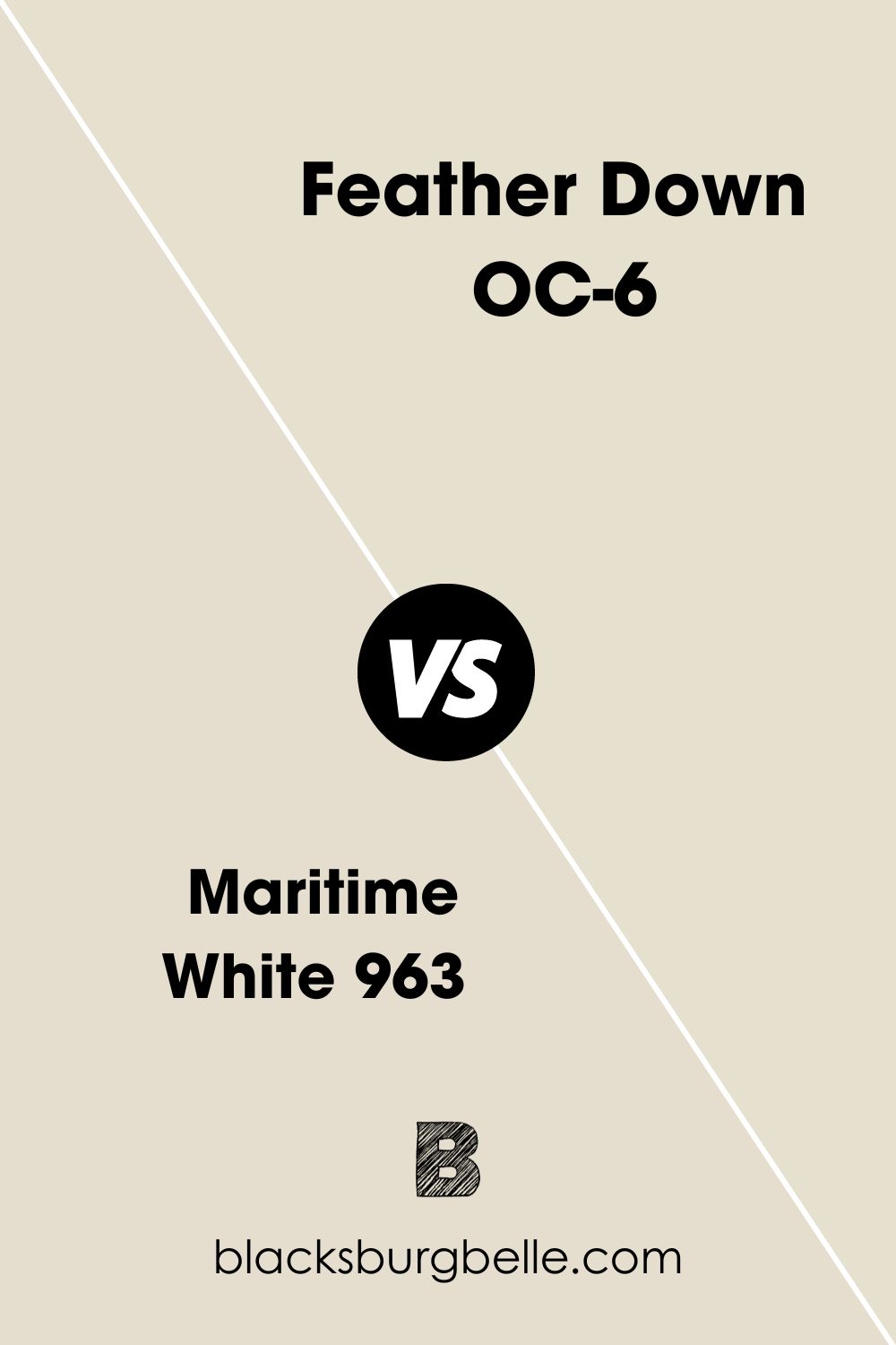
Benjamin Moore Feather Down vs. Benjamin Moore Maritime White (963)
Use Maritime White if you want a muted greige off-white color instead of Feather Down’s golden beige and faint green undertones.
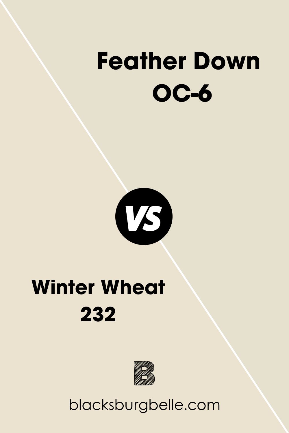
Benjamin Moore Feather Down vs. Benjamin Moore Winter Wheat (232)
Unlike Feather Down, Winter White has a subtle peach undertone that makes it softer.
Benjamin Moore Feather Down vs. Benjamin Moore Hushed Hue (1520)
You’ll get a faint green tint with an off-white exterior in Hushed Hue but no yellowish-beige like Feather Down. 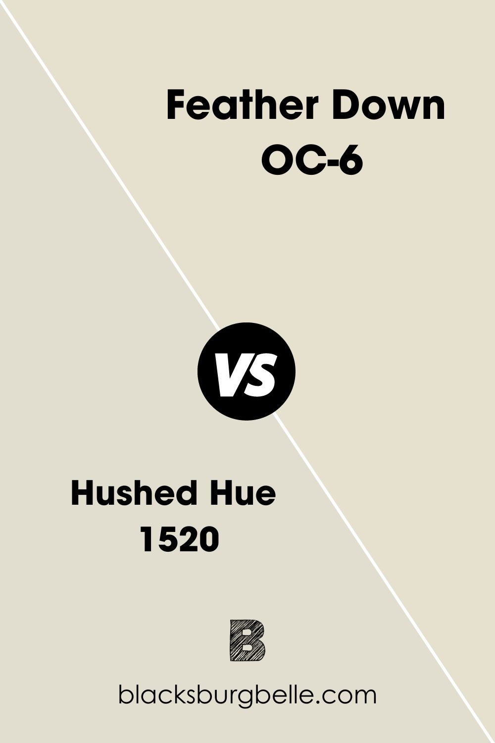
Benjamin Moore Feather Down Equivalent with Other Brands
You don’t have to worry about buying the “wrong” Feather Down because only Benjamin Moore has a paint with this name. But if you can’t access BM and want this exact shade, you can custom order from another brand using the hex value.
Alternatives from other brands also exist but have different undertones that make them slightly different from Feather Down. Check them out:
Behr’s Hazelnut Cream, Farrow & Ball School House White, PPG Vanilla Love, Sherwin-Williams Arrowroote, and Valspar Presidential White.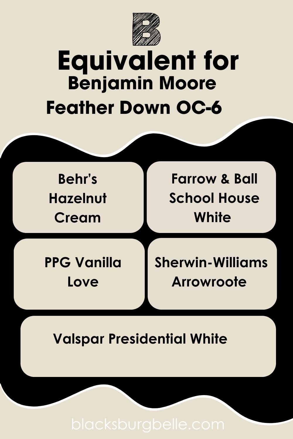
Where can you use Benjamin Moore Feather Down?
I know I said Feather Down is a versatile off-white color but it works wonders to certain spaces better than others. Here are some inspirations to help you design the best space.
Benjamin Moore Feather Down on Walls
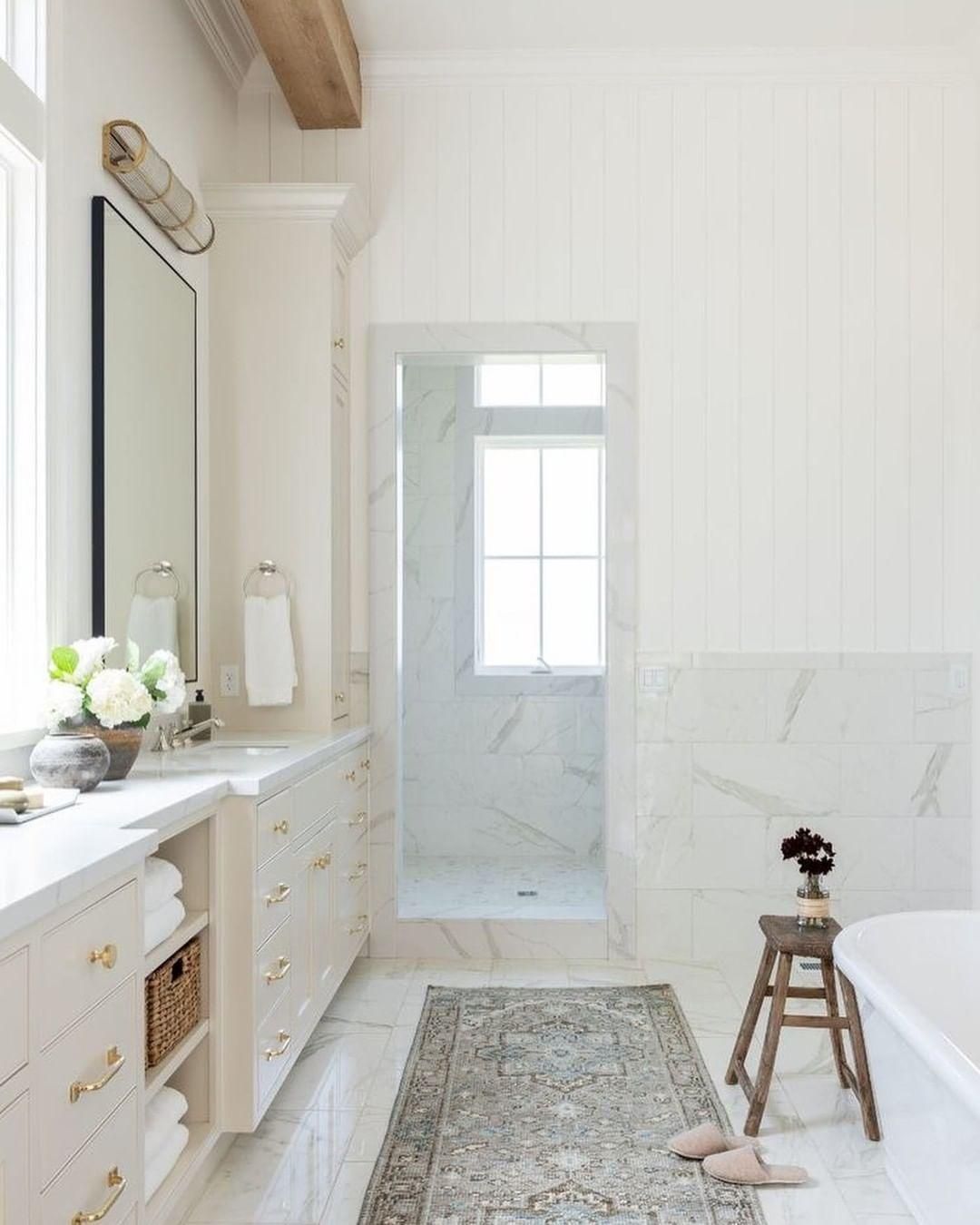
Feather Down walls are beautiful inside and outside because they turn bright golden white under the sunlight and a softer beige indoors. You’ll love the color better in your living room, bathroom and exteriors because of its warmth as you’ll soon see.
Notice that most living rooms pair Feather Down with monochromatic color strips. In this picture, there’s a golden brown leather chair with a lighter cream drapery and patterned rugs.
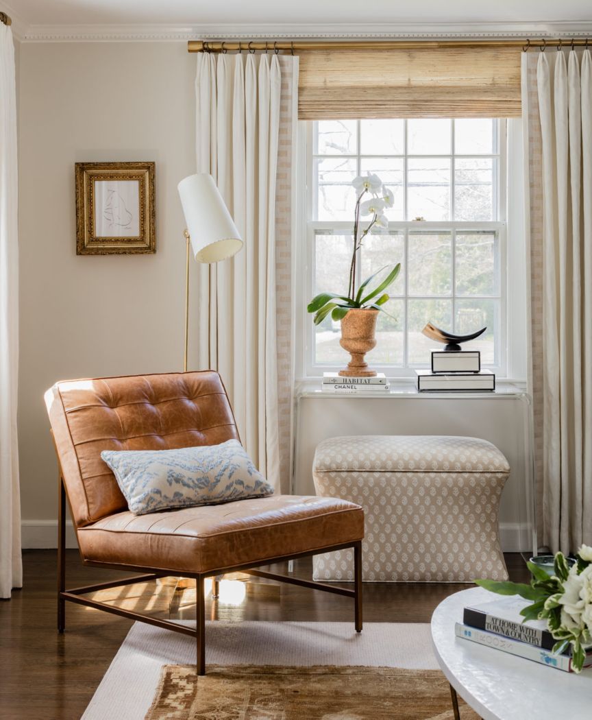
Benjamin Moore Feather Down in the Living Room
Your living room is perfect for using Feather Down walls, no matter the chosen palette. However, I recommend using a monochromatic or complementary theme to keep the space simple and classy.
You can paint your walls Feather Down, then accessorize with other colors like this house.
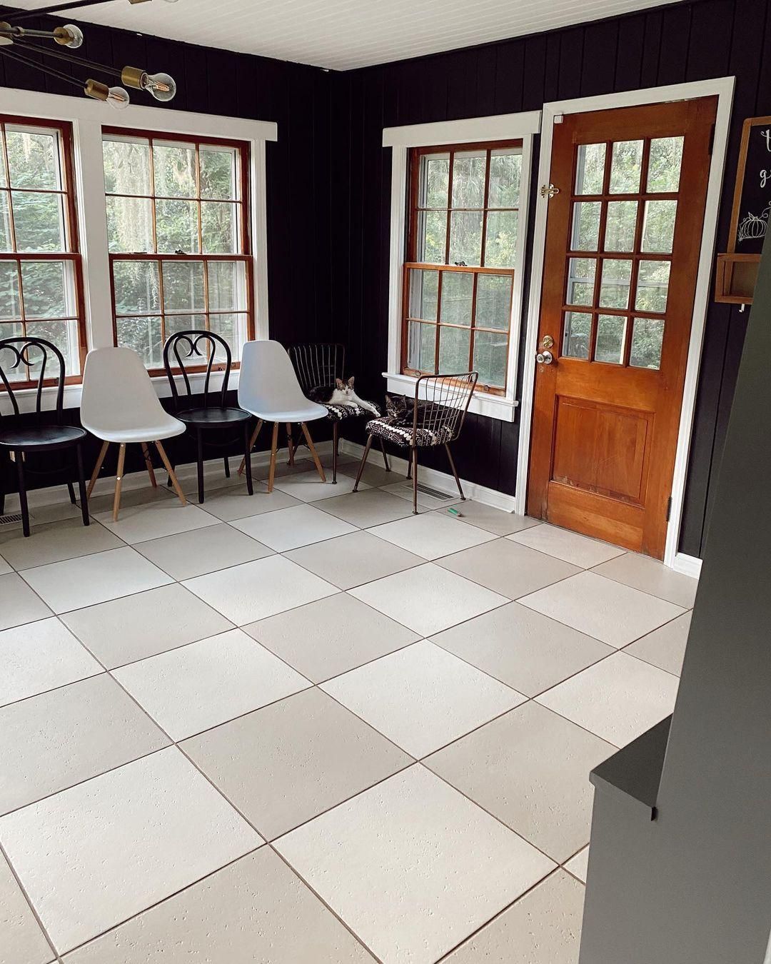
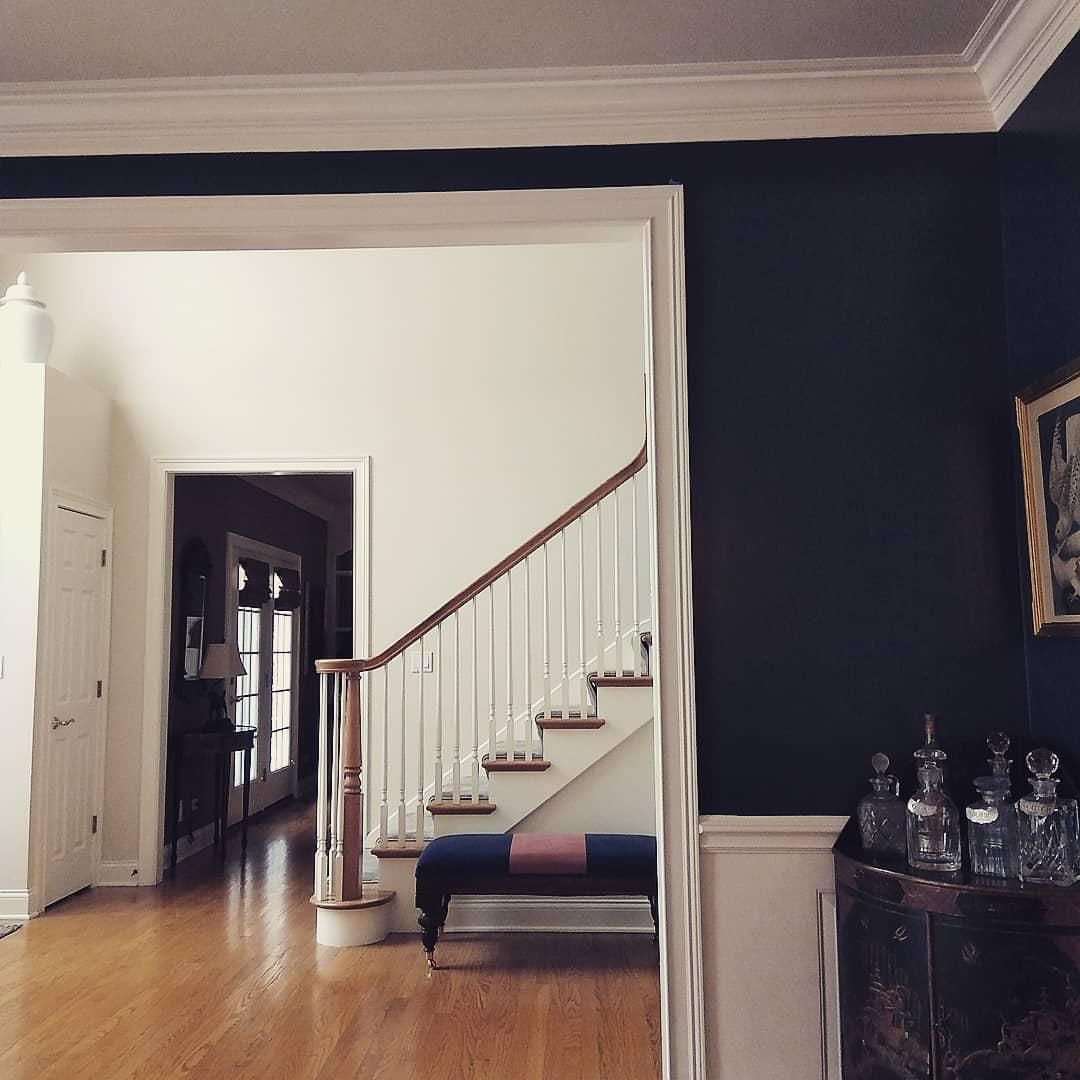
Benjamin Moore Feather Down as a Trim
I didn’t think you could use Benjamin Moore Feather Down as a trim until I saw this inspiration. And I’ll tell you for free, it’s worth it! Because the backdrop is a deep navy blue with wooden brown doors and windows, Feather Down’s brightness shines more.
The mix-matched floor tiles also add flair and highlight the double undertone in the Feather Down trims. It’s a better option than a crispy, cool white, which would’ve made the navy walls appear darker and colder.
Benjamin Moore Feather Down in the Kitchen
Incorporating Feather Down in your kitchen can work in a number of ways, but the most common is through cabinets. Now, you can use it on all your kitchen cabinets or mix it with a complementary color like this one.
Here, I’m not talking in the literal sense but saying the second cabinet color or material must match Feather Down. And what better way to match than using golden wooden furniture.
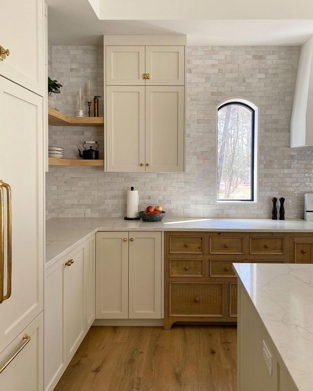
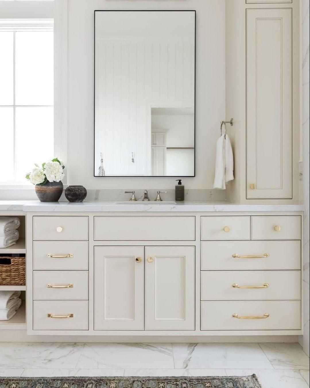
Benjamin Moore Feather Down on Cabinets
Another place your Feather Down cabinets can shine is in the bathroom if you’re not putting them in your bedroom. Again, decorating it in a monochromatic palette is best to highlight its undertones, tints, and shadows.
The white marble tiles and gold fixtures here highlight Feather Down’s warmth and beige undertone. It makes the space look clean but not clinical and boring. Instead, it gives a mature and sophisticated vibe.
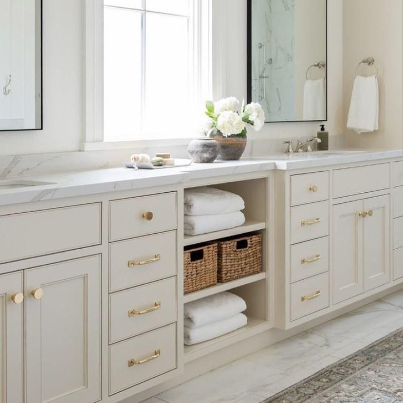
Benjamin Moore Feather Down in the Bathroom
Let’s look closer at Feather Down in the bathroom since you’ve seen the sneak peek. Notice how all fixtures and accessories complement the cabinet, including the far wall tile that has a subtle blue undertone to its whiteness.
Benjamin Moore Feather Down in the Entryway
What better way to welcome people into your space than using a bright and warm color like Feather Down in the entryway? You don’t have to extend the cheerful tone into the rest of the house because it’ll make a lasting impression on the small entryway space.
You can then go as dark or bright as you want for your other rooms, like this house that used a deep navy tone in the dining room and a matching hue in the living room. The reflection from the Feather Down entryway lends its brightness to the room and prevents it from looking too dark.
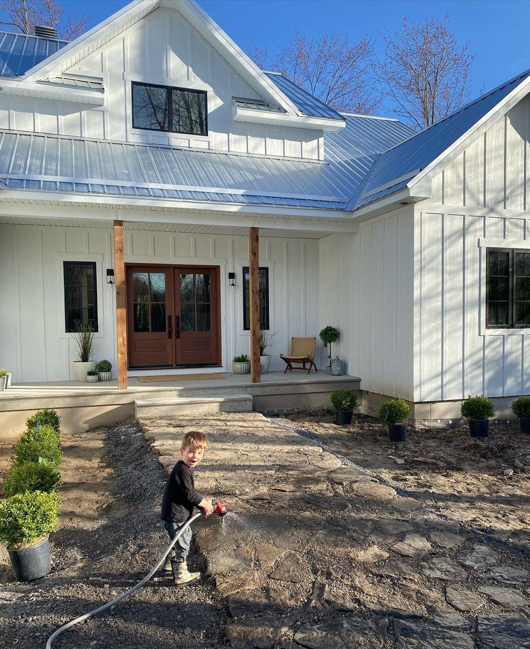
Benjamin Moore Feather Down on Exteriors
This is perhaps my favorite usage of Benjamin Moore Feather Down because of how direct sunlight transforms the color. I’ve chosen two exterior types to highlight this off-white’s beauty so, take your time to observe them.
The first look is at Feather Down on the front porch and walls of a farmhouse. The color is bright without being cold. Instead you can see hints of the green and beige undertone warming up its neutral tone.
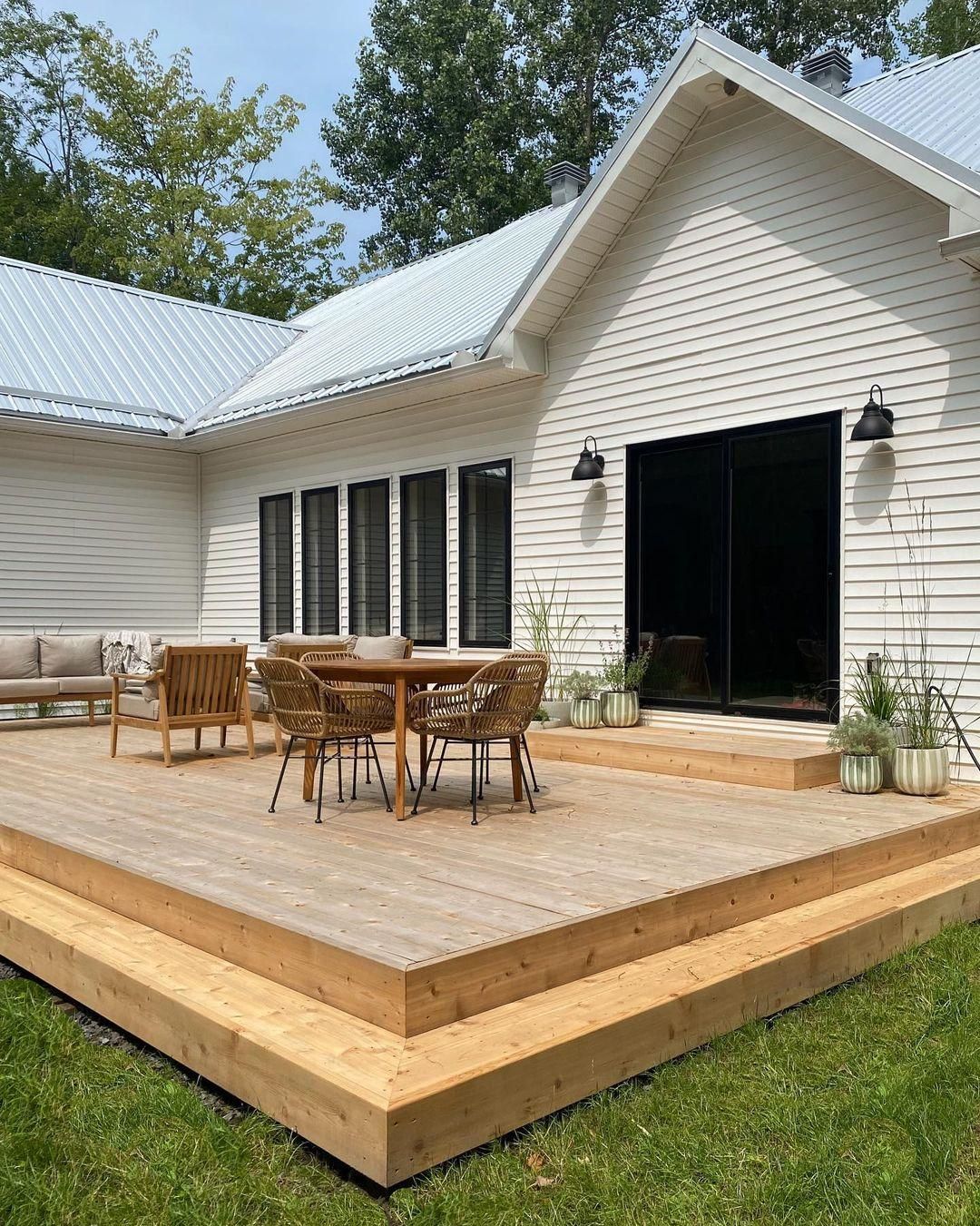
Meanwhile, on this back deck, Feather Down shines in all its warm glory thanks to the dwindling Western-facing light.
Also, notice how the green potted plants match the surrounding agriculture, and the rattan furniture plus decking makes it look elegant and homely. I imagine Sunday Brunch with family and friends on this deck or even a festive barbeque day.
Conclusion
Benjamin Moore Feather Down is undoubtedly a classic, elegant, off-white color fit for a simple, sophisticated style. It’s best used in exteriors and your living rooms and bathrooms.
Even though I recommend using Feather Down in a monochrome or complementary palette for the best result, don’t let my tips ruin your creativity. You can still explore some of the other themes I highlighted in this review.
Always remember to sample the product before purchase. Please share your thoughts and experiences with others in this community. We’d love to hear from you!
Happy Styling!
 Sherwin Williams Incredible White (Palette, Coordinating & Inspirations)
 Sherwin Williams Naval (Palette, Coordinating & Inspirations)
 Sherwin Williams Tricorn Black (Palette, Coordinating & Inspirations)
 Sherwin Williams Silvermist (Palette, Coordinating & Inspirations)
 Sherwin Williams Snowbound SW 7004 Review
 Sherwin Williams Charcoal Blue SW 2739: Color Review
