
It is not surprising that you are comparing Sherwin Williams Alabaster and Benjamin Moore Swiss Coffee. Both paint colors look the same, and the untrained eye can hardly tell the difference. So, is there a way to differentiate them?
While they are off-white paint colors with similar hues, there are subtle differences. Alabaster SW 7008 is slightly less warm than Swiss Coffee OC-45. This is because of the slight difference in their undertones. Swiss Coffee shows a little more yellow or creaminess than Alabaster.
This is the main difference between them and should be enough to help you compare them. However, that is not all there is because these off-white paint colors are not as simple as they look. If you want more details, come along on this ride with me.
Table of Contents
When to Choose SW Alabaster vs BM Swiss Coffee
Let’s face it: deciding the best time to choose SW Alabaster over BM Swiss Coffee can be a challenge. Unless you know specific situations where one works better than the other, it is near impossible. But I can help you with a few pointers in this area.
Choose SW Alabaster if:
- You want a bit of neutrality
- Your decor needs white but nothing too stark or plain
- You want to create an impression of more space
Choose Swiss Coffee if:
- An off-white is preferable to a pure white paint color
- A room has cold light and needs a warm, bright color
- Brightness is as important as warmth in your white paint color
While they look alike, Alabaster and Swiss Coffee don’t perform exactly the same way in a space. Swiss Coffee may look warmer than Alabaster because of its undertones, especially when there are a lot of warm colors around it.
Alabaster will also look warm but not excessively so because it has a little gray in it. The gray hue tones it down and makes it a little more neutral than Swiss Coffee. And this brings me to another point. Alabaster creates a better balance between color schemes than Swiss Coffee.
Now, let me show you how much these paint colors look alike and see whether you can pick more differences between them.
A Visual Comparison of SW Alabaster vs BM Swiss Coffee
Pictures are ideal for explaining difficult issues, such as the differences between Alabaster and Swiss Coffee. With pictures, you can see how they perform in real spaces and which looks like the better option for your decor.
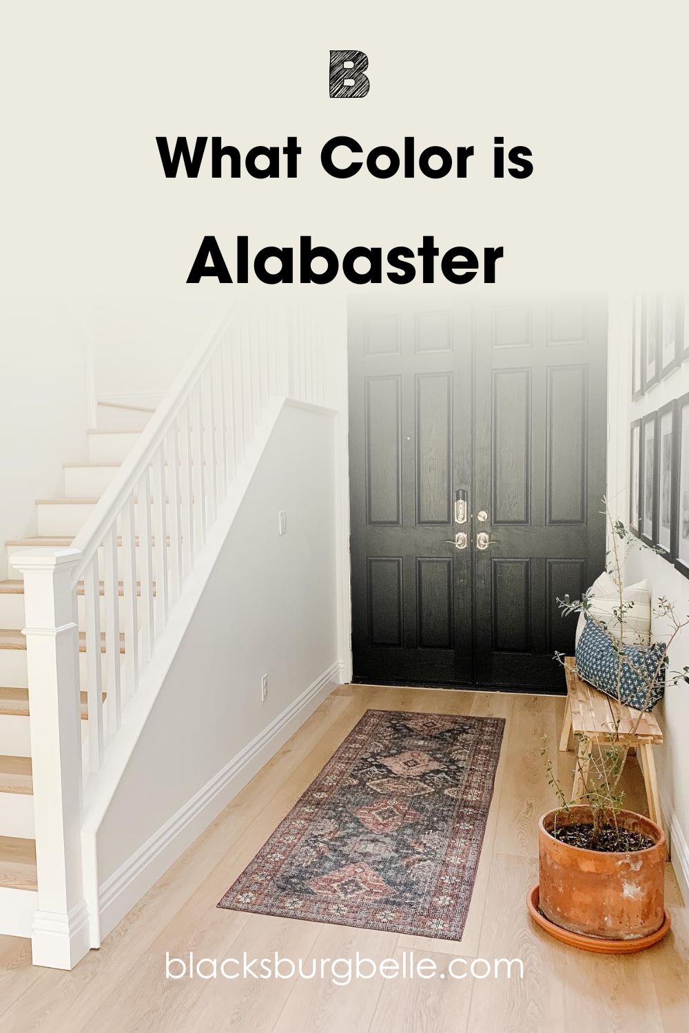
First, this is Alabaster in this entryway and stairwell:
And this next picture is Swiss Coffee used with light wood tones and simple decor:
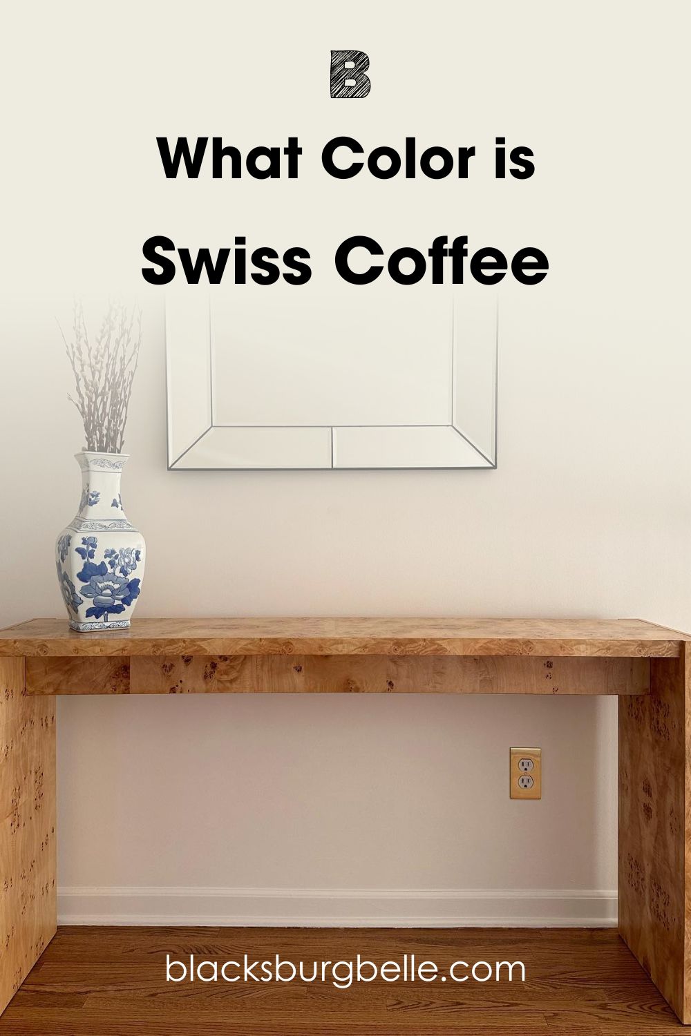
Alabaster is clearly less warm than Swiss Coffee. It looks bright and white in the decor, and this may be because of the natural light and dark colors around it. But the Swiss Coffee picture also has good natural lighting. Yet, the color appears warm and off-white.
What does that tell you? Use Alabaster if you want that spacious and classic white feeling that white brings. And use Swiss Coffee if you want an inviting and warm feeling without compromising on color. Note that the lighting conditions in each case can change the appearance of these off-white paint colors.
More on lighting later. For now, I want to show you basic attributes that indicate the differences between them.
A Swift Comparison Between SW Alabaster vs BM Swiss Coffee
Every paint color has attributes that make them unique. They are valuable in helping you choose or compare similar colors like Alabaster and Swiss Coffee. What are these basic attributes? Let’s find out.
| SW Alabaster | BM Swiss Coffee | |
| RGB | 237, 234, 224 | 238, 236, 225 |
| LRV | 82 | 81.91 |
| Undertone | Yellow-beige-gray | Yellow-green |
| HEX Value | #EDEAE0 | #EEECE1 |
Emotional Effects: SW Alabaster vs BM Swiss Coffee
While Alabaster and Swiss Coffee look the same, they don’t always feel the same in a room. One of them feels cooler and the other looks warmer. What you actually want in a room will determine which wins the day.
Alabaster looks whitey-white compared to Swiss Coffee because of the neutral base it has. So, in a room, it will create a pure and calming atmosphere that leaves you feeling peaceful. It will also make the room feel more spacious than it truly is.
As the slightly warmer and creamier color, Swiss Coffee creates a cozy feeling, making it easy to relax after a long day. It brings the decor together with its warmth, especially if the room feels too big. You can count on the color to produce enough brightness without sacrificing color or warmth.
LRV of SW Alabaster vs BM Swiss Coffee: Which Reflects More Light?
The LRV of color means its light reflectance value. This value is measured using a scale of 0 to 100, and true blacks have a value of 0 while pure whites have a value of 100. However, paint colors don’t have true blacks or pure whites, so experts use a scale of 2.5 to 94.
Sherwin Williams Alabaster has an LRV of 82. On the scale of things, this value is pretty high and embodies how bright the color appears even in a room with low light. Little wonder it looks like a pure white paint color, right?
Benjamin Moore Swiss Coffee has an LRV of 81.91. There is almost no difference between the LRVs of these paint colors, although when placed side by side, Alabaster will appear slightly brighter. So, in simple terms, Alabaster reflects more light.
Undertones of SW Alabaster vs BM Swiss Coffee: Are They the Same?
The undertones of Alabaster and Swiss Coffee are what set them apart. You can use them to compare and tell the difference, as I explained at the beginning of this guide.
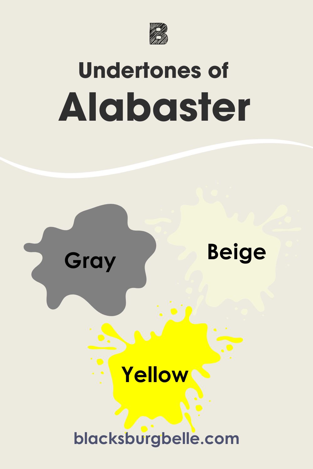
Alabaster has gray and beige undertones with a hint of yellow. The infusion of yellow makes the color warm, but the presence of gray mutes it a bit and gives it a slightly cool cast. Therefore, it performs well as a neutral color if you are not keen on gray or darker neutrals.
On the other hand, Swiss Coffee has yellow undertones that can read green in some rooms. When the light is not very bright or there are green items around it, the paint color can take on a green hue. It is a complex color that can show a touch of pink or lean toward gray in some cases. The good news is that it doesn’t show too much of any of these colors in a room.
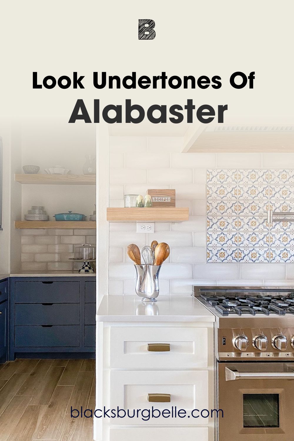
Picking Up on the Undertones of Alabaster
If you were not already aware of it, Alabaster can be a warm color when the setting is right. I have just the right picture to show you its undertones and how warm it can get.
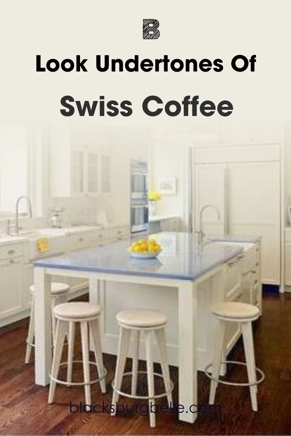
Picking Up on the Undertones of Swiss Coffee
In the same way, this next picture shows you just how warm and slightly green Swiss Coffee can get. If you opt for it, keep this possibility in mind when selecting colors to pair with it.
You can see the warm beige and slightly gray cast in Alabaster. The paint color holds up well as a warm color, especially with the bright light and warm wood tones around it. It helps to know how much this color can change in different settings.
Swiss Coffee shows a hint of green in the picture above. It looks both warm and cool in the setting, although it is typically a warm off-white. But remember how I said that the undertones can read green in low light? This is proof of it.
SW Alabaster vs BM Swiss Coffee: Are They Warm or Cool?
Both paint colors are basically warm colors, but there is a difference. Alabaster is slightly less warm than Swiss Coffee and can reveal a cool face when prompted. Therefore, you may notice a cool cast when used with a warm white like Swiss Coffee or others like it.
Swiss Coffee is noticeably warm, although some say it has a slight gray in it. I don’t see it; all its undertones are warm and subtle. It has everything to do with the yellow-green in it. While green is a cool color, it can lean warm when it is closer to yellow.
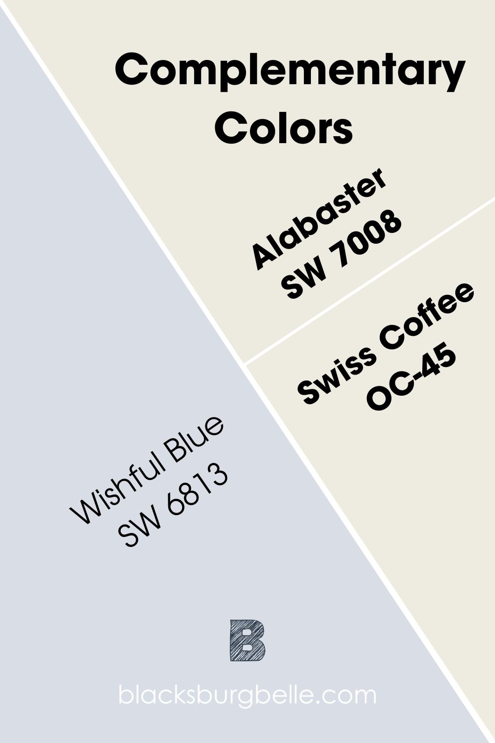
SW Alabaster vs BM Swiss Coffee Complementary Colors
If you want to get the best out of Alabaster and Swiss Coffee, it is best to discover their complementary colors. These are colors that sit opposite each other on the color wheel and cancel each other when mixed to produce a grayscale like white or black.
Complementary colors don’t have to appear agreeable, although when used well, they can look spectacular together. What are the complementary colors for SW Alabaster and BM Swiss Coffee?
The best complementary color for Alabaster is Sherwin Williams Wishful Blue SW 6813. It is a light cyan blue that appears to have a bit of purple in it. And for Swiss Coffee, the best complementary color for Swiss Coffee is Sherwin Williams Wishful Blue SW 6813. The color is pretty similar to Wishful Blue because of the closeness of the primary hues.
SW Alabaster vs BM Swiss Coffee Color Palettes
Complementary colors are only one aspect of picking colors to pair with Alabaster and Swiss Coffee. For a whole-house effect, you must create a suitable color palette for each one unless you plan to use it for the entire house, which may be boring.
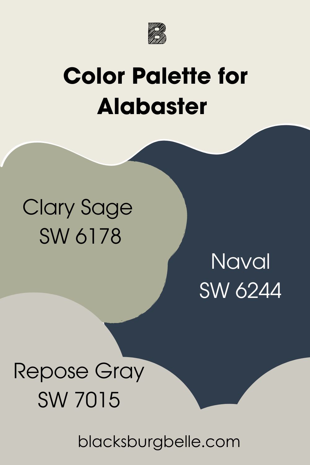
Color Palette for SW Alabaster
Clary Sage, Naval, and Repose Gray are colors I’ve picked to start you off on the journey of building a unique palette. You can add other colors, but use this as a guide to get there.
- Clary Sage SW 6178: This is a sage green that brings enough warmth to make Alabaster work, plus a slight pop of color
- Naval SW 6244: A navy blue paint color that adds some versatility to the decor when you pair it with Alabaster
- Repose Gray SW 7015: A light warm gray that works with anything and blends well with the balanced Alabaster paint color
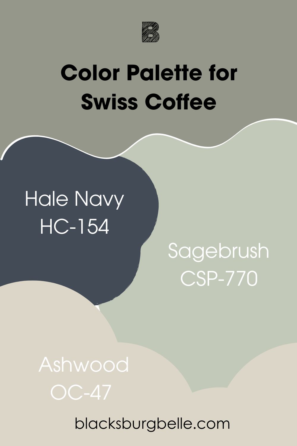
Color Palette for BM Swiss Coffee
Hale Navy, Sagebrush, and Ashwood are some of the colors to try in a palette for Swiss Coffee. This is because Swiss Coffee is a versatile color and works well with many others. Use this as a guide to build your palette.
- Hale Navy HC-154: A striking dark blue with enough depth to make the usual creamy Swiss Coffee pop with extra brightness
- Sagebrush CSP-770: A pale shade of sage green that brings softness to Swiss Coffee without making it look washed out
- Ashwood OC-47: This is a light gray paint color with a hint of aloe hue to balance the already warm Swiss Coffee
SW Alabaster vs BM Swiss Coffee in Bedrooms
White is the go-to color for many rooms and exterior walls. Alabaster and Swiss Coffee are ideal for every room, including bedrooms. Let’s see them at work in real bedrooms.
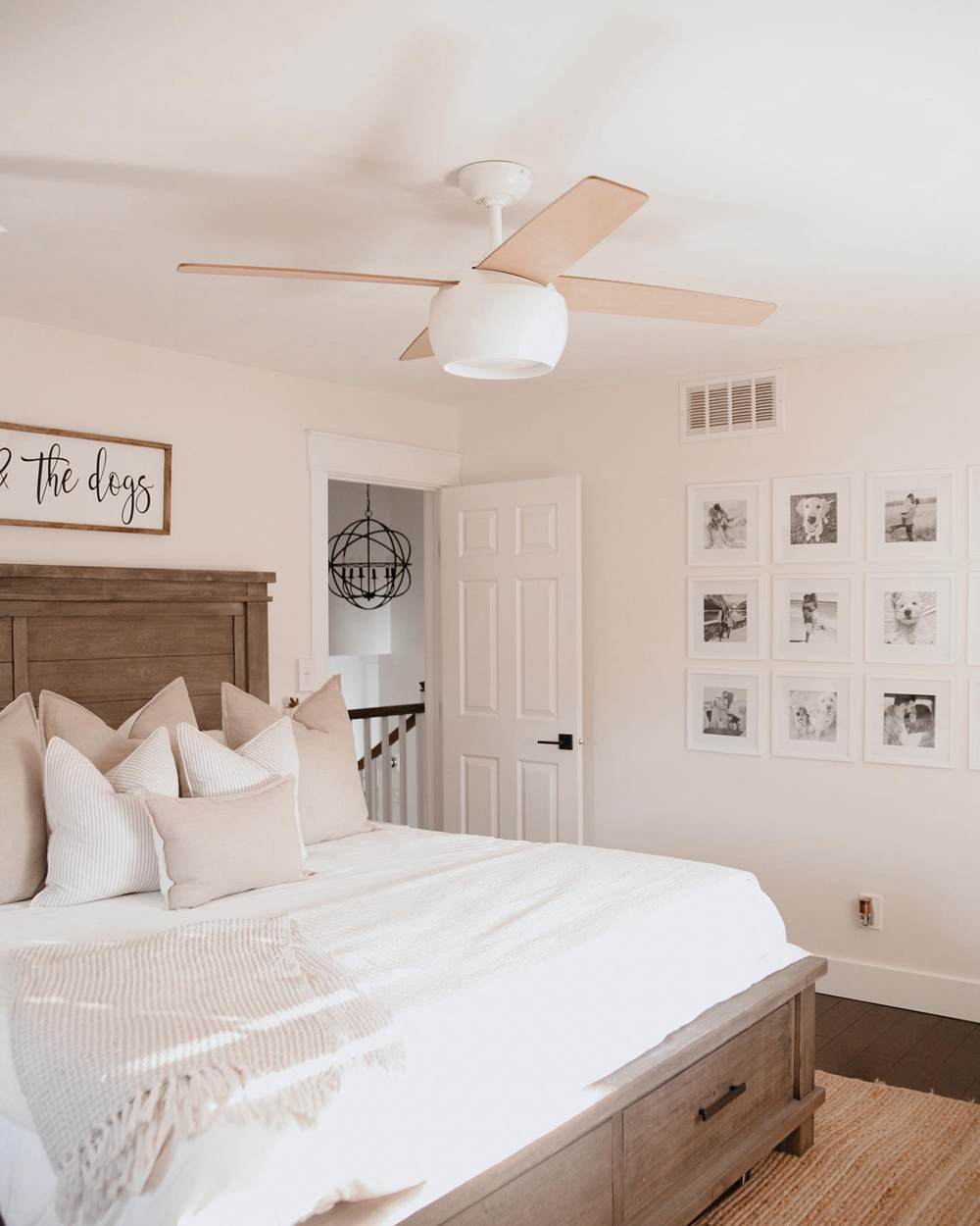
SW Alabaster in Bedrooms
This bedroom has Alabaster on the walls, and the paint color looks slightly red-hued instead of creamy or gray.
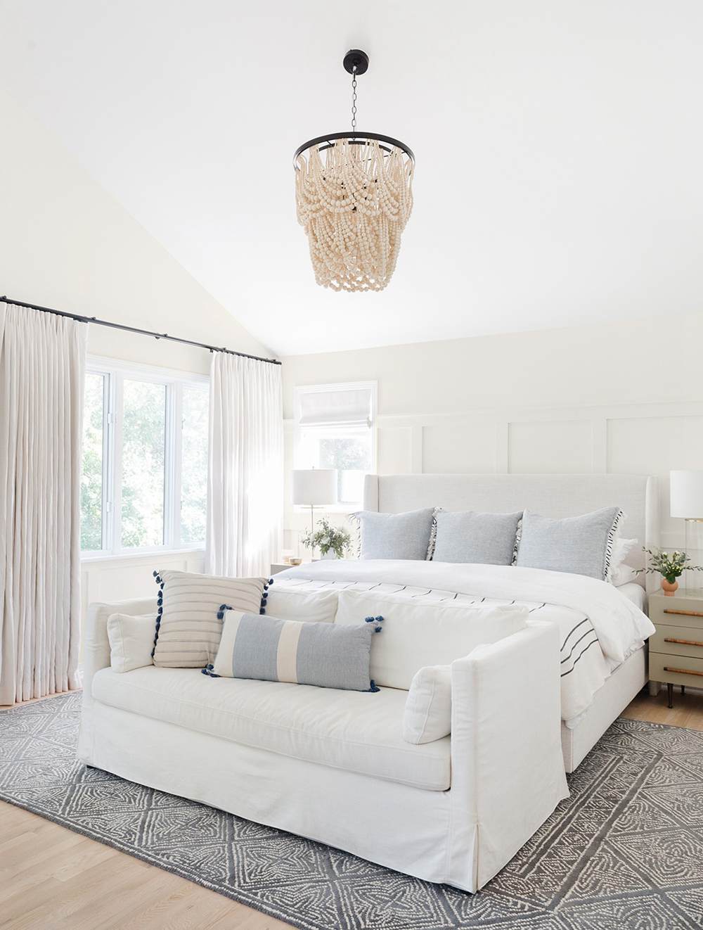
BM Swiss Coffee in Bedrooms
In this next picture, you will notice how bright and white Swiss Coffee looks. This has something to do with the colors in the decor and the abundance of natural light in the room.
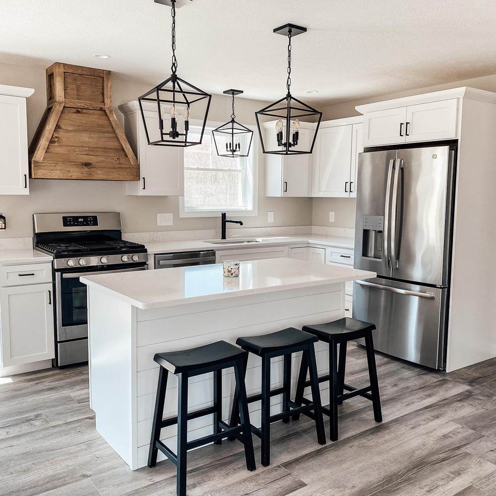
SW Alabaster vs BM Swiss Coffee on Cabinets
Cabinets are one of the first places that we think of when using white paint. Once the cabinets are bright and white, they transform the entire kitchen, making it look entirely new.
SW Alabaster on Cabinets
Here, Alabaster looks pretty creamy instead of whitey-white as it usually does.
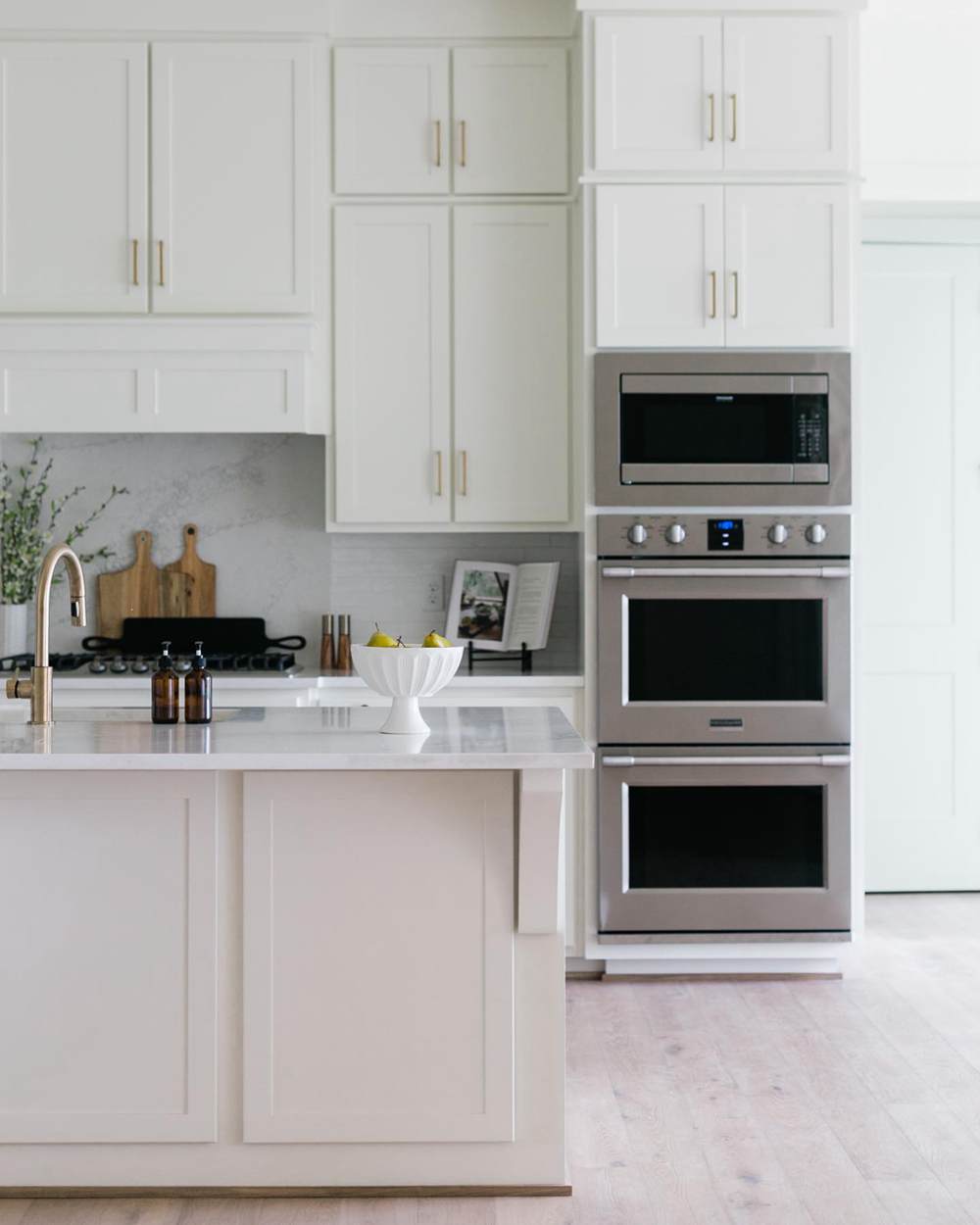
BM Swiss Coffee on Cabinets
In contrast, Swiss Coffee appears to be the whiter of the two paint colors. You can also notice a slightly green cast to it.
SW Alabaster vs BM Swiss Coffee in Living Rooms
Like bedrooms, you can use these paint colors alone in your living room. The splash of color to add versatility and make the decor striking can come from accessories around the room.
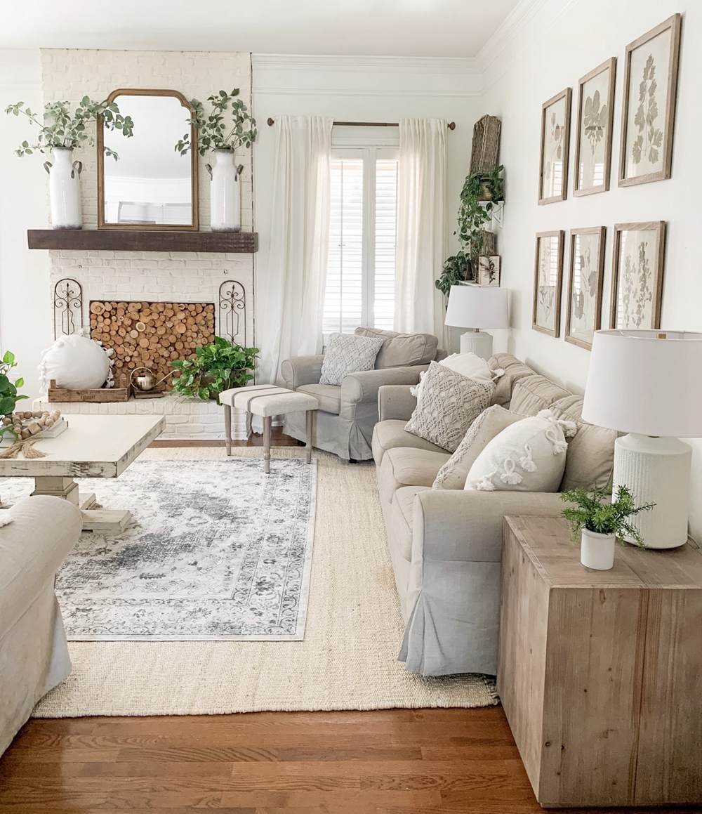
SW Alabaster in Living Rooms
You don’t have to wonder whether this paint color is ideal for a living room. Whether or not you have bright lighting, it will not be a dark color. But low light may make it appear cool with a gray cast.
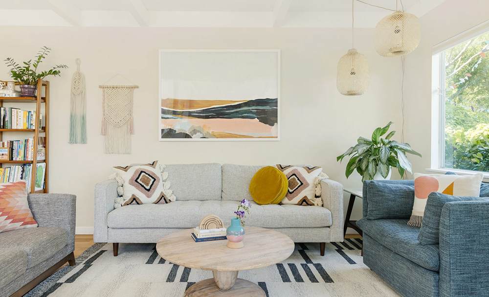
BM Swiss Coffee in Living Rooms
This is another popular paint color option for living rooms because of its brightness and warmth. Plus, it works well with many other colors.
SW Alabaster vs BM Swiss Coffee in Bathrooms
Various colors are becoming trendy in bathrooms, but white will always be a favorite. It is safe and clean, and it matches everything. If pure white is too stark, try off-whites like Alabaster or Swiss Coffee.
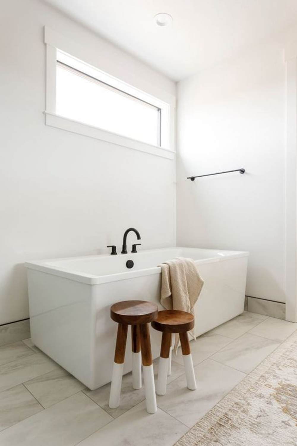
SW Alabaster in Bathrooms
This paint color appears very white in this bathroom, which is what you may get when you use Alabaster.
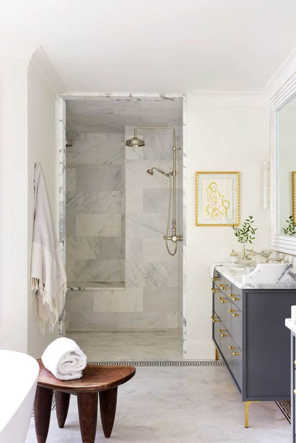
BM Swiss Coffee in Bathrooms
This bathroom allows Swiss Coffee to show its real color. It looks off-white, creamy, and warm despite the bright light.
SW Alabaster vs BM Swiss Coffee on Exteriors
They may seem too bright, but Alabaster and Swiss Coffee have proven to be great options for exteriors. The manufacturers recommend them for exteriors and interiors, so you are good to go if you want to use them for this purpose.
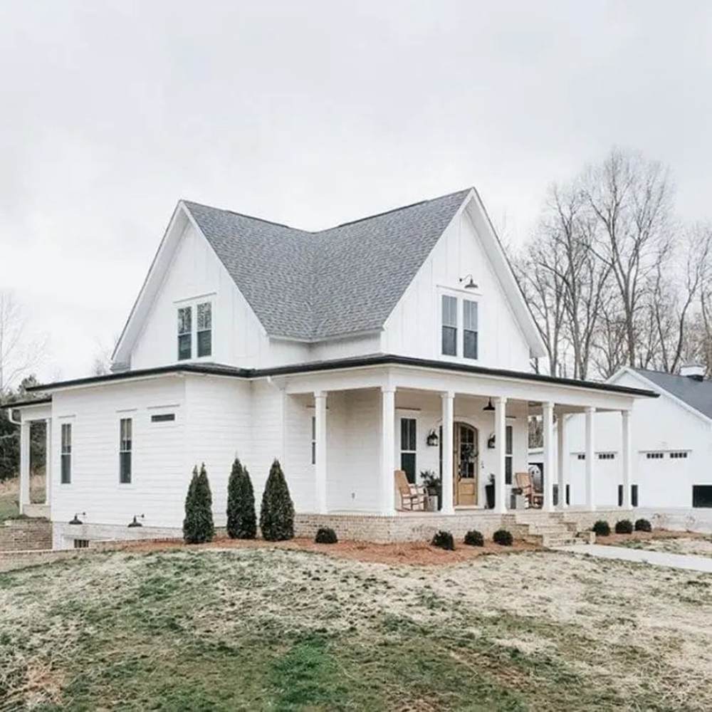
SW Alabaster on Exteriors
This house is done all in Alabaster and looks better than using pure white. The paint color retains some warmth and shows some of its undertones.
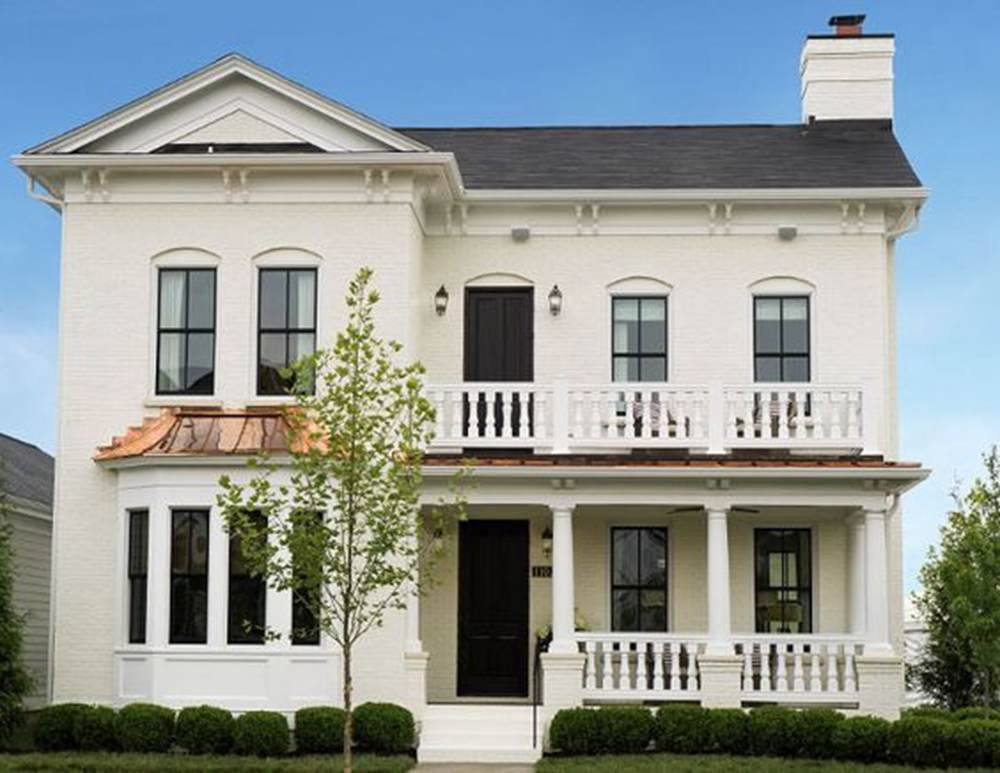
BM Swiss Coffee on Exteriors
Swiss Coffee looks almost greige on the exterior of the house in the next picture. There is no denying it is one of the best white or off-white colors for exterior walls.
SW Alabaster vs BM Swiss Coffee on Trim
Because they are white, Alabaster and Swiss Coffee perform well on trim. But you must use them with colors that have a corresponding tone to ensure there is no clash of tones.
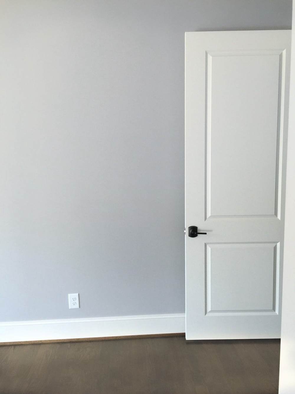
SW Alabaster on Trim
Here is Alabaster on the trim and door, making the blue-gray on the wall pop.
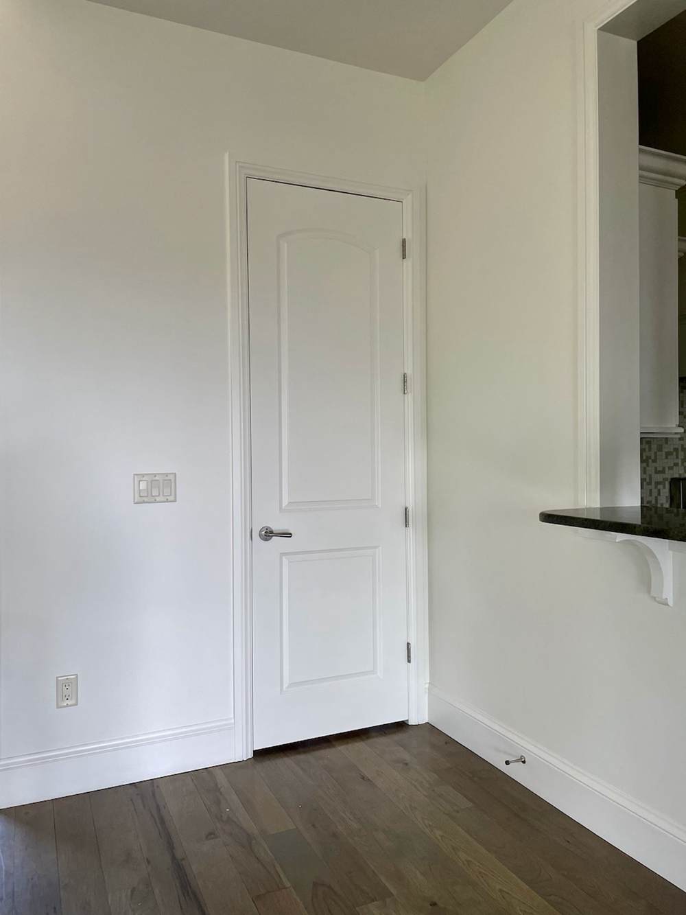
BM Swiss Coffee on Trim
It may not look like it, but Swiss Coffee looks great on trim if used correctly. Pair it with a dark white to make it work.
Lighting Conditions
I already mentioned how mercurial these colors can be, although not excessively so. Alabaster and Swiss Coffee can brighten or become muted, depending on the lighting. And the undertones can take on different colors if the lighting permits them.
Low light can bring out the gray in Alabaster, although it is a typically bright color. Swiss Coffee can also take on a muted shade if the lighting is unfavorable. In the same vein, the surrounding elements may throw their hues on these bright colors, causing them to look different.
However, they are naturally bright whites, so they hold up well in any lighting conditions. Nevertheless, consider using them with good lighting if you want them to reveal their true colors and perform well in a room.
Conclusion
It is hard to get it wrong with SW Alabaster or BM Swiss Coffee. But if you are torn between them, this guide explains their differences and the ideal time and place to use each one. You will also find their undertones and LRVs, so you know how to pair them with other colors.
I have also given you a guide to creating suitable color palettes for Alabaster and Swiss Coffee. What you use will depend on your existing decor, surrounding elements, scenery, or style. But since they are bright whites, you will hardly get it wrong.
Don’t hesitate to reach me in the comments section if you have further questions or observations. Remember that rooms love color, so add splashes of vibrant colors to complement these whites. Have fun painting and decorating!
 Sherwin Williams Worldly Gray Vs Agreeable Gray
 Sherwin Williams Alabaster Vs Pure White: How to Choose!
 Revere Pewter vs Agreeable Gray: What’s The Difference?
 Light French Gray vs Repose Gray: How to Choose?
 Benjamin Moore Edgecomb Gray vs Revere Pewter: How to Choose?
 Benjamin Moore Simply White vs Cloud White: How to Choose?
