
Are you stuck choosing between gray or beige, like Benjamin Moore’s Revere Pewter and Edgecomb Gray? You’re not alone. I struggled with the same confusion, which led to my review of the two colors.
Would you pick a classic foggy gray like Revere Pewter or embrace tradition with a medium-light beige like Edgecomb Gray?
One color will make your space look progressive with its coolness, while the other will make it appear cozy and homely. Which one would it be? There’s nothing like the trusted side-by-side comparison to clarify your decision, so let’s do it.
Table of Contents
When Should you Choose Edgecomb Gray and Revere Pewter?
It’s not enough to identify each color. You need to understand when to use Edgecomb Gray and Revere Pewter. They’re two diverse neutrals that’ll give you opposing looks and auras.
The multiple undertones in Edgecomb Gray and Revere Pewter make exciting neutral options.
Before we continue, check out some tips for using these colors.
Choose Edgecomb Gray if:
- You want to paint a family home
- You want your walls to portray warmth and coziness to your guests
- You love cream and earthy tans
Revere Pewter is Ideal when:
- You’re designing modern-themed homes but preferably for professional spaces
- You paint bathrooms, bedrooms, and other relaxation spaces
- You want to create a beachy presence with blue motifs
Curating a color palette for coordination becomes more than a mindless chore as you explore its many nuances. Neutrals are versatile colors for all spaces but beige suits homes while gray suits offices.
Learn how to use Edgecomb Gray and Revere Pewter by assessing their scientific and creative aspects.
Comparing Edgecomb Gray and Revere Pewter: A Visual Showcase
Let’s start by observing both colors physically and analyzing the different moods they inspire. When placed side-by-side, Edgecomb Gray and Revere Pewter look different, but it’s best you see that yourself.
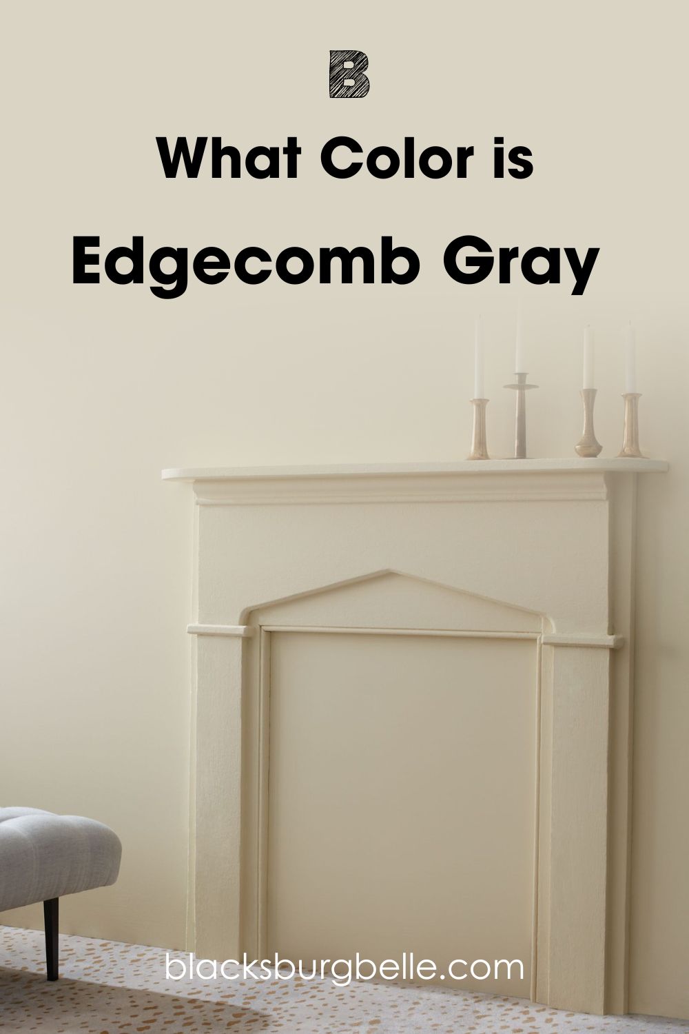
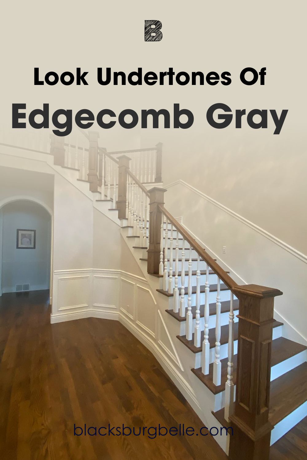
See Benjamin Moore Edgecomb Gray against a Wall
Now see Revere Pewter used on the same wall:
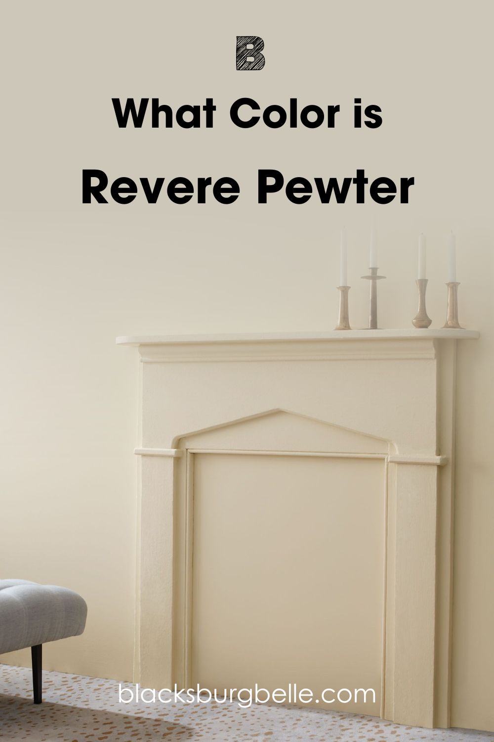
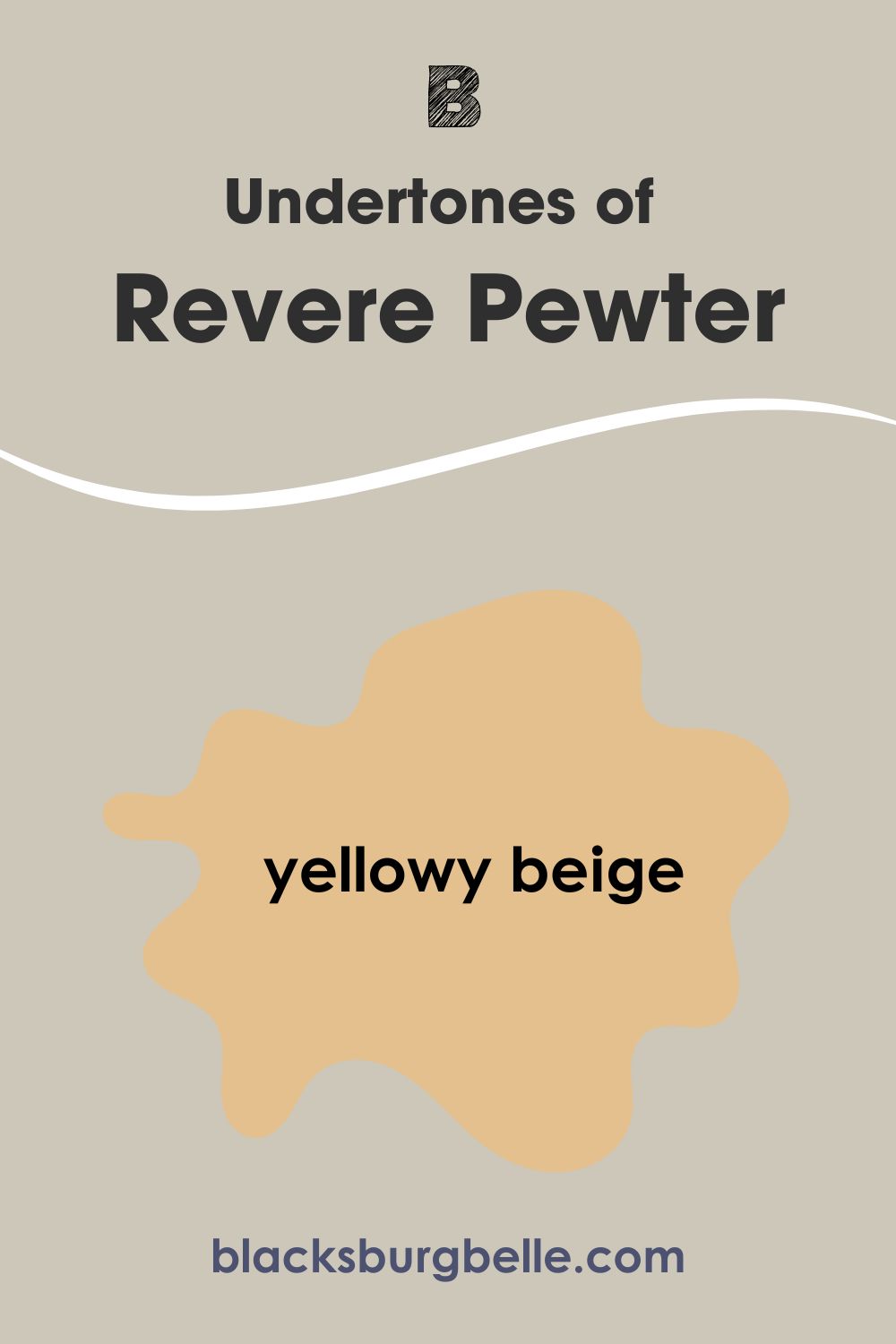
You’ll notice that Revere Pewter has two colors, with the lower right side showing as a yellowy-beige while the top left fades into an off-white tone. Meanwhile, Edgecomb Gray has an intense creamy look with a soft gray cast on both colors.
Despite their different tones, it’s clear that Edgecomb Gray and Revere Pewter both have gray casts that show up underneath dim lighting. However, Edgecomb Gray’s creamy note makes it lighter than Revere Pewter, which is more of a greige tone.
Learn more about those differences as we compare the essential characters of Edgecomb Gray and Revere Pewter below.
Comparing Edgecomb Gray and Revere Pewter: A Quick Overview
Here’s a summary of the differences between Edgecomb Gray and Revere Pewter to make your decision quick.
| Edgecomb Gray | Revere Pewter | |
| LRV | 63.09 | 55.05 |
| RGB | Red 218 | Green 212 | Blue 197 | Red 204 | Green 199 | Blue 185 |
| Undertones | Cream and Orange | Beige and Yellow |
| Hex Value | DAD4C5 | CCC7B9 |
Emotional Effects: Edgecomb Gray vs. Revere Pewter
Paint colors inspire different emotions subconsciously. You need energetic shades for functional spaces, while calming tones are best suited in relaxation rooms. Both Edgecomb Gray and Revere Pewter are vibrant neutrals because of their undertones.
Edgecomb Gray is ideal when you want your neutral paint to tie in some other vibrant colors and energize the space. It’s a great shade to uplift your mood when feeling down.
Meanwhile, Revere Pewter is more of a soothing gray with the potential to be for coolness while subtly infusing a soothing aura with its gray cast.
Light Reflectance Value (LRV) of Edgecomb Gray vs. Revere Pewter — Which Color Reflects More Life?
At face value, you’ll see that Edgecomb Gray is a lighter color than Revere Pewter even before noticing the LRV figures.
LRV is the extent to which a paint color reflects or absorbs light into its surroundings, with three being an absorbent black and 97 being a reflecting bright white. You can’t get 0 for pitch black or 100 for pure white because all paints have undertones.
Edgecomb Gray has an LRV of 63.09 which is way off the median but not close to being light. Hence, it’s a medium-light color that’ll brighten up a space in its natural state without oversaturating it with its light.
However, only additional lighting will emphasize its deepest cream and orange undertones.
Revere Pewter has an LRV of 55.05, meaning it’s only a few percentages brighter than the median of 50. It’s a mood stabilizer because the color typically remains the same even with additional lighting, with flashes of its undertones shining occasionally.
Undertones of Edgecomb Gray vs. Revere Pewter: Are They The Same?
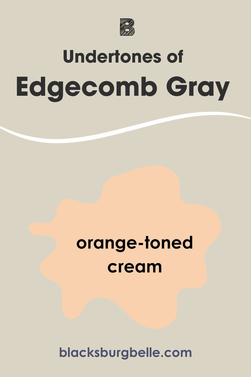
Edgecomb Gray and Revere Pewter share gray overtones but not the same undertones. Edgecomb Gray flashes an orange-toned cream, while Revere Pewter has a yellowy beige tint.
These undertones are the results of the RGB combination, a mixture of red, green, blue, and black that creates each unique paint shade. Edgecomb Gray has an RGB of 218/212/197, while Revere Pewter has 204/199/185.
A Closer Look at the Undertones in Edgecomb Gray
Edgecomb Gray often appears as a creamy paint because of its strong orange undertone, but white lighting emphasizes its gray cast. If you’re wondering why a color tagged “gray” looks like a dusty off-white, there’s your answer.
A Closer Look at the Undertones in Revere Pewter
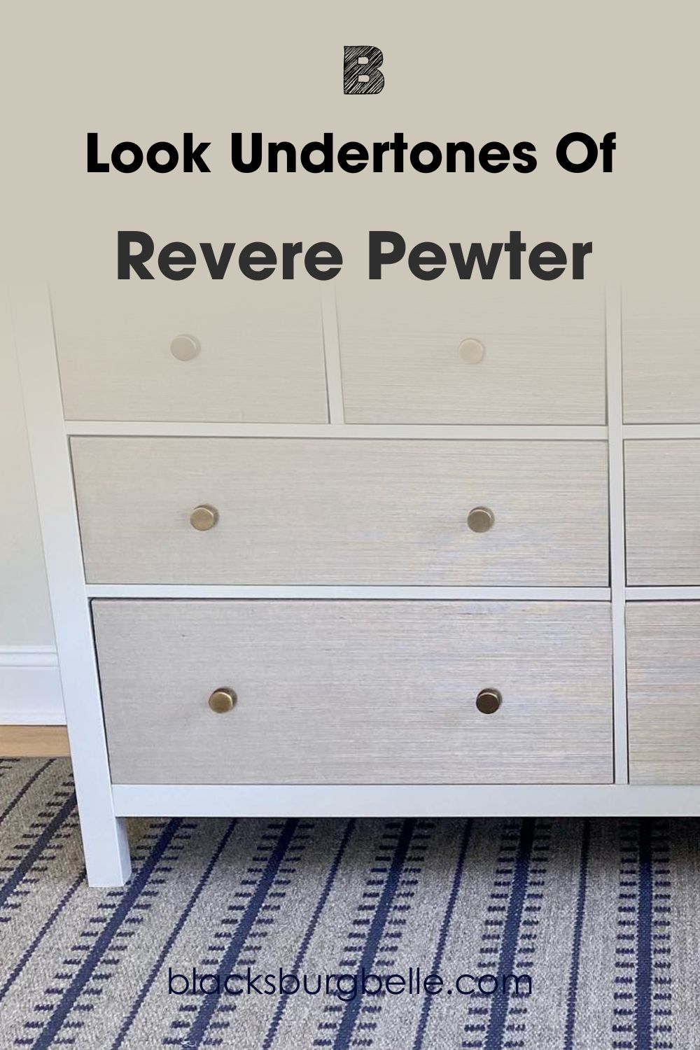
With Revere Pewter, you’ll get a visibly gray color with subtle flashes of beige and yellow. Yellow is the base note of beige, so it’s no surprise it appears in Revere Pewter, especially when you pair the color with other warm coordinates.
Greige neutrals are ideal options when you can’t decide between gray and beige as your unifying tone, and that’s why Edgecomb Gray and Revere Pewter are bestsellers.
You’ll get orange flashes from Edgecomb Gray in South-facing light but yellow tints from Revere Pewter. Use the paints in North-facing or West-facing light to maintain their gray cast and natural shade.
I’ll be discussing color palettes for Edgecomb Gray and Revere Pewter soon, but first, let’s talk about the color’s temperature and why it makes you feel the way it does.
Edgecomb Gray vs. Revere Pewter — Warm or Cool?
Edgecomb Gray is warm, while Revere Pewter blends warmth and coolness in one hue. As neutral paints, I had to view both colors underneath natural light and artificial light to see how the undertones react and influence the mood in the room.
Cool colors are those with a calming and relaxing aura, like the ocean (green, blue, purple), while Warm colors are fiery and vibrant, like heat (yellow, orange, red.)
So, Edgecomb Gray is a soothing color that sometimes resembles a light taupe tone, while Revere Pewter is relaxing with a touch of homeliness.
South-facing sunlight and warm lighting will intensify color and give you its coziest look, while West-facing sunlight and white lighting cast a faint shadow and keeps it cool.
Knowing how light transforms the colors and pairing them with the right tones is best to avoid clashing combos.
Complementary Colors for Edgecomb Gray vs. Revere Pewter
Complementary colors are two shades that sit opposite each other on the color wheel. There are fixed color wheel pairs (red & green, blue & orange, yellow & purple), but neutrals require extra thought because those hues are only present as undertones.
I’ve identified each color’s undertone and highlighted them with bolder shades for a complementary palette.
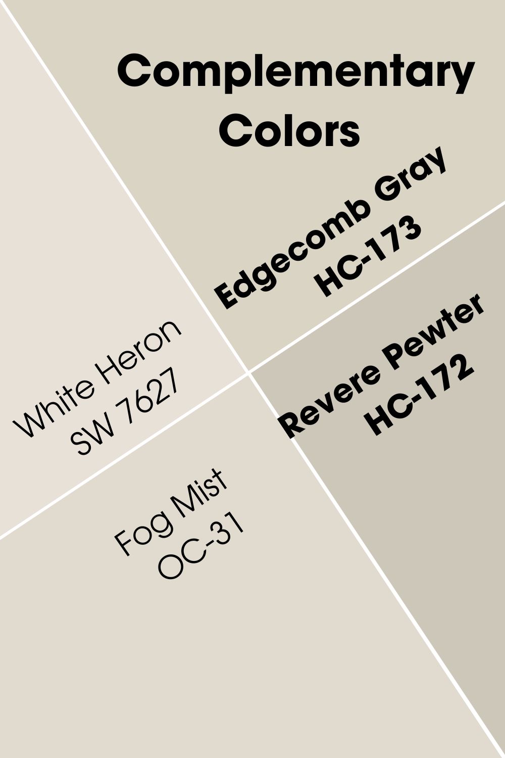
Edgecomb Gray has an orange undertone, so its complementary color is blue. Pair it with a soothing smoky blue like Benjamin Moore Boothbay Gray, which has a gray cast to match its greige undertone for a relaxing aura.
If you prefer to intensify its warmth, add the low LRV Pashmina, a deep taupe tone, to create an earthy vibe matching its cream undertone.
Stick to White Heron for the trims as its neutrality binds the complementary colors, and use Dove Wing’s silvery white as an accent or adjacent wall.
On the other hand, Revere Pewter’s beige-yellow undertone matches blue-toned grays with purple-tinted neutrals. Use colors like Chelsea Gray, which has a deep charcoal tone, and Sparrow’s, a bronze and taupe-toned neutral, to highlight its beige-yellow tints.
For a brighter reflection with similar base notes, pair Revere Pewter with Fog Mist, a cloudy white paint. The combo will create a greige and off-white neutral haven suitable for the neutral lover. Bind all colors with White Dove as trims, nooks, and wainscoting accents.
Color Palette for Edgecomb Gray and Revere Pewter
Color coordination is fun in interior decor because you can express your feelings and personality. The possibilities are endless because of the available themes, including Monochrome, Analog, Complementary, and Contrasts.
We’ve already discussed complementary colors, so let’s move on to the other three.
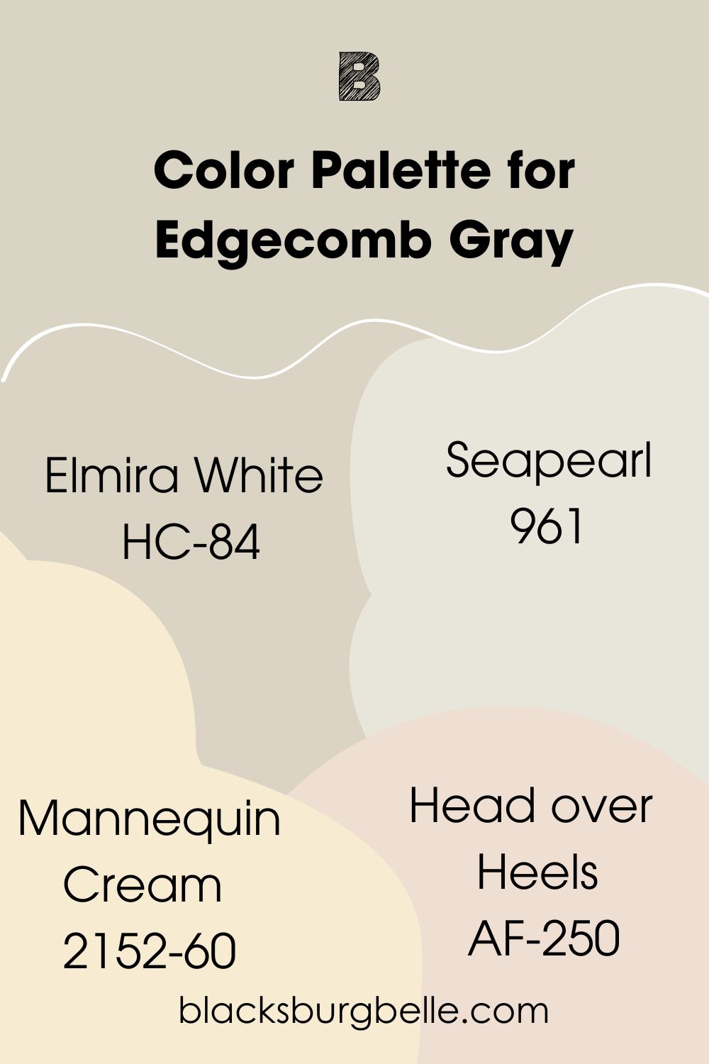
Edgecomb Gray Color Palette
Because Edgecomb Gray is a neutral paint, it’s ideal for a monochrome palette that involves similar shades.
You can also explore the theory by pairing Edgecomb Gray with side-by-side colors from the wheel. We’re still using the undertones here, so those colors are yellow and red. But I prefer to use their variations of cream and pink for a seamless flow.
Pair Edgecomb Gray with any of these colors:
- Elmira White (HC-84):When you need to replace Edgecomb Gray, Elmira White is your trusted alternative.
- Seapearl (961):Use Seapearl’s brighter gray tone to emphasize the cream base in Edgecomb Gray. It’ll make an ideal monochrome palette.
- Mannequin Cream (2152-60):If you want to highlight the creamy undertone in Edgecomb Gray, you need a bright cream tone like this one.
- Head over Heels (AF-250):This blush pink works wonders in a space and adds a soft brighter tone to the mid-toned Edgecomb Gray.
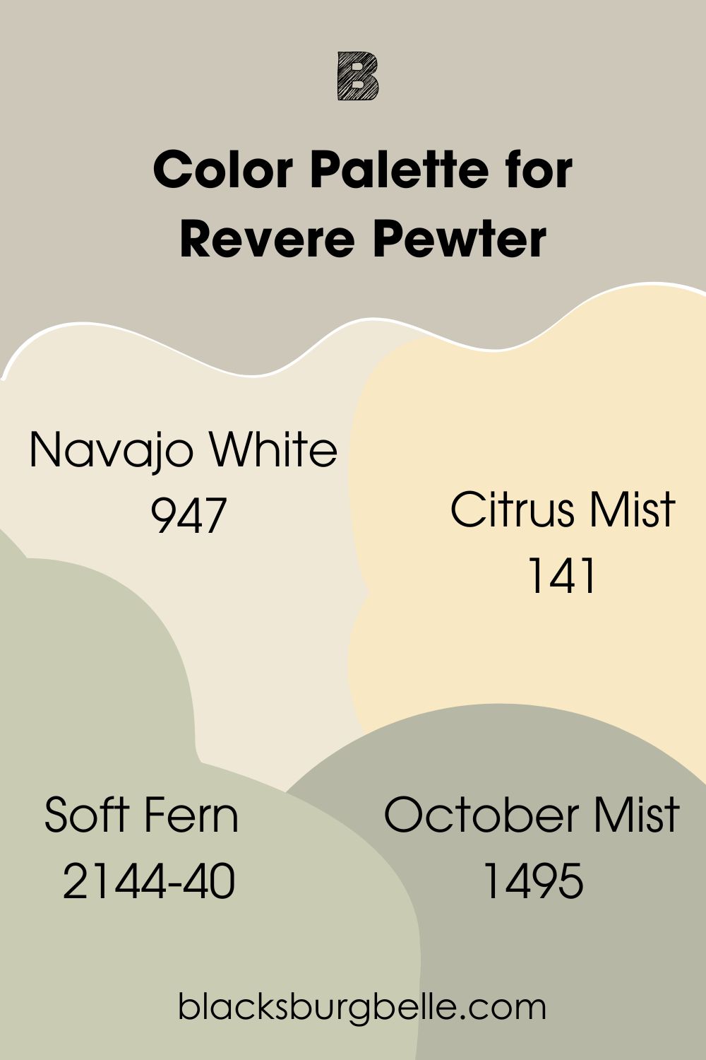
Revere Pewter Color Palette
Keep the mood balanced by pairing Revere Pewter with similar colors to make your space look like a progression of light and shadows against a single color. Simplicity at its best.
Get creative and bring back color blocking with green and orange to highlight the yellow-beige undertone in Revere Pewter. Use traditional orange and green interiors for your living room but stick to tertiary tones of sage, mint, and beige for your bedroom.
Make the carpets, art, and curtains secondary colors while the blinds and beddings tone the brightness with beige and other cool greens. This analog decor is the best way to highlight Revere Pewter’s dual temperature.
Explore these Benjamin Moore colors
- Navajo White (947):Use this off-white paint to maintain the casual vibe in your Revere Pewter room by painting it on your trims and accents.
- Citrus Mist (141): When you need an energy booster, pair Revere Pewter with Citrus Mist, a bright beige-yellow paint that’ll highlight its warm undertones.
- Soft Fern (2144-40):Sage greens like Soft-Fern add an earthy element to greige paints like Revere Pewter. It’s a great choice for creating a serene aura in your space.
- October Mist (1495):Green-gray is another neutral that gives your home or office a modern look, so feel free to pair it with Revere Pewter.
Can you use Edgecomb Gray with Revere Pewter?
Revere Pewter and Edgecomb Gray would work well in an analog theme because their yellow and orange undertones are color sisters.
Also, pairing them would create a relaxing mood as both Revere Pewter gray accentuate the foggy side of Edgecomb Gray.
Because Edgecomb Gray is the lighter color, use it as the highlight (upper wall, entire wall, ceiling), make Revere Pewter your accent (lower wall, furniture, trims, alcoves, wainscoting) or use them in equal measure as adjacent walls.
After all, there’s nothing wrong with merging cream and modern gray in a space.
Let’s play a game of this or that and see how Edgecomb Gray and Revere Pewter work in different scenarios.
Edgecomb Gray vs. Revere Pewter on Walls
Wall paints show emotion and affect the entire room’s vibe, making them an essential foundation when curating a color palette. One neutral color is calming with a touch of coziness, while the other is welcoming. Find out which one fits each profile.
Edgecomb Gray on Walls
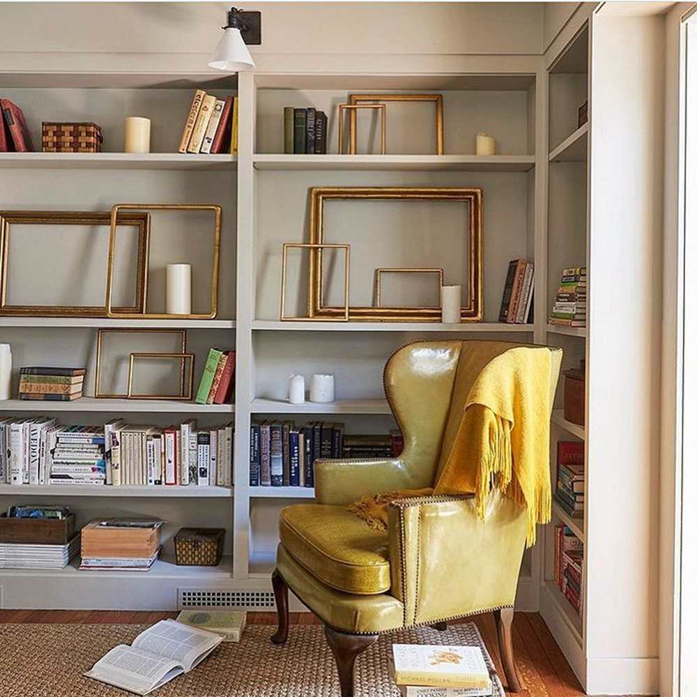
Edgecomb Gray on the walls makes your home look neutral, refreshing, and familiar with its warm and inviting aura. You can elevate that fuzzy feeling with cream drapery and orange furniture, including honey-toned wooden floorboards and cupboards.
Revere Pewter on Walls
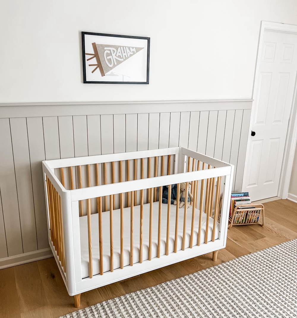
Create a cool atmosphere mixed with warmth with the two-toned nature of Revere Pewter. It’s versatile and works with any theme, promoting domestic coziness or professional stoic energy.
Edgecomb Gray vs. Revere Pewter on Cabinets
Cabinets are often made of wood, and many people prefer to use a wood finish and leave it in its natural state. However, painting your cupboards, credenzas, and islands is ideal for letting your personality speak in the room.
Edgecomb Gray Cabinets
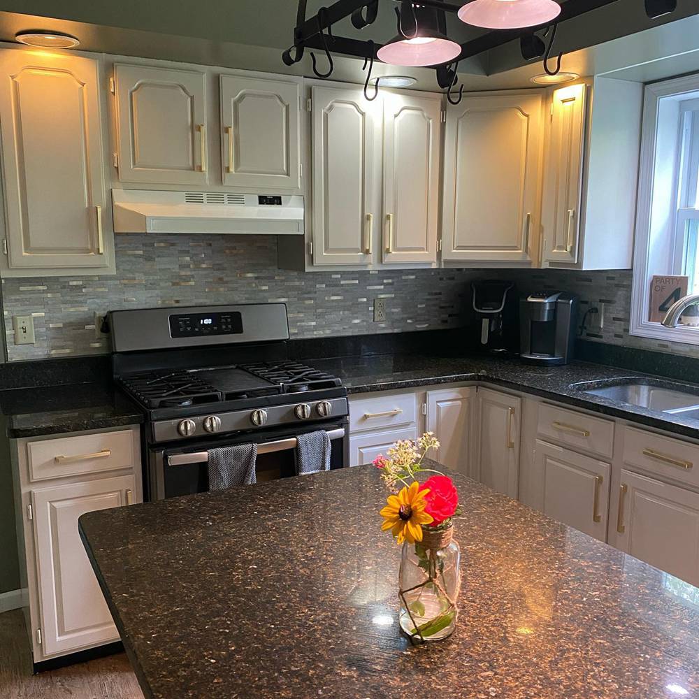
With Edgecomb Gray cabinets, your kitchens and bedrooms take on a traditional look, especially when paired with wooden slabs, countertops, and floorboards. Choose golden tan tones to highlight the cream undertones in your paint and keep its gray cast subtle.
Revere Pewter Cabinets
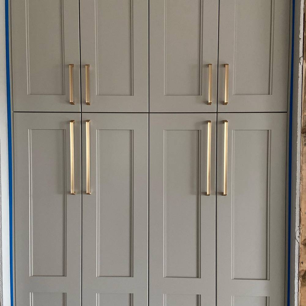
Maintain a neutral stance while making your cabinets look less impersonal with Revere Pewter. It’s the best choice when you’re going for a modern or futuristic look.
Use Revere Pewter cabinets in the bathroom, kitchens, and offices.
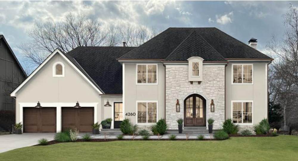
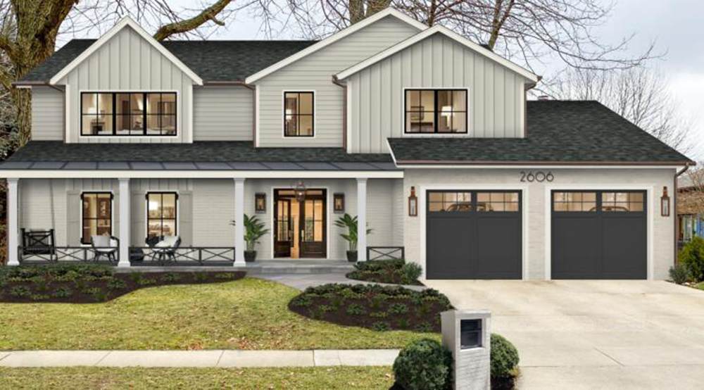
Edgecomb Gray vs. Revere Pewter Exteriors
First impressions last longest and you want your exterior to prepare your visitors for what’s coming inside the building. Whether it’s a professional or personal space, see what works best for you.
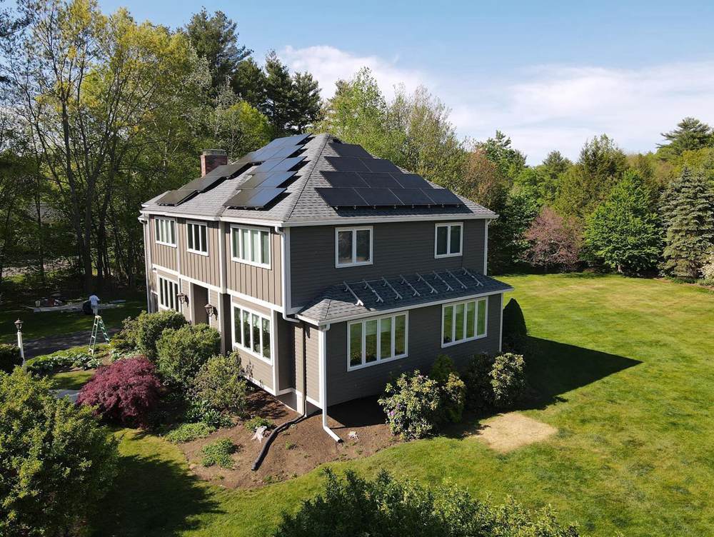
Edgecomb Gray Exteriors
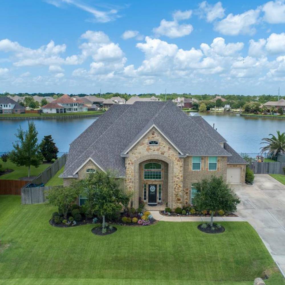
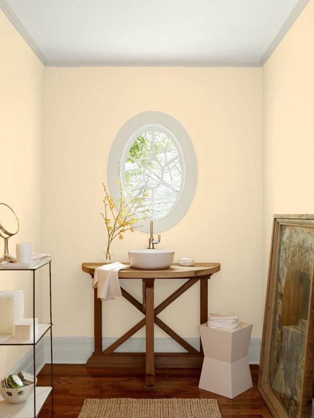
Give your guests a promise of home-cooked meals and hot summer drinks like coffee and cocoa with the golden glow of Edgecomb Gray on your exteriors. Family homes, Sauna houses, Coffee shops, and Bed & Breakfasts are great options to paint in this neutral hue.
Revere Pewter Exteriors
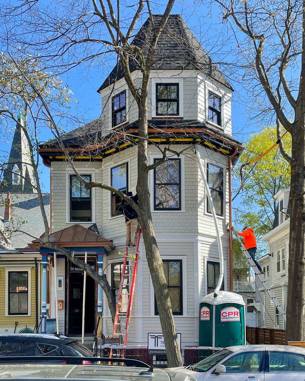
Resorts, Hotels, Offices, and Retreats would do well with Revere Pewter exteriors as the soothing gray color with beige flashes promises visitors a reasonable time within its walls. This color shines best in Winter as snow and heavy clouds add to its gray film.
Edgecomb Gray vs. Revere Pewter as Accents
Using neutrals as accents is tricky because they’re primarily impersonal tones, but Edgecomb Gray and Revere Pewter have interesting undertones to convey emotions.
Edgecomb Gray Accents
Using Edgecomb Gray as an accent side wall, half wall, nook, or door against a bold tan, orange, or blue wall would tone down the color’s vibrance.
Revere Pewter Accents
Make your pink, red, and purple interior decor pop by adding the dusky Revere Pewter as an accent. It’ll take some of the colors’ brightness once the light hits its surface and balance the reflection with its cool gray cast.
Edgecomb Gray vs. Revere Pewter for Trims
Say goodbye to boring plain white trims by exploring tinted neutrals. 2023 is all about thinking out of the box with your interior decor which Edgecomb Gray and Revere Pewter does without straying too far off the mark.
Edgecomb Gray for Trims
Using Edgecomb Gray on darker cream and tan walls will make the colors pop more when the undertones shine from lighting.
Revere Pewter for Trims
Highlight your windows, front doors and walls with Revere Pewter trims for a nature-inspired look. It suits homes with indoor and outdoor plants that’ll attract the sun’s rays and intensify the color’s greige undertone.
Edgecomb Gray vs. Revere Pewter on Woodwork
Elevate your woodwork with Edgecomb Gray and Revere Pewter, especially to match the running theme in your room. Most times, people leave their woodwork in its natural state, which clashes with the walls and furniture in the room.
Why not switch it up without being too bold?
Edgecomb Gray on Woodwork
Match cream walls with Edgecomb Gray woodwork and capture the best lighting to accentuate its orange and cream undertones.
Revere Pewter on Woodwork
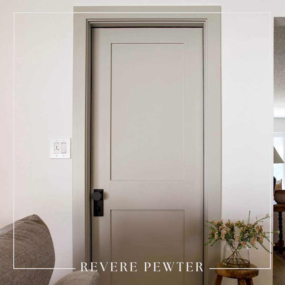
Use Revere Pewter for your front doors, especially against white-painted exterior walls and taupe or gray entryways. The monochrome harmony would create a beautiful color combo as you open and shut the doors.
Edgecomb Gray vs. Revere Pewter on Fences
You likely don’t want your fences to call attention but that doesn’t mean it has to be boring. Because fences are outdoors, they’ll catch the morning light but the degree of reflection depends on the position.
Edgecomb Gray on Fences
Edgecomb Gray on fences would typically appear cream especially when the base material is natural wood. The orange undertone will come out to play and most likely take over the entire shade. Don’t use it if you don’t want a sunny outdoor vibe.
Revere Pewter on Fences
Revere Pewter as an alternative fence paint isn’t tame either although it’s more moody than its counterpart. It’s a great way to say “I’m serious but I can have fun.” See the color’s greige tone on this garage wall (not a fence, but it’s close enough) paired with deep gray doors.
Edgecomb Gray vs. Revere Pewter on Doors
Doors can be exciting because they’re a pathway to “a whole new world” whether it’s the entrance or adjoining rooms.
Edgecomb Gray on Doors
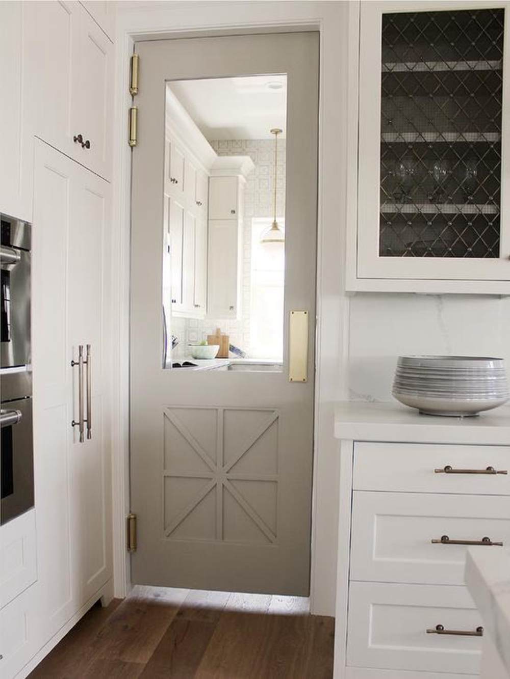
Edgecomb Gray is a good choice for door painting when the rooms have complementary colors on the wall. The door in this picture looks grayer because of its enclosed space and white wall paint.
Revere Pewter on Doors
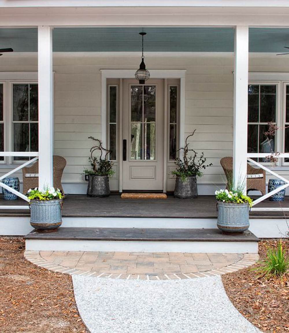
This Revere Pewter door appears more beige than gray because of its complementary tones. The muted blue roofing, off-white siding, and crisp white trims highlight its warm undertones especially in the morning South-facing sunlight.
Lighting Conditions
As earlier noted, lighting conditions play a large role in highlighting your neutral paint’s undertones. South-facing light is the brightest, North-facing light is the most stable with a medium ray, West-facing light is the lowest, and East-facing light is for afternoon brightness.
Using warm lighting or placing the color in strategic positions to receive the brightest natural glow will give you the intense shade (orangish-cream for Edgecomb Gray and yellowish-beige for Revere Pewter.)
Or you can maintain the neutral notes with the foggy gray overtones in North-facing light.
Conclusion
Getting samples of Edgecomb Gray and Revere Pewter from Benjamin Moore for real-time swatches is best before settling on one. Once you’ve seen the physical differences, you can compare them to all the new information you’ve learned from this guide.
We’d love to hear your thoughts and recommendations and see how you’ve used this guide to create your perfect space. Always remember to do the following before painting;
- Measure your room
- Observe the lighting and all options
- Choose your sheen
- Clean your walls before painting, and protect all non-painted areas with plastic
- Paint
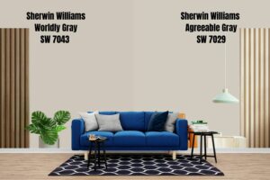 Sherwin Williams Worldly Gray Vs Agreeable Gray
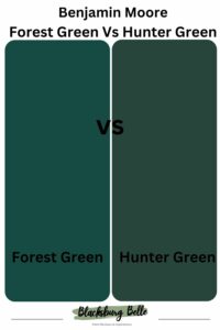 Forest Green Vs Hunter Green: What are the Differences?
 Taupe Vs Beige: What are the Differences?
 Benjamin Moore Alabaster vs Sherwin Williams Alabaster: What’s the Difference?
 Sherwin Williams Pure White vs Extra White: How to Choose?
 Repose Gray Vs Revere Pewter: How to Choose?
