
Did you know that white paints have many faces? I’ve enjoyed reviewing this popular neutral color for the past few weeks and discovered the medium-light off-white that is Benjamin Moore Dove Wing OC-18.
Dove Wing is part of the brand’s elite Off-White Collection, and although it’s not a popular shade, I’m sure it’ll gain newfound fame this year. Dove Wing is an elegant creamy white with a unique silvery undertone.
Here’s everything I learned about Benjamin Moore Dove Wing, including its specifications and color coordination.
Table of Contents
When Should I Choose Benjamin Moore Dove Wing?
Many of the inspirations I found on the internet favored Dove Wing for mid-century, vintage, and southern decor. I see it on exteriors and partial interiors paired with wooden furniture and accessories. Use Benjamin Moore Dove Wing if you’re:
A Vintage Aesthetic Lover
Benjamin Moore Dove Wing stands out when paired with warm wood for vintage aesthetics.
Looking for Light
You’ll get adequate brightness from this warm medium-light paint with or without additional lighting.
Exploring Color White
Step outside the pure white box and revel in the creaminess of this silvery off-white paint color.
Thinking of a Kitchen Re-Do
Benjamin Moore Dove Wing gives your kitchen an upgraded vintage look.
Need a Bold and Minimal Exterior
Let your exterior walls exude subtle elegance with the warm and creamy Benjamin Moore Dove Wing.
What Color is Benjamin Moore Dove Wing?
Benjamin Moore Dove Wing gets its name from Doves’ wings. The Dove is a peaceful bird with creamy white feathers that appear silvery when it spreads its wings.
Paint manufacturers may name their colors after real-life inspirations or abstract ideas, and Dove Wing belongs to the first category. If you’ve seen a dove up close, you’ll understand why this color got this name. So, let me show you a visual representation.
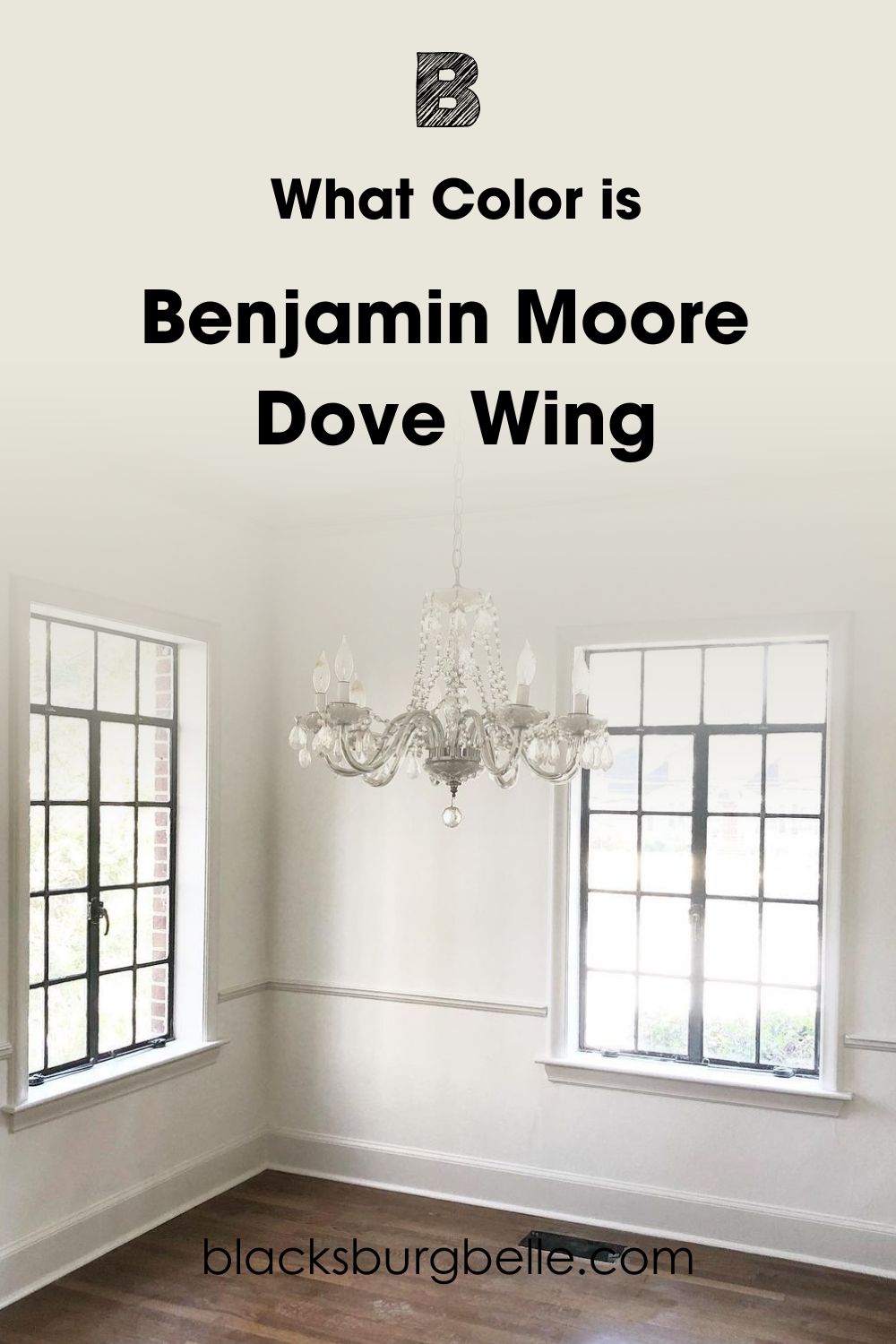
Dove Wing has a clean and silvery exterior with a soft creaminess waiting to show underneath dim lighting. The color is like a familial hug when it gets sunny and a quiet luxury when the silvery tone comes up.
You’ll understand Dove Wing better after seeing its specifications. Then I’ll share coordinating tips and inspirations before we wrap up.
Snapshot of Benjamin Moore Dove Wing Specification
Let’s get to the root of Benjamin Moore Dove Wing by analyzing its specifications. This table is an x-ray showing the RGB, hex value, Light Reflectance Value, and Undertones.
| Name | Dove Wing OC-18 | 960 |
| RGB | Red 233 | Green 229 | Blue 218 |
| Hex Value | #E9E5DA |
| LRV | 77.52 |
| Undertones | Silver, Cream |
The LRV of Benjamin Moore Dove Wing
Light Reflectance Value is graded on a scale of 0 – 100 to determine how much light a color reflects. Pure White is highly reflective at 100 and pitch black is absorbent but it doesn’t work that way for paints. The scale caps at 3 – 97 because there’s not pure manufactured paint.
50 as the midpoint is neutral, 3 – 29 is dark, 30 – 45 is medium-dark, 46 – 55 is medium, 56 – 79 is medium-light, and 80 – 97 is light.
Benjamin Moore’s Dove Wing is a medium-light color because of its 77.52 LRV. But it has unique silver and cream undertones, making it appear lighter than most medium-light hues. That’s why Dove Wing can illuminate any room without natural or artificial lighting.
But if you want to see the full extent of its warmth, here’s how to take advantage of the undertones.
Does Benjamin Moore Dove Wing Have Undertones?
Before we start, yes, Dove Wing has silver and cream undertones. Those tints give it an off-white look meaning it sometimes doesn’t look like white. You can trace this back to undertones, and I’ll tell you why.
You’ll get a surface tone and subtle undertones when you create a unique paint color with RGB (a mixture of Red, Green, Blue, and pure black pigments). These undertones only show when you adjust the lighting surrounding said paint.
See a demonstration on the picture below.
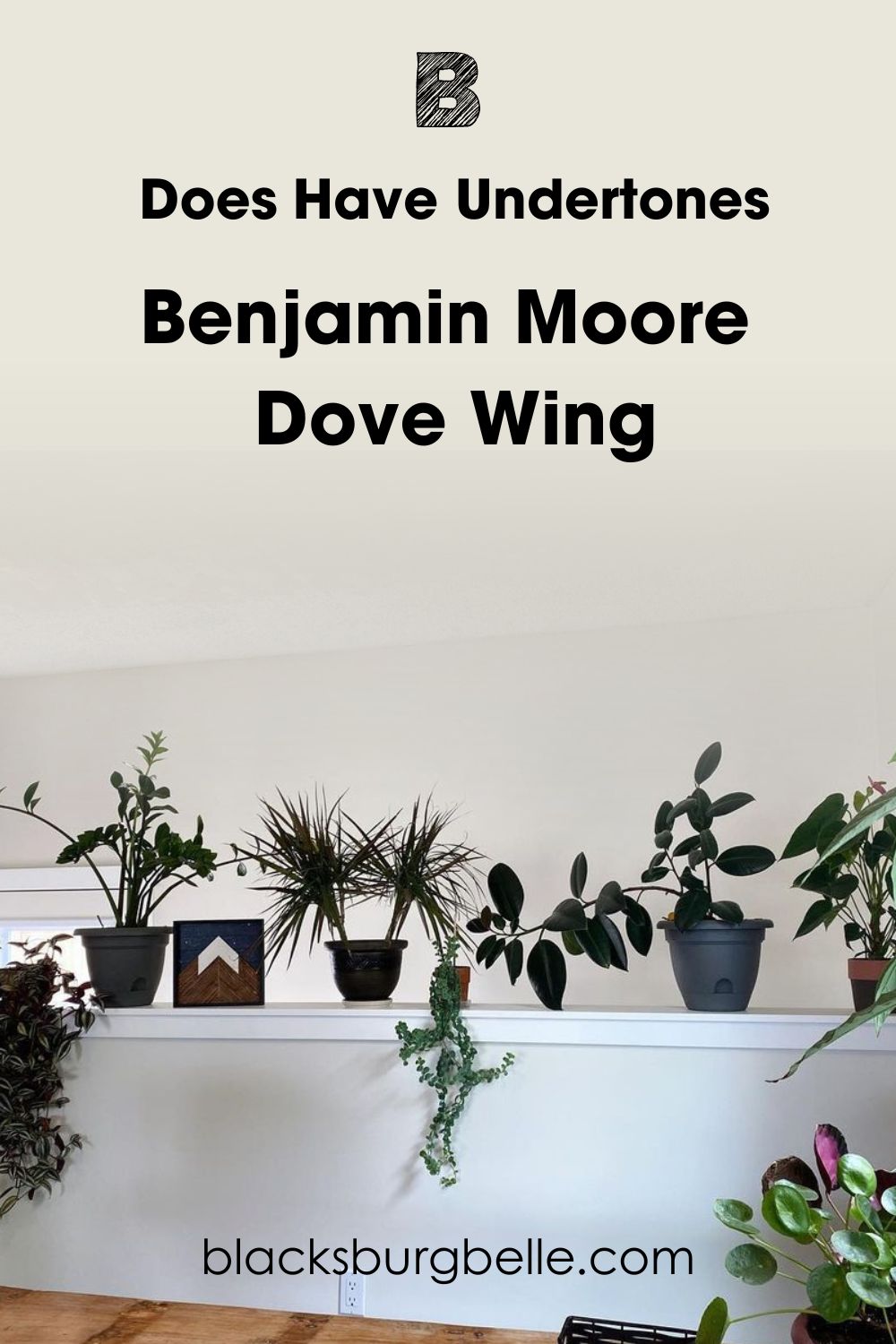
This picture has two walls with the same Benjamin Moore Dove Wing painting. But you’ll notice that the half-wall with the potted plants appears cooler with its silvery tone, while the far wall looks creamy.
Why did that happen?
Lighting Effects on Benjamin Moore Dove Wing
When you use warm lighting (yellow, orange, or red bulbs), paints appear more intense, including Dove Wing. The combination of the hot lighting and summery colors creates a golden glow. But you’ll get a dull reflection if you use cool lighting (blue & white bulbs).
If you don’t have artificial lighting, you can get these effects by manipulating natural sunlight and your room’s position. Here’s how:
Southern-facing light reflects the hottest and brightest, especially from late morning until noon. Then, the heat moves further East and shines bright until late noon. By 4:30 p.m., the sun gets ready to set in the West and often has a dwindling reflection.
So, South-facing windows get the most light, then East-facing and West-facing windows get a lesser glow.
Meanwhile, Northern-facing windows receive steady and medium sunlight throughout the day. That’s why it’s the most suitable room for maintaining Dove Wing’s off-white surface. You’ll get both undertones in that position if you can’t choose one over the other.
Use a compass to determine your room’s position for optimal lighting usage. If you don’t have a compass, go old-school and dust up your elementary school knowledge. Stand outside at sunset and point to the sun with your right hand for the West.
Point your left hand in the opposite direction for the East. You’ll face the North and back to the South. Now let’s talk undertones.
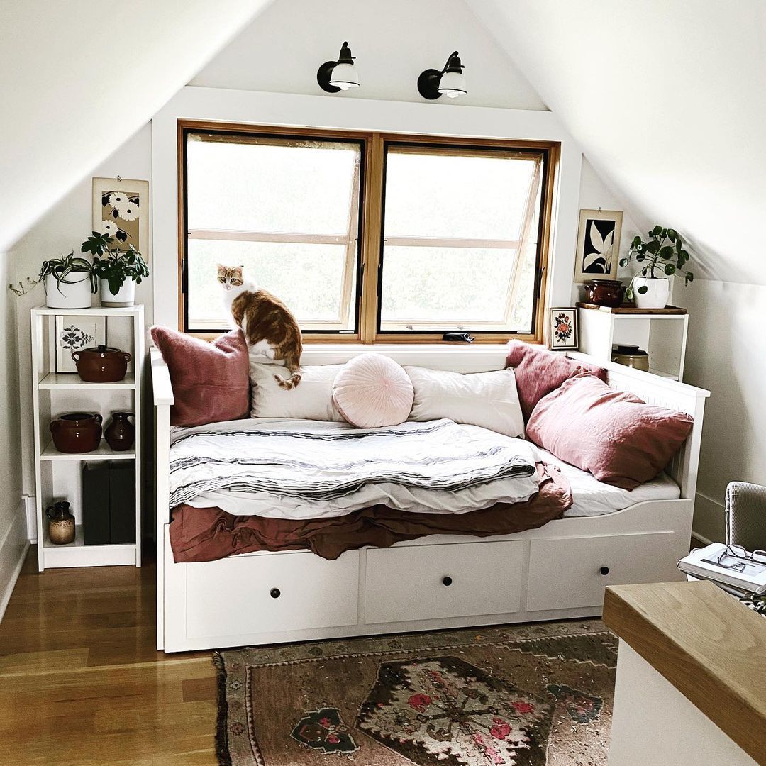
Does it look Silvery?
Benjamin Moore Dove Wing will show a silvery cast and brighten up a room when you use it under South and East-facing light or cool lighting. It’s the cleanest reflection of the color you’ll ever get and works wonders for any space.
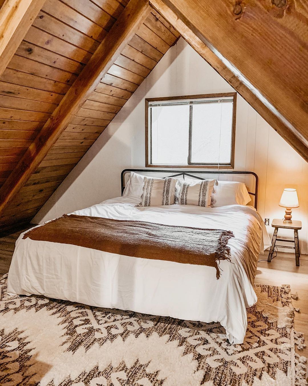
If you’re painting Dove Wing in a modern-themed space, those are your best positions for keeping it fairly cool, like this attic bedroom. It has vintage features from its design to the rug, floorboards, and windows.
But embracing the silver part of Dove Wing with modern furniture and color palette gave it an airy look.
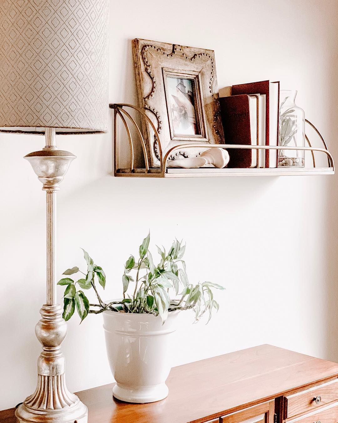
Does it look Cream?
Meanwhile, you’ll get a creamy look when you paint Dove Wing walls under warm lighting or low Western and Northern light. This wall is a perfect example because you can see the clean white lower wall and the creamy upper part taking the light’s shadow.
The homeowner favors a vintage design for this undertone hence the wall-fixed book organizer and mid-century lamp holder. You can also see the wooden cabinet peeking in the bottom corner of the picture.
So, make your choice. Would you prefer the silvery Dove Wing reflection or a warm creamy off-white?
Is Benjamin Moore Dove Wing a Warm or Cool Color?
Whichever choice you made earlier, one thing is certain – Benjamin Moore Dove Wing is a warm, wealthy, and happy neutral color. It’s not an in-your-face white paint that’ll have you walking on eggshells for fear of staining it. But its elegance will encourage restraint.
I was tired of reviewing white paints because I saw some Debbie Downers recently until I found Dove Wing. Immediately, its richness captivated me, and I was hooked.
I didn’t want to stop seeing people’s interpretations of it, and I’m sure that’s how it feels to see it in real time. If you want your guests to walk into your home confidently and stare in awe at your interior decor, make Dove Wing your anchor color.
I recommend using Benjamin Moore Dove Wing outside, in your living room, personal bedroom, and on your furniture. Dove Wing has a way of making you feel wealthy and confident. So, don’t sleep on the color.
Let’s get to the creative and fun part of using Dove Wing.
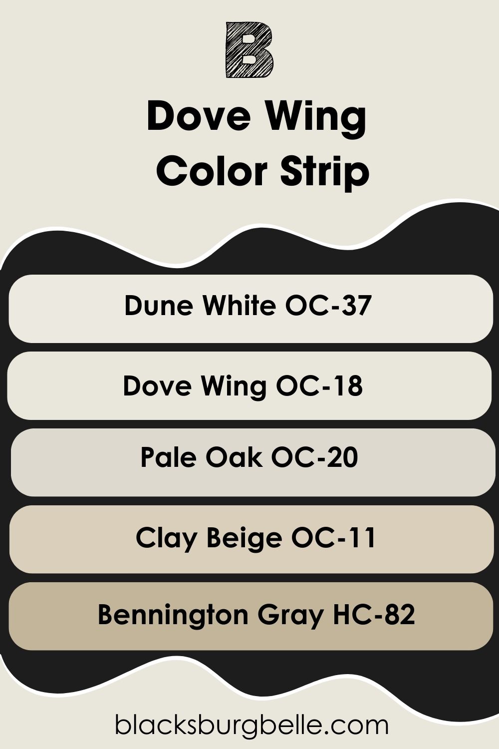
Benjamin Moore Dove Wing Color Strip: Lighter or Darker Exploration
As much as I love Dove Wing, I understand, it may be too bright or not even bright enough for your taste. If that’s the case, here are some other options you can try. They also have cream, beige, or gray undertones but in different shades from Dove Wing.
- Benjamin Moore Dune White OC-37
- Benjamin Moore Dove Wing OC-18
- Benjamin Moore Pale Oak OC-20
- Benjamin Moore Clay Beige OC-11
- Benjamin Moore Bennington Gray HC-82
Dune White is the lightest in this strip with an LRV of 80.18 followed by Dove Wing (LRV 77.52), Pale Oak (LRV 68.64), Clay Beige (61.61), and Bennington Gray (LRV 46.68).
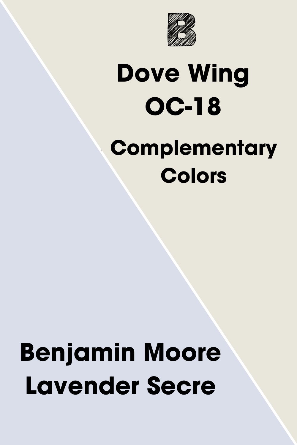
Complementary Colors for Benjamin Moore Dove Wing
Complementary colors are two hues placed opposite each other on the color wheel. They have different auras which creates a beautiful balance and bold look. You’ll notice these combos on brand and business logos. Here are the popular combos:
- Red – Green
- Yellow – Purple
- Blue – Orange
Benjamin Moore Lavender Secret is the complementary color for Dove Wing. It makes sense because purple contrasts with yellow, and yellow is one of the base notes for cream. Remember, I mentioned the undertones in Dove Wing earlier.
Because it has an LRV of 73.14, this pastel lavender appears darker in contrast to Dove Wing’s 77.52.
Benjamin Moore Dove Wing Coordinating Colors
Color coordination is all about self-expression and that’s why there are multiple existing combinations. Check them out and decide which one best suits your personality or the character you’d like for your room.
- Analogous Theme:Pairs three colors placed beside each other on the color wheel. Examples are blue-green-yellow, orange-red-yellow, and purple-blue-magenta.
- Complementary Theme:Contrast two opposite colors from the color wheel. Standard combos are red-green, blue-orange, and purple-yellow.
- Triadic Theme:Triangulate equally spaced colors on the color wheel. So all primary colors will be in one group likewise secondary colors and tertiary colors.
- Split Complementary Theme: Use the adjacent colors of the complementary hue by splitting it. So, if you have purple as the complement for yellow in Dove Wing, your split-complementary will be indigo (blue-purple) and magenta (red-purple).
- Monochromatic Theme:Pairs multiple shades and tints of the same color.
Choose complementary and monochromatic palettes for simple and classic decors. Then, use Analogous, Split-Complementary, and Triadic palettes for bolder and more colorful themes.
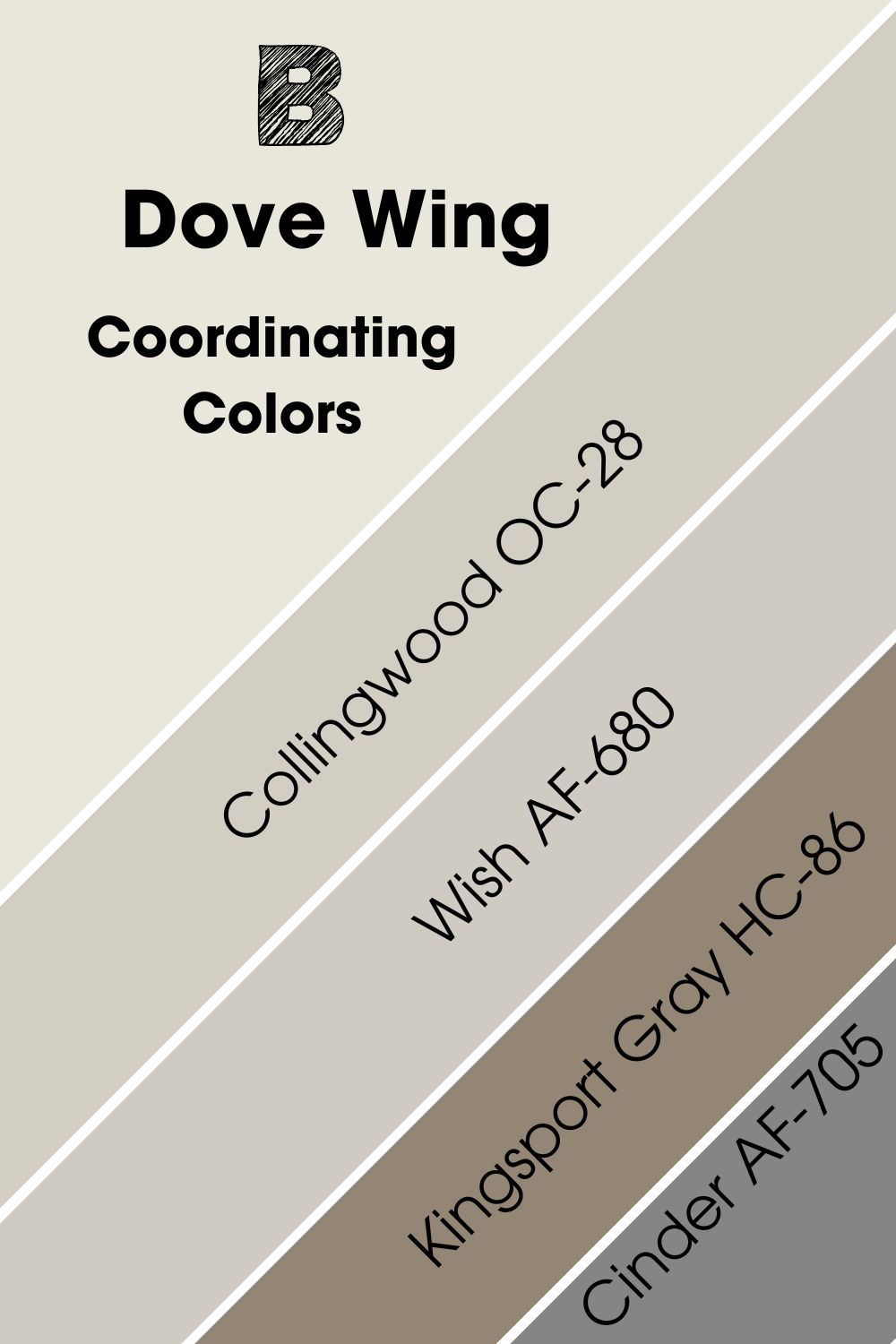
Coordinating Colors for Benjamin Moore Dove Wing
Benjamin Moore recommends pairing Dove Wing with four colors, so I decided to explore them. I noticed three of them are variations of gray, and the final hue is a dark gray-green color.
It shows that Benjamin Moore designers prefer the silvery undertone in Dove Wing to its cream tone. I have a different idea, but before I share that, here are the colors:
- Benjamin Moore Collingwood OC-28
- Benjamin Moore Wish AF-680
- Benjamin Moore Cinder AF-705
- Benjamin Moore Kingsport Gray HC-86
Collingwood leans towards gray and has an almost invisible green undertone, while Cinder is a dark charcoal gray. Kingsport Gray is the darkest, with a taupe surface that appeals to the cream and silver in Dove Wing.
Finally, Wish is a warm gray with an LRV of 58.58 and a soft green undertone.
Benjamin Moore Dove Wing Color Palette
Here are some other palettes for you to explore including my top picks for coordinating Dove Wing:
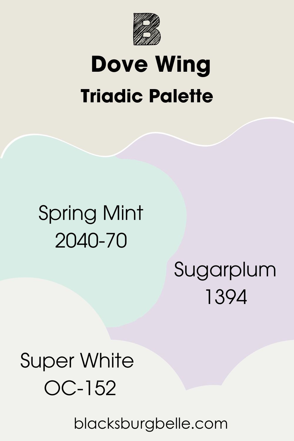
Triadic Palette
- Benjamin Moore Spring Mint 2040-70:A mesmerizing light oceanic cyan with equal parts green and blue.
- Benjamin Moore Sugarplum 1394: A medium-light purple with a soft reflection.
- Benjamin Moore Super White OC-152:This bright white has the faintest purple undertone but shines with a classic clean look.
Trim this palette with the highly reflective Super White then highlight the Dove Wing furniture with Sugarplum (purple) walls in your bedroom and Spring Mint (blue-green) in the living room/entryway. You can also switch the positions depending on your preferred mood.
Spring Mint and Super White are the brightest in this palette.
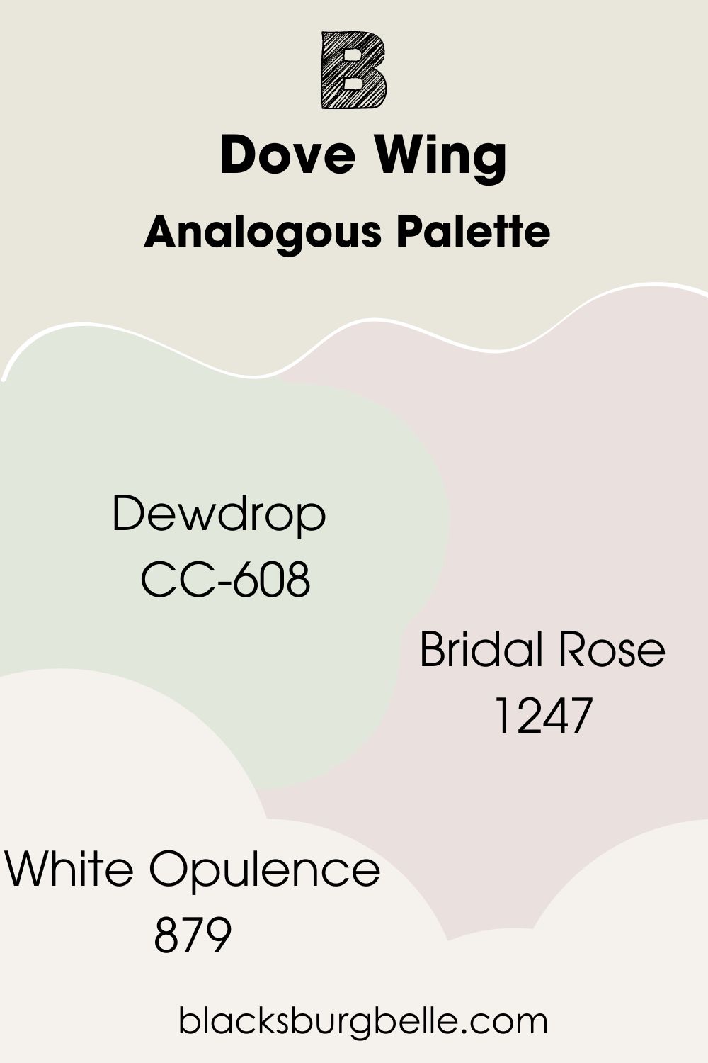
Analogous Palette
- Benjamin Moore Dewdrop CC-608:A unique medium-light mint green that’s part of the Designer Classics collection.
- Benjamin Moore Bridal Rose 1247:This classic pale pink paint sometimes looks like an off-white with violet undertones.
- Benjamin Moore White Opulence 879:A very bright white with the softest pink blush.
Use this palette for an all-white interior decor but note that it has hints of other colors like mint-green (Dewdrop) and pink (Bridal Rose) to add surprising pastel charm to the space. Use White Opulence for the trimmings because it’s the lightest of all four colors.
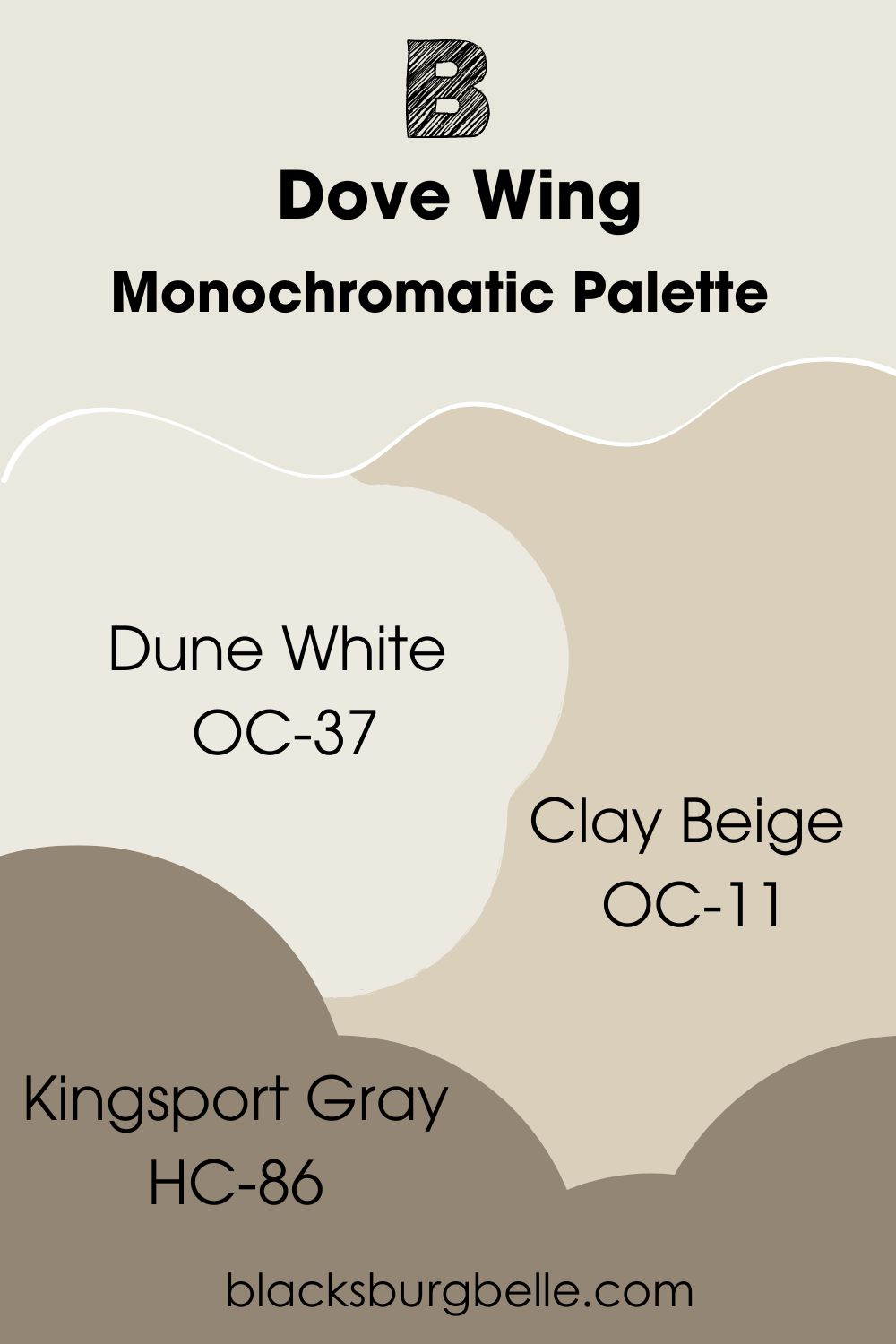
Monochromatic Palette
- Benjamin Moore Dune White OC-37:A bright creamy white with gray-green undertones.
- Benjamin Moore Clay Beige OC-11:A medium-light yellow-tinted beige paint with a sandy glow that sometimes leans towards white.
- Benjamin Moore Kingsport Gray HC-86:This dark taupe has a rich brown surface to match any vintage-themed palette.
Use Kingsport Gray to create a dark and earthy shadow on Dove Wing and Clay Beige to highlight its softer undertone. Then trim the different shades with the bright Dune White.
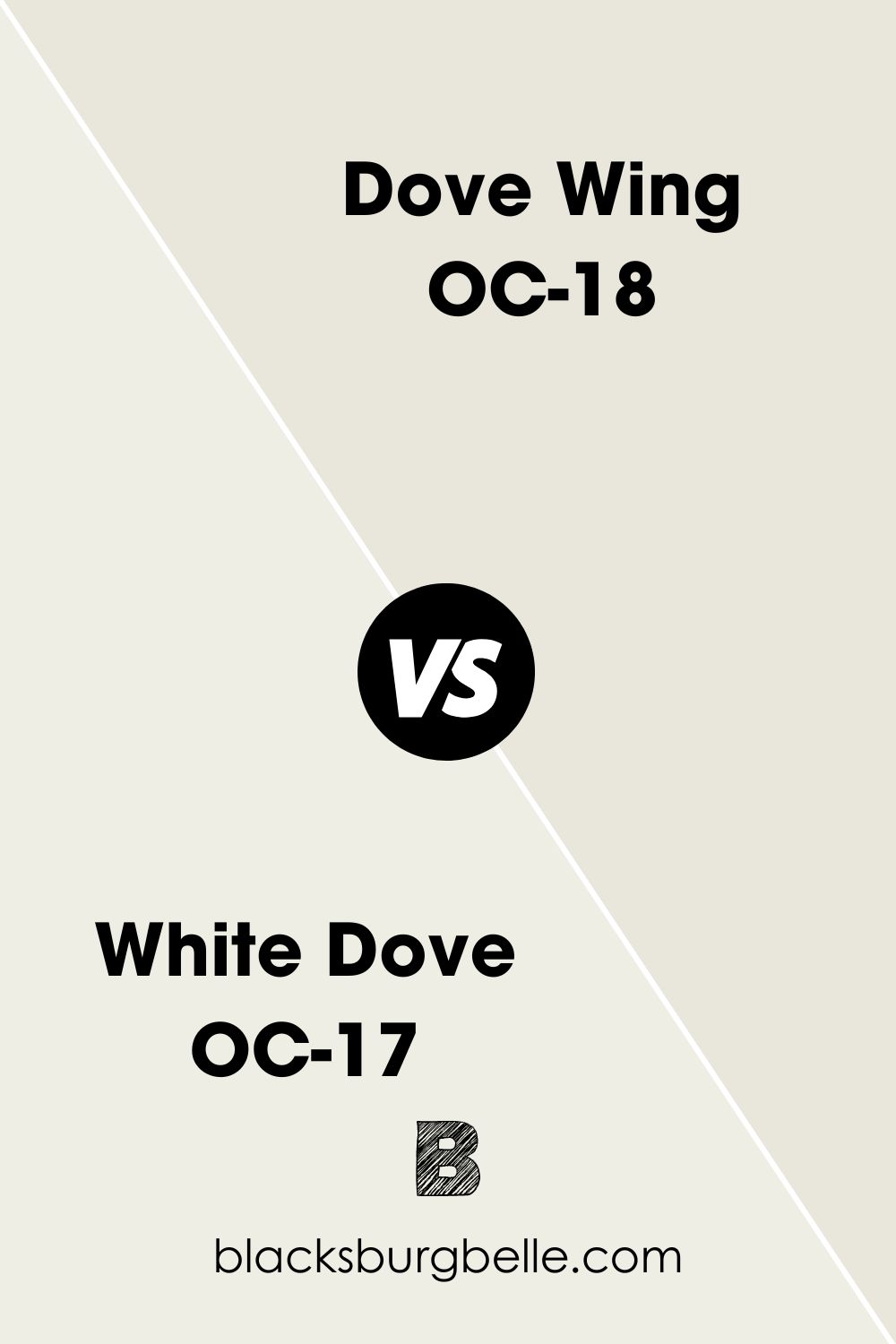
Benjamin Moore Dove Wing vs. Benjamin Moore White Dove (OC-17)
Benjamin Moore White Dove is a brighter and less-tinted version of Dove Wing.
Benjamin Moore Dove Wing vs. Benjamin Moore Swiss Coffee
You can barely see the gray undertone in Benjamin Moore Swiss Coffee because of its brightness unlike Dove Wing.
Benjamin Moore Dove Wing vs. Benjamin Moore Pale Oak
If you want the darker version of Dove Wing, then get Benjamin Moore Pale Oak.
Benjamin Moore Dove Wing vs. Benjamin Moore Seapearl (961)
Benjamin Moore Seapearl shares undertones with Dove Wing but is slightly lighter.
Benjamin Moore Dove Wing vs. Benjamin Moore Classic Gray (OC-23)
Benjamin Moore Classic Gray is cool unlike Dove Wing because it lacks a beige undertone.
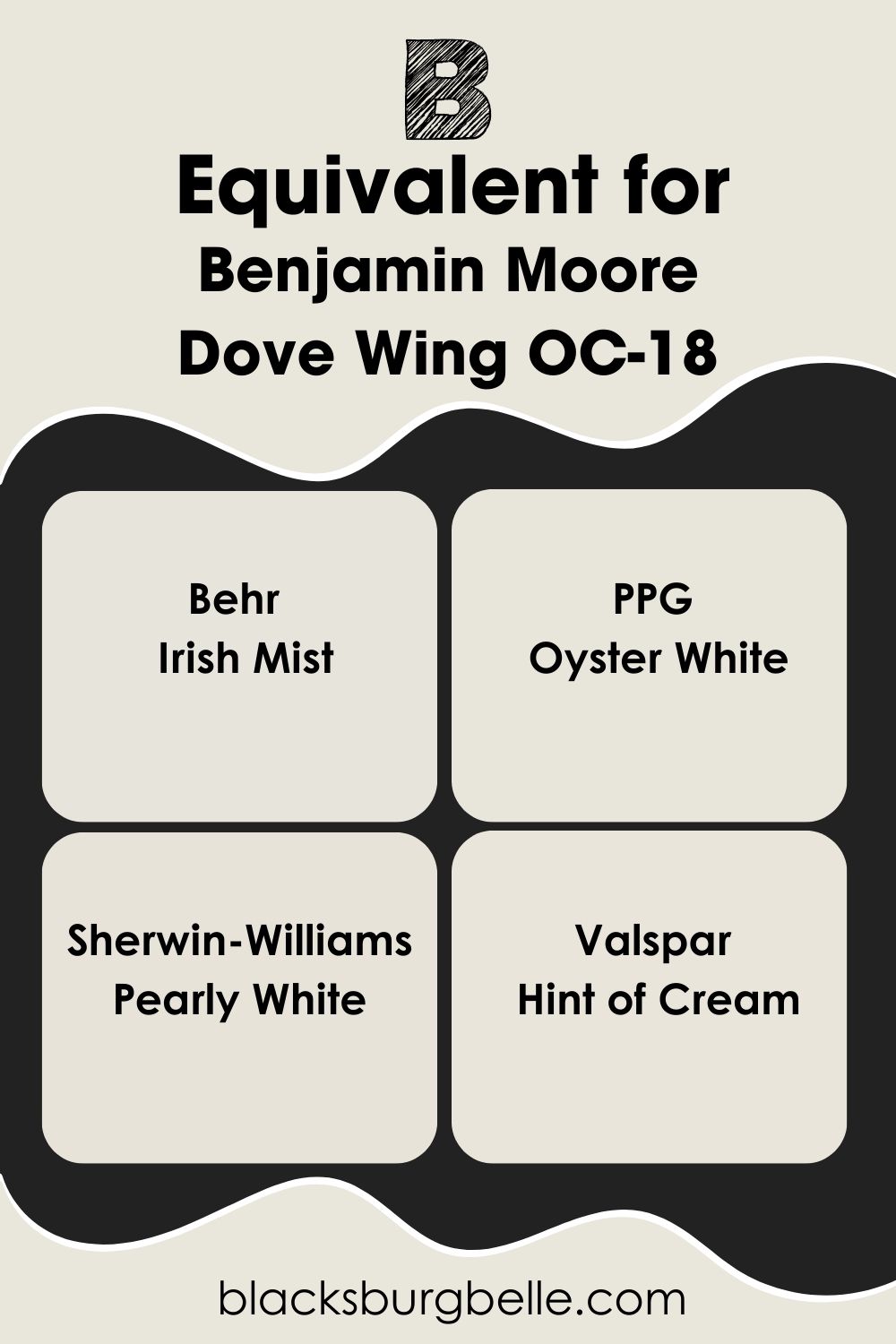
Benjamin Moore Dove Wing Equivalent with Other Brands
Benjamin Moore is the only paint manufacturer that named an off-white Dove Wing. Other variations like Behr’s Dove, Sherwin-Williams Dover White, and Valspar’s Dove White, but none of them look like Benjamin Moore’s version.
For similar colors from other top brands check out these options:
Behr – Irish Mist
PPG – Oyster White
Sherwin-Williams – Pearly White
Valspar – Hint of Cream
Where can you use Benjamin Moore Dove Wing?
The beauty of Benjamin Moore Dove Wing makes it versatile and fitting for almost any space. But this off-white paint works better in some rooms and on some objects than others. I scouted the internet and found multiple ways to use Dove Wing.
Benjamin Moore Dove Wing on Walls
Using Dove Wing on your interior walls gives the space an elegant and classic look. It’s gorgeous in monochrome themes. You can use Dove Wing walls for a modern arrangement like this living room or a vintage-styled space. See more below.
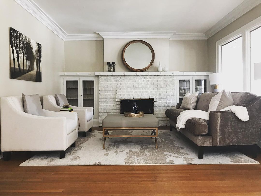
Benjamin Moore Dove Wing in the Living Room
Most of the living rooms with Dove Wing walls embrace a monochrome or monotone theme. With monochrome themes, there are variations of creamy white colors in the room. But monotone themes use only one white color like we have here.
An accent navy blue wall complements Dove Wing and prevents the room from being “too white.” It adds a mysterious sophistication to space and keeps you guessing about what’s in the next room.
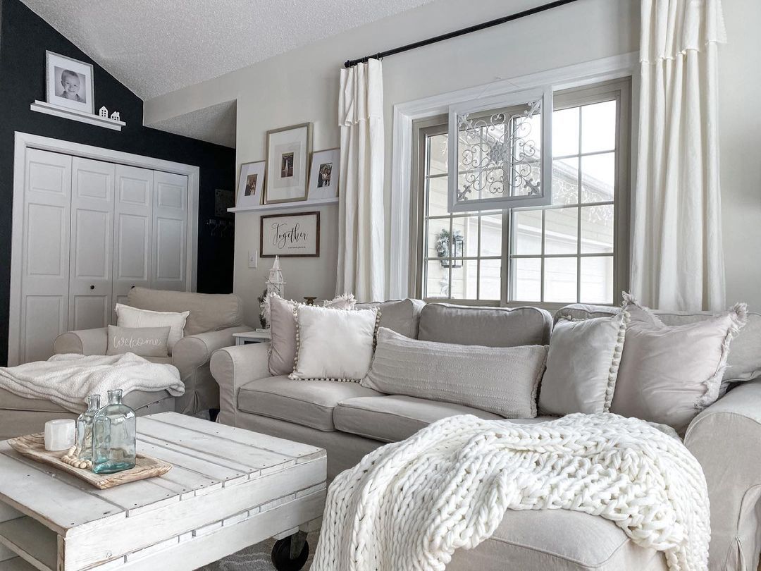
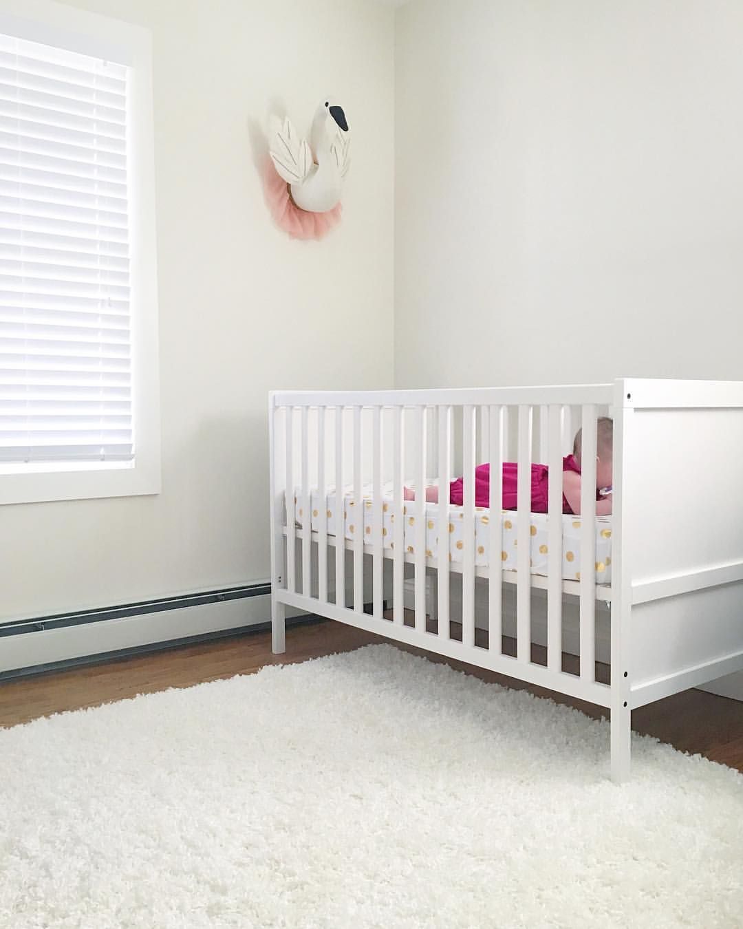
Benjamin Moore Dove Wing in the Bedroom
You can explore Dove Wing as a warm paint best in the bedroom. All the inspirations I found leaned heavily on mid-century designs and wooden furniture. The warmth is intense in this room because of the wooden ceiling and tan-infused decor.
Dove Wing walls aren’t restricted to adult bedrooms. You can highlight its silver undertone for an airier look in a nursery. For that style, however, use cool pastel colors.
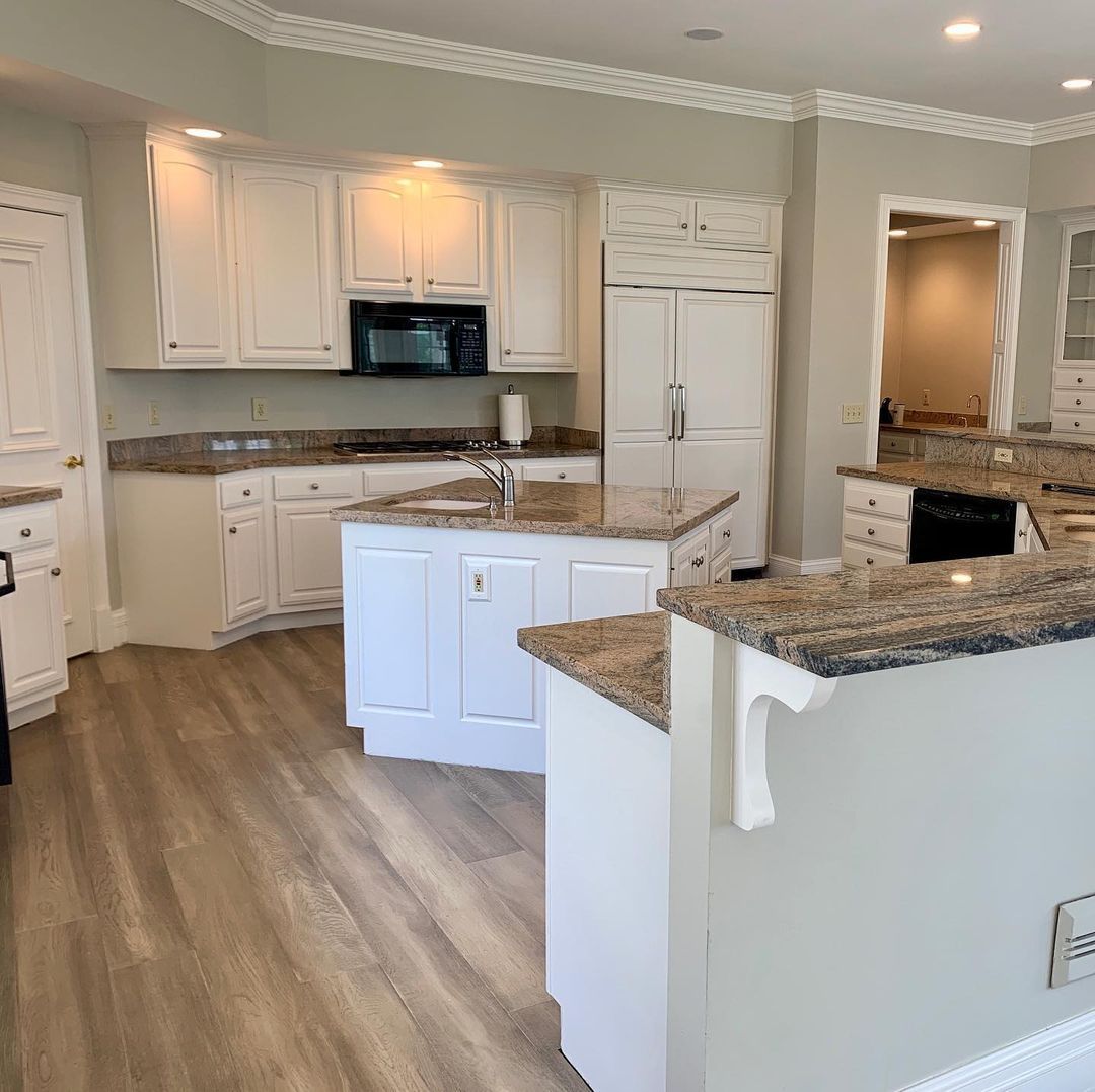
Benjamin Moore Dove Wing on Cabinets
I love how the lighting in this kitchen gives the Dove Wing cabinets different reflections. The wall cabinets underneath the warm ceiling light appear as creamy off-whites while the lone island remains a bright silvery white.
Together, the kitchen has a clean and elegant look despite embracing a traditional style. The wooden floorboards and brown marbled tabletops complete the charming modernized vintage aesthetic.
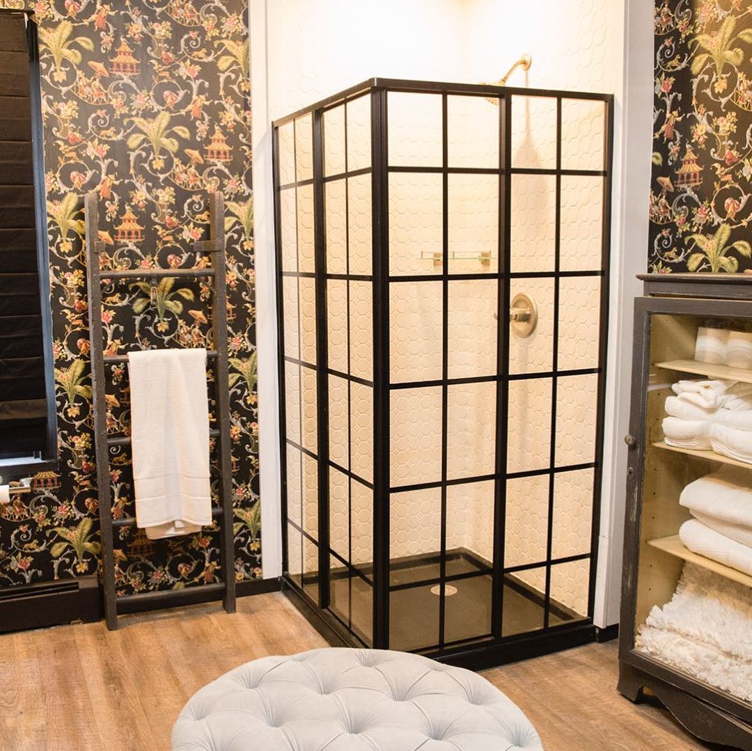
Benjamin Moore Dove Wing in the Bathroom
I almost gave up on the idea of Dove Wing walls and cabinets in the bathroom until I saw this vintage-themed bathroom. The designer stayed true to the mid-century wallpaper design but added light and warmth with Dove Wing walls in the shower.
So, use Dove Wing to bring brightness and cheerful energy into your shower time.
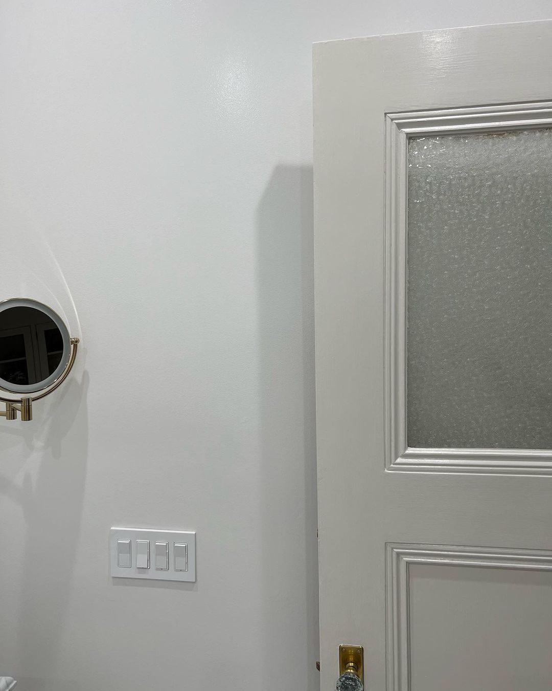
Benjamin Moore Dove Wing on Doors
When you paint your interior or exterior all-white, using an off-white like Dove Wing on the doors is a great way to distinguish it from the walls. You can hardly see the difference between the open door and the pristine walls, but a close look will reveal it.
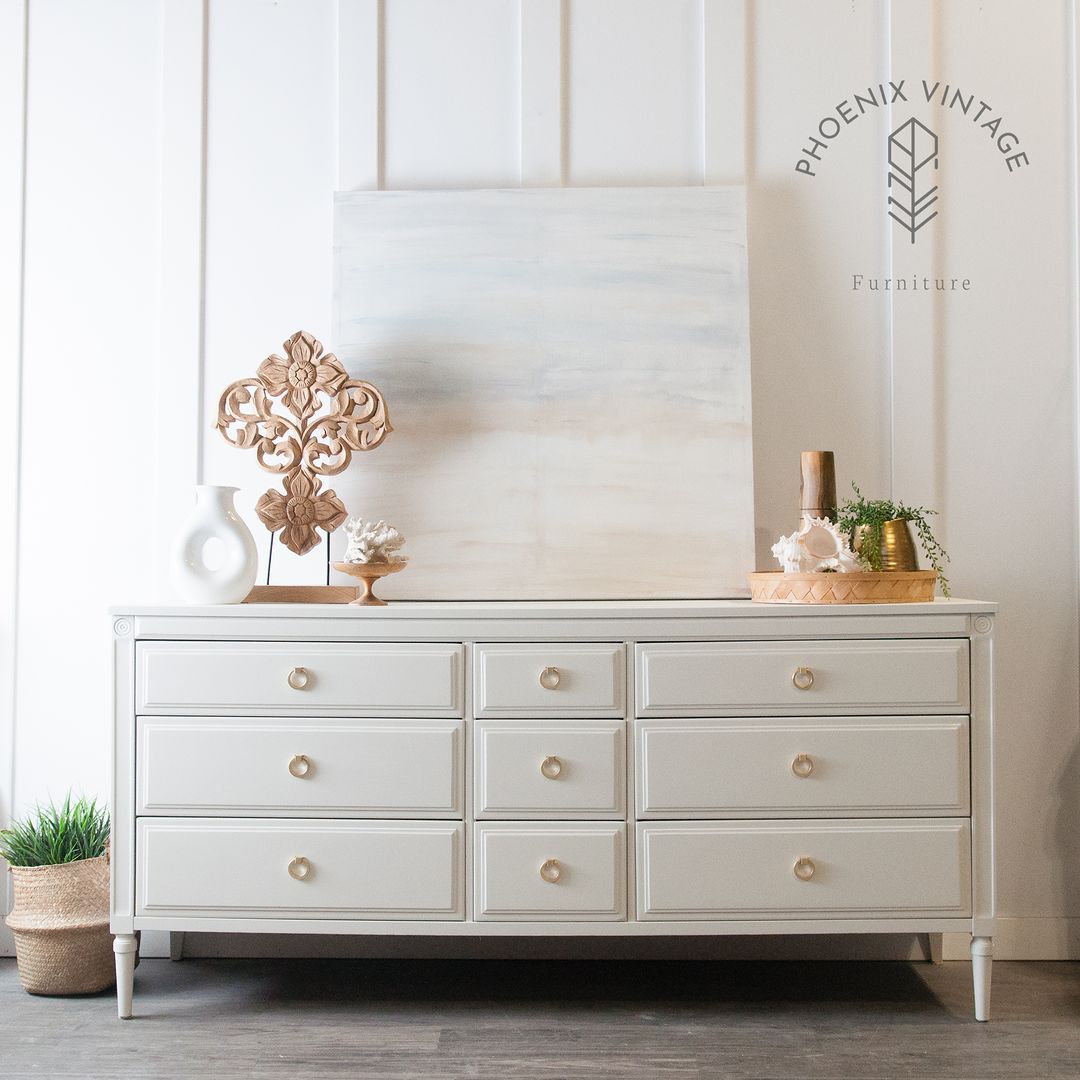
Benjamin Moore Dove Wing on Furniture
I’m a big fan of elegance, as you well know by now. So, using Dove Wing on furniture will always be a yes for me. It gives the woodwork a modern and expensive look regardless of the structure.
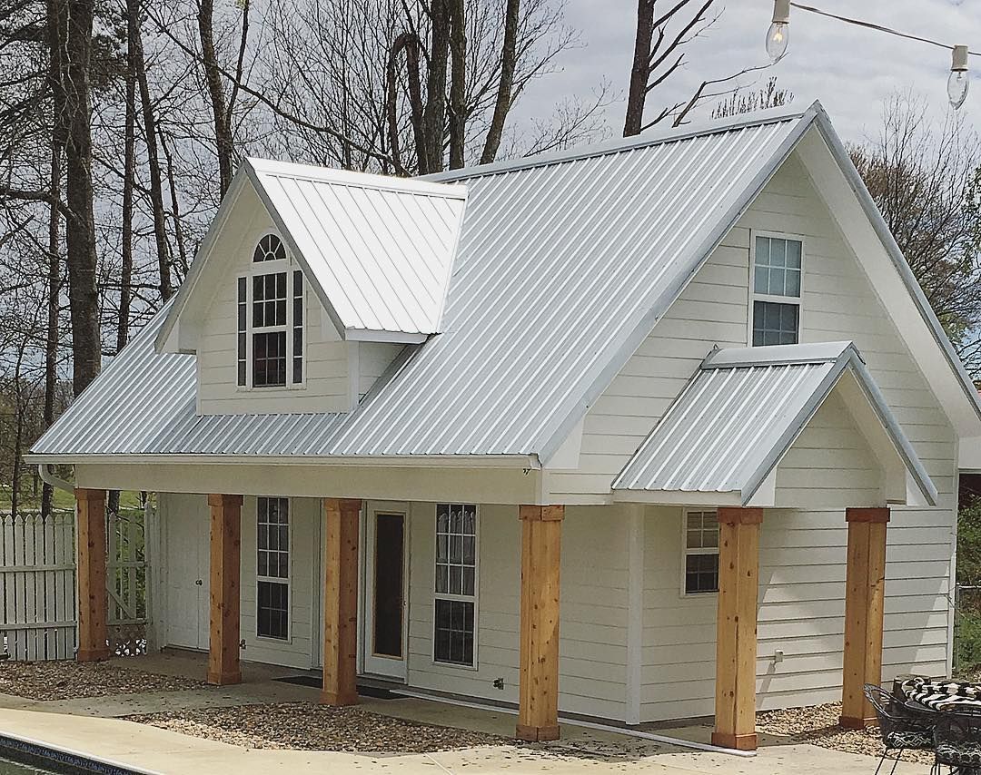
Benjamin Moore Dove Wing on Exteriors
I noticed that most homeowners who used Benjamin Moore Dove Wing on their exteriors live in the south or have mid-century homes. That confirms my point about Dove Wing being a traditional off-white paint. The cream and silver undertone adds to its charm and makes any building look beautiful from any position.
The silver undertone takes over in this long shot, giving the Dove Wing walls a bright and inviting look. This building will attract the attention of every passerby, so avoid Dove Wing if you’re going for a bland look.

I need you to see Dove Wing on exterior walls up close to understand its beauty. This zoomed-in view shows you the color’s elegance when the cream undertone takes over.
Using a stark white trim highlights its uniqueness, and the wooden pillars add rustic charm to the structure.
Is Benjamin Moore Dove Wing a Good Color?
I’ll rate Dove Wing a 10/10 color, and I believe it’ll soon become a Benjamin Moore bestseller. It has all the elements of good color, including its versatility and aura.
Does Dove Wing Go with Gray?
Dove Wing will only work with a warm gray paint that can complement its silvery and cream undertone. A good example is Kingston Gray which has a brownish taupe tone. Another option is Wish, a warm green-gray with an almost neutral LRV.
Conclusion
It’s sad to say goodbye because I enjoyed reviewing Benjamin Moore Dove Wing and sharing inspirations with you. But I have to go. Congratulations if I’ve convinced you to get this creamy white paint.
Your home is about to experience a captivating transformation. Remember that Dove Wing is a medium-light color with a cream and silver undertone. It exudes elegance, so avoid it if you don’t like attention.
I’d love to see what you do with Dove Wing in your space and hear your thoughts on using the color. Have a lovely time designing until we meet again for another exciting review.
 Sherwin Williams Rock Bottom (Palette, Coordinating & Inspirations)
 Sherwin Williams Alpaca (Palette, Coordinating & Inspirations)
 Sherwin Williams Topsail (Palette, Coordinating & Inspirations)
 Sherwin Williams Ice Cube (Palette, Coordinating & Inspirations)
 Sherwin Williams Creamy SW 7012: Review & Inspiration
 Sherwin Williams Halcyon Green SW 6213: Paint Color Review
