

When it comes to finding a warming but bright color, the choices are seemingly endless. However, rather than going for a warm beige or even a greige, Sherwin Williams Creamy SW 7012 offers a great solution to your interior design woes.
This color is a rich, warm white with golden-yellow undertones that, like its namesake, appears good enough to eat!
I personally love how this paint can work wonders to uplift any room without feeling like too safe or boring of a white.
Carry on reading for my full breakdown of why Sherwin Williams Creamy will be the perfect paint for you.
Table of Contents
When to Choose Sherwin Williams Creamy?
If you’re wondering how you would use Sherwin Williams Creamy, don’t fear! I’ve been going through all of the details, and looking at loads of design inspiration to come up with some of the ways to best use this paint color.
For That Farmhouse Feeling
Sherwin Williams Creamy is great at creating a country farmhouse vibe. Use on kitchen cabinets or in a bathroom to create a truly rustic look, or use on interior or exterior paneling for a barnyard feel.
Warm and Cozy Vibes
If you’re looking to create a warm and cozy space, then Sherwin Williams Creamy has you covered! With its buttery undertones, it makes you feel as if you are sinking into a rich and silky pillow. Don’t just consider it for your walls though, try painting some furniture pieces to carry this look through.
A Color for All Seasons
Creamy really is a color that meshes with all sorts of lighting and weather. Dark and dingy winter days? Creamy can warm them up for you with the golden glow of an undertone. Enjoying a sunny spring morning? Allow Creamy to add to that bright feeling.
A Friend to Many Shades
Sherwin Williams Creamy SW 7012 is an incredibly versatile shade. Not only can it work with similar tones, but it can also work with dark contrasting colors for a real pop! This warm-toned shade is also a great bedfellow with pale, cool-toned shades without losing any of its own luster.
A Dreamy Alternative to White
Does white seem a little bit too boring? Try using Sherwin Williams Creamy instead for a cozy change. The color can also carry on from walls to ceiling, creating a seamless look that can really bring a room together.
This is just a snapshot of what this paint can truly offer. Keep scrolling to continue on this color journey with me to really see Sherwin Williams Creamy’s potential for transforming your home.
What Color is Sherwin Williams Creamy?
So, why did Sherwin Williams choose to call this paint Creamy?
This warm white has a lot of similarities with the decadent dairy treat it is named after. With a creaminess to the color and a warm yellow undertone, it’s clear to see why it got its name!
Thanks to the yellow undertone, this color actually reminds me of a certain type of cream that is considered a delicacy in England. Sherwin Williams Creamy SW 7012 has buttery yellow tones of clotted cream, which is a staple on top of a cream tea.
So you can get an idea of this, take a look at the picture I’ve found below:
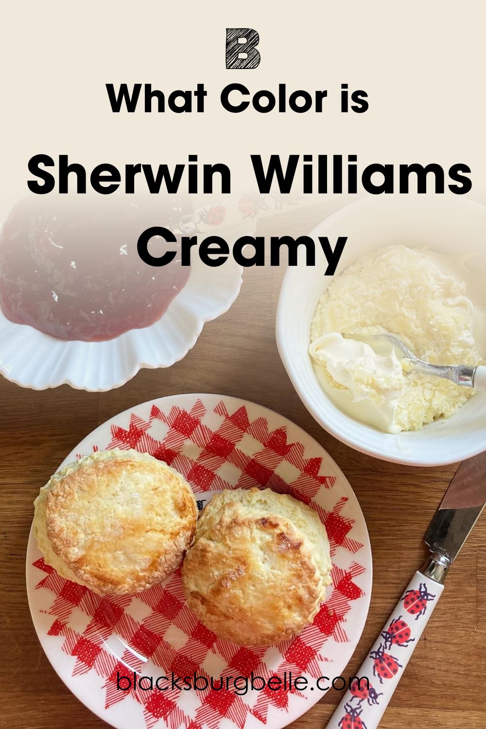
If you take a look at the bowl on the right-hand side, it is filled with luscious clotted cream! As you can see, it has all of the characteristics of this Sherwin-Williams paint. Creamy SW 7012 in summary then is a warm off-white with buttery yellow undertones.
Snapshot of Sherwin Williams Creamy Specifications
Although I have briefly described this paint color to you, I know many of you would find it helpful to know the technical specifications of this color. For that, take a look at this handy chart below:
| Sherwin Williams Creamy SW 7012 | |
| RGB | R: 239 G: 232 B: 219 |
| Hex Value | #EFE8DB |
| LRV | 81 |
| Undertones | Yellow |
The LRV of Sherwin Williams Creamy
For those of you who might not have heard of this term before, LRV stands for light reflective value and helps us to know how much light a color reflects. The traditional scale goes from 0, reflecting no light at all, so black, to 100, where you find white with the highest reflective value.
It’s worth noting though that no paint color is truly black or pure white, as there is always a level of pigment in the manufacturing process. This means that when looking at paint, the darkest color you can get comes in at 2.4, and the brightest at 94.
The LRV of Sherwin Williams Creamy is 81. That means it’s not the brightest color out there, but it is definitely one of the brighter off-whites that you can put on your walls. I’d say this actually works to its advantage, as it adds a bit more character and depth to this paint than if it were lighter and more washed-out.
Undertones of Sherwin Williams Creamy
I’ve already been shouting from the rooftops about how much I am obsessed with the undertones of Sherwin Williams Creamy, but here’s my chance to really sell them to you!
The undertone of Creamy SW 7012 is yellow, but it’s not just any yellow. It’s warm, and rich, with hints of butteriness and even a touch of gold! Check out this photo I’ve found that perfectly encapsulates its sumptuous undertones in style.
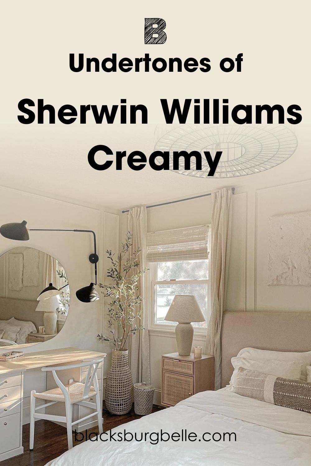
By pairing it with other neutral tones, this designer has really helped Sherwin Williams Creamy to sing. I’m in love!
Is Sherwin Williams Creamy Super Reflective?
With it being such a light color, you may be wondering whether Sherwin Williams Creamy might be too reflective and wash a room out.
Thankfully, as it is a warm-toned color, this is not an issue as the deep and warming undertones will help to combat this.
Take a look at this picture that I have found. The cabinets are painted in Creamy SW 7012 and you can see the transition from light to dark in this bright utility room.
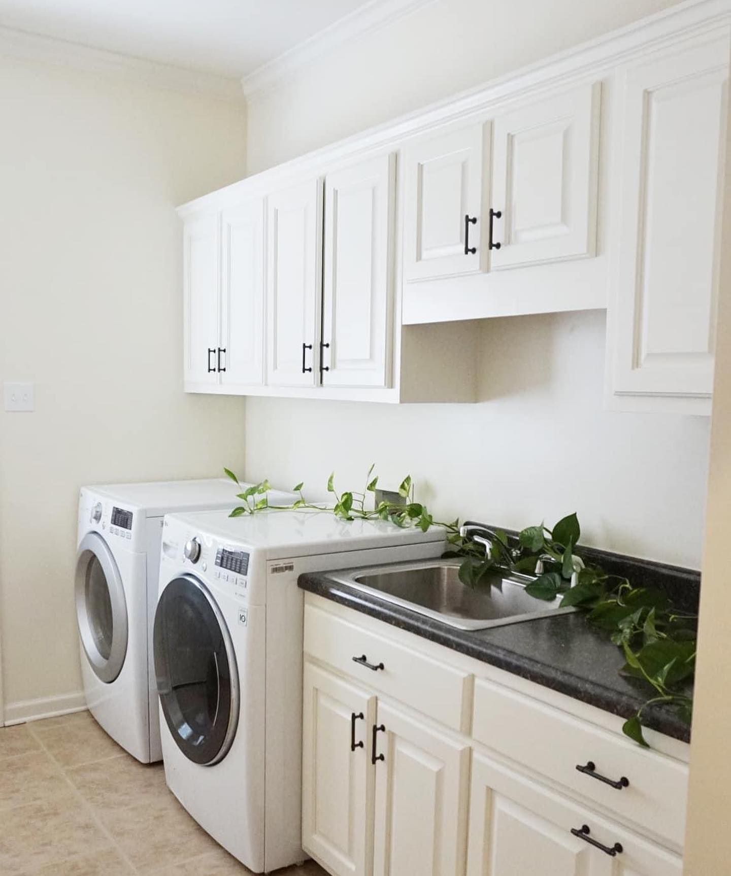
As you can see, even the cabinets with more light on them still have that richness to them, especially when you contrast them to the white appliances below.
However, it is worth keeping in mind that the reflectiveness of Sherwin Williams Creamy, as with other paint colors, will vary depending on the type of finish that you go for. Paint with a matte finish will not reflect much light, whereas eggshell or gloss will be much more shiny and reflective.
Sherwin Williams Creamy is Warm or Cool Color?
If you haven’t guessed it already, Sherwin Williams Creamy is a warm color. This is thanks to its yellow-cream undertones, which keep it on the warmer side to give a nice, comforting glow.
These warm tones help Creamy SW 7012 to be able to breathe life and light into a room in a gentle, rather than harsh way.
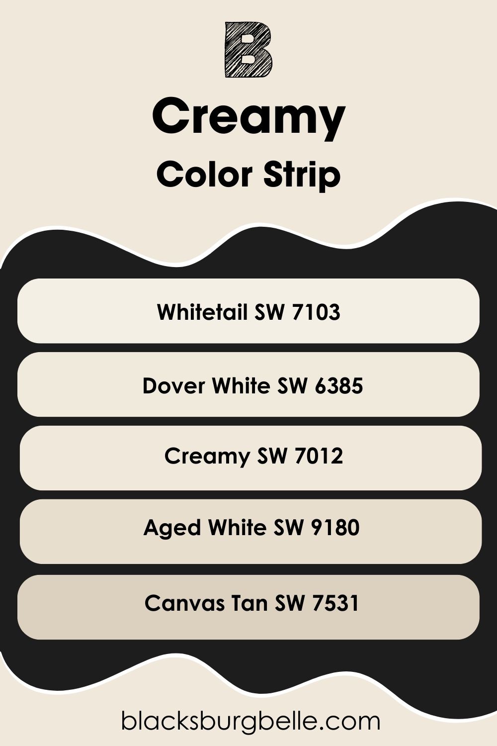
Sherwin Williams Creamy Color Strip: Lighter or Darker Exploration
Now, as much as I love Sherwin Williams Creamy, I know that it’s not going to be the perfect fit for everybody. Depending upon the project at hand and the space that is being decorated, a lighter or darker shade than Creamy may be better for you.
Don’t fear! I’ve got your back and created a selection of colors from light to dark so you can find your perfect alternative to Creamy SW 7012. See my list below, with the lightest colors first. I’ve put Creamy in the middle in bold for your reference, too.
- Sherwin Williams Whitetail SW 7103
- Sherwin Williams Dover White SW 6385
- Sherwin Williams Creamy SW 7012
- Sherwin Williams Aged White SW 9180
- Sherwin Williams Canvas Tan SW 7531
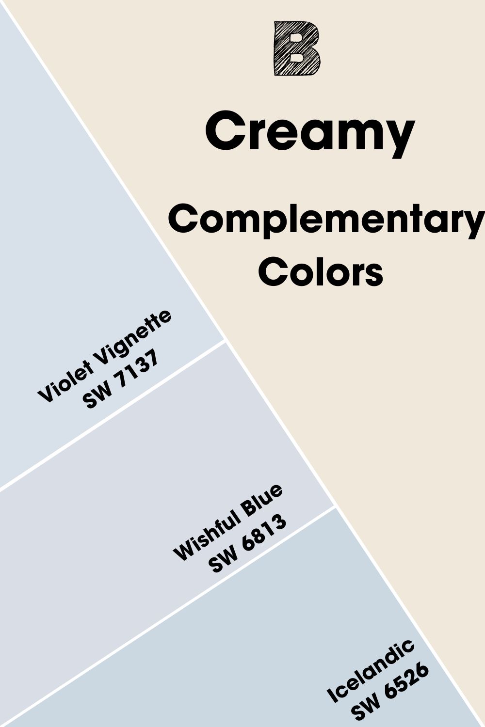
Sherwin Williams Creamy Complementary Colors
You can’t just paint the entirety of your home in Creamy, as much as it is an amazing paint color! So, you’re going to need some perfect colors to pair it with.
One of the best tricks to find a good accent color is to look for a complementary color. To find it, you look on the opposite side of the color wheel in a straight line.
If that sounds like it could be tricky, don’t worry! I’ve gone ahead and found the complementary color to Sherwin Williams Creamy for you!
The complementary color is a pale blue-violet color, and so I’ve found a paint by Sherwin Williams which is its closest match: Violet Vignette SW 7137. This cool-toned color would work great with Creamy as an accent color to help to draw the eye to focal points in the room, such as a statement piece of furniture or an accent wall.
Violet Vignette is an archived color for Sherwin Williams though, meaning you can only get it as a paint or as Color to Go. If you need a fuller range of options, the best alternative from their current catalog would either be Icelandic SW 6526 if you enjoy the cool blue undertones, or if you like the purple side of Violet Vignette, try Wishful Blue SW 6813.
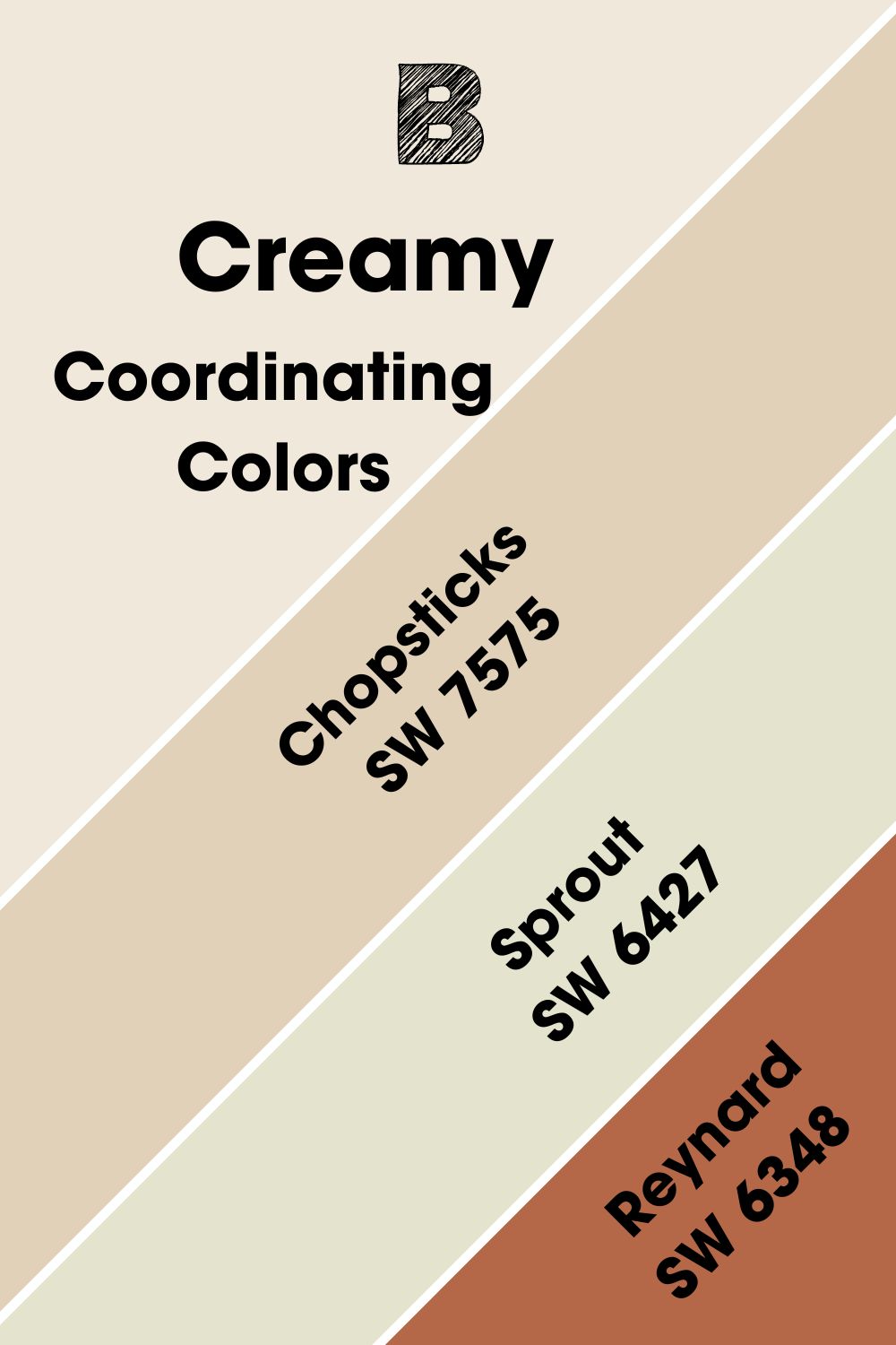
Sherwin Williams Creamy Coordinating Colors
It’s not just complementary colors that can help you to create the perfect look with Sherwin Williams Creamy. Coordinating colors are also great picks to really tie a space together!
I’ve done some of the hard work for you and picked my 3 top coordinating colors from Sherwin Williams for Creamy SW 7012.
- Sherwin Williams Chopsticks SW 7575:Peaches and cream make for a great sweet treat, and the peachy undertones of Sherwin Williams Chopsticks make it a fantastic match for Creamy! Consider using it as an accent color on features such as recesses or a standalone wall to really make the most of this color.
- Sherwin Williams Sprout SW 6427:This earthy yellow-green pairs really well with Creamy when it comes to brightening up a space. Consider using it on furniture or kitchen cabinets for a cheerful color scheme guaranteed to put a smile on your face.
- Sherwin Williams Reynard SW 6348: This rich, deep orange works remarkably well with Creamy. With terracotta notes, it can help to create a warm and earthy scheme, especially when used as an accent or feature wall to draw in the eye.
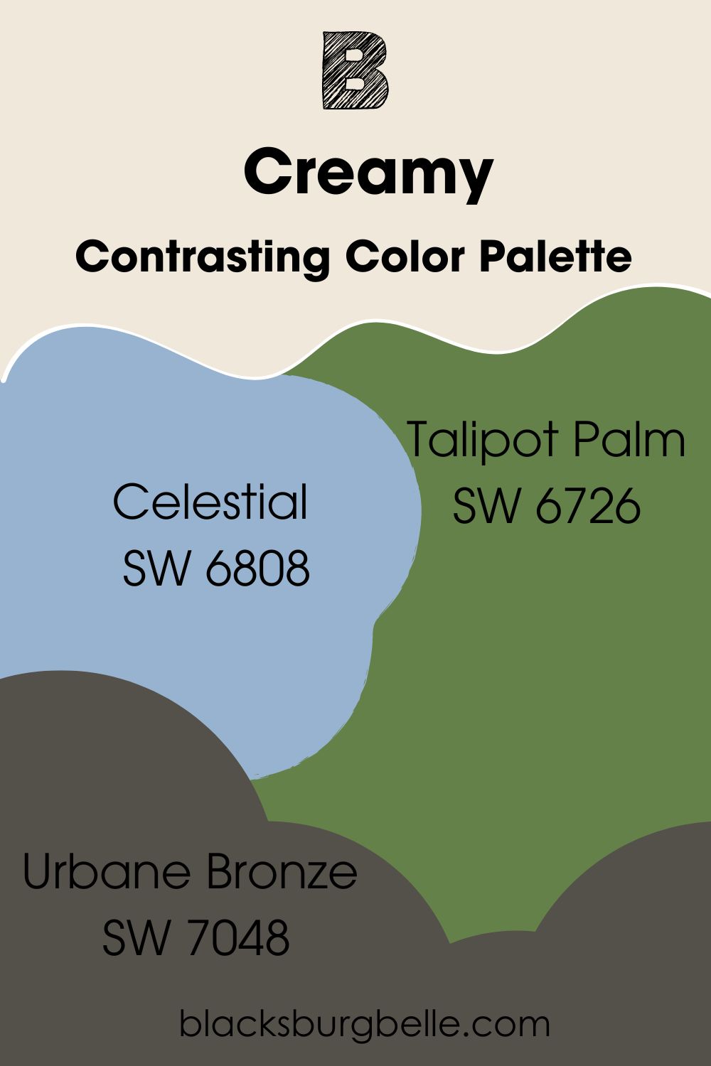
Sherwin Williams Creamy Color Palettes
As you can see from the colors I’ve picked out above, Sherwin Williams Creamy is an incredibly versatile color that can work with a variety of other shades. So, I’ve put together 3 color palettes to give you everything you need to create that dream space.
Contrasting Color Palette
- Celestial SW 6808: This airy but rich blue-purple provides a contrast to Creamy while also helping to create a crispness when used together as paneling or a trim.
- Talipot Palm SW 6726: This deep forest green provides a rich contrast to the much more subtle Creamy.
- Urbane Bronze SW 7048:This colder brown-gray helps to truly highlight how warm and inviting Creamy is while providing a moody edge.
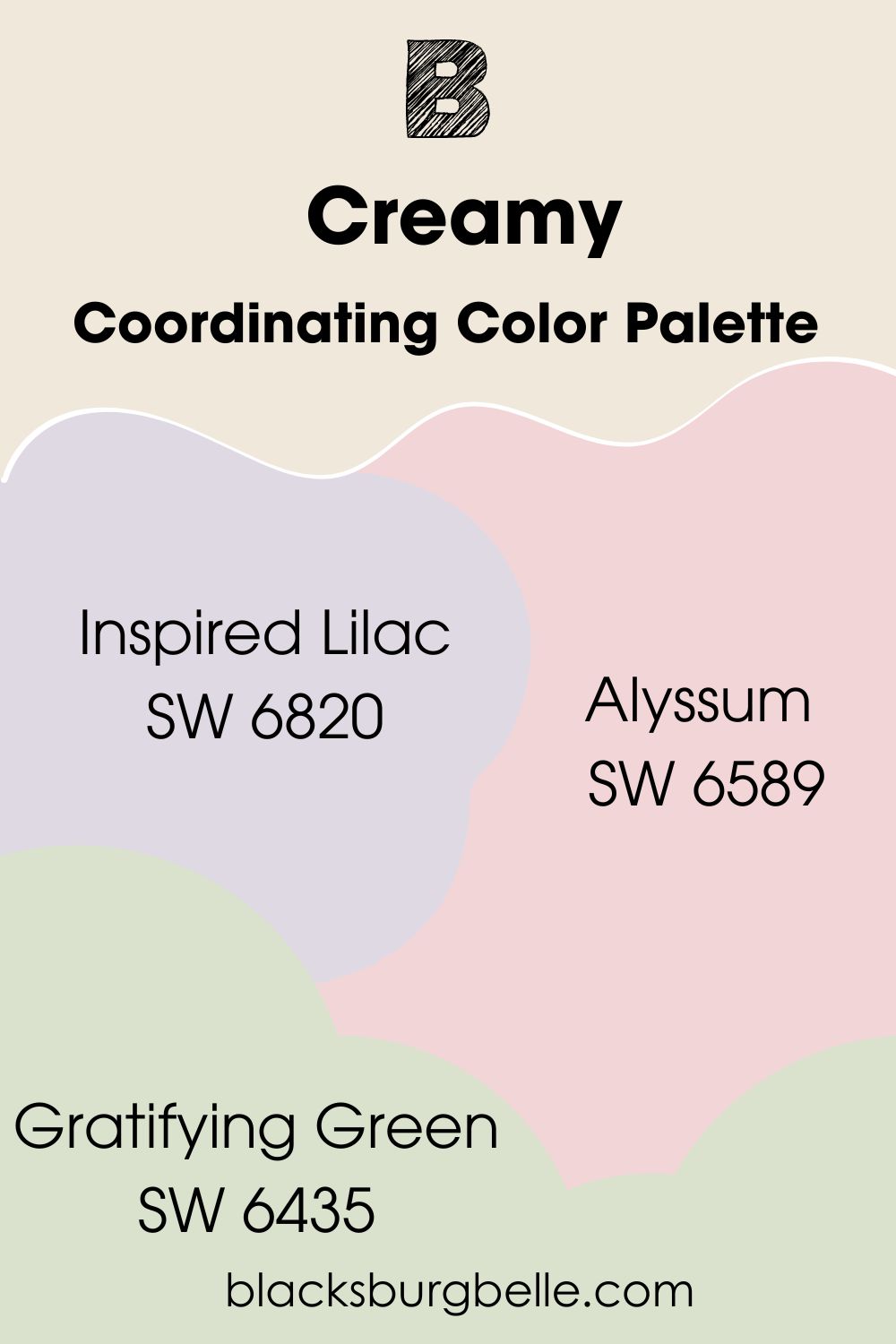
Coordinating Color Palette
- Inspired Lilac SW 6820:This playful and warm purple works well with Creamy to add a splash of color.
- Alyssum SW 6589:Alyssum is a sweet, rosy pink that when paired with Creamy reminds me of pink frosting! It’s no surprise then that they work super well together.
- Gratifying Green SW 6435: This apple green adds freshness to any space, and with the help of Creamy it doesn’t feel too cold.
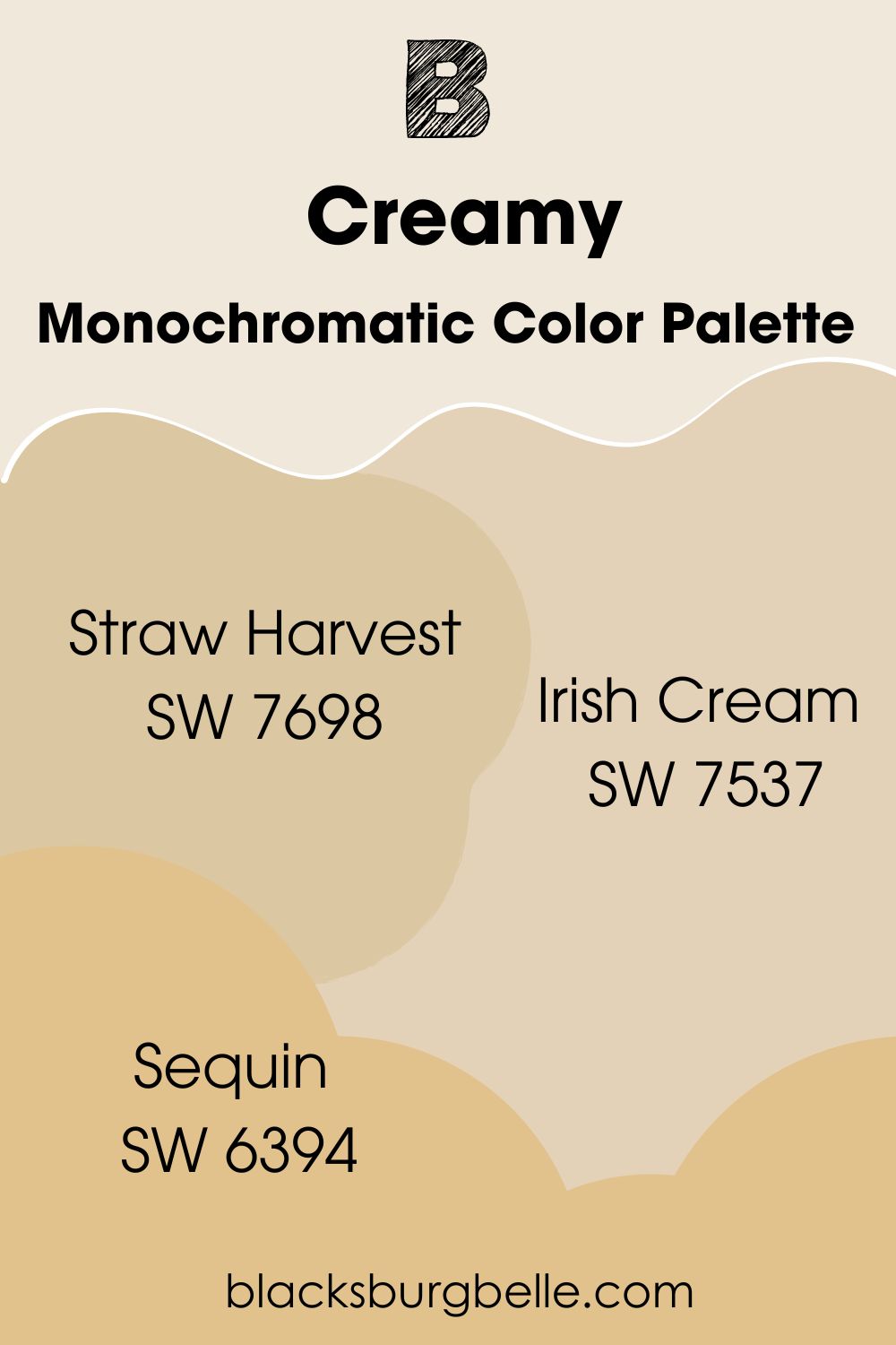
Monochromatic Color Palette
- Straw Harvest SW 7698: Straw Harvest helps to pick up on the yellow undertones of Creamy to really bring a room together.
- Irish Cream SW 7537: Creamy helps to bring out the warming and sumptuous orange undertones of Irish Cream.
- Sequin SW 6394: This warm yellow verges on being gold, helping to bring the buttery undertones of Creamy to life.
Sherwin Williams Creamy vs Other Paint Colors
Sherwin Williams Creamy vs Alabaster
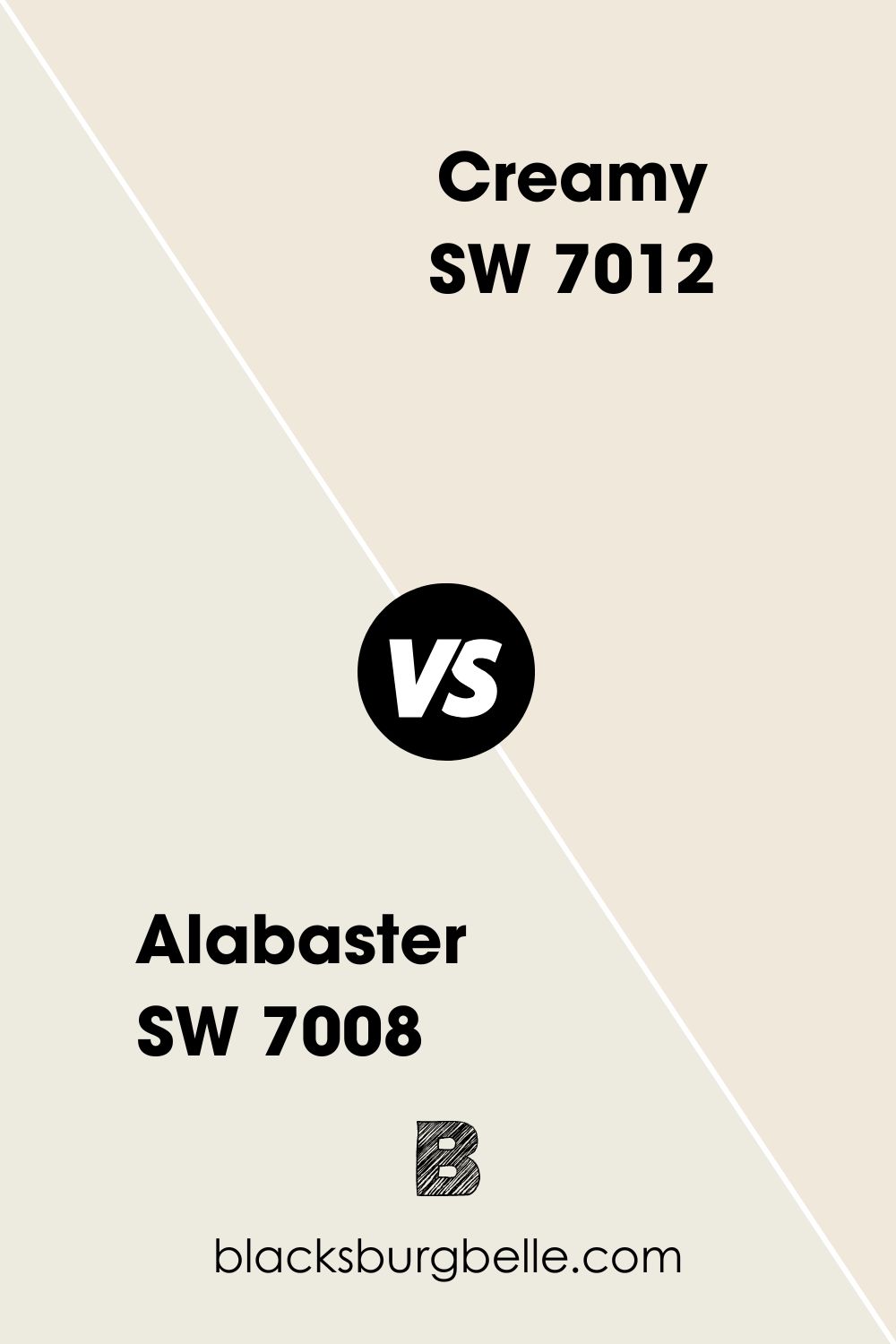
While both are similar in their lightness, the thing that sets Creamy apart from Alabaster is its undertones. Alabaster edges more towards a gray undertone, while Creamy’s is a buttery yellow.
Sherwin Williams Ivory Lace vs Creamy
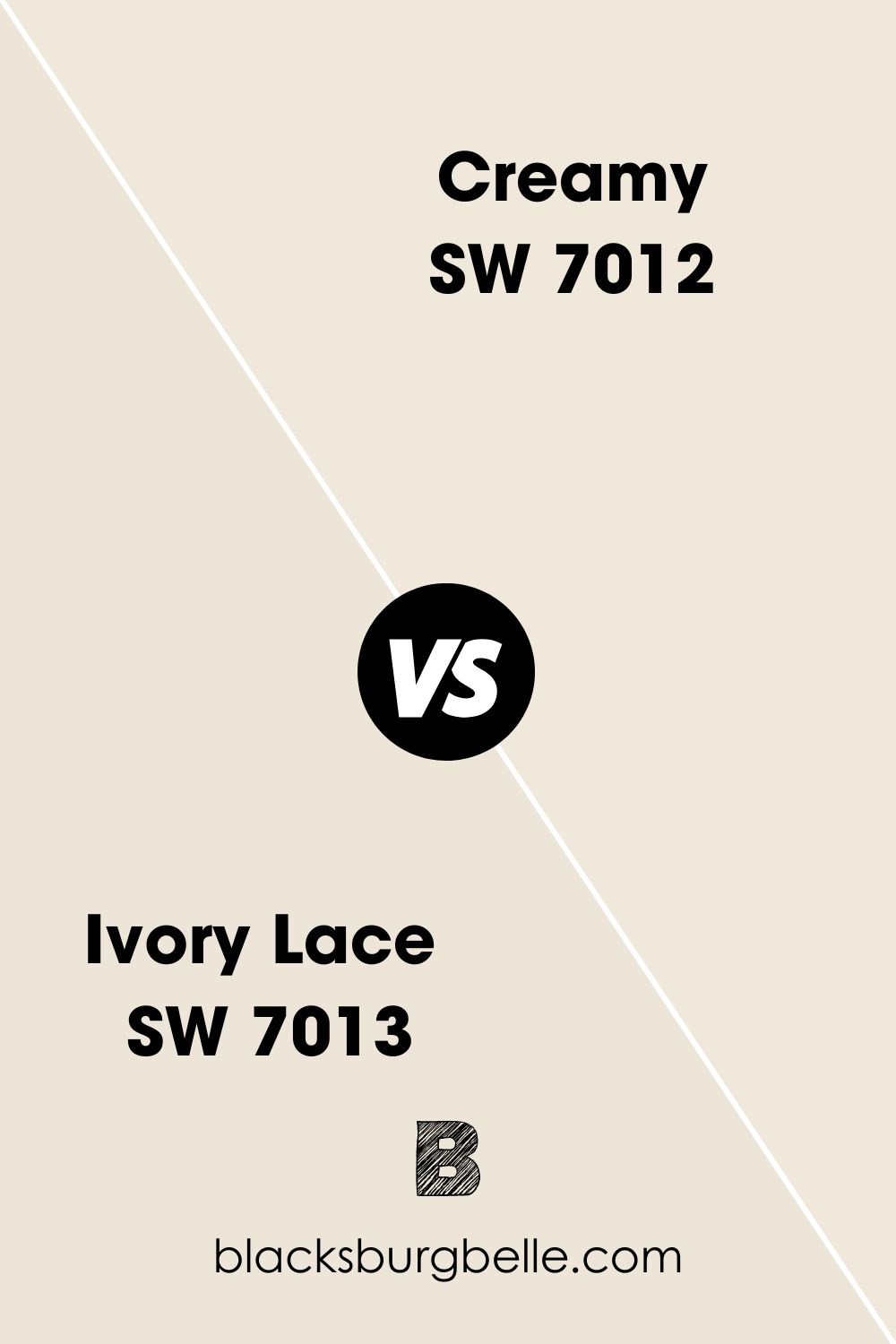
Ivory Lace vs Creamy is an easy one to distinguish. This is because Ivory Lace leans to the cool side, while Creamy is a warm color. They also differ when it comes to their undertones, as Ivory Lace’s is a cool pink.
Sherwin Williams Dover White vs Creamy
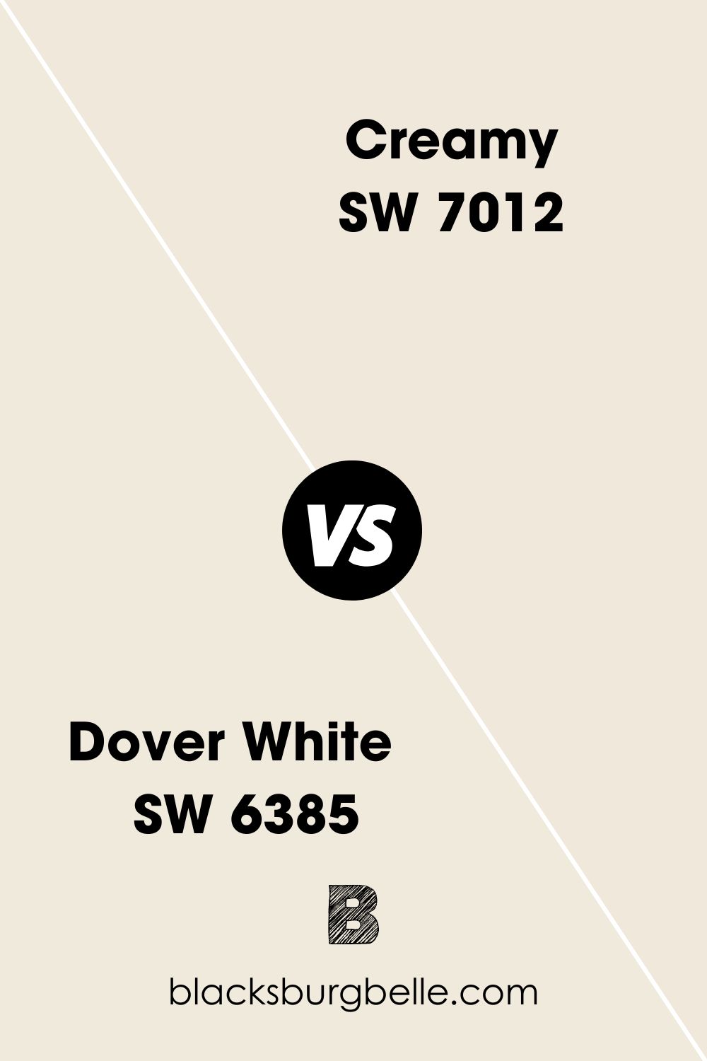
When it comes to Dover White vs Creamy, both are incredibly similar, being warm neutral shades with similar undertones. However, Dover White sits 2 points lighter on the LRV scale at 83, and I would argue that its undertone is more on the beige side.
Sherwin Williams Greek Villa vs Creamy
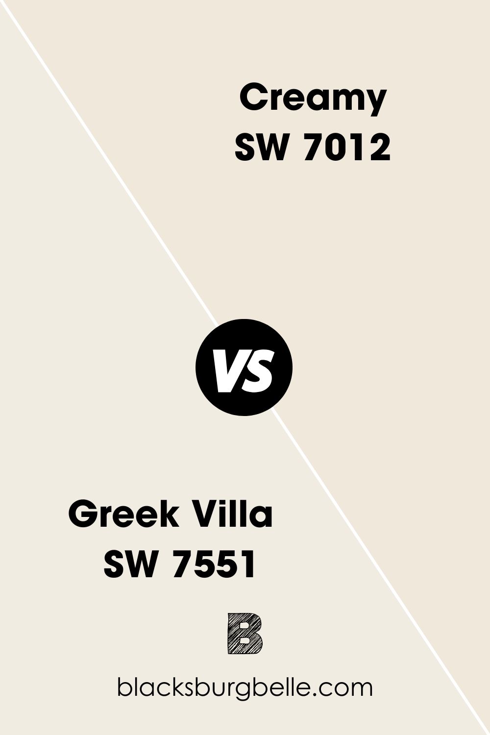
Greek Villa is a bright white at 84 on the LRV scale, and as a result, it doesn’t have the richness of Creamy. Greek Villa is perfect for painting with dark, contrasting colors, while Creamy can do this and more with ease, also working with lighter colors without getting too washed out.
Sherwin Williams Shoji White vs Creamy
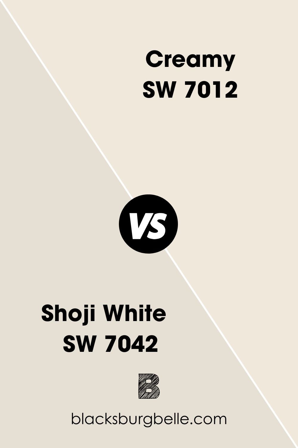
One of the easiest ways to tell Shoji White and Creamy apart is the fact that Shoji White is a lot darker with an LRV of 74. Creamy is also, well, cream, whereas Shoji White is very much a greige.
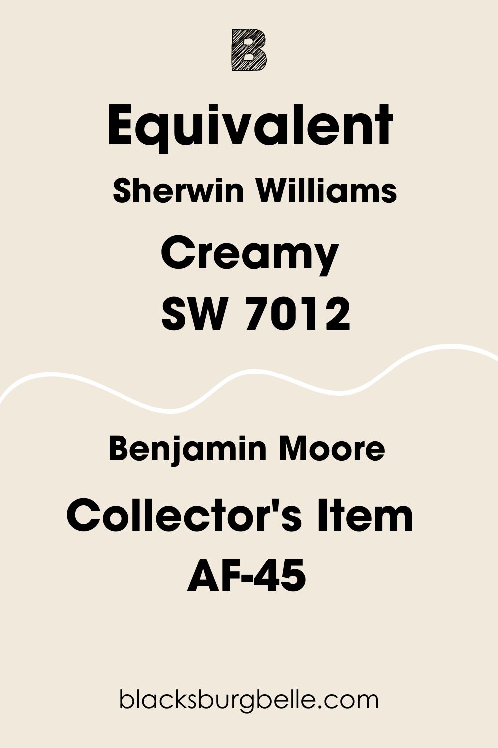
Sherwin Williams Creamy Benjamin Moore Equivalent
Benjamin Moore does have some paints with a similar name to Sherwin Williams Creamy SW 7012 in the form of Creamy White, Creamy Orange, and Creamy Beige, etc, but no color that has an exact name match.
Now, if we are talking color, the most similar paint from Benjamin Moore to Sherwin Williams Creamy is Collector’s Item AF-45. It’s worth keeping in mind though that although they are pretty similar, the undertone of Collector’s Item is much more pinkish than Creamy.
Where Can You Use Sherwin Williams Creamy SW 7012?
This gorgeous paint from Sherwin Williams has a lot to offer when it comes to including it in your design projects. I’ve collected lots of examples and inspiration for you here, so hopefully you are spoiled for choice on how to use Creamy!
Sherwin Williams Creamy Exterior
Using Sherwin Williams Creamy as the color for the outside of your property is never a bad choice! It’s the perfect mix of light and warming, ensuring every visitor to your home feels welcome.
For an example, check out this property I found. Look at how Creamy SW 7012 stands out against the gray roof and the dark window frames like a cheerful smile!

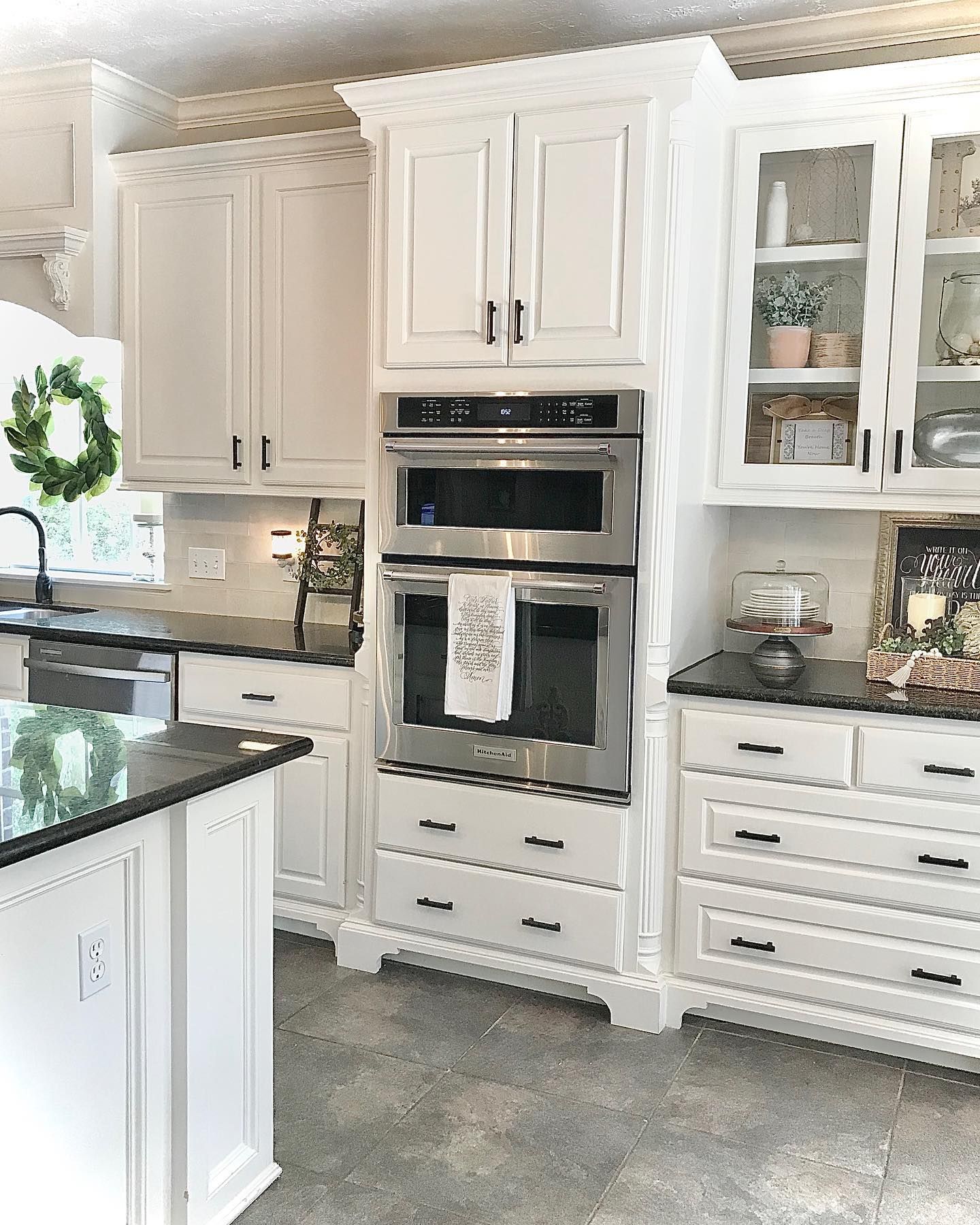
Sherwin Williams Creamy Kitchen Cabinets
Freshen up any kitchen by giving the kitchen cabinets a lick of Sherwin Williams Creamy. Not only does it add to the cozy vibes, but it also helps to create a farmhouse kitchen feel too. For an idea of what I mean, check out this gorgeous kitchen.
Sherwin Williams Creamy Trim
You can also use Sherwin Williams Creamy on window frames, doorframes, and other pieces of trim for a less harsh alternative to pure white. This is especially effective when put with a slightly darker warm shade such as the light tan color in this hallway.

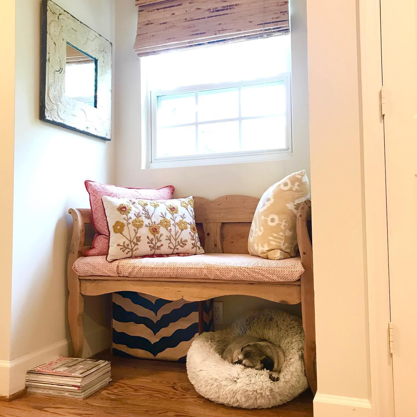
Sherwin Williams Creamy Nook
I’ve already mentioned how much Creamy is a cozy color, so as you can guess a perfect way in which to use it is to create a bright and cozy reading nook or corner feature! Take a look at this photo I’ve found and tell me you wouldn’t curl up there with a good book and a warm cup of tea!
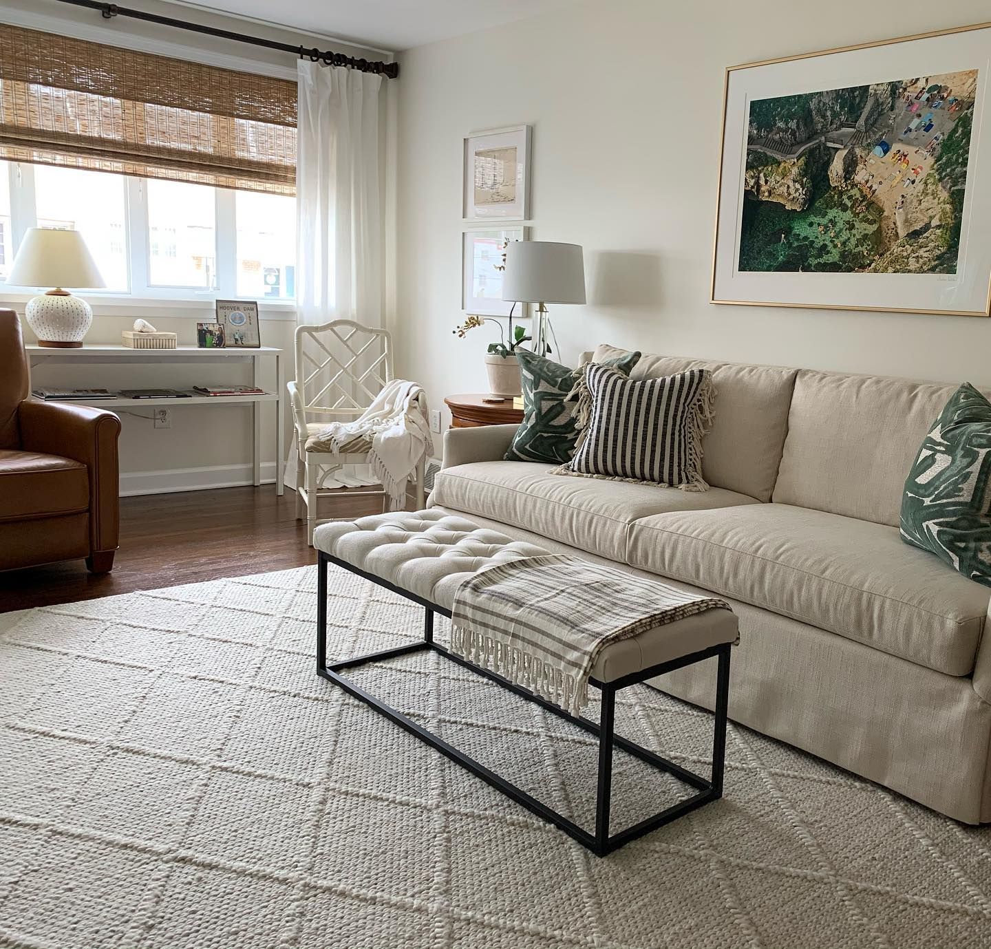
Sherwin Williams Creamy Living Room
If you want to bring warmth to your living room even in the darkest of seasons, consider painting the walls with Creamy SW 7012 and pairing it with neutral accessories and a small pop of natural color like my inspiration pic below to create a room that feels like a warm hug to relax in of an evening.
Sherwin Williams Creamy Bedroom
One of the great things about this paint color is the fact that when it is paired with white linen such as in this next photo I am going to show you, it keeps the color looking really crisp but still with the cozy feeling. This bedroom also highlights how well Creamy can mesh with a complementary color like the mint green of those nightstands!

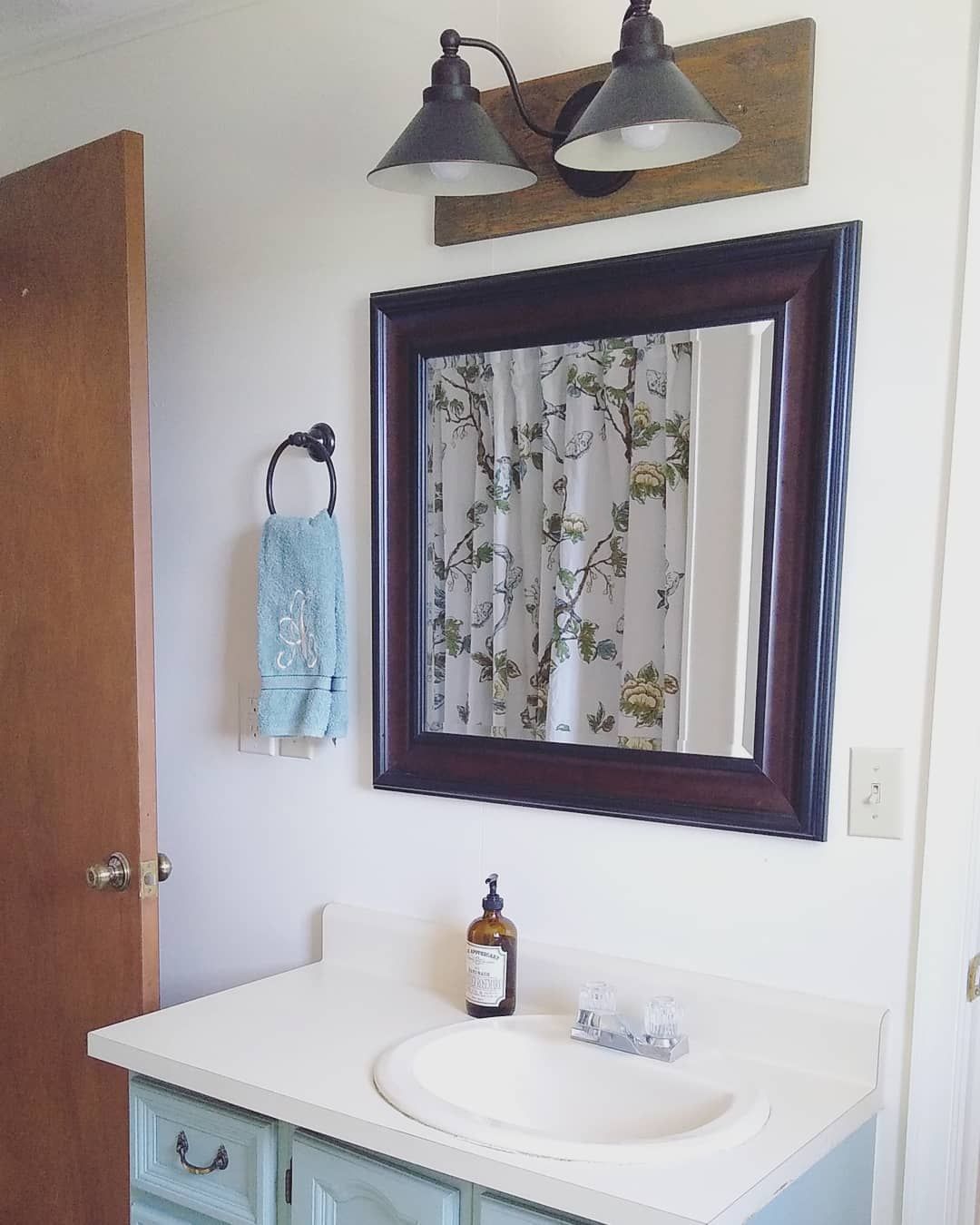
Sherwin Williams Creamy Bathroom
A Sherwin Williams Creamy bathroom definitely brings those farmhouse vibes. It also works really well with both a floral print and cool tones, as you can see in this inspiration photo I’ve found that just has the right amount of vintage chic.
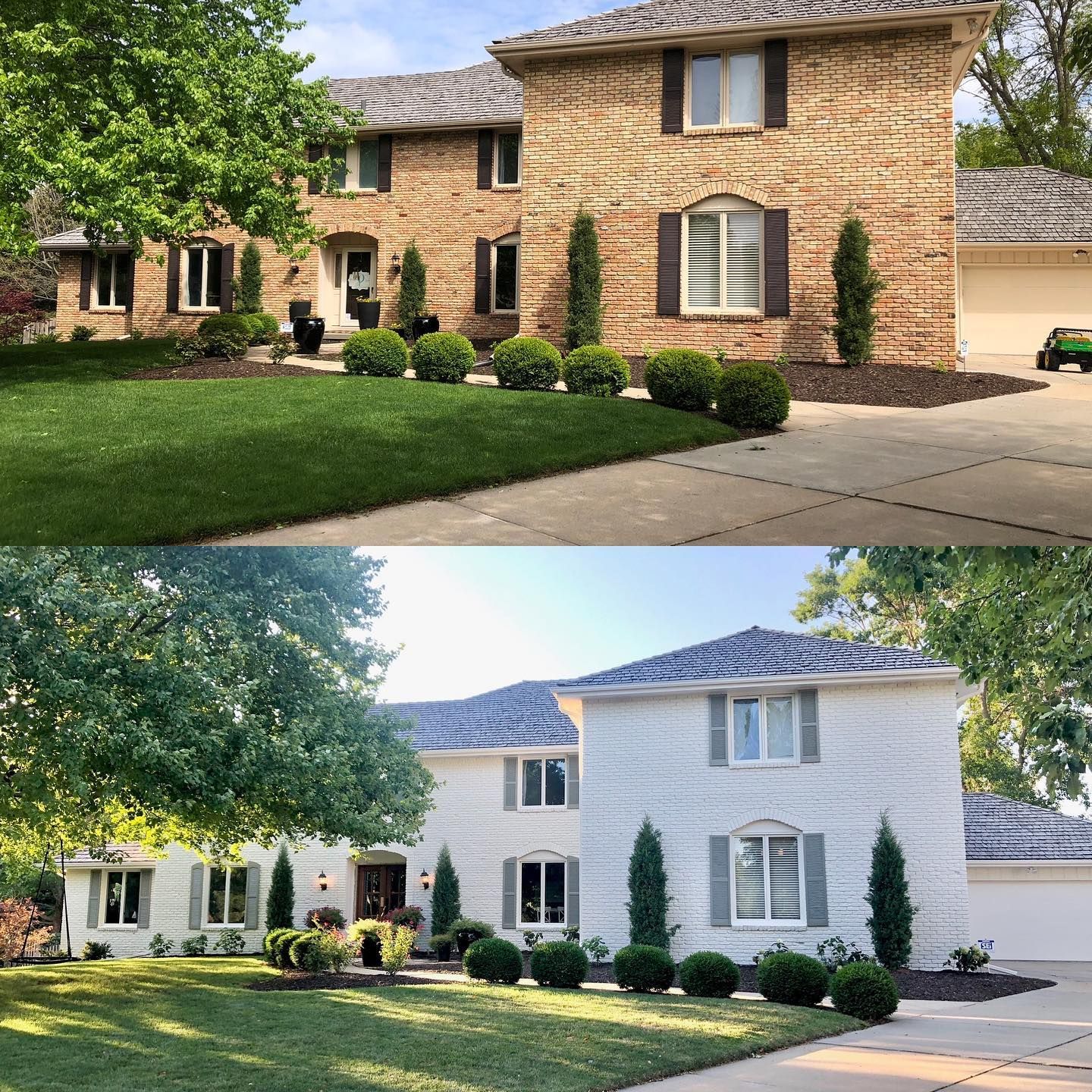
Sherwin Williams Creamy Exterior Brick
Sherwin Williams Creamy can help to seriously add curb appeal to exterior brick. It gives a bright facelift, especially when paired with a complementing gray for any trim details or features such as garage doors or window shutters. Take a look at the before and after pictures below: tell me which one you prefer, I bet I know which one!
Sherwin Williams Creamy on Furniture
Creamy isn’t just meant for walls. Instead, try using it to transform pieces of furniture, whether they are wood, or wicker like these cute stools I have found! Doesn’t it just fill you with a cozy feeling just looking at them? If farmhouse decor or cottage-core is your thing, you need to get in on the action with Sherwin Williams Creamy!

Conclusion
In summary, if you want to create a super cozy space, look no further than Sherwin Williams Creamy! This versatile and warm white is perfect for creating a farmhouse feel but also for anywhere you need a warm neutral to lift a room.
I personally love its buttery yellow undertones which set it apart from any other white or cream I have looked at in the paint world. Why not grab a pot for yourself and give it a try?
 Sherwin Williams Drift of Mist (Palette, Coordinating & Inspirations)
 Sherwin Williams Privilege Green (Palette, Coordinating & Inspirations)
 Sherwin Williams Storm Cloud (Palette, Coordinating & Inspirations)
 Sherwin Williams Dorian Gray (Palette, Coordinating & Inspirations)
 Sherwin Williams Indigo Batik (Palette, Coordinating & Inspirations)
 Sherwin Williams Daphne SW 9151: Paint Color Revie
