
If you have ever had to choose between Benjamin Moore’s Palladian Blue vs Wythe Blue, it wouldn’t come as a surprise that we are comparing them. They both look like the same color, but there are differences that make it easy to pick one.
Palladian Blue HC-144 is a blue paint color with gray-green undertones. On the other hand, Wythe Blue is a blue-green paint color with gray undertones. Also, Palladian Blue is considerably brighter than Wythe Blue.
Have all you need to tell the difference and make a choice? You can go ahead and pick the ideal one, but that is not all there is to know about these paint colors. I’ve so much more to show you, so come along on this ride to learn how to tell the difference between Palladian Blue vs Wythe Blue.
Table of Contents
When to Choose Benjamin Moore Palladian Blue vs Wythe Blue
Before we go deeper into this review, I want to point out when it is better to use Palladian Blue instead of Wythe Blue and vice versa. It will go a long way in helping you tell the difference without agonizing over it.
Choose Palladian Blue if:
- You want a light blue-green paint color to create airiness
- You want to blend a traditional space featuring different colors
- The space does not have a lot of light
Choose Wythe Blue if:
- You don’t mind a muted blue-green to act as a neutral color
- The space has a lot of light to brighten the color
- You want a balance between warm and cool-toned colors
Wythe Blue is a muted blue-green because of its relatively low LRV. Don’t know what an LRV is? I’ll get to that later. But because of the obvious gray in the paint color, it leans more toward the neutral end of the spectrum than Palladian Blue. However, it is usually more cool-toned than warm-toned because of the cool gray undertones.
If your style is more of a blue paint color that reads green in some cases to remind you of the sea or beach, Palladian Blue is your best bet. It has a higher LRV than Wythe Blue and shows only a bit of gray, so it does not appear too cool or muted.
Now, let’s look at the similarities and differences between these paint colors using pictures. I’m excited to show you how they work in real-life spaces.
A Visual Comparison of Benjamin Moore Palladian Blue vs Wythe Blue
Pictures are excellent at showing clear differences between things, regardless of how similar they appear. In the case of Palladian Blue and Wythe Blue, the following pictures represent how they may appear in specific rooms and under different lighting.
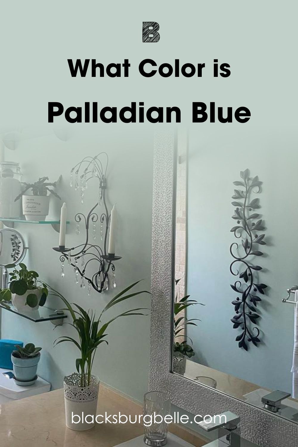
The first one is Palladian Blue, looking cool, calm, and collected in this dim bathroom:
The next picture shows Wythe Blue looking more blue than green, especially with so many colors around it:
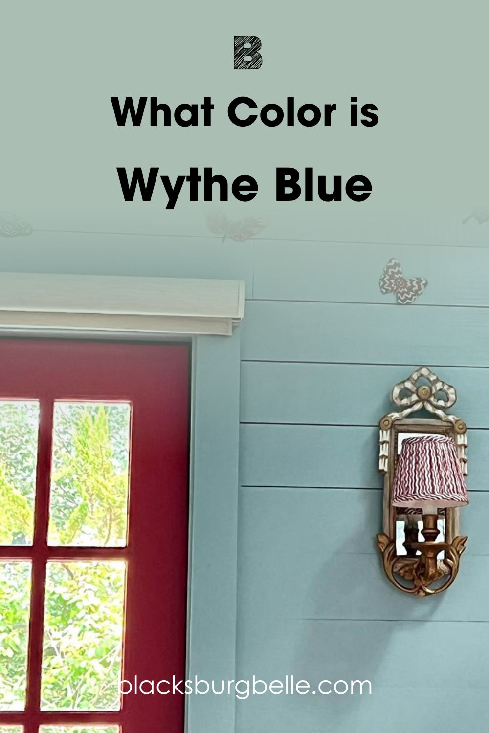
So, Wythe Blue looks like the brighter one of the two colors, but this is because of the lighting. You will not notice much blue in it as it usually appears. And what do you know, it looks great on wood!
Palladian Blue appears muted and dull, and I can confidently tell you it is because of the lighting in the room. This is a good place to tell you that these colors are mercurial. They can change their hues with different lighting, making them appear pretty different from what they are.
But we will get to lighting conditions later. For now, a quick rundown of the basics of these colors.
Benjamin Moore Palladian Blue vs Wythe Blue: A Swift Comparison
Using a table, I’m going to separate Palladian Blue and Wythe Blue according to their basic attributes. These attributes are common to all paint colors and help with picking the right one.
| Palladian Blue | Wythe Blue | |
| RGB | 193, 209, 201 | 170, 190, 180 |
| LRV | 60.4 | 48.11 |
| Undertone | Green-gray | Gray |
| HEX Value | #C1D1C9 | #AABEB4 |
Emotional Effects: Benjamin Moore Palladian Blue vs Wythe Blue
Both paint colors are blue with a mix of green and gray, but they tend to feel different in a room. Palladian Blue, as the brighter color, feels light and airy bringing a fresh feel to any room. You will immediately feel refreshed and relaxed with this color in a room.
Wythe Blue is more laid-back and cool in many cases. So, it will feel calming and serene in a room. These are qualities you want after going through a lot of stress and heat during the day. Besides, it may give the impression of a bigger room, which is ideal for small spaces.
LRV of Benjamin Moore Palladian Blue vs Wythe Blue
Remember how I talked about LRV earlier in the guide? It means light reflectance value and refers to, on a scale of 0 to 100, how much light color can reflect. Pure black is 0, while pure white is 100.
However, no paint color is entirely black or white; there are usually other hues. Or what we call undertones from colors used to create them, including red, green, and blue. Because of this, the LRV scale for paint colors is between 2.5 and 94.
Palladian Blue has an LRV of 60.4. The paint color is bright enough to reflect a good amount of light in a room, especially with its light color. However, it is not so high as to rank as a highly reflective color.
Wythe Blue, on the other hand, has an LRV of 48.11. This value is slightly below the middle point of 50. So, you can call it a medium blue, not bright enough to work in a dimly lit room. Simply put, Palladian Blue reflects more light than Wythe Blue.
Benjamin Moore Palladian Blue vs Wythe Blue: Are Their Undertones Alike?
The undertones of paint colors are the hues that appear under different lighting apart from the primary hue. Every color has a bit of an undertone, but some reveal it more than others. That is why some colors are termed neutral; they reveal minimal undertones.
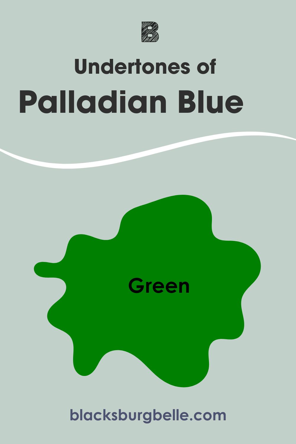
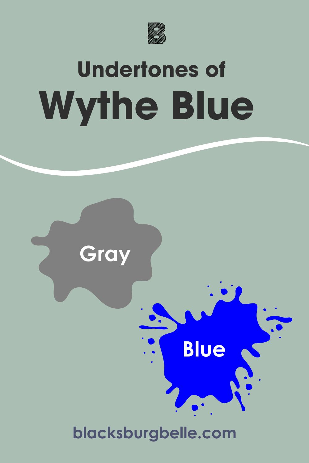
Palladian Blue and Wythe Blue have similar undertones of green and gray. However, Palladian Blue is more of a blue paint color with green-gray undertones than Wythe Blue. On the flip side, Wythe Blue is more of a blue-green paint color with visible gray undertones than Palladian Blue.
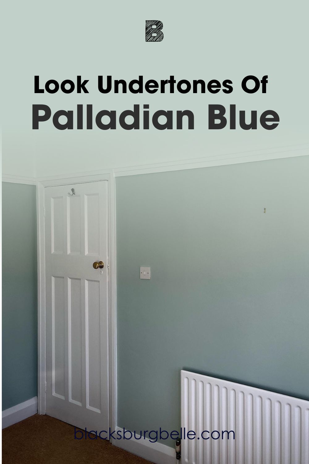
Spotting the Undertones of Palladian Blue
You will better understand how these undertones perform and whether or not they are alike if you see pictures. So, here is Palladian Blue looking more blue-gray with just a wink of green.
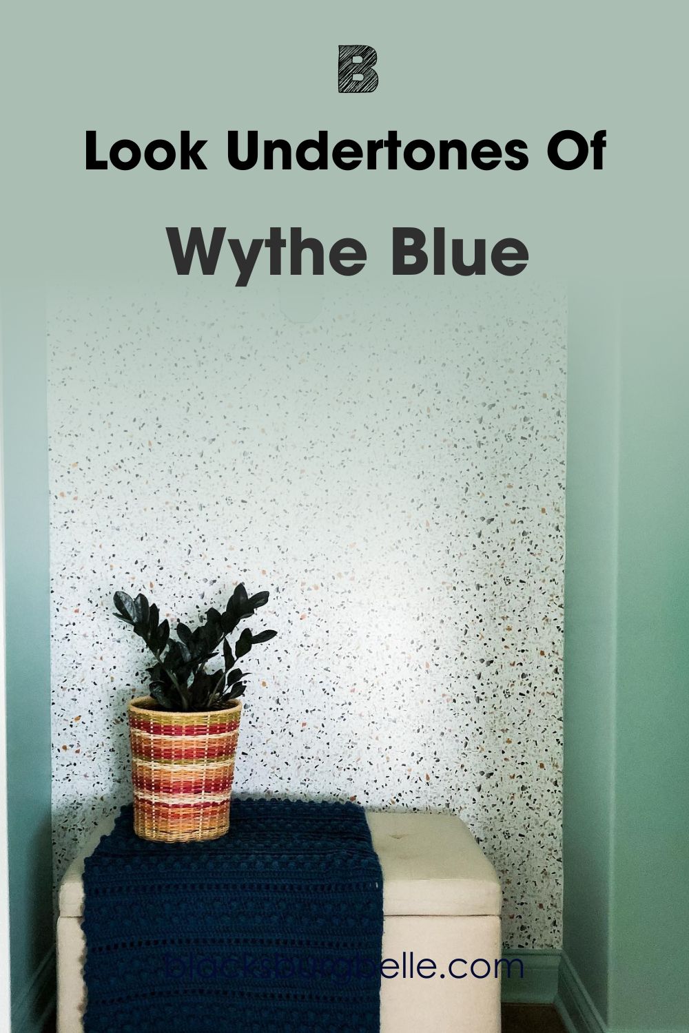
Spotting the Undertones of Wythe Blue
Unlike Palladian Blue, Wythe Blue reveals more green with just a hint of gray and blue in this picture.
These colors can change in the twinkle of an eye if the light changes. That is why I called them mercurial. You must understand that in low light, Wythe Blue may show more gray than green or blue, making it appear cool. In slightly brighter light, the green may become more obvious. And in bright natural light, it shows its true color.
Palladian Blue is slightly more balanced and remains solid in low or bright light. It holds up better in a room with cold or low light than Wythe Blue, reflecting more light than it absorbs, because of its higher LRV.
Benjamin Moore Palladian Blue vs Wythe Blue: Are They Warm or Cool?
You can term Palladian Blue and Wythe Blue as cool colors. This is because of their undertones which consist of green and blue. Gray is typically a cool color, although it can read warm in a few cases.
Green is also a cool color unless you talk about olive, sage, pistachio, and khaki because of the infusion of yellow, which is a warm color. In this case, it is a cool green, which makes the paint colors calm and serene.
However, Wythe Blue can play the role of neutral paint color, leaning neither warm nor cool, if the setting is right. While it is pretty similar to Palladian Blue, it has a more obvious gray cast than its sibling color. Therefore, it can bring other colors together in any decor.
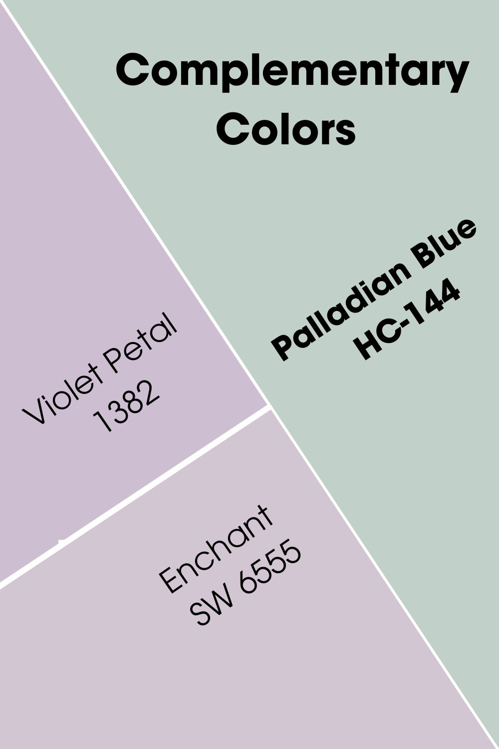
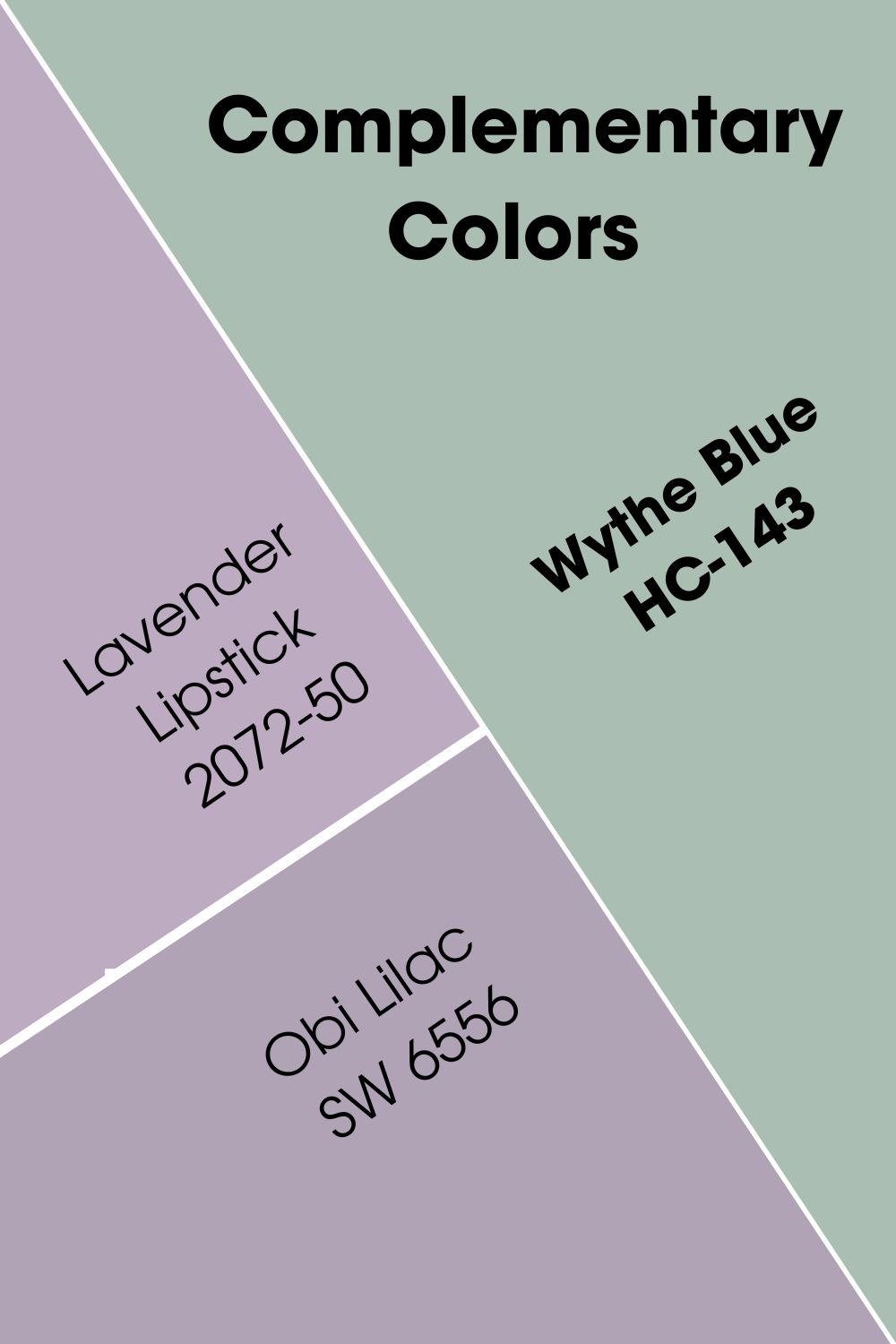
Benjamin Moore Palladian Blue vs Wythe Blue Complementary Colors
Complementary colors refer to opposite colors on the color wheel. They usually don’t look like they can work together at first glance, but they do when you have the right shades. So, what are the best complementary colors for Palladian Blue and Wythe Blue?
Benjamin Moore’s Violet Petal 1382 is the color that best complements Palladian Blue. Another one is Sherwin Williams’ Enchant SW 6555. For Wythe Blue, the best color to complement it is Benjamin Moore’s Lavender Lipstick 2072-50 or its Sherwin Williams equivalent of Obi Lilac SW 6556.
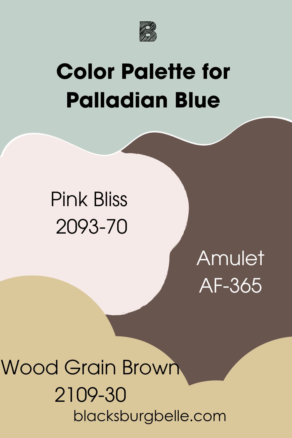
Benjamin Moore Palladian Blue vs Wythe Blue Color Palettes
Color palettes are what make every paint color work. This is because they include different colors, including vibrant, soft pastels, bold colors, and neutrals. How you create your palette will depend on your style, but the colors must match the central hue.
Color Palette for Palladian Blue
Pink Bliss, Wood Grain Brown, and Amulet are some colors that make a good combination with Palladian Blue. The beautiful thing about it is that you can add other colors; this is simply a guide on how to start.
- Pink Bliss 2093-70: A barely-there shade of pink that can serve as a warm neutral and soft pastel to complement the Palladian Blue
- Wood Grain Brown 2109-30: Add some versatility to your decor with this deep and earthy tone to make the light Palladian Blue pop
- Amulet AF-365: A light tan paint color with yellow undertones to create a pastel palette with Palladian Blue
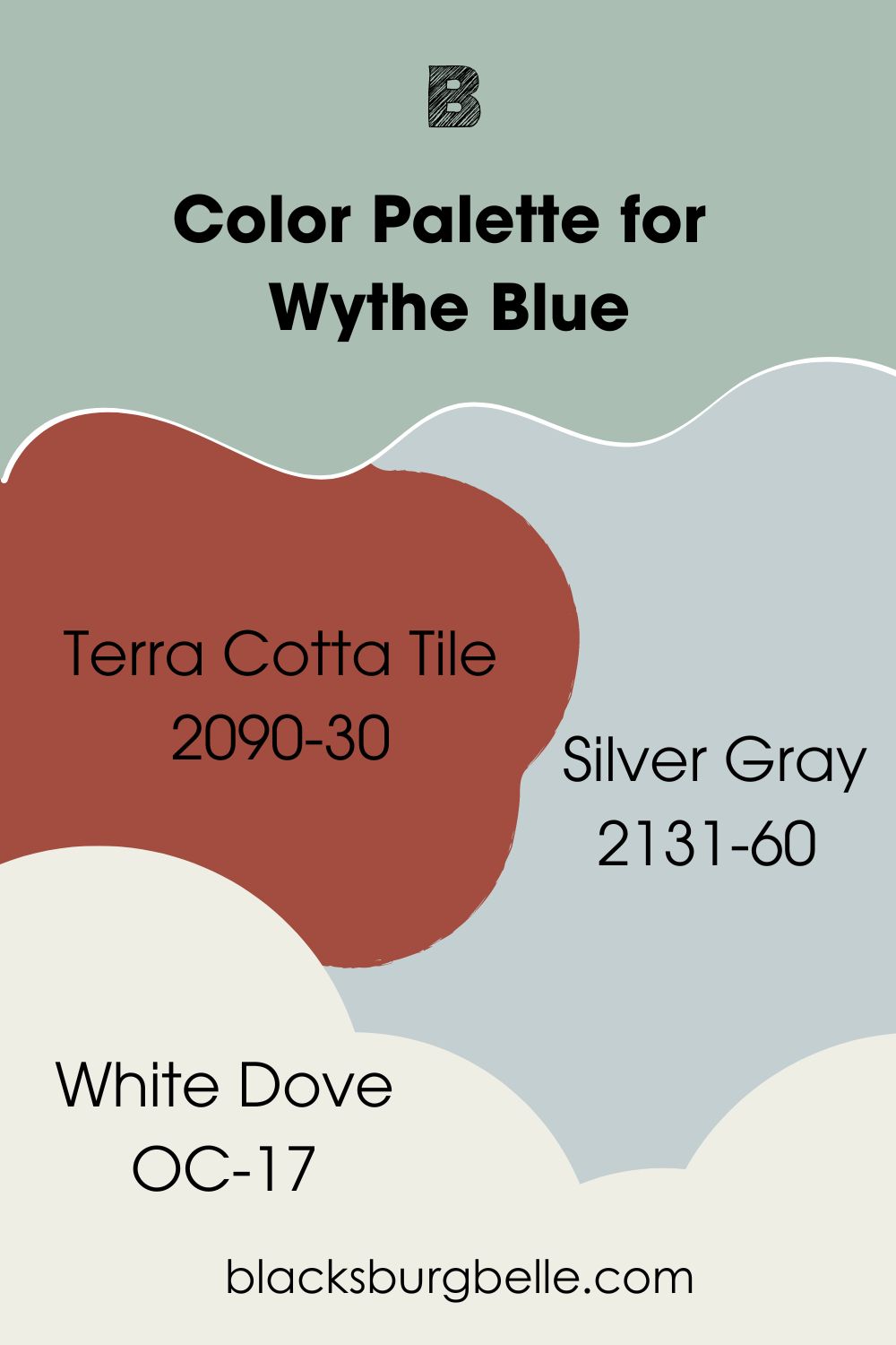
Color Palette for Wythe Blue
Terra Cotta Tile, Silver Gray, and White Dove are ideal colors to add to this color palette for starters. You must also check the existing decor and surrounding elements before making a final decision.
- Terra Cotta Tile 2090-30: A dark red with earthy hues to keep it from being too loud, making it ideal for the soft Wythe Blue for versatility
- Silver Gray 2131-60: This is a light gray paint color with blue-green undertones to complement the darker Wythe Blue perfectly
- White Dove OC-17: A warm white with slightly creamy undertones to brighten the room with its high LRV paired against the low one of Wythe Blue
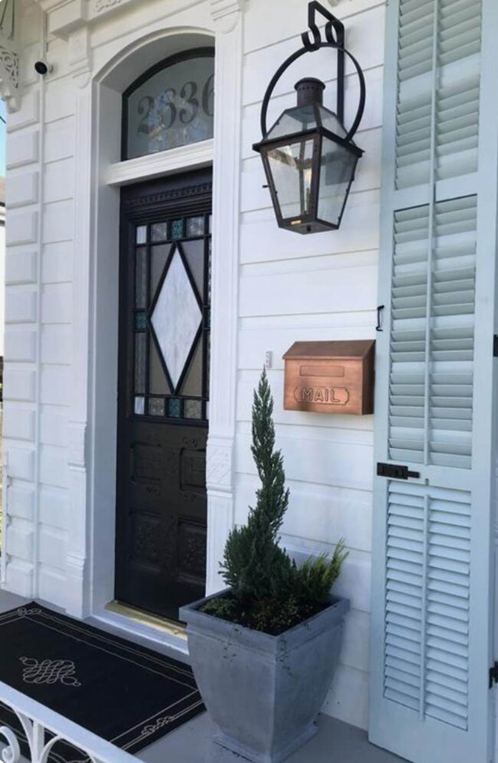
Benjamin Moore Palladian Blue vs Wythe Blue on Doors
Go whimsical and paint your front door, or any other door for that matter, an unconventional color like Palladian Blue or Wythe Blue. Wondering how they will perform? Let me show you in pictures.
BM Palladian Blue on Doors
Here is what to expect if you use Palladian Blue on a door, especially if it is a front door. The color will look bright and beautiful because of the natural light.
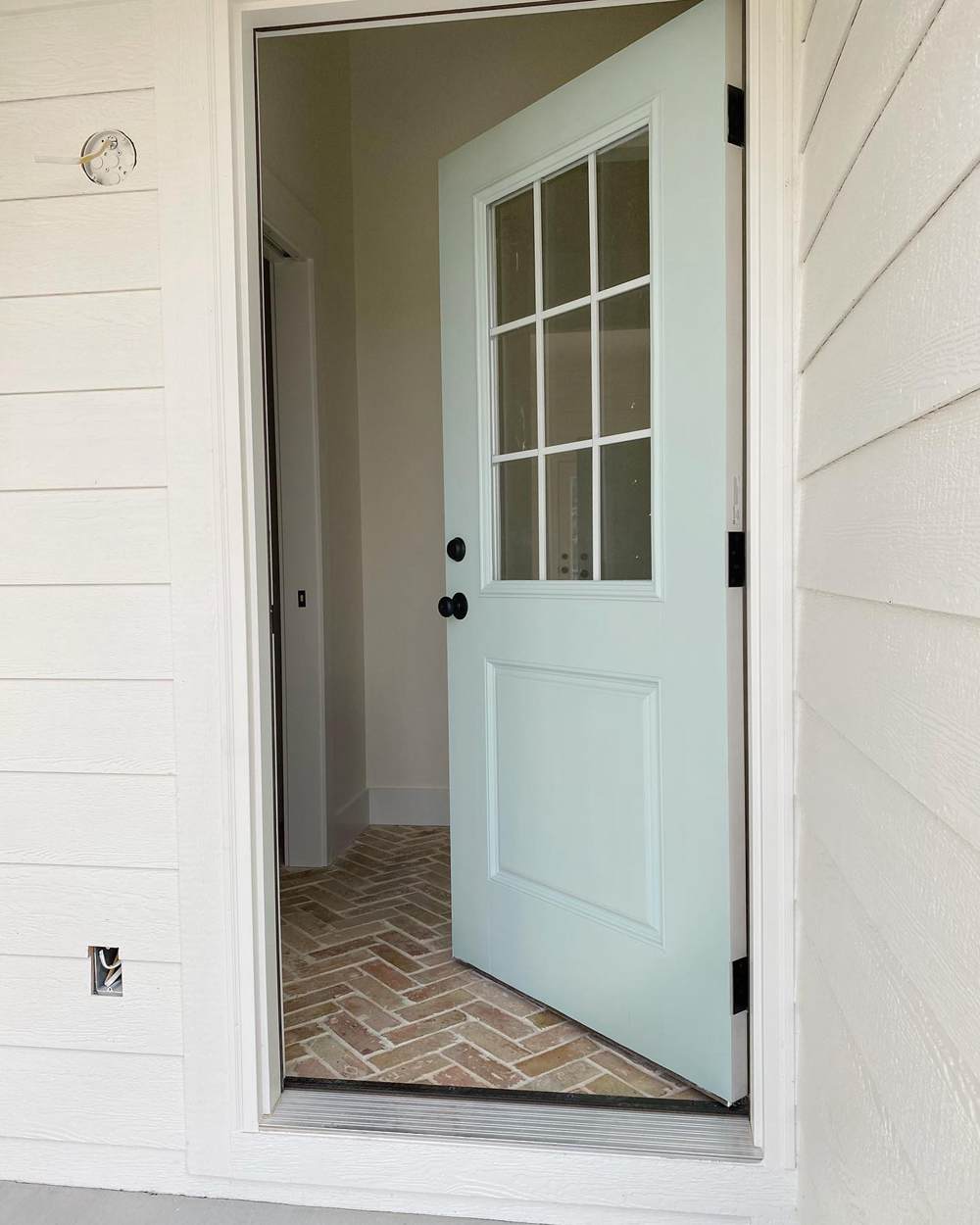
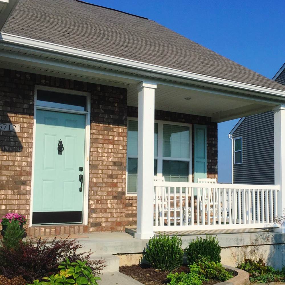
BM Wythe Blue on Doors
And here is Wythe Blue looking almost the same shade as Palladian Blue, only with a smidge greener.
Benjamin Moore Palladian Blue vs Wythe Blue on Trim
It is not the first color that comes to mind when you want a trim color. I mean, white is the classic color. But blue-green is such a beautiful trim color, and because it is uncommonly used, you make a statement with it.
BM Palladian Blue on Trim
This is not traditionally a trim, but the space is painted in such a way that you get an idea of what Palladian Blue looks like on the trim. Have a look.
BM Wythe Blue on Trim
This next picture is a better representation of what these paint colors look like on the trim. The beauty of this room makes me want to leap for joy. Yes! This is it!
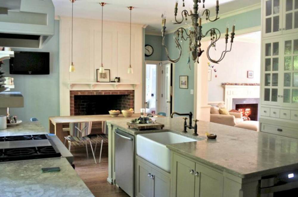
Benjamin Moore Palladian Blue vs Wythe Blue on Cabinets
If you want a fresh-looking kitchen with just a coat of paint, you can try Palladian Blue or Wythe Blue on the cabinets. The same applies to the laundry room or any other room with cabinets. These colors bring a calm freshness and airiness that even white doesn’t bring.
BM Palladian Blue on Cabinets
Paired with white and stainless steel appliances in this kitchen, Palladian Blue looks amazing and blue-green instead of blue.
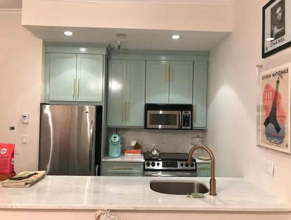
BM Wythe Blue on Cabinets
The lighting in the next picture makes Wythe Blue look its true shade, only slightly brighter. It is paired with warm whites and other colors.
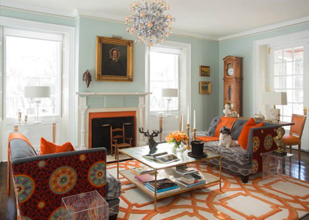
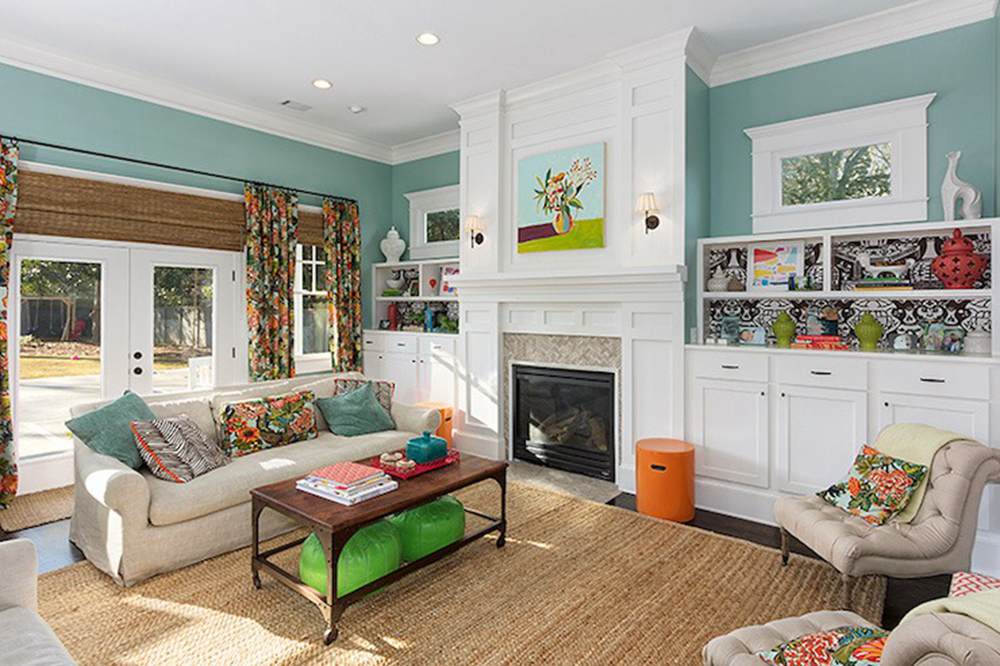
Benjamin Moore Palladian Blue vs Wythe Blue in Living Rooms
Living rooms require beautiful colors to make them work. While every color seems ideal, how you use it with other colors is crucial to the final result. So, let’s see if Palladian Blue and Wythe Blue perform well.
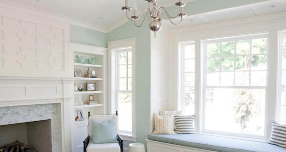
Benjamin Moore Palladian Blue in Living Rooms
It looks like minty blue and holds up well with dark colors and wood tones in this living room.
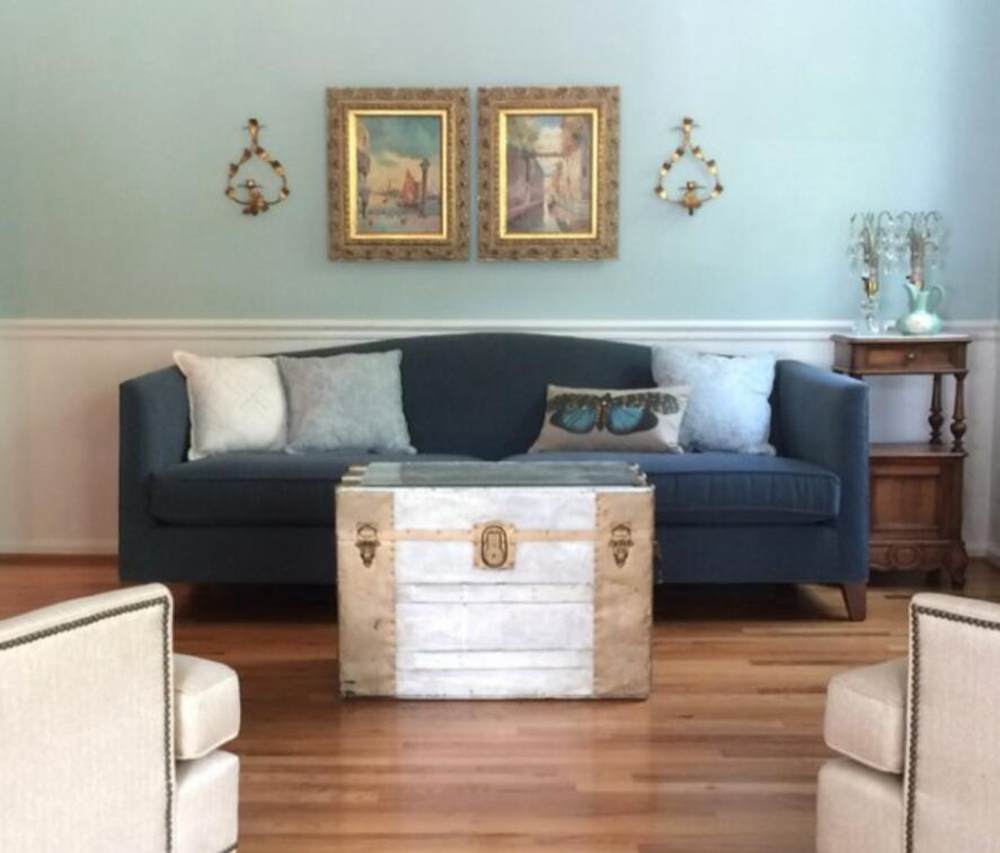
BM Wythe Blue in Living Rooms
It can be a conversation starter because it presents a soft and welcoming face in any living room. Beautiful, isn’t it?
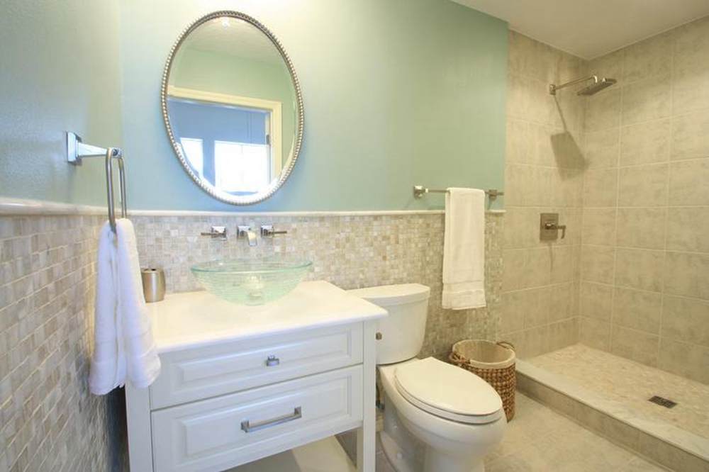
Benjamin Moore Palladian Blue vs Wythe Blue in Bathrooms
These next pictures present the true colors of Palladian Blue and Wythe Blue. Bathrooms are some of the best rooms to use blue-green or blue-gray because of the feeling of wellness and the reminder of water.
BM Palladian Blue in Bathrooms
This bathroom looks really inviting because of the blue and white decor. And Palladian Blue is so blue on the wall.
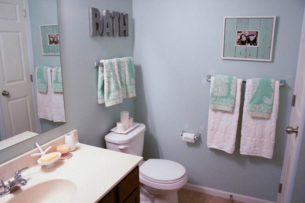
BM Wythe Blue in Bathrooms
In contrast, Wythe Blue appears blue-green with green undertones. You have to agree with me that it performs well here.
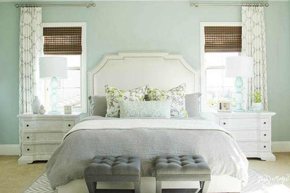
Benjamin Moore Palladian Blue vs Wythe Blue in Bedrooms
Like bathrooms, bedrooms look great when painted with Palladian Blue or Wythe Blue. Since a bedroom is where we typically relax, we need it to look its best, right?
BM Palladian Blue in Bedrooms
Here, Palladian Blue looks green in this bedroom, but it has a lot to do with the lighting.
BM Wythe Blue in Bedrooms
And Wythe Blue presents a blue and cool face in this lowly-lit room. Paired with white and other neutrals, it comes out beautifully.
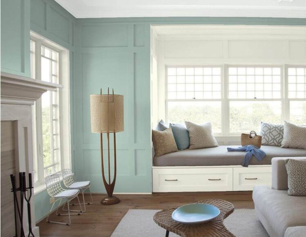
Benjamin Moore Palladian Blue vs Wythe Blue with Various Colors
If you are unsure of these colors when paired with other colors, you don’t have to wonder about it any longer. Light colors can easily pick up the hues from vibrant colors, so it may be helpful to decide this before picking one.
BM Palladian Blue Paired with Various Colors
Here is Palladian Blue with several colors used as accessories. The paint color looks perfect as a neutral that holds all other colors together in this room.
BM Wythe Blue Paired with Various Colors
Wythe Blue is paired with an amazing array of colors in this living room. It doesn’t pick any of them and still looks so striking.
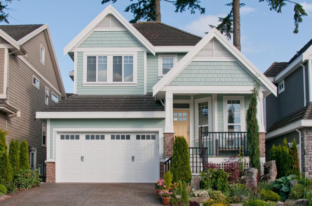
Benjamin Moore Palladian Blue vs Wythe Blue on Exterior Walls
Light blue is not a popular color on the entire exterior of a house. If you are considering using it beyond the front door or porch, it is best to see what it looks like before deciding.
BM Palladian Blue on Exteriors
What do you think of this color on the exterior of this house? Yay or nay? You can decide for yourself.
BM Wythe Blue on Exteriors
It is a great color on the exterior if you don’t mind bright pastels. And paired with white trims, it comes out beautifully. But is it your style? Let’s find out.
Lighting Conditions
Use Wythe Blue in a room with adequate lighting because of its low LRV. But also note that lighting can change the color, making it cooler or warmer. The same is true of Palladian Blue. And because of the gray in it, Wythe Blue will look cool and slightly crisp in a dimly lit room.
As the brighter option, Palladian Blue is more versatile when it comes to lighting. But it is less neutral than Wythe Blue. Therefore, use Wythe Blue in a brightly-lit room and Palladian Blue in any room. I recommend using them with good lighting, whether natural or artificial.
Conclusion
This guide reviews Benjamin Moore’s Palladian Blue vs Wythe Blue so you can easily tell the difference and pick the better option. They are both light blue paint colors with undertones of green and gray. Wythe Blue is a blue-green with gray undertones, while Palladian Blue is a blue with green-gray undertones.
And with Palladian Blue being brighter than Wythe Blue because of its higher LRV, you already know it fits better in all lighting conditions. Wythe Blue may look too muted in low light. Keep this mind when choosing, as well other colors you plan to blend in the decor.
You can always reach me by using the comments section. I’m excited to share my thoughts and expertise to get you to that destination you want. I also woud love to see pictures of what you’ve done with either Palladian Blue or Wythe Blue. Have fun painting and blending!
 Accessible Beige Vs Agreeable Gray: Which is Good?
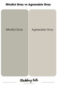 Mindful Gray vs Agreeable Gray: What’s the Difference?
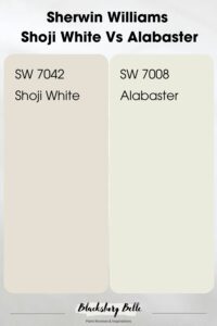 Sherwin Williams Shoji White Vs Alabaster: How to Choose
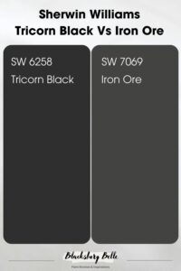 Sherwin Williams Tricorn Black vs Iron Ore: How to Choose?
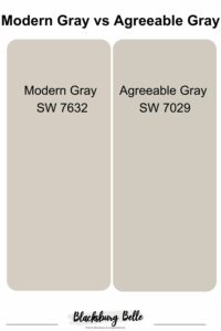 Modern Gray vs Agreeable Gray: How to Choose?
 Sherwin Williams Iron Ore vs Peppercorn: Is There a Difference?
