
Do you want the relaxing feel of blue but also want the calmness of green for your space? Will you love to have a color flexible enough to give these tones depending on factors you can control? Let me tell you about Benjamin Moore Palladian Blue.
Palladian Blue offers the best of both worlds with its blue and green tones. It belongs to Benjamin Moore’s Historical Color Collections, which is fitting for such a lovely paint color. Do you want some cheerful vibes and a gentle, stylish touch for your space? Consider Palladian Blue.
I have done a comprehensive review of Benjamin Moore Palladian Blue. Continue reading to find out the paint color’s LRV, undertones, color pairings, and much more.
Let’s get started!
Table of Contents
When to Choose Benjamin Moore Palladian Blue (HC-144)
With Benjamin Moore Palladian Blue’s versatility, knowing when to use it in your space might prove challenging. But don’t worry, I’ve highlighted some tips below to help you decide.
So, when do you choose Benjamin Moore Palladian Blue (HC-144)?
Looking for bright coastal vibes?
Palladian Blue is a blue-green paint color with a coastal look. An LRV of 60.4 puts it on the bright side but doesn’t dilute its color depth. If you want a versatile coastal paint color for your space, consider Palladian Blue.
Aiming for a spa-like look or vibe?
Not only does Palladian Blue give coastal vibes, but it also works well in spa-inspired palettes and decor. Pair it with relevant colors and you’ll get the spa-like look you seek.
Comfortable with the color leaning into green?
Although it’s mainly a blue paint color, Benjamin Moore Palladian Blue has strong green tones too. The color blends these two tones together for a lovely look. This makes it easy for it to lean into either one of blue or green.
Note that Palladian Blue’s look depends on surrounding colors and lighting. This means you can control how the paint color looks in your space.
Working on a bedroom, bathroom or front porch?
Palladian Blue’s serene, coastal look and vibes make it popular for spaces like bedrooms, bathrooms, and even front porches. If you’re working on such areas in your home, the paint color is a valid option to examine.
Worried about adequate lighting?
If you’re working with Benjamin Moore Palladian Blue, you shouldn’t worry too much about lighting. The reason is that the paint color has a moderately high reflectance and doesn’t darken any room.
However, while lighting won’t make it look moody or gloomy, it can determine which tone appears strongly in the space.
What Color is Benjamin Moore Palladian Blue?
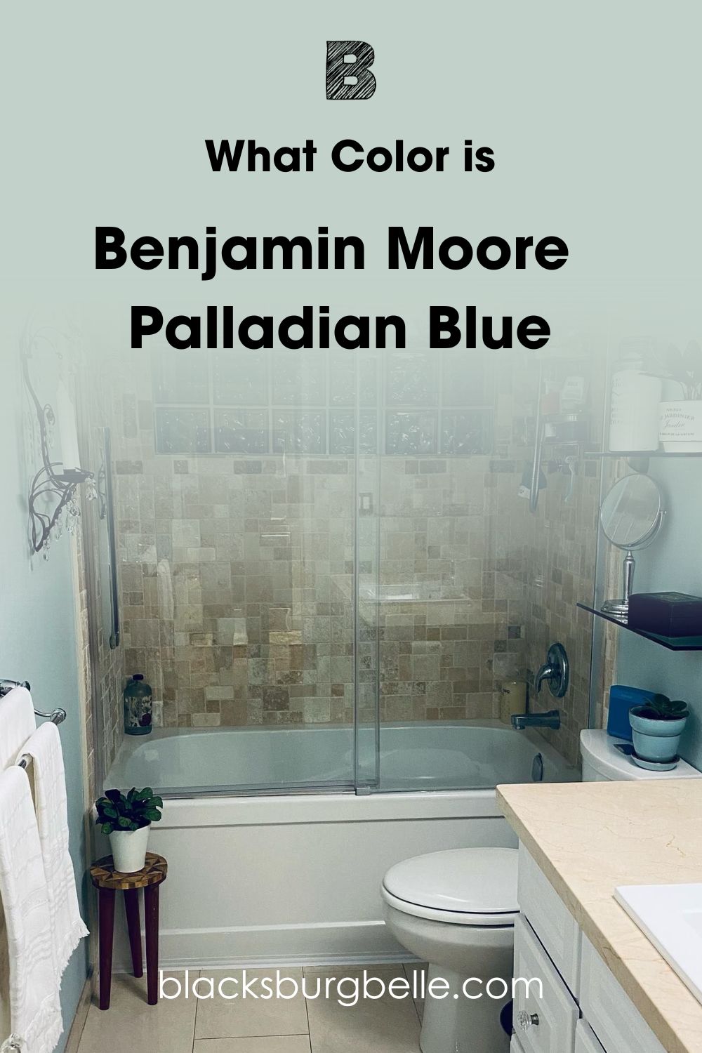
Palladian Blue is a blue-green blend that gives any space an airy, coastal look. Its tones appear tranquil and refreshing in a home’s interior and exterior areas. The paint color can lean into either one of its blue or green, depending largely on lighting and color pairings.
Benjamin Moore describes Palladian Blue as “all is calm with this soft, airy blue that conjures clear skies and flecks of mother of pearl.” This emphasizes the fact that the paint color looks light-hearted and gives spa-like vibes. And what’s common among spa-like colors? They give beachy vibes too!
Somewhere in the mix, you’ll spot some gray tones. However, Palladian Blue displays more of its blue and green in both dark and bright spaces.
Snapshot of Palladian Blue’s Specifications
A paint color’s specifications show its core attributes. These properties influence the paint color’s appearance and behaviour. The table below shows Palladian Blue’s specifications.
| Specifications | Palladian Blue |
| RGB | 194, 210, 202 |
| HEX Value | #C2D2CA |
| LRV | 60.4 |
| Undertones | Strong Green and Gray |
The LRV of Benjamin Moore Palladian Blue
Benjamin Moore Palladian Blue has an LRV of 60.4. Does this value mean it’s a bright paint color? Does it influence the color’s interaction with light?
LRV means Light Reflectance Value, which indicates how strongly a paint color reflects light. Since every paint color relies on light for their looks, this value is important. LRV runs on a scale of 0 – 100, with darker colors having lower values because 0 indicates true black. And brighter colors have higher values because 100 indicates true white.
Palladian Blue’s LRV of 60.4 puts it on the bright side of the scale. Although it doesn’t fall in the category of off-whites and whites, the paint color will brighten any space. This makes it suitable for both dim-lit and bright areas of your home.
Undertones of Benjamin Moore Palladian Blue (HC-144)
Undertones mostly stay just beneath the main tone of your paint color. They can come out when least expected or when you pair the paint color with other relevant colors. Lighting in a space can also reveal hidden tones in the paint color.
Benjamin Moore Palladian Blue has green and gray undertones. This makes it a sort of opposite to other coastal colors like Benjamin Moore Wythe Blue. Don’t worry, I’ll explain this better in the color comparison section.
The paint color can lean into blue or green depending on other colors in the area and the lighting. Green paint colors strengthen Palladian Blue’s green tones. Interestingly, cool, bright whites give the paint color a sky-blue shade.
Is Palladian Blue more green or blue?
Although it has both blue and green tones, Palladian Blue is primarily a blue paint color. However, it can lean into any of the tones, depending on the lights and colors in your space. Generally, Palladian Blue has stronger blue tones than green.
Will Palladian Blue appear gray on walls?
Benjamin Moore has some gray undertones too. However, the paint color won’t look gray readily. The reason is that it has strong blue and green tones that will always show up in any space.
Note that dim-lit spaces can bring out more of its gray tones.
Is Palladian Blue a Warm or Cool Color?
Benjamin Moore Palladian Blue has cool blue and warm green tones. Therefore, its temperature largely depends on which tone is dominant at any given time. Regardless, the paint color mostly stays mildly cozy, especially in interior space.
North-facing rooms generally have cool natural lights. They bring out the paint color’s blue tones. However, its gray prevents it from looking icy or cold. As such, Palladian Blue simply adds a soft, cool touch to such spaces.
On the other hand, south-facing rooms and incandescent lights strengthens the paint color’s green tones. They give it a warm, cozy look that is moderated by the gray undertones. Therefore, while Palladian Blue can look warm and cozy, it will not display such vibes as intense as a regular warm green.
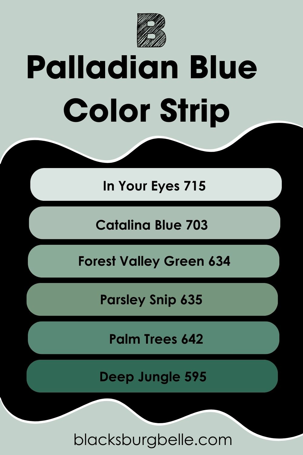
Benjamin Moore Palladian Blue Different Shades: Lighter or Darker Exploration
Most of time, paint colors come in groups of varying shades, forming a sort of family. We call them color strips and you will sometimes see a list of different shades of a paint color, like in this case.
Color strips/different shades of your color share similar tones but different LRVs. One thing I love about them is that they pair nicely for monochromatic palettes and decor.
The following paint colors are varying shades of Palladian Blue from the brightest to darkest:
- Benjamin Moore In Your Eyes 715
- Benjamin Moore Catalina Blue 703
- Benjamin Moore Forest Valley Green 634
- Benjamin Moore Parsley Snip 635
- Benjamin Moore Palm Trees 642
- Benjamin Moore Deep Jungle 595
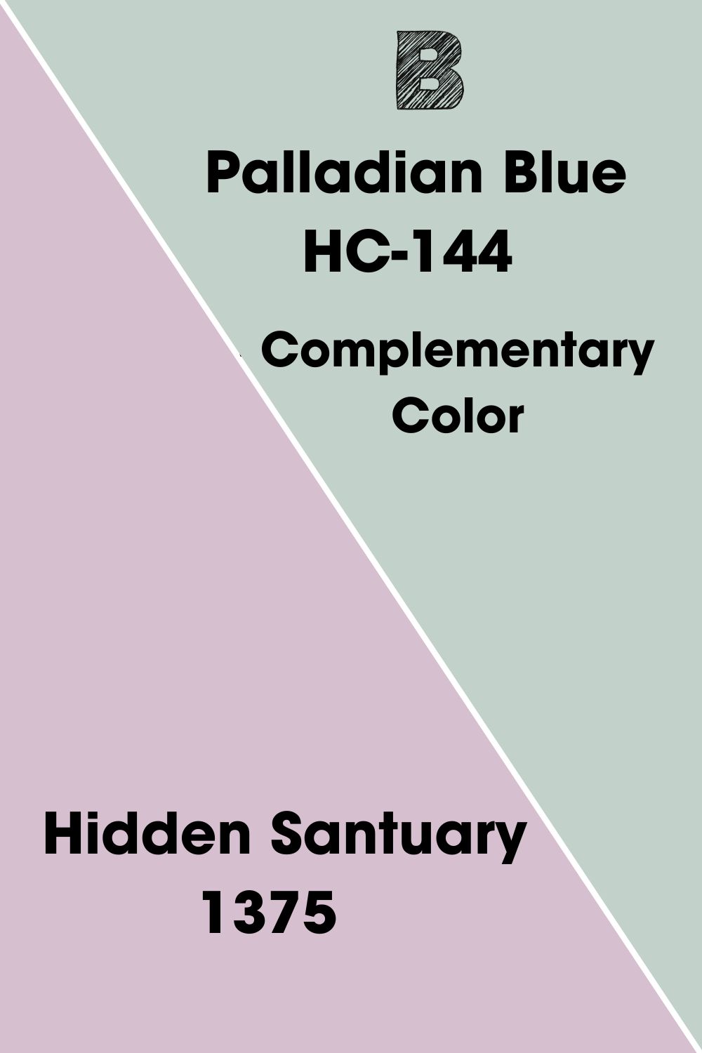
Palladian Blue’s Complementary Color
Complementary colors give the best contrasting effect to your paint color. They sit on the opposite of your paint color on the wheel. This makes it important to know your color’s complement and use it to give your space a better look.
BM Palladian Blue’s Complementary Color is Benjamin Moore Hidden Santuary. This paint color is the closest to the hue that complements Palladian Blue.
Benjamin Moore Hidden Santuary 1375
Hidden Santuary is a medium to bright shade of violet with an LRV of 55.87. It has a romantic vibe that can remind you of the fragrance of lavender. You can transform your space into a sanctuary with its soft touch and lush look.
What’s more? Hidden Santuary belongs to Benjamin Moore’s Classic Colors Collection. It contrasts nicely with Palladian Blue for a nostalgic, classy feel. While it works well in both interior and exterior spaces, Hidden Santuary is arguably more popular in bathrooms and bedrooms.
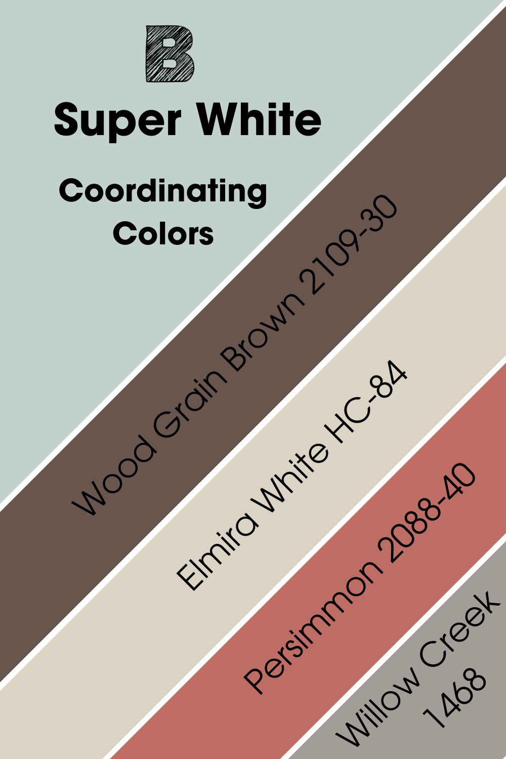
Benjamin Moore Palladian Blue (HC-144) Coordinating Colors
While your color’s complement gives the best contrasting look, there are other colors that pair with it for various effects. These are coordinating colors and you can have several different hues for a color scheme.
Color schemes fall into several categories, mainly the following:
- Analogous Color Scheme.
- Triadic Color Scheme.
- Complementary Color Scheme.
- Split Complementary Color Scheme.
- Monochromatic Color Scheme.
Coordinating colors for Benjamin Moore Palladian Blue include the following:
- Benjamin Moore Elmira White HC-84: Despite its name, Elmira White is a soft greige with mild pink undertones. It has an LRV of 64.67 and looks cozy in any space, especially interiors.
- Benjamin Moore Persimmon 2088-40: This lovely blend of terracotta and rosy tones infuses color and energetic vibes into your space. Although it looks uniquely stylish, Persimmon isn’t suitable for exterior spaces.
- Benjamin Moore Willow Creek 1468: This warm, cozy gray has intriguing vibes and an LRV of 34.48. Willow Creek has mild violet undertones but can sometimes display some beige, especially in dim-lit spaces.
- Benjamin Moore Wood Grain Brown 2109-30: This deep brown shade looks sophisticated in any space. Wood Grain Brown has an LRV of 10.69 and some red undertones. The paint color works well on accent walls and cabinets alike.
Benjamin Moore Palladian Blue Color Palettes
Palladian Blue looks great with several palettes and decor. However, the paint color is more popular for coastal looks or spa-like decor.
Here are some palettes that work for Palladian Blue.
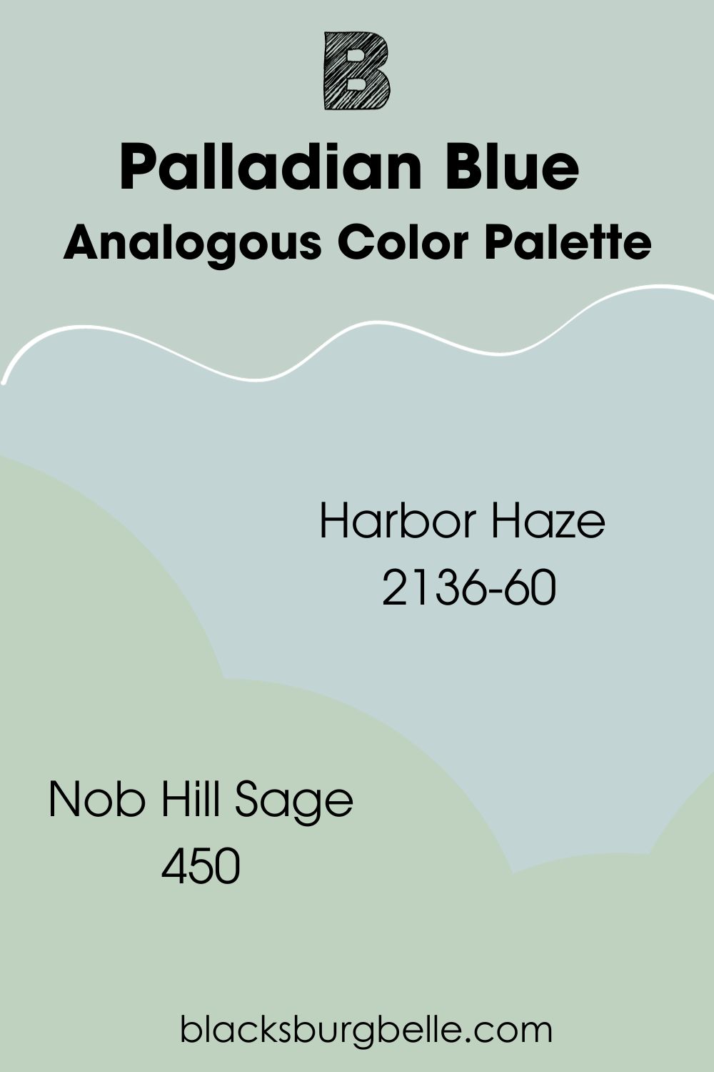
Analogous Color Palette
- Benjamin Moore Harbor Haze 2136-60: Harbor Haze is a blue-green blend with mild gray undertones. The paint color has stronger blue tones than Palladian Blue but also pair with it for a soft gradient look. Habor Haze has an LRV of 62.47.
- Benjamin Moore Nob Hill Sage 450: This light shade of jade green has gray undertones and an LRV of 59.5. Nob Hill Sage brings a soothing feel to any space. It has no blue undertones and stronger green tones than Palladian Blue.
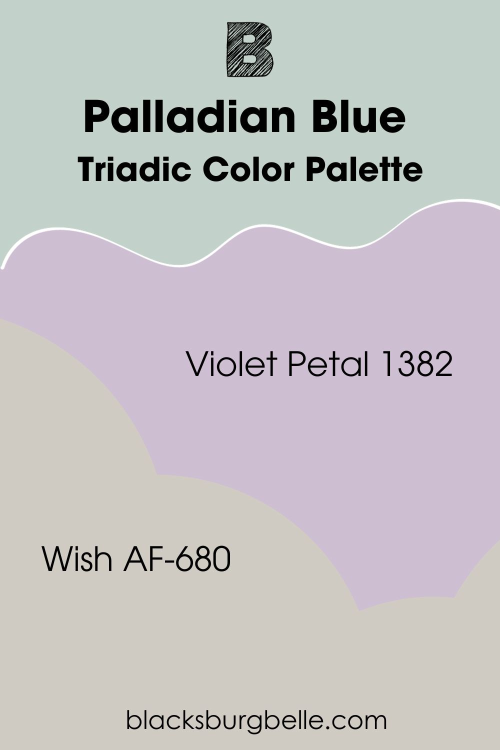
Triadic Color Palette
- Benjamin Moore Violet Petal 1382: Violet Petal is a light shade of purple with mild red undertones. The paint color looks flowery and colorful in any space. It belongs to the same hue that complements Palladian Blue. Therefore, Violet Petal contrasts nicely with the paint color.
- Benjamin Moore Wish AF-680: Wish is a versatile gray that looks cozy in any space. It has warm undertones and an LRV of 58.58. You can use the paint color on walls and furniture for a snug feel.
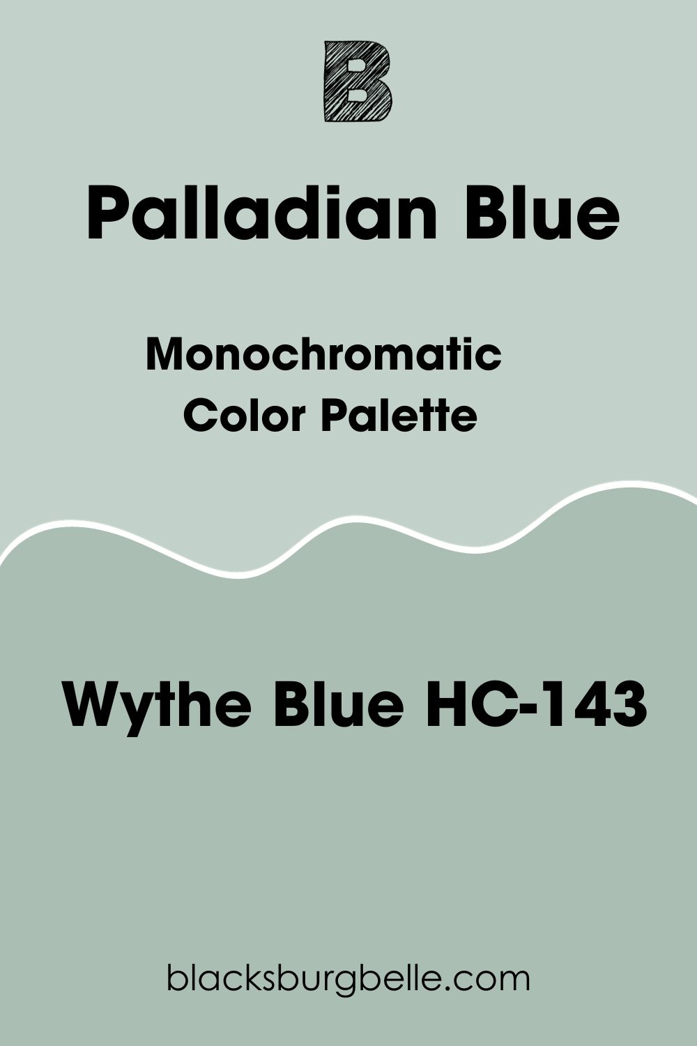
Monochromatic Color Palette
- Benjamin Moore Wythe Blue HC-143: Wythe Blue is a green-blue blend with a lesser LRV than Palladian Blue. Both paint color pair nicely for monochromatic palettes, thanks to the difference in their shades.
Benjamin Moore Palladian Blue vs. Similar Paint Colors
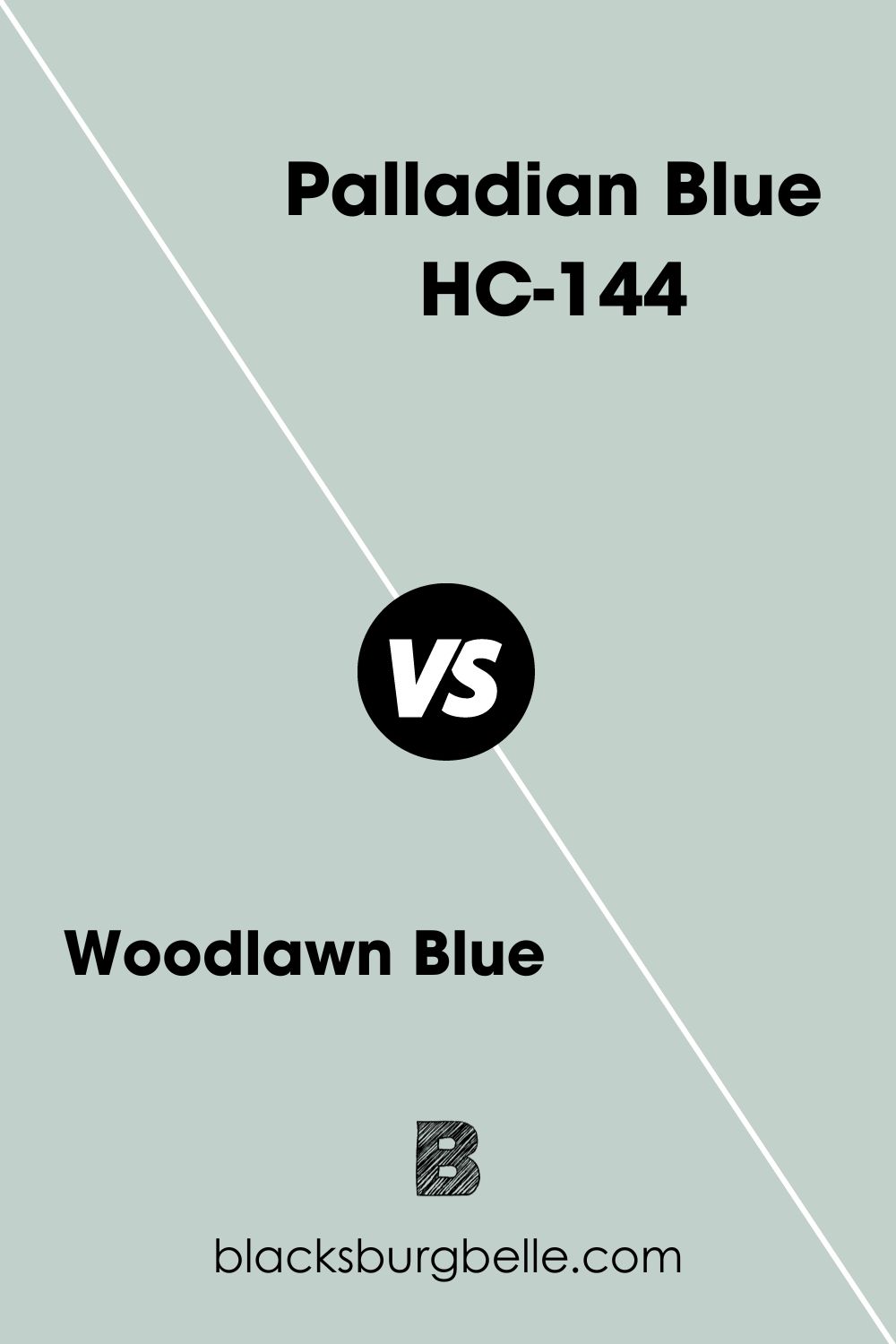
Woodlawn Blue vs Palladian Blue
Benjamin Moore Woodland Blue is a light, pearly blue shade with an LRV of 60.65. Although it looks similar to Palladian Blue at first glance, Woodland Blue has stronger gray tones. Also, the paint color rarely displays green tones, compared to Palladian Blue.
Both paint colors have similar versatility.
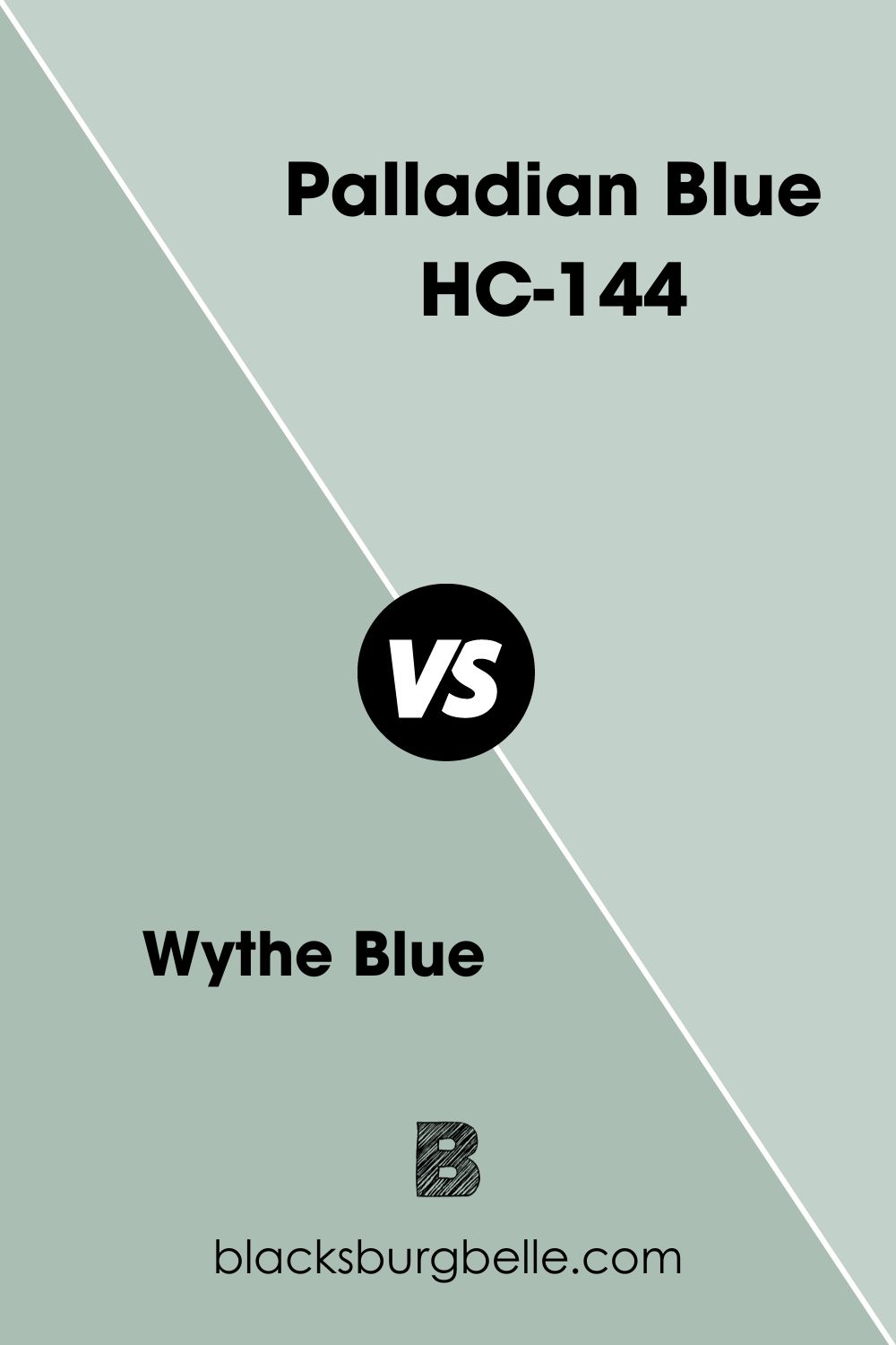
Wythe Blue vs Palladian Blue
Benjamin Moore Wythe Blue is another paint color with similar tones to Palladian Blue. However, Wythe Blue is a green paint color with blue and gray undertones, while Palladian Blue is a blue paint color with green and gray undertones.
Also, Wythe Blue has a lower LRV and deeper tones than Palladian Blue.
Quiet Moments vs Palladian Blue
Benjamin Moore Quiet Moments lives up to its name with gentle, serene vibes and a meditative aura. The paint color blends blue, green, and gray into a soft, lovely mix. However, it looks quite distinct from Palladian Blue, even though they both have similar tones and LRVs.
Quiet Moments has significantly stronger gray undertones and less intense blue and green.
Palladian Blue vs Sea Salt
Sherwin Williams Sea Salt is a muted, coastal green with blue and gray undertones. The paint color has a slightly higher LRV than Palladian Blue. Also, Sea Salt has less intense blue compared to Palladian Blue.
Note that Benjamin Moore Sea Salt is the more popular and versatile paint color of the two.
Yarmouth Blue vs Palladian Blue
Benjamin Moore Yarmouth Blue is a light, airy blue paint color with an LRV of 55.82. It has no green in it but displays stronger gray undertones compared to Palladian Blue. Yarmouth Blue brings a refreshing, minty feel to any space.
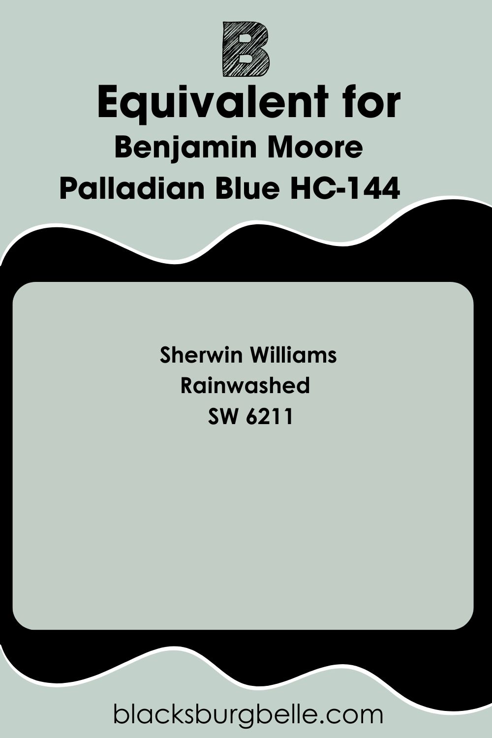
Benjamin Moore Wythe Blue Sherwin Williams Equivalent
Sometimes, you might be able to get a particular paint color from one brand due to a variety of reasons. When this happens, you can always check out the paint color’s equivalent from another paint brand. More often than not, paint brands have products with similar tones and appearances.
Sherwin Williams Rainwashed is the brand’s equivalent of Benjamin Moore Palladian Blue.
Sherwin Williams Rainwashed (SW 6211)
Rainwashed is a cool green paint color with light, airy vibes and an LRV of 59. It has blue undertones that give it a tranquil feel in any space. The paint color works just as well as Palladian Blue in bedrooms and bathrooms.
You can use Sherwin Williams Rainwashed in coastal and spa-like palettes and decor.
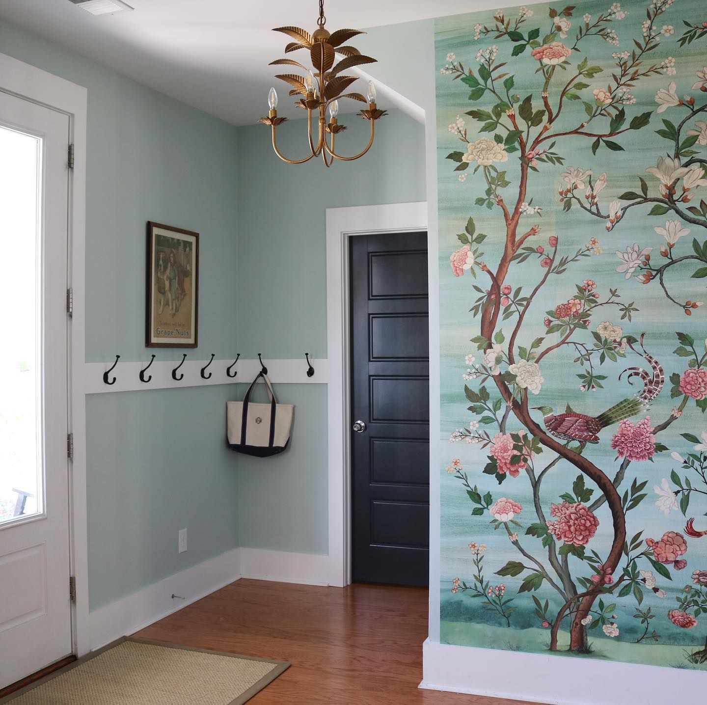
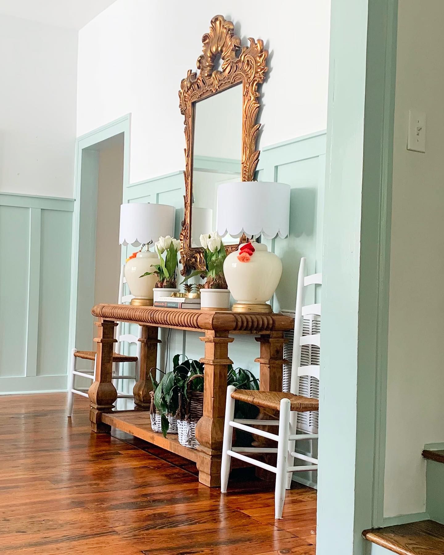
Benjamin Moore Palladian Blue Living Room
Palladian Blue looks colorful and cheerful in any interior space, as seen on the walls in the pictures below. The paint color displays its coastal vibes on the walls, pairing nicely with white and the other surrounding colors.
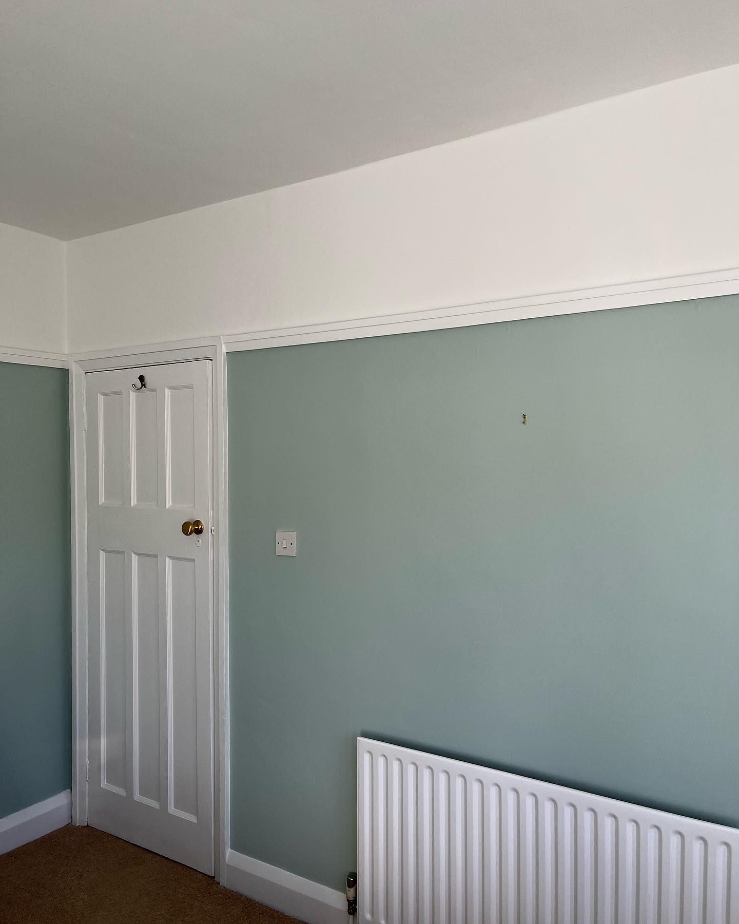
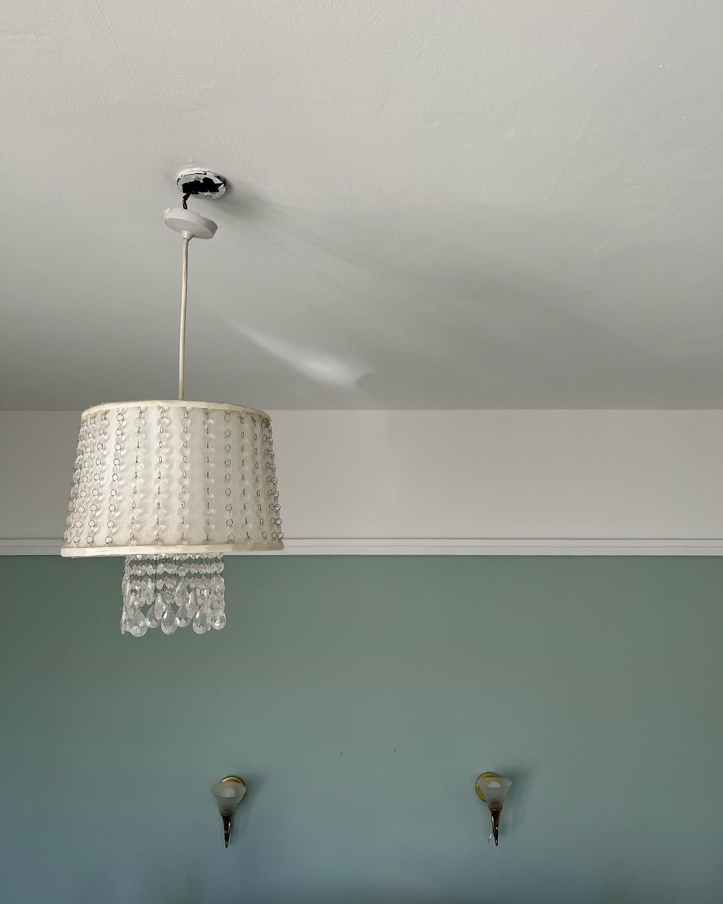
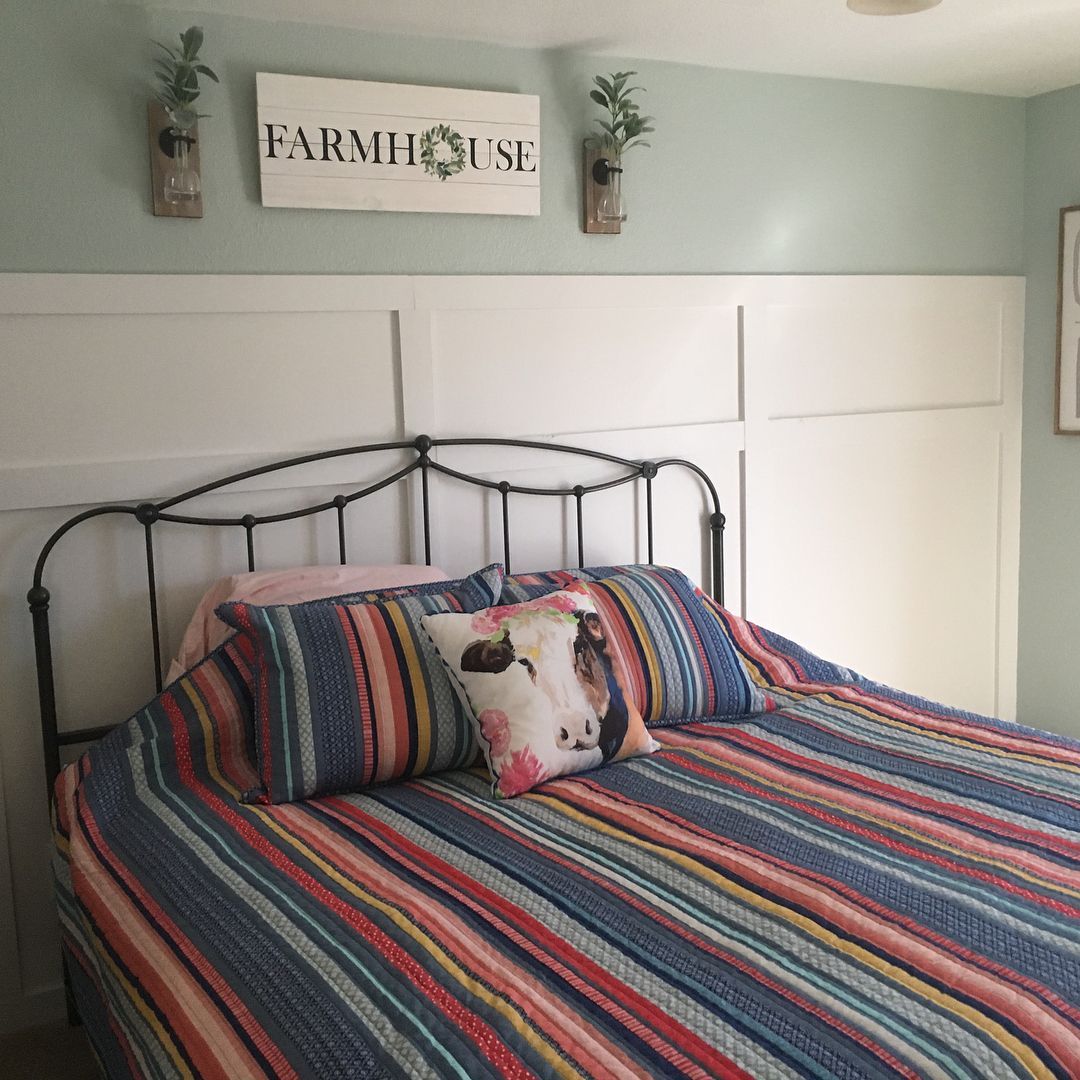
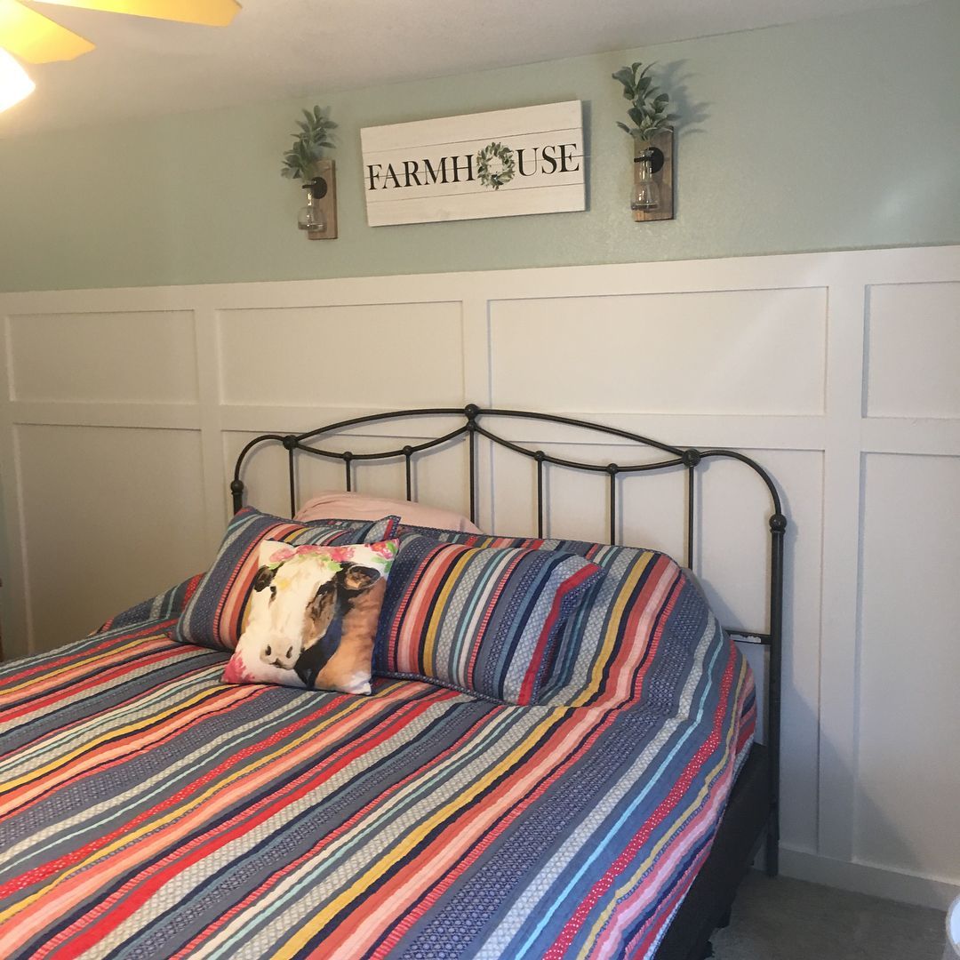
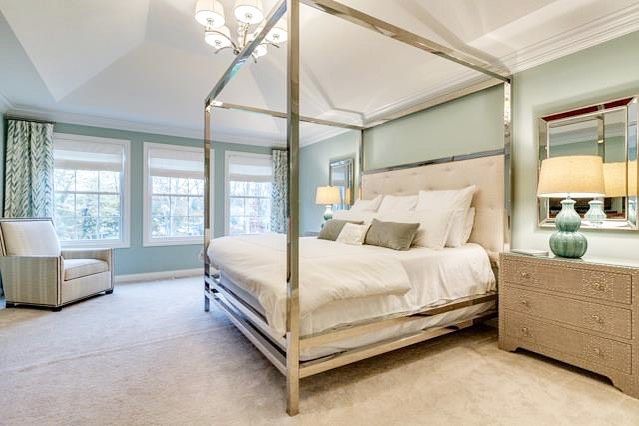
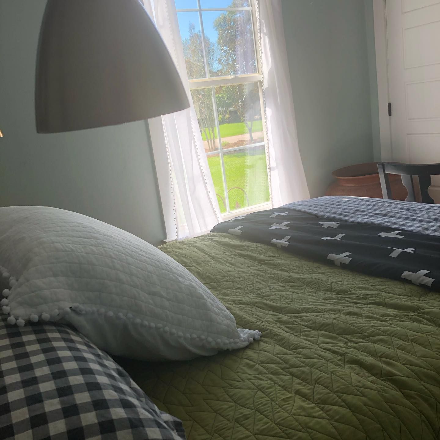
Benjamin Moore Palladian Blue Bedroom
Bring lighthearted, uplifting vibes to your bedroom with this calm blend of blue and green. Palladian Blue exudes its coastal feel in the bright bedroom below.
On the other hand, the second picture shows the paint color in a dim-lit bedroom. While you can see the difference in vibrance, Palladian Blue still gives a soft, welcoming touch to the space.
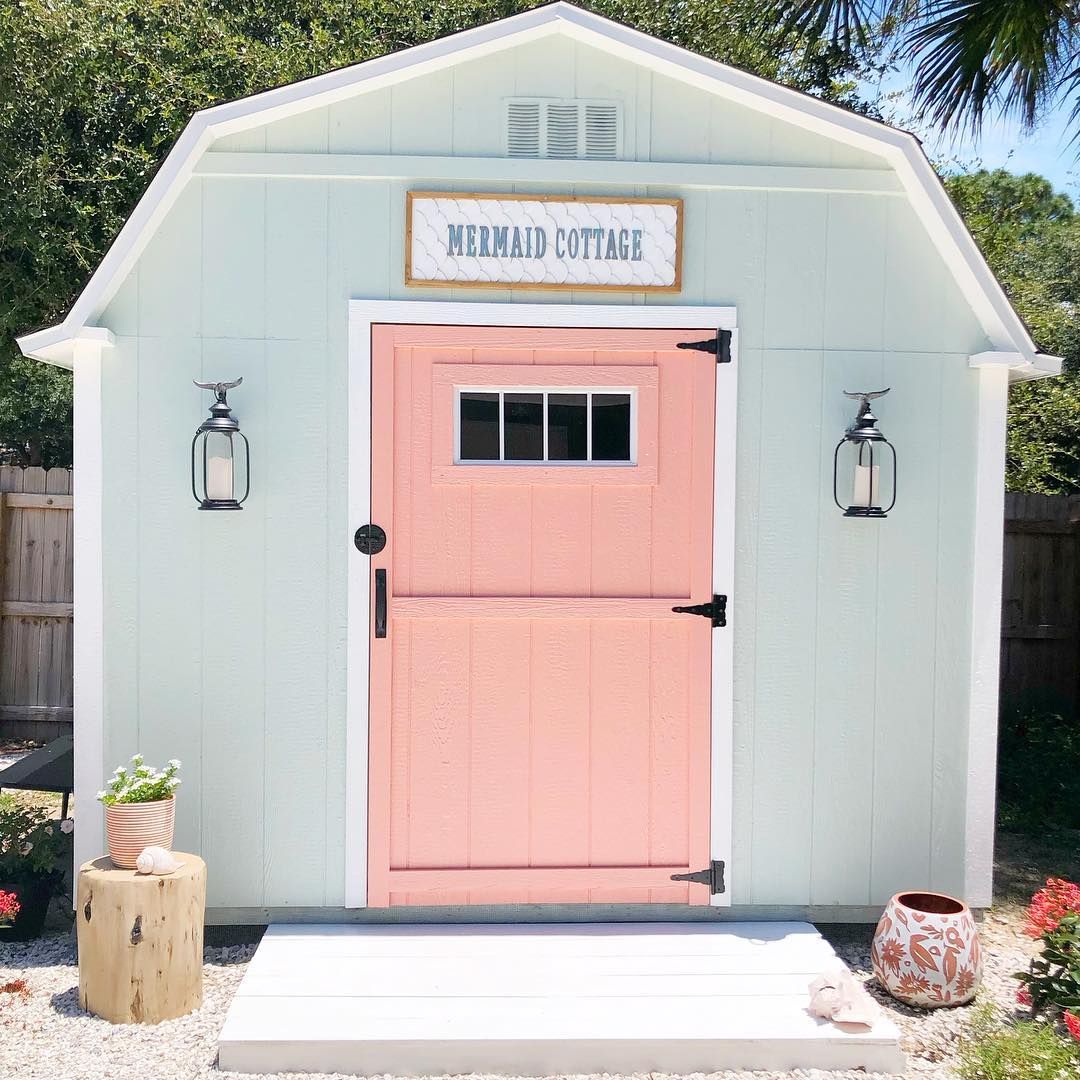
Benjamin Moore Palladian Blue Exterior
Palladian Blue pairs nicely with to give airy, beachy vibes on this cottage’s exterior. Notice how the paint color retains its lovely tones, even in the bright sunlight? Yes, Palladian Blue will not wash out in bright light.
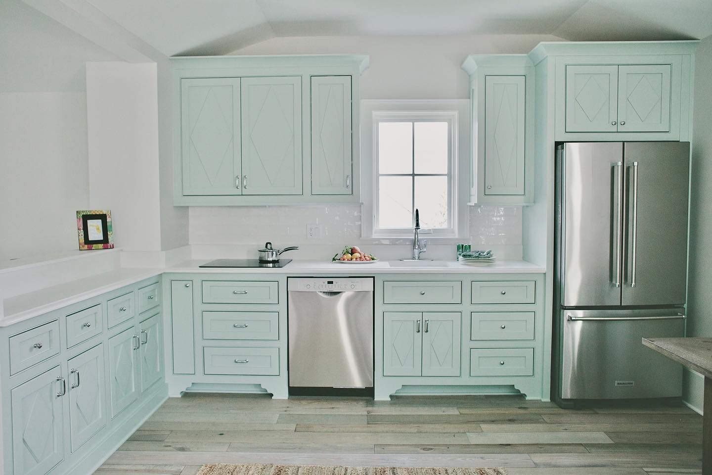
Benjamin Moore Palladian Blue Kitchen
Bring a refreshing and welcoming vibe to your kitchen by using Palladian Blue. The paint color works wonders on both walls and cabinets alike.
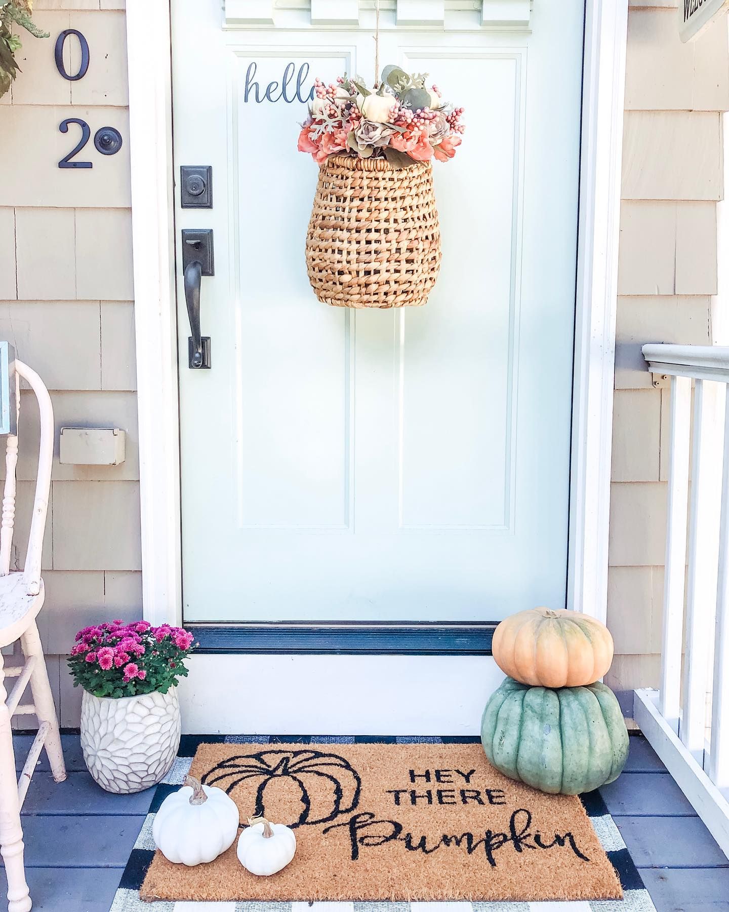
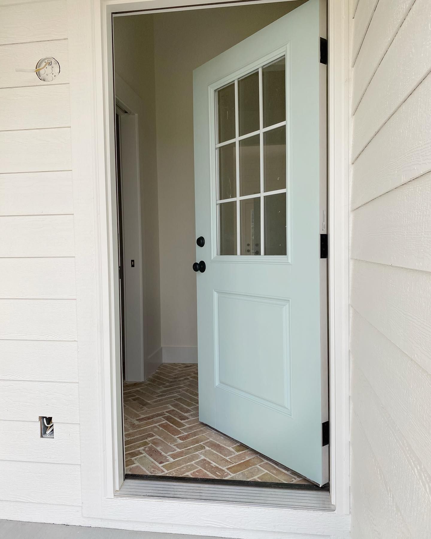
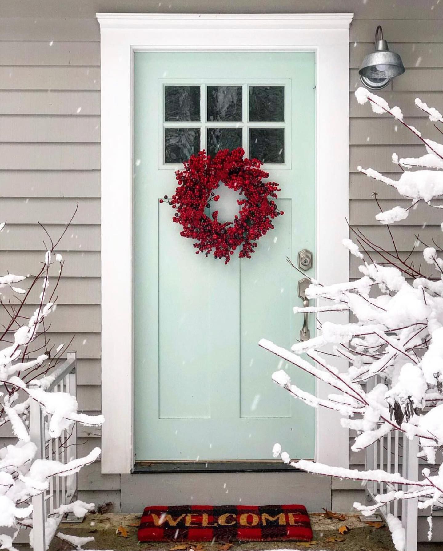
Benjamin Moore Palladian Blue Front Door
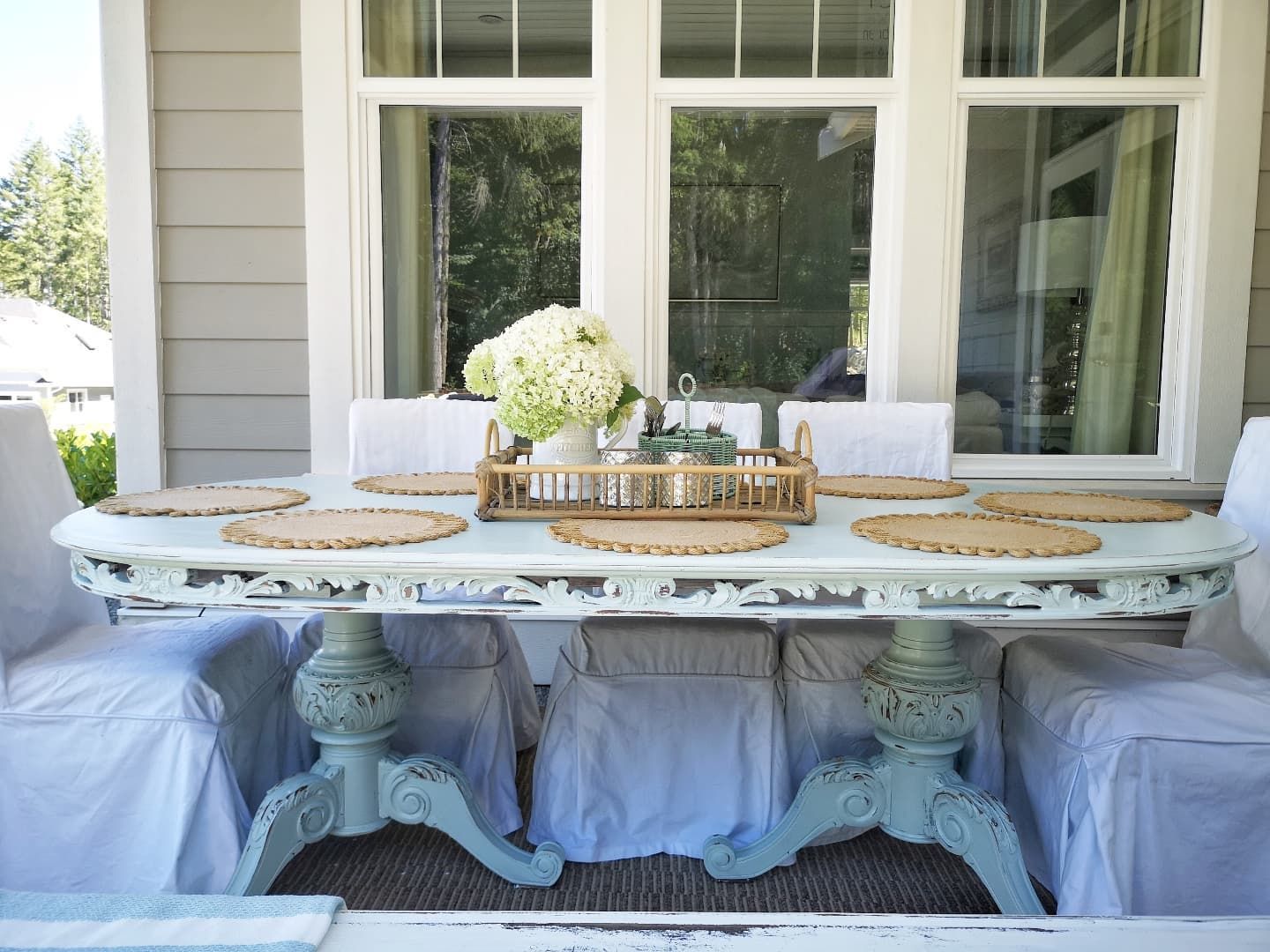
If you’re looking to set a calm and cheerfully welcoming vibe for your home, Palladian Blue does it on front doors. Since it pairs nicely with lots of colors, most notably gray, you can rest assured that the paint color will look wonderful on your home’s exterior.
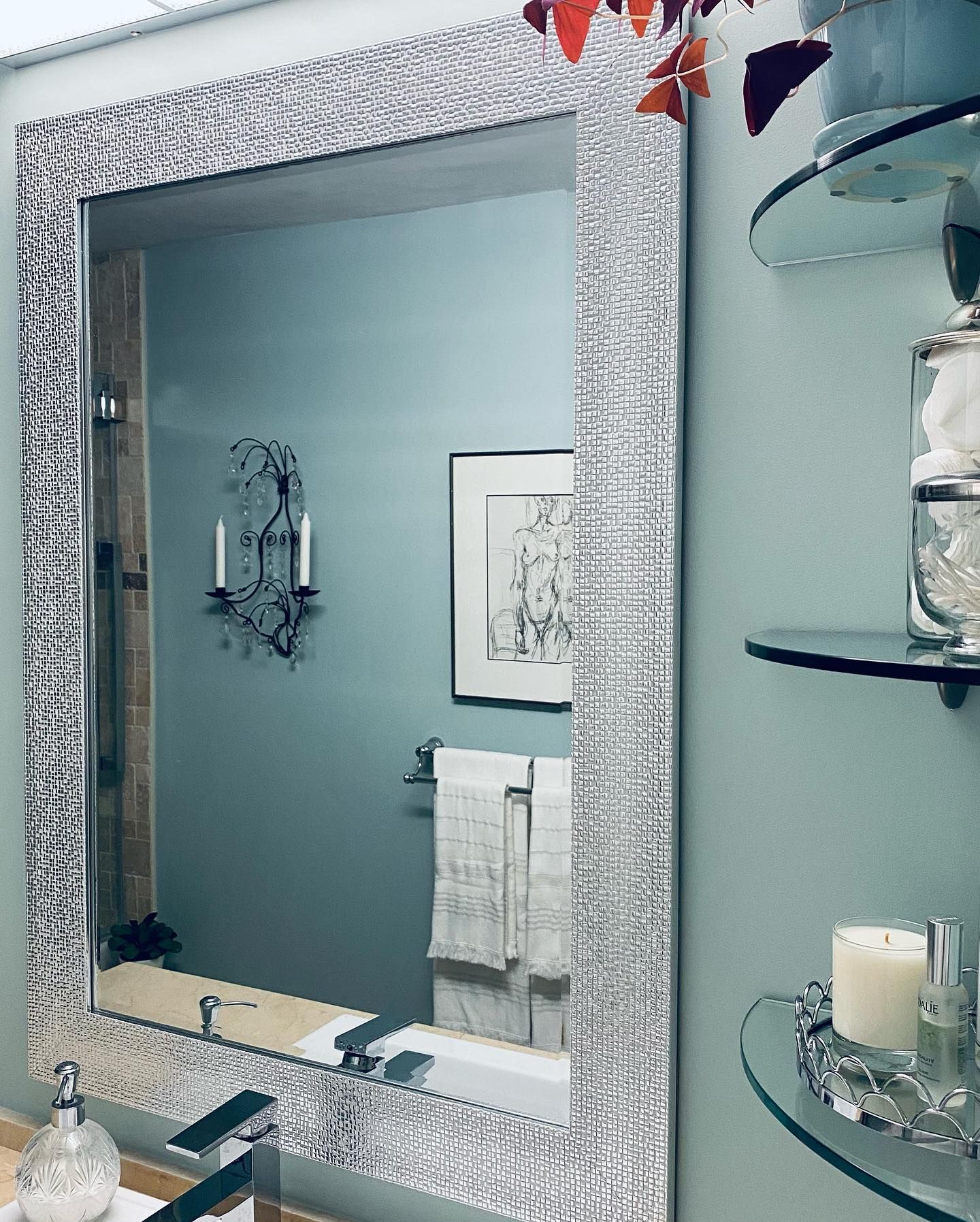
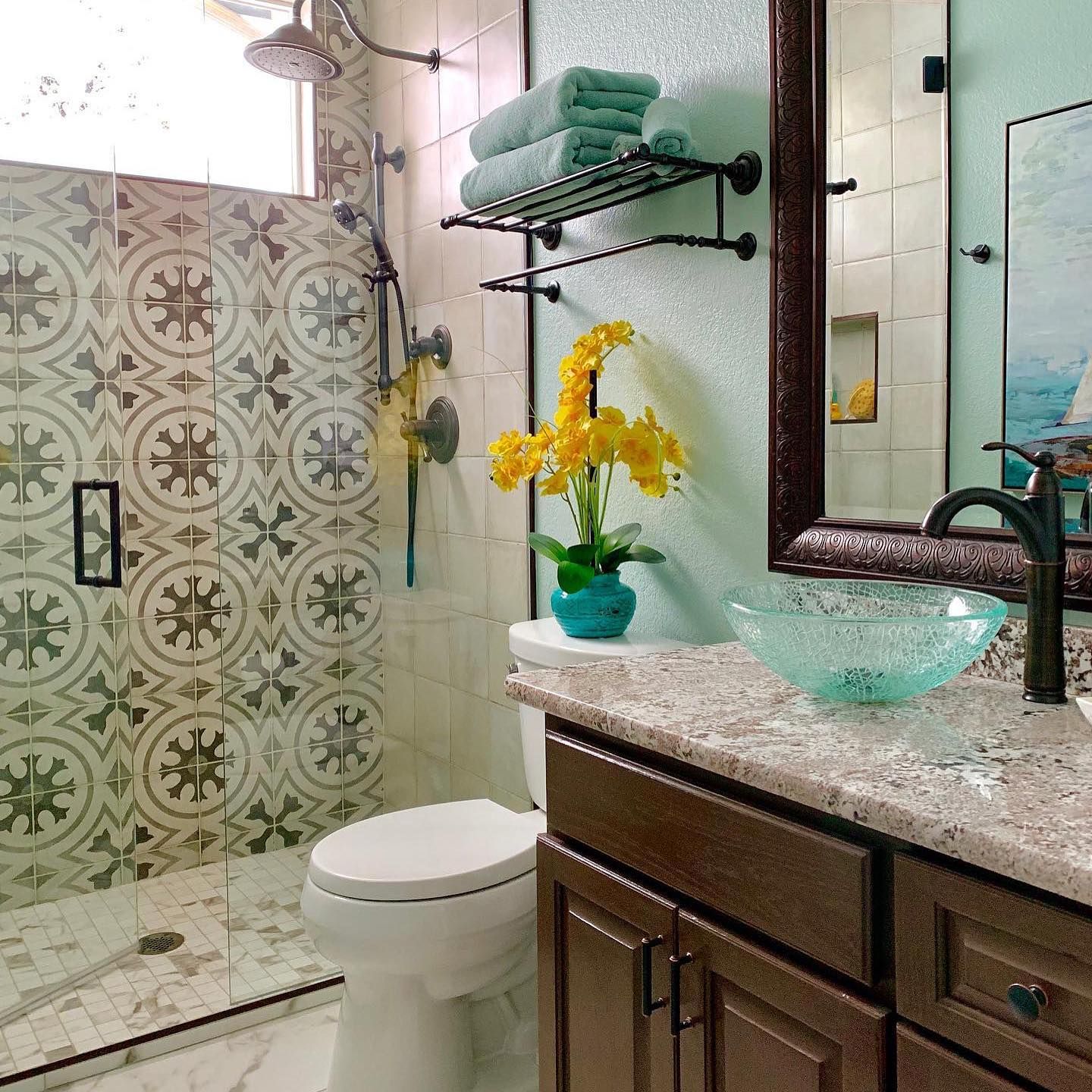
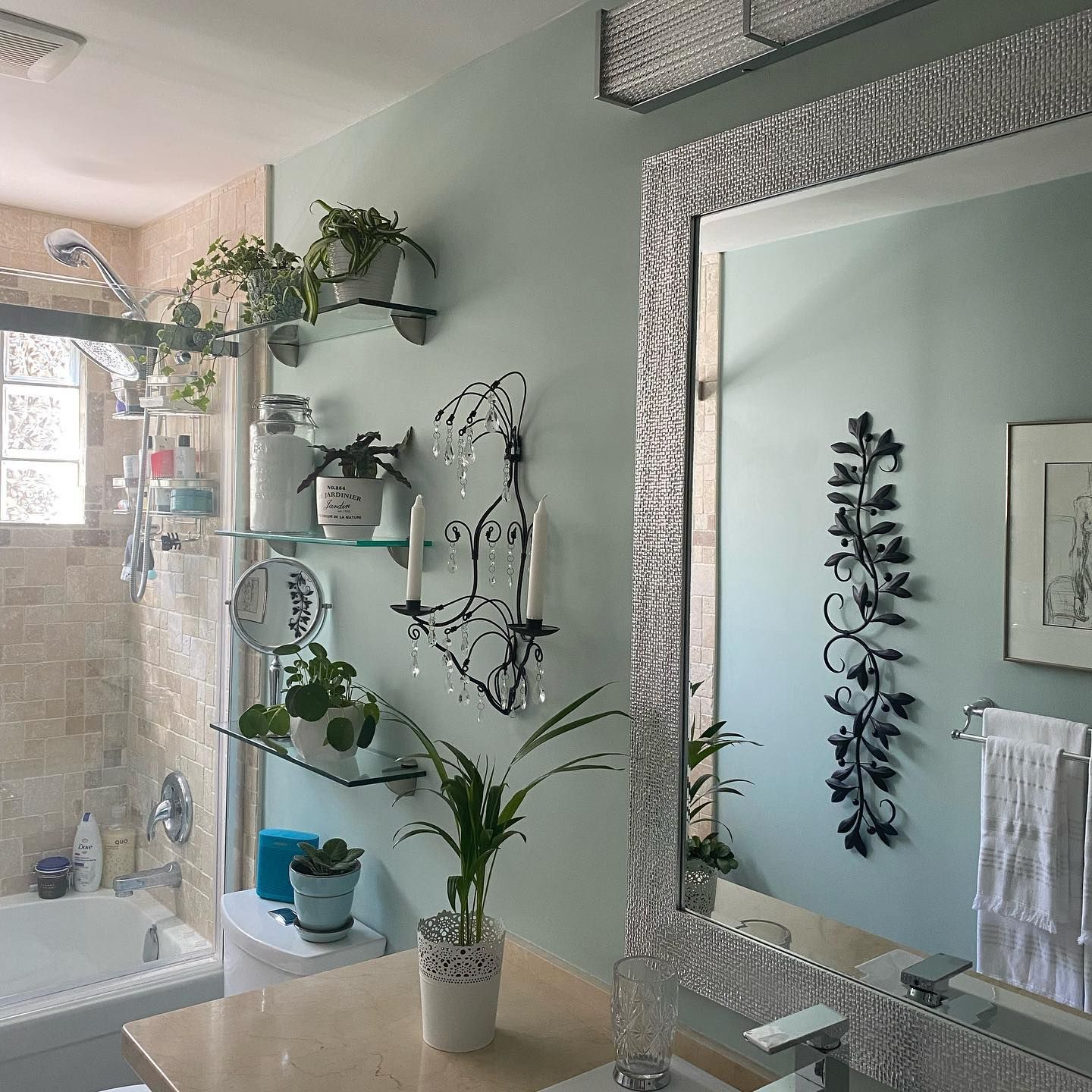
Benjamin Moore Palladian Blue Bathroom
Introduce that much-loved spa look into your bathroom with Benjamin Moore Palladian Blue. The paint color feels right at home in bathrooms among other relevant spaces in a home.
Benjamin Moore Palladian Blue Furniture
Not only does it look wonderful on walls, but Palladian Blue works wonders on furniture too. You can use white on the walls and Palladian Blue on your furniture for a classy, coastal look.
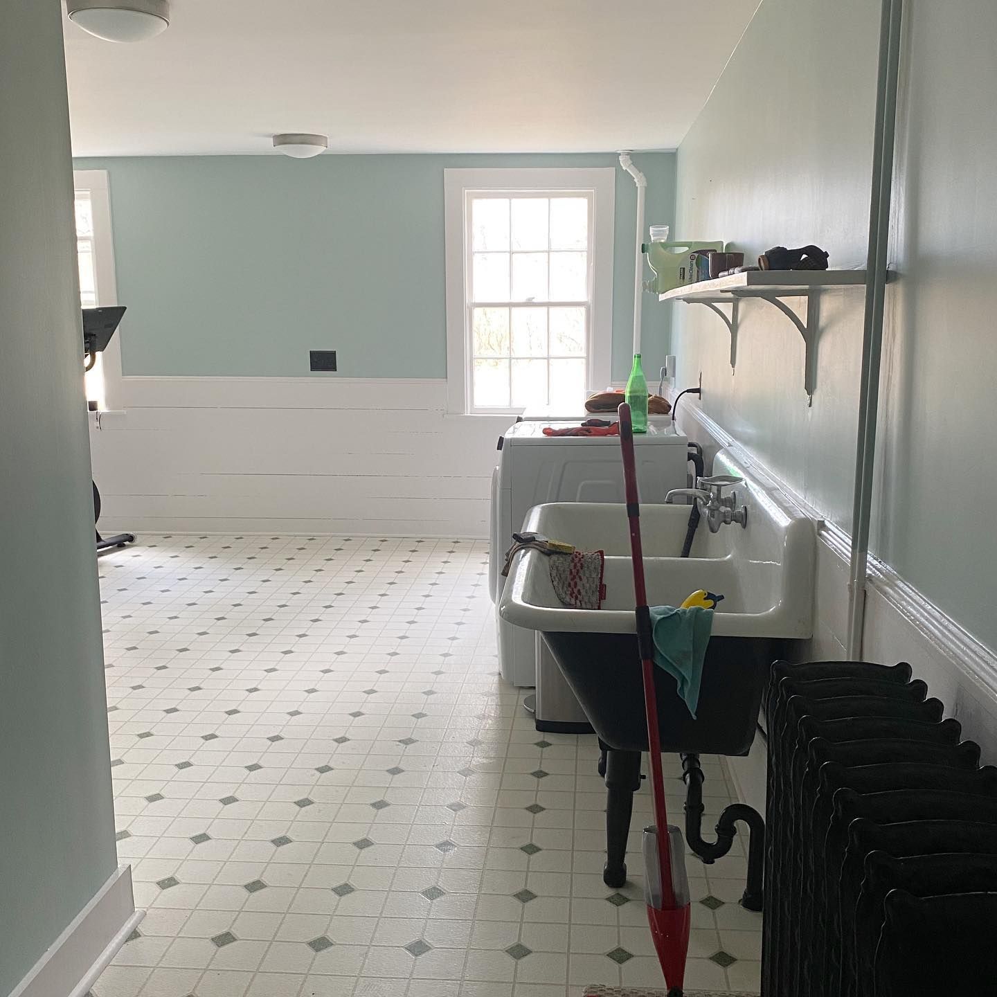
Benjamin Moore Palladian Blue Laundry Room
Your laundry/workout room doesn’t have to look stifling when you can give it an airy, cheerful vibe with Palladian Blue. The paint color pairs nicely with white in the picture below, fitting right into the spacious area.
Conclusion
Now that you understand Benjamin Moore Palladian Blue better, you can see how amazing the paint color looks. Regardless, I always recommend sampling any and every paint color first before use. Palladian Blue is no different.
Here’s a quick recap of the paint color:
- Palladian Blue is more of a blue-green blend with gray undertones.
- The paint color has stronger blue tones but can lean into either one of the two tones.
- When blue appears dominant, Palladian Blue reads cool.
- When green appears dominant, Palladian Blue looks cozy and warm.
- Palladian Blue is moderately bright and works well in dim and well-lit spaces.
- Palladian Blue fits well into spa-like palettes and decor.
Feel free to drop your questions in the comments section. I’ll answer them all!
 Sherwin Williams Contented (Palette, Coordinating & Inspirations)
 Sherwin-Williams Anonymous (Palette, Coordinating & Inspirations)
 Sherwin Williams Extra White (Palette, Coordinating & Inspirations)
 Sherwin Williams Misty SW 6232: Paint Color Review
 Sherwin Williams Windy Blue SW 6240: Review & Inspirations
 Benjamin Moore Balboa Mist OC-27: Review & Inspiration
