
As we’re headed toward the colder seasons, the call for interior redesigns may be on a high among homeowners, and this is where a warm neutral like Creamy White comes in handy.
This versatile color makes any space look charming, matching many other colors while leaving a timeless touch in your home.
It’s quite strange how unpopular this color is, especially as I haven’t seen many reviews about it online, but I’m here to provide detailed information on Creamy White in this article, including its LRV, Hex Code, and possible interpretation of CW in real life spaces.
Let’s set the ball rolling.
Table of Contents
When to Choose Benjamin Moore Creamy White OC-7?
Before going any deeper here are situations when I’ll list situations where Creamy White best fits your home. This color is warm and very projected with impeccable range. The world is your oyster with this one.
Do You Love Warm Neutrals?
Creamy White is provides the warmth required to turn a cold space around. It’s also gentle, so no need to worry about how it performs when paired with other tones and textures.
Do Green Undertones Do it for You?
If you’re into green aesthetics, as in plants and trees around your home, then you shouldn’t miss out on this one because it’ll work with your palette beautifully.
Are You a fan of Minimalist Decor?
With warm colors like Benjamin Moore Creamy white, you get a balanced result.
Are You Looking for the Perfect Kitchen Cabinetry Color
Creamy White is well pigmented; hence, if you apply it on kitchen cabinets, you get bright and colorful feedback without doing too much. You can also pair it with any lighting and still make it work.
What Color is Benjamin Moore Creamy White OC-7?
The Benjamin Moore Creamy White doesn’t stray much from its name. This neutral tone is a warm and fresh white that makes your space relaxing, inviting, and, most importantly, timeless, as it can work on traditional and contemporary palettes.
It’s rich in undertones and texture, boasting an impressive catalog of coordinating colors, color strips, and complementary colors that will work wonders in the hands of a true artist.
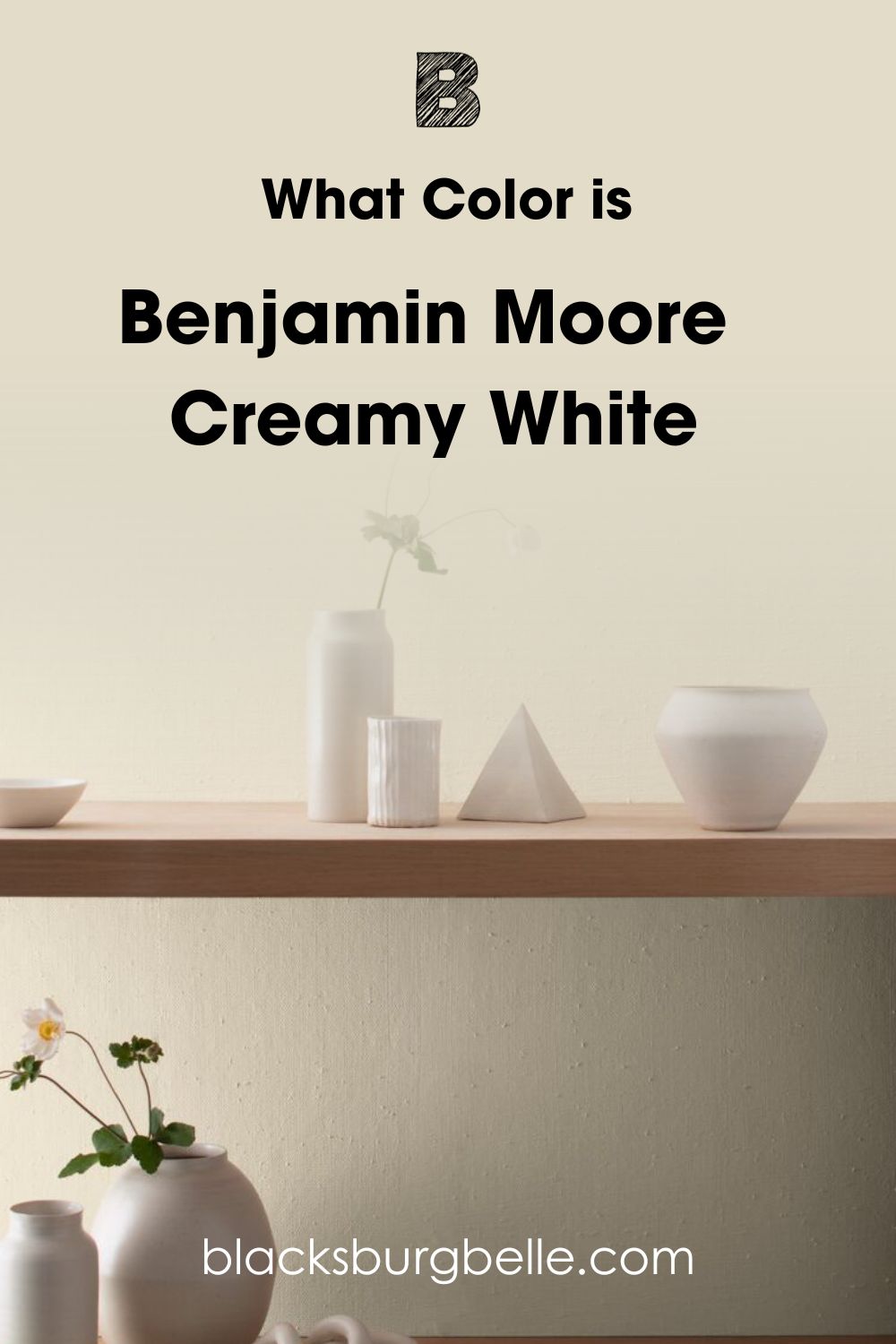
I recommend Benjamin Moore Creamy White to people in cold regions as this color helps warm things up outdoors and indoors. Creamy White also has a decent LRV, so you might not spend too much on lighting or heavy accessorizing.
Fun Fact: This color is also known as Benjamin Moore Spring in Aspen 954.
Snapshot of Benjamin Moore Creamy White Specifications
With the right information, achieving your dream space is possible. For this reason, I’ve put together all the crucial numerical statistics of Benjamin Moore Creamy White.
| Color Name | Benjamin Moore Creamy White |
| RGB | 228, 218, 199 |
| LRV | 70.95 |
| Hex Code | #E4DAC7 |
| Undertones | Green, Orange, and Gray |
The LRV of Benjamin Moore Creamy White
Light Reflective Value is a mode of measurement adopted by interior designers and color experts to determine how much light a given color can reflect or absorb. The scale runs from 0-100, with 0 being the least and 100 being the highest figure.
However, research has proven that there’s no true black or white, as all colors have traces of undertones in them. Hence, the scale has been reworked to run from 3-97; with that said, Benjamin Moore Creamy White has an LRV of 70.95.
This high figure puts Benjamin Moore Creamy White high on the LRV scale, and it also means when you use this paint color in a small space, it’ll help create an illusion of wider space while making the most of incoming light.
This also means that Benjamin Moore Creamy White will appear washed out when applied outdoors or used in a large space.
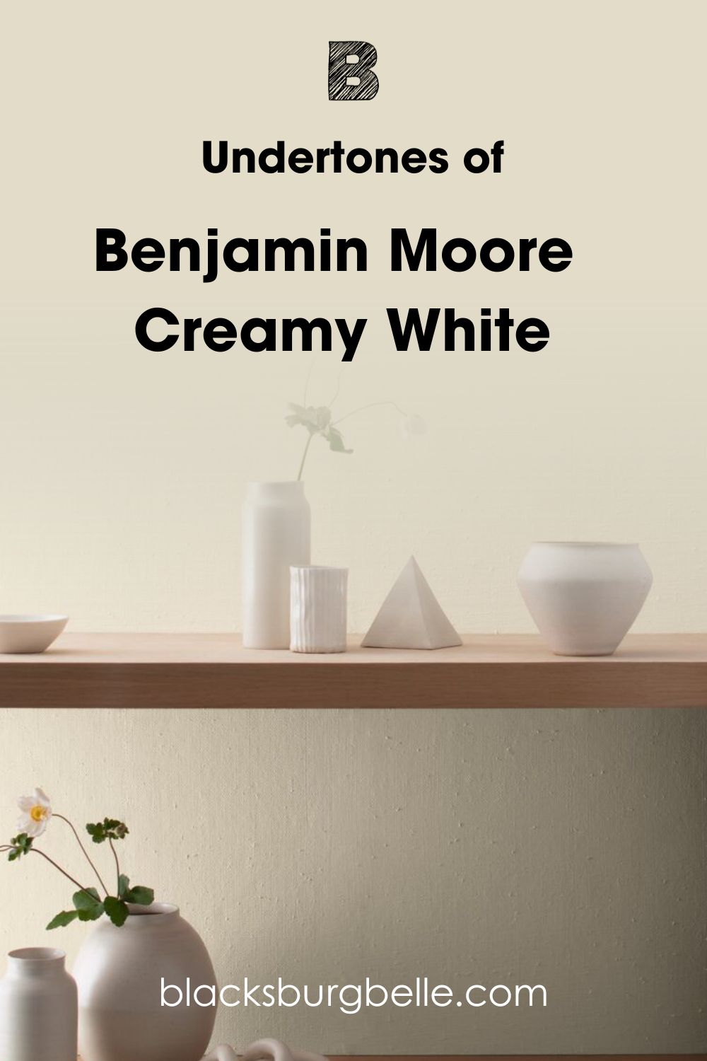
Undertones of Benjamin Moore Creamy White OC-7
Benjamin Moore Creamy White has some gorgeous undertones that increase its range and ability to work with multiple colors.
You’re probably wondering what the concept of undertones means. Let me help you out. Colors are not created from one tone; from all we know, there are three primary colors and two neutrals: Red, Green, Blue, Black, and White.
Now, every other color shade was obtained from mixing one or more of these five, and it goes like that. These side characters still find a way to seep through even after the final result and often do it under different lighting conditions, which I’ll explain below.
Before I proceed however, it’s worth noting that Benjamin Moore Creamy White has Green and Orange undertones with soft hints of Gray.
Does Lighting Condition Affect the Appearance of Creamy White
Lighting is the ultimate decider of the performance of your color in a space. You can do everything right, but it’s wasted under the wrong lighting. This rule also applies to Creamy White.
In a north-facing room, you’ll find out that Benjamin Moore Creamy White reads cooler than usual thanks to the blue tint from the sun, which stays blue all day.
The implication is that Creamy White simultaneously shows off a muted whiff of its green sides and gray.
When applied in a Southern-facing room, the warm light from the sun casts an intense glow on Creamy White, causing it to show off its orange undertones and envelope the entire room in a warm embrace all day long.
Western and Eastern-facing rooms follow the flow of the sunrise and sunset; hence, Creamy White reads warmer in the late afternoon and early evening for Western-facing rooms and in the early mornings to early afternoons for Eastern-facing rooms.
Can I Find Green Tones in Benjamin Moore Creamy White?
The Green in Benjamin Moore Creamy White keeps it from leaning too warm, extending its application range. While the naked eye may not see this color indoors, it’s quite glaring outdoors as the surrounding greenery heavily influences it.
When applied in an area with low light, you can see the green in Creamy White or, better still, pair it with other vibrant green tones.
Does Benjamin Moore Creamy White Read Orange?
As a warm color, Benjamin Moore Creamy White sure contains a red-based undertone. You’ll see traces of orange in this unique color when you apply it in spaces that get an intense amount of warm light, perhaps from the sun or an artificial light source.
Pairing Benjamin Moore Creamy White with orange or red accessories will also help draw out its hidden warm shades.
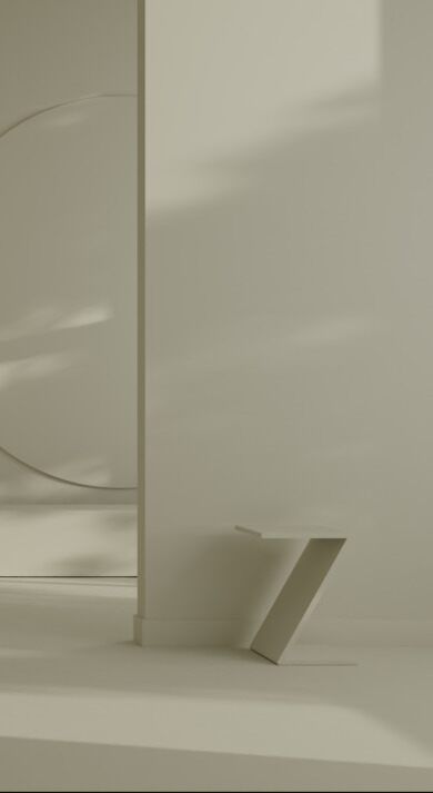
Can I Find Gray Undertones in Benjamin Moore Creamy White?
The gray in this color is so subtle that I sometimes wonder why it’s present there, but it all makes sense as the green and gray work together to bring a sense of balance to this color, making it easier to work with.
You’ll most likely experience the gray side of this color very early in the morning or in a muted space. The image above perfectly exemplifies how Benjamin Moore Creamy White fares under cool lighting.
Benjamin Moore Creamy White: Is It a Warm or Cool Color?
Colors exist in two variants, warm and cool, with incredible features that set them apart. Warm colors are usually red or orange-based and have a strong effect on the eyes; they envelope whichever space they’re in with so much personality by staying radiant on the walls.
For cool colors, you’ll find them in blue, purple, and sometimes gray categories. This genre is subtle, relaxing, and boasts great depth upon application.
Benjamin Moore creamy white is a warm color. This is thanks to its undertones of green and orange. However, this color can also pass as a neutral because of the gray undertones that help balance the impact and effect of the warm undertones in spaces.
This means that when you apply Benjamin Moore creamy white in a cold space, this color keeps it warm all day. Another endearing feature of creamy white is how soft it feels in your space.
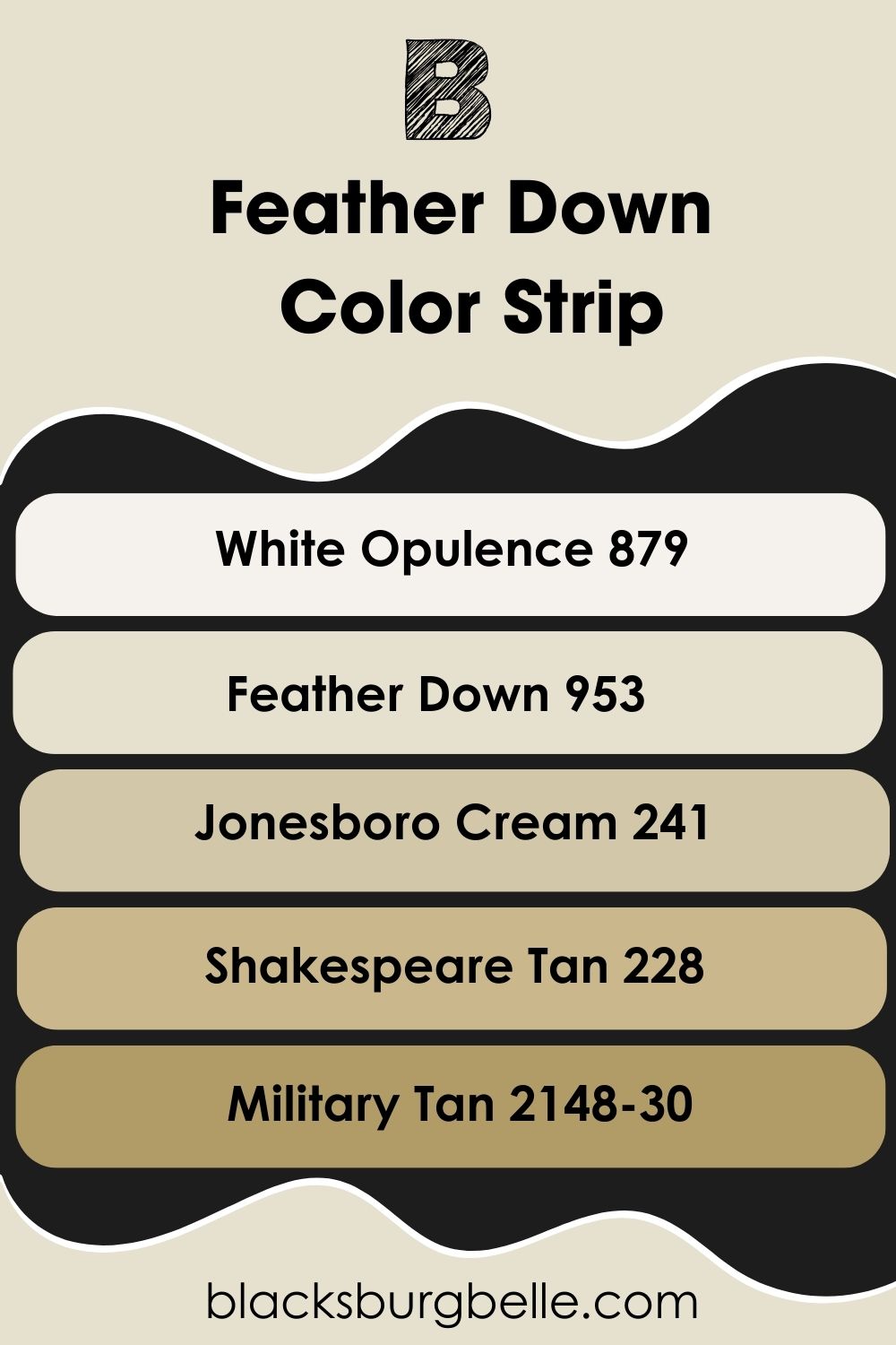
Benjamin Moore Creamy White Color Strip: Lighter or Darker Exploration
There’s a way it works in the world of colors- they must exist in variations, whether planned by the creators or just mere coincidence; nature itself exists in different intensities. The arrangement of these different degrees of lightness and depth is called Color Strip.
Benjamin Moore Creamy White color strip is a glorious graduation of 7 colors that all share subtle green/red undertones and will work with Creamy White in any capacity and at any given time.
- Benjamin Moore Natural Wicker OC-1
- Benjamin Moore Pale Almond OC-2
- Benjamin Moore Lambskin OC-3
- Benjamin Moore Brandy Cream OC-4
- Benjamin Moore Maritime White OC-5
- Benjamin Moore Feather Down OC-6
- Benjamin Moore Creamy White OC-7
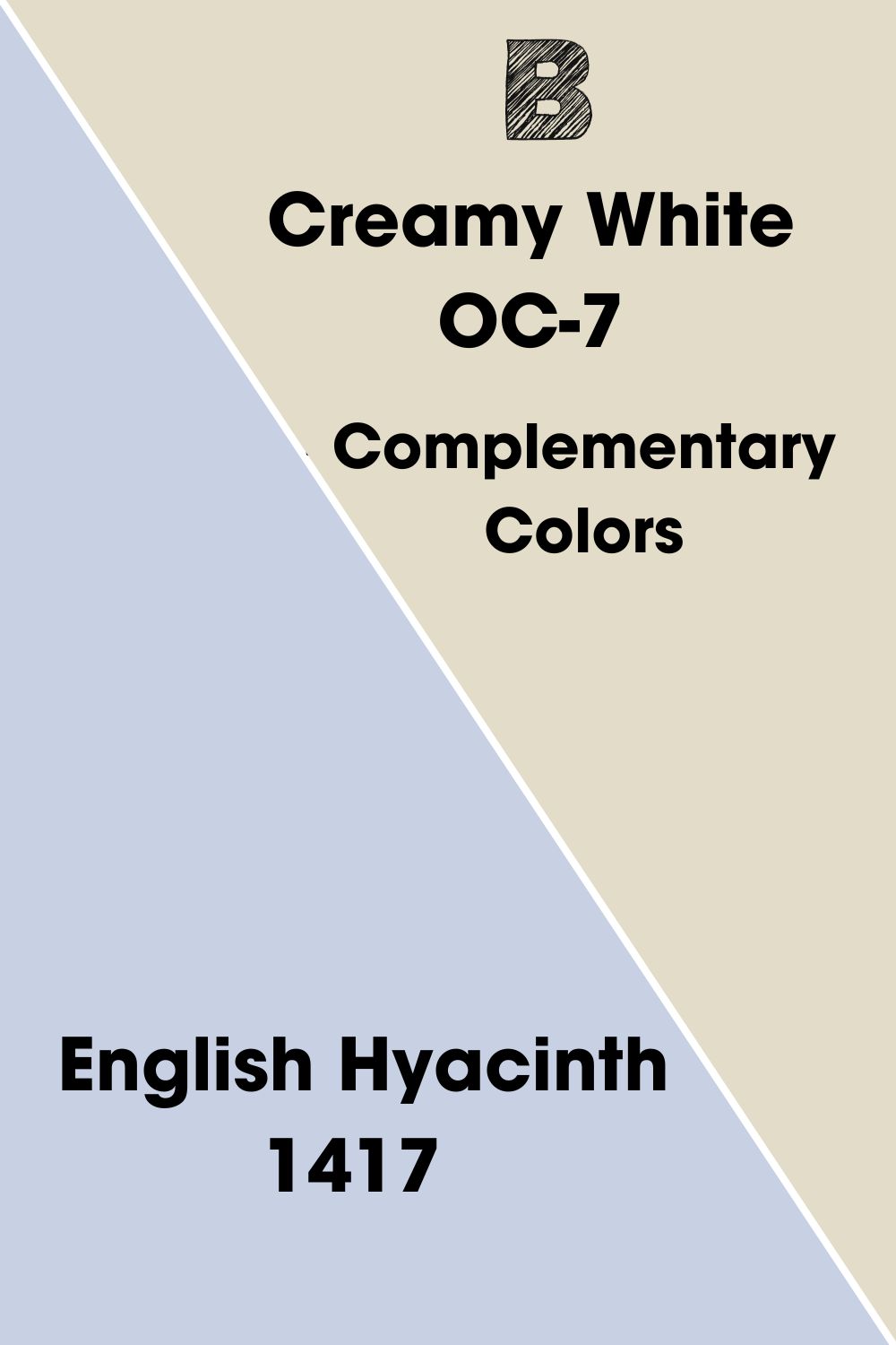
Benjamin Moore Creamy White Complementary Colors
Complementary colors are directly opposite your anchor shade on the color wheel, meaning you’ll get a grayscale color when you mix them. The most popular complementary color combinations include Blue and Orange, Red and Green, Purple and Yellow.
In case you haven’t noticed, this interesting arrangement is made of one warm and cool color, making it easy for the contrast to take place and ultimately deliver a realistic result both on surfaces and in spaces.
The ideal complementary color for a warm shade like Benjamin Moore Creamy White is cool, preferably with blue or purple undertones. Benjamin Moore English Hyacinth 1417 is the perfect fit for this. The color is a soft shade of purple with strong blue undertones and an LRV of 61.85.
I’d pair this color with Creamy White in the bathroom or use it as an accent wall in a Creamy White nursery.
Benjamin Moore Creamy White Coordinating Colors
Applying colors in your space goes beyond picking “seemingly matching tones” or staying within the confines of your preference (this is not a dig at your choices).
Some combinations are completely out of this world, and when you see them on paper, they may not make sense, but if you follow them to the letter, the ensuing result is a tasteful, timeless, and aesthetically balanced space.
There are six universally accepted color schemes; this guide will help you understand how they work and what they really mean.
- Complementary Color Theme: The sharpest of all the combinations. This theme contains colors opposite each other on the color wheel; you get a very bright contrast when paired together.
- Monochromatic Color Theme: Widely regarded for its simplicity, it consists of a base color to which tints and shades (white and black) are added to create a balanced graduation.
- Analogous Color Theme: The three colors on this theme are located beside each other on the color wheel. Use one as the main shade and the other as an accent or trim.
- Split Complementary Theme: A variant of the complementary color theme but with far more color options. This theme contains two opposite colors to your anchor shade and the color next to them.
- Triadic Color Theme: The triadic color theme combines three equally spaced hues on the color wheel.
- Tetradic Color Theme: This arrangement contains four colors that form a rectangle. So you get two complementary pairs for this one, pick a main color, and use the remaining three as trims/accents.
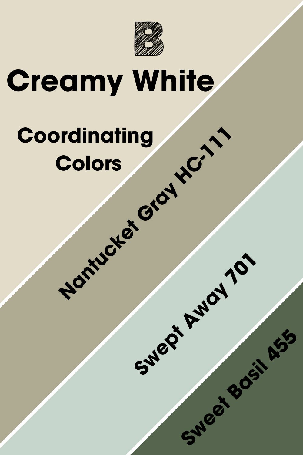
Coordinating Colors for Benjamin Moore Creamy White
Blame it on my hidden affection for green tones, but I thoroughly enjoyed compiling this list. Every color you see here has a working relationship with the undertones rooted in Creamy White.
They exist as stand-alone colors or complement the undertones in Creamy White, which means you get a breathtaking result when you pair them together on a palette.
Let me give a trick that has worked for me over the years- you can get an idea of your anchor color undertones by studying the coordinating colors. (You’re welcome)!
Benjamin Moore Nantucket Gray HC-111: This rich gray is packed with cool green undertones and an LRV of 39.83. Nantucket Gray can work as the perfect cabinetry color in a Creamy White kitchen or as a trim color for a Creamy White exterior.
Benjamin Moore Swept Away 701: This color reminds you of the gentle waves of the deep ocean with its green-gray hue and LRV of 62.9. You can pair this with Creamy White if you want a coastal-themed bathroom.
Benjamin Moore Sweet Basil 455: The darkest of the bunch with an LRV of 13.51, this warm green brings you closer to nature, and when you pair it with Creamy White, you get a fine clash between the light and dark qualities of this color.
They can work outdoors or in the kitchen with Sweet Basil as the trim or cabinet shade.
Benjamin Moore Creamy White Color Palette
True satisfaction comes from making these themes come to life by finding colors that interpret your vision. In this section, I’ve curated the perfect list to satisfy your decor cravings.
For the modern minimalist who will fancy the monochrome arrangement to the traditional decor addicts who can create wonders with the analogous and triadic scheme, this is where all your answers lie.
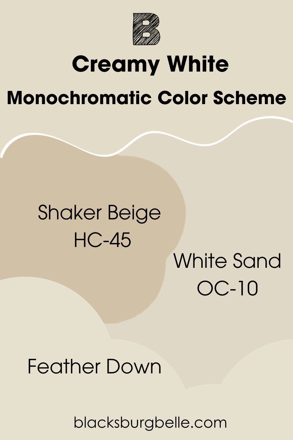
Monochromatic Color Scheme
- Benjamin Moore Shaker Beige HC-45: With almost 20 points behind Creamy White, this rosy neutral adds an earthy touch to your space, especially when paired with CW. It’s darker and warmer with a bit of green in it.
- Benjamin Moore White Sand OC-10: Definitely brighter than Shaker Beige, this neutral has an LRV of 66.95 with matching orange and green undertones. White Sand is 4 points behind Creamy White, and they’re both great for traditional and modern spaces.
- Benjamin Moore Feather Down: This bright beige is three points ahead of Creamy White with an LRV of 73.16 but with the same undertones. Feather Down will make a great cabinetry color in a Creamy White kitchen.
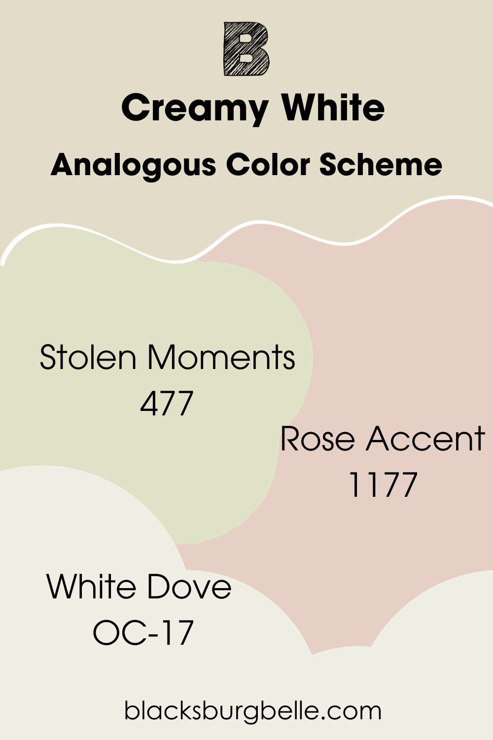
Analogous Color Scheme
- Benjamin Moore Stolen Moments 477: This is a classic from the brand; this warm green has soft yellow undertones and an LRV of 71.84. It works beautifully with Creamy White as a bathroom or bedroom color, as they’re soft and relaxing.
- Benjamin Moore Rose Accent 1177: Soft pink undertones cast the perfect blush on this beige color. It’s warm with impressive depth and an LRV of 63.37. Rose Accent is a perfect drawer or vanity cupboard color in a Creamy White space.
- Benjamin Moore White Dove OC-17: A creamy and rich softly shaded white with an LRV of 83.16 to offer needed balance to your Benjamin Moore Creamy White analogous palette.
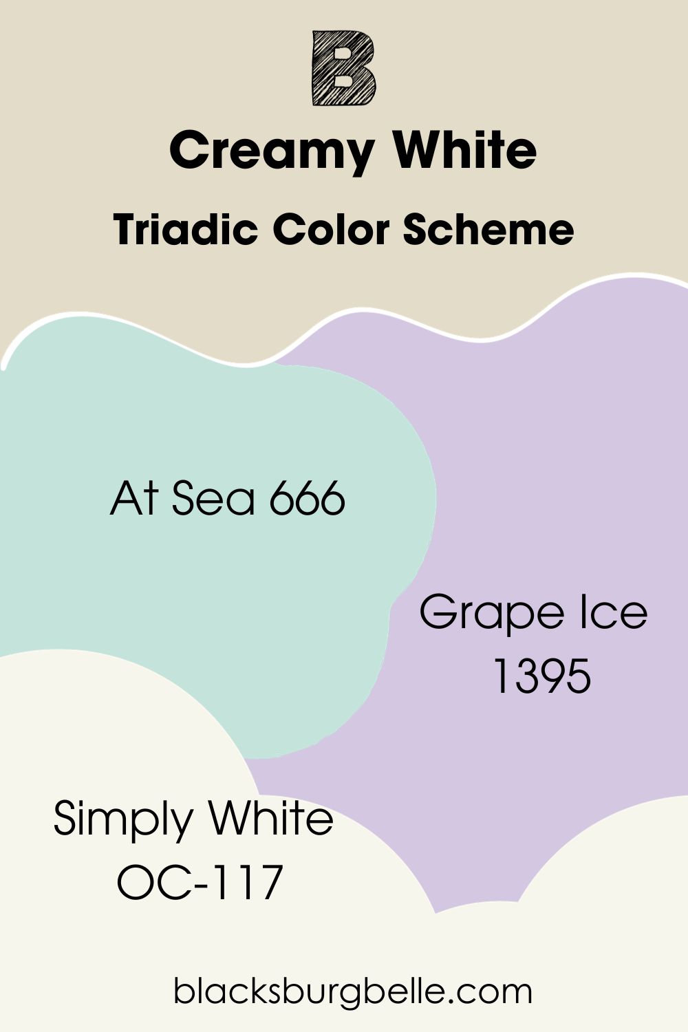
Triadic Color Scheme
- Benjamin Moore At Sea 666: A stunning cool and rich blue-green that showcases the sea’s beauty in your space. At Sea has an LRV of 70.71, almost the same as Creamy White.
Due to the bright nature of this color, it’ll work well with Creamy White in the bathroom, or turn it up and use At Sea for outdoor trims in a coastal area. Right on the theme, eh!
- Benjamin Moore Grape Ice 1395: I’m getting literal chills just from writing this. This exotic color is a unique purple shade with muted blue undertones and an LRV of 60.89. I’d use this color as an accent for the nursery alongside Creamy White.
- Benjamin Moore Simply White OC-117: A very functional white that’s warm, fresh, and creamy with yellow undertones. You can use this color to balance things out if the triadic scheme is too chaotic for you.
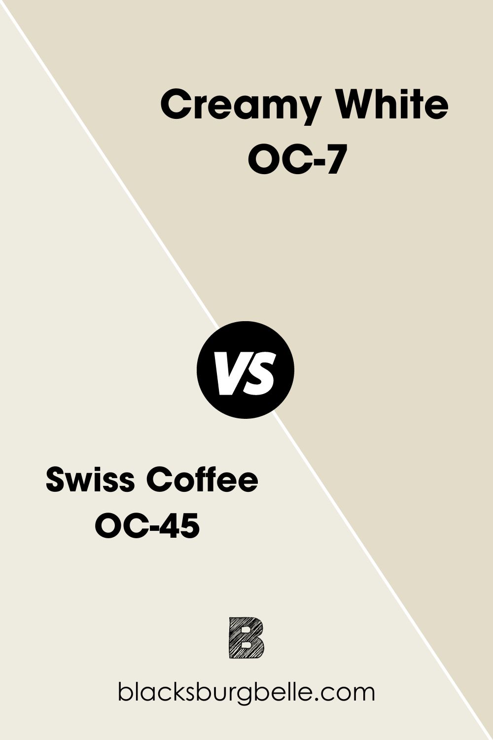
Benjamin Moore Creamy White vs. Swiss Coffee OC-45
Benjamin Moore Swiss Coffee is quite popular among paint enthusiasts because, like Creamy White, it’s also a very accommodating neutral and also on the bright side with an LRV of 81.91.
This warm off-white is 11 points higher than Creamy White, and when used side by side, CW instantly appears darker, which means it can work as an accent or trim color.
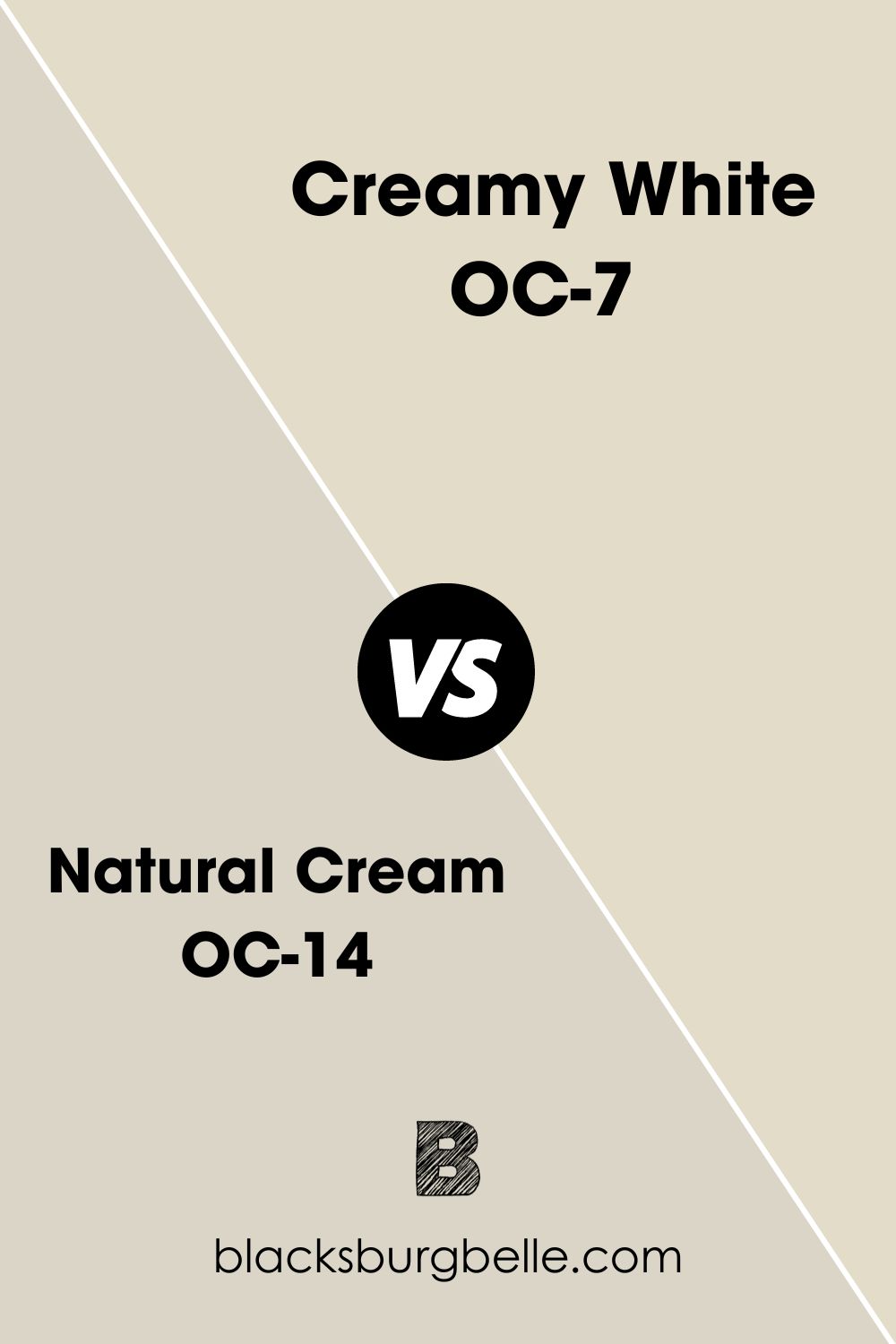
Benjamin Moore Natural Cream OC-14 vs. Creamy White
Natural Cream has an LRV of 64.78, which means it is darker than Creamy White with about 6 points and, by implication, makes it a medium-toned color.
Like Creamy White, this color has green, yellow, and gray undertones, slightly different from CW’s orange.
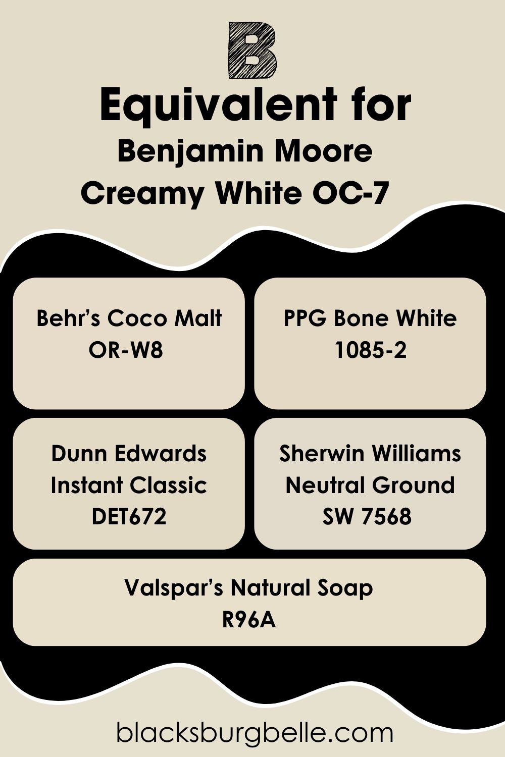
Benjamin Moore Creamy White Equivalent in Sherwin Williams and Other Brands
So you can’t find Benjamin Moore Creamy White on store shelves. Well, other colors bear a striking resemblance to this shade from other brands.
However, you must know that two colors don’t have the same statistics or outcome on walls, so you shouldn’t expect Creamy White verbatim on your home wall. We both know how much brands love uniqueness.
Behr’s Coco Malt OR-W8, PPG Bone White 1085-2, Dunn Edwards Instant Classic DET672, Sherwin Williams Neutral Ground SW 7568, and Valspar’s Natural Soap R96A are warm off-whites with similar undertones to Creamy White that can give you close outcomes.
Where can you use Benjamin Moore Creamy White OC-7?
I already established that this color is quite a hard worker, and by implication, it can work anywhere in your home, be it the living room, bedroom, kitchen, or even outdoors.
Creamy White leaves an amazing touch in your space without getting too overbearing or “creamy,” as most warm off-whites do.
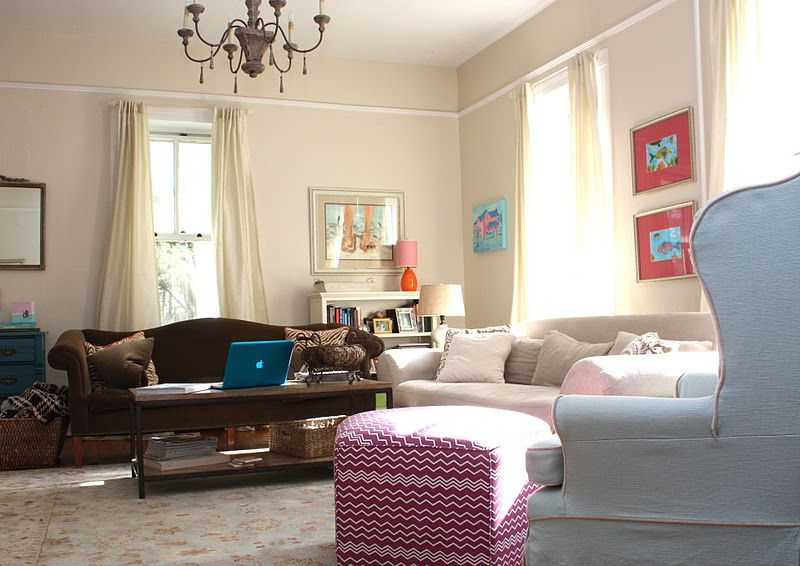
Benjamin Moore Creamy White in the Living Room
It’s giving European beauty in this living room. I love incorporating brighter colors on this palette as it prevents the space from looking too warm or bland.
Also, you’ll find that this setting is far from monochromatic; if anything, it leans towards traditional with hints of the medieval times per the chandelier.
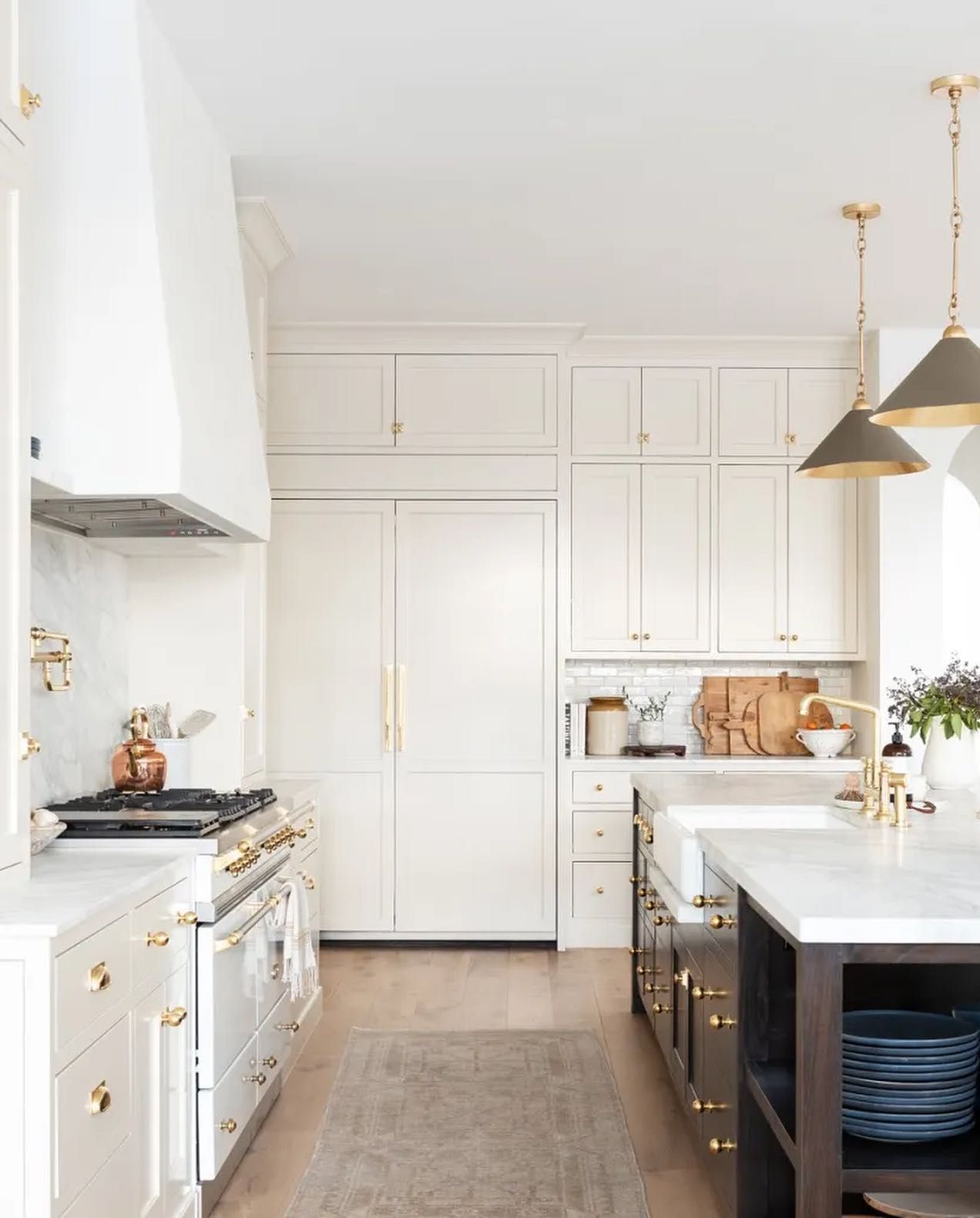
Benjamin Moore Creamy White in the Kitchen
An absolute sweetheart and hard worker in the kitchen, Creamy White brings an earthy vibe to your space when you apply it on the walls or cabinets like this image. Draw out the fresh orange undertones with gold handles, warm lighting, and bright wooden floors.
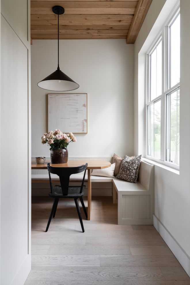
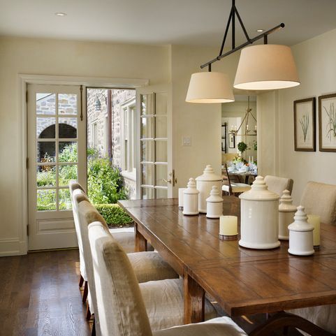
Benjamin Moore Creamy White in the Dining Space
First, I love the incorporation of white dove trims in this space as it helps draw away excess warmth from Creamy White. Notice how CW quickly caught the greenery outside and reflected works with the orange notes to give off a neutral vibe.
Add black tones and accessories for more character and to prevent your space from looking too orangey.
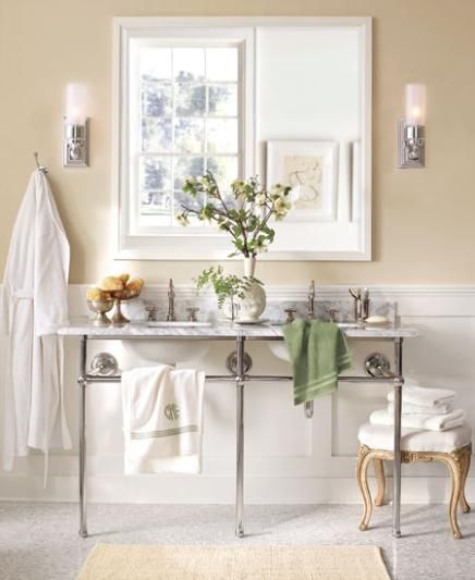
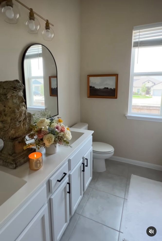
Benjamin Moore Creamy White in the Bathroom
Yes, warm colors can work in the bathroom, too, especially if they come with a high light reflective value like Creamy White. The color reads pretty gray in this space and works with the gray flooring, too.
One way to cool off warm colors in your space is to incorporate white trims and black accessories- however, you must proceed with maximum caution because you still need that soft, warm vibe.
What Colors Go With Benjamin Moore Creamy White OC-7
Benjamin Moore Creamy White can be paired with a wide range of solid tones as a neutral, soft, warm color. You can make the palette warmer by pairing this shade with red, oranges, or yellow.
Cool things off and pair Creamy White with rich greens, light and dark blues, and purple, or keep it neutral by adding a crispy, clean white to the mix.
Overall, Creamy White will perform amazingly with various colors, whether as accent, trim, or ceiling shades.
Conclusion
I would have loved to dig deeper into the beauty of Creamy White, but the unavailability of pictures is a stumbling block to that. Regardless, you can deduce from my shared information that Creamy White is a versatile color that can work anywhere and with anything.
Let me refresh your memory one last time
- Creamy White has an LRV of 70.95
- It’s also known as Spring in Aspen 954.
- Creamy White has orange, green, and gray undertones, which can pass as a neutral.
I would love to know what you think about this color, so be generous with those comments and feedback in the box.
 Sherwin Williams Drift of Mist (Palette, Coordinating & Inspirations)
 Sherwin Williams Storm Cloud (Palette, Coordinating & Inspirations)
 Sherwin Williams Indigo Batik (Palette, Coordinating & Inspirations)
 Sherwin Williams Daphne SW 9151: Paint Color Revie
 Sherwin Williams Moody Blue SW 6221 Review
 Benjamin Moore Swiss Coffee OC-45: Review & Inspiration
