
Neutral paint colors will always be trendy, and this is not just because of their versatility. They are also beautiful and easy to work with, and that is why greiges like Benjamin Moore’s Pashmina are popular with designers and decorators.
There’s so much you can do with Pashmina, and I’m excited to show you what the paint color is. We’ll explore the undertones, LRV, possible color palettes, and how best to use the color in your decor. Stick around on this journey of discovery; it will be worth your time, I promise.
Table of Contents
When to Choose Benjamin Moore Pashmina
This paint color is one of the best neutrals, although it doesn’t usually get the accolades it deserves. But it can still be a little challenging to determine when to choose it. Here are a few pointers to help you in this regard.
Using brick or stonework in your decor?
Pashmina is one of those colors that pair well with bricks or stone without looking washed out. Depending on the color of the stone or bricks, you may see the color looking a little warmer than you expect, but you can always work around it, especially if it’s outside the house.
Is lighting not an issue?
Because of its medium color, Pashmina may appear to have more depth than usual when used in a room with low light. While this may not be too much of a problem, the paint color looks its best when used with a lot of light.
Looking for a new exterior color?
As mentioned, Pashmina loves light, as do many other paint colors. So, you will find that it looks gorgeous as an exterior paint color, perfect for a house put up for sale.
While there are many greiges, Pashmina stands out because it works differently. Lighting can affect how it performs, but I’ll get to that later. Now, let’s find out what the color is and a few key aspects that make it unique.
What Color is Pashmina?
The term pashmina typically refers to a woolen scarf made from cashmere wool obtained from the Changthangi goat. The scarf is known to be of Indian descent, but it has evolved so much that there’s a whole fashion range dedicated to it. And pashmina is pretty expensive.
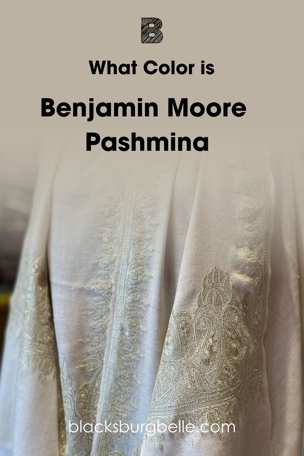
The paint color is reminiscent of raw pashmina, although the cashmere wool may come in different neutral colors. Benjamin Moore’s Pashmina AF-100 is a medium neutral paint color that leans toward greige. It’s a smooth and creamy color that acts as a bridge between warm and cool colors.
A Snapshot of the Specifications of Benjamin Moore Pashmina
Let’s look at a chart detailing specific characteristics of Pashmina that make it what it is. These include the undertone and LRV, among other details.
| Benjamin Moore Pashmina | |
| RGB | 187, 178, 161 |
| LRV | 44.2 |
| Undertone | Green, beige |
| HEX Code | #BBB2A1 |
Benjamin Moore Pashmina: Understanding the LRV
The LRV of color refers to its light reflectance value and refers to the amount of light the color reflects on a scale of 0 to 100. Lower LRVs represent dark colors, while higher LRVs represent light colors. That means black has an LRV of 0 and white has an LRV of 100.
When it comes to paint colors, the case is slightly different. The scale for paint colors is 2.5 to 94 because there are no true white or black ones. Undertones change the game, making it impossible to find colors without hues under them.
Benjamin Moore’s Pashmina has an LRV of 44.2, below the middle point of 50 but still a medium-range color. While the value is not high, Pashmina is not one of the darkest colors, meaning it can reflect some light.
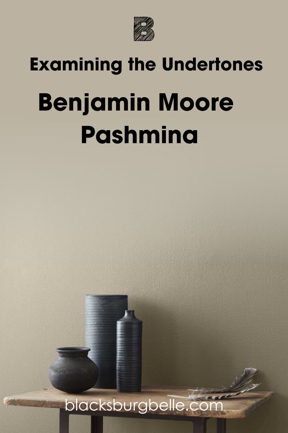
Benjamin Moore Pashmina: Examining the Undertones
Pashmina is a neutral color, which means it doesn’t exactly reveal undertones and doesn’t lean toward any tone, warm or cool. However, in certain lighting conditions, it may show a passive green undertone, and at other times, you may notice a little beige under it.
This is Pashmina in its neutral form.
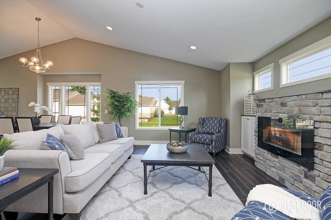
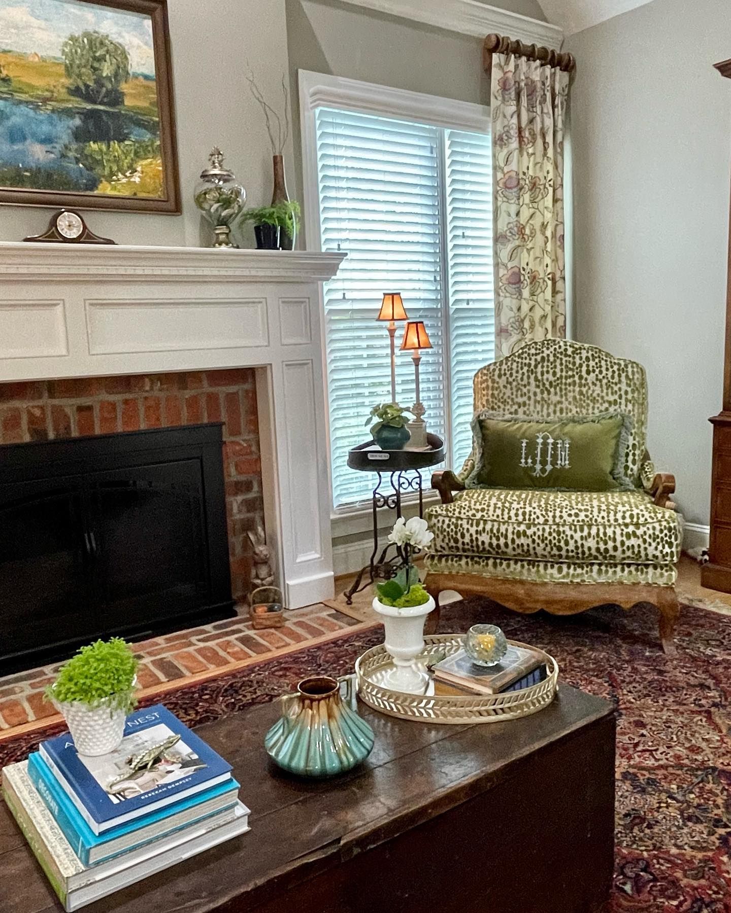
In this living room, you can notice a hint of green. See how well the paint color pairs with the light brick wall.
How Does Lighting Affect Pashmina?
Lighting can make the paint color look warm or a little muted. In a south-facing room with direct sunlight, Pashmina may reveal more of its beige side without appearing like a beige paint color. But in a north-facing room, it may reveal its gray side.
Pashmina looks warm, soft, and creamy on the cabinets without looking too beige in the warm sunlight.
But in cool light, you will notice that Pashmina shows more depth and may reveal a slightly pink-purple undertone.
In warm yellow artificial lighting, Pashmina looks great. I mean, the paint color can take on many forms, and this is just one of them.
Does Pashmina Look Yellow?
Although it has a yellow base, Pashmina doesn’t look yellow in most cases. However, when the lighting is very warm and direct, it may lean a little toward that without becoming very obvious.
How Does Pashmina Feel in a Room?
The paint color feels warm, inviting, and welcoming in a room, all attributes we need after a long and tiring day. We all want our space to have that touch of a safe haven without overdoing it, and Pashmina offers that. You can freely add other colors without overshadowing the Pashmina backdrop.
Benjamin Moore Pashmina: Warm or Cool?
Pashmina is a neutral paint color that lies between warm and cool, according to Benjamin Moore. And I agree because I’ve seen how it blends with both cool and warm colors.
However, it’s a mixture of beige and gray with just a touch of yellow, which makes it lean toward the warm tone.
Nevertheless, you can use it with colors that are not crisp or icy, such as colors with cool green or gray undertones. Consider avoiding mixing it with colors with blue undertones.
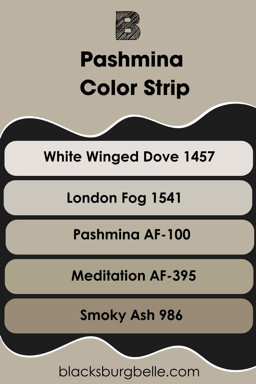
Benjamin Moore Pashmina Color Strip: Lighter to Darker Exploration
You may find that Pashmina is not the shade you want; your decor may prefer something darker or lighter. In such a case, don’t look further than this guide. I’ve picked colors within the same color strip as Pashmina to give you alternatives.
- Benjamin Moore White Winged Dove 1457
- Benjamin Moore London Fog 1541
- Benjamin Moore Pashmina AF-100
- Benjamin Moore Meditation AF-395
- Benjamin Moore Smoky Ash 986
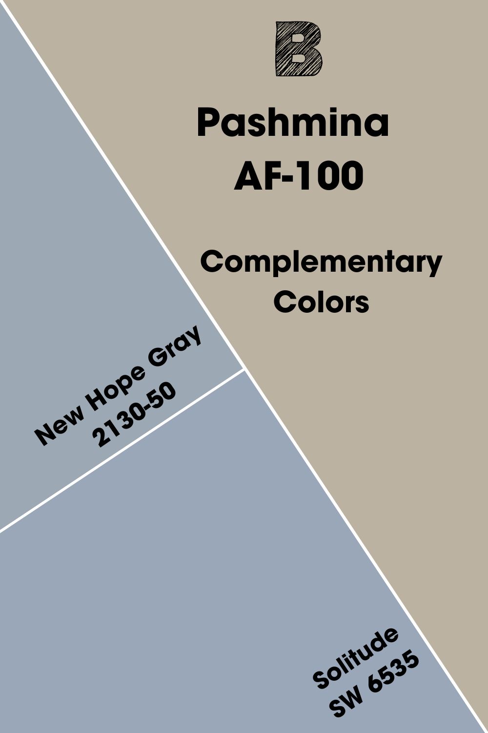
Benjamin Moore Pashmina Complementary Color
The color wheel features all the colors you can think of unless they are neutral. It is easy to pick out the complementary color of any color because these colors are opposite each other on the color wheel.
They enhance the vibrant part of each other, although they may look nothing alike. Examples are red and green, blue and orange, and purple and yellow.
Pashmina is an unusual neutral, which means it doesn’t typically appear on the color wheel. However, because of the undertones and unique shade, I’ve carefully picked its complementary color, which is a medium shade of blue-gray.
Benjamin Moore’s New Hope Gray 2130-50 is similar to this color; you can also try Sherwin Williams’ Solitude SW 6535 if it better suits the decor.
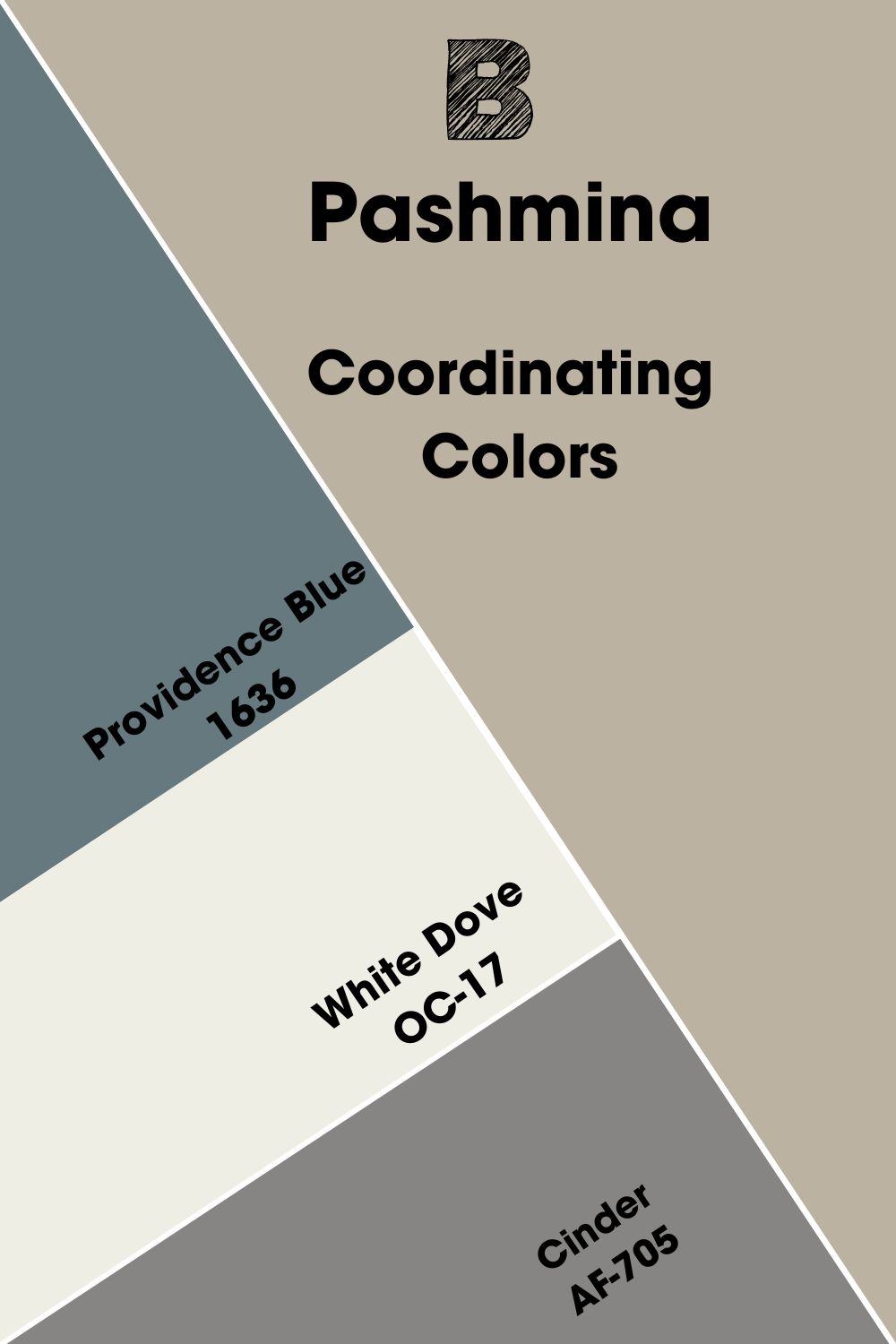
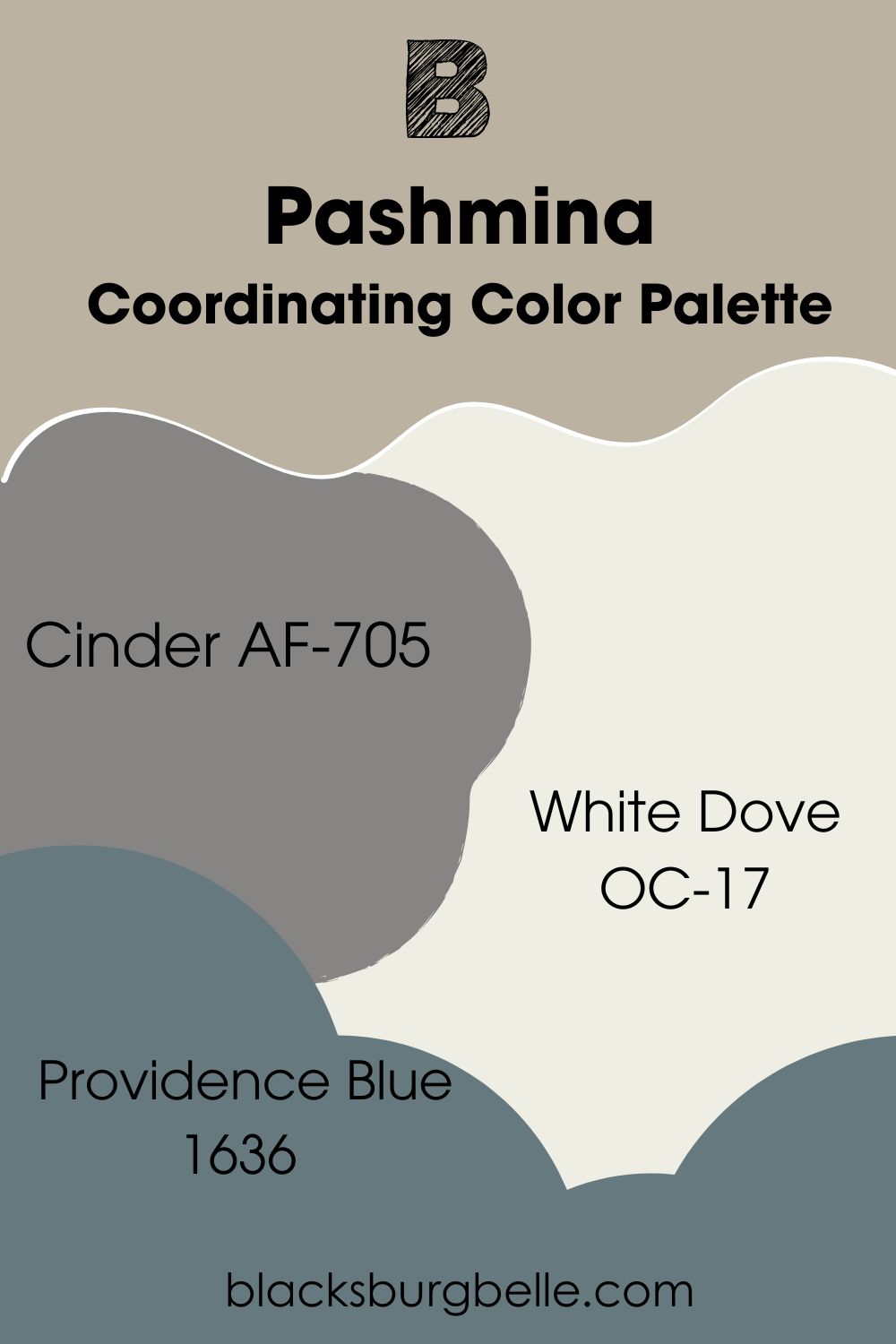
Benjamin Moore Pashmina Coordinating Colors
As a neutral paint color, Pashmina has several coordinating colors, including Providence Blue, White Dove, and Cinder. Let’s discuss these colors and how they relate to Pashmina.
- Benjamin Moore Providence Blue 1636: A slate blue paint color whose dark gray undertone reflects the gray in Pashmina and creates a seamless flow.
- Benjamin Moore White Dove OC-17: One of the most popular white paint colors on the market, White Dove reflects the warmth in Pashmina, complementing its beige undertone.
- Benjamin Moore Cinder AF-705: A mid-to-dark gray paint color with a slightly taupe hint that pairs well with the neutral Pashmina.
Benjamin Moore Pashmina Color Palettes
The following are some color palettes to consider when matching Pashmina with colors for your decor.
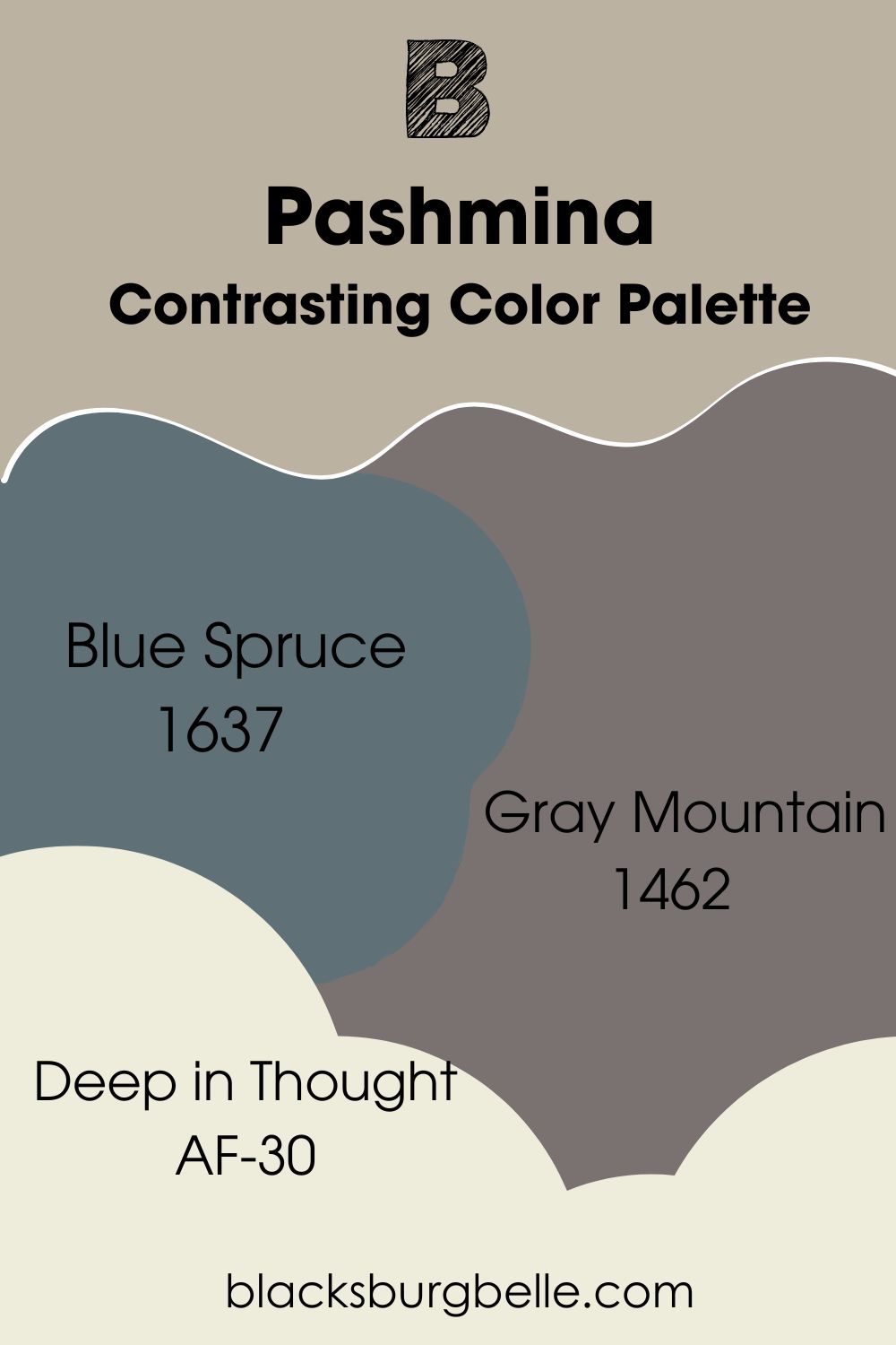
Contrasting Color Palette
- Blue Spruce 1637: A blue paint color with green and blue undertones that blend with Pashmina.
- Gray Mountain 1462: A deep gray paint color with slightly purple tones that look stunning against the Pashmina shade.
- Deep in Thought AF-30: A warm white with a slightly yellow hue that brings the spark into the decor as the trim color for Pashmina walls.
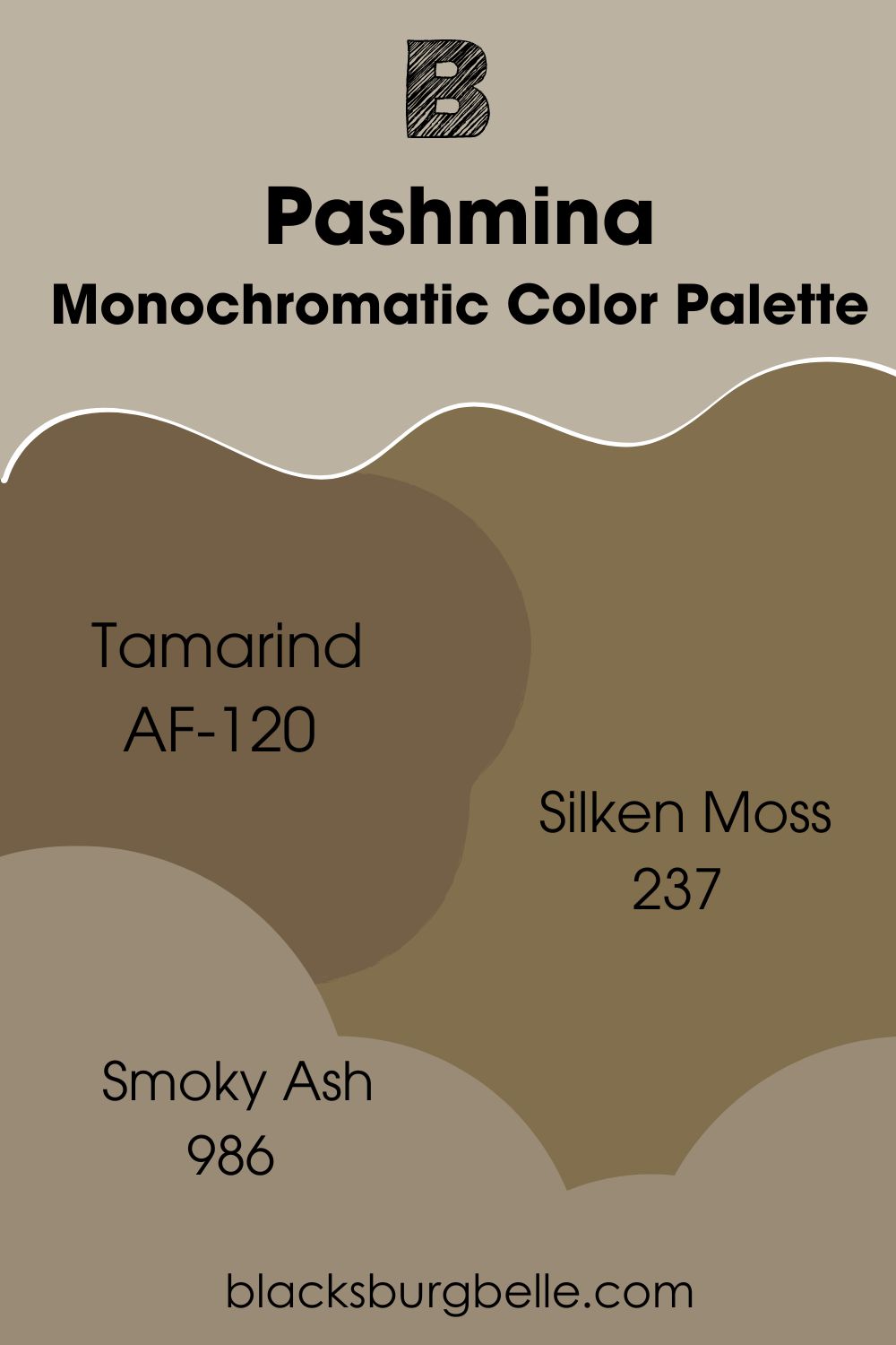
Monochromatic Color Palette
- Tamarind AF-120: Reminiscent of nature, this earthy brown is a darker shade of Pashmina that works well in a monochromatic style.
- Silken Moss 237: A rich shade of brown made unique by the barest hint of green, which complements the green in Pashmina.
- Smoky Ash 986: Another brown paint color made versatile by its greenish-yellow and slightly purple undertones that surprisingly blend well with Pashmina.
Coordinating Color Palette
- Cinder AF-705: A mid-to-dark gray paint color with a slightly taupe hint that pairs well with the neutral Pashmina.
- White Dove OC-17: One of the most popular white paint colors on the market, White Dove reflects the warmth in Pashmina, complementing its beige undertone.
- Providence Blue 1636: A slate blue paint color whose dark gray undertone reflects the gray in Pashmina and creates a seamless flow.
Benjamin Moore Pashmina vs Similar Paint Colors
Some paint colors are pretty similar to Pashmina, and I’d like you to see how they compare side by side.
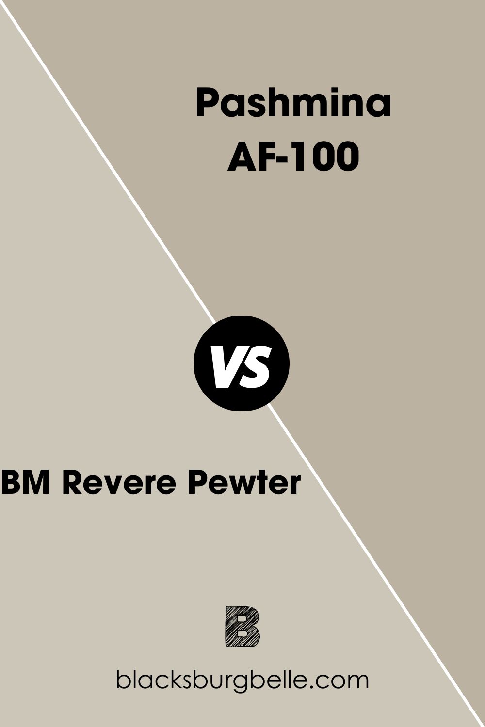
BM Revere Pewter vs BM Pashmina
Revere Pewter reveals more green than Pashmina but is lighter with an LRV of 55.05. Apart from these differences, both colors are interchangeable.
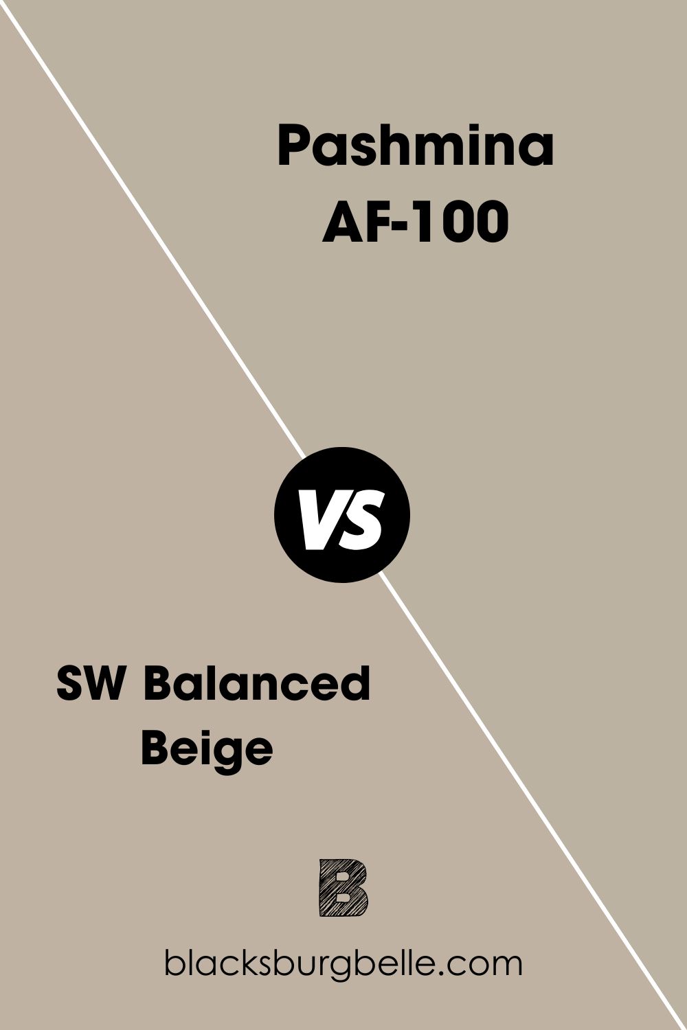
SW Balanced Beige vs BM Pashmina
Balanced Beige from Sherwin Williams has the same warm green and gray in it as Pashmina but with a slightly higher LRV of 46. Sometimes, it may reveal red or pink-purple undertones.
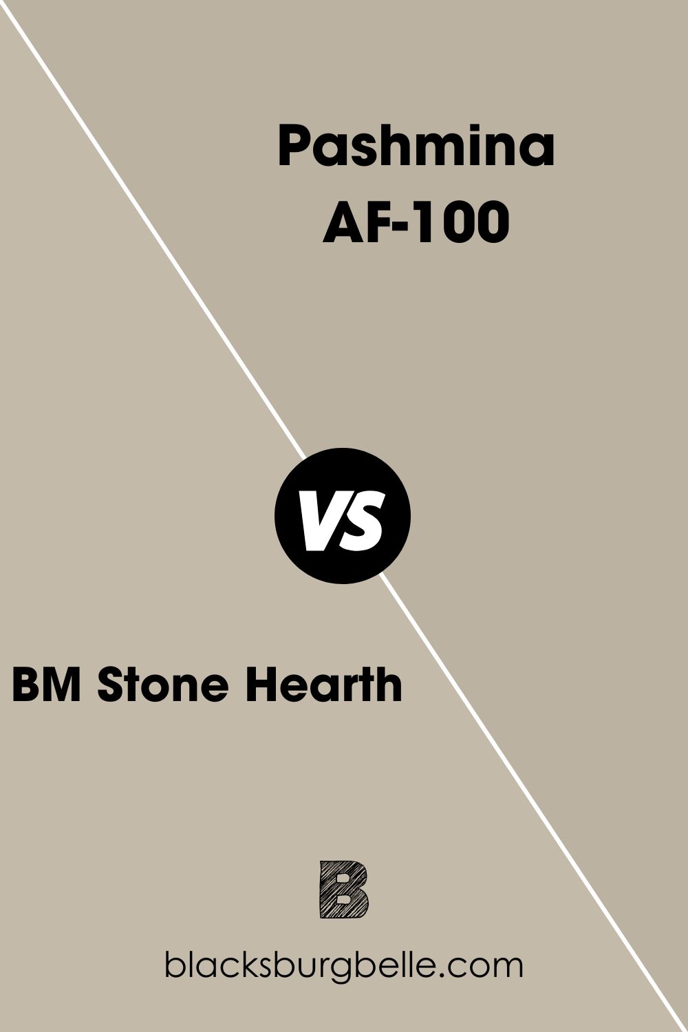
BM Stone Hearth vs BM Pashmina
Stone Hearth has the same shade as Pashmina and is only a little lighter, with an LRV of 48.45.
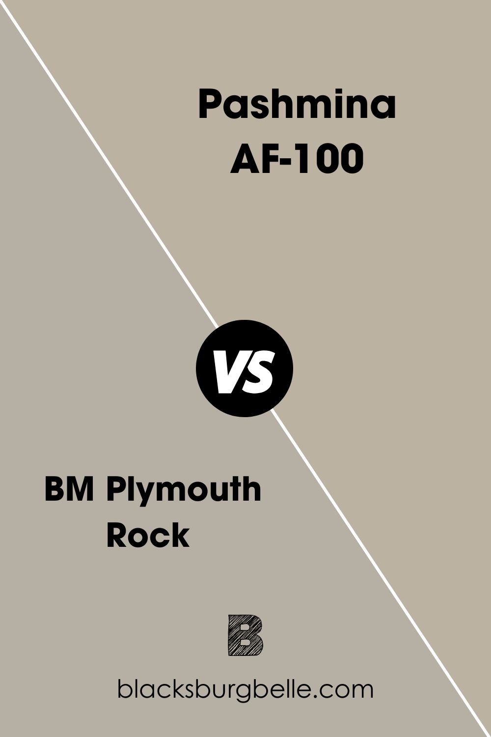
BM Plymouth Rock vs BM Pashmina
Plymouth is more muted than Pashmina and is more of a taupe paint color than gray or greige.
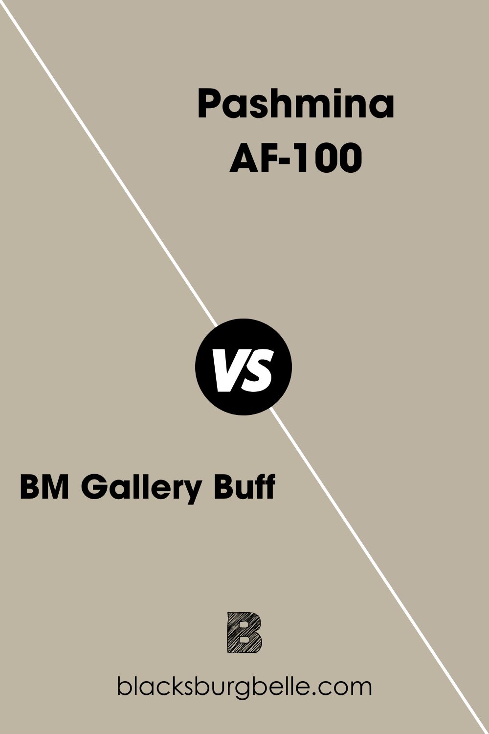
BM Gallery Buff vs BM Pashmina
Both paint colors look alike because of their undertones. But when paired side by side, you’ll notice that Gallery Buff is slightly lighter because of its higher LRV.
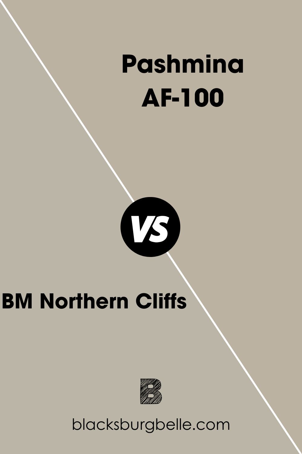
BM Northern Cliffs vs BM Pashmina
Northern Cliff is as neutral as Pashmina but only lighter. It doesn’t have the same beige tone as Pashmina but appears cooler.
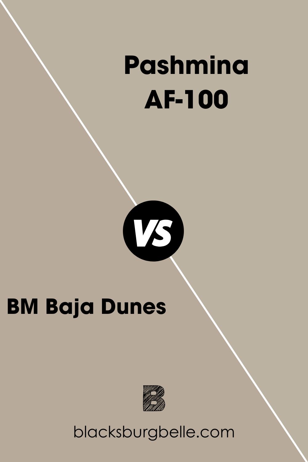
BM Baja Dunes vs BM Pashmina
Baja Dunes features the same green undertone as Pashmina, but the paint color is darker when compared to Pashmina.
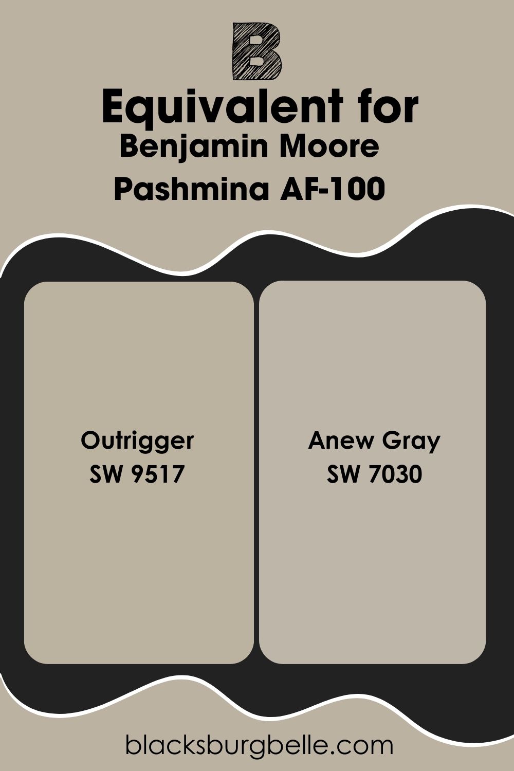
Sherwin Williams Paint Color Equivalent to Benjamin Moore Pashmina
There’s no equivalent paint color from Sherwin Williams to match Benjamin Moore’s Pashmina. This is because every paint color is unique. However, Sherwin Williams’ Outrigger SW 9517 is so similar to Pashmina that they are the same color except from different brands. Anew Gray SW 7030 is also similar to Pashmina in many ways.
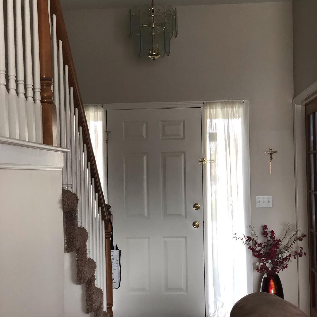
Where Can You Use Benjamin Moore Pashmina?
As a versatile color, you can use Pashmina as an interior and exterior color without missing a beat. Use it on cabinets, trim, bathrooms, bedrooms, living rooms, and other areas in your house. Here are some examples to inspire you.
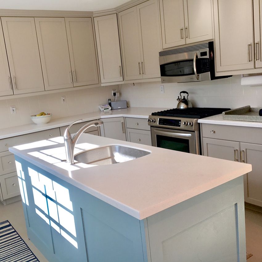
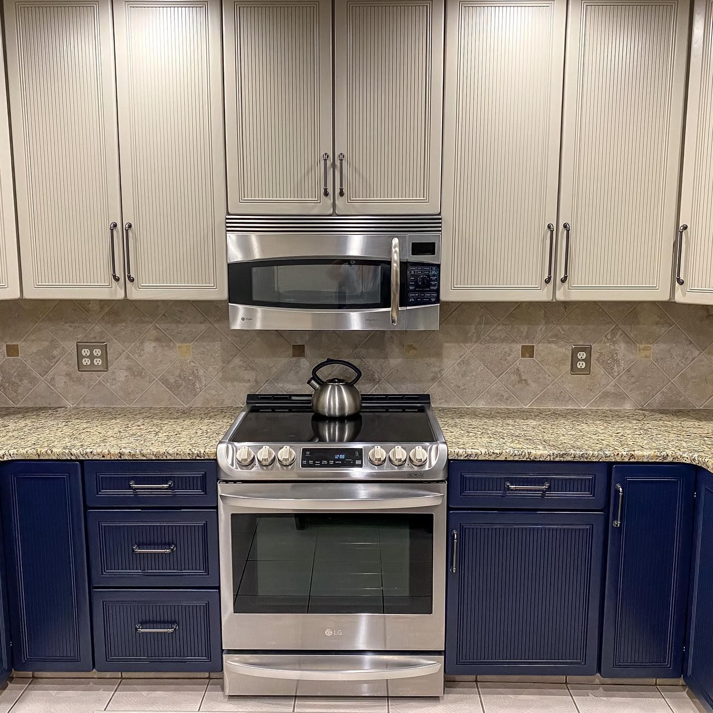
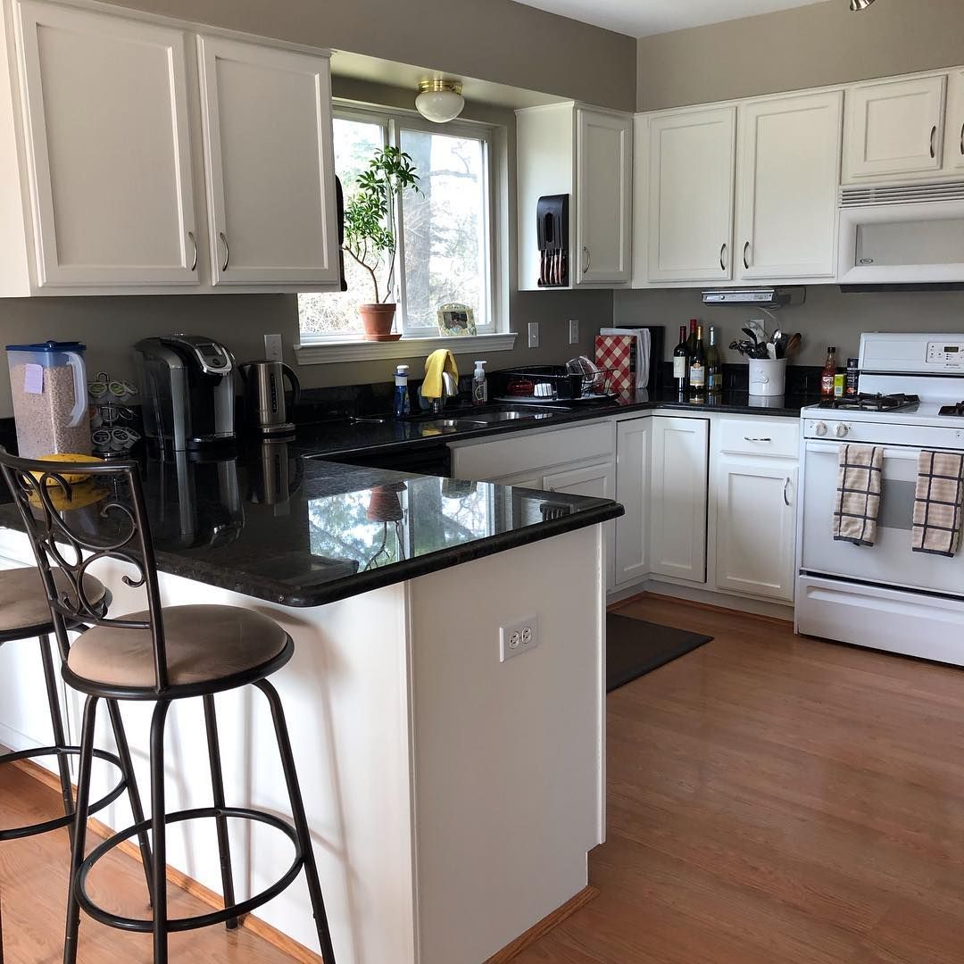
Benjamin Moore Pashmina on Kitchen Cabinets
The top cabinets are Pashmina, while the lower ones are done in Sherwin Williams’ Anchors Aweigh.
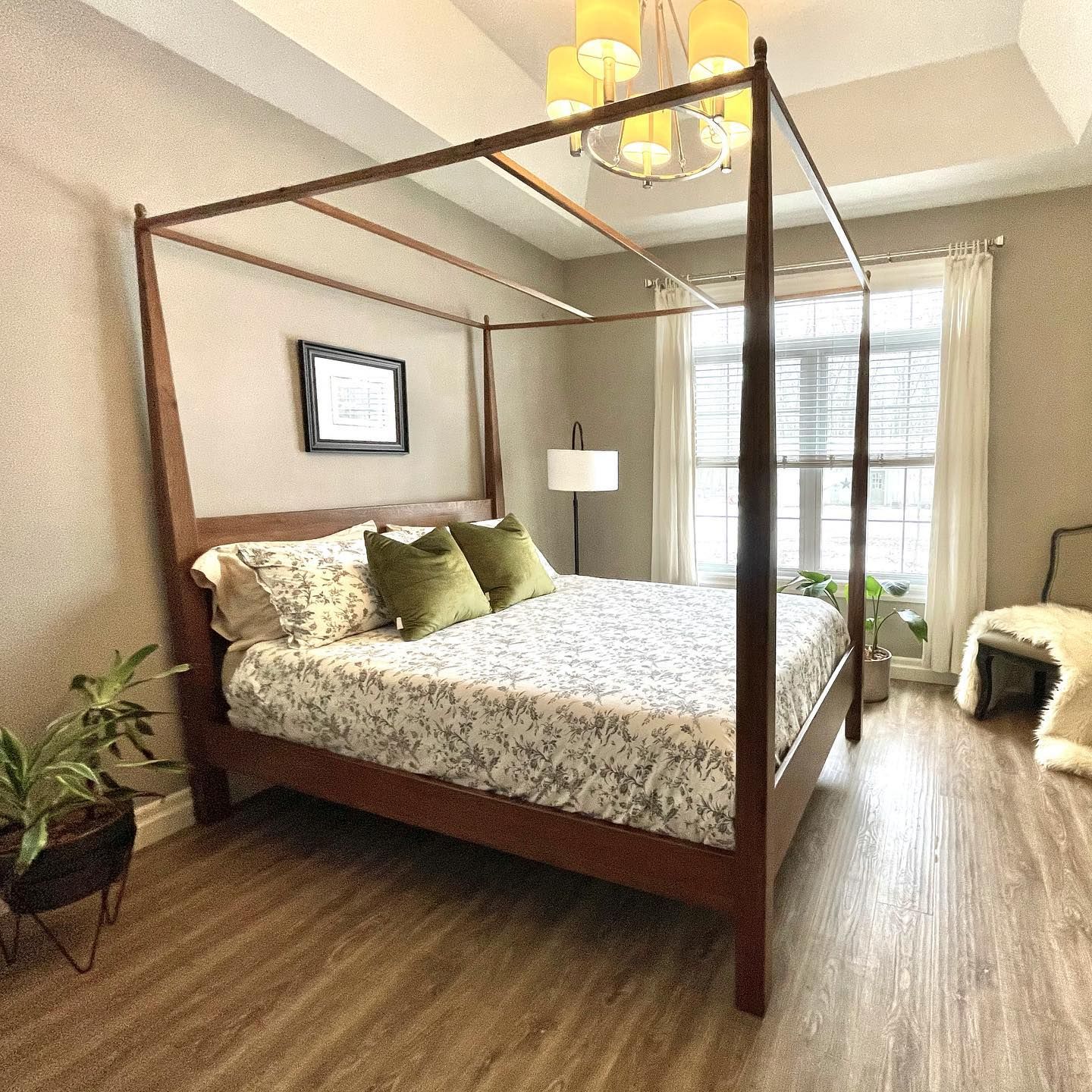
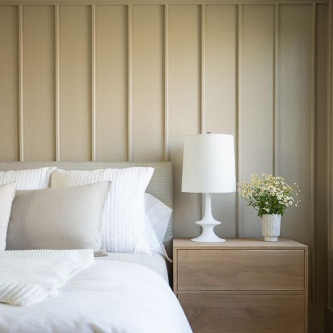
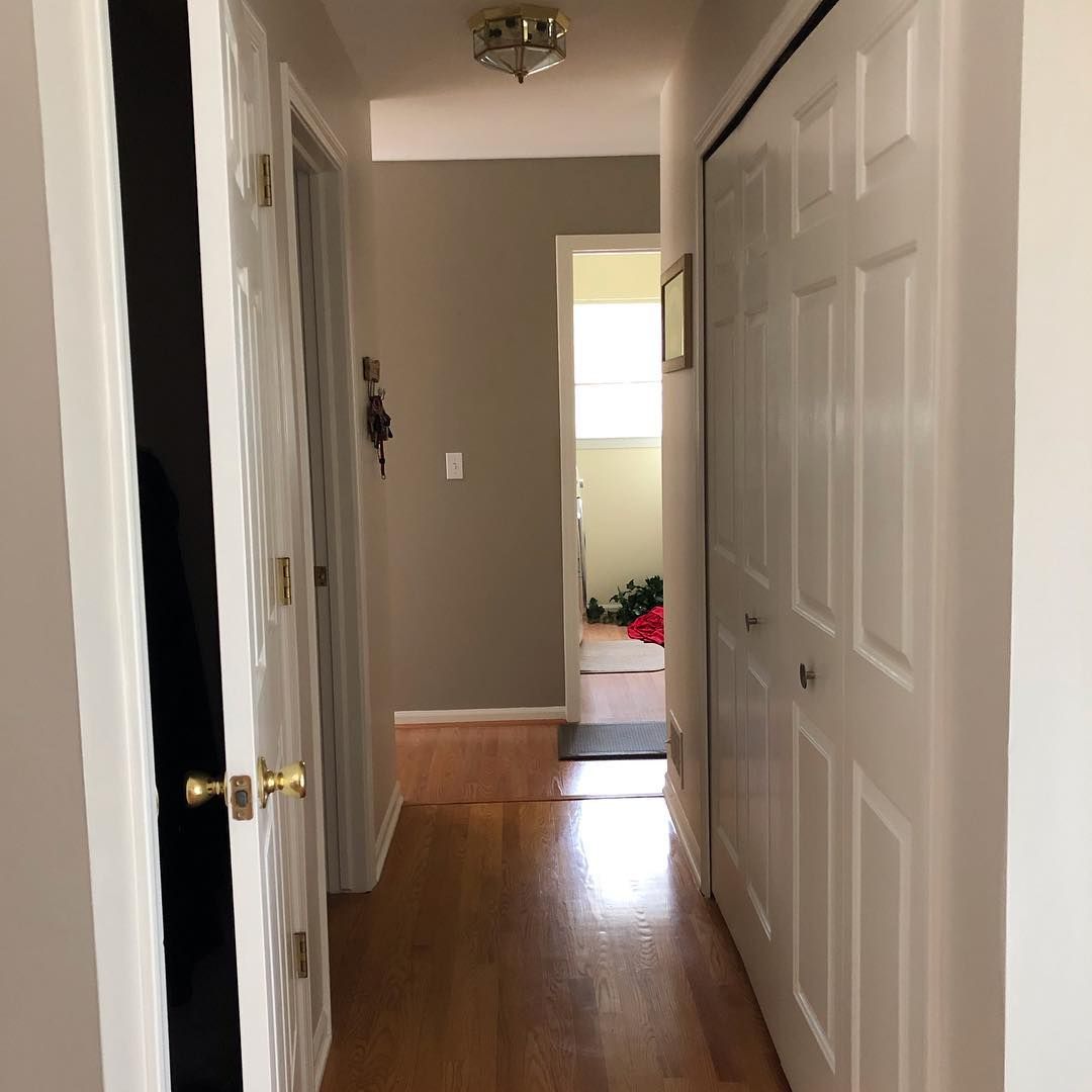
Benjamin Moore Pashmina in a Bedroom
The paint color looks soft against the whites in this room.
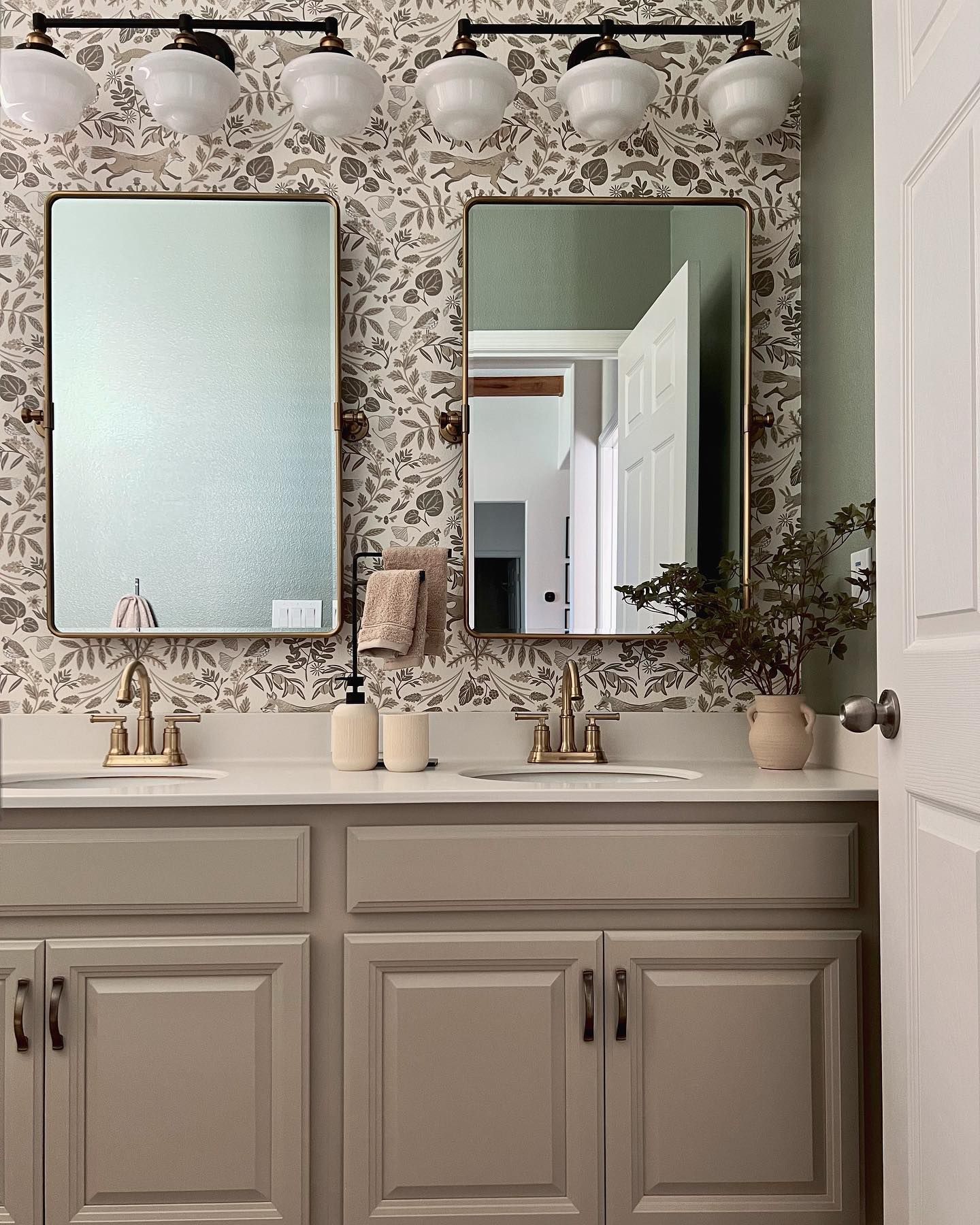
Benjamin Moore Pashmina in a Bathroom
The vanity has some color love from Pashmina and matches the exquisite wallpaper.
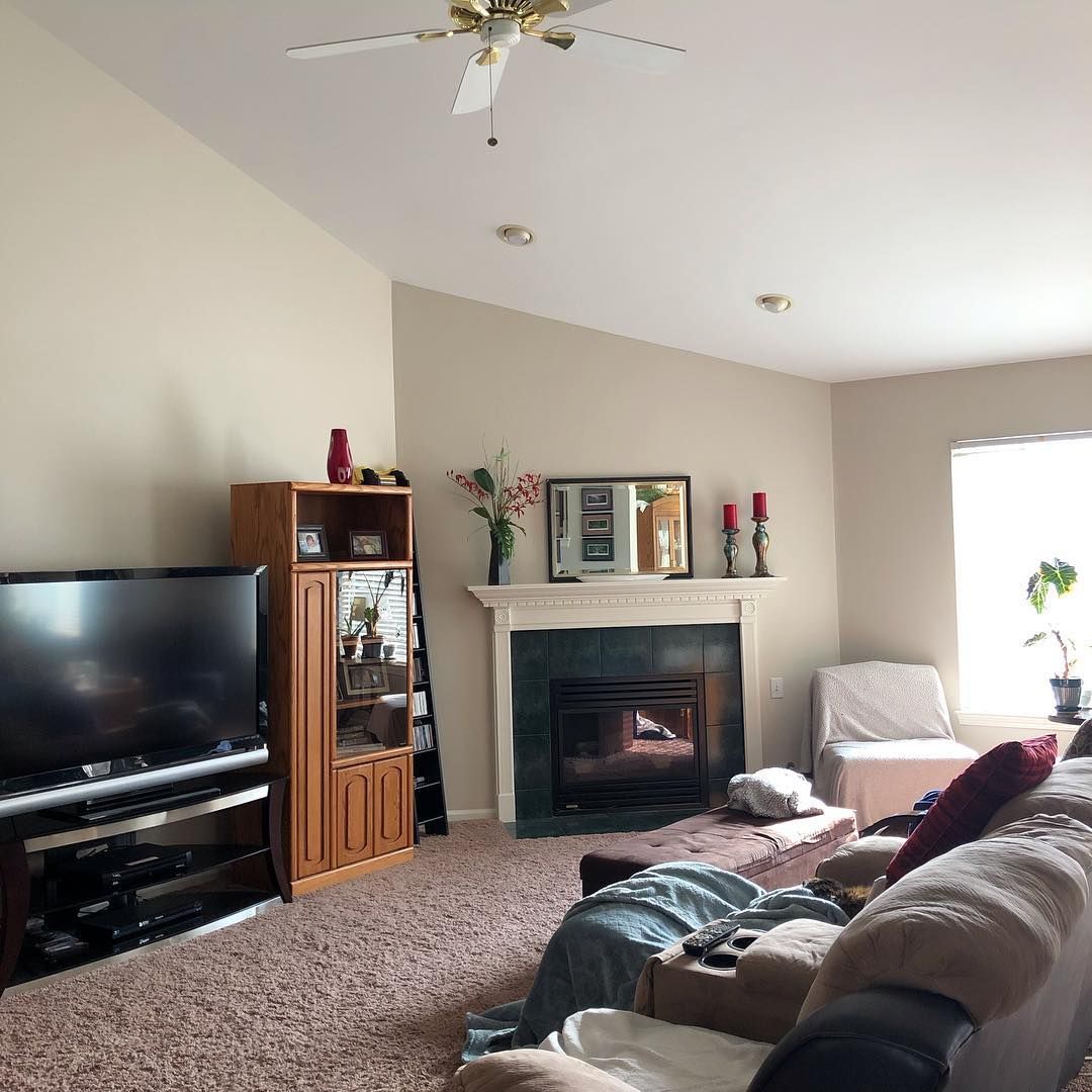
Benjamin Moore Pashmina in a Living Room
Best Trim Color for Benjamin Moore Pashmina Walls
I recommend white for the best result because it deepens the color and makes it pop.
Best Ceiling Color for Benjamin Moore Pashmina Walls
Like the trim, I also recommend white because of how it complements the color.
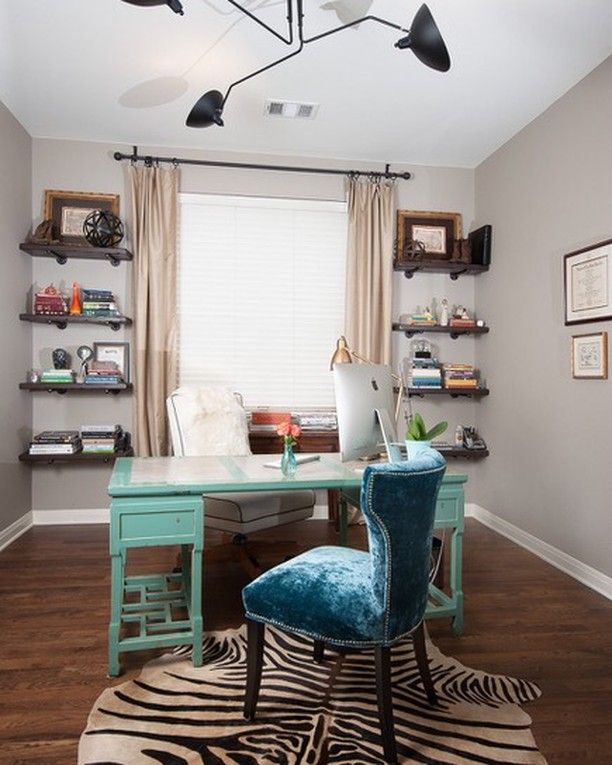
Benjamin Moore Pashmina in a Home Office
The splash of various colors does nothing to diminish Pashmina on the walls of this home office.
Benjamin Moore Pashmina on Kitchen Walls
The cabinets are a warm white color, perfectly complementing the darker Pashmina on the walls.
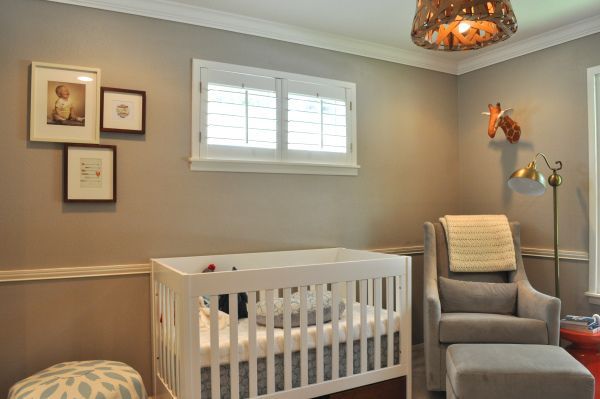
Benjamin Moore Pashmina in a Nursery
If you have good lighting, Pashmina can work anywhere, including a nursery.
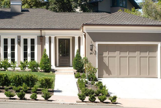
Benjamin Moore Pashmina on Exterior
As mentioned, Pashmina is one of the best colors to use on exterior walls, especially if you plan to put the house up for sale.
Conclusion
Benjamin Moore’s Pashmina is a medium neutral paint color with a green undertone that may change with different lighting conditions. It has an LRV of 44.2, so it doesn’t reflect a lot of light. This also means the paint color loves a lot of natural light.
Pair it with wood tones, light neutrals, or vibrant colors, whether warm or cool, because Pashmina is a bridge between tones. You can follow my guide to create color palettes that suit your decor.
Remember to test the paint color with samples before using it. That way, you’re sure of the result you’re getting. Don’t hesitate to reach me in the comments section if you have any questions.
 Sherwin Williams Watery (Palette, Coordinating & Inspirations)
 Sherwin-Williams Canvas Tan (Palette, Coordinating & Inspirations)
 Sherwin Williams First Star ((Palette, Coordinating & Inspirations)
 Sherwin Williams Agreeable Gray SW 7029 Review
 Sherwin Williams Cotton White SW 7104 Review
 Sherwin Williams White Flour SW 7102: Paint Color Review
