
You don’t have to live on the beach before you can enjoy the vibes of living in a beach house. With the right colors, you can turn your house into one and experience the feel of the seaside or a tropical paradise.
Asides from making your home look serene, relaxing, and inviting, beach house colors also make it look spacious. This is particularly good for those with small spaces.
Additionally, beach house colors are complementary. They are a great foundation for coordinating other designs and styles in your home, whether bold or subtle.
Since beach house colors have a natural feel, they can remind you to stay calm and peaceful, especially during busy days. Besides, they have a timeless appeal. With them, your decor never goes out of style! Below are the 17 best beach house paint colors you can opt for;
Table of Contents
Tips for Choosing a Beach House Paint Colour
While beach house paint colors are great, you need to be careful when choosing. Below are some tips for choosing a beach house paint color:
Lightness
You want to opt for light colors, such as cream, as it helps your home look more spacious and airy. Besides, light colors naturally reflect the beach’s color, making replicating these coastal vibes in your home easier. However, testing your preferred beach house color on a small part of your home is advisable before painting the entire section. This helps you see how the colors look during different times of the day.
Surroundings
Beach house colors take on a different look if they complement your environment. To be sure, you can walk around your home to see your surroundings. Pay particular attention to the color of the sky, sand, and flowers. Also, you can include beach-inspired elements in your surroundings to give that coastal vibe, such as using seashell-themed outdoor furniture or woven baskets.
Creativity
You can easily combine colors based on the rules, such as using light colors because they help your room look more spacious or using colors that complement your surroundings. However, you’ll only get results that have been gotten before because you follow the rules. What if you decide to be creative with your colors and create a new look from what’s available? So, dare to be creative with your beach house, paint colors and make your home a statement.
Durability
Finally, you should consider how long-lasting the color is before you settle for it. For example, if you choose a trendy color, it is in style throughout the duration of the trend. Once it stops trending, the color goes out of style. Having trend-based decors can be expensive to maintain because you have to change them with every new trend. However, it is a long-term investment if you opt for timeless beach house paint colors. You can rest assured that the trend doesn’t determine your decor and can easily transition into any color scheme you want.
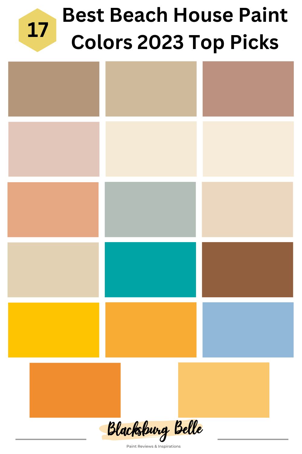
17 Best Beach House Paint Colors
The following are the top colors to consider if you want a beach house paint color:
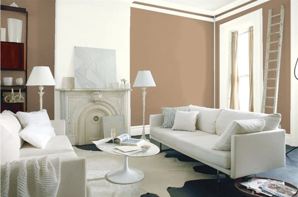
1. Benjamin Moore Beach House Beige 1083
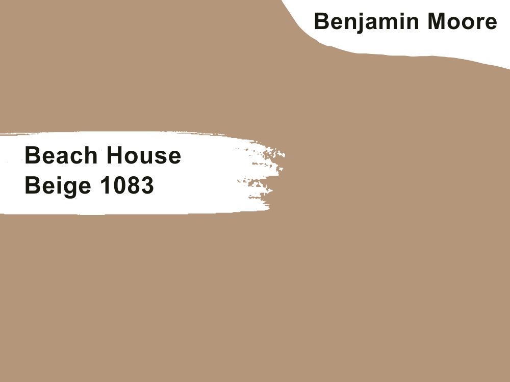
| RGB | 180 147 121 |
| LRV | 32.87 % |
| Undertone | Peach, pink, yellow, orange, green. |
| Matching Colors | White Dove OC-17, Santorini Blue 1634, Smoke 2122-40, |
The Beach House Beige 1083 is warm and pleasing to the eye. The Beach House Beige 1083 effortlessly complements various colors and designs with a deep creamy caramel. It is a perfect backdrop for any color and pattern in your home.
Furthermore, its deep caramel tan makes it never go out of style. It is timeless, and depending on how well you combine it with other colors and patterns, it will appear new every day. If you love sophistication, this color is perfect for you. If you also want your home cozy and warm throughout the day, Beige 1083 is your best bet. It is very versatile – you can use it anywhere and on anything. Finally, it makes any space adaptable and relaxing.
2. Benjamin Moore Stone House 1039
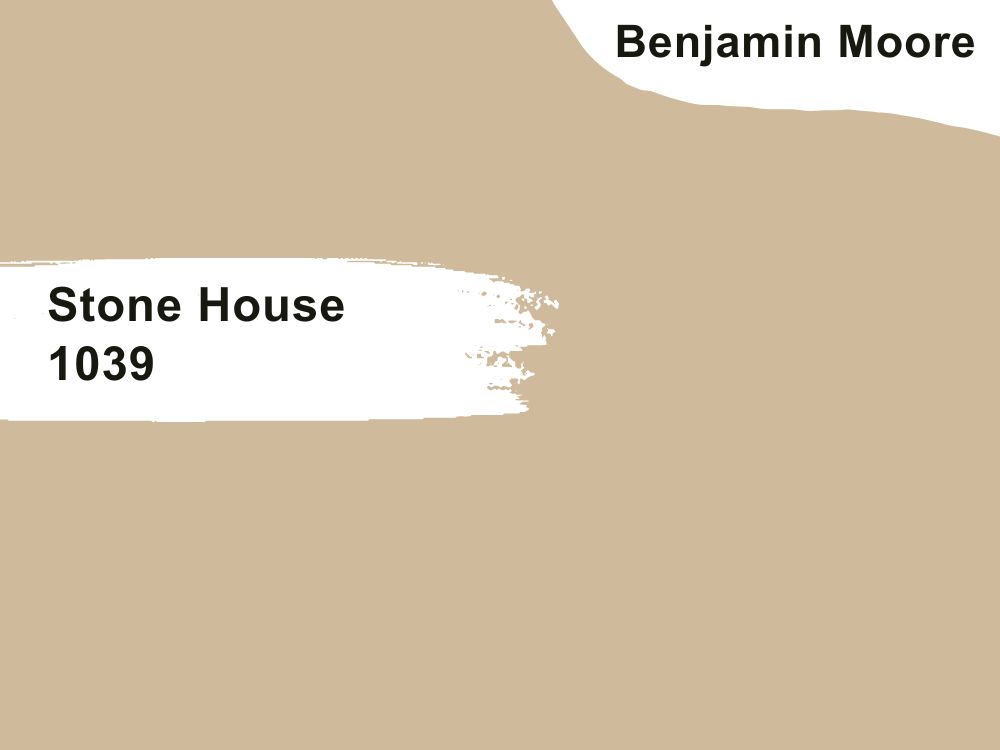
| RGB | 207 183 156 |
| LRV | 49.42 |
| Undertone | pink, orange. |
| Matching Colors | White Dove OC-17, Chantilly Lace OC-65, Ivory Porcelain 239, Incense Stick 2115-20 |
One prominent quality that endears Stone House 1039 to many people is its versatility. This color can be used anywhere. Its medium tan makes it durable. As such, it suits every weather condition; you don’t have to worry about your paint peeling off as long as it’s properly maintained. Besides, Stone House 1039 is a beach house paint color that easily absorbs heat. This improves your home’s cooling quality by making it more airy.
Aside from its cooling quality, this color has a natural and timeless appearance, making it a great backdrop for color and pattern combinations, especially bright white, purple blends, and gray-blues. Since it is neutral, you can use it in any space, whether it’s the bedroom, kitchen, sitting room, or guest lounge.

3. Benjamin Moore Lake House 1175
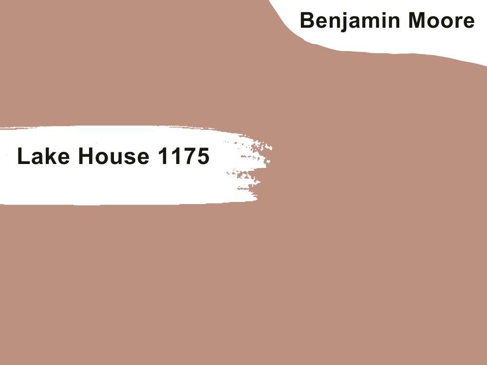
| RGB | 188 145 127 |
| LRV | 32.61 % |
| Undertone | pink, brown. |
| Matching Colors | White Opulence OC-69, Cloud White OC-130, Sand Dollar OC-71, Chocolate Mouse 1025, |
If you want your space captivating, the Lake House 1175 is your best bet. It is highly alluring, making your home soothing and warm. It makes a perfect companion for your busy days! Another reason you should go for this color is its suitability with natural light. It enhances natural light, making your room feel more spacious and welcoming.
Also, it easily harmonizes with any color and pattern you pitch it with, whether it’s classic decor or a bold statement. However, even the Lake House 1175 makes a great foundational color; it’s advisable you pair it with contrasting colors so that your home won’t feel flat or monotonous. You might also want to be creative by personalizing with bold accents through your home accessories, fittings, and other decorative elements.
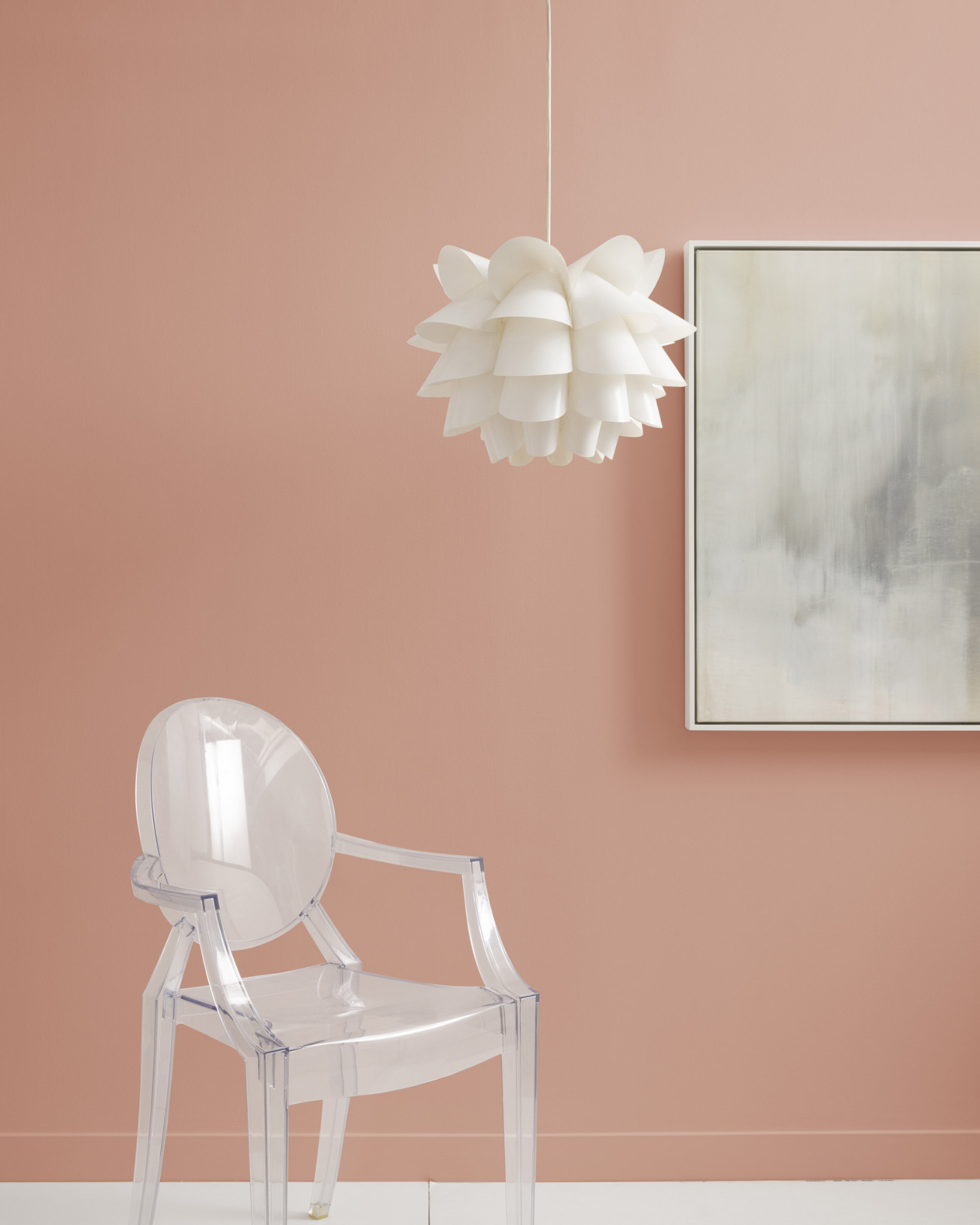
4. Benjamin Moore Pink Beach 1172
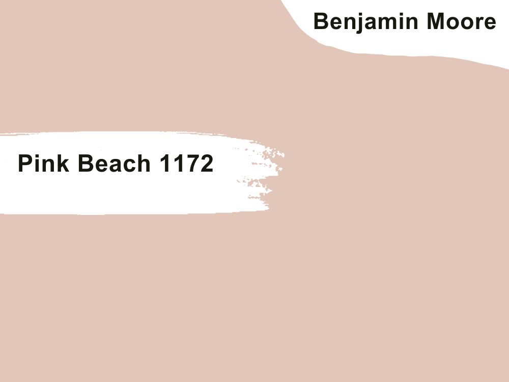
| RGB | 225 198 185 |
| LRV | 59.46 % |
| Undertone | Pink, coral, neutral |
| Matching Colors | White Opulence OC-69, Foxy Brown 1189, Nocturnal Gray 2135-30, White Dove OC-17 |
The fourth on our list of the best beach house paint colors in 2023 is the Pink Beach 1172. It easily complements neutral colors such as grays and whites or can be used to create a fascinating visual appeal by combining it with contrasting colors such as gold or green.
What matters is that you apply this soft and inviting paint color to your home in the right quantity if you mix it with other colors. It’s suitable for every space, whether the bedroom, study, or nursery. It’s comfortable, welcoming, and easily blends with your surroundings.
However, its appearance is highly dependent on the lighting type. It is enhanced by natural light, while artificial light reduces its aesthetic feel. As such, you might want to use it in spaces with natural light. In addition, be careful not to mix it with colors that don’t match, as it makes your decor look chaotic.
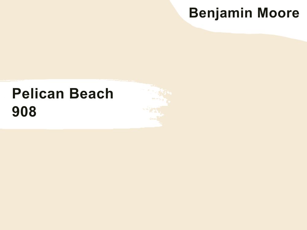
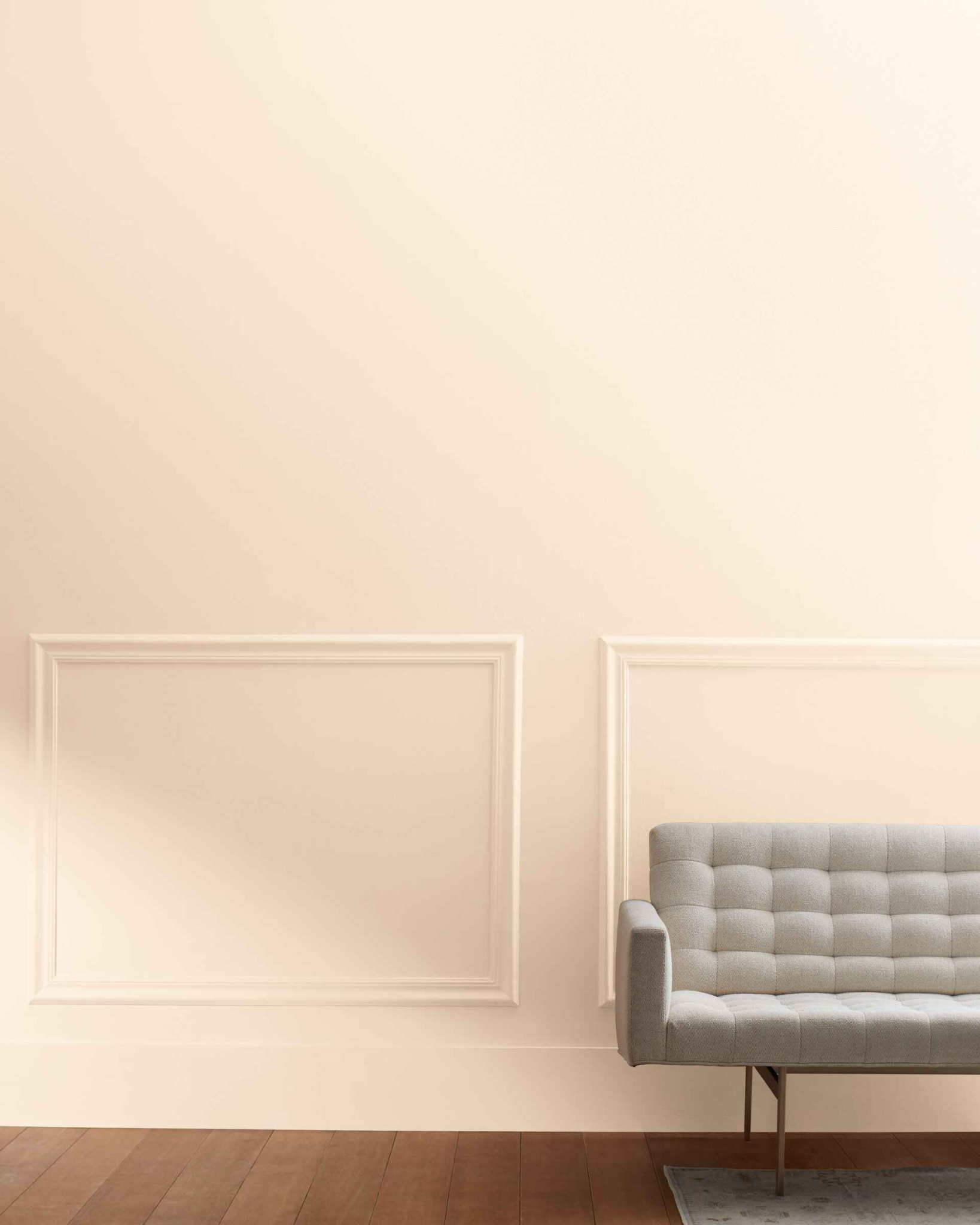
5. Benjamin Moore Pelican Beach 908
| RGB | 245 232 213 |
| LRV | 80.42 |
| Undertone | Peach, off-white |
| Matching Colors | Slate Blue 1648, Monroe Bisque HC-26, Pennies from Heaven 063, Tate Olive HC-11 |
The Pelican Beach 908 is distinct; it is in a class of its own. Therefore, it can’t be paired with other vibrant colors. The best companion for this classy color is neutral tones such as gray, white, and cream. Additionally, the Pelican Beach 908 color doesn’t fit any space due to its vibrant look.
It’s highly selective. Its vibrancy is better suited to rooms where creative activities happen, such as the entertainment areas in the home. It’s a bad choice for spaces such as the bedroom and study where calmness and serenity are the order. Finally, this color chooses the light conditions. Before you apply it on your walls, you should test it under different lighting conditions to see which fits. If none does, you might have to pick another color or change the lighting in your house.
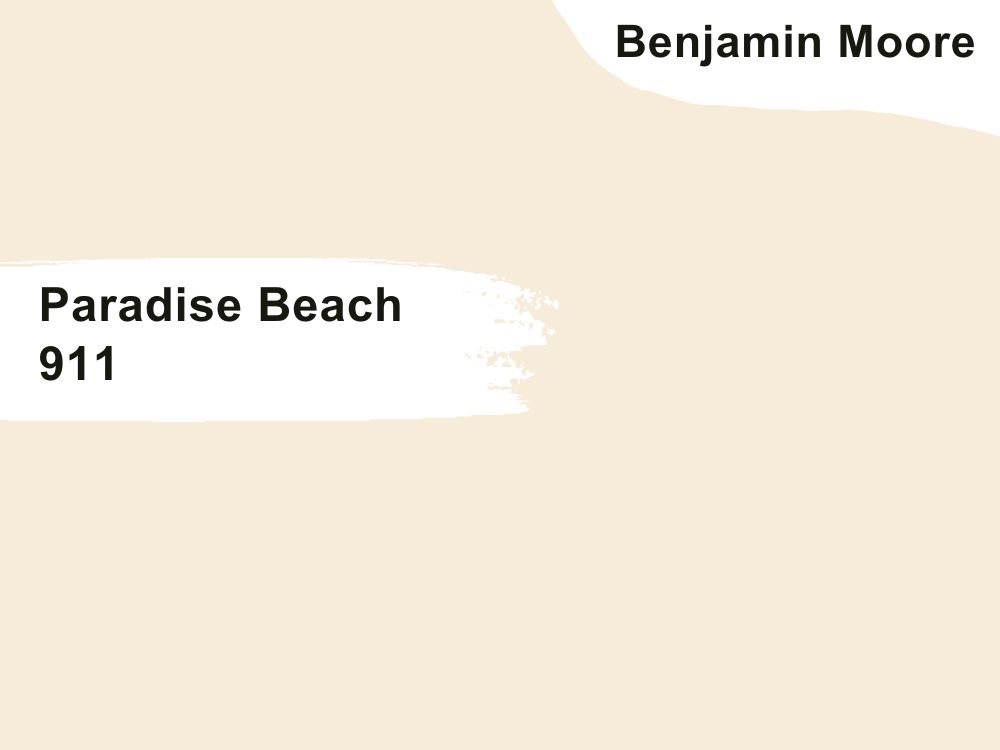
6. Benjamin Moore Paradise Beach 911
| RGB | 247 236 218 |
| LRV | 83.32 |
| Undertone | cream, off-white, sand |
| Matching Colors | Simply White OC-117, Revere Pewter HC-172, Autumn Leaf 1131, Everlasting 1038 |
Like the Pelican Beach 908, the Paradise Beach 911 color is vibrant and natural. As such, it evokes an outdoor feeling. If you love being outdoors, this color is your go-to because it will give your home that outdoor feel. Also, its outdoor feel makes it blend well with other natural colors such as white, black, red, yellow, etc. It makes your surroundings come alive, creating a tension-free and emotional environment.
Its cream and off-white undertones make it highly versatile; it can be combined with other colors aside from natural tones. Since blue naturally enhances mental alertness, it is highly suited for rooms where various creative and productive activities take place, such as your workspace, playroom, etc. In short, if you want a perfect coastal setting, the Paradise Beach 911 color is your best bet.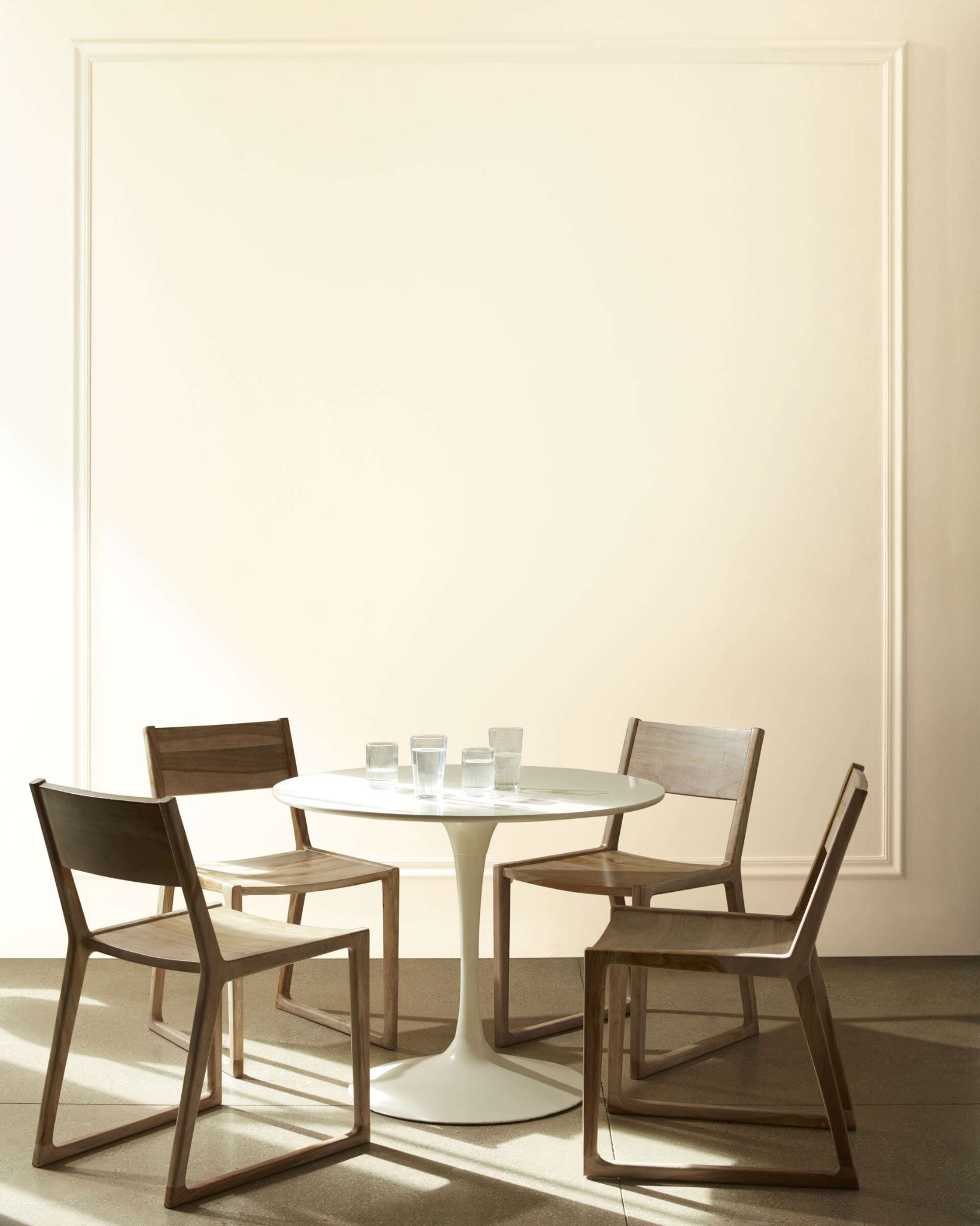
7. Benjamin Moore Myrtle Beach 061
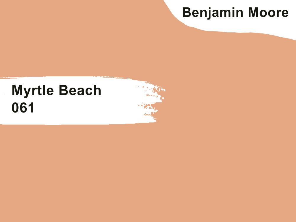
| RGB | 228 163 131 |
| LRV | 45.62% |
| Undertone | Orange, white |
| Matching Colors | Weston Flax HC-5, Snowfall White OC-118, Ocean Floor 1630, Baby’s breath 873 |
The first thing you should know about Myrtle Beach 061 is that it is a very bold color. Its green undertone makes it dominate any space it is used in, so it isn’t suitable for large spaces. It’s best for small rooms and in small quantities. Most importantly, its versatility is limited. You have to be cautious when matching it with other colors so your decor doesn’t seem riotous.
Also, its limited versatility makes it expensive to maintain because it may not readily blend with your existing decor. You might need new, complementary decors to use the Myrtle Beach 061. However, it is natural and tranquil. It gives an outdoor feel, like the lushness of greenery. Also, it is soothing and relaxing, and it has a positive impact on health and wellness.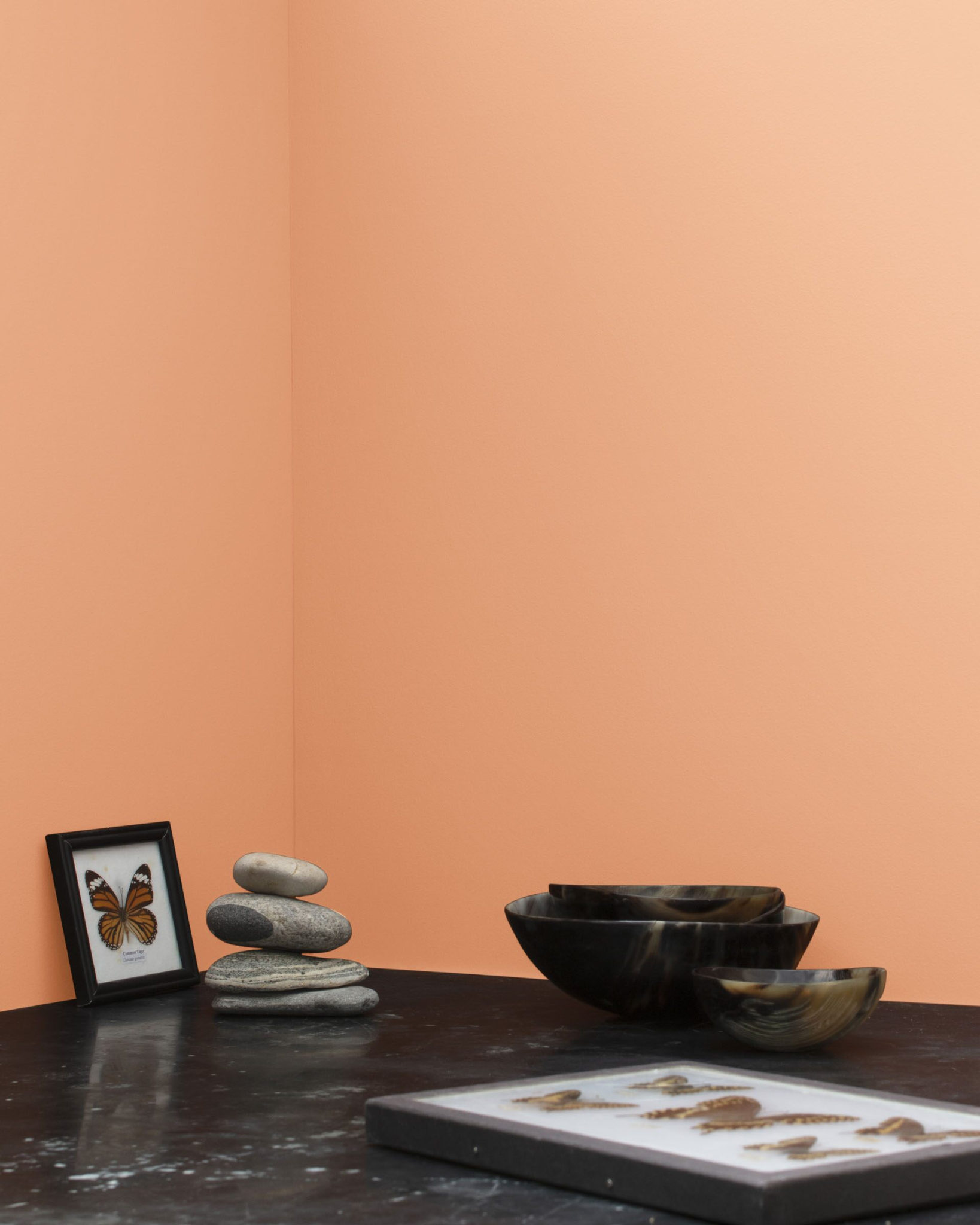
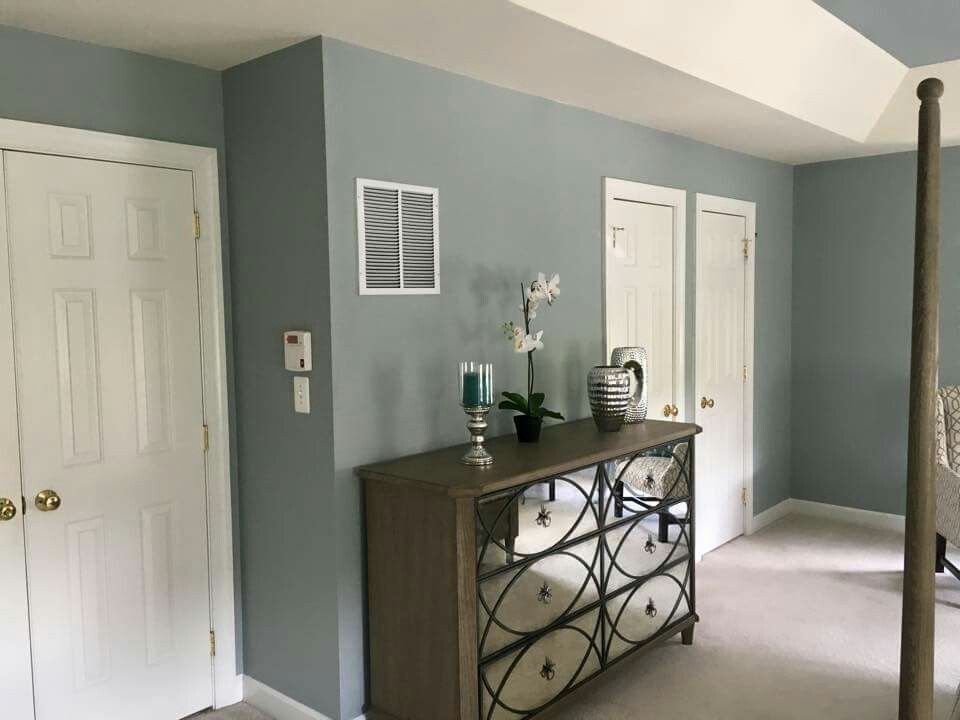
8. Benjamin Moore Beach Glass 1564
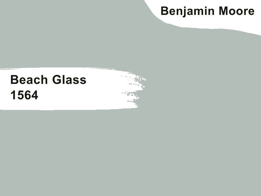
| RGB | 178 190 185 |
| LRV | 49.7 |
| Undertone | gray, blue-green |
| Matching Colors | Super White OC-152, Man on the Moon OC-106, Midnight Blue 1638, Snow White OC-66 |
Not many beach-themed colors have the exquisite feel of the Beach Glass 1564. As expected of any beach-themed color, the Beach Glass 1564 is refreshing and calm. It can be easily incorporated into any decor or color scheme without losing its uniqueness.
Its soft undertones make it pair well with both neutral and bold colors. You can make it reflect the beauty of other colors or complement them. Another reason you should go for the Beach Glass 1564 is that it is timeless. There’s no fear of it going out of style. Instead, it sets the trend any time, any day!
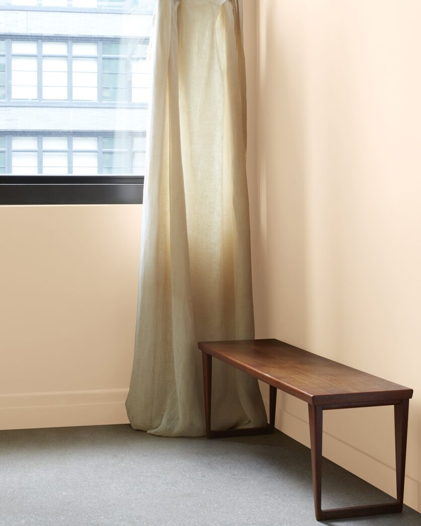
9. Benjamin Moore Painted Sands 1142
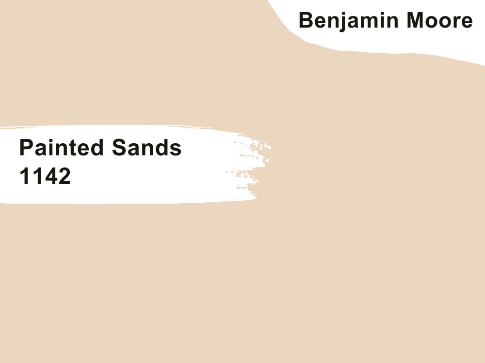
| RGB | 235 213 190 |
| LRV | 69.45% |
| Undertone | Brown, red, orange |
| Matching Colors | White Opulence OC-69, Chantilly Lace OC-65, Nature’s Symphony 1162, Ashwood OC-47 |
Warm colors are always welcoming and inviting, and the Painted Sands 1142 is no different. It’s a great option for social places in the home, such as the sitting room or guest room. Besides its social feel, it is versatile. Its earthy tone makes it blend well with both organic and inorganic colors. This color can be creatively combined with various designs and styles to create a unique look. It never goes out of date, so you can rest assured that your decor will always be in style.
10. Benjamin Moore Ocean Beach 958
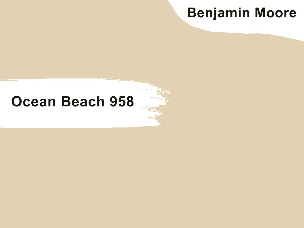
| RGB | 227 207 178 |
| LRV | 63.42% |
| Undertone | pink, beige |
| Matching Colors | Indian River 985, White Heron OC-57, Cloud White 967, Wythe Blue HC-143 |
The Ocean Beach 958 color is best for making a statement. It is bold and deep, with unique beach vibes. Asides from applying it on your walls, you can use this beach-themed color for your furniture, accent pieces, personal elements, and other decorative items.
It suits any space – bedrooms, bathrooms, cabinets, workspaces, sitting rooms, kitchens, etc. However, remember to pair this color with neutral tones like beige and white to create a balanced, coastal look.
11. Sherwin Williams Surfer SW 6946
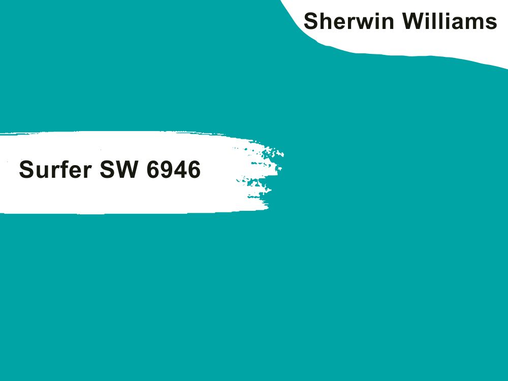
| RGB | 1 164 165 |
| LRV | 29 |
| Undertone | green, white |
| Matching Colors | Pewter Tankard SW 0023, Mature Grape SW 6286 |
Surfer SW 6946 color is bold and saturated. Its green undertone makes it perfect for people who want to illuminate their spaces with a unique vibrancy. It blends perfectly with deep green, lemon, off-white, and white hues.
However, it is important that you find the right balance when pairing it with other colors. You can test it by applying it to a small area on the wall to see how it looks. In short, if you want your home to come alive, you can opt for this illuminating color. It is available both in interior and exterior paint.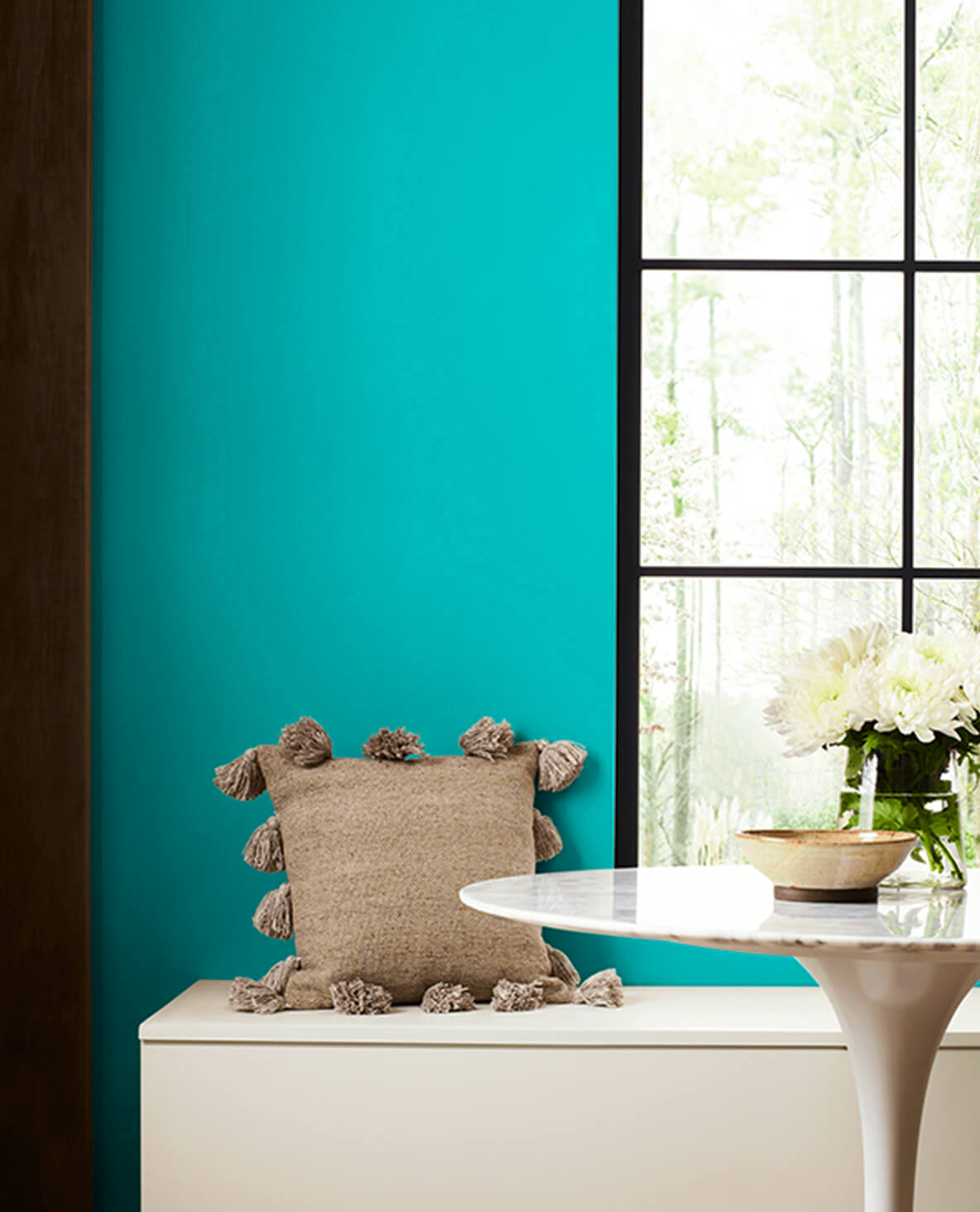
12. Sherwin Williams Carmel SW 2921
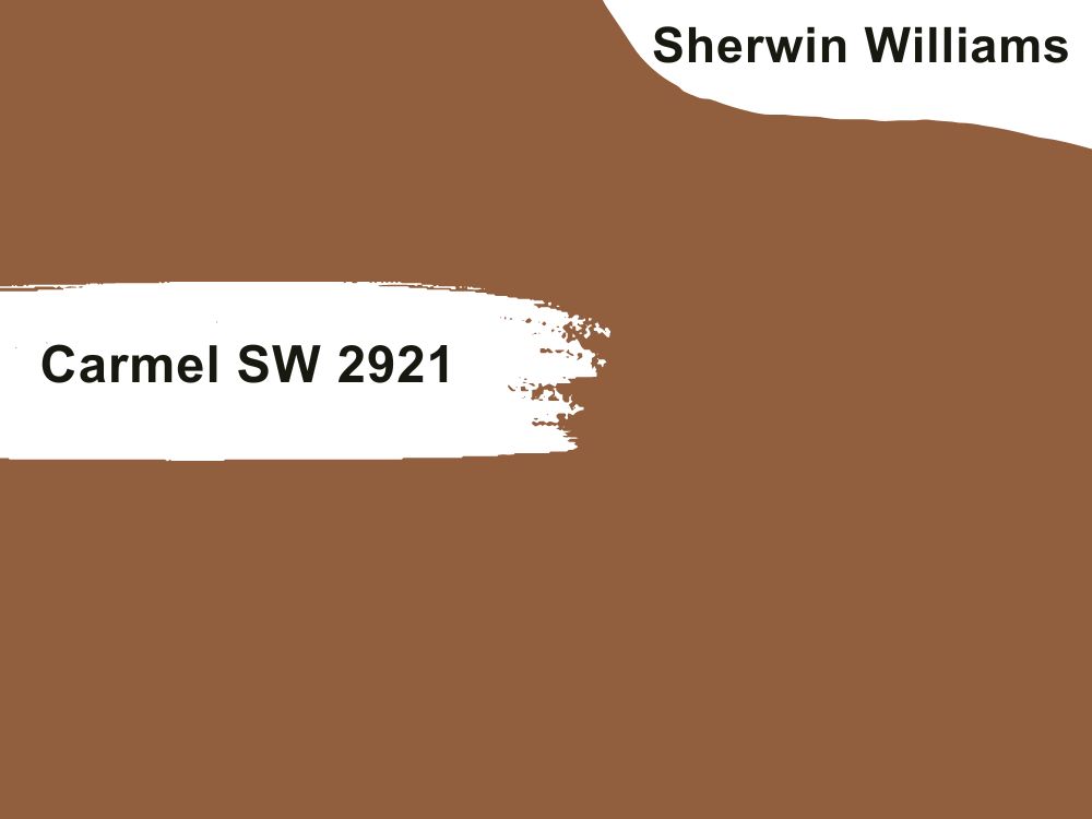
| RGB | 145 95 61 |
| LRV | 14.09 % |
| Undertone | brown, beige, khaki |
| Matching Colors | Steamed Milk SW 7554, Foxhall Green SW 9184 |
Desert-inspired colors are timeless yet trendy, and the Carmel SW 2921 is no different. Its earthy tone makes it flexible and natural, so it works well with neutral colors such as cream and beige, cool colors such as sky blue, coral, pink, green, and warm tones such as deep brown and orange. Moreover, this fascinating color is warm and welcoming and can be used in relaxation areas. Its natural feel also makes it befitting for urban spaces where the touch of an outdoor feel is needed.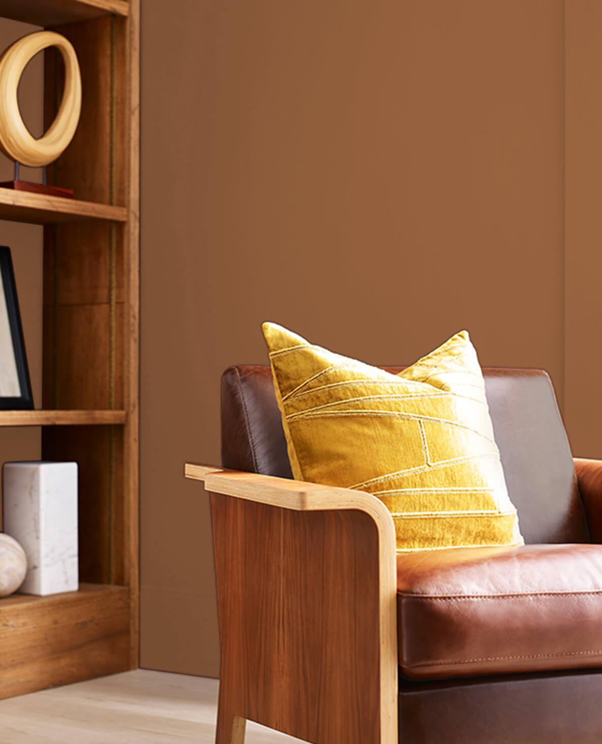
13. Sherwin Williams Citrus SW 6906
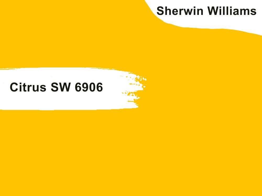
| RGB | 255 196 1 |
| LRV | 61% |
| Undertone | pale yellow, cream, white |
| Matching Colors | High Tea SW 6159, Stone Lion SW 7507 |
Elegant, inviting, and timeless, the Citrus SW 6906 color never goes out of style. This classy yellow color works well for creating beach-themed decor. It looks great in natural light, making it easier to maintain. Asides its aesthetic appeal, it has a pleasing psychological effect. Using it as your home’s color can evoke memories of the time and fun you had at the beach with your loved ones. It serves as a great reminder of the beach and an escape from the hustle and bustle of everyday life.
It works well with other coastal colors and decor, perfectly harmonizing with its environment. However, don’t use this color in a small room. The Citrus SW 6906 needs plenty of natural light to create an elegant look, which a small room can’t provide. Also, it’s essential you create a balanced look with it.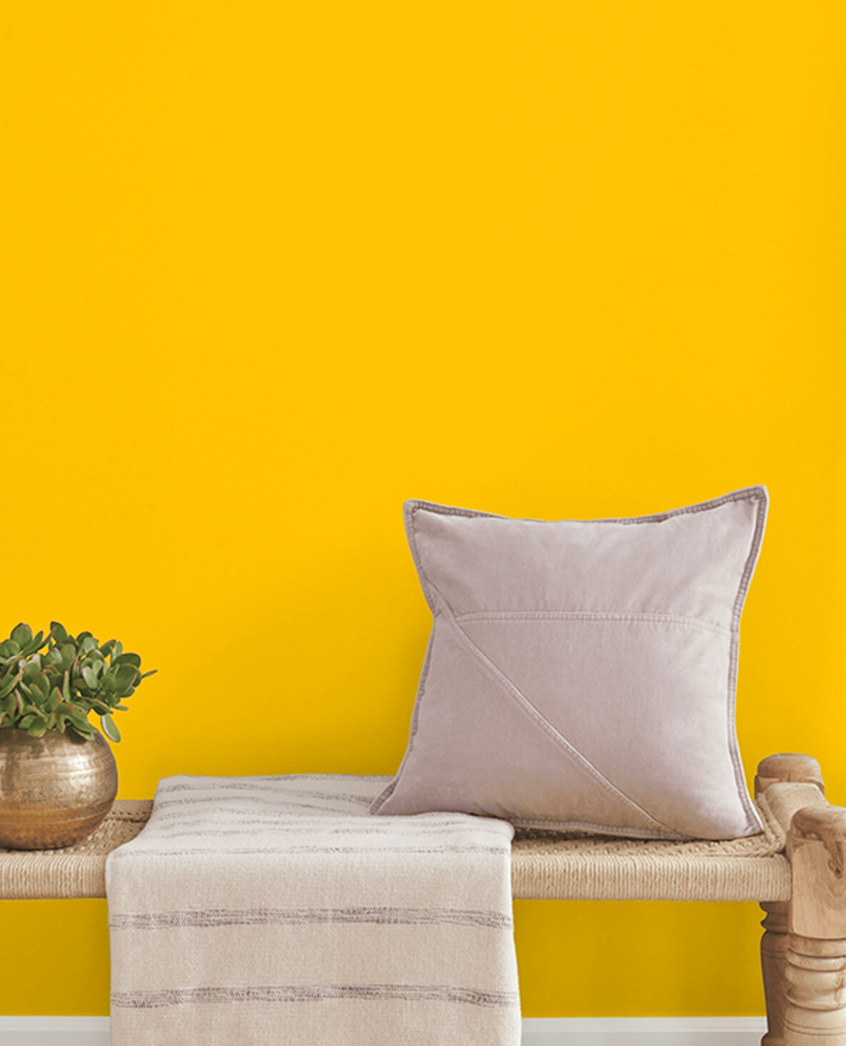
14. Sherwin Williams Nasturtium SW 6899
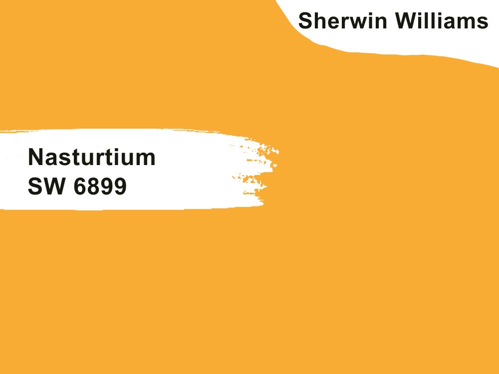
| RGB | 249 172 52 |
| LRV | 50% |
| Undertone | Red, green, blue, brown |
| Matching Colors | Barcelona Bridge SW 7530, Mountain Road SW 7743 |
The Nasturtium SW 6899 is a soft color that works well with earth tones such as burnt orange, blue hues such as teal or sky blue, metallic colors such as bronze, warm accents such as orange and cream, neutrals such as light gray and beige and whites.
However, when combining the Nasturtium SW 6899 color with others, ensure the design is moderate. Using too many colors with it can make it look cluttered, which defeats the purpose of using the color in the first place. It’s advisable you experiment with your preferred color combinations in small areas before making a final decision. Also, you can try out contrasting colors to create a captivating look.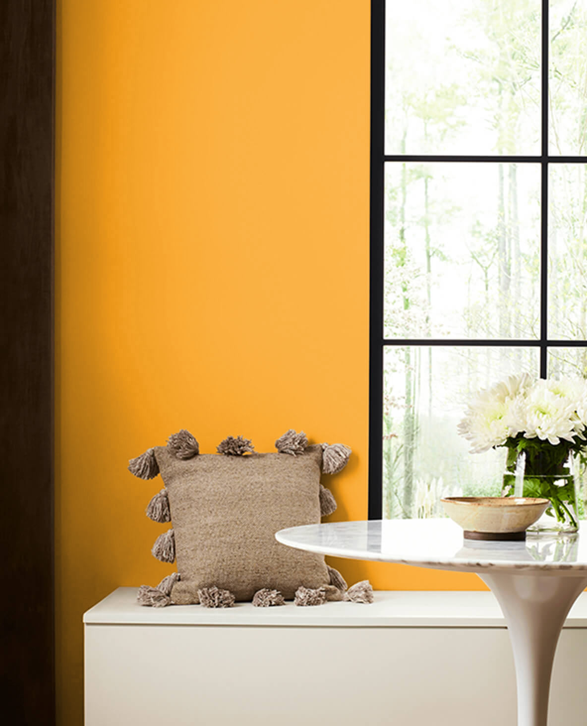
15. Sherwin Williams Blue Beyond SW 6961
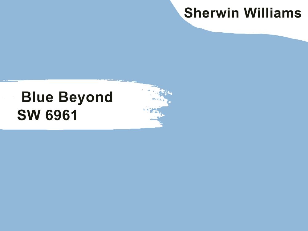
| RGB | 145 184 217 |
| LRV | 45 |
| Undertone | Green, gray |
| Matching Colors | Bosporus SW 6503, Dill SW 6438 |
There are quite several ways to rock this beach-inspired color in your home. First, you can apply this paint color on one of the walls to make a bold statement, preferably in your sitting room or dining area. Also, you can pair it with brown or neutral colors to create a coastal-inspired decor. However, it is more beautiful when it is the main color in the decor.
Asides from applying it on walls, you can use it on your furniture, statement pieces, decorative items, etc. This creates a more heightened visual appeal in your home. Finally, you can apply it on your bathroom walls to create a refreshing look and serve as the perfect backdrop for romantic and peaceful nights in your bathtubs.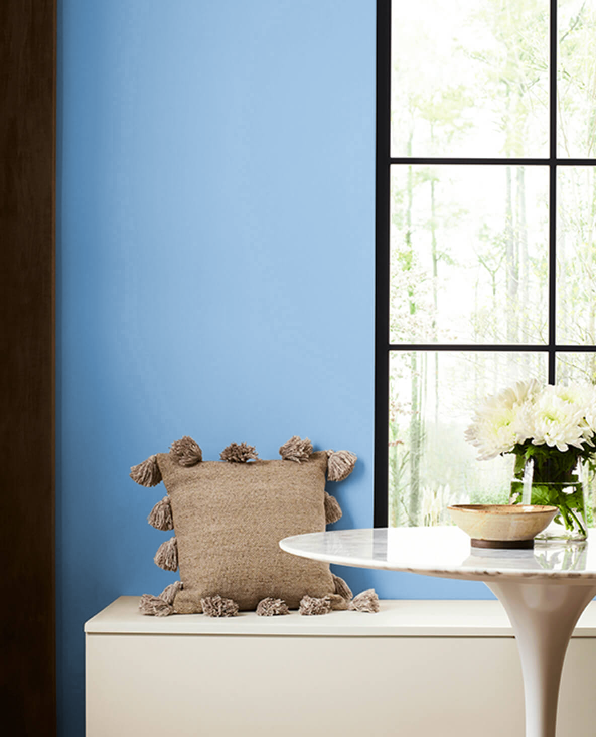
16. Sherwin Williams Mandarin SW 6891
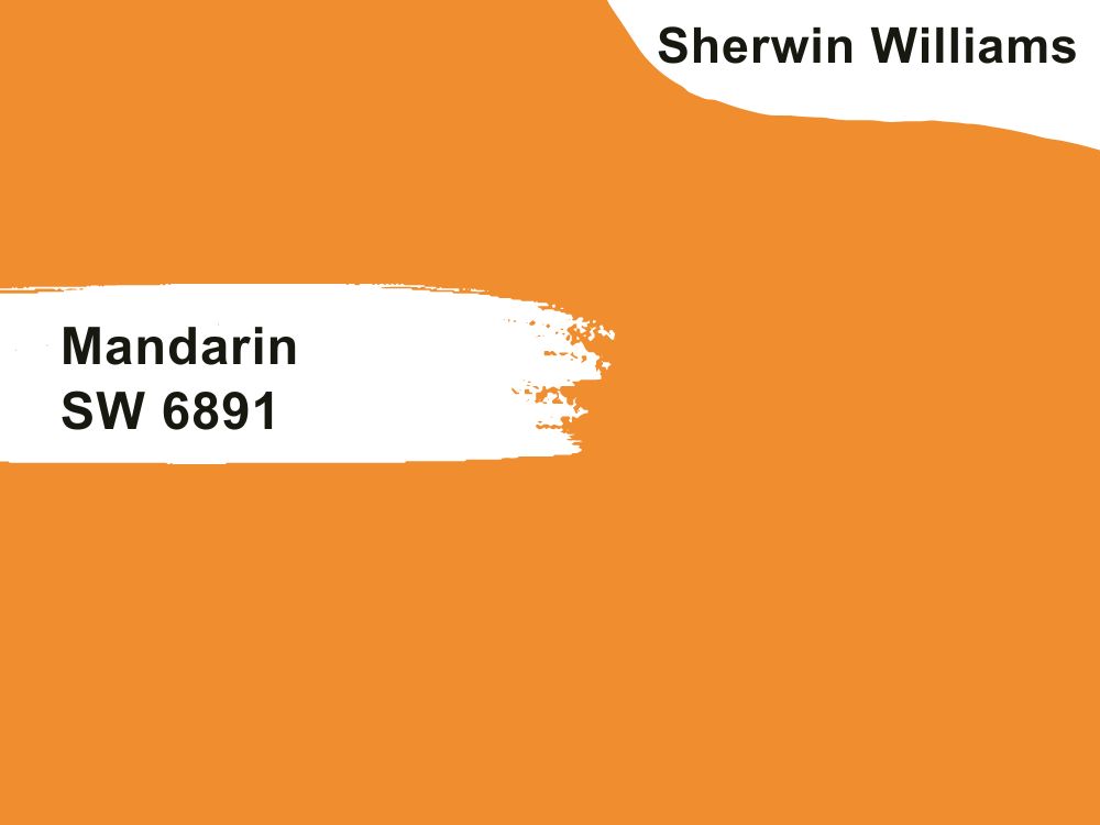
| RGB | 240 141 46 |
| LRV | 38 % |
| Undertone | off-white, orange, peach |
| Matching Colors | Natural Choice SW 7011, Mega Greige SW 7031 |
This light-colored hue serves as an excellent complement to many accent colors. It’s a perfect option for those looking to enhance the accent color pieces in their home appealingly. Moreover, the Mandarin SW 6891 undertones make any space feel more spacious, especially under natural lighting conditions.
This exquisite color can be used in the bedroom to create a serene atmosphere for easy relaxation, in the workspace to inspire productivity and calmness, in the dining room to replicate the feeling of having dinner by the beach, or in the bathroom to establish a coastal feel. In short, the Mandarin SW 6891 is perfect for any space!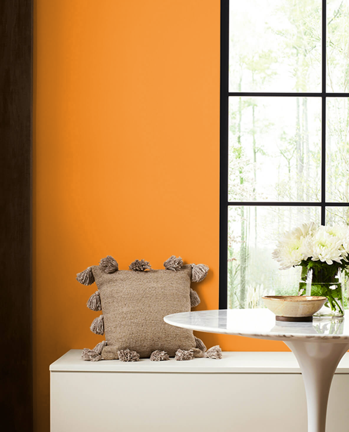
17. Sherwin Williams Sundance SW 6897
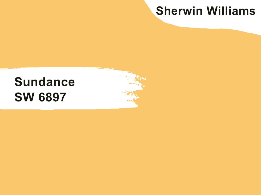
| RGB | 250 199 108 |
| LRV | 62 % |
| Undertone | Golden yellow, |
| Matching Colors | Lanyard SW 7680, Concord Buff SW 7684 |
As the name implies, the warm sand CSP-280 is warm and welcoming. It brings out the beauty of any space it is used in. You can use this color on various spaces in your home. It blends well with the color of the utensils and appliances in the kitchen. It establishes a peaceful atmosphere that enhances sleep if used in the bedroom.
Due to its warm undertones, it has a natural look that reminds you of the outdoors and evokes cheerfulness. The Sundance SW 6897 is always in season, no matter the decor trend.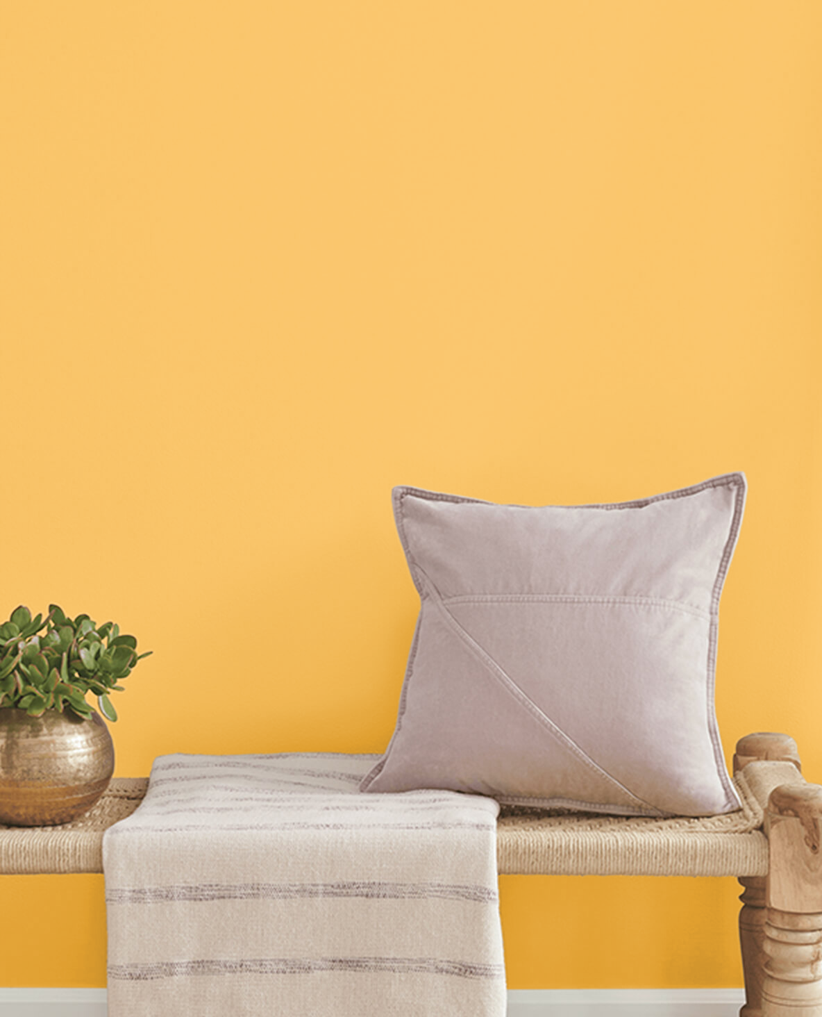
Conclusion
From the versatile Stone House 1039 to the bold Ocean Beach 958 to the timeless Sundance SW 6897, various beach house paint colors exist. No matter your preference, there’s one for you. You can create your coastal-inspired decors with any of the colors mentioned above. However, you need to strike a balance in your combinations. Beach house colors are tranquil, and you want to maintain this quality in all your creations. If you are still unsure about which color to go for, you can test the colors on a small part of an interior wall to make an informed decision.
 10 Best Sherwin Williams White Paint Colors (Trend 2023)
 10 Best Sherwin Williams Farmhouse Paint Colors (Trend 2023)
 17 Best Sherwin Williams Teal Paint Colors (Trend 2023)
 25 Best Blue Gray Paint Colors for Your Home Interiors
 21 Best Cream Paint Colors for 2023
 21 Best Wall Colors That Go With A Cream Kitchen (Cabinets & Trims)
