
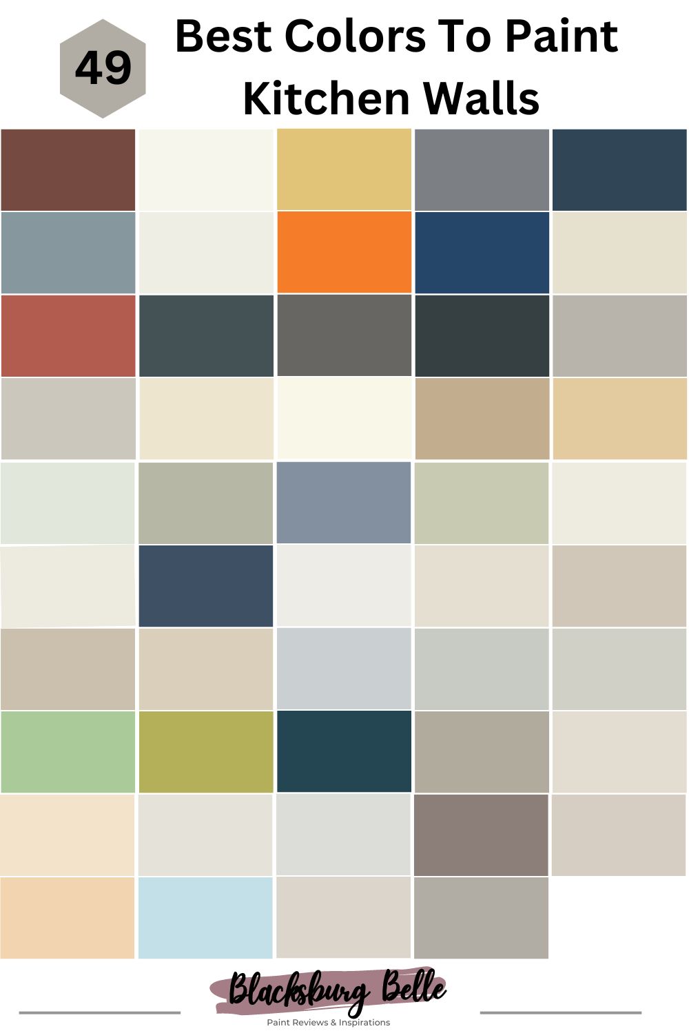
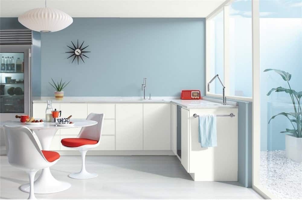
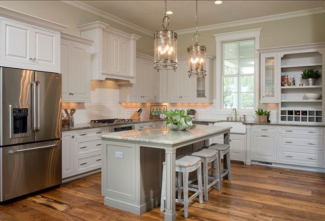
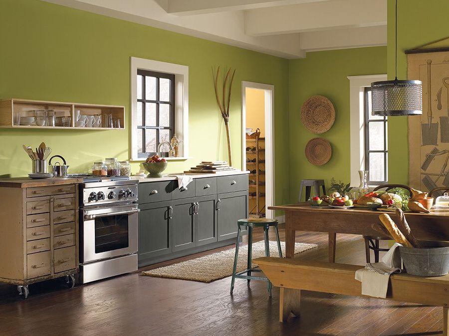
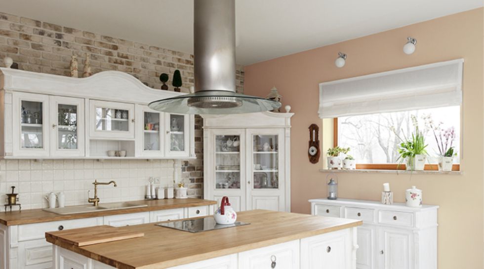
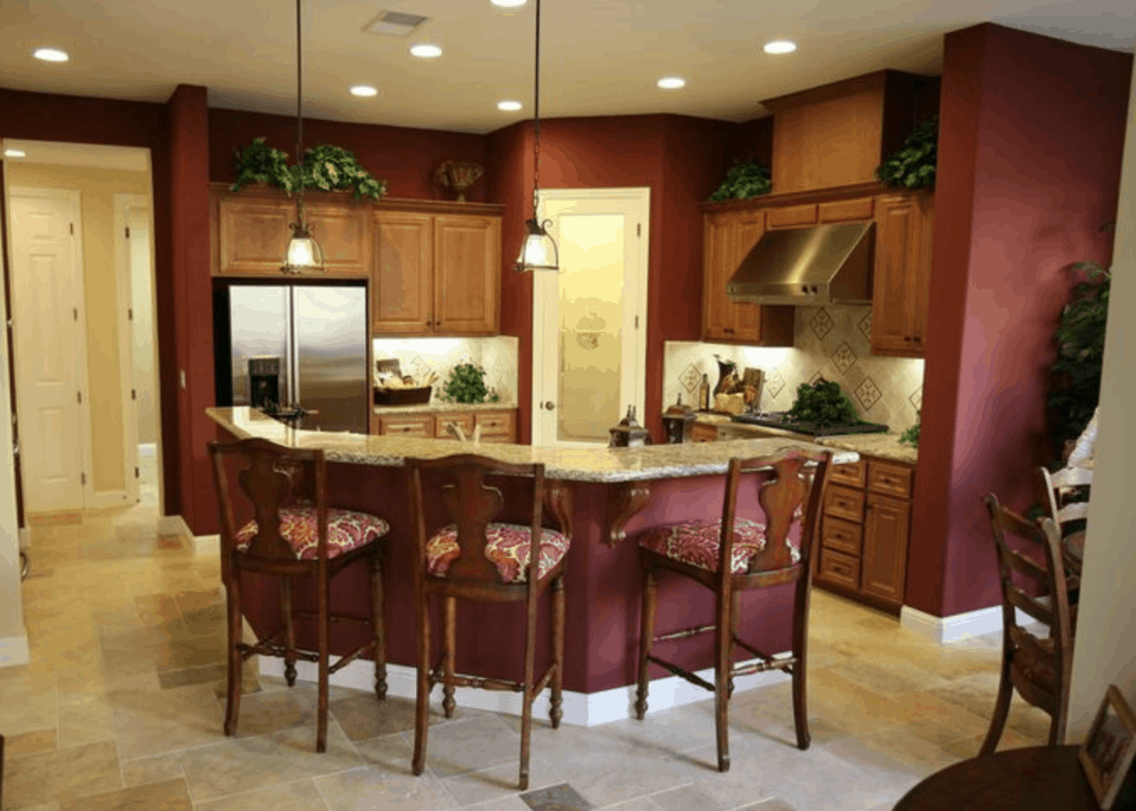
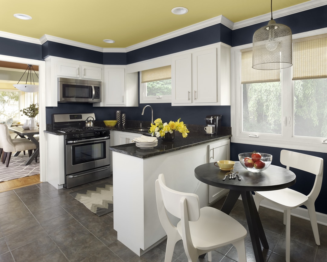
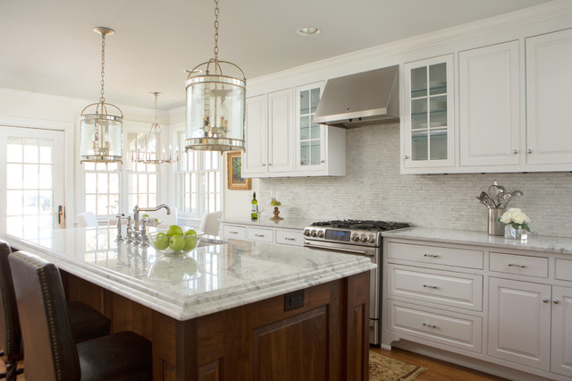
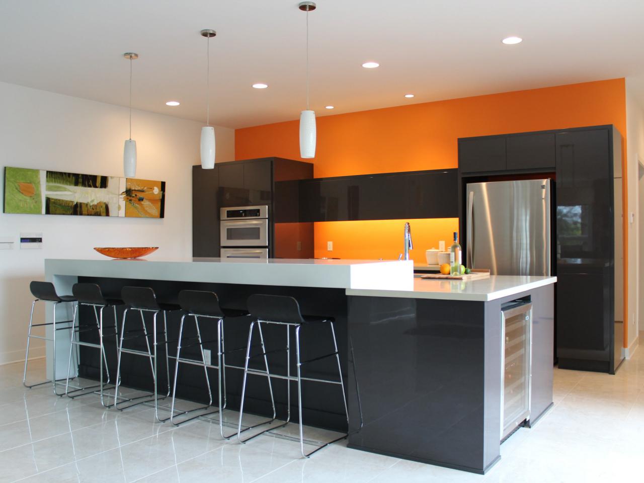
Adding color to your kitchen is the best way to make it look polished without having to break the bank.
The kitchen is undoubtedly one of the busiest rooms in the home. When it comes to prepping and cooking food, unpacking the shopping, and washing up dishes, the kitchen is where you’ll do it.
As a central core, the kitchen gets a lot of traffic, so it’s vital to select a paint that’ll stand up well to cooking fumes, finger marks, and all the shebang that comes with handling the kitchen.
In this article, we will aim at dishing out the best paints you could use for your kitchen walls, that can stand well to not only the above-mentioned but also portray your kitchen as the heart of the home beautifully.
Table of Contents
Best Benjamin Moore Paints For Your Kitchen Walls
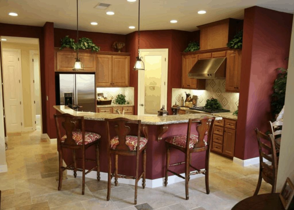
1. Benjamin Moore Peat Moss 2103-30
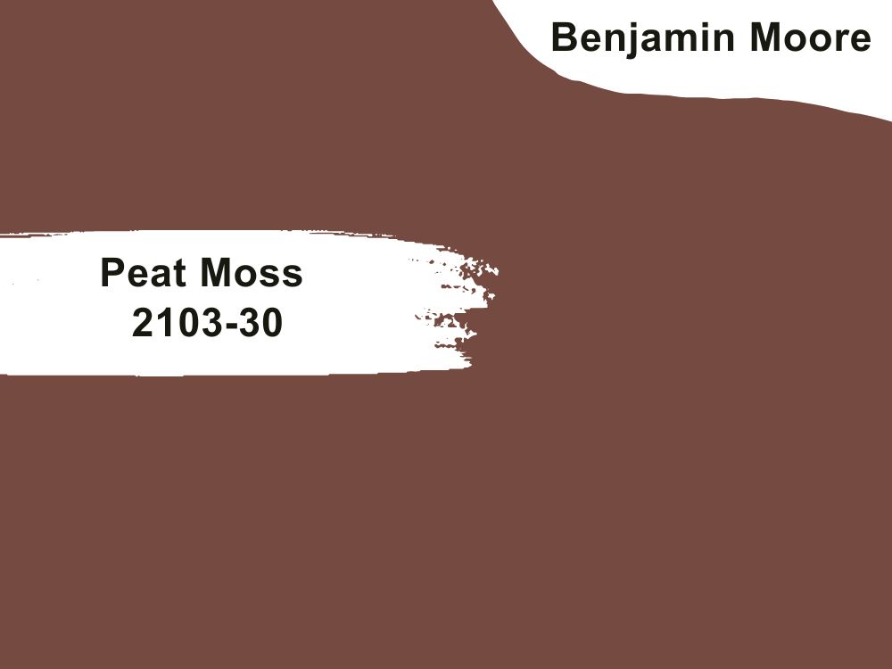
| RGB | 115 73 65 |
| LRV | 10.75 |
| Matching colors | White dove, sonnet, Gobi desert |
| Undertones | Brown, purple |
This reddish-brown color is absolutely mesmerizing and captures the essence of nature in its entirety. Its unique blend of hues evokes a sense of timelessness and sophistication. With undertones of both brown and purple, it exudes a richness that is truly captivating. Moreover, this neutral shade has the ability to assert itself and make a space its own. When applied to kitchen cabinets and furniture, it imparts a charming vintage charm reminiscent of beautifully painted antiques.
2. Benjamin Moore Simply White Oc-117
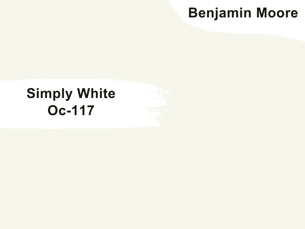
| RGB | 247 244 235 |
| LRV | 89.52 |
| Matching colors | Somerville red , silver satin, Casco bay |
| Undertones | Yellow |
Simply White by Benjamin Moore has proven itself over and over again to be an ageless and highly compatible color that can create a clean, crisp, and airy look in your kitchen, making the kitchen space feel and look bigger. For people who want a white kitchen, this color is versatile enough to fit into any design or style of house ranging from modern to traditional. Its flexibility also allows it to be paired with a variety of different colors.
3. Benjamin Moore Marblehead Gold Hc-11
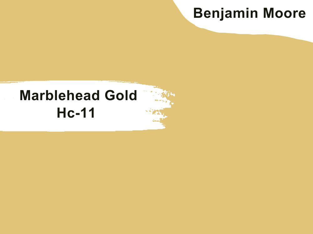
| RGB | 228 189 120 |
| LRV | 55.07 |
| Matching colors | Snowfall white, charcoal slate, powder sand |
| Undertones | Green |
Benjamin Moore’s Marblehead Gold is a rich yellow-gold mixture of hue with hints of green. This deep shade of color is a classy yet cheerful color. When applied to your kitchen walls, it tends to give your kitchen the appearance of a very lively and welcoming space. This color also matches well with snowfall white, charcoal slate, and powder sand.
4. Benjamin Moore Charcoal Linen 2133-40
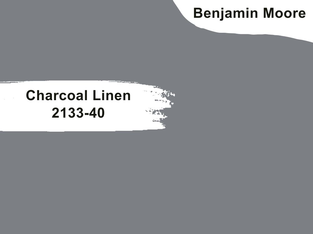
| RGB | 124 127 132 |
| LRV | 21.95 |
| Matching colors | Decorator’s white, Portland gray, white heron |
| Undertones | Indigo, blue |
Charcoal Linen is a dark handsome shade of gray that is edgy enough to showcase the kitchen as being too classic and elegant. It pairs well with almost every color because of its flexible characteristics. The indigo and sometimes blue undertones become visible depending on the nature of exposure to light. It blends flawlessly with colors like the decorator’s white and white heron.
5. Benjamin Moore Gentleman’s Gray 2062-20
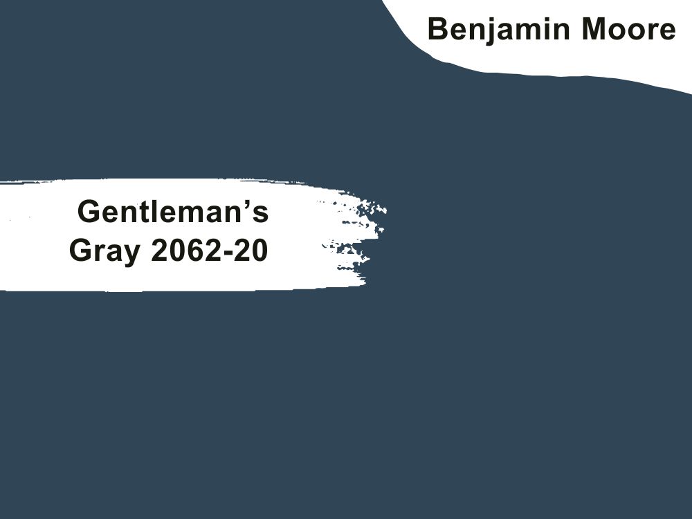
| RGB | 45 72 85 |
| LRV | 7.26 |
| Matching colors | Chalk white, stormy Monday, gardenia |
| Undertones | Green |
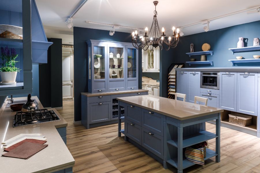
Blue is now the new neutral!!! And Benjamin Moore’s gentleman’s gray is a shade of color you can never go wrong with. This teal blue is one of the most loved dark blue colors of all time. It strikes a very captivating balance between richness and restraint. When used on your kitchen walls, this paint releases a smooth combination of utmost luxury and absolute radiance.
6. Benjamin Moore Water’s Edge 1635
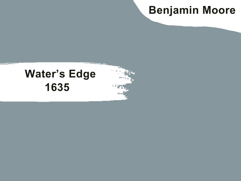
| RGB | 135 154 157 |
| LRV | 31.48 |
| Matching colors | Dove wing, simply white, antique jade |
| Undertones | teal |
This is one of the oldest shades of blue you will find anywhere that still fits into our contemporary kitchens effortlessly. This shade of paint is ideal for people who want their kitchen to look bright but not have eye-blinding brightness. One major characteristic of this paint color is that it is versatile enough to blend with different colors without giving you an unpleasant view, and also flexible enough to be used in traditional-themed kitchens and not just contemporary-themed kitchens.
7. Benjamin Moore White Dove Oc-17
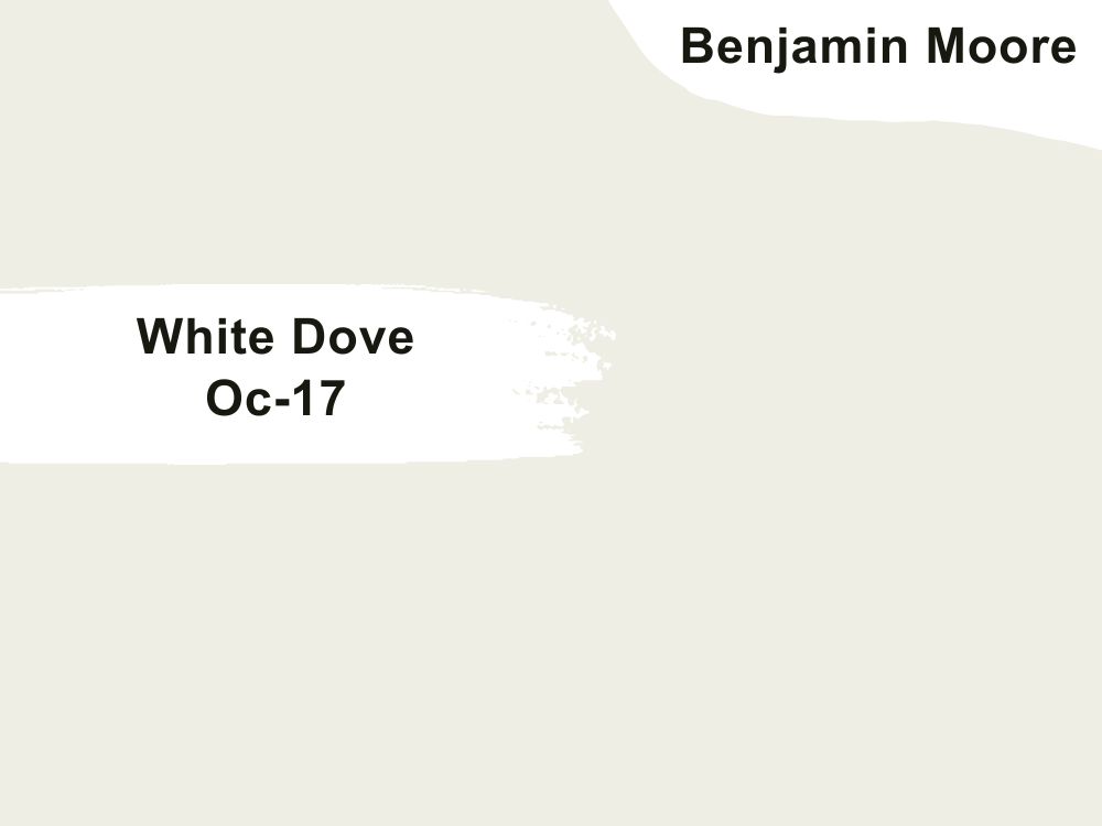
| RGB | 240 237 228 |
| LRV | 85 |
| Matching colors | Kendall charcoal, balboa mist, country redwood |
| Undertones | Creamy yellow, gray |
If you want a white-themed kitchen, this is the color for you. White dove has no competition when it comes to white kitchens and there is no bragging about this. The white dove has proven to be everything entertaining, welcoming, intriguing, and pleasant. This color finds a way to be unapologetically soft and warm, giving out a tiny bit of the off-white feeling. It works beautifully in both traditional and contemporary spaces, and the color reads so well with both warm and cool tones finishes.

8. Benjamin Moore Orange Burst 2015-20
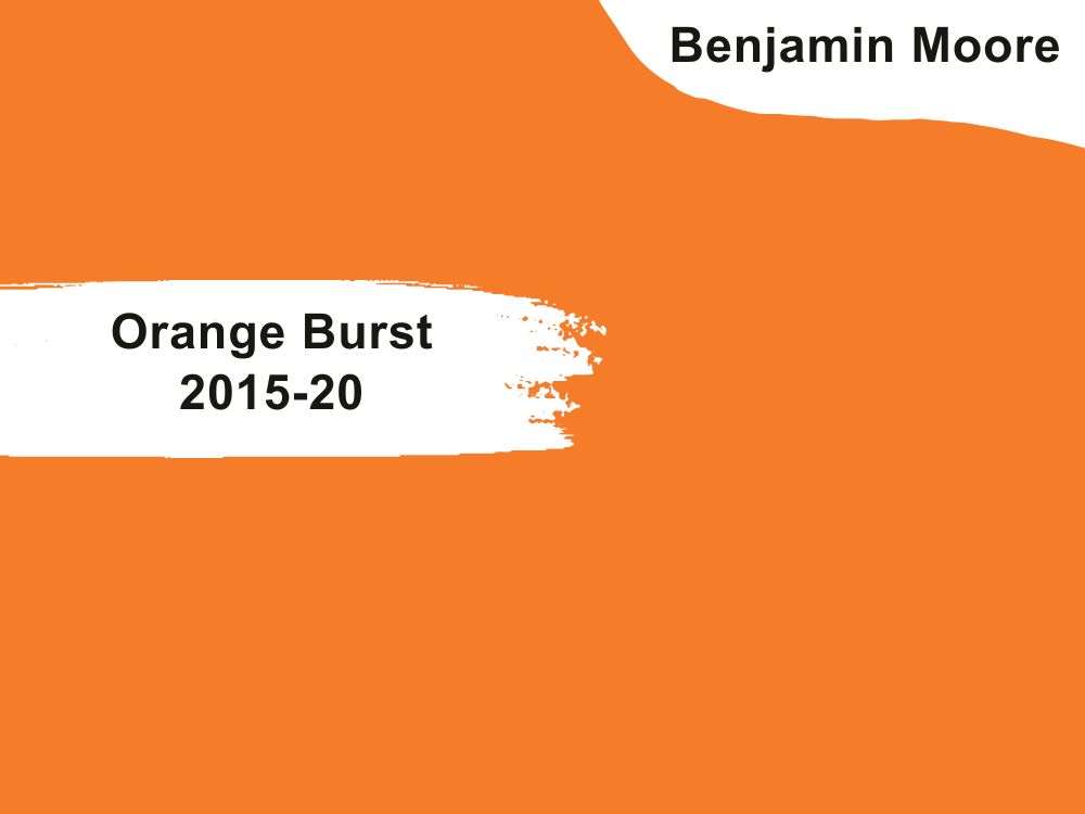
| RGB | 242 118 40 |
| LRV | 31.86 |
| Matching colors | Cancun sand, black raspberry, ancient ivory |
| Undertones | Red |
Orange is a bold move and also a bold move for a kitchen, especially a whole wall of cabinetry. This richly saturated color is however, one that will leave you hinged on addiction with just the swipe of the brush. This paint color is the ultimate dose of a high spirit; it can energize any space, as well as be an instant mood lighter. When this paint is applied on your kitchen walls; it sweeps out boredom, bringing in a lively sensation that comes with happiness.

9. Benjamin Moore Downpour Blue 2063-20
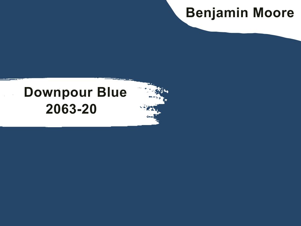
| RGB | 29 75 103 |
| LRV | 7.48 |
| Matching colors | Abyss, snowfall white, old prairie |
| Undertones | Gray |
There is no lie about the fact that navy blues are taking over the paint market. Not to say the least, downpour blue is one of the colors that stand out as one of the best paint colors for kitchen walls. This is a handsome shade of navy blue with a striking balance between rich and muted undertones. This mixture provides a deep glossy blue to add polish and pop not forgetting to still maintain its classy and classic feeling. It is best paired with colors like the abyss, snowfall, and old prairie.
10. Benjamin Moore Feather Down 953
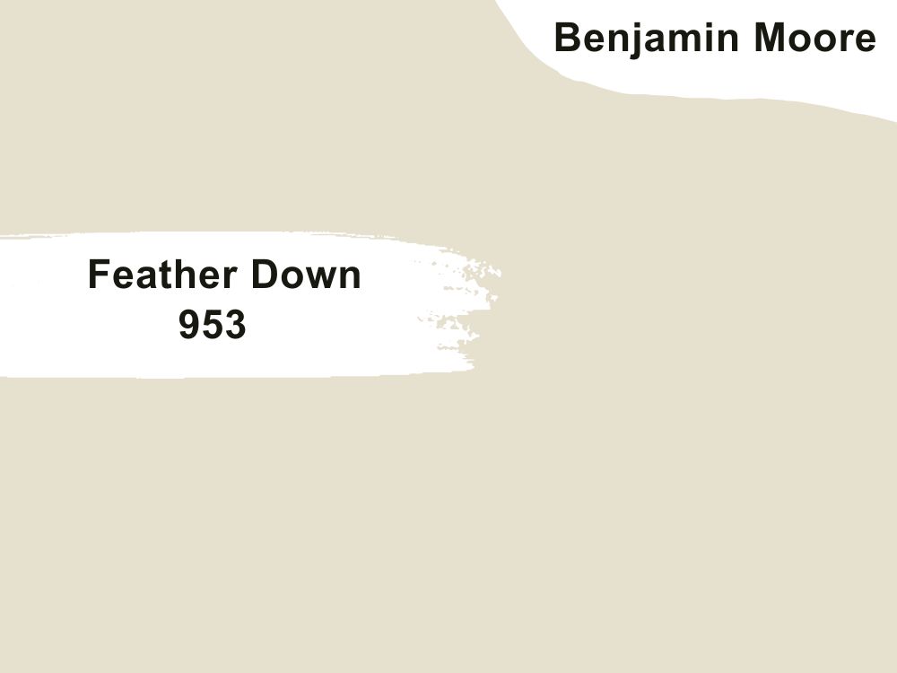
| RGB | 231 222 206 |
| LRV | 73.16 |
| Matching colors | Cloud white, smoke, Chantilly lace |
| Undertones | Green |
The shade releases a perfect warm neutral paint color for kitchen walls to equalize clean white cabinetry. For people looking for a creamy and extremely soft neutral paint, this is the paint for you.
Feather Down is one of those paints that have its ways of tricking spaces to give it an airy and spacious feeling. Also, this color contains just enough gray and brown to make it perfectly compatible with both warmer and cooler tones.
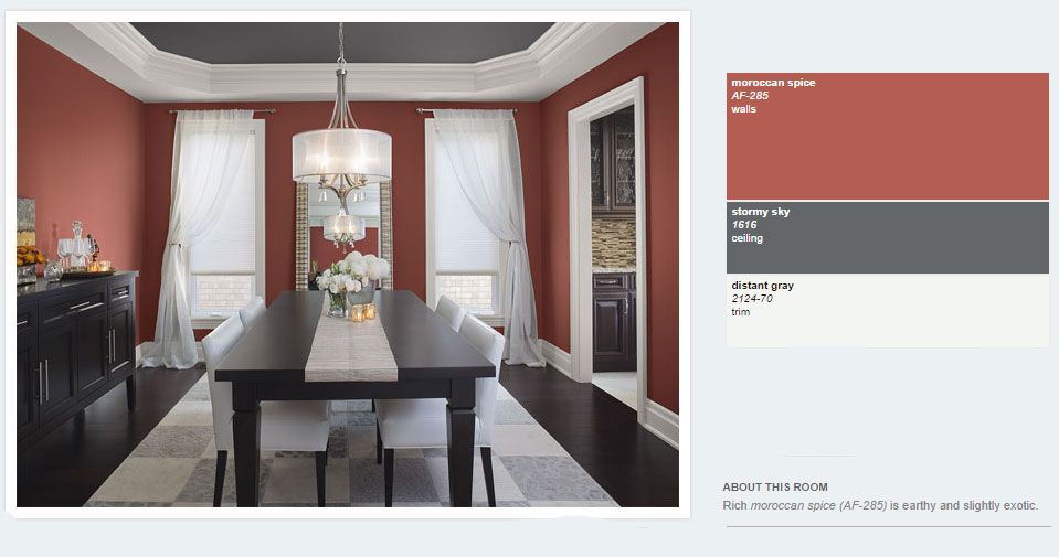
11. Benjamin Moore Moroccan Spice Af-285
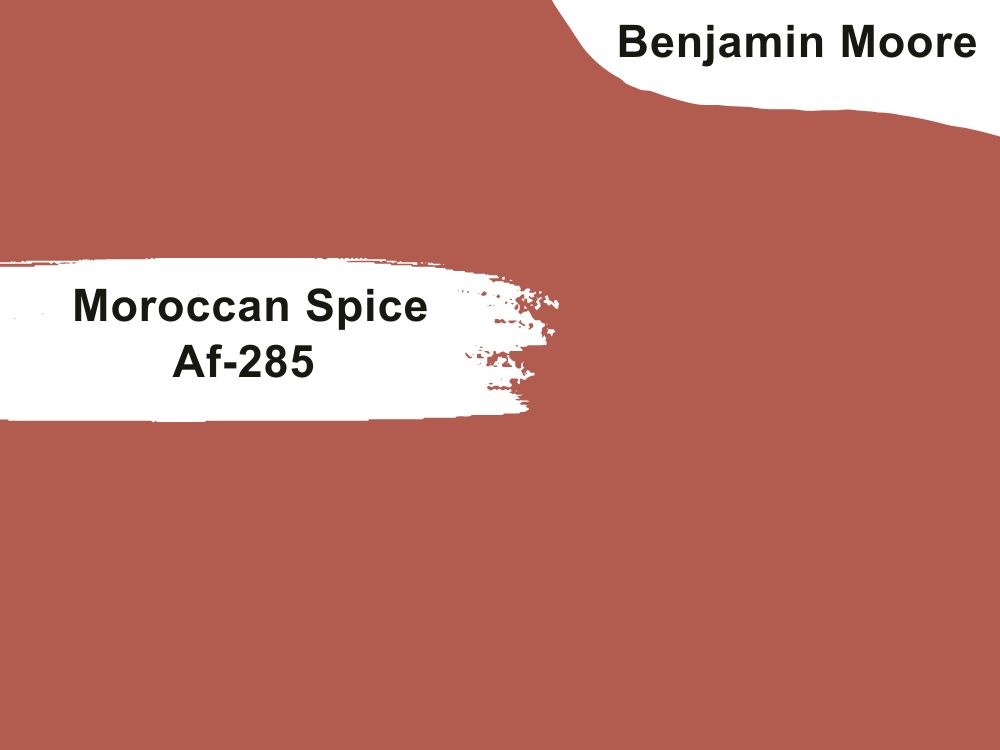
| RGB | 174 92 80 |
| LRV | 18.48 |
| Matching colors | Vapor, harmony, Swiss coffee |
| Undertones | Pink |
Red always comes with all the drama and spice, and this gripping shade of red with muted pink undertones is not an exception. Its earthy red never stops being appetizing. A kitchen painted with Moroccan Spices creates a dramatic focus in the kitchen and makes sure there is not even an ounce of boredom or gloom in the hidden corner. This color pairs well with vapor, harmony, and Swiss coffee.
12. Benjamin Moore Navy Masterpiece 1652
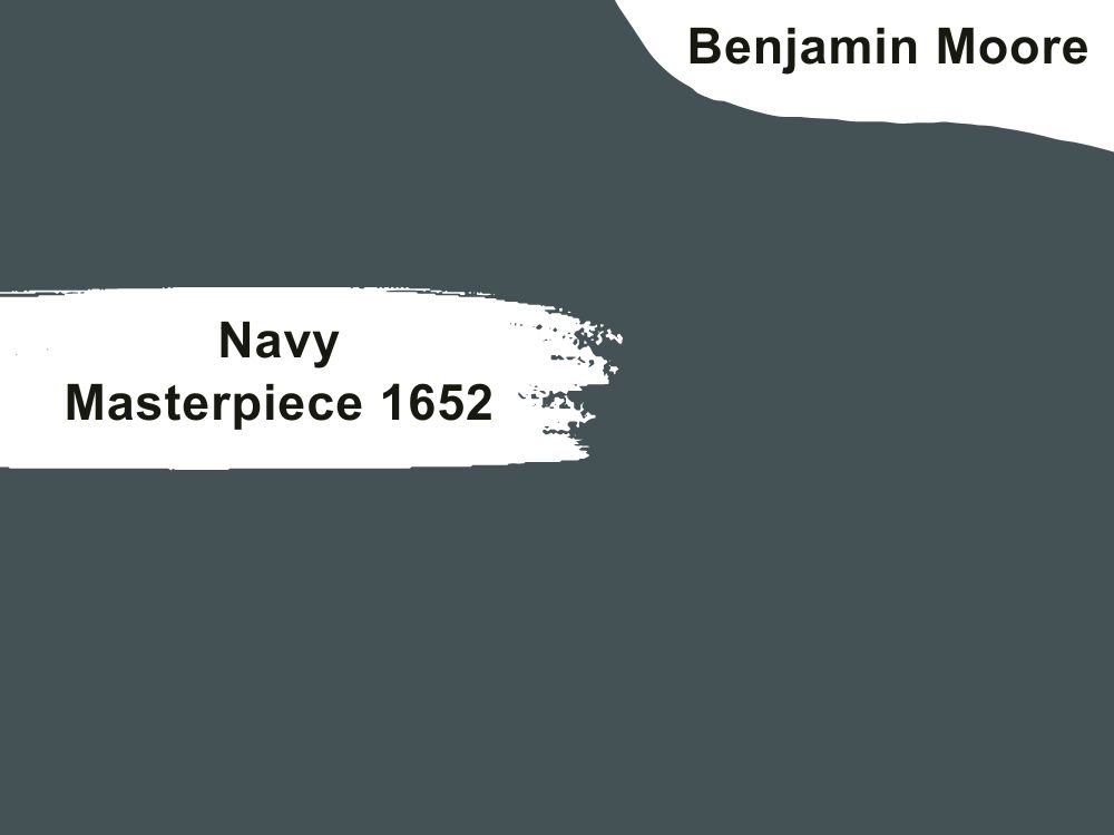
| RGB | 68 82 85 |
| LRV | 9.14 |
| Matching colors | Navajo white, pure white, Boothbay gray |
| Undertones | Green |
Navy Masterpiece portrays architectural relevance at its highest peak. You cannot possibly go wrong with this bold, black teal on your kitchen walls. When you are looking for nothing less than the best in the world of Navy blues on your kitchen walls, this is the perfect choice for you.
This color, though a dark one, allows you to be creative enough with colors and still maintain an unshakeable stability while it still helps to keep other colors around looking coordinated.
13. Benjamin Moore Kendall Charcoal Hc-166
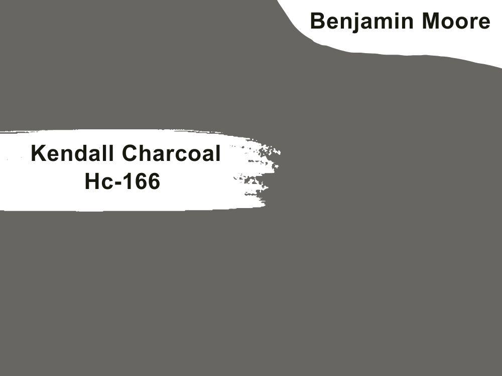
| RGB | 104 102 98 |
| LRV | 14.61 |
| Matching colors | Simply white, harbor haze, snow white |
| Undertones | Green |
Kendall charcoal is a deep and Luxurious shade of gray that balances effortlessly between dark gray and almost black. It is one of those colors that have proven to us that dark colors can also be neutrals. It lays the foundation for a kitchen that will create a strong presence. This color blends well with almost every color and style of kitchen to create a timeless classic kitchen. It rounds it up with an overall feeling of luxury and class.
14. Benjamin Moore Regent Green 2136-20
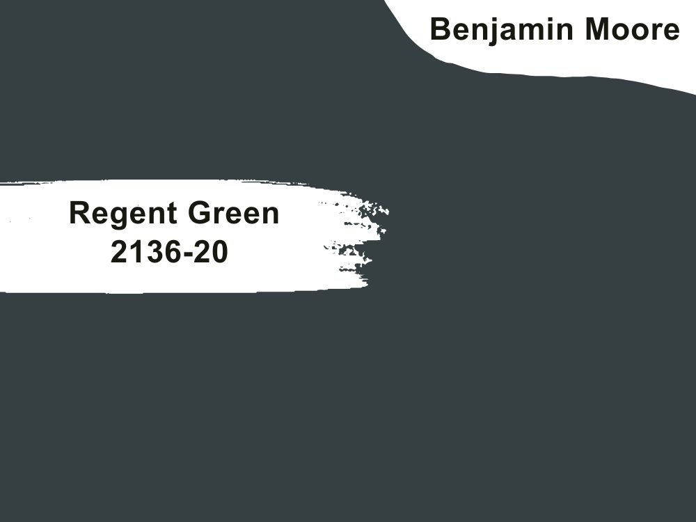
| RGB | 54 64 66 |
| LRV | 6.16 |
| Matching colors | Mayonnaise, cloud white, April showers |
| Undertones | Black |
If your kitchen has a traditional setting, this is the absolute best paint color for you. Regent Green is a deep, muted pine green that verges on black but finds a way not to read off the traditional theme of the kitchen or look too masculine. This very dark green complements kitchens in older homes and with a more traditional theme. It’s bolder and creates a better mood, compared to other paints.
15. Benjamin Moore La Poloma Gray 1551
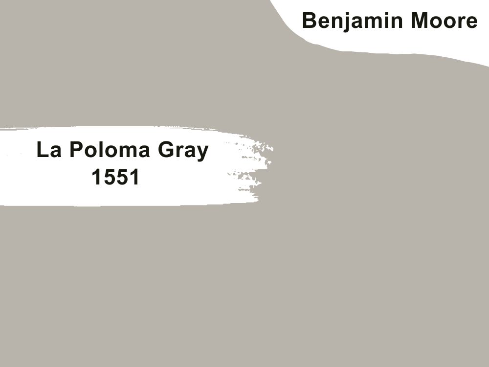
| RGB | 185 179 170 |
| LRV | 45.62 |
| Matching colors | Cloud cover, hidden falls, wood violet |
| Undertones | Brown |
This warm color releases the most perfect aura of soothing calmness. La poloma gray has the quality of possessing a brownish stone undertone that helps it pair well with white. This classic color works for contemporary-themed kitchens as well as traditionally-themed kitchens. It pairs off beautifully with colors like cloud cover, hidden falls, and wood violet.
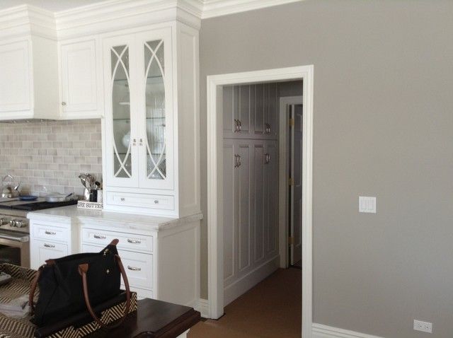
16. Benjamin Moore London Fog 1541
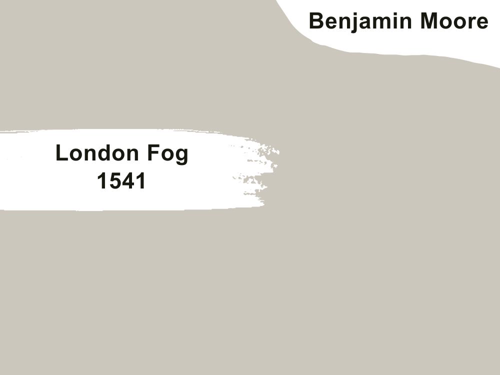
| RGB | 203 198 189 |
| LRV | 56.44 |
| Matching colors | White dove, cloud white, blue gaspe |
| Undertones | Gray, brown |
This is the perfect color for enhancing a kitchen without adding a whole lot of drama. London fog is a perfect warm neutral and a must-have for every kitchen wall. While this color stands out for its unique versatility, it is equally flexible and can work well for every type of kitchen design just as it blends beautifully with most colors placed around it. The effect this color gives your kitchen walls is to enhance their appearance without adding a whole lot of drama. London fog matches well with colors like White dove and cloud white to give out a pleasing appearance.
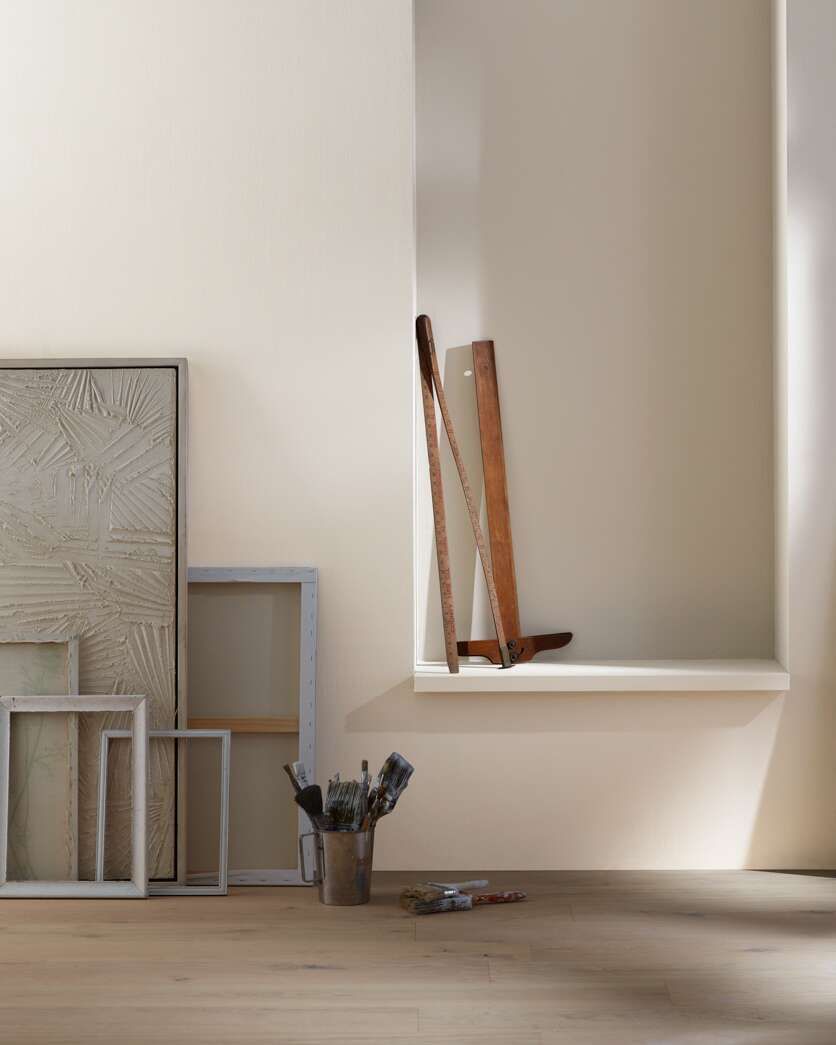
17. Benjamin Moore Chatsworth Cream 225
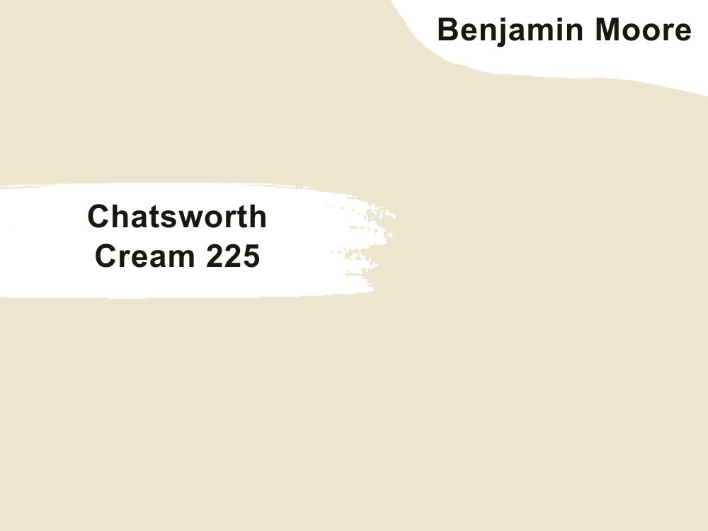
| RGB | 237 229 237 |
| LRV | 76.35 |
| Matching colors | Crisp khaki, simply white, hearthstone |
| Undertones | Green |
This is a clean and classic warm beige that is gently shaded with gray. It has a tint of green that releases a cool and complex intensity. This paint color is one that works with both traditional and modern designs of a kitchen.

18. Benjamin Moore Mascarpone Af-20
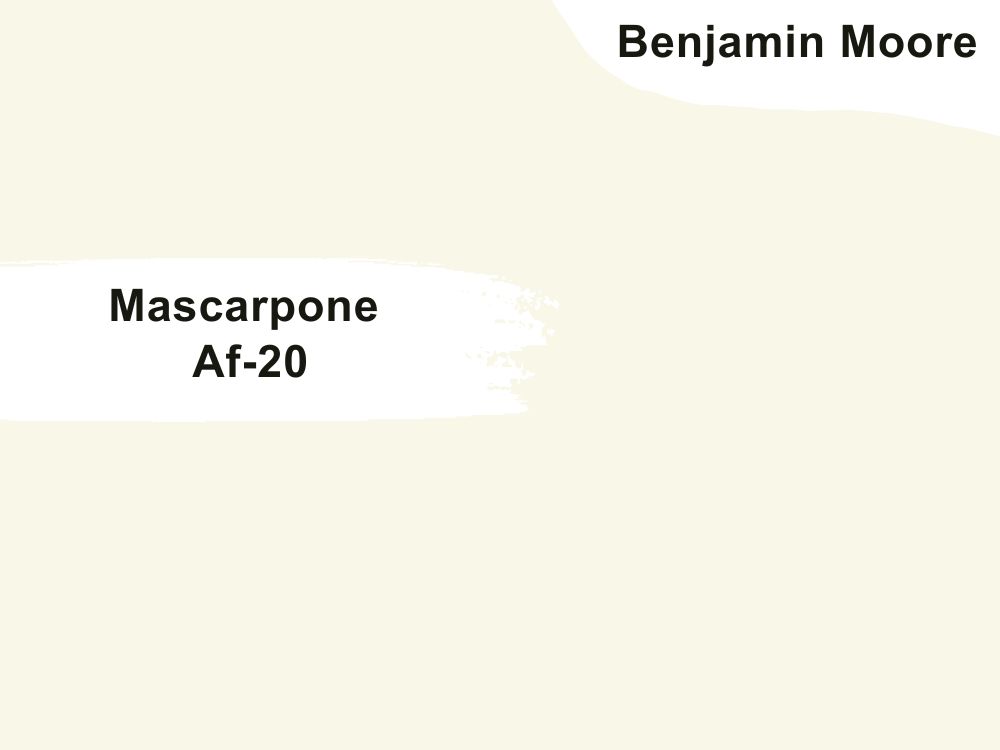
| RGB | 249 245 231 |
| LRV | 89 |
| Matching colors | Splendor, sparrow, rockport gray |
| Undertones | Yellow, off white |
Mascarpone is an off-white shade of paint with flashes of yellow and green undertones.
This is a paint color that works well for every kind of kitchen, from the tiniest to the most spacious. The yellow undertone gives the color its versatile characteristic which makes it compatible with almost every color placed beside it.
19. Benjamin Moore Lenox Tan Hc-44
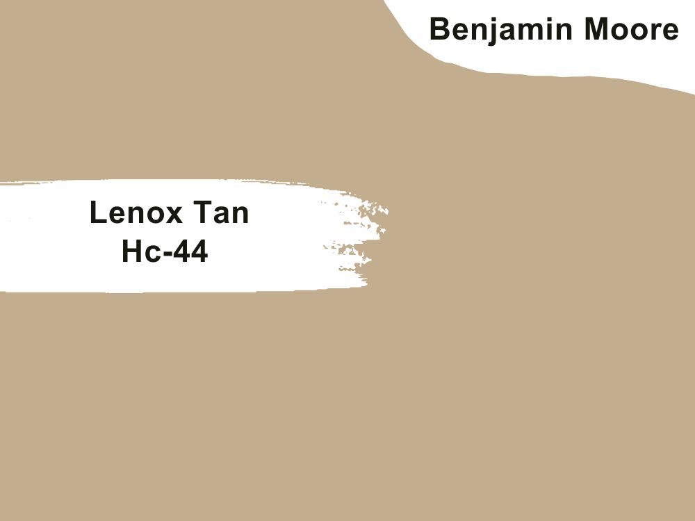
| RGB | 195 175 143 |
| LRV | 43.14 |
| Matching colors | Marble White, Knoxville Gray, Cloud White |
| Undertones | Orange, Brown |
Lenox tan is a beige that is simple and popularly described as khaki color. It is a color that gives your kitchen a balance between the traditional and contemporary feeling. This color blends beautifully with other colors and shares its contagious beauty with everything around it. When applied on the walls of the kitchen, it compliments your cabinet and kitchen island just right. The orange undertone is responsible for the soothing and welcoming aura that envelops your cooking space.
20. Benjamin Moore Byrd Beige Cw-365
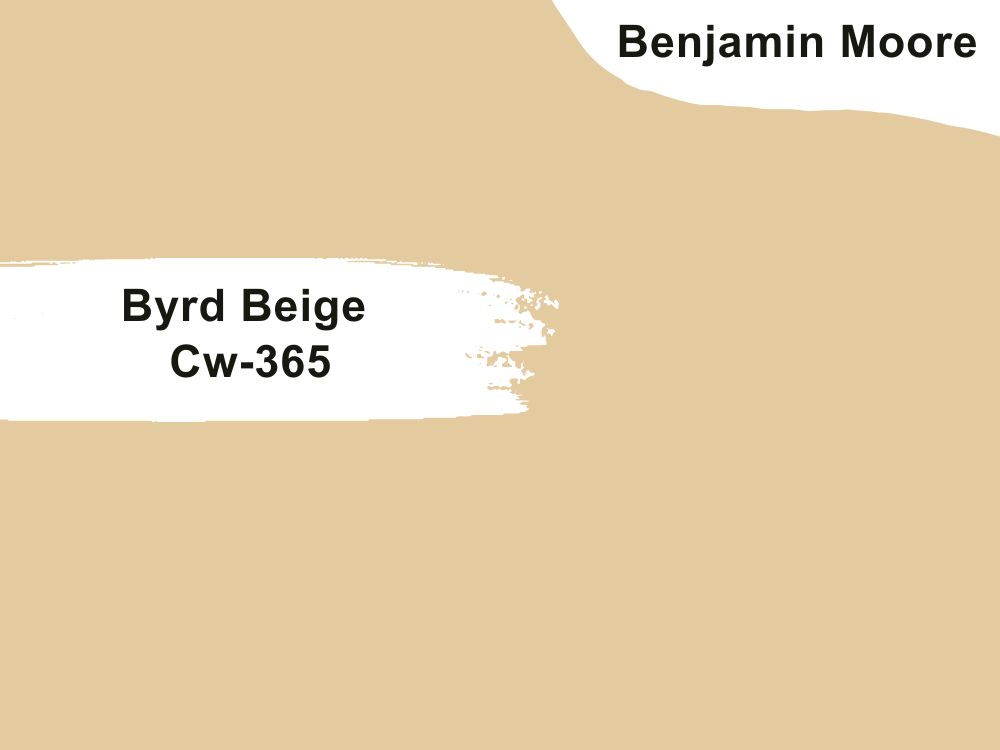
| RGB | 230, 198, 158 |
| LRV | 59.4 |
| Matching colors | Capitol White, Massicot, Cloud White, Sparrow |
| Undertones | White and yellow |
This is the perfect color for a modern-themed kitchen. Byrd is a bold shade of color with a touch of yellow. Byrd Beige has an LRV of 59. When used in the kitchen, it gives a soothing feeling that is not overbearing. One special thing about this color Is that it compliments other colors in the rooms without being intrusive. Colors like Capitol White, Massicot, Cloud White, and Sparrow make Byrd’s beige look its best when paired together.
21. Benjamin Moore Woodland White 463
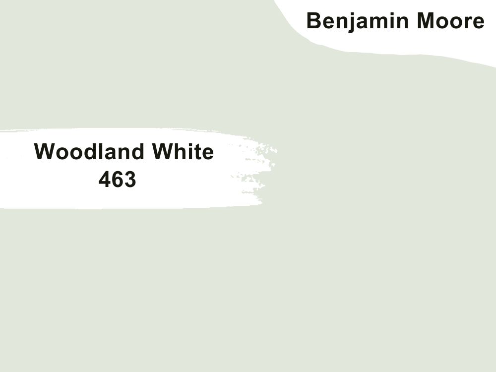
| RGB | 219 209 193 |
| LRV | 76.93 |
| Matching colors | Ocean City blue, frostine, flora |
| Undertones | Green |
This is a timeless color that has an undertone of minty green, and it emits a feeling of freshness and morning mist. Woodland White has the perfect blend of nature and all of Earth’s goodness in itself. It is a cool color that aligns perfectly with any type of kitchen design and with any type of furniture. The green undertone blends perfectly to create an addictive shade. Ocean City blue, frostine, and flora when paired with woodland white, graces our eyes with the best appearance.

22. Benjamin Moore October Mist 1495
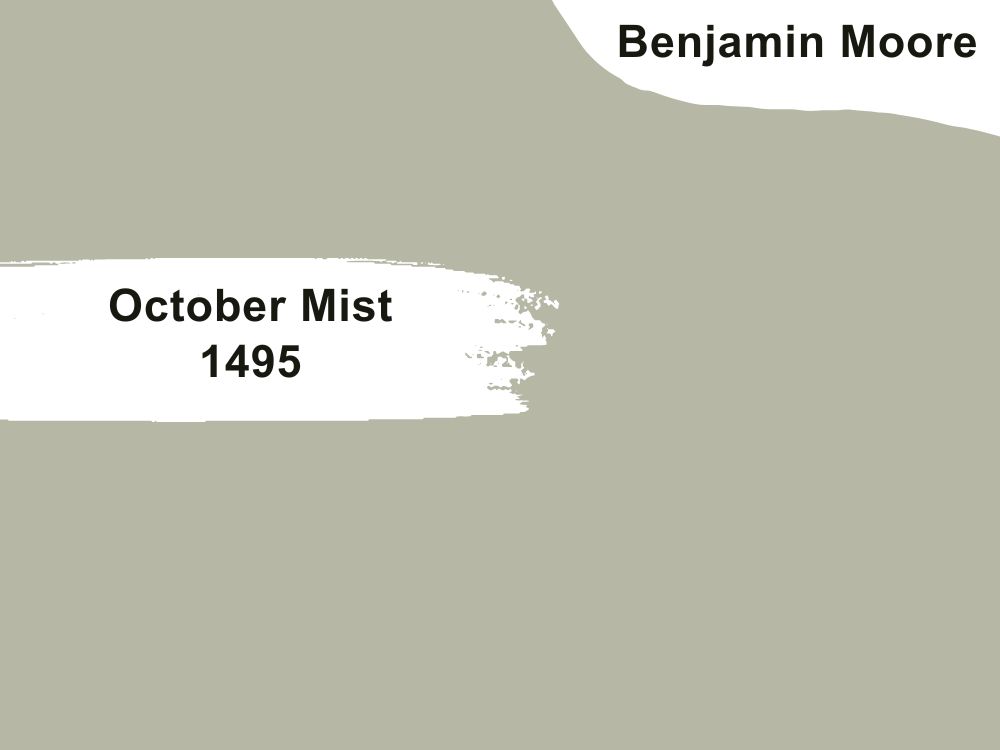
| RGB | 182 184 165 |
| LRV | 46.54 |
| Matching colors | White dove, cloud white, hale navy |
| Undertones | Beige |
October Mist is a shade of color obtained from the perfect balance of green-gray. It is a soft and fine blend that generates a paint color that goes very well with earth tones. It has a green base that is responsible for the very subtle warmth that it releases. October mist has beige as an undertone, this helps to give the paint a neutral color instead of a vibrant green or muddy gray, carrying the soft neutral along.
23. Benjamin Moore Oxford Gray 2128-40
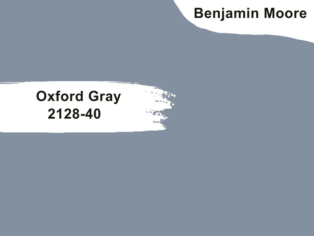
| RGB | 111 141 157 |
| LRV | 28.78 |
| Matching colors | Distant gray, witching hour, white dove |
| Undertones | Gray lavender |
You can’t help but fall in love with this smart handsome gray color. This shade of gray has a light reflection value of 28.78 meaning that it absorbs quite an amount of light. This paint color is most definitely for people who want their kitchens to have a cozier look with a dark shade of color, but not too dark that it starts to look sad and moody. Oxford gray blends beautifully with colors like a distant gray and white dove.
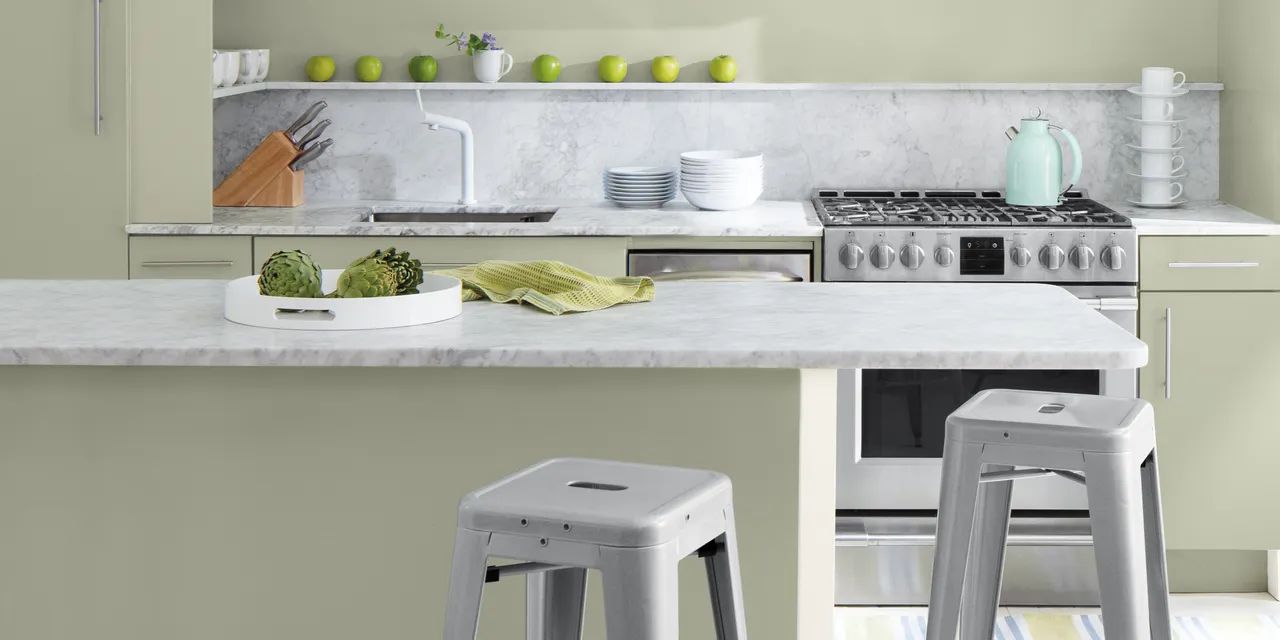
24. Benjamin Moore Soft Fern 2144-40
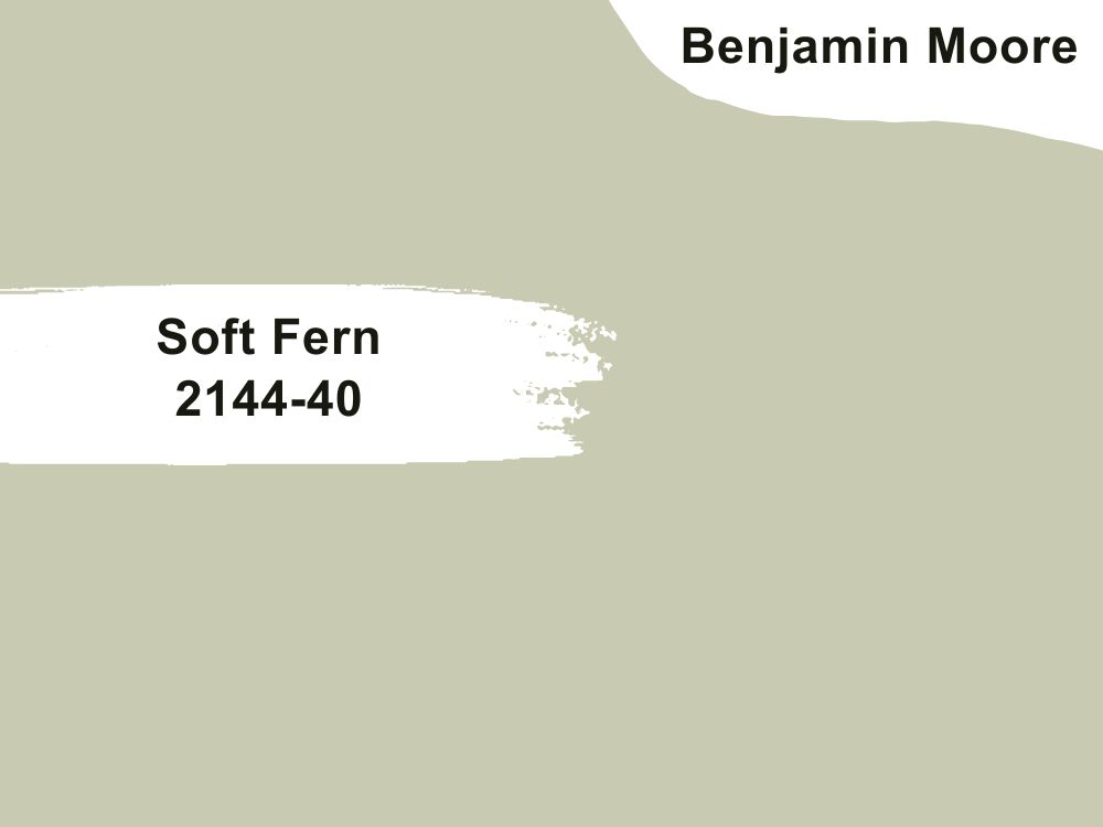
| RGB | 200 203 177 |
| LRV | 56.67 |
| Matching colors | White dove, wolf gray, swiss coffee |
| Undertones | Gray and brown |
Soft fern just like the name implies is a soft pale green merged with gray. It is such a unique color and shows it off by how versatile it is, soft fern is ideal for all kinds of decorations ranging from interior to exterior decorations. It is also one of those colors that shockingly work excellently for kitchen walls. This color compliments most of the colors placed with it and looks good on every type of kitchen. It has a light reflection value of 56.67 and pairs well with a white dove, wolf gray, and Swiss coffee.
25. Benjamin Moore Swiss Coffee Oc-45
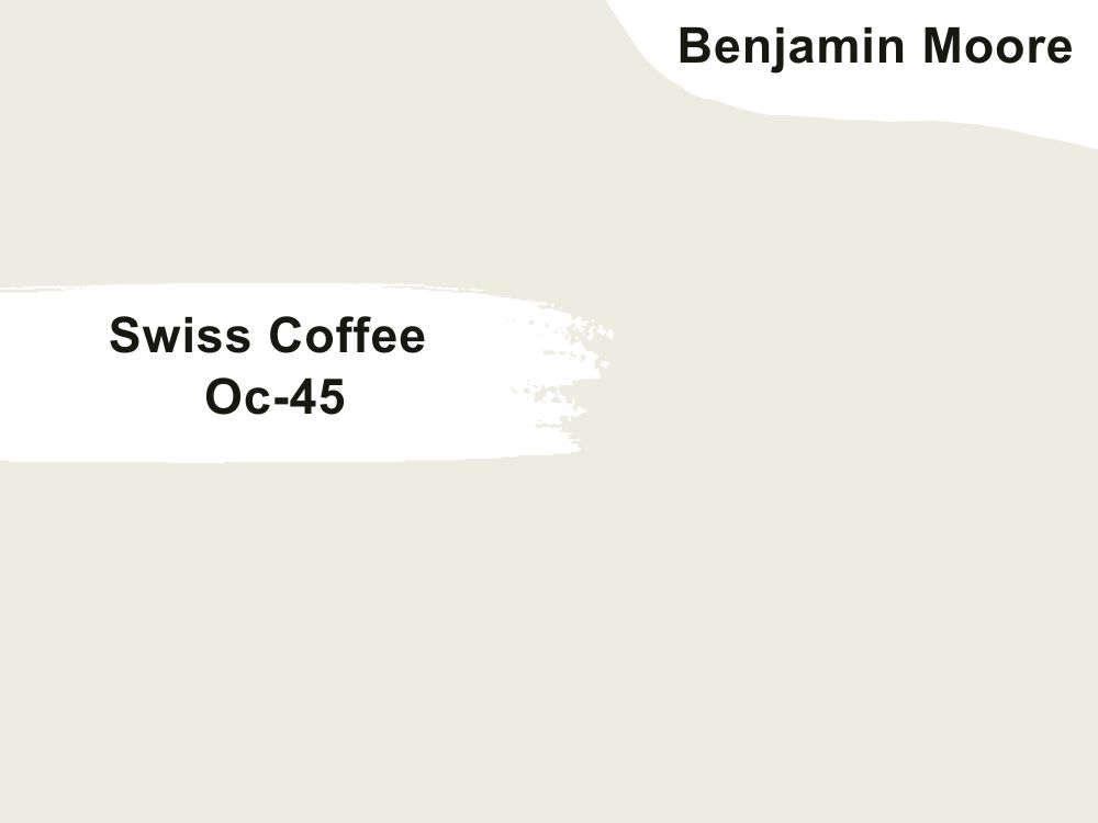
| RGB | 237 243 224 |
| LRV | 81.91 |
| Matching colors | White drifts, lush, fossil |
| Undertones | Gray, green and yellow |
This is the ultimate white sweetheart with just the right amount of warmth. Swiss coffee is a versatile paint color. This beautiful neutral strikes a firm balance between vintage and elegance. It has a yellow undertone that gives the color its welcoming softness and warmth while the gray undertone tames down the warmth so the color doesn’t appear too yellow. This is the perfect color if you are looking towards getting the traditional aesthetic feeling in your kitchen.
Sherwin Williams Colors To Paint Kitchen Walls
26. Sherwin Williams Alabaster Sw 7008
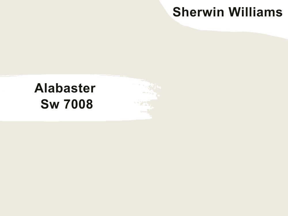
| RGB | 237 234 224 |
| LRV | 82 |
| Matching colors | Townhall tan, Dakota wheat, creamy |
| Undertones | Greige |
This is one of Sherwin Williams most loved shades of white paint. This color sits comfortably between warm and white without losing any of its coziness or softness. Alabaster is a white paint color with beige and gray undertones. When applied on your kitchen walls, comes with an alluring creaminess that helps to stop the walls from being too stark. However, the undertones tame it down, but completely for the creaminess to be lost but enough to stop it from getting too yellow.

27. Sherwin Williams Indigo Batik Sw 7602

| RGB | 62 80 99 |
| LRV | 8 |
| Matching colors | Sands of time, pacer white, icicle |
| Undertones | Navy blue |
Blue has definitely become the new gray without any doubt. The way it blends effortlessly with any color is very amazing. For people who are scared of venturing into painted kitchens, blue can be a safe choice to bring color to your kitchen and remain neutral. Kitchens are one of the places where indigo batik shows its beauty the most. This rich deep blue color comes to life in a kitchen filled with natural light and becomes dark and moody in low-light environments. Hence, this color is best for large kitchens or open-concept kitchens.
28. Sherwin Williams Pure White Sw 7005
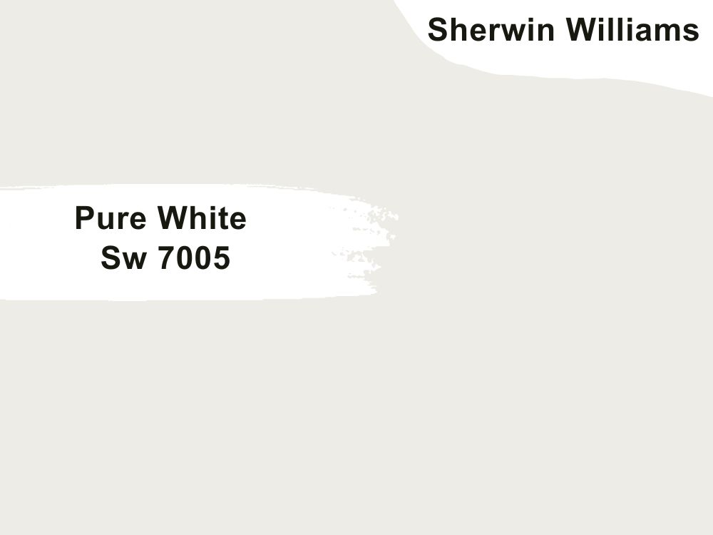
| RGB | 237 236 230 |
| LRV | 84 |
| Matching colors | March wind, perle noir, extra white |
| Undertones | Yellow, black |
Pure White is a very versatile off-white color. It is a soft, clean, and gorgeous paint color. Having an LRV of 84 proves that this paint reflects a good amount of light. The exciting thing about this color is that although it has an undertone of yellow, it is not too obtrusive; the base it gives is mainly a neutral natural base. The yellow undertone gives it faint warmth and the black is what keeps it from being too warm or too yellow. It’s a little bit cooler than Alabaster, yet still warm enough to pair well with most other colors.
29. Sherwin Williams White Duck SW 7010
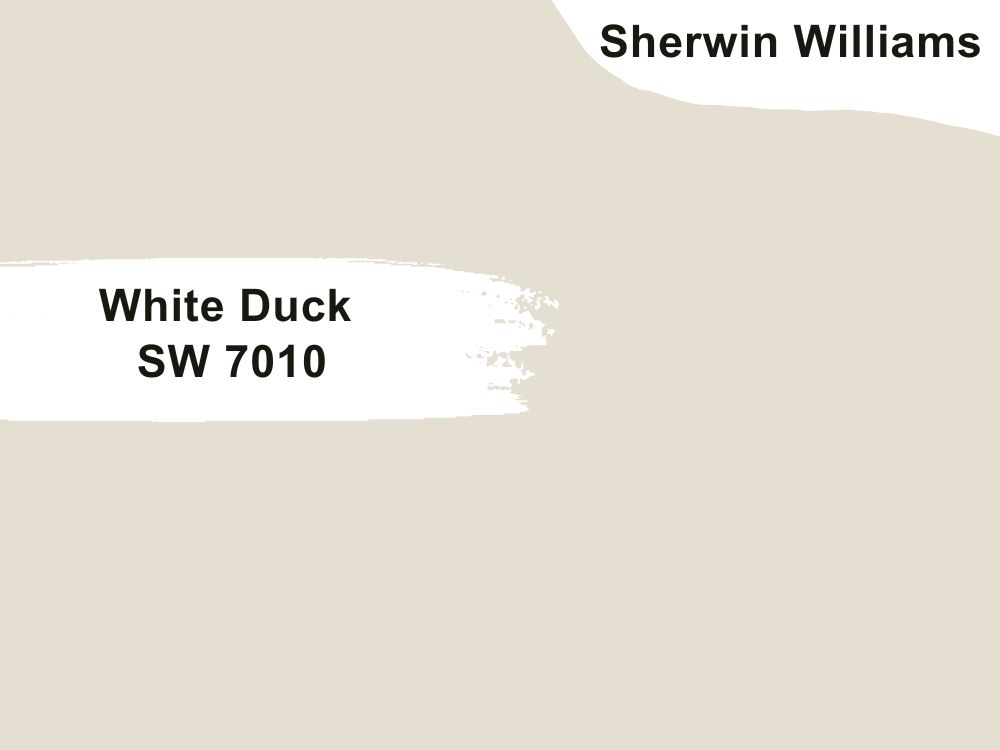
| RGB | 229 223 210 |
| LRV | 74 |
| Matching colors | Warm stone, trade wind, moody blue |
| Undertones | Neutral undertones |
This paint is an amalgam of cream and greige, resulting in a very pale greige that creates a lovely warm, but fresh look. If you want white walls and white cabinets in your kitchen but want a slight distinction between the color on your walls and those on your cabinets white duck is a great color option for your kitchen walls. This color also has the ability to make the kitchen look and feel bigger and more spacious, so it is a perfect choice of paint for people who feel that their kitchen space is small.
30. Sherwin Williams Accessible Beige Sw 7036
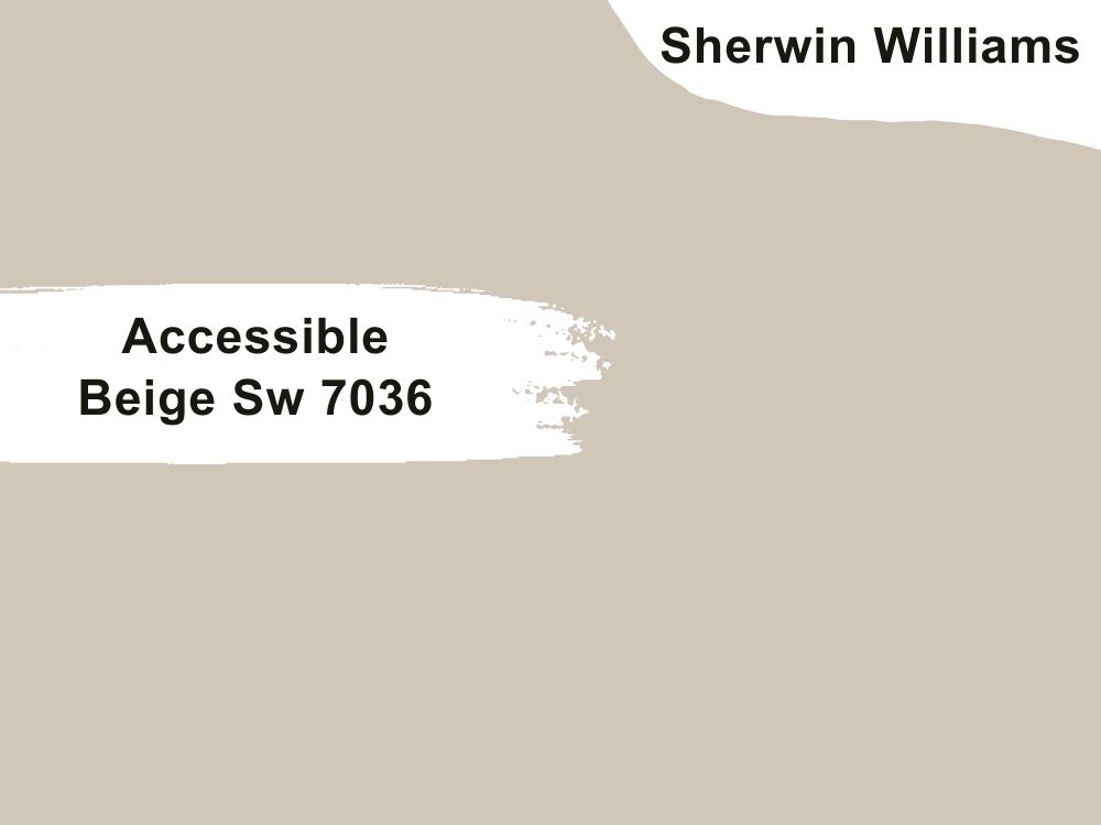
| RGB | 209 199 184 |
| LRV | 58 |
| Matching colors | Alabaster, urbane bronze, sea salt |
| Undertones | Gray |
This is simply a beige that carries its gray undertones majestically. This gray undertone gives this paint the ability to make a space feel warm and comfy. Accessible Beige is lovely in your kitchen, it doesn’t matter the nature and color of your cabinets or the theme of your kitchen. While it might look neutral on your walls at first glance, it leaves a delicate hint of color on your walls.
31. Sherwin Williams Naturel Sw 7542
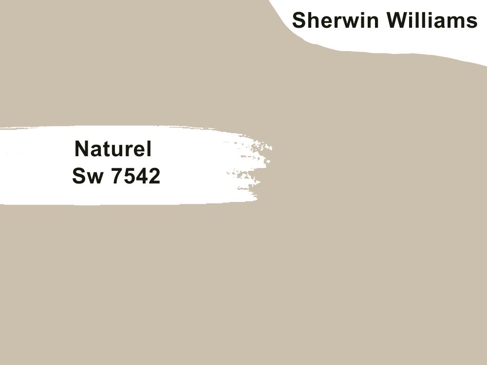
| RGB | 203 193 175 |
| LRV | 54.07 |
| Matching colors | Grecian ivory, hardware, alabaster |
| Undertones | Yellow-green |
Naturel is a light to medium beige with a yellow-green undertone. It has a light reflection value of 54.07 telling us that it doesn’t reflect much light or absorb much either. Beige colors for paints are stealing the hearts of many decorators and homeowners today because of how versatile and flexible they are; to say the least, nature is among the top on that list. Naturel is another fresh warm neutral shade for the kitchen. It is one that allows you to play around with and be creative with colors, ranging from very bright to cool-toned colors without losing its balance.
32. Sherwin Williams Wool Skein Sw 6148
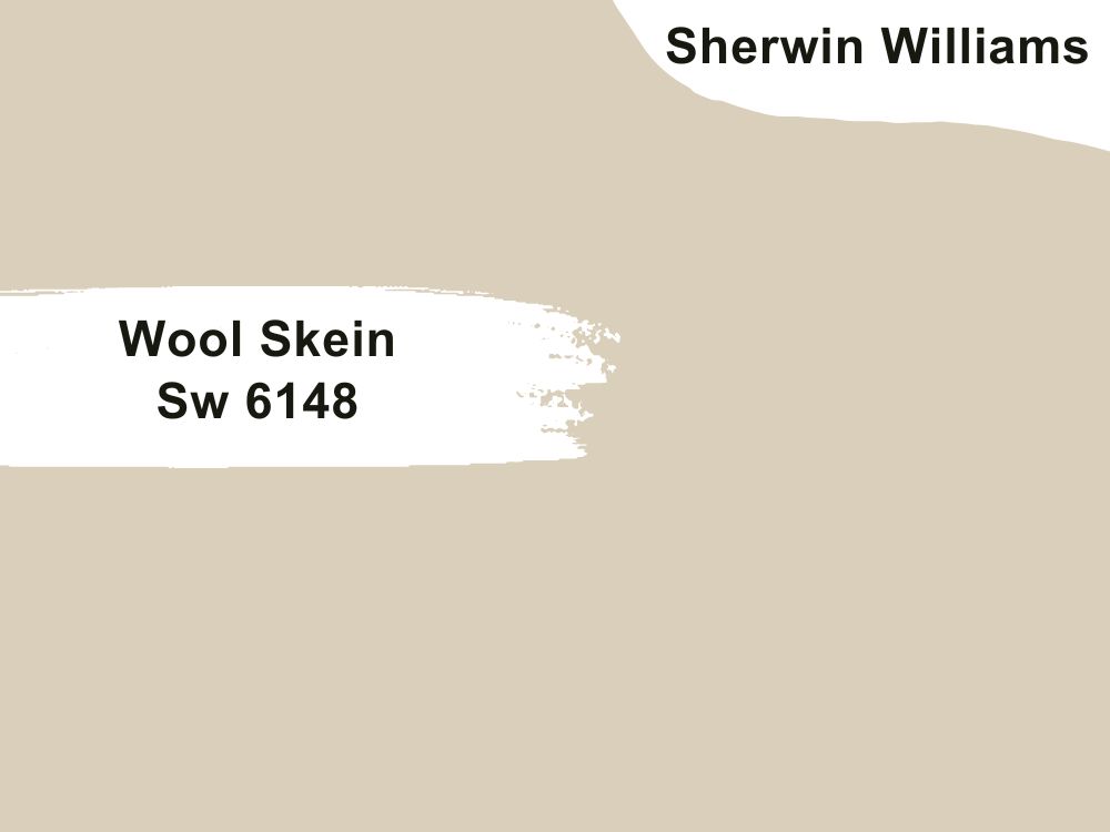
| RGB | 217 207 186 |
| LRV | 63 |
| Matching colors | Green earth, escape gray |
| Undertones | Khaki, green |
Wool skein is a unique beige with khaki undertones and slight green undertones. What this paint color does when it is applied on the walls of your kitchen is to first give an amazing eye-catching base and then fill the kitchen with an aura of freshness which it gets from the green undertones.
The khaki undertone is what makes this color neutral and also warm. With this color, you don’t have to be scared of going wrong, it will not happen. This color allows you to reach the elastic limit of your creativity while it just blends in and blends out everything effortlessly
33. Sherwin Williams North Star Sw 6246
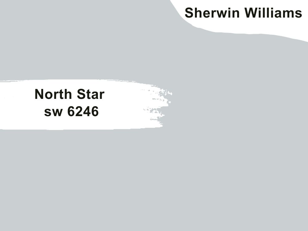
| RGB | 202 208 210 |
| LRV | 62 |
| Matching colors | Quick silver, alabaster, cadet |
| Undertones | slate gray |
North Star is a blue airy shade of color. This is a color that makes you stop, stare and get emotional at its beauty. This color carries a very pretty but delicate aesthetic. However, it is one that requires a lot of careful attention, because one mistake of matching it with the wrong color can make the perfect-looking color not so perfect anymore.
If you want to go creative, go with North Star on your kitchen walls, get a bright white color for your cabinets and trims, while you use black marble for the countertop, and wait to behold real-life magic that occurs in your kitchen.
34. Sherwin Williams Silver Strand Sw 7057
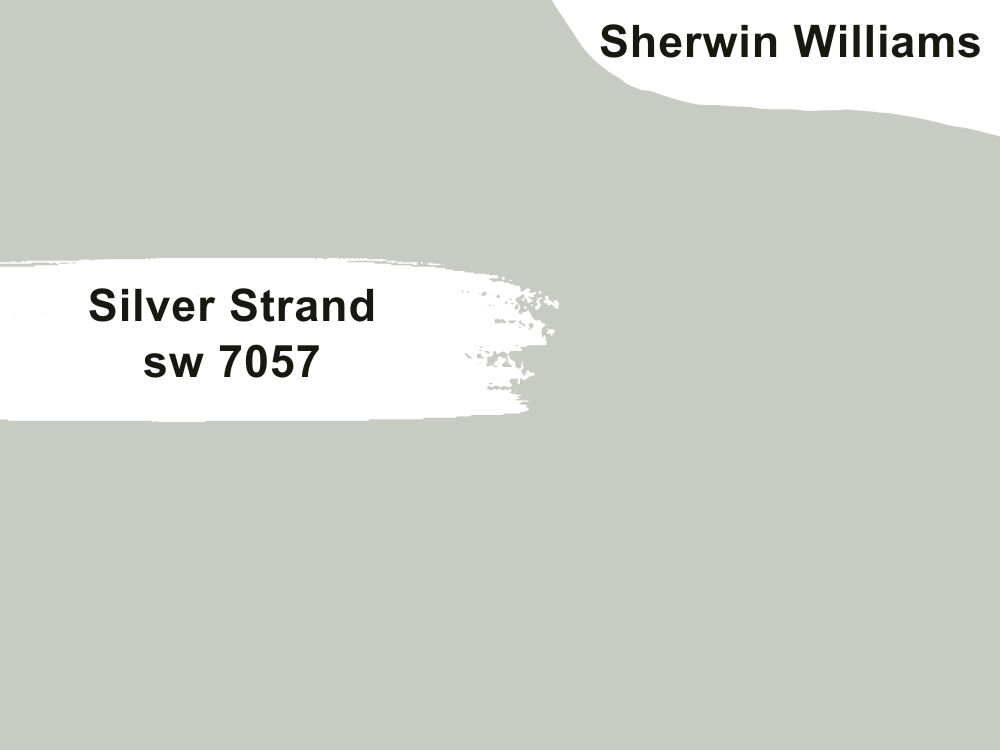
| RGB | 200 203 196 |
| LRV | 59 |
| Matching colors | White heron, sea salt, Chelsea gray |
| Undertones | Cyan |
This light gray paint color with a blue-green undertone also known as cyan. This beautiful blend of cool tones is a great choice for your kitchen walls, especially if your kitchen is small and you are looking towards giving it a more airy look. This color reads like a soft color on your walls, especially if it is paired with white cabinets giving out a very appealing appearance.
35. Sherwin William Conservative Gray Sw 6183
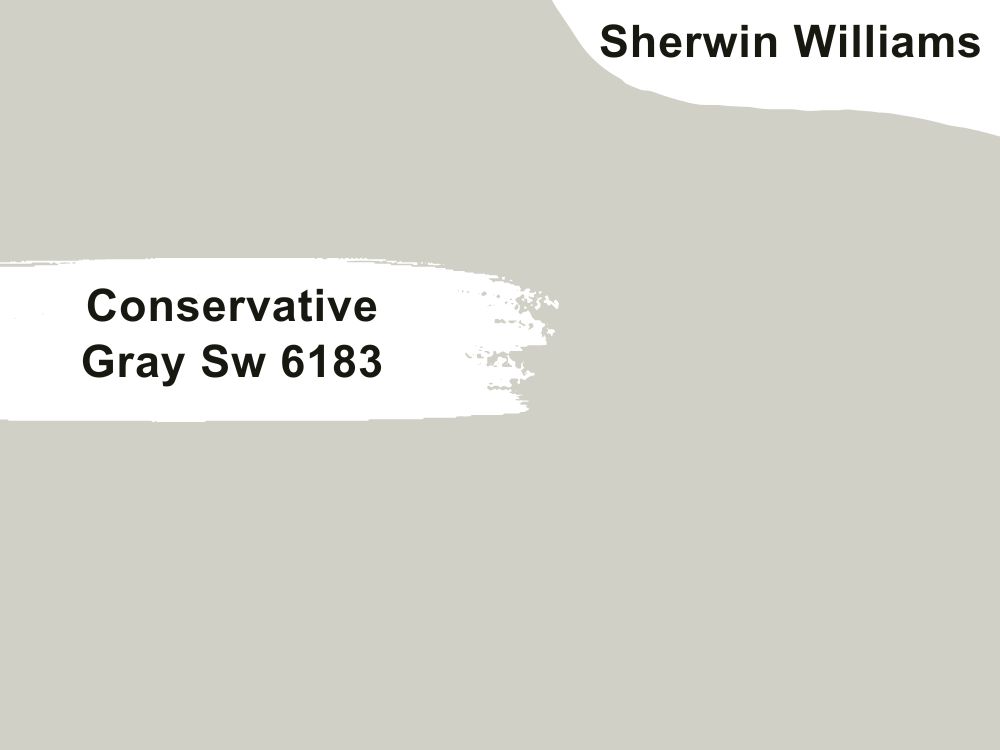
| RGB | 209 208 196 |
| LRV | 63 |
| Matching colors | Nacre, dried thyme, ethereal white |
| Undertones | Blue-green |
Conservative gray is an exquisite light neutral gray shade that effortlessly transforms your kitchen into a haven of positive emotions. This captivating color has the remarkable ability to create a sanctuary-like atmosphere, where tranquility and serenity abound. The gentle green undertone infused within this light gray paint resembles the delicate hue of sage green, lending a soothing and refreshing vibe to the space. The resulting ambiance is one of elegance and harmony, where every moment spent in the kitchen becomes an opportunity to unwind and experience a sense of inner peace.
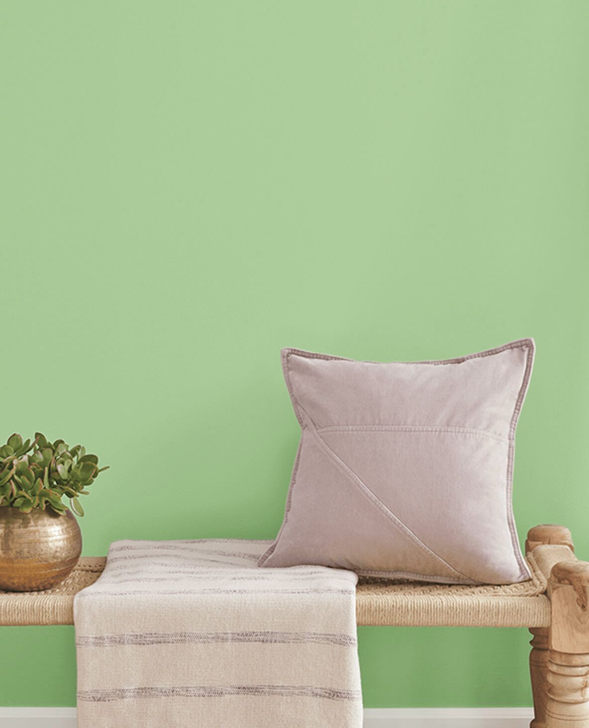
36. Sherwin Williams Oh Pistachio Sw 9033
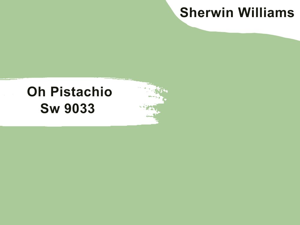
| RGB | 172 204 153 |
| LRV | 54 |
| Matching colors | Alabaster, attitude gray, sprout |
| Undertones | gray |
Oh pistachio is a paint color that allows you to be creative as much as you want without making it look like you are doing too much. It maintains stability and balance that stands firm no matter what. When it is applied to your kitchen walls, it gives off a sensation of softness and sophistication. This color also helps to coordinate colors around it, helping the kitchen space to look organized and arranged.
37. Sherwin Williams Parakeet Sw 6711
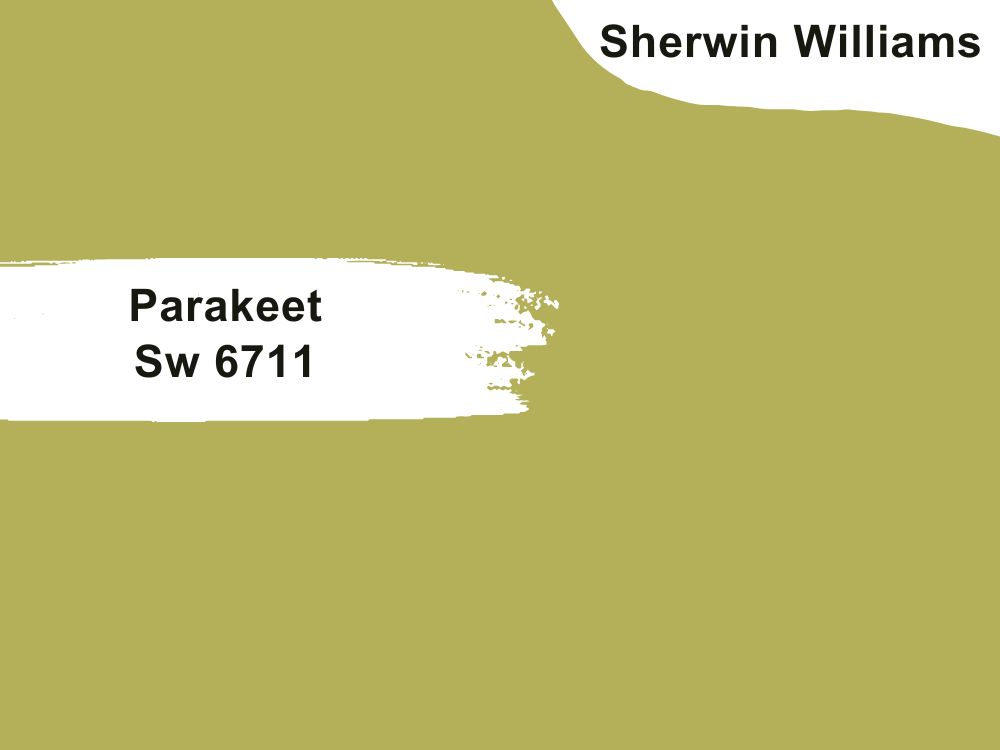
| RGB | 180 176 91 |
| LRV | 41.62 |
| Matching colors | Dried lavender, roman column, shell white |
| Undertones | gray |
This is an olive-like shade of green that releases a tropical burst emotion. It has a soft nourishing feeling that is attributed to the green color and brings a lot of tranquility and happiness into your kitchen. Your kitchen doesn’t have to be boring; yes you can give your kitchen a pop of color. For people looking to have a nature-based kitchen feeling, this is definitely the shade of Paint you are looking for. Dried lavender, Roman column, and shell white help to bring out the beauty of this painting more.
38. Sherwin Willians Rainstorm Sw 6230
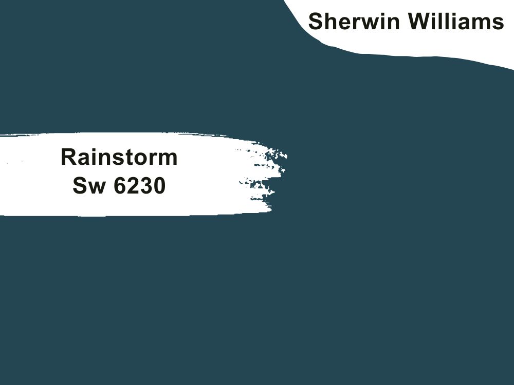
| RGB | 48 76 89 |
| LRV | 6.55 |
| Matching colors | Frosted emerald, fleur de sel, mountain air |
| Undertones | Slate gray |
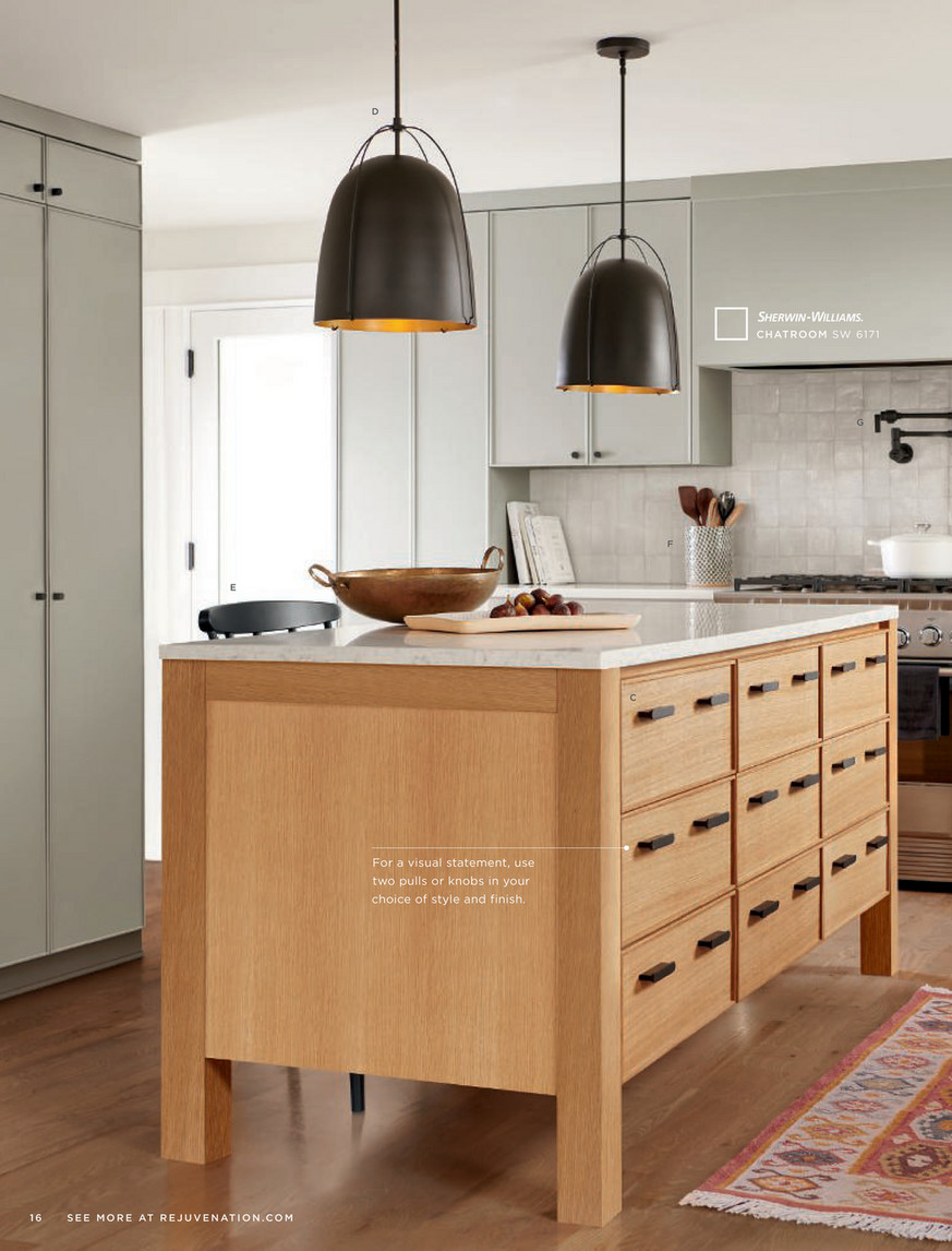
This is a paint color everyone needs to be careful with because it will hypnotize you and steal your heart away with its undeniable beauty. A kitchen painted with rainstorms might as well just become your favorite place in the home. This is because this hue creates a view that is always very ravishing to look at, and the way it balances out surrounding colors and still finds a way to stabilize Itself is always very contagious and satisfying. Rainstorm’s slate gray undertone makes it a good match for any kind of cabinet and drawer.
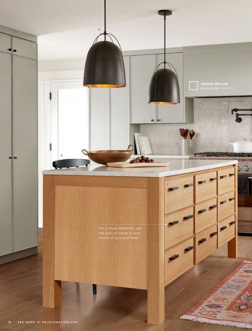
39. Sherwin Williams Chatroom Sw 6171
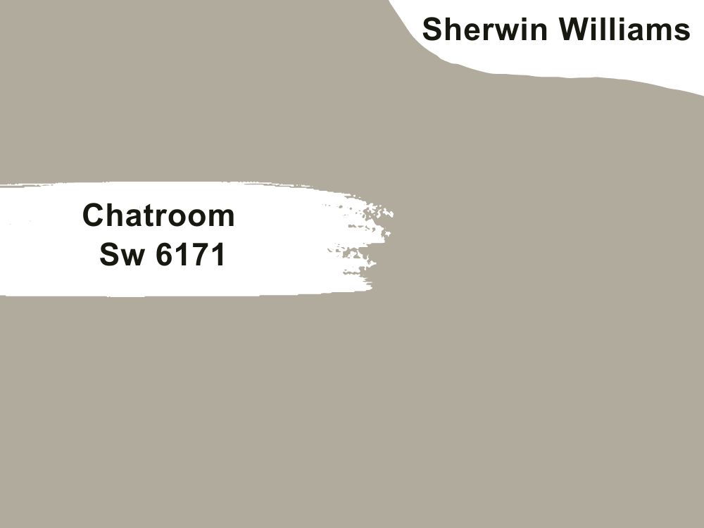
| RGB | 175 171 154 |
| LRV | 40.54 |
| Matching colors | Cajun red, ivoire, moderne white |
| Undertones | Gray |
This is a soft greige that is made up of a fine blending of green and yellow without a fault. This very versatile neutral color is an ideal option for kitchen walls because of its ability to blend into the surroundings and fit into every space, every furniture type, and every type of kitchen, be it contemporary or traditional. This color has a way of coordinating other colors around it to give your kitchen a very beautiful balance of color.
40. Sherwin Williams Oyster White Sw7637
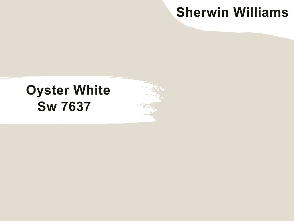
| RGB | 226 221 208 |
| LRV | 72 |
| Matching colors | Analytical gray, brassy |
| Undertones | Green, gray, beige. |
This paint color carries itself in both a stylish and calming way, disputing the saying that whites are stale and boring. It has an LRV (Light Reflectance Value) of 72 telling us that it is a light color. It is crisp and gives that cool reserved look for people looking towards creating a serene-themed environment in the kitchen.
Though this paint color dramatically changes its appearance due to the nature of light it is exposed to, it still maintains a balance strong enough to make it remain neutral. Oyster white has the characteristic of being versatile and flexible, so it fits well with traditional and contemporary kitchens, as well as tiny and large kitchens.
41. Sherwin Williams Vanillin Sw 6371
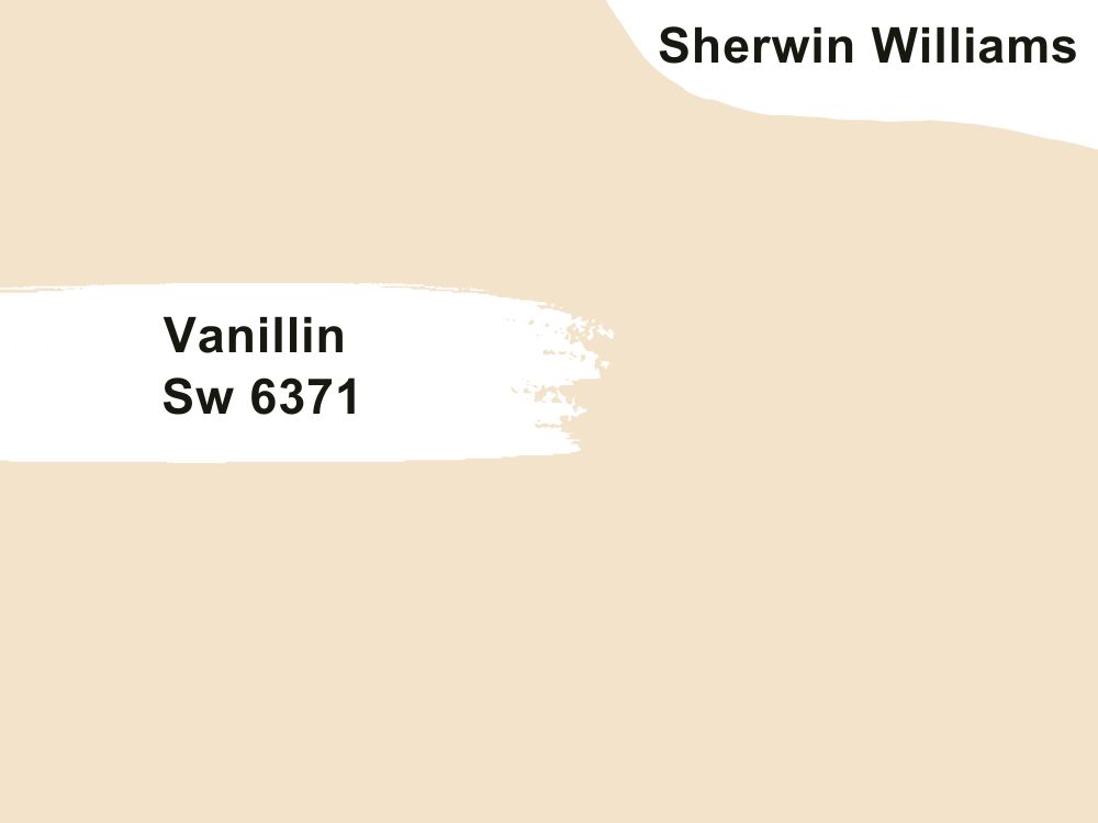
| RGB | 243 227 202 |
| LRV | 78.37 |
| Matching colors | Marshmello |
| Undertones | Warm yellow |
This is a warm shade that finds a balance somewhere between white and tan. This combination gives out a cozy feeling when applied to the walls of your kitchen. This color wraps your kitchen with a sweet, inviting, warmth when it is applied to your kitchen walls. Vanillin is best matched with colors like marshmallows.
42. Sherwin Williams Origami White Sw 7636
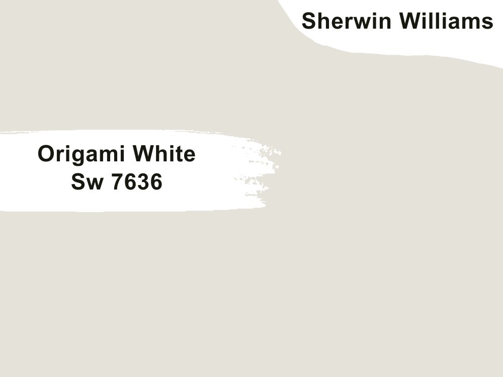
| RGB | 229 226 218 |
| LRV | 76 |
| Matching colors | Anew gray, Spalding gray, little blue box |
| Undertones | Violet |
Who said whites can’t make an outstanding statement when applied on your kitchen walls.
Origami white is a soft warm delicate shade of white with undertones of violet. Origami white has a versatile nature that makes it able to blend easily into your kitchen walls and complement your cabinet and kitchen island perfectly no matter the color.
It can also work for different kitchen designs ranging from traditional to contemporary. Its violet undertone creates a very subtle base that appears under low light as a good-looking soft lilac. It works well with colors like Spalding gray, Anew gray.
43. Sherwin Williams Sw 7666 Fleur De Sel
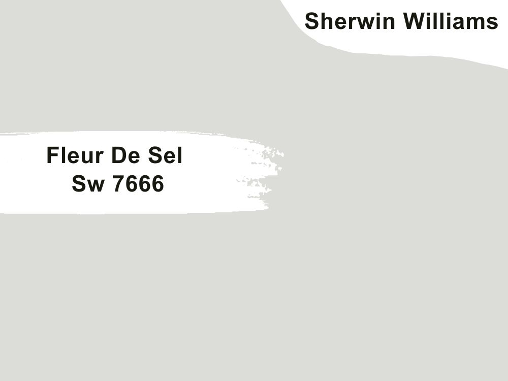
| RGB | 222 221 215 |
| LRV | 72.27 |
| Matching colors | Extra white, march wind, carley’s rose |
| Undertones | gray |
This is one among the few colors that look great with stainless steel appliances. However, this color blossoms more in places with lots of natural light. This bright and dreamy shade of off-white has very faint undertones of green that command thoughts of the seaside and the cool, coastal feeling of being at peace.
Fleur de Sel is a very flexible and versatile shade of color. It’s an off-white color that can work in just about any part of the house. All décor styles can use this bright neutral, from modern to traditional houses.

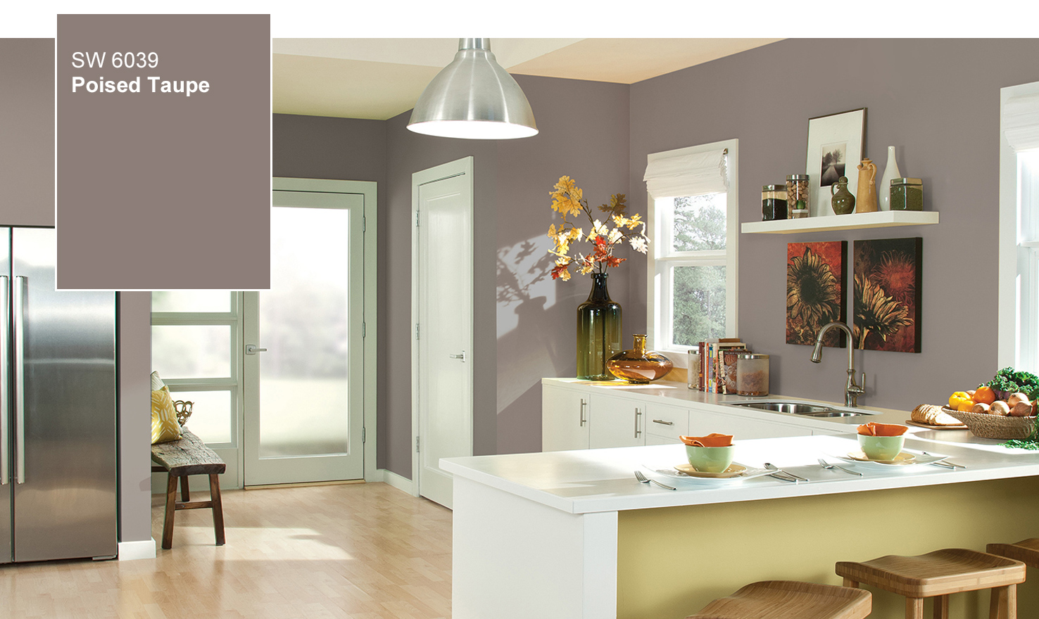
44. Sherwin Williams Poised Taupe Sw 6039
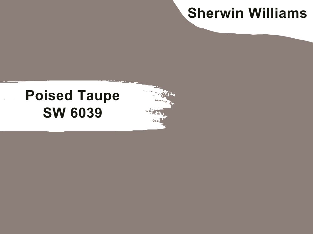
| RGB | 140 126 120 |
| LRV | 21.77 |
| Matching colors | Cultured pearl, vintage vessel, |
| Undertones | Purple |
Poised Taupe is a neutral color made up of deep clay and violet. This color is one that adds an air of peaceful sophistication to your space, and when used in your kitchen, releases tranquility and it brings nature and freshness to your cooking space. Poised taupe can be used anywhere in the house because of its versatile nature, and the kitchen is not an exception as it blends perfectly with every style.

45. Sherwin Williams Modern Gray Sw 7632
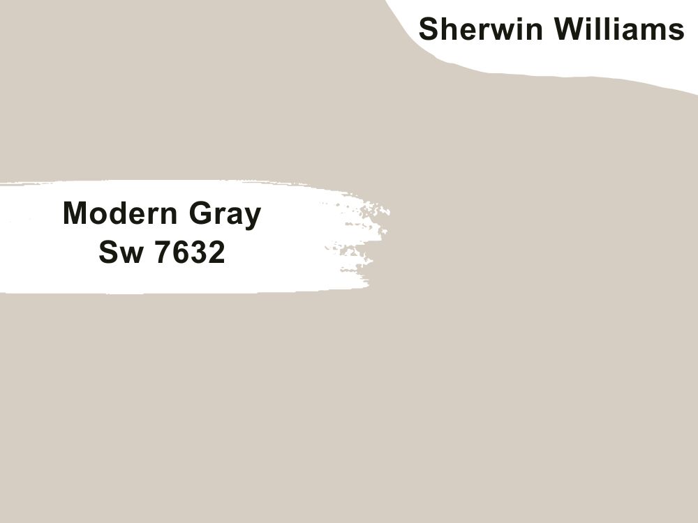
| RGB | 214 206 195 |
| LRV | 62 |
| Matching colors | Taupe tone, plum daddy, snowbound |
| Undertones | Pink, purple |
A gray that allows you to be creative, a gray that allows you to play around with all shades of color while it just balances out everything is definitely modern gray SW7632. Modern Gray is a warm paint color that appears most of the time more as a taupe than a warm gray. The change in color occurs due to lightning and direction. This color however is ideal for kitchen walls because it blends everything beautifully, creating an alluring aesthetic.
46. Sherwin Williams Inviting Ivory Sw 6372
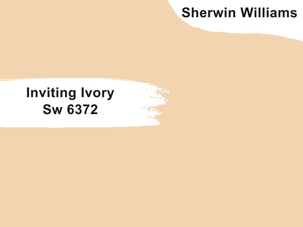
| RGB | 243 214 176 |
| LRV | 70.21 |
| Matching colors | Shell white, dockside, vanillin |
| Undertones | orange |
Just like its name, this paint color is very inviting and accommodating. It is beautifully soft and fascinating; this shade is perfect in kitchens with white cabinetry or hardware.
When this paint color is used on your kitchen walls, it brings about a togetherness that creates perfect harmony between the colors used around it. This color too also finds a way to creep sweetly into dark spaces and illuminate them.
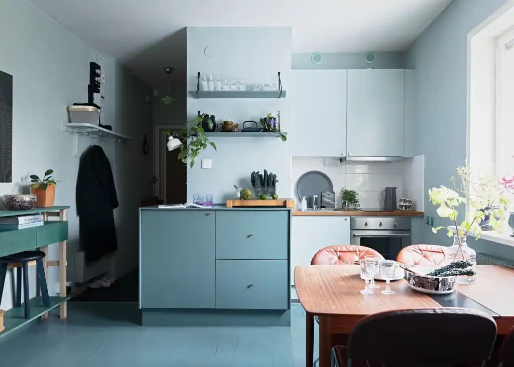
47. Sherwin Williams Soar Sw 6799
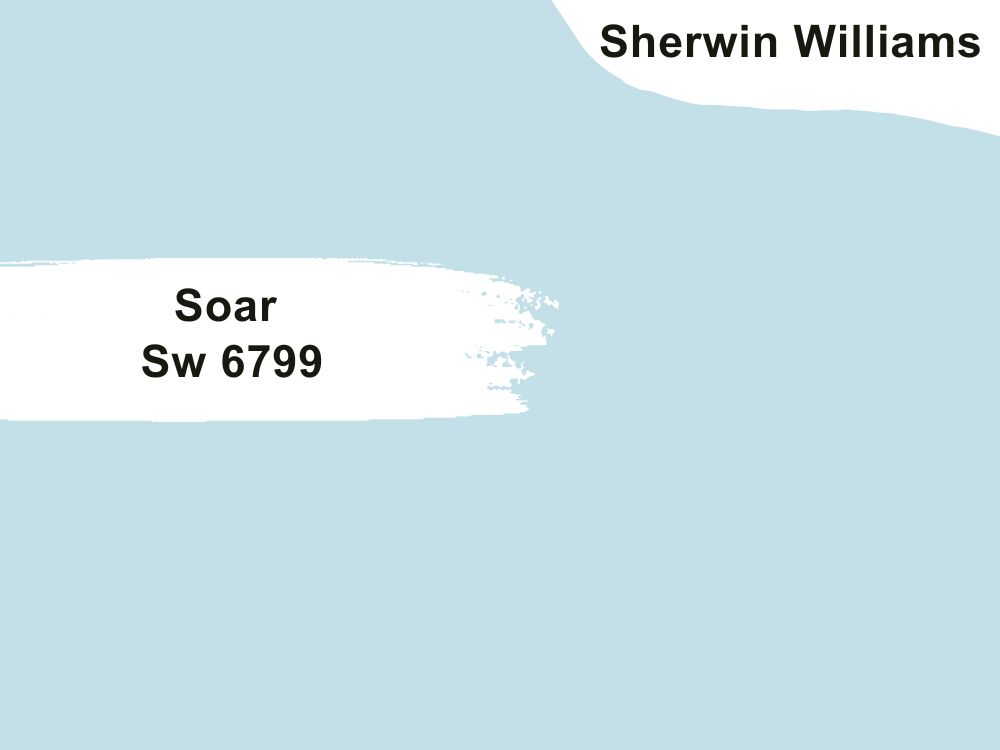
| RGB | 193 223 232 |
| LRV | 70 |
| Matching colors | Extra white, napery, iceberg |
| Undertones | blue |
This is a pastel purple paint that appears blue most of the time due to its high content in the RGB value. This color has a high LRV of 70, which means it reflects quite a large amount of light. This paint color tends to bring brightness to the kitchen when it is used on the walls. This color will work best for a small or not-so-large kitchen that needs a touch of brightness. This is because it has the ability to make the kitchen look and feel bigger.
48. Sherwin Williams Lime Wash Sw9589
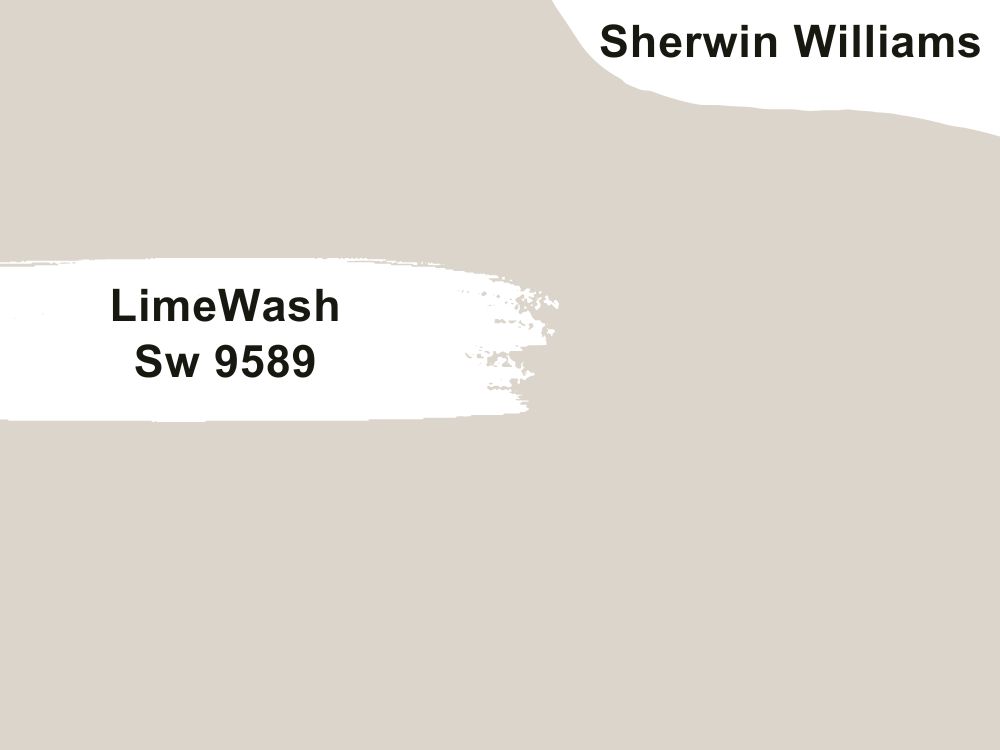
| RGB | 219 213 203 |
| LRV | 67 |
| Matching colors | Origami white, alabaster |
| Undertones | Yellow |
Lime is a very light greige that can read off as gray depending on the lighting situation and the level of exposure. This color is a very cool color that has the ability to pair with almost every color that can be matched with it. However, be careful when pairing it with bright colors like red which might tend to overshadow it. When this color is applied to your kitchen walls, it is bound to create a relaxed, bold, and confident feeling.
49. Sherwin Williams Pussywillow SW 7643

| RGB | 178 173 164 |
| LRV | 42 |
| Matching colors | Origami white, vintage vessel, gauntlet gray |
| Undertones | Brown |
This is a very unique yet complicated color. Pussy willow is a smooth warm gray paint that changes appearance based on surrounding lighting situations. This deep gray can appear very hard and pale when not paid with the right colors. In order to avoid that, it is important to pair this color with very warm tones like vintage vessels, in order to create the most welcoming environment in your kitchen.
Conclusion
Who said choosing the best paint color for your kitchen isn’t necessary? The kitchen is the place where the best ideas and memories are created and made. It doesn’t have to be boring, ugly, or neglected. If you are thinking of giving your kitchen a pop of color, go ahead and do it you will not regret it.
 10 Perfect White Paint Colors for Trim (Trend 2023)
 15 Best Behr White Paint Colors Popular and Trending in 2023
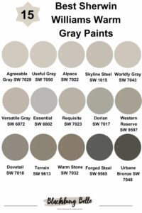 15 Best Sherwin-Williams Warm Gray Paints (Trend 2023)
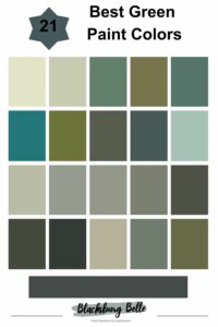 21 Best Green Paint Colors: From Light to Dark Green
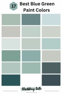 17 Best Blue Green Paint Colors In 2023
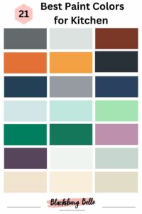 21 Best Paint Colors for Kitchen Island Trending in 2023
