
Gray paint colors are like a blank canvas on which you can express your creativity. More specifically, gray paint colors with purple undertones are some of the prettiest on the market because of how delicate they look. However, there are many of them, so how do you select the best?
We have some good news. Our research has shown us excellent gray paint color choices with subtle purple undertones. We picked from two top brands: Sherwin Williams and Benjamin Moore. All you have to do is go through this list and select the most suitable or combine a few in your decor.
Table of Contents
Are Gray Paint Colors with Purple Undertones Warm or Cool?
If a gray paint color of choice has hints of purple or clear purple undertones, the paint color is cool. Paint colors with red, yellow, or orange undertones are warm, while those with blue, green, or purple/violet undertones are cool.
However, there may be a few exceptions, as you may find gray-purple paint colors leaning toward the warm zone. This may be affected by the lighting and surrounding elements in a room. Grays with a mixture of purple and red undertones tend to have this attribute in rooms with different lighting.
Where Can You Use Gray Paint Colors with Purple Undertones?
These types of paint colors are suitable for any room or object. Cabinets, walls, entryways, accents, front doors, and trims are some of the best places to use them. That means they fit well in kitchens, bedrooms, powder rooms, living rooms, dining rooms, and even nurseries among other places.
However, it is best to use them in rooms facing south or west because of the high light exposure. Cool colors, like gray paints with purple undertones, work better with a lot of natural lighting. But you may want to check the exposure if the light reflectance value (LRV) of such a paint color is high. Too much light may make it look washed out instead of light and airy.
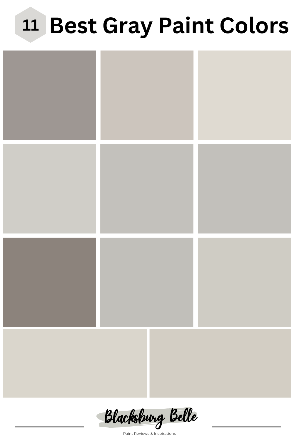
11 Best Gray Paint Colors with Purple Undertones from Sherwin Williams and Benjamin Moore
Let’s look at some of the best gray paint colors with purple undertones from the two top brands and see how they perform in different spaces.
6 Best Gray Paint Colors with Purple Undertones from Sherwin Williams
1. Polished Concrete SW 9167
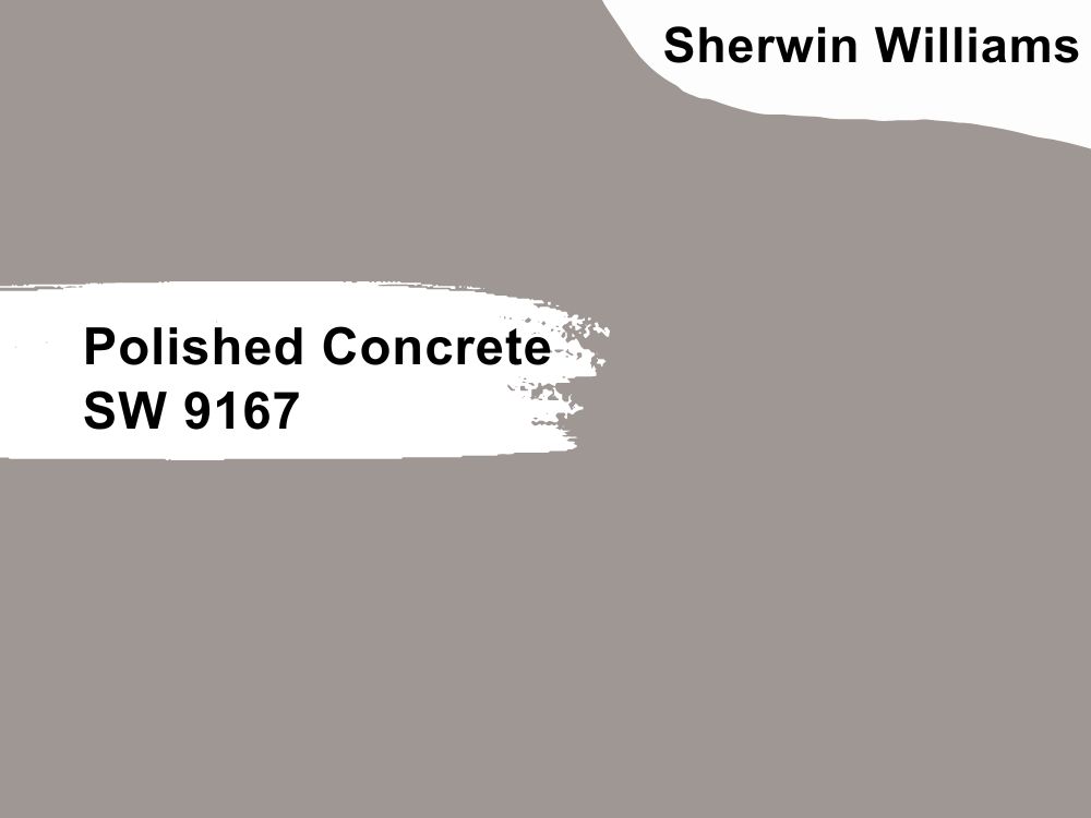
This gray paint color has an undeniable purple undertone, and with its medium depth, it can fit any wall, including your porch. Medium depth means it is not too light or too dark, making it ideal for areas with bright light. You will better appreciate it if all the hues are visible, so consider using it in a well-lit room.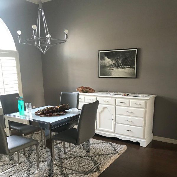
With an LRV of 32, this color does not have a high capacity to reflect light. This is part of the reason it works best in a well-lit room. And with an RGB color code of 158, 151, and 147, it is best to coordinate Polished Concrete with Plum Dandy, Rhinestone, and Snowfall.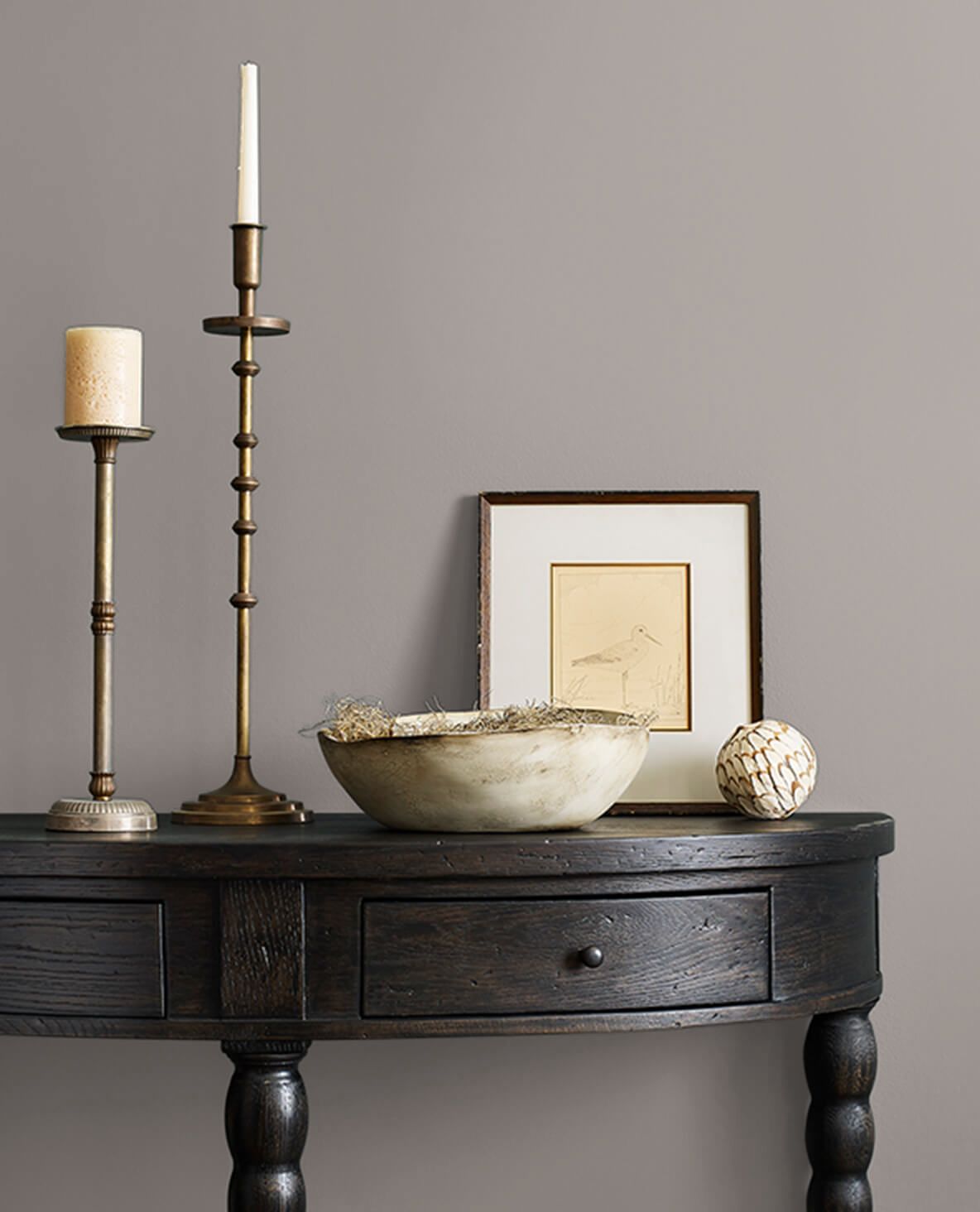
2. Alpaca SW 7022
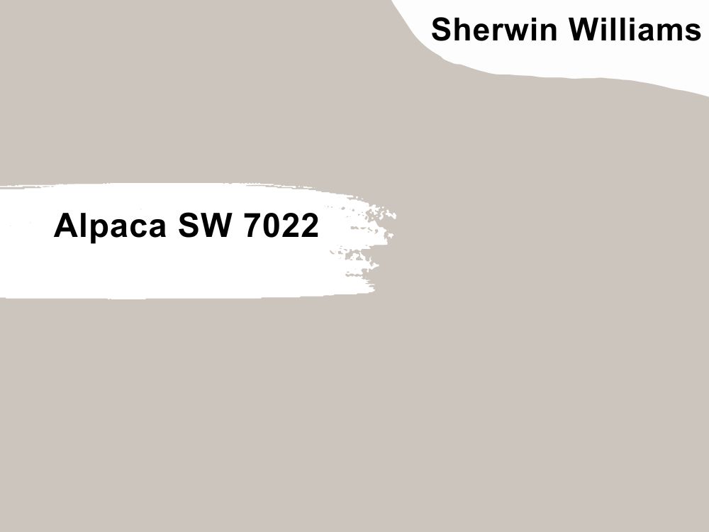
An excellently warm beige-gray paint color with subtle violet undertones, Alpaca is a versatile neutral that blends well with other neutrals and vibrant colors. With an LRV of 57, it is bright enough to reflect light in a room. That is why it is a popular choice for living rooms and bedrooms.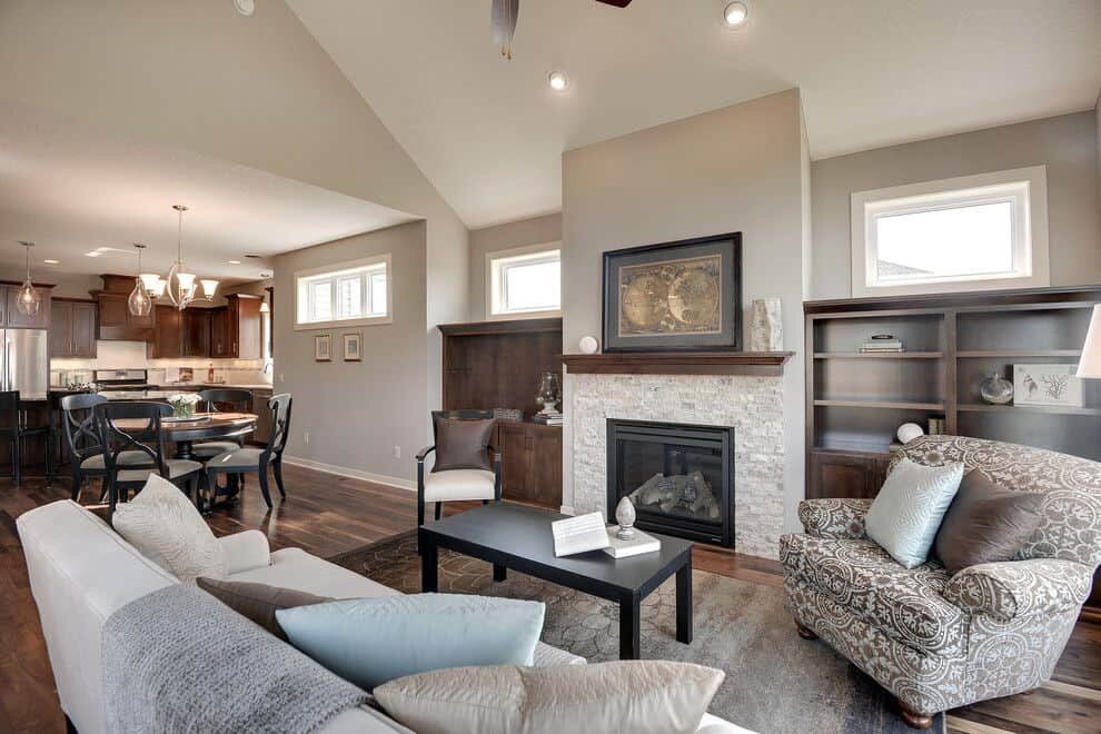
And with an RGB color code of 204, 197, and 189 respectively, Alpaca makes a room arm and inviting with its warmth. For the best effect, pair it with colors such as Moonlit Orchid, Alabaster, and Simply White from Sherwin Williams.
3. City Loft SW 7631
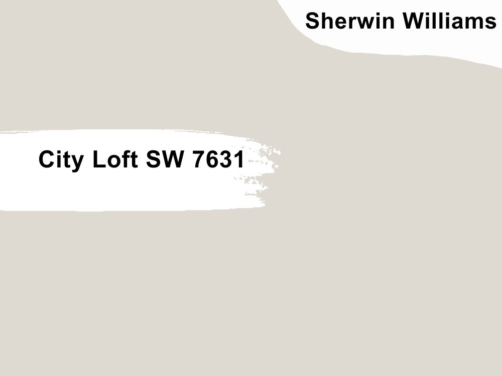
Your immediate response to the question of undertones in this color is red and beige, and you are not wrong if you say that. However, certain elements make it lean toward purple, and the red hue in its color code makes it appear so. You will not be the first person to desire to use City Loft as the main color in your living room or kitchen.
With an LRV of 70, which is quite high, and an RGB color code of 223, 218, and 209 respectively, City Loft offers warmth in some settings and coolness in others. Coordinate it with Cooner’s Lakefront, Taupe Tone, and Snowbound for the best results.
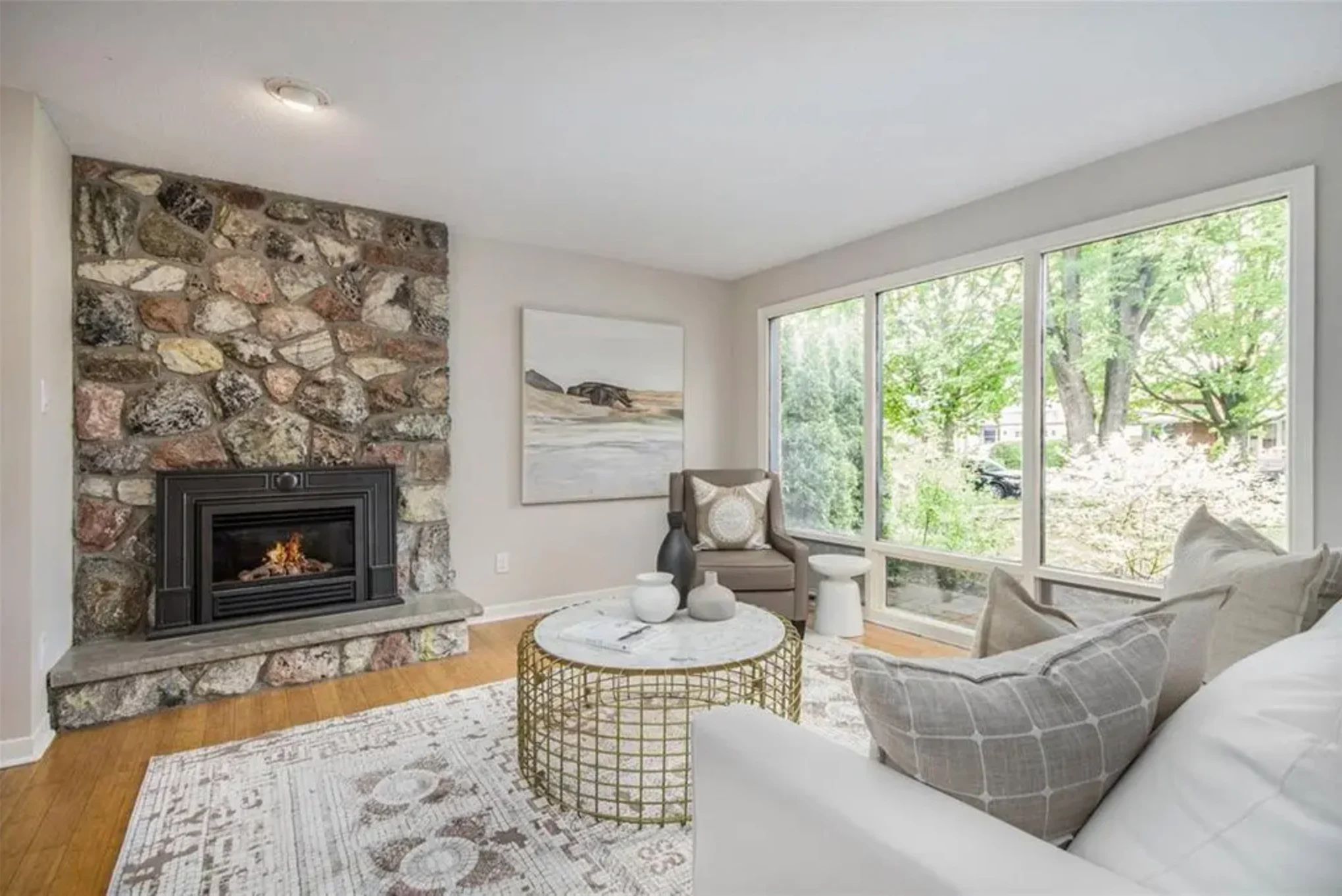
4. On the Rocks SW 7671
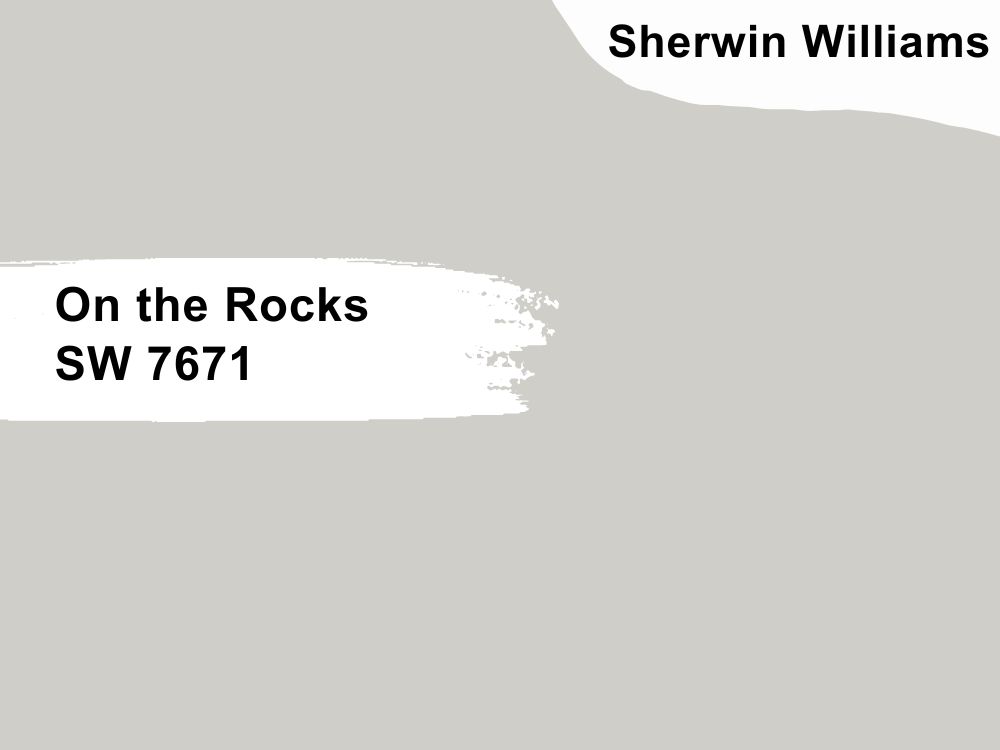
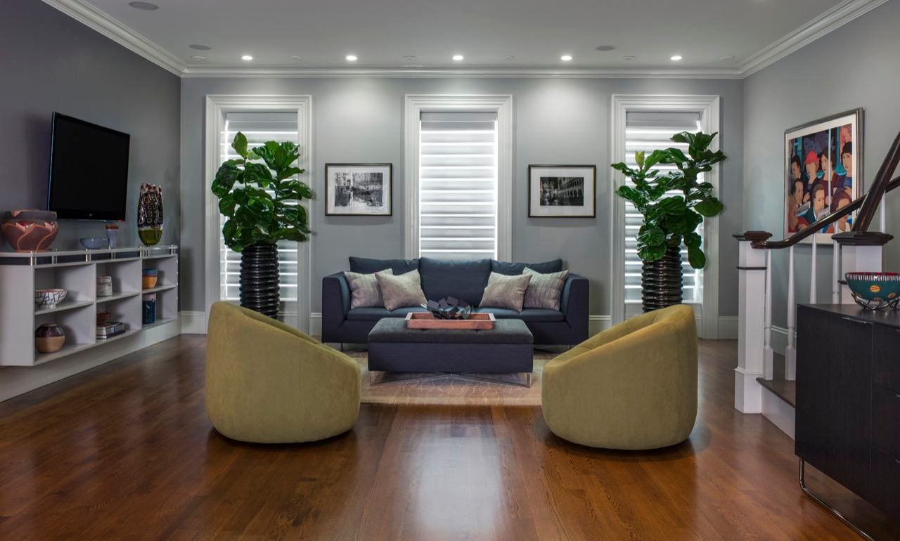
You cannot go wrong with On the Rocks if you want to blend it into warm or cool color schemes. This is because the gray paint color is balanced, neither warm nor cool. Its exposure to light will determine the tone per time. With a lot of light, it may appear warm, but in a north-facing room, it may appear colder than it should be with a slightly purple undertone.
So, think about the room where you want to use this color and the appearance you want. On the Rocks has an RGB color value of 208, 206, and 200 respectively, and an LRV of 62, this paint color is almost a perfect neutral. Consider matching it with Almond Roca, Greek Villa, and Extra White.
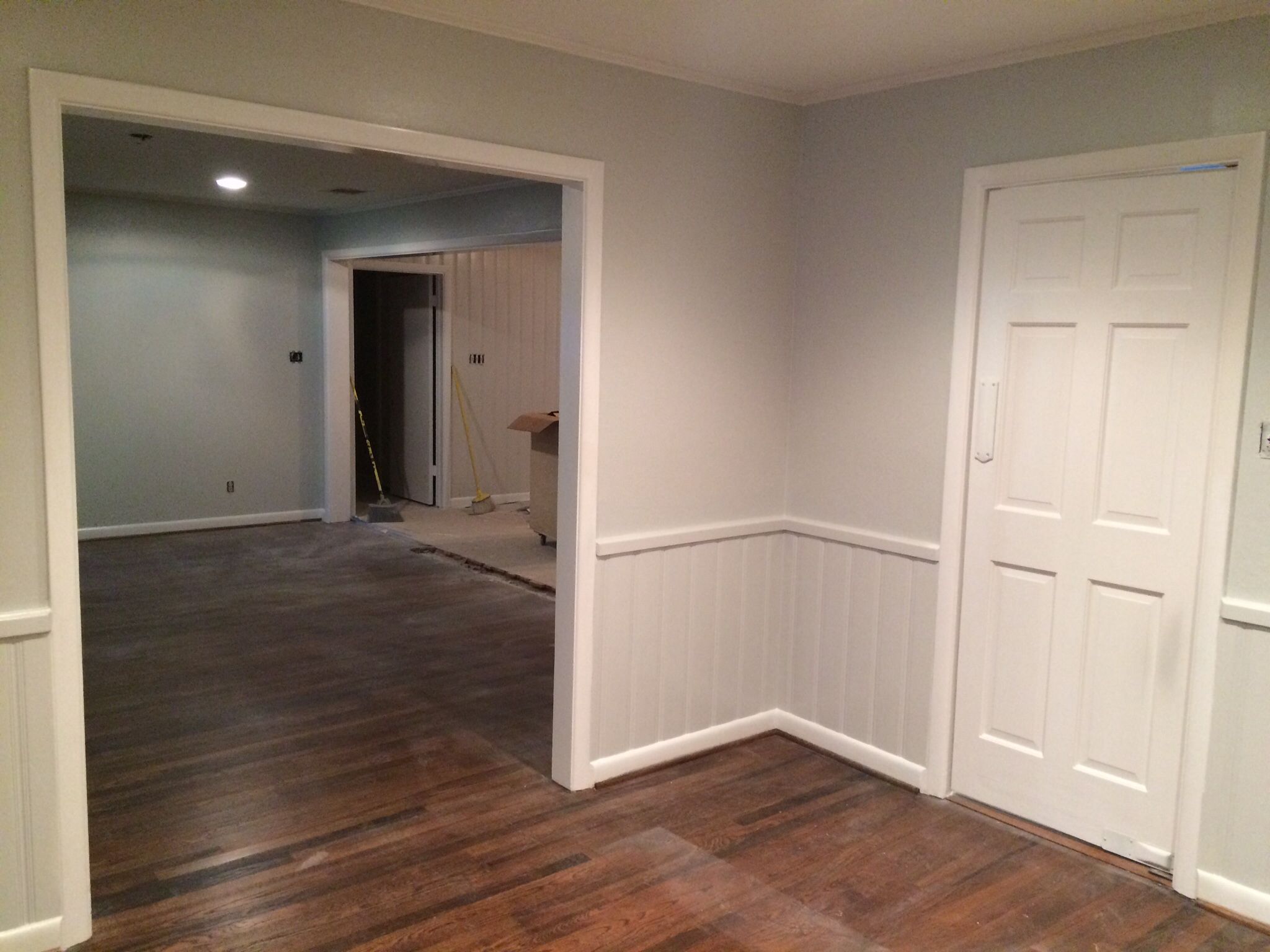
5. Knitting Needles SW 7672
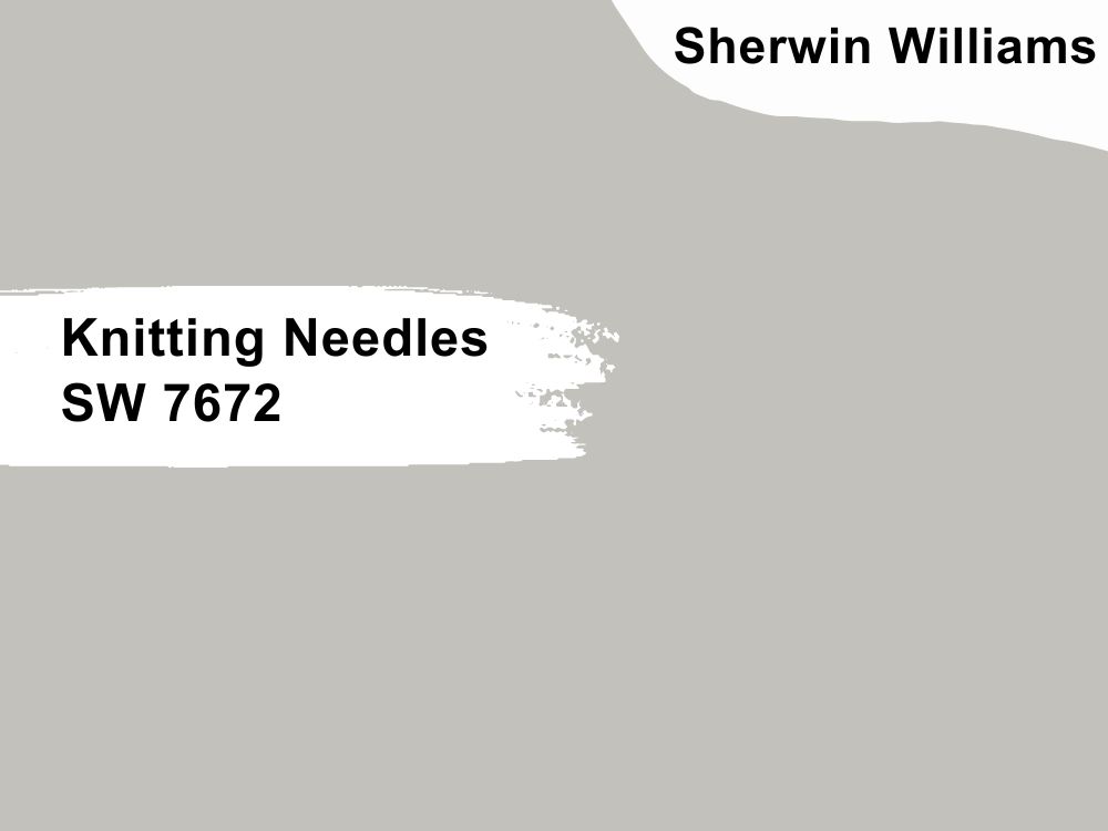
It would have been a bland gray with nothing exciting about it except for the cool undertone of purple. Knitting Needles softens the look of a room, especially with the right lighting. It is a neutral paint color that matches well with other colors, despite the undertone.
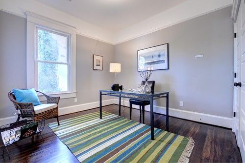
We like it because of its almost perfect red, green, and blue color balance of 195, 193, and 188. Combined with its LRV of 53, Knitting Needles is your go-to neutral if you want a hint of color. It puts its best face forward when you coordinate it with Attitude Gray, Shell White, and Extra White.
6. Light French Gray SW 0055
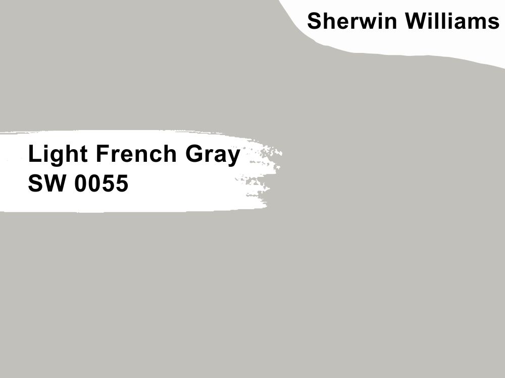
If you want a paint color that has a balance between warm and cool, consider using Light French Gray. It is a neutral gray with an amazing shade, and interestingly, it is not a flat color. Its robustness boosts the look and feel of any decor, especially when coordinated with Gentle Grape and Origami White.
As a timeless color, it never gets old in your decor and makes other colors pop, even if they are neutral. The purple undertone softens it to make it almost a pastel. Light French Gray has an LRV of 53, which is average and perfect, and an RGB color code of 194, 192, and 187 respectively.
5 Best Gray Paint Colors with Purple Undertones from Benjamin Moore
1. Metropolis CC-546
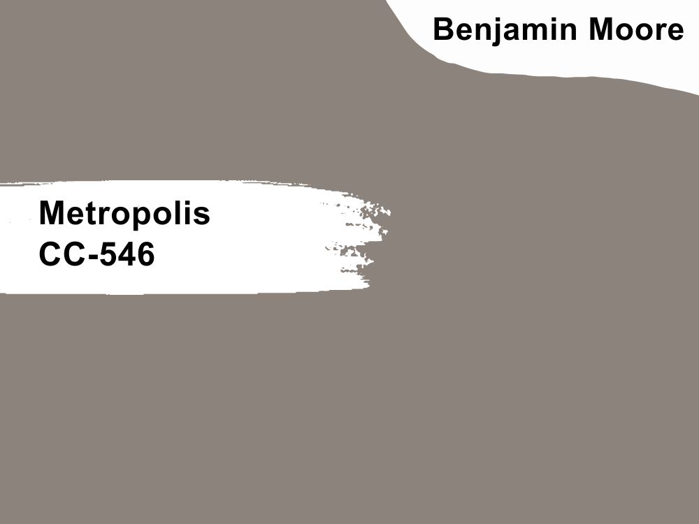
This warm gray-taupe paint color has a hint of plum to add some character to it. In this right setting, Metropolis is spectacular and you may want to use light neutrals to complement it. Alternatively, light grays ad wood tones are also an excellent match for it.
Metropolis has an LRV of 24.46 and an RGB color code of 140, 131, and 124 respectively. Match it with colors such as Distant Gray and Thundercloud Gray or Cloud Cover and Mocha Cream from Benjamin Moore.
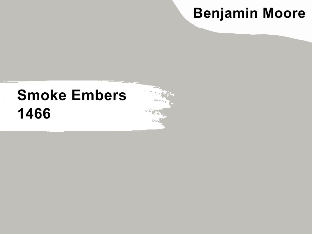
2. Smoke Embers 1466
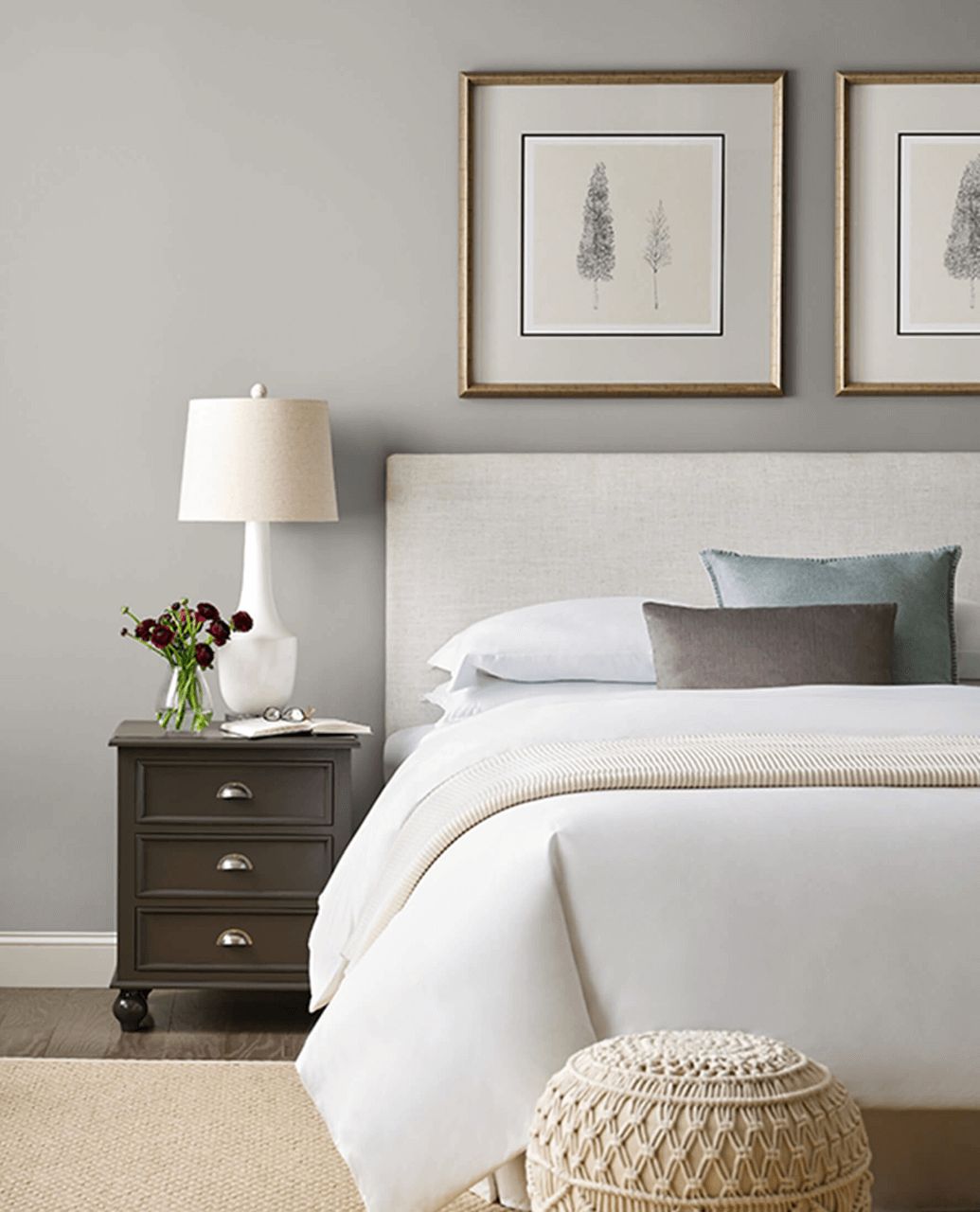
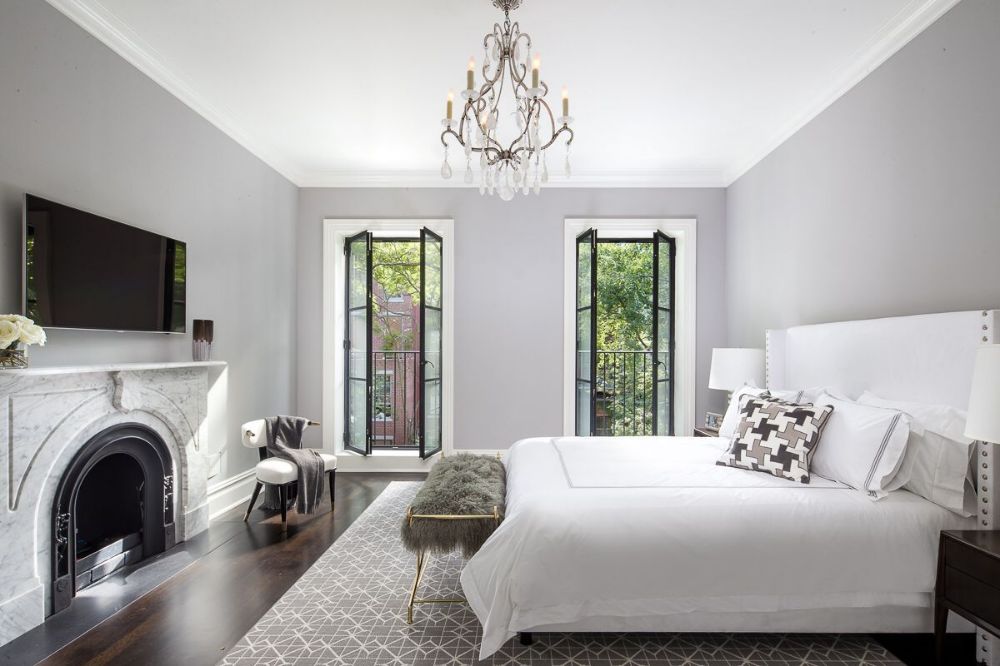
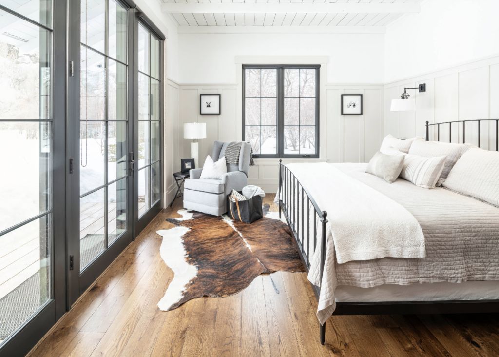
This slightly cool gray paint color can turn warm in an instant if you use the right lighting. However, it has more of a balanced tone than either cool or warm because of its red, green, and blue color balance of 193, 191, and 186 respectively. You cannot deny that it is quite pretty in this sophisticated bedroom decor on Pinterest.
Smoke Embers has an LRV of 51.44, so it can reflect enough light in a room without looking washed out. Coordinate it with colors like Cloud White and Westchester Tan or White Dove and Newburyport Blue.
3. Nimbus 1465
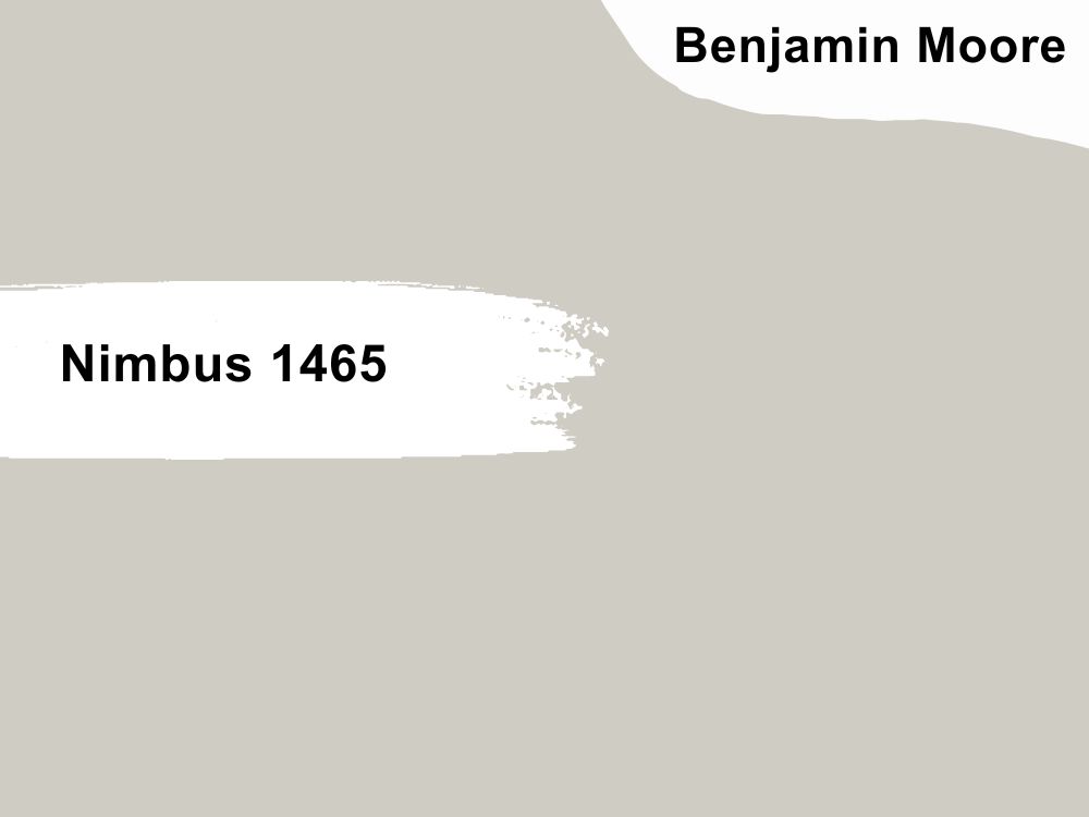
Looking more greige than gray, Nimbus is a good example of when subtle purple and brown meet. It is a soft color that fits into warm and cool color schemes without clashing with any color. Use it as the perfect backdrop for all colors, especially wood tones and other neutrals.
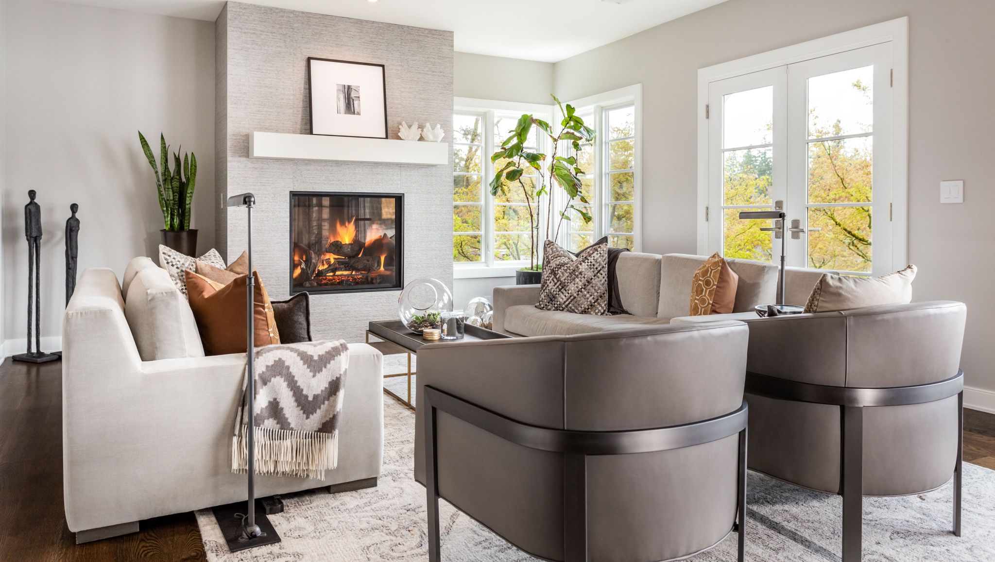
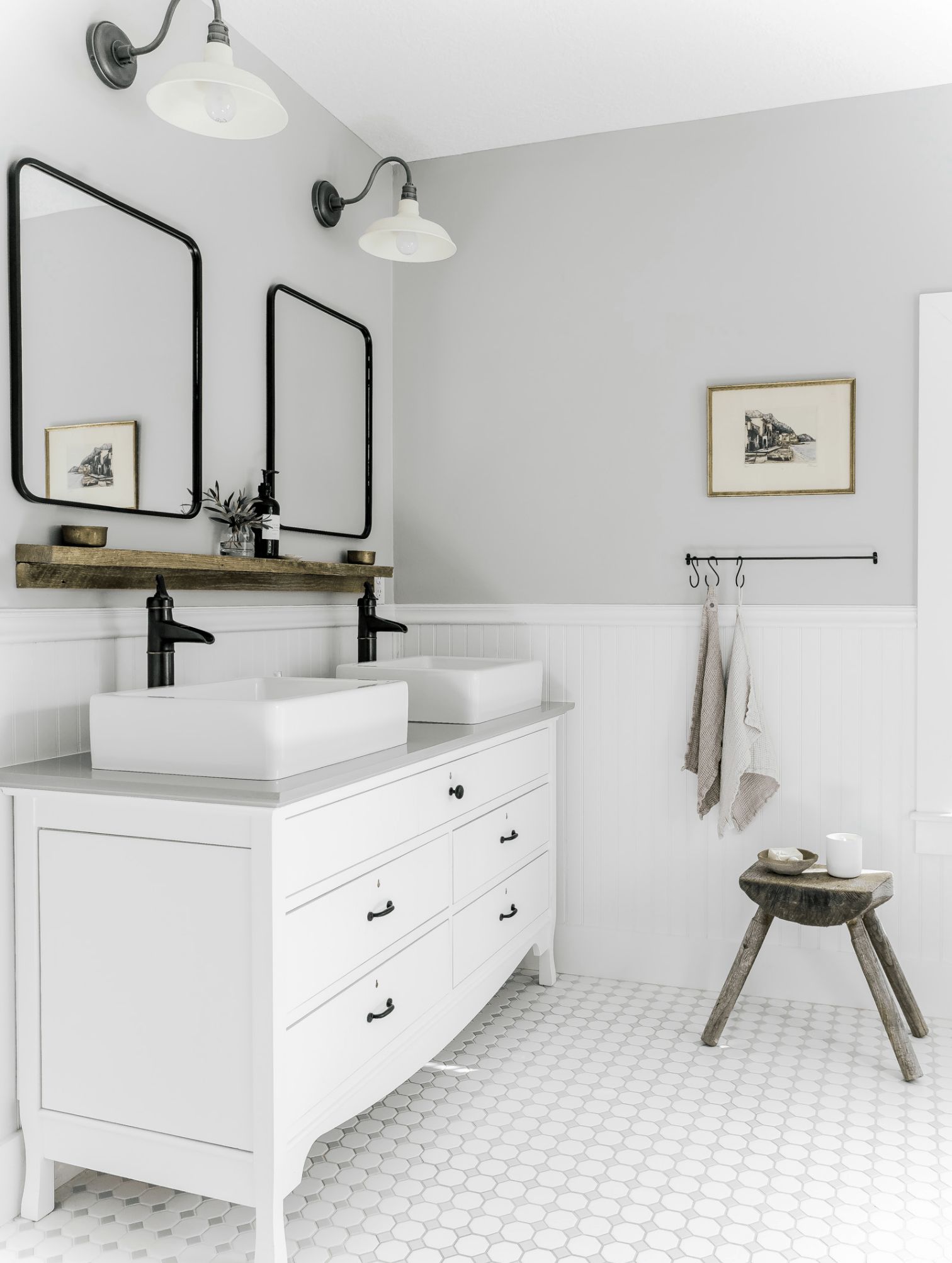
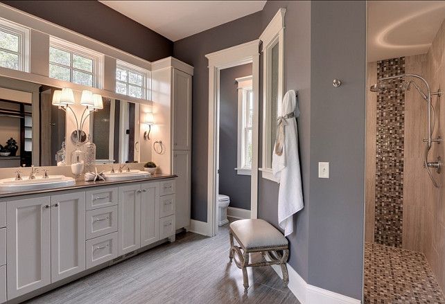
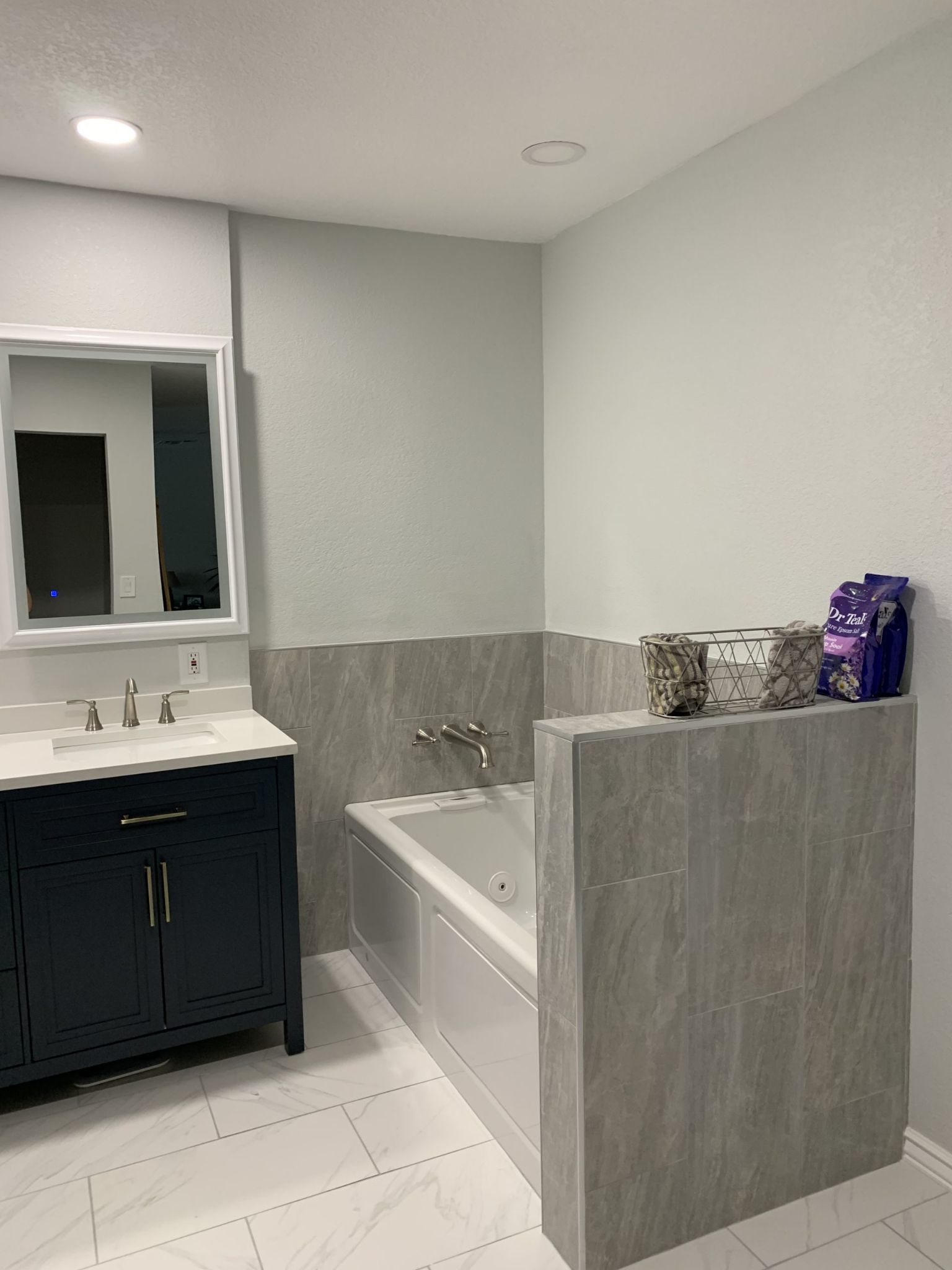
Nimbus has an LRV of 59.4 and an RGB color code of 207, 204, and 196 respectively. White Dove and Stardust or Cloud Cover and Timber Wolf are some of the best colors with which to match it. You can also use other colors, as Kylie M Interiors did in this bathroom decor.
4. Balboa Mist OC-27
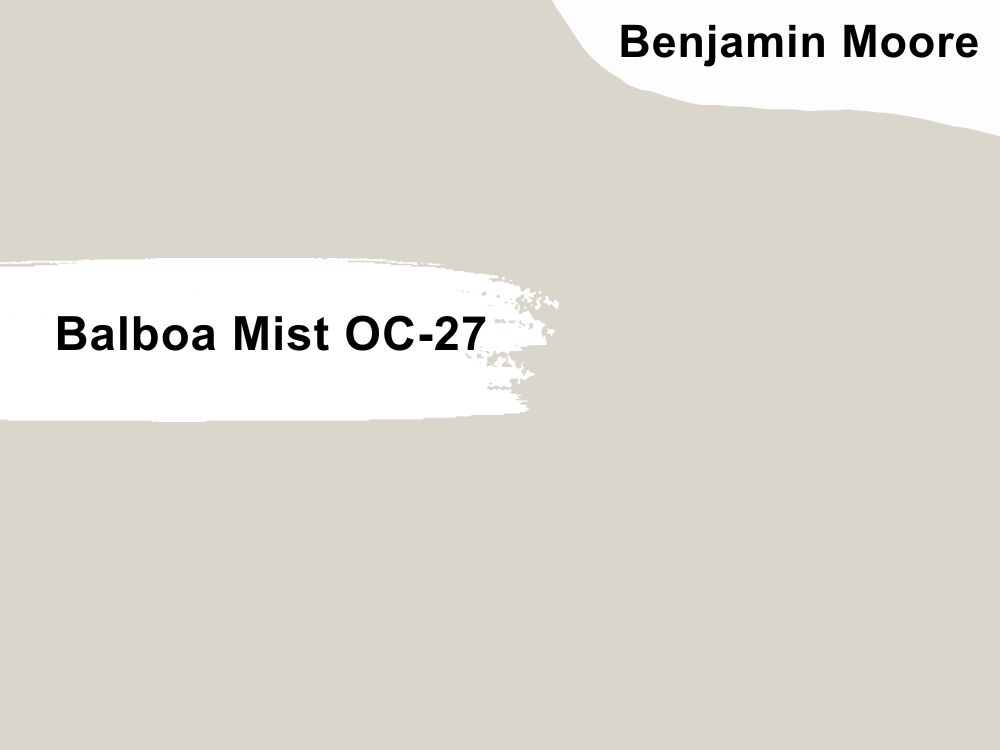
Another pale gray that blends well with anything, Balboa Mist has a touch of purple that is well-hidden. We like how neutral the color is, making it easy to add color to any decor. One of its best attributes is the slightly warm tone that eliminates iciness from the color.
Balboa Mist has an LRV of 65.53 and an RGB color code of 218, 214, and 204 respectively. If you want to get the best out of this soft color, coordinate it with colors like Flint and Barista or Cloud Cover and Rock Gray. Alternatively, use deep wood tones and light grays against a backdrop of this color.
5. Collingwood OC-28
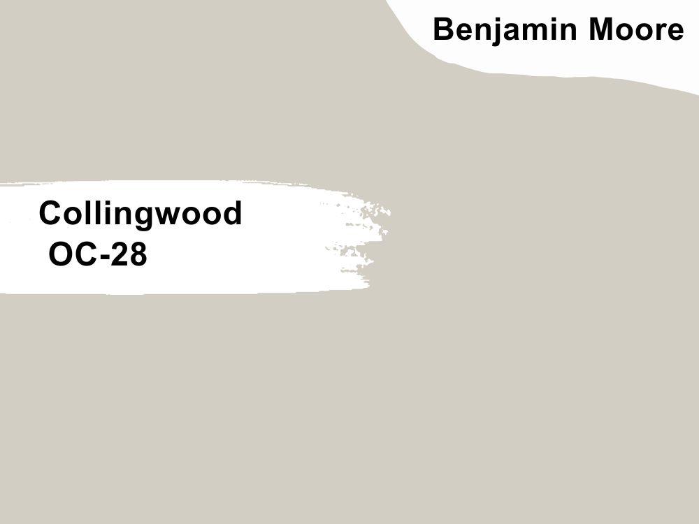
This is, perhaps, the best example of a light gray paint color with the most subtle purple undertones. It is also one color that sways cool in one moment and warm in the next one. Collingwood is a soothing gray with an undeniable hint of warmth that turns cool under different lighting.
Because of this, Collingwood pairs well with almost every color. You just need to know how to use them along with the elements in a room. It has an LRV of 61.52 and an RGB color code of 211, 206, and 196 respectively. Match it with other Benjamin Moore colors like White Heron and Amazon Soil or Steam and Silhouette.
Bottom Line
Gray paint colors with purple undertones are not difficult to find, but it may be a challenge to select the best from many options. Conse
quently, we have reviewed a few of the top ones from Sherwin Williams and Benjamin Moore to ease your selection process.
The lighting, colors, and accessories in any room greatly affect the visible undertones you see in any color. However, this guide will show you design ideas about where these grays fit.
We would love to know your thoughts about these colors. Feel free to share them with us in the comments section.
 17 Best Sherwin Williams Green Paints (Trend 2023)
 23 Perfect Sherwin-Williams Front Door Colors (2023 Trends)
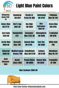 31 Best Light Blue Paint Colors: Review and Inspiration
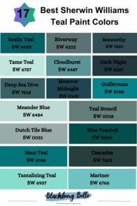 17 Best Sherwin Williams Teal Paint Colors (Trend 2023)
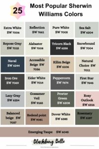 25 Most Popular Sherwin Williams Colors in 2023
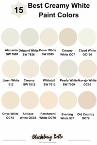 15 Best Creamy White Paint Colors For 2023
